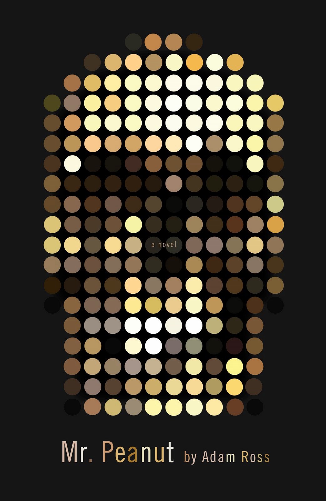
Skip to content

The Casual Optimist Posts

Midweek Miscellany, October 21st, 2009

The lovely folks at Book City Jackets (mentioned previously here) have just released Artist Edition No.2 featuring original work by Nishat Akhtar, Cheeming Boey and Michael C. Hsiung.

“Can’t We All Just Get Along?” — Steve Ross, Former President at HarperCollins and Sr. VP at Random House, on publishing, e-books, and pricing at the Huffington Post:

Permeating… the conversation… is the sense that publishers are resistant to e-books for some reason. But publishers want e-books to succeed because they have the potential not only to expand readerships but leapfrog us over the historically insuperable and tenacious cancer at the heart of the business model; returnable books.

The New Old Thing — Jane Friedman, former president and chief executive of HarperCollins Publishers Worldwide, has launched Open Road which will focus on publishing e-book editions of backlist titles by well-known authors. Does this sound a lot like the original Penguin model for paperbacks to anyone else? There are more details at PW

Stet — editor and author Diana Athill is interviewed by Vit Wagner in today’s Toronto Star. Granta recently released Life Class, which collects Athill’s memoirs Yesterday Morning, Instead of a Letter, Stet, and Somewhere Towards the End in a single volume. Athill is appearing with Alice Munro at IFOA this evening.

Vit also interviewed the fascinating Antony Beevor, author of the Stalingrad and Berlin: The Downfall 1945, earlier this week.

Designer and design blogger David Airey has launched a graphic design bookstore on Amazon with his book recommendations.

And finally…

I came across this lovely looking new book on the Bauhaus while browsing  D.A.P.‘s Fall 09 catalogue. The book accompanies the exhibition Bauhaus 1919-1933: Workshops for Modernity at MoMA in New York, November 8, 2009 — January 25, 2010.

The Museum of Modern Art, New York
2 Comments

Less is More…

Poets & Writers magazine have just published the final installment of Jofie Ferrari-Adler’s series of interviews with publishing professionals.

The last interview in this excellent series is with Jonathan Karp, publisher and editor in chief of Hachette‘s remarkably successful Twelve imprint.

Formerly an editor at Random House, Karp founded Twelve with the objective of publishing no more than one book a month. Since their launch, 15 of Twelve’s first 30 books, including Christopher Hitchens’ God Is Not Great and Dave Cullen’s Columbine (pictured above — cover designed by Henry Sene Yee), have been New York Times best-sellers. It’s clearly a successful model, even if it is one that’s hard for start-ups to replicate (how many new imprints could have snapped up the rights to True Compass by Ted Kennedy for example?).

The interview is, of course, well worth reading in full. But here are a few passages about Twelve that stood out for me…

On founding Twelve:

I was thinking, “Okay, I want everything to be the lead title. I want to have at least a month to put it across. And I want to have the best talent. What’s the best way to do that?” It’s to make a promise to the author and to make the promise so explicit that it’s on the spine of the book: Twelve. That’s it. One a month. You get your launch and, although we can’t guarantee that the book’s going to be a best-seller, we can at least guarantee that you will have our full attention, focus, and commitment for a sustained period. We will talk about your book until people will not listen to us anymore.

On acquisitions:

I really am amazed by how often publishers decide to do something because a similar book succeeded. That is flawed reasoning. Books catch on for any number of reasons, and it’s not a mathematical formula that can be reproduced. Even more insidious is the idea that sometimes creeps into acquisition decisions in a really cynical and negative way, where people say, “Well, that nondescript work caught on, so this nondescript work could too.” I just don’t understand why you would want to go down that road. It makes no sense to me. I would think that you would feel as if you were going through your life just imitating other people, doing something you didn’t really believe in. I’m genuinely mystified by that.

On publishing fewer books:

What I do think is that the Twelve model makes a great deal of sense for unknown authors or authors who want to break out. I think that’s true. I think that this is the best way to publish a midlist author or an author who’s on the way up. Let me put it another way: I think it would behoove the major publishing houses to publish fewer books with more focus. I think that everybody would benefit from that. What I don’t know is whether the companies can meet their targets doing it. I’d have to be a CFO to know that, and it would be arrogant of me to say that a major publisher can get by without disposable books. I don’t know the answer to that. What I know is that I’m working for a company that publishes a lot less than the other major publishers with a more concentrated marketing approach and seems to be making a lot of money doing it.

On the “future of publishing”:

I have an idealistic hope that as more and more media becomes disposable, books will be increasingly regarded as the permanent expression of thought and feeling and wisdom. So publishers who can offer definitive material will thrive. Now, as I say, that’s idealistic. Plenty of publishers are going to continue to do well publishing derivative material that they don’t really believe in. But I think it’s going to be harder for them. It’s going to be harder for them to survive. I think there will be some displacement—some houses will shrink and other houses will grow. I could see some pure play digital publishers who aren’t encumbered by the weight of overhead and the history of their business relationships becoming influential factors in the publishing world. So I think it’s a transitional time and a transformative time. But it’s always been that way. I don’t think anything should be regarded as permanent. All we ultimately have is our belief in the particular books. And as long as you have that, you’re fine.

As I say, the whole interview (the whole series in fact) really is worth your time.

3 Comments

Missed Things: Friday

Floating — Toronto illustrator Michael Cho on his cover art and interior illustrations for The Amazing Absorbing Boy by Rabindranath Maharaj (published by Random House Canada).

The Ideal Studio Library — It’s Nice That interviews designer Jason Godfrey about his beautiful new book Bibiographic: 100 Classic Graphic Design Books, published by Laurence King,  (and yes, full disclosure, LK are distributed in Canada by my employer Raincoast Books):

My aim was to create the ideal studio library of graphic design books and put this into a book format. I had always felt that there was a need for a visual reference to that could give flesh to many reading lists that have been published… The really tricky choices were the more recent books as it is difficult to know whether they will become classic points of reference, time will tell if I made the right choices on these books.

Bezette Stad —  A book of poems by Paul van Ostaijen, illustrated with woodcuts by Oskar Jespers, available in full at the University of Iowa Libraries’ astonishing International Dada Archive (via the lovely Aqua-Velvet).

And finally…

ENOUGH! — The hilariously on the money Editorial Anonymous:

I REALLY NEED A FRICKING BREAK FROM THE “FUTURE OF PUBLISHING” TALK… I don’t need to read any more of these articles, and neither do you.

A quick overview:

1. Publishing is a somewhat crappy business. Which makes it PRETTY MUCH LIKE EVERY OTHER BUSINESS.
2. Publishing has a future. NO ONE KNOWS WHAT IT WILL BE.

So everyone can stop
a. COMPLAINING
and
b. COMPLAINING.

Thank you.

No, no, Thank YOU.

3 Comments

Mr. Peanut

From Mr. Mendelsund. Brilliant.

Comments closed

Missed Things: Thursday

Covers for The Invincible Iron Man No. 20 and 21 by Salvador Larroca and Frank D’Armata, with design by Rian Hughes (seen at the website of the author Matt Fraction). Is it just me, or do these have a whiff of Marber’s Penguin Crime series about them? Or is it more like Olly Moss?

Grey Overcoat Music —  3:AM Magazine‘s Lee Rourke talks to photographer Kevin Cummins about his new book Manchester: Looking for the Light through the Pouring Rain (published by Faber & Faber), which documents 30 years of the Manchester’s music scene. 

The Guardian also has a slide show of  photographs by Cummins (above: Ian Curtis, 1979).

And if you’re interested in Factory Records and the Manchester music scene you might also be interested in The Haçienda: How Not to Run a Club by New Order bassist Peter Hook (published by Simon & Schuster) also reviewed in The Guardian.

The Lost Pleasure of Browsing — Charles Rosen for the New York Review Blog:

I realize that mail order shopping has been going on for a long time, but have always thought that this destroys one of the pleasures of civilized life. I do not understand how one can buy clothes without trying them on, and as for books, the individual book should seduce and inspire you to buy it.

Spelling “Theatre” the British Way — Andy Ross talks to New Yorker page OK’er Mary Norris about copy editing “America’s most prestigious literary magazine” at The Red Room:

The main thing here is to respect the writer. The writers don’t have to do everything we want them to—we make suggestions. The ideal would be to give an editor a proof and have all your suggestions meet with approval. Sometimes you notice that your suggestions have not been taken, so if something bothers you, you try again. Sometimes you wear them down, sometimes you cave.

I have been on both sides of the process, as a writer and as a query proofreader. Being edited sometimes felt like having my bones reset on a torture rack. I don’t ever want to do that to a writer, but I probably have from time to time.

And bless The New Yorker for using double consonants before suffixes — “traveled” is barbaric.

And finally…

Illusive: Contemporary Illustration Part 3 published by Gestalten looks rather fine.

http://blogs.nybooks.com/post/212201723/the-lost-pleasure-of-browsing
Comments closed

Missed Things: Wednesday

Henry Sene Yee, Creative Director of Picador, discusses the elegantly understated cover design for Time by Eva Hoffman, the latest addition to Picador’s BIG IDEAS // small books series.

And I’ve mentioned this before but it bears repeating: Picador are putting their catalogues — and, therefore, their outstanding cover designs — on their Facebook page.

Logicomix by Apostolos Doxiadis and Christos H. Papadimitriou reviewed in The New York TimesThe Guardian, and FT. It sounds kind of awesome. The book also has a nice website with lots of content.

The Inevitable Frontier — Jennifer de Guzman, editor-in-chief at the independent comics publisher SLG Publishing, on digital comics in PW:

Right now, sales from digital comics aren’t going to mean we can pack up print publishing. Not even close. But despite being in the midst of it rather than a wide-eyed observer, I can see that in the near future digital comics are going to be playing a bigger role for all publishers than they do now. And it’s better to be so integrated in the change that you don’t notice that it’s happening than to find yourself left behind and marveling at “the things they can do now.”

“Issues” — A less than warm reception for the Kindle in Australia:

Jeremy Fisher, executive director of the Australian Society of Authors, said he was advising his 3000 members to resist publishing through the Kindle.

“As I understand at this point in time, Amazon asks for a very, very big discount from publishers for their works to be included in Kindle so that the return coming back to the publisher is smaller and the return coming back to the author is smaller,” he said.

“The person making the most money is Amazon.”

Hmm… Yes, well, moving swiftly on…

Jacket Whys — A really nice blog about children’s and YA book covers.

And on the subject of kids books…

Who The Wild Things Are –Artist Roger White looks at the inspiration Maurice Sendak’s Wild Things for the Boston Globe:

The Wild Things looked like nothing ever seen in a children’s book. Rendered in simple ink-hatch over watercolor sketches, they evoked a perfect mixture of proto-adult dread and anarchic, childlike glee – an eternal, platonic form of the kindly monster. From the moment they appeared in 1964, they seemed bracingly and completely original. But in fact Sendak’s monsters had a long series of ancestors and descendants…

But according to Bruce Handy, deputy editor at Vanity Fair, (and his children) kids don’t actually like Where the Wild Things Are… Umm… What?

Comments closed

Missed Things: Tuesday

Thesis Project — Mikey Burton’s illustrative reinterpretations of classic book covers for junior-high-school students. Mikey’s more recent work, including gig posters for Wilco, is also awesome.

The Writer’s Reader — Michael Silverblatt, the endlessly enthusiastic host of KCRW radioshow Bookworm, profiled in O, The Oprah Magazine (via TEV).

We Are The Friction seen at The BCA, Design Work LifeSwissMiss and others. Sing Statistics, the “collaborative concern” of designer Jez Burrows and illustrator Lizzy Stewart, and publisher of We Are The Friction, also has a great Flickr photostream (and there are images of the book launch at Edinburgh’s Analogue Books on the shop’s Flickr photostream).

It Isn’t Rocket Science — Makenna Goodman, formerly an assistant to an unpleasant sounding literary agent in New York, talks about her move to rural Vermont and happier times with publisher Chelsea Green in the Huffington Post.

Intelligent Eclecticism — Steven Heller on the groundbreaking illustrated covers used for Time‘s “soft-cover book club” throughout the 1960’s:

Eclecticism was a viable and intelligent decision. While consistent design for a series of related books makes good strategic sense, these books were bound together by the editors’ judgment. Designing them as separate entities — avoiding the impression of formulaic repetition — made the most sense for the book club but also for the artists and designers who created them. Each cover (indeed each book) had a unique integrity that raised the standard of the genre while showcasing the creators’ artistic strengths.

And finally…

On the subject of vintage book design and great illustrations, be sure to take a look at Martin Klasch blogger P-E Fronning’s set of Swedish book covers on Flickr.

Comments closed

Missed Things: Monday

I was talking about Romek Marber right before I left the building, so it seems appropriate to get things started with him too…

In an extract from a new book called Penguin by Illustrators, the Creative Review reprints the full text of the presentation made by Marber to the Penguin Collectors Society in 2007:

Much has been made of the grid; it has even been labelled ‘the Marber grid’. I believe that the pictures for the initial twenty covers, played an important part in forging the identity of the Crime series. The grid was important as the rational element of control. The consistency of the pictures contributed, as much as the grid, to the unity of the covers, and the dark shadowy photography gave the covers a feel of crime.

And on a related note, idsgn profiles Gill Sans, the ‘Helvetica of England’ which was used by Edward Young on the early Penguin paperbacks (Marber switched to Akzidenz Grotesk if memory serves…).

Coaxing — Ron Charles, Deputy Editor of the Washington Post’s Book World, interviewed in Bookslut:

The number of books keeps rising, as far as I can tell. The number of readers is stable or stagnant or even declining. When you look at the amount of space we spend covering television… I’m not criticizing my own paper, I’m criticizing my own industry. Who needs help watching TV? Reviews of television shows, I shake my head; I can figure out if I want to watch The Office or Curb Your Enthusiasm all by myself. But help me find a good novel, in this enormous stack of books at the book store. That’s a real service.

You can also follow (the surprisingly candid) Ron Charles on Twitter.

Meanwhile, Publishing Trends looks at Book Reviews, Revamped.

Correspondence — Eric Hanson, author of A Book of Ages, commemorates the 60th anniversary of the letter that inspired the lovely 84, Charing Cross Road (via The Second Pass).

If any of you haven’t read 84 Charing Cross Road, please go do so now…

The Billy bookcase turns 30 — Lucy Mangan celebrates in The Guardian.

And lastly…

I’ve linked here before on several occasions, but I just wanted to mention the all around awesomeness that is A Journey Round My Skull. Recent posts include BLICKFANG — The Eye-Catching Covers of Weimar Berlin and Thirty More Book Covers From Poland.

1 Comment

Reasons to be Cheerful


They’re here and I’m back — officially one year older, and a father of two. Mum and the twins, born a week before my birthday, are doing well.

The new Raincoast website is close to being on schedule (thanks to Monique at Boxcar, Al, Tony, Jamie and Siobhan at Raincoast HQ) and daily coffee consumption — while still exceptionally high — is back to a more sustainable level. I still have that grid for Amazon to do though…

But back to the Optimist business: I missed a lot of great stuff while I was away, so expect posts every day this week (starting Monday) as I try to catch up. The interviews with book designers will hopefully return in November.

Thanks to Mark for the pep talk a couple of weeks ago, and thanks to the people who emailed and left comments while I was away.

It’s nice to be back.

11 Comments

Something for the Weekend, September 25th, 2009

Great Ideas — Art director and designer David Pearson discusses his publishing venture White’s Books with Peter Terzian in Print Magazine (above: cover for Emma, published by White’s Books; illustrated by Amy Gibson):

Due to the arrival of eBooks, many prophesied the death of the printed word, but we see it as an opportunity to turn the spotlight back on the traditional methods of book production and to luxuriate in the craft and tactility of the physical book and the printed page. It’s lovely to be designing with longevity in mind as we aim to create objects that will be retained and cherished by their readers.

David Pearson also discusses his work for Éditions Zulma and Penguin. I’m hoping to post a Q & A with David on The Casual Optimist later this fall.

Questions Should Be Answered — Dutch type designer Jos Buivenga, whose quality free typefaces (including personal favourite Fontin Sans) are available from his one-man font foundry exljbris, interviewed in the MyFonts newsletter. Jos’ new typeface Calluna (shown above) looks rather lovely.

The Future of Publishing? — Patrick at the Vroman’s Bookstore blog looks at what publishers do and how they might do it (or something different) in the future. While there is nothing especially new here, it’s an interesting post in part because it’s written from the perspective of a bookstore. The comments are worth reading too, if only for Ann Kingman‘s contributions and hilarity of a certain self-styled “agent of change” having the audacity to accuse someone else of oversimplifying (pot introducing kettle). All of which is a good, solid reminder that I have a related post in my drafts folder than needs dusting off… *Sigh*

And on a related note…

Reimagining the Book — Mark of index//mb is looking for people to help organise a conference on authorship in Toronto.

And just FYI: There is a good chance that this will be the last post for a couple of weeks. Work stuff + Life Stuff + Internet Fatigue means that I need a break from even the gentle rigours of irregularly posting here. Hopefully normal service will resume in October (for what it’s worth…).

Out.

2 Comments

Sunnyside

I just picked up  copy of Glen David Gold’s most recent novel Sunnyside.

Book Covers Anonymous gave the British cover — with a whimsical illustration by Adam Simpson — some love back in July, but I think I prefer this lovely elegant, and understated cover by Megan Wilson for the US edition published by Knopf:

You can see more of Megan Wilson’s work at her website, including these rather lovely covers for Vintage’s Richard Yates reissues:

Young Hearts Crying: Photograph by Richard Rutledge

A Special Providence: Photograph by John Rawlings

Comments closed

Midweek Miscellany, September 23rd 2009

It’s funny how topics of conversation sometimes repeat themselves for no apparent reason. This week Romek Marber and his designs for Penguin have come up with sufficient frequency for me to take it as a sign I should post some links about about him:

Eye Magazine has a great article about his classic design of Penguin Crime Series:

Marber’s grid allows for different placements of title and author’s name depending on the length of the title and the needs of the design as a whole. There are small inconsistencies in some of the vertical measurements on a few of the books, probably due to printer’s error, but the basic design is sufficiently robust that it does not matter… With the typographic structure in place, Marber could concentrate on producing images that reflected the atmosphere of the books, which he read with relish from cover to cover. He was a graphic image-maker of great versatility, able to sum up the stories with motifs and ciphers that contrived to be both playful and threatening. Many of these whodunnits were decades old, but his interpretations gave them a contemporary allure.

The Ministry of Type shows you how to construct the famous Marber grid.

Apt Studio have a Marber WordPress theme (demo). Are any literary blogs using this I wonder?

And there’s this great Flickr set of Romek Marber Crime Covers.

Please let me know if you have any other good Marber links…

In other news…

The Electro-Plasmic Hydrocephalic Genre-Fiction Generator 2000 by David Malki (via INDEX // mb).

The Awesomeness Manifesto — I’m a little skeptical about these kinds of manifestos simply because they’re not terribly useful, but Umair Haque’s list is as interesting for its criticism about the chimera that is ‘innovation’ as for what is says about the warm and fuzzy  ‘awesomeness’.

1 Comment