3000 (ish) photos of Abigail Uhteg making 35 books over a 2 month period at the Women’s Studio Workshop in Rosendale, NY:
(via Jacket Copy amongst others…)
Comments closedBooks, Design and Culture
3000 (ish) photos of Abigail Uhteg making 35 books over a 2 month period at the Women’s Studio Workshop in Rosendale, NY:
(via Jacket Copy amongst others…)
Comments closed
To my embarrassment, it wasn’t until his wonderful design for Obsession by Lennard J. Davis that I really began to pay attention to Isaac Tobin‘s work. There was something about the lettering — painstakingly created with pin pricks into thick cardstock — that made me curious about the designer. Who would do that?
But clearly I should have been paying closer attention.
By the time Obsession was published last year, Isaac’s work had already been recognised by the Art Directors Club, the Association of American University Presses, and The Type Director’s Club, and his covers included in AIGA 50/50 and the Print Magazine Regional Annual.
As senior designer at the University of Chicago Press, his portfolio is full of understated, witty designs for books on topics as diverse as American humor, citrus, Iraq, Islam, Italian culture, Victorian illumination, Yiddish and everything in between. And thanks to his imaginative use of type, there is always a lot more show than tell, which cannot be easy with academic titles (and their epic subtitles).
Needless to say, Isaac is more than just one cover. I think his work is remarkable. I hope you agree…

Design by Isaac Tobin

Design by Isaac Tobin
What inspired you to become a book designer?
I grew up in a family of academics and my parents were always working on their books; sending off manuscripts, going over proofs, preparing indexes, and eventually receiving their cover designs. I was always interested in art but designing books didn’t occur to me until much later.
I studied graphic design at RISD and fell in love with typography but wasn’t sure what to do after graduation. Luckily one of my teachers (who worked as a book designer) knew that books would be a good fit for me, and let me know that Beacon Press, one of her clients, had an opening for an assistant designer.
Book design turned out to be perfect for me, and I’ve semi-unintentionally ended up in the familiar world of academic publishing, about as close as I could get to the family business while still doing graphic design. And now I’ve had the privilege of designing covers for both of my parents. My brother is writing his dissertation right now so I may also get to design the cover of one of his books.

Design by Isaac Tobin
Briefly, could you tell me about University of Chicago Press?
The University of Chicago Press is the largest university press in the U.S. We publish about 250 books a year. About a third of those are trade books for general audiences, and the rest are either specialist or academic monographs. Print runs vary dramatically but I’d say the average is about 1000. And of course we’re most well known for publishing the Chicago Manual of Style.
There are 8 of us in the book design department, and we all design both covers and interiors, as well as typeset illustrated books in-house. Jill Shimabukuro, our creative director, has put together a really strong group of designers and it’s a great place to work.

Illustration by Lauren Nassef; design by Isaac Tobin
What is your role there, and approximately how many covers do you work on a season?
I’m a senior designer, and work on about 30-40 covers per year.
How is working at university press different from working at a trade publisher?
I think the biggest difference is that university press designers normally work on both covers and interiors (and typeset illustrated books too). Most trade designers are much more specialized, and work on either covers or interiors.
Academic press art and production budgets are also probably lower than at trade publishers, but I imagine all publishers are trying to cut costs wherever they can these days.

Design by Isaac Tobin
Could you describe your design process?
It really depends on the book. When I’m assigned a book I jot down my first ideas in crude thumbnail sketch form. These tend to be the most obvious and cliched solutions, but sometimes my first reaction is the strongest and purest. Most of the time I put together a big messy Illustrator file filled with visual research and typeface tests. I like to quickly style the title in lots of different typefaces so I can get a sense of the potential word shapes. Then I start combining and recombining various elements and quickly building crude comps so I can explore lots of different options at once. I like being able to zoom out and see all my different comps in a single window. The hardest part is always when I have to stop generating new ideas and variations and start editing down to a single design.

Design by Isaac Tobin
What are your favourite books to work on?
I’ve gotten to work on a couple of books that focus on the history of a single idea; Obsession and Accident. Both were dream opportunities from a design perspective because they were each about a single, clear, yet abstract subject, and their short titles allowed for bold, expressive typography.
I also enjoy working on the less glamorous academic monographs with small print runs and specialist audiences. They often have really suggestive and interesting subject matters. And because of the lower sales expectations it also tends to be easier to get more subtle or unusual designs approved.

Design by Isaac Tobin
What are the most challenging?
The covers that are asked to communicate too much. Sometimes the title of a book doesn’t clearly define the genre or subject matter, so it is important for the jacket design to define it instead. Sometimes everyone can’t agree on just how a book should be positioned in terms of subject matter and genre, and we have to go through multiple cover designs before the right balance is found.
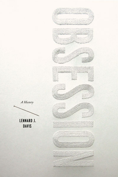
Lettering by Lauren Nassef; design Isaac Tobin
What was the inspiration for the cover of Obsession: A History?
This book is a wide ranging history of the idea of obsession and the way it has changed over time. Because obsession can be such an important part of the creative process, I wanted to find a way to make the cover itself a result of an obsessive act.
To keep things simple I decided to not bring in outside imagery and work with the title itself. I’m a sucker for the classic typography 101 exercise where you make a word look like its meaning, and the one-word title was a great opportunity. But my attempts to construct the word “obsession” with repetitive typographic elements on the computer were falling flat. My wife pointed out that the computer was making the repetition too easy, and it would be better to make it by hand so the hours of work would be visible in the final product. She had actually been making drawings with pin pricked holes years ago and suggested using that technique. Right away I knew she was right, and could see exactly how the cover would come together.
What was it like collaborating with Lauren on the cover?
Like many of our collaborations, it emerged naturally. I pitch a lot of my cover ideas to her first, and show her all of my comps, so she’s often involved in my work, and in the course of one of these discussions we realized that not only was her idea the right idea for the book, but she was the one who could pull it off. This was a very easy collaboration for me; she pretty much came up with the idea and then did basically all the work. All I had to do was design the typography (in my go to home-made sanserif Attleboro), take the photo at the end, and handle the ancillary type.


Design by Isaac Tobin (using display type Attleboro)

Spread from Whiskey Tango Foxtrot
Do you see any recent trends in book design?
It seems like more cover designers are creating their own lettering and imagery these days. I guess the DIY approach that started with crude and faux-naive hand-made designs has evolved into something more refined and craftsmanship-based. A lot of these custom letterforms and images are being drawn on the computer, but whether handmade or digital they are clearly labored over.
I’m probably too close to the subject matter to be a good judge though. I try not to analyze design trends or how my work fits into them too much. I used to do that a lot and found it kind of crippling, so I’ve been trying to follow my instincts more. My instincts are probably just subconscious recapitulations of the dominant trends, but I’m happier this way.

Illustration Lauren Nassef; design Isaac Tobin
Where do look for inspiration and who are some of your design heroes?
I really can’t believe how many great cover designers are working right now. It’s both incredibly inspiring and humbling. The list of designers I love is too long to recite here and you’re off to a great start with this interview series. I don’t know if the field is getting stronger or if the internet is making it easier to see more work. Maybe a bit of both; the internet is breaking down barriers and putting all of us in direct conversation/competition, leading to better work. Design Related has been a big part of this, as have all the cover blogs. I remember when the only way to see new covers was to prowl bookstores and pore over the AAUP and AIGA annuals.
I’m continually inspired by the work my colleagues at the UofC Press are doing. I think we’ve all gotten better over the last few years and keep inspiring each other. It’s always exciting when I go to grab a print from the communal laser printer and accidentally see someone else’s cover. Not all of my colleagues have websites (yet!) but here are the ones who do: Matt Avery, Maia Wright, Natalie Smith, Mike Brehm, and Dustin Kilgore.
My good friends from college Jenny Volvovski and Matt LaMothe started a design firm with another RISD friend, Julia Rothman, and they’re doing amazing work. And finally my wife Lauren Nassef is a constant inspiration. She just completed the second year of her drawing blog where she posts a new drawing every day.

Design by Isaac Tobin

Interior detail from Cartographies of Travel & Navigation
What does the future hold for book cover design?
I’m really not sure.
But E-books are definitely going to change things. I won’t get into the future of text design (except to say e-books won’t really be viable until they support decent typography and don’t strip away all our work in favor of badly justified default fonts) but I would speculate that cover design is going to get less focused on the cover itself and more on what you might call book identity systems. As books are increasingly sold in multiple formats and for different devices, we’ll have to transition away from designing objects to designing open ended systems. In a best case scenario, this could be great and provide lots of opportunities for inventive designs that range from masterfully produced collectible physical books to all manner of online formats. I hope that publishers continue to support cover design and recognize the value that good design can add to their books, whatever format they may be published in.
Thanks Isaac!

Illustration by Lauren Nassef; design by Isaac Tobin (for Kiepenheuer & Witsch)
You can see more of Isaac’s work at his website and design:related portfolio.
10 Comments
Is this a new cover for J G Ballard’s Crash? HarperCollins Canada have a release date of November 2nd, so I guess so. And I would assume The design/illustration is by the immensely talented David Wardle who did the previous covers in this series… Can anyone confirm?
In any case, I think the Warhol/Banksy Elizabeth Taylor illustration fits the book pretty well and it’s a nice counterpart to the Marilyn Monroe on the cover of Atrocity Exhibition.
Moving the Needle — Literary agent Nathan Bransford on the challenges facing publishers in the HuffPo:
One of the big recent surprises in the industry… is a newfound difficulty making a splash… with adult nonfiction. Now, to get an idea of what a huge problem… this is, bear in mind that for many years adult nonfiction was the bread and butter workhorse of the industry. Fiction, except for very very established authors, has always been regarded as something of a crapshoot. Nonfiction, on the other hand, was a source of relative stability, and… healthy margins.
Not so much anymore. Everything is difficult to break out.
Artists’ eBooks — a new project from James Bridle and booktwo.org (now, James, if you could only get my bkkeepr badge work properly…)

I Don’t Know Why — UnderConsideration‘s FPO (For Print Only) looks at the quirky and deliciously creepy There Was An Old Lady by Jeremy Holmes, published by Chronicle Books (and — full disclosure alert — distributed by Raincoast in Canada)
And finally…
The (slightly bonkers) illustrator and musician mcbess has a new book (and vinyl record!) called Malevolent Melody coming out from Nobrow:
(If you haven’t seen the insane mcbess/The Dead Pirates Dirty Melody/Wood animated video, you can find that here if you are so inclined).
Update: Thanks to Deanna McFadden of the Tragic Right Hip and HarperCollins Canada for confirming with her UK counterparts that the Ballard cover was designed by David Wardle.
2 Comments
The Nabokov Collection — Art Director John Gall on the Vintage Nabokov redesign at Design Observer:
Nabokov was a passionate butterfly collector, a theme that has cropped up on some of his past covers. My idea was also a play on this concept. Each cover consists of a photograph of a specimen box, the kind used by collectors like Nabokov to display insects. Each box would be filled with paper, ephemera, and insect pins, selected to somehow evoke the book’s content. And to make it more interesting… I thought it would be fun to ask a group of talented designers to help create the boxes.
John’s short essay is accompanied by a great slide show of the specimen boxes (above: The Luzhin Defense by Paul Sahre; below Speak, Memory by Michael Bierut).

And Joseph at The BDR has a nice follow up post, with a couple of nice vintage Nabokov covers.
So, do the specimen boxes (lovely as they are) work as covers? You tell me…
Amazon releases a Kindle app for PCs. But who cares? Hmm… I don’t know if I ‘care’ as such, but I do think it’s significant. Is it one more nail in the plastic coffin of single use devices? There’s more on the app at the Washington Post…
And while we’re on the subject of e-books…
The Internet Isn’t Killing Anything — From Russell Davies:
Something That’s Growing Is Not The Same As Something That’s Big.
Something That’s Declining Is Not The Same As Something That’s Small.
…Worth remembering I think.

Best Illustrated Children’s Books of 2009 — The New York Times choose their favourites (accompanied with a lovely slide show). The New Yorker‘s Adam Gopnik talks about the selection process with Sam Tanenhaus on the Book Review Podcast (pictured above: Tales From Outer Surburbia written and illustrated by the awesome Shaun Tan).
And finally…

A sneak peak at the new Krazy & Ignatz cover by Chris Ware for Fantagraphics.
1 CommentPenguin Great Ideas
Does British designer David Pearson really need an introduction?
Even if you don’t recognise the name immediately — and perhaps it is less familiar on this side of the Atlantic — then you will almost certainly recognise David’s type-driven design work: Penguin by Design by Phil Baines, Pocket Penguins, Penguin Great Loves, Penguin Great Journeys, Penguin Reference, and, of course, the astonishing Penguin Great Ideas series.
When the first set of Great Ideas titles arrived they looked like nothing else in the bookstore. Each cover was unique and yet they all fitted perfectly within the series. Their thick paper covers, limited colour palette and bold typography were clearly a wink to the design history of Penguin books (and perhaps the Arts & Craft movement) but also imaginative, playful, and starkly modern.
Since then, there have been three more sets in the Great Ideas series with a fifth on the way. David still works with Penguin, but has set up his own firm. He has designed covers for Éditions Zulma, and somehow found the time to help launch White’s Books.
David and I chatted over email…
Illustration by Michael Kirkham; design by David Pearson
How did you get into book design?
Whilst at college I was lucky enough to be offered a work placement by my Typography tutor, Phil Baines. The job was to design a large-scale art monograph for Phaidon Press and Phil walked me through every stage of the book’s production, from styling the edited manuscript through to the final layouts. I even got to run my designs past Alan Fletcher, who at the time was responsible for overseeing Phaidon’s visual output. This seemed like an absurdly privileged position for a student to be in. The first time I went to Phil’s studio he told me off for not aligning the letters on his hot and cold taps so you can imagine how fastidiously constructed my pages became under his tutelage. Before long I began to laugh at Phil’s funny ways and he in turn mocked my special design slippers. A friendship was born, nicknames were awarded and my first experience with books turned out to be an entirely lovely one. Moving into my third year, I knew that book design was for me and began to check Penguin’s website every week for job vacancies. For all sorts of obvious reasons I knew that I wanted to work for the company and made sure that I checked throughout my final year at college, desperate as I was to remain in London afterwards. I got lucky and landed a job as text designer (setting the insides of books) the day after I graduated.
 This is a terrible question, but I’m curious: Which came first, your interest in Penguin’s design history, or designing books about Penguin’s design history?
Oh, absolutely the former. I was already an avid collector and the idea for a design retrospective was one that I’d run past my Art Director before it was eventually tagged onto the company’s 70-year anniversary celebrations. I’d always wanted to get into the archives and have a really good poke around and fortunately for me, this gave me the perfect excuse. If I was unaware of the magnitude of the company’s past achievements they very quickly became apparent as I worked my way through the vast isles of books.
The Penguin archive
Experimental layout from the Penguin archive
What was it like working with designer and typographer Phil Baines on Penguin By Design?
Having been given an enormous amount of freedom by the company (to personally manage the project) I found myself in a position where I could enlist an author. Phil seemed like the perfect choice because of his analytical and objective writing style. The last thing I wanted was a blinkered, frothing account of the company’s history because even a cursory glance round the archive revealed some decidedly dark periods. Phil and I keep very similar hours so the book took shape very naturally and it felt strangely normal to work through the night before heading to a pub together the following morning. Indeed, because there was no framework in place for our department to produce books of this kind, I had to rely on the goodwill of my Art Director, Jim Stoddart as I would design covers during the day and then the design book at night. The lines often became blurred and I was once asked to be escorted from the building as it was judged that I had not left for over two days. Phil is currently working on Puffin by Design, a partnering edition to Penguin by Design and as much as I would’ve liked to have been asked to work on it I suspect that we’re both better off that I wasn’t!
Artwork by Phil Baines; design by David Pearson
Your work on Penguin’s Great Ideas series won you a D&AD Yellow Pencil. What was the design brief for books?
Like all the good ones it was a happy blend of strict parameters (most notably in terms of budget) and creative freedom (there being no existing blueprint to adhere to or living authors to appease). The series’ success should be attributed to many different factors: Editor Simon Winder’s original idea was a great one, implying that world-changing thought and writing equates to Penguin, while the finished books seemed to fit a model of what people wanted from the company, a reaffirmation of Allen Lane’s original philosophy; but above all the publisher displayed an unfaltering level of confidence in the project and allowed us to break some fairly established rules in the process.
Artwork and design by David Pearson
Artwork and design by David Pearson
Artwork and design by David Pearson
The fourth series of Great Ideas has just been released. Was it difficult to create interesting new designs that were consistent with the previous two series?
Speaking from my own perspective I’d say that I’ve loosened up as a designer. Looking at my earlier efforts I think I was rather inhibited and it wasn’t until I brought in Phil that I could see the true size of the project’s potential. Phil added pace and variety through his very bold, expressive cover designs and this made me realise that I too could let my hair down a little.
Artwork by Joe McLaren; design David Pearson
Artwork and design by David Pearson
How is running your own studio different from working at Penguin?
There are certainly negative sides to being ‘out of house’. For example, I am no longer in a position to affect the approval of my work. Instead it has to very much stand up for itself, without the highly-sensitive designer attached. That said, I feel much calmer as a result. I may well still be in a honeymoon period but I’m enjoying managing every facet of my business – from doing the accounts to cleaning the windows. The rewards seem so much more tangible as a result.
Could you describe your design process for book covers?
Since the vast majority of what I do is type-driven, a fair amount of time is given over to researching letterforms. I am lucky enough to work just down the road from one of the world’s best typographic resources and thankfully they don’t mind me popping over to waste their time. Typophiles – in particular – can be a particularly unforgiving bunch and so time spent researching is never wasted.
Design by David Pearson
Design by David Pearson
What are your favourite books to work on?
Working within tight constraints is a blessing. There’s nothing quite so daunting as a completely open brief as you never get the feeling that you’re solving a problem, rather just satisfying your own whims. I always feel much more creative when my palette has been limited, either by the client or by myself.
Illustration and design by David Pearson
What are the most challenging?
Very simply, the ones that attempt to house more than one idea or repeat a sentiment. I think that book covers communicate quicker if they are boiled down to their most essential elements or rather, they have the best chance to communicate if they do one thing and do one thing purposefully. Confidence and a clarity of purpose are not found in abundance in trade publishing.
Illustration by Victoria Sawdon; design by David Pearson
Massimo Vignelli says that designers just need 6 typefaces. Should designers limit the number of typefaces they use?
Not at all. I am completely opposed to this view. While I appreciate that it takes time to fully understand and competently utilise a typeface I suspect that they all have a use for something. And doesn’t the use of such a limited palette suggest an unwillingness to shift from a preconceived agenda? This is all well and good if the client is buying into your look and trading from it but I would question whether this is a healthy starting point for someone working in the communications industry. Or, perhaps I’m just not enough of a Modernist to understand such an approach.
What are your favourite typefaces to work with?
I absolutely love Vendôme by François Ganeau and Roger Excoffon. Its over-emphasised, angular serifs brilliantly support its sensuous, bulking forms. I wasn’t in Paris in the Fifties, but Vendôme feels to me very much like Paris in the Fifties. Anything by the peerless Matthew Carter is a joy to use and I recently saved up to buy Martin Majoor’s Nexus family which I seem to be consistently delighted with.
From David Pearson's ephemera collection
Where do look for inspiration and who are some of your design heroes?
Like most book designers I have a healthy collection of ephemera; matchbox and travel labels being my favourite, and a huge chunk of my salary is redirected towards book buying. My design heroes are rather predictable, but for good reason I think. Jamie Keenan’s covers always seem so fresh and live long in the memory because they require a level of decoding. Jamie is also one of those rare designers whose work is just as effective on either side of the Atlantic. Hans Schmoller’s meticulous and elegant typography reassures me on a great many levels and I can’t quite manufacture enough situations where I am working with the immensely talented Joe McLaren. Then there’s the Penguin roll call: Curtis, Miles, Gentleman, Games, Marber, Birdsall, Robertson, Aldridge, Pelham and of course, Tschichold.
Design by David Pearson (not yet published/work in progress)
What does the future hold for book cover design?
It feels like this has been pretty well covered by people who are much more future literate than myself. All I can do, as a simple print designer, is live from day-to-day.
Design by David Pearson (not yet published/work in progress)
Thanks David!
You can see more of David’s work at his Flickr page and the David Pearson Design site.
27 Comments
Wild Woodbines — The Creative Review profiles illustrator Tony Meeuwissen who designed the brilliant cover — based on a pack of cigarettes — for Keith Waterhouse’s Billy Liar pictured above (NB: David the Designer has more on this wonderful cover if you’re interested).
There is an exhibition, Tony Meeuwissen: 50 Years in Illustration and Graphic Art at the Subscriptions Rooms, George Street, Stroud (UK) from December 5th – 19th if you’re in the neighbourhood.

The Wonderful Wizards of Lodz — Vintage Polish kid’s books at A Journey Round My Skull.
In Praise of Chapbooks — Bryce Milligan, publisher/editor of Wings Press, at Publishing Perspectives:
I do not think that the average reader—no matter how happy he or she is with their voluminous digital libraries on their diminutive screens—will be satisfied to never have access to a true literary artifact, something tangible that connects them to a favorite author. It makes perfect sense that larger printed works violate both our economic and our evolving green sensibilities, but small artifacts of the author may remain a necessity, if only a psychological one.
He’s Just Like Me But >choke< EVIL! — Comics Alliance list their favorite comic book clichés.
Can you put more balloons in your stories? — Hark! A Vagrant: comics by K. Beaton (thx Sio):
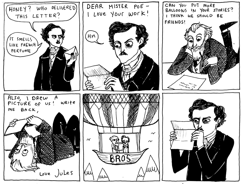
And also in comics news… 70 Things You Didn’t Know About Marvel in The Times (via largehearted boy‘s Twitter).
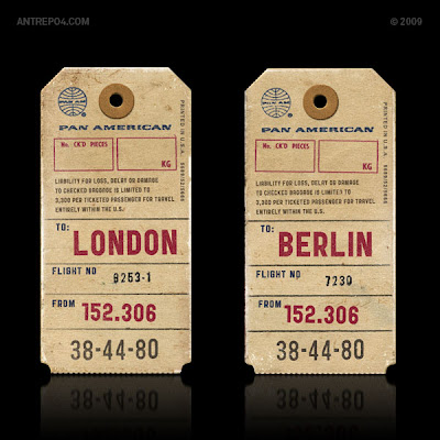
Public Gothic — Having already ‘fessed up to slab-serif obsession earlier this week, I might as well tell you that I’m also slightly obsessed with vintage ephemera — especially luggage tags — so I’m very intrigued by this new typeface from Antrepo even though I’ve no idea how I’d use it or been able to download it!
And speaking of typography, ephemera, and luggage tags, take a look at Alistair Hall’s (We Made This) Flickr Set while you’re at it:
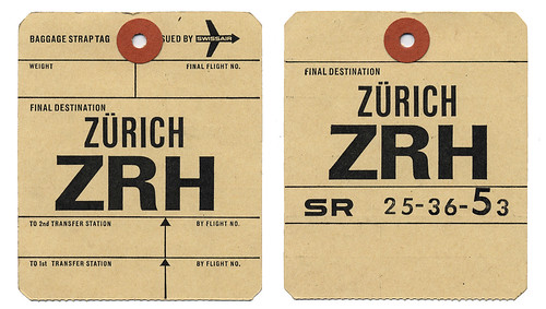
And finally…
Barack Obama Names Alan Moore Official White House Biographer:
“As evidenced by his epic run on Swamp Thing #21–64, Moore’s deft hand with both sociopolitical commentary and metaphysical violence makes him an ideal choice to chronicle my time in office”
Oh come on…. It would be awesome.
2 Comments
There is nothing quite like pricing to get book people’s pulses racing and the recent price war in the US — and the American Booksellers Association’s open letter to the Department of Justice — certainly has everyone and their mother all aflutter.
We have plenty of pricing issues of own in Canada. The unique challenges of publishing here (big geography + small population) and the fluctuating US dollar make Canadian pricing particularly fraught. But we haven’t really seen the same kind of problems as the US or the supermarket price wars that have plagued the UK.
As The Toronto Star helpfully points out, Canada is different. But it is not simply a matter of being more polite than Americans (or nicer than the British) — what makes us different is that we are a small book market dominated by a single retailer. Dropping the gloves with Canada’s Chief Booklover hardly seems worth the effort.
Nevertheless, Canadian consumers keep a keen eye on the US and a sustained price war south of the border would inevitably put pressure on bookstores in Canada (including Chapters-Indigo). It would be foolish to ignore what is going on.
The most emotive issue is, of course, the detrimental impact of price wars on already struggling independent bookstores. As HarperStudio’s Bob Miller notes:
The short-term results of this price war are some losses for Wal-Mart and Amazon, and some brisk sales for the publishers whose books have been chosen. But the “road kill” here are the accounts who can’t afford to participate in the race—traditional booksellers.
Clearly though, publishers like Miller are worried too. It has been a particularly difficult 18 months in US publishing, and the thought of additional pressure on prices and discounts is, for many, terrifying. We seem to be lurching from one crisis to the next.
But, is this really anything more than another storm in the tempestuous book industry teacup?
To some extent I agree with Mark and The New Yorker that twitchy book people are exaggerating the effects of this price war. We are, after all, only talking about ten books. This isn’t going to wreck publishing just yet. In the short term it will be good for sales, and as long as Amazon, Wal-Mart and Target are willing to take the losses, the publishers will be laughing all the way to the bank.
But there will clearly be problems down the road if this continues, and I think Michael Hyatt, CEO of Thomas Nelson, is on to something when he suggests that the strategy behind the price war is actually damaging for everyone — publishers, authors, booksellers, mass retailers, and consumers (although Dennis Johnson at Moby Lives isn’t totally convinced by Hyatt’s solutions).
If there are going to be ‘winners’ in this, it is only going to be the big retailers and it will not be long before they demand more books and deeper discounts. Publishers will have to run the risk of crippling returns if the discounted books don’t sell, and will be increasingly reluctant to bet on creative projects. Corners will be cut in the effort to produce cheaper books that are short-term ‘sure things’.
Without over-stating it, I am also troubled that such discounts set the expectation that all books should be less than $10 (and if you’re skeptical about setting expectations with arbitrary numbers, you might want to read Nudge).
In the end, you get what you pay for. Books — good books — take time and they take money, whether they are printed or distributed digitally. If a book costs less than $10, then you can expect publishers — and self-publishers for that matter — to churn out a lot of poorly researched, quickly written, hurriedly edited, badly designed and cheaply produced books. And, as Don Linn, former Senior VP and Publisher at Taunton Books, points out, this will certainly hurt authors first:
When content’s price and value is pushed below a sustainable level for publishers… writers will suffer. They will be forced to make the economic choice to write less to finance their careers. It’s not enough to say glibly that ‘writers have to write so they will’ or that self-publishing will be their salvation. When content’s value drops, self-published content’s value drops as well.
Of course, publishers need to take responsibility here. Too often publishers dump bad books into stores in pursuit of a fast-buck, and they only have themselves to blame when stores demand big discounts up front and readers don’t actually want to pay full price for them.
And I think it is too easy to say that books (paper or digital) need to be cheaper and more ‘timely’. Sure. But I’m willing to bet that readers are also willing to seek out and to pay for books that surprise and delight (and that format isn’t the real issue).
It is difficult for publishers to think about the long-term (especially if shareholders are involved), but if we are seriously worried about pricing, then perhaps the place to start is publish books that are worth the price tag?
2 Comments
Fluid — John Gall discusses his brilliant cover design for the Vintage edition of Tom McCarthy’s Remainder, which is still one of my favourite novels of the last few years.

Hamilton Wood Type Catalog No.14 (1899-1900) at Unicorn Graphics’ Wood Type Museum. I quietly obsessed with slab-serifs right now so this is like crack (via Draplin Design Co.).
And The Beat Goes On — Sarah Weinman (much missed at GalleyCat) is writing about publishing for AOL’s money and finance news blog DailyFinance.

Gigantic Robot — Awesome cartoonist and illustrator Tom Gauld has a new website (to accompany his excellent Flickr photostream).
BOOM! — PW talks to Mark Waid, Editor-In-Chief of independent comics publisher BOOM! Studios:
We’re great at getting a focused message out. Because we don’t publish eighty comics a month, our inestimable marketing department does a great job of making every title important in the marketplace and every launch an event. We’re also better than the big guys at taking risks because we don’t have stockholders to answer to, or lenders who would call us crazy… We’re very much a writer-driven, idea-driven company. We start with the story first (with a talented writer) and focus on getting that right.
30 Conversations on Design — Designers, including luminaries such as Massimo Vignelli, Erik Spiekermann, Ellen Lupton and Paula Scher, answer two questions: “What single example of design inspires you most?” and “What problem should design solve next?”
Unheimlich — Sam Leith argues for scary kids books in The Guardian (confession: I’m mostly linking to this story so I could type “unheimlich” which — rather disappointingly — means “unhomely” rather than “the act of undoing the heimlich manoeuver”).
And finally…
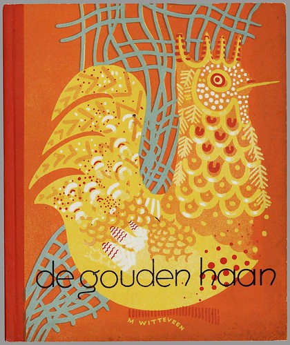
Dutch Picture Books 1810 – 1950 at BibliOdyssey (above: ‘De Gouden Haan’ by Marietje Witteveen, 1940).
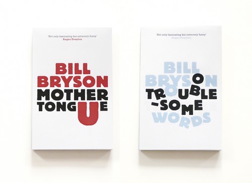 Unpublished concept jacket designs by London-based print designer Allan Sommerville for the Penguin’s Bill Bryson books (via Cosas Visuales).
Fonts — This is AWESOME: Wisconsin Public Radio’s To The Best of Our Knowledge talk fonts with Jonathan Hoefler and Tobias Frere-Jones, designers of Gotham, Matthew Carter, designer of Verdana, author Nicholson Baker, Tracy Honn, director of the Silver Buckle Press, and Kitty Burns Florey, author of Script and Scribble: The Rise and Fall of Handwriting. Listen NOW.
Many Happy Returns — Author, academic and newspaper columnist John Sutherland (The Boy Who Loved Books) on 30 years of The London Review of Books for The Financial Times:
The LRB front cover logo was “THE LONDON REVIEW of Books” – the last two words being smaller. As the typography signalled, it was the review that mattered as much as the book under review. Articles in the LRB were, and are, long: anything between 2,000 and 5,000 words. On special occasions they can run into the tens of thousands. Rates of pay seemed to me startlingly high: three or four times, in the early years at least, what the TLS paid. Miller personally appeared austerely indifferent to money. I suspect he worked for little or nothing. Nor did rises or falls in circulation appear to trouble him overmuch. Quality was all.
(There’s also a rather lovely addendum about the LRB’s personal columns, so read to the end!).
Somewhere Towards The End — A wonderful essay on editor and author Diana Athill by Ian Jack,former editor of Granta, in The Guardian:
[W]hat held me about the writing was its candour. The quality has since become an Athill trademark, though in itself candour is no guarantee of literary pleasure or interest: frank books aren’t always good books and can often be tedious by boasting of their frankness. Athill’s way of being candid is more subtle and its effect more persuasive… Part of this comes from her considerable gift as a maker of sentences, which are so lucid and direct; some of it is owed to the breaking of taboos that then surrounded female sexual behaviour; most of it, though, stems from her triumphant struggle to “get it right”, a lesson she learned from two of the writers she edited. Rhys told her that the trick of good writing was “to get it as it was, as it really was”. Naipaul said that “provided you really get it right, the reader will understand”.
The Internationalist — An all too short interview with Penguin Canada’s David Davidar, who was recently appointed CEO of Penguin’s new division Penguin International, in the Globe and Mail.
And finally… I do love Tom Gauld:
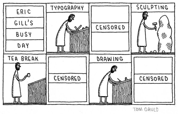
(More on Eric Gill)
Comments closed
Dawn of the Dreadfuls — not normally my kind of book cover, but hey it’s Hallowe’en and I think Quirk Books knocked this out of the park (full disclosure: Quirk are distributed by Raincoast Books in Canada).
And continuing the spooky theme…
Hallorave — Fantagraphics have been posting previews of the first volume of Mezzo and Pirus’ “extraordinary suburban horror trilogy”, King of the Flies, on their blog all this week. Pages 1, 2, 3, 4, 5, 6. It looks intense:


Devices and Contraptions Extraordinaire — “The world’s first exhibition of steampunk art” at the Museum of the History of Science in Oxford, England. There is a blog accompanying the exhibition by curator Art Donovan (via ReadySteadyBlog).
Dark Star — Michael Dirda’s review of The Complete Short Stories of J.G. Ballard, published by W.W. Norton, in the Washington Post:
In “The Complete Short Stories of J.G. Ballard” devastated worlds are matched with even more devastated psyches. But these aren’t simply “myths of the near future,” they are probes sent down into the desolate heart of the here and now. As Ballard knew, reality has become just a subgenre of science fiction.
And finally…just for Hallowe’en, here’s a great vintage cover for Bram Stoker’s Dracula seen at the Golden Age Comic Stories blog (via the awesome, but not entirely safe for work, This Isn’t Happiness):

Normal, non-spooky, service will resume next week…

(The always awesome) FaceOut Books talks to Argentinian designer Juan Pablo Cambariere.
In the interview Juan Pablo mentions Alejandro Ros, “probably the greatest contemporary Argentinean designer”.
Alejandro Ros’ website — like his book design — is lovely, but it’s all Flash so you’re just going have to take a look for yourself…

The Creative Review‘s second extract from Penguin by Illustrators is the text of the presentation made by artist, engraver, illustrator and designer David Gentleman.
The first extract (mentioned here) was the text of a presentation given by Romek Marber.
It’s in the Retelling — Booker winner Hilary Mantel, author of Wolf Hall, on historical fiction in The Guardian:
A novelist doesn’t sit at the keyboard sucking her thumb, thinking “what next?” A novel arrives whether you want it or not. After months or years of silent travel by night, it squats like an illegal immigrant at Calais, glowering and plotting, thinking of a thousand ways to gain a foothold. It’s useless to try to keep it out. It’s smarter than you are. It’s upon you before you’ve seen its face, and has set up in business and bought a house.
And finally…

Some lovely identity design for the McNally Jackson in NYC by Christine Celic Strohl and Eric Janssen Strohl (via DesignWorkLife). Interesting enough Eric Janssen Strohl also designs books and beautiful colophons (and again, Eric’s site is Flash and so you’re going to have take look yourself)…
Comments closed