Skip to content

The Casual Optimist Posts

Something for the Weekend

It’s been a slightly shite week in the book trade this week.

Amidst the plethora of end of year/decade “Best of…” lists and gift guides, it was announced that Kirkus and Editor & Publisher Magazine are going to close (are we surprised? No); B&N’s Nook e-reader turned out to be not be quite as good as it was cracked up to be (are we surprised? No); and Simon & Schuster, Hachette, and HarperCollins upset the usual suspects (for all the usual reasons — only Moby Lives seemed to get that it might be about something else) by announcing their decision to hold back the release of a few e-book editions (are we surprised? No)… Is any of this particularly interesting? No. (Although — for the record — I am grateful to the WSJ‘s Jeffrey A. Trachtenberg  for reporting on the e-book developments, and to indefatigable Largehearted Boy for compiling a comprehensive list of Best of… lists)…

So needless to say, there isn’t much about the book industy in today’s links. Ah well…

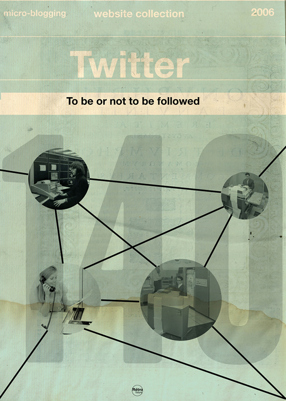
Another addition to the weirdly brilliant (or brilliantly weird?) vintage book/pop culture mash-up phenomenon:  Web Services Book Covers by French illustrator Stéphane Massa-Bidal AKA Hulk4598, or Rétrofuturs. They’re sort of like Olly Moss meets Cristiana Couceiro. (First seen at Design You Trust and then just about everywhere else this morning).

The Sixties — Another fantastic new cover by Henry Sene Yee for Picador’s BIG IDEAS // small books series.

Type for the Tube — an interesting history of Edward Johnston’s typeface for the London Underground from its design to current usage.

And finally…

F is For Fail — A really charming “alphabetical odysessy through the creative process” by Brent Barson (via the lovely Aqua-Velvet):

Can I go home yet?

(Have a great weekend!)

3 Comments

Midweek Miscellany

Well, oh shit. Go fuck yourself — The pugnacious George Lois in BlackBook magazine:

The design was the idea. I don’t design, if you know what I mean. If you want Andy Warhol being devoured by his own fame in a can of Cambell’s soup, you just put the can there and you have him drowning in it. Case closed.

You’re knocked down by the idea, and the fact that it’s got complete clarity visually. Don’t complicate it with busy work.

That’s the way I do everything. If I was a doing a magazine, it’s not a question of if I’d be having more white space. It’s a question of every third or fourth spread I’d make a spread that would take your breath away — or piss you off. Or something.

“Yoda” — An interview with Dieter Rams at More Intelligent Life (Thanks Ben S.):

We have enough products. If you look at the market you have ten or 20 coffee makers that basically look all the same, doing all the same thing: they are making coffee. We don’t need 20 of these things, we need one good one.

Less, But Better… Less, But Better… [REPEAT].

The View From TorontoNational Post book critic Philip Marchand (formerly of the Toronto Star) talks to Conversations in the Book Trade:

I’m not sure how much “trouble” literature is in. The age of Tennyson was the last period in literature when “serious” literature found a mass market. Ever since, we’ve had a very small minority of readers for “serious” stuff, and a fairly large audience for thrillers, romance novels, detective novels, and so on. Then there’s the Da Vinci Code phenomenon in which everybody, from your dentist to your car mechanic, is reading a certain book – in order to be able to join in discussions about the book on social occasions, if for no other reason.

Frontmatters — Alex Camlin, Creative Director at Da Capo (interviewed here), has started a blog! Yay Alex!

This is Display! — Another site (along with the Alvin Lustig archive) that probably should have been on yesterday’s list of inspiring websites, Display is a “curated collection of 59 (and growing) important graphic design books, periodicals and ephemera.”

Comments closed

10 Websites for Vintage Books, Covers and Inspiration

1. A Journey Round My Skull — “Unhealthy book fetishism from a reader, collector, and amateur historian of forgotten literature.”

2. The Art of Penguin Science FictionA comprehensive collection of Penguin sci-fi covers from 1935 onwards.

3. BibliOdyssey“Books… Illustrations… Science… History… Visual Materia Obscura… Eclectic Bookart.”

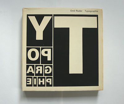
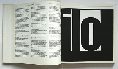
4. Book (Design) Stories — Felix Wiedler’s incredible collection of modernist design and typography books from Germany and Switzerland 1925–1965.

5. Book Worship — “graphically interesting, but otherwise uncollectible, books that entered and exited bookstores quietly in the 50s, 60s, and 70s”.

6. I Was A Bronze Age BoyComic books, crime fiction and pulp magazines curated by Mark Justice. Awesome name. Awesome blog.

7. Killer Covers of the Week — Pulpy goodness and vintage crime fiction covers expertly curated The Rap Sheet‘s J. Kingston Pierce.

8. The Pelican ProjectThings Magazine‘s collection of Pelican paperbacks organized by decade.

9. Pop Sensation — Rex Parker appraises, critiques and generally ridicules his vintage paperback collection.

10. Spanish Book CoversSpanish pulp: detectives, masked gangsters, pin-ups, skeletons, and zombies! (French language)

AND BONUS! 11. French Book Covers — But not entirely safe for work… It’s French. You have been warned.

Let me know if I’ve missed any other great vintage book cover sites. AND  I’m working on a list of book cover related photostreams and groups on Flickr so please pass on your recommendations! Cheers.

modernist book design in germany and switzerland 1925–1965 (and beyond)

17 Comments

Rime

Jimmy Turrell‘s book cover illustration for Beat IV: The Rime of the Ancient Mariner, a fully illustrated edition of the Samuel Taylor Coleridge poem published by the Heart Agency to showcase the work of their illustrators. The book, designed by Pentagram, won a D&AD Award for illustration and book design.

(via We Made This)

Comments closed

Something for the Weekend

Gosh! — Limited edition Footnotes in Gaza bookplate by Joe Sacco for Gosh! Comics in London (seen at The Ephemerist).

There is also an interesting interview with Joe Sacco about his new book on the BBC World Service’s The Strand.

How To Be An Artist — Criterion designer Eric Skillman discusses his design process for Eddie Campbell‘s Alec: The Years Have Pants published by TopShelf.

And Eddie Campbell is interviewed by USA Today about the book.

Imaginary Worlds — PW Comics Week talks to Helen McCarthy, author of The Art of Osamu Tezuka: God of Manga:

I don’t know if it’s his themes that make his work timeless, so much as his breadth of interest. He was interested in everything and everyone that lives. He gives every character in his works the respect of allowing them to exist as real individuals; whether they’re likeable or not, they’re real. I think that’s the quality that makes animation director Hayao Miyazaki resemble him most strongly, that insistence that nobody is a stereotype or a cipher, that everybody has equal validity whether they’re a ‘nice’ person or not. Personally, I love his approach to women. He treats them exactly like normal human beings, and so few writers really do that, even in these allegedly liberated times.

There is also a short interview with the author in the WSJ.

Is Publishing Dead? (PDF) — An good interview with Sarah Nelson, former editor-in-chief at PW and now book director for O, The Oprah Magazine, from the 2009 PubWest Conference (via GalleyCat):

I don’t think that digital, per se, is the culprit. I don’t even think that Google, per se, is the culprit. I think that there are a lot of people in publishing who look to those things, to Google, to eBooks, to Amazon and say that they are the devil, and they are killing our business. I think it’s not that simple. I think that publishers need to think about the business model in which they operate and to give advances – and… it’s less true of the small and medium sized publishers, and for that reason, they’re in better shape than some of the big guys – but when you’re giving several million dollar advances on books, you are destined to lose money. And that is only going to become more true if more books are read digitally, because the amount of money you’re going to make on a digital book is a lot less than the amount of money you’re going to make on hardcover.

Judging 2009 by its Cover — Amazon (somewhat ripping our friend at The BDR) have started a Best Book Cover of the Year poll. Please vote for something worthy.

And, as you’ve no doubt seen, Ben has chosen his top 10 covers of the decade at the Book Cover Archive Blog.

And last (but by no means least)…

Advent Books — Crazy Sean Cranbury of Books on the Radio, and Book Madam Julie Wilson have a Christmas book project:

The idea behind it is simple: authors, publishing professionals, bloggers, and booksellers will write short enthusiastic recommendations of their favorite books that have been published in the last year.  We’ll publish a few of these every day, including pics and links for the books… It’s what we’re calling the Digital Handsell 3.0.  Just in time for the Holiday Season.

I don’t think my selection will come as surprise to anyone who reads this blog regularly, but apparently it’s controversial.

2 Comments

E-Reading the Tea Leaves

While The Wall Street Journal recently suggested that e-readers are more eight-track than iPod and Forrester Research predicted that B&N will steal market share from Amazon and Sony in 2010, Joe Wikert, General Manager & Publisher at O’Reilly Media, made the even bolder prediction that Amazon — in the face of stiff competition from other e-readers and multi-use devices like the iPhone — “will completely exit the Kindle hardware space within the next 3 years”.

Although predicting the future is a mug’s game (and Amazon are particularly adept at being at least 2 or 3 steps ahead of the pundits), I think that Joe — an early Kindle advocate — might actually be onto something and Amazon really might be prepared to let the device, if not the format or apps, die quietly.

Does this mean that Amazon made a mistake in launching their own e-reader?

I don’t think so.

If publishers had rushed to embrace the Kindle, Amazon would have completely pwned the distribution of e-books (and had publishers even further over the proverbial barrel).

But even though this hasn’t quite worked out, Amazon are still sitting pretty. The Kindle has undoubtedly increased the popularity of e-books and Amazon — the best known and largest online bookstore — is the natural beneficiary. Even if manufacturing the hardware becomes too much like hard work, Amazon will still sell a lot of e-books and the Kindle will surely have served its purpose as a beachhead…

Kindle and Shortcovers

And on the subject of the Kindle, it’s been interesting to see Indigo, Canada’s biggest book retailer, respond to Amazon launching their e-reader north of the border.

Joel Silver, President of Indigo, — who apparently reads on his Blackberry — discussed e-readers and e-books on Business News Network last week (there’s also an interesting follow up interview with the estimable Jason Epstein) and Michael Serbinis, President of Indigo’s e-book initiative Shortcovers, took a few (slightly uncharitable) pot-shots at the Kindle in a recent interview with The National Post.

But, as Shortcovers clearly demonstrates, Indigo have been preparing for the arrival of the Kindle for a while, and — if you have a spare hour — it worth listening to Michael Tamblyn, their VP of Content, Sales & Merchandising, re-enact his Tools of Change presentation Your Reading Life, Always With You to see where they are going…

So what do you think is the future of e-readers? Any thoughts?

Comments closed

Q & A with Jacob Covey, Art Director Fantagraphics Books

I get excited just about every time I post an interview on The Casual Optimist (I am officially a cheap date), but it is a special thrill to post a Q & A with Jacob Covey, designer and Art Director at Fantagraphics.

Partly this is because I’m grateful that in defiance of all reason, publishing wisdom, cold, hard financial facts, bitter law suits, common sense and ‘good taste’, pioneering Seattle-based comics publisher Fantagraphics even exists.

Partly it’s an excuse (not that I really need one) to post Love + Rockets cover art.

And partly it’s because I thought there was a very real chance the interview wouldn’t happen.

But mostly it is because there is something about Jacob’s work — which combines the Chantry-esque DIY design aesthetic of skate art, gig posters, record sleeves, underground comix, zines and punk, with a Ware-like preoccupation with detail and precision — that resonates with me and fits so perfectly with Fantagraphics.

Needless to say, Jacob’s award-winning work has been featured in Print, Communication Arts and How.

We caught up over email…

How did you get into book design?

The germ of the thing started with working at the public library where I was a conspicuously slow page. I would look at every cover I was shelving, setting aside certain ones to check out and carry a few blocks away to a color photocopier. I liked having the inspiration around and I couldn’t afford to buy design books. This was around 1999, when I was beginning to study graphic design and at night was staying out late shooting photos of bands for record labels, local monthlies, and things like that. As for getting into book design professionally, in late 2003 I had just moved back to the Northwest after leaving a job in Los Angeles at a skate company. I was interviewing for a job to churn out ads at the local alternative weekly, The Stranger, and the Art Director, Joe Newton, kindly suggested that I instead talk to Gary Groth at Fantagraphics. They were looking for a new designer but apparently they were in no hurry to actually hire someone as I basically called relentlessly for six months. I think I was just the last man standing at the other end of the phone line so they hired me.

 Briefly, could you tell me about working at Fantagraphics?

If the publishing industry is a zoo, then Fantagraphics is the monkey house. It’s not a conventional workplace and you could get tetanus from walking barefoot but it’s a place where everyone is laboring out of love and there’s a lot of receptivity to trying new things and having your ideas heard. Much more so than I think is possible at most publishers. I have immense respect for the history of the company as an archivist of great work and I have the opportunity to deal with our publishing decisions on a regular basis. It’s satisfying in that way– but the office itself is a neglected three story house with 30 years of dusty artwork, ancient paste-ups, and discarded razor blades strewn about. So it’s not for everyone.

As for the work, Fantagraphics publishes the great cartoonists from Charles Schulz to R. Crumb, but as often as not I’m designing a book of paintings or a collection of pop culture artifacts or even the occasional prose novel.

You’re also a freelance designer. How is that different from your role as art director at Fanta

For one thing I’ve established myself with Fantagraphics enough that I know the material well and have to explain my decisions less. They’re very supportive and because of that I am mostly pushing myself to do better work. With my freelance clients there’s a lot more to learn from their needs and the process involves more time spent on researching and exploring ideas. The freelance work is also much more varied subject matter. For example, as I type this I’m working on the branding for a 2011 museum exhibition focusing on the band Nirvana, a non-fiction book cover for HarperCollins, a band t-shirt design, an AIGA event poster, and a book layout for a start-up imprint in the UK. There are a lot of other publishers I’d like to work with but I’m a pretty shoddy self-promoter.


Could you describe your design process?

In the case of Fantagraphics, I hate to say that most of the time there are so many projects on my plate that I’m just cranking the books out, trying to trust my instincts and learning from any mistakes. We have a list of about 50 books a year with only me and one other designer, Adam Grano, along with our works-through-the-night production guy, Paul Baresh, scanning and laying out everything from the books to the ads and supplying media requests — if we get behind schedule we rarely hire out for another designer, the book simply gets published late. So there’s a lot of pressure to just keep moving. The job requires a lot of discipline to approach books with an eye on getting them approved by the editor/artist without delays and yet still make them interesting. There is process but it’s very accelerated and it’s not unusual that I have to go with my first impulse for a book design and wish I had time to do a dozen more comps.


Is designing for reprint collections different than designing for new material?

Notably, the job description of a cartoonist and a graphic designer are similar in that they both work with text and images but the truth is very few cartoonists have a very developed design sense (just as my cartooning skills are sub par). Working with individual artists on original material can be a really rewarding collaboration or a Sisyphean attempt to improve an idea that the artist is married to. So, in truth, the deader the artist, the easier my job — reprint collections have a more dispassionate approval process.

What are your favourite books to work on?

I’m not sure that there’s any type of book that’s my favorite to work on but I’ve become very comfortable with the process that goes into art books in general. I just finished working on a very collaborative book of VHS box art with the collector/editor Jacques Boyreau and I enjoyed that. The subject matter itself isn’t necessarily what’s interesting to me but there was a long process of sitting with Jacques early on and determining the best way to showcase the work, which ended up being very austere, spotlighting the actual physical history of the boxes and conjuring the experience of seeing them in their element by retaining the old, beaten up boxes, plastered in rental stickers. Some of these boxes we had to prop back together from having been chopped up for those large plastic cases that were used in videostores. In the end, there was more of an anthropological story to looking at the boxes themselves rather than just the art that was on them.

This doesn’t work for every project but it’s great for receptive, collaborative editors. It’s fun to step into someone else’s fixation and figure out how to present the material more evocatively, in a way that will pull other people into what the editor loves about the subject. To design in a way other than plop-plop-plop, here are the images and some nice captions. Then I finish that book and it’s my job to find out and communicate what’s exciting about the next one.

How much say do the artists involved have in the design of their books?

Assuming the artists are involved in a given project, they generally have all the say they want. Fantagraphics publishes The Best and we have to respect the artists’ wishes and peccadilloes. They’re visual people so we usually end up with a good package, if not always a great one.

How are final cover decisions made at Fanta?

On a lot of projects I get more say than is customary for the Art Director but it ultimately rests on the in-house editor of the project and the outside artist or editor whose book it is. We all hash out our opinions about what works for the material and the market but we don’t really have scheduled meetings to sit down and scrutinize. Again, it’s all pretty swift moving.

Who else do you think is doing interesting work right now?

Honestly I can’t seem to go on the web without being intimidated by all the talent that’s out there. I couldn’t list all the people. By far, the designer who most consistently floors me is Peter Mendelsund. The man works brilliantly in every genre thrown at him. I also have to say how happy I am that the Design Works Group guys are in nearby Oregon. I don’t know any other book designers here in Seattle so it’s great to have them around, making a good name for the Northwest.

Where do you look for inspiration and who are some of your design heroes?

I’m a cliché: Inspiration is wherever it turns up.

Art Chantry has been really important throughout my development and is someone whose talent and vision I admire a great deal. I think his influence shows up the most in my work, though not necessarily in the most obvious ways. Chantry, Lester Beall and the Constructivists were my heroes when I used to proclaim design heroes. I would definitely add Mendelsund and Paul Sahre to my contemporary list.

Of course you can’t work in comic book design without acknowledging the significance of two of the world’s most important contemporary designers, Chip Kidd and Chris Ware. They made it possible for me to do a lot of what I do with Fantagraphics.

Could you tell me a little about your personal project Beasts! ?

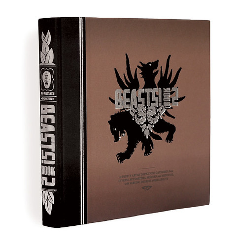
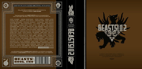
Beasts! is a classical bestiary of mythological creatures as depicted by some of my favorite contemporary artists from the worlds of comics, skate graphics, rock posters, children’s book illustration, the fine art world, et cetera. The first book is now in its fourth printing and the second and final volume came out in early 2009. Each book has ninety artists and four writers involved. I call myself the curator of the project as it’s more like an art exhibit than a standard art book. I wrote up brief descriptions based on my research of creatures, then the artists chose the creature that was most interesting to them and the writers would pen proper text based on historical references to the creatures. It’s a lot more serious than people seem to expect. I like these stories, I like that these creatures existed to someone who told the original story, and it was great to see them given form — a lot of the beasts are very obscure and before I got art from an artist there usually wasn’t any depiction to be found for a beast. There are also interviews with respectable experts like the marine biologist, artist, and writer Richard Ellis as well as contemporary eyewitnesses to some mysterious beasts.

Did you design the Beast! books as well as edit them?

Yes, except the Chinese edition that just came out. The publisher translated and totally repackaged it for that market. It was part of my intent with Beasts! to see what could come of a close working relationship between the editor and the designer on a book project. (Obviously I took that to the extreme by performing both roles.) Books are generally fairly linear, straight-forward affairs or sometimes they’re eccentric art books that end up feeling like design masturbation. I’m interested in what can happen somewhere in between these things that will engage the reader to enjoy multiple readings or even to just feel like more of a participant in the whole experience. There are a lot of interesting details that never make it into books simply because the designer isn’t involved with the editorial side or is otherwise not involved on a collaborative level.
What does the future hold for book cover design?

Everyone’s got an opinion on that and my voice would just be din. It’s hard to say if it’s like the film world facing VCRs or the music world facing MP3s but it’s not bleak to me.

Thanks Jacob!

You can find more of Jacob’s work on his website.

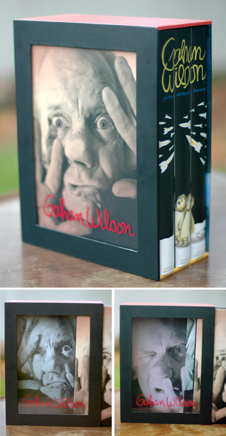
UPDATE: Jacob was kind enough to send me a few more images to accompany the interview and these have now been added to the original post.
8 Comments

Dieter Rams: Less and More

“The un-spectacular things are the important things — especially in the future”

A fascinating Gestalten.tv interview with legendary Braun designer Dieter Rams:

The book Less and More: The Design Ethos of Dieter Rams is published by Gestalten this month to accompany an exhibition of the same name at the Design Museum in London (18 November – 07 March 2010).

(NB: Post updated with the Vimeo version of the video)

1 Comment

Midweek Miscellany (Paul Auster Edition), November 25th, 2009

The award-winning Folio Society edition of The New York Trilogy by Paul Auster and illustrated by Tom Burns has just about blown my mind. MUST. HAVE.
James Wood on the novels of Paul Auster in the The New Yorker:

Auster is a compelling storyteller, but his stories are assertions rather than persuasions. They declare themselves; they hound the next revelation. Because nothing is persuasively assembled, the inevitable postmodern disassembly leaves one largely untouched. (The disassembly is also grindingly explicit, spelled out in billboard-size type.) Presence fails to turn into significant absence, because presence was not present enough. This is the crevasse that divides Auster from novelists like José Saramago, or the Philip Roth of “The Ghost Writer.”

(Personally speaking I think I prefer Auster’s interesting awkward failures over the portentous bludgeon prose of Philip Roth, but that’s just me…)

And, if you haven’t had enough Auster for one post, he’s also interviewed in New York Magazine.

The Making of Fantastic Mr. Fox designed by Angus Hyland — New work from Pentagram for Rizzoli.

Covers from Cleethorpes — A brief, but funny, interview with designer David Pearson at It’s Nice That.

“We Like Lists Because We Don’t Want to Die” — Umberto Eco interviewed in Der Spiegel:

The list is the origin of culture. It’s part of the history of art and literature. What does culture want? To make infinity comprehensible. It also wants to create order — not always, but often. And how, as a human being, does one face infinity? How does one attempt to grasp the incomprehensible? Through lists, through catalogs, through collections in museums and through encyclopedias and dictionaries.

An Innocent Abroad — Journalist and cartoonist Joe Sacco (Palestine, Safe Area Gorazde) interviewed about his new book Footnotes in Gaza in The Observer:

I’m a nondescript figure; on some level, I’m a cipher. The thing is: I don’t want to emote too much when I draw myself. The stories are about other people, not me. I’d rather emphasise their feelings. If I do show mine – let’s say I’m shaking [with fear] more than the people I’m with – it’s only ever to throw their situation into starker relief.

And on the speaking of comics…

Paul Gravett, author of multiple books on the art form, interviewed by Dazed & Confused:

I like the control I have when reading a comic. I’ve grown impatient and disenchanted with the tropes of a lot of movies and TV, their conventional angles and cuts, their manipulation through music, lighting, special effects and above all, the efforts of acting to make me emote. Comics struggle to make us feel anything at all… They often don’t work that brilliantly, but when they do, the impact of fixed, unephemeral, often hand-drawn images can really surprise me. It’s a primal, even primitive medium, as old as our first cave paintings, and it is still being invented and discovered.

2 Comments

Going West — Where Books Come To Life

A stunning stop-animation film produced by Colenso BBDO and animated by Andersen M Studio for the New Zealand Book Council:

(via Letterology)

3 Comments

Q & A with David Gee

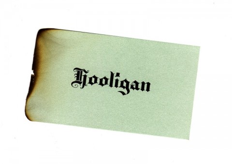
I am somewhat in awe of Canadian designer David Gee. Not only does he fashion stylishly left-field book covers for independent publishers and major houses, he is also willing to scorch individual business cards by hand using vice-grips and a blowtorch (see above).

And he does it all part-time. While holding down a day job.

To an aspiring generalist like me, knowing that David manages to work in more than one creative field is incredibly inspirational. And, as most of us struggle to do to even one thinking well, it is simply breathtaking that David’s work — in both his chosen fields — is brilliant and apparently effortless.

David and I chatted about his designs — and the day job — over email earlier this month…

How did you did get into designing books?

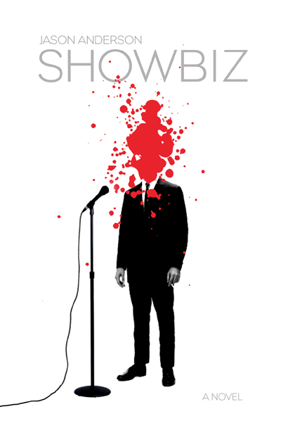
A friend of mine, Jason Anderson, wrote his first novel a few years back and he asked if I would be a ‘careful reader’ and give him some feedback on his manuscript. He later dropped a bomb on me asking if I would design the cover, too. Anyway, the publisher, ECW Press, loved the final cover and they eventually asked me for more and it all kind of snowballed from there. This cover ended up in a Quill & Quire article, an Applied Arts design annual and even GQ Italia. After a year or two of doing freelance stuff for ECW, I just started emailing other publishers and I got a lot of “Yeah, we loved that Showbiz cover!” responses.

What are the pros and cons of designing part time?

Well, the upside is that I don’t burn out too easily. Since my inbox is rarely overflowing, I can take my time with projects and make sure they get the attention they deserve or in some cases, might not deserve. Also, I find that I can still bring a bit of an outsider’s approach to my work. The cons include not being able to build up my portfolio as quickly as I’d like or log the hours that certain jobs end up requiring.

Approximately how many titles do you work on a year?

Roughly twenty or so titles a year. I don’t turn down any work at all, if I can help it. There are the usual pre-catalogue rushes but, for the most part, it’s manageably and workably steady, all year long.

Who are some of the publishers you’ve worked with?

My Main clients include ECW Press, HarperCollins, W.W. Norton, Penguin and Hamish Hamilton, to name a few. I should really try to add to my client roster but, at the end of the day, I’ve little time left for self-promotion since I’m doing this on the night shift. Add that to the “cons” list.

Do you work more on fiction or nonfiction titles?

It balances out a bit but my meat and potatoes seem to be in non-fiction work. In addition to the fiction titles I’ve been doing for Penguin, they’ve been sending me a bit of science fiction work too, which has been a lot of fun. The Hamish Hamilton titles have been a big boost to my ego and hopefully my skills as a cover designer, too. HarperCollins is mostly non-fiction and ECW sends me just about anything you can think of from abstract poetry to scandalous wrestling bios.

What are your favourite books to work on?

Every job creates its own unique set of challenges, so it’s hard to say if one trumps the other. With fiction I approach the conceptual end of things more laterally and obliquely whereas with non-fiction I try to approach the execution laterally if only in order to separate the book from similar titles on that particular shelf.

What are the most challenging?

I haven’t the breadth of experience required to provide a quantitative, scientific answer to that. They’re all challenging since the last thing I ever want to do is just phone it in. I recently finished a cover for a book on the history of beer in Canada, which for a hoser like myself was just so ominously and ridiculously huge and daunting a task I think I actually lost sleep over it.

What is the “day job”?

I’m an advertising copywriter working in television and radio, mostly. My business cards say “Senior Writer” actually, even though my family still doesn’t understand what I do for a living despite the awards. (I’m required by a secret and arcane advertising edict to mention that I have won awards. Many awards.)

Does working in advertising influence how you think about book design?

I think what my day job has trained me to do is recognize a good idea in its purest, raw form. My own personal barometer goes something like “Is this actually an idea or is it just acting like an idea?” which means does the core concept have an element of truth to it, doing service to the product/service/book cover, or am I just relying on flashy execution alone?

Could you describe your design process?

It usually begins with an immediate gut-reaction to the brief, scribbling this idea down and then entirely forgetting about the project for a few days. Most of the hard work is purely mental, trying to formulate concepts and visualize their treatments. Executionally, I don’t really do a lot of back-end tinkering, making the type one-point bigger or smaller, etc. I’m pretty rigid at the mechanical stage but overall, I tend to “play it where it lies”, to borrow a golfing term (for some reason). I think this comes from my vocational history of working in lead-type print shops and sign-painting shops when I was a young lad, onto my get-your-hands-dirty fine art schooling and my Letratone and line-tape design background, all of which predate computers and their sinister ability to allow you the chance to second-guess yourself every step of the way.

Where do look for inspiration and who are some of your design heroes?

I like different designers for different reasons. I respond to David Drummond’s thinking. I always assumed he had an advertising background (which I later found out he does), as his ideas are right on the money and need little in the way of window-dressing. Peter Mendelsund’s covers have a weird quality; seemingly equal parts glib and fussy. Henry Sene Yee’s covers are quietly dignified. The usual suspects, I suppose. I’d be remiss if I didn’t doff the proverbial to my online chums Jason Gabbert, Kimberly Glyder, Ingrid Paulson, Nate Salciccioli, Christopher Tobias & Michel Vrana.

Inspiration is always in the brief. You just have to find it yourself.

What does the future hold for book cover design?

Not a clue. Same strategies, different tactics? If my own personal future of book cover design affords me the opportunity to continue to do this (and maybe work with Eric Hanson on a project or design some Donald Barthelme books), I welcome it with open arms.

Thanks David!

You can see more of David Gee’s work on his blog.

4 Comments

Midweek Miscellany, November 18th, 2009

Lusting After Lustig — Designers Charles Brock and Tim Green share their collection at FaceOut Books.

While Amazon announced the Kindle will be available in Canada this week, The New York Times looks at reading on phones:

Many people who want to read electronic books are discovering that they can do so on the smartphones that are already in their pockets — bringing a whole new meaning to “phone book.” And they like that they can save the $250 to $350 that they would otherwise spend on yet another gadget.

No. Shit.

But, on the subject of e-books… Steve Haber, the president of Sony’s digital reading division, talks to TechFlash (via TeleRead).

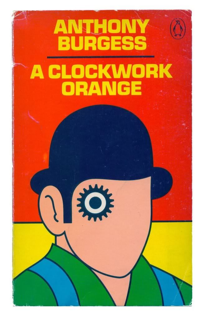
A History of 16 Science Fiction Classics, Told In Book Covers at i09 (including the brilliant cover for A Clockwork Orange pictured above and yet more covers for 1984).

A Winter’s Tale — Ali Smith (The Accidental) on The True Deceiver by Finnish author Tove Jannson, creator of the Moomins:

If the Moomins are Jansson’s most celebrated legacy – a community of inventive, big-nosed, good-natured beings who survive, again and again, the storms and existentialism of a dark Scandinavian winter through simply being mild, kind, inclusive and philosophical – what will happen when a real community is put in its place? What will the outcome be when Jansson tackles, naturalistically, the life of a tiny hamlet in a dark, wintry landscape – and in a book so close to real local life that the original Swedish publication carried a disclaimer saying it was in no way based on any real place, nor its characters on anybody living?

You had me at “existentialism of a dark Scandinavian winter.”

The Genius — The awesome Tom Gauld interviewed at It’s Nice That. Limited edition letterpress prints of Tom’s Characters for an Epic Tale are available now.

And finally…

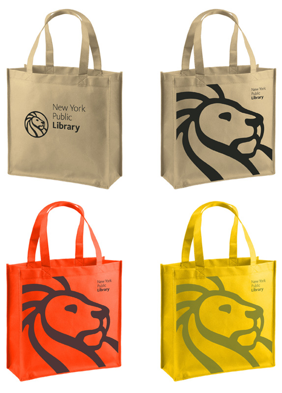
UnderConsideration’s Brand New looks at the new logo for The New York Public Library (via Daily Discoveries on Design)

Comments closed