Tom McCarthy, author of Remainder and C, interviewed on KCRW’s Bookworm:
Comments closed
Books, Design and Culture
I’ve mention Kate Donnelly’s blog a couple of times here previously, but now you can take a look at my office space on From The Desks Of… should you be so inclined.
 Other (more interesting) recent contributors to From The Desk Of… include book designers Peter Mendelsund and Coralie Bickford-Smith, and New Yorker critic Alex Ross. I’m honoured to be in their esteemed company.
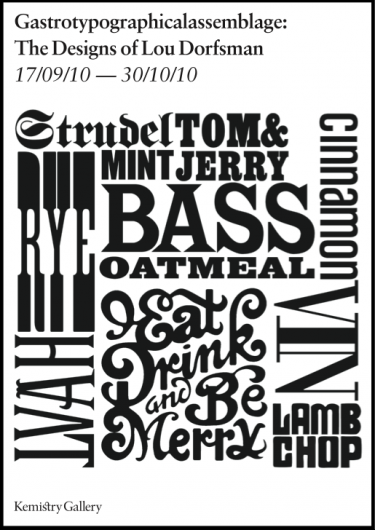
Over the last month, Kemistry Gallery in London has been exhibiting the work of legendary designer Lou Dorfsman, art director for the CBS network. The exhibition, which closes at the end of the October, centres on Dorfman’s most famous creation, the 11 metre wide handmade wooden typographic wall Gastrotypographicalassemblage. With custom type created by Herb Lubalin and Tom Carnase, it contains almost 1500 individual characters:
Comments closed
Mode of Transportation by VSA Partners for Mohawk Fine Papers, seen at For Print Only.
Convergence — Richard Nash on the Frankfurt Book Fair, the book business, and enhanced e-books:
The reality is that the lack of audio and video in book is a feature, not a bug. All art forms are defined as much by what they exclude as by what they include, by what is left out as much as what is put in, by performing addition by subtraction, by less being more. The rules of haiku, of villanelle, of science fiction all exist to describe what is disallowed so as to give the freedom of not-everything-being-possible to the artist. Which, again, is not to say artists ought not create transmedia works. They should, and will. It is instead to say that when frightened publishers start scheming to create them in cahoots with third-party vendors we can safely say that this is a policy designed not to create desirable consumer products nor to create art but to create a survival pod for the publisher. What problem does the enhanced eBook solve?
(While not exactly a fan of enhanced e-books myself, I have no doubt that some people would be equally critical if publishers weren’t experimenting in this area).

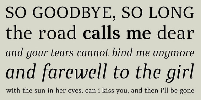
Daniel Justi’s new font Ataxia is now available from You Work from and MyFonts. My interview with Daniel is here.
And finally…
A neat book trailer for John Lanchester’s Whoops! Why Everyone Owes Everyone and No One Can Pay (I.O.U. in Canada and the US) with animated segments by Yum Yum London (who made the wonderful short Parallel Parking):
(h/t the funniest man who-used-to-work-at-Penguin, Alan Trotter)
Comments closed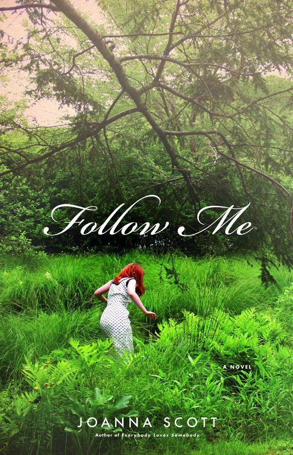
It is possible that the cover for Follow Me by Joanna Scott — with its lovely typography and curious undertones of David Lynch’s small town America — was the first time I noticed the name of designer Karen Horton. But then again, it might have been because of something on Design:Related, which she co-founded, or her blog Daily Design Discoveries, which is (as the name suggestions) a daily source of eclectic design inspiration.
Certainly, once I started to notice Karen’s name, I kept noticing it.
I’m grateful to Karen for taking time out from her busy schedule to reply to my emails and questions, and for providing all the amazing covers accompanying the Q & A (full credits and notes can be found at the end of the post).
What inspired you to become a book designer?
Working as a book cover designer almost happened by accident. Shortly after graduation I moved to NYC. I wanted to work on print design and started by applying to either magazines or book publishing houses almost exclusively. If the right opportunity came along to work at a magazine, I might be on a different track today. I liked the idea of designing something tactile and I already loved books.
 Until recently you were the Art Director at Little, Brown & Company. Where did you work previously?
The first position of my professional career was as a Junior Designer in the Ad/Promo department of St. Martin’s Press. One of my responsibilities involved being a liaison between the Ad/Promo department and the Trade Art division. This might’ve been my lucky break. I felt that I was a nag visiting the cover designers weekly to remind them we needed layered files and cover tiffs for an upcoming catalog. When a junior level position opened in the cover art department, the art directors thought of me and suggested that I apply. I’m so thankful that I had the chance to work among such a talented group of designers and mentors. The job was very challenging and after a couple of years I began to question if I was a book cover designer just because I fell into that role and if it was my real niche. I wanted the experience of designing more than what fits within the constraints of a 6×9 rectangle. This led to my next position at The Children’s Museum of Manhattan where I had opportunities to work with my hands with an endless variety to the kinds of projects I collaborated on. The people working with me were fantastic, but I knew from the beginning that I missed book publishing. It took leaving it for me to appreciate what I left behind.

My next book-publishing job was at Oxford University Press where I started as a Design Associate and quickly moved up to the level of Art Director (partly due to unusual circumstances). It was surreal to have a team reporting to me, and this proved to be very rewarding. I have an incredible amount of respect for the editors and quality of books published by OUP, and there are many reasons why I loved the culture within a university press. All the same, I didn’t have the personal confidence yet to be in this leadership role and believed I still had much to learn before becoming the kind of art director I aspired to be. Also, I sought the opportunity to work on fiction in addition non-fiction books. After OUP, I worked at Little, Brown and Company as a Senior Designer and was later promoted to an Art Director.
 Could you describe your design process?
This varies dependent on the kind of assignment. For fiction titles I will always start with reading the full manuscript if available. I spend a good amount of time thinking, researching, and when applicable looking for historically appropriate typefaces. Although, sometimes I might be better off spending more time on the execution of my ideas than the preparation before-hand.

What are your favourite books to work on?
This is a hard question; there isn’t a clear favorite. Having a personal connection to an aspect or subject can greatly contribute to my enjoyment. Last year I had the privilege of designing the Picador paperback edition of Israel is Real. My mother is Israeli so I naturally had an interest.
What are the most challenging?
The same things that can make a project enjoyable can also contribute to the challenges. When you feel too attached to a cover design it can become tough to edit down your ideas and discard ones that you have an attachment to and may not appeal to the wider audience. In the past I’ve had the habit of saving my favorite projects to the end, wanting all the time to try out all options and make the design perfect.
 Now you’ve left Little, Brown & Co., What’s next for you?
It’s too soon to tell. I’m still spending a good portion of my time designing book covers for various clients, including Hachette. The flexibility of working from my own studio will eventually allow more time to devote to the Design:Related project. The responsibility of managing a social community while having a full-time job was becoming increasingly difficult. I didn’t bring my Design:Related tasks to the office, but at a point it was evident that I was needed in a greater capacity if the site would succeed. I was always feeling behind (and lacking sleep) and the CEO and fellow co-founder of the site also had a full-time job he recently left. We both decided to make a greater investment of our time in order to take the project past the level of a side project and onto the next chapter.
For people unfamiliar with the site, could you describe Design:Related?
Design:Related is an online community where designers can share inspirations and resources to fellow creatives in a broad range of fields related to design. It also provides networking opportunities and portfolio tools to help with your online presence as a creative professional.

What motivated you and your co-founders to start it?
While Matt Sung (CEO, co-founder) and I were in school at the University of Florida we started conceptualizing a site for designers to share their work and ideas. It took a few years after graduating for us to transform our initial concept into a fully functioning design network.
Approximately how many users does it have now?
For now these numbers are subjective to me and the figures change daily. What’s interesting is how many quality members we have who contribute to the integrity of the site by sharing relevant design news, inspirations, comments, and encouragement to students. We are working on enhancements to the overall experience and functionality of the site that we hope will help continue to grow the network in a positive direction.
 What is your current role at Design:Related?
I’m the Co-founder and Content Director. Since we are still a small team with limited resources, all who are involved with the project are continuously juggling tasks outside of their designated responsibilities.
You also blog at Daily Design Discoveries. Do you think it’s important for designers to have a strong presence online?
It’s important for a designer to have an online presence separate from Facebook, but I don’t think having a blog is necessary. For me it is just a welcome distraction from my real work. As a co-founder of Design:Related, all of the content I make is tied to our brand, which adds importance and value. With my Daily Design Discoveries blog I don’t overthink my posts, which is nice from time to time.
Where do you look for inspiration?
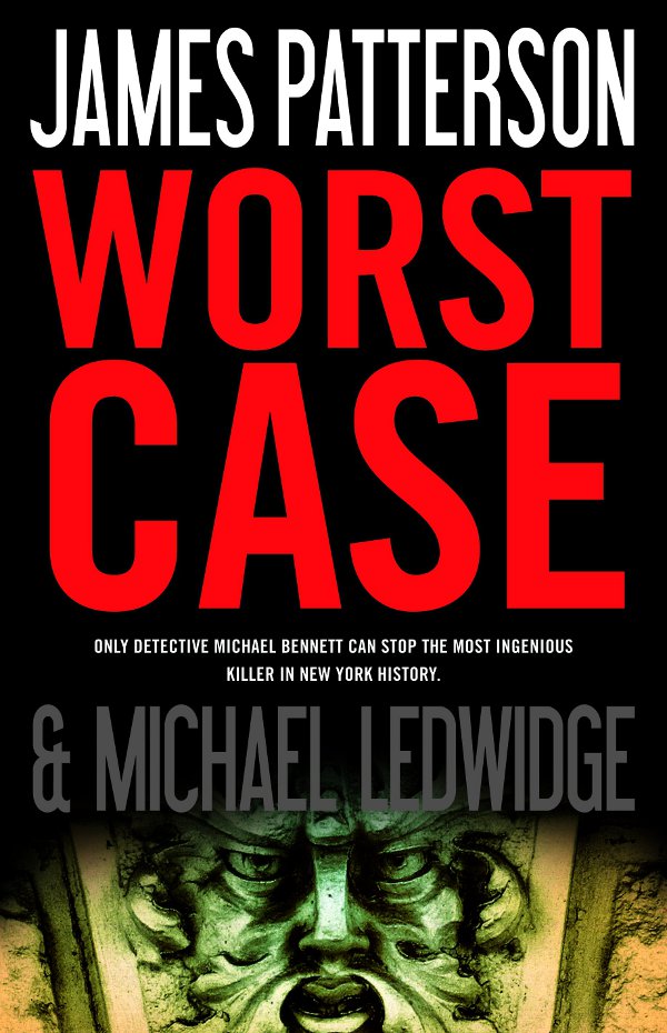
One of my favorite past times is browsing a flea market or used bookstore. As a kid I used to beg my mom to take me to garage sales on weekends. I’m fortunate to be walking distance from The Strand and the Chelsea Flea Market. This is dangerous for my bank account though. Some book assignments can lead you on field trips. For the book Worst Case by James Patterson, the kind of imagery I was looking for was limiting with just search browsers. My Creative Director suggested that I spend a couple hours browsing the Metropolitan Museum of Art. Right when I was about to leave, I found the perfect book at the museum’s shop. It is more exciting when you find imagery in an unexpected source.
 Who are your design heroes?
Although I admire many designers, Alvin Lustig comes to mind.
What does the future hold for book cover design?
I wish I knew. At times I think the profession of being a book cover designer is in jeopardy with the increasing popularity of reading on smartphones and other portable devices. There may be greater emphasis placed on starting with a strong design, without the luxury of relying on fancy printing effects or being neatly displayed in a shop window. For example, designers may need to review their covers as small thumbnails to determine the legibility of delicate text and elements when sitting in an iBooks shelf. Who knows? Maybe in an over-saturated marketplace, with rampant closures of bookstores, design could be more important than ever before.
Thanks Karen!
Images:
Journalist Simon Garfield talks about book design, typography and his new book Just My Type in this video for The Guardian:
The Guardian also has an excerpt from the book here.
Comments closed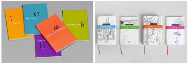 The stunningly beautiful book design work of FBA, a graphic design consultancy based in Coimbra, Portugal, seen at Cosa Visuales.
The Cosa Visuales post also introduced me to Spined, the design blog of Spanish graphic designer Álex Durana. Worth a look.
Wall of Sound — Alex Ross, music critic for The New Yorker and author of The Rest is Noise and Listen to This, talks about his workspace at From The Desks Of…
My study is stereotypically overstuffed with books and CDs. On the desk I keep well-thumbed reference works—the Chicago Manual of Style, Strunk’s Source Readings in Music History, and Paul Griffiths’s Penguin Companion to Classical Music—together with two books that my spirits when sagging: the Wallace Stevens collection Palm at the End of the Mind and William James’s The Varieties of Religious Experience. I leaf through Stevens in search of a fresh word or rhythm I can apply somewhere on the page: for me, he’s the supreme magician of the modern English language. I look to James for philosophical guidance—he shows the way out of ideological traps and abysses.
Also of interest: Designer Jarrod Taylor, shares an annotated photo of his desk in the art department of HarperCollins, New York.
But speaking of The New Yorker… James Surowiecki on what we can learn from procrastination:
The idea of the divided self, though discomfiting to some, can be liberating in practical terms, because it encourages you to stop thinking about procrastination as something you can beat by just trying harder. Instead, we should rely on what Joseph Heath and Joel Anderson, in their essay in “The Thief of Time,” call “the extended will”—external tools and techniques to help the parts of our selves that want to work. A classic illustration of the extended will at work is Ulysses’ decision to have his men bind him to the mast of his ship. Ulysses knows that when he hears the Sirens he will be too weak to resist steering the ship onto the rocks in pursuit of them, so he has his men bind him, thereby forcing him to adhere to his long-term aims. Similarly, Thomas Schelling once said that he would be willing to pay extra in advance for a hotel room without a television in it.
And finally…
Jackasses and pirate-loving Monkeys — Author and illustrator Lane Smith talks (apparently to himself) about the charming It’s a Book (via The Second Pass):
Comments closedI like arranging and rearranging books on my bookshelves. In other words, I am a nerd.
Not to say that I’m not excited by the new technologies and reading devices introduced (it seems) nearly every month, I am. But I’m sure on some level I’ll always be a traditional book guy. Then again I’m the kind of guy who still watches silent movies and listens to vinyl.
Unlike Grandpa (me), today’s kids are whip smart and tech savvy. I know eventually everything will be digital and kids won’t even know from a regular old book book and that’s fine. Truthfully? The reason I made the book? Certainly not to “throw down the gauntlet” as one critic has stated. Naw, I just thought digital vs. traditional made for a funny premise.
 A new monograph on Japanese un-brand MUJI to be published by Rizzoli later this month (via Swiss Legacy).
Finishing Touches — Type foundry Hoefler & Frere-Jones on the little details that make their typefaces:
In the middle of Gotham, our family of 66 sans serifs, there is a hushed but surprising moment: a fraction whose numerator has a serif. So important was this detail that we decided to offer it as an option for all the other fractions, a decision that ultimately required more than 400 new drawings. Why?…[I]t’s something that we added because we felt it mattered. Even if it helped only a small number of designers solve a subtle and esoteric problem, we couldn’t rest knowing that an unsettling typographic moment might otherwise lie in wait.
And on the subject of typography… A handy PDF chart for mixing typefaces (via Smashing Magazine)
Blade Runner Will Prove Invincible — Philip K. Dick on Blade Runner, the film adaptation of Do Androids Dream of Electric Sheep, in a letter to the production company (via Coudal):
The impact of BLADE RUNNER is simply going to be overwhelming, both on the public and on creative people — and, I believe, on science fiction as a field… Science fiction has slowly and ineluctably settled into a monotonous death: it has become inbred, derivative, stale. Suddenly you people have come in, some of the greatest talents currently in existence, and now we have a new life, a new start… My life and creative work are justified and completed by BLADE RUNNER. Thank you… It will prove invincible.

And by coincidence, not only did I just watch the director’s cut of Blade Runner again just the other day (for approximately the bazillionth time), it was recently announced that Blade Runner director Ridley Scott would be producing a 4-part TV adaptation of The Man in the High Castle for the BBC. Awesome.
Deceptively Simple — Three Percent’s Chad W. Post on OR Books innovative publishing model:
The OR Books business model is deceptive in its simplicity. In many ways, it’s a throwback to a time before supply-chain intermediaries permanently altered the bookselling business—a time when publishers were also printers and bookstores. It’s a model that—if successful in the long run—thrives on both satisfying the needs of customers and maximizing the publisher’s return.
And finally…
Part One of Eleanor Wachtel’s interview with John le Carré about his new book Our Kind of Traitor for CBC Radio’s Writers & Co.:
Writers and Co. John Le Carre Interview
Comments closed
Twenty-nine year old Brazilian designer Daniel Justi graduated in graphic design and art direction from centro universitário belas artes de são paulo, and has been working in editorial design and type design in São Paulo for the last 6 years.
Regular readers of Caustic Cover Critic and Design Work Life will already be familiar with his distinctive book jackets and typography, but I’m happy to post a new interview with Daniel here.
Daniel and I corresponded by email, and he was good enough to answer all my questions in English.
 How did you get into book design?
When I was finishing university, I received a proposal for an internship job at an publish house called Editora Manole. So I started working as an editorial assistant. After a while, I started to get very interested in the various methods of making books, so I started studying typography, grids, proportions and many things about Fibonacci, Villard and the golden ratio more deeply. Today, I think that designing the interiors of books is one of the most technical fields of graphic design.
What is your current role in the industry?
Fortunately, I got a position that is rather rare nowadays, which is working with both the cover design and the interiors of books. Sometimes there isn’t enough time so I need to hire freelancers and, in these cases, I need to act as art director. Besides, I run my small type foundry and also do freelance work for some publishers.
Are there a lot of opportunities for book designers in São Paulo?
Yes and no. The publishing field in São Paulo is quite busy. There are many publishers and most of them hire freelancers. At the same time is unusual to work for several publishers. It is more common to do work for only one or two. The editors don’t seem to like to vary their freelancers. So when an editor trusts you, you usually get a lot of work.
Could you describe your design process?
My design process is often not linear. Of course I always start with basics like color, shape and typography, but I think its important not to have total control of the process. The accidents, incidents and coincidences are important in my process. For books, I usually say, “let the text control.” The content is what sets the decisions like to using or making illustrations, pictures, collages, textures, typography, etc..
There is nothing better than content to define the shape.
What are your favourite books to work on?
Definitely literature and art.
I believe that literature books are the best. They don’t need obvious solutions. You can be daring, try something new or maybe weird, since that has something to do with the content and, most important, makes the reader think.
I think the main function of a book cover is to create a communication with the reader and not just give you all the obvious way. It is important never to underestimate the reader.
I also enjoy working on academic books, containing information graphics, charts and timelines. I like to find the visual solutions for these kind of books.
 What are the most challenging?
Medical books.
The publishing company where I work is well known for his books on medicine. It’s always a great challenge to make good design books on this topic. Currently I think it’s a fun challenge, but a few years ago, it was terrifying!
 When did you become interested in type design?
In my last year of university, I had an extra course of a project called Tipocracia.
Tipocracia is a project of a graphic designer and professor called Henrique Nardi. The purpose of this project is to disseminate the typography and type design in Brazil. It is a very important initiative and encourages students to engage in the field.
I’ve always had a great interest in typography, but contact with Tipocracia was what motivated me to start my own type foundry.
Does working so closely with type inform your book design?
Absolutely! Work with type design completely changes your view of typography.
Currently, my attention is more focused on covers, but I never want to stop designing the interiors of the books, which is where all your technical knowledge is put to the test. So, for me, doing both (cover and interior) will always be enjoyable.
 What are some of the current design trends in Brazil?
Hard to say. Brazil is a very big country and many things happen outside of São Paulo.
In São Paulo, for example, I don’t think there’s a specific local trend. I think it’s more like trends that exist in other large cities and urban centers, like London or New York.
Trends end up becoming more global. This year, for example, designers from Pentagram (including Paula Scher and DJ Stout ) came to São Paulo to promote workshops. At the end of the year Stefan Sagmeister is coming. Maybe it’s all about a global trends.
Who are some of the Brazilian designers we should look out for?
There are so many names, but I’ll try to summarize my favorites by area:
Book covers: Retina_78
Graphic Design: Rico Lins
Type design: Fabio Haag
Illustration: Thiago Queiroz
Photo: Cia de Foto

Where do you look for inspiration and who are some of your design heroes?
I try not to look for inspiration in graphic design field. I think it’s necessary to have other interests to inspire you. Things that inspire me are simple like skateboarding on a Saturday afternoon, reading a book, listening to some music, photography and going to the movies or art exhibitions.
Some of my heroes are Paul Rand, Alvin Lustig, Neville Brody, László Moholy-Nagy, Josef Müller-Brockmann, Jan Tschichold and so many others…

What does the future hold for book cover design?
I believe that things tend to increasingly professionalize. The market is saturated of free stock images. It’s important to create customized solutions so we don’t repeat what has already been done.
My central philosophy is to never underestimate the consumer. Design is communication, and for it to exist, you must not deliver everything and let people think for themselves. There must be an interaction.
I really like Massimo Vignelli’‘s phrase:
“I disagree with people who think the word dog should look like a dog. Even worse are people who think the word dog should bark.”
Thanks Daniel!
1 Comment