Skip to content

The Casual Optimist Posts

A Year in Reading 2010

2010 was a year of losing battles and one of the first casualties was time for personal reading. The moments I did have were snatched on the subway and, if I could keep my eyes open, last thing at night. I often found myself unwittingly rereading chapters I had read the previous day, or worse, that very morning. The difficulty this week of compiling a list of my favourite books of the year — and the predictability of that list (to be posted soon) — made it very clear that not only did I read less than previous years, I rarely strayed off the beaten path.

The year was thus defined, for better or worse, by two big novels that were in some senses polar opposites: C by Tom McCarthy and Freedom by Jonathan Franzen. If C was modern experimental novel masquerading as an early 20th century bildungsroman, Freedom was a Victorian drama in modern dress. It felt like “Two Paths for the Novel” all over again.

Someone cleverer than me observed C “was surrounded by the sort of buzz and static which it contained and described.” But while the buzz amplified C to the Booker shortlist, the hype around Freedom and Franzen seemed to diminish the book. It was so ludicrously overpraised, and subsequently criticized and shunned, that it was almost impossible to evaluate fairly.

OTHER FICTION

Like just about everyone else, I started 2010 reading Stieg Larsson, but now, with 2011 just around the corner, The Girl Who Kicked the Hornet’s Nest remains unfinished, my bookmark at Chapter 6.

I loved the architecture and weird psycho-geography at the heart of the mysterious The City and the City (published in paperback this year) and went on to read China Miéville’s earlier, equally architectural, novel Perdido Street Station.

I was also happy to belatedly discover that Phillip Kerr had resurrected his Bernie Gunther Berlin Noir detective series. Better late than never…

Sadly neither The Imperfectionists by Tom Rachman nor Zero History by William Gibson really added up to more than the sum of their (occasionally really quite good) parts.

I simply abandoned Justin Cronin’s clunker The Passage.

Better was Canal, Lee Rourke’s L’Étranger in London. I wasn’t entirely convinced by it, but an off-beat novel about urban ennui and existential violence was a welcome change of pace. Rourke is no doubt an author to watch.

Canal had the added virtue of being short, something of  a rare and undervalued quality these days. In fact almost all of the fiction I enjoyed the most this year — the icily beautiful The True Deceiver by Tove Jansson, the bonkers Memories of the Future by Sigizmund Krzhizhanovsky, and the lyrical The Blue Fox by Sjon — were short. And not actually published in 2010.

Colony by Hugo Wilcken, also short and published in 2007, was unquestionably my favourite novel of the year. Drawing its title from Kafka’s The Penal Colony (and, in turn, Joy Division’s song Colony), the book seemed to me more like a post-modern Conrad, or perhaps Camus trying his hand at a Boy’s Own Adventure. Needless to say, I’m looking forward to Wilcken’s next novel…

NONFICTION

I waited too long to read Patti Smith’s wistful and self-depreciating memoir Just Kids, but I was charmed by it nonetheless. I was less enthralled with Bob Dylan in America by Sean Wilentz. I was not, I suspect, the target audience however…

Jared Lanier’s You Are Not a Gadget: A Manifesto and Nicholas Carr’s The Shallows both raised intelligent concerns about development of the internet. I was less convinced by Lanier’s polemic than Carr’s tweedier defense of long-form reading, but neither were as reactionary as they were sometimes characterized, and both offered interesting insights whether one agreed with them or not.

The subjective magazine-style reportage of War by Sebastian Junger and the gossipy Game Change by John Heilemann and Mark Halperin were both signals of what we can expect from nonfiction in future.  But both were troubling, especially War, which felt both narcissistic and yet, at the same time, voyeuristic and exploitative. Neither book properly addressed the complications of embedded insider journalism.

Both War and Game Change were, at least, entertaining. That cannot be said of Bob Woodward’s less than electrifying Obama’s Wars. There is something to be said for detailing events in chronological order, but that doesn’t make it any more readable. Worse, perhaps, I didn’t gain any greater insight into what had happened.

COMICS

Even though Dan Clowes is the godfather of the miserable asshole, it is now such a common trope in indie comics that despite his undeniable virtuosity I was somewhat disappointed by the uncompromising Wilson. It was, however, unfair of me to expect Clowes to be anyone other than Clowes, and just about everyone whose opinion I respect tells me I am wrong about this book, so don’t take my word for it.

KENK took up a lot of my professional time this year so I was glad to see it get such a positive critical response and I’m hopeful that it will finally see a US release in 2011.

Having a short attention span, I enjoyed the latest installment of Hellboy, and its gothic spin off Sir Edward Grey Witchfinder, but continued to be underwhelmed by Mignola’s plodding BPRD series.

Like just about every other nerd in Toronto I read the 6th and final installment of Bryan Lee O’Malley’s Scott Pilgrim series (now handily available as a box set). I also finally read Jeff Smith’s epic Bone from cover to cover and revisited The Rocketeer stories by the late Dave Stevens, which were collected, at long last, in a slim hardcover edition at the end of last year.

I loved The Outfit, the latest installment of Darwyn Cooke’s adaptations of Richard Stark’s Parker stories (my Advent Book Blog recommendation this year), and Jason’s strange and delightful Werewolves of Montpelier.

Footnotes In Gaza (published late in 2009) left me depressed, but thoroughly in awe of Joe Sacco.

THE ONES I DIDN’T GET TO (BUT MEANT TO)

The list of new books that I had every intention of reading this year but didn’t is far, far, too long. Here, however, are a few of the books (in no particular order) that I intend to get to sooner rather than later: Matterhorn by Karl Marlantes, Our Tragic Universe by Scarlett Thomas, Super Sad True Love Story by Gary Sheyngart, A Visit From the Goon Squad by Jennifer Egan, Every Man Dies Alone by Hans Fallada,  Boxer, Beetle by Ned Beauman, Kraken by China Miéville, What Ever Happened to Modernism? by Gabriel Josipovici, The Hare With Amber Eyes by Edmund Dewaal, A History of the World in 100 Objects by Neil MacGregor, Just My Type: A Book About Fonts by Simon Garfield, Set to Sea by Drew Weing and H.P. Lovecraft’s At the Mountains of Madness adapted by Ian Culbard. There are no doubt many, many more… I would love to hear what you read and enjoyed this year and what I should add to the list of books for 2011…

2 Comments

Midweek Miscellany

Just to continue the Gatsby theme this week, Penguin UK have been adding more recent and vintage book designs to their Flickr, including this Fitzgerald cover from 1998 (Thanks Alan! Can we get design credits please?).

Running Out of Room — Will Schofield, the chap behind the awesome A Journey Round My Skull, at From The Desk Of…

I love records and books equally, and have collected both with abandon since my teenage years. Luckily I never had a strong vinyl fetish so last year sold a bunch of records and now mainly listen to mp3s. I say luckily because I ran out of room for my books and records around 2003.

“The boxes have now changed, but they are still boxes” — Marshall Poe, author of A History of Communications, on how the internet changes nothing (via Rough Type):

We knew the revolution wouldn’t be televised, but many of us really hoped it might be on the Internet.  Now we know these hopes were false.  There was no Internet Revolution and there will be no Internet Revolution.  We will stumble on in more or less exactly the way we did before massive computer networks infiltrated our daily lives.  Just look around and you will see that the Singularity is not near.  For some reason we don’t want to admit this fact.  Media experts still talk as if the Internet is new, as if it is still evolving, as if it will shortly “change everything.”

And finally…

Fonts in Use — A catalogue of type in use. Like the Book Cover Archive for fonts. Brilliant.

5 Comments

Q & A’s of 2010

This week’s Q & A with The Heads of State is my last interview of 2010. There are more Q & A’s with book designers and other book folk planned for 2011, but in the meantime, here’s a round-up of this past year’s interviews:

4 Comments

Q & A with The Heads of State

Jason Kernevich (left) and Dustin Summers (right), known together as award-winning design shop The Heads of State, met in the design program at Tyler School of Art, Philadelphia. Shortly after graduating, the duo began producing screen-print posters for the local independent music scene. The simple, bold graphic style of their work quickly garnered international attention and acclaim, and their clients now include the likes of R.E.M., Wilco, The National, The New York Times and The Guardian, as well as publishers Penguin, HarperCollins, and Random House.

If that wasn’t enough, the duo recently released a new letterpress print inspired by F. Scott Fitzgerald’s novel The Great Gatsby . The 4-colour, limited edition print (on 140 lb. French Poptone Sweet Tooth paper) shows the business cards and personal stationery of the Jazz Age VIPs that attend Gatsby’s parties in the summer of 1922. Complete with lovely touches such vintage typography and the characters’ professions and street addresses, the print is a beautiful tribute to a 2oth Century classic.

Jason, Dustin and I corresponded by Twitter and email about the Gatsby print and their unique design collaboration.

How did this project come about?

We’d been kicking around the idea of doing something with the novel for a long time. Chapter Four breaks from the plot for a moment and the narrator begins reminiscing about the folks who came to the parties that summer. The names by themselves are just incredible. There is some detail given about the characters’ background but not much. We had to make a lot of it up. But there were hints at a profession or an address here and there and that led to the idea to do business cards.

What’s the enduring appeal of The Great Gatsby for you?

Like most people, we first came across this book in high school and hated it. Rediscovering it later in life has been a joy. The time period holds endless allure. It was between the wars. The reputation of the roaring twenties and its decadence and flamboyance allows the reader to imagine so much more than what’s on the page. And there’s plenty on the page! It’s all the more poignant because of the crash that followed.

Do you think the story has particular contemporary relevance?

The lead-up to the Great Depression holds a contemporary economic relevance for sure. But it’s also a hell of a break-up story in a way with it’s jealousy, conspiracy, and doomed aspirations. That is certainly a side of the novel not fully grasped in the 9th grade.

Your work often seems inspired by New Deal era WPA illustration and mid-century modern design. Are you also inspired by the Jazz Age?

We hadn’t really looked to it for much inspiration in the past, but through our research we found that a lot of the documents of that era were much more practical and less decorative than we anticipated, which connected more with our aesthetic.

How did you recreate the vintage type?

A lot of it came from books that we scanned as well as classic typefaces that predate the era or modern decorative faces that reference it. There was also some hand lettering done.

Did you research 1920’s typefaces? Were you trying to be totally accurate?

We weren’t trying to be 100% accurate. Capturing the spirit was the most important thing. We had a few historical references for inspiration. The credits and titles for the original King Kong conveyed a sense of glamour and of old New York that was appropriate for some cards despite the film being from 1933. We found a few business cards from the early twenties for doctors, furriers, jewelers, etc. They were surprisingly modest and utilitarian. Which makes sense due to printing and lettering limitations. So we aimed for somewhere in the middle.

Do you have a favourite ‘card’ on the poster?

It changes. The “Films Par Excellence” card is a favorite. But Jordan Baker’s gets our pick. She is the only main character we did a card for and we wanted to sneak it in as a payoff to fans of the book. We like to say that her card was inspired not just by her profession (golf champion) but by her eyelashes.

What’s the appeal of manual printing processes like letterpress and silkscreen?

It a tactile, sensual thing that you feel connected to as a viewer. It’s great to be able to interact with a piece of design in that way. It also added a disguise of authenticity and age to this project. Oh, the irony.

Could you describe your creative process? How does your collaboration work?

Over the years we’ve developed quite a shorthand with one another. Our process is sometimes as simple as a conversation while sketching. We’ve hit on some of our best ideas in a matter of few minutes by just talking through the problem at hand. Sometimes it’s more labored over. In those instances we hit the books, research, sketch, and let the best and most clear idea win. We are both always in pursuit of the best idea and that helps move things along.

Who are your design heroes?

We have so many. Plenty of usual suspects from the 1950’s and 1960’s and from our early days of making silkscreen posters. We love the travel posters of David Klein. Book designers like John Gall and Paul Sahre. Leanne Shapton is a personal favorite. A lot of our artist friends never cease to amaze us with the work they churn out. Jessica Hische. Tim Gough. Matt Curtius and Gina Triplett. Martha Rich. Josh Cochran and Chris Neal and everybody else at the Pencil Factory in Brooklyn.

What’s next for The Heads of State? Will we be seeing more book covers from you soon?

We’ve got some book covers in the works. We’re also working on more self-initiated projects and products as well as a few branding projects we’ll be unveiling in the next few months that we’re pretty psyched about.

Thanks!

How did this project come about?

We’d been kicking around the idea of doing something with the novel for a long time. Chapter Four breaks from the plot for a moment and the narrator begins reminiscing about the folks who came to the parties that summer. The names by themselves are just incredible. There is some detail given about the characters background but not much. We had to make a lot of it up. But there were hints at a profession or an address here and there and that led to the idea to do business cards.

What’s the enduring appeal of The Great Gatsby for you?

Like most people, we first came across this book in high school and hated it. Rediscovering it later in life has been a joy. The time period holds endless allure. It was between the wars. The reputation of the roaring twenties and its decadence and flamboyance allows the reader to imagine so much more than what’s on the page. And there’s plenty on the page! It’s all the more poignant because of the crash that followed.

Do you think the story has particular contemporary relevance?

The lead-up to the Great Depression holds a contemporary economic relevance for sure. But it’s also a hell of a break-up story in a way with it’s jealousy, conspiracy, and doomed aspirations. That is certainly a side of the novel not fully grasped in the 9th grade.

Your work often seems inspired by New Deal era WPA illustration and mid-century modern design. Are you also inspired by the Jazz Age?

We hadn’t really looked to it for much inspiration in the past, but through our research we found that a lot of the documents of that era were much more practical and less decorative than we anticipated, which connected more with our aesthetic.

How did you recreate the vintage type?

A lot of it came from books that we scanned as well as classic typefaces that predate the era or modern decorative faces that reference it. There was also some hand lettering done.

Did you research 1920’s typefaces? Were you trying to be totally accurate?

We weren’t trying to be 100% accurate. Capturing the spirit was the most important thing. We had a few historical references for inspiration. The credits and titles for the original King Kong conveyed a sense of glamour and of old New York that was appropriate for some cards despite the film being from 1933. We found a few business cards from the early twenties for doctors, furriers, jewelers, etc. They were surprisingly modest and utilitarian. Which makes sense due to printing and lettering limitations. So we aimed for somewhere in the middle.

Do you have a favourite ‘card’ on the poster?

It changes. The Films Par Excellence card is a favorite. But Jordan Baker’s gets our pick. She is the only main character we did a card for and we wanted to sneak it in as a payoff to fans of the book. We like to say that her card was inspired not just by her profession (golf champion) but by her eyelashes.

What’s the appeal of manual printing processes like letterpress and silkscreen?

It a tactile, sensual thing that you feel connected to as a viewer. It’s great to be able to interact with a piece of design in that way. It also added a disguise of authenticity and age to this project. Oh, the irony.

Could you describe your creative process? 10. How does your collaboration work?

Over the years we’ve developed quite a shorthand with one another. Our process is sometimes as simple as a conversation while sketching. We’ve hit on some of our best ideas in a matter of few minutes by just talking through the problem at hand. Sometimes it’s more labored over. In those instances we hit the books, research, sketch, and let the best and most clear idea win. We are both always in pursuit of the best idea and that helps move things along.

Who are your design heroes?

We have so many. Plenty of usual suspects from the 1950’s and 1960’s and from our early days of making silkscreen posters. We love the travel posters of David Klein. Book designers like John Gall and Paul Sahre. Leanne Shapton is a personal favorite. A lot of our artist friends never cease to amaze us with the work they churn out. Jessica Hische. Tim Gough. Matt Curtius and Gina Triplett. Martha Rich. Josh Cochran and Chris Neal and everybody else at the Pencil Factory in Brooklyn.

What’s next for The Heads of State? Will be seeing more book covers from you soon?

We’ve got some book covers in the works. We’re also working on more self-initiated projects and products as well as a few branding projects we’ll be unveiling in the next few months that we’re pretty psyched about.
Thanks!  Dan

5 Comments

Pigskin Over Wood

CBS News looks at the past, present, and future of book covers, and talk to Knopf’s Associate Art Director Peter Mendelsund and some guy called Chip Kidd:

Comments closed

Something for the Weekend

I’ve not been entirely convinced by all of the artists’ books covers I’ve seen coming out the Never Judge…? show at StolenSpace in London (to be fair, I’ve not been to the exhibition in person), but Gary Taxali’s design for The Confederacy of Dunces is just great. I believe this edition will be available from Penguin UK in April 2011. There’s more on the exhibition at Creative Review.

What Font Should I Use?Smashing Magazine’s 5 principles for choosing and using typefaces.

The Collectors — NPR on e-readers, data collection and personal privacy (via MobyLives):

Most e-readers, like Amazon’s Kindle, have an antenna that lets users instantly download new books. But the technology also makes it possible for the device to transmit information back to the manufacturer.

“They know how fast you read because you have to click to turn the page,” says Cindy Cohn, legal director at the nonprofit Electronic Frontier Foundation. “It knows if you skip to the end to read how it turns out…”And it’s not just what pages you read; it may also monitor where you read them. Kindles, iPads and other e-readers have geo-location abilities; using GPS or data from Wi-Fi and cell phone towers, it wouldn’t be difficult for the devices to track their own locations in the physical world.

(It’s also worth noting, as Steven W. Beattie does, that this all applies equally (if not more so) to  Kobo’s new Reading Life app.)

Not Just a Stereotype — Michael Bhaskar, Digital Publishing Manager at Profile Books, offers some final thoughts on 2010 at Book Brunch, dispelling a few myths along the way:

Like many groups, publishers are easily stereotyped, and like such groups too, they find that the media usually plays along with the stereotype rather than discovering the nuances behind it. So we hear about a slightly staid world of boring pedants, blinking helplessly at the on-rushing lights of the digital juggernaut and eagerly burrowing their way back to the 1950s… But this isn’t the industry I know. Far from being terrified of digital, publishing has actually already become well adapted to the digital world.

In his recent study of publishing, Cambridge academic John Thompson makes the point that, from the industry’s point of view, much of the digital transition has already taken place. In the workflows of most publishers the only time we see printed material is at the very end of the process… The day to day reality of a publishing house is one of dealing with digital products…

Wave of Information — Gary Shteyngart, author of Super Sad True Love Story, in conversation with Robert Birnbaum for The Morning News:

Sure the novel has survived. Television, radio, telegraph, film—just about anything that has been thrown at it. It’s a very durable form. And the novels are getting better and better. I am shocked at the quality of literature. What I worry about more than anything is—maybe this anecdotal “living in New York”—is the exhaustion of people… The difficulty people have of opening up a book after a day of being bombarded with bits of information, most of it useless. And much, if redundant, certainly information that is ceaseless. Ceaseless waves of it. You come home, the quest for narrative is still there—you want narrative. What’s the water-cooler discussion going to be about? It’ll be about Mad Men, which you can sit there and passively take in—it’s a wonderful show—as opposed to something that requires a mass of concentration and effort. That’s my fear. Who knows, maybe it’s completely unfounded.

And finally…

Carolyn Kellogg chooses her 13 favourite bookplates from Etsy for the LA Times ‘Jacket Copy’ blog (pictured above: Skull and Crossbones bookplates by rxletterpress).

1 Comment

Midweek Miscellany

Beautiful typographic notecards by Chicago-based designer Tom Davie.

The King of Comps — The prolific Ian Shimkoviak, one half of The Book Designers, interviewed at Caustic Cover Critic:

Every designer has their way of doing things… For me, I start with 3 sketches and as I work on those it will lead to other potential solutions and then I see something online or on a walk or in a magazine and it seems like it could work well for that project too and it just goes on and on. Things also happen unexpectedly. Something happens almost by accident and it looks interesting and somehow works.

No Layout — described as “a digital library for independent publishers, focusing on art books and fashion magazines.” (via Michael Surtees)

Warmblooded — NPR talks to independent booksellers, including Rebecca Fitting and Jessica Stockton Bagnulo of Greenlight Books in Brooklyn, about the future of bookstores:

“I kind of feel like we’re coming to end of the age of dinosaurs and there’s all these warmblooded animals running around instead,” [Fitting] says…

For her part, Bagnulo sees the chains’ woes — and the recent news that Google is entering the e-book market — as something of an opportunity.

“The potential is for there to be two trends,” she explains. “Digital content — which is ubiquitous and everywhere — and the local, boutique, curated side. And the chain stores unfortunately don’t have the advantage in either of those areas. I mean, they can’t carry every book in the world in their store, and they don’t have the same emotional connection to their neighborhood that a local store does.”

And finally…

Author Umberto Eco on WikiLeaks and how technology advances crabwise (and sounding weirdly like William Gibson) for Presse Europ:

So how can privy matters be conducted in future? Now I know that for the time being, my forecast is still science fiction and therefore fantastic, but I can’t help imagining state agents riding discreetly in stagecoaches along untrackable routes, bearing only memorised messages or, at most, the occasional document concealed in the heel of a shoe. Only a single copy thereof will be kept – in locked drawers. Ultimately, the attempted Watergate break-in was less successful than WikiLeaks.

I once had occasion to observe that technology now advances crabwise, i.e. backwards. A century after the wireless telegraph revolutionised communications, the Internet has re-established a telegraph that runs on (telephone) wires. (Analog) video cassettes enabled film buffs to peruse a movie frame by frame, by fast-forwarding and rewinding to lay bare all the secrets of the editing process, but (digital) CDs now only allow us quantum leaps from one chapter to another. High-speed trains take us from Rome to Milan in three hours, but flying there, if you include transfers to and from the airports, takes three and a half hours. So it wouldn’t be extraordinary if politics and communications technologies were to revert to the horse-drawn carriage.

1 Comment

Peter Mendelsund: Stieg Larsson Boxed Set

Peter Mendelsund, Associate Art Director at A.A. Knopf, talking about the design of The Millennium Trilogy boxed set:

Comments closed

Bring the Noise: Alex Ross Talks to Paul Morley

Paul Morley interviews fellow music critic Alex Ross, author of The Rest is Noise and Listen to This,  for The Guardian:

Morley’s post about critics, and meeting Alex Ross, is also worth reading:

I’ve always liked a critic who doesn’t think like anyone else. Someone who takes me so much by surprise with their opinions, approach and rigour that they themselves become a kind of artist. I like a critic who demonstrates that they deserve to evaluate and document the work and art of others by writing in such a way that the work makes more sense, sometimes only makes sense, because of what they write and why they write it. I loved critics, whether it was Kenneth Tynan, Susan Sontag, Tom Wolfe, Richard Meltzer, John Updike, Roland Barthes, Pauline Kael, Angela Carter or Lester Bangs, for the way they made it clear, with such evangelical poise, precision and purpose, that without the great critic, the world, and the worlds of those that made up the world, was never properly finished off.

Comments closed

Something for the Weekend

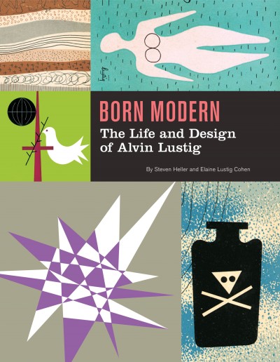
Past and Present — An excerpt from Born Modern: The Life and Design of Alvin Lustig by Steve Heller and Elaine Lustig Cohen at Design Observer*:

Lustig’s designs fluidly shift from past to present. For his early “experimental” work he built upon an armature of old technologies… and techniques…, which evolved through new technologies… into unprecedented styles… Toward the end of his life, his typography turned into a playful amalgam of vintage letters composed in contemporary layouts with vibrant colors. In “Personal Notes,” he wrote, “As we become more mature we will learn to master the interplay between past and present and not be so self-conscious of our rejection or acceptance of tradition. We will not make the mistake that both rigid modernists and conservatives make, of confusing the quality of form with the specific forms themselves.”

The AuthenticChuck Klosterman, author most recently of Eating the Dinosaur, profiles Jonathan F., author of Freedom, for GQ Magazine:

It’s a present-day problem: There’s just no escaping the larger, omnipresent puzzle of “reality.” Even when people read fiction, they want to know what’s real. But this, it seems, is not Franzen’s concern. He disintegrates the issue with one sentence.

“Here’s the thing about inauthentic people,” he says on the train, speaking in the abstract. “Inauthentic people are obsessed with authenticity.”

Telling Stories — Nicholas Carr, author of The Shallows, on interactive storytelling:

The ability to write communally and interactively with computers is nothing new… Digital tools for collaborative writing date back twenty or thirty years. And yet interactive storytelling has never taken off. The hypertext novel in particular turned out to be a total flop. When we read stories, we still read ones written by authors. The reason for the failure of interactive storytelling has nothing to do with technology and everything to do with stories.

Footnotes — Part one of a long interview with journalist and cartoonist Joe Sacco, author most recently of the remarkable Footnotes in Gaza, at Art Threat (via Drawn):

[T]he biggest influence on me journalistically speaking has been George Orwell. I don’t know if you’re familiar with the book Road to Wigan Pier, but Orwell spent time in the industrial areas of Britain during the depression and took a room with a miner, lived with miners. He went down into the mine shaft with the miners. His ability to go to these places and really look at things from a ground level, that was impressive to me. And for other reasons too: because he was so dedicated to his work, and he felt that his work was sort of bigger than himself as a human being. I appreciated that dedication.

Part two will run on Monday apparently…

And finally… Superhero WikiLeaks:

(Thanks Shawn)

*Born Modern is published by Chronicle Books and is distributed in Canada by my employer Raincoast Books.

Comments closed

Midweek Miscellany

Little Nemo meets David Lynch — Mark Medley interviews Charles Burns, author of Black Hole and X’ed Out , for The National Post:
Whereas Black Hole, which takes place in the early 1970s, examines the dread and confusion of adolescence using the tropes of a horror film, X’ed Out, which is set in the late 1970s at the height of punk music, is an exploration of young adulthood and the anger, uncertainty and experimentation that comes with aging.

“I definitely started out wanting to do my punk story,” says Burns, 55. “As typically happens, you start with one idea and it spreads.”

A House Full of BooksThe LA Times book critic David L. Ulin on the gift of books:

We have a rule in our house: My wife and I will always pony up for books. It’s not even a subject of discussion — if either of our kids wants a book, we will buy it, no questions asked. This is equally true of the books we have at home, which are equally available to everyone, regardless of subject matter or degree of difficulty. Whatever else they are, after all, books are gifts (for the mind, the eye, the hand), which makes it downright uncharitable to deny them to anyone.

This, I should say, is how I was raised too, in a house full of books, by parents who put a premium on the written word. I was allowed to pick up everything — and often did. When I was in third grade, I checked out “War and Peace” from the school library (I was looking for the longest book in the world), and although I never actually opened it, I remain thrilled by the idea that no one told me not to try.

Don’t Know What They’re MissingThe Economist profiles type designer Matthew Carter:

Mr Carter doesn’t own an iPad, Kindle, or other reading device, as he is waiting for them to mature. (He does own an iPhone.) He frets that, as things stand, reading devices and programs homogenise all the tangible aspects of a book, like size or shape, as well as font. They are also poor at hyphenation and justification: breaking words at lexically appropriate locations, and varying the spacing between letters and between words. This may sound recondite but it is a visual imprint of principles established over the entire written history of a language. “Maybe people who grow up reading online, where every book is identical, don’t know what they’re missing.”

On a sort of related note… Mashable talks to designer Susan Kare about her icon designs for the original Apple Macs.

And finally (as we’re talking about typography)…

Jean-Luc — A free display typeface in two styles designed by Atelier Carvalho Bernau to celebrate Jean-Luc Godard’s 80th birthday.

Comments closed

Q & A with Jason Gabbert

Sometimes it can take me a little while to feature a designer on The Casual Optimist. Such is the case with Oregon-based book designer Jason Gabbert.

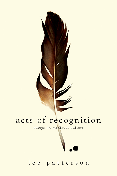
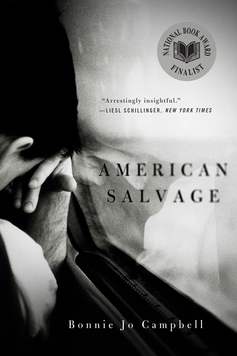
I was impressed with Jason’s work with Charles Brock and — at that time — Nate Salciccioli (interviewed here) back when Faceout Studio was still known as the DesignWorks Group. But neither the time or the topics ever seemed to be completely right. Then, earlier this year, Jason announced he was branching out on his own and going freelance. What better excuse could there be for an Q & A?

Jason and I corresponded by email. I think it was worth the wait…

How did you get into book design?

I was first introduced to book design my senior year of high-school. My family has been involved with publishing since I can remember and that led to me receiving an internship with a publisher in town. From that internship I was brought on as an intern to the brilliant Faceout Studio, which specializes in book cover design. The internship ended up turning into a full time design position. And now I’m doing my own thing.

Why did you decide to go freelance?

After working at Faceout Studio several years I began to realize that my passions were driving me to going freelance for myself. Different people work well in different environments and I wanted to try a new one out.

Was it a difficult decision?

The decision was a difficult one to make. A good beer and Jedi Knights helped with that though! The economy was screaming at me to stay where I was at, while my passions were screaming the opposite. In the end, my family and I (through stressful nights, prayer, and the counsel of those we trust) decided that this would be the best decision for me to establish my own personal creative integrity.

Could you describe your design process?

I think my process is more like a choose your own adventure book than a guide. But, broadly speaking, I like to gather as much information as possible on what I am designing, then I try and think of the simplest and most striking way to communicate the content’s key idea or ideas. After that I start doing random things (image searching, font searching, looking at different inspirations, etc…) hoping I’ll find a good way to showcase that key idea.

What are your favourite books to work on?

That’s a hard one. Off the top of my head, my favorite books are probably the more academic. Books with deep content that is just begging to be simplified to a cover.

What are the most challenging?

The most challenging books for me are often those that have been written a hundred different ways by a hundred different authors (though I am sure authors have their reasons for reintroducing these ideas). It is very difficult to keep coming up with new solutions for old ideas… but in the end, we are problem solvers… and avoiding cliché is one of the greatest challenges of all.

Do you have any recent favourites?

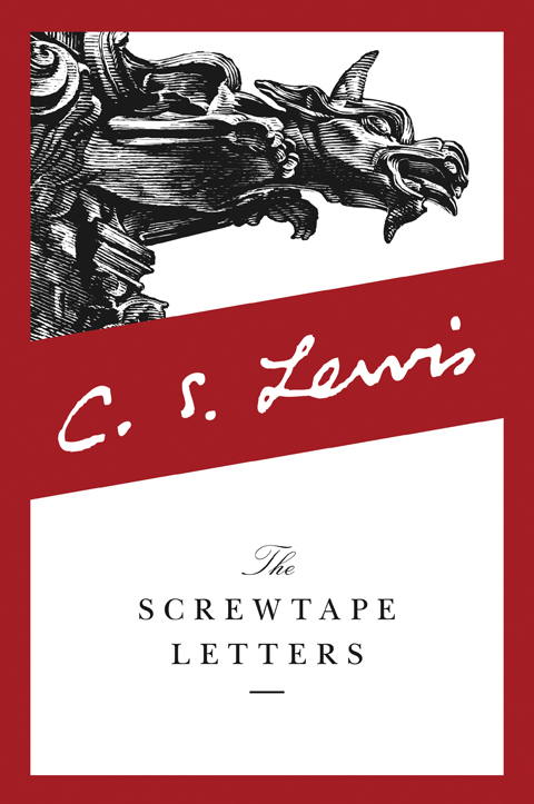
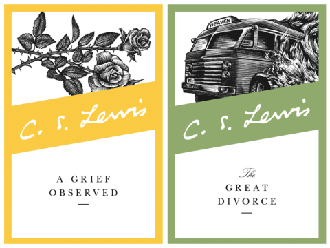
Of my own? That’s tough. I think one of my most recent favorites was the C.S. Lewis series I was able to work on. That was a dream project, and I was happy to be involved. In the end I wasn’t able to direct the illustrations themselves, but simply being able to come out with an effective format to communicate Lewis’s academic side was a privilege. I also have several academic books I’ve enjoyed working on.

Do you discern any current trends in American book cover design?

I’m sure there are trends flying by all the time. The beautiful thing about book cover design is that there are so many designers out there with so many different ways to solve a problem. I also think that trends that exist are changing faster all the time (though you would have to talk to a cover design veteran to know for sure). The cover design industry is growing its online presence, we see new things and change our approaches all the time.

Do you think that the Pacific Northwest has different design sensibility from New York and the East coast?

I’m sure it does, though I can’t recall any differences off the top of my head. I think I pull my inspiration from many similar sources as the East coast does. I don’t get as many inspirations in person, but I see many of the same things. I don’t go putting mountains, trees, and fish on every design I make… or do I…?

Where do you look for inspiration, and who are some of your design heroes?

I live on the internet. Blogs and online portfolios are my friend. My design heroes vary and are many. During this freelance transition I have had great encouragement from Henry Sene Yee and Peter Mendelsund… designers I have great respect for. The list is much longer than those two though.

Who else do you think is doing interesting work right now?

So many! I’ve been impressed with how many designers are creating fresh and intelligent works. Specifically, I’d probably want to tip my hat to the University of Chicago Press, they have been doing a ton of brilliant work.

What does the future hold for book cover design?

Change. Who knows what changes… but things will always change. We should always be seeing how we ourselves can also change to meet new challenges. I believe people will always read and books will always need to be identified by some graphic element.

Thanks Jason!

5 Comments