With library closures threatening in the UK, here’s Tom Gauld’s comic ‘Withdrawn‘ for The Guardian‘s Saturday Review:

Books, Design and Culture
With library closures threatening in the UK, here’s Tom Gauld’s comic ‘Withdrawn‘ for The Guardian‘s Saturday Review:

Blinders — Charles Burns, author of Black Hole and X’ed Out, interviewed at Full Stop:
I’ve never really – and this sounds stupid because I’m working in a commercial medium – but I’ve never thought about an audience, or written for a specific audience, per se. I’m just trying to pull together my ideas in the best possible way, and I’ve never tailored those ideas for a particular audience. I bet I could do a pretty good teenage vampire story, for example. It would have plenty of romance, and just the right amount of titillating sex, but I think I’d wind up out on the Ben Franklin Bridge looking down at that water and thinking it looked pretty good down there [laughs]. I’ve really tried to put blinders on and just tell my stories the best way I can.
Book designer Stefanie Posavec at 10 Answers.
And thanks to MobyLives for pointing me to this 2008 article from The FontFeed: Top Ten Typefaces Used by Book Design Winners.
A Step Behind Where They Needed To Be — Peter Osnos on what went wrong at Borders for The Atlantic:
Borders stores took on a generic quality as executives and investors lacked the knowledge and patience to address the chains’ mounting problems. I’m sure there is more to this story (especially in the financial and real estate areas) than I know, but what really hurt Borders from the perspective of a book person like me was that the chain was no longer in the hands of true book retailers… Whatever else Borders does in the months ahead, it needs to recover its belief that real book-selling is an art (with all the peculiarities that entails), as well as a viable business.
And finally…

A look inside Seasons, the new book by the amazing French illustrator Blexbolex, published by Enchanted Lion Books:
(via Printeresting)
Comments closedFilmmakers Joel and Ethan Coen recently discussed their movie adaptation of Charles Portis’ novel True Grit with Terry Gross on NPR’s Fresh Air:
Most of the dialogue is taken from the book, direct from the book. And in places where it wasn’t, where we were kind of, where we were aping the language of the book because the scenes didn’t derive from the original book, it wasn’t a question of learning to – you know, it wasn’t a foreign language. It is a strikingly different use of the English language, but it was more a question of kind of aping the tone, as opposed to anything more of an exercise than that… [We] didn’t go back to the Bible, although clearly in the book, the character is steeped in the Bible. Actually, all the characters, you kind of assume that part of their speech derives from either having learned to read from the Bible or, in that probably a lot of them are illiterate, just having heard a lot of Scripture.
Meanwhile, Jeff Bridges, the dude who plays US Marshall Reuben “Rooster” Cogburn in the Coen brothers’ film, is the subject of a new PBS American Masters documentary:
[UPDATE: The full PBS documentary can be seen here]
And, if you haven’t seen the movie yet, here’s the trailer:
Comments closed Canadian illustrator and typographer Darren Booth at From The Desks Of…
There’s on more on Darren’s cover for An Object of Beauty on his blog.
Misery — Editor and author Diana Athill profiled at The Telegraph (via PD Smith):
‘I have always been a watcher,’ she says. ‘Of myself in particular. Even at times of acute unhappiness I’ve watched myself being unhappy. I also think I’m one of those people who has never been wholly involved in an emotion, but then I think a lot of writers are like that.’
Is Modernism Boring? — Rhys Tranter at The Spectator Book Blog:
If modernism means anything in Woolf or Joyce, it is the struggle for what it means to be modern. Both present us with an array of fascinatingly complex characters, seeking to question their identity and their place in the modern age. Language becomes a character, too, an all-pervading texture that sets the mood of each story, and playfully subverts the ABC plots of yesteryear. Amid a proliferation of new technologies, of political upheaval and social change, Joyce, Woolf and the literary modernists actively interrogate the way we perceive the world around us, in ways still relevant today. In this way, modernism is not something we leave on our shelves and neglect to pick up. Modernism is that which speaks to modern life.
What’s the Worst that can Happen? — Gary Shteyngart, author of the dystopian Super Sad True Love Story, interviewed at the new and great looking book blog Full Stop:
Most people don’t care anymore because they’re beyond caring. The endless cult of self-expression that makes people stream or write about themselves day in and day out without any kind of filter. If you write a novel, you’re often writing about yourself as well, but you’re clearly filtering it through a bunch of things, not least of which is technique. So it’s not an entirely plausible future, but in some ways it could be. What if all the worst things happen politically, socially, and in terms of our literacy?
Top 10 fonts of 2010 lists from You Work For Them and Fontwerk (Google Translate version here).
And finally…
 The 50 best comic book covers of 2010 as chosen by Robot 6

John Gall is Vice President and Art Director for Vintage/Anchor Books, an instructor at the School of Visual Arts, and the author Sayonara Home Run! The Art of the Japanese Baseball Card.
Previously Art Director at Grove/Atlantic, Gall has been interviewed about his work by Step Inside Design, Design Bureau, and Barnes & Noble (video). He garnered even wider attention in 2009 when he commissioned a roster of high-profile designers — including Rodrigo Corral, Carin Goldberg, Chip Kidd, Paul Sahre, Megan Wilson and Duncan Hannah — to redesign twenty-one Vladimir Nabokov book covers within the confines of specimen boxes (read more about the designs at Print Magazine).

I have wanted to interview John for a long time, but as he talked about book design extensively elsewhere and regular readers are more than likely familiar with his work already, I was waiting for the right subject. It was his colleague Peter Mendelsund, who suggested that rather than discuss his book covers, I should ask John about his collages. John Gall makes collages? Yes, indeed he does. And, needless to say, they are very good.
I met John in Toronto in December last year, and we corresponded by email.

When did you first start making collages?
It’s something that I’ve been doing sporadically since forever. And when I say sporadic I mean, years or decades between doing anything.
Do you create them digitally or by hand?
All hand done. One of the reasons I do this is to get away from the computer, drop the design think and work with the hands. Its kind of liberating to not have the ability to resize things on the fly. I sometimes use a digital camera to keep track of the permutations since my brain no longer can.

Can you give me a sense of their size?
8 x 10 on up to 18 x 24
How do you chose your titles?
The titles come from things I may be thinking about, or reading, or songs I may be listening to at the time I am making them. Then I make an anagram. It now takes me a lot of time to decipher the original source and many times I cannot. Strangely, when I posted “Hot Elves,” I got a ton of hits, which made me briefly consider naming everything after comic-nerd fetishes.
Who are your artistic influences and where do you look for inspiration?
I like the same old dead people as everyone else: Kurt Schwitters, Marianne Brandt, Georges Hugnet, Rauschenberg, John Chamberlain (not dead yet!), etc. People working today who make me incredibly jealous: Fred Free, Mark Lazenby, John Stezaker, James Gallagher, Lou Beach and family, Wangechi Mutu, Clara Mata, Robert Pollard, Nicole Natri, Paul Butler, Charles Wilkin and a bunch of people I’ve met on Flickr who’s real names I do not know.
Not sure how influential any of these folks are but they do inspire me to get off my ass and get to work.

Is creating a collage a similar process to designing a cover?
Yes and no. In both cases you are moving things around on a page until they look “right”. For me, when I am doing the collage work I am eliminating the concept (and most of the time the typography) so it is reduced to forms on a page.
Graphic design is a total left brain/right brain thing. A combination of logical carefully considered thinking and intuitive personal expression. For the collage work I try to put the logical aside and exercise the intuitive muscle.

Has making collages informed your designs?
When I am stuck, I sometimes find myself thinking “What can’t I do on a book cover”? Its chance to make the wrong path and see where that leads. Force myself to make the wrong decisions. Trying to leave thoughts of what looks “good” out of the equation. Nearly impossible, but that is the goal. The hope was that these notebooks could fuel design ideas. Not so sure if that is still the case. They’ve become a thing unto their own.
Have you ever used one of your pieces in a cover?
I used them on a poster once. Attempted to use them on a skateboard design. A couple of people have tried to use them on book covers, to no avail.


Was creating a series of collages from recombined book covers cathartic?
Not really. More like, “hmmm…its 12:30 AM, I’ve spent all day working on book covers and now I’m tearing apart old covers to make new covers. Lo-ser”.
That said I’ve since started up this series again and will be posting them shortly. But I can only do these when I am away from work for a spell. Generally its like, “enough with the book covers already, is Food Jammers on yet?”.
Where do you gather your source materials from?
Most of what I work with comes in the daily mail: catalogs, magazines, etc. I intentionally try not to work with anything that is too vintage or too inherently beautiful—though I do break this rule all the time. My thinking is that all the great collage artists of the past used source material that was lying around in the trash or purchased at the local five and dime. Today we look at a Cornell piece or a Schwitters piece and marvel at the incredible printed material they had to work with. They were working with the Foodtown circulars and Bass Pro Shop catalogs of their day except, well, OK, more beautiful.
Do you still collect Japanese baseball cards?
The collecting has tapered of quite a bit since the book was published. I’m much more selective now. but if I see something particularly beautiful up for auction I’ll probably go for it. I’m not a super smart collector though. I tend to buy what I like and not what will be valuable.

Do you collect anything else?
I’m trying not to acquire to much stuff anymore and am getting ready to purge. I collect old snapshots, the occasional flashlight and I’ve recently acquired a hankering for old high school yearbooks. I’ve also been trading and collecting collage work.
Your collages are included in the recently released Graphic: Inside the Sketchbooks of the World’s Great Graphic Designers. How did that come about?
The author Steven Heller, asked me if I had anything that I’d want to contribute. I told him I keep two kinds of notebooks, one that is basically a to do list and idea book. The others are the collage notebooks. They were much more interested in those. By the way, its a beautiful book.

Untitled, James Gall (2008); Untitled, Owen Gall (2008)
You’ve collaborated with your kids on some collages. Can you tell me about ‘Dad’s Drawing Class’?
Kids are the best. The great thing about collage is that anybody can do it, but its hard to do well. Kids are naturals. They have no preconceived notions as to what looks good, just do what they like. So they are free to do whatever they want—that is, until they get old enough to become self conscious..
Dad’s Drawing Class is something I like to do with my kids while we are hanging out on vacation without cellphones and video games. We’ve done collage, some drawing exercises. I even had them drawing typographic forms one morning. My wife is also very creative and influential in this regard. She teaches a nature drawing program for children.

Where can we see your work next?
I had a couple pieces in a group show last year and some of my work will be in a book coming out next spring called “Cutters”. Showing this work is not something that I am actively pursuing. I’m not so convinced of its worthiness. I have a flickr stream, a typepad blog and if you find yourself wandering around in my attic any time soon, you will probably see some work.
Thanks John!
Images:

Born in New York 1926, Vivian Maier was an American-French photographer who worked as a nanny in Chicago from the mid-1950’s to the 1990’s. In 2007, two years prior to Maier’s death, 26-year-old real estate agent John Maloof purchased a box filled with 30,000 negatives from an estate sale for $400. On discovering the quality of beautiful street photography, Maloof then bought other boxes of Maier’s negatives in an attempt to find out more about the woman who took them:
An exhibition of Maier’s work opens at the Chicago Cultural Center today, and there is more on Maier and her photography here.

(via PetaPixel)
3 CommentsA Sense of What’s Possible — Ramona Koval talks to Edith Grossman about her book Why Translation Matters and her translation of Don Quixote for The Book Show on ABC Radio National. From the transcript:
What I mean by ‘deep reading’…and it comes after a couple or three readings…what I mean is capturing the subtleties of what the original author is doing. Because artful language has both the stated and the unstated in it, and the stated is fairly obvious, the unstated is really what differentiates one writer’s style from another. And those unstated, unspoken elements are what I try to bring over in analogous fashion into English. That kind of reading, analysing the way parts of the sentence relate to one another and how the sentences in a paragraph relate to one another and so forth, how the paragraphs connect within the chapter, this is more intensive than an ordinary reading of a book. But to my mind it’s what I have to do in order to create something in English that feels to the English-speaking reader the way the original feels, in my case, to the Spanish speaker.
MyFonts’ Top Fonts of 2010, which includes the charming Lady René by Argentinian foundry Sudtipos:
 See Also: DesignWorkLife’s favourite typefaces of 2010.
Legendary design consultancy Pentagram have launched a new website to showcase their work, including some great book design (via FormFiftyFive).
And finally…

The New York Times looks at the work of Thatcher Wine and other designers who assemble and create custom book collections for clients (one can only hope the above was for The White Stripes).
Comments closed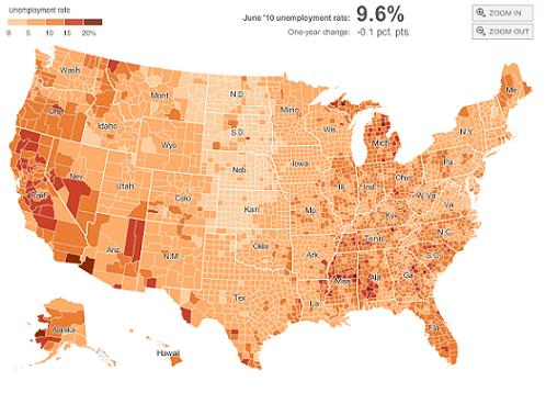
Amanda Cox, graphics editor at The New York Times, discusses data visualization with Nora Young for CBC Radio’s Spark:
 Nothing is Forgotten — A dark and beautiful wordless webcomic by Ryan Andrews (via Drawn).
And on the subject of comics, Kelly Thompson of the brilliantly named 1979 Semi-Finalist blog picks her top 20 favourite female comics creators of 2010, including Kate Beaton and Emily Carroll, for Comics Should Be Good: Part One and Part Two.
Most Anticipated… — The Millions list of interesting new books coming out in 2011 (not that I’ve caught up with 2010 yet).
The Best Fonts of 2010 as chosen by FontShop.
Wordmark — A handy online tool that allows you to preview and compare all the fonts installed on your computer (via Fontblog).
And lastly…
Critical Life — Ramona Koval interviews Gabriel Josipovici, author of What Ever Happened to Modernism?, for The Book Show on ABC Radio National. From the transcript:
[F]or all my writing life I felt one shouldn’t comment critically about one’s contemporaries, because in a way that is self-defeating. What one should do is praise the works one likes and gradually people will see their value. I suppose I was being unduly idealistic and I felt that I was only talking to the converted, as it were, and I wanted just for once to actually make people sit up a little more and to let out in print what I have said and talked about with friends, this feeling that English culture had become this thing that was rather mean and dispiriting, aided and abetted not just by…it wasn’t just something in the writers but it was something in the whole culture…
(via ReadySteadyBlog)
HAPPY NEW YEAR!
Comments closedDucking in just under the wire, here is my list of favourite of new books of the year. It’s not meant to represent the “best” of 2010. Rather, it’s a completely unscientific, very subjective list of books (arranged in alphabetical order) that I enjoyed. As I mentioned in my previous post, I found compiling the list a bit of a challenge and yet, for all that, there’s an air of withering predictability about the selections. There are no surprises. But even if this wasn’t a particular stellar year for reading, there were still lots of books I was excited about and that can only be a good thing.
I should also mention, for the sake of disclosure and all that, the top 10 includes one book distributed by Raincoast Books in Canada, and the list of honourable mentions refers to a couple of other titles I have helped promote in some minor capacity. They’re included here because I actually like them, not for any nefarious marketing reasons, but I guess you’ll just have to take my word for that. In any case, all these titles are identified with an asterisk…
And with that out of the way, on to the list!
Born Modern: The Life and Work of Alvin Lustig*
Elaine Cohen Lustig & Steven Heller
Chronicle Books
ISBN 9780811861274
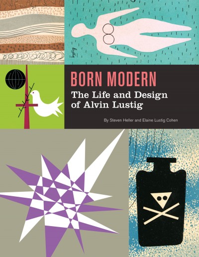
I am a little embarrassed to start this list with a title distributed by Raincoast, but it comes first alphabetically and, I can honestly say tat Born Modern was the book I was most looking forward to this year. And I was not the only person excited about the book. When I tweeted about it from the Raincoast sales conference, the response was immediate. Almost every North American book designer I’ve ever spoken to cites Lustig — who designed covers for New Directions Press in the 1950’s — as an influence. The book designer’s book designer, then… A must-have.
C
Tom McCarthy
Knopf
ISBN 9780307593337

Tom McCarthy’s C was, as mentioned previously, one of the defining books of the year for me, standing — perhaps unfairly — opposite the ubiquitous Freedom. If I am honest though, I liked it less than McCarthy’s previous novel, the starkly compact Remainder (one of my favourite books of the last 10 years). At times, the sprawling, crawling C felt like it was held together with the sticky-tape of McCarthy’s singular intellect (a thought reaffirmed by seeing him in conversation with Douglas Coupland in Toronto). But somehow, in the end, it still works in some sort of baffling, gorgeous way.
The book was also perfect excuse to finally talk to Knopf cover designer Peter Mendelsund for the blog. The Q & A with Peter and Tom about C is here.
The City and the City
China Miéville
Del Rey
ISBN 9780345497529

I am cheating a little by including The City and the City because it was first published in 2009. It was, however, published in paperback in 2010, and as that’s how a lot of us still buy our fiction, I’m bending the rules to include it.
The novel itself is essentially a detective story, but what lifts out of the ordinary is the imaginary space in which it takes place. Architecture, geography and maps are clearly important to Miéville, but where, for example, Perdido Street Station creates a fantastically baroque city of ghettos and towering alien architecture, The City and the City is only slightly off-kilter — familiar but unsettling — and the book is even better for it.
Joy Division
Kevin Cummins
Rizzoli
ISBN 9780847834815

This was my Christmas present (thank you Mrs C.O.!) and it is — pretty obviously I would think — for fans only. Still, I’m guessing there’s quite a few out there. In any case, the book is a collection of beautiful black and white photographs of Joy Division and the late Ian Curtis by Manchester-born photographer Kevin Cummins. It includes Cummins’ iconic pictures for the NME of the band standing on a snowy bridge in Hulme, Manchester, as well as photographs of live performances and the band back stage. The book was stylishly designed — with more than a whiff of Peter Saville — by London design agency Farrow.
Just Kids
Patti Smith
Ecco
ISBN 9780060936228

Other than owing a copy of Horses, I can’t say that I’m particularly familiar with the work of Patti Smith, or Robert Mapplethorpe for that matter (other than the sort of stuff must people know about his art, and that he was connected to Sam Wagstaff, no relation). But, it doesn’t really matter. Smith’s memoir about her relationship with Mapplethorpe is a touching and self-deprecating look at their early years together in New York and their adventures in the art/music scene of the late 1960’s and early 1970’s.
Memories of the Future
Sigizmund Krzhizhanovsky, translated by Joanne Turnbull
NYRB
ISBN 9781590173190

I am definitely cheating by including this in the list as it was published in 2009. That said, it was published late in 2009, I missed it, and it’s too good not to be in this year’s top 10.
The book itself is a collection of seven short stories written between 1922 and Krzhizhanovsky’s death in 1950, all of which were suppressed by Soviet censors. The stories are reminiscent of Gogol’s short fiction and Bulgakov’s novellas, and suffice to say, they’re all bonkers. But in a good way. I loved the story Quadraturin about the man who gets lost in his black, ever-expanding apartment, and the strange time travel title story which concludes the book.
Penguin 75: Designers, Authors, Commentary (the Good, the Bad…)
Paul Buckley
Penguin
ISBN 9780143117629

Seeing as I spend so much time talking about cover design, I would be remiss if I didn’t include Penguin 75 in my top 10. Released to celebrate Penguin’s 75th anniversary, it’s a surprisingly diverse and candid look at the recent cover designs from Penguin’s US outpost in New York. I talked about Penguin 75 with art director Paul Buckley and book designer Christopher Brand here.
Parker: The Outfit
Darwyn Cooke
IDW
ISBN 9781600107627

The previous book in Darwyn Cooke’s Richard Stark adaptations, The Hunter, was on last year’s list, so perhaps it is hardly surprising that the sequel, which I think is better, is in this year’s top 10 as well. In new book, the formidable Parker — now with a new face — turns the tables on ‘the Outfit’, who quickly wish that they’d let sleeping dogs lie. Cooke seems in more confident form with this adaptation and the result is a stylish and fast-paced noir that looks incredibly cool. My pithier Advent Book Blog pitch for The Outfit is here.
The Shallows
Nicholas Carr
W.W. Norton & Co.
ISBN 9780393072228

I had a frisson of recognition reading Carr’s description of internet affected attention spans and I doubt I was the only one who thought “oh god, that’s happening to me” while reading The Shallows. The book is too long — a shorter book would’ve been even more effective — but it is still compelling. Carr doesn’t say technology is wrong, but reminds us that for all its benefits, we should be mindful of the consequences and what we might be losing.
Werewolves of Montpelier
Jason
Fantagraphics
ISBN 9781606993590

I wrote about my love for Jason’s comics when Werewolves of Montpellier was about to be released earlier this year, and the book itself didn’t disappoint. Ostensibly the book is about a thief called Sven who disguises himself as werewolf to rob people’s apartments and incurs the wrath of the town’s actual werewolves. It is, however, as much about friendship, identity, loneliness, and, ultimately, Sven’s unrequited love for his neighbour Audrey. In a lovely one-page scene, Audrey stands behind Sven, hugging his shoulders. “Do women come from another planet?” she asks. “Yes, women come from another planet,” Sven replies. The whole book is achingly brief, but Werewolves of Montpellier is possibly my favourite Jason book to date.
Honourable Mentions
American Trademarks edited by Eric Baker and Tyler Blick*
Footnotes In Gaza by Joe Sacco (December 2009)
I.O.U.: Why Everyone Owes Everyone and No One Can Pay by John Lanchester (published in the UK as Whoops!)
KENK by Richard Poplak and Nick Marinkovich*
Large Scale: Fabricating Sculpture in the 1960’s and 1970’s by Jonathan Lippincott*
The Lost Rolling Stones Photographs: The Bob Bonis Archive, 1964-1966 by Larry Marrion
The Rocketeer: The Complete Collection by Dave Stevens (December 2009)
Shirley Craven and Hull Traders: Revolutionary Fabrics and Furniture 1957-1980 by Lesley Jackson (October 2009)
So there you go. If this hasn’t met your requirements, Largehearted Boy is aggregating every online “best of 2010” book list he can find, and Fimoculous is aggregating all of the lists related to 2010 in categories ranging from ‘Advertising’ through to ‘Words’. That should keep you busy…
Happy New Year!