Skip to content

The Casual Optimist Posts

Le Carré | Stuart Bache

I’m a big fan John Le Carré’s spy stories, so I was really pleased to see these wonderfully stark redesigns for Sceptre by British designer Stuart Bache, who I interviewed last year about his cover designs for the Canongate editions of Gil Scott-Heron.

You can see all 14 covers in the series here.

Comments closed

Midweek Miscellany

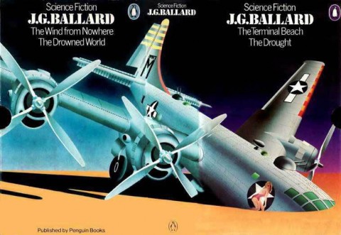
Atrocity Exhibition — Rick Poynor on the book covers  and other visual interpretations of J.G. Ballard at Design Observer:

The repeated failure of editors, designers and illustrators to engage intellectually with The Atrocity Exhibition is all the more remarkable because the book offers a litany of Ballardian images: bunkers, concrete causeways, jutting balconies, crashed bombers, a drained sculpture fountain, a deserted beach resort, rubber mannequins and plastic dummies, as well as more ambiguous images such as a “conceptual auto disaster” or a “spinal landscape” — quite apart from its erotic content.

See also: James Pardey’s essay on David Pelham’s Ballard covers for Penguin.

Cock of the Walk — Publisher Benedikt Taschen profiled in The Wall Street Journal:

Mr. Taschen admits he puts too much love and attention into his creations to ever go into the orbit of mass publishing, adding that he wants to make collectibles, not disposables. “Most books look so s— and dispassionately done; they are disposable from the beginning,” says the publisher. “Their books are not designed to become significant objects, so most books have no identity, no soul. I’m not saying all, but the vast majority [of publishing houses], with a few exceptions, have lost their profile and personality. It doesn’t look like they have spent a lot of care and love.”

(Says the publisher of The Big Butt Book book…)

A wonderful gallery of book trade labels.

See also: Book trade labels in the collection of Crossett Library Bennington College (via @shelfappeal).

The Lure of Lists — Literature professor Jeremy Dauber on the attraction of literary lists for More Intelligent Life:

Looking at the books double-stacked on shelves in my office, I can check off their provenance one by one: New York Times 10 Best Books of 2010; 500 Essential Graphic Novels; Harold Bloom’s guide at the end of The Western Canon; the awards list at the Locus Index to Science Fiction Awards; and the National Yiddish Book Centre’s 100 Greatest Works of Modern Jewish Literature. The stacks include the occasional recommendation of a friend or an impulse buy, but those are the exceptions to the list-derived rule.

And finally…

…On the list of all things awesome, BLDGBLOG interviewing Hellboy creator Mike Mignola ranks pretty highly (thanks @derekmurr):

I have never done a story in a shopping mall because, even if I’m not drawing it myself, I don’t want to see somebody draw a shopping mall. In the Hellboy world, and in other things I’ve done, those places almost don’t exist. When I do Eastern Europe—and I’ve been to Eastern Europe, and I’ve seen the shopping malls and the god-awful housing projects and things, and there are horror stories that take place in there, I have no doubt—but I gravitate toward the classic, clichéd, spooky places, whether they truly exist in this world or not.

See also: Hellboy: The Whittier Legacy in USA Today.

Comments closed

Too Much Information

That the reality of machines can outpace the imagination of magic, and in so short a time, does tend to lend weight to the claim that the technological shifts in communication we’re living with are unprecedented… The scale of the transformation is such that an ever-expanding literature has emerged to censure or celebrate it. A series of books explaining why books no longer matter is a paradox that Chesterton would have found implausible, yet there they are, and they come in the typical flavors: the eulogistic, the alarmed, the sober, and the gleeful.

The New Yorker‘s critic-at-large Adam Gopnik reviews the recent spate of books about the internet and our minds — including Cognitive Surplus by Clay Shirky, The Shallows by Nicholas Carr, and Hamlet’s Blackberry by William Powers — neatly dividing them into the categories “Never-Betters”, the “Better-Nevers”, and the “Ever-Wasers”:

The Never-Betters believe that we’re on the brink of a new utopia, where information will be free and democratic, news will be made from the bottom up, love will reign, and cookies will bake themselves. The Better-Nevers think that we would have been better off if the whole thing had never happened, that the world that is coming to an end is superior to the one that is taking its place, and that, at a minimum, books and magazines create private space for minds in ways that twenty-second bursts of information don’t. The Ever-Wasers insist that at any moment in modernity something like this is going on, and that a new way of organizing data and connecting users is always thrilling to some and chilling to others—that something like this is going on is exactly what makes it a modern moment. One’s hopes rest with the Never-Betters; one’s head with the Ever-Wasers; and one’s heart? Well, twenty or so books in, one’s heart tends to move toward the Better-Nevers, and then bounce back toward someplace that looks more like home.

It is an article unlikely to satisfy either the evangelists or doom-mongers, but it sounds about right to me in a smart-alecky sort of way…
Comments closed

Richard Ford | Writer’s & Co.

An interview with Richard Ford, recorded onstage at a special PEN benefit at the International Festival of Authors in Toronto, on CBC Radio’s Writers & Company:

CBC Radio Writer’s & Co. Richard Ford Mp3

Comments closed

Something for the Weekend

A two-part interview with Chris Ware, author of Jimmy Corrigan: The Smartest Kid on Earth,  in The Comics Journal:

I just wanted to make a comic book that had a bit of density to it, and build on the cartoonists whose work I really deeply admire. I could list hundreds of cartoonists whose work I’ve stolen from, and I try to acknowledge them all, so I just wanted to make a book that didn’t lie, as much as I could.

Part One | Part Two.

And, designer Eric Heiman on Chris Ware for Eye Magazine:

Ware’s aims are literary, not pragmatic. But his work is still a subtle reminder that no amount of order we – as designers or otherwise – impose on our lives can ever eliminate the unexpected twists and turns they take. Quantitative data, no matter how clearly and beautifully presented, is not always the know-all, end-all answer, even in this age of Google analytics.

The Literarian — The new online journal for The Center for Fiction.

Science Fiction Lesson – Author Ursula K. Leguin talks about writing and science fiction with Owen Bennett Jones for the BBC World Service.

Split Personality — Author John Banville on author Benjamin Black in The Boston Globe:

I do a Benjamin Black in the spring and early summer. I hate summer so this is a wonderful excuse to sit in my room and pound away at a crime book. I write those quickly on the computer, in three to four months. What I want from Benjamin Black is spontaneity; John Banville writes in longhand with a fountain pen. I can’t do them both at the same time. Banville was never much interested in character, dialogue, and plot, and Black is entirely character and dialogue and plot. With the crime novels, it’s delightful to have protagonists I can revisit in book after book. It’s like having a fictitious family.

And finally…

A neat animated trailer for the documentary Waiting for “Superman”:

Comments closed

Merchants of Culture | The Book Show

Another really interesting interview with John Thompson, author of Merchants of Culture, about the past, present, and future of the book business.  This time he talks with Ramona Koval for The Book Show on ABC Radio National:

ABC Radio National The Book Show: John Thompson Mp3

Comments closed

A [EYE] GA

I’ve had some really encouraging feedback about my post on Peter Mendelsund’s Kafka redesigns, and this morning I received a surprise email from AIGA in New York about it that included the cover for the AIGA Annual Graphic Design USA: 3 designed by Paul Rand. It’s too good not to share:

Thanks all.

1 Comment

Midweek Miscellany

Designers & Books — A beautiful new site compiling lists of books that designers identify as “personally important, meaningful, and formative.” Nice.

Rules Are What Make You — Michael Bierut at Designer Observer on his modernist upbringing at Vignelli Associates:

The rules weren’t written down anywhere or even explicitly communicated. They were more like unspoken taboos. Using Cooper Black, like human cannibalism or having sex with your sister, simply wasn’t done. For many young designers in the studio, the rules were too much. They resisted (futilely), grew restless (eventually), and left. By staying, I learned to go beyond the easy-to-imitate style of Helvetica-on-a-grid. I learned the virtues of modernism.

Thoughts on Design — The legendary George Lois at 10 Answers

When I was 14, aspiring to be a designer, 26 year-old Paul Rand published his iconic book, THOUGHTS ON DESIGN. My copy of it, bought, dime by dime with tip money delivering flowers all over the five boroughs for my fathers florist shop, remains the most important book in my library of over 10,000 art books. It’s thread-bare condition is witness to my reading, and memorizing, his revolutionary approach to the creation of communicative design.

Autodestruct — Author Ursula K. Le Guin reviews Monsieur Pain by Roberto Bolaño for The Guardian:

Surrealist narrative is a literary form at war with itself; disconnection is a primary tactic of surrealism, and story is a process of making connections, however unexpected. Readers open to the autodestructive element of modern art may find the surrealist devices in Monsieur Pain more deeply engaging than coherent narrative. I find them curiously old-fashioned, overly cinematic, and all too close to self-parody. But this early Bolaño novel has a moral and political urgency that obliges me to accept its noir banalities. Its tortuous method of approaching the unspeakable reveals the face of evil without glamorising it, as popular literature and film so often do. By indirection it avoids collusion.

And finally…

A stop motion digital magazine cover by Adam Voorhes and Will Bryant for Bluetooth’s publication Signature:

(via DesignWorkLife)

Comments closed

Erik Spiekermann — Putting Back the Face into Typography

In this fantastic video from Gestalten, graphic designer and typographer Erik Spiekermann, founder of MetaDesign and FontShop, and author of Stop Stealing Sheep, talks about designing type:

Spiekermann also discusses his love typography in this profile on Deutsche Welle TV:

(via I Love Typography)

1 Comment

Q & A with Jason Ramirez, St. Martin’s Press

I recently mentioned to a friend that I was going to interview book cover designer Jason Ramirez. “Jason’s the best,” he said. “Any time I’m stuck on type, I try to imagine what Jason would do and work from there.”

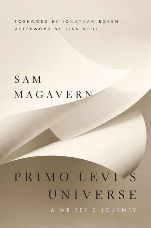
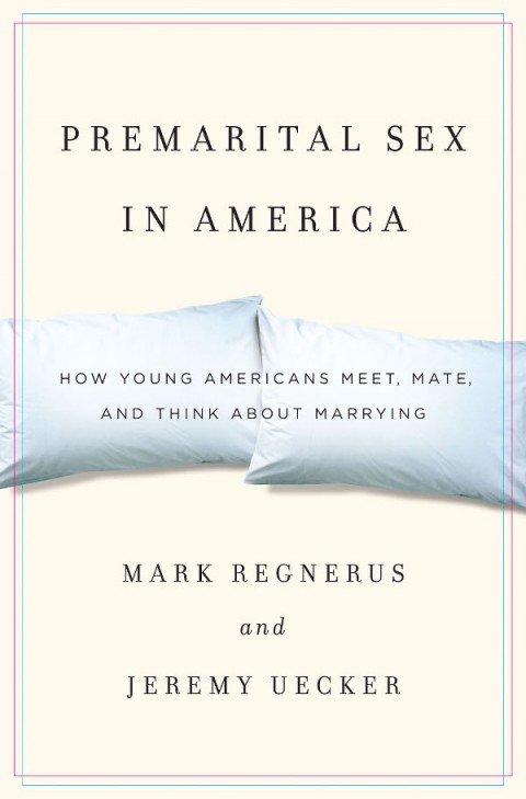
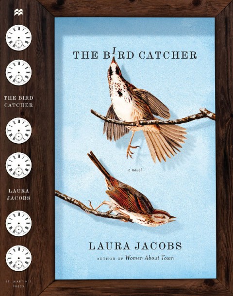
And when you look at Jason’s book covers you know what he means. A designer at New York’s St. Martin’s Press his typography is always beautiful. Each elegant letter is given room breath and perfectly compliments the design as a whole.

There is, in fact, an irresistible incisiveness and precision to Jason’s work that lend all his book covers an airy beauty. They feel spacious and uncluttered; direct without ever being blunt. I’m sure it won’t be too long before more designers ask, “what would Jason do?”

Jason and I corresponded by Twitter and email, and you can see more his portfolio on the Behance Network.
How did you get into book design?

I pretty much took a roundabout way into book design. I first went to college in upstate New York with the intention to eventually study medicine. Four years later, after a near-fatal rendezvous with organic chemistry, I graduated with a degree in comparative religious studies. I spent the next few years in San Francisco working for a real estate investment company, first in human resources and then in marketing and branding. It was during my stint in marketing and branding, which introduced me to the design world of San Francisco, that I began to daydream about a move to the city of New York to study design. Eventually I worked up the courage to make the move and was accepted to Parsons School of Design. During my last year at Parsons I had the good fortune of taking a book cover design course instructed by Gabriele Wilson. Pretty much from the onset of the class I was hooked. Shortly after graduating again, I began working with Rodrigo Corral and continued for a bit over a year before landing at St. Martin’s Press.
How long have you been at St Martin’s?

I’ve been with St. Martin’s Press since November 2007.

Approximately how many titles do you work on a season at St Martin’s?

I work on anywhere from ten to fifteen new titles each season, across four different imprints: St. Martin’s Press (trade hardcover), St. Martin’s Griffin (trade paperback), Minotaur (mystery) and Palgrave-Macmillan (which is actually an academic and trade publishing company; a close cousin to St. Martin’s).
Is there a house style?

No. One of the terrific things about working at St. Martin’s is the variety of titles published each season. Working across genres provides an opportunity to bring a fresh perspective to each project.

Do you also work freelance?

I’ve had the opportunity to work with a few publishers including, Atlas & Co., HarperCollins, Oxford University Press, The Countryman Press, W.W. Norton, and Vintage. I’ve also dabbled in a bit of interior book design with the talented design and publishing duo of Scott & Nix (Charles Nix and George Scott).

Could you describe your design process?

My process may vary depending on the project, but I always begin by reading. I try to read as much as possible of whatever materials are available, be it a manuscript, proposal, or synopsis. Depending on the subject matter, additional research might be needed. Not to mention that a bit of scouting for related imagery and typography can often inform and inspire. I tend to rely heavily on a sketchbook to record notes relating to the content and meaning of a book; ideas about imagery, typefaces and colors; and thumbnail sketches. And from this hopefully a clear, clever and attractive idea will prevail.
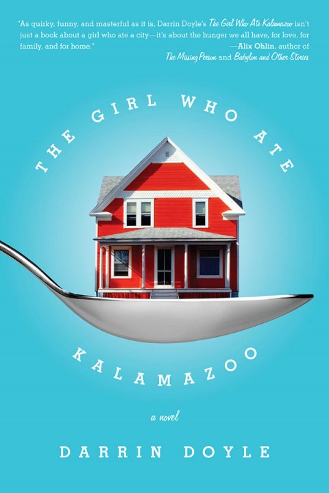
What are your favourite books to work on?

I appreciate the opportunity and challenge to work on various genres. Though I often tend to be drawn to non-fiction titles such as academic and business-oriented subjects. The conceptual challenge to visually simplify complex and comprehensive subject matter that might not be immediately accessible to a reader resonates with me.

What are the most challenging?

Any project has the potential to be challenging. Sometimes a project that I expect to be relatively easy to nail will prove to be the most time-consuming, requiring multiple rounds of revision. The challenge in this situation can be sustaining a fresh approach throughout multiple iterations, as well as mitigating your ideas with the opinions of others involved.
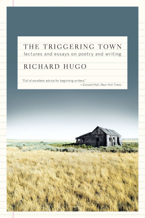
Do you have any recent favourites?

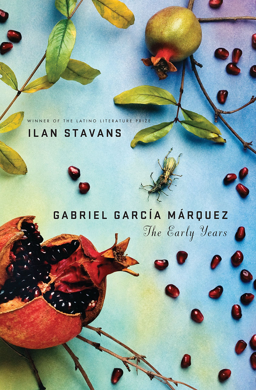
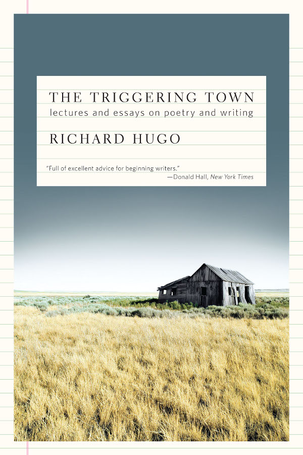
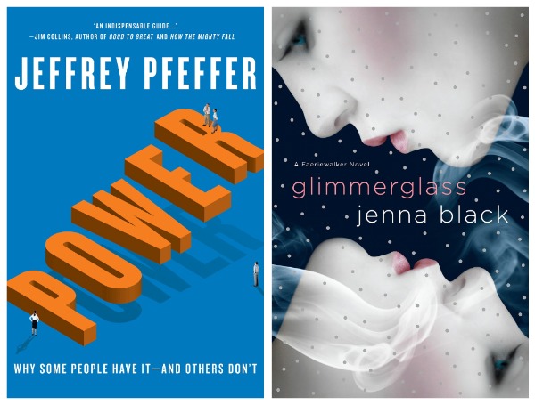
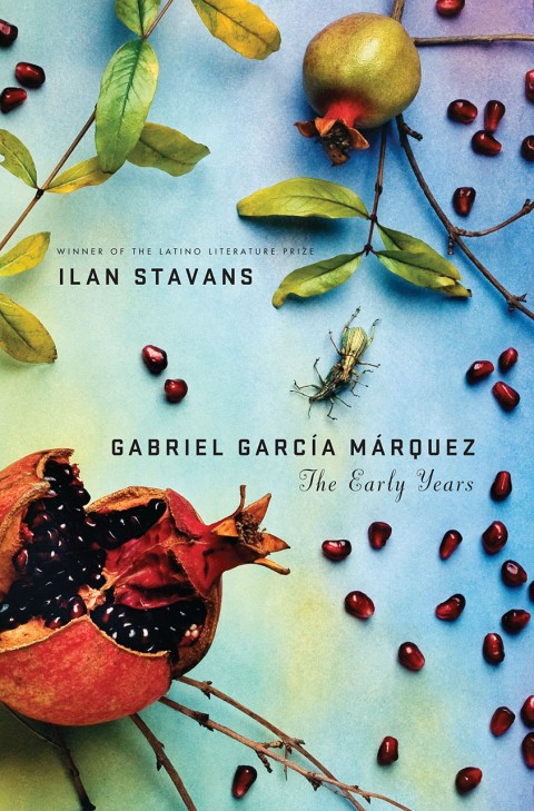
Two recent favorites include, Gabriel García Márquez: The Early Years, a biography that charts Márquez’s life leading up to the publication of his classic, One Hundred Years of Solitude; and Glimmerglass, my foray into the burgeoning young adult paranormal genre. I’m also quite fond of two relatively recent freelance projects: Power, a business management book about leadership and management success; and The Triggering Town, a collection of witty and inspirational essays on writing and poetry.

Where do you look for inspiration, and who are some of your design heroes?

I will take cues from popular culture, be it the daily headlines, magazines, music, television, movies, and the internet. On any given day, I might find inspiration in a post in my Twitter feed, from a thought-provoking illustration within the New York Times, by thumbing through a design or art book, or simply from a conversation had with a friend or colleague. And I’m almost always inspired when inside a book store.

I admire the work of Paul Rand, Alvin Lustig, Vaughan Oliver, Stefan Sagmeister, and Michael Bierut, to name a few. But the reality is that there so many visually creative people, both inside and outside of publishing, whose work I admire and find inspirational.
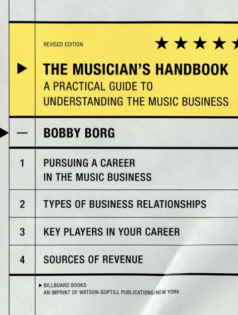
Who else do you think is doing interesting work right now?

There are many smart and talented designers working in publishing today who are consistently creating great jacket design such as Rodrigo Corral, Evan Gaffney, John Gall, Jamie Keenan, Peter Mendelsund, and Gabriele Wilson.

What are you reading currently?

Admittedly, at times I can be a bit lazy. So aside from finishing the lingering manuscript, scrolling through my Twitter feed, or browsing my Netflix queue, it’s not surprising that I’m reading an outdated issue of New York Magazine, inching closer to finishing The Glass Castle which I began last summer, and randomly reading excerpts from the Autobiography of Mark Twain.
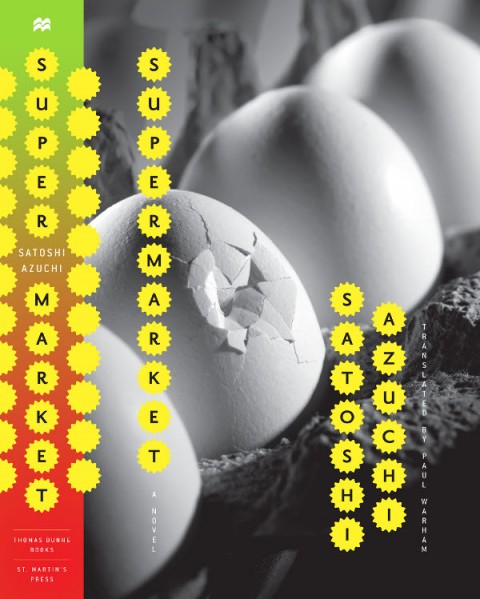
What does the future hold for book cover design?

This is the great unknown. I prefer to believe that the physical book will survive alongside the electronic book. That said, as technology evolves, additional possibilities may be created for book cover design in a digital form. In the long-term perhaps the digital book, both the content and the artwork used to package and identify it, will become multi-dimensional and interactive so that a reader might have the ability to navigate through multiple layers of storytelling. Or maybe I’ve seen one too many Harry Potter movies … I guess we’ll have to wait and see.

Thanks Jason!

1 Comment

Just My Type | The Book Show

Simon Garfield, author of Just My Type: A Book About Fonts, talks to Ramona Koval for The Book Show on ABC Radio National:

RN Book Show —  Simon Garfield: Just My Type Mp3

Comments closed

Monday Miscellany

These are mostly links I was going to post on Friday, but with a long post on Mendelsund and a last minute WordPress fail (to add to all the usual pressures of part-time blogging) I thought I might as well hold them over until today. Think of it less as a bad end to last week, and a great start to this one (or something like that)…

Designer Eric Skillman on Adrian Tomine’s illustrations for the Criterion boxed set of Yasujiro Ozu’s The Only Son/There Was a Father.

And on the subject of Adrian Tomine, David L. Ulin reviews his new book Scenes From an Impending Marriage for The LA Times:

Tomine has always been a master of the small gesture, as anyone familiar with his work knows. Such encounters motivate the deceptively informal stories in his series “Optic Nerve,” as well as his graphic novel “Shortcomings,” which explores the limits of identity and intimacy. With “Scenes from an Impending Marriage,” though, he seems almost willfully understated, tracing, in a series of offhand comics, the peculiar rigors of the wedding dance, from guest lists to seating charts to invitations and beyond.

(For the record: several of Adrian’s books, including the new one, are distributed in Canada by my employer, Raincoast Books).

The Impulse to Write — Patti Smith talks about her writing and music in The Guardian:

“More than anything that’s been the thread through my life – the desire to write, the impulse to write. I mean, it’s taken me other places, but it was the impulse to write that led me to singing. I’m not a musician. I never thought of performing in a rock’n’roll band. I was just drawn in. It was like being called to duty – I was called to duty, and I did my duty as best as I could.”

And finally…

London Intrusion — China Miéville, author most recently of The City and The City and Kraken, is posting a webcomic on Tumblr (via Robot 6).

(And speaking of Tumblr… Posts from here and The Accidental Optimist are now also available on Tumblr if that’s your thing.)

Comments closed