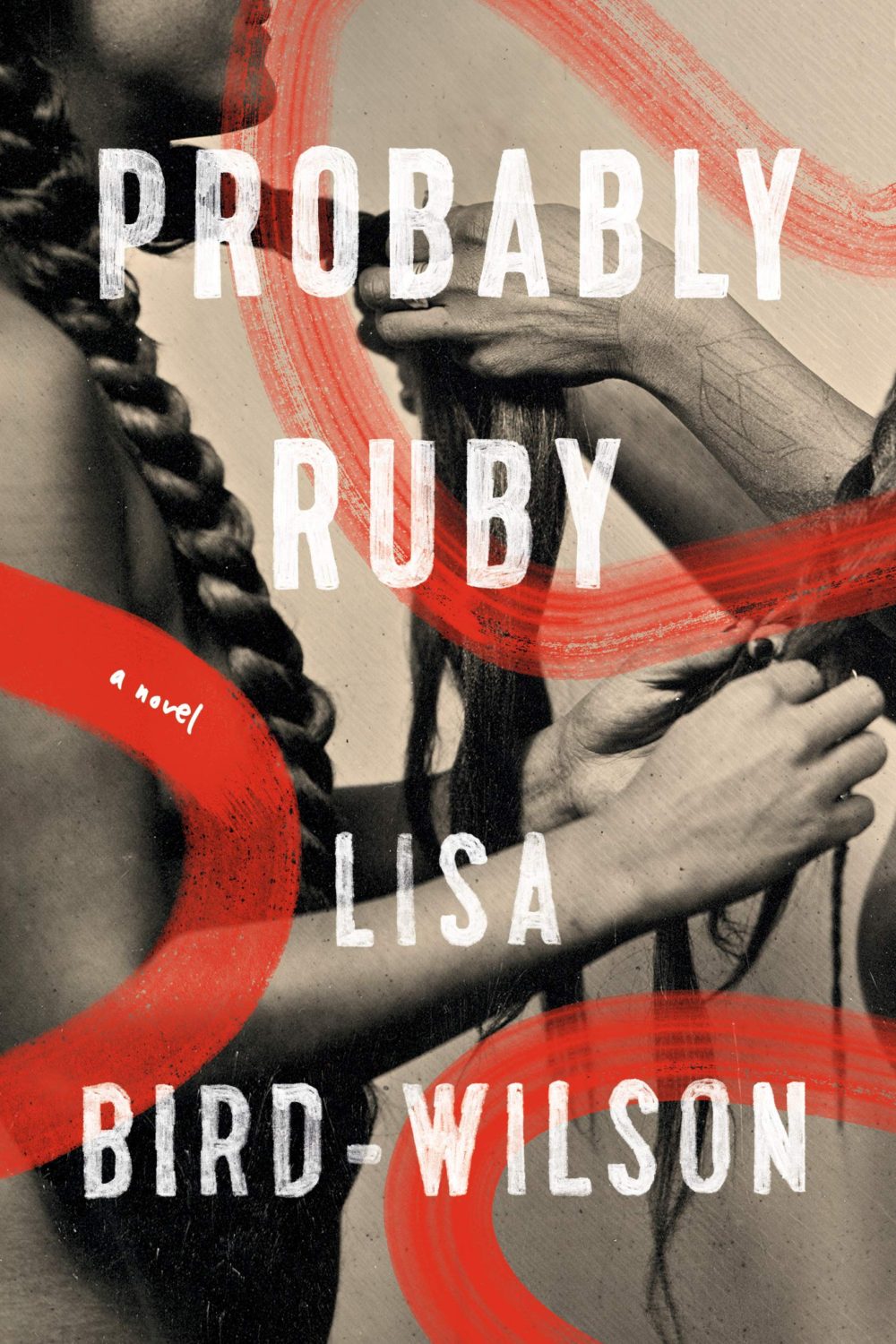
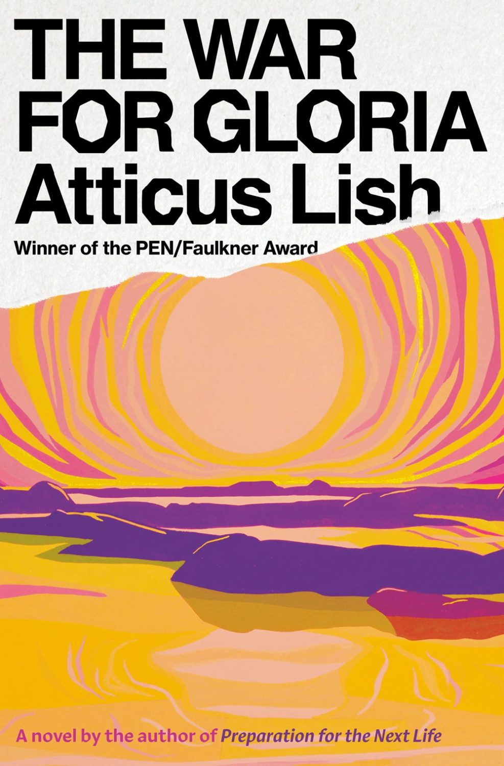
Earlier this year, a Canadian magazine asked me what the latest trends in book cover design were. I don’t think I had a very satisfactory answer. 2021 felt very much like a continuation of 2020, which itself felt like a year on hold.
The trends that came to mind were not exactly new. In no particular order: big faces (big sunglasses!); cropped faces; hands; mouths; postmodern typefaces;1 big skies; rainbows; gradients; the colour orange; psychedelia; collage; contemporary painting.
A lot was made of “blob” covers this year. I’m not sure that anything has really changed since Vulture published this article about “blocky” covers in 2019. They seemed like much the same thing.
Design is about the constraints and, as it turns out, the constraints around designing commercial literary fiction covers that have to work just as well online as in bookstores can lead to similar design solutions — large, legible type, and bright, abstract backgrounds. 2 The surprising thing is not that a few covers look the same when you squint; it’s that more of them don’t.
There were a lot of good covers (that didn’t look alike) in 2021. LitHub posted 101 of them. Still, it didn’t exactly feel like a vintage year.
Do I say that every December? Possibly.
A few years ago I worried that covers were moving in a more conservative direction, particularly at the big publishers. I’m not sure this has come to pass, at least not in the US. There are plenty of covers from the big, prestigious American literary imprints in this year’s list, as there were last year, and every year before that.
There are fewer covers from the UK in this year’s list than in previous years though, and I feel less confident about the situation there. From a distance, things seem a little sedate. I may be mistaken. It’s quite possible I haven’t see enough covers — or perhaps enough of the right ones — from British publishers to get a good sense of the overall picture.3
It would not be a surprise, however, if publishers were feeling a little risk-averse at the moment. We are two years into a global pandemic, experiencing a major supply chain issues, and living through a seemingly endless series of sociopolitical crises.
Nor would it be a surprise if designers were personally feeling the effects too — I’m not sure we are talking about this enough, and I’m not sure I know how to.
Thank you to everyone who has supported the blog in 2021. It means a lot. Here are this year’s book covers of note…

After the Sun by Jonas Eika; design by Lauren Peters-Collaer; art by Dorian Legret (Riverhead / August 2021)

Amoralman by Derek Delgaudio; design by John Gall (Knopf / March 2021)
Also designed by John Gall:

Klara and the Sun by Kazuo Ishiguro; design John Gall (Knopf / March 2021) 
The Republic of False Truths by Alaa Al Aswany; design John Gall (Knopf / August 2021)

Animal by Lisa Taddeo; design by Greg Heinimann (Bloomsbury / June 2021)
Greg Heinimann talked to Creative Review about his work in April.

Are You Enjoying? by Mira Sethi; design by Janet Hansen (Knopf / April 2021)

Antonio by Beatriz Bracher; design by Janet Hansen (New Directions / March 2021) 
Stranger to the Moon by Evelio Rosero; design by Janet Hansen (New Directions / September 2021) 
Speak, Okinawa by Elizabeth Miki Brina; design by Janet Hansen (Knopf / February 2021)

Ariadne by Jennifer Saint; design by Joanne O’Neill (Flatiron Books / May 2021)
Also designed by Joanne O’Neill:

Cultish by Amanda Montell; design by Joanne O’Neill (Harper Wave / June 2021) 
Once Upon a Time in Hollywood by Quentin Tarantino; design by Joanne O’Neill; art by Paul Mann (Harper / November 2021)

he Art of Wearing a Trench Coat by Sergi Pàmies; design by Arsh Raziuddin and Oliver Munday (Other Press / March 2021)

The Atmospherians by Alex McElroy; design by Laywan Kwan (Atria / May 2021)
Black Village by Lutz Bassmann; design by Anne Jordan (Open Letter / December 2021)

A Calling for Charlie Barnes by Joshua Ferris; design by Gregg Kulick (Little Brown and Company / September 2021)

Come On Up by Jordi Nopca; design by Roman Muradov (Bellevue Literary Press / February 2021)

Consent by Vanessa Springora; design by Stephen Brayda; art by Rozenn Le Gall (Harpervia / February 2021)
Stephen Brayda talked about his design for Consent with Spine Magazine.
Also designed by Stephen Brayda:

Their Eyes Were Watching God by Zara Neale Hurston; design by Stephen Brayda; art by Patrick Dougher (Amistad Press / January 2021) 
I Was Never the First Lady by Wendy Guerra; design by Stephen Brayda; art by Liset Castillo (Harpervia / September 2021)

The Copenhagen Trilogy by Tove Ditlevsen; design by Na Kim (FSG / January 2021)
Na Kim talked to PRINT about her career and the designs for the Ditlevsen series in February. If, like me, you were wondering about typeface on the covers, it’s Prophet from Dinamo apparently.


Crying in H Mart by Michelle Zauner; design by Na Kim (Knopf / April 2021)
Also designed by Na Kim:

Pure Flame by Michelle Orange; design by Na Kim (Farrar, Straus and Giroux / June 2021) 
Believers by Lisa Wells; design Na Kim; art by Lisa Ericson (Farrar, Strauss & Giroux / July 2022) 
Fulfillment by Alex MacGillis; design by Na Kim (Farrar, Straus and Giroux / March 2021)

Damnation Spring by Ash Davidson; design by Jaya Miceli; art by Jeremy Miranda (Scribner / August 2021)

Dead Souls by Sam Riviere; design by Jamie Keenan; paper engineering and photography by Gina Rudd (Weidenfeld & Nicholson / May 2021)
Also designed by Mr. Keenan:

Night Train by A.L. Snijders; design by Jamie Keenan (New Directions / October 2021) 
A Shock by Keith Ridgway; design by Jamie Keenan (New Directions / July 2021)

The Delivery by Peter Mendelsund; design by Alex Merto (Farrar, Straus and Giroux / February 2021)
Also designed by Alex Merto:

Recent East by Thomas Grattan; design by Alex Merto (MCD / March 2021) 
The Revelations by Erik Hoel; design by Alex Merto (Abrams / April 2021)
Detransition Baby by Torrey Peters; design by Rachel Ake Keuch (One World / January 2021)

Dog Flowers by Danielle Geller; design by Anna Kochman; illustration by Mike McQuade (One World / January 2021)

Double Trio by Nathaniel Mackey; design by Rodrigo Corral and Boyang Xia (New Directions / April 2021)


Falling by T. J. Newman; design by David Litman (Simon & Schuster / July 2021)
Also designed by David Litman:

The Final Girl Support Group by Grady Hendrix design by David Litman (Berkley Books / July 2021) 
Look For Me and I’ll Be Gone by John Edgar Wideman; design by David Litman (Scribner / November2021)

Fight Night by Mirian Toews; design by Patti Ratchford; illustration by Christina Zimpel (Bloomsbury / October 2021)

Filthy Animals by Brandon Taylor; design by Luke Bird (Daunt Books / June 2021)
Also designed by Luke Bird:

The Dangers of Smoking in Bed by Mariana Enriquez; design by Luke Bird ; illustration by Pablo Gerardo Camacho (Granta / April 2021) 
Tokyo Redux by David Peace; design by Luke Bird (Faber & Faber / June 2021)
Foucault in Warsaw by; design Daniel Benneworth-Gray (Open Letter / June 2021)

God of Mercy by Okezie Nwọka; design Sara Wood (Astra House / November 2021)
Sara Wood talked about her design for God of Mercy with Spine Magazine.

I Love You But I’ve Chosen Darkness by Claire Vaye Watkins; design by Rachel Willey (Riverhead / October 2021)

July by Kathleen Ossip; design by Alban Fischer (Sarabande Books / June 2021)
Like Me by Hayley Phelan; design Emma Dolan (Doubleday Canada / July 2021)

Living in Data by Jer Thorp; design by Rodrigo Corral; art by Andrew Kuo (MCD / May 2021)

The Making of Incarnation by Tom McCarthy; design by Peter Mendelsund (Knopf / November 2021)

Matrix by Lauren Groff; design by Grace Han (Riverhead / September 2021)

Mona by Pola Oloixarac; design by Thomas Colligan (Farrar, Straus and Giroux / March 2021)

Mother for Dinner by Shalom Auslander; design by Jack Smyth (Picador / February 2021)
Jack Smyth talked to Totally Dublin about his work earlier this year.
Also designed by Jack Smyth:


Pure Gold by John Patrick McHugh; design by Jack Smyth (New Island Books / February 2021) 
Last Words on Earth by Javier Serena; design by Jack Smyth (Open Letter / September 2021)

Mrs Death Misses Death by Salena Godden; design by Gill Heeley (Canongate / January 2021)

Nectarine by Chad Campbell; design by David Drummond (Signal Editions / May 2021)

Nightbitch by Rachel Yoder; design by Emily Mahon (Doubleday / July 2021)

No One Is Talking About This by Patricia Lockwood; design Lauren Peters-Collaer (Riverhead Books / February 2021)
Also designed by Lauren Peters-Collaer:

After the Sun by Jonas Eika; design by Lauren Peters-Collaer; art by Dorian Legret (Riverhead / August 2021) 

The Mission House by Carys Davies; design by Lauren Peters-Collaer (Scribner / February 2021)

O by Steven Carroll; design by Gray318 (HarperCollins Australia / February 2021)
Also designed by Gray318:

Beautiful World, Where Are You? by Sally Rooney; design by Gray318 (Farrar, Straus & Giroux / September 2021) 
Orwell’s Roses by Rebecca Solnit; design by Gray318 (Viking / October 2021)
If you’re wondering about the Super-Seventies Sally Rooney typeface, it is Ronda designed by Herb Lubalin and Tom Carnese (I only know because I asked).

Once More With Feeling by Sophie McCreesh; design by Jennifer Griffiths (Anchor Canada / August 2021)

On Time and Water by Andri Snær Magnason; design Zoe Norvell (Open Letter / March 2021)

Outlawed by Anna North; design by Rachel Willey (Bloomsbury / January 2021)

Paradise by Lizzie Johnson; design by Elena Giavaldi (Crown / August 2021)

La Part des Chiens by Marcus Malte; design by David Pearson (Editions Zulma / April 2021)
Also designed by David Pearson:

Anarchism and the Black Revolution by Lorenzo Kom’Boa Ervin; design by David Pearson (Pluto Press / October 2021) 
Black People in the British Empire by Peter Fryer; design by David Pearson (Pluto Press / June 2021) 
Comic Timing by Holly Pester; design by David Pearson (Granta / February 2021)

The Plague by Albert Camus; design by Sunra Thompson (Knopf / November 2021)

The Plot by Jean Hanff Korelitz; design by Anne Twomey (Celadon Books / May 2021)

Rabbit Island by Elvira Navarro; design by Gabriele Wilson (Two Lines Press / February 2021)
Gabriele Wilson talked about her cover design for Rabbit Island with Spine Magazine.
Gabriele Wilson is doing some lovely work for Two Lines Press:

Nancy by Bruno Lloret; design by Gabriele Wilson (Two Lines Press / April 2021) 
Empty Wardrobes by Maria Judite de Carvalho, translated by Margaret Jull Costa; design Gabriele Wilson (Two Lines Press / October 2021) 
Kaya Days by Carl de Souza; design by Gabriele Wilson (Two Lines Press / September 2021)

Red Island House by Andrea Lee; design by Tristan Offit (Scribner / March 2021)

The Removed by Brandon Hobson; design by Elizabeth Yaffe (Ecco / February 2021)
The Shimmering State by Meredith Westgate; design Chelsea McGuckin (Atria / August 2021)

A Shock by Keith Ridgway; design by Nathan Burton (Picador / June 2021)

Summerwater by Sarah Moss; design by June Park (Farrar, Straus & Giroux / January 2021)

Virtue by Hermione Hoby; design by Ben Denzer (Riverhead / July 2021)

This Weightless World by Adam Soto; design by Tyler Comrie (Astra House / November 2021)
Also designed by Tyler Comrie:

The China Room by Sunjeev Sahota; design by Tyler Comrie (Viking / July 2021) 
King Richard by Michael Dobbs; design by Tyler Comrie (Knopf / May 2021) 
Don’t Shed Your Tears for Anyone Who Lives on These Streets by Patricio Pron; design by Tyler Comrie (Vintage / April 2021)
Thank you to everyone who has supported the blog in 2021. It means a lot.
- I am not convinced that the term “postmodern” quite captures what I mean here (and/or worse, implies something different in the context of typography), but it’s the best I’ve got. I’m not talking about the kind of experimental typography you might associate with the likes of Wim Crouwel or Emigre, or the aesthetic of someone like David Carson. What I am trying to get at is idiosyncratic type that purposely exaggerates or plays with letterforms, and doesn’t conform to function-first modernism. To my mind, this would include some typefaces from the 1960s and 70s, as well as some more contemporary type. In a sense what I am describing is display faces — and I think the eclectic, innovative use of type in Victorian advertising might be an inspiration to designers here — but I don’t think it is just about size. ↩
- an alternative solution is what Australian designer John Durham, AKA Design by Committee, memorably referred to as the “lost dog poster school of cover design”. ↩
- I don’t want to jinx it, but are Canadian covers getting more adventurous? ↩