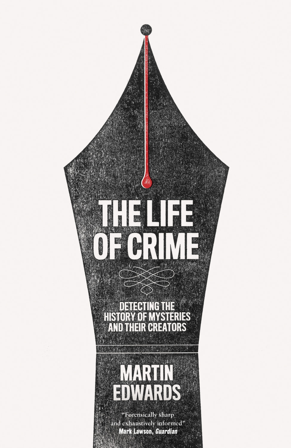
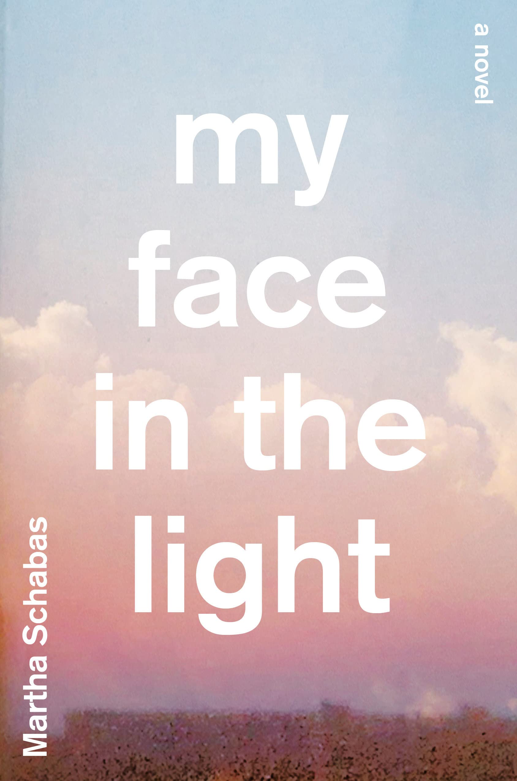
I should, at this point, rename this post “Young Adult Book Covers I Saw Last Year, Quite Liked, and Could Find Some Credits For.” It would be accurate.
December turned out to be really busy. It is every year. I’m not sure why it still catches me out. That said, 2022 did seem to be especially busy for reasons far, far too boring to get into here (yes, I got sick amongst other things).
I had thought, in fact, that it might be time to retire this particular annual post. But then I looked around to see what other YA cover lists had been posted and… well, it wasn’t great. If I don’t do it, who will?
This year’s list — like last year’s — is full of illustrated covers. It seems to be the dominant trend, and I would really like someone more knowledgeable than me to profile some of the illustrators and put their work in its proper context. Maybe there is an art book in it for an enterprising publisher, if there isn’t one already? There are so many great covers from the past couple of years to choose from. 1
Anyway, I hope you enjoy this very late look at some of the YA covers of 2022. Feel free to leave your thoughts below.
“Cover design in the US went from being house-styled, design driven and idiosyncratic (think Grove Press or New Directions or whatever Push Pin was up to) to the ‘big book look’ of the 1970s defined by designers like Paul Bacon. Make the type as large as possible, centre it, and combine with some non-specific imagery. That look still defines what we see on the bestseller list to this day. It established a generic way for covers to look and a familiar shorthand for sales teams and booksellers to understand – ‘aah, this must be a … big book!’. It ignored design principles of layout, composition and conceptual thinking that had been codified over the previous 50 years in favour of a commercial literal-ness. It also took away a lot of the fun.”
Jamie Keenan’s review of Joe Orton and Kenneth Halliwell’s naughty cover for The Secret of Chimneys by Agatha Christie is also a good time.
2022. Twenty twenty-two. Two thousand and twenty-two… “Where did it go?” Or, sobbing, “ are we done yet?” It feels like both. It’s been a year that’s simultaneously dragged on interminably and disappeared in a cognitive blur.
I’m glad other people have already written about it.
At Creative Review, writer and editor Mark Sinclair picked his favourite covers of 2022 and reflected on industry trends in the UK, including the Design Publishing & Inclusivity mentorship program for under-represented creatives launched this year by Ebyan Egal, Donna Payne, and Steve Panton.
Literary Hub posted the best covers of the year as chosen by 31 designers. With a comprehensive 103 covers on the list, it tacitly poses the annual question “what do I have left to add to this conversation?” LitHub have been posting these lists for seven years apparently. I am an ancient desiccated husk.
Fast Company and the Washington Post asked slightly smaller groups of designers to write about their favourites covers.
Designer and art director Matt Dorfman chose the best book covers of 2022 for the New York Times, and empathized with the plight of the designers:
Most often, any personal stylistic expressions in their work are swallowed up in service to the multiple masters — editors, marketing directors, sales teams — who sign off on a book’s cover. There is also the matter of adhering to any one publisher’s dos and don’ts, which can inform mandates about typography, color palettes and production flourishes like embossing or metallic inks. For people employed in a theoretically creative pursuit, designers’ talents are often defined by how effortlessly they can make themselves disappear to serve the book.
Matt Dorfman, New York Times
No one captured the prevailing mood better than this Tom Gauld cartoon. A reminder, if one were needed, that nobody knows anything.
Earlier in the year, Australian reporter Rafqa Touma called out the trend of ‘well dressed and distressed’ young women on covers. As designer Mietta Yans notes, the covers often reflect their books’ stylish and sad protagonists, so I’m not sure this one is on the art departments.
Some of the trends I’ve talked about before spilled over into 2022. Collage, painting (contemporary, and historical — often tightly cropped), big skies, landscapes and seascapes, black and white photography (not just for LGBTQ+ trauma!), retro-ness, idiosyncratic display typefaces. Orange. Pink was in vogue too. The Instagram-ish combination of both pink and orange (sometimes with deep purple-ish blues too) seemed to be very much a thing this year. I suspect this is what happens when you ask designers to make things “pop” one too many times.
It is hard to know if these are genuine trends, or if it is just the stuff I notice. I’m sure there are things going on with commercial covers that I don’t pay enough attention to (although I will not be sad to see the popularity of that flat illustration style — the one that Slate pointed out in TWO THOUSAND AND FIFTEEN! — eventually fade away). I certainly don’t get the sense that everything looks the same, which is often the criticism. There is still room for a little weirdness and that can only be a good thing…
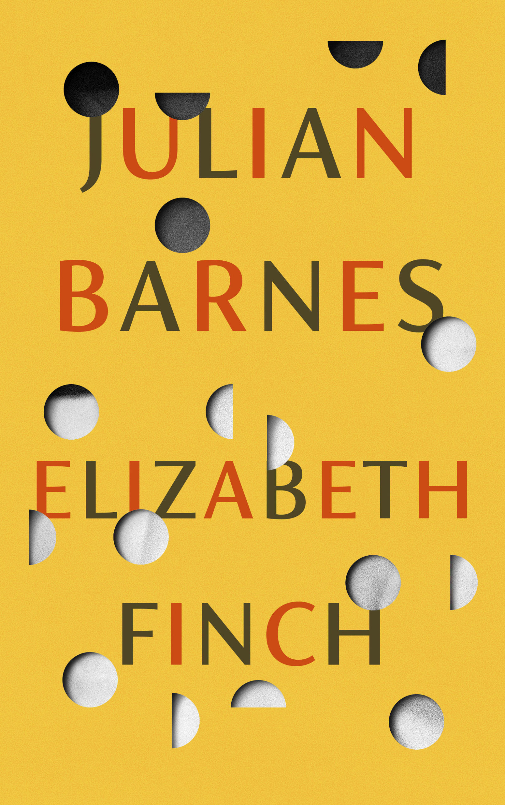
Ghost Music by An Yu; design Suzanne Dean (Harvill Secker / November 2022)Elizabeth Finch by Julian Barnes; design by Suzanne Dean (Jonathan Cape / April 2022)
The Julian Barnes cover also came in blue, and under the die-cut jacket is a beautiful photo from René Groebli’s photoessay The Eye of Love.
Pure Colour by Sheila Heti; design by Na Kim (Farrar, Straus & Giroux / February 2022)
Also designed by Na Kim:
Present Tense Machine by Gunnhild Øyehaug; design by Na Kim (Farrar, Straus & Giroux / January 2022)Run and Hide by Pankaj Mishra; design by Na Kim (Farrar, Straus & Giroux / March 2022)Either/Or by Elif Batuman; design by Na Kim (Penguin Press / May 2022)
You can read about Alban’s design process for Till the Wheels Come Off at Spine.
Worn by Sofi Thanhauser; design by Janet Hansen (Pantheon / January 2022)
Also designed by Janet Hansen:
A Country of Strangers by D. Nurkse; design by Janet Hansen (Knopf / April 2022)Sedating Elaine by Dawn Winter; design by Janet Hansen (Knopf / April 2022)
Yoga by Emmanuel Carrère; design by Rodrigo Corral (Farrar, Straus & Giroux / August 2022)
This month’s post includes a few covers that I missed earlier in the year along side the new and recent releases. I’m starting to think about my annual recap so please let me know if you think I’ve overlooked any other particularly notable covers that stood out for you and/or seemed emblematic of wider trends in 2022.
And just a reminder with all the stuff going on with social media that if you’d prefer to get new posts auto-magically emailed to you, you can subscribe here. I have also re-opened comments on new posts after closing them for a few months if you want to politely share your thoughts below.
“Fuuuuuuuuuck….!” is the only way I can describe the mixture of awe and annoyance that I hadn’t thought of it I felt when I saw this cover. So simple and so clever.
This has a very similar ‘obscured face collage’ feel to Tristan Offit’s cover for Briefly, A Delicious Life by Nell Stevens, which I thought I had posted here earlier in the year but apparently did not (probably because I didn’t — and still don’t! — know who designed the cover of the UK edition (it was designed by Mel Four, photograph by Marta Bevacqua) and I wanted to post them together?).
Pacifique by Sarah L. Taggart; design by Natalie Olsen (Coach House Books / October 2022)
People Person by Candice Carty-Williams; design by Emma A. Van Deun (Scout Press / September 2022)
Mr. Keenan also designed the cover for the Liveright edition of The Waste Land itself a few years ago.
(The US edition of Matthew Hollis’s book, forthcoming from W. W. Norton, also has an interesting cover. If anyone from Norton would like to send me a hi-res image with the design credit, I’ll be happy to add it in!)
It’s been a while since I posted about author, illustrator and designer Coralie Bickford-Smith. In a new video for Penguin Books she talks about her creative process, her work on the original Clothbound Classics, and Penguin’s new Little Clothbound editions.
I’m doing my best to catch up a little bit this month, but there’s no such thing as a quiet month in publishing any more. Just rest assured nobody knows what they’re doing — we’re just here for the chaos and romance…
“Today is wretched and plain. And it is not the bottom, as many people may feel it is. It will get worse; we will go lower. As the Court’s dissent insists, correctly, ‘Closing our eyes to the suffering today’s decision will impose will not make that suffering disappear.‘
And so, with all this laid out, ugly and incontrovertible, the task for those who are stunned by the baldness of the horror, paralyzed by the bleakness of the view, is to figure out how to move forward anyway.
Because while it is incumbent on us to digest the scope and breadth of the badness, it is equally our responsibility not to despair.
These two tasks are not at odds. They are irrevocably twined. As Dahlia Lithwick wondered just a few weeks ago, after the massacre in Uvalde, another clear and awful day: ‘What does it mean, the opposing imperative of honoring the feeling of being shattered, while gathering up whatever is left to work harder?’
It means doing the thing that people have always done on the arduous path to greater justice: Find the way to hope, not as feel-good anesthetic but as tactical necessity.“
Rebecca Traister, ‘The Necessity of Hope’, The Cut
For my art history friends, I believe the painting is “Agnus Dei” by Spanish Baroque artist Francisco de Zurbarán.
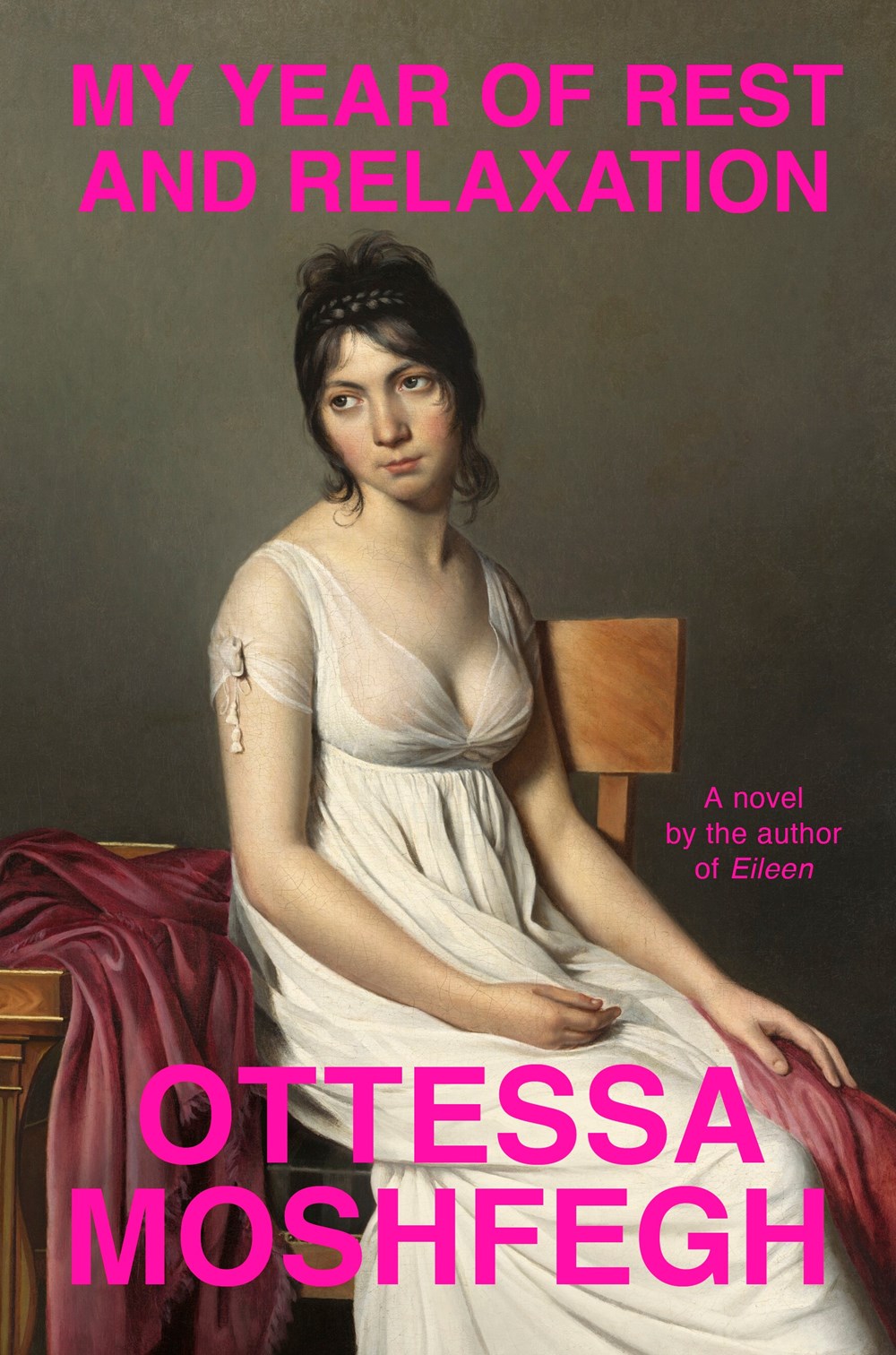
IIRC the cover of Moshfegh’s novel My Year of Rest and Relaxation was designed by Darren Haggar. The painting is by French Neoclassical artist Jacques-Louis David.
I compile these posts over the month and then write this bit at the end if I have anything to say. I really don’t have the words at the moment. Posting about the most superficial of subjects feels faintly ridiculous at the end of yet another awful week. But here we are. I am just going to refer you to Wednesday’s Today in Tabs and say that there a lot of really nice covers this month if you are need of distraction…
Appliance by J. O. Morgan; design by the author (Jonathan Cape / May 2022)
I was reminded of Jon Gray‘s cover for Ilustrado by Miguel Syjuco from what seems like ages ago (2010)… Of course they look nothing alike. I had completely forgotten the pen was at jaunty angle.
The cover of the US edition was designed by Rachel Ake Kuech using a illustration by Grant Haffner. The difference between how Canada represents Canada and how the US represents Canada is…. interesting.
Big vertical light leaks might also be a thing… (Freedomland designed by Henry Sene Yee for Cornell University Press)
We’ve almost made it to the end of April, so that’s something. Thanks to Daniel Benneworth-Gray for the mention earlier this month. It surely means I’m about to disappoint a large number of people — if I have not, in fact, already done so — but I hope you find something you like here…
I believe the Elizabeth Finch cover also comes in yellow, but I wasn’t able to find a hi-res image. If anyone wants to send it over, I’ll be happy to add it.
The jacket also comes in yellow, which feels very on trend to me and the blue and yellow look lovely side by side. Thank you to Suzanne for taking the time to send over the image of the yellow version.
Suzanne also sent over an image of the boards for those of you curious to see what is under the jacket, peeking through the die-cuts. The gorgeous photograph is from René Groebli’s photoessay The Eye of Love.
This is the problem with seeing covers/jackets primarily online. You rarely get to appreciate these finer details. This must be a beautiful book to hold and unwrap.
And I have been trying to recall what both these covers remind me of. Possibly ‘Composition of Circles and Semicircles‘ by abstract artist Sophie Taeuber-Arp?
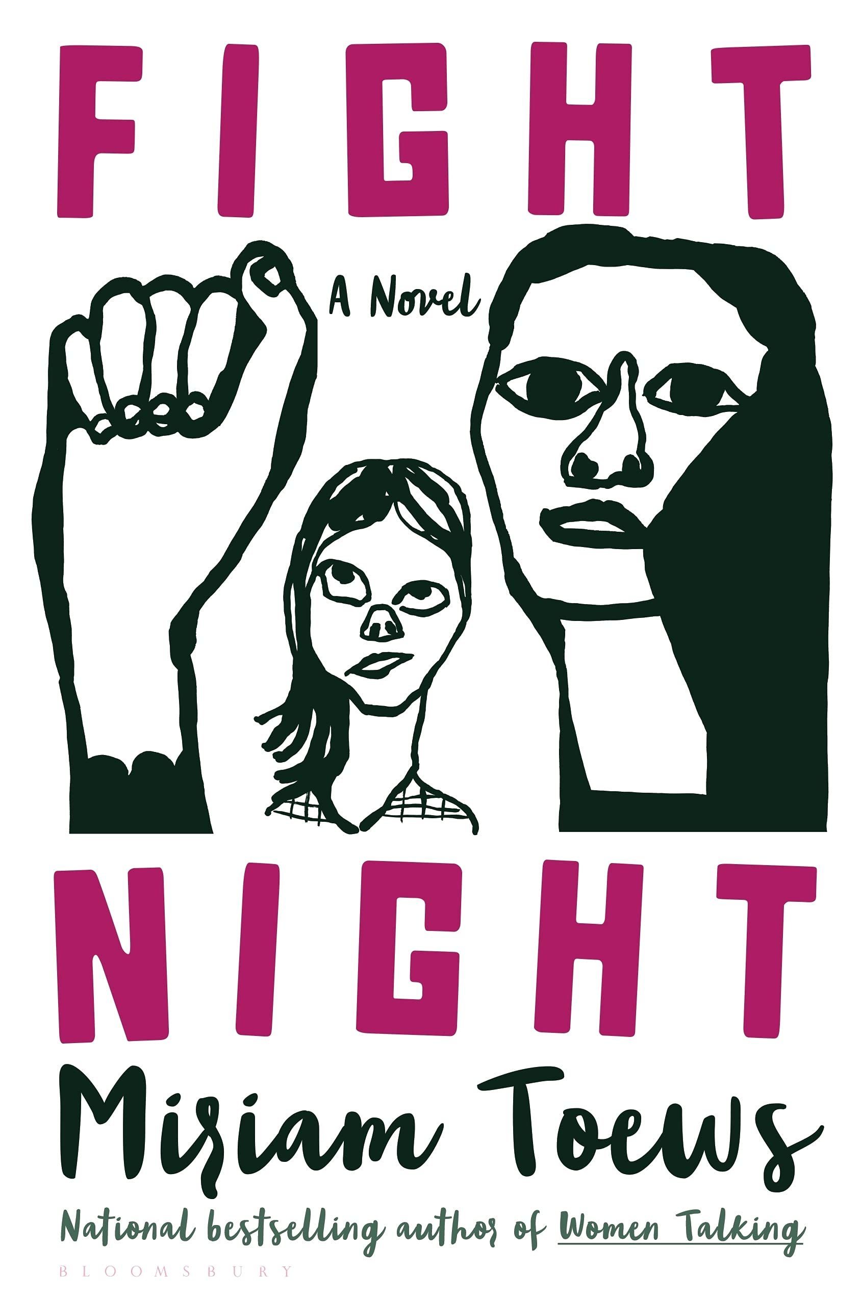
The black and white illustration and pink type reminded me of the US cover for Fight Night by Mirian Toews, designed by Patti Ratchford with an illustration by Christina Zimpel, from last year.
Boothby Karen Joy Fowler; design by Tal Goretsky (G.P. Putnam’s Sons / March 2022)
If you’d asked me to guess sight-unseen, I would’ve 100% said this was designed by someone else. It just goes to show that designers are talented, versatile people and I know nothing (NOTHING).
I am very, very late to this, but Penguin are in the process of reissuing Len Deighton’s thrillers as Modern Classics with new covers by Jim Stoddart inspired by Raymond Hawkey’s original paperback designs.
There are a lot more titles available now (Len Deighton wrote a lot of books!), but you can read more about the first wave of reissues in this Creative Review article from last year, and I’ve posted a few of my favourite covers below.
These posts are such a last minute scramble I don’t usually offer much in the way of commentary. It is hard to ignore, however, how many of my selections this year are illustrated. This may be a reflection of my personal preferences. Certainly, it isn’t new. As I mentioned in my look back at the year’s adult covers, the trends in 2021 felt very much like a continuation of the previous couple of years. Even so, I was struck by the sophistication and the range of YA illustrations this year. There are some illustrators whose work appears here more than once, but I don’t get the sense that there is a dominant style across category. It seems to depend very much on the specifics of the genre and the age range of the readership. That said, there is, perhaps, a common theme of ornate detail and decoration.
I am also finding it harder to differentiate between covers for more mature YA readers and adult covers of the same genre these days. If the cover blurbs and other identifiers (“A Novel”) didn’t give it away, the combination of the typography, colour palette, and the apparent age of the protagonist depicted used to give me a clue. Now it seems to me that there is a blurring of the lines, and I’ve had to check a couple of times recently to be sure of the intended readership age. I’d be curious to know if this is intentional on the part of publishers.
Anyway, there are some fantastic covers this year. Buzzfeed has a really decent list with design and illustration credits too if you’re looking for a second opinion (not that they need any clicks from me!). You can find my 2020 list here if you are interested.
Drawn That Wayby Elissa Sussman; design by Sarah Creech; lettering and illustration by art lettering Francesca Protopapa (Simon & Schuster Books for Young Readers / September 2021)
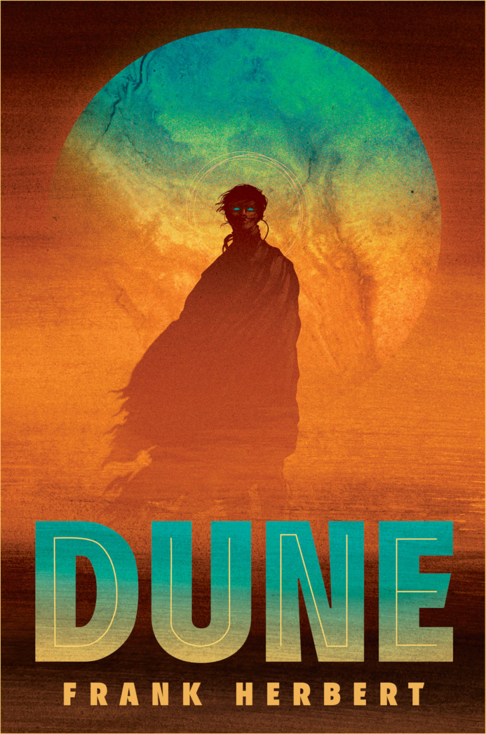
Aside from generally being a terrific SFF illustrator, I believe Matt Griffin illustrated the cover of Ace Books’ deluxe hardcover edition of Dune by Frank Herbert a couple of years ago, so he seems like an inspired choice here.
Love is for Losers by Wibke Brueggemann; design by Rachel Vale (Macmillan Children’s Books / January 2021)
The cover of the US edition, published by Farrar, Straus and Giroux (BYR) in February, was designed by Aurora Parlagreco with an illustration by Sally Nixon. I like it a lot too. It’s interesting to see the contrast between the UK and US markets.
Me (Moth) by Amber McBride; design and illustration by Richard Deas (Feiwel & Friends / August 2021)
(Another cover image with a roundel. Apologies. At least it is somewhat less obtrusive here.)
Yolk by Mary H. K. Choi; design Lizzy Bromley; cover art by gg (Simon & Schuster Books for Young Readers / March 2021)
The covers of Emergency Contact and Permanent Record by Mary H.K. Choi designed by Lizzy Bromley with art by gg have featured in previous year’s lists.