
Multiple people sent me this 2016 Seth Fleishman cartoon after The New Yorker re-posted it to Instagram recently. I’m not exactly sure what they were trying to tell me…
1 CommentBooks, Design and Culture
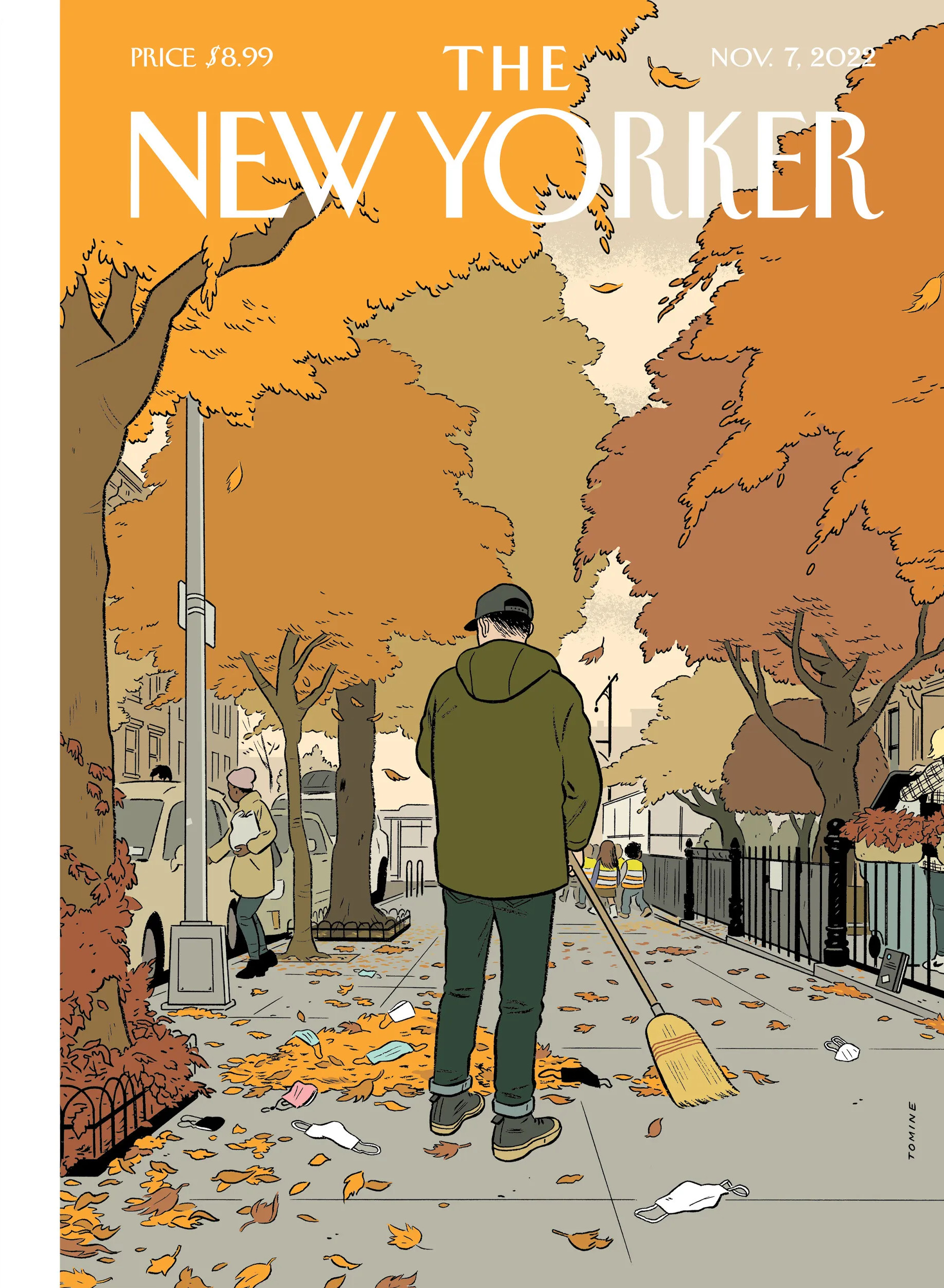
I was raking leaves in Toronto last night where it also feels like a lot of folks have discarded masks, so Adrian Tomine‘s latest cover for The New Yorker resonated with me.
The copy of The Loneliness of a Long-Distance Cartoonist propped up against the railing is also a nice touch.
1 Comment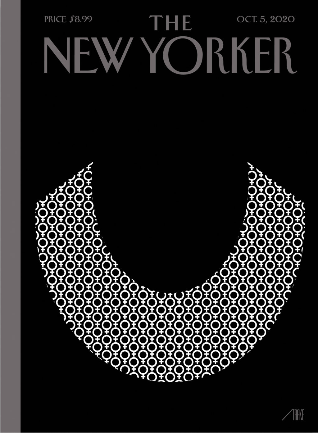
Bob Staake’s new cover for The New Yorker commemorates Ruth Bader Ginsburg, who died aged 87 last week.
It brought to mind Stephanie Ross’s cover for the 2018 biography of Ginsberg by Jane Sherron De Hart published by Knopf, which also focused on her lace collar.


I love this illustration for the June 29 issue of The New Yorker magazine by Matt Willey. It accompanies ‘The Rescue Will Begin in Its Own Time‘, a series of short pieces by Franz Kafka that have not been published in English before, and that will appear this fall in the New Directions book The Lost Writings.
Comments closed
After posting Chris Ware’s pandemic cover for The New Yorker earlier this week, I remembered I had also meant to post Christoph Niemann’s “Critical Mass” cover from two weeks ago. It may not pull at your heart strings the way Ware’s cover does, but it’s a brilliant and prescient illustration of the pandemic.
Comments closedI believe that the best concepts develop in the process of drawing. I don’t usually have ideas pop in my head fully formed when I’m not at my desk. Yet the genesis for this image, the idea of a sneezing domino standing on top of a globe packed with other domino pieces, came to me when I was lying in bed, trying to fall asleep… I got up again and sketched down the idea. Only the next day, when I sat down to turn the concept into a proper art work, did I realize that the globe and the pieces actually resemble a virus. In the end, it still proves my theory that all decent ideas come together when you actually draw them.

“As a procrastination tactic, I sometimes ask my fifteen-year-old daughter what the comic strip or drawing I’m working on should be about—not only because it gets me away from my drawing table but because, like most kids of her generation, she pays attention to the world. So, while sketching the cover of this Health Issue, I asked her.
“ ‘Make sure it’s about how most doctors have children and families of their own,’ she said.
Chris Ware’s heartbreaking cover for the New Yorker‘s Health Issue arrives in the midst of the covid-19 pandemic.
I was reminded of his 2009(!) cover for the New Yorker‘s from Halloween edition in which parents all look at their phones while their kids trick-or-treat. It’s an interesting contrast…

Comments closed
Well, this is a little close to home isn’t it?

Tom Gauld for The Guardian.
On a related note, Tom’s musical cover for April 16 edition of The New Yorker is lovely.
Comments closed Oh, Batman.
(Zachary Kanin for The New Yorker).
Comments closed
Rebecca Mead’s long profile of publisher Gerhard Steidl for The New Yorker is a wonderful, fascinating read:
Each Steidl title is unique, printed with a bespoke combination of inks and papers. But to the informed eye, and the informed hand, a Steidl book is as distinctive as an Eggleston photograph. Unlike another German art publisher, Taschen—which is known for reproducing risqué images by the likes of Helmut Newton in enormous formats that would crush most coffee tables to splinters—Steidl produces books that invite holding and reading. Steidl dislikes the shiny paper that is often found in photography books, and prefers to use uncoated paper, even though it takes longer to dry and thus makes a printing cycle more expensive. He opts for understatement even with projects that would tempt other publishers to be ostentatious. “Exposed,” a collection of portraits of famous people by Bryan Adams, the rock star turned photographer, has no image on its cover. Bound in blue cloth, the book looks as if it might be found on a shelf in an academic library. Steidl wants his creations to satisfy all the senses. When he first opens a book, he holds it up close to his nose and smells it, like a sommelier assessing a glass of wine. High-quality papers and inks smell organic, he says, not chemical. To the uninitiated, a Steidl book smells rather like a just-opened box of children’s crayons.
I love this part about the attention to the detail:
Comments closedDesigning a book’s packaging is a process Steidl particularly relishes. “He wants to pick the cover, he wants to pick the endpapers,” [Robert] Polidori told me. “He treasures this limited one-on-one time with the artist. It’s almost a love act.” Sometimes Steidl indulges in a brightly colored ribbon for a bookmark, like statement socks worn with a formal suit. He pays attention to elements that barely register with most readers, such as the head and tail bands—colored silk placed where the pages attach to the spine. “It’s a tiny bit of fashion,” Steidl said. “With Karl [Lagerfeld], it is the buttons. With me, it is the head and tail bands.” For Gossage, he chose black bands and black endpaper, to contrast with the colored ink on the pages. The endpaper was made from cotton, and would cost thirty cents per book, as opposed to the seven cents it would cost if he used offset paper. “Using the cheaper one saves significant money for the shareholders,” he said. “But I am the only shareholder.”

At The New Yorker, Jia Tolentino profiles G. Willow Wilson, the writer behind Ms. Marvel, a superhero who is (in her current incarnation) a teenage Muslim from Jersey City:
The première of “Ms. Marvel” sold more copies digitally than it did in print—a company first. Marvel doesn’t release digital-sales numbers, but piecemeal statistics have shown female characters performing especially well in digital formats. Traditionally, comic books are purchased in single, floppy issues at dedicated brick-and-mortar shops, but these can be intimidating spaces for novices: when I walked into Forbidden Planet in Manhattan, I found myself wishing for the ability to act like I belonged. Some readers may simply opt to buy collected issues in paperbacks at regular bookstores or, increasingly, to download e-books. There are now, Wilson suggested, two audiences for comic books, and many people in the industry “are loath to recognize that these two audiences might want two very different things out of the same series. They don’t shop in the same places, they don’t socially overlap, and their tastes might not overlap.”
The relationship between this divided landscape and the most recent Presidential election is not lost on her. At the coffee shop, as a barista cleared our plates, we talked about how the stakes of every identity-politics debate feel heightened since November—and also about new alliances that seem to be forming in the election’s wake. Wilson spoke with some astonishment about the fact that she could include a gay secondary character in “Ms. Marvel”—the blond, popular Zoe—and still have mothers and daughters show up to her readings in hijabs. “It’s funny. Those right-wing bloggers who said my work was part of some socialist-Muslim-homosexual attack on American values, they really created the thing they feared. There wasn’t a socialist-Muslim-homosexual alliance before, but there sure as fuck is one now, and I love it.”
I don’t read a lot of comics from Marvel (or DC for that matter) these days, but Ms. Marvel is truly a joy.
Comments closed
I have to confess that I haven’t seen the TV adaptation of Philip K. Dick’s The Man in the High Castle, but I found Aaron Bady’s discussion of the series — and how it differs from the book — at The New Yorker, quite interesting:
In another year, the show’s insistence on humanizing fascists might have seemed like a provocative choice—an effort, like Arendt’s, to understand how normal people can find it in themselves to commit the worst atrocities. In 2017, however—when it is more urgent than ever to distinguish right from wrong, real news from fake, and differences of political opinion from the dangerous undermining of democracy—it feels instead like a pernicious cynicism. At the same time, the series depicts the ideological excesses of the Resistance in the most unforgiving light. More like Al Qaeda than French partisans of the nineteen-forties, they are grim, unsympathetic zealots, who use scattershot terror tactics and have no qualms about causing the suffering of innocent bystanders…
…This nihilism would have been alien to Philip K. Dick… Dick’s “The Man in the High Castle” focussed on how everyday people struggle to carve out lives of integrity in the face of evil, even while knowing—perhaps especially while knowing—that their actions will not ultimately change the course of history. In the novel, Frank Frink’s primary struggle is how to be an artist, not how to overthrow the Reich. In Dick’s view, this, too, was a form of resistance: his major theme as a novelist was the unavoidable complicity of living “normally” under empire; he believed in evil because he saw it everywhere. But if there wasn’t much hope in Dick’s fiction, that was exactly the point of writing it: even in the midst of a triumphant fascist dystopia, the quest for intellectual autonomy lived on in the dissident imaginations of those who could envision a different kind of world. It is telling, too, that the “man in the high castle” was in Dick’s novel not a collector of film reels but a novelist—an eccentric inventor of alt-histories who served as a stand-in for Dick himself. The character was, above all, a tribute to artists who dare to resist power in dark times.
The cover of the Penguin Modern Classic edition (pictured above) was design by Jim Stoddart.
Comments closed