Skip to content

Tag: Publishing

More than…

In a recent op-ed for The NY Times, ‘There’s More to Publishing Than Meets the Screen’, Jonathan Galassi, president of Farrar, Straus & Giroux, asked:

Are e-books a new frontier in publishing, a fresh version of the author’s work? Or are they simply the latest editions of the books produced by publishers like Random House?

This is essentially a more articulate framing of a question I asked here a couple of weeks ago. But unsurprisingly Galassi offers a far more compelling defence of Random House than I could manage:

[S]hould another company be able to issue e-book versions of Random House’s editions without its involvement? An e-book version of Mr. Styron’s “The Confessions of Nat Turner” will contain more than the author’s original words. It will also comprise Mr. Loomis’s editing, as well as all the labor of copy editing, designing and producing, not to mention marketing and sales, that went into making it a desirable candidate for e-book distribution. Mr. Styron’s books took the form they have, are what they are today, not only because of his remarkable genius but also, as he himself acknowledged, because of the dedicated work of those at Random House.

I think the point here is that books are often a collaboration between author and publisher, and in this sense publishers add value — or, at least, they did in the past. Galassi’s example is Styron, but we now know that Raymond Carver’s editor Gordon Lish was instrumental in defining the author’s trademark style. No doubt there are other high profile examples…

As Peter Ginna, director of Bloomsbury Press, points out in this post, and in a comment on my post here, there are definitely some issues around royalty payments that Random House need to address. But while e-books are little more than converting the file format of a work, I do have some sympathy for Random House’s argument about rights.

2 Comments

Favourite New Books of 2009

Unlike indomitable, indefatigable Sarah Weinman, I didn’t read over 462 books this year (think about it — that’s a book-and-a-quarter a day people!), so I couldn’t possibly post a best of the year list and keep a straight face. Still, I thought it might be nice to post an unscientific list of my 10 favourite new books of 2009 on the very last day of the year.

Compiling the list, I realised that while I finally read a lot of books I’d been meaning to get to for a while (including the brilliant The Invention of Morel, the insane — and insanely good — Pop. 1280 and the classic New Grub Street), I didn’t actually read a lot of new fiction this year. Mostly it was the result of my monstrous indifference to the majority of novels published in 2009, but there were more than few books — The Girl Who Played With Fire, Invisible, Let The Great World Spin, There Once was a Woman Who Tried to Kill Her Neighbor’s Baby, True Deceiver, When I Forgot, Wolf Hall, et al — that are sitting in a big pile that I won’t get to until 2010.

I also realised that — try as I might — it would be impossible to leave out books that I had worked on in some capacity. Apparently I need to get out more, but it I think this is a more universal symptom of work-life, digital-life, and “real” unplugged-life blurring (sometimes uncomfortably) for a lot of people in publishing (or is it just me?).

Anyway, with this in mind, all the books on this list distributed in Canada by Raincoast are identified with an asterisk. They’re here because I genuinely like them, but you’re an adult so you can make up your own mind about their merit.

And one last note: All the title links are to the Book Depository in the UK because they readily ship books worldwide. However, I have also linked to all the respective publishers, and added an IndieBound widget to the left sidebar (with links to all the listed titles) for anyone in the US who would like to support their local independent bookstore (Canadians: You can find your local indie via the CBA website).

And so on to the ten…

ASTERIOS POLYP BY DAVID MAZZUCCHELLI
Pantheon, ISBN 9780307377326

My Advent Books recommendation for 2009, Asterios Polyp made it on to so many best of 2009 lists that Mazzuccelli’s beautifully understated and deceptively nuanced book almost feels over-hyped at this point. But you know what? It couldn’t possibly leave it off this list. I loved it. It’s a elegantly balanced combination of show and tell, and like Maus, Palestine, and, hell, even Watchmen before it, Asterios Polyp feel likes it expands the possibilities of the medium. Oh and Polyp reminds me of my art teacher at school — right down to the way he holds his cigarette — which, to be honest, is more than enough reason to be on this list.

BIBLIOGRAPHIC: 100 CLASSIC GRAPHIC DESIGN BOOKS BY JASON GODFREY
Laurence King ISBN 9781856695923

A wonderful visual shopping list for any design-minded book collector, each of 100 classic graphic design books in this “ideal library” is shown with its cover and a number of spreads. It’s gorgeous and inspiring.

(NB: I’m hoping to have an interview with Jason in the New Year. Fingers crossed).

BIRD* BY ANDREW ZUCKERMAN
Chronicle
, ISBN 9780811870986

Zuckerman’s crisp hyper-real photographs (also see Creature, Wisdom) retain a warmth and genuineness that so often goes AWOL in contemporary digital photography. I mean god knows how much — or how little — work was actually done in Photoshop after the fact, but somehow the grace and natural beauty of the birds comes through. There is nothing clever, or even particularly gimmicky about this book, it is just really, really well done.  The perfect coffee table book.

CHARLEY HARPER: AN ILLUSTRATED LIFE BY TODD OLDHAM
Ammo Books ISBN 9781934429372

I’d been coveting the oversize and limited editions of this unashamedly beautiful collection of Harper’s paintings and illustrations for a while before Ammo released an affordable hardcover edition this year. This is simply a wonderful, inspiring book, and now there is no excuse not to own it.

A DRIFTING LIFE* BY YOSHIHIRO TATSUMI
Drawn and Quarterly ISBN 9781897299746

Yoshihiro Tatsumi’s lovingly rendered 856 page manga portrait of an artist as a young man in post-war Japan was criminally overlooked in the best of the year lists in my humble opinion. It apparently took Tatsumi a decade to complete. “Epic” is just about the only word that covers it.

A PDF preview is available at D+Q.

THE HANDY BOOK OF ARTISTIC PRINTING* BY DOUG CLOUSE AND ANGELA VOULANGAS
Princeton Architectural Press ISBN 9781568987057

The subtitle — “A Collection of Letterpress Examples with Specimens of Type, Ornament, Corner Fills, Borders, Twisters, Wrinklers, and other Freaks of Fancy” — probably sums up this lovely book best. It is, admittedly, slightly bonkers, but it’s exactly the kind of thing that will eventually go out of print and then you’ll wish you’d bought one when you had the chance (and no, I won’t sell you mine).

THE HUNTER BY RICHARD STARK, ADAPTED & ILLUSTRATED BY DARWYN COOKE
IDW, ISBN 9781600104930

Bleak, snappy, and fabulously illustrated, Darwyn Cooke’s adaptation of Richard Stark’s hardboiled Parker novel is pretty much pitch perfect. I only hope more Parker adaptations are on the way. Pretty, pretty please.

LEVIATHAN OR, THE WHALE BY PHILIP HOARE
Fourth Estate ISBN 9780007230143

I deliberated over whether to include Philip Hoare’s charming book about whales in this list. Not that it isn’t worthy — it certainly is (it won the Samuel Johnson Prize for Nonfiction earlier this year) — but because it was first published in the UK 2008 and it is not available in North America until 2010 (HarperCollinsEcco imprint are releasing it under the title The Whale in February). So does it count as a 2009 title? In the end I decided it was eligible because it was published in paperback in 2009 and, ultimately, this is the year I read it (admittedly in hardcover) and it was too good to leave out. And Philip Hoare is from my home town. But that has nothing to do with it. Honestly.

THE MAGICIANS BY LEV GROSSMAN
Viking
ISBN 9780670020553


The privileged offspring of Harry Potter and The Secret History (and/or Whit Stillman) invade Narnia and shoot things. It’s almost as good as it sounds, although it’s a shame the protagonist is, to be quite frank, a simpering cock. Nice villain though.

NAÏVE: MODERNISM AND FOLKLORE IN CONTEMPORARY GRAPHIC DESIGN ED. BY R. KLANTEN AND H. HELLIGE
Gestalten ISBN 9783899552478

A tidy collection of contemporary graphic design inspired by the classic mid-century modern of Saul Bass, Lucienne Day, Alexander Girard, Charley Harper, and others. There are a few too many music posters perhaps, but Naïve is still neato coolsville.

So there you go, that’s my 10 favourite books of the year. What were yours?

9 Comments

Midweek Miscellany

Reading a Book is Reading a Book — Peter Ginna has another thoughtful post on about the Random House e-book rights controversy (which better articulates some of what I was trying to get at here).

A Decade of Fear — David Ulin, book editor of The LA Times, looks back at the last 10 years (and forward to the next).

Book Lovers Never Go To Bed Alone — a Tumblr collection of  bookshelves (via index//mb)

Hello, I’m Robot! — A somewhat surreal — but definitely awesome — Soviet kids’ book at A Journey Round My Skull

And…

Russian Artists and The Children’s Book 1890-1992 — 512 pages, full color with over 1100 images. Written and privately published by Albert Lemmens and Serge Stommels in The Netherlands. Yours for only $195 plus shipping (seen at The Daily Heller).

And…

Three Designers from Moscow — MyFonts interviews Russian type designers Vera Evstafieva, Alexandra Korolkova and Elena Novoselova.

And… Thinking of MyFonts…

…They’ve just released the rather lovely exljbris slab serif Museo Slab. Regular Museo Slab and Museo Slab Italic are free downloads.

The Book Design Review‘s Favourite Covers of 2009 — All good choices. Go vote. Now.

And… Have I mentioned just how incredible Peter Mendelsund’s new Foucault covers are…? I did? OK. Just want to make sure…

RUSSIAN ARTISTS AND THE CHILDREN’S BOOK 1890-1992.
1 Comment

Something for the Weekend

The Pox and the Covenant — A nice new entry in the “metacover” category from DWG‘s midfield general Jason Gabbert.

Book Publishers Have Reason to Resist Amazon — Columnist John Gapper in the Financial Times (via MobyLives):

The idea that book publishers are failing to act in their own interests because they somehow do not want to serve their customers, or because they do not “get” electronic distribution ignores the business reality they face… In any case, why is it illogical for publishers to defend their own business interests against those of Amazon, which is a public company trying to extend leverage over them to benefit its own shareholders?

Not Saving The Newspaper Business Any Time SoonThe Awl does the math on McSweeney’s gorgeous newspaper project The San Francisco Panorama. Hint: it doesn’t quite add up. Although that’s probably wasn’t the point. (via Sarah Weinman. Who else?).

The 50 Best Comic Book Covers of 2009 at Complex — Something for everyone here, including the wonderful Gorey-esque cover pictured above by Skottie Young (via Veer).

The Tempest Wakens — a short web comic for Tor’s Cthulhu Christmas, by the awesome Teetering Bulb team Kurt Huggins and Zelda Devon.

Comments closed

A Question

I’ve been staying clear of the publishing shit-storm du jour — Random House’s claim to backlist e-book rights and Stephen Covey’s decision to sell exclusive digital rights to two of his bestselling books to Amazon rather than his traditional publisher Simon & Schuster — because I simply don’t know enough about rights. But, Peter Ginna, publisher and editorial director of Bloomsbury Press, (who should know a thing or two) has a couple of interesting related posts, ‘The E-Book Wars Have Really Begun’ Part 1 and 2, on the issues.

Leaving the specifics of Covey aside (because I just don’t think you can generalize from his position), Peter Ginna doesn’t seem to think Random House has much of a leg to stand on. Nor, for that matter, does Richard Curtis, or the Author’s Guild. And agents are understandably unhappy…

But my question (to someone who does know something about rights) is if e-books remain essentially shovelware and aren’t substantially transforming the original book as edited and designed by the publisher, don’t Random House kind of have a point?

[Before you yell at me — I’m just curious!]

5 Comments

Midweek Miscellany

Eye, Eye! — The Creative Review looks at the vibrant work of printing studio/small press Nobrow.

It’s an Anagram! — Indigo’s e-book initiative Shortcovers has become ‘Kobo’. Much fuss has been made about the name (and the slightly iffy redesign), but what’s more interesting is that Kobo is being spun-off from its parent company in an attempt to expand its global reach… The intrepid Mark Bertils and PW have more on the international angle; Wired think Amazon should be worried; and The National Post have a good Q&A with Kobo CEO Michael Serbinis…

Collector’s Items — Vote for your favourite Nabokov cover from John Gall‘s set of individually commissioned redesigns for Vintage.

The Decade of Dirty DesignSteven Heller, author of Handwritten and New Vintage Type (to name just a couple) on the “anti-digital” Oughts (via Charles Brock):

With the increase of the D.I.Y. sensibility, with renewed emphasis on “making things from scratch,” designers were feeling a need to make physical (not virtual) contact with their materials and outcomes…

[Perhaps less “anti-digital” than “post-digital“? Any thoughts designers?]

And finally…

ryan-tym

The Hitchcock Collection — a self-initiated project by London-based graphic designer Ryan Tym (via FormFiftyFive):

After recently purchasing a badly designed Alfred Hitchcock
DVD box set, I set to work on creating my own collection of
original covers. Each design features an iconic image related
to the film it represents and includes a bold typographic
title.

I would love to see Ryan design some book covers… Wouldn’t you?

3 Comments

Something for the Weekend

It’s been a slightly shite week in the book trade this week.

Amidst the plethora of end of year/decade “Best of…” lists and gift guides, it was announced that Kirkus and Editor & Publisher Magazine are going to close (are we surprised? No); B&N’s Nook e-reader turned out to be not be quite as good as it was cracked up to be (are we surprised? No); and Simon & Schuster, Hachette, and HarperCollins upset the usual suspects (for all the usual reasons — only Moby Lives seemed to get that it might be about something else) by announcing their decision to hold back the release of a few e-book editions (are we surprised? No)… Is any of this particularly interesting? No. (Although — for the record — I am grateful to the WSJ‘s Jeffrey A. Trachtenberg  for reporting on the e-book developments, and to indefatigable Largehearted Boy for compiling a comprehensive list of Best of… lists)…

So needless to say, there isn’t much about the book industy in today’s links. Ah well…

Another addition to the weirdly brilliant (or brilliantly weird?) vintage book/pop culture mash-up phenomenon:  Web Services Book Covers by French illustrator Stéphane Massa-Bidal AKA Hulk4598, or Rétrofuturs. They’re sort of like Olly Moss meets Cristiana Couceiro. (First seen at Design You Trust and then just about everywhere else this morning).

The Sixties — Another fantastic new cover by Henry Sene Yee for Picador’s BIG IDEAS // small books series.

Type for the Tube — an interesting history of Edward Johnston’s typeface for the London Underground from its design to current usage.

And finally…

F is For Fail — A really charming “alphabetical odysessy through the creative process” by Brent Barson (via the lovely Aqua-Velvet):

Can I go home yet?

(Have a great weekend!)

3 Comments

Something for the Weekend

Gosh! — Limited edition Footnotes in Gaza bookplate by Joe Sacco for Gosh! Comics in London (seen at The Ephemerist).

There is also an interesting interview with Joe Sacco about his new book on the BBC World Service’s The Strand.

How To Be An Artist — Criterion designer Eric Skillman discusses his design process for Eddie Campbell‘s Alec: The Years Have Pants published by TopShelf.

And Eddie Campbell is interviewed by USA Today about the book.

Imaginary Worlds — PW Comics Week talks to Helen McCarthy, author of The Art of Osamu Tezuka: God of Manga:

I don’t know if it’s his themes that make his work timeless, so much as his breadth of interest. He was interested in everything and everyone that lives. He gives every character in his works the respect of allowing them to exist as real individuals; whether they’re likeable or not, they’re real. I think that’s the quality that makes animation director Hayao Miyazaki resemble him most strongly, that insistence that nobody is a stereotype or a cipher, that everybody has equal validity whether they’re a ‘nice’ person or not. Personally, I love his approach to women. He treats them exactly like normal human beings, and so few writers really do that, even in these allegedly liberated times.

There is also a short interview with the author in the WSJ.

Is Publishing Dead? (PDF) — An good interview with Sarah Nelson, former editor-in-chief at PW and now book director for O, The Oprah Magazine, from the 2009 PubWest Conference (via GalleyCat):

I don’t think that digital, per se, is the culprit. I don’t even think that Google, per se, is the culprit. I think that there are a lot of people in publishing who look to those things, to Google, to eBooks, to Amazon and say that they are the devil, and they are killing our business. I think it’s not that simple. I think that publishers need to think about the business model in which they operate and to give advances – and… it’s less true of the small and medium sized publishers, and for that reason, they’re in better shape than some of the big guys – but when you’re giving several million dollar advances on books, you are destined to lose money. And that is only going to become more true if more books are read digitally, because the amount of money you’re going to make on a digital book is a lot less than the amount of money you’re going to make on hardcover.

Judging 2009 by its Cover — Amazon (somewhat ripping our friend at The BDR) have started a Best Book Cover of the Year poll. Please vote for something worthy.

And, as you’ve no doubt seen, Ben has chosen his top 10 covers of the decade at the Book Cover Archive Blog.

And last (but by no means least)…

Advent Books — Crazy Sean Cranbury of Books on the Radio, and Book Madam Julie Wilson have a Christmas book project:

The idea behind it is simple: authors, publishing professionals, bloggers, and booksellers will write short enthusiastic recommendations of their favorite books that have been published in the last year.  We’ll publish a few of these every day, including pics and links for the books… It’s what we’re calling the Digital Handsell 3.0.  Just in time for the Holiday Season.

I don’t think my selection will come as surprise to anyone who reads this blog regularly, but apparently it’s controversial.

2 Comments

Q & A with Jacob Covey, Art Director Fantagraphics Books

I get excited just about every time I post an interview on The Casual Optimist (I am officially a cheap date), but it is a special thrill to post a Q & A with Jacob Covey, designer and Art Director at Fantagraphics.

Partly this is because I’m grateful that in defiance of all reason, publishing wisdom, cold, hard financial facts, bitter law suits, common sense and ‘good taste’, pioneering Seattle-based comics publisher Fantagraphics even exists.

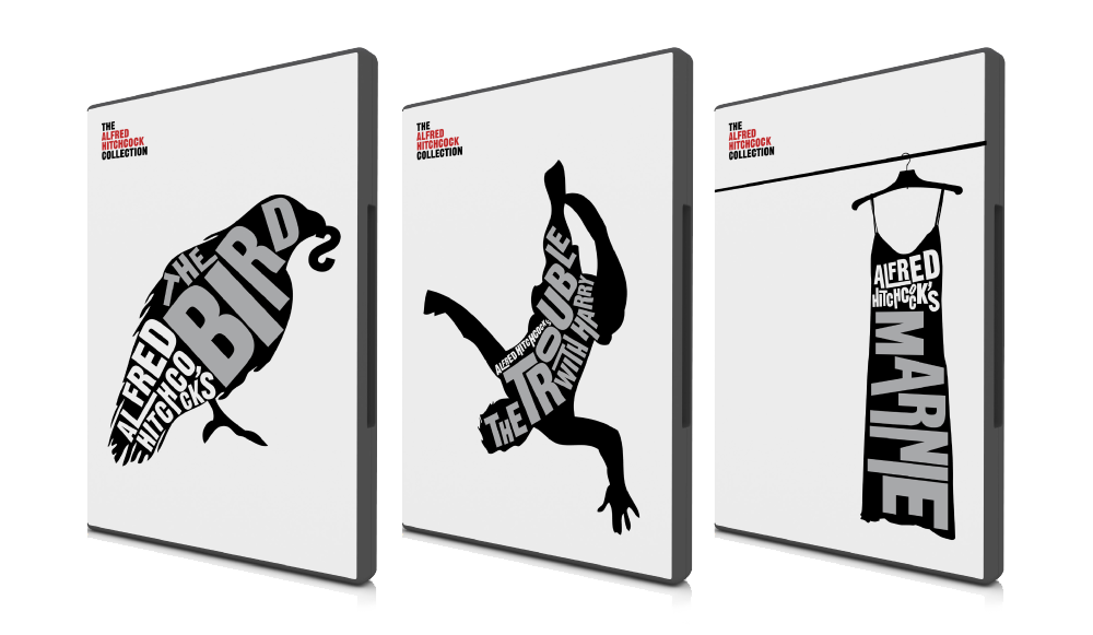
Partly it’s an excuse (not that I really need one) to post Love + Rockets cover art.

And partly it’s because I thought there was a very real chance the interview wouldn’t happen.

But mostly it is because there is something about Jacob’s work — which combines the Chantry-esque DIY design aesthetic of skate art, gig posters, record sleeves, underground comix, zines and punk, with a Ware-like preoccupation with detail and precision — that resonates with me and fits so perfectly with Fantagraphics.

Needless to say, Jacob’s award-winning work has been featured in Print, Communication Arts and How.

We caught up over email…

How did you get into book design?

The germ of the thing started with working at the public library where I was a conspicuously slow page. I would look at every cover I was shelving, setting aside certain ones to check out and carry a few blocks away to a color photocopier. I liked having the inspiration around and I couldn’t afford to buy design books. This was around 1999, when I was beginning to study graphic design and at night was staying out late shooting photos of bands for record labels, local monthlies, and things like that. As for getting into book design professionally, in late 2003 I had just moved back to the Northwest after leaving a job in Los Angeles at a skate company. I was interviewing for a job to churn out ads at the local alternative weekly, The Stranger, and the Art Director, Joe Newton, kindly suggested that I instead talk to Gary Groth at Fantagraphics. They were looking for a new designer but apparently they were in no hurry to actually hire someone as I basically called relentlessly for six months. I think I was just the last man standing at the other end of the phone line so they hired me.

 Briefly, could you tell me about working at Fantagraphics?

If the publishing industry is a zoo, then Fantagraphics is the monkey house. It’s not a conventional workplace and you could get tetanus from walking barefoot but it’s a place where everyone is laboring out of love and there’s a lot of receptivity to trying new things and having your ideas heard. Much more so than I think is possible at most publishers. I have immense respect for the history of the company as an archivist of great work and I have the opportunity to deal with our publishing decisions on a regular basis. It’s satisfying in that way– but the office itself is a neglected three story house with 30 years of dusty artwork, ancient paste-ups, and discarded razor blades strewn about. So it’s not for everyone.

As for the work, Fantagraphics publishes the great cartoonists from Charles Schulz to R. Crumb, but as often as not I’m designing a book of paintings or a collection of pop culture artifacts or even the occasional prose novel.

You’re also a freelance designer. How is that different from your role as art director at Fanta

For one thing I’ve established myself with Fantagraphics enough that I know the material well and have to explain my decisions less. They’re very supportive and because of that I am mostly pushing myself to do better work. With my freelance clients there’s a lot more to learn from their needs and the process involves more time spent on researching and exploring ideas. The freelance work is also much more varied subject matter. For example, as I type this I’m working on the branding for a 2011 museum exhibition focusing on the band Nirvana, a non-fiction book cover for HarperCollins, a band t-shirt design, an AIGA event poster, and a book layout for a start-up imprint in the UK. There are a lot of other publishers I’d like to work with but I’m a pretty shoddy self-promoter.


Could you describe your design process?

In the case of Fantagraphics, I hate to say that most of the time there are so many projects on my plate that I’m just cranking the books out, trying to trust my instincts and learning from any mistakes. We have a list of about 50 books a year with only me and one other designer, Adam Grano, along with our works-through-the-night production guy, Paul Baresh, scanning and laying out everything from the books to the ads and supplying media requests — if we get behind schedule we rarely hire out for another designer, the book simply gets published late. So there’s a lot of pressure to just keep moving. The job requires a lot of discipline to approach books with an eye on getting them approved by the editor/artist without delays and yet still make them interesting. There is process but it’s very accelerated and it’s not unusual that I have to go with my first impulse for a book design and wish I had time to do a dozen more comps.


Is designing for reprint collections different than designing for new material?

Notably, the job description of a cartoonist and a graphic designer are similar in that they both work with text and images but the truth is very few cartoonists have a very developed design sense (just as my cartooning skills are sub par). Working with individual artists on original material can be a really rewarding collaboration or a Sisyphean attempt to improve an idea that the artist is married to. So, in truth, the deader the artist, the easier my job — reprint collections have a more dispassionate approval process.

What are your favourite books to work on?

I’m not sure that there’s any type of book that’s my favorite to work on but I’ve become very comfortable with the process that goes into art books in general. I just finished working on a very collaborative book of VHS box art with the collector/editor Jacques Boyreau and I enjoyed that. The subject matter itself isn’t necessarily what’s interesting to me but there was a long process of sitting with Jacques early on and determining the best way to showcase the work, which ended up being very austere, spotlighting the actual physical history of the boxes and conjuring the experience of seeing them in their element by retaining the old, beaten up boxes, plastered in rental stickers. Some of these boxes we had to prop back together from having been chopped up for those large plastic cases that were used in videostores. In the end, there was more of an anthropological story to looking at the boxes themselves rather than just the art that was on them.

This doesn’t work for every project but it’s great for receptive, collaborative editors. It’s fun to step into someone else’s fixation and figure out how to present the material more evocatively, in a way that will pull other people into what the editor loves about the subject. To design in a way other than plop-plop-plop, here are the images and some nice captions. Then I finish that book and it’s my job to find out and communicate what’s exciting about the next one.

How much say do the artists involved have in the design of their books?

Assuming the artists are involved in a given project, they generally have all the say they want. Fantagraphics publishes The Best and we have to respect the artists’ wishes and peccadilloes. They’re visual people so we usually end up with a good package, if not always a great one.

How are final cover decisions made at Fanta?

On a lot of projects I get more say than is customary for the Art Director but it ultimately rests on the in-house editor of the project and the outside artist or editor whose book it is. We all hash out our opinions about what works for the material and the market but we don’t really have scheduled meetings to sit down and scrutinize. Again, it’s all pretty swift moving.

Who else do you think is doing interesting work right now?

Honestly I can’t seem to go on the web without being intimidated by all the talent that’s out there. I couldn’t list all the people. By far, the designer who most consistently floors me is Peter Mendelsund. The man works brilliantly in every genre thrown at him. I also have to say how happy I am that the Design Works Group guys are in nearby Oregon. I don’t know any other book designers here in Seattle so it’s great to have them around, making a good name for the Northwest.

Where do you look for inspiration and who are some of your design heroes?

I’m a cliché: Inspiration is wherever it turns up.

Art Chantry has been really important throughout my development and is someone whose talent and vision I admire a great deal. I think his influence shows up the most in my work, though not necessarily in the most obvious ways. Chantry, Lester Beall and the Constructivists were my heroes when I used to proclaim design heroes. I would definitely add Mendelsund and Paul Sahre to my contemporary list.

Of course you can’t work in comic book design without acknowledging the significance of two of the world’s most important contemporary designers, Chip Kidd and Chris Ware. They made it possible for me to do a lot of what I do with Fantagraphics.

Could you tell me a little about your personal project Beasts! ?

Beasts! is a classical bestiary of mythological creatures as depicted by some of my favorite contemporary artists from the worlds of comics, skate graphics, rock posters, children’s book illustration, the fine art world, et cetera. The first book is now in its fourth printing and the second and final volume came out in early 2009. Each book has ninety artists and four writers involved. I call myself the curator of the project as it’s more like an art exhibit than a standard art book. I wrote up brief descriptions based on my research of creatures, then the artists chose the creature that was most interesting to them and the writers would pen proper text based on historical references to the creatures. It’s a lot more serious than people seem to expect. I like these stories, I like that these creatures existed to someone who told the original story, and it was great to see them given form — a lot of the beasts are very obscure and before I got art from an artist there usually wasn’t any depiction to be found for a beast. There are also interviews with respectable experts like the marine biologist, artist, and writer Richard Ellis as well as contemporary eyewitnesses to some mysterious beasts.

Did you design the Beast! books as well as edit them?

Yes, except the Chinese edition that just came out. The publisher translated and totally repackaged it for that market. It was part of my intent with Beasts! to see what could come of a close working relationship between the editor and the designer on a book project. (Obviously I took that to the extreme by performing both roles.) Books are generally fairly linear, straight-forward affairs or sometimes they’re eccentric art books that end up feeling like design masturbation. I’m interested in what can happen somewhere in between these things that will engage the reader to enjoy multiple readings or even to just feel like more of a participant in the whole experience. There are a lot of interesting details that never make it into books simply because the designer isn’t involved with the editorial side or is otherwise not involved on a collaborative level.

What does the future hold for book cover design?

Everyone’s got an opinion on that and my voice would just be din. It’s hard to say if it’s like the film world facing VCRs or the music world facing MP3s but it’s not bleak to me.

Thanks Jacob!

You can find more of Jacob’s work on his website.

UPDATE: Jacob was kind enough to send me a few more images to accompany the interview and these have now been added to the original post.

8 Comments

Going West — Where Books Come To Life

A stunning stop-animation film produced by Colenso BBDO and animated by Andersen M Studio for the New Zealand Book Council:

(via Letterology)

3 Comments

Q & A with David Gee

I am somewhat in awe of Canadian designer David Gee. Not only does he fashion stylishly left-field book covers for independent publishers and major houses, he is also willing to scorch individual business cards by hand using vice-grips and a blowtorch (see above).

And he does it all part-time. While holding down a day job.

To an aspiring generalist like me, knowing that David manages to work in more than one creative field is incredibly inspirational. And, as most of us struggle to do to even one thinking well, it is simply breathtaking that David’s work — in both his chosen fields — is brilliant and apparently effortless.

David and I chatted about his designs — and the day job — over email earlier this month…

How did you did get into designing books?

A friend of mine, Jason Anderson, wrote his first novel a few years back and he asked if I would be a ‘careful reader’ and give him some feedback on his manuscript. He later dropped a bomb on me asking if I would design the cover, too. Anyway, the publisher, ECW Press, loved the final cover and they eventually asked me for more and it all kind of snowballed from there. This cover ended up in a Quill & Quire article, an Applied Arts design annual and even GQ Italia. After a year or two of doing freelance stuff for ECW, I just started emailing other publishers and I got a lot of “Yeah, we loved that Showbiz cover!” responses.

What are the pros and cons of designing part time?

Well, the upside is that I don’t burn out too easily. Since my inbox is rarely overflowing, I can take my time with projects and make sure they get the attention they deserve or in some cases, might not deserve. Also, I find that I can still bring a bit of an outsider’s approach to my work. The cons include not being able to build up my portfolio as quickly as I’d like or log the hours that certain jobs end up requiring.

Approximately how many titles do you work on a year?

Roughly twenty or so titles a year. I don’t turn down any work at all, if I can help it. There are the usual pre-catalogue rushes but, for the most part, it’s manageably and workably steady, all year long.

Who are some of the publishers you’ve worked with?

My Main clients include ECW Press, HarperCollins, W.W. Norton, Penguin and Hamish Hamilton, to name a few. I should really try to add to my client roster but, at the end of the day, I’ve little time left for self-promotion since I’m doing this on the night shift. Add that to the “cons” list.

Do you work more on fiction or nonfiction titles?

It balances out a bit but my meat and potatoes seem to be in non-fiction work. In addition to the fiction titles I’ve been doing for Penguin, they’ve been sending me a bit of science fiction work too, which has been a lot of fun. The Hamish Hamilton titles have been a big boost to my ego and hopefully my skills as a cover designer, too. HarperCollins is mostly non-fiction and ECW sends me just about anything you can think of from abstract poetry to scandalous wrestling bios.

What are your favourite books to work on?

Every job creates its own unique set of challenges, so it’s hard to say if one trumps the other. With fiction I approach the conceptual end of things more laterally and obliquely whereas with non-fiction I try to approach the execution laterally if only in order to separate the book from similar titles on that particular shelf.

What are the most challenging?

I haven’t the breadth of experience required to provide a quantitative, scientific answer to that. They’re all challenging since the last thing I ever want to do is just phone it in. I recently finished a cover for a book on the history of beer in Canada, which for a hoser like myself was just so ominously and ridiculously huge and daunting a task I think I actually lost sleep over it.

What is the “day job”?

I’m an advertising copywriter working in television and radio, mostly. My business cards say “Senior Writer” actually, even though my family still doesn’t understand what I do for a living despite the awards. (I’m required by a secret and arcane advertising edict to mention that I have won awards. Many awards.)

Does working in advertising influence how you think about book design?

I think what my day job has trained me to do is recognize a good idea in its purest, raw form. My own personal barometer goes something like “Is this actually an idea or is it just acting like an idea?” which means does the core concept have an element of truth to it, doing service to the product/service/book cover, or am I just relying on flashy execution alone?

Could you describe your design process?

It usually begins with an immediate gut-reaction to the brief, scribbling this idea down and then entirely forgetting about the project for a few days. Most of the hard work is purely mental, trying to formulate concepts and visualize their treatments. Executionally, I don’t really do a lot of back-end tinkering, making the type one-point bigger or smaller, etc. I’m pretty rigid at the mechanical stage but overall, I tend to “play it where it lies”, to borrow a golfing term (for some reason). I think this comes from my vocational history of working in lead-type print shops and sign-painting shops when I was a young lad, onto my get-your-hands-dirty fine art schooling and my Letratone and line-tape design background, all of which predate computers and their sinister ability to allow you the chance to second-guess yourself every step of the way.

Where do look for inspiration and who are some of your design heroes?

I like different designers for different reasons. I respond to David Drummond’s thinking. I always assumed he had an advertising background (which I later found out he does), as his ideas are right on the money and need little in the way of window-dressing. Peter Mendelsund’s covers have a weird quality; seemingly equal parts glib and fussy. Henry Sene Yee’s covers are quietly dignified. The usual suspects, I suppose. I’d be remiss if I didn’t doff the proverbial to my online chums Jason Gabbert, Kimberly Glyder, Ingrid Paulson, Nate Salciccioli, Christopher Tobias & Michel Vrana.

Inspiration is always in the brief. You just have to find it yourself.

What does the future hold for book cover design?

Not a clue. Same strategies, different tactics? If my own personal future of book cover design affords me the opportunity to continue to do this (and maybe work with Eric Hanson on a project or design some Donald Barthelme books), I welcome it with open arms.

Thanks David!

You can see more of David Gee’s work on his blog.

4 Comments

Midweek Miscellany, November 18th, 2009

Lusting After Lustig — Designers Charles Brock and Tim Green share their collection at FaceOut Books.

While Amazon announced the Kindle will be available in Canada this week, The New York Times looks at reading on phones:

Many people who want to read electronic books are discovering that they can do so on the smartphones that are already in their pockets — bringing a whole new meaning to “phone book.” And they like that they can save the $250 to $350 that they would otherwise spend on yet another gadget.

No. Shit.

But, on the subject of e-books… Steve Haber, the president of Sony’s digital reading division, talks to TechFlash (via TeleRead).

A History of 16 Science Fiction Classics, Told In Book Covers at i09 (including the brilliant cover for A Clockwork Orange pictured above and yet more covers for 1984).

A Winter’s Tale — Ali Smith (The Accidental) on The True Deceiver by Finnish author Tove Jannson, creator of the Moomins:

If the Moomins are Jansson’s most celebrated legacy – a community of inventive, big-nosed, good-natured beings who survive, again and again, the storms and existentialism of a dark Scandinavian winter through simply being mild, kind, inclusive and philosophical – what will happen when a real community is put in its place? What will the outcome be when Jansson tackles, naturalistically, the life of a tiny hamlet in a dark, wintry landscape – and in a book so close to real local life that the original Swedish publication carried a disclaimer saying it was in no way based on any real place, nor its characters on anybody living?

You had me at “existentialism of a dark Scandinavian winter.”

The Genius — The awesome Tom Gauld interviewed at It’s Nice That. Limited edition letterpress prints of Tom’s Characters for an Epic Tale are available now.

And finally…

UnderConsideration’s Brand New looks at the new logo for The New York Public Library (via Daily Discoveries on Design)

Comments closed