It used to be enough for a book to idly stand out in a bookstore. Nowadays, however, new books must jostle for attention with everything. Thousands of distractions are just a click away. Is it any wonder that book-cover design is more important than ever?
In today’s Globe and Mail, I talks about recent trends in book cover design and pick a few of my favourite covers from the year so far. If you live in Canada you can find a lovely-looking print version of the article in the Arts pages.
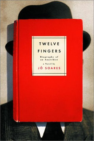
It started, innocently enough, with a tweet from my friend Steven Beattie, book review editor of Canada’s Quill & Quire magazine, about the cover of The Most Dangerous Book, Kevin Birmingham’s new ‘biography’ of Ulysses by James Joyce, designed by Ben Wiseman (Penguin June 2014).
That sparked a conversation with designer David Gee and Joseph Sullivan of The Book Design Review about books on book covers. Joe wrote a a post on the subject in 2009 on the subject, and I rather naïvely thought it would be easy (EASY!) to post a few contemporary examples of the trend, completely underestimating what an undertaking such a project would become.
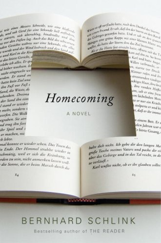
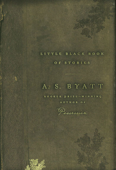
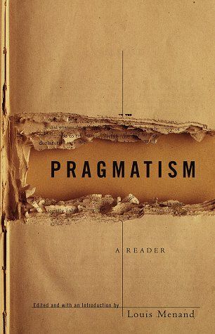
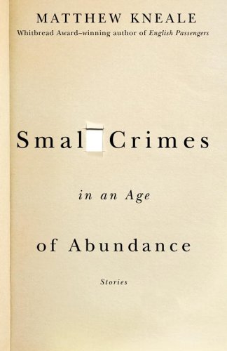
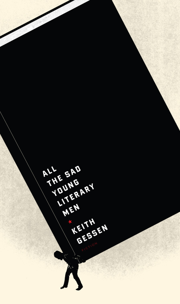
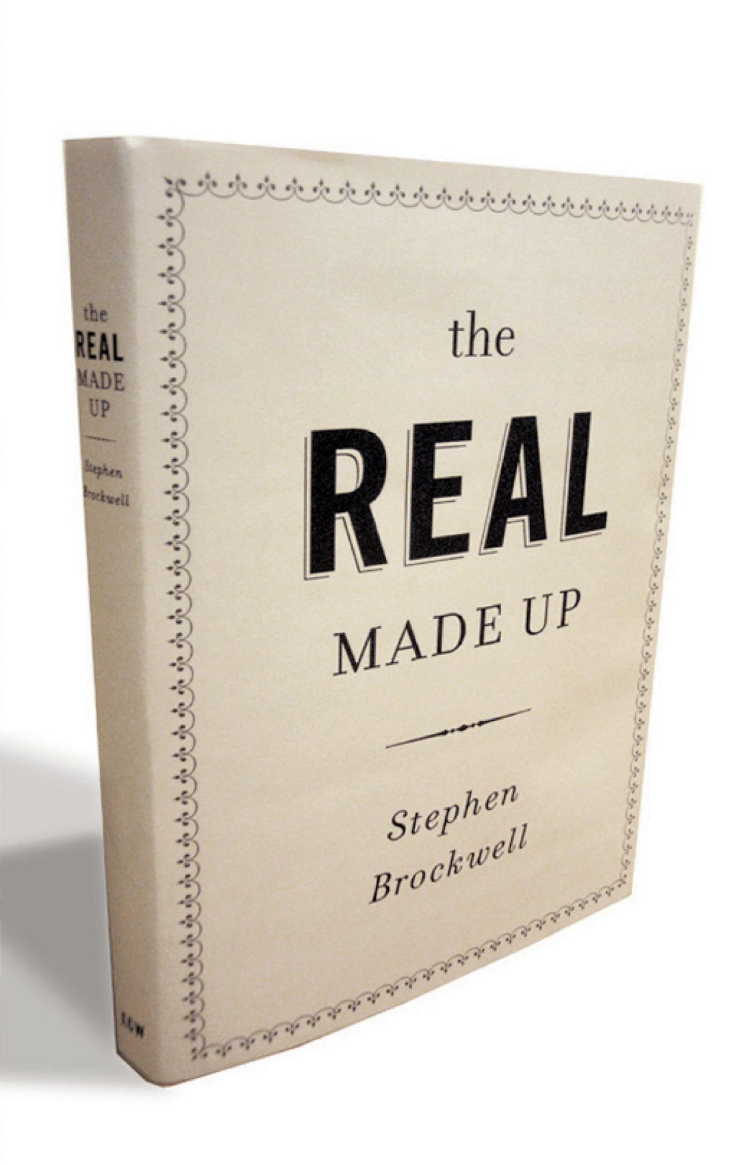
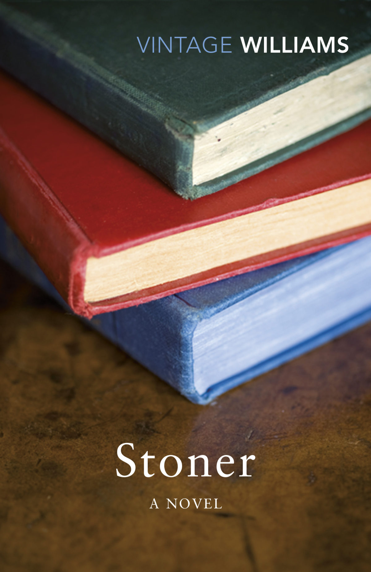
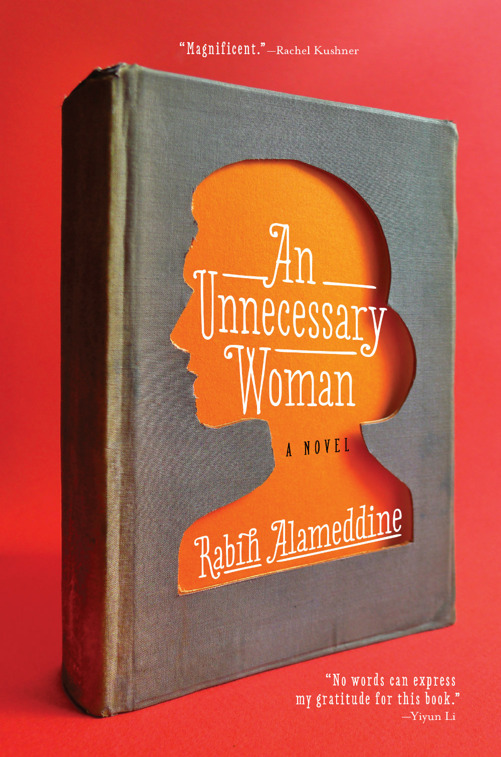
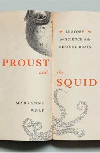
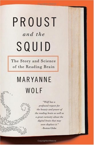
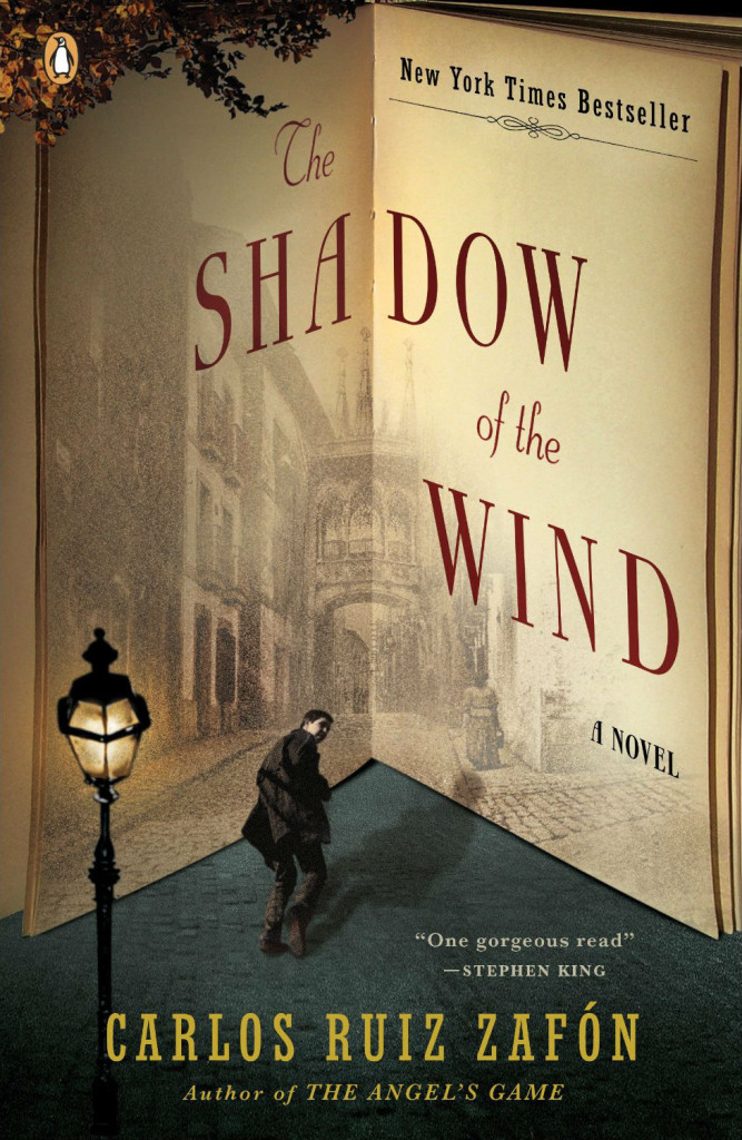
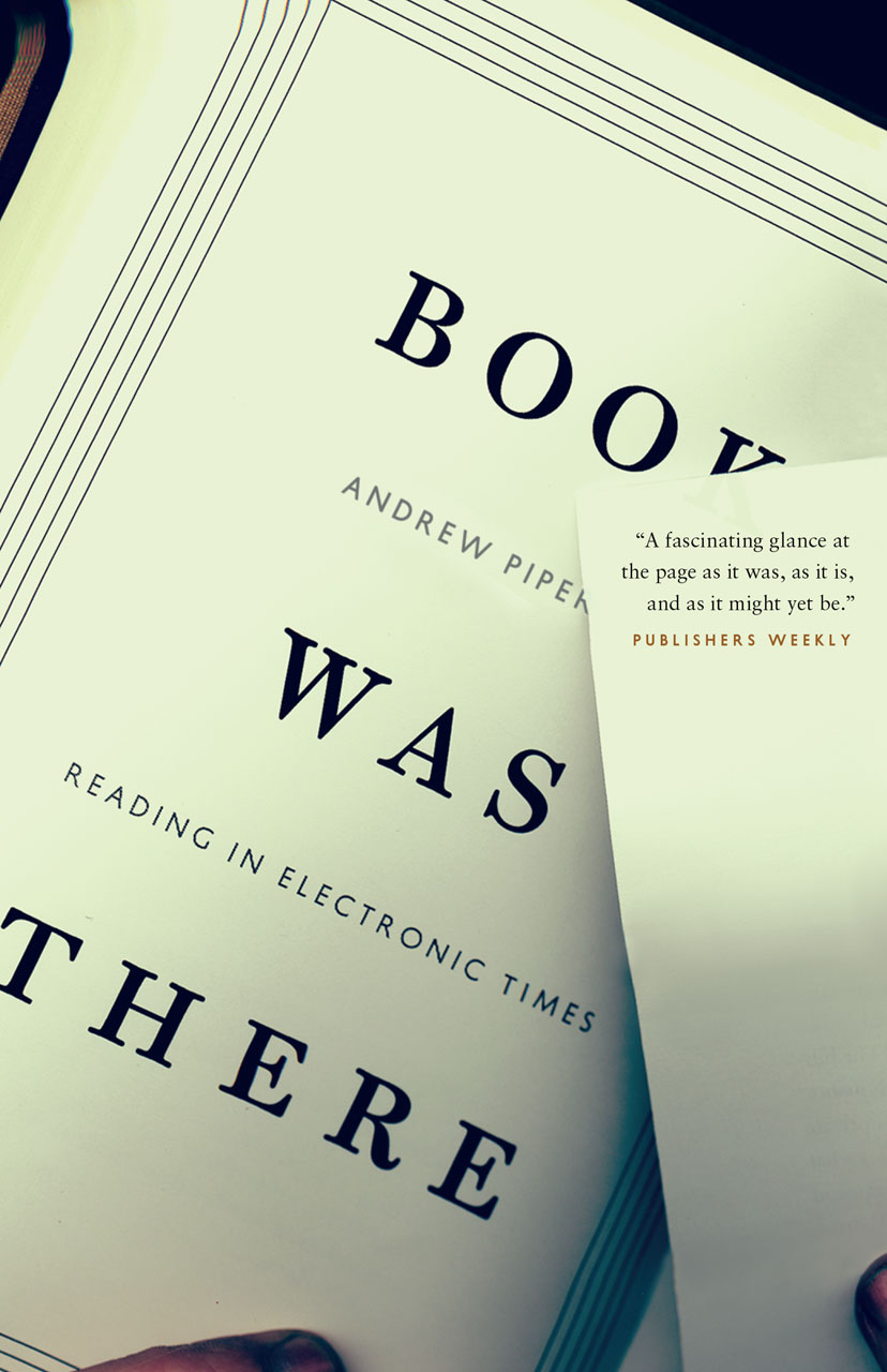
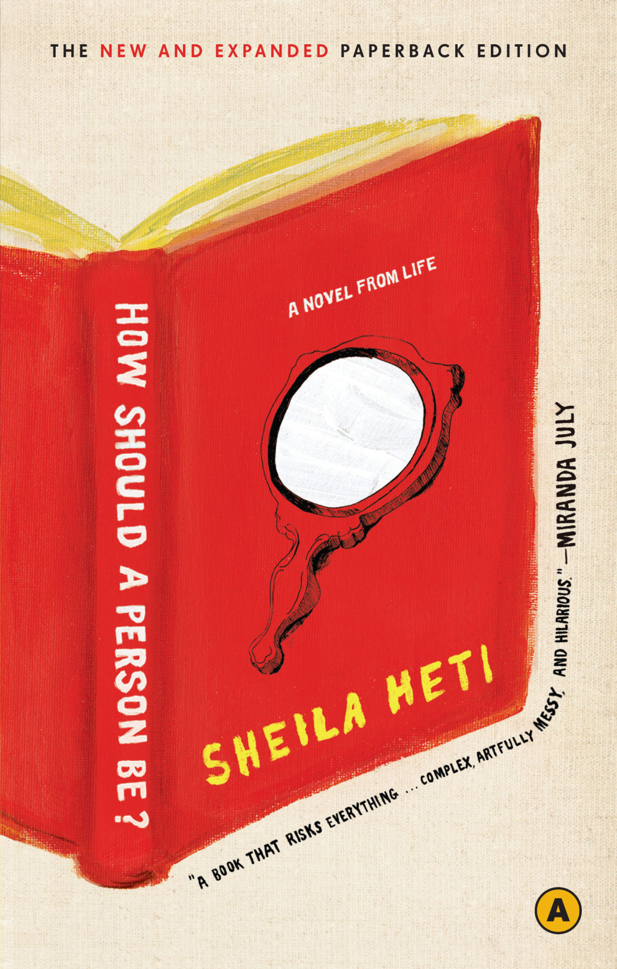
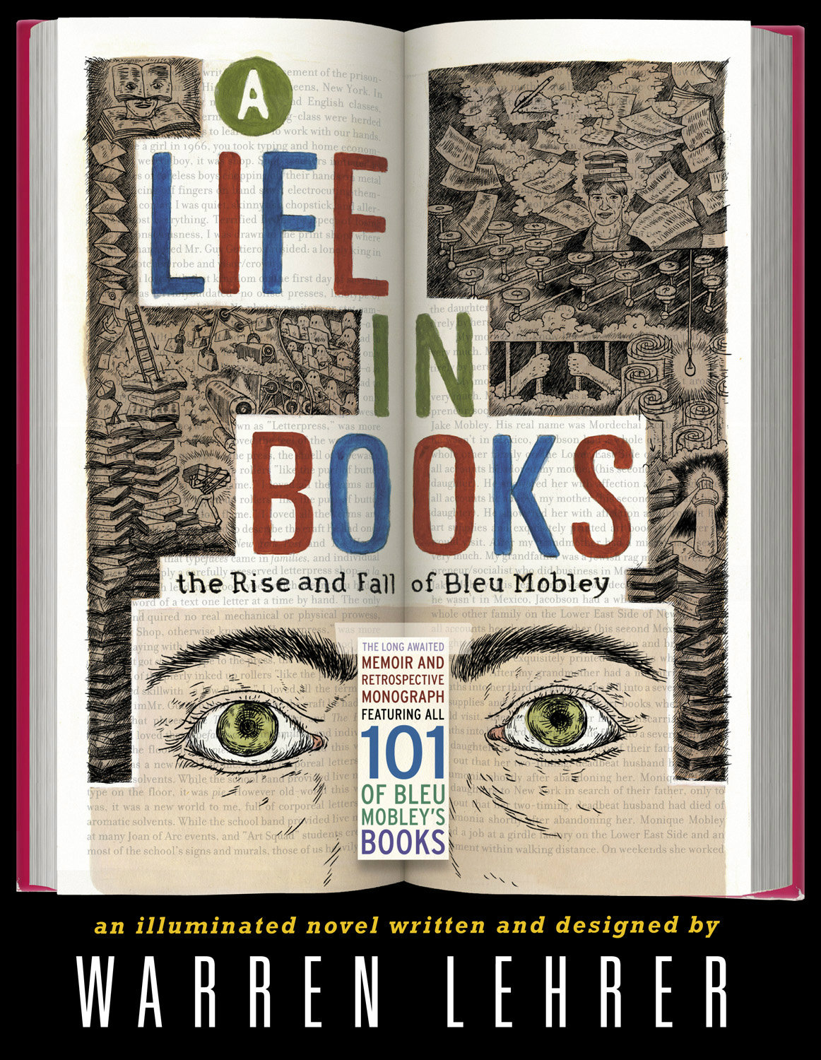
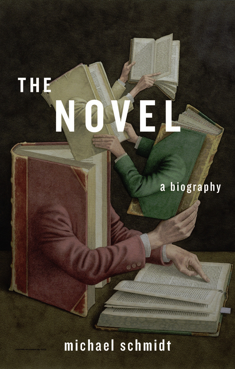
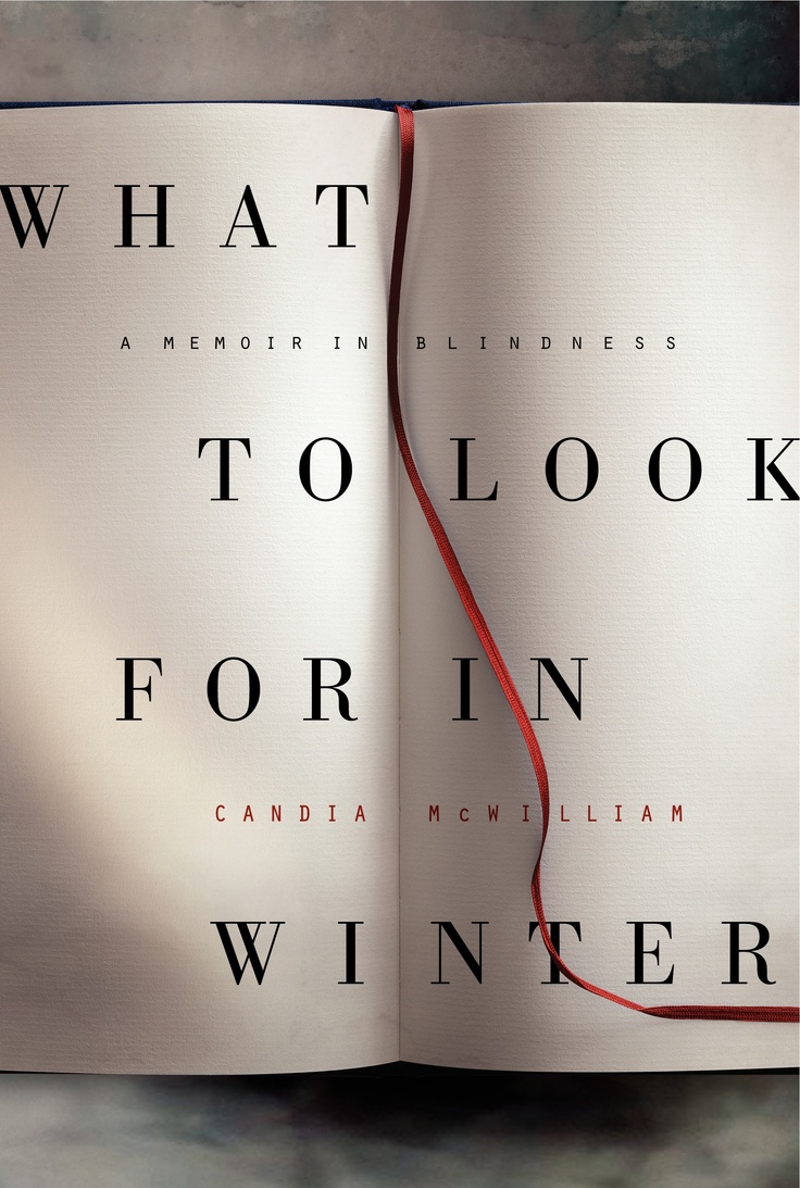
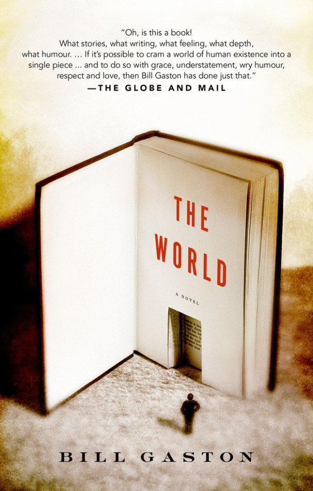
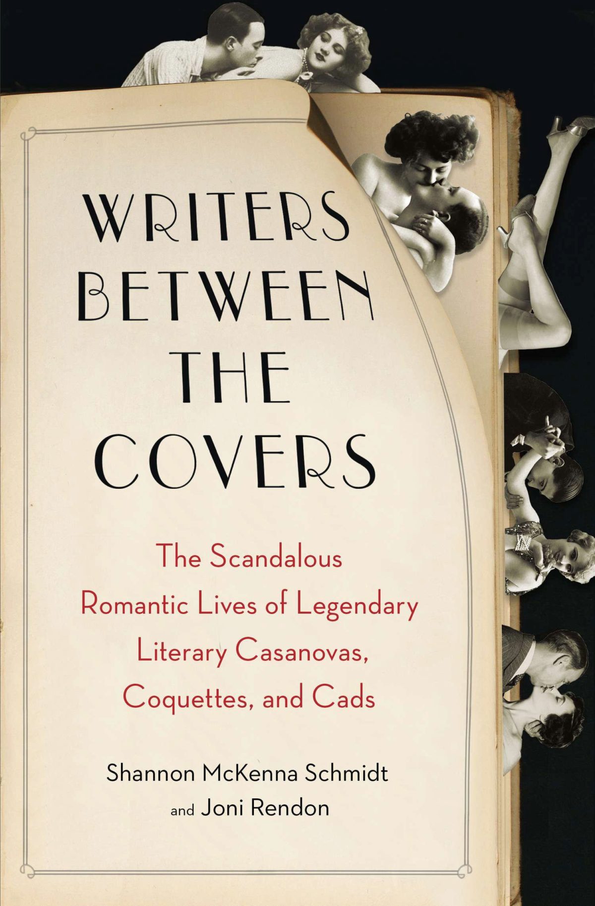
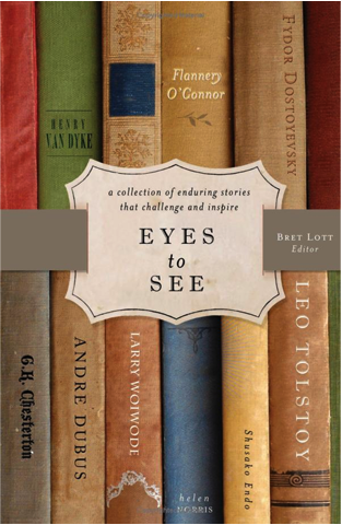
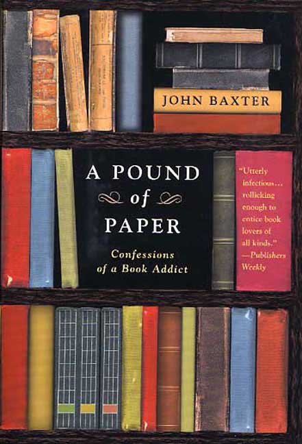
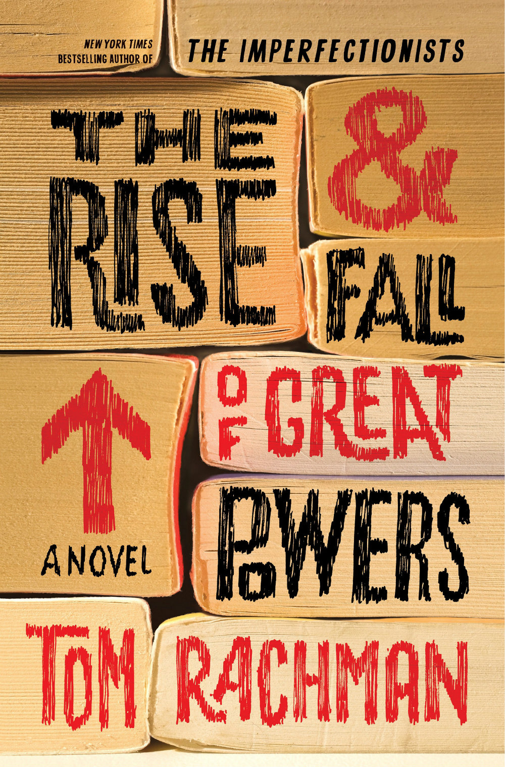
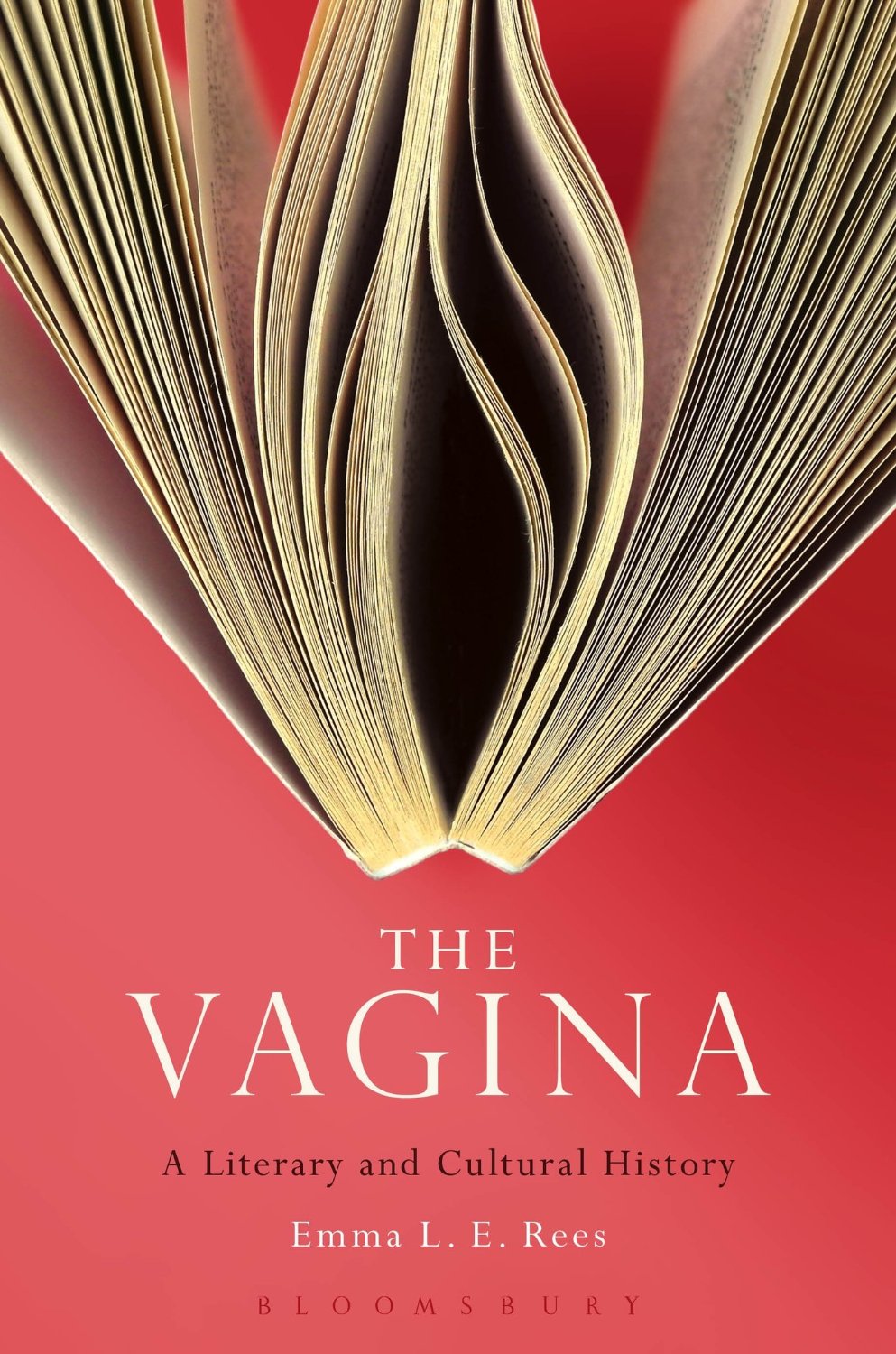
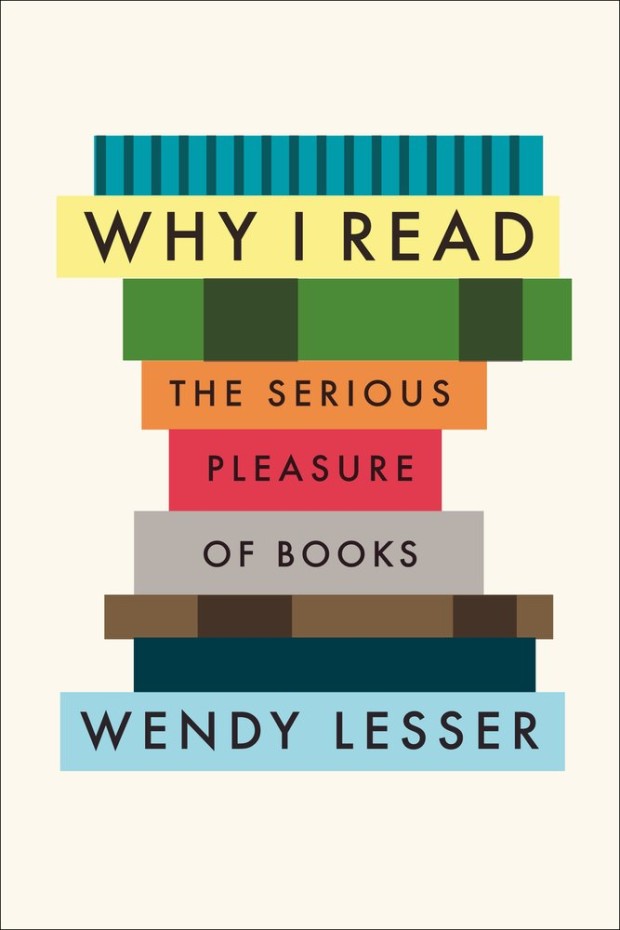
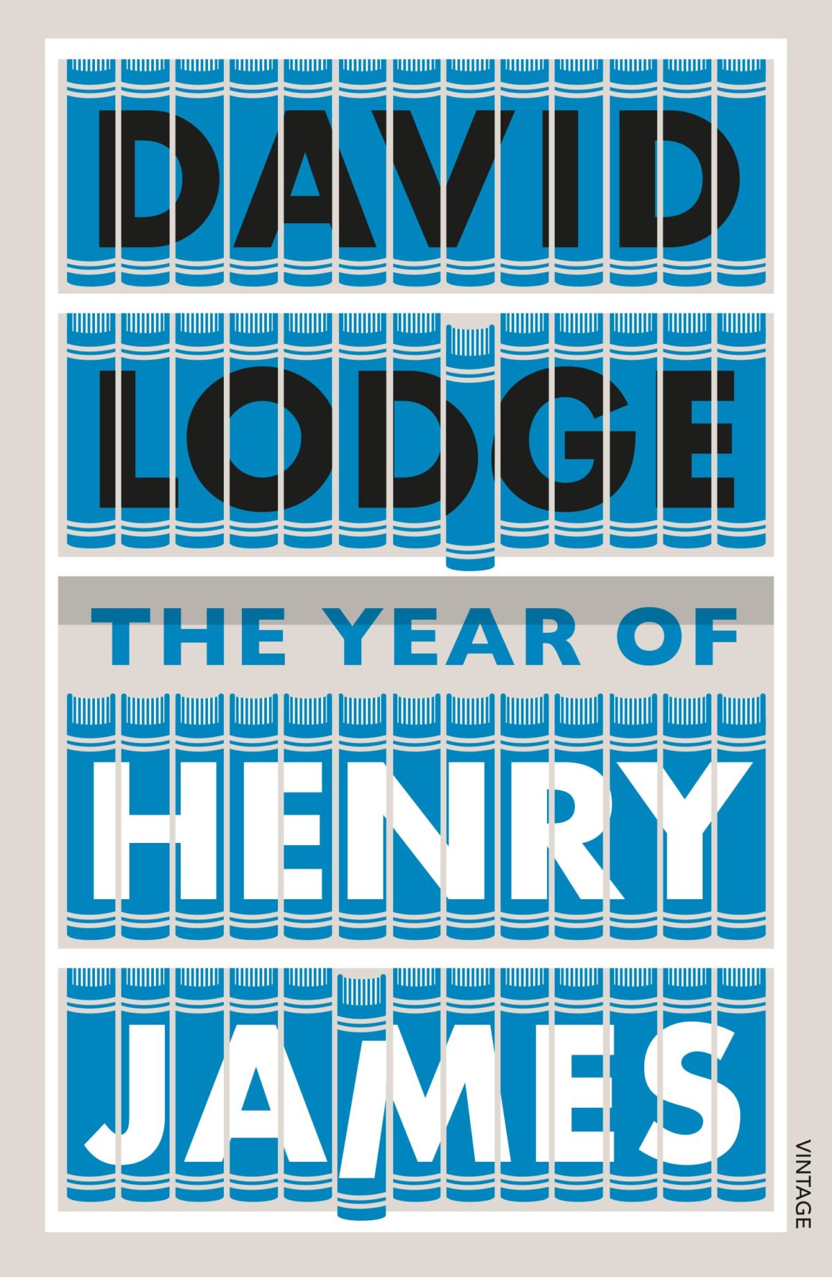
What follows is an attempt to showcase some of different ways designers incorporate books into their cover designs. Along side covers from the past five years, I’ve included some earlier examples from Joe’s post, and this post about ‘meta-covers’ from HTML Giant. Many of the images of the older titles are small (and some are just not very good), but where I have been able to source a larger image, I’ve included it at full (or close to full) size. I’m indebted to the Book Cover Archive, which is still an invaluable resources after all this time, Ferran Lopez‘s (also mothballed) Jacket Museum, and all the designers and book folk who sent me cover images, and helped me in numerous other ways. Thank you. This isn’t comprehensive survey but, to be honest, I had to stop somewhere…
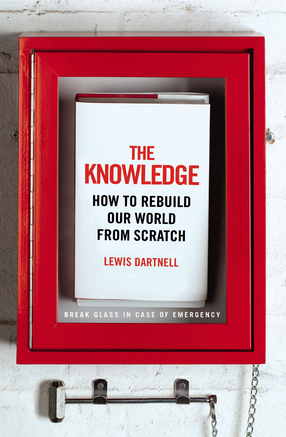
The Knowledge by Lewis Dartnell; design by Kris Potter (Penguin April 2014) Priceless by William Poundstone; design by Jennifer Carrow (Hill & Wang January 2010)
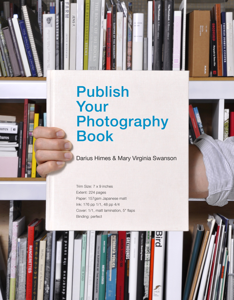
Publish Your Photography Book by Darius D. Himes & Mary Virginia Swanson; design by David Chickey & Masumi Shibata (Princeton Architectural Press March 2011)
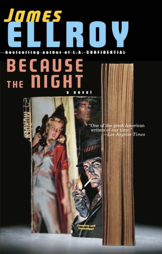
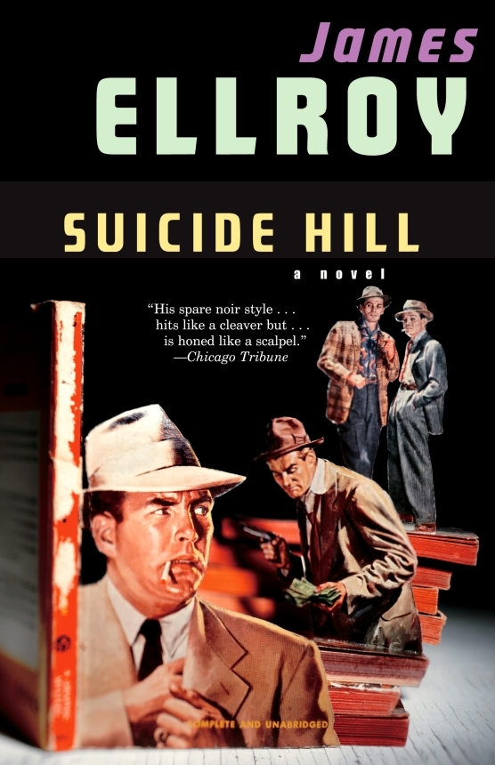
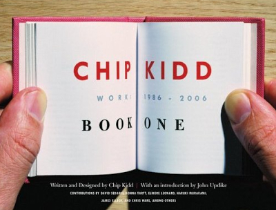
And those of you with a good memory will remember Chip Kidd used also art by Thomas Allen for a series of James Ellroy titles publisher by Vintage in the US:
As well posting great cover designs for books released in July, I’ve taken this month’s round-up as an opportunity to catch up on a few I missed earlier this year. Enjoy!
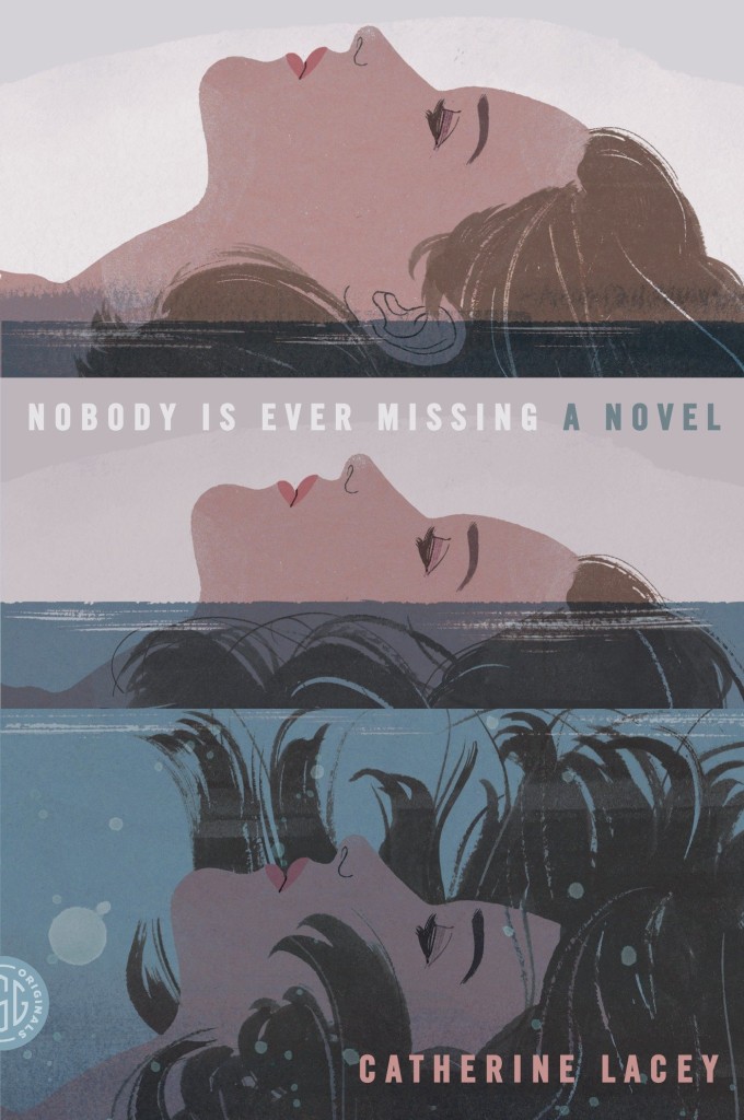
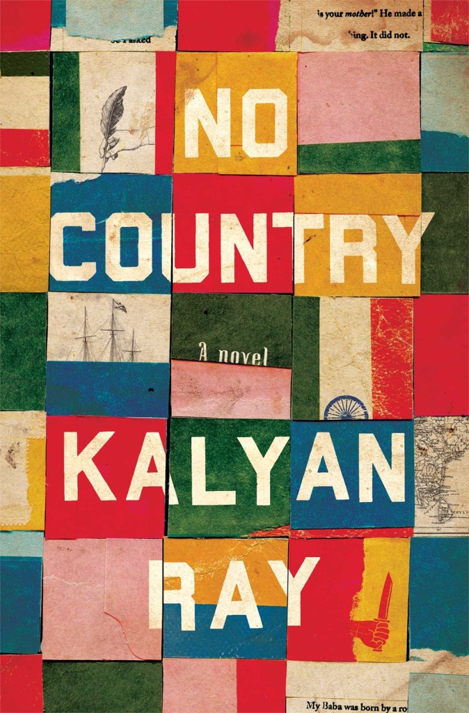
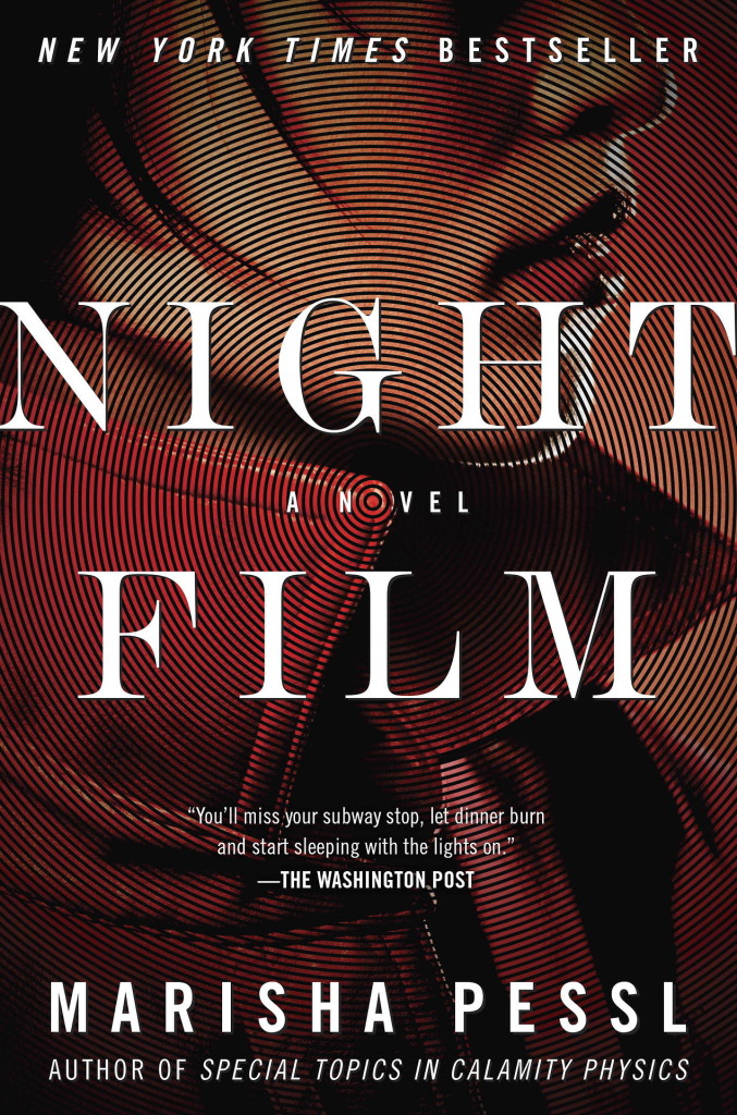
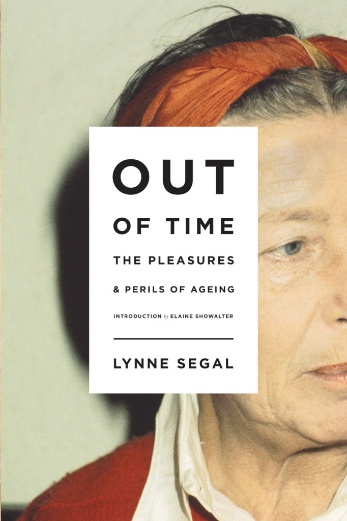
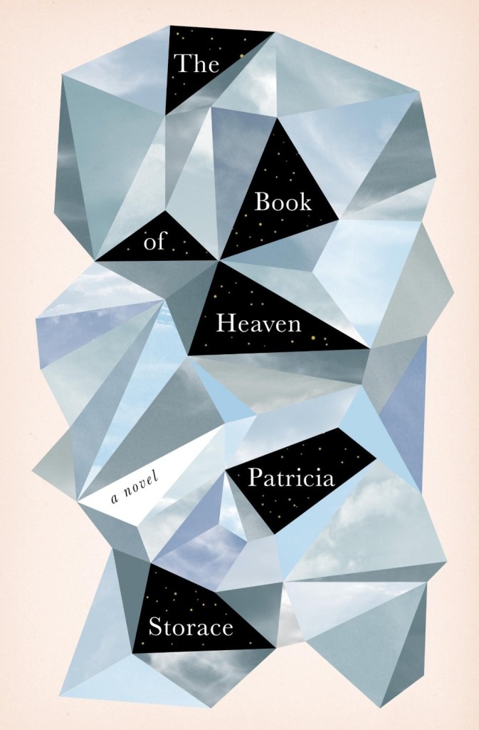
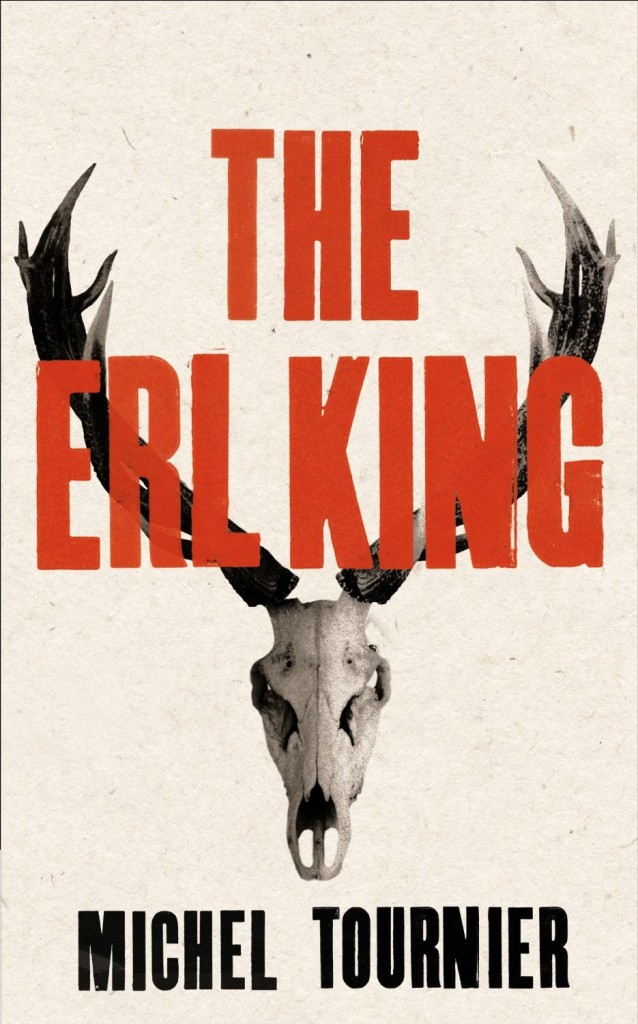
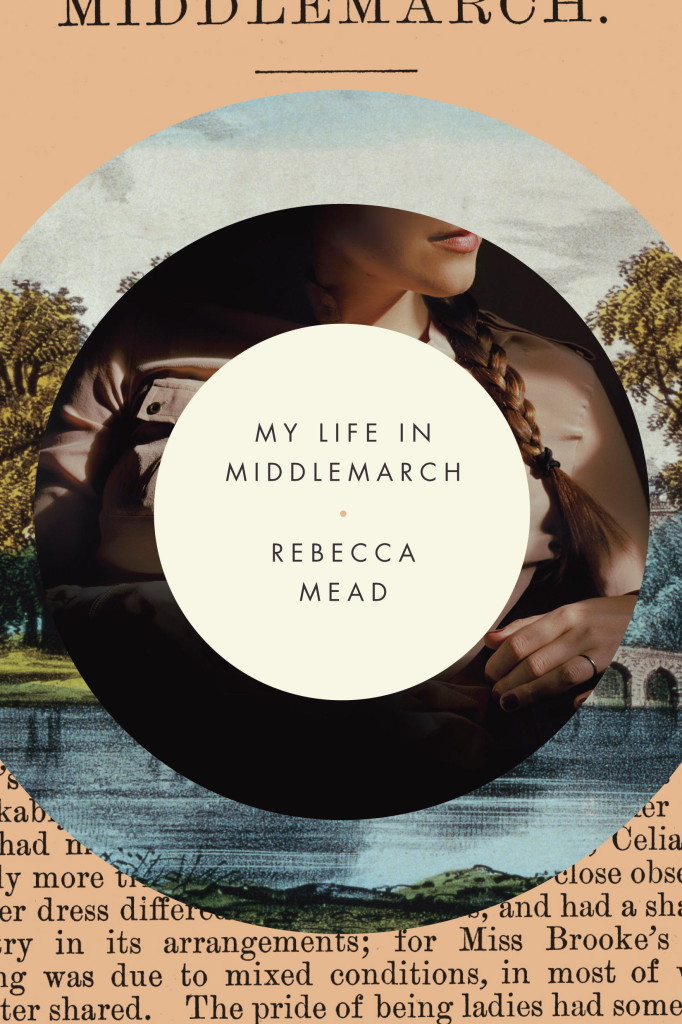
It’s almost March and I’ve just realised that I haven’t posted very many book covers this year. To make up for this lapse, here are ten of my favourite covers from the last few months:
I haven’t posted a lot of book covers recently, so to amend the situation here’s a completely unscientific selection of a few designs that have caught my eye recently:
Ghost Shapes — Writer Warren Ellis talks comics and, very briefly, his new novel Gun Machine at Robot Six:
Gun Machine is as much about the ghost shape of Manhattan’s previous settlements and roadways as it is about its modern architecture, and the invisible channels of wireless communication around which that structure now bends. I see — or at least I look for — the foundations of deep time, and the deals we do with it.
In Ellis’ world, everything is all-caps, all the time, and any character who can ask for a cup of coffee in a way that doesn’t call for at least one exclamation point is a spoilsport. Gun Machine, Ellis’ second prose novel, is in exactly the same style and spirit as his comics; like his first novel, Crooked Little Vein, it gives the impression that Ellis didn’t write it as a comic only because pictures would have slowed down the action.
Sounds about right. The book is also reviewed at The New York Times. (That fabulous cover for Gun Machine was designed by Keith Hayes designed by Oliver Munday with art direction by Keith Hayes by the way).
Be Still My Exploding Heart — Stephen Page, head of Faber & Faber, on the Penguin-Random House merger and what it means for the industry at large, at The Guardian:
Authors are talked about as brands in their own right, and this is correct. Publishers rarely achieve the status of becoming consumer brands of scale and significance. Is the next story for publishing going to be one dominated by global and local author and publisher brands, especially in niches? Authors and readers are at the centre of the world of books, and finding new ways to serve them will create further different structures. This merger may be seen as a starting pistol or perhaps an explosion in the heart of the old order dominated by the book trade.
Disposable by Design — Nicholas Carr on e-books and the apparent resilience of print books, at the Wall Street Journal:
From the start, e-book purchases have skewed disproportionately toward fiction, with novels representing close to two-thirds of sales. Digital best-seller lists are dominated in particular by genre novels, like thrillers and romances. Screen reading seems particularly well-suited to the kind of light entertainments that have traditionally been sold in supermarkets and airports as mass-market paperbacks… Readers of weightier fare, including literary fiction and narrative nonfiction, have been less inclined to go digital. They seem to prefer the heft and durability, the tactile pleasures, of what we still call “real books”—the kind you can set on a shelf. E-books, in other words, may turn out to be just another format—an even lighter-weight, more disposable paperback. That would fit with the discovery that once people start buying digital books, they don’t necessarily stop buying printed ones.
An alternative, more circumspect, version of the article can be found on Carr’s blog:
None of this means that, in the end, e-books won’t come to dominate book sales. My own sense is that they probably will. But, as we enter 2013, I’m considerably less confident in that prediction than I was a few years back, when, in the wake of the initial Kindle surge, e-book sales were growing at 200 or 300 percent annually. At the very least, it seems like the transition from print to electronic will take a lot longer than people expected.
Covering some similar ground, only bleaker, Dennis Johnson’s striking post on the slow death of Barnes & Noble is also essential reading:
Perhaps the most disturbing thing about all this is the fact that, as with the demise of Borders, the demise of B&N has nothing to do with what its customers actually wanted, what’s best for mother literature or free speech, or anything other than made-up trends covering for killer capitalism. There’s still plenty of evidence that people like bookstores, for example, and even sales of hardcovers — let alone print books — are holding on. And so the lust for higher margins — whether from Godiva chocolates or ebooks — turned into fool’s gold for B&N. It’s perhaps a typical death in the Free Trade era, when companies lose all sight of their identity in the blinding light of the bottom line … but it’s the wrong death for a bookseller.
Somewhere in there, Johnson quotes this article by David Streitfeld in the New York Times, which makes the rather chilling point about a demise of Borders in 2011. Not only did it have a negative effect on the sale of print books, it was bad for e-books too. “Readers could no longer see what they wanted to go home and order.”