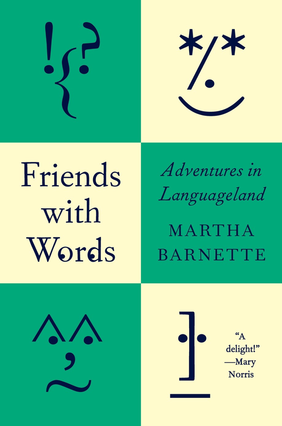
Hey. I hope you’re keeping safe and well. I’m posting this late on the last day of the month, but hopefully it was worth waiting for.
I will let you get to the covers posthaste, but before I go, today (September 30th) is also Orange Shirt Day and National Day for Truth and Reconciliation in Canada, so I would like take a moment to acknowledge and remember the survivors of residential schools, their families and the kids who didn’t come home. <3
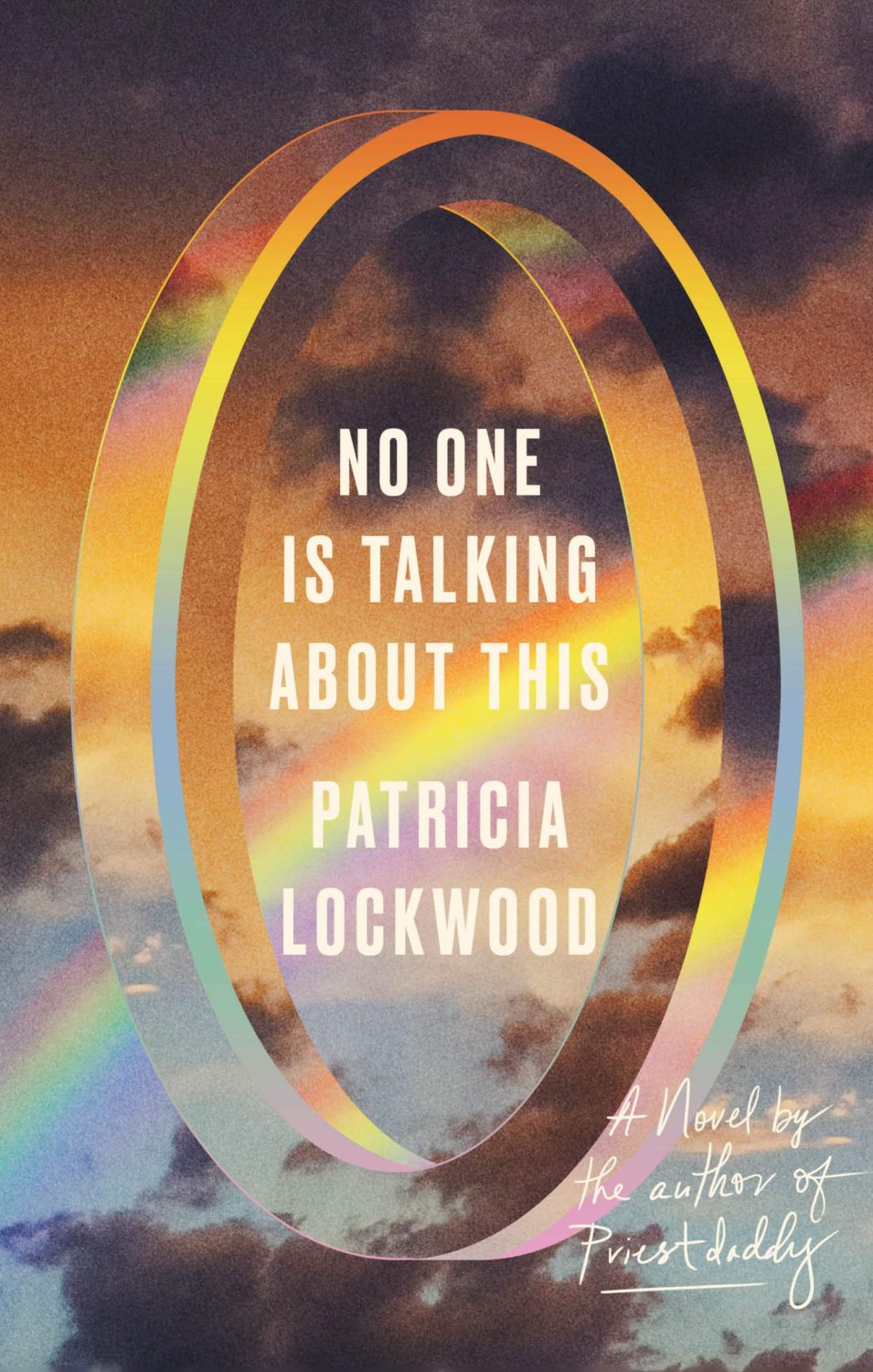
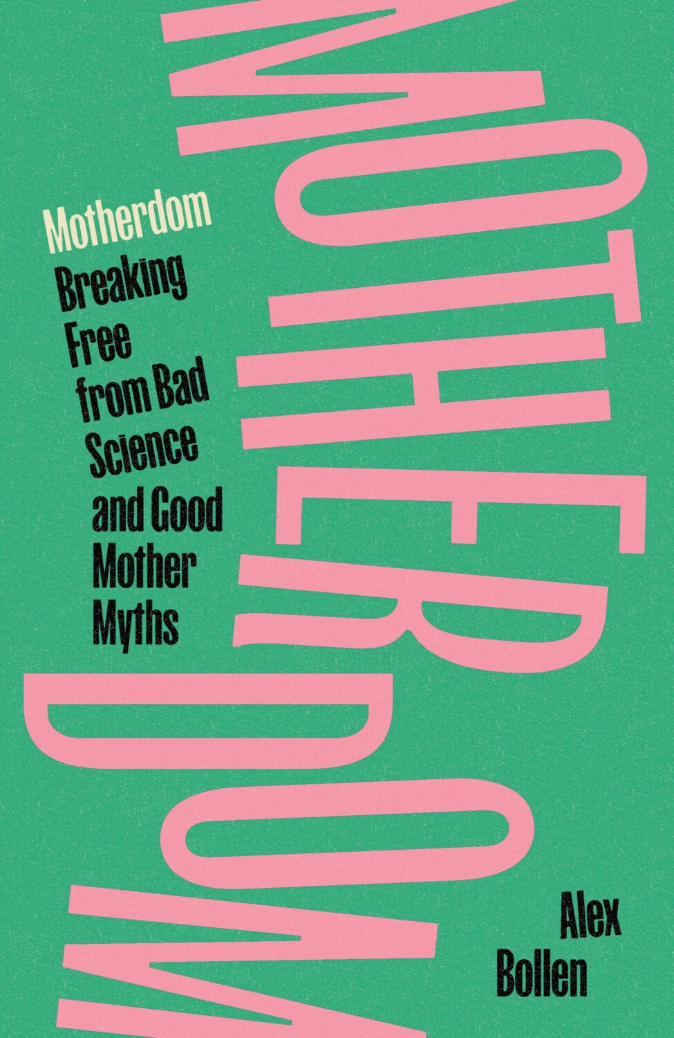
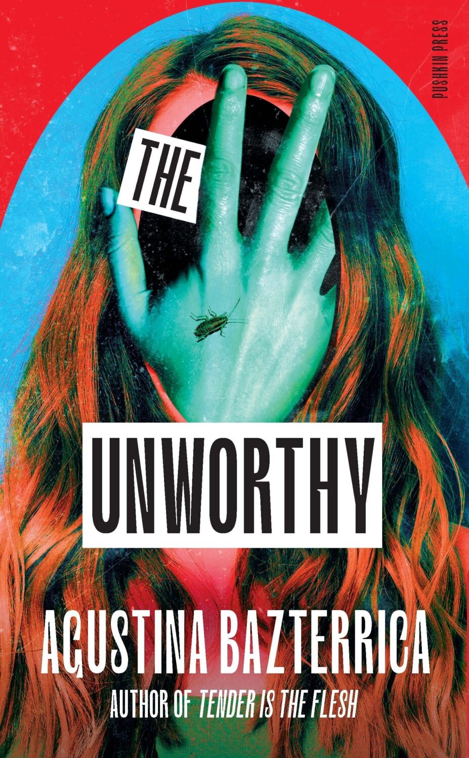
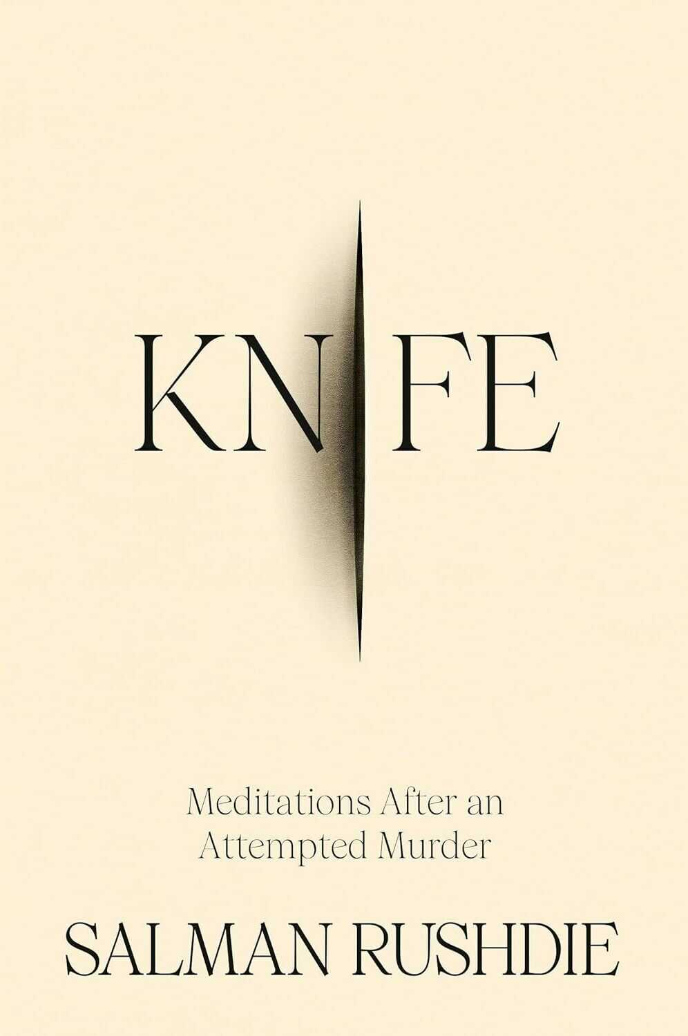
This is holographic foil just in case it’s not obvious from the above (and if someone at Head of Zeus / Bloomsbury is reading and wants to fire me a better cover image that would be great!)
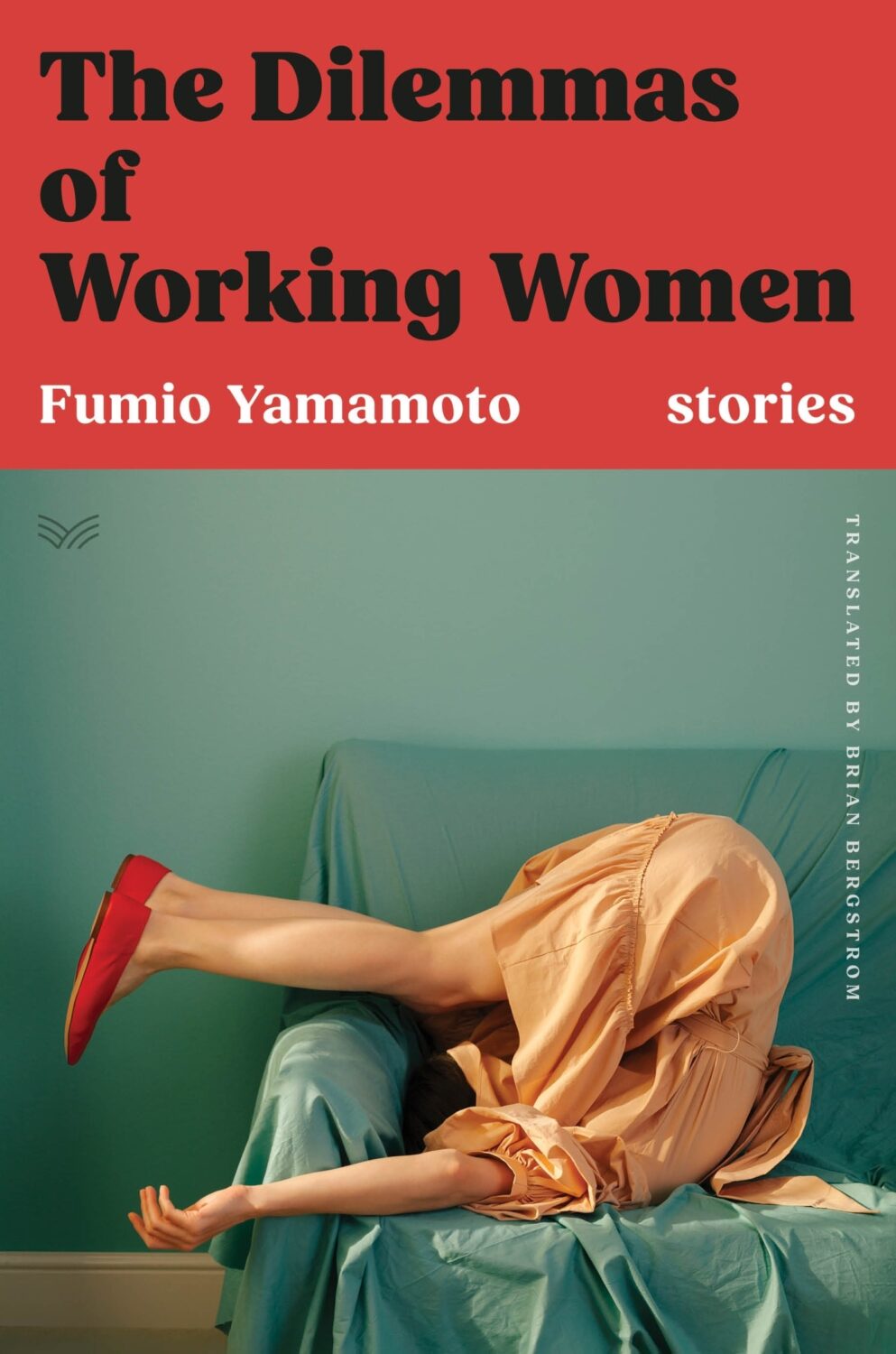
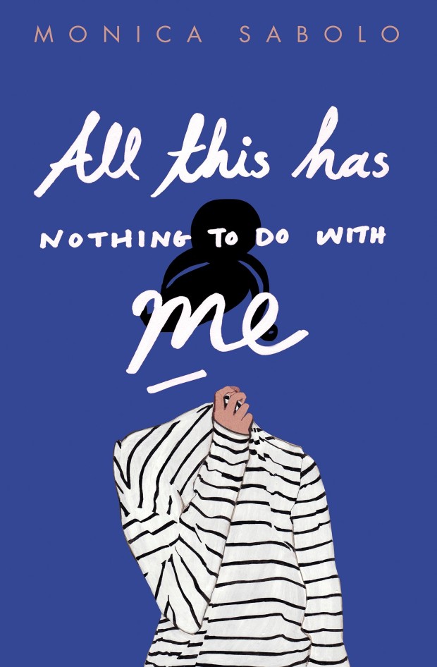
With this and the cover of The Dilemmas of Working Women designed by Sarah Kellogg (featured last month), we may have a new sub-genre of ‘well dressed and distressed’. Are there other examples?
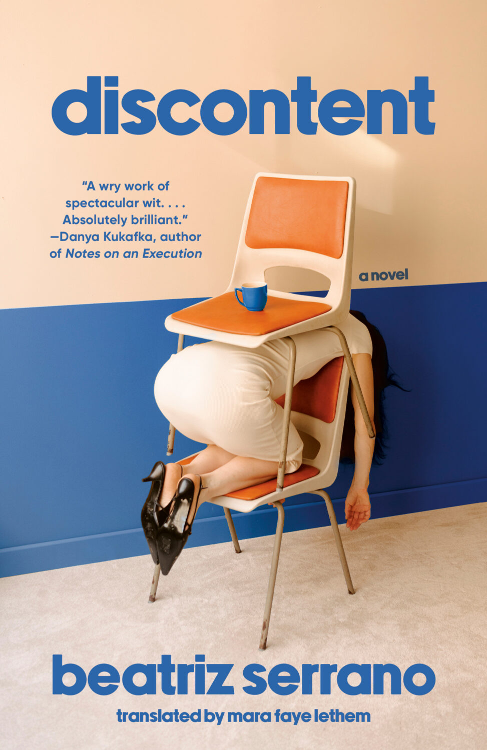
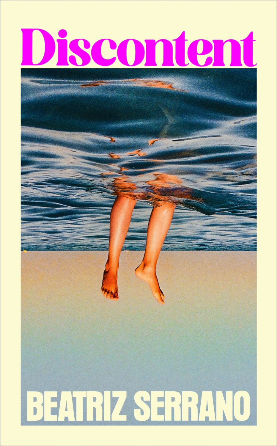
Possibly a different kind of distress, the UK edition of Discontent, published last month by Harvill Secker, was designed by Kris Potter using a photograph by Laurent Tixador.
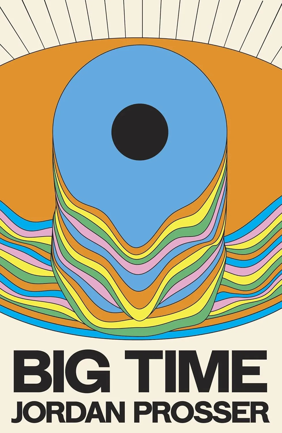
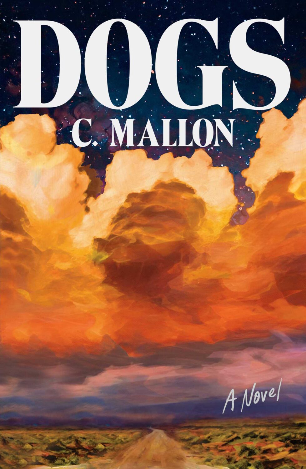
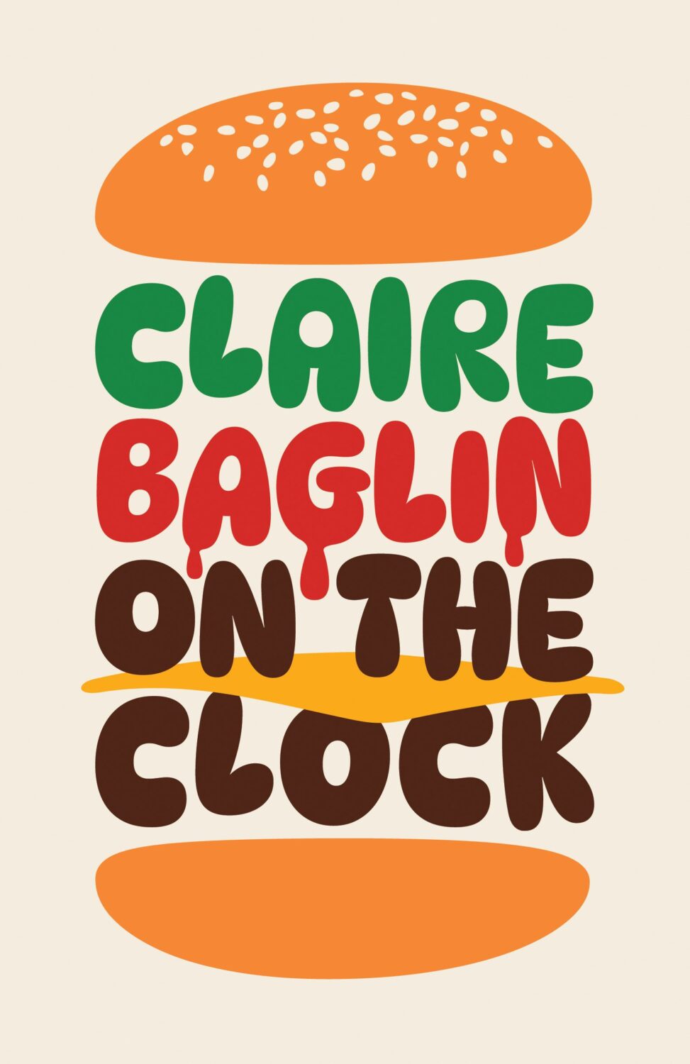
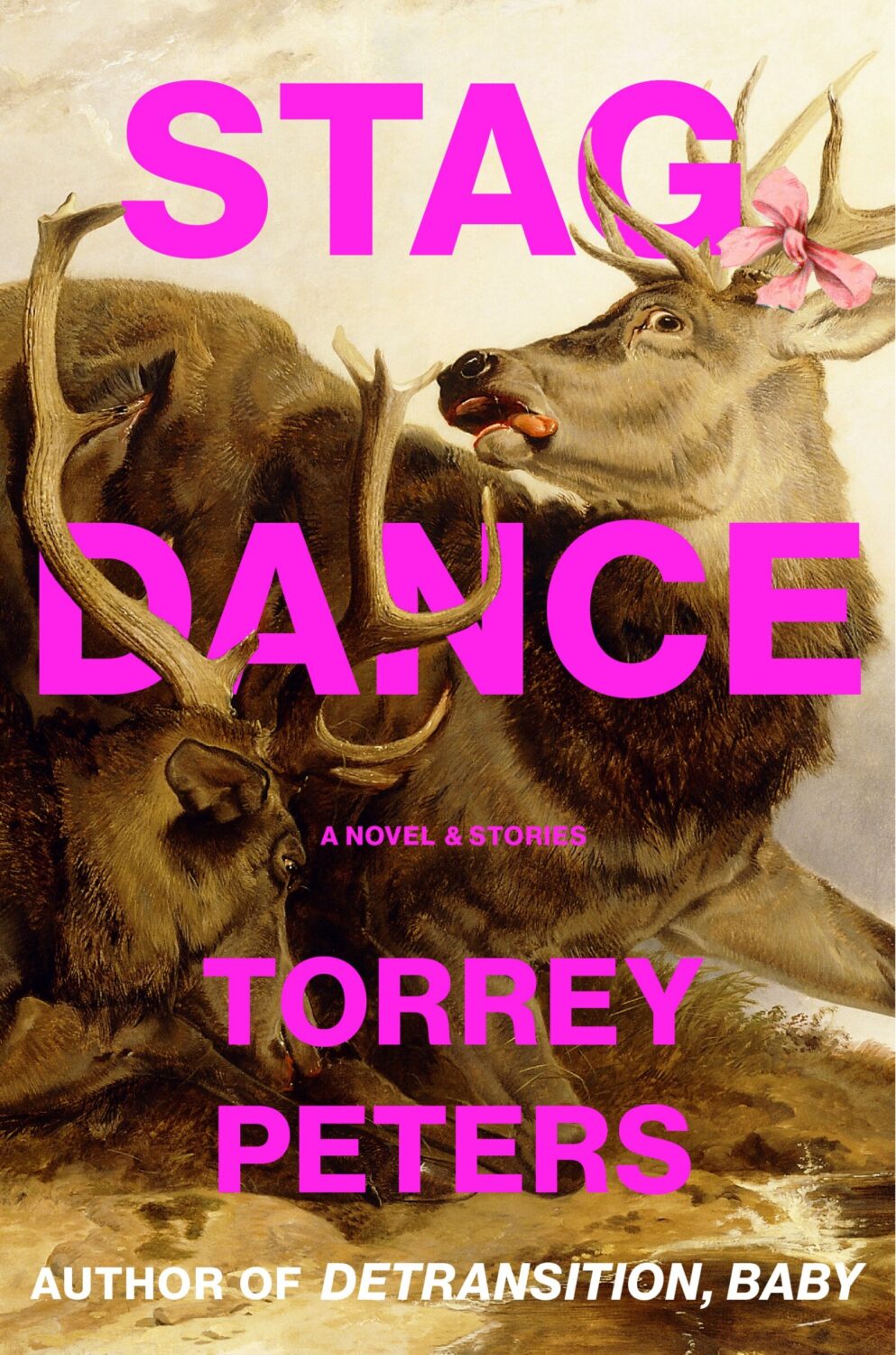
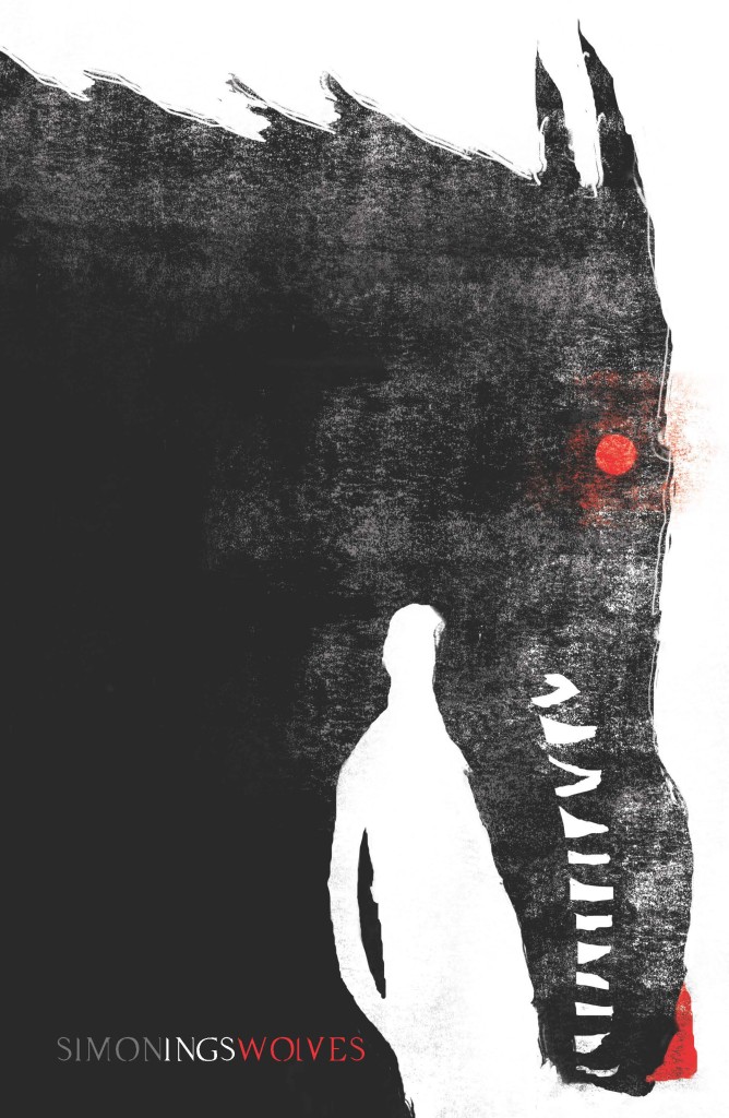
Dogs by C. Mallon; design by Jaya Miceli (Scribner / August 2025)
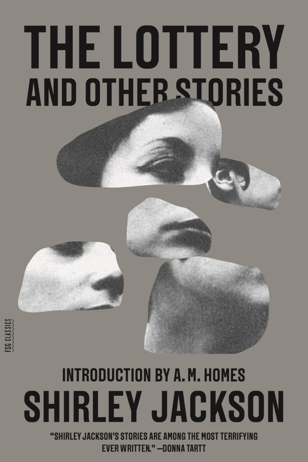
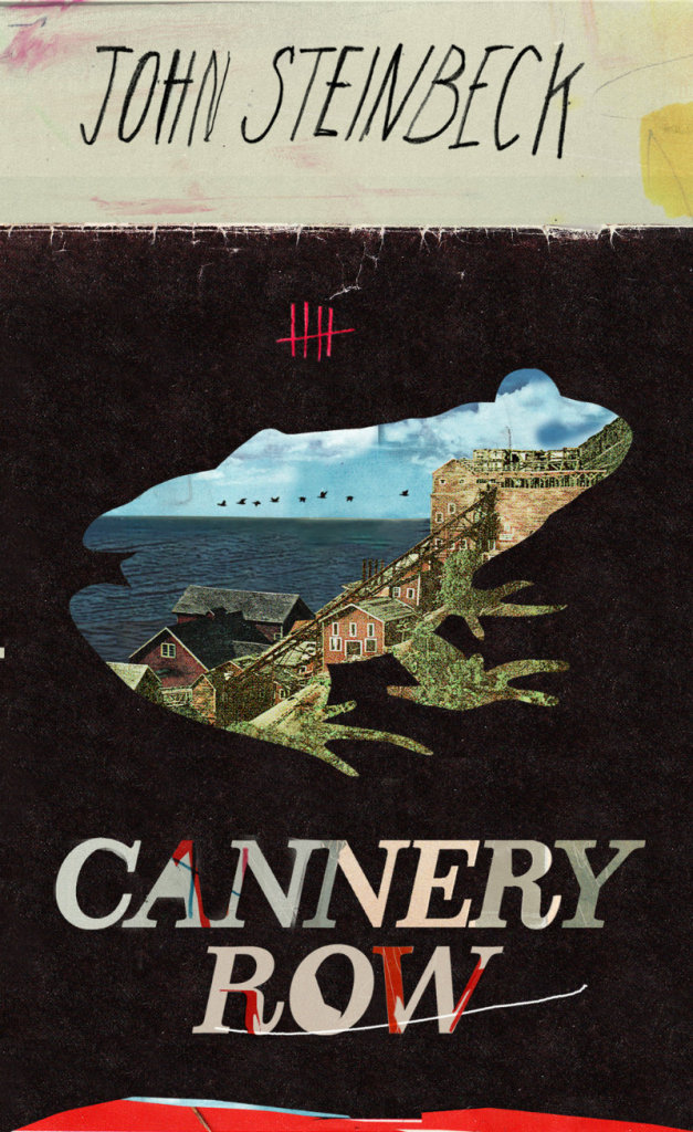
Is the “blob cut-out” a thing? I kind of thought it was but then I couldn’t think of any other examples except maybe this Paul Sahre / Erik Carter cover for The Lottery and Other Stories by Shirley Jackson from a few years ago, which is more of a collage really. Are they any other examples?
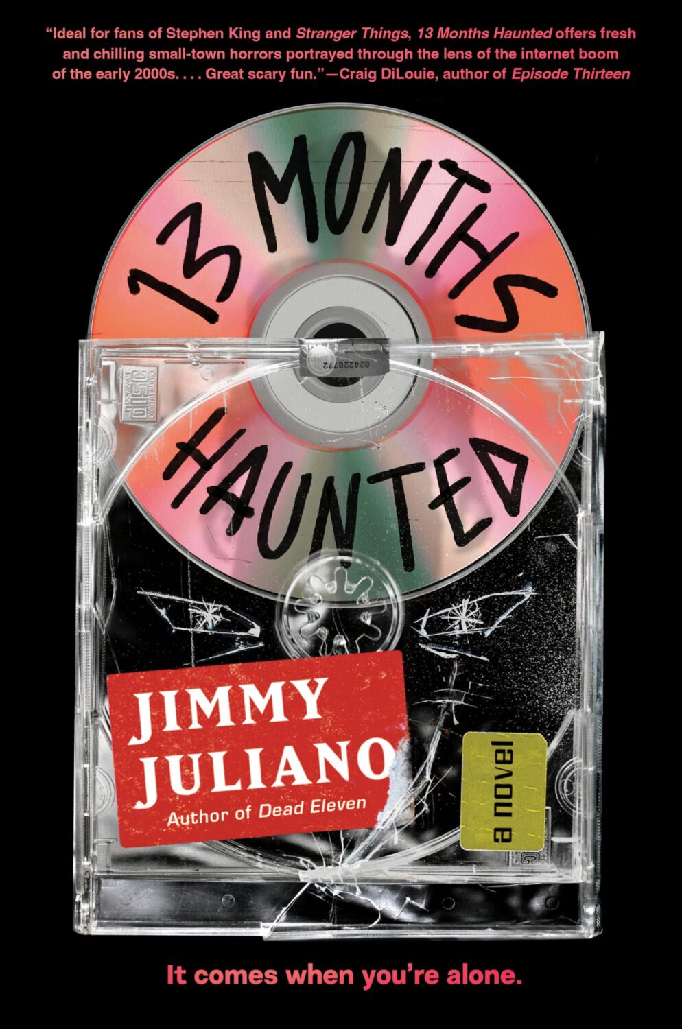
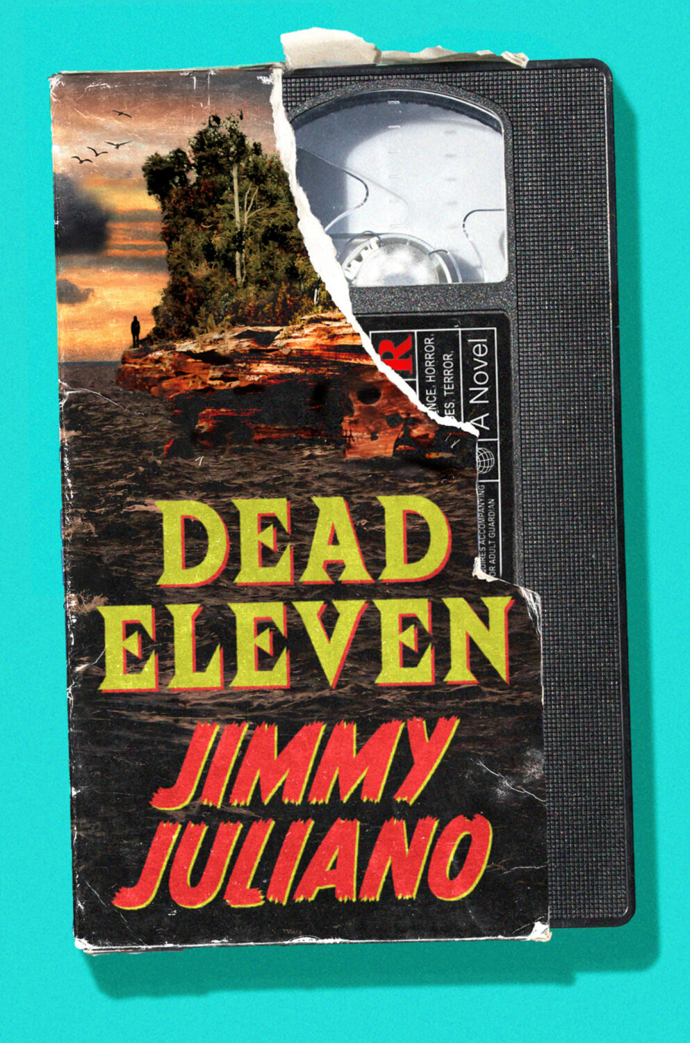
Alex also designed the cover of Jimmy Juliano’s previous book Dead Eleven. I confess I have mixed feelings about the current nostalgia for all things 1980s/90s…
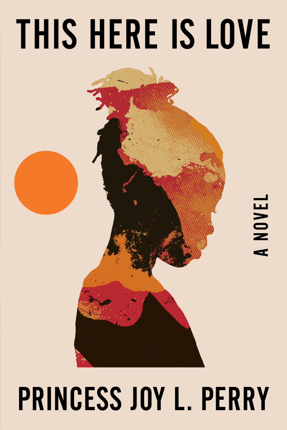
This Here is Love by Princess Joy L. Perry; design by Keith Hayes (W.W. Norton / August 2025)
I was reminded, looking back at the posts from 2018, that someone really should collect Keith’s photos into a book…
Well, I don’t know about you, but I certainly didn’t miss the ceaseless chaos and constant anxiety. It is exhausting.
Anyway… I hope you’re keeping safe and well despite it all. I don’t know where March has gone, but this month’s post is another bumper edition with lots of great covers. I’m happy to have a bit more nonfiction in the mix, and there are lots of covers from indie publishers and even a university press along side the usual suspects. There are also a couple of Canadians if you’re keeping score.
Disposable by Sarah Jones; design by Keith Hayes; photograph by Susan Goldstein (Avid Reader / February 2025)
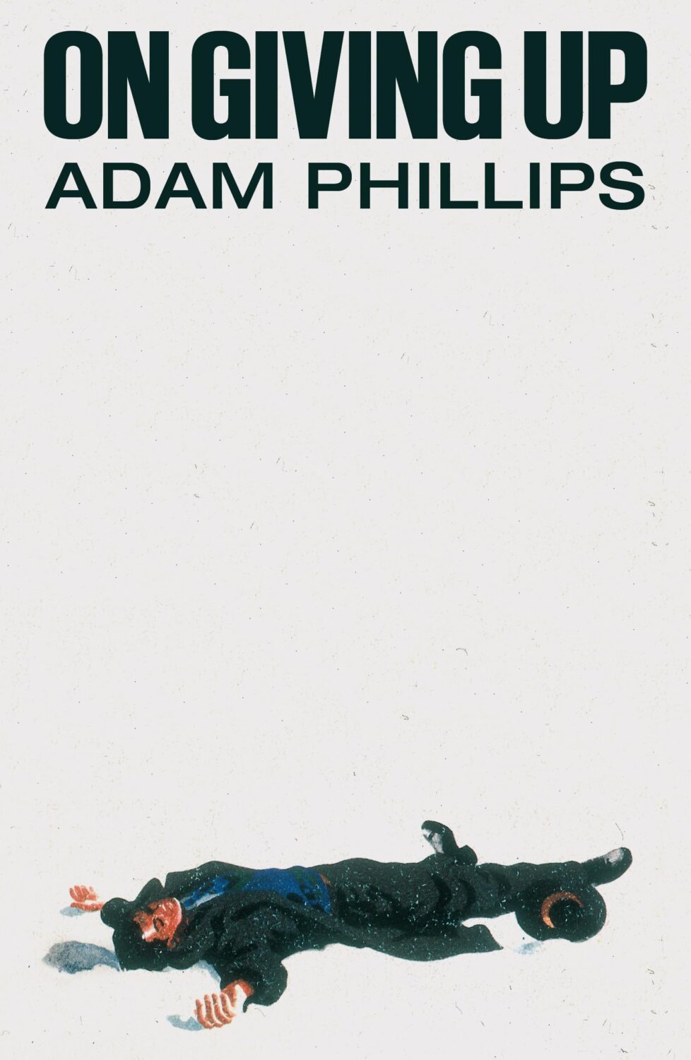
On Giving Up by Adam Phillips; design by Alex Merto (Farrar, Straus & Giroux / March 2024)
Yes, this is from March 2024, so I am precisely a year late posting it. Either I didn’t see it last year or I couldn’t find the credit at the time. Anyway, Alex posted or re-posted this cover relatively recently and it spoke to me.
I also thought it went quite well with this cover…
The slightly less bonkers, but also fun cover of the US edition (published by Scribner this month) was designed by Math Monahan. I’m also quite partial to the definitely bonkers Polish(?) cover designed by Tomasz Majewski.
It is the time of year for lists and I should’ve been done weeks ago, but I am late and already well behind the pack. Apologies for that.
I admire Matt Dorfman‘s ability to whittle his list down to a dozen covers for the New York Times. I imagine it takes him a lot less time for one thing, but I’m sure Matt still agonizes over every cover. It requires a level of discipline and restraint that I do not possess to keep it that tight year after year.
PRINT’s list of best book covers of 2024, compiled by editor-at-large Zachary Petit, is also long. It’s a 100 covers. Last year it was 50.
I’m not trying to throw stones here. We are all seeing more covers than we used to. There are more books for one thing. But they’re not just something we just experience in print in anymore. You don’t have to go into a bookstore or read the newspaper or magazine to see them. They’ve become something we see and share all the time online. Designers are promoting their own work and (slowly) getting more credit for it (although there is a lot more to be done in that area. Publishers — credit your designers!). My monthly round-ups are now one of several you can choose from.
And it is not like my list is short. This year it features work by 48 designers — more than half of them women — and 86 covers (plus a couple of supplementary images).
The consensus seems to be that it was a decent year for covers, and it’s hard to argue with other people’s selections even if I don’t love them all.
It is telling though that 100 of LitHub’s selections were individual picks. There are covers on my list that are not on the anyone else’s despite their length. So while I think we agree there were lots of good covers, I’m less certain we entirely agree on which ones were actually the outstanding ones.
A recent article Spine argued that there is a battle between minimalism and maximalism going on (you can find Spine’s end of year list here by the way). I think that could be true. Different approaches work for different audiences. But I also think it’s messier than that. I get the sense that publishers are less sure of what they want and what sells (certain genres notwithstanding).
It has been a rough year for a lot of publishers, so there is undoubtedly a lot of uncertainty, and no small amount of anxiety. I could go on about why that it is (and the publishing’s self-inflicted wounds) but, in short, what I think we’re also seeing with book covers is more meddling and less direction.
Anyway, I don’t want to end this on a bleak note. This year was shit enough. Despite it all, there genuinely were a lot of good covers in 2024, and some that I did think we’re outstanding. A couple of them made me laugh, which was no small thing. It was a strong year for several individual designers in particular and, despite the pressures, many produced work that was recognizably theirs. I thought there were more interesting covers coming out of the UK and Ireland (that mercifully wasn’t just about the inks or the finishes!), and there were some fun Canadian covers too.
Thanks, as always, for reading, and I hope you’re all keeping safe and well. Happy Holidays!
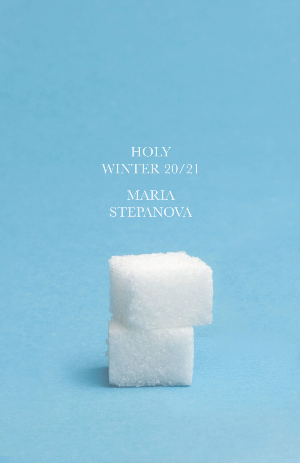
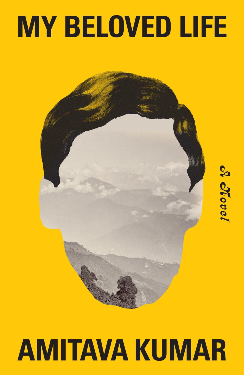
Holy Winter 20/21 by Maria Stepanova; design by Oliver Munday (New Directions / October 2024)My Beloved Life by Amitava Kumar; design by Oliver Munday (Knopf / February 2024)
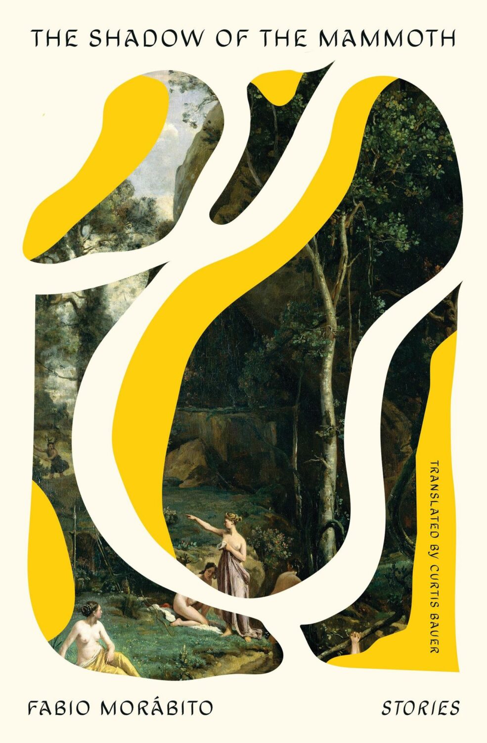
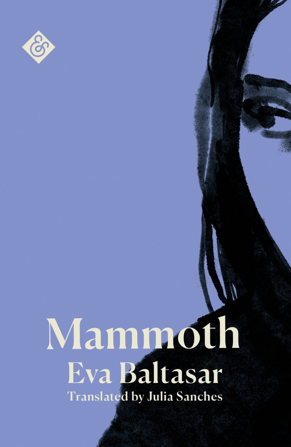
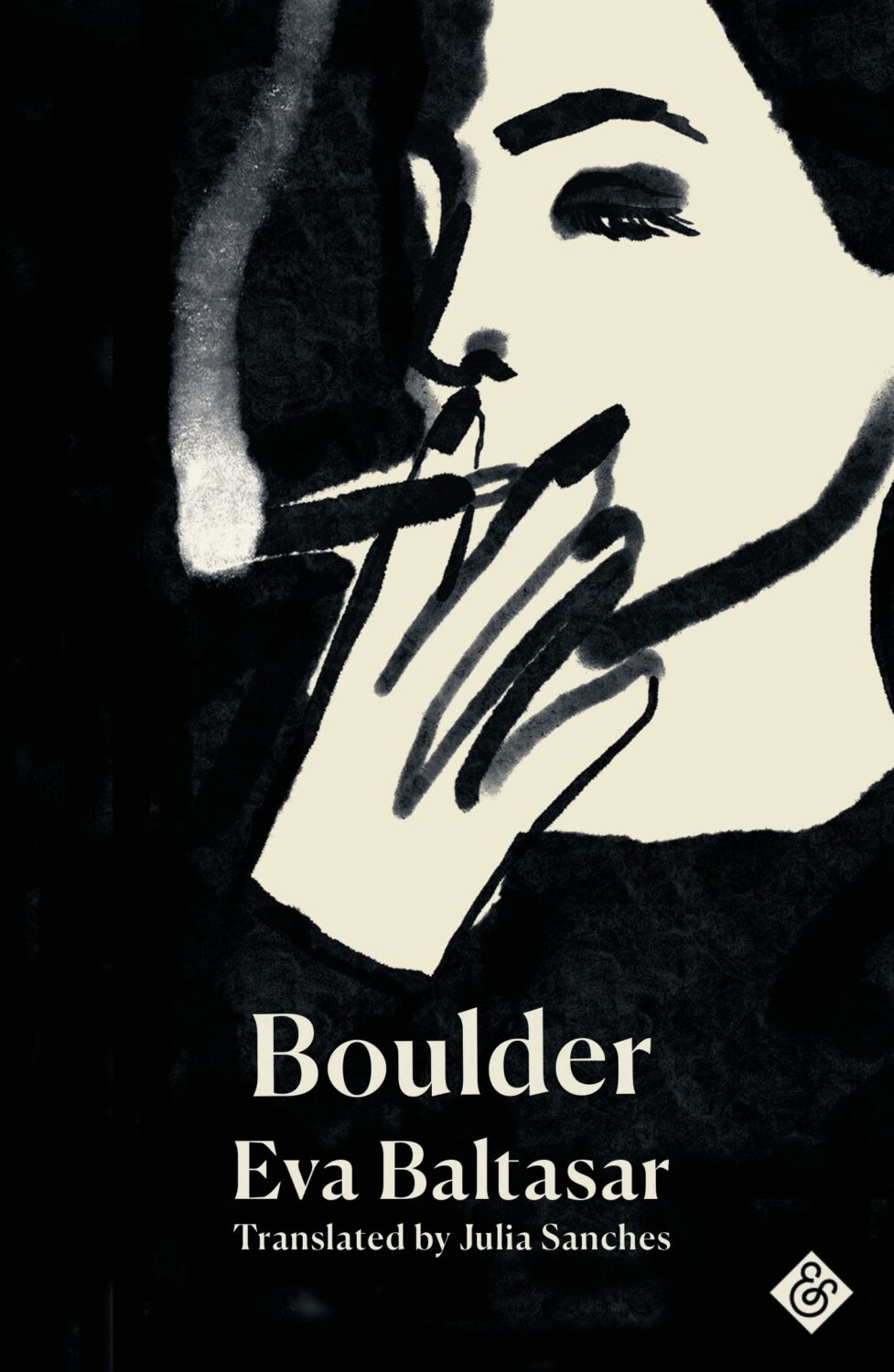
Mammoth by Eva Baltasar; design by Anna Morrison (And Other Stories / August 2025)
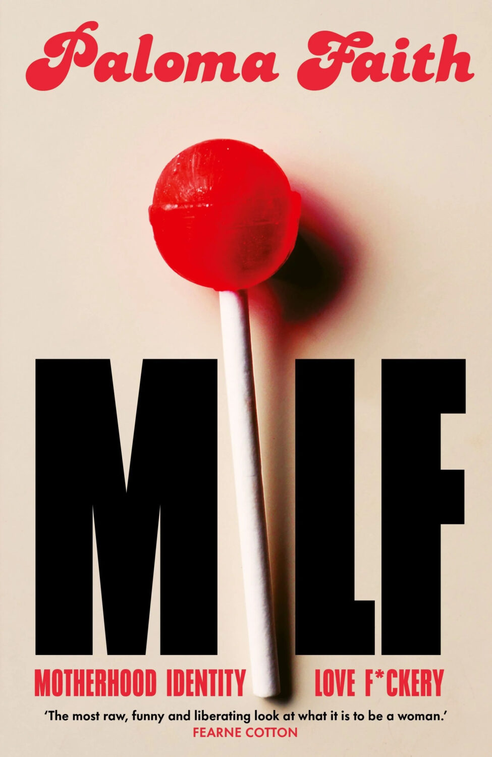
MILF by Paloma Faith; design by Jack Smyth (Ebury / June 2024)
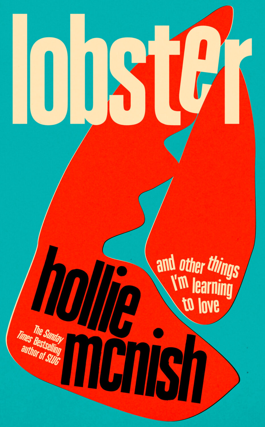
Also designed by Jack Smith:
Lobster by Hollie McNish; design by Jack Smyth (Little, Brown / March 2024)Neu Klang by Christoph Dallach; design by Jack Smyth (Faber & Faber / May 2024)
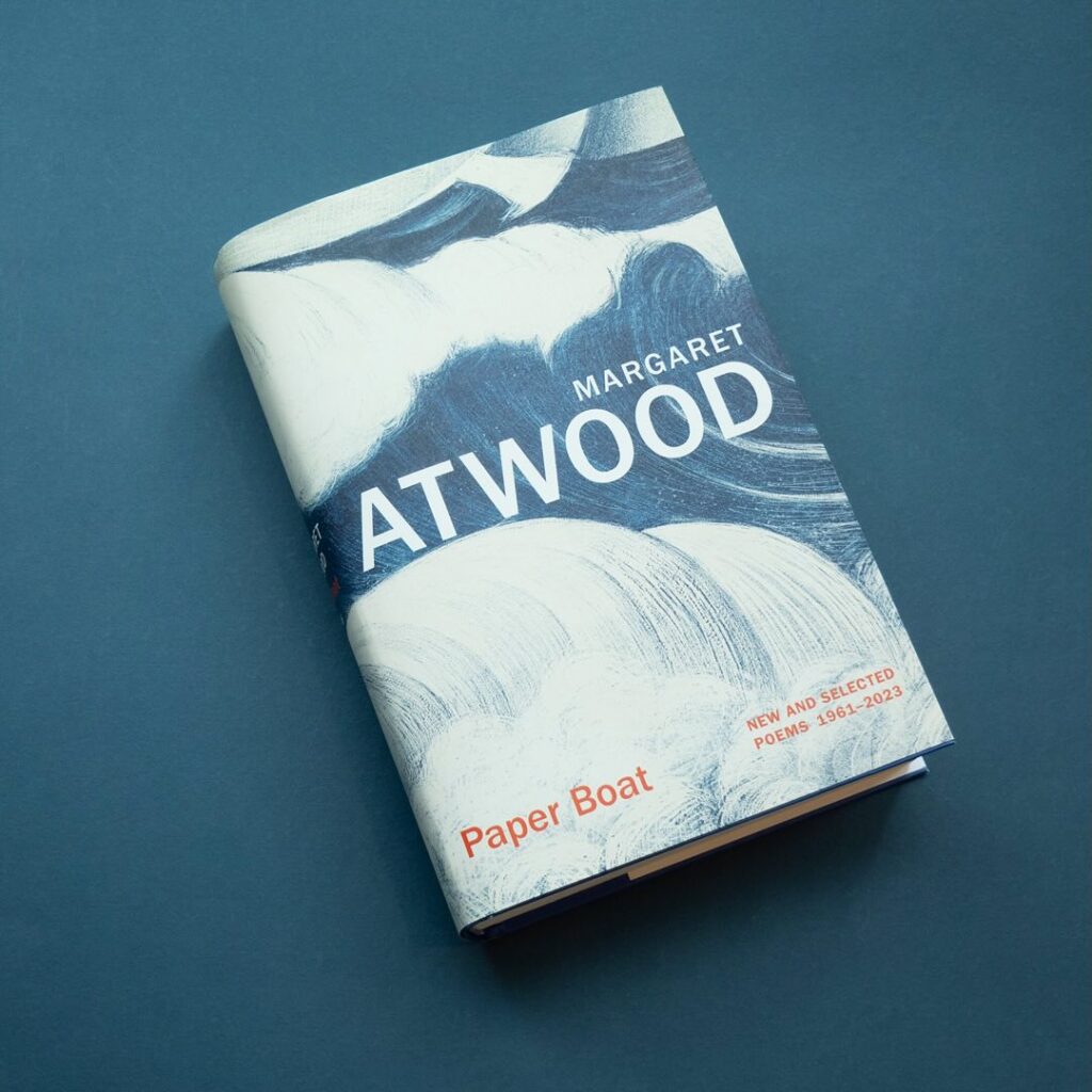
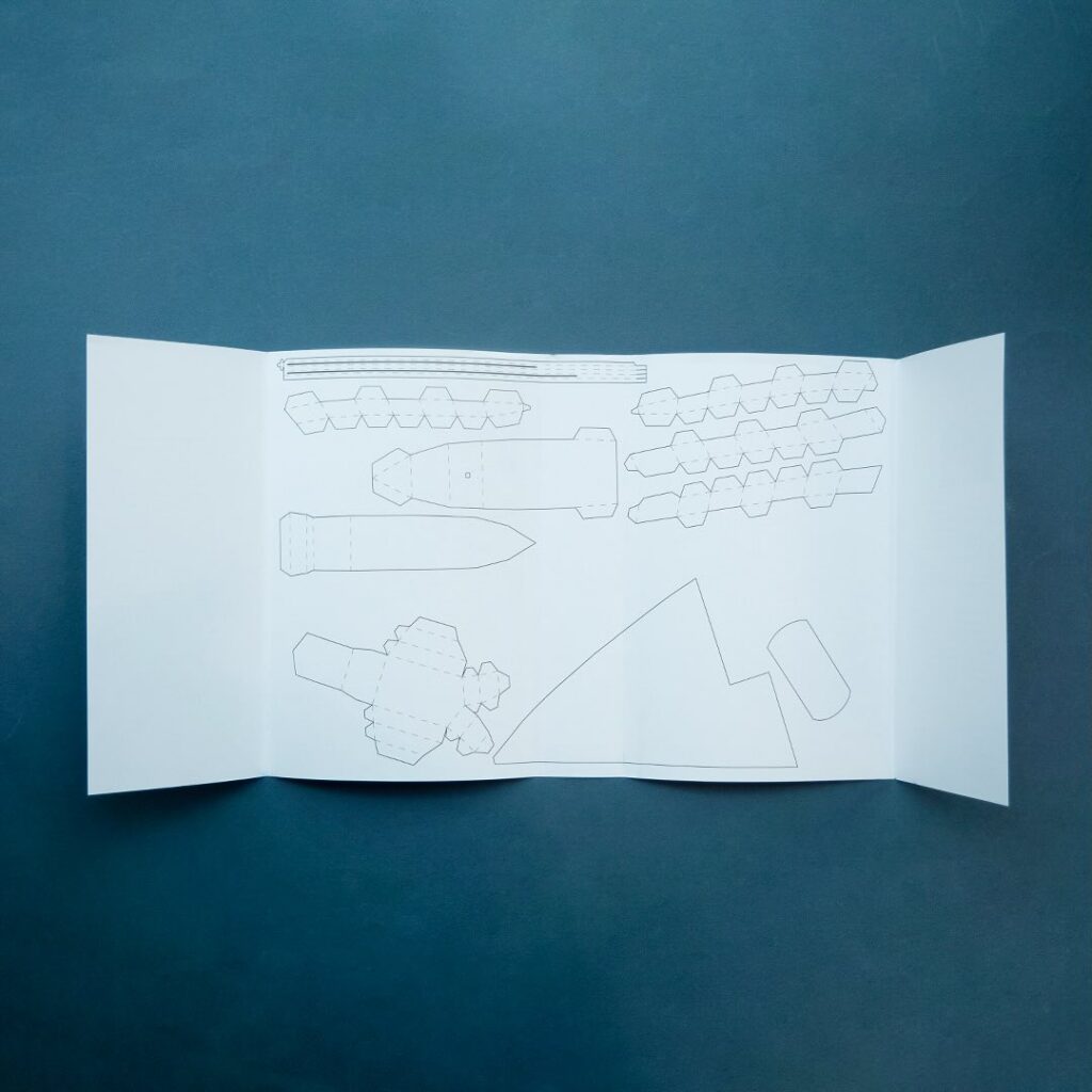
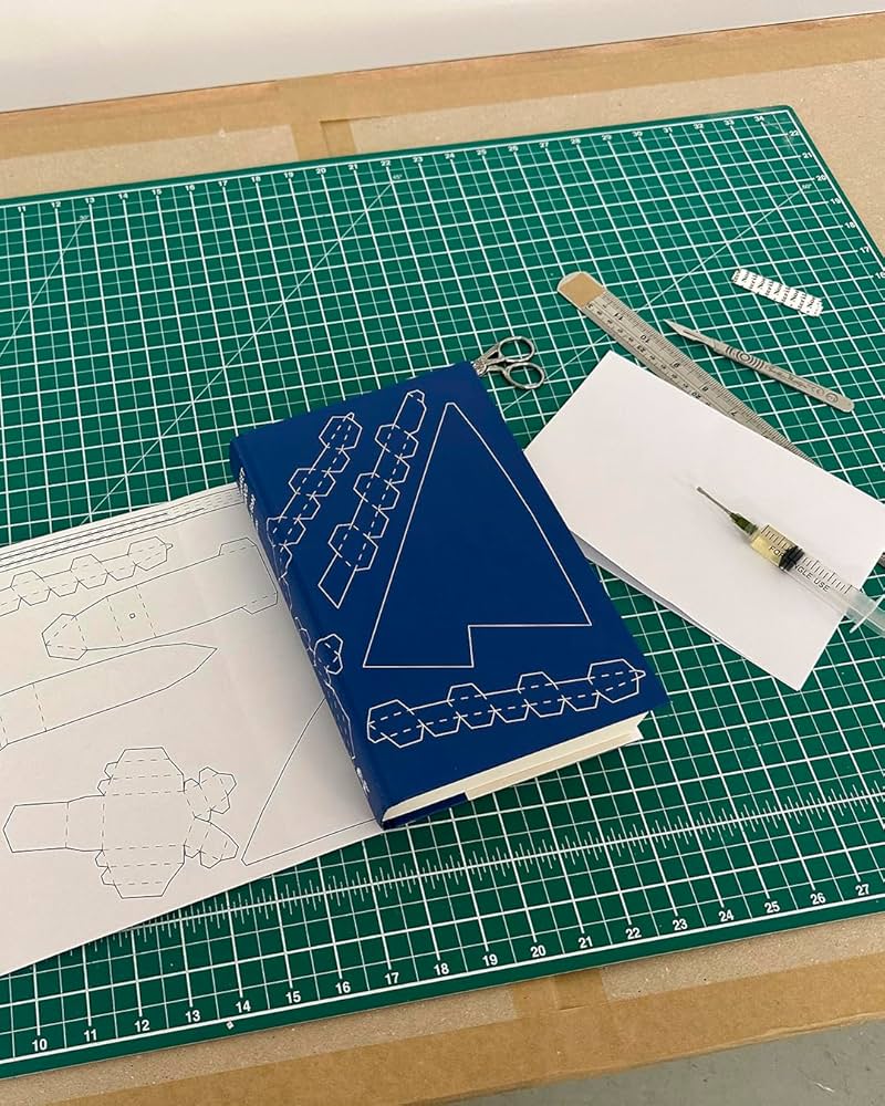
I also have to give a special shout out to the cover for Paper Boat by Margaret Atwood (Chatto & Windus / October 2024). Suzanne commissioned paper art by Nathan Ward to design a template for a paper boat that could be cut out from the dust jacket and stuck together.
Hey, I hope you’re keeping safe and well. I feel like I just finished July’s post and now it’s the end of August. There are a few more covers from earlier in the year in this month’s post. I’m still catching up. But there’s some Canadian content, a few covers from the UK, some indie presses, and a university press, which is always nice. Enjoy the last few weeks of summer!
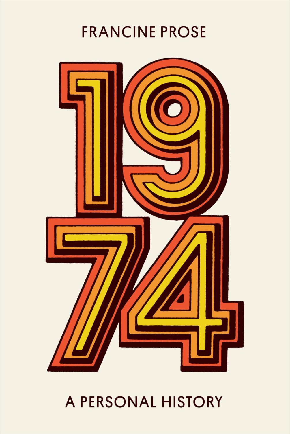
1974 by Francine Prose; design by High Tide (Harper / June 2024)
Thanks to Robin Bilardello and AD Milan Bozic at Harper for their help on the credit for this one! :-)
Anyone’s Ghost by August Thompson; design by Keith Hayes (Penguin Press / July 2024)
This was published last month, but I had it in my August folder. If I had to guess it was because of the author’s name. I am easily confused.
I think this came out in July too, but it looks like Faber used the ISBN of the existing 2017 edition even though there is a new cover so I don’t know for sure when it was updated (publishers: don’t do this).
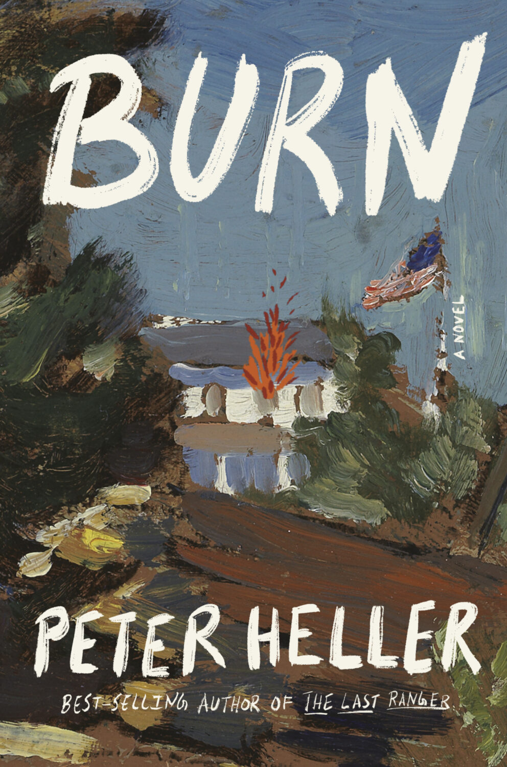
Burn by Peter Heller; design Kelly Blair; painting ‘Boat Building in Maine’ (detail) by Paul Dougherty (Knopf / August 2024)
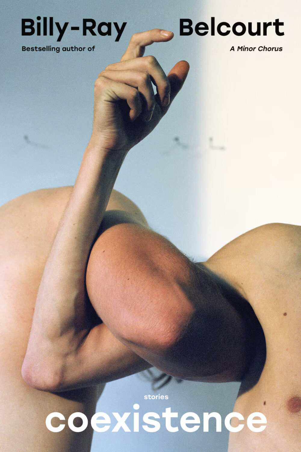
Coexistence by Billy Ray Belcourt; design by Kelly Hill; photography by Steven Beckly (Hamish Hamilton Canada / May 2024)
Because I am of certain age (old and mouldering like an ancient vampire hiding from the sun of contemporary pop culture) this reminded me of the cabinet art for the original Space Invaders arcade game. Hilariously, if not surprisingly, there is a Fonts in Use post about the typography of the original promo materials and cabinet art of Space Invaders. If anyone knows of a good article about the artwork itself I would love to read it.
Speaking of all things retro, Henry has posted some photos of his Letraset experiments for this cover on Instagram.
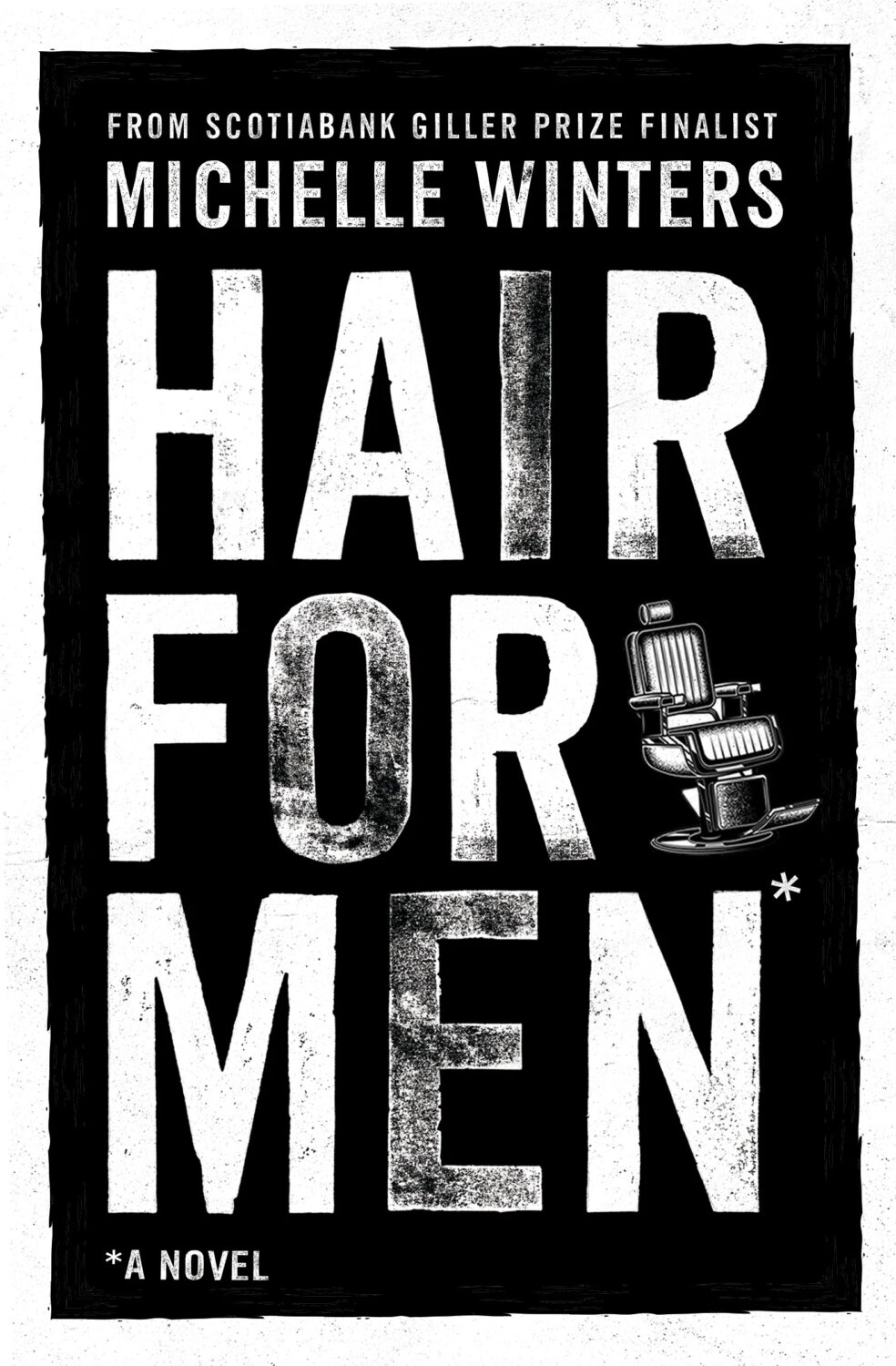
Hair for Men by Michelle Williams; design by Greg Tabor (House of Anansi / August 2025)
There is something ‘early 2000s Canlit’ about this cover. If you’d told me this was designed for Anansi by Bill Douglas in like 2004 I would’ve believed you, and I mean that in the best way. (I appreciate that only the grizzled Canadian publishing folks like me will get this reference but hey…)
Mammoth by Eva Baltasar; design by Anna Morrison (And Other Stories / August 2025)
Anna also designed the covers for two previous novels by Eva Baltasar published by AOS, including a pink special edition of Permafrost (which is possibly my favourite).
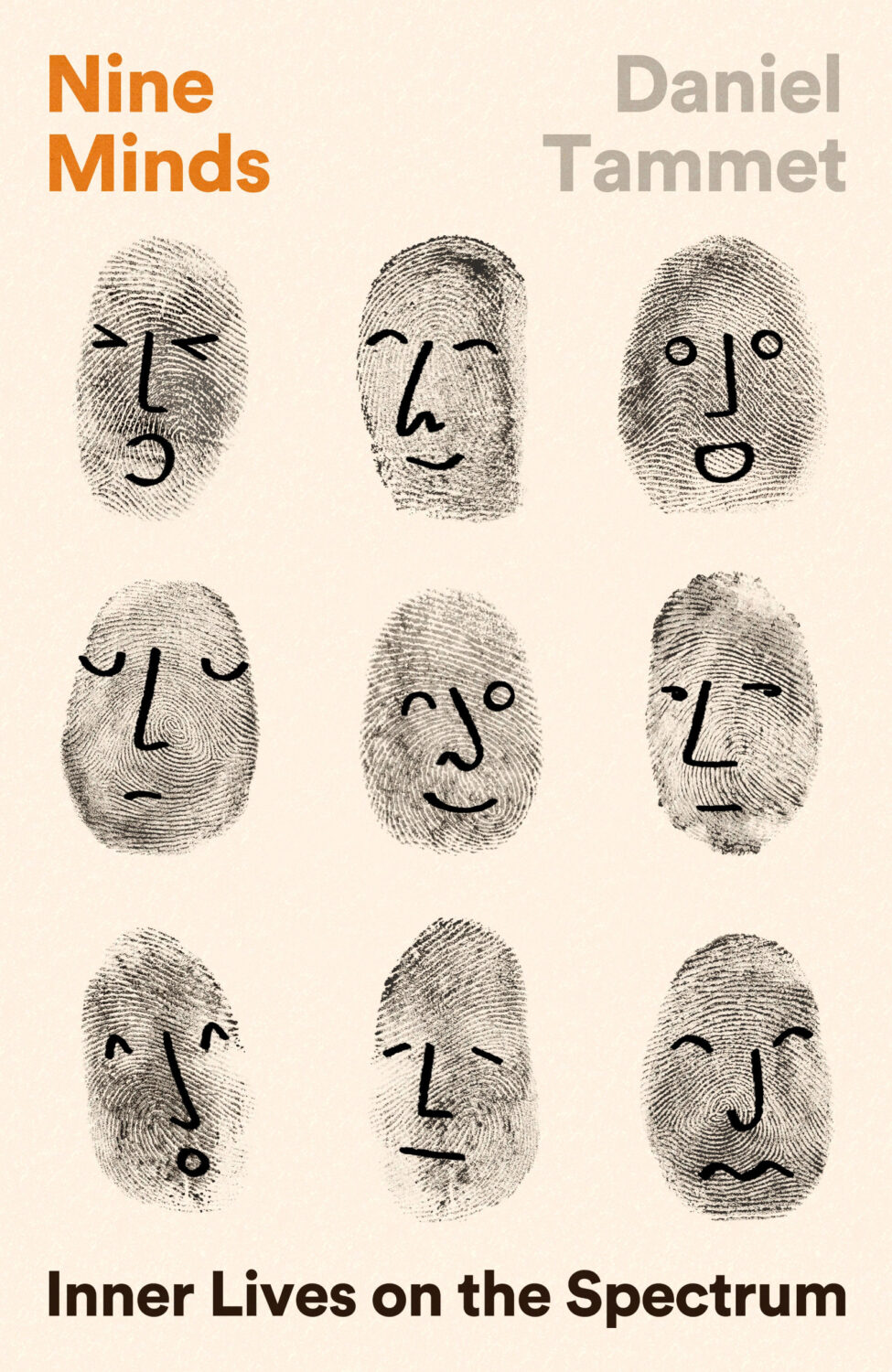
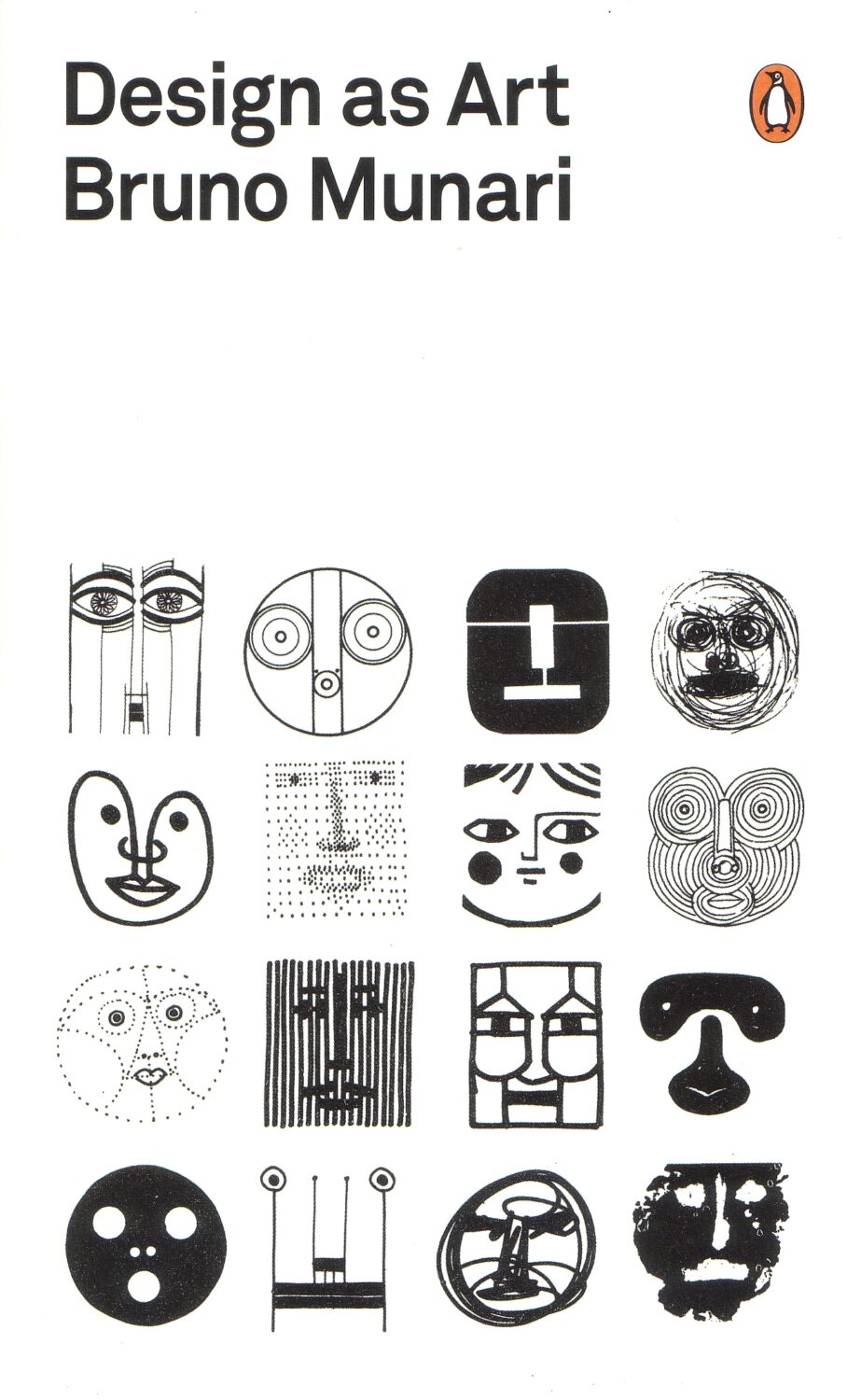
I was trying to think what this reminded me of and I think it’s either Ed Emberley’s Great Thumbprint Drawing Book or possibly the current cover of Design as Artby Bruno Munari, which (IIRC) uses drawings of faces from inside the book (but no thumbprints!).
I don’t know how you would describe this particular shade — salmon pink? Financial Times pink? (Are those variations of the same thing, actually?) — but it feels like a pink covers are still a bit of thing. (Did I mention pink covers already a couple of months ago? I think I did…? Sigh. I am repeating myself. It might be time to give this up)
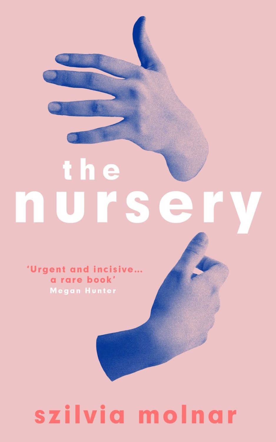
I like this cover a lot, but is the disembodied hug also becoming a thing? I think I mentioned this a while back too! (Pictured: the cover The Nursery by by Szilvia Molnar designed by Hayley Warnham from May last year, and a poster by Vasilis Marmatakis for the 2015 movie The Lobster)
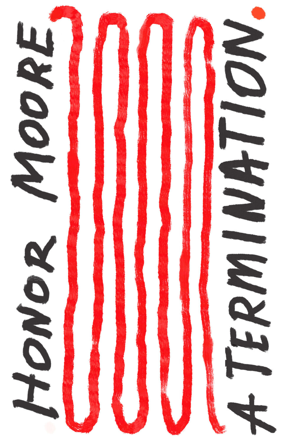
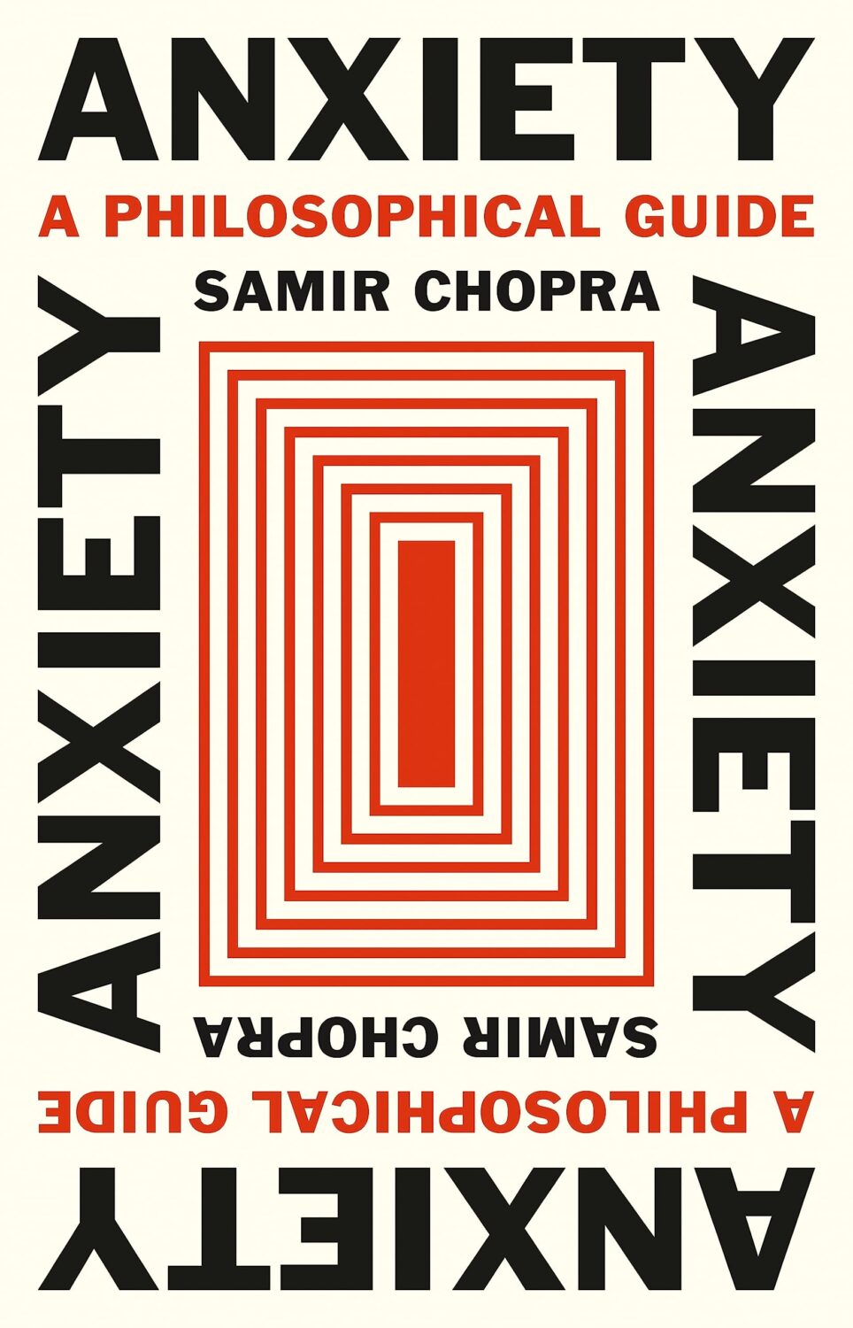
Obviously the details of the designs and the approaches are quite different, but the cover of A Termination reminded me of the cover of Anxiety by Samir Chopra designed by Karl Spurzem for Princeton University Press from March this year. I think it’s an interesting compare and contrast?
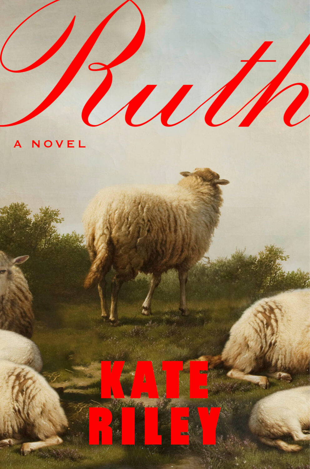
The Wisdom of Sheep by Rosamund Young; design by Darren Haggar (Penguin Press / August 2024)
Sam by Allegra Goodman; design by Donna Cheng; photograph by Mariam Sitchinava (Dial Press / January 2023)
I’m not sure exactly why, but I just assumed this was a UK cover when I first saw it (despite it literally having “New York Times Bestselling Author” in all-caps at the top!).
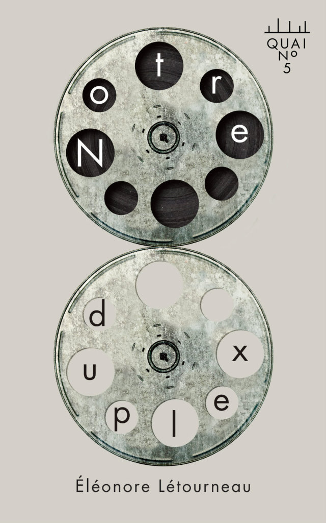
Sing, Nightingale by Marie Hélène Poitras; translated by Rhonda Mullins ; design by Ingrid Paulson (Coach House / February 2023)
For some reason this makes me think of the ‘weird nature’ (including animals with human eyes!) in Annihilation by Jeff Vandermeer, which is still one of my favourite novels of the last 10 years…
True Life by Adam Zagajewski; design by Jeff Clark (Farrar, Straus & Giroux / February 2023)
I also saw Pete Garceau’s cover for School House Burning by Derek W. Black recently, which snuck past me when it was published by PublicAffairs in September 2020 but still seems terribly au courant…
Wolfish by Erica Berry; design by Keith Hayes; illustration by Rokas Aleliunas (Flatiron / February 2023)
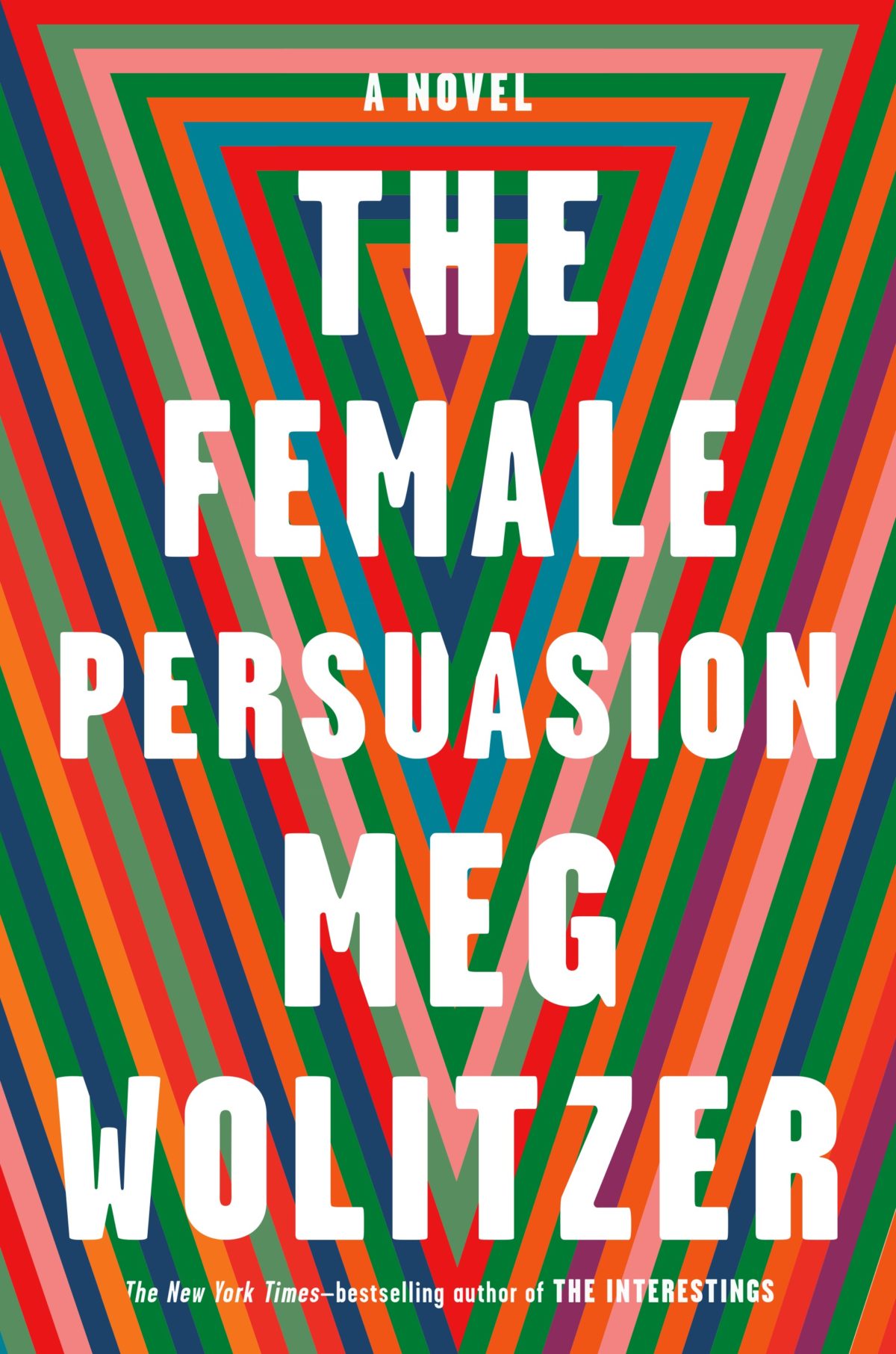
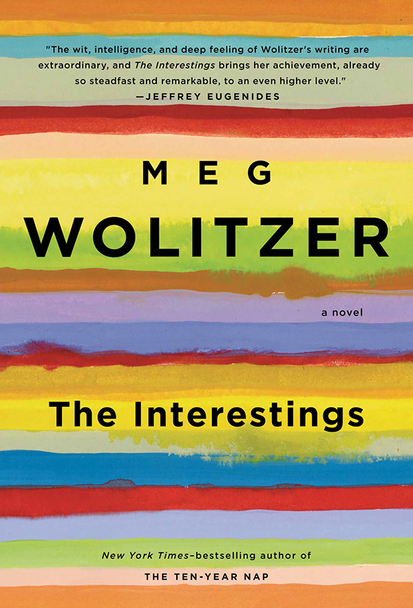
I like how the design for The Female Persuasion has bands of colour similar to those on Lynn Buckley’s cover design for The Interestings, but uses them in a completely different way…
Patient X by David Peace; design by Luke Bird (Faber & Faber / April 2018)
And on the subject of David Peace, Steve Panton has designed new covers for the Red Riding Quartet (1974, 1977, 1980 and 1983) published by Serpent’s Tail this month:
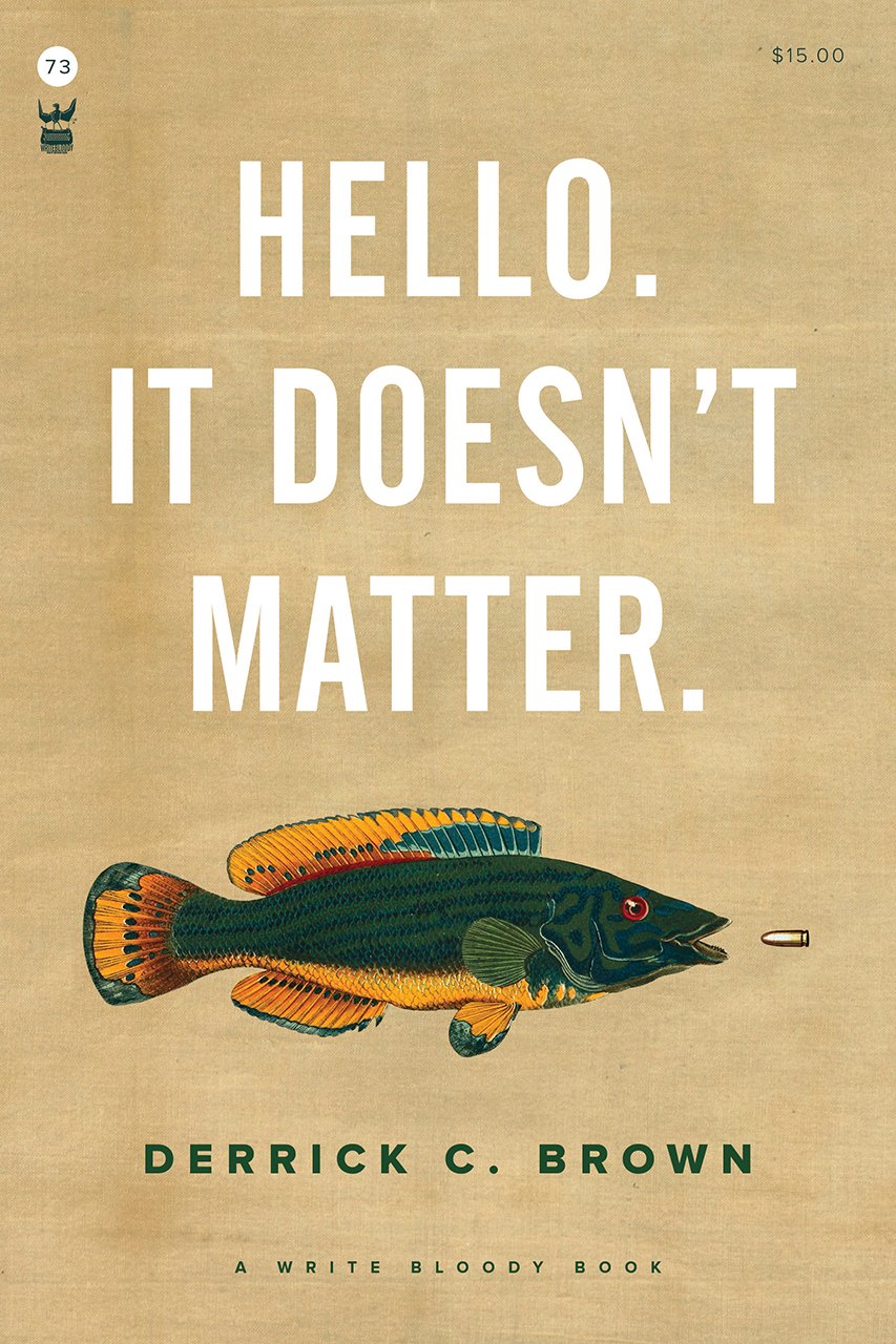
Funnily enough, I was just discussing the prevalence of big and centred white sans serif type on contemporary book covers on Twitter. While it’s common (see the covers of The Female Persuasion and Hello, It Doesn’t Matter above!), it’s also effective when it’s done well. That said I did think that David Pearson — a designer well known for his typographic covers — made a good general point about big type:
The idea that legibility is enhanced by big type is so flawed. Big type surrounded by busyness is often no more legible than small type surrounded by space. Perhaps it is the space that people are scared of. Our idiot eyes might look at the wrong part of the cover.
She Regrets Nothing by Andrea Dunlop; design by Rachel Willey (Washington Square Books / February 2018)
Sunburn by Laura Lippman; design by Elsie Lyons (William Morrow / February 2018)
I included the cover of Sunburn and Elsie Lyons’s cover for The Woman in the Window by A.J. Finn (featured last month) in a recent presentation about the differences between US and UK cover design. UK editions of both books have a much more conventional genre covers. They signal very clearly to readers that they are thrillers.
The US covers on the other hand have a much more literary, sophisticated look. They both have a distinctive, individual appearance (although I suspect we may see covers copying the approach of The Woman in the Window very soon!) that suggest that these are not your average thrillers.
It is not that one approach is necessarily better than the other from a marketing perspective (although I can guess which designers might prefer!), but it is an interesting contrast.
I will admit it was the photo-realistic painting that first drew my eye to this cover, but I also like that the blocky typography echoes the cover of the author’s previous novel California.
Woman No. 17 by Edan Lepucki; design by Michael Morris; illustration by Oliver Wilson (Crown / February 2018)
It’s October and the fall book season is in full swing. It’s kind of bonkers in the trade from now until Christmas, so this is the second to last (if not the actual last) cover round-up for 2014. I think I can probably squeeze in one more next month, but then we will be well into ‘covers of the year’ territory so we’ll have to see. I also have more posts in the Beasts! series (and goodness know what else) to fit in somehow! While I figure that out, however, here is this month’s collection of notable book covers…
10:04 by Ben Lerner; design by Scott Richardson (McClelland & Stewart / September 2014)
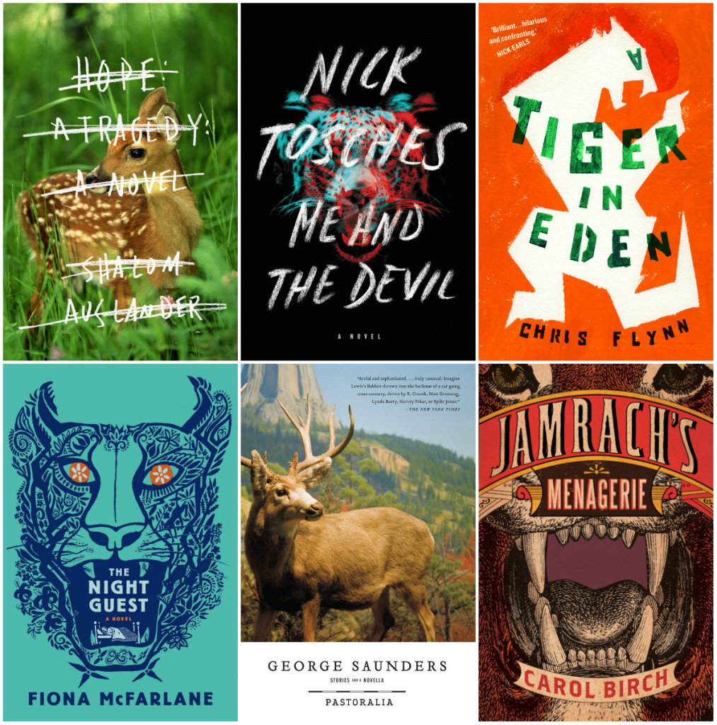
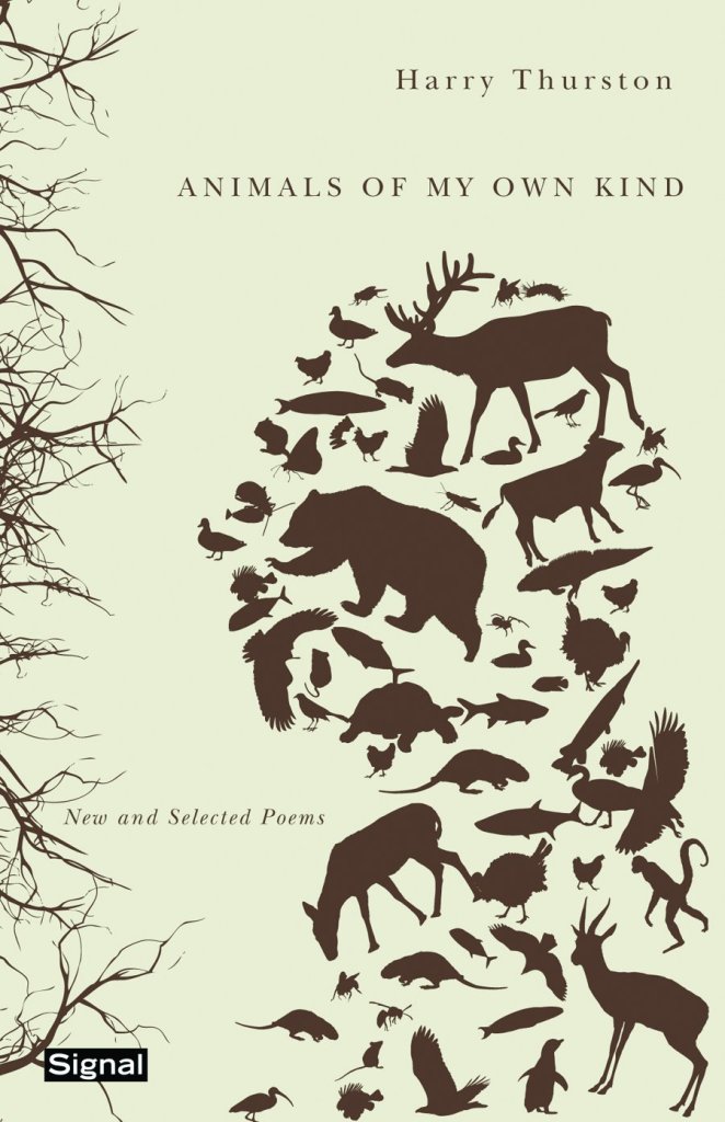
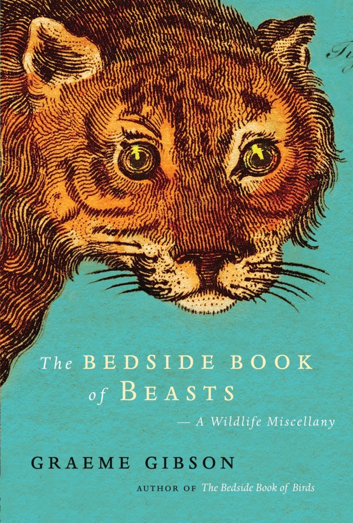
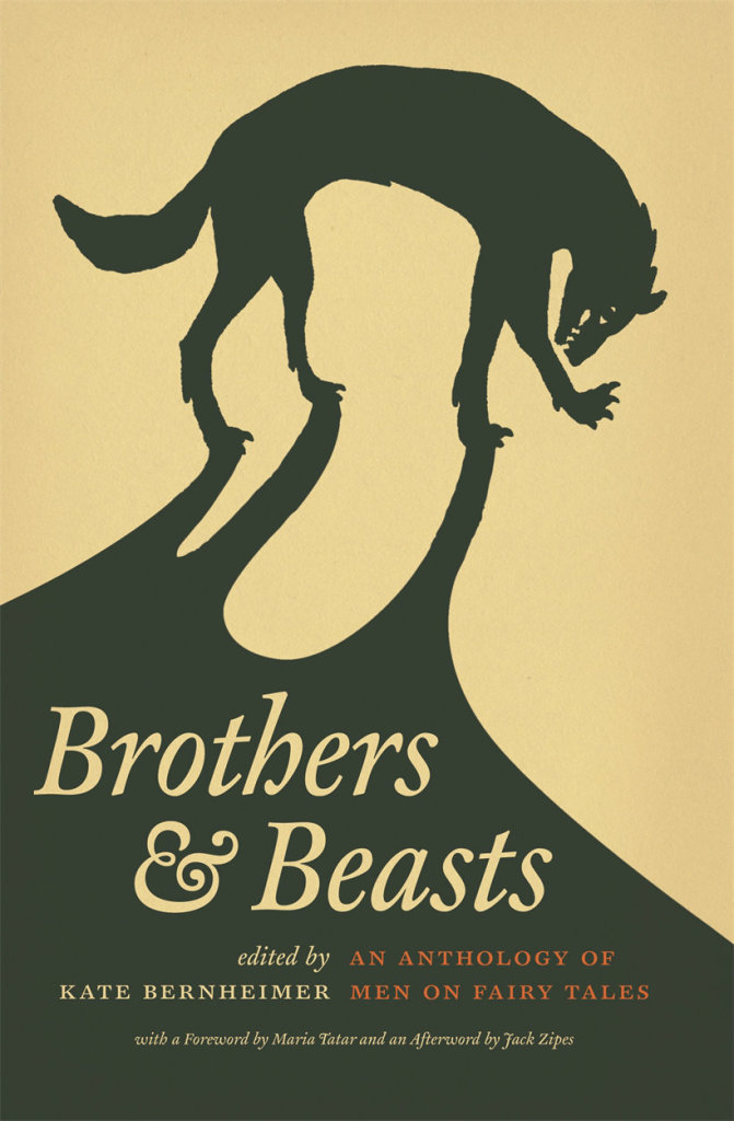
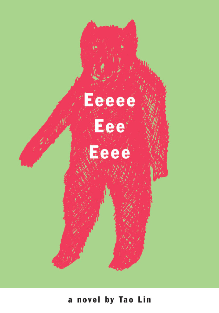
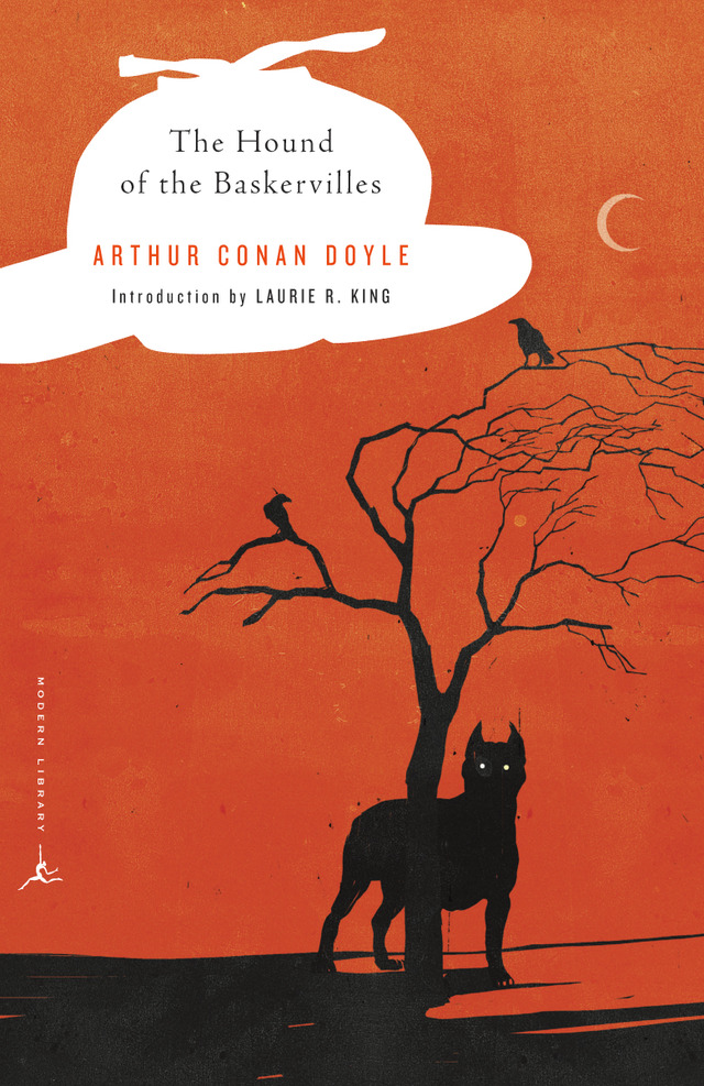
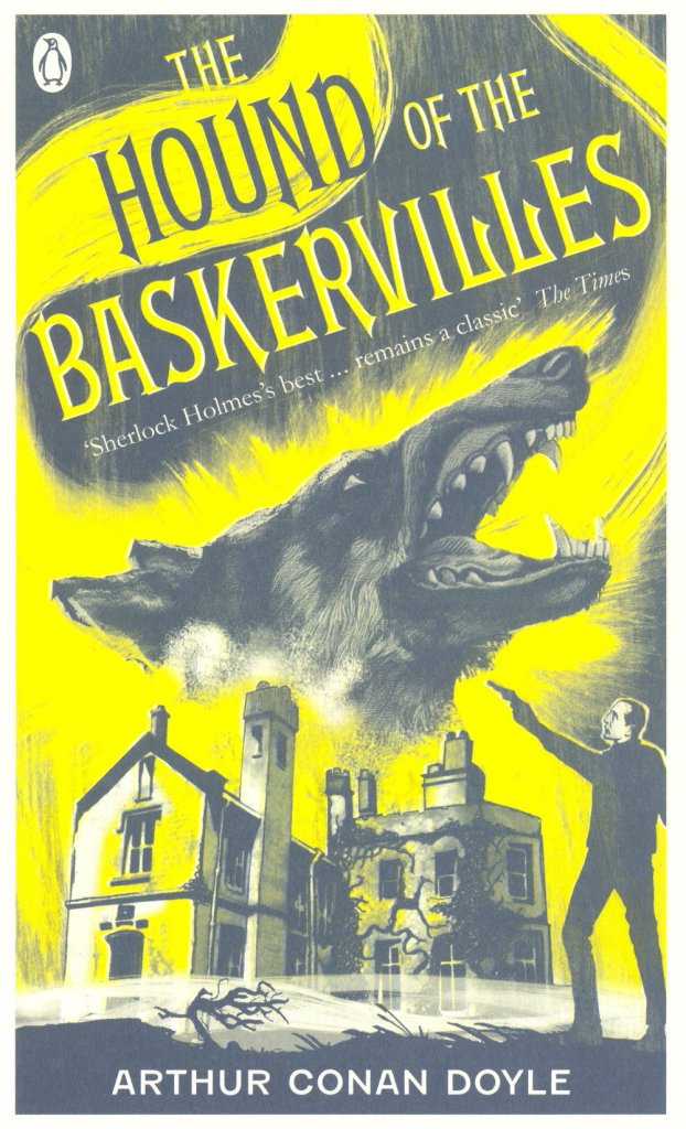
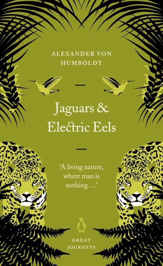
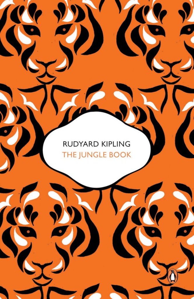
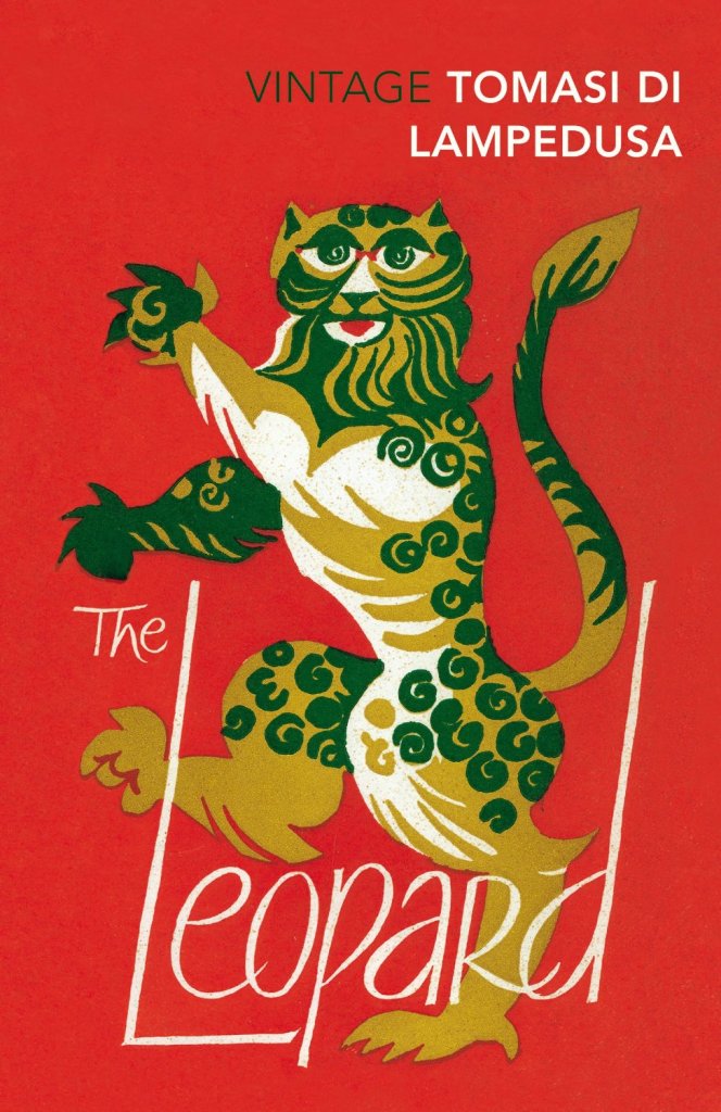
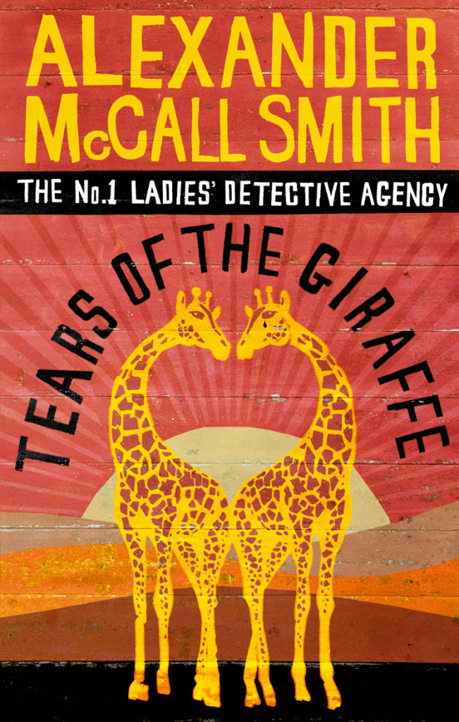
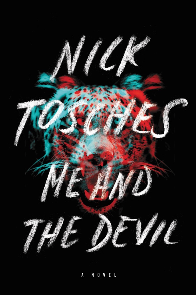
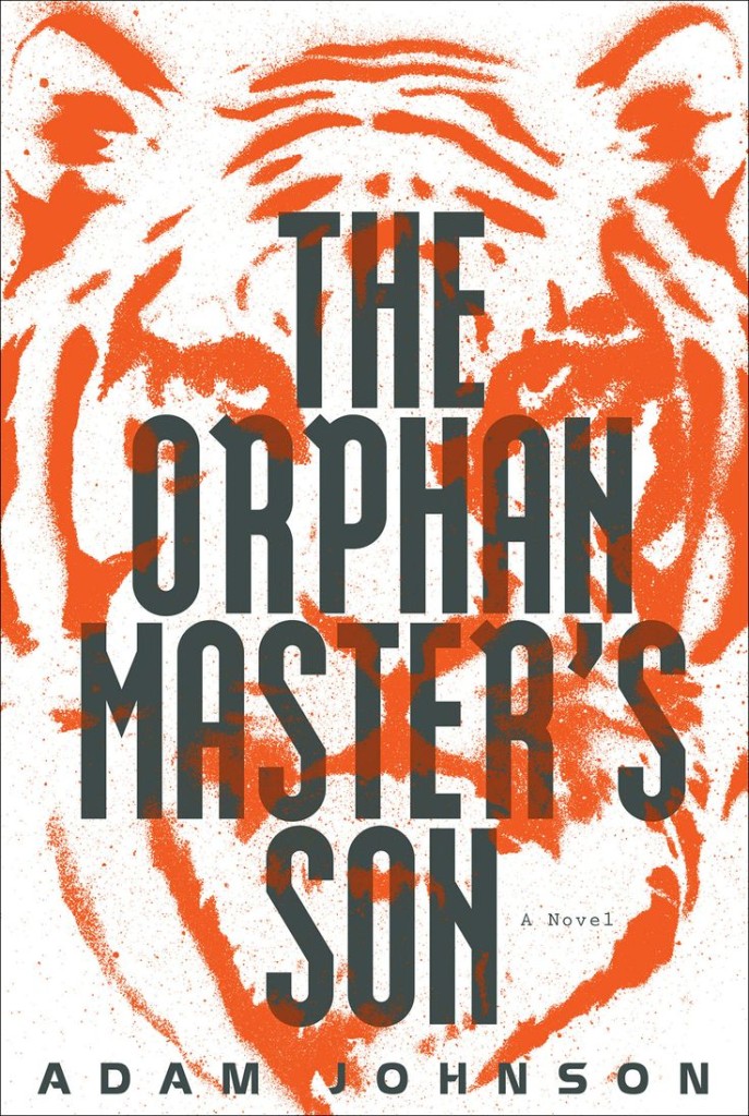
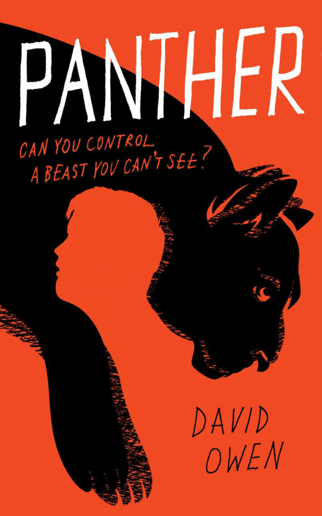
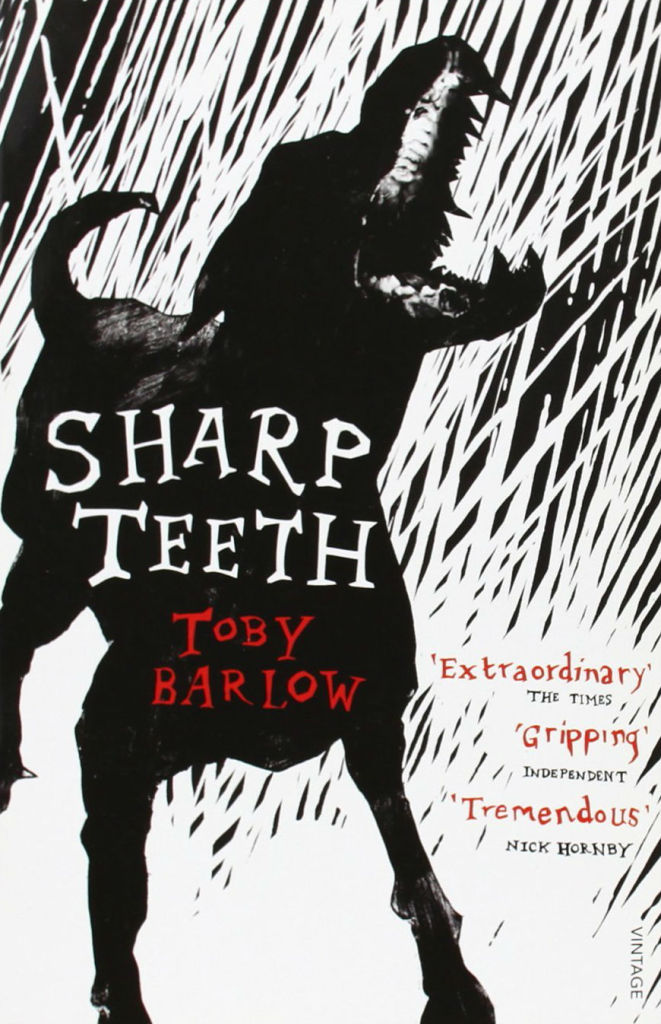
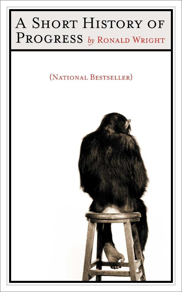
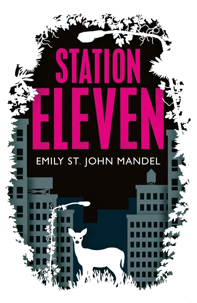
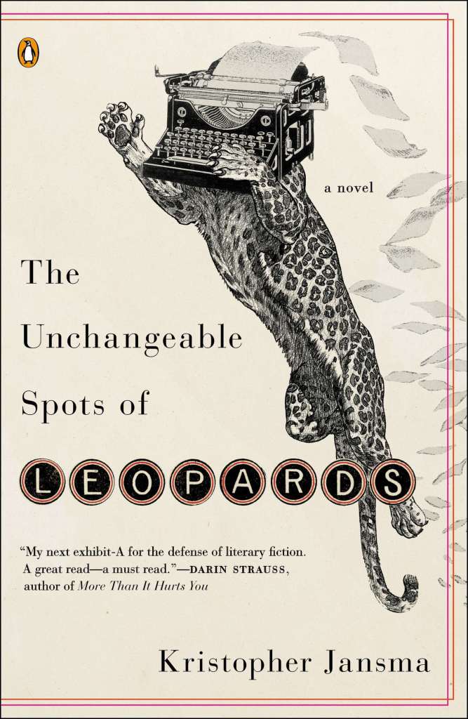
Lions and tigers and bears! Oh my! I’m kicking off a new series today on animal book covers. The first post is on ‘beasts’ — mostly ‘wild’ beasts, but one or two more domesticated (and dead) animals may have nosed their way in. Other posts series will look at birds, bugs, reptiles and amphibians, and quite possibly sea creatures and farm animals (unless someone pays me a large amount of money to stop before that). Thanks to all the designers, ADs, publicists and others who have been helping me with images and credits. If you notice that some information about a cover is missing, please let me know.