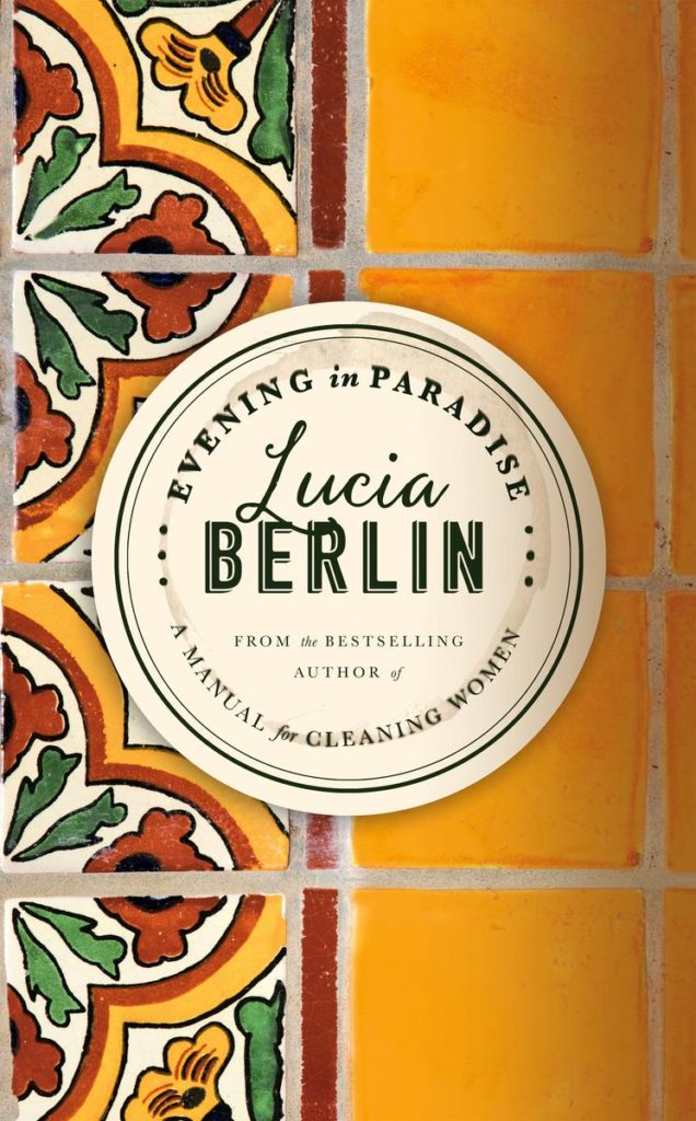
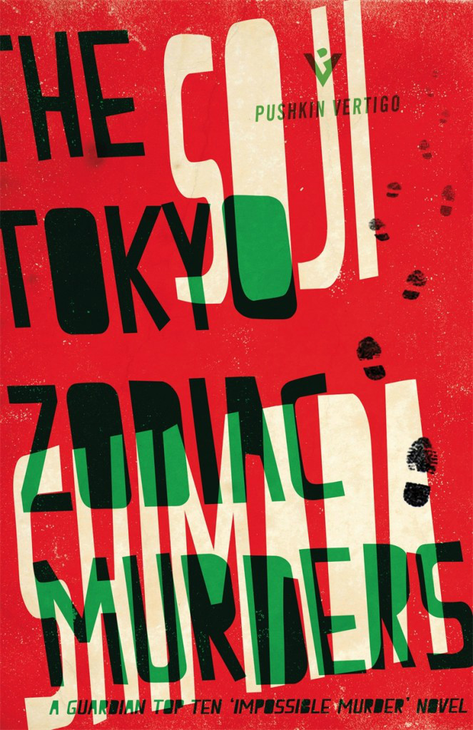
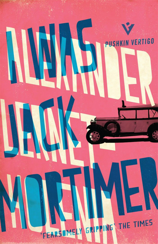
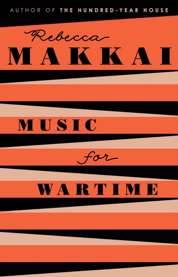
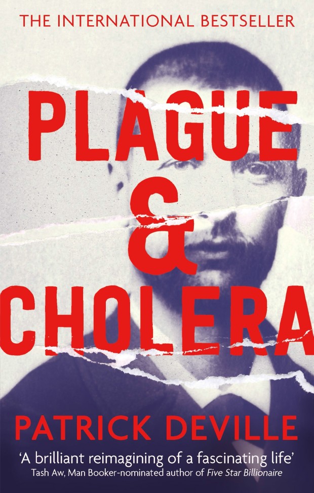
I am very, very late to this, but Penguin are in the process of reissuing Len Deighton’s thrillers as Modern Classics with new covers by Jim Stoddart inspired by Raymond Hawkey’s original paperback designs.
There are a lot more titles available now (Len Deighton wrote a lot of books!), but you can read more about the first wave of reissues in this Creative Review article from last year, and I’ve posted a few of my favourite covers below.
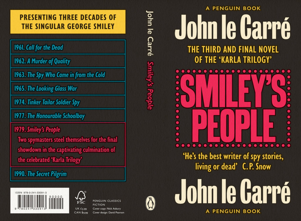
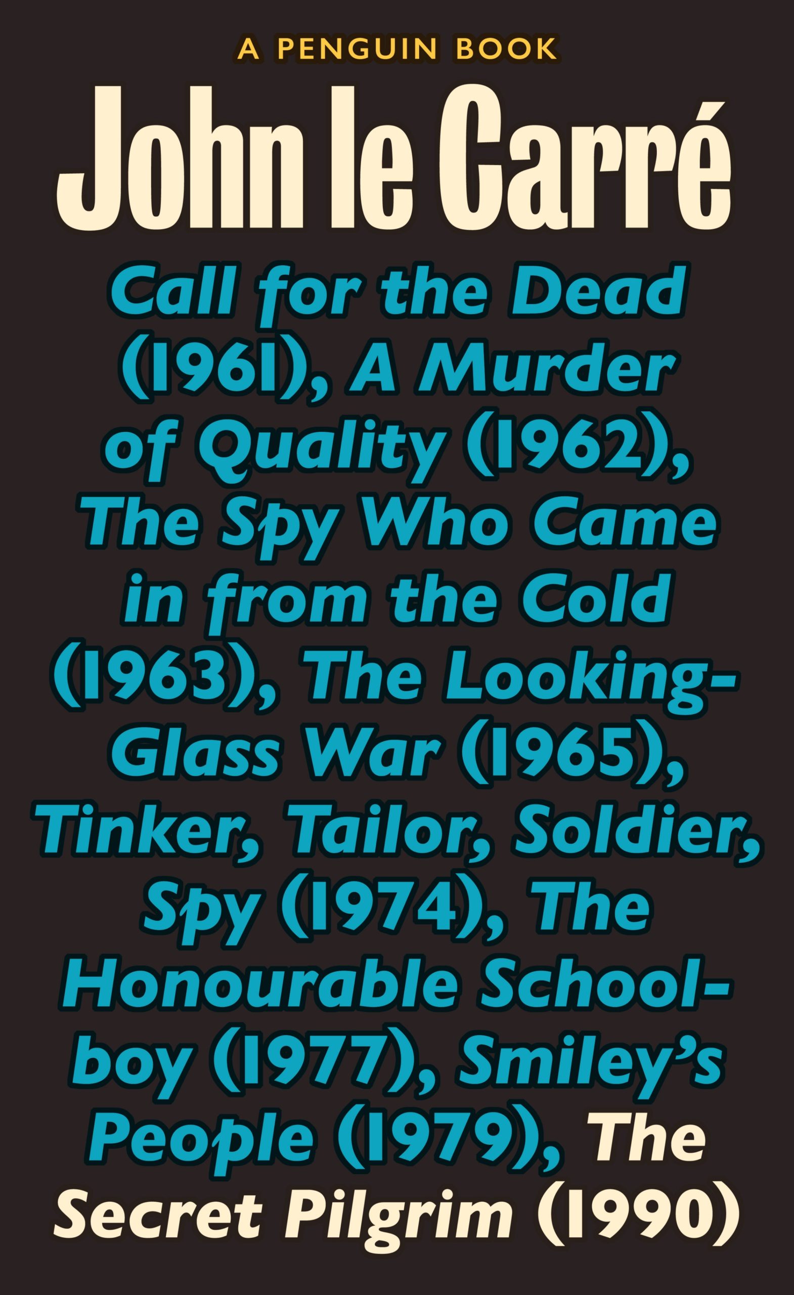
It’s been a while since I did a post of David Pearson series design, so I am delighted to share his brilliant new covers for the Penguin UK editions of John le Carré’s George Smiley novels, available this month. The design is a collaboration with Nick Asbury who wrote the copy for the covers (I talked to Nick to ages ago about his Corpoetics book if you’re interested).
The small type is the lovely looking Gill Sans Nova, recently designed by George Ryan for Monotype as a contemporary digital typeface derived from Eric Gill’s original work. The large type is Stephenson Blake Condensed Sans, which is not available digitally and was pieced together from different sources by David himself. I’m sure it was a total pain in the ass to do, but it’s a pleasing contrast and well worth the effort, I think you’ll agree! Jim Stoddart was the clever AD here.
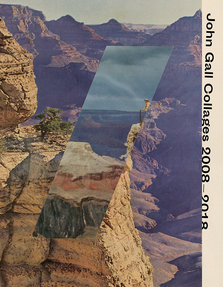
This is my last monthly round-up for 2018. Next month I’ll post my round-up for the year. I have to confess that I have not given the blog 100% of my attention of late, so if you think that there are covers I might’ve overlooked this year please feel to send them my way for consideration.
The blackletter is similar, I believe, to the type used for the movie title / credits, and the chevrons are a nice reference to a design that appears in the movie. The Guardian reviewed the book last month if you are curious. (And someone in the UK needs to buy it for me as a Christmas present!)
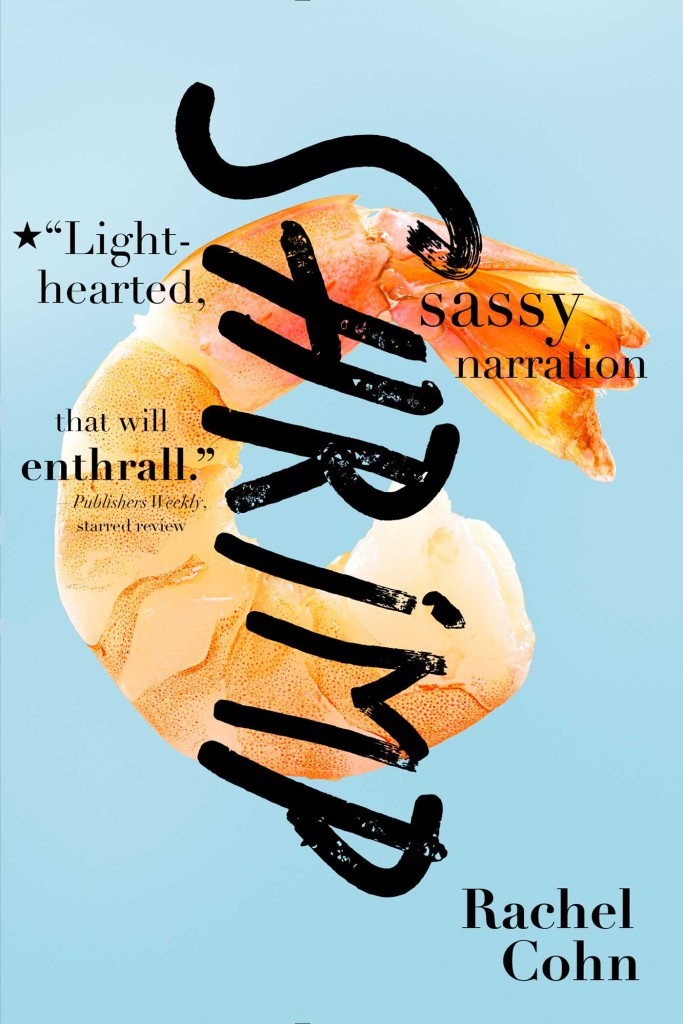
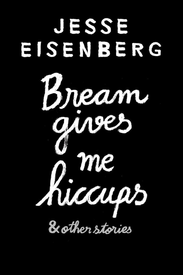
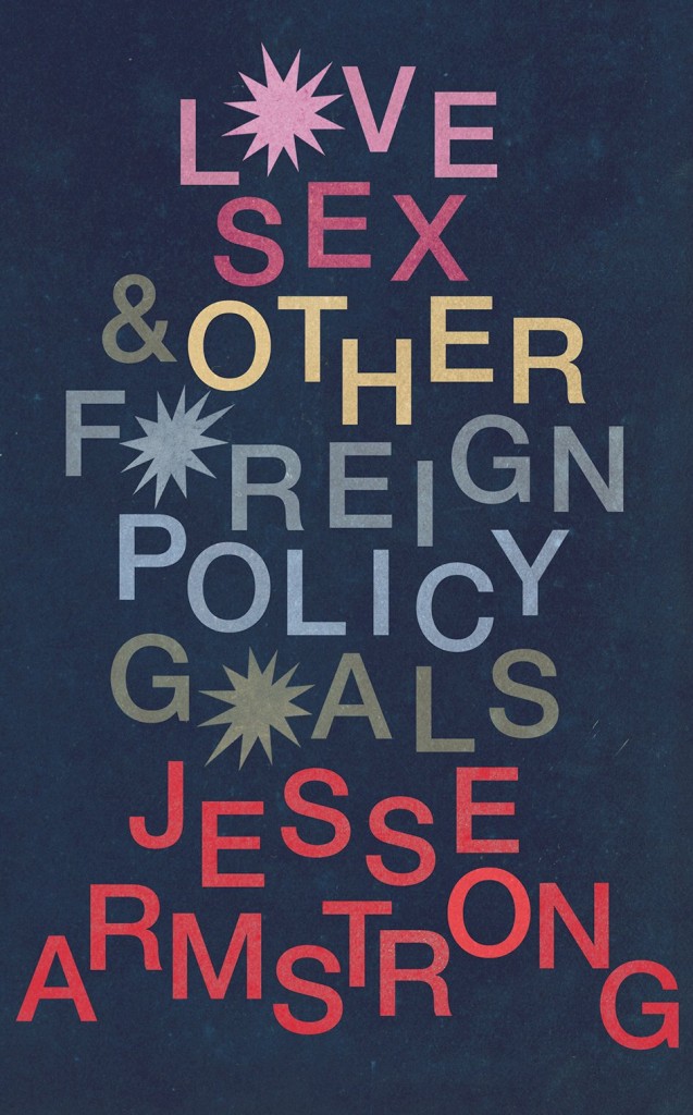
Usually I’m a bit reluctant to post the covers of celebrity books, but this is pretty great.
Celebrity book covers are often look beautiful — the recent memoirs by Sally Fields and Michelle Obama come to mind — but often that’s because of a glamourous photograph. The designer’s job is just to get out of the way. That makes sense from a marketing point of view, it’s just not terribly interesting from a design perspective. This feels like it has a bit more to it somehow. Or maybe it’s just more fun…
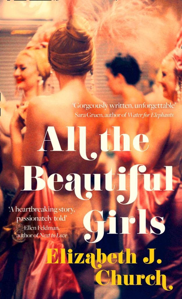
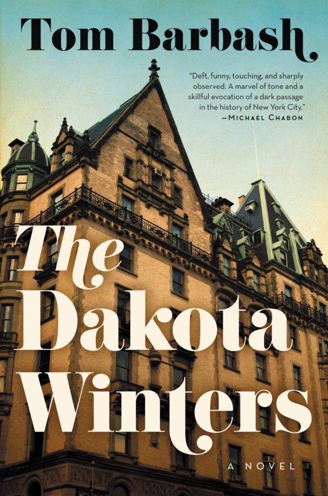
That all said, I have started to see this kind of swashy retro type pop-up more frequently of late. A couple of recent examples that come to mind are the covers of All the Beautiful Girls by Elizabeth J. Church, designed by Anna Morrison (Fourth Estate), and The Dakota Winters by Tom Barbash designed by Allison Saltzman (Ecco):
I would guess the fonts are Bodoni or variants thereof, but no doubt someone with a better eye for type will be able to tell us for sure.
UPDATE: Anna Morrison tells me the font she used for All the Beautiful Girls is Cabernet, which just goes to show what I know. According to the ever-useful Fonts in Use, Cabernet is “an uncredited revival of Benguiat Caslon, a 1970s Photo-Lettering typeface by Ed Benguiat.” I’m pretty sure Benguiat Caslon was used for the iconic Philip Roth covers in the 1970s so I probably should’ve recognized it…
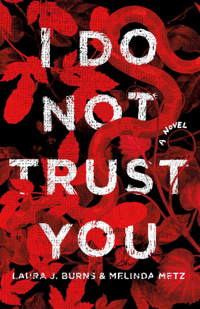
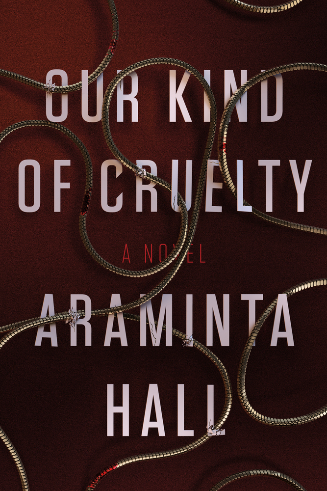
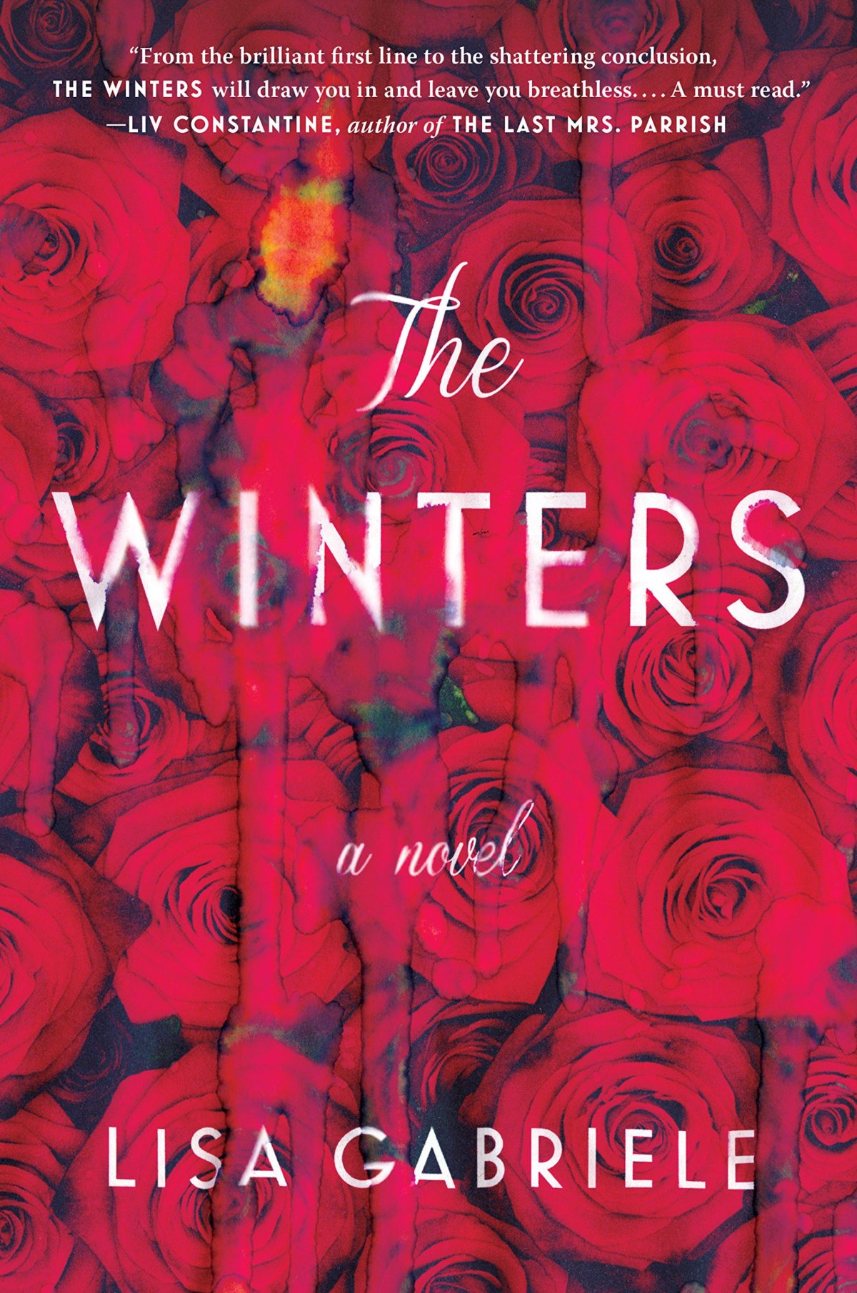
I had it in my mind that snaky red covers with big white type were very “in” for thrillers right now, but the only other example I could think of was the US cover for Our Kind of Cruelty by Araminta Hall designed by Alex Merto, which is really not that similar…
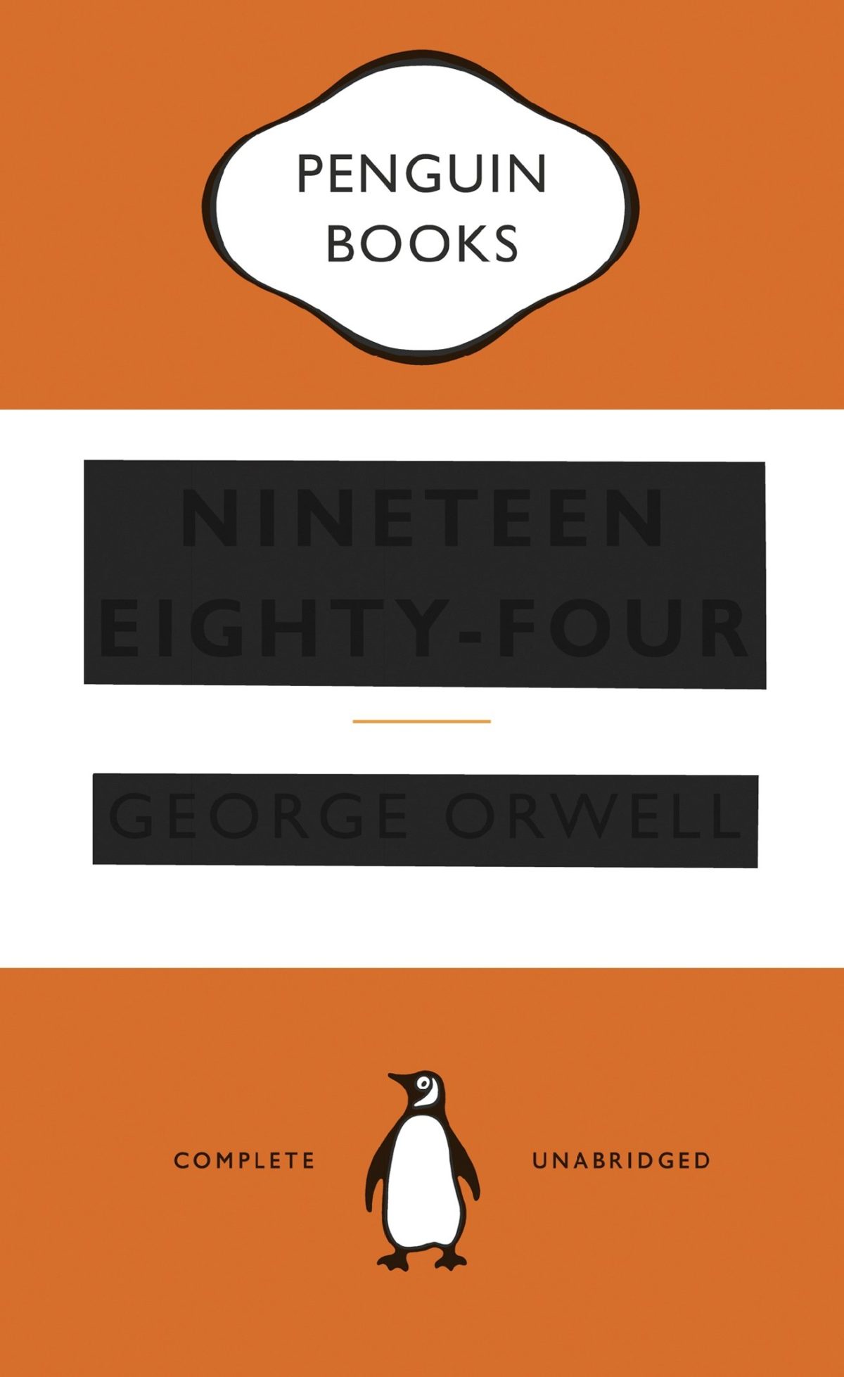
1984 by George Orwell; design by WH Chong (Text Publishing)
The dystopia described in George Orwell’s nearly 70-year-old novel “1984” suddenly feels all too familiar. A world in which Big Brother (or maybe the National Security Agency) is always listening in, and high-tech devices can eavesdrop in people’s homes. (Hey, Alexa, what’s up?) A world of endless war, where fear and hate are drummed up against foreigners, and movies show boatloads of refugees dying at sea. A world in which the government insists that reality is not “something objective, external, existing in its own right” — but rather, “whatever the Party holds to be truth is truth.”
“1984” shot to No. 1 on Amazon’s best-seller list this week, after Kellyanne Conway, an adviser to President Trump, described demonstrable falsehoods told by the White House press secretary Sean Spicer — regarding the size of inaugural crowds — as “alternative facts.” It was a phrase chillingly reminiscent, for many readers, of the Ministry of Truth’s efforts in “1984” at “reality control.” To Big Brother and the Party, Orwell wrote, “the very existence of external reality was tacitly denied by their philosophy. The heresy of heresies was common sense.” Regardless of the facts, “Big Brother is omnipotent” and “the Party is infallible.”
I have to confess that I haven’t seen the TV adaptation of Philip K. Dick’s The Man in the High Castle, but I found Aaron Bady’s discussion of the series — and how it differs from the book — at The New Yorker, quite interesting:
In another year, the show’s insistence on humanizing fascists might have seemed like a provocative choice—an effort, like Arendt’s, to understand how normal people can find it in themselves to commit the worst atrocities. In 2017, however—when it is more urgent than ever to distinguish right from wrong, real news from fake, and differences of political opinion from the dangerous undermining of democracy—it feels instead like a pernicious cynicism. At the same time, the series depicts the ideological excesses of the Resistance in the most unforgiving light. More like Al Qaeda than French partisans of the nineteen-forties, they are grim, unsympathetic zealots, who use scattershot terror tactics and have no qualms about causing the suffering of innocent bystanders…
…This nihilism would have been alien to Philip K. Dick… Dick’s “The Man in the High Castle” focussed on how everyday people struggle to carve out lives of integrity in the face of evil, even while knowing—perhaps especially while knowing—that their actions will not ultimately change the course of history. In the novel, Frank Frink’s primary struggle is how to be an artist, not how to overthrow the Reich. In Dick’s view, this, too, was a form of resistance: his major theme as a novelist was the unavoidable complicity of living “normally” under empire; he believed in evil because he saw it everywhere. But if there wasn’t much hope in Dick’s fiction, that was exactly the point of writing it: even in the midst of a triumphant fascist dystopia, the quest for intellectual autonomy lived on in the dissident imaginations of those who could envision a different kind of world. It is telling, too, that the “man in the high castle” was in Dick’s novel not a collector of film reels but a novelist—an eccentric inventor of alt-histories who served as a stand-in for Dick himself. The character was, above all, a tribute to artists who dare to resist power in dark times.
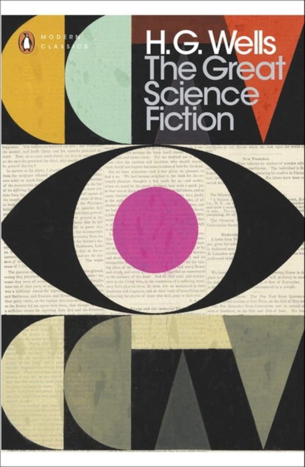
The cover of the Penguin Modern Classic edition (pictured above) was design by Jim Stoddart.
Some of the most interesting and innovative book covers in the last few years have been designed as part of a series — designers and art directors seem to have more leeway with backlist titles (especially so if the author is no longer in the picture!) — and 2016 was no exception. Here are some of my favourite series designs from past year…
The Angelus Trilogy by John Steele; designed by Jason Booher (Blue Rider Press / 2016)
Inspector Littlejohn Mysteries by George Bellairs; design Stuart Bache (IPSO Books / 2016)
The Birds and the Bees; cover art by Timorous Beasties (Vintage / 2016)
A new Penguin Modern Classic edition of Mortal Engines by Polish science fiction writer Stanislaw Lem is available in the UK this week. Art directed by Jim Stoddart, this is the third of Lem’s books in the Penguin Modern Classics series featuring cover art by illustrator and designer by Haley Warnham.
You can read more about Warnham’s collages in an interview with illustrator on AIGA’s Eye on Design blog.
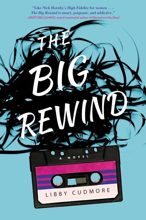
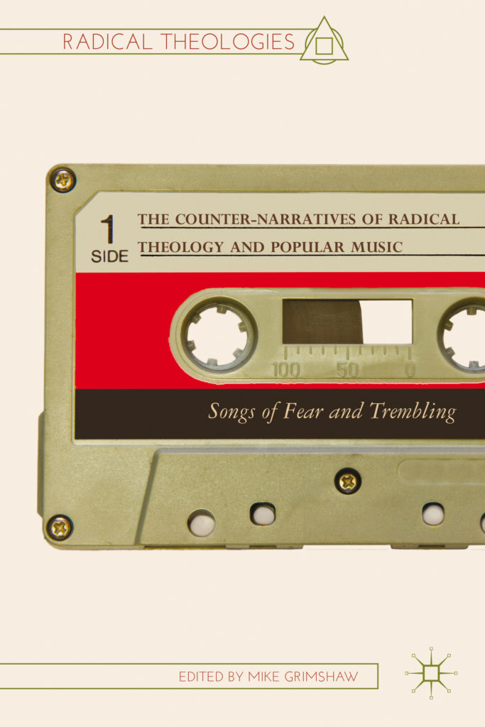
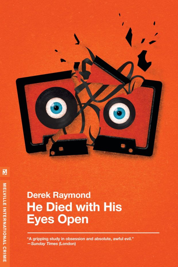
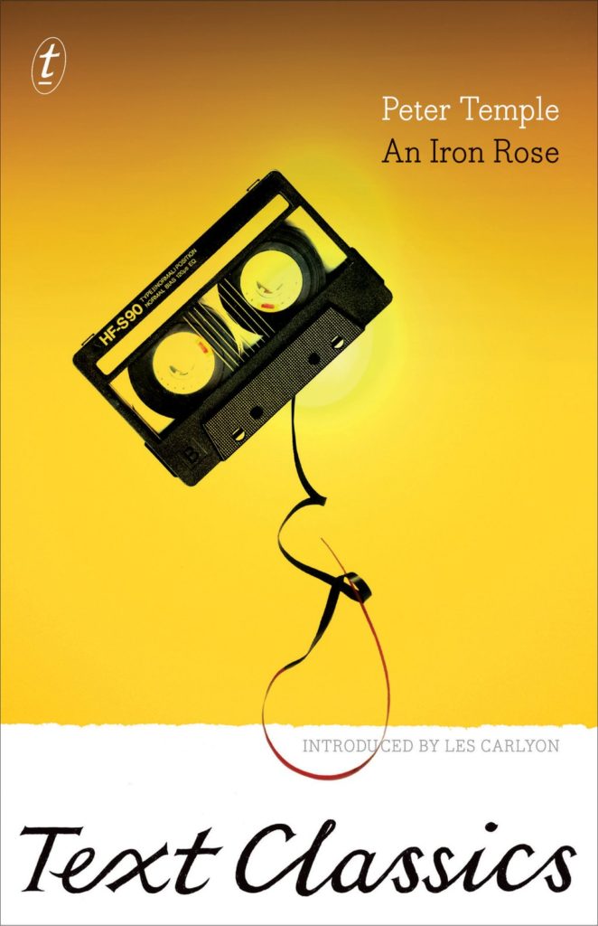
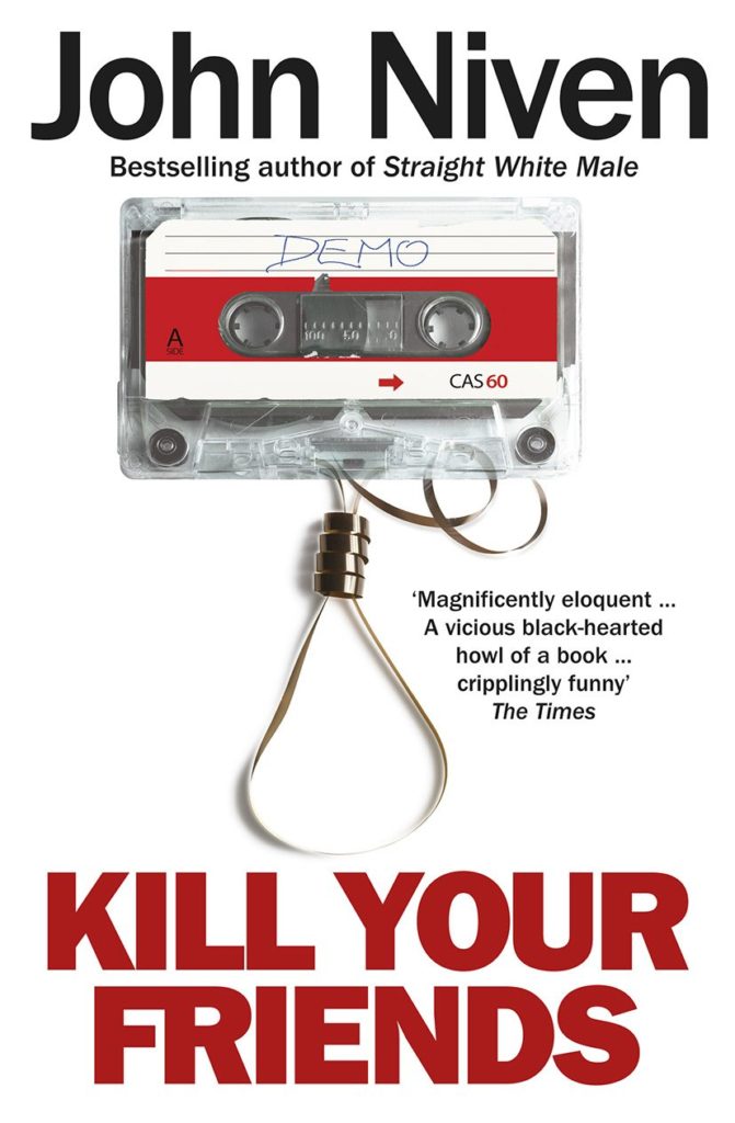
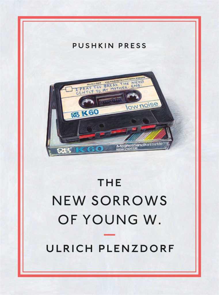
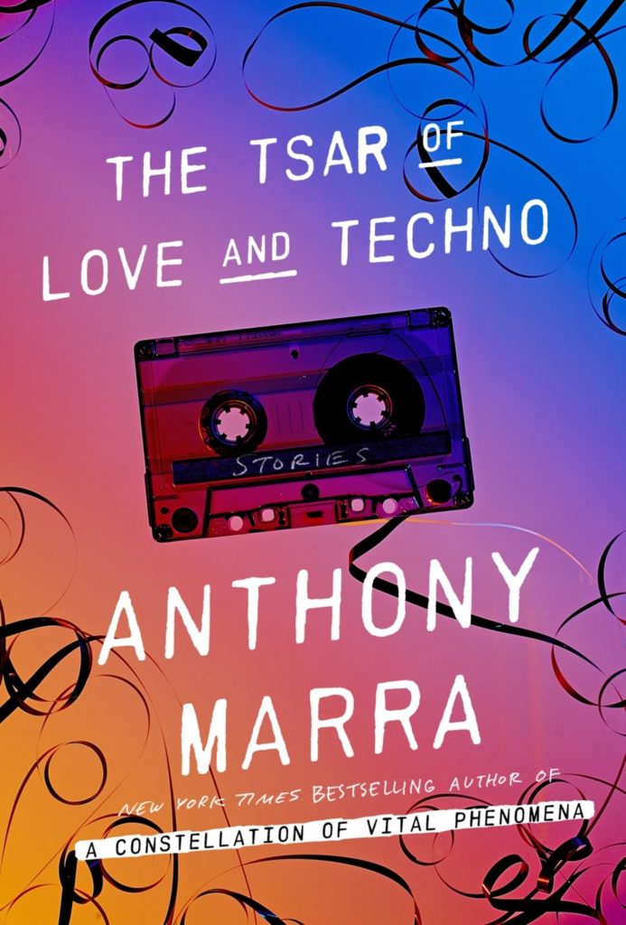
This is another one of those posts that started out on Twitter — a flippant tweet from me sparking a conversation about books with cassette tapes and vinyl records on their covers. It turns out that putting a record on a cover has become quite popular. Unfortunately the composition of many of these covers is often strikingly similar, even if the tone/intent is different.
design and illustration Chloe Cushman
design Michel Vrana
design James Paul Jones
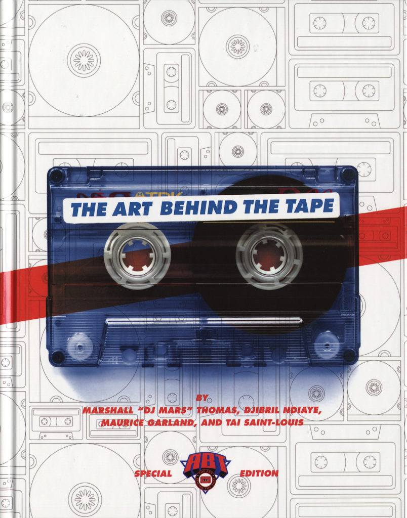
The combination of clunky retro-future technology of cassettes and the DIY aesthetic of mix tapes, on the other hand, provides a richer vein of inspiration…
The Art Behind the Tape by Marshall “DJ Mars” Thomas, Djibril Ndiaye, Maurice Garland, and Tai Saint-Louis; design UnderConsideration (2015)
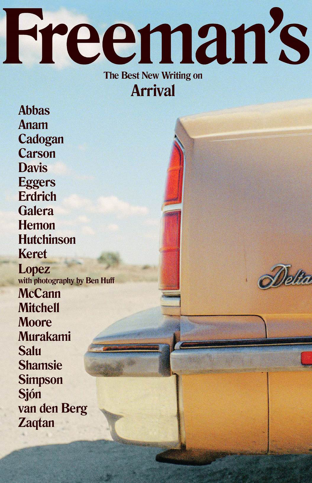
The very first Freeman’s anthology was published in fall this year, but hopefully this design will set the tone for the rest of the series. The second volume is scheduled for next year.
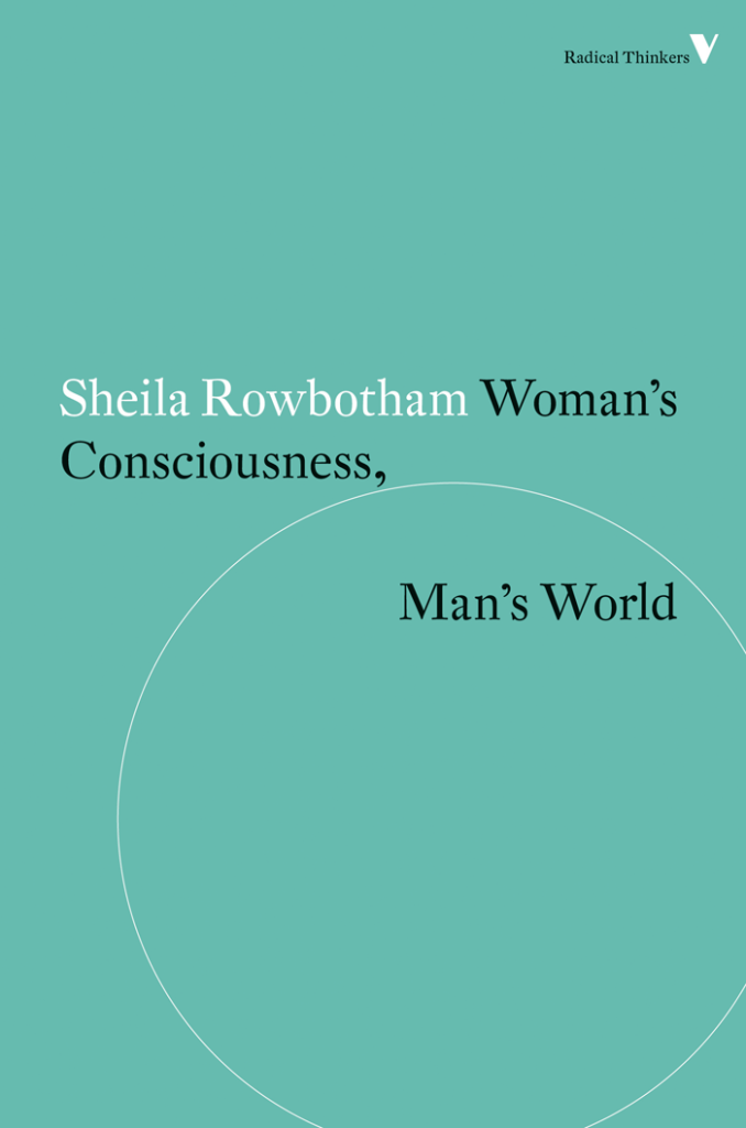
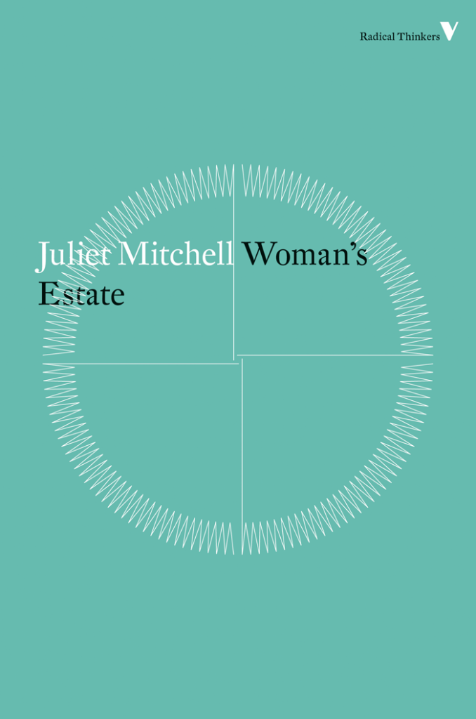
Vintage Feminism; design by Matthew Broughton (Vintage / 2015)
Little Black Classics; design by Jim Stoddart (Penguin / 2015)
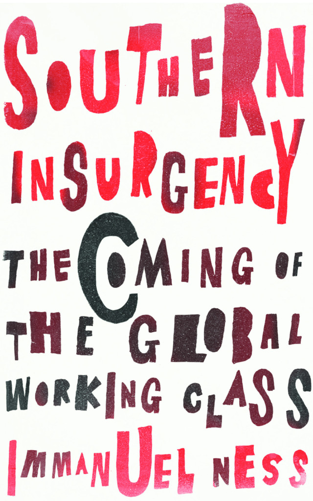
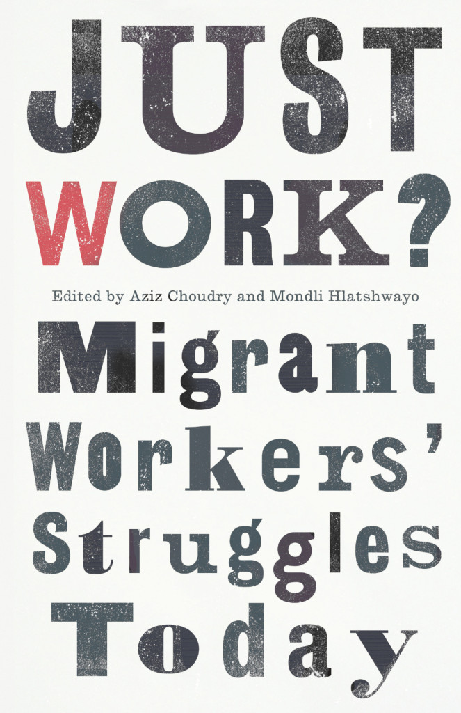
A little bit later than scheduled, here is my October selection of book covers. There are three from Verso, and two by James Paul Jones, but I think it’s still another month of interesting, diverse, and eclectic work. I hope you agree…
(I was raving about this cover on Twitter no so long ago. It really needs to be seen in person because the image doesn’t do it justice at all. The finish on the jacket is lovely and gives the design a beautiful nuance and subtlety)
Never mind that still feels like some crazy never-ending winter in Toronto, it’s (allegedly) April so here are a few new and recent covers that have caught my eye in the past month…
American Warlord by Johnny Dwyer; design by Oliver Munday (Knopf / April 2015)
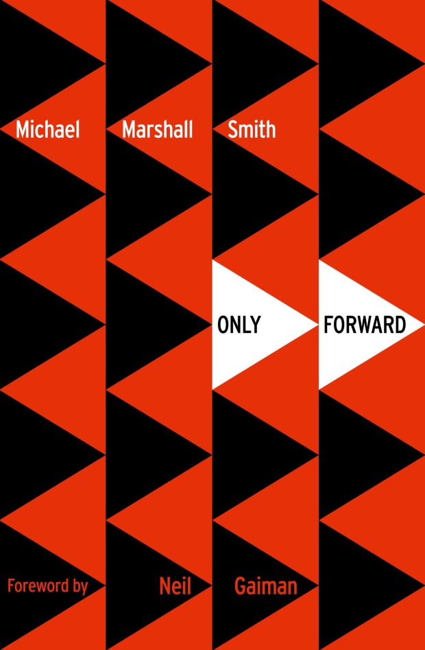
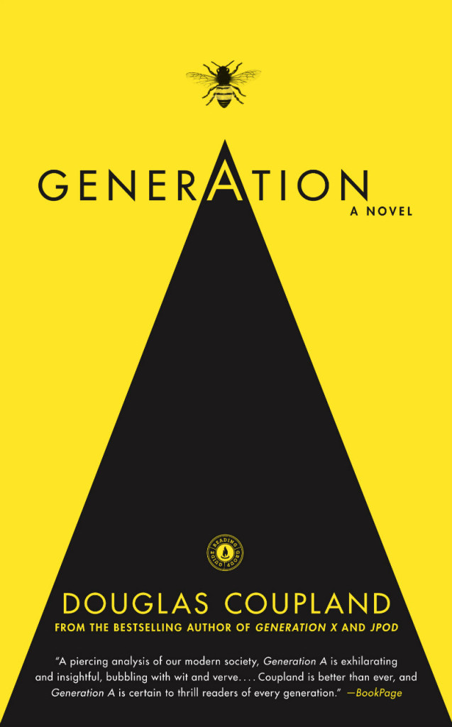
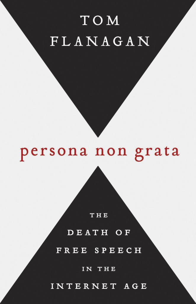
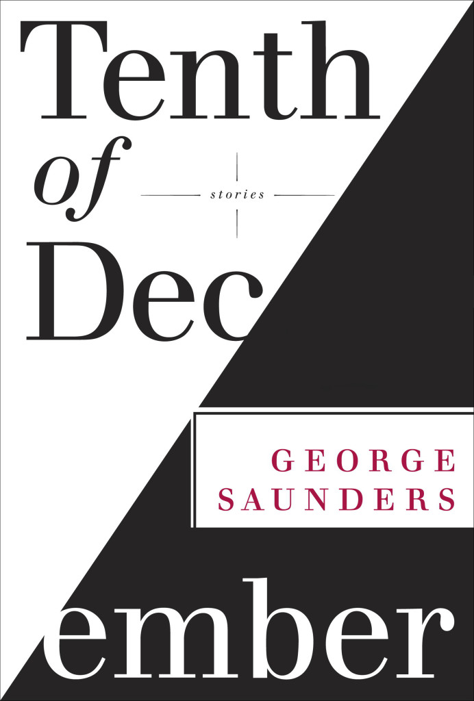
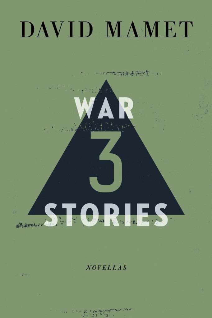
To paraphrase The Smiths circa 1987, I may have started something I can’t finish with this triangles on book covers thing. Typical me. This is my second post on the topic, and there is one more in the works, but then I think I will be done. Enjoy…
Antifragile (hardcover)
Antifragile (paperback)
Antifragile by Nassim Nicolas Taleb (Penguin hardcover November 2012)
Antifragile by Nassim Nicolas Taleb (Penguin paperback November 2013)


