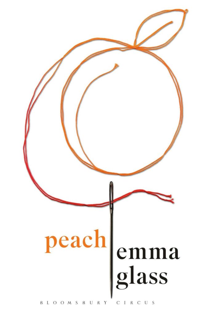
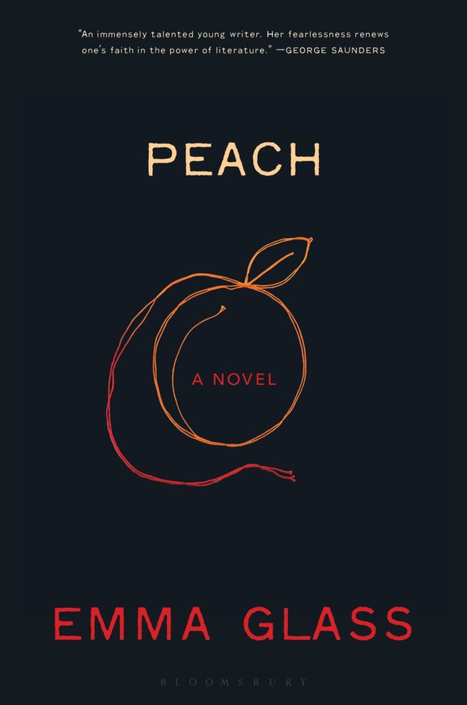
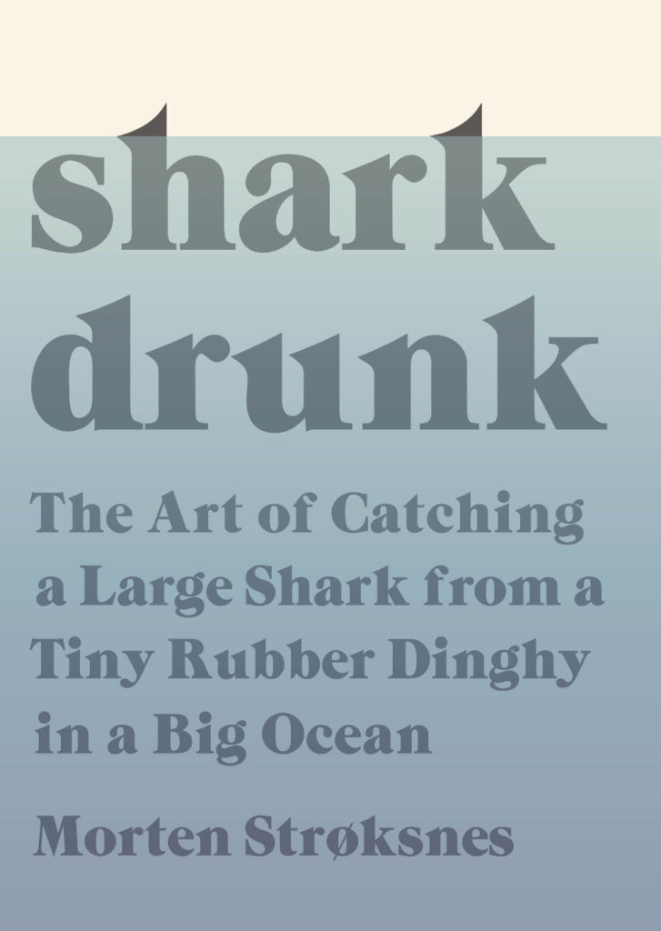
The cover of the UK edition, published earlier this year by Picador, was designed by Katie Tooke. You can read about the design process for the UK cover here.
Dear Mrs Bird by AJ Pearce; design by Kimberly Glyder (Scribner / July 2018)
Florida by Lauren Groff; design by Grace Han (Riverhead / June 2018)
The cover of Groff’s 2015 novel Fates and Furies (also published by Riverhead) was designed by Rodrigo Corral and Adalis Martinez:
Florida by Lauren Groff; design by Grace Han (Riverhead / June 2018)
Fates and Furies by Lauren Groff; design by Rodrigo Corral and Adalis Martinez (Riverhead / September 2015 )
Besides using a beautiful photograph, I get the sense this cover is very much on trend, and not just for YA — I’ve seen the cover of a thriller coming out this fall that also uses a close-cropped image of a woman’s face, a similar sans-serif type, and a warm sepia colour palette.
Smile by Roddy Doyle; design and lettering by Nick Misani (Viking / October 2017)
OK, so I am very late to this one. I saw it last year and didn’t know who the designer was — I only found out this week when art director Jason Ramirez revealed that it was one of the TDC Communication Design Competition winners this year!
Thanks to a combination of disk storage issues, the AUPresses Book, Jacket, and Journal Show, breaking my wrist, general anxiety, and utter despair at the latest round of horror, corruption and lies to the south, this month’s covers post is…well, late. Fuck it. Donate to a good cause. 1
Aroused by Randi Hutter Epstein; design Zoe Norvell (W.W. Norton / June 2018)
There have been a number of covers making use of work by famous photographers in recent months. I think the risk of this approach is that the image overwhelms the text. If the photograph is so important, perhaps it is better to just to get out of the way and let it speak for itself? (If, ahem, the ‘interested parties’ will let you, of course!)
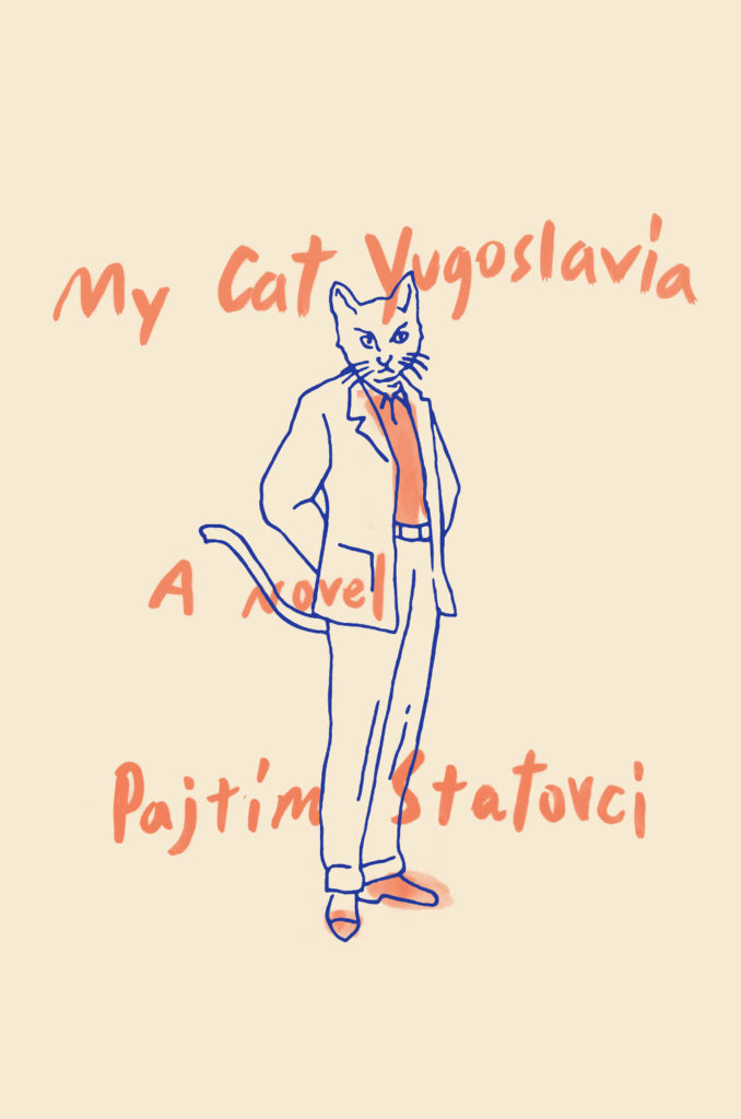
The cover for the US edition, published by Henry Holt, was designed by Nicolette Seeback. For me, it’s made by the cat wrapping around the spine onto the back cover. Listing the ten arguments on the back is also a really nice touch.
The Canadian edition, published by Knopf Canada and designed by Leah Springate, takes a photographic approach. I think it’s a good example of how the Canadian market can be quite different from the UK (and the US)…
For some reason this reminded me of a Peter Mendelsund’s 2009(!) cover design for Vintage’s Foucault list. In reality, they don’t actually look that a like at all:
The Gloaming by Kirsty Logan; design Julia Connolly (Harvill Secker / April 2018)
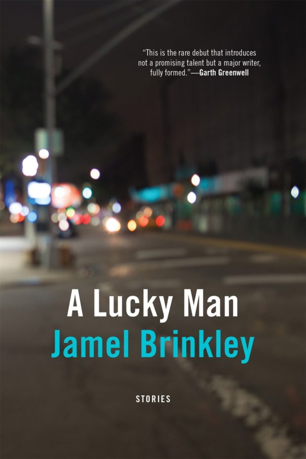
A Lucky Man by Jamel Brinkley; design by Kyle G. Hunter (Graywolf / May 2018)
I have to confess that I’m including this partly because I recently had a conversation with a publisher about a street scene on a book cover. The publisher said the author insisted on using a specific photo, which always makes things difficult, but all the same, I felt the photo could be used more effectively. The cover for A Lucky Man isn’t fancy, but it does the job really well — while there is a sense of place and atmosphere (it may even be recognizable if you know the street?), there is also ambiguity that leaves it open to interpretation. The blue of the authors name echoes the blue of a sign in the photo, but it doesn’t over do it — it’s nicely understated.
Using a Nan Goldin photo feels like a bold choice — especially for one of the most anticipated books of the year. I don’t know… perhaps Goldin’s photos aren’t as controversial as they once were? It seems appropriate to me, but then I Goldin’s photography. I guess the cover of A Little Life by Hanya Yanagihana used a photo by Peter Hujar…?
In any case, it’s quite different look from The Flamethrowers cover (designed by Charlotte Strick), and yet the compositions seem to echo each other (the horizontal bands of title — rectangular photo — author) when you place them side by side:
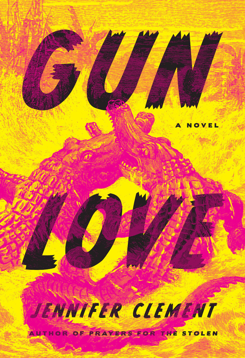
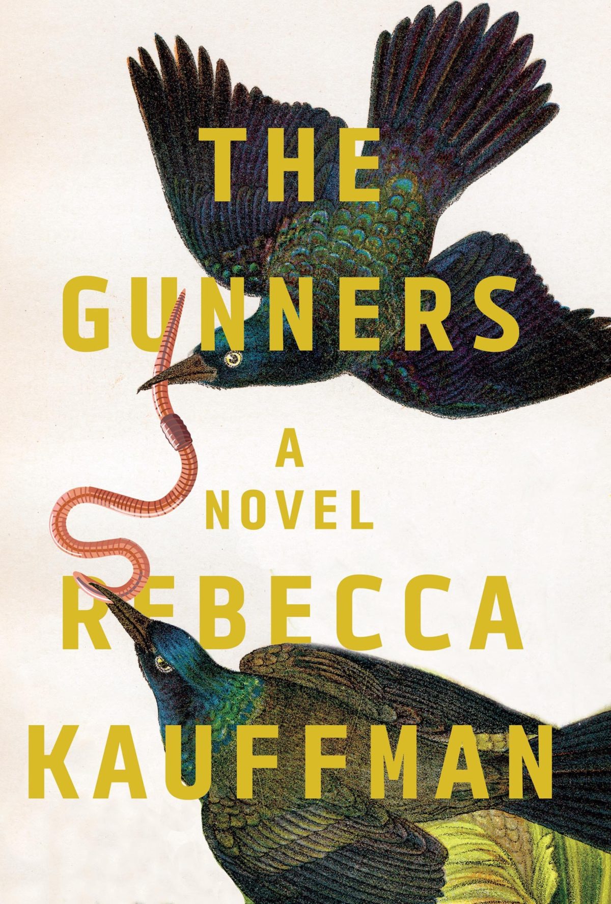
Nicole’s recent covers for Counterpoint all work quite well together. It’s interesting that snaking curves — a worm, a road, an actual snake! — appears in the background of these three:
Tomb of the Unknown Racist by Blanche McCrary Boyd; design by Nicole Caputo (Counterpoint / May 2019)
It Needs To Look Like We Tried by Todd Robert Petersen; design by Nicole Caputo (Counterpoint / May 2019)
The Gunners by Rebecca Kauffman; design by Nicole Caputo (Counterpoint / March 2018)
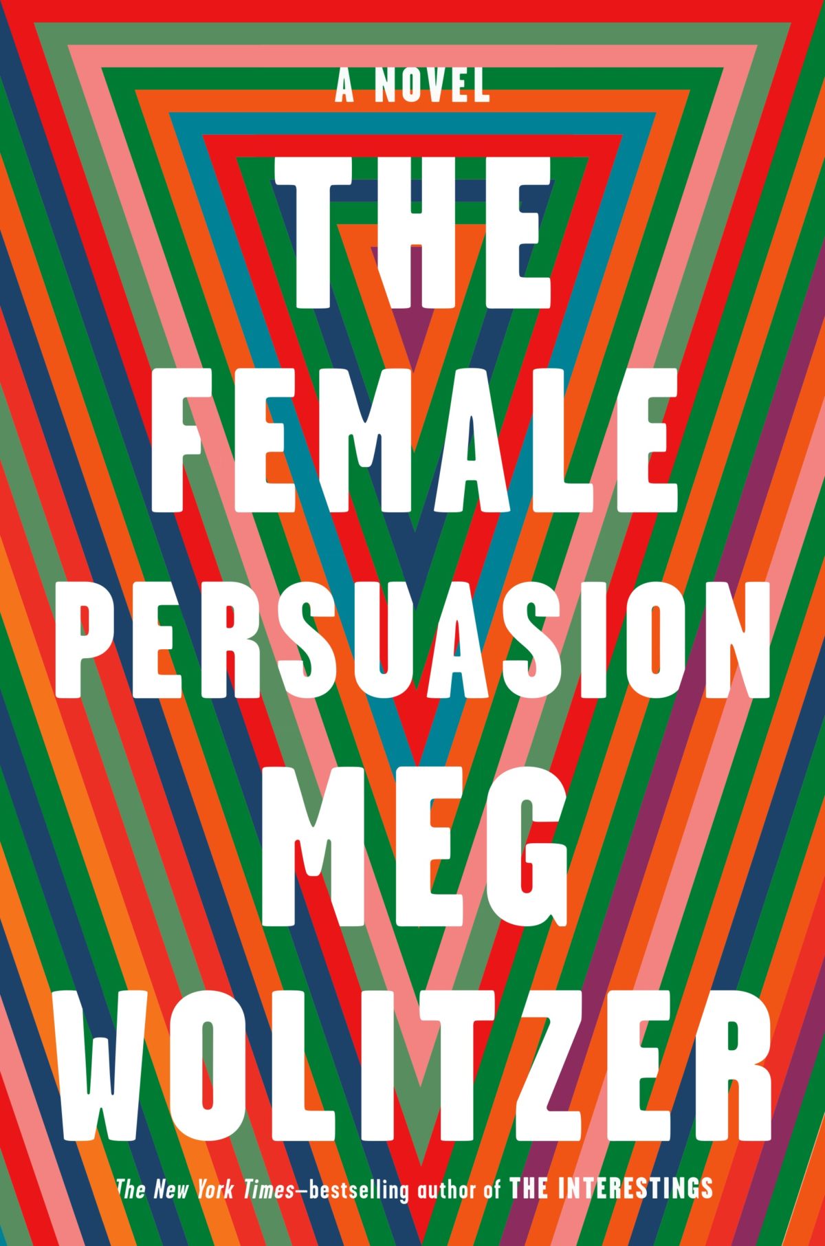
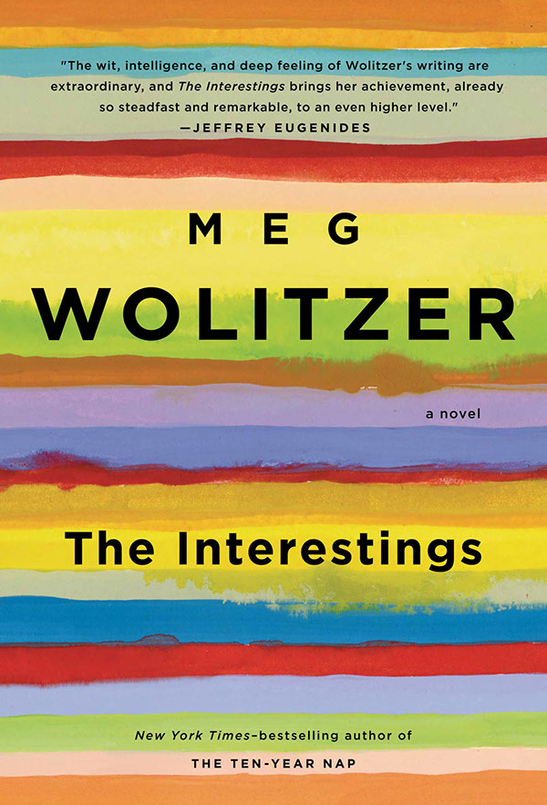
I like how the design for The Female Persuasion has bands of colour similar to those on Lynn Buckley’s cover design for The Interestings, but uses them in a completely different way…
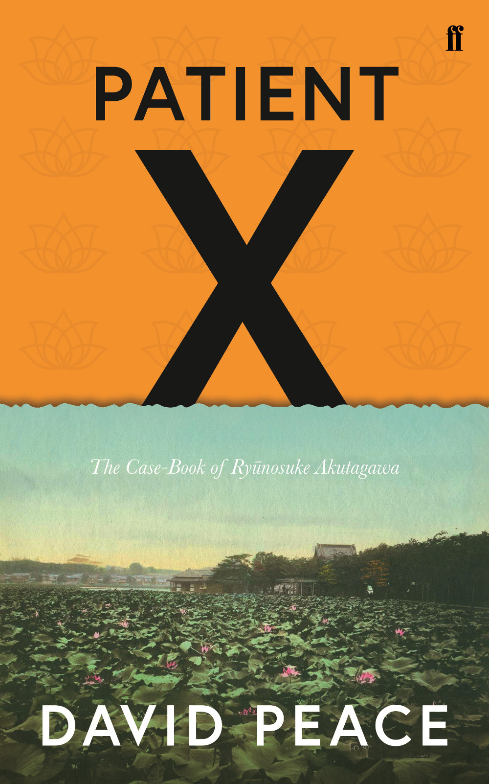
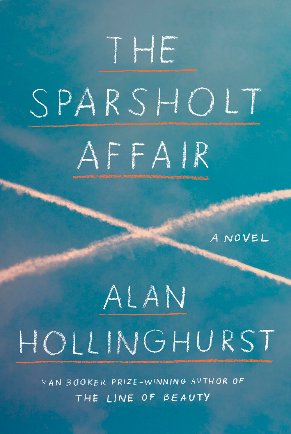
Patient X by David Peace; design by Luke Bird (Faber & Faber / April 2018)
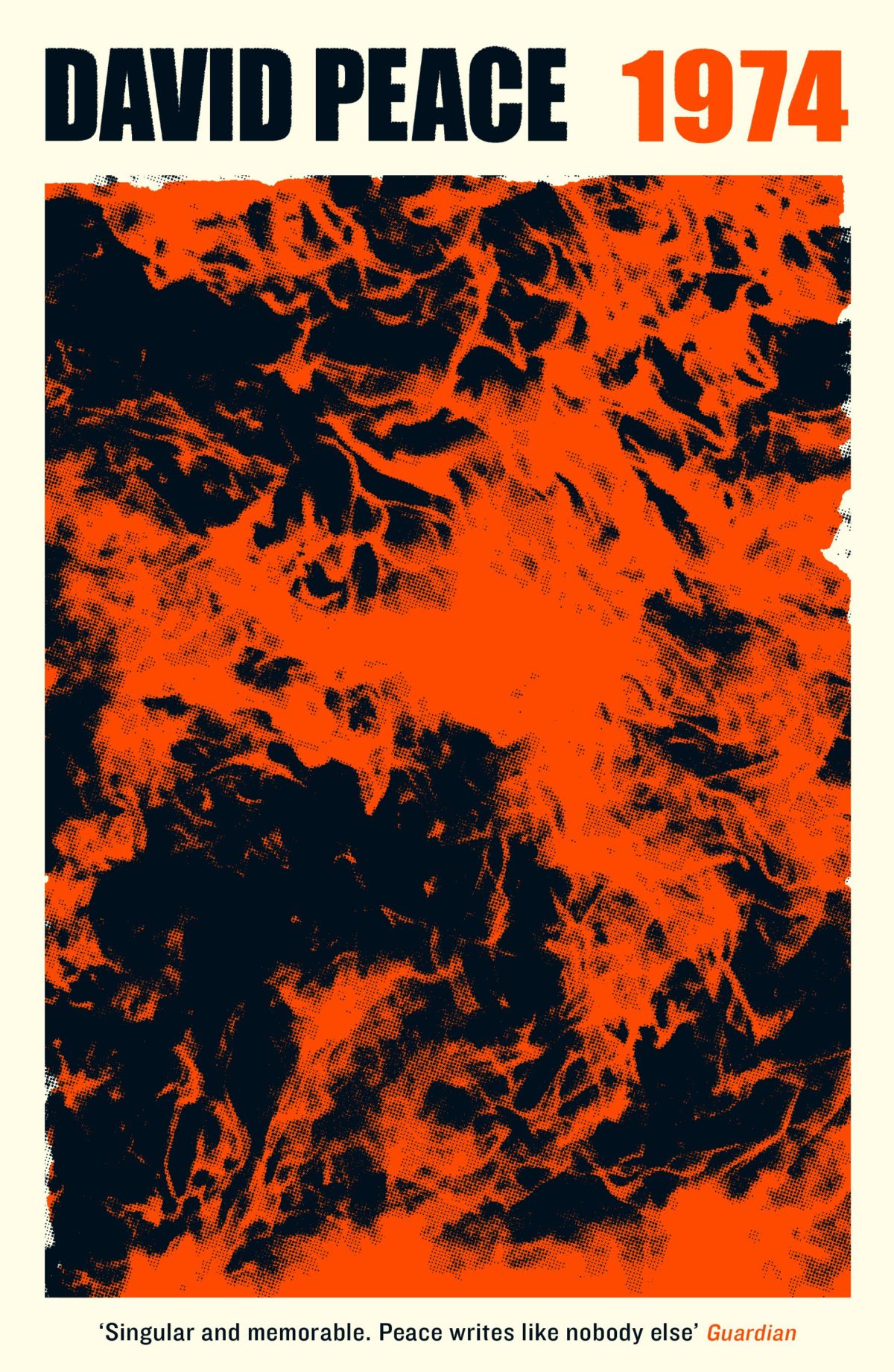
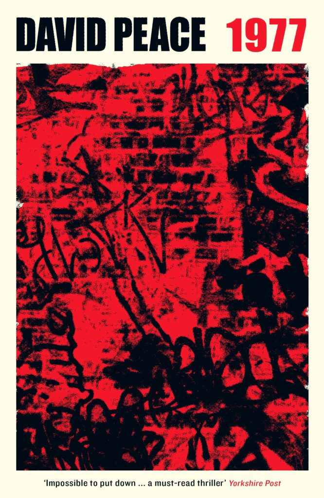
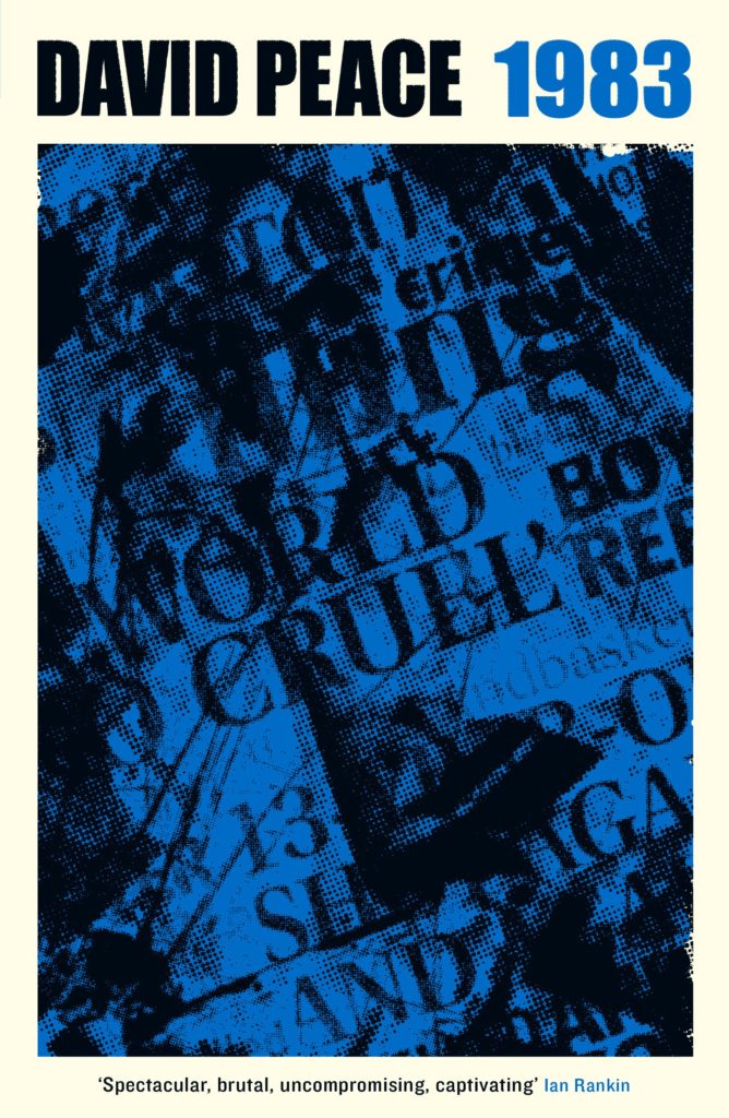
And on the subject of David Peace, Steve Panton has designed new covers for the Red Riding Quartet (1974, 1977, 1980 and 1983) published by Serpent’s Tail this month:
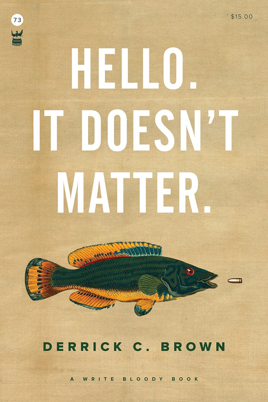
Funnily enough, I was just discussing the prevalence of big and centred white sans serif type on contemporary book covers on Twitter. While it’s common (see the covers of The Female Persuasion and Hello, It Doesn’t Matter above!), it’s also effective when it’s done well. That said I did think that David Pearson — a designer well known for his typographic covers — made a good general point about big type:
The idea that legibility is enhanced by big type is so flawed. Big type surrounded by busyness is often no more legible than small type surrounded by space. Perhaps it is the space that people are scared of. Our idiot eyes might look at the wrong part of the cover.
The show is the oldest continuous book design competition in the US, and I was lucky enough to join McSweeney’s designer Sunra Thompson in deciding this year’s cover selections. The book selections were made by designer Linda Secondari and writer Robert Bringhurst. You can see all the selected entries — books and covers — in this AUPresses slideshow:
I am unfashionably late to the party here, but the winners of the 2018 Academy of British Cover Design (ABCD) Awards were announced last week.
The ABCD Awards are always pleasantly surprising. Every year the shortlists include at least two or three covers I have never seen before, and I find it strangely reassuring that the winners picked on the night are not always the covers I would’ve chosen — somehow that makes it feel more democratic.
The awards have a brand new website (designed by Joseph Bisat Marshall) where you can find this year’s shortlists and archive of the previous awards, but you will find all the winning covers from last week below…
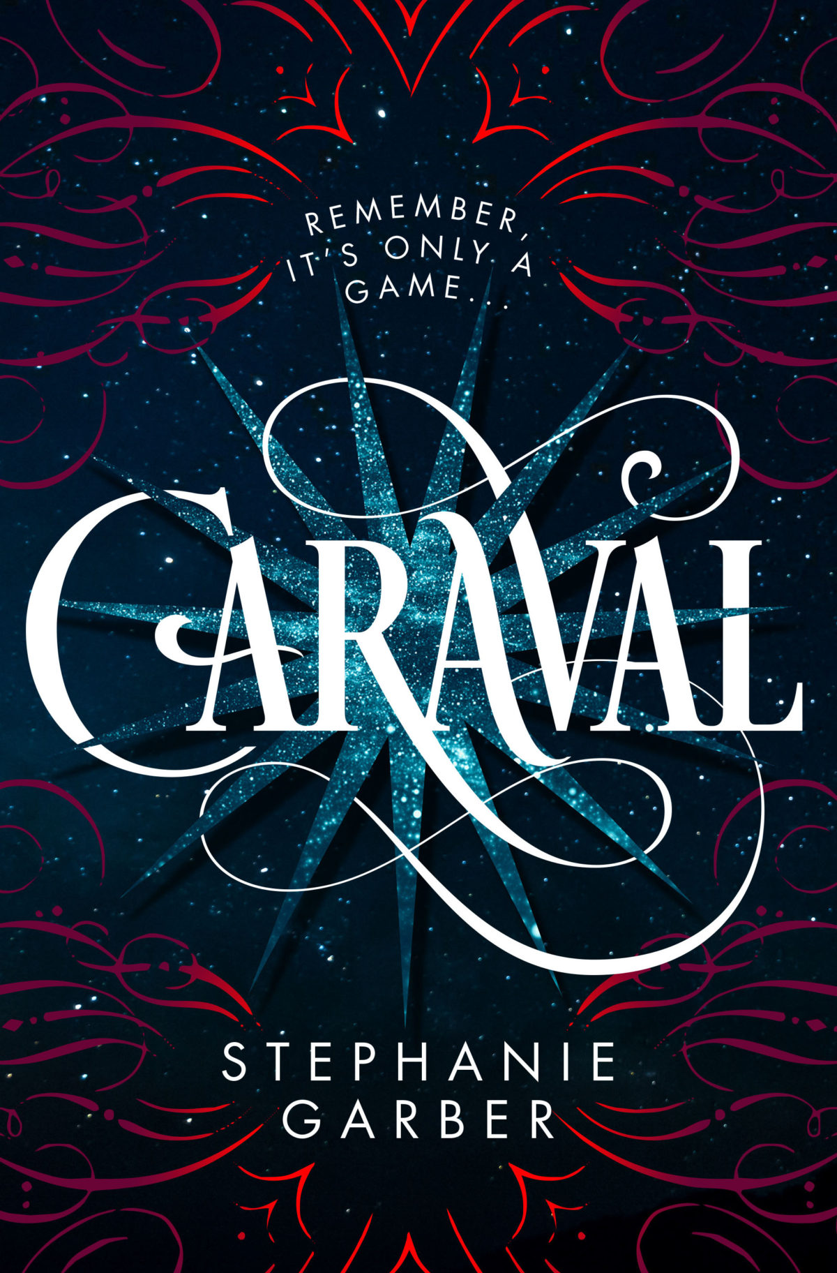
Lots to see this month, including several YA covers (which I know will please some regular readers), some ‘big’ literary fiction, and a couple of confrontational nonfiction covers to round it out. Enjoy!
Aetherial Worlds by Tatyana Tolstaya; design by Stephanie Ross (Knopf / March 2018)
Although it pains me a little to say it, I think Amazon’s ‘book club’ imprint Lake Union are doing an impressive job commissioning appealing covers for their intended market. I would be interested to hear about the process from designers who’ve worked with them.
I like this cover very much–especially the type. The illustration and colour combination remind me of Matt Dorfman’s 2011 cover for The Pyschopath Test by Jon Ronson (Riverhead):
It’s interesting to see the UK publisher go in such a different direction from the US cover (designed and illustrated by Sandra Chiu) which, as I noted back in January, seems very on trend internationally to me.
I felt like this cover might be a little too much when I first saw it online, but I bet it will look absolutely stunning in print and piled up on tables.
For reference, I have a pinboard of contemporary covers that make use of Lydian, the typeface used here. It was designed for American Type Founders by Warren Chappell in 1938, and it’s very distinctive (those ‘R’s!), so it’s interesting to me that it suddenly has this kind of cult popularity.
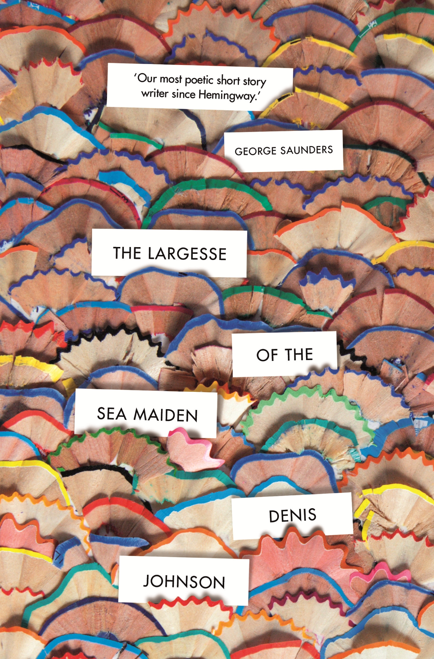
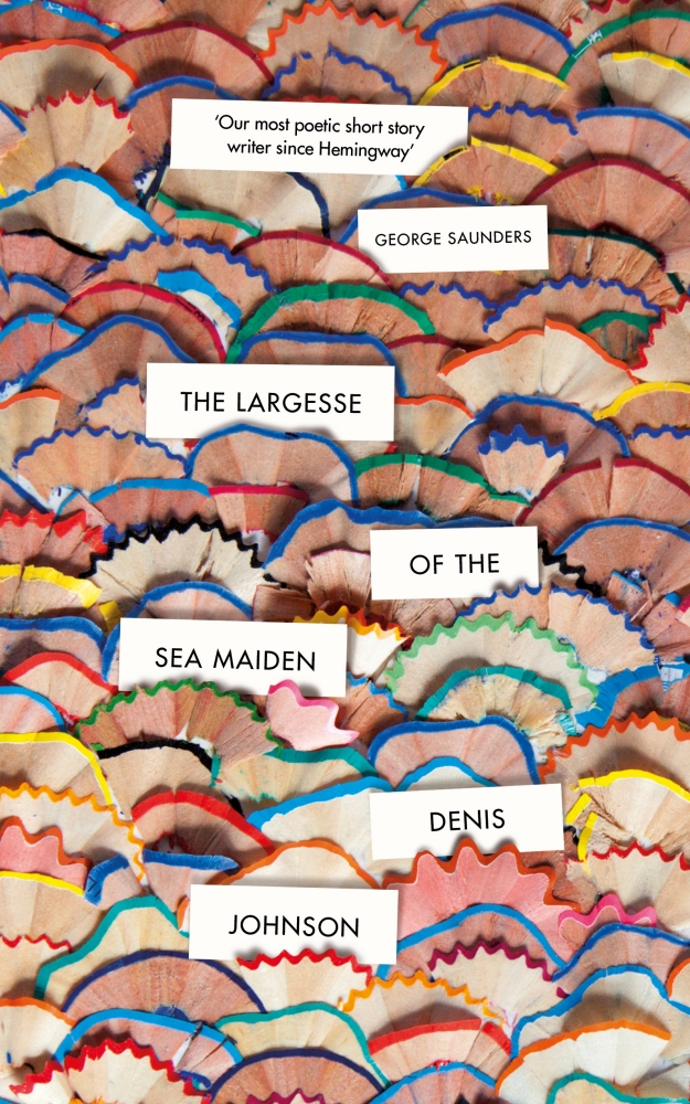
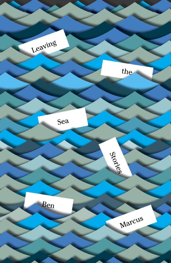
The pencil shavings are delightful of course, but I did immediately think of Peter Mendelsund‘s covers for Leaving the Sea (2014) and The Flame Alphabet (2012) by Ben Marcus.
Can anyone tell me if there is a term for this kind of semi dust jacket? It seems like more than just a belly band.
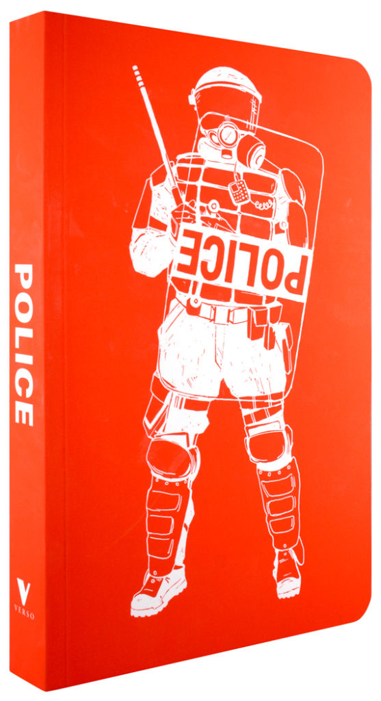
The upside-down ‘POLICE’ shield is an interesting decision. It gives the illustration a kind of authenticity (I assume it is based on an actual example), but it also subtly implies something about the contents of the book (as does the not so subtle decision to show a police officer in riot gear rather than more approachable attire!).
She Regrets Nothing by Andrea Dunlop; design by Rachel Willey (Washington Square Books / February 2018)
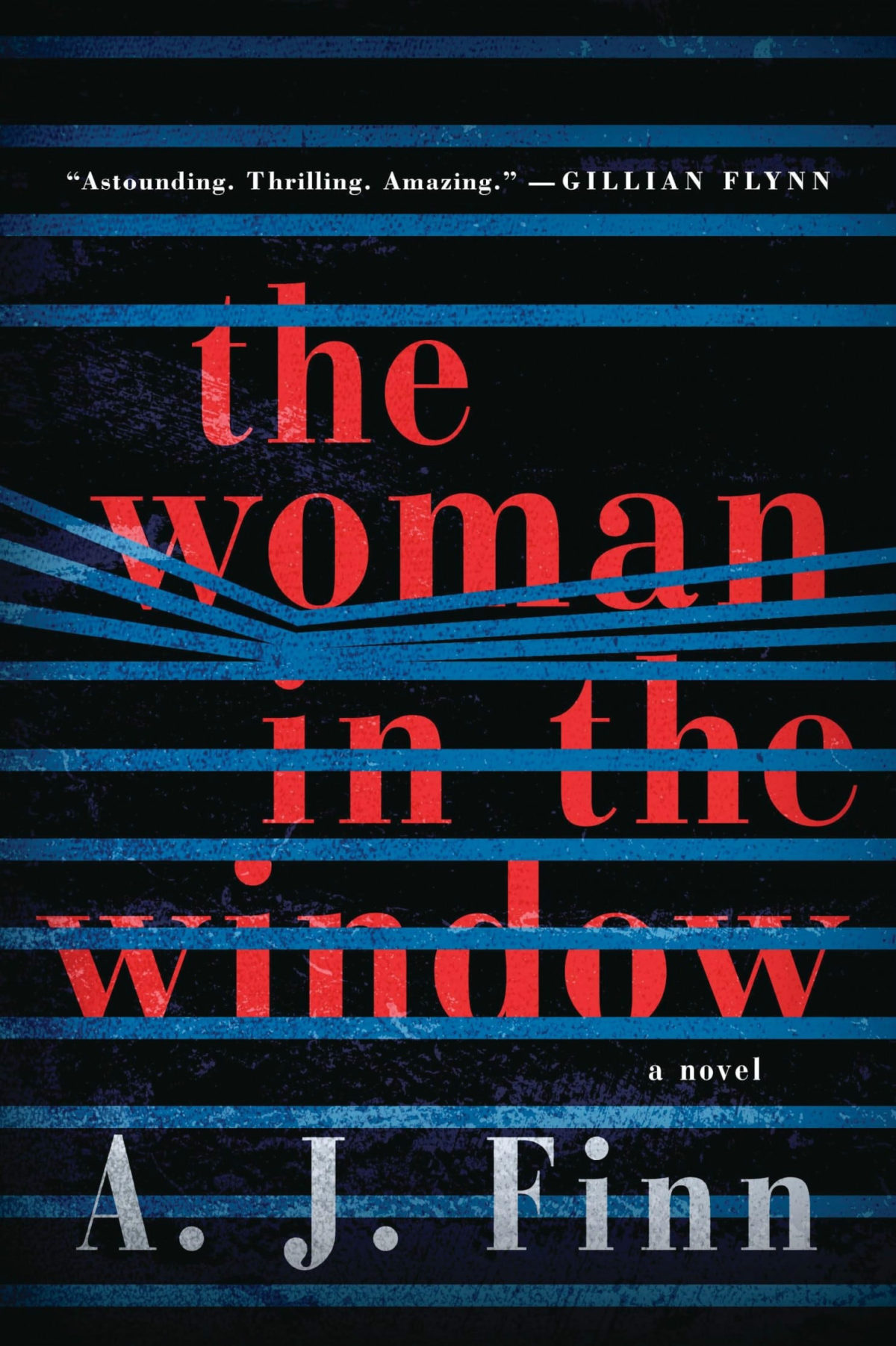
Sunburn by Laura Lippman; design by Elsie Lyons (William Morrow / February 2018)
I included the cover of Sunburn and Elsie Lyons’s cover for The Woman in the Window by A.J. Finn (featured last month) in a recent presentation about the differences between US and UK cover design. UK editions of both books have a much more conventional genre covers. They signal very clearly to readers that they are thrillers.
The US covers on the other hand have a much more literary, sophisticated look. They both have a distinctive, individual appearance (although I suspect we may see covers copying the approach of The Woman in the Window very soon!) that suggest that these are not your average thrillers.
It is not that one approach is necessarily better than the other from a marketing perspective (although I can guess which designers might prefer!), but it is an interesting contrast.
I will admit it was the photo-realistic painting that first drew my eye to this cover, but I also like that the blocky typography echoes the cover of the author’s previous novel California.
Woman No. 17 by Edan Lepucki; design by Michael Morris; illustration by Oliver Wilson (Crown / February 2018)
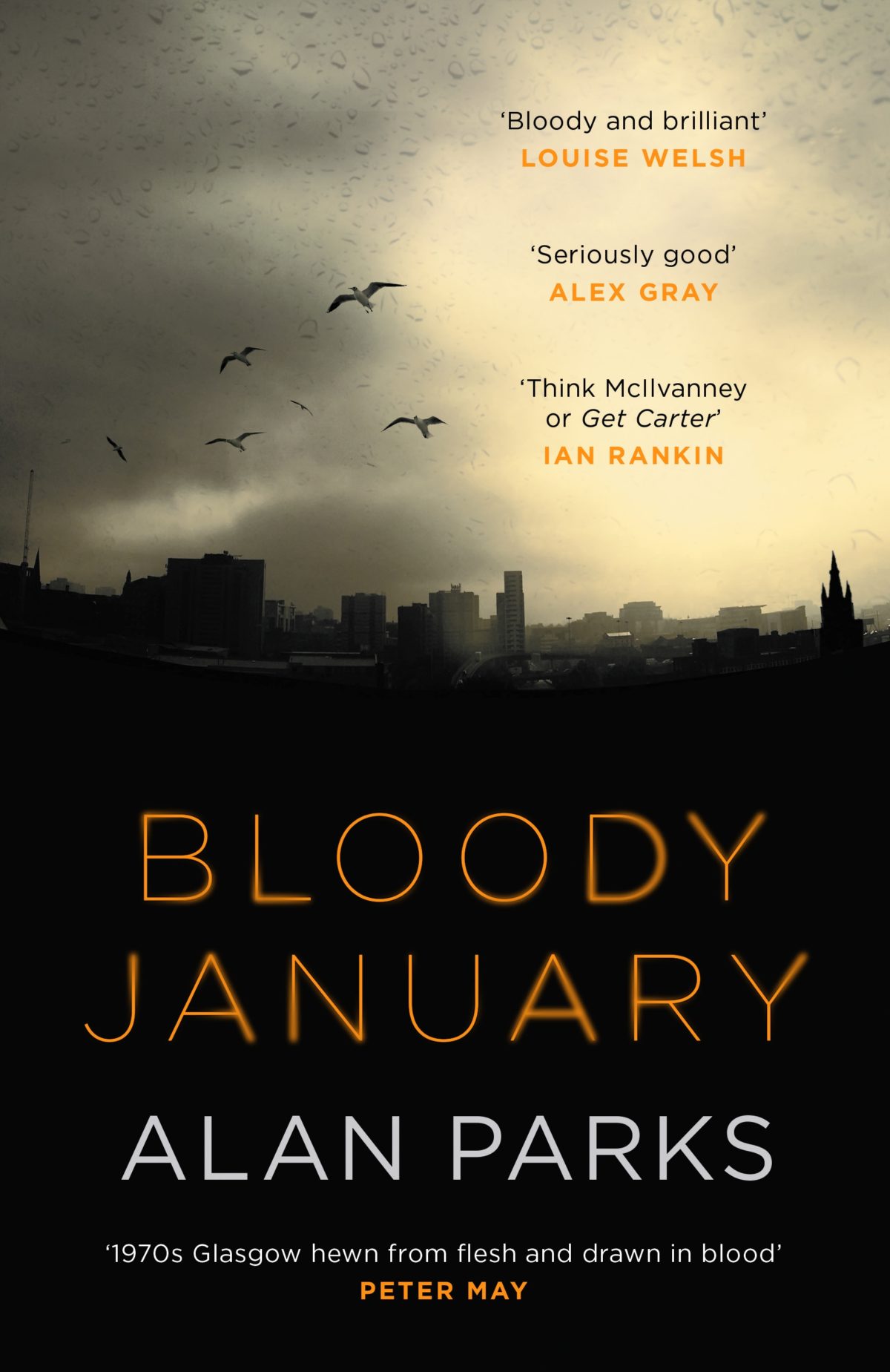
Bloody January by Alan Parks; design by Chris Gale (Canongate / December 2017)
(I’m including this partly because I spend a lot of my professional life trying to explain the difference between the cover needs of Canada/US and the UK. This is a rare genre cover that — it seems to me at least — does a decent job for both sides of the Atlantic)
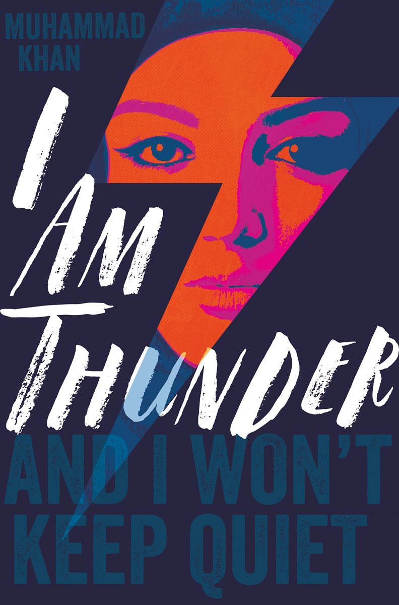
I Am Thunder by Muhammad Khan; design by Rachel Vale (Pan Macmillan / January 2018)
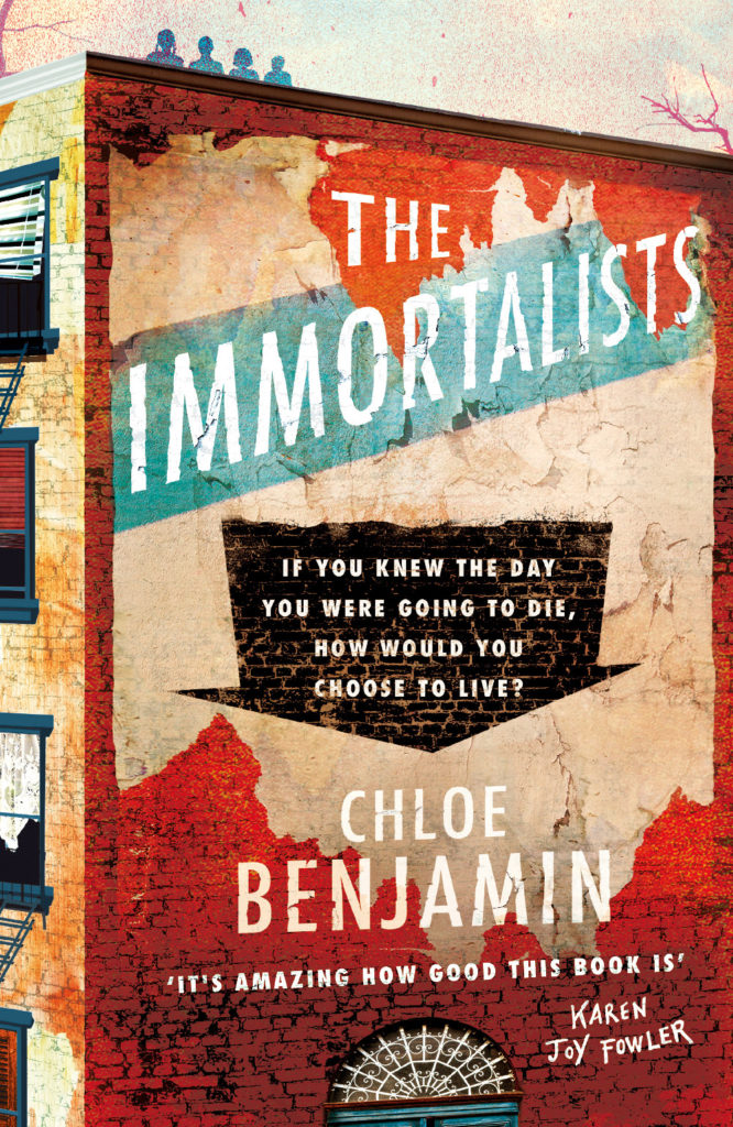
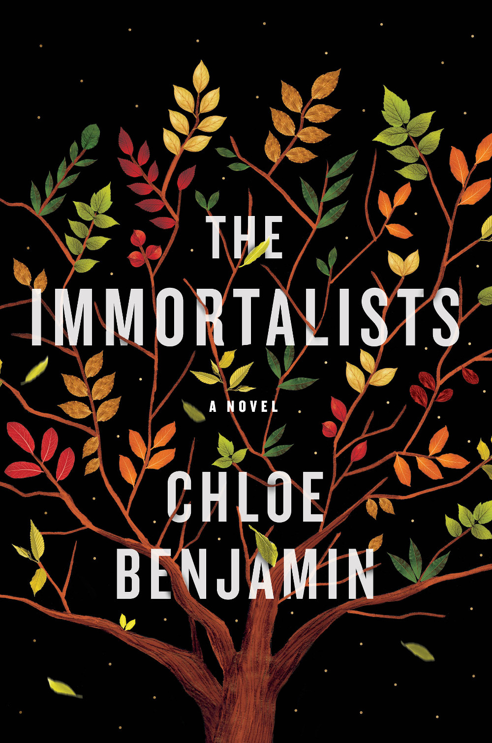
The Immortalists by Chloe Benjamin; design and illustration by Sandra Chiu (G.P. Putnam’s Sons / January 2018)
This cover seems rather on trend to me. It is very nicely done all the same.
(Something about the shape and colour of the leaves on black background also reminds me of the illustrations in Jon Klassen’s picture book This Is Not My Hat).
Happy New Year! Let’s hope it’s better than the last one, eh? But before we finally bid adieu to 2017 and toss it onto the flaming garbage fire, here’s are some of the other lists that looked back at the year in book cover design…
We Are Okay by Nina Lacour; design by Samira Iravani; illustration by Adams Carvalho (Dutton / February 2017)
The Age of Perpetual Light by Josh Weil; design by Nick Misani (Grove Press / September 2017)
Spine Magazine were ahead of the pack — as they have been all year — with their eclectic list of 50 ‘Book Covers We Loved’.
The End by Fernanda Torres; design by Strick & Williams (Restless Books)
The Show That Never Ends by Dave Weigel; design by Tal Goretsky (W. W. Norton)
Designer and New York Times Book Review art director Matt Dorfman chose his ‘Best Book Covers of 2017‘ for the Times. Matt’s lists always have a lot of personality, and this one is no exception. I think it’s probably the list I look forward to most, and I suspect it’s also the list that matters most to many American designers too.
Hollow by Owen Egerton; design by Matt Dorfman (Counterpoint / July 2017)
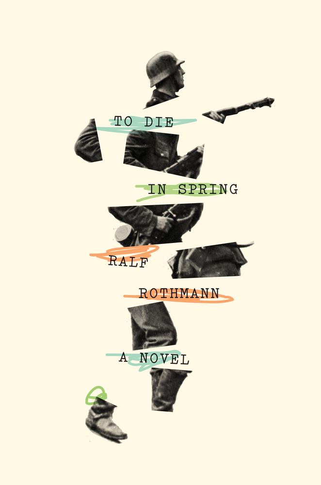
To Die in Spring by Ralf Rothmann; design by Oliver Munday (Farrar, Straus & Giroux / August 2017)
At Literary Hub, Emily Temple asked 20 of her favourite designers for their picks for best book covers of the year. While Matt Dorfman’s cover design for Hollow byOwen Egerton was the top pick, Oliver Munday was the most popular designer with seven covers on the list.
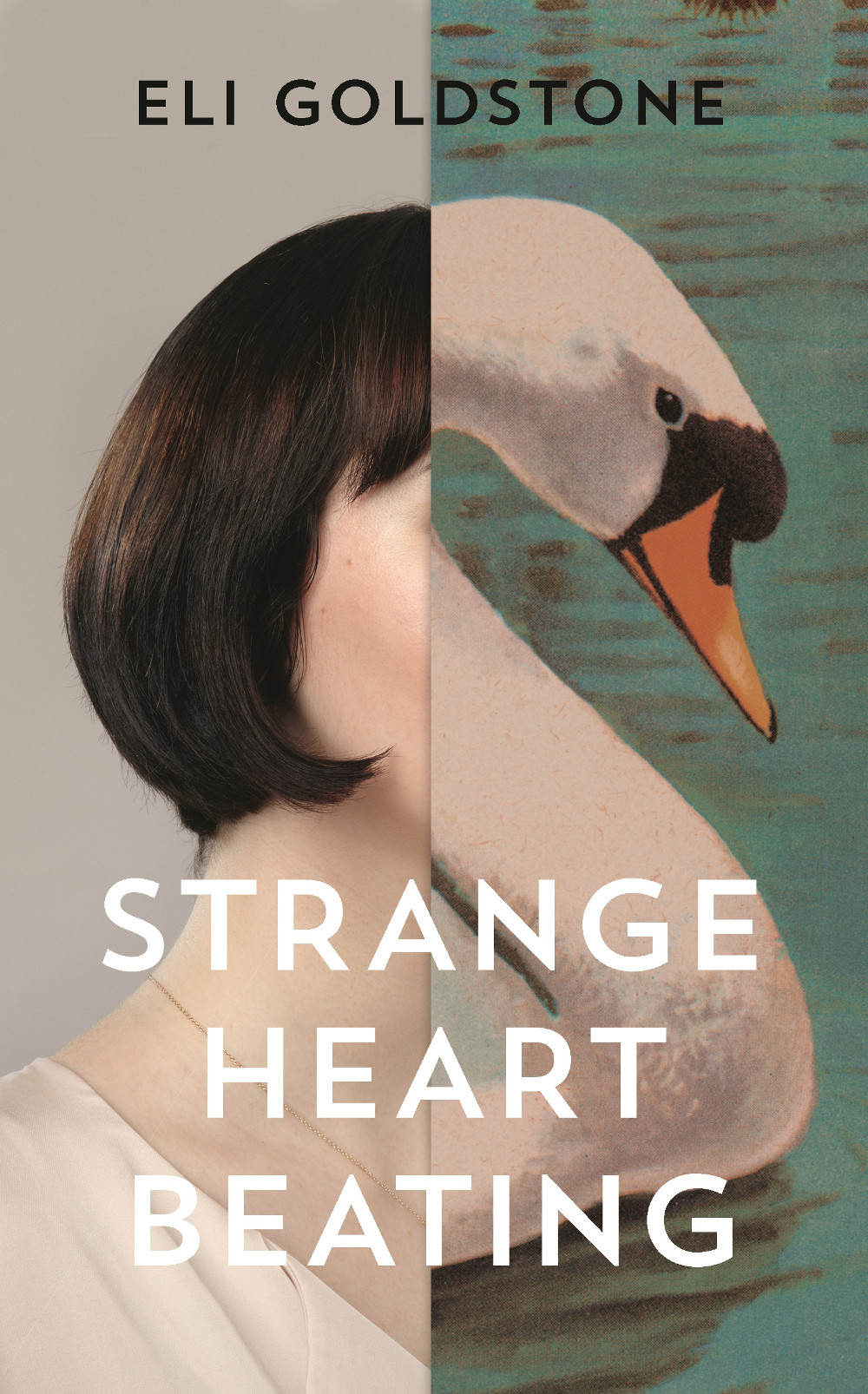
Strange Heart Beating by Eli Goldstone; design by Jo Walker (Granta / May 2017)
All We Saw by Anne Michaels; design by Janet Hansen; photograph by Jouke Bos (Knopf / October 2017)
CMYK, Vintage UK’s design blog, also posted a short but sweet list of their designers’ favourite covers of the year.
Priestdaddy by Patricia Lockwood; design by Rachel Willey (Riverhead / May 2017)
The Book of Disquiet by Fernando Pessoa; design by Peter Mendelsund (New Directions / August 2017)
I contributed to two lists (aside from my own) this year. I gave Vulture my two cents for their list of the ’10 Best Book Covers of the Year’.
Riot Days by Maria Alyokhina; design by Tom Etherington (Allen Lane 2017)
Ghachar Ghochar by Vivek Shanbhag; design by Luke Bird (Faber & Faber / April 2017)
So here it is, Merry Xmas, everybody’s having fun, my YA (and middle-grade) covers round-up for 2017. This is far from my area of expertise (I mostly work on the adult trade side of things), but until someone else steps up to do a annual post on YA covers with design credits and publisher details you’re stuck with me. Sorry.
All the picks are, of course, mine, but thank you to all the designers who have helped me over the year with covers, suggestions, and credits, and special thanks to Erin Fitzsimmons at HarperCollins and Sarah Creech at Simon & Schuster who helped me with this post in particular. Happy holidays!
Since 2010, I’ve posted an annual survey of the year in book covers. The post has expanded and developed over the past 7 years, but essentially it is a collection of the covers published in the previous 12 months that I found interesting or noteworthy in some way. As with the previous couple of years, the 2017 list is organized by covers (alphabetical by title), and by designer so that I can show a greater variety of work, and no one designer or studio dominates.
Thank you to everyone who has supported the blog this year, and special thanks to all the designers, art directors, authors, publishers, and fellow design enthusiasts who have helped me with covers and design credits. My sincere apologies to the designers and publishers not on this year’s list and whose covers I have overlooked in the past 12 months.
A post looking back on the YA covers of 2017 is to follow.


