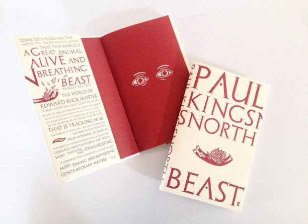
Creative Review talks to Mark Ecob about his cover design for Paul Kingnorth’s new book Beast (Faber & Faber, July 2016), which incorporates “a series of folkloric linocut illustrations” by Alan Rogerson.
I love this cover.
Comments closedBooks, Design and Culture
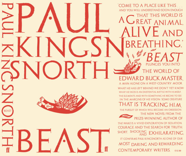
Creative Review talks to Mark Ecob about his cover design for Paul Kingnorth’s new book Beast (Faber & Faber, July 2016), which incorporates “a series of folkloric linocut illustrations” by Alan Rogerson.
I love this cover.
Comments closed
One of the fun things about doing this blog is that you never quite know when one post might lead to another. After posting photographs of Alex Kirby’s jacket and cover design for Amnesia by Peter Carey yesterday, I realised Alex had also sent me photographs of his work on Matchbox Theatre by Michael Frayn, published by Faber & Faber last month. As you can see, it is rather splendid:


Comments closed
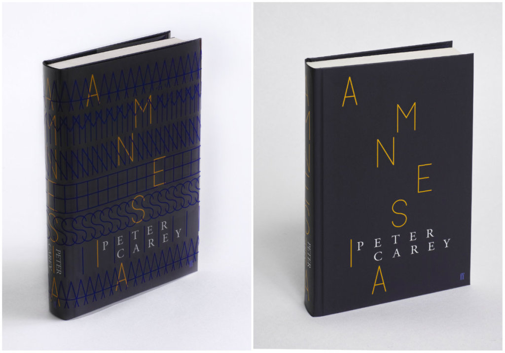
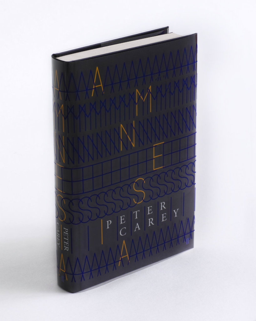
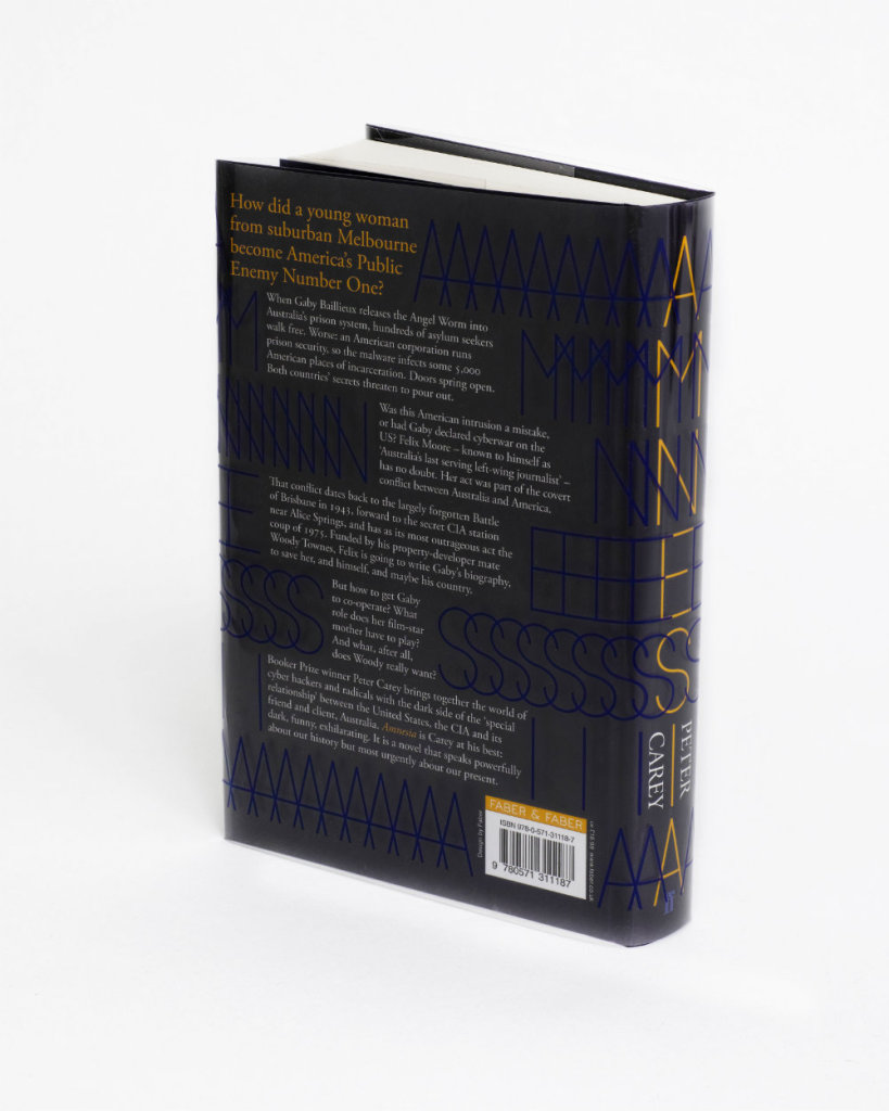
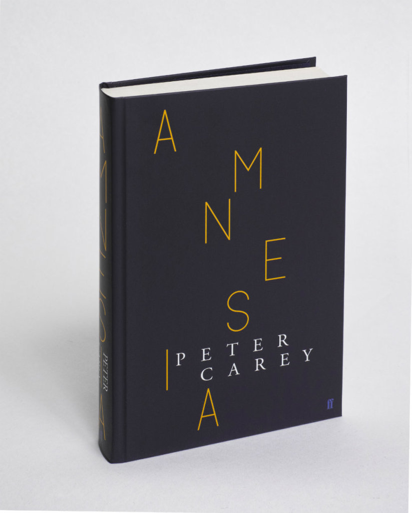
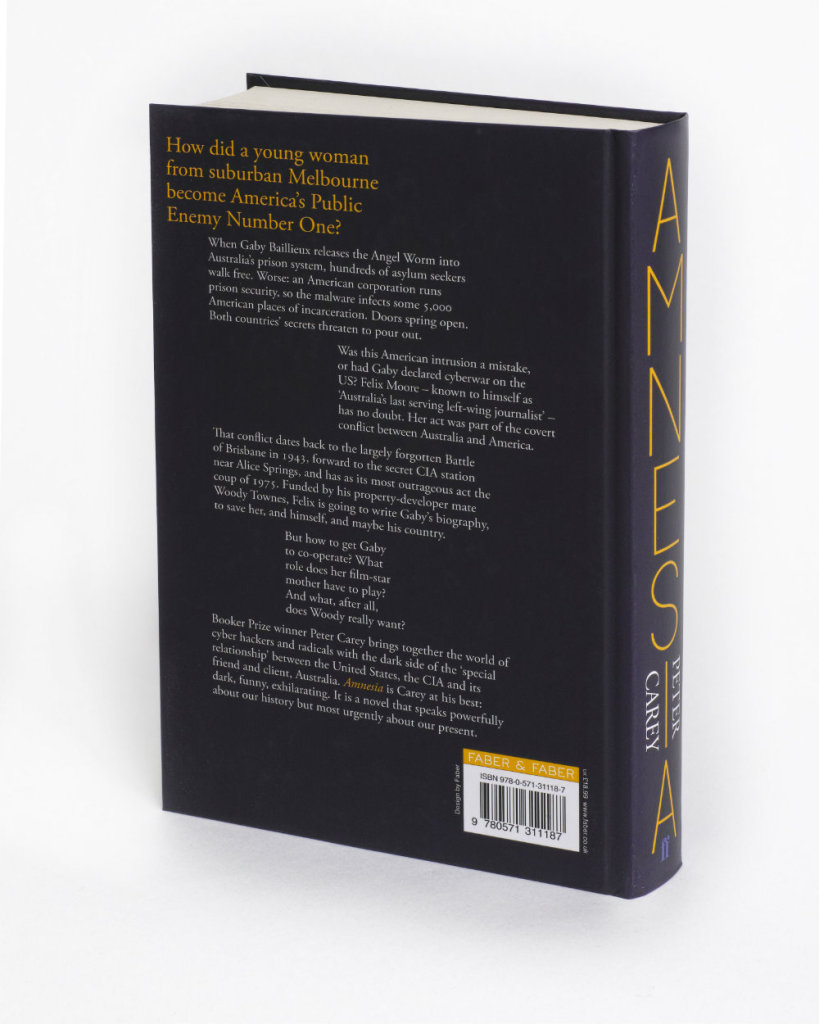
The cover for the new Faber & Faber edition of Amnesia by Peter Carey was featured in this month’s ‘book covers of note‘ post, and designer Alex Kirby kindly sent me some lovely photographs of the book with and without it’s acetate dust jacket so you can get a better look at it:
The Bookseller has posted an edited transcript of a recent speech by Stephen Page, chief executive of Faber & Faber, at the IPG and Publishing Scotland conferences:
Comments closedOne joy of digital is that it promotes thinking about all incarnations of reading, from the insubstantial to the disposable to the luxurious. We’re back to a place where we must imagine all the means we have of expressing value for a text. Where a reader will buy a £100 edition, let’s make that, and a 99p e-book where that’s appropriate… In the future we’ll spend a lot more time talking and listening to consumers. Whether they’ll listen will depend on our skills and the degree of fandom for the writer. If we’re successful, we’ll get a conversation going among consumers, and if we’re really skilful they’ll come back to talk some more. Having the systems and skills to do this will be the core to a publisher’s commercial opportunity, alongside taste.
In his recent essay ‘Graphic Design Criticism as a Spectator Sport’ designer Michael Bierut (author of 79 Short Essays on Design) suggested that “at a time where more people than ever are engaged with design,” design criticism has been reduced to a “seemingly endless series of drive-by shootings punctuated by the occasional lynch mob, conducted by anonymous people with the depth of barroom philosophers and the attention span of fruit flies.”
Unsurprisingly, I thought of Mr. Bierut during the recent furore about the cover design of The Bell Jar.

When Faber and Faber published a 50th anniversary edition of Sylvia Plath’s novel last month with a brightly coloured new cover, they can hardly have expected a controversy. But the design, which features a photograph of a woman holding a compact and touching up her make-up, was, it turned out, nothing less than “a ‘fuck you’ to women everywhere.” It was so truly hideous, that if “Sylvia Plath hadn’t already killed herself, she probably would’ve” when she first saw it. It was “THE BELL JAR as chick lit” — “1990s chick lit“!
It wasn’t much better when the designers weighed in. If the diplomatic Jamie Keenan thought Faber hadn’t “got it quite right,” Barbara DeWilde was less equivocal: “it’s a travesty… I’m still almost speechless that it was published in this form.”
We are, of course, morbidly fascinated by Plath, who died tragically young — there are at least 3 new books about her life being published this year alone. That The Bell Jar is both semi-autobiographical and her only novel makes our opinions about it even more intense.
But just how much of the criticism was actually fair?
On the face of it, the image isn’t entirely inappropriate. Mirrors (and photographs) are a recurrent motif in the book (one of its working titles was The Girl in the Mirror). The novel even begins with Esther working for a fashion magazine in New York. She talks about her looks, her clothes and her make-up. She carries a compact in her bag. Esther is fixated with appearances even as she struggles against being defined by hers.

Nor is the new design some kind of “chick lit makeover” — that just seemed like a convenient, if inaccurate, headline. While defining what qualifies a ‘chick lit’ is notoriously difficult, the cover has none of whimsy usually associated with the genre. Furthermore the new design wasn’t a sudden attempt to make the book look more feminine. The beautiful Faber Firsts cover from 2009 designed by Mark Swan also uses a glamorous retro image (albeit a disturbingly cropped one).
In fact, the new cover, also designed by Swan, is much more jarring than the Faber Firsts’ almost romantic image. There’s an angular sickliness to it — an awkward, unpleasant toxicity. The bright colours are unnaturally heightened, the pose mannered, the jerky lettering like “loops of string lying on the paper” blown askew.
As Faber themselves would later would confirm, it was meant to unsettle. The intent “was that the image of the expressionless woman ‘putting on her mask’ and the discordant colour palette would suggest ambivalence and unease.”

Certainly the new cover, is harder to like. It is indisputably ugly, especially compared to Swan’s earlier design or the original Faber cover from 1967 (pictured above) designed by Shirley Tucker (if not more so than this Warholian shocker from 1998). But tasteful covers rarely stand out on the shelves and from a marketing perspective there isn’t anything necessarily wrong with something being dissonant. It can be startling effective as Peter Mendelsund’s covers for Simone de Beauvoir demonstrate. Disruptive designs can also provoke interest in new readers and there is even some anecdotal evidence this is precisely what has happened with The Bell Jar — it is, apparently, “doing the business.”

Still, the design of The Bell Jar fails, at least as an accurate representation of the book. The mirror’s reflection does nothing to imply the introspection or detachment of the novel — only a coquettish vanity and narcissism. The woman in the photograph is just too put-together, too worldly. The mannered glamour is reminiscent of the stifling fashion photography of the 1950’s. This isn’t a 19 year-old’s face, “bruised and puffy and all the wrong colours.” There is no ennui or anxiety on display. No hint of poverty or isolation. Nothing of the suicidal depression aor a person coming apart. There is none of the disappointment. It is just an icily cool model posing for a photograph — an image Esther herself denies:
The magazine photograph showed a girl in a strapless evening dress of fuzzy white stuff, grinning fit to split, with a whole lot of boys bending in around her. The girl was holding a glass full of a transparent drink and seemed to have her eyes fixed over my left shoulder on something that stood behind me, a little to my left. A faint breath fanned the back of my neck. I wheeled around.
The night nurse had come in, unnoticed, on her soft rubber soles.
“No kidding,” she said, “is that really you?”
“No, it’s not me. Joan’s quite mistaken. It’s somebody else.”

To make matters worse for Faber, they also revealed the new cover shortly after Penguin Classics reissued new editions of George Orwell with cover designs by David Pearson. The contrast is unfavourably stark. Where Pearson deftly combines wit and originality with respect for material (not to mention Penguin’s design heritage), the stock photography, anachronistic type and bright colours of The Bell Jar seem crass and gaudy.

Comparisons with similarly stylish new editions of Kafka and Joyce designed Peter Mendelsund, Truman Capote designed by Megan Wilson, and Ralph Ellison designed by Cardon Webb, are unequally unflattering. It’s not hard to see that Plath, like so many other women writers, has been decidedly short-changed.
As Fatema Ahmed, noted in her post ‘Silly Covers for Lady Novelists‘ for the London Review Books blog, “the anniversary edition fits into the depressing trend for treating fiction by women as a genre, which no man could be expected to read and which women will only know is meant for them if they can see a woman on the cover.”
In recent years, contemporary writers as diverse as Francine Prose, Jodi Picoult, Jennifer Weiner, Meg Wolitzer, Fay Weldon, and Lionel Shriver have all noted how fiction by women is marginalized. No matter that women buy the most books, women writers are less well-reviewed, win fewer literary awards, and all too often the covers of their books don’t accurately reflect nature of the work itself.

If books by Jonathan Franzen, Chad Harbach and Ben Marcus are designed to look different and stand out on the shelves, contemporary literary fiction written by women tends to look the same regardless of the book’s subject matter. All too often there is a photograph of woman on the cover — pretty, domesticated, inoffensive and wistful. The assumption is that women only want to read certain kinds of stories, and that men don’t want to read books by women at all. In discussing the treatment of her own work, Shriver dryly pointed out, “publishing’s notion of ‘what women want’ is dated and condescending.”

This isn’t always true, of course. Hilary Mantel’s Thomas Cromwell novels defy all expectations. See Now Then, Jamaica Kincaid’s first novel in 10 years, has a type-only cover. The Casual Vacancy by J. K. Rowling is notable for its hand-drawn lettering and calculated, corporate blandness. Both the American and the British editions of Zadie Smith’s NW — designed by Darren Haggar/Tal Goretsky and Gray318 respectively — are stunning. Alison Forner’s sinister canned cranberries for May We Be Forgiven by A. M. Homes is a neat inversion of domesticated happiness. The Penguin Modern Classics reissues of Carson McCullers designed by Jim Stoddart — with images selected by Penguin Press picture editor Samantha Johnson — also demonstrate that 20th century classics by women do not have to suffer from poor design or gender stereotypes.

There are surely other isolated examples too. But one can’t help thinking they are exceptions that prove the rule, and it is a particularly bitter irony that Plath’s novel about a young woman struggling with society’s expectations of her should, 50 years later, expose that woman writers are still stereotyped and treated poorly in comparison to their male counterparts. My sense is, however, that this latest controversy is a sign that the tide is turning. Women, both writers and readers, are being more outspoken about what is wrong with the way their books are handled by publishers and the media. They expect more and they expect better. This is the upside of design as a spectator sport. White middle-aged men are no longer the only voices being heard. Thankfully.
I was recently asked for my opinion on the new cover of The Bell Jar for an article in the Chicago Tribune. This an edited and expanded version of my comments to journalist Nara Schoenberg for that article. Thanks to everyone who gave feedback on an earlier draft of these remarks.
9 Comments

The Bell Jar by Sylvia Plath was first published in 1963 under the pseudonym Victoria Lucas. To mark the book’s 50th anniversary, Faber & Faber have posted a series of fascinating video interviews with Shirley Tucker, who designed the cover of their original 1966 edition.

After studying graphic art at the Royal College, Tucker spent several years working in Penguin’s design department, then headed by the distinguished German designer Hans Schmoller. She joined Faber in 1959 and worked alongside another great German emigre typographer, Berthold Wolpe (who created the Albertus typeface used on many of Faber’s typographic covers). Tucker worked in Faber production department until her retirement in 1987.
Shirley Tucker on Designing Book Covers:
Shirley Tucker on her Favourite Faber Covers:
Shirley Tucker on Berthold Wolpe:
1 Comment
You’re All Just Jealous of My Jetpack — Tom Gauld has a Tumblr (The title is a reference to this of course).
Legacy Issues — Stephen Page, chief executive of Faber & Faber, writing at The Guardian:
Let’s deal with technological obsolescence. Media businesses are not technology businesses, but they can be particularly affected by technology shifts. I run a so-called legacy publishing house, Faber & Faber. Most of our business is based on licensing copyrights from writers and pursuing every avenue to find readers and create value for those writers. We are agnostic about how we do this. For our first 80 years, we could only do it through print formats (books); now we can do it through books, ebooks, online learning (through our Academy courses), digital publishing (such as the Waste Land app) and the web. Technology shifts have tended to result in greater opportunity, not less.
Bibliophiles in London — The Economist on The London International Antiquarian Book Fair:
Most interesting, perhaps, is the air of optimism—there is not the slightest whiff of gloom at the state of the book world. The internet, paradoxically, has made books “à la mode”, says Claude Blaizot of the Librarie August Blaizot in Paris, purveyor of first editions of “Tintin” and fantastically bound livres d’artiste. “It has brought people to books, and shown them booksellers they never would have known existed before,” he says. Clive Farahar, the Antiques Roadshow’s book specialist, agrees that technology has opened up the book trade, and made the world of books much more accessible to all. “It’s not just the dim little shop on the high street anymore,” he said. “We can learn so much now we never would have known before.”
Simplicity — A two-part interview with Apple designer Jonathan Ive at The Telegraph:
“Simplicity is not the absence of clutter, that’s a consequence of simplicity. Simplicity is somehow essentially describing the purpose and place of an object and product. The absence of clutter is just a clutter-free product. That’s not simple.”
(part two)
And finally…

Daniel Clowes at wired.com:
Comments closed“Digital seems like such a step back from a printed book… For me, the whole process involves envisioning this book in my head as I’m working. That is what I’m trying to create. That’s the work of art. That’s the sculpture I’m chipping away at, and when I’m finally done, I will arrive at that perfect 3-D object. The iPad version would be like a picture of the book, which doesn’t hold any interest at all for me. Even if I only had 10 readers, I’d rather do the book for them than for a million readers online.”
Jarvis Cocker talks to Faber Publishing Director Lee Brackstone about songwriting and the publication of Mother, Brother, Lover, his first collection of lyrics:
Mother, Brother, Lover will be published by Faber in October.
(via Largehearted Boy)
Comments closed
Charlotte Strick, art director at Faber & Faber, Farrar, Straus and Giroux and The Paris Review, writes about the book design process for The Atlantic:
Even though I frequently have designs for titles from the previous season still on my plate, and just when I think I can’t possibly come up with another original idea for a cover, the creative sparks begin to fly. At the launch meetings, editors take turns presenting recent acquisitions… As the books are introduced, each of us begins to wonder: Will I solve the problem with illustration or photography? If the title is brilliant and descriptive, maybe an all-type treatment that’s bold and clever is the best solution. (These are always my favorites.) Is there even any budget for art after the copy-editing fees, production costs, and author’s advances have been tallied? No? Never mind! We’ll get out our paintbrushes and dust off our cameras and get to work.
She is also interviewed by The Atlantic’s Daniel Fromson:
Everyone has an opinion on whether or not the book publishing world as we know it is doomed. Just as the design of websites was becoming more interesting and thoughtful by the late ’90s, it’s clear that the look and feel of e-books will transform over the next decade. As a designer who makes her living creating covers for actual books, I hope to take part in this. I don’t want our work to be reproduced exclusively in black and white or viewed only at postage stamp size.
(Pictured above: sketches by Chris Silas Neal for the cover of Poser: My Life in Twenty-Three Yoga Poses, by Claire Dederer, published by FSG)
Comments closed The Man With the Getaway Face — Cartoonist Darwyn Cooke talks The LA Times’ Hero Complex blog about his latest Richard Stark (AKA Donald Westlake) adaptation, The Outfit, released this month:
With the first book, I was really trying to get Don Westlake’s worldview across to people. The story had already been told several times in films… and what-have-you, but it had never been told down the line, so it was really important for me to do that. With “The Outfit,” I was able to sort of step back and say, ‘OK, the plan is we’re doing four books here; are there ways I can make this one stronger in terms of how it relates to the three other books?’ We don’t have, say, 20 books to get our readers acquainted with this entire world, so are there things that I can do here to help in that regard? So I changed a few things. And to be honest, I fixed a couple of tiny problems with the story that I think Donald would have giggled about if I had brought them up. ‘Oh, geez, good point…‘
And on the subject of Richard Stark, David Drummond recently posted the final 3 covers (there are 18 in total) for the University of Chicago Press’ Parker reissues (mentioned previously here):
 Where the Wind Blows — Stephen Page, CEO of Faber & Faber, outlines the challenges facing existing book publishers at The Guardian:
Publishers perform roles that writers need. The question now is whether writers will continue to turn to existing publishers to perform these tasks, and whether they believe they offer value. Some authors will bypass publishers (some always have) but among most authors and agents I deal with, there is no appetite to do so, because publishers continue to perform essential roles for writers in both the physical and digital worlds (editorial, marketing, distribution, and so on). However, urgent questions are rising about how a successful 21st-century publisher ought to look and function, and whether existing publishers can adapt quickly enough…
A Hipster Never Teaches a Square Anything — Over at Good, Lexicographer Mark Peters looks at the origins of the word “hipster” and why, these days, nobody admits to being one:
“Hipster” first popped up in 1940, and The Historical Dictionary of American Slang’s first use includes the statement that “A hipster never teaches a square anything.” The OED’s early examples include semi-definitions such as “know-it-all” (1941) and “man who’s in the know, grasps everything, is alert” (1946). Those descriptions sound groovy, but in the HDAS’s definition of “hipster,” we can find the seed that grew into today’s widespread hipster-phobia: “A person who is or attempts to be hip, esp. a fan of swing or bebop music.” It’s that attempting—especially in clumsy, transparent ways—that make the hipster horrible.
And finally…
What Batman Taught Me About Being a Good Dad — The headline tells you just about all you need to know about Adam Rogers post for The Atlantic (what dad doesn’t secretly believes that Batman is full of very important life lessons?), but hey…
I am trying to build a good human being here, someone who will make the world better for his presence. Because I don’t know any other way to do it, that means I’m building a little geek… I want him to think that these stories have weight, that they mean something; they are our myths. I give my son comics and cartoons and episodes of Thunderbirds because I want him to understand right and wrong, and why it’s important to fight the dark side of the Force. The mantras spoken in this corner of pop culture are immature, but they have power: With great power comes great responsibility. Truth, justice, and the American Way. The weed of crime bears bitter fruit. No evil shall escape my sight.


Another great set of designs for the 2009 D&AD student award brief for typography sponsored by Faber and Faber, this time by Rinse Design (via Cosa Visuales). See also: Ed Cornish’s designs for the brief.
Phaidon have relaunched their website and it is really rather nice (via FormFiftyFive).
The Imaginary Present — Mike Doherty interviews William Gibson about his new novel Zero History for The National Post:
In his earlier books, Gibson says, he aimed to devise “futures that felt as though they were filled with designed artifacts, as indeed they would be. I can’t think of too many science fiction writers who’d bother trying to do that.” In the [new] series, his devotion to design has gone into overdrive, reflecting the idea that “everything is ‘designer,’ ” even though “with most things, you’ll never know the name of a designer.”
PopMatters also spoke to the author about the new book.
Code — Jennifer Egan, author of A Visit From the Goon Squad, reviews Tom McCarthy’s C for The New York Times:
[McCarthy] aligns disparate things into larger patterns full of recurring images: analogies between the human body and earth, and machinery; hums and whirs; film screens; bowels and tunnels; electric circuits; cauls and other silken membranes. These repetitions come to feel like the articulation of a larger code — as if, were readers to plot their exact positions throughout the novel, they would discover a hidden message.
What Ever Happened to Reading Properly? — ReadySteadyBlog’s Mark Thwaite on critics misreading of Gabriel Josipovici’s What Ever Happened to Modernism?:
It’s interesting that Josipovici’s book which, in many ways, is both a call to read more carefully and an enquiry into why reading carefully is beyond so many cultural gatekeepers, has been read so sloppily by so many of its critics… Josipovici doesn’t invoke marginal or avant-garde writers, nor praise typographical or narrative playfulness over stale traditionalism, but rather brings us back to canonical writers (a good part of his essay is taken up with Wordsworth) and allows us to see what was at stake for those artists in their work, and what is at stake for us as readers.
And finally… It’s Vignelli week at Design Observer:
 Debbie Millman’s 2007 interview with Massimo Vignelli (excerpted from her book How To Think Like a Graphic Designer):
I’m interested in “essence” — my major aim is really to get to the essence of the problem. And just throw away everything that’s not pertinent to it. At the end of a project, my work should be the projection of that experience, the essence of effect. It’s a habit that you get into… The essence is what is left when there’s nothing else that you can throw away.
Michel Bierut profiles Lella Vignelli:
Massimo has often defined their working relationship like this: “I’m the engine, and Lella is the brakes.” The first time I heard this as a young designer, it was clear to me which was more important. If you were a designer, wouldn’t you want to be the engine, powerful, propulsive, driving forward? It was only years later that I remembered something my high school driving instructor once said: “You don’t get killed in a car accident because the car won’t start. You get killed because the breaks fail.”
And, there is an interesting, beautifully shot, video interview with Massimo Vignelli by photographer John Madere here.
There will surely be more good stuff as the week progresses…
Comments closedThere’s a great op-ed by Stephen Page, chief executive of Faber & Faber, in today’s Guardian about the iPad and publishing:
It’s clear that publishers must move faster to establish our compelling and useful role in the modern life of reading. While acquiring new expertise, we must assert the best of our traditional strengths; providing capital (in the form of advance payments), offering editorial expertise, and creating a readership by designing, creating, storing, promoting and selling the works of writers. But that’s not enough. Publishers also have to explain what value they are bringing to the relationship between writers and readers, a conversation that is made far more transparent through digital media and digital texts.
Page goes on to list what he sees as guiding principles for publishing going forward. These include retaining print and digital rights, reviewing royalties, flexible pricing, connecting to readers, and excellent metadata. He concludes:
The iPad launch is not the moment, but that’s because the moment has passed. We need to work with authors in new ways, and keep pace with reading’s evolution, or better still become agents of change ourselves.
It’s a must-read. If you work in publishing, send it to your CEO.
1 Comment