Skip to content

Tag: designers

Penguin 75: Q & A with Paul Buckley and Christopher Brand

Launched with 10 titles by Allen Lane in 1935, Penguin Books turns 75 this year. To commemorate the anniversary, Executive VP Creative Director Paul Buckley has compiled Penguin 75, a collection of 75 book covers from the Penguin US archive.

Penguin 75 is an inside look at the Penguin design process with candid and irreverent commentary from authors, designers, editors and artists as well as Penguin Art Directors Darren Haggar and Roseanne Serra and Buckley himself. Filled with the kind of distinctive illustrative covers that are now associated with Penguin US, the book is wonderful slice of American book cover design. As Karen Horton recently noted in her interview with Buckley for design:related:

Penguin 75… is less about the history of the old orange-spined paperbacks and more about the relationships Creative Director Paul Buckley helped to facilitate in the last decade between publisher, editor, author, and designer.”

I was lucky enough to talk to Paul and the book’s designer Christopher Brand about Penguin 75 last week.

How did Penguin 75 come about?

PB: I’ve always had a mix of fascination, disdain, and understanding, for what my staff and I go through in trying to get our work approved, as well as what the editors and publishers are dealing with on their end. Of course all people whose work is subjective go through some sort of approval process — and it’s not easy for the folks on the other end of the situation either; the ones saying “this is just not right”. As it’s something we do not hear much about (other than at some industry function), I thought it would be interesting to put some of these stories together in book form.

And how did you get involved in the project, Chris?

CB: I was working on staff at Penguin at the time. I let Paul know that I would be interested in working on it when he first mentioned the project to everyone. I mostly work on covers but I’ve had the chance to work on a few interiors before this one.

What criteria did you use to choose the covers?

PB: There were different sets of criteria; the most obvious being that they had to be Penguin paperbacks, as we had decided to use this project in conjunction with our 75th Penguin imprint anniversary. Another criteria was that I wanted to show recent Penguin work, so nothing older than 10 years or so. Then it came down to a combination of which covers look great and also have an interesting story associated with them, as well as trying to get a mix of intriguing authors and designers in there — not just your obvious fiction darlings, but a true microcosm of the publishing world and art world.

The covers are very different from the iconic Penguin paperback covers. Do you think the book shows a different side to Penguin’s design history?

PB: Of course. Penguin UK does a gorgeous job of tapping into the Penguin archive and history, and while I like to go there from time to time, I’m very interested in Penguin’s future in a different sort of way. The beautiful Penguin by Design is just not who I am, and if I tried to do a version of that, two things would happen — I’d fail as my heart would not be in it, and no one would buy it as it’s already out there in a few books. This is not to say that I’m not a huge fan of Penguin’s design history — I am, but I see it as a place to tap into occasionally, while still moving the brand forward — as nothing creative can remain as it was, nor should it if it wants to stat vital in it’s own day. But we do maintain Penguin’s age old love of illustrated and well crafted covers.

Do you have a sense that Penguin US has a design sensibility that is separate from the Penguin UK tradition?

PB: Whether you’re UK or US, it’s still Penguin tradition, so I don’t define it as you do. Both sides are very proud of Penguin, it’s history, it’s cache, it’s values — and both sides have built Penguin into what it is today, and what it stands for. So while we are separate entities that bring different things to the table, the overall strive to keep the quality bar set very high is paramount to either side.

Was it hard to choose just 75 covers?

PB: Unbelievably hard. That ate up the first month or so, just getting it down to 75, who was left in, who was left out, who on staff has five covers in, while another has only one or two, is it a good mix visually and editorially of this and that, etc etc.

Chris, did you have a say in any of the selections?

CB: Paul did an initial edit and went through tons of the books. Once he narrowed it down I helped a little bit with figuring out what we should put in, but mostly I would come to Paul later on when were trying to lay out the book. If we couldn’t get enough content for one of the books then we would have to find another one to put in. Or, if Paul wanted to add more books toward the end then we had to figure out what to subtract. I was more involved when it affected the design.

Were there any covers or comps that you wanted to include but couldn’t?

PB: By the nature of only utilizing 75 covers / series, things have to be left out. So yes, but only for that reason.

Penguin 75 includes contributions from authors and editors as well as designers, but I notice you left out Sales & Marketing!

PB: I did not leave out sales and marketing any more than I left out elves and leprechauns… I simply did not have any real sales and marketing stories. The Penguin marketing director, John Fagan, is hands down the best marketing director in the universe — we all know the horror stereotype stories of the marketing director killing this and that just to hear their own voices in the room, but John is so much an integral part of our team and loves what we are doing with our packaging; so unless he really thinks we’re missing something, he’s incredibly supportive; and when he does have something to say, he still manages to do it in a kind and intelligent way. Our sales team also leaves that stereotype behind. Trust me, you see in the book that I’m not pulling any punches and I made sure no one else in the book did either — so if I had great Penguin sales and marketing stories, you’d be reading them.

As a designer, were you surprised by any of the  comments from authors and editors about the cover designs, Chris?

CB: The range of comments from the authors was pretty surprising. Some were very thoughtful and you could tell they appreciate and understand book cover design. Other authors weren’t very happy with their covers and they made that pretty clear.

Was it fun to design a book about book design?

CB: More than anything, it was just fun for me to be working on the interior of a book instead of just the cover. It was a nice change.

Were there any unique challenges?

CB: The biggest challenge was that Paul and I were working on this book, but at the same time we both had full time jobs at Penguin. Paul tried to clear my plate for me a bit, but we both still had a lot of other responsibilities to deal with. Another thing that was hard was that we were sort of doing this whole thing on the fly. We were responsible for not just designing the book but gathering all of the content and all of the things that we needed to design the book (the comments, the hi-res art, etc.). We had to get everything together as we went and this stuff trickled in throughout the process.

On a design level, there was a lot of information to organize. It was challenging to come up with a system for everything. We had comments from that authors and designers, then there were comments from the art directors that we created another system for, all of the credit information for each book, we were showing alternative designs for some covers. There was a lot to think about.

Did you try to take account of Penguin’s design history while working on your design?

CB: I did take Penguin’s history into account at the beginning when we were figuring out what the layout should look like. I used Gill Sans throughout the book, but it’s pretty small and doesn’t feel overwhelmingly “Penguin”. I tried some things that were more in the style of older Penguin covers, but in the end we went with something more modern.

Was it strange to design a book that includes some of your own work?

CB: It was a little strange at first, but many of the covers in the book were designed by my co-workers so a lot of the work was very familiar to me.

So, did the book make you reconsider any of your own designs, or your design process?

PB: I’d love to sound thoughtful and say “yes” and expound on some brilliant new design wisdom — but the answer is “no”. All of the entries in this book are well known to me, and most have been for years. Putting them all down in one place just made me feel proud of what my department does — but I’ve always been incredibly proud of my team. If anything, it made me reconsider what it takes to put a book together, and see editors and authors in a more favorable light.

And, Chris, I have to ask… How does it feel to be immortalized on the cover of The Shadow of the Wind by Carlos Ruiz Zafón?

CB: It was an amazing opportunity. I think this only the beginning of my modeling career.

Thanks Paul and Chris!

Images:

  1. Penguin 75 cover, design by Paul Buckley
  2. Penguin “Graphic Classics”:
    The Dharma Bums | Art Director: Paul Buckley |  Illustrator/Designer: Jason
    The Portable Dorothy Parker | Art Director: Paul Buckley | Illustrator/Designer: Seth
  3. Graham Greene Backlist | Designer/Art Director: Paul Buckley | Illustrator Brian Cronin
  4. Don Delillo Backlist:
    Americana
    | Designer/Art Director: Paul Buckley | Photos: Jeff Brouws
    White Noise | Designer/Art Director: Paul Buckley | Photos: Jason Fulford
    Great Jones Street | Designer/Art Director: Paul Buckley | Photos: Hugues Colson (top), Tom Zimberzoff (bottom)
  5. Emporium and unused image | Designer/Art Director: Paul Buckley | Illustrator: Viktor Koen
  6. Special Topics in Calamity Physics | Designer/Art Director: Paul Buckley
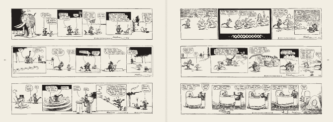
  7. Pages 220 – 223  Penguin 75 | Designer: Christopher Brand
  8. Pages 244 – 247 Penguin 75 | Designer: Christopher Brand
  9. There Once Lived a Woman Who Tried To Kill Her Neighbor’s Baby | Designer: Christopher Brand | Illustrator: Sam Weber | Art Director: Roseanne Serra
  10. The Jewish Messiah | Designer: Christopher Brand art Rodrigo Corral Design | Art Director: Darren Haggar
  11. The Shadow of the Wind | Designer: Tal Goretsky | Art Directors: Darren Haggar and Paul Buckley
4 Comments

Penguin RED

Penguin Press Art Director and designer Jim Stoddart talks about his design for the (Penguin Classics)RED edition of Thérèse Raquin by Émile Zola:

Penguin designers Coralie Bickford-Smith and Stefanie Posavec also talk about their designs for series.

There’s more information about the videos and the (Penguin Classics)RED editions on the Penguin Blog and you can see all the covers of all 8 books on Flickr.

You can read my interview with the talented Ms. Bickford-Smith here.

2 Comments

Q & A with Peter Mendelsund and Tom McCarthy

In the early days of The Casual Optimist I scribbled out a short list of book designers I wanted to interview. More designers have been added since then, but a few of the original list remain un-interviewed. At the top of the list has been the name I actually wrote down first: Peter Mendelsund.

As Senior Designer at Knopf, Mendelsund’s designs feature here regularly. Much as I love his covers, however, Peter has been interviewed extensively elsewhere. I just haven’t known how to approach his work in a way that he would find interesting.

That was until I saw the shockingly subversive jacket design for Tom McCarthy‘s new novel “C”. The pairing of Mendelsund, the designer who is a musician, and McCarthy, the author who is an artist, was — it seemed to me — inspired.

A perfect opportunity…

What follows is primarily an interview with Peter about that design for “C”. But over the course of a few emails, Peter and I both decided to bring Tom into the conversation. I had met Tom shortly after the release of his debut novel Remainder and Peter had, it transpired, met Tom in New York after Knopf had signed “C”. It made sense to both of us.

It is a long, but absolutely fascinating exchange. Peter kindly answered my questions more fully than I had any right to expect and Tom, who was contributing from Stockholm, was more than gracious in less than ideal circumstances. I’m grateful to them both.

7 Comments

Something for the Weekend

Circulation and the City design by David Drummond

New from David Drummond

The Original Spirit — Toronto indie institution This Ain’t The Rosedale Library (one of the 10 best bookshops in the world according to The Guardian) featured at Books@Torontoist, with some nice quotes from owner Charlie Huisken:

“creative knowledge [is] accumulative and comes from many sources… Being an autodidact has served me well”

Books in the Age of the iPad — Craig Mod’s article on printed books and digital publishing caused much of a flutter on Twitter yesterday. I’m not sure that I entirely agree with his thesis — which seems to imply that some kinds of content can be completely divorced from their media — but his website is beautifully designed, and more importantly he makes some interesting points. I especially like his conclusion:

I propose the following to be considered whenever we think of printing a book:

  • The Books We Make embrace their physicality — working in concert with the content to illuminate the narrative.
  • The Books We Make are confident in form and usage of material.
  • The Books We Make exploit the advantages of print.
  • The Books We Make are built to last

In that vein, more on David Pearson‘s beautiful book cover designs for Cormac McCarthy at We Made This. I love that he used rubber stamps…

And finally… Jaron Lanier, author of You Are Not A Gadget, talks about the failure of Web2.0 with Aleks Krotoski of The Guardian:

3 Comments

Ben Wiseman | Chekhov

I really like these Chekov covers for W.W. Norton by Rodrigo Corral Design’s Ben Wiseman:


But I think the alternates are pretty special too:

There is a very short interview with Ben at idsgn.

(via FormFiftyFive and Cosas Visuales)

Update:

The good folks at W.W. Norton have just added Ben’s Chekhov covers to their Flickr design archive (thank you!).

These new editions are available in July 2010.

4 Comments

Daily Discoveries on Design

Karen Horton is co-founder of the design community site design:related and Art Director at Little, Brown and Company. Her Tumblr blog Daily Discoveries on Design is currently one of my favourite RSS Feeds. It’s full of great design, art, books, photography and inspiration — so much so, that it makes feel like a total sloth for my inability to post here daily. If you’re not subscribing already, you really should be.

You can find Karen own work (also great) on design:related (where else?).

(pictured: I Never Loved a Man the Way I Love You, cover design by Karen Horton for St. Martin’s Press).

1 Comment

Q & A with Jacob Covey, Art Director Fantagraphics Books

I get excited just about every time I post an interview on The Casual Optimist (I am officially a cheap date), but it is a special thrill to post a Q & A with Jacob Covey, designer and Art Director at Fantagraphics.

Partly this is because I’m grateful that in defiance of all reason, publishing wisdom, cold, hard financial facts, bitter law suits, common sense and ‘good taste’, pioneering Seattle-based comics publisher Fantagraphics even exists.

Partly it’s an excuse (not that I really need one) to post Love + Rockets cover art.

And partly it’s because I thought there was a very real chance the interview wouldn’t happen.

But mostly it is because there is something about Jacob’s work — which combines the Chantry-esque DIY design aesthetic of skate art, gig posters, record sleeves, underground comix, zines and punk, with a Ware-like preoccupation with detail and precision — that resonates with me and fits so perfectly with Fantagraphics.

Needless to say, Jacob’s award-winning work has been featured in Print, Communication Arts and How.

We caught up over email…

How did you get into book design?

The germ of the thing started with working at the public library where I was a conspicuously slow page. I would look at every cover I was shelving, setting aside certain ones to check out and carry a few blocks away to a color photocopier. I liked having the inspiration around and I couldn’t afford to buy design books. This was around 1999, when I was beginning to study graphic design and at night was staying out late shooting photos of bands for record labels, local monthlies, and things like that. As for getting into book design professionally, in late 2003 I had just moved back to the Northwest after leaving a job in Los Angeles at a skate company. I was interviewing for a job to churn out ads at the local alternative weekly, The Stranger, and the Art Director, Joe Newton, kindly suggested that I instead talk to Gary Groth at Fantagraphics. They were looking for a new designer but apparently they were in no hurry to actually hire someone as I basically called relentlessly for six months. I think I was just the last man standing at the other end of the phone line so they hired me.

 Briefly, could you tell me about working at Fantagraphics?

If the publishing industry is a zoo, then Fantagraphics is the monkey house. It’s not a conventional workplace and you could get tetanus from walking barefoot but it’s a place where everyone is laboring out of love and there’s a lot of receptivity to trying new things and having your ideas heard. Much more so than I think is possible at most publishers. I have immense respect for the history of the company as an archivist of great work and I have the opportunity to deal with our publishing decisions on a regular basis. It’s satisfying in that way– but the office itself is a neglected three story house with 30 years of dusty artwork, ancient paste-ups, and discarded razor blades strewn about. So it’s not for everyone.

As for the work, Fantagraphics publishes the great cartoonists from Charles Schulz to R. Crumb, but as often as not I’m designing a book of paintings or a collection of pop culture artifacts or even the occasional prose novel.

You’re also a freelance designer. How is that different from your role as art director at Fanta

For one thing I’ve established myself with Fantagraphics enough that I know the material well and have to explain my decisions less. They’re very supportive and because of that I am mostly pushing myself to do better work. With my freelance clients there’s a lot more to learn from their needs and the process involves more time spent on researching and exploring ideas. The freelance work is also much more varied subject matter. For example, as I type this I’m working on the branding for a 2011 museum exhibition focusing on the band Nirvana, a non-fiction book cover for HarperCollins, a band t-shirt design, an AIGA event poster, and a book layout for a start-up imprint in the UK. There are a lot of other publishers I’d like to work with but I’m a pretty shoddy self-promoter.


Could you describe your design process?

In the case of Fantagraphics, I hate to say that most of the time there are so many projects on my plate that I’m just cranking the books out, trying to trust my instincts and learning from any mistakes. We have a list of about 50 books a year with only me and one other designer, Adam Grano, along with our works-through-the-night production guy, Paul Baresh, scanning and laying out everything from the books to the ads and supplying media requests — if we get behind schedule we rarely hire out for another designer, the book simply gets published late. So there’s a lot of pressure to just keep moving. The job requires a lot of discipline to approach books with an eye on getting them approved by the editor/artist without delays and yet still make them interesting. There is process but it’s very accelerated and it’s not unusual that I have to go with my first impulse for a book design and wish I had time to do a dozen more comps.


Is designing for reprint collections different than designing for new material?

Notably, the job description of a cartoonist and a graphic designer are similar in that they both work with text and images but the truth is very few cartoonists have a very developed design sense (just as my cartooning skills are sub par). Working with individual artists on original material can be a really rewarding collaboration or a Sisyphean attempt to improve an idea that the artist is married to. So, in truth, the deader the artist, the easier my job — reprint collections have a more dispassionate approval process.

What are your favourite books to work on?

I’m not sure that there’s any type of book that’s my favorite to work on but I’ve become very comfortable with the process that goes into art books in general. I just finished working on a very collaborative book of VHS box art with the collector/editor Jacques Boyreau and I enjoyed that. The subject matter itself isn’t necessarily what’s interesting to me but there was a long process of sitting with Jacques early on and determining the best way to showcase the work, which ended up being very austere, spotlighting the actual physical history of the boxes and conjuring the experience of seeing them in their element by retaining the old, beaten up boxes, plastered in rental stickers. Some of these boxes we had to prop back together from having been chopped up for those large plastic cases that were used in videostores. In the end, there was more of an anthropological story to looking at the boxes themselves rather than just the art that was on them.

This doesn’t work for every project but it’s great for receptive, collaborative editors. It’s fun to step into someone else’s fixation and figure out how to present the material more evocatively, in a way that will pull other people into what the editor loves about the subject. To design in a way other than plop-plop-plop, here are the images and some nice captions. Then I finish that book and it’s my job to find out and communicate what’s exciting about the next one.

How much say do the artists involved have in the design of their books?

Assuming the artists are involved in a given project, they generally have all the say they want. Fantagraphics publishes The Best and we have to respect the artists’ wishes and peccadilloes. They’re visual people so we usually end up with a good package, if not always a great one.

How are final cover decisions made at Fanta?

On a lot of projects I get more say than is customary for the Art Director but it ultimately rests on the in-house editor of the project and the outside artist or editor whose book it is. We all hash out our opinions about what works for the material and the market but we don’t really have scheduled meetings to sit down and scrutinize. Again, it’s all pretty swift moving.

Who else do you think is doing interesting work right now?

Honestly I can’t seem to go on the web without being intimidated by all the talent that’s out there. I couldn’t list all the people. By far, the designer who most consistently floors me is Peter Mendelsund. The man works brilliantly in every genre thrown at him. I also have to say how happy I am that the Design Works Group guys are in nearby Oregon. I don’t know any other book designers here in Seattle so it’s great to have them around, making a good name for the Northwest.

Where do you look for inspiration and who are some of your design heroes?

I’m a cliché: Inspiration is wherever it turns up.

Art Chantry has been really important throughout my development and is someone whose talent and vision I admire a great deal. I think his influence shows up the most in my work, though not necessarily in the most obvious ways. Chantry, Lester Beall and the Constructivists were my heroes when I used to proclaim design heroes. I would definitely add Mendelsund and Paul Sahre to my contemporary list.

Of course you can’t work in comic book design without acknowledging the significance of two of the world’s most important contemporary designers, Chip Kidd and Chris Ware. They made it possible for me to do a lot of what I do with Fantagraphics.

Could you tell me a little about your personal project Beasts! ?

Beasts! is a classical bestiary of mythological creatures as depicted by some of my favorite contemporary artists from the worlds of comics, skate graphics, rock posters, children’s book illustration, the fine art world, et cetera. The first book is now in its fourth printing and the second and final volume came out in early 2009. Each book has ninety artists and four writers involved. I call myself the curator of the project as it’s more like an art exhibit than a standard art book. I wrote up brief descriptions based on my research of creatures, then the artists chose the creature that was most interesting to them and the writers would pen proper text based on historical references to the creatures. It’s a lot more serious than people seem to expect. I like these stories, I like that these creatures existed to someone who told the original story, and it was great to see them given form — a lot of the beasts are very obscure and before I got art from an artist there usually wasn’t any depiction to be found for a beast. There are also interviews with respectable experts like the marine biologist, artist, and writer Richard Ellis as well as contemporary eyewitnesses to some mysterious beasts.

Did you design the Beast! books as well as edit them?

Yes, except the Chinese edition that just came out. The publisher translated and totally repackaged it for that market. It was part of my intent with Beasts! to see what could come of a close working relationship between the editor and the designer on a book project. (Obviously I took that to the extreme by performing both roles.) Books are generally fairly linear, straight-forward affairs or sometimes they’re eccentric art books that end up feeling like design masturbation. I’m interested in what can happen somewhere in between these things that will engage the reader to enjoy multiple readings or even to just feel like more of a participant in the whole experience. There are a lot of interesting details that never make it into books simply because the designer isn’t involved with the editorial side or is otherwise not involved on a collaborative level.

What does the future hold for book cover design?

Everyone’s got an opinion on that and my voice would just be din. It’s hard to say if it’s like the film world facing VCRs or the music world facing MP3s but it’s not bleak to me.

Thanks Jacob!

You can find more of Jacob’s work on his website.

UPDATE: Jacob was kind enough to send me a few more images to accompany the interview and these have now been added to the original post.

8 Comments

Sunnyside

I just picked up  copy of Glen David Gold’s most recent novel Sunnyside.

Book Covers Anonymous gave the British cover — with a whimsical illustration by Adam Simpson — some love back in July, but I think I prefer this lovely elegant, and understated cover by Megan Wilson for the US edition published by Knopf:

You can see more of Megan Wilson’s work at her website, including these rather lovely covers for Vintage’s Richard Yates reissues:

Young Hearts Crying: Photograph by Richard Rutledge

A Special Providence: Photograph by John Rawlings

Comments closed

Designer Q & A’s Round One

Monday’s interview with Paul Buckley wrapped up the first round of my Q & A’s with book designers. I’ve been overwhelmed by the generosity of the designers who have participated in the series and I’ve had some great correspondence from designers and non-designers alike who have read the posts. I owe a lot of people a lot of thanks. Thank you. But now the fall book season is well and truly under way now and there’s going to be a (hopefully) short hiatus before the second round of Q & A’s start.

As with round one, I’m hoping to talk to designers who are in different stages of their careers and whose work is interesting and distinctive. I’m very excited about the designers who have already agreed to answer my questions, and I have some ideas about other designers who I’d love to be involved.

Suffice to say it should be good (fingers crossed) — it’s just going to take a little time — so I hope you can be patient while I try and set things up (and juggle life and the day job).

In the meantime, here’s a recap of the great designers I spoke to this summer:

Nate Salciccioli, designer, The DesignWorks Group

Ingsu Liu, VP Art Director, W.W. Norton and Co.

Ingrid Paulson, designer,  Ingrid Paulson Design

Michel Vrana, designer, Black Eye Design

Alex Camlin, Creative Director, Da Capo Press

Coralie Bickford Smith, Senior Designer, Penguin Press

Paul Buckley, VP Executive Creative Director,  Penguin US

And these two older interviews might also be of interest if you missed them:

Ben Pieratt and Eric Jacobsen, dudes, The Book Cover Archive

Ellen Lupton, designer, writer, editor, educator, Design Writing Research

Thanks.

3 Comments

Q & A with Paul Buckley, Penguin US

Photo by Erika Larsen. Design by Paul Buckley

It is not every day that I get an email from the Vice President Executive Creative Director of Penguin US, so it was something of a surprise when Paul Buckley sent me a note a few weeks ago about a book cover design mentioned in my interview with his wife Ingsu Liu.

I had been conspicuously unable to locate the image online and Paul was able to help. But it seemed like too good an opportunity to miss, so I asked the Brooklyn-based designer if he would be willing to do a Q & A about his work as well. Again, much to my surprise, not only did Paul say yes, he managed get his answers back to me in record time (with annotations and links included!)…

Of Mice and Men

How did you come to book design?

I went to SVA on an illustration scholarship, and was very intent on becoming an illustrator. While other parents were giving their kids children’s books, my father was giving me illustration annuals. But I supported myself during my college years working for various NYC design studios as a designer, learning through those around me… and at the same time pursuing freelance illustration assignments as well – basically learning both crafts simultaneously through different venues. Right after graduation I took a 3 month road trip spending my savings, and thus came home to Greenpoint needing an income. A studio manager at one of the studios I worked in during my early college years suggested me to her sister who was working at NAL/Plume/Dutton, as they needed a Junior Designer… I landed the position with a portfolio that was equal parts design and illustration. Though in the beginning I was very hardcore about becoming the best painter I could be, I quickly fell in love with designing book covers and never looked back… within two years we merged with Penguin. Though I’ve become far too busy (and lazy!) to pull out the oils and actually paint something, I did manage to get a few simple ink drawings in the Society of Illustrators this year. I realize these will pale in comparison to 99% of everything else done by the true working pros in the annual, but it was still a kick and an honor to have my work chosen for inclusion.

The World According to Garp

Can you describe your role at Penguin?

I act as a Creative Director overseeing a sizeable staff and many many projects. My Penguin publishing team is very open to me and my guys pitching ideas and we nicely act as an overall creative team, in a way that editorial and art together collaborate to create nice projects — most recently I’m directing a cover design book where we have the authors commenting on their covers, and a new series named Penguin Ink, where the world’s leading tattoo artist’s do covers for me. Recently in the stores is the gorgeous collaboration of Roseanne Serra with Ruben Toledo… this was all Roseanne’s brilliant art direction, and I had nothing to do with it — but it is gorgeous Penguin project that is very much worth checking out.

Art by Duke Riley
Waiting for the BarbariansArt by Chris Conn

How many imprints do you oversee?

Six

Does each imprint have a particular design style?

Yes, each imprint is very unique unto itself, as each Publisher/Editorial team brings their own style, as does each Art Director. In my group, Roseanne Serra and I collaborate on Penguin paperbacks, and to a lesser degree, with the Viking imprint as well. Roseanne art directs Pam Dorman books. Joe Perez smartly art directs Portfolio and Sentinel, which are brilliant business and political imprints. Darren Haggar art directs Penguin Press overseeing the packaging for literary giants like Thomas Pynchon and Zadie Smith… and while not it’s own imprint per se, Maggie Payette Art Directs our gorgeous poetry series.

The Jan Tschichold Penguin paperbacks are design icons in the UK. Is there a sense of that legacy within Penguin Group USA?

Very much so. We all have quite a few Tschichold books on our shelves. The UK Penguin art department, under the Art Direction of Jim Stoddart and John Hamilton, does an incredibly beautiful job of keeping that legacy alive.

How is American book cover design different from the UK?

I don’t know that it is all that different. In fact, Art Directors over here, and Art Directors over there, are hiring the same art and design talents on each side of the Atlantic.

Do you discern any current trends in American book cover design? Yes… very nicely a resurgence of designers and illustrators who do both the design and illustration; the whole package. Jaya Miceli, Chris Brand, Jon Gray, Gregg Kulick, Jamie Keenan, Rodrigo Corral, Ben Wiseman, Jennifer Wang, Tal Goretsky, etc – these are the folks creating the personally unique covers of today that will be the design icons of tomorrow.

Art by Chris Ware

How did the Penguin Graphic Classics come about?

We do a handful of what we call Penguin Graphic Classics Deluxe packages every list, and when it was time do one for Voltaire’s Candide, I handed it off to Helen Yentus who was in my group at the time. Helen wanted to work with Chris Ware on it, and off it went with us all happy that he accepted the assignment. When Chris’s sketch came in, it just sort of blew everyone away… Up to that point we’d never had anyone grab editorial control of a cover that way… Chris had gone hog wild and wrote all his own copy and illustrated and designed the living hell out of every square inch of this cover from flap to flap. It took forever to make its way around the packaging meeting table with everyone grabbing hold of it, reading it and laughing out loud. A short time later, our Penguin Publisher Kathryn Court declared that we needed to do more of these. Kathryn really nurtures good art and design and is one of the reasons I’ve been here so long.

Cover by Tomer Hanuka with design by Paul Buckley and Tomer Hanuka


Art by Anders Nilsen
Art by Charles Burns
Art by Roz Chast

How did you match the artists with the titles?

The titles were given to us by the Penguin Classics editorial team, and Helen and I would sit in my office surrounded by comic books and simply have fun matching this artist with that title.

Art by Michael Cho. Design by Paul Buckley

Are their plans to expand the series? What new covers can we look forward to in the future?

We do about 6 a year and I think we are all comfortable with that number at the moment. I just finished White Noise with Michael ChoMoby Dick by Tony Millionaire just came out, as did Huck Finn by Lilli Carré, and Ethan Frome by Jeffrey Brown. In the near future, I’d really love to do something with Jim Rugg, Jeff Lemire, Mike Mignola, David Small, and I still hold out hope that one day Crumb will actually say to me “damnit you pesky bastard… ok, ok, I’ll do it”.

Art by Tony Millionaire


Art by Lilli Carre. Design by Paul Buckley

Do you still design yourself?

All the time… mostly in the evenings after everyone has gone home and I can focus without the constant distractions of the work day. My greatest hits are posted on my website.

 
Art by David Byrne. Design by Paul Buckley. 
Pigmented foil stamped on linen cloth
Art by Will Eisner. Design by Paul Buckley. 
Art direction by Ingsu Liu & Albert Tang
 Photo by Fredrik Broden. Design by Paul Buckley

Could you describe your design process?

I start each project with the hope that I’m going to do something unusual; and then I try my best to do just that — read the material and find a visually unique way to interpret it. I tend to go either very loud, or very subdued and moody. I do a ton of comps for every cover I work on — sometimes, 20 or more to explore what I’m thinking and all the tangents that come along during the process — I get nuts when freelancers send me two or three comps. I’ll show 3-5 of what I think are the best and receive comments and direction on those from editorial… when discussing why a designer did this or that, I think what people commenting on book covers seem to gloss over is that the publishers and editors have far more at stake than the cover designer — they have committed sums of money and must answer to the house and the author to make this book a success — so they are very strong about what they think the cover should be and nothing is being printed without their full consent.

Here are a few rejects from the pile… I’m not saying these covers are better for the individual book, than what got printed… maybe the books would have tanked with these covers… but they do illustrate how in-house visions do not always sync:

Upper left: art by Paul Buckley. Upper right: various stock.
Lower Left: art by Amy Bennett with descending placards by Paul Buckley.
Lower Right: painting by Keniche Hoshine with added stock image.
(see final cover here)
Various antique endpapers combined with altered ebay images
and antique portrait of feral child.
(see final cover here)

Do you approach fiction and non-fiction differently?

Often, yes. Fiction needs a more peripheral approach where I’m looking to capture a mood to reflect the book’s tone, whereas non-fiction often needs you to stare it directly face on and state precisely what the topic is.

What are your favourite books to work on?

Any title where the Editor and Publisher are open.

What are the most challenging?

Any title where the Editor and Publisher are nervous.

Where do you look for inspiration?

Everywhere. My staff blows me away daily. My wife shows me beautiful work constantly. Editors show me stuff. Blogs like yours so nicely showcase how much great work is out there. Friends deluge my inbox with artist links. Illustrators. Photographers. Fine Artists. Music. Furniture. All talent is inspiring. Cruising Flickr and the web in general has me bookmarking new people daily, and I can spend hours google imaging the most absurd things that always tangent me to the greatest places. I found and purchased an image for a difficult book cover project recently just because I decided to google “leucistic squirrel” after I noticed a few in Prospect Park. I have no idea how we all existed before the internet.

What do you look for in a designer’s portfolio?

A unique talent. Distinction.

Front cover art by Frank Miller. Design by Paul Buckley

What does the future hold for book cover design?

There will be a market that just wants/needs to download the material for reading purposes, and there will be a market that is looking for an object. What Penguin does with the Graphic Classics is a great example– some student will download Gravity’s Rainbow cheaply, while an older Thomas Pynchon or Frank Miller fan with a little more cash in their pocket will want the beautiful book/object. So I believe the cover design market will shrink in that way. Textbooks and travel guides will go digital first as there is no real reason to carry all that in your backpack or pay for all that book production. For digital readers, big budget fiction and non fiction titles will have moving covers, more like mini movie trailers. If Grisham were still with us, his future digital reader cover would be something akin to us looking at a murky black screen… the reader would hear running footsteps and ragged breathing… then a loud shot rings out, and a big red splotch hits your screen and drips to form the title type. Then one blurb after another flies across the screen and after a moment Grisham himself pops up in the corner thanking you for purchasing his new book and asking if you’d like to peruse his backlist titles… and click this link if you’d like to pay an extra dollar to help our troops in North Korea, Iran, Afghanistan or Iraq. Interior-wise, there will be tons of product placement… not necessarily for gratuitous reasons; but because people, places and things are mentioned on every page in every book be it fiction or non fiction; and if folks desire a more interactive read that really helps them get into the book in a different way, then it’s possible there will be quick jump links to everything – for instance… if in this book, the character is having lunch in Balthazar and then running off to the Standard Hotel for an ongoing affair… then why not have Balthazar and The Standard pay a small fee to the publisher to provide these links; this seemingly free advertising? Big money to had there. I reserve judgement as to whether any of this is a good thing or a bad thing… but as publishing goes more digital, I think it’s naive to think these things wont happen to books just as they happen everywhere else.

Thank you very much!

You bet.

9 Comments

Q & A with Coralie Bickford-Smith, Penguin Press

Coralie Bickford-Smith was one of the first book designers I mentioned on The Casual Optimist and her distinctive cover designs have featured regularly ever since.

While Coralie’s work for Penguin clearly draws inspiration from the Arts & Crafts Movement and British inter-war illustration and design, it never seems trite or conventional. There is always an asymmetry, angle, pattern, or colour combination that gives it an unexpected twist that lifts it out of the ordinary. Her covers for Penguin’s ‘Gothic Reds’, for example, are amongst the most brilliantly stark, original, off-kilter and unsettling covers of recent memory.

It almost goes without saying that I am thrilled that Coralie agreed to an interview, and I’m using it as a shameless excuse to post a lot of images of her work.

When did you decide to become  a designer?

I don’t remember when I heard the term designer for what I wanted to do and it all became clear, but I spent my childhood collecting stamps, letraset, calligraphy nibs, books and making my own edition of the dictionary. All that made a lot of sense once I started studying design at university.

What is your role at Penguin,  and where did you work previously?

I’m a senior cover designer for Penguin Press, which publishes Penguin’s classic fiction list as well as non-fiction titles in science, philosophy, history, etc. Before I started at Penguin I worked in various jobs designing whole books, magazines and instore promotions for supermarkets. It was not until a started at Penguin that I settled down and really started to feel creatively fulfilled.

Do you work on particular  imprints?

At Penguin Press we have a number of imprints: Allen Lane, Particular Books, Penguin Classics, Modern Classics, Red Classics and Penguin Paperbacks. Our art department shares the titles around so we get to work on different projects and designers are not tied to one imprint.

Penguin is synonymous with British book design. Is there a sense of that legacy within Penguin  itself?

Absolutely, it’s great to work for a publisher with such a rich design heritage. The responsibility to live up to that can be quite daunting at times, but you just have to get on with what you do and enjoy it, otherwise it would get paralysing. The reputation means that design is valued within the company, which gives the designers a stronger voice. Not that we get carte blanche — sales and marketing obviously have their say — but there isn’t always the decision to play it safe, we’re given a bit more rope to take some risks and hopefully push things further. So we get to have a lot of fun with design and feel listened to and respected.

Could you describe your  design process for book covers?

The first stage of every new cover is nerves and self-doubt: can I do something interesting, visually smart and get across the fundamental nature of the book and help it sell? Nightmare. So I get reading and then try to throw away all my concerns and fears and start getting stuff down on the page, sketching on paper and working things out on the computer. Usually that means trying out a lot of rubbish and having to trust that eventually something will emerge from the process that works. When that happens I can breathe a short sigh of relief and then get on with developing and refining until the cover is finished.

Your work often incorporates  traditional Arts and Craft elements like ornamentation, illustration,  and hand-drawn type. Is this something you strive for or is it dictated  by the nature of the projects?

I suppose those elements are close to being obsessions of mine — I was heavily into William Blake and William Morris as a child. Some projects have quite open briefs so I can pursue a particular vision — the first of my hardback classics grew out of a fascination with Victorian book bindings, which inspired me to experiment with foil-stamped cloth bindings. Other times there will be an element in the brief — illustration for the Boys’ Adventure series for example — that I latch on to and try to get the most out of, with lots of period research and careful commissioning. A lot of the hand-drawn type on my books is commissioned — Stephen Raw is great at period type — but I’d like to develop my own skills in that area as well. John Gray is a constant source of inspiration, the energy in his hand-drawn type is incredible.

What are your favourite  books to work on?

I would say the cloth classics right now. I really enjoy the process of getting the best colour combinations and the feel of the end result in my hands. Representing classic literature through patterns is fun there is so much to go on within the text. Life only doing these would be dull though, so I like that I get to work on a variety of titles. I like that there’s always another area in which to push myself as a designer. I think its coming up with concepts I like best. The rush of the moment where you show it to someone and they get it. When you feel that you know you have got it right.

What are the most challenging?

They’re all challenging at the start, when I think I might make a hash of this one. Conceptual covers for non-fiction can be quite a challenge — especially when there’s a late change to the title or subtitle that makes a great design suddenly redundant. It can be hard scrapping a cover I’ve become attached to and has been approved. I just have take a deep breath and remind myself that the cover is there to serve the book and not the other way around…

How is designing for a series  different for designing an individual cover?

As you would expect, it’s a more intense process. I always have to have rules that will work across the series, from colour usage to typography. There are often period-specific elements that have to researched and backed up. It there’s a grid it has to work across the whole series and not get tired and boring. It’s a longer process, and the energy and attention to detail has to be maintained to the end. With individual covers its a bit more organic as you won’t have to pay down the line for decisions that might create difficulties if spun out into a series. If it works it works and once you’ve got it you move on.

Do have a favourite set  from your recent designs?

Again it has to be the cloth classics as they sit so satisfyingly on the shelf as a set. I tend to pick my work apart after each series is finished and make notes about what I would do next time and how I can improve on the way I approach the typography and the images, well all of it really. I think designers are harsh critics of their own work; there’s a dissatisfaction that motivates us to keep producing new stuff, new approaches.

Where do look for inspiration  and who are some of your design heroes?

The internet is a huge and readily accessible resource. I can spend ages going from site to site just soaking up inspiration. I like to collect objects that I see in junk shops/ebay/charity shops. Bookshops too of course – I really enjoy the Oxfam book shops, so many gems to be found. As for design heroes, there are many. The Williams I mentioned earlier — Blake and Morris. Then there’s so much inspiration in the Penguin back catalogue, form people like Romek Marber and Alan Aldridge. In current book design, John Gray and David Pearson often come up with things that make me think wow, look what you’ve done, that’s amazing. There are also many outside of the book world I admire, such as Orla Kiely. I love her use of colours, and also the 70’s vibe. I have a thing for 70’s orange plastic, and her stuff reminds me of that, its really comforting.

What does the future hold  for book cover design?

Covers are still a lot of the time the only piece of marketing material to attract the customer so I don’t think that is going anywhere fast. We might go through a wave of utter tripe as everyone gets all excited about 3D or animated covers, and the novelty of technology takes precedence over good design. Electronic books are inevitably going to impact physical publishing, but the printed book is a very successful technology in its own right and I don’t think it will be entirely displaced. For all the advantages of ebooks — portability, interactivity, production and distribution savings — there’s something potent about the physical object that will always have a strong appeal. I like to think that as the volume of physical books declines, the average quality of the design will increase, because books will have to work harder to justify their physical presence.

Thanks Coralie!

7 Comments

Q & A with Alex Camlin, Da Capo Press

Even though I first noticed the chunky Eisner-esque cover design for Douglas Wolk’s Reading Comics at The Book Design Review, it wasn’t until much, much later — when Ben Pieratt posted about the elegant redesign of The Harvard Review at  The Book Cover Archive blog back in June — that I registered that it was the work of designer Alex Camlin.

Both Reading Comics and The Harvard Review demonstrate Alex’s incredible attention to typography, his range of his influences, and the amazing diversity of his portfolio. Currently Creative Director for Da Capo Press, I caught with Alex via email earlier this month.

Briefly, could you tell me about Da Capo Press?

By most accounts, Da Capo started as a New York based trade paperback reprint house in 1975. At the time, many mid-to-large-sized publishers licensed paperback rights to reprint operations, rather than publishing their own paperbacks. In the beginning, Da Capo focused on licensing nonfiction, concentrating on music (jazz and blues/roots mostly), military history, and biographies. This continued through the late 90s, until Da Capo was purchased by the Perseus Books Group, who added the imprint to a growing portfolio that included Basic Books, Public Affairs and Running Press, among others. Da Capo was relocated to Cambridge, Massachusetts in 1999 to set up shop alongside another member of the Perseus group, the former trade division of Addison Wesley, renamed Perseus Publishing. Since then, Da Capo has evolved to publish its front list in hardcover and paperback originals, in many more categories. In the process, we managed to spin off a sister imprint—Lifelong Books—with a list focused on self help, childbirth, parenting, cooking, nutrition, and relationships. My first day on the job was also Da Capo’s first day in Cambridge, and we’ve been hacking away ever since on a shadowy fringe of the MIT campus. It will be 10 years in September!

How would you describe the role of Creative Director?

I’m basically just a glorified art director. My ‘staff’ has taken different forms over the years. Currently, it’s myself and one in-house art director who handle the entire list by either collaborating with freelance designers/photographers/illustrators, or engaging in some good old-fashioned DIY.

Approximately how many titles do you work on a season?

50-60 titles per season has been the norm for a while now. We publish two lists per year, Spring and Fall. Due to the changing market and current economic climate (stop me if you’ve heard this one before) our list is down-sizing a bit, and we will be closer to 90 titles per year by next Fall.

What are your favourites to work on?

I really enjoy working on books that are a bit off-beat or quirky. Recently, I’ve worked covers for a Karaoke memoir, a history of jetpacks, and a fake autobiography of Steve Jobs. I find that the books with moderate-to-low sales expectations (usually due to their niche subject matter) are the best to work on. Very few people bother to deconstruct what I’ve done, and the off-beat content usually leads to some interesting visuals.

What are the most challenging?

Believe it or not, it’s the parenting, pregnancy, and self-help books. Visually, these categories are so narrowly defined that it’s a real struggle to develop a unique look for a cover. Plus, the editors and authors who are publishing in these categories tend to favour literal interpretations, which can be quite limiting. So you will rarely ever see any of these in my portfolio, because the goal is usually to make them look the same as—but different than—all of the other books on the same subject. One up-side is that I’m intimately familiar with the range of pregnant-lady stock art that’s currently available, so if anyone out there needs some, just let me know!

How are final covers decided upon at Da Capo?

Initial comps are shown to and discussed by a ‘committee’ comprised of the publisher, marketing director, the book’s editor, and myself. We meet as needed, with greater frequency as the catalogue deadline approaches. I try to address all major concerns and present as many revisions as possible before the catalogue is printed. Covers are finalized somewhere between their appearance in the catalogue and their press date, after we field the reactions of the authors, our sales force and—in some cases—booksellers. Our overall process is probably a bit less formalized compared to other publishers.

Could you describe the design process for the Winnie and Wolf cover for Picador?

A.N. Wilson’s Winnie and Wolf is a historical fiction based on a relationship between Adolf Hitler and Winifred Wagner, the heiress of composer Richard Wagner. Their real-life friendship is well-documented, but the book builds on this to imagine a complicated love affair with Hitler’s rise to power and eventual demise as a backdrop. The themes of Wagner’s operas—primarily Parsifal—are referenced, and echo throughout the book. Picador wanted a new cover for their paperback edition, and I was hired by (the eminent and talented) Henry Yee to work on it. I knew immediately that the novel’s quirky-but-dark premise plus historical setting would offer a good range of possible imagery. I submitted four comps:

COMP 1: The first was my take on an interwar-era German poster, using a photograph of Winifred Wagner as the basis for the illustration. My only reasoning for this direction was that it sort of placed “Winnie” on a pedestal, which the narrator seems to do throughout the entire book. Mostly, it was just fun to create.

A series of propaganda photographs, by Adolf Hitler’s personal photographer, of the German dictator meeting ordinary Germans in 1932 and 1933 – around the time he came to power. (Photo by Heinrich Hoffmann/Hulton Archive/Getty Images)

COMP 2: I was ambivalent about this direction, mostly because I really wanted to avoid using Hitler’s image on the cover. The beautiful ornamental border comes from the cover to a playbill for a performance of Wagner’s Parsifal. The photograph is a piece of Nazi propaganda which is somewhere between symbolic and metaphoric representation of the love affair (the normally fierce and confident Winnie is observed as being girlish and entranced in the presence of Hitler). It also doubles as a literal representation of a scene near the end of the book. Ultimately, this direction was chosen for the final cover. I made a few adjustments and re-drew the title type for the final version. The photo was a black-and-white image which I tinted using some hand-tinted photos from an old Nazi book as a color guide.

COMP 3: I loved this one, mostly because of the way the illustration (a detail from an interwar-era festival poster) worked with the title. Also, in the book, Hitler is known to the Wagner children as “Uncle Wolf”, and spends a lot of time telling fairy tales and staging puppet shows for them. With the design, I was shooting for the look of a German children’s book from the 30s. Both direction and comp #1 were influenced by posters and other design featured in a great exhibition I saw several years ago at the RISD museum: Graphic Design In Germany 1890-1945, curated by Jeremy Aynsley.

COMP 4: The art depicts a scene in Wagner’s The Twilight of the Gods from a group of fantastic children’s book illustrations by Arthur Rackham. I thought that several themes from the book could be interpreted in this.

In the end, I was happy with comp #2 being selected. I guess it has the best of both worlds: fanciful Wagnerian themes—that are true to the story, coupled with Nazis—that sell books.

How did you become involved in the redesign of the Harvard Review?

The Review’s editor, Christina Thompson, asked me to speak to a class she was teaching at Harvard back in 2000 or 2001. She had recently been appointed editor of the Review and was planning on repackaging it, and agreed to let me submit some ideas for the cover. I started designing the covers at that time, and we finally had the opportunity to reconsider the entire package (cover and text) last year, for issue #35. It was great timing, because #35 featured the work of Kara Walker and Chuck Close (in addition to the usual selection of great writers)—not bad company.

Do you see any recent trends in book design?

Blogs by book cover designers like David Drummond, Kimberly Glyder, Henry Yee and The Design Works Group offer insight into the thought processes and mechanics involved in cover design, and I think this sort of journal-keeping is really validating for the profession. As for visual trends, I’m really enjoying the resurgence of hand-lettering on covers that has been happening for a while now. There’s something very pure, expressive and organic in handmade letterforms that can somehow be infused with style and attitude, but also timeless.

Who else do you think is doing interesting work right now?

Peter Mendelsund, Julia Hasting, Paul Buckley. Gray318 always does great work. Charlotte Strick’s design for FSG’s paperback edition of 2666 raises a bar (if not the bar)—other publishers should take note. One of the most inspiring covers I have seen lately is Carol Carson’s design for My Father’s Tears by John Updike. Peter Mendelsund discusses it here. It is deceptively simple, beautiful and timeless. Carson seems to have made a point of designing all-type jackets recently, which I totally admire. There is a purist inside of me that believes ALL covers should be all-type.

Where do look for inspiration and who are some of your design heroes?

I read eye and baseline magazines regularly. The Book Cover Archive is also a great resource, it’s been fun watching it grow as a sort of visual database. As for design heroes: W. A. Dwiggins, Jan Tschichold, Alvin Lustig, Massin, Sister Corita Kent, Alexey Brodovitch, Virginia Lee Burton, Wim Crouwel, Buckminster Fuller, Karl Gerstner, Josef Albers, my mom…the list goes on, but that’s a good cross-section.

What does the future hold for book cover design?

I don’t know. For the most part, people have stopped asking me to “make sure the title can be read in that thumbnail image on Amazon”—probably because someone told them that a 3-D, 3G full-color latte-brewing Kindle is going to be the next big thing. Sadly, too many trade publishers—under pressure from mega-store retailers—are focused on ‘packaging’, and are largely concerned with making covers that fit a certain category, rather than those that offer true insight or interpretation of what’s between the covers. On the other hand, the industry is saturated with brilliant designers who flocked to publishing because of people like Chip Kidd, Louise Fili, John Gall, Paul Bacon, etc. This keeps the practice of cover design highly competitive, and we are all better because of the current standard. When you look at some of the amazing stuff that actually makes it to press in spite of the modern publishing process, it’s encouraging and quite inspirational and hints at a future full of possibilities.

Thanks Alex!

Next week: Coralie Bickford-Smith, Penguin Press

9 Comments