Skip to content

Tag: design

Something for the Weekend

I’ve not been entirely convinced by all of the artists’ books covers I’ve seen coming out the Never Judge…? show at StolenSpace in London (to be fair, I’ve not been to the exhibition in person), but Gary Taxali’s design for The Confederacy of Dunces is just great. I believe this edition will be available from Penguin UK in April 2011. There’s more on the exhibition at Creative Review.

What Font Should I Use?Smashing Magazine’s 5 principles for choosing and using typefaces.

The Collectors — NPR on e-readers, data collection and personal privacy (via MobyLives):

Most e-readers, like Amazon’s Kindle, have an antenna that lets users instantly download new books. But the technology also makes it possible for the device to transmit information back to the manufacturer.

“They know how fast you read because you have to click to turn the page,” says Cindy Cohn, legal director at the nonprofit Electronic Frontier Foundation. “It knows if you skip to the end to read how it turns out…”And it’s not just what pages you read; it may also monitor where you read them. Kindles, iPads and other e-readers have geo-location abilities; using GPS or data from Wi-Fi and cell phone towers, it wouldn’t be difficult for the devices to track their own locations in the physical world.

(It’s also worth noting, as Steven W. Beattie does, that this all applies equally (if not more so) to  Kobo’s new Reading Life app.)

Not Just a Stereotype — Michael Bhaskar, Digital Publishing Manager at Profile Books, offers some final thoughts on 2010 at Book Brunch, dispelling a few myths along the way:

Like many groups, publishers are easily stereotyped, and like such groups too, they find that the media usually plays along with the stereotype rather than discovering the nuances behind it. So we hear about a slightly staid world of boring pedants, blinking helplessly at the on-rushing lights of the digital juggernaut and eagerly burrowing their way back to the 1950s… But this isn’t the industry I know. Far from being terrified of digital, publishing has actually already become well adapted to the digital world.

In his recent study of publishing, Cambridge academic John Thompson makes the point that, from the industry’s point of view, much of the digital transition has already taken place. In the workflows of most publishers the only time we see printed material is at the very end of the process… The day to day reality of a publishing house is one of dealing with digital products…

Wave of Information — Gary Shteyngart, author of Super Sad True Love Story, in conversation with Robert Birnbaum for The Morning News:

Sure the novel has survived. Television, radio, telegraph, film—just about anything that has been thrown at it. It’s a very durable form. And the novels are getting better and better. I am shocked at the quality of literature. What I worry about more than anything is—maybe this anecdotal “living in New York”—is the exhaustion of people… The difficulty people have of opening up a book after a day of being bombarded with bits of information, most of it useless. And much, if redundant, certainly information that is ceaseless. Ceaseless waves of it. You come home, the quest for narrative is still there—you want narrative. What’s the water-cooler discussion going to be about? It’ll be about Mad Men, which you can sit there and passively take in—it’s a wonderful show—as opposed to something that requires a mass of concentration and effort. That’s my fear. Who knows, maybe it’s completely unfounded.

And finally…

Carolyn Kellogg chooses her 13 favourite bookplates from Etsy for the LA Times ‘Jacket Copy’ blog (pictured above: Skull and Crossbones bookplates by rxletterpress).

1 Comment

Midweek Miscellany

Beautiful typographic notecards by Chicago-based designer Tom Davie.

The King of Comps — The prolific Ian Shimkoviak, one half of The Book Designers, interviewed at Caustic Cover Critic:

Every designer has their way of doing things… For me, I start with 3 sketches and as I work on those it will lead to other potential solutions and then I see something online or on a walk or in a magazine and it seems like it could work well for that project too and it just goes on and on. Things also happen unexpectedly. Something happens almost by accident and it looks interesting and somehow works.

No Layout — described as “a digital library for independent publishers, focusing on art books and fashion magazines.” (via Michael Surtees)

Warmblooded — NPR talks to independent booksellers, including Rebecca Fitting and Jessica Stockton Bagnulo of Greenlight Books in Brooklyn, about the future of bookstores:

“I kind of feel like we’re coming to end of the age of dinosaurs and there’s all these warmblooded animals running around instead,” [Fitting] says…

For her part, Bagnulo sees the chains’ woes — and the recent news that Google is entering the e-book market — as something of an opportunity.

“The potential is for there to be two trends,” she explains. “Digital content — which is ubiquitous and everywhere — and the local, boutique, curated side. And the chain stores unfortunately don’t have the advantage in either of those areas. I mean, they can’t carry every book in the world in their store, and they don’t have the same emotional connection to their neighborhood that a local store does.”

And finally…

Author Umberto Eco on WikiLeaks and how technology advances crabwise (and sounding weirdly like William Gibson) for Presse Europ:

So how can privy matters be conducted in future? Now I know that for the time being, my forecast is still science fiction and therefore fantastic, but I can’t help imagining state agents riding discreetly in stagecoaches along untrackable routes, bearing only memorised messages or, at most, the occasional document concealed in the heel of a shoe. Only a single copy thereof will be kept – in locked drawers. Ultimately, the attempted Watergate break-in was less successful than WikiLeaks.

I once had occasion to observe that technology now advances crabwise, i.e. backwards. A century after the wireless telegraph revolutionised communications, the Internet has re-established a telegraph that runs on (telephone) wires. (Analog) video cassettes enabled film buffs to peruse a movie frame by frame, by fast-forwarding and rewinding to lay bare all the secrets of the editing process, but (digital) CDs now only allow us quantum leaps from one chapter to another. High-speed trains take us from Rome to Milan in three hours, but flying there, if you include transfers to and from the airports, takes three and a half hours. So it wouldn’t be extraordinary if politics and communications technologies were to revert to the horse-drawn carriage.

1 Comment

Something for the Weekend

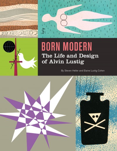
Past and Present — An excerpt from Born Modern: The Life and Design of Alvin Lustig by Steve Heller and Elaine Lustig Cohen at Design Observer*:

Lustig’s designs fluidly shift from past to present. For his early “experimental” work he built upon an armature of old technologies… and techniques…, which evolved through new technologies… into unprecedented styles… Toward the end of his life, his typography turned into a playful amalgam of vintage letters composed in contemporary layouts with vibrant colors. In “Personal Notes,” he wrote, “As we become more mature we will learn to master the interplay between past and present and not be so self-conscious of our rejection or acceptance of tradition. We will not make the mistake that both rigid modernists and conservatives make, of confusing the quality of form with the specific forms themselves.”

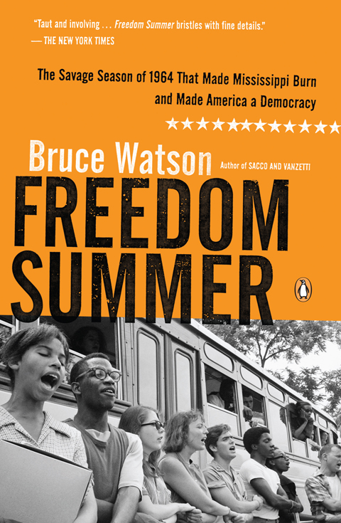
The AuthenticChuck Klosterman, author most recently of Eating the Dinosaur, profiles Jonathan F., author of Freedom, for GQ Magazine:

It’s a present-day problem: There’s just no escaping the larger, omnipresent puzzle of “reality.” Even when people read fiction, they want to know what’s real. But this, it seems, is not Franzen’s concern. He disintegrates the issue with one sentence.

“Here’s the thing about inauthentic people,” he says on the train, speaking in the abstract. “Inauthentic people are obsessed with authenticity.”

Telling Stories — Nicholas Carr, author of The Shallows, on interactive storytelling:

The ability to write communally and interactively with computers is nothing new… Digital tools for collaborative writing date back twenty or thirty years. And yet interactive storytelling has never taken off. The hypertext novel in particular turned out to be a total flop. When we read stories, we still read ones written by authors. The reason for the failure of interactive storytelling has nothing to do with technology and everything to do with stories.

Footnotes — Part one of a long interview with journalist and cartoonist Joe Sacco, author most recently of the remarkable Footnotes in Gaza, at Art Threat (via Drawn):

[T]he biggest influence on me journalistically speaking has been George Orwell. I don’t know if you’re familiar with the book Road to Wigan Pier, but Orwell spent time in the industrial areas of Britain during the depression and took a room with a miner, lived with miners. He went down into the mine shaft with the miners. His ability to go to these places and really look at things from a ground level, that was impressive to me. And for other reasons too: because he was so dedicated to his work, and he felt that his work was sort of bigger than himself as a human being. I appreciated that dedication.

Part two will run on Monday apparently…

And finally… Superhero WikiLeaks:

(Thanks Shawn)

*Born Modern is published by Chronicle Books and is distributed in Canada by my employer Raincoast Books.

Comments closed

Q & A with Jason Gabbert

Sometimes it can take me a little while to feature a designer on The Casual Optimist. Such is the case with Oregon-based book designer Jason Gabbert.

I was impressed with Jason’s work with Charles Brock and — at that time — Nate Salciccioli (interviewed here) back when Faceout Studio was still known as the DesignWorks Group. But neither the time or the topics ever seemed to be completely right. Then, earlier this year, Jason announced he was branching out on his own and going freelance. What better excuse could there be for an Q & A?

Jason and I corresponded by email. I think it was worth the wait…

How did you get into book design?

I was first introduced to book design my senior year of high-school. My family has been involved with publishing since I can remember and that led to me receiving an internship with a publisher in town. From that internship I was brought on as an intern to the brilliant Faceout Studio, which specializes in book cover design. The internship ended up turning into a full time design position. And now I’m doing my own thing.

Why did you decide to go freelance?

After working at Faceout Studio several years I began to realize that my passions were driving me to going freelance for myself. Different people work well in different environments and I wanted to try a new one out.

Was it a difficult decision?

The decision was a difficult one to make. A good beer and Jedi Knights helped with that though! The economy was screaming at me to stay where I was at, while my passions were screaming the opposite. In the end, my family and I (through stressful nights, prayer, and the counsel of those we trust) decided that this would be the best decision for me to establish my own personal creative integrity.

Could you describe your design process?

I think my process is more like a choose your own adventure book than a guide. But, broadly speaking, I like to gather as much information as possible on what I am designing, then I try and think of the simplest and most striking way to communicate the content’s key idea or ideas. After that I start doing random things (image searching, font searching, looking at different inspirations, etc…) hoping I’ll find a good way to showcase that key idea.

What are your favourite books to work on?

That’s a hard one. Off the top of my head, my favorite books are probably the more academic. Books with deep content that is just begging to be simplified to a cover.

What are the most challenging?

The most challenging books for me are often those that have been written a hundred different ways by a hundred different authors (though I am sure authors have their reasons for reintroducing these ideas). It is very difficult to keep coming up with new solutions for old ideas… but in the end, we are problem solvers… and avoiding cliché is one of the greatest challenges of all.

Do you have any recent favourites?

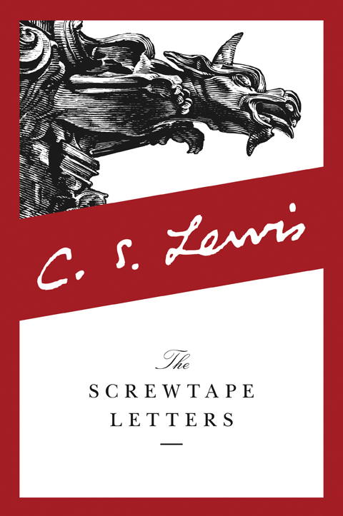
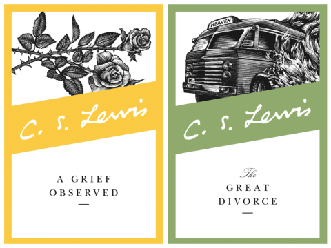
Of my own? That’s tough. I think one of my most recent favorites was the C.S. Lewis series I was able to work on. That was a dream project, and I was happy to be involved. In the end I wasn’t able to direct the illustrations themselves, but simply being able to come out with an effective format to communicate Lewis’s academic side was a privilege. I also have several academic books I’ve enjoyed working on.

Do you discern any current trends in American book cover design?

I’m sure there are trends flying by all the time. The beautiful thing about book cover design is that there are so many designers out there with so many different ways to solve a problem. I also think that trends that exist are changing faster all the time (though you would have to talk to a cover design veteran to know for sure). The cover design industry is growing its online presence, we see new things and change our approaches all the time.

Do you think that the Pacific Northwest has different design sensibility from New York and the East coast?

I’m sure it does, though I can’t recall any differences off the top of my head. I think I pull my inspiration from many similar sources as the East coast does. I don’t get as many inspirations in person, but I see many of the same things. I don’t go putting mountains, trees, and fish on every design I make… or do I…?

Where do you look for inspiration, and who are some of your design heroes?

I live on the internet. Blogs and online portfolios are my friend. My design heroes vary and are many. During this freelance transition I have had great encouragement from Henry Sene Yee and Peter Mendelsund… designers I have great respect for. The list is much longer than those two though.

Who else do you think is doing interesting work right now?

So many! I’ve been impressed with how many designers are creating fresh and intelligent works. Specifically, I’d probably want to tip my hat to the University of Chicago Press, they have been doing a ton of brilliant work.

What does the future hold for book cover design?

Change. Who knows what changes… but things will always change. We should always be seeing how we ourselves can also change to meet new challenges. I believe people will always read and books will always need to be identified by some graphic element.

Thanks Jason!

5 Comments

Stefan Sagmeister: Don’t Take Creativity For Granted

Stefan Sagmeister outlines the creative process behind his short film projects at 99%:

(via Brain Pickings)

1 Comment

Dieter Rams and Vitsœ: 10 Principles of Good Design

Mark Adams, Managing Director of Vitsœ, discusses Dieter Ram’s 10 principles of good design and the elegant 606 Universal Shelving System with Cool Hunting:

And for those of you who just need to see a little more of the 606 Universal Shelving System (and who doesn’t?) here is a short film of it in action:

(via The Fox is Black)

1 Comment

Midweek Miscellany

I’m something of skeptic when it comes to Nick Hornby (to put it politely) but the “Ministry of Stories” is, despite its Orwellian moniker, clearly a well intentioned venture, and the design of its Hoxton Street Monster Supplies storefront by We Made This is pretty stellar.

There is more on the Ministry of Stories, which is based on David Eggers 826 project, at The Guardian.

Elsewhere…

Largehearted Boy is doing everyone a favour by aggregating every online “Best of 2010” book list he can find.

AND Design Observer’s contributing writers recommend books for the holidays. While The Bygone Bureau asks some stellar bloggers for their Best BLOGS of 2010.

The Daily Cross Hatch has a four-part interview with Love & Rockets cartoonist Jaime Hernandez:

There are teachers and there are doers—I’m a doer. I don’t know how this stuff happens, it just spills out of me, it’s that kind of thing.

After a while, I’ll think about it and say, “oh, that’s how I do it.” But I couldn’t stand in front of a class and tell them how to do it.

[part one] [part two] [part three] and [part four]

And finally…

A fantastic animated Batman short by Spanish illustrator Javier Olivares:

(via The Ephemerist)

Comments closed

Mr Smith’s Letterpress Workshop

The Creative Review visits the South London studio of independent letterpress printer Kelvyn Smith:

Smith’s work is being shown as part of the Reverting To Type exhibition at the Standpoint Gallery in London, opening December 10th (mentioned previously here).

(via Coudal / Acejet 170)

1 Comment

Reverting to Type

Curated by Graham Bignell & Richard Ardagh, Reverting to Type at the Standpoint Gallery in London will showcase the work of twenty contemporary letterpress practitioners from around the world:

Reverting To Type runs from December 10th–24th and continues January 4th–22nd, 2011. The Creative Review has more on the exhibition here.

Comments closed

The Story of Eames Furniture

Marilyn Neuhart, author of The Story of Eames Furniture, and her husband John both worked in close proximity to Charles and Ray Eames and key members of the Eames Office for almost 30 years. In this fascinating video interview with GestaltenTV, the couple talk about the people behind the iconic Eames designs:

The Story of Eames Furniture is published by Gestalten.

Comments closed

Q & A with Clare Skeats

Hugo Wilcken’s Colony (published in 2007 and mentioned previously here) is almost certainly the novel I’ve talked up most this year. The cover, something like a jaunty vintage travel poster to a malarial Heart of Darkness (nauseously appropriate for a postmodern novel about a French penal colony), was designed by London-based print designer Clare Skeats.

Specializing in book design and art direction, Clare has a a great eye for partnering distinctive typography with bold creative imagery. Her covers often seem to use elements from the past, but always feel dynamically contemporary.

I’m really happy to have had the opportunity talk to Clare about her work. We corresponded by email.

How did you get into book design?

After graduating in 97, I tried, and failed to get a job as a junior designer at Penguin. They did offer me work experience though — so I moved to London to do that, and basically never left.

Have you always run your own studio? Where were you previously?

No. I stayed at Penguin for 4 years (they did eventually employ me!), then during a brief period at Random House, an opportunity arose to work for UK clothing designer Margaret Howell. It was great to step away from books for a bit and be part of a completely different industry. I was involved in virtually all aspects of the company; from designing Fashion Week press invites to drawing up manufacturing specification manuals. During my time there I was also working freelance — so after two very busy years, I left Margaret Howell to become full-time freelance, which is where I am now.

Could you describe your design process?

I’m lucky in that a lot of my clients allow me to just read and then make all the suggestions. I work in a number of ways; completely independently, or collaboratively with an illustrator or photographer. If I decide that illustration is the most appropriate response, I spend time identifying the right style and finding relevant practitioners. I’ve worked with Kazuko Nomoto (aka Nomoco) a great deal, and I found her initially as I had Andy Warhol’s Vogue illustrations in my head for Lolita. I’ll suggest say 3 or 4 illustrators to the client, along with a rough idea of the brief and composition. I then refine the brief and collaborate with the chosen illustrator.

Whether I’m working on my own, or collaboratively, I spend a lot of time researching — it’s a process I’ve always loved. For Somebody to Love I had to research embalming as the book is about a transsexual mortician who falls in love with one of her, um… clients. I wanted the cover to reflect the surgical and beautifying themes so I started to research embalming tools which lead me to those 18th-Century engravings of surgical instruments. Also used to great effect on this Simian Mobile Disco record cover designed by Kate Moross:

I needed to commission illustrations of modern instruments but retain the engraving reference and I initially proposed a wood engraver to the client, but the idea scared them. So I had to find a vector illustrator who could approximate an engraving style. I found Fred van Deelen who did a brilliant job. What I loved about Kate’s record cover was the way the central black circle (or maybe its a die-cut?) was working as a device to hold the type. So I shamelessly adapted it to my own needs for my cover.

When I started working on Potty!, I read the author’s autobiography which lead to a fun afternoon poking around the posh country outfitters shops of St. James and Saville Row — I took lots of photos and produced a mood board which helped me to get the sample spreads and art direction approved. I teach on the foundation course at Central St Martins and I’m always banging on about research — mostly because I can’t understand why a student wouldn’t want to do it!
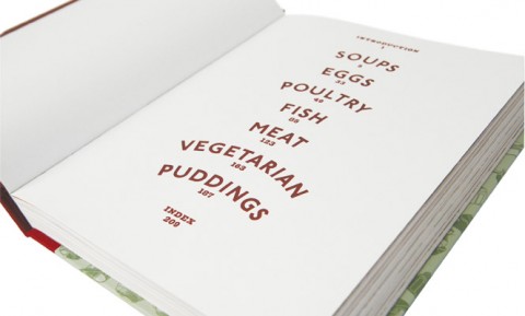
My client for Potty!, wanted an illustrative component to the design and I was wary at first as I think illustration can often look like a whimsical add-on in some cookbooks, which wouldn’t be appropriate at all with Clarissa. The book is about one pot cookery so I decided to make the pots the stars and commissioned scraper-board maestro Joe McLaren to produce them — there are 24 in total and this is my absolute favourite:

Do you prefer to use unconventional typography and hand-drawn lettering than more classic typefaces?

Not particularly — the enjoyment comes from finding the right type style for the job, and that could be making lettering out of cake decorations, or typesetting a whole book — each offers their own sense of fulfillment. Working with the wildly varying content of books offers wonderful opportunities to work with typefaces that wouldn’t normally get considered for most commercial print jobs. I hate snobbery in design — if Dom Casual is right for a job, go with it!

Do you ever create the type or letters yourself ?

I wouldn’t have the confidence to create digital type from scratch, its such a skill in itself — adapting existing fonts is about as far as I go. I’ve hand-drawn lettering quite a bit though — I like to use a dip pen and drawing ink which creates a really nice line. I used this for Lolita, Tom Bedlam and Just in Case, to name a few. Another Meg Rossoff cover I had rejected features lettering that I drew on damp paper to create a cloud-like effect when reversed-out of the sky.

I can’t walk past an art supply shop. The ‘STEINBECK’ stamp in Of Mice and Men comes courtesy of something called Fabfoam, which you’ll find next to the sequins and glitter in the ‘hobby craft’ section.

How do you approach designing a series of covers?

Find the longest combination of title and author, and then work backwards from there! If your design can accommodate One Day in the Life of Ivan Denisovich by Alexander Solzhenitsyn then you know you’re on to a good thing. I think a successful series style has enough consistency and rigour to be easily recognised but has enough flexibility within it to future-proof against unforeseen issues. If there are too many variables within a series style, it lacks identity — and if there are not enough, it looks dry and undynamic. The nice thing about designing the Vintage Classics series design was that I knew the images would be really diverse so I could make the rest of the cover quite restrained and structured.

What are your favourite books to work on?

Its always a thrill to get asked to do a classic. I did Animal Farm very early in my career at Penguin and I’ve always regarded it as a huge privilege — especially as I was so junior at the time. I recently had to re-do the artwork to fit the new Modern Classics grid, so I’m really honoured that it survived a series re-design!

I also like first-time authors (as there’s no baggage), and books about really odd subjects: invisible dogs, menopause, suicide, unicorns … bring it on. I’d like to do more books for young adults, but they usually get rejected!

What are the most challenging?

Without a doubt, it’s the BIG book. The one the publisher has paid huge sums for at Frankfurt as it’s ‘going to be the next … (insert name here)’. The amount of emphasis placed on the role that the jacket is expected to perform is enormous and yet if the book becomes a bestseller its widely regarded as being down to good writing and good reviews. But if it fails, its regarded as being the fault of the jacket. Its this widely-held belief that allows high street booksellers and supermarkets to assert so much influence on the design — so what should be an exciting job can turn into a fairly unrewarding experience for the designer.

Do you prefer working with illustrators or photographers? Or does it depend on the project?

I do enjoy the camaraderie on shoots — the Potty! shoot was great fun — but publishing cover budgets are usually such a feeble match for photographer’s fees that I find I’m constantly looking at ways to cut costs which just becomes a bit boring after a while. The preponderance of headless women on book covers is testament to the fact that there’s rarely budget for a model, hair or make-up. And yet, interestingly, the expectation from the publisher for a Merchant Ivory film still remains pretty high — even if the budget doesn’t.

I love the spontaneity of working with an illustrator — of making the most of their skills and seeing how they interpret a brief. When I saw the physical object that I commissioned from Helen Musselwhite on The Still Point, I gasped (in a good way)! Being able to hand-pick such talented people to work with is a huge privilege — it’s a part of my job that I will always love.

Do you see any recent trends in British book design?

Yes, I think production specs (particularly on hardbacks), have been steadily increasing in a bid to get the public excited about the physical objects again, so we’ve had a glut of cloth-and-foil, sprayed edges etc. There’s been a lot of patterns and a return to traditional typographic sensibilities, and a rediscovery of our British design heritage. Mid-century modern references are still enjoying a bit of a moment…

Where do you look for inspiration and who are some of your design heroes?

My earliest design hero was Charles Schultz. I was obsessed with Peanuts when I was a kid and copied the way that the characters wrote — I loved the way their handwriting appeared above their heads, I thought it was genius!

I was also a huge Roald Dahl fan and consequently grew up with the scratchy inky gorgeousness of Quentin Blake‘s illustrations.

No surprises here, but I greatly admire the work of designers like Saul Bass, Abram Games, Alan Fletcher, Alvin Lustig and Paul Rand — the wit and brevity of their work is so impressive. Slightly more decorative demi-gods include Eric Ravillious, Edward Bawden and Osbert Lancaster. Sorry for the lack of anyone female — or indeed, alive.

What does the future hold for book cover design?

Hopefully the impact of ebooks will be a positive; there’s a lot of books out there that really don’t deserve to see a printing press.

Thanks Clare!

4 Comments

Michael Bierut on Typography

In this 2008 interview with The Atlantic, Michael Bierut, author of 79 Short Essays on Design*, talks about typography, Stanley Kubrick’s favorite font and the cover design of The Catcher in the Rye:

(via Design Observer)

*79 Short Essays on Design is distributed in Canada by my employer Raincoast Books.

Comments closed