Skip to content

Tag: design

Midweek Miscellany

Designers & Books — A beautiful new site compiling lists of books that designers identify as “personally important, meaningful, and formative.” Nice.

Rules Are What Make You — Michael Bierut at Designer Observer on his modernist upbringing at Vignelli Associates:

The rules weren’t written down anywhere or even explicitly communicated. They were more like unspoken taboos. Using Cooper Black, like human cannibalism or having sex with your sister, simply wasn’t done. For many young designers in the studio, the rules were too much. They resisted (futilely), grew restless (eventually), and left. By staying, I learned to go beyond the easy-to-imitate style of Helvetica-on-a-grid. I learned the virtues of modernism.

Thoughts on Design — The legendary George Lois at 10 Answers

When I was 14, aspiring to be a designer, 26 year-old Paul Rand published his iconic book, THOUGHTS ON DESIGN. My copy of it, bought, dime by dime with tip money delivering flowers all over the five boroughs for my fathers florist shop, remains the most important book in my library of over 10,000 art books. It’s thread-bare condition is witness to my reading, and memorizing, his revolutionary approach to the creation of communicative design.

Autodestruct — Author Ursula K. Le Guin reviews Monsieur Pain by Roberto Bolaño for The Guardian:

Surrealist narrative is a literary form at war with itself; disconnection is a primary tactic of surrealism, and story is a process of making connections, however unexpected. Readers open to the autodestructive element of modern art may find the surrealist devices in Monsieur Pain more deeply engaging than coherent narrative. I find them curiously old-fashioned, overly cinematic, and all too close to self-parody. But this early Bolaño novel has a moral and political urgency that obliges me to accept its noir banalities. Its tortuous method of approaching the unspeakable reveals the face of evil without glamorising it, as popular literature and film so often do. By indirection it avoids collusion.

And finally…

A stop motion digital magazine cover by Adam Voorhes and Will Bryant for Bluetooth’s publication Signature:

(via DesignWorkLife)

Comments closed

Erik Spiekermann — Putting Back the Face into Typography

In this fantastic video from Gestalten, graphic designer and typographer Erik Spiekermann, founder of MetaDesign and FontShop, and author of Stop Stealing Sheep, talks about designing type:

Spiekermann also discusses his love typography in this profile on Deutsche Welle TV:

(via I Love Typography)

1 Comment

Q & A with Jason Ramirez, St. Martin’s Press

I recently mentioned to a friend that I was going to interview book cover designer Jason Ramirez. “Jason’s the best,” he said. “Any time I’m stuck on type, I try to imagine what Jason would do and work from there.”

And when you look at Jason’s book covers you know what he means. A designer at New York’s St. Martin’s Press his typography is always beautiful. Each elegant letter is given room breath and perfectly compliments the design as a whole.

There is, in fact, an irresistible incisiveness and precision to Jason’s work that lend all his book covers an airy beauty. They feel spacious and uncluttered; direct without ever being blunt. I’m sure it won’t be too long before more designers ask, “what would Jason do?”

Jason and I corresponded by Twitter and email, and you can see more his portfolio on the Behance Network.

How did you get into book design?

I pretty much took a roundabout way into book design. I first went to college in upstate New York with the intention to eventually study medicine. Four years later, after a near-fatal rendezvous with organic chemistry, I graduated with a degree in comparative religious studies. I spent the next few years in San Francisco working for a real estate investment company, first in human resources and then in marketing and branding. It was during my stint in marketing and branding, which introduced me to the design world of San Francisco, that I began to daydream about a move to the city of New York to study design. Eventually I worked up the courage to make the move and was accepted to Parsons School of Design. During my last year at Parsons I had the good fortune of taking a book cover design course instructed by Gabriele Wilson. Pretty much from the onset of the class I was hooked. Shortly after graduating again, I began working with Rodrigo Corral and continued for a bit over a year before landing at St. Martin’s Press.

How long have you been at St Martin’s?

I’ve been with St. Martin’s Press since November 2007.

Approximately how many titles do you work on a season at St Martin’s?

I work on anywhere from ten to fifteen new titles each season, across four different imprints: St. Martin’s Press (trade hardcover), St. Martin’s Griffin (trade paperback), Minotaur (mystery) and Palgrave-Macmillan (which is actually an academic and trade publishing company; a close cousin to St. Martin’s).

Is there a house style?

No. One of the terrific things about working at St. Martin’s is the variety of titles published each season. Working across genres provides an opportunity to bring a fresh perspective to each project.

Do you also work freelance?

I’ve had the opportunity to work with a few publishers including, Atlas & Co., HarperCollins, Oxford University Press, The Countryman Press, W.W. Norton, and Vintage. I’ve also dabbled in a bit of interior book design with the talented design and publishing duo of Scott & Nix (Charles Nix and George Scott).

Could you describe your design process?

My process may vary depending on the project, but I always begin by reading. I try to read as much as possible of whatever materials are available, be it a manuscript, proposal, or synopsis. Depending on the subject matter, additional research might be needed. Not to mention that a bit of scouting for related imagery and typography can often inform and inspire. I tend to rely heavily on a sketchbook to record notes relating to the content and meaning of a book; ideas about imagery, typefaces and colors; and thumbnail sketches. And from this hopefully a clear, clever and attractive idea will prevail.

What are your favourite books to work on?

I appreciate the opportunity and challenge to work on various genres. Though I often tend to be drawn to non-fiction titles such as academic and business-oriented subjects. The conceptual challenge to visually simplify complex and comprehensive subject matter that might not be immediately accessible to a reader resonates with me.

What are the most challenging?

Any project has the potential to be challenging. Sometimes a project that I expect to be relatively easy to nail will prove to be the most time-consuming, requiring multiple rounds of revision. The challenge in this situation can be sustaining a fresh approach throughout multiple iterations, as well as mitigating your ideas with the opinions of others involved.

Do you have any recent favourites?

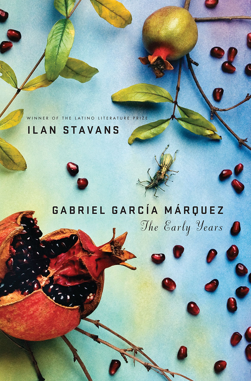
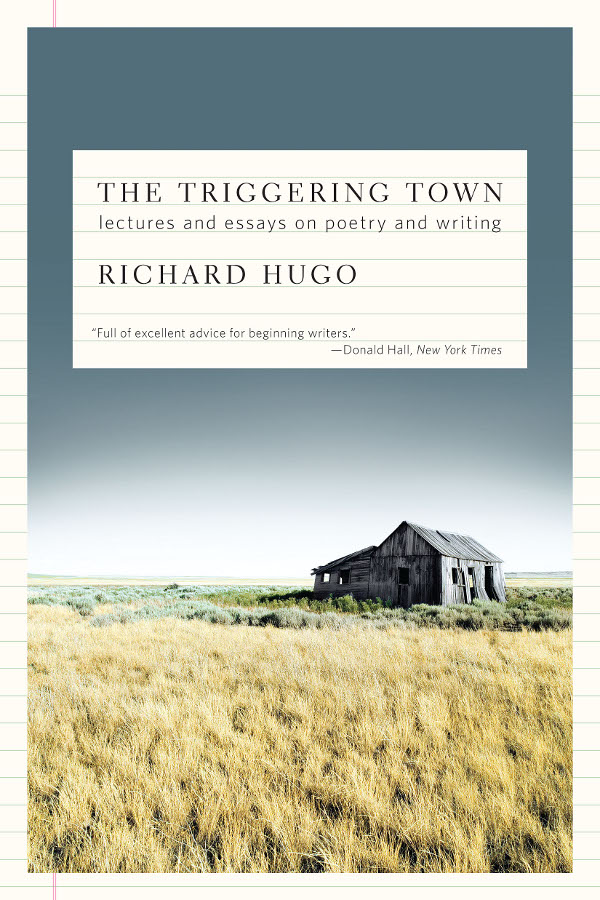
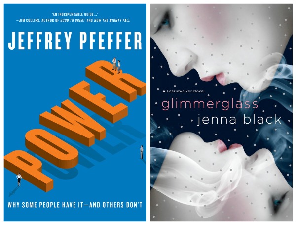
Two recent favorites include, Gabriel García Márquez: The Early Years, a biography that charts Márquez’s life leading up to the publication of his classic, One Hundred Years of Solitude; and Glimmerglass, my foray into the burgeoning young adult paranormal genre. I’m also quite fond of two relatively recent freelance projects: Power, a business management book about leadership and management success; and The Triggering Town, a collection of witty and inspirational essays on writing and poetry.

Where do you look for inspiration, and who are some of your design heroes?

I will take cues from popular culture, be it the daily headlines, magazines, music, television, movies, and the internet. On any given day, I might find inspiration in a post in my Twitter feed, from a thought-provoking illustration within the New York Times, by thumbing through a design or art book, or simply from a conversation had with a friend or colleague. And I’m almost always inspired when inside a book store.

I admire the work of Paul Rand, Alvin Lustig, Vaughan Oliver, Stefan Sagmeister, and Michael Bierut, to name a few. But the reality is that there so many visually creative people, both inside and outside of publishing, whose work I admire and find inspirational.

Who else do you think is doing interesting work right now?

There are many smart and talented designers working in publishing today who are consistently creating great jacket design such as Rodrigo Corral, Evan Gaffney, John Gall, Jamie Keenan, Peter Mendelsund, and Gabriele Wilson.

What are you reading currently?

Admittedly, at times I can be a bit lazy. So aside from finishing the lingering manuscript, scrolling through my Twitter feed, or browsing my Netflix queue, it’s not surprising that I’m reading an outdated issue of New York Magazine, inching closer to finishing The Glass Castle which I began last summer, and randomly reading excerpts from the Autobiography of Mark Twain.

What does the future hold for book cover design?

This is the great unknown. I prefer to believe that the physical book will survive alongside the electronic book. That said, as technology evolves, additional possibilities may be created for book cover design in a digital form. In the long-term perhaps the digital book, both the content and the artwork used to package and identify it, will become multi-dimensional and interactive so that a reader might have the ability to navigate through multiple layers of storytelling. Or maybe I’ve seen one too many Harry Potter movies … I guess we’ll have to wait and see.

Thanks Jason!

1 Comment

Monday Miscellany

These are mostly links I was going to post on Friday, but with a long post on Mendelsund and a last minute WordPress fail (to add to all the usual pressures of part-time blogging) I thought I might as well hold them over until today. Think of it less as a bad end to last week, and a great start to this one (or something like that)…

Designer Eric Skillman on Adrian Tomine’s illustrations for the Criterion boxed set of Yasujiro Ozu’s The Only Son/There Was a Father.

And on the subject of Adrian Tomine, David L. Ulin reviews his new book Scenes From an Impending Marriage for The LA Times:

Tomine has always been a master of the small gesture, as anyone familiar with his work knows. Such encounters motivate the deceptively informal stories in his series “Optic Nerve,” as well as his graphic novel “Shortcomings,” which explores the limits of identity and intimacy. With “Scenes from an Impending Marriage,” though, he seems almost willfully understated, tracing, in a series of offhand comics, the peculiar rigors of the wedding dance, from guest lists to seating charts to invitations and beyond.

(For the record: several of Adrian’s books, including the new one, are distributed in Canada by my employer, Raincoast Books).

The Impulse to Write — Patti Smith talks about her writing and music in The Guardian:

“More than anything that’s been the thread through my life – the desire to write, the impulse to write. I mean, it’s taken me other places, but it was the impulse to write that led me to singing. I’m not a musician. I never thought of performing in a rock’n’roll band. I was just drawn in. It was like being called to duty – I was called to duty, and I did my duty as best as I could.”

And finally…

London Intrusion — China Miéville, author most recently of The City and The City and Kraken, is posting a webcomic on Tumblr (via Robot 6).

(And speaking of Tumblr… Posts from here and The Accidental Optimist are now also available on Tumblr if that’s your thing.)

Comments closed

Designing for Solitude

Ben Fullerton, Director of User Experience at Method Design in San Francisco, talks to Nora Young about design that supports solitude and mindfulness for CBC Radio’s Spark:

CBC Spark: Ben Fullerton Designing for Solitude Mp3

(I love this idea).

Comments closed

Peter Mendelsund and the Art of Metamorphosis

I posted about Peter Mendelsund’s reinterpretations of Kafka for Schocken Books rather breathlessly earlier this week, and I wanted to revisit them now I’ve had some time for greater reflection.

The covers are exceptional designs and surprising reinterpretations of Kafka. What particularly interested me, however, is that they are also a surprising direction for Mendelsund to go in.

As Peter himself notes in his original post, the natural impulse when designing Kafka is to draw on the avant-garde art movements of the early 20th Century. These movements — which smashed together fine art, design, typography, photography, montage, and film — burgeoned in Central and Eastern Europe in aftermath of the Russian Revolution and the First World War, a period when Kafka himself was writing (he died in Vienna in 1924).

Unsurprisingly, recent reinterpretations of Kafka (at least the ones that have eschewed the non-design of an author photograph) have incorporated elements taken from Surrealist photography, modernist posters, and silent film.

The influence of the avant-garde is often apparent in Mendelsund’s work. Covers such as The Idiot, Crime and Punishment and The Double and The Gambler by Fydor Dostoevsky, House of Meetings by Martin Amis, and K. by Roberto Calasso all incorporate elements of Suprematism, Constructivism, DADA and other stark European art movements of the early 20th Century. The new covers, however, which focus on the humour in Kafka’s writing, move in a new direction and incorporate elements from the optimistic age of American mid-century modern design.

Mendelsund’s use simple geometric shapes, flat colour backgrounds, and stripe patterns are typical of work by Paul Rand and Alvin Lustig.

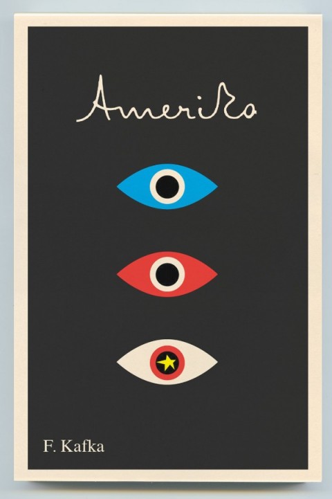
Hand-written lettering of the type we see in Mendelsund’s Kafkas is used to great effect in Lustig’s design for Kafka’s Amerika and is characteristic of several of Rand’s book covers.

As others have noted, the eye motif used by Mendelsund is also similar to Rand’s iconic IBM poster (and his unused logo for the AIGA). But in this instance at least, Rand is clearly not the only influence. His contemporary Rudolph de Harak used the same motif in his cover design for T.E. Lawrence By His Friends published by McGraw-Hill in 1963.

There are echoes too of an exhibition poster by American expatriate designer E. McKnight Kauffer who designed the cover for the Random House edition of James Joyce’s Ulysses published in 1949 (and who was reputedly an influence on Lustig), and a George Salter cover for a Robert Bloch novel, The Scarf, published by The Dial Press in 1947.

The eye motif also recalls Bill Golden’s CBS logo designed in 1951 (repeated in the British Associated Televison ATC logo), which was itself inspired by a Shaker ‘All Seeing Eye’ symbol Golden had seen. And it is perhaps no coincidence that Mendelsund’s design for The Castle (and McKnight Kauffer’s poster) is reminiscent of the masonic Eye of Providence (also known as the “all-seeing eye of God”) familiar from the US one dollar bill.

Of course, not all of these elements and influences are new to Mendelsund’s work (see his designs for The Millennium Trilogy boxed set), and the new covers draw on some of his more familiar inspirations such as Jean Arp, a founding member of the DADA movement (and likely an influence on Lustig), and post-war European design (see Germano Facetti’s design for George Orwell’s 1984 designed in the early 1960’s).

But compare the Kafka covers to Mendelsund’s recent designs for The Snowman by Jo Nesbø  or C by Tom McCarthy, and the difference is striking. To look at these macabre designs for Knopf — which seem to owe more to the cut-and-paste of DADA, the punk aesthetic of Barney Bubbles or, perhaps, the anti-design of David Carson’s Ray Gun —  is like looking at the work of a wholly different designer.

That Mendelsund is capable of reinterpreting and subverting mid-century modern and making it his own not only demonstrates his creative flexibility, but serves to reminds us that one of his greatest strengths as a designer is his ability to surprise and delight us.

8 Comments

Something for the Weekend

Mark Lamster on Gerd Arntz, designer of the Isotype pictographs, at Design Observer.

A new book on Arntz — Gerd Arntz: Graphic Designer — has just been published by Dutch publisher 010. A preview of the book can be seen here. (And, yes, my Twitter avatar is a Gerd Arntz Isotype. #nerd)

Barnes & Noble: The Last, Best Hope for American Bookselling? — Editor Edward Nawotka in Publishing Perspectives:

B&N still has enough consolidated power to “make” books. Its buying power makes it indispensable to publishers who need advance orders to justify print runs and the various other knock on effects that entails. They are providing –- via their Nook device –- the biggest rival to Amazon’s e-reader hegemony. And, let’s face it, if they –- along with Borders -– disappeared, how many communities would suddenly be underserved or not served at all? This is the reason small towns lobby B&N to open stores in their community: people are now, like it or not, accustomed to the selection available at big box retailers. True, perhaps half of those who shop at B&N’s aren’t there for the books, but what better chance is there to entice a not-so-avid reader into picking up a book?

The Man with Two Brains — Psychiatrist and author Iain McGilchrist talks about his book The Master and His Emissary with Natasha Mitchell for ABC radio show All in the Mind:

[T]he idea was that the brain was like a machine that carried out certain functions, and because there were two hemispheres there was twice as much computing power as it were, but we would compartmentalise things. So there was a story that language was in the left hemisphere, reason was in the left hemisphere and something like creativity and emotion were in the right hemisphere. That’s a complete and utter….misconception of things. Every single brain function is carried out by both hemispheres. Reason and emotion and imagination depend on the coming together of what both hemispheres contribute. So that particular dichotomy is incredibly unhelpful and misleading and I keep trying to steer away from it, but there is still, nonetheless, fairly obviously a dichotomy.

(If, like me, you completely missed this book when it was published, author A.C. Grayling reviewed it for the Literary Review).

Jason Kernevich and Dustin Summers of The Heads of State interviewed at From the Desks Of

And finally…

The Gamification of Everything — NPR’s On The Media looks at the future of gaming and creating social change through game design:

3 Comments

Midweek Miscellany

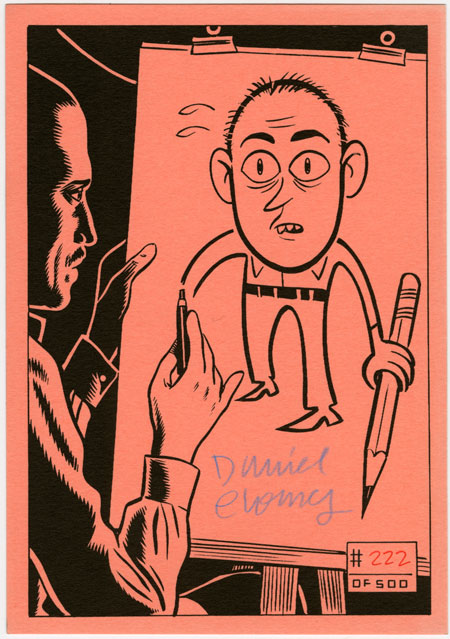
Fantagraphics find a cache of signed, limited-edition bookplates by artists including Dan Clowes, Jaime Hernandez and Gilbert Hernandez.

The Case & Point — A new website showcasing the best in custom type design and lettering curated by Vancouver-based design studio Working Format.

Designer, educator and author Ellen Lupton interviewed at From the Desks Of… (My Q & A with Ellen from 2009 is here).

And finally…

The New Thing — William Gibson, author most recently of Zero History, interviewed at Jack Move Magazine (via the man himself @GreatDismal):

The genuinely new things are really hard to imagine. When you do imagine them, they’re very hard to relay in anything like a sense in which the people who are totally used to them would use them. There’s always this factor in future-tech science fiction where somebody, be it the characters or the narrative voice, is really kind of wowed by future tech. It’s a powerful impulse. You want the reader to get a wowie. But there’s a way in which it’s not naturalistic; it’s not a genuinely naturalistic vision of the future, because that would be one in which people take it utterly for granted.

2 Comments

Q & A with John Gall

John Gall is Vice President and Art Director for Vintage/Anchor Books, an instructor at the School of Visual Arts, and the author Sayonara Home Run! The Art of the Japanese Baseball Card.

Previously Art Director at Grove/Atlantic, Gall has been interviewed about his work by Step Inside Design, Design Bureau, and Barnes & Noble (video). He garnered even wider attention in 2009 when he commissioned a roster of high-profile designers — including Rodrigo Corral, Carin Goldberg, Chip Kidd, Paul Sahre, Megan Wilson and Duncan Hannah —  to redesign twenty-one Vladimir Nabokov book covers within the confines of specimen boxes (read more about the designs at Print Magazine).

I have wanted to interview John for a long time, but as he talked about book design extensively elsewhere and regular readers are more than likely familiar with his work already, I was waiting for the right subject. It was his colleague Peter Mendelsund, who suggested that rather than discuss his book covers, I should ask  John about his collages. John Gall makes collages? Yes, indeed he does. And, needless to say, they are very good.

I met John in Toronto in December last year, and we corresponded by email.

When did you first start making collages?

It’s something that I’ve been doing sporadically since forever. And when I say sporadic I mean, years or decades between doing anything.

Do you create them digitally or by hand?

All hand done. One of the reasons I do this is to get away from the computer, drop the design think and work with the hands. Its kind of liberating to not have the ability to resize things on the fly. I sometimes use a digital camera to keep track of the permutations since my brain no longer can.

Can you give me a sense of their size?

8 x 10 on up to 18 x 24

How do you chose your titles?

The titles come from things I may be thinking about, or reading, or songs I may be listening to at the time I am making them. Then I make an anagram. It now takes me a lot of time to decipher the original source and many times I cannot. Strangely, when I posted “Hot Elves,” I got a ton of hits, which made me briefly consider naming everything after comic-nerd fetishes.

Who are your artistic influences and where do you look for inspiration?

I like the same old dead people as everyone else: Kurt Schwitters, Marianne Brandt, Georges Hugnet, Rauschenberg, John Chamberlain (not dead yet!), etc. People working today who make me incredibly jealous: Fred Free, Mark Lazenby, John Stezaker, James Gallagher, Lou Beach and family, Wangechi Mutu, Clara Mata, Robert Pollard, Nicole Natri, Paul Butler, Charles Wilkin and a bunch of people I’ve met on Flickr who’s real names I do not know.

Not sure how influential any of these folks are but they do inspire me to get off my ass and get to work.

Is creating a collage a similar process to designing a cover?

Yes and no. In both cases you are moving things around on a page until they look “right”. For me, when I am doing the collage work I am eliminating the concept (and most of the time the typography) so it is reduced to forms on a page.

Graphic design is a total left brain/right brain thing. A combination of logical carefully considered thinking and intuitive personal expression. For the collage work I try to put the logical aside and exercise the intuitive muscle.

Has making collages informed your designs?

When I am stuck, I sometimes find myself thinking “What can’t I do on a book cover”? Its chance to make the wrong path and see where that leads. Force myself to make the wrong decisions. Trying to leave thoughts of what looks “good” out of the equation. Nearly impossible, but that is the goal. The hope was that these notebooks could fuel design ideas. Not so sure if that is still the case. They’ve become a thing unto their own.

Have you ever used one of your pieces in a cover?

I used them on a poster once. Attempted to use them on a skateboard design. A couple of people have tried to use them on book covers, to no avail.

Was creating a series of collages from recombined book covers cathartic?

Not really. More like, “hmmm…its 12:30 AM, I’ve spent all day working on book covers and now I’m tearing apart old covers to make new covers. Lo-ser”.

That said I’ve since started up this series again and will be posting them shortly. But I can only do these when I am away from work for a spell. Generally its like, “enough with the book covers already, is Food Jammers on yet?”.

Where do you gather your source materials from?

Most of what I work with comes in the daily mail: catalogs, magazines, etc. I intentionally try not to work with anything that is too vintage or too inherently beautiful—though I do break this rule all the time. My thinking is that all the great collage artists of the past used source material that was lying around in the trash or purchased at the local five and dime. Today we look at a Cornell piece or a Schwitters piece and marvel at the incredible printed material they had to work with. They were working with the Foodtown circulars and Bass Pro Shop catalogs of their day except, well, OK, more beautiful.

Do you still collect Japanese baseball cards?

The collecting has tapered of quite a bit since the book was published. I’m much more selective now. but if I see something particularly beautiful up for auction I’ll probably go for it. I’m not a super smart collector though. I tend to buy what I like and not what will be valuable.

Do you collect anything else?

I’m trying not to acquire to much stuff anymore and am getting ready to purge. I collect old snapshots, the occasional flashlight and I’ve recently acquired a hankering for old high school yearbooks. I’ve also been trading and collecting collage work.

Your collages are included in the recently released Graphic: Inside the Sketchbooks of the World’s Great Graphic Designers. How did that come about?

The author Steven Heller, asked me if I had anything that I’d want to contribute. I told him I keep two kinds of notebooks, one that is basically a to do list and idea book. The others are the collage notebooks. They were much more interested in those. By the way, its a beautiful book.

Untitled, James Gall (2008); Untitled, Owen Gall (2008)

You’ve collaborated with your kids on some collages. Can you tell me about ‘Dad’s Drawing Class’?

Kids are the best. The great thing about collage is that anybody can do it, but its hard to do well. Kids are naturals. They have no preconceived notions as to what looks good, just do what they like. So they are free to do whatever they want—that is, until they get old enough to become self conscious..

Dad’s Drawing Class is something I like to do with my kids while we are hanging out on vacation without cellphones and video games. We’ve done collage, some drawing exercises. I even had them drawing typographic forms one morning. My wife is also very creative and influential in this regard. She teaches a nature drawing program for children.

Where can we see your work next?

I had a couple pieces in a group show last year and some of my work will be in a book coming out next spring called “Cutters”. Showing this work is not something that I am actively pursuing. I’m not so convinced of its worthiness. I have a flickr stream, a typepad blog and if you find yourself wandering around in my attic any time soon, you will probably see some work.

Thanks John!

Images:

  1. The Eye by Vladimir Nabokov, designed by John Gall
  2. The Enchanter by Vladimir Nabokov, designed by Megan Wilson and Duncan Hannah
  3. The Gift by Vladimir Nabokov, designed by Rodrigo Corral
  4. Paper Souls, John Gall (2008)
  5. Less Bravos, John Gall (2008)
  6. Shack Wine, John Gall (2010)
  7. Yeast Grippe, John Gall (2009)
  8. Limeade Fans, John Gall (2009)
  9. Cover Combine #13, John Gall (2011)
  10. Cover Combine #8, John Gall (2011)
  11. Cover Combine #4, John Gall (2009)
  12. Amendable Boy, John Gall (2010)
  13. Spray Degree, John Gall (2010)
  14. Untitled, James Gall (2008)
  15. Untitled, Owen Gall (2008)
  16. Gas Diode Zoom, John Gall (2008)
3 Comments

Something for the Weekend

A Sense of What’s Possible — Ramona Koval talks to Edith Grossman about her book Why Translation Matters and her translation of Don Quixote for The Book Show on ABC Radio National. From the transcript:

What I mean by ‘deep reading’…and it comes after a couple or three readings…what I mean is capturing the subtleties of what the original author is doing. Because artful language has both the stated and the unstated in it, and the stated is fairly obvious, the unstated is really what differentiates one writer’s style from another. And those unstated, unspoken elements are what I try to bring over in analogous fashion into English. That kind of reading, analysing the way parts of the sentence relate to one another and how the sentences in a paragraph relate to one another and so forth, how the paragraphs connect within the chapter, this is more intensive than an ordinary reading of a book. But to my mind it’s what I have to do in order to create something in English that feels to the English-speaking reader the way the original feels, in my case, to the Spanish speaker.

MyFonts’ Top Fonts of 2010, which includes the charming Lady René by Argentinian foundry Sudtipos:

See Also: DesignWorkLife’s favourite typefaces of 2010.

Legendary design consultancy Pentagram have launched a new website to showcase their work, including  some great book design (via FormFiftyFive).

And finally…

The New York Times looks at the work of Thatcher Wine and other designers who assemble and create custom book collections for clients (one can only hope the above was for The White Stripes).

Comments closed

Q & A with The Heads of State

Jason Kernevich (left) and Dustin Summers (right), known together as award-winning design shop The Heads of State, met in the design program at Tyler School of Art, Philadelphia. Shortly after graduating, the duo began producing screen-print posters for the local independent music scene. The simple, bold graphic style of their work quickly garnered international attention and acclaim, and their clients now include the likes of R.E.M., Wilco, The National, The New York Times and The Guardian, as well as publishers Penguin, HarperCollins, and Random House.

If that wasn’t enough, the duo recently released a new letterpress print inspired by F. Scott Fitzgerald’s novel The Great Gatsby . The 4-colour, limited edition print (on 140 lb. French Poptone Sweet Tooth paper) shows the business cards and personal stationery of the Jazz Age VIPs that attend Gatsby’s parties in the summer of 1922. Complete with lovely touches such vintage typography and the characters’ professions and street addresses, the print is a beautiful tribute to a 2oth Century classic.

Jason, Dustin and I corresponded by Twitter and email about the Gatsby print and their unique design collaboration.

How did this project come about?

We’d been kicking around the idea of doing something with the novel for a long time. Chapter Four breaks from the plot for a moment and the narrator begins reminiscing about the folks who came to the parties that summer. The names by themselves are just incredible. There is some detail given about the characters’ background but not much. We had to make a lot of it up. But there were hints at a profession or an address here and there and that led to the idea to do business cards.

What’s the enduring appeal of The Great Gatsby for you?

Like most people, we first came across this book in high school and hated it. Rediscovering it later in life has been a joy. The time period holds endless allure. It was between the wars. The reputation of the roaring twenties and its decadence and flamboyance allows the reader to imagine so much more than what’s on the page. And there’s plenty on the page! It’s all the more poignant because of the crash that followed.

Do you think the story has particular contemporary relevance?

The lead-up to the Great Depression holds a contemporary economic relevance for sure. But it’s also a hell of a break-up story in a way with it’s jealousy, conspiracy, and doomed aspirations. That is certainly a side of the novel not fully grasped in the 9th grade.

Your work often seems inspired by New Deal era WPA illustration and mid-century modern design. Are you also inspired by the Jazz Age?

We hadn’t really looked to it for much inspiration in the past, but through our research we found that a lot of the documents of that era were much more practical and less decorative than we anticipated, which connected more with our aesthetic.

How did you recreate the vintage type?

A lot of it came from books that we scanned as well as classic typefaces that predate the era or modern decorative faces that reference it. There was also some hand lettering done.

Did you research 1920’s typefaces? Were you trying to be totally accurate?

We weren’t trying to be 100% accurate. Capturing the spirit was the most important thing. We had a few historical references for inspiration. The credits and titles for the original King Kong conveyed a sense of glamour and of old New York that was appropriate for some cards despite the film being from 1933. We found a few business cards from the early twenties for doctors, furriers, jewelers, etc. They were surprisingly modest and utilitarian. Which makes sense due to printing and lettering limitations. So we aimed for somewhere in the middle.

Do you have a favourite ‘card’ on the poster?

It changes. The “Films Par Excellence” card is a favorite. But Jordan Baker’s gets our pick. She is the only main character we did a card for and we wanted to sneak it in as a payoff to fans of the book. We like to say that her card was inspired not just by her profession (golf champion) but by her eyelashes.

What’s the appeal of manual printing processes like letterpress and silkscreen?

It a tactile, sensual thing that you feel connected to as a viewer. It’s great to be able to interact with a piece of design in that way. It also added a disguise of authenticity and age to this project. Oh, the irony.

Could you describe your creative process? How does your collaboration work?

Over the years we’ve developed quite a shorthand with one another. Our process is sometimes as simple as a conversation while sketching. We’ve hit on some of our best ideas in a matter of few minutes by just talking through the problem at hand. Sometimes it’s more labored over. In those instances we hit the books, research, sketch, and let the best and most clear idea win. We are both always in pursuit of the best idea and that helps move things along.

Who are your design heroes?

We have so many. Plenty of usual suspects from the 1950’s and 1960’s and from our early days of making silkscreen posters. We love the travel posters of David Klein. Book designers like John Gall and Paul Sahre. Leanne Shapton is a personal favorite. A lot of our artist friends never cease to amaze us with the work they churn out. Jessica Hische. Tim Gough. Matt Curtius and Gina Triplett. Martha Rich. Josh Cochran and Chris Neal and everybody else at the Pencil Factory in Brooklyn.

What’s next for The Heads of State? Will we be seeing more book covers from you soon?

We’ve got some book covers in the works. We’re also working on more self-initiated projects and products as well as a few branding projects we’ll be unveiling in the next few months that we’re pretty psyched about.

Thanks!

How did this project come about?

We’d been kicking around the idea of doing something with the novel for a long time. Chapter Four breaks from the plot for a moment and the narrator begins reminiscing about the folks who came to the parties that summer. The names by themselves are just incredible. There is some detail given about the characters background but not much. We had to make a lot of it up. But there were hints at a profession or an address here and there and that led to the idea to do business cards.

What’s the enduring appeal of The Great Gatsby for you?

Like most people, we first came across this book in high school and hated it. Rediscovering it later in life has been a joy. The time period holds endless allure. It was between the wars. The reputation of the roaring twenties and its decadence and flamboyance allows the reader to imagine so much more than what’s on the page. And there’s plenty on the page! It’s all the more poignant because of the crash that followed.

Do you think the story has particular contemporary relevance?

The lead-up to the Great Depression holds a contemporary economic relevance for sure. But it’s also a hell of a break-up story in a way with it’s jealousy, conspiracy, and doomed aspirations. That is certainly a side of the novel not fully grasped in the 9th grade.

Your work often seems inspired by New Deal era WPA illustration and mid-century modern design. Are you also inspired by the Jazz Age?

We hadn’t really looked to it for much inspiration in the past, but through our research we found that a lot of the documents of that era were much more practical and less decorative than we anticipated, which connected more with our aesthetic.

How did you recreate the vintage type?

A lot of it came from books that we scanned as well as classic typefaces that predate the era or modern decorative faces that reference it. There was also some hand lettering done.

Did you research 1920’s typefaces? Were you trying to be totally accurate?

We weren’t trying to be 100% accurate. Capturing the spirit was the most important thing. We had a few historical references for inspiration. The credits and titles for the original King Kong conveyed a sense of glamour and of old New York that was appropriate for some cards despite the film being from 1933. We found a few business cards from the early twenties for doctors, furriers, jewelers, etc. They were surprisingly modest and utilitarian. Which makes sense due to printing and lettering limitations. So we aimed for somewhere in the middle.

Do you have a favourite ‘card’ on the poster?

It changes. The Films Par Excellence card is a favorite. But Jordan Baker’s gets our pick. She is the only main character we did a card for and we wanted to sneak it in as a payoff to fans of the book. We like to say that her card was inspired not just by her profession (golf champion) but by her eyelashes.

What’s the appeal of manual printing processes like letterpress and silkscreen?

It a tactile, sensual thing that you feel connected to as a viewer. It’s great to be able to interact with a piece of design in that way. It also added a disguise of authenticity and age to this project. Oh, the irony.

Could you describe your creative process? 10. How does your collaboration work?

Over the years we’ve developed quite a shorthand with one another. Our process is sometimes as simple as a conversation while sketching. We’ve hit on some of our best ideas in a matter of few minutes by just talking through the problem at hand. Sometimes it’s more labored over. In those instances we hit the books, research, sketch, and let the best and most clear idea win. We are both always in pursuit of the best idea and that helps move things along.

Who are your design heroes?

We have so many. Plenty of usual suspects from the 1950’s and 1960’s and from our early days of making silkscreen posters. We love the travel posters of David Klein. Book designers like John Gall and Paul Sahre. Leanne Shapton is a personal favorite. A lot of our artist friends never cease to amaze us with the work they churn out. Jessica Hische. Tim Gough. Matt Curtius and Gina Triplett. Martha Rich. Josh Cochran and Chris Neal and everybody else at the Pencil Factory in Brooklyn.

What’s next for The Heads of State? Will be seeing more book covers from you soon?

We’ve got some book covers in the works. We’re also working on more self-initiated projects and products as well as a few branding projects we’ll be unveiling in the next few months that we’re pretty psyched about.
Thanks!  Dan

5 Comments