While looking for something else entirely, I recently stumbled across this video of British book designer Derek Birdsall discussing the work of influential graphic designer Hans ‘Zero’ Schleger:
Coincidently, Birdsall turned 80 early this month and Mike Dempsey reposted a link to his 2002 interview with the designer. If you’re interested in post-war British design, it’s essential reading:
Despite this astonishing attention to detail, Birdsall’s work is disarmingly simple. Like great screen actors, it is what is left out that makes the performance compelling. He is not a showy designer interested in trends. His passion lies in the details: the typeface, naturally and, with books, the feel of the paper; the quality of the binding; the cut of the font; the evenness of line endings; the perfect balance of image to space. These are the things that elevate his work to the ranks of typography. These and an incredibly inventive mind responsible for producing a consistently high standard of work for over 40 years: he designed the first Pirelli calendar in 1964… as well as book jackets for Penguin and Monty Python, and art-directed magazines including Town, Nova and The Independent’s colour magazine. Birdsall’s own view of his work is very pragmatic. ‘As designers we are here to please the client,’ he says. He doesn’t believe in forcing things down their throats. What he does do is weigh up all the possible questions and objections that a client might voice and have his answers ready.
Matthew Battles, author of Library: An Unquiet History(and co-founder of HiLobrow), kicked off the series on Friday with a fascinating post about Aldine Italic:
Aldus Manutius was a printer in sixteenth-century Venice, and he was looking to shake things up. The roman typefaces, based on manuscript letterforms the humanists thought dated back to Roman times (but which were in fact medieval in origin) had offered Italian counterpoint to the black-letter typefaces of the first German printers, but already they were old hat. When Aldus put the first version of a typeface we call italic to use in 1501, the printing press had been proliferating in Europe for half a century. In other words, it was about as old as the computer is now. It was a time of immense invention and swiftly spun variety in the printed book, and a time of new mobility and independence of thought and activity among certain classes of people as well — and the combination of new ways and new tools meant new kinds of books. Crucially, the book was getting smaller, small enough to act not only as a desktop, but as a mobile device.
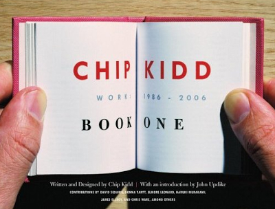
On the blog of designer and art director Henry Sene Yee there is a fake poll question: “Who is your favourite book cover designer?” Three of poll’s four possible answers are “Chip Kidd.” The fourth is “none of the above.” The joke is, of course, that Kidd is the only book cover designer most people can name (if they can name one at all).
After this week, however, Henry might have to add a second designer to his list — Chip Kidd’s colleague at Knopf, Peter Mendelsund.
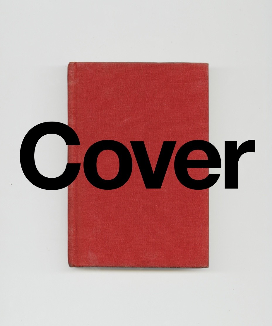
Already a well-known figure in book design circles, the publication of Peter’s two new books this week—Cover and What We See When Read—has apparently made everyone else sit up and take notice. Already interviewed by Alexandra Alter for the New York Times last week, Peter is suddenly everywhere.
At the New Republic, he discusses his work with Amy Weiss-Meyer:
I think the most import thing about being a cover designer is being a decent reader. If you haven’t read a book well, [and] you just throw an image on it, chances are you’re going to fail at representing it. On the other hand, if you do use imagery that’s broad enough, then you want something that’ll serve as a universal emblem to the book rather than one particular reading of it.
The truth is when you go to school to learn something, you’re on a dedicated trajectory. So that puts a certain kind of burden on you to succeed in that particular trajectory. One of the wonderful things about having sidestepped into design is that there was never any pressure for me to succeed. … It’s not something I spent money to learn how to do. So I still kind of feel like I’m dabbling, and I think what’s great about that is you can maintain a certain kind of beginner’s mind when you’re working, which obviously, I think, makes for better work. You’re just fresher because you don’t have the anxiety of influence. There’s nothing really at stake.
And at The New Yorker, Peter talks to his friend Peter Terzian about his work and the genesis of What We See When We Read:
Reading with a mind to designing a jacket is very different from just reading. When I’m reading for work, I’m looking for something described in the book that will be reproducible visually and that will serve as an emblem for the entire book—a character, or an object, or a scene, or a setting. That’s not the way one reads when one is simply immersed in a book.
Let’s say I’m reading something and I come across a scene that I think is particularly pregnant with significance and that could really work as that emblematic something to go on the jacket. It’s not like I picture it completely and then render it on the screen. I have the idea that this scene and its structural components could work well as a jacket, and then I start making things. And when something is made, I compare it back to the reading experience and ask, Is this dissonant with the way I’m reading this, or consonant with it? Does it in fact represent the author’s project? But it’s not like I’m rendering something that I saw. When I start to make it, that’s when I start to look at it for the first time—that’s when it develops visual coherence. That moment is very satisfying, professionally, but also disappointing as a reader.
Dwight Garner reviewed What We See When We Read for the New York Times. While at the Washington Post, visual editor David Griffin reviews both Peter’s new books (one less favourably than the other).
And if that weren’t enough, Pablo Delcán and Brian Rea have also made this trailer, apparently the first in a series, for What We See When We Read:
And this is surely just the beginning. Congratulations Peter, it’s well-deserved.
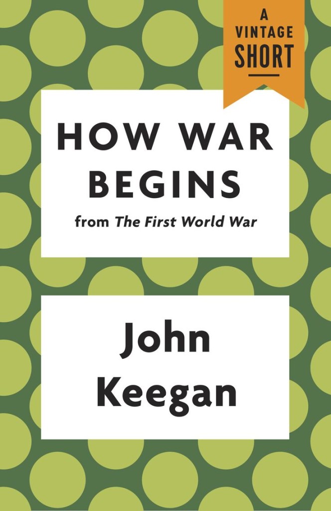
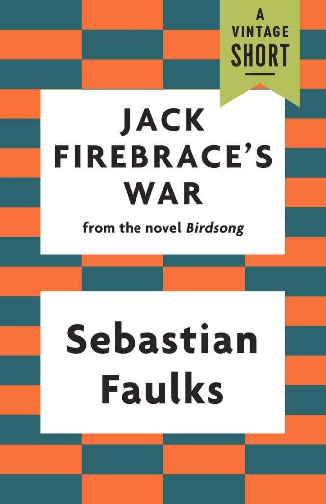
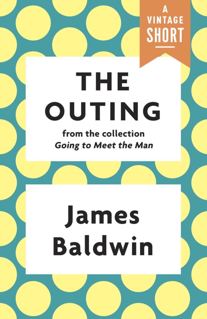
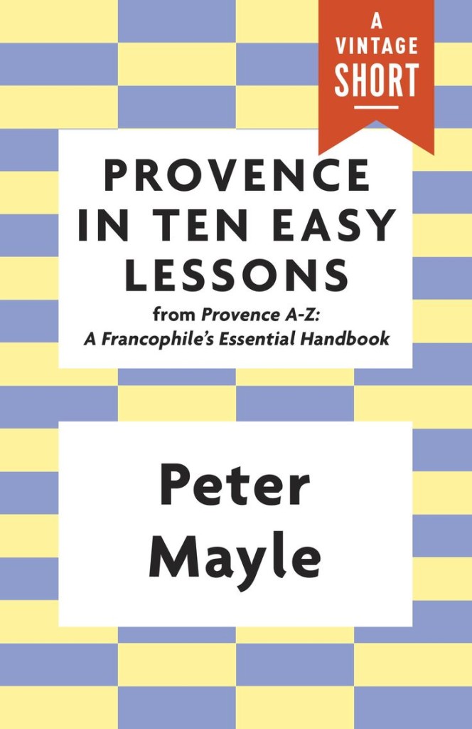
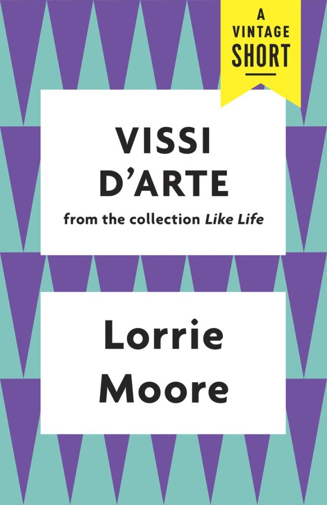
Vintage Books (US) recently announced Vintage Shorts, a series of stories, excerpts and other short pieces exclusively available as eBooks. The bold, geometric ‘covers’ were designed by the talented Joan Wong.
And, in case you were wondering, the typeface is Agenda, designed by Greg Thompson for Font Bureau. Apparently it was inspired by Edward Johnston’s typeface for the London Underground, so no wonder I like it!
Mr. Mendelsund has long been regarded as one of the top book designers at work today, taking his place alongside design luminaries like Chip Kidd, Alvin Lustig and George Salter. Now, he’s making his debut as a writer, with two books coming out next week. Both explore the peculiar challenges of transforming words into images, and blend illustrations with philosophy, literary criticism and design theory.
In “What We See When We Read,” which is being published by Vintage Books next Tuesday, Mr. Mendelsund tackles the mysterious way text yields vivid mental pictures, even when the author supplies very little visual detail. Most readers, for instance, feel as if they can perfectly describe Anna Karenina, even though Tolstoy gives us little more than gray eyes, thick lashes and curly brown hair. In short, illustrated chapters, Mr. Mendelsund argues that reading is an act of co-creation, and that our impressions of characters and places owe as much to our own memory and experience as to the descriptive powers of authors.
On the same day, PowerHouse Books is releasing “Cover,” a 267-page coffee-table book with more than 300 of Mr. Mendelsund’s most arresting book jackets, and dozens of rejected drafts. The images are interspersed with notes on his process, along with essays by authors of some of the featured books, including the best-selling Norwegian crime writer Jo Nesbo and James Gleick, author of the nonfiction books “Chaos” and “The Information.”
If you are New York next week, there is a launch party for both books on August 5th, 7:00-9:00 pm at the PowerHouse Arena, 37 Main St, Brooklyn. Peter will be in conversation with Will Schwalbe, author of The End of Your Life Book Club, followed by a brief Q & A.
Church of Type is the new letterpress studio in Santa Monica, California, of veteran designer and printmaker Kevin Bradley. In this lovely short film, Bradley talks about relocating to Los Angeles, typography, the printing press, and making things by hand:
The brilliant Jason Booher, whose cover for A History of Histories featured in my previous post, kindly just sent me his original design for the book. I think this could be the meta-cover to end all meta-covers. Sadly, the editor decided it might be a little too much of a good thing.
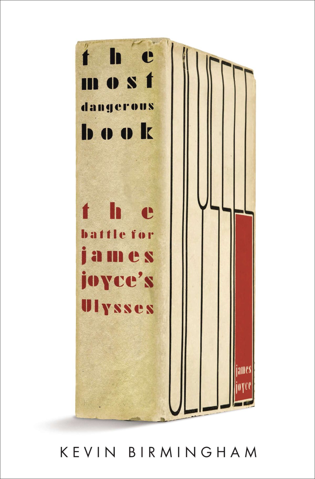
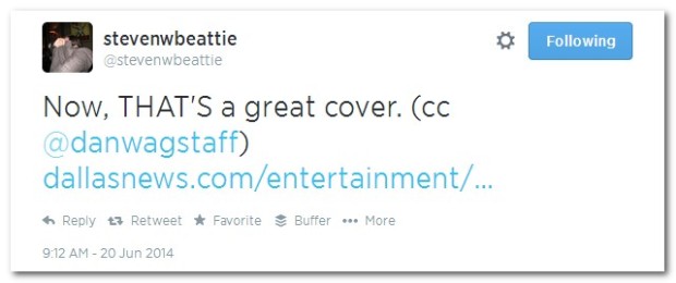
It started, innocently enough, with a tweet from my friend Steven Beattie, book review editor of Canada’s Quill & Quire magazine, about the cover of The Most Dangerous Book, Kevin Birmingham’s new ‘biography’ of Ulysses by James Joyce, designed by Ben Wiseman (Penguin June 2014).
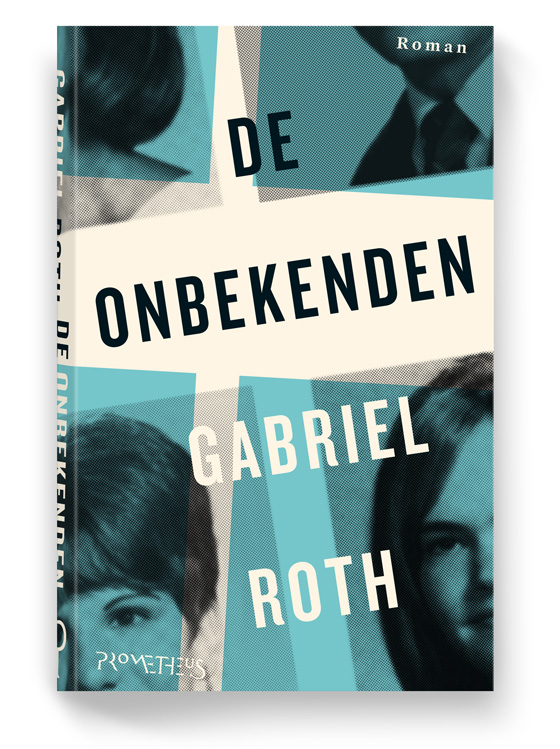
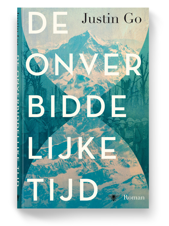
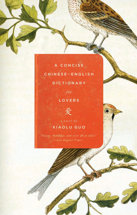
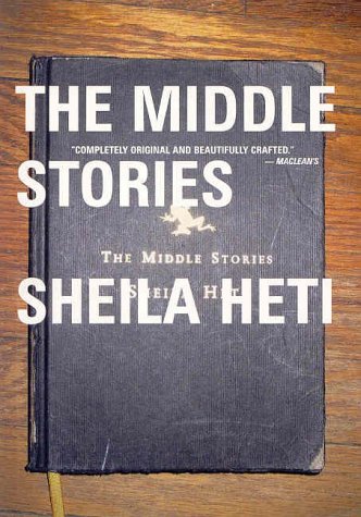
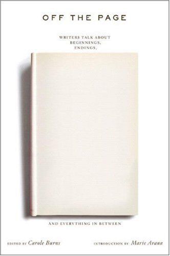
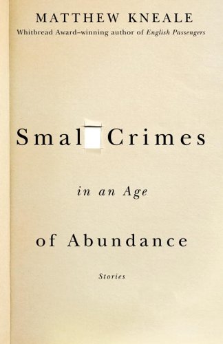
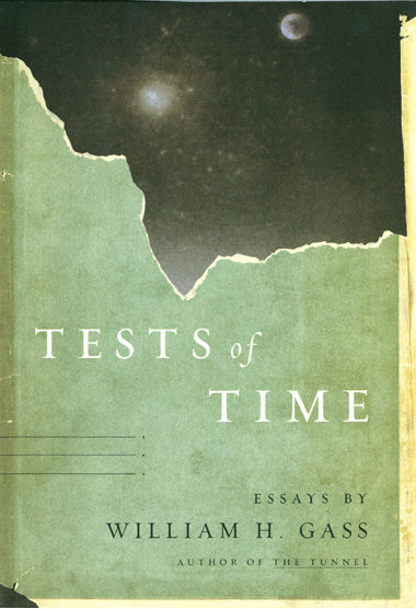
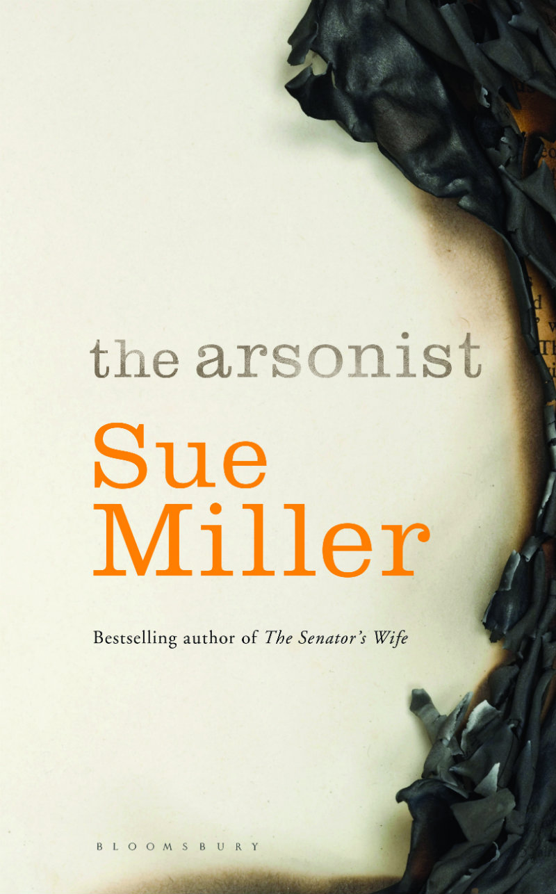
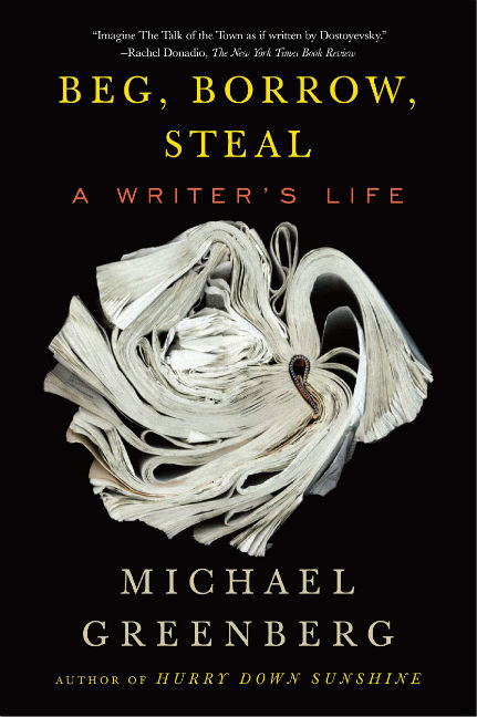
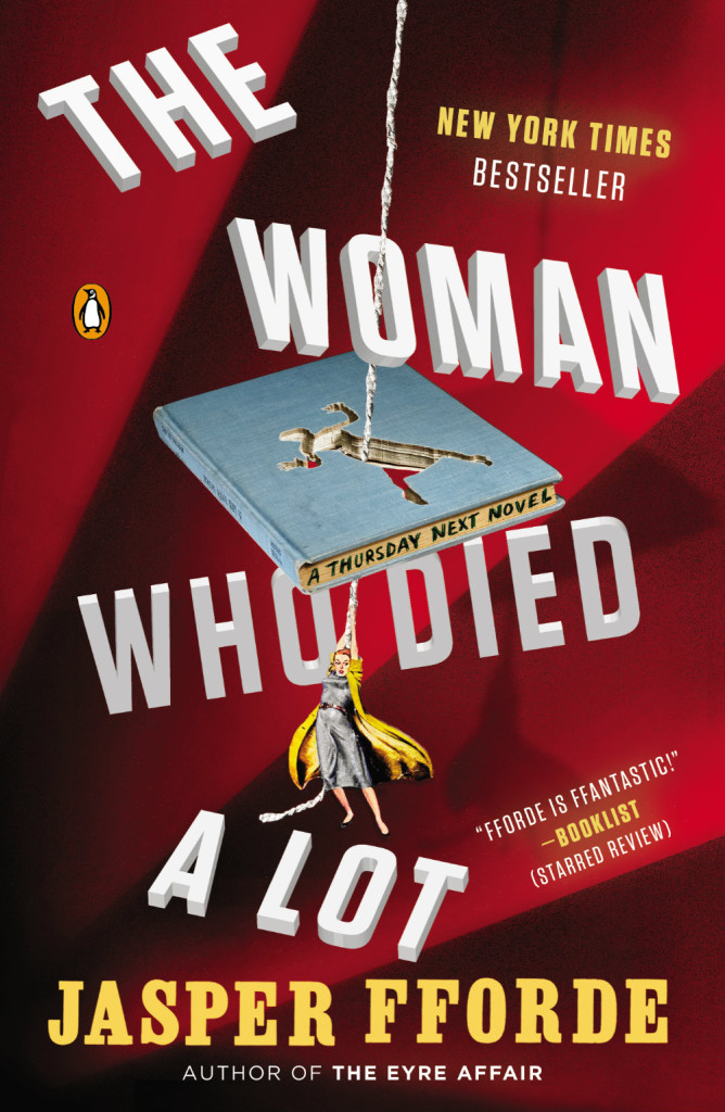
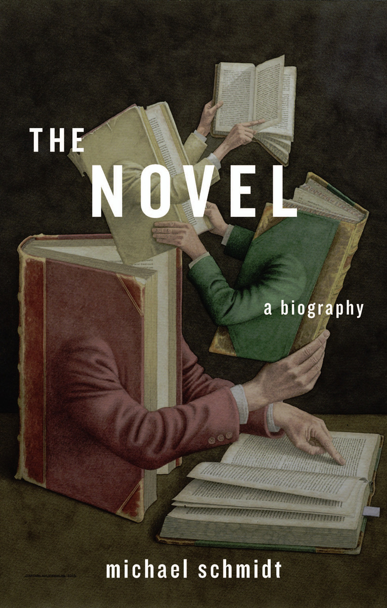
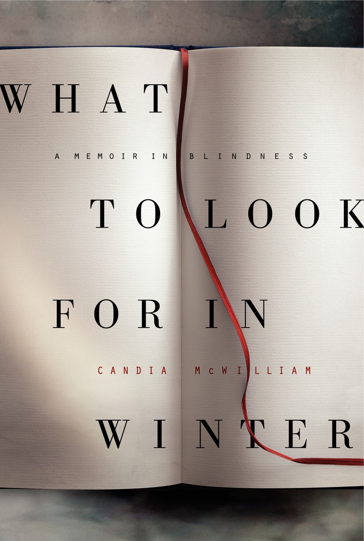
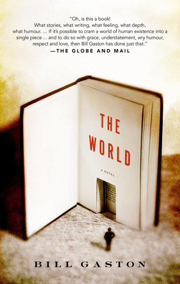
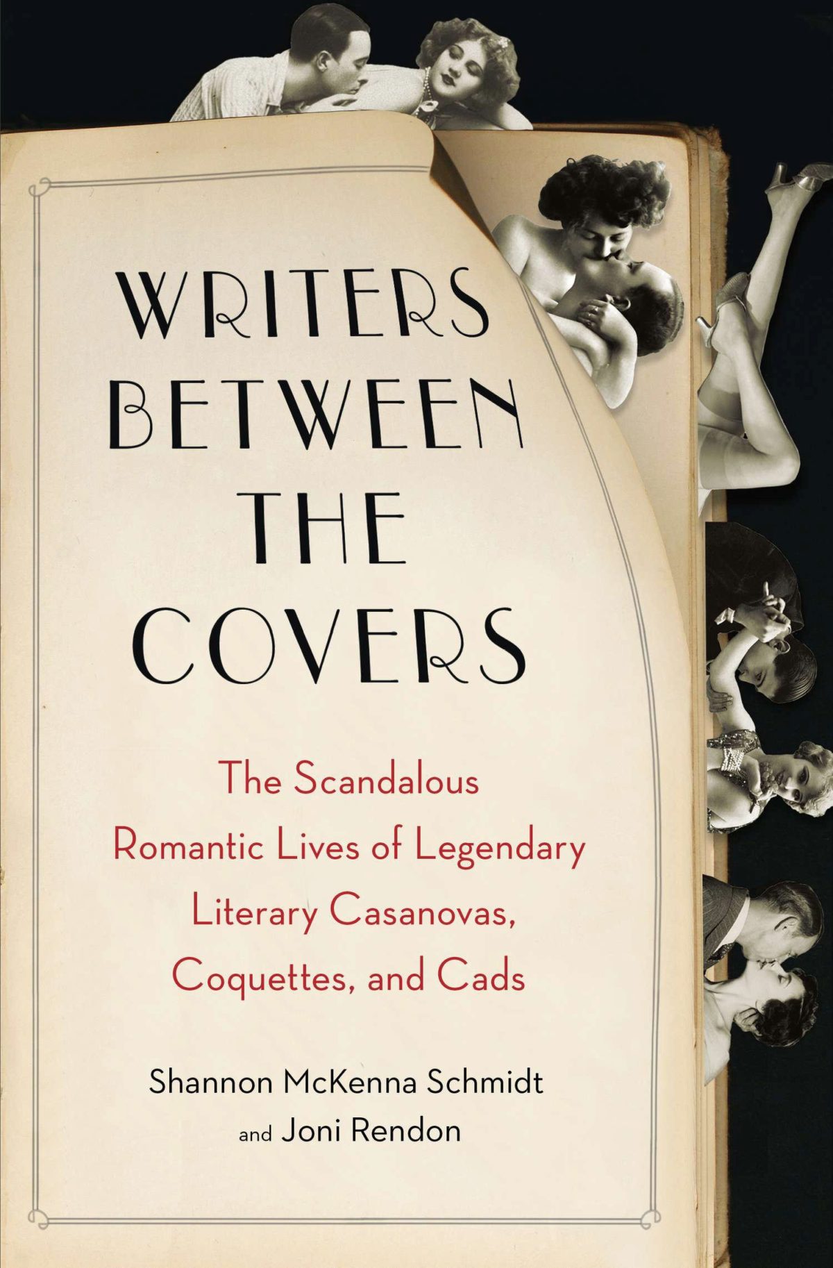
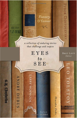
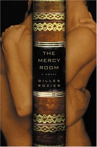
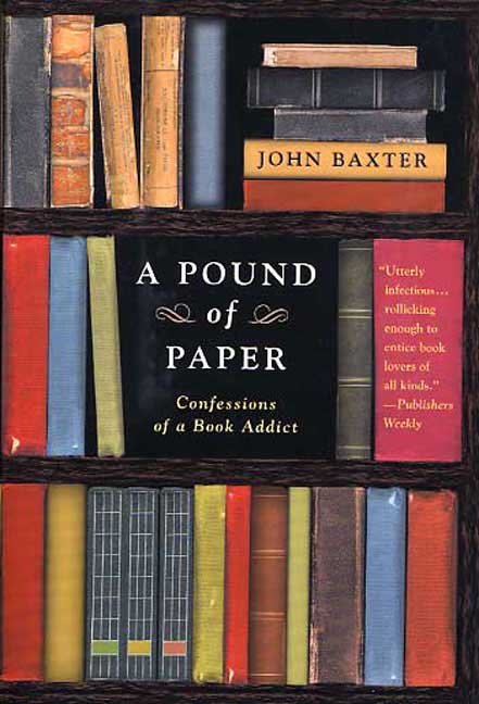
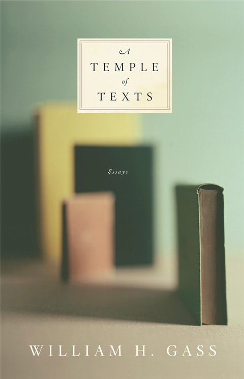
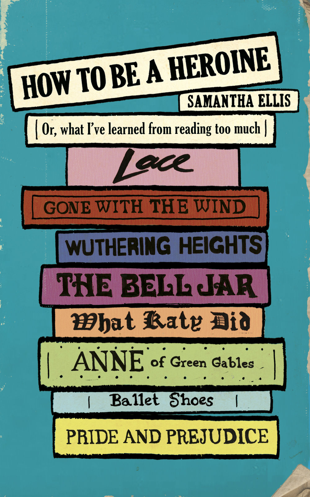
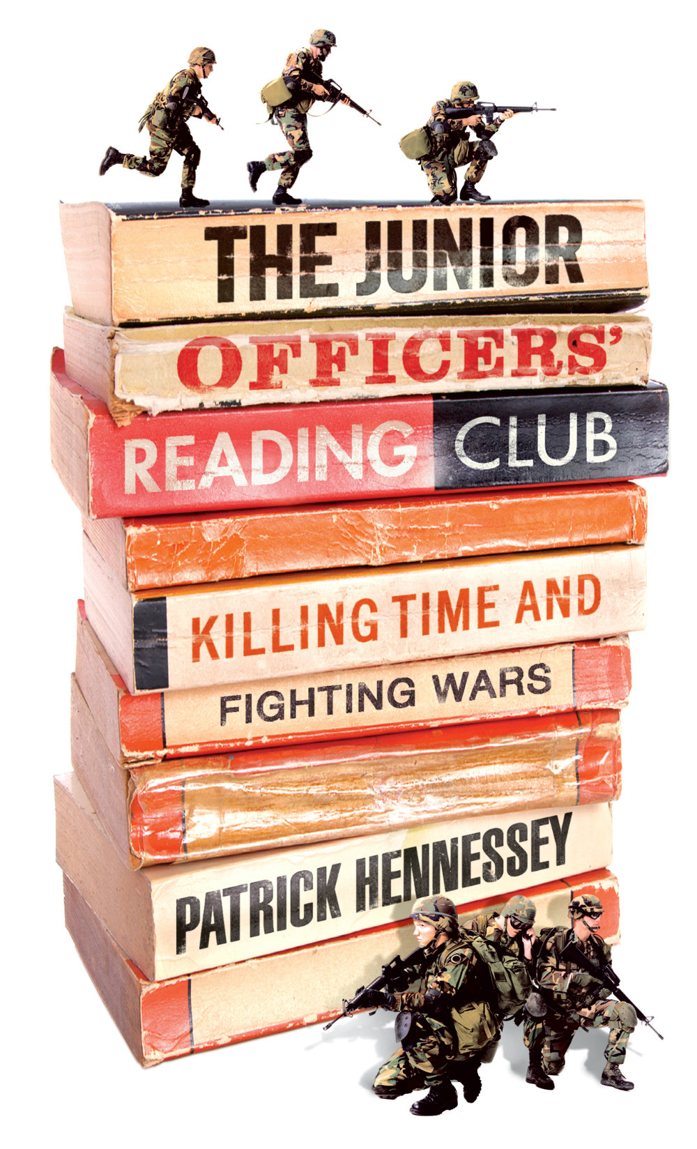
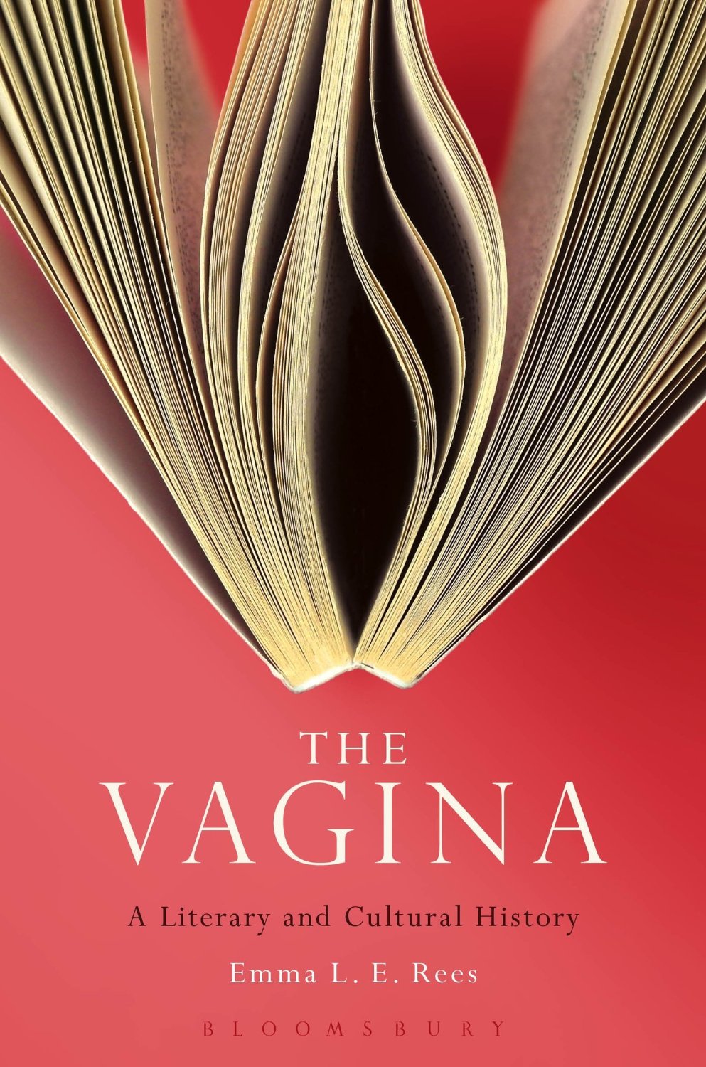
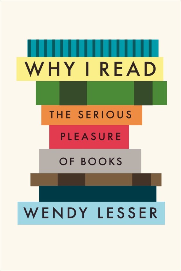
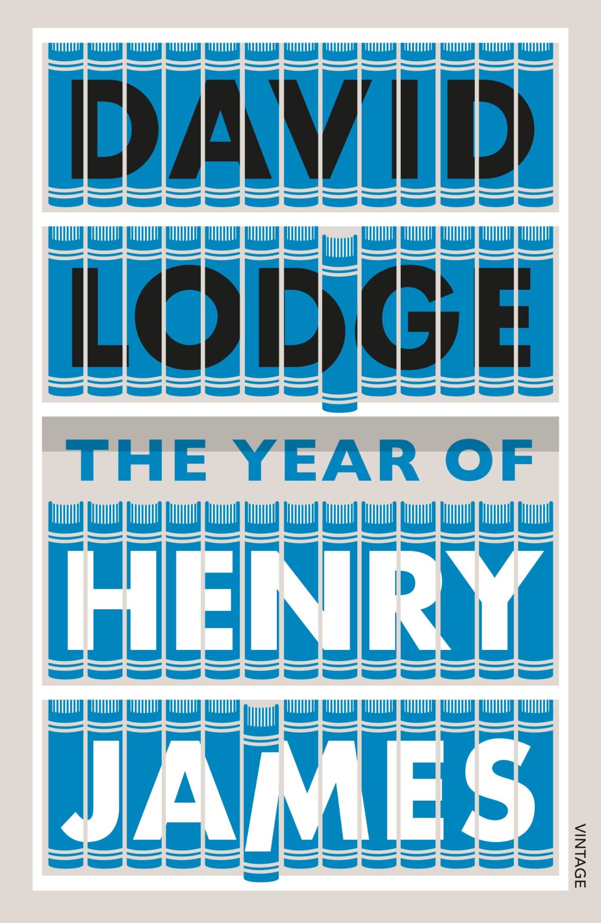
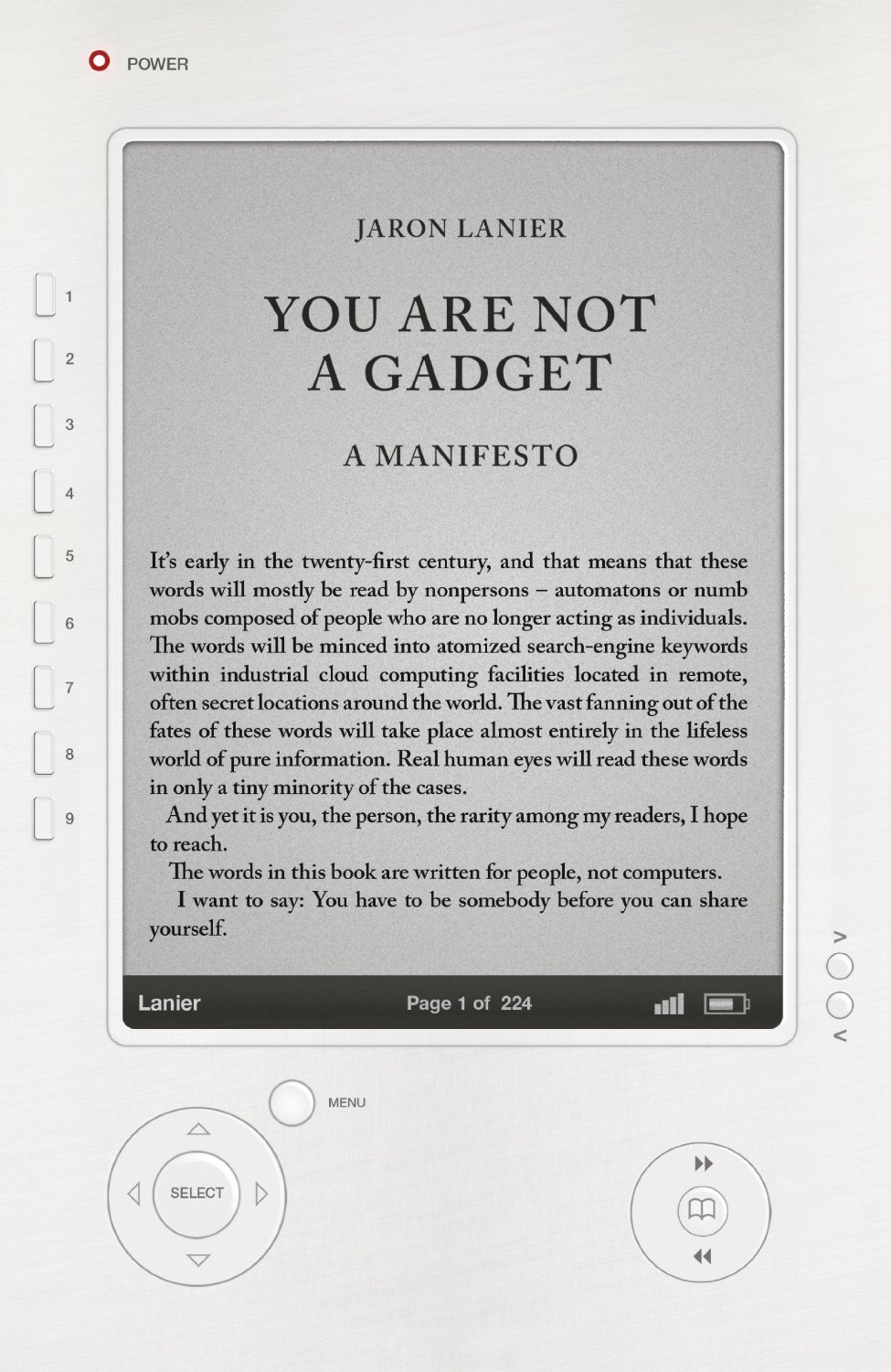
That sparked a conversation with designer David Gee and Joseph Sullivan of The Book Design Review about books on book covers. Joe wrote a a post on the subject in 2009 on the subject, and I rather naïvely thought it would be easy (EASY!) to post a few contemporary examples of the trend, completely underestimating what an undertaking such a project would become.
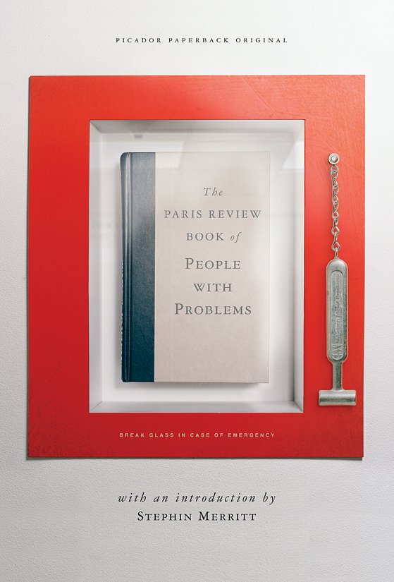
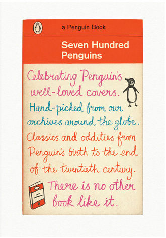
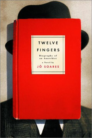
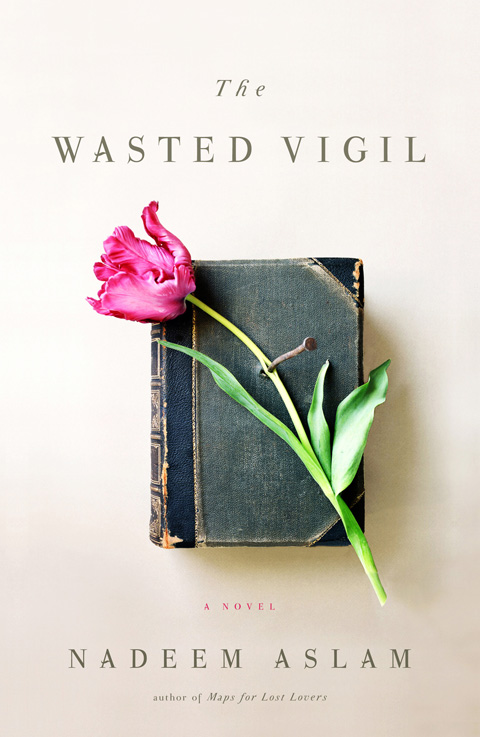
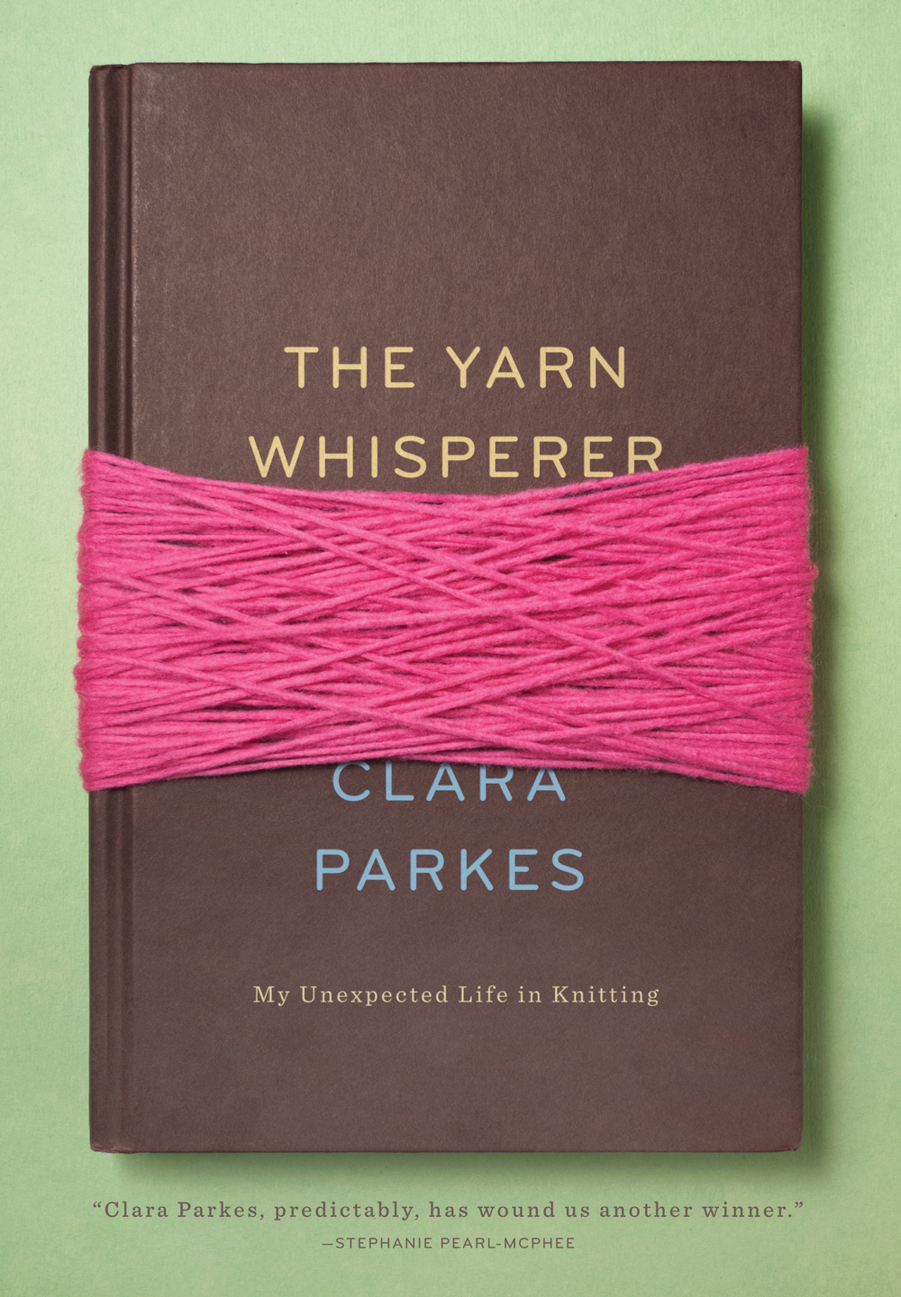
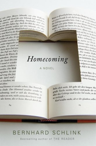
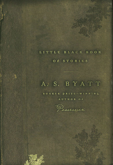
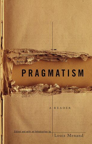
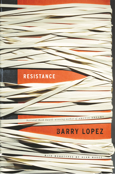
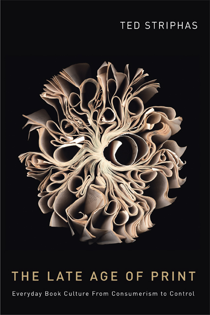
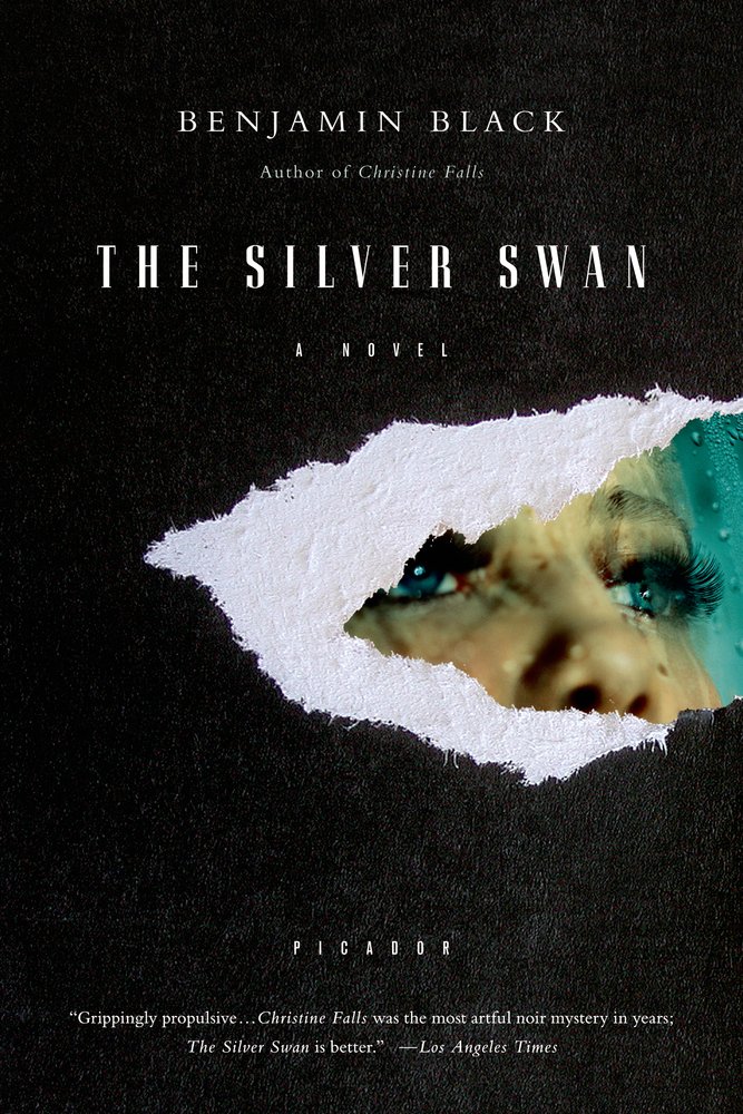
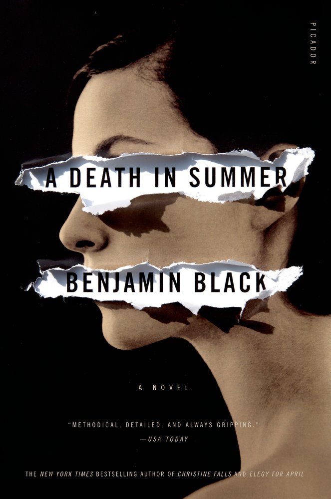
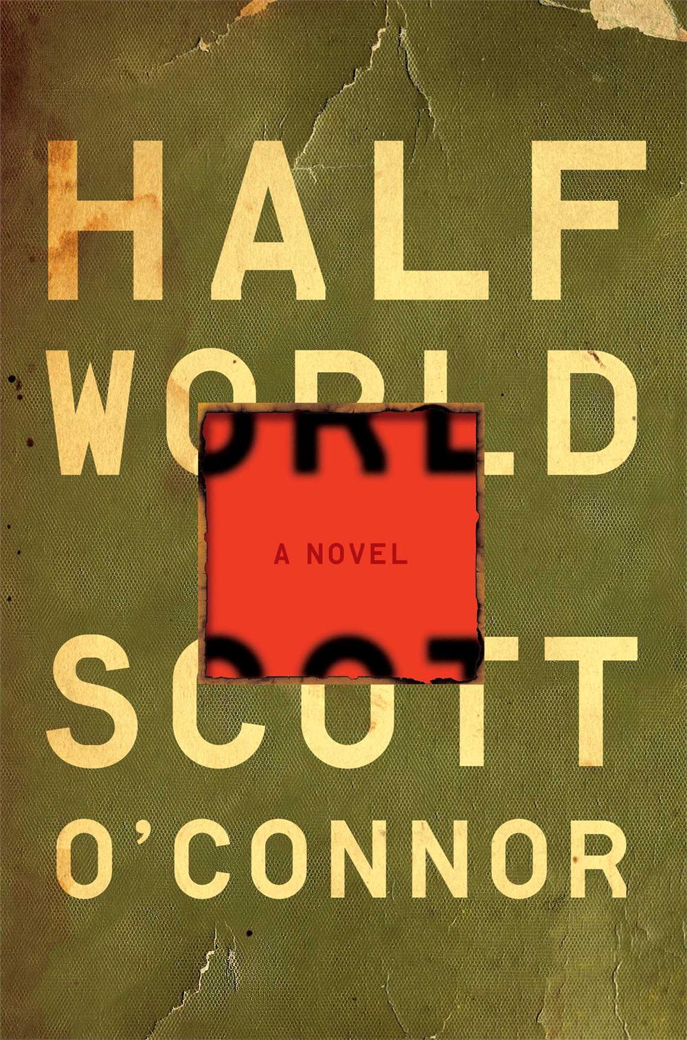
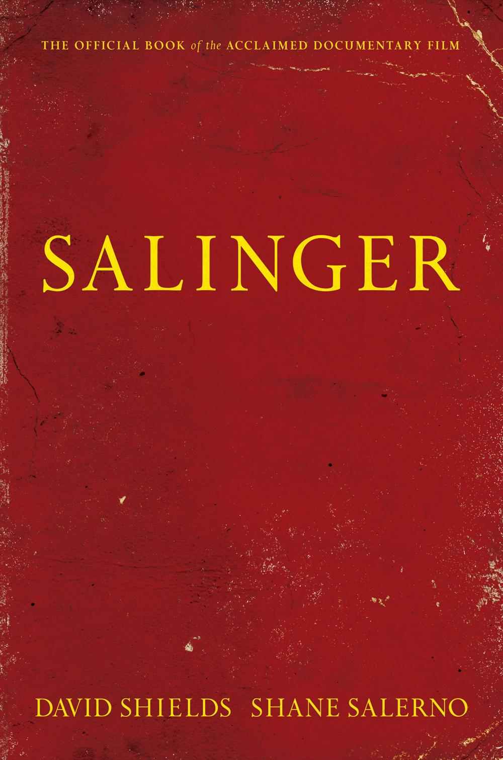
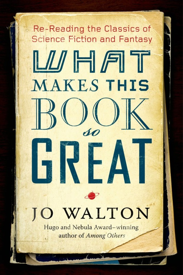
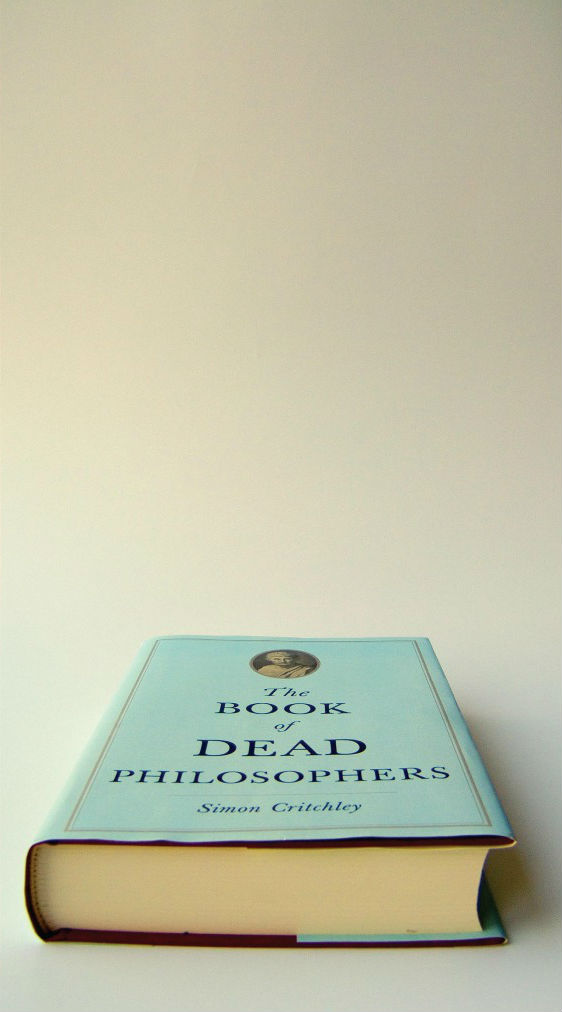
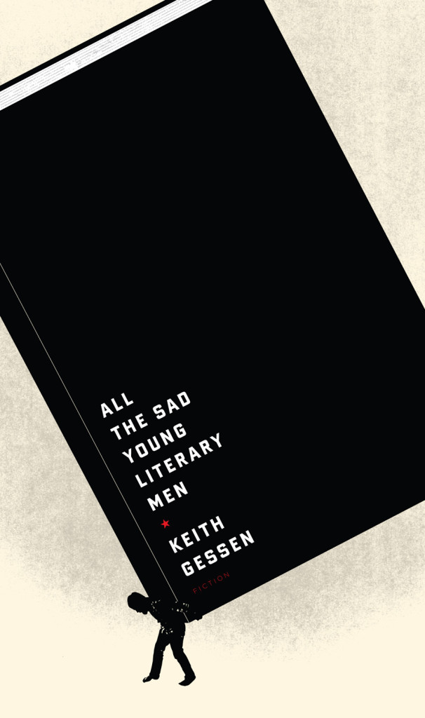
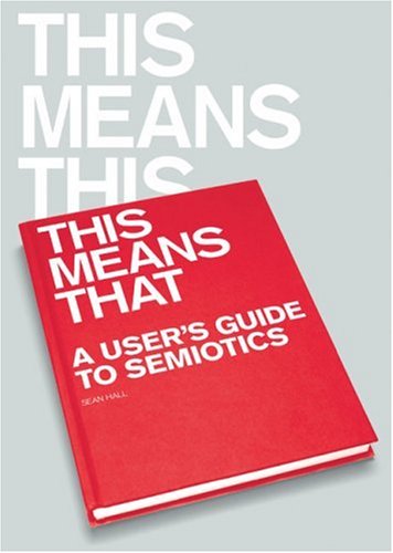
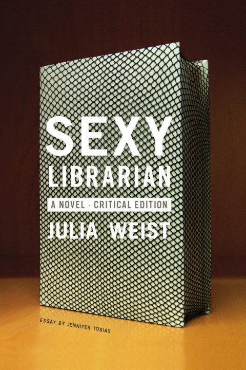
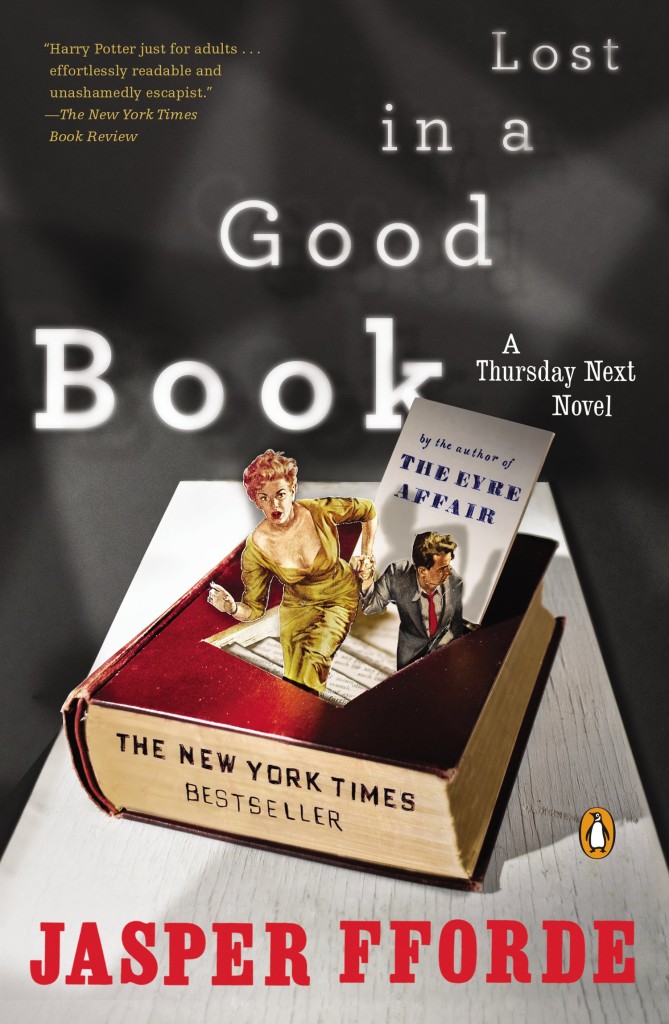
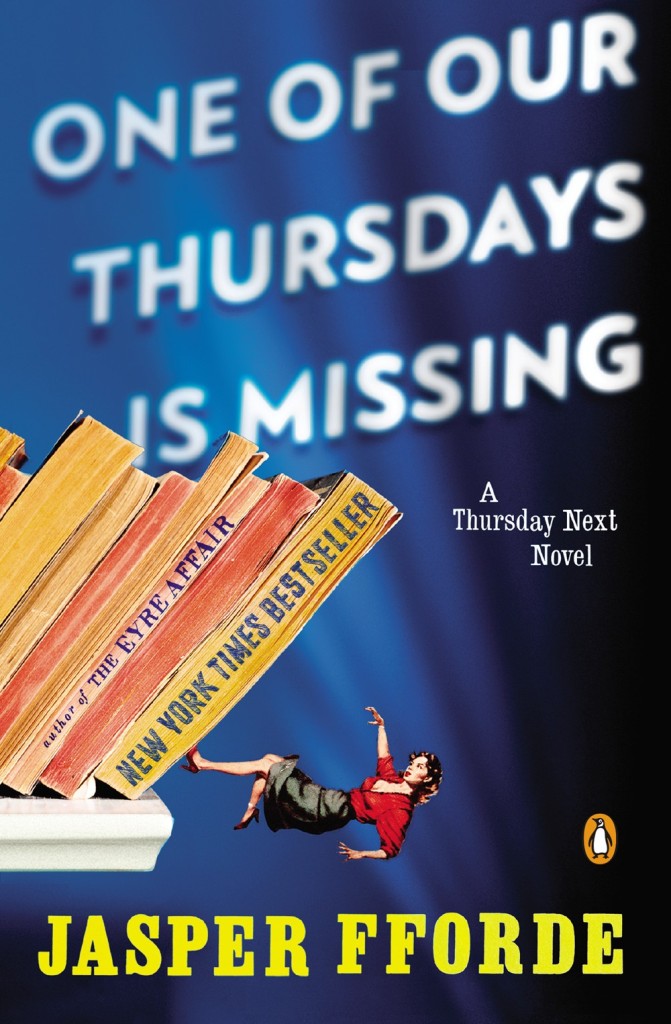
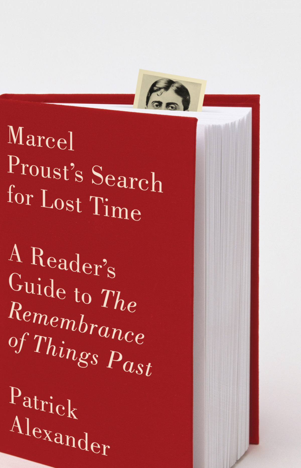
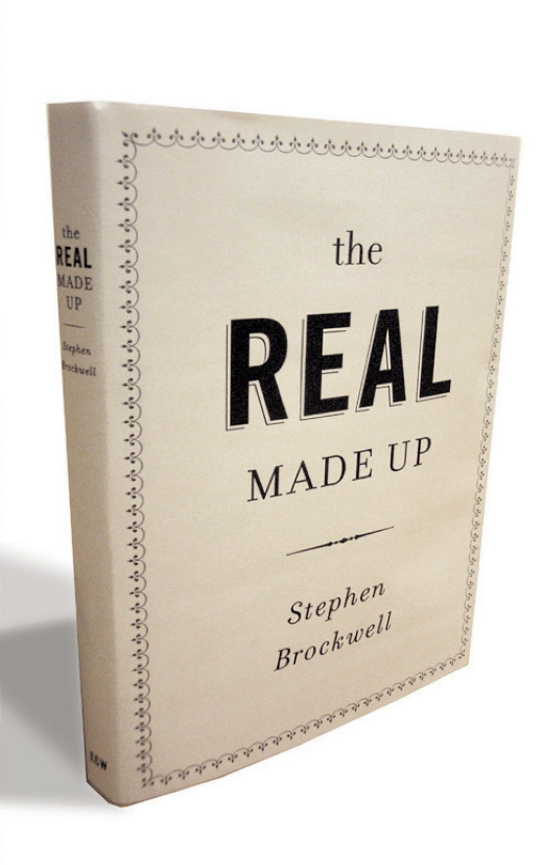
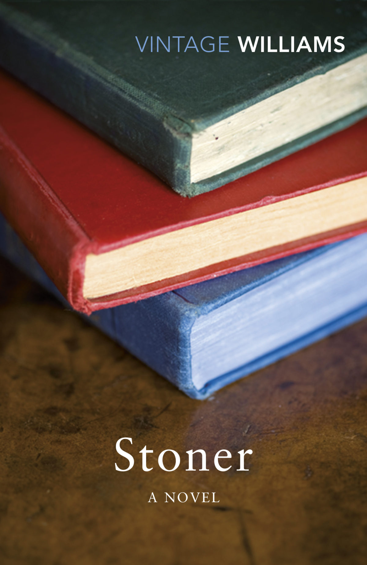
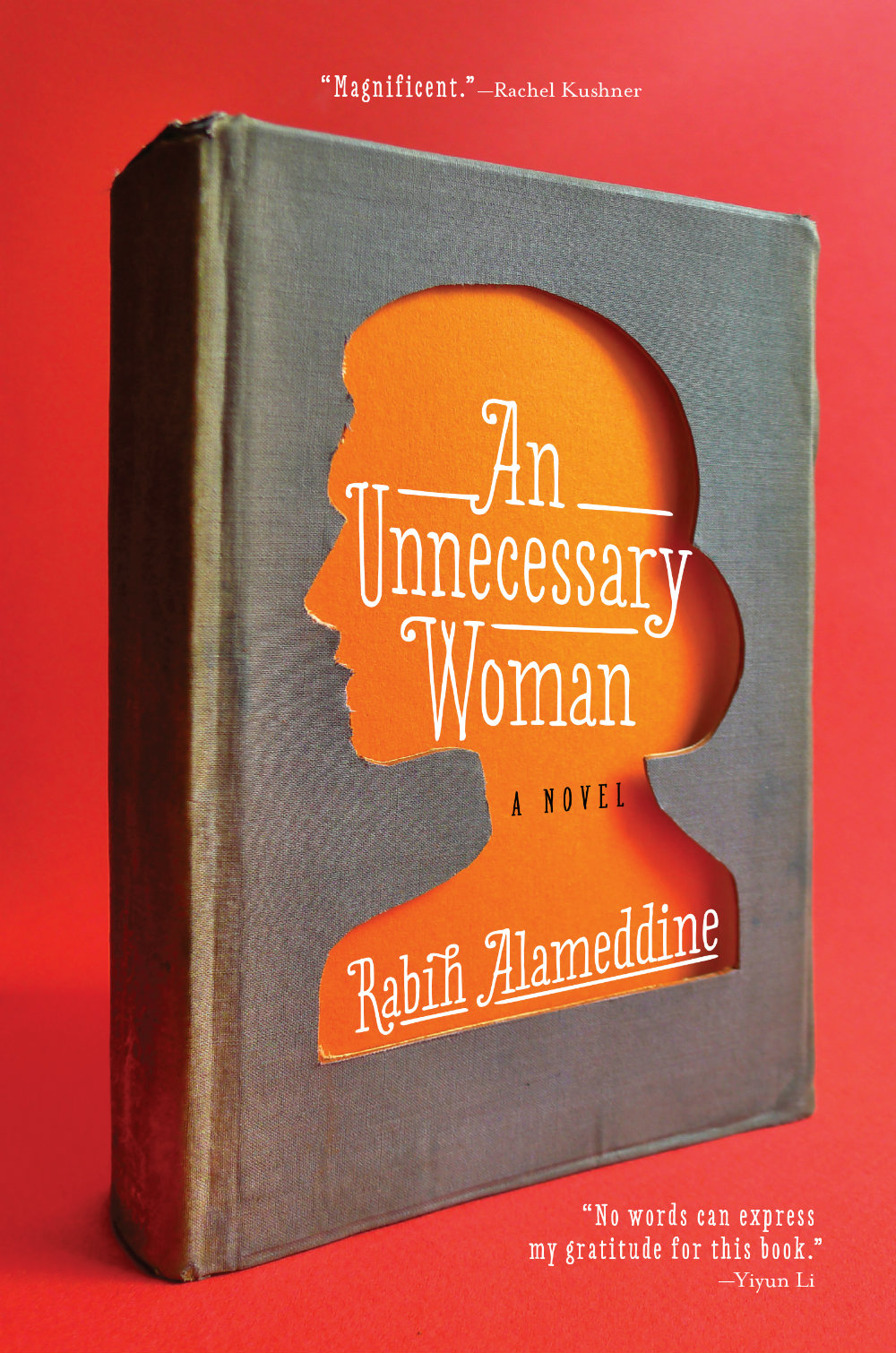
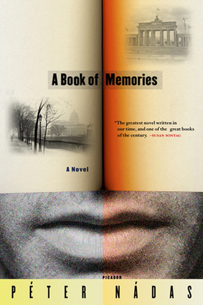
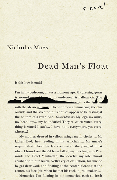
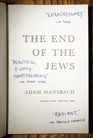
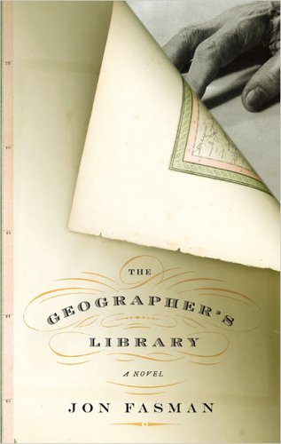
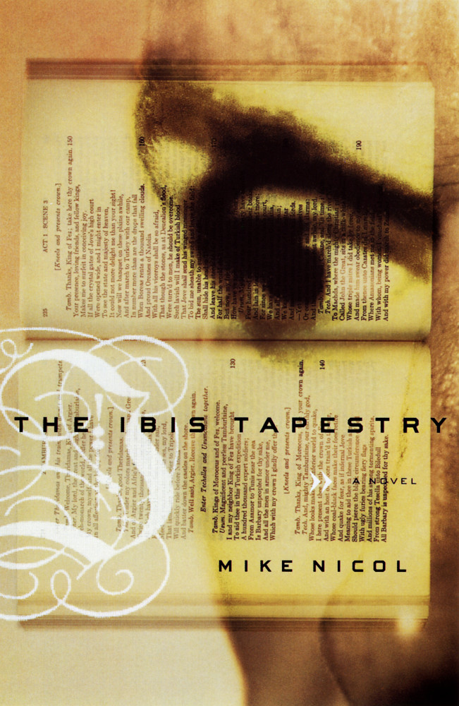
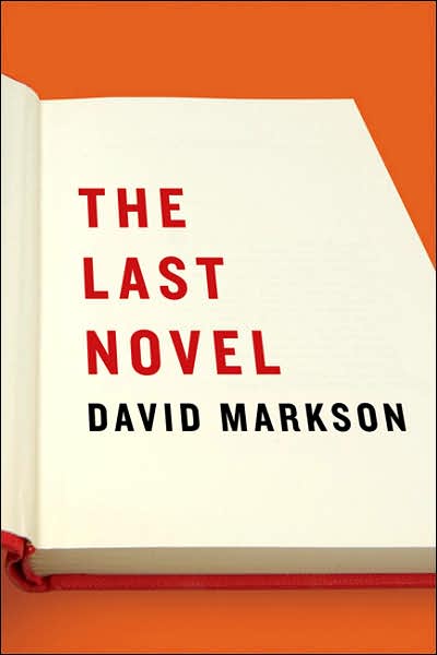
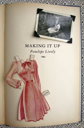
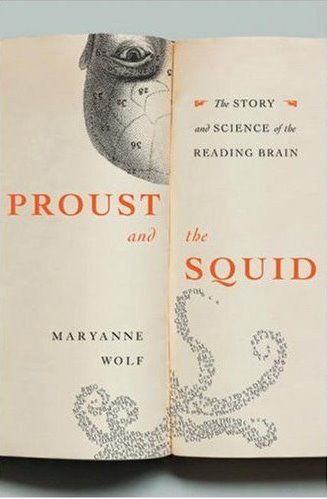
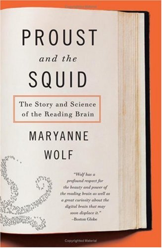
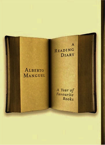
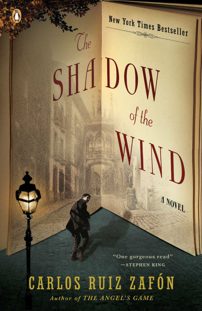
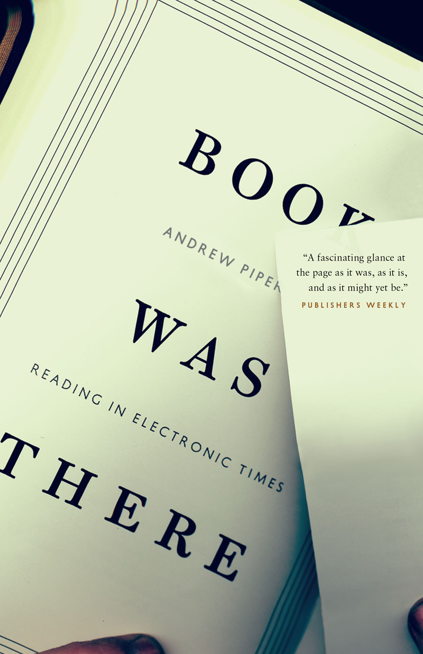
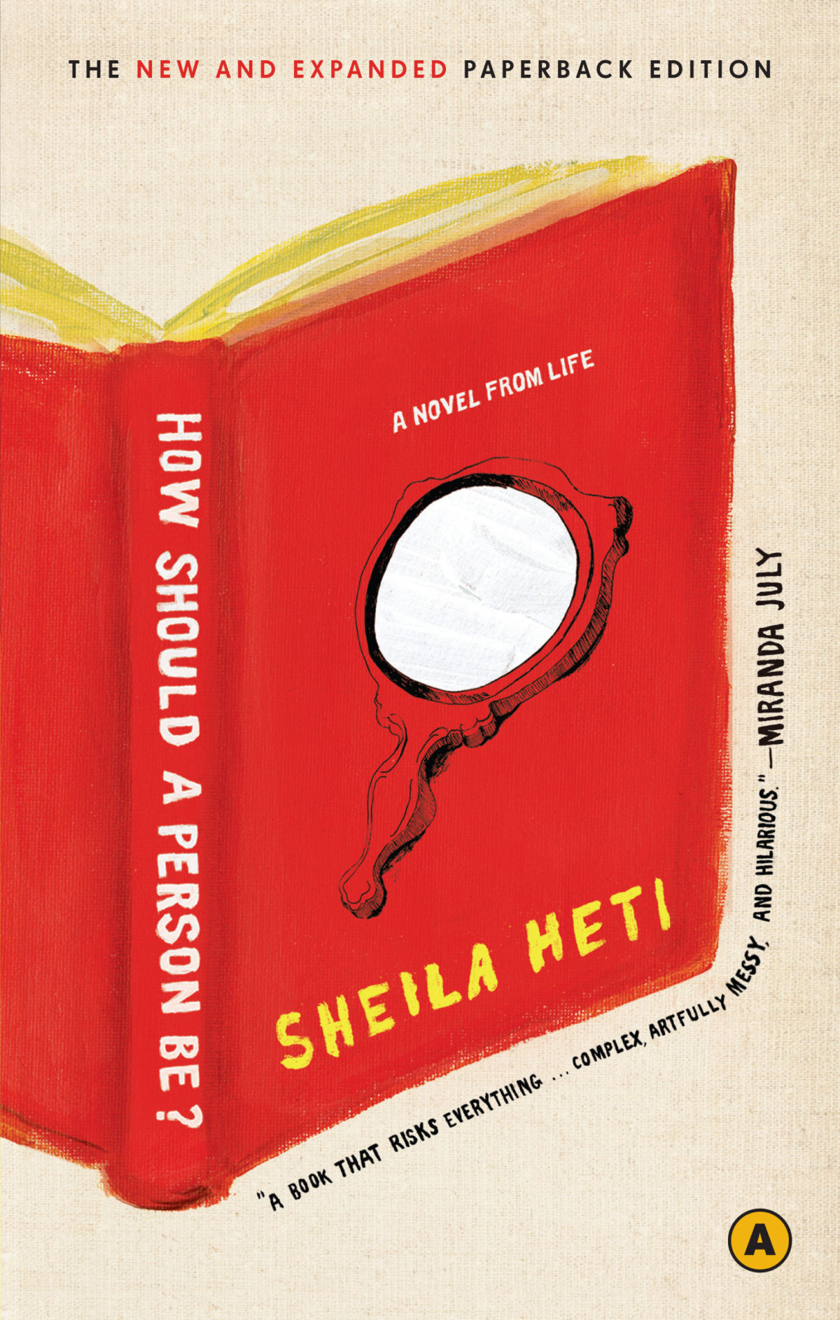
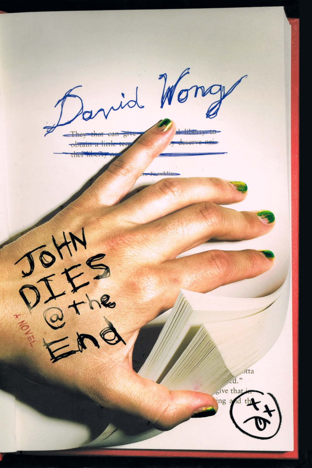
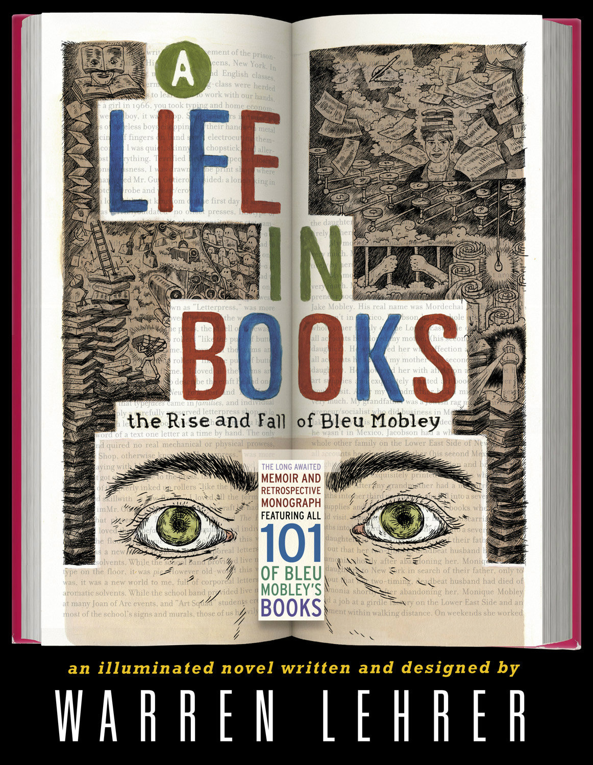
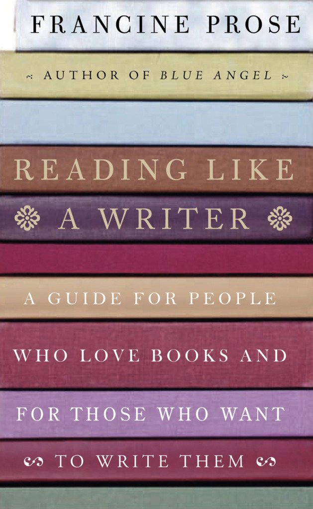
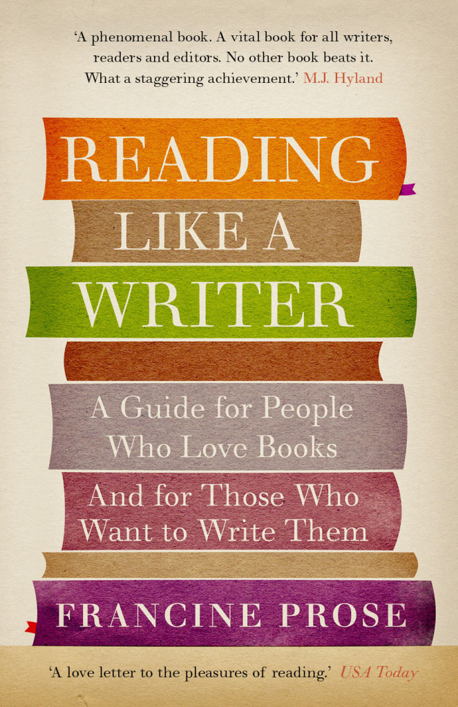
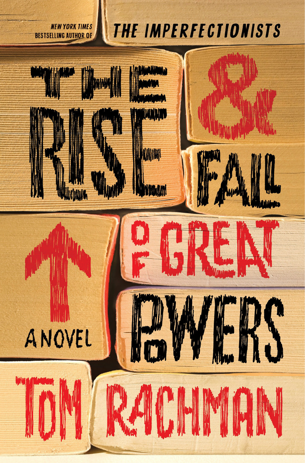
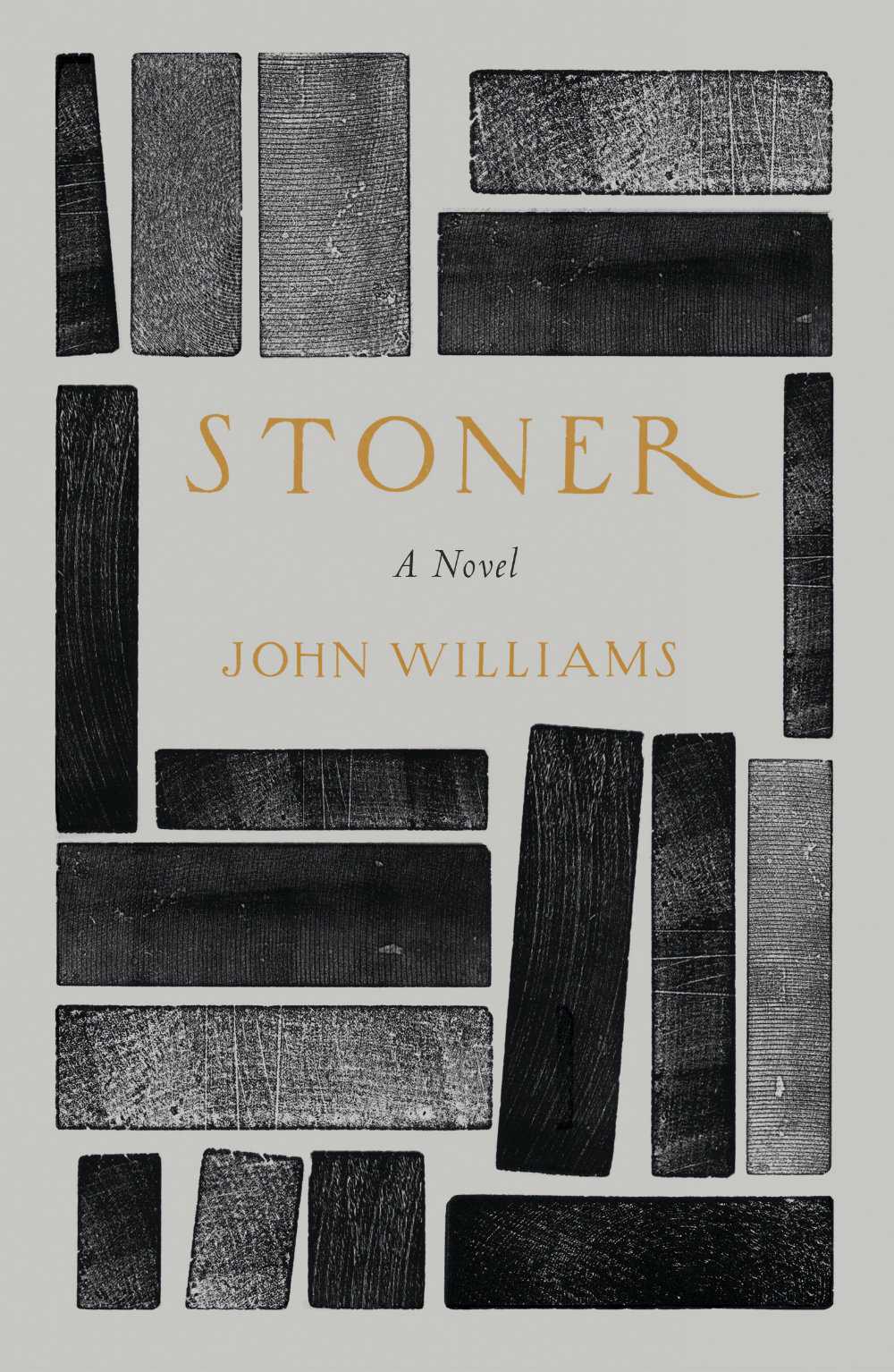
What follows is an attempt to showcase some of different ways designers incorporate books into their cover designs. Along side covers from the past five years, I’ve included some earlier examples from Joe’s post, and this post about ‘meta-covers’ from HTML Giant. Many of the images of the older titles are small (and some are just not very good), but where I have been able to source a larger image, I’ve included it at full (or close to full) size. I’m indebted to the Book Cover Archive, which is still an invaluable resources after all this time, Ferran Lopez‘s (also mothballed) Jacket Museum, and all the designers and book folk who sent me cover images, and helped me in numerous other ways. Thank you. This isn’t comprehensive survey but, to be honest, I had to stop somewhere…
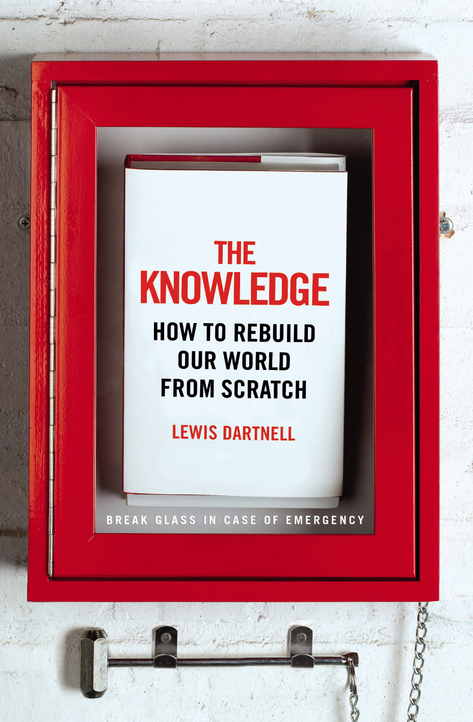
The Knowledge by Lewis Dartnell; design by Kris Potter (Penguin April 2014) Priceless by William Poundstone; design by Jennifer Carrow (Hill & Wang January 2010)
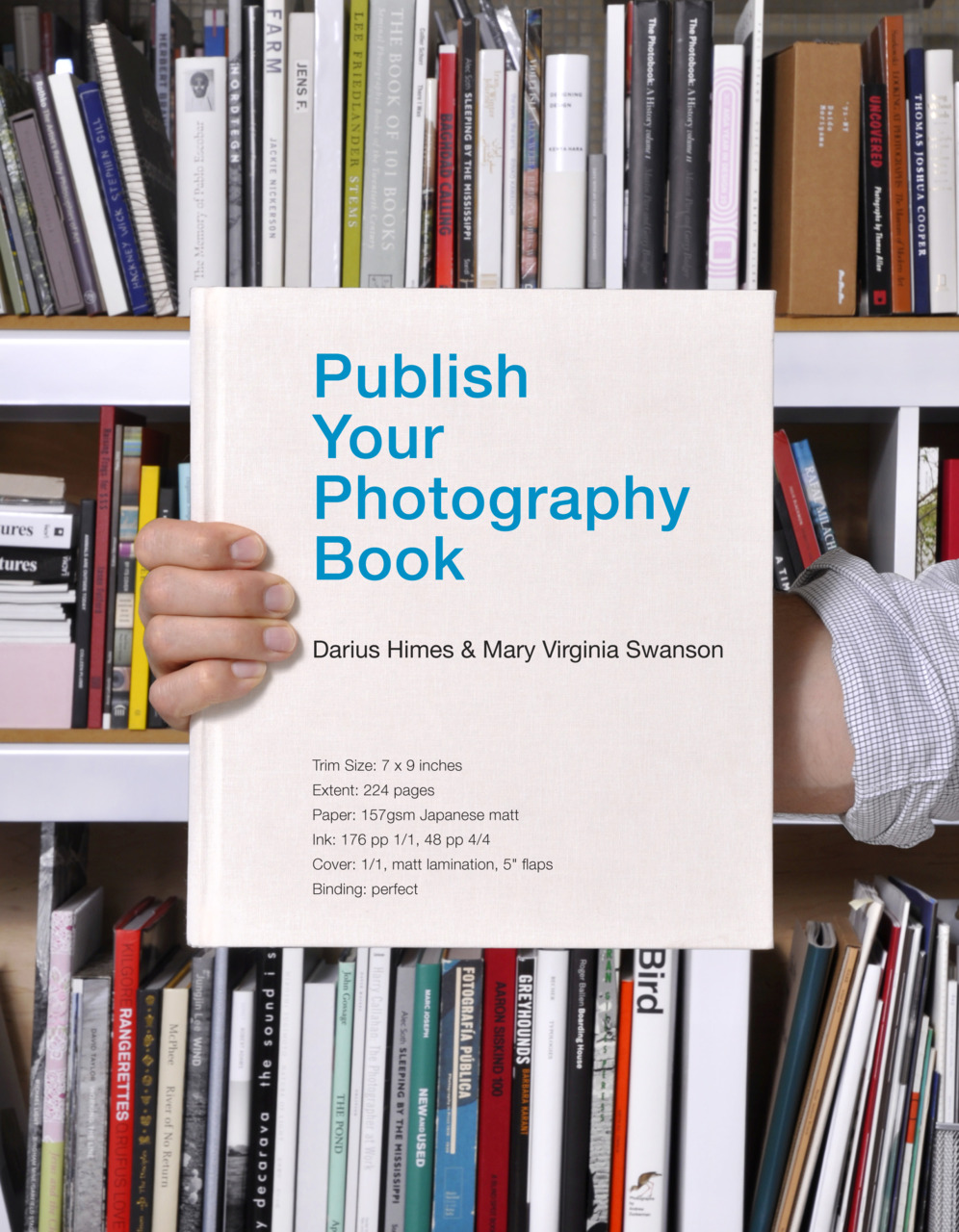
Publish Your Photography Book by Darius D. Himes & Mary Virginia Swanson; design by David Chickey & Masumi Shibata (Princeton Architectural Press March 2011)
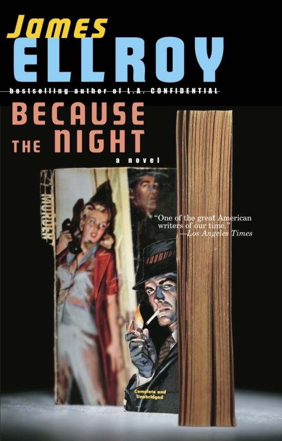
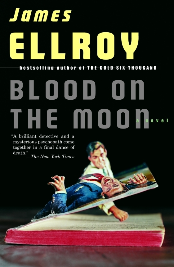
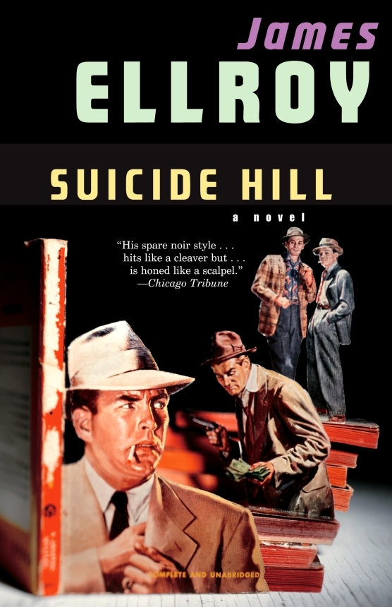
And those of you with a good memory will remember Chip Kidd used also art by Thomas Allen for a series of James Ellroy titles publisher by Vintage in the US:
If you follow me at all on Twitter, you’ll know that I’m working on a post about meta-covers, or book covers with books on them. It’s proving to be a much more difficult task than I first imagined, and it’s taking a very long time to pull it all together. It is, finally, almost done, and I hope it will be on the blog in the next couple of weeks. In the meantime, however, I came across these remarkable book posters by German designer Gunter Rambow for S. Fischer Verlag from the 1970s while compiling images for the post, and I thought I would share them now while you wait.
There is also a book, Gunter Rambow: Plakate / Posters, that collects Rambow’s posters from 1962 to 2007 when the Museum fur Angewandte Kunst Frankfurt mounted a major exhibition to his work.
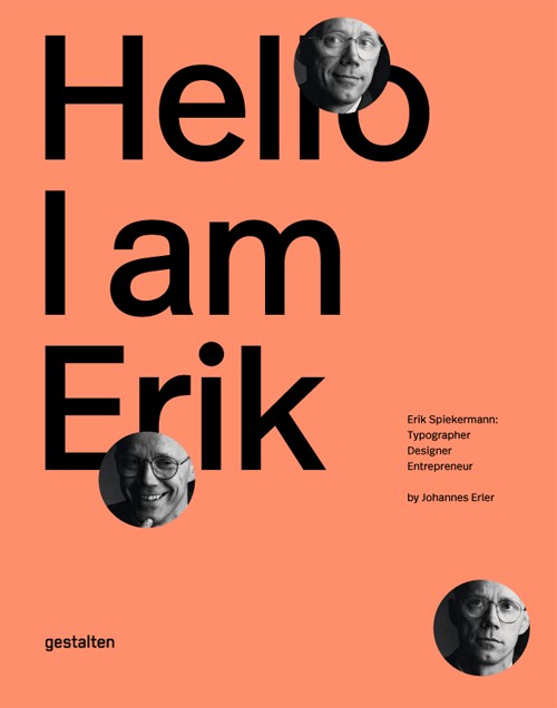
Next month, the fine folks at Gestalten are publishing Hello, I Am Erik, a ‘visual biography’ of typographer and designer Erik Spiekermann. In this new interview with GestaltenTV, Spiekermann talks about his 30 year career, and how working with blocks of movable type is different from designing on a screen: