Skip to content

Tag: david gee

Book Covers of Note May 2014

Another month, another selection of beautiful book covers…

9781447258896


The Axeman’s Jazz by Ray Celestin; design by Jo Thomson (Mantle May 2014)


The Bees by Laline Paull; design by Steve Attardo (Ecco May 2014)

DorothyMustDie
Dorothy Must Die by Danielle Paige; design by Ray Shapell (HarperCollins April 2014)

enlightenment

Enlightenment 2.0 by Joseph Heath; design by David A. Gee (HarperCollins April 2014)

goodbye-to-all-that

Goodbye To All That by Robert Graves; design by Matthew Young (Penguin May 2014)

Karate-Chop
Karate Chop by Dorthe Nors; design by Carol Hayes (Graywolf February 2014)

lunch-at-the-shop

Lunch at the Shop: The Art and Practice of the Midday Meal by Peter Miller; design by John Gall (Abrams April 2014)

one-and-only
The One and Only by Emily Giffin; design by Jennifer Heuer (Ballantine May 2014)

other-language

The Other Language by Francesca Marciano; design by Ben Wiseman (Pantheon April 2014)

raising-hell

Raising Expectations (and Raising Hell) by Jane McAlevey; design by Gray318 (Verso Books May 2014)

9781447229759

Vanishing by Gerard Woodward; design by Jamie Keenan (Picador UK March 2014)

young-skins

Young Skins: Stories by Colin Barrett; design by James Paul Jones (Jonathan Cape March 2014)

2 Comments

50 Covers for 2013

I decided to go in a slightly different direction with my covers list this year (see my lists for 2012, 2011, and 2010). It’s just a straight up list of the fifty covers designs with a few annotations and links a long the way. I’m sorry for woeful under-representation of Australian and NZ designers, and for completely ignoring the entire non-English-speaking world. I will try and do better in 2014. But until then, here, in alphabetical order, are my fifty covers of 2013:

33 Comments

50 Canadian Book Cover Designs

Lists are always problematic, but CBC Books longlist of Canada’s Most Iconic Book Covers seems strangely underwhelming somehow. Setting aside what counts as ‘Canadian’ (some of the books on the list were not designed by Canadians for example), ‘iconic’ covers are inevitably those that have stuck around and we are most familiar with, not necessarily those that are well designed or particularly interesting to look at. Needless to say, the list says more about our fondness for certain books and authors than about the current state of Canadian book cover design. Perhaps it isn’t really fair to judge the CBC’s contest this way, but it makes the list less interesting than it might otherwise have been (to me, at least).

That said, I am terrible, no good Canadian. 10 years and one Canadian passport later, I still feel like the immigrant I am. It’s not that I feel particularly British any more (if I ever did), it’s more like I haven’t finished unpacking yet (which might literally be true come to think of it)! In nearly five years of blogging I haven’t dedicated a single post to Canadian book design. To remedy to that, below are 50 (FIFTY!) recent book covers designed in Canada. Some of them are well-known, some of them are award-winners, some of them were recommended, some I’ve posted before, and some are just personal favourites. I can’t say they’re ‘iconic’ but they are all great covers. Enjoy. (Pictured above: The Bedside Book of Beasts by Graeme Gibson; design by Scott Richardson; published by Doubleday Canada).

15 Comments

More New and Recent Book Covers of Note

So is this a thing now? I don’t know. You folks seem to like these posts, so maybe… (but probably not because a lot of designers I really like just don’t updated their portfolios that often—you know who you are… cold, hard, stare)…

Here are half-a-dozen covers that have caught my eye recently:

Carnival by Rawi Hage; design by Richard Bravery

I’ll Seize the Day Tomorrow by Jonathan Goldstein; design by Michel Vrana (I think this is actually from last year, but I saw it recently and I really like it. If I’d been paying better attention, it might well have made my 2012 list—maybe next to this!).

The Towers of Trebizond by Rose Macaulay; design by Charlotte Strick (also not that recent, but charlotte talks about her design process here).

Idiopathy by Sam Byers; design by Joanna Neborksy (Jonathan Gibbs wrote about this cover in his regular book design column for The Independent a couple of months ago, and funnily enough I believe the aforementioned Charlotte Strick was the AD on this)

Bleeding Edge by Thomas Pynchon; design by Evan Gaffney (this on the other hand is not out until September!)

 The Hamlet Doctrine by Simon Critchley; design by David A. Gee (also out in September)

Have a great weekend!

4 Comments

Favourite Covers of 2012

For the past couple of years now (since Joseph Sullivan put the Book Design Review on ice in fact), I’ve been posting a short list of my favourite covers for books for the year. Now that thing for the New York Times is out of the way, I’m free to post my list for 2012.

To make a couple of very general observations about book design this year, the cover that probably made the greatest impact was Fifty Shades of Gray. It was a design that made it OK to read erotica in public, something which surely contributed to the book’s breakout success — a point not lost on other publishers who rushed to re-package their own erotica titles in a similar fashion. The results inevitably lacked the finesse of the original, but imitation is the sincerest form of flattery, as they say…

But while the cover of Fifty Shades of Gray smartly defied the conventions of its genre, it wasn’t an exciting cover and some publishers seemed to be more conservative in their design choices, playing it safe or relying on formulas. The jacket for The Casual Vacancy could hardly have been more forgettable, and it was not alone. A bland sameness crept in. Perhaps that could be said every year. I suspect, however, that smaller budgets, tighter deadlines, and readers browsing thumbnails rather than shelves had an effect.

Nevertheless, some publishers were willing to trust their art directors and designers, and publish interesting and challenging covers. If I was to identify a common theme to my choices this year, it would be hand-drawn lettering and illustrated designs. With the ubiquity of stock photos and uninspired type-choices, that seems to be where the interesting things are happening, at least to my mind. Perhaps photographs will make a come back next year?

After Freud Left edited by John Burnham; designed by Isaac Tobin
University of Chicago Press

All Men Are Liars by Alberto Manguel; design by Jason Booher
Riverhead

El asenino hipocondríaco by Juan Jacinto Muñoz Rengel; design by Ferran López, illustration Santiago Caruso
Plaza & Janés


Crockett Johnson and Ruth Krauss by Philip Nel; design by Chris Ware
University Press of Mississippi

Cruel Britannia by Ian Cobain; design by FUEL
Portobello Books

The Dubliners by James Joyce; design by Apfel Zet / Richard Bravery
Penguin Essentials, Penguin (UK)

The Flame Alphabet by Ben Marcus; design by Peter Mendelsund
Knopf

A Free Man by Aman Sethi; design by Ben Wiseman
W.W. Norton

Goodbye to Berlin by Christopher Isherwood; illustration by Vania Zouravliov

Vintage Isherwood, Vintage (UK)

The Heart Broke In by James Meek; design by Jennifer Carrow; illustration by Michele Banks
Farrar, Straus & Giroux

Hope: A Tragedy: A Novel by Shalom Auslander; design by John Gall
Riverhead

How to Sharpen Pencils by David Rees; design by Christopher Brian King
Melville House

The Hundred-Year-Old Man Who Climbed Out of the Window and Disappeared by Jonas Jonasson; design by Jonny Pelham
Hesperus Press

Husk: A Novel by Corey Redekop; design by David A. Gee

In Praise of Nonsense by Ted Hiebert; design by David Drummond
McGill-Queens University Press

Invisible Man by Ralph Ellison; design by Cardon Webb

Vintage (US)

Lost at Sea by Jon Ronson; design by Matt Dorfman
Riverhead

May We Be Forgiven by A. M. Homes; designed by Alison Forner
Viking

Men in Space by Tom McCarthy; design by John Gall
Vintage (US)

NW by Zadie Smith; designed by Gray318
Hamish Hamilton

Office Girl by Joe Meno; design by Cody Hudson, photograph by Todd Baxter
Akashic

Pride and Prejudice by Jane Austen; design by Jessica Hische / Paul Buckley

Penguin Drop Cap, Penguin (US)

Swimming Studies by Leanne Shapton; design Leanne Shapton / Matthew Young
Particular Books

Watergate: A Novel by Thomas Mallon; design by Paul Sahre

Why We Build by Rowan Moore; illustration by Diane Berg
Picador (UK)

Honourable Mentions:

;

You can find my lists for 2010 and 2011 here and here, and if you haven’t seen my 50 covers post from earlier this year, you can find that here. Happy Holidays!

16 Comments

Midweek Miscellany

A shiny new (and somewhat unsettling) cover for Joyland’s next e-book, How I Came to Haunt My Parents by Natalee Caple, designed by the shiny (and somewhat unsettling) David A Gee.

Holden Caulfield’s Goddam WarVanity Fair excerpts J. D. Salinger: A Life by Kenneth Slawenski:

Tuesday, June 6, 1944, was the turning point of J. D. Salinger’s life. It is difficult to overstate the impact of D-day and the 11 months of combat that followed. The war, its horrors and lessons, would brand itself upon every aspect of Salinger’s personality and reverberate through his work. As a young writer before entering the army, Salinger had had stories published in various magazines, including Collier’s and Story, and he had begun to conjure members of the Caulfield family, including the famous Holden. On D-day he had six unpublished Caulfield stories in his possession, stories that would form the spine of The Catcher in the Rye. The experience of war gave his writing a depth and maturity it had lacked; the legacy of that experience is present even in work that is not about war at all. In later life, Salinger frequently mentioned Normandy, but he never spoke of the details—“as if,” his daughter later recalled, “I understood the implications, the unspoken.”

An excerpt from Jason Epstein’s review Merchants of Culture: The Publishing Business in the Twenty-First Century by John B. Thompson for the latest NYRB:

Digital enthusiasts should… consider that as the embrace of other electronic media has widened, the average quality of their product has declined: from Masterpiece Theatre to Jersey Shore, from Franklin Roosevelt and Adlai Stevenson to Sarah Palin, from Julia Child to Rachael Ray. My own guess is that the digital future in which anyone can become a published writer will separate along the usual two paths, a narrow path toward more multilingual variety, specificity, and higher average quality and a broader path downward toward greater banality and incoherence, while the collective wisdom of the species, the infallible critic, will continue to preserve what is essential and over time discard the rest.

(The full review requires a subscription)

Best Online Comics Criticism 2010 chosen by contributors to The Comics Journal. And from that list, film scholar David Bordwell on Tintin (via Robot6):

Most commentators on Hergé mention that he was a film fan and drew many situations from movies of the 1920s and 1930s. Like Hollywood studio cinema, his tales put striking technique in the service of fluent storytelling. Pause to study the narrative and you’ll find a surprising richness to the imagery; start by looking at the pictures as pictures, and you’ll see how composition, color, and detail smoothly advance the action. Hergé was well aware that his polished imagery could stand scrutiny in its own right, but he saw it as serving a larger narrative dynamic.

(Out of curiosity, does anyone compile annual list of the best online literary criticism?)

Montaigne and Monkeys — Saul Frampton, author of the ridiculously titled  When I Am Playing With My Cat, How Do I Know She Is Not Playing With Me?: Montaigne and Being in Touch With Life, on 16th Century French philosopher Michel-de-Montaigne and neuroscience in The Guardian:

For Montaigne, as for contemporary neuroscientists, humans… have an inbuilt imitative, sympathetic capacity. Moreover, he does not see it as species-dependent… In one of his most famous aphorisms he asks: “When I am playing with my cat, how do I know she is not playing with me?” And he tells how animals themselves form “a certain acquaintance with one another” and greet each other “with joy and demonstrations of goodwill”. Then, in a lengthy comment added to the final edition of his essays, he completes the circle from animal-to-human to human-to-human again, concluding that we cannot help but communicate ourselves in some way… even if it is something to which we are habitually blind…

And finally  (in the unlikely case anyone missed it)…

Caustic Cover Critic interviews Christopher King, the new Art Director at Melville House Publishing.

1 Comment

Midweek Miscellany

The Eyes Have It — An interview with gentleman book cover designer and advertising copywriter David Gee about his design for Jim Hanas’s e-book short story collection Why They Cried. You can find my interview with David here.

Writers on Process — Writers of every stripe talking about how they write (via Largehearted Boy).

In Their Own Words — A BBC archive of television and radio interviews with modern British novelists including Virginia Woolf, Daphne du Maurier, Anthony Burgess, J.G. Ballard,  and Muriel Spark. One could quibble about about selection of some of  contemporary novelists, but otherwise this is pretty amazing collection.

And speaking of archives…

Design is History is an expanding reference for graphic design history created by designer Dominic Flask.

And finally…

The only page of Jason’s silent and sadly aborted adaptation of Edgar Allan Poe’s The Black Cat.

e-book short story collection, Why They Cried

3 Comments

You Can’t Judge A Book By It’s Cover

As it’s Friday, and with thanks to David Gee who sent this my way, a little something for journalists who can’t let sleeping clichés lie:

Have a great weekend.

1 Comment

Somthing for the Weekend

“Spot gloss on the molecules” — David Gee’s cover for 7 Good Reasons Not To Be Good by John Gould.

Going Back — Artistic Director Michael Salu on the creating the cover of the new issue of Granta magazine:

For this concept to work, we needed to strive for authenticity – to create the physical object ourselves. The typefaces would need to be sourced, traditionally hand-set and photographed to give the cover the depth that the issue deserves. For this I approached St Bride Printing Library, which has long been a place of fascination and wonder for me. My first visit to the library – with its oil, wood and metal, its smell of history – made a huge impression on me.

The Connoisseurs — Peter and Charlotte Fiell, who recently ended their 15-year tenure as heads of the design branch of Taschen, talk about their new publishing venture Fiell at More Intelligent Life:

What is design? It’s the forethought that goes into the making of man-made things. It’s films, pharmaceuticals, airplanes, chairs, tape recorders … it’s the world of stuff. It’s huge, so everybody should have a big interest. It’s not some avant-garde, highly expensive niche. We want to make money by publishing books that sell, but we’re in the business of promoting ideas, culture, taste, connoisseurship. If you want to make a difference you want to get into as many people’s heads as you can and change their opinion. The secret is to strike this balance between making your books appealing to learned type readers, while at the same time, making them useful and interesting to novice readers. Our aim is to make books as appealing to teenagers in Tokyo as architects in Amsterdam.

(Above: Spreads from Tools for Living: A Sourcebook of Iconic Designs for the Home by Charlotte and Peter Fiell)

Designing In Order To  Eat — Chris Ware’s introduction to Penguin 75 excerpted at GQ magazine:

Book designers, you should know, have to be ready to create something new, exciting, and original almost every day in order to eat, and a certain degree of burnout smokes out the weaker specimens; I can’t imagine coming up with cover after cover without at some point resorting to an out-of-breath take, intentional or not, on someone else’s great idea. This urge toward ever-freshness brings the profession perilously close to that of fashion, and the worst examples of such greet us at the grocery store checkout among the tabloids, gum, and ring pops. But the best of it, those that last, have recently been appearing from Penguin (yes, Penguin, not just the bearer of boring spring break assignments anymore!), following a path led by designer Paul Buckley into beautiful new ways of graphically proffering the written word.

The excerpt is accompanied by a slideshow of covers from the book. My interview with Paul Buckley and designer Christopher Brand about Penguin 75 will be up early next week.

And Finally… The book cover design Tumblr (via Alan Trotter’s ≥ notes)

1 Comment

Under the Covers: Reviewing the Covers of 2009

Tonight is the BPPA‘s annual review of the best and worst book covers of the year.

Sadly Alan Jones, Senior Designer at HarperCollins Canada, had to drop out at the last minute and is being replaced by Boy Wonder David A. Gee (interviewed here) and umm… me. No, I’m not quite sure what they were thinking either (about asking me — David is obviously a great choice)…

The other panellists are freelance designer Ingrid Paulson (also interviewed here), Terri Nimmo Senior Designer at Random House Canada, and Steven Beattie Review Editor at The Quill & Quire.

Panel moderator David Ward of McClelland & Stewart has promised me Jaffa Cakes.

The event is 6:30-8:30 pm at The Arts and Letters Club (3rd Floor) in Toronto. It’s free for BPPA Members, $20.00 for non-members apparently.

There’s more information on the BPPA’s event page.

3 Comments

Q & A with David Gee

I am somewhat in awe of Canadian designer David Gee. Not only does he fashion stylishly left-field book covers for independent publishers and major houses, he is also willing to scorch individual business cards by hand using vice-grips and a blowtorch (see above).

And he does it all part-time. While holding down a day job.

To an aspiring generalist like me, knowing that David manages to work in more than one creative field is incredibly inspirational. And, as most of us struggle to do to even one thinking well, it is simply breathtaking that David’s work — in both his chosen fields — is brilliant and apparently effortless.

David and I chatted about his designs — and the day job — over email earlier this month…

How did you did get into designing books?

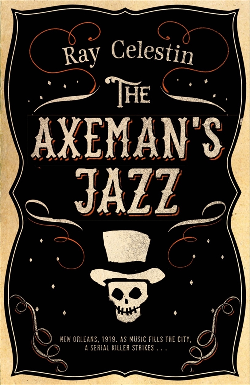
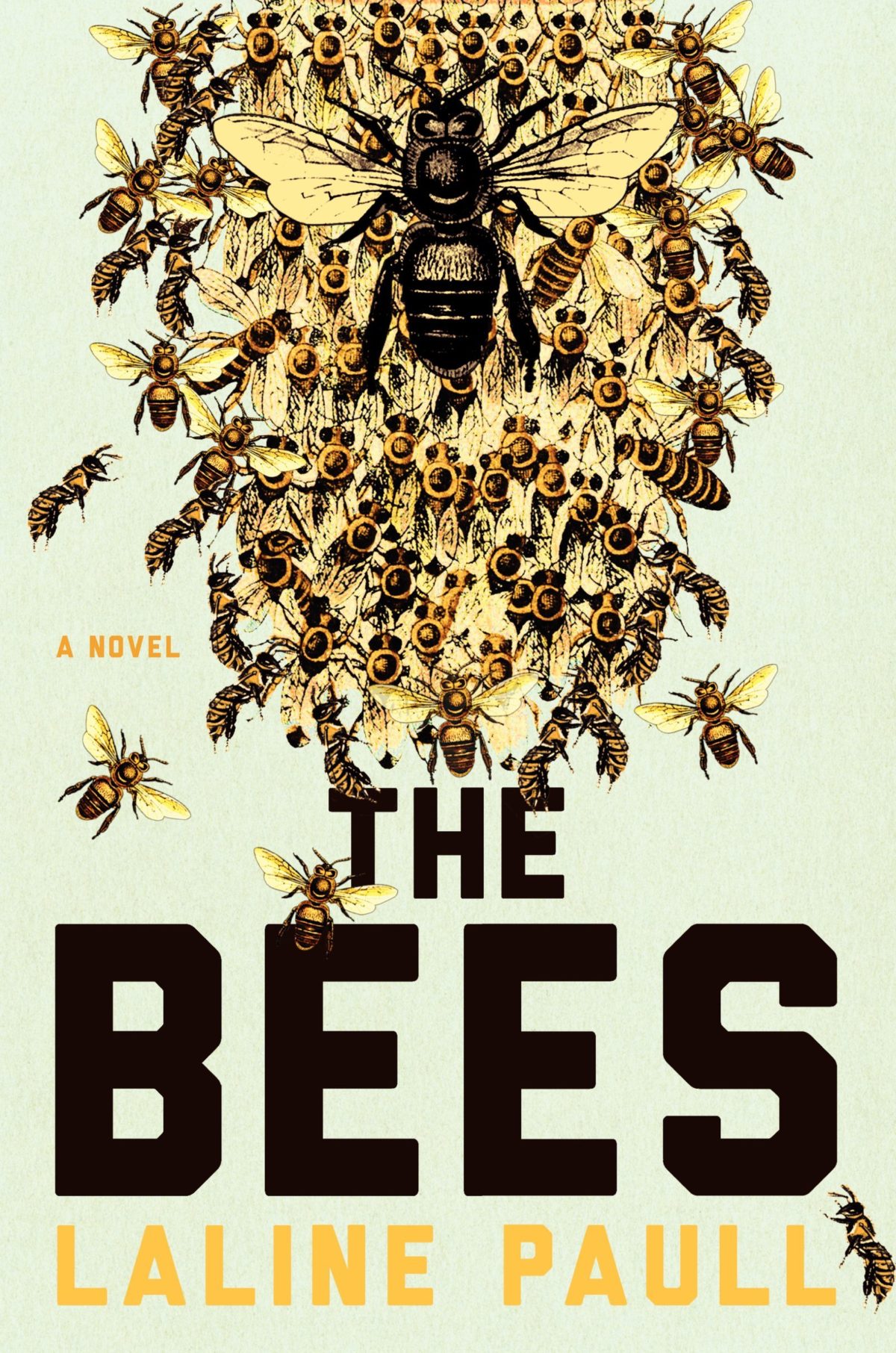
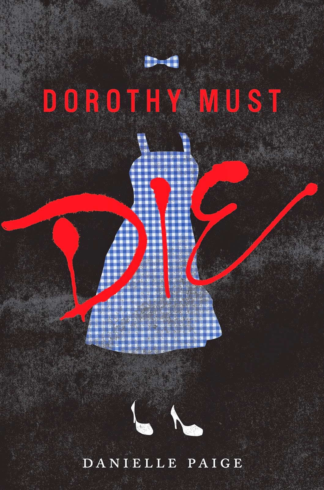
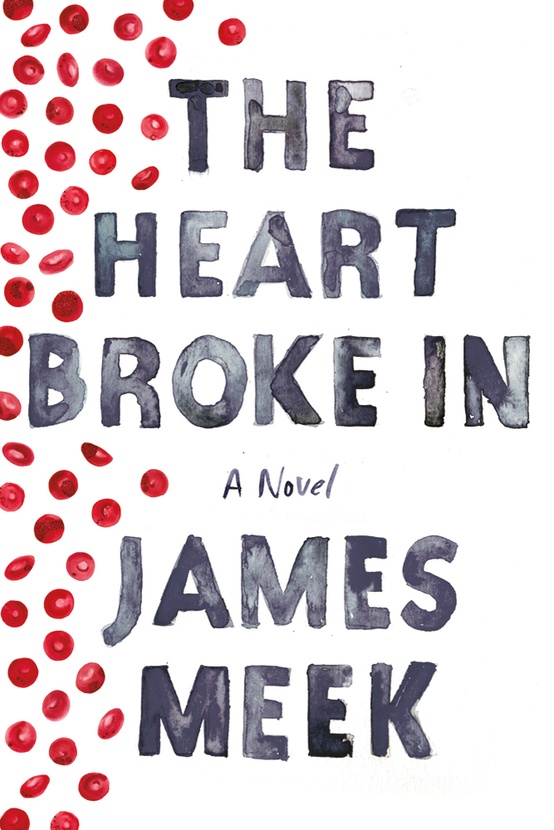
A friend of mine, Jason Anderson, wrote his first novel a few years back and he asked if I would be a ‘careful reader’ and give him some feedback on his manuscript. He later dropped a bomb on me asking if I would design the cover, too. Anyway, the publisher, ECW Press, loved the final cover and they eventually asked me for more and it all kind of snowballed from there. This cover ended up in a Quill & Quire article, an Applied Arts design annual and even GQ Italia. After a year or two of doing freelance stuff for ECW, I just started emailing other publishers and I got a lot of “Yeah, we loved that Showbiz cover!” responses.

What are the pros and cons of designing part time?

Well, the upside is that I don’t burn out too easily. Since my inbox is rarely overflowing, I can take my time with projects and make sure they get the attention they deserve or in some cases, might not deserve. Also, I find that I can still bring a bit of an outsider’s approach to my work. The cons include not being able to build up my portfolio as quickly as I’d like or log the hours that certain jobs end up requiring.

Approximately how many titles do you work on a year?

Roughly twenty or so titles a year. I don’t turn down any work at all, if I can help it. There are the usual pre-catalogue rushes but, for the most part, it’s manageably and workably steady, all year long.

Who are some of the publishers you’ve worked with?

My Main clients include ECW Press, HarperCollins, W.W. Norton, Penguin and Hamish Hamilton, to name a few. I should really try to add to my client roster but, at the end of the day, I’ve little time left for self-promotion since I’m doing this on the night shift. Add that to the “cons” list.

Do you work more on fiction or nonfiction titles?

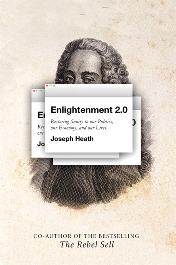
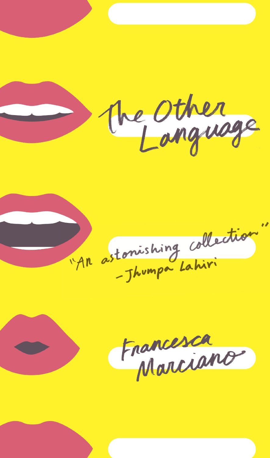
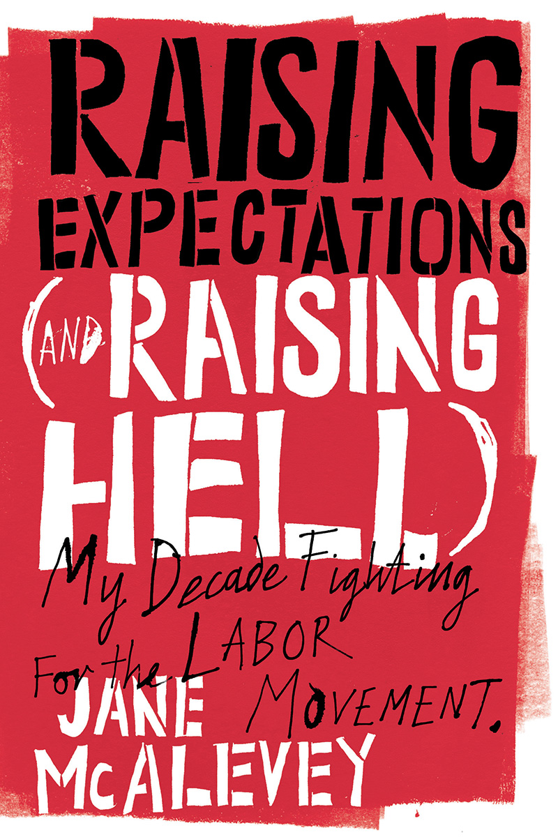
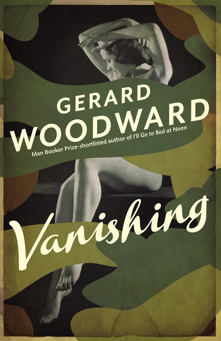
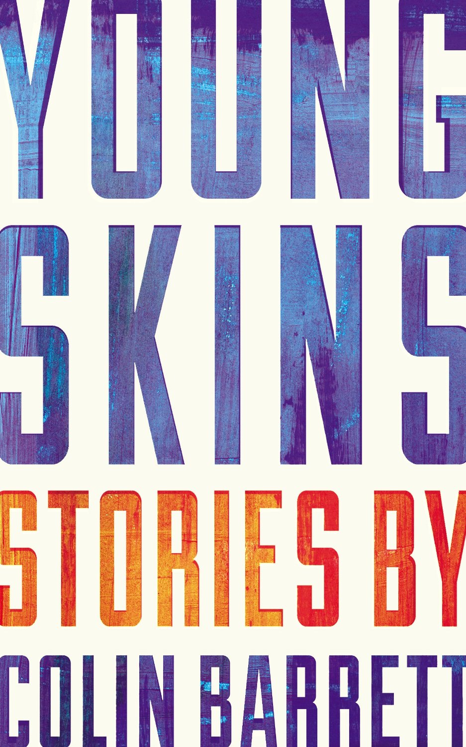
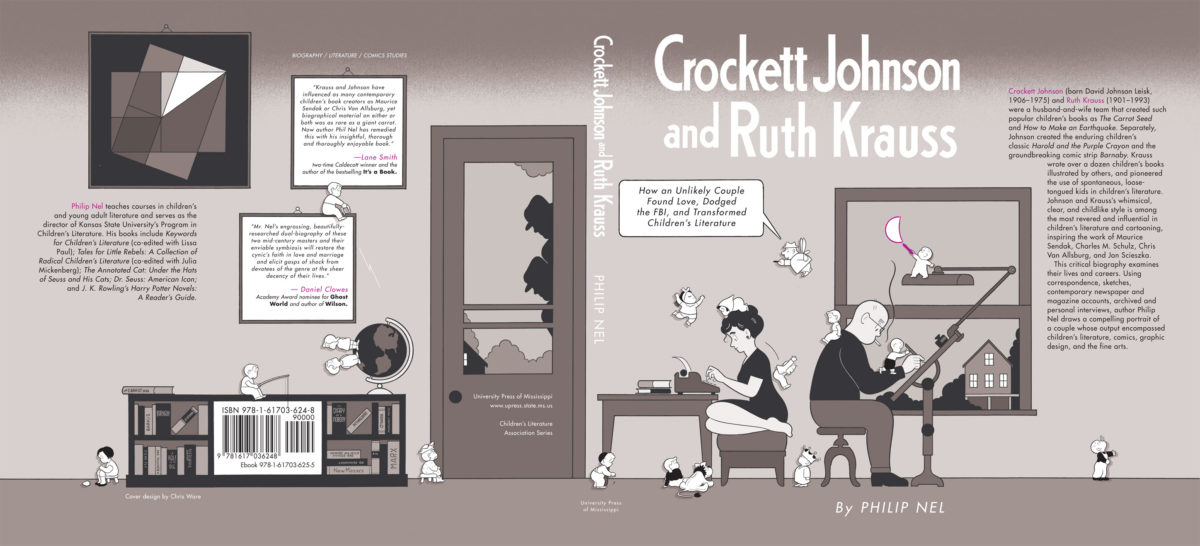
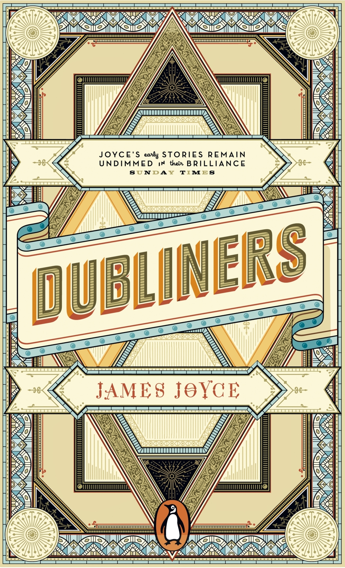
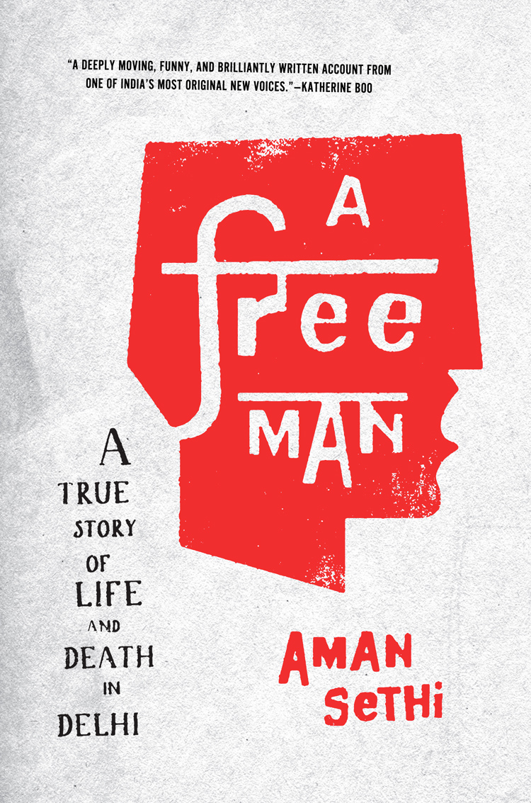
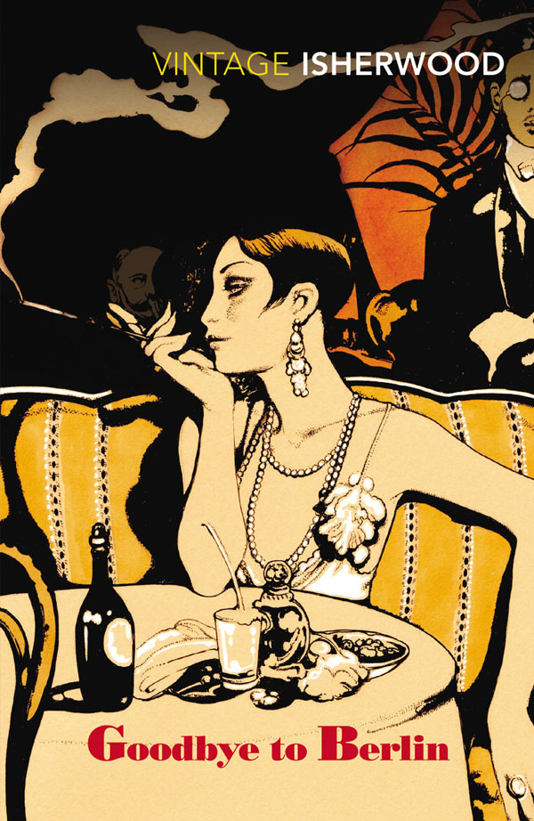
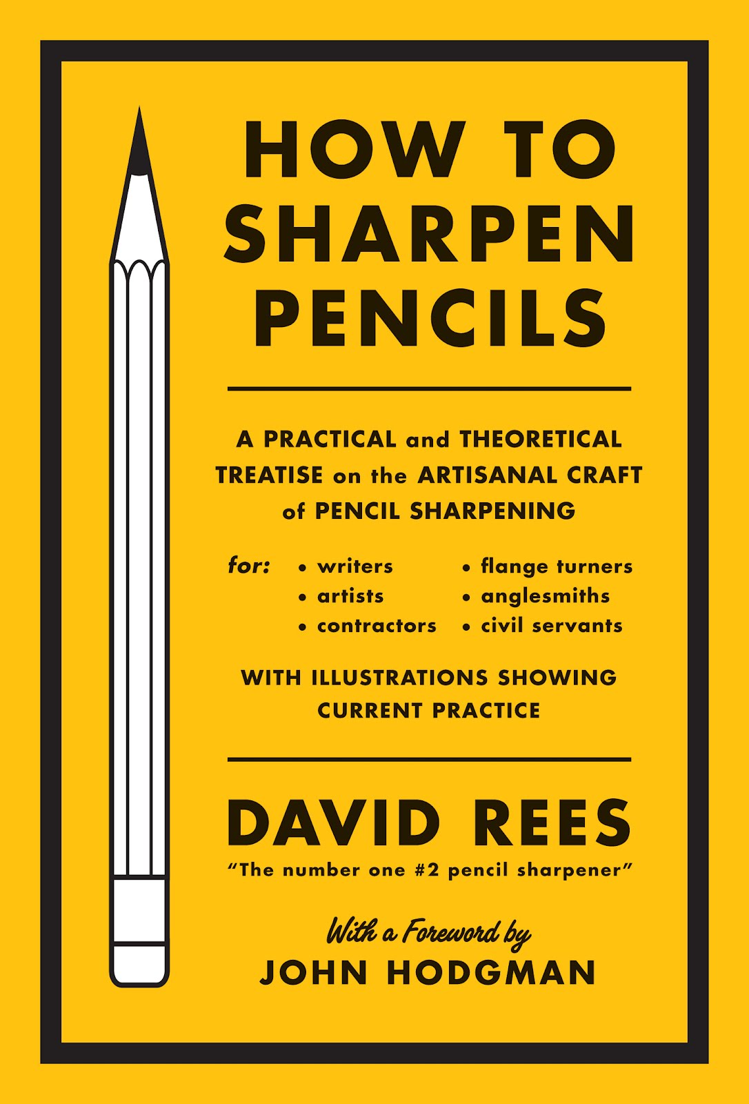
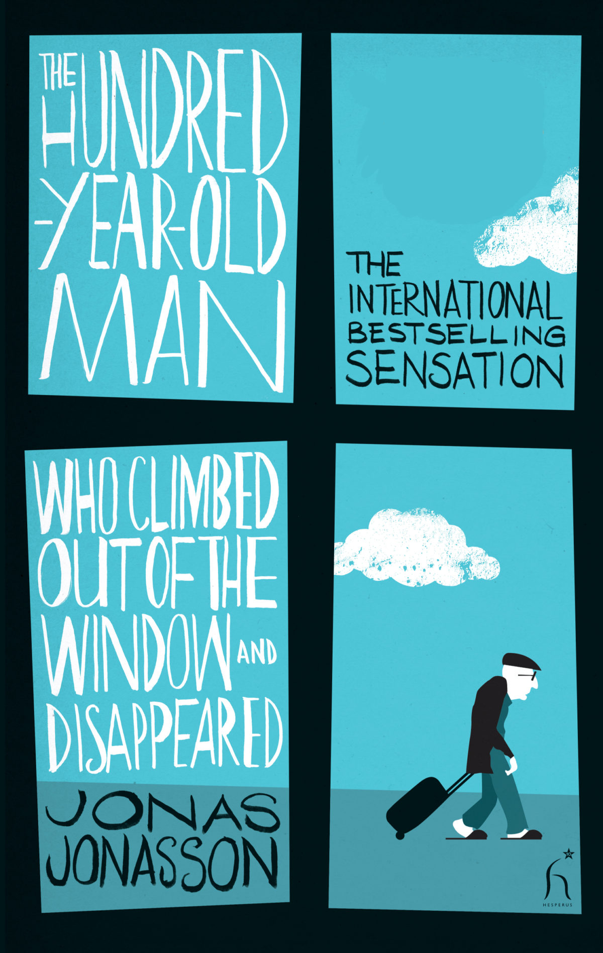
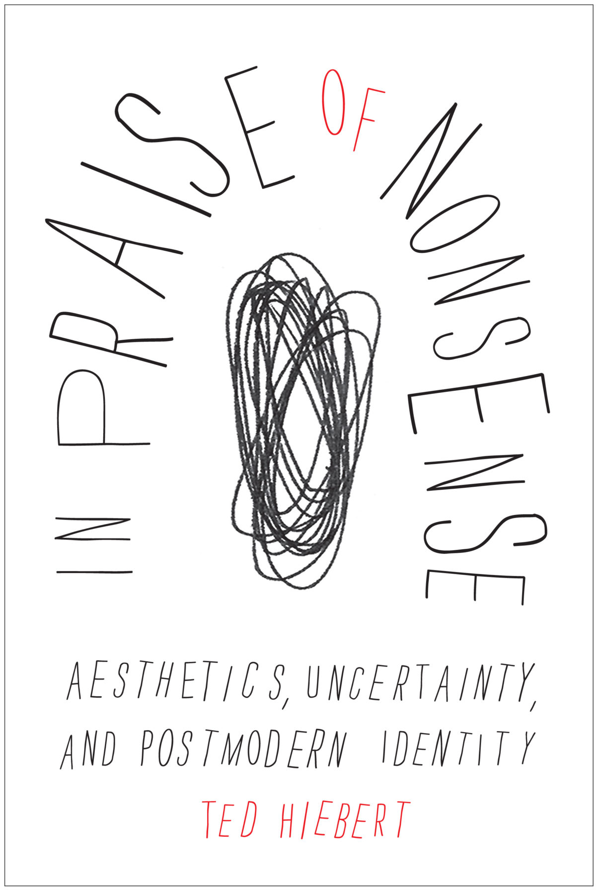
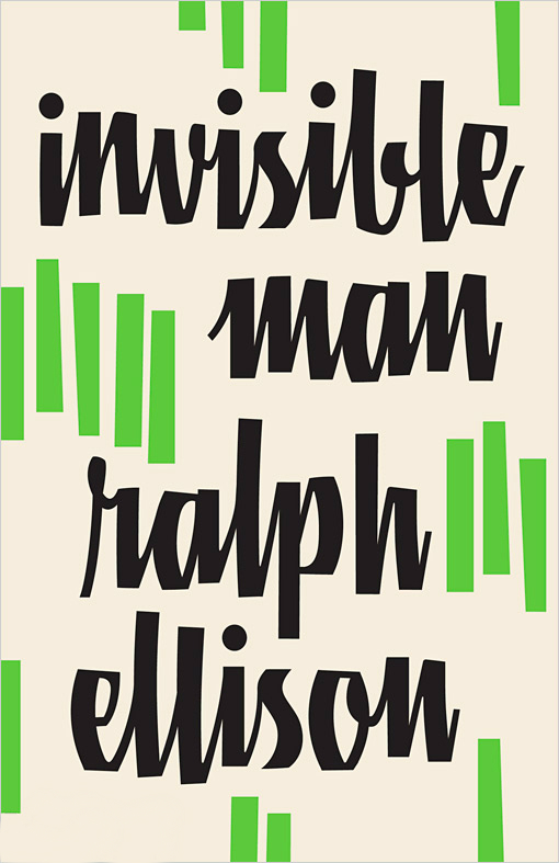
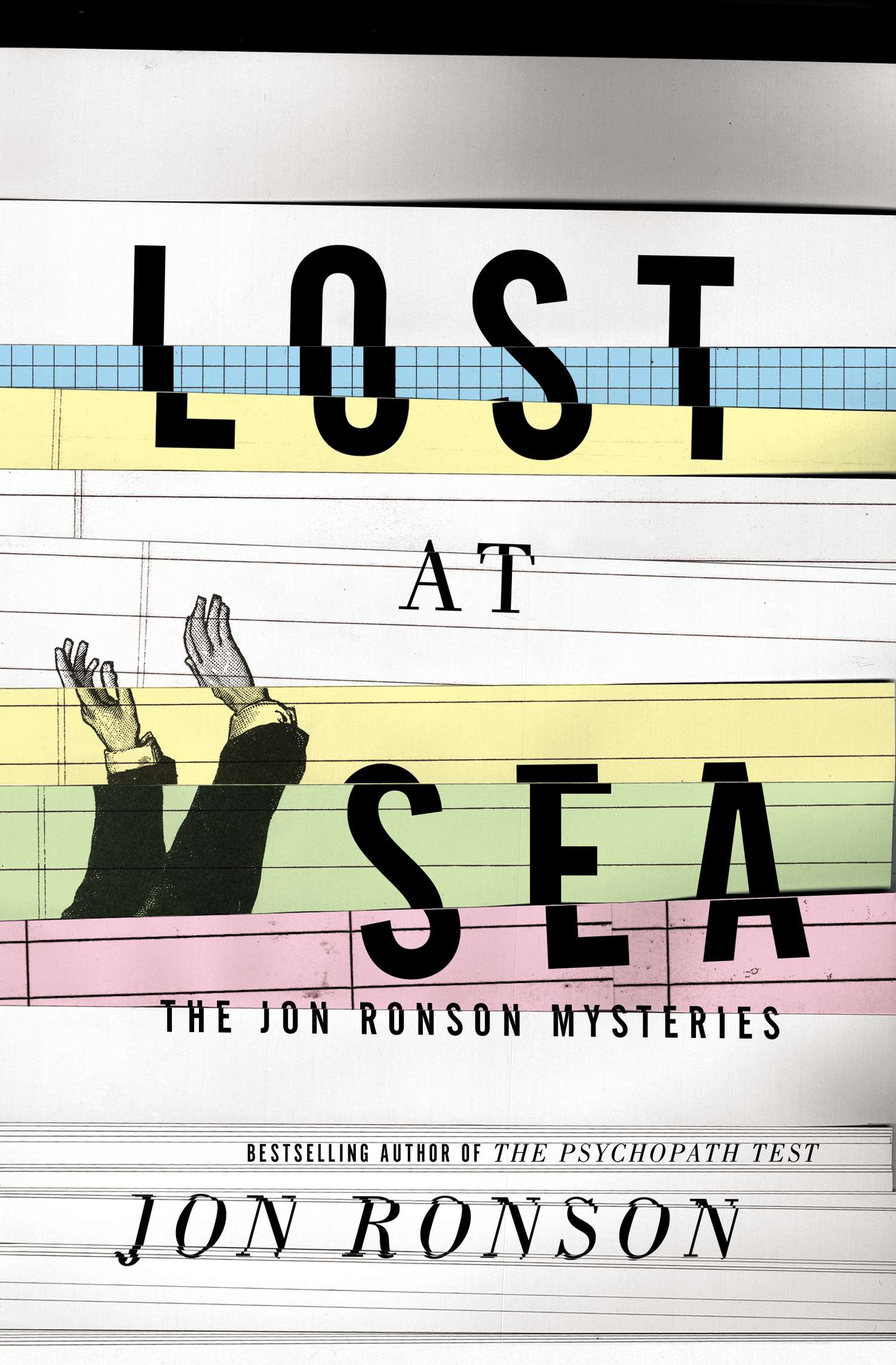
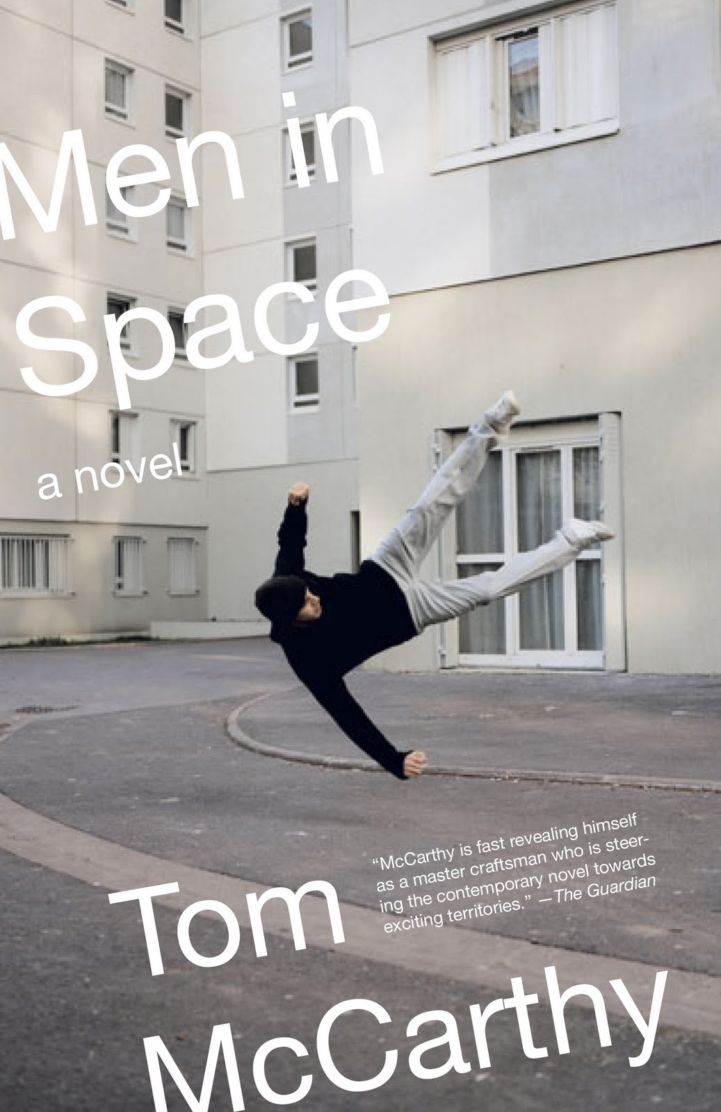
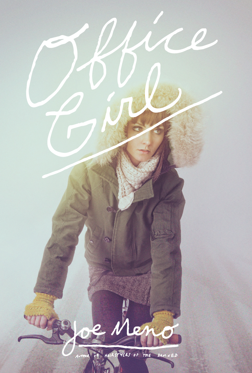
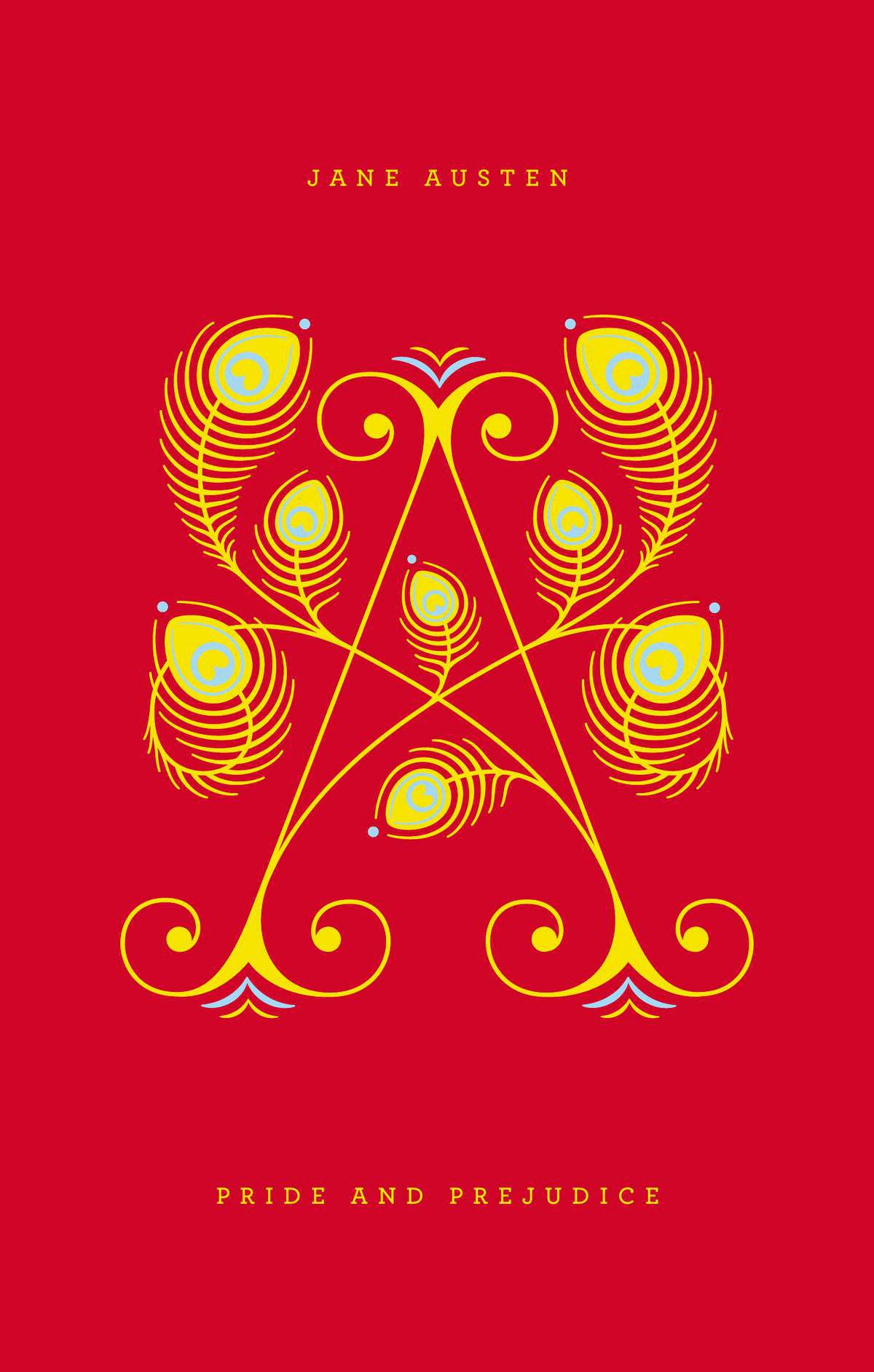
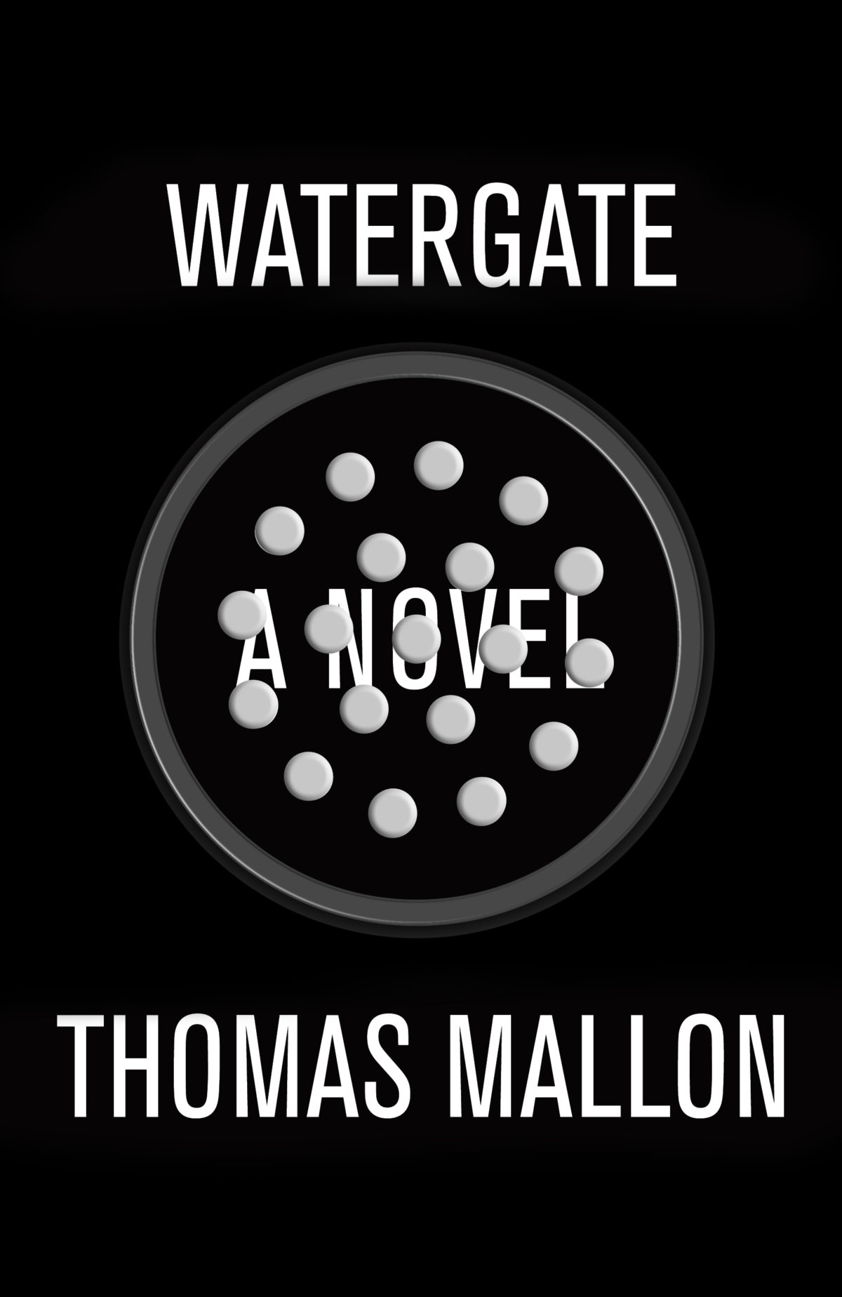
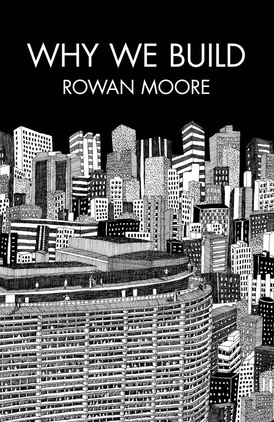
It balances out a bit but my meat and potatoes seem to be in non-fiction work. In addition to the fiction titles I’ve been doing for Penguin, they’ve been sending me a bit of science fiction work too, which has been a lot of fun. The Hamish Hamilton titles have been a big boost to my ego and hopefully my skills as a cover designer, too. HarperCollins is mostly non-fiction and ECW sends me just about anything you can think of from abstract poetry to scandalous wrestling bios.

What are your favourite books to work on?

Every job creates its own unique set of challenges, so it’s hard to say if one trumps the other. With fiction I approach the conceptual end of things more laterally and obliquely whereas with non-fiction I try to approach the execution laterally if only in order to separate the book from similar titles on that particular shelf.

What are the most challenging?

I haven’t the breadth of experience required to provide a quantitative, scientific answer to that. They’re all challenging since the last thing I ever want to do is just phone it in. I recently finished a cover for a book on the history of beer in Canada, which for a hoser like myself was just so ominously and ridiculously huge and daunting a task I think I actually lost sleep over it.

What is the “day job”?

I’m an advertising copywriter working in television and radio, mostly. My business cards say “Senior Writer” actually, even though my family still doesn’t understand what I do for a living despite the awards. (I’m required by a secret and arcane advertising edict to mention that I have won awards. Many awards.)

Does working in advertising influence how you think about book design?

I think what my day job has trained me to do is recognize a good idea in its purest, raw form. My own personal barometer goes something like “Is this actually an idea or is it just acting like an idea?” which means does the core concept have an element of truth to it, doing service to the product/service/book cover, or am I just relying on flashy execution alone?

Could you describe your design process?

It usually begins with an immediate gut-reaction to the brief, scribbling this idea down and then entirely forgetting about the project for a few days. Most of the hard work is purely mental, trying to formulate concepts and visualize their treatments. Executionally, I don’t really do a lot of back-end tinkering, making the type one-point bigger or smaller, etc. I’m pretty rigid at the mechanical stage but overall, I tend to “play it where it lies”, to borrow a golfing term (for some reason). I think this comes from my vocational history of working in lead-type print shops and sign-painting shops when I was a young lad, onto my get-your-hands-dirty fine art schooling and my Letratone and line-tape design background, all of which predate computers and their sinister ability to allow you the chance to second-guess yourself every step of the way.

Where do look for inspiration and who are some of your design heroes?

I like different designers for different reasons. I respond to David Drummond’s thinking. I always assumed he had an advertising background (which I later found out he does), as his ideas are right on the money and need little in the way of window-dressing. Peter Mendelsund’s covers have a weird quality; seemingly equal parts glib and fussy. Henry Sene Yee’s covers are quietly dignified. The usual suspects, I suppose. I’d be remiss if I didn’t doff the proverbial to my online chums Jason Gabbert, Kimberly Glyder, Ingrid Paulson, Nate Salciccioli, Christopher Tobias & Michel Vrana.

Inspiration is always in the brief. You just have to find it yourself.

What does the future hold for book cover design?

Not a clue. Same strategies, different tactics? If my own personal future of book cover design affords me the opportunity to continue to do this (and maybe work with Eric Hanson on a project or design some Donald Barthelme books), I welcome it with open arms.

Thanks David!

You can see more of David Gee’s work on his blog.

4 Comments