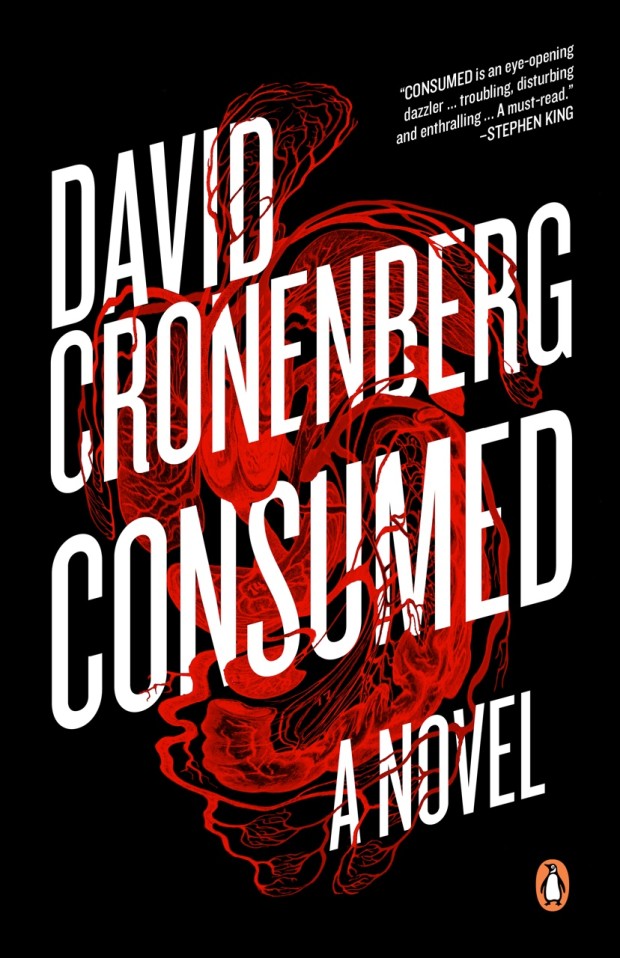
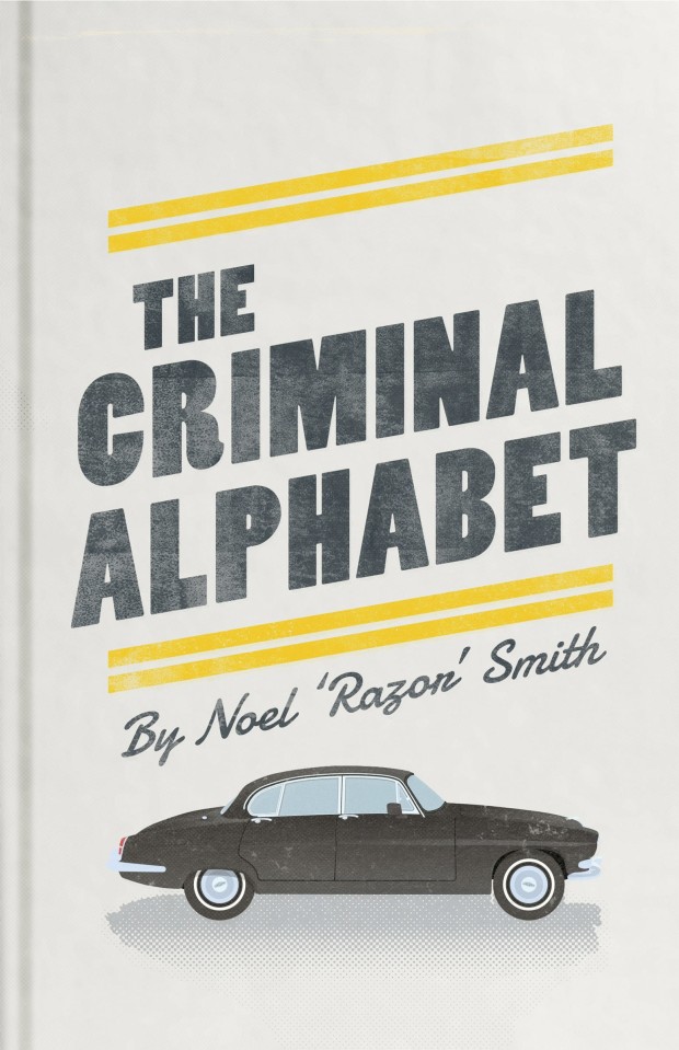
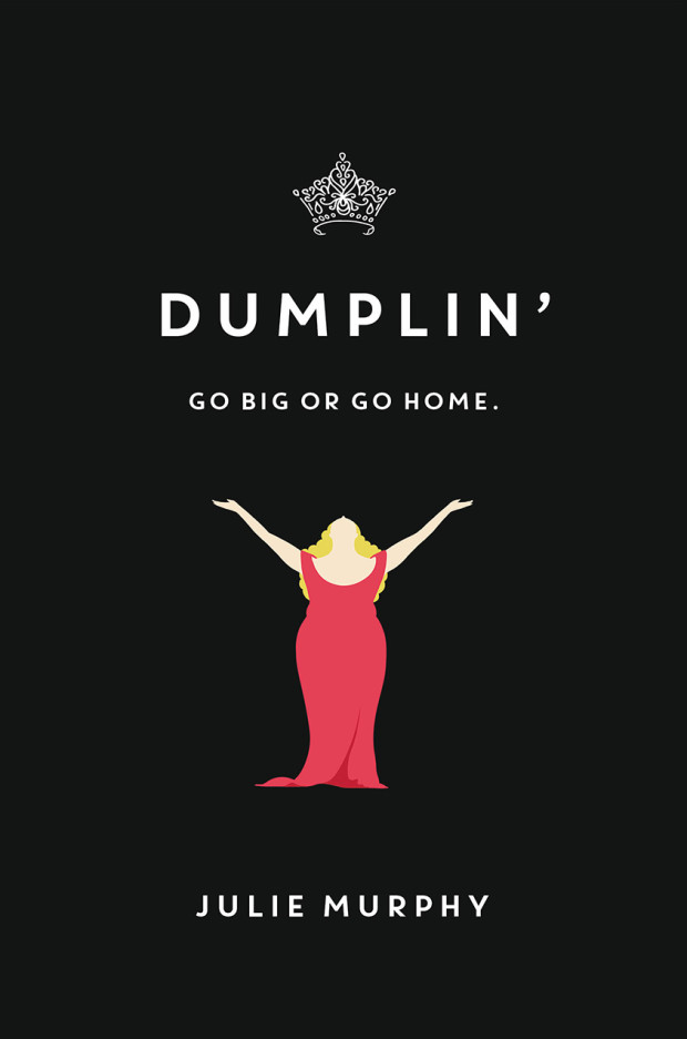
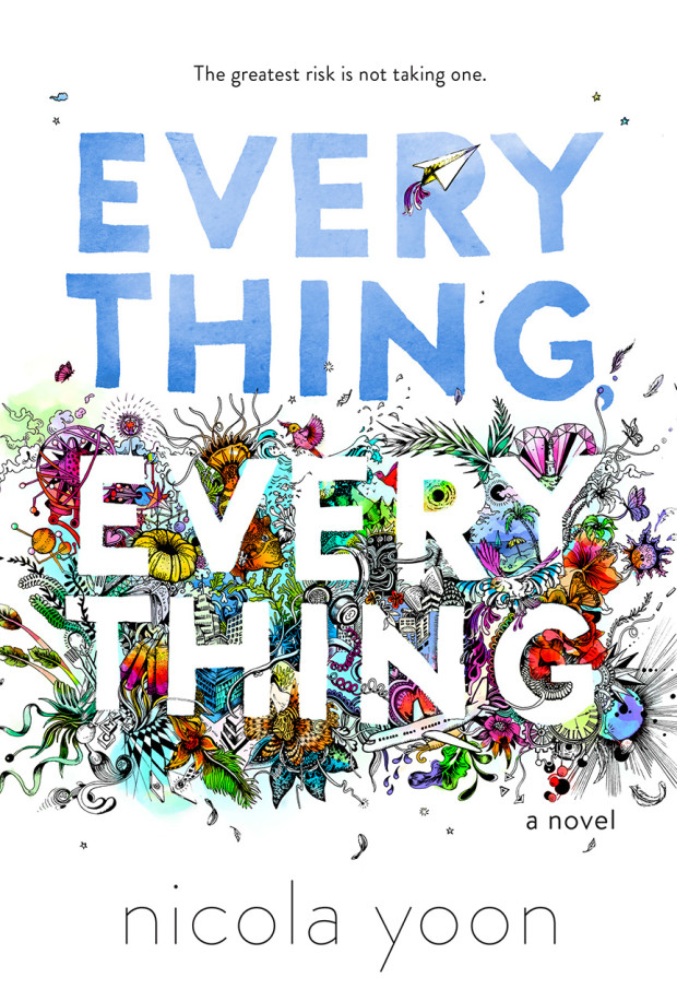
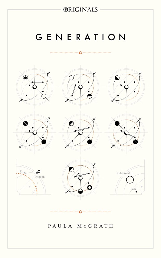
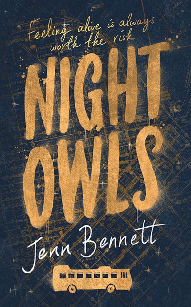
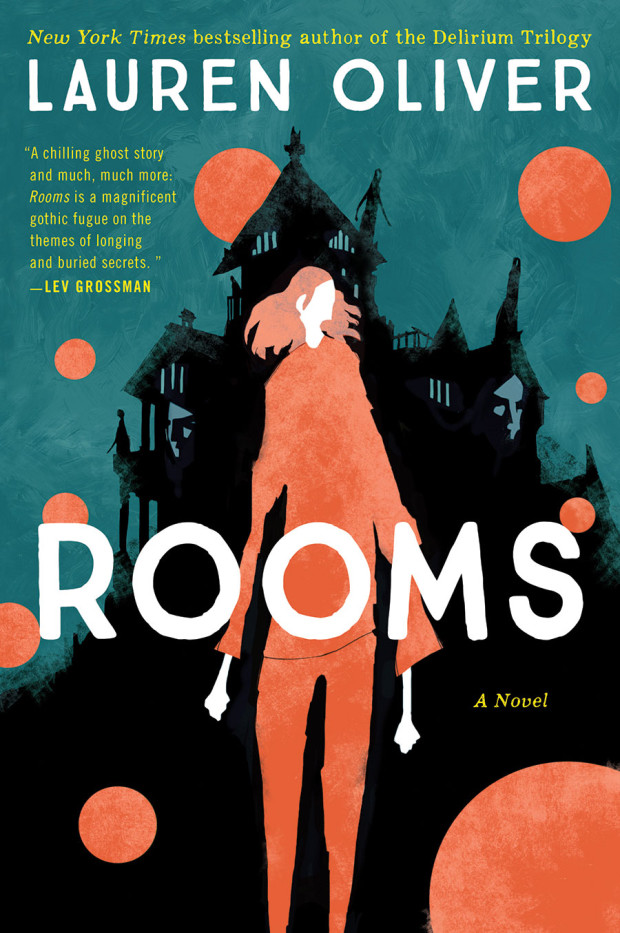
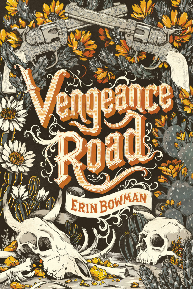
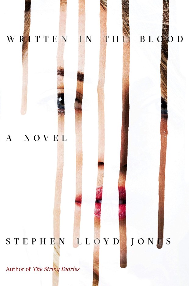
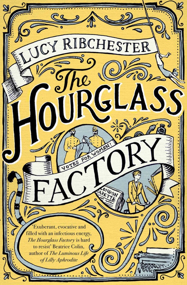
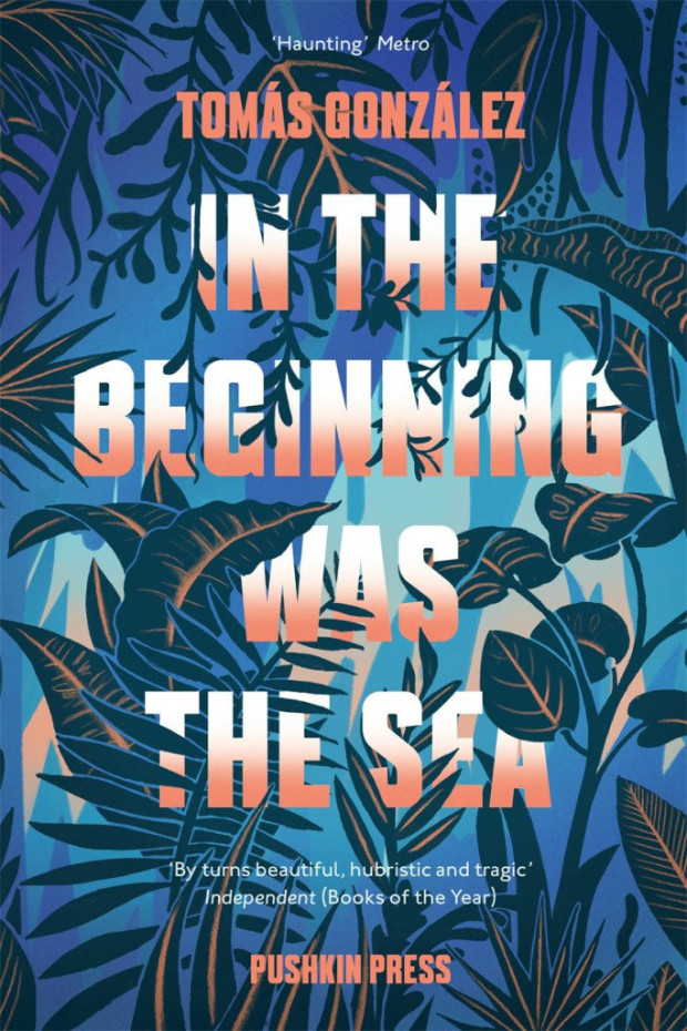
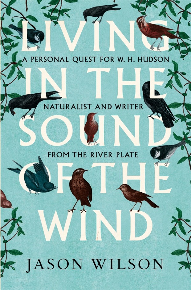
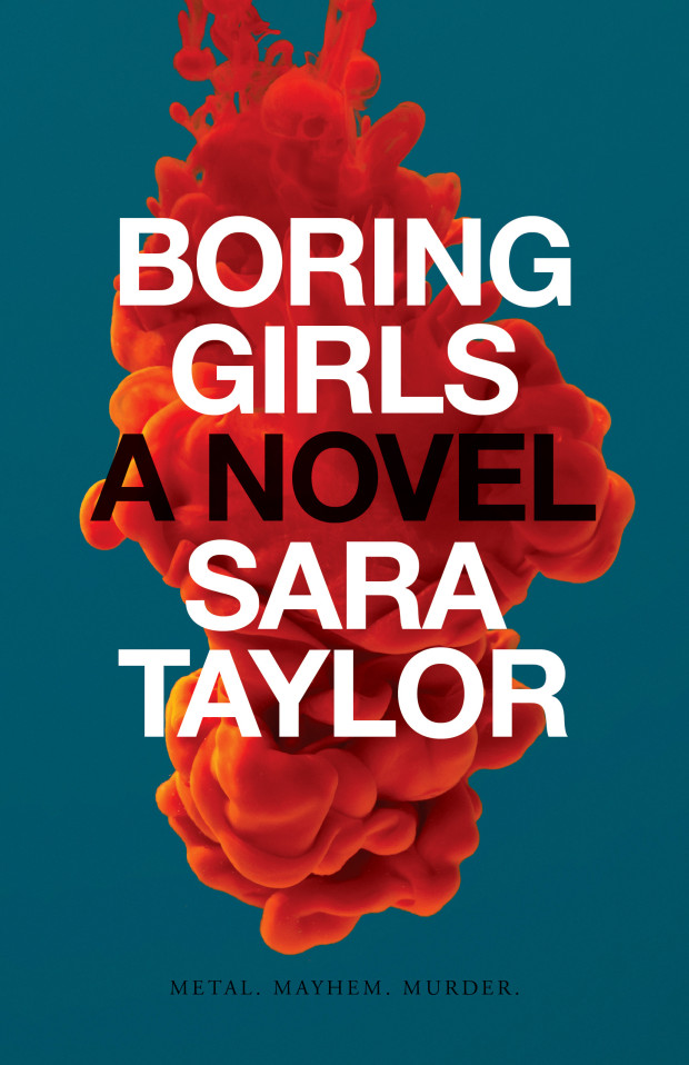
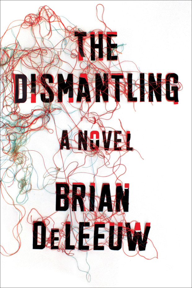
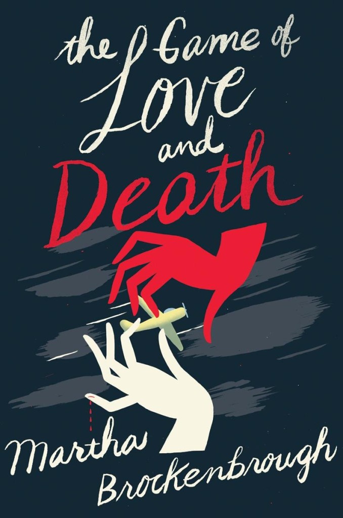
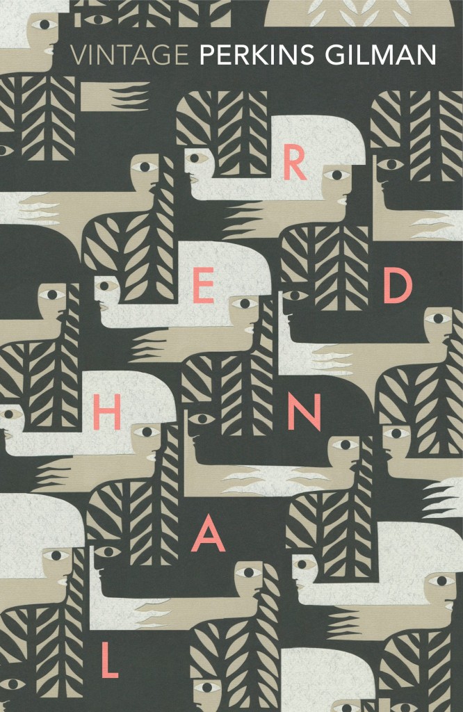
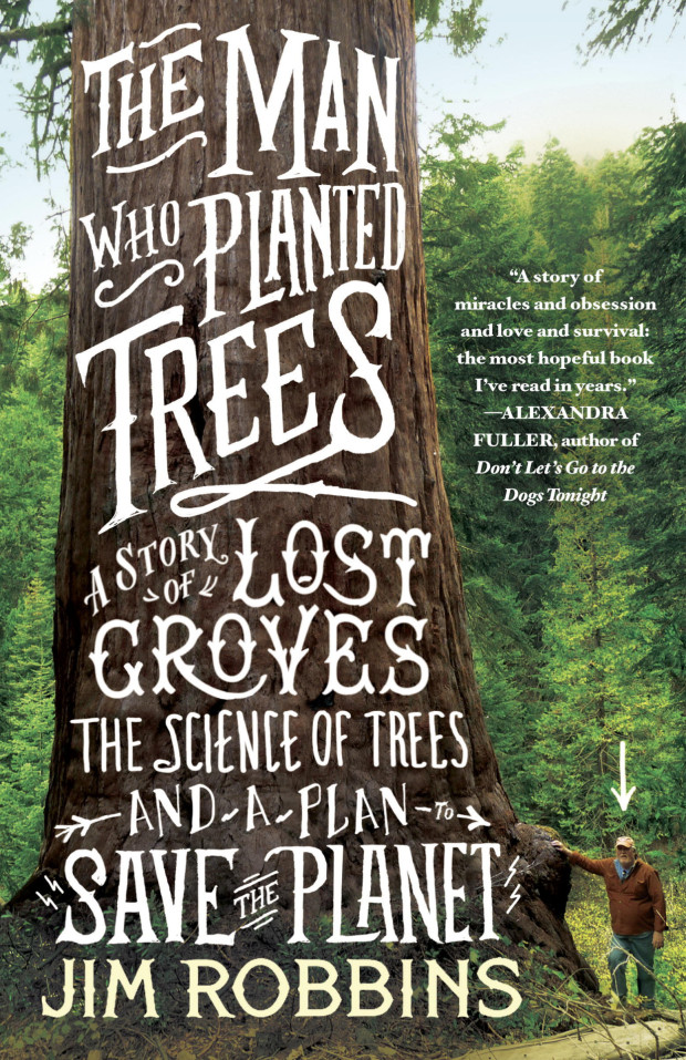
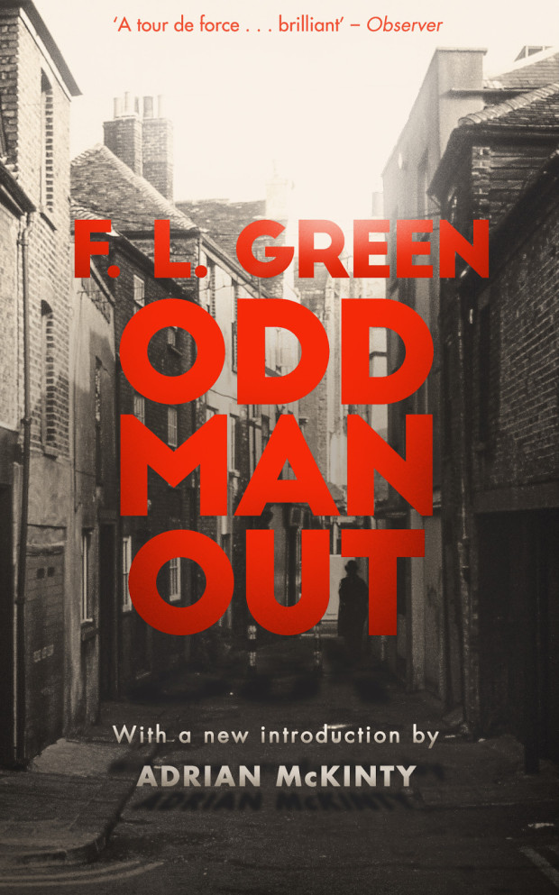
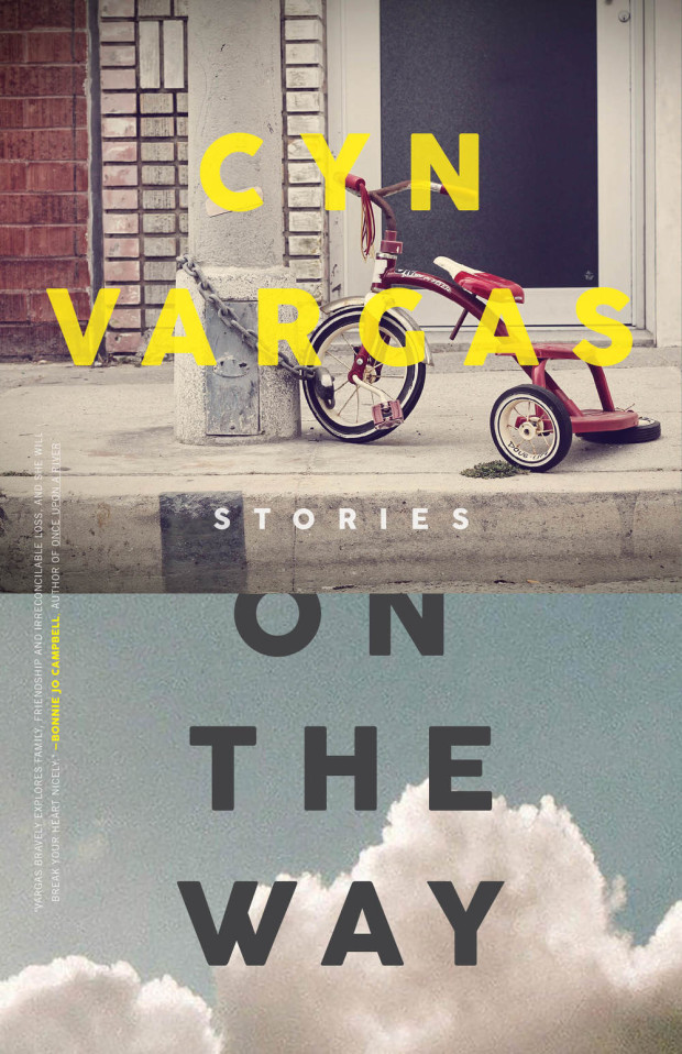
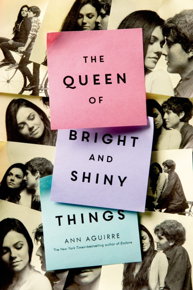
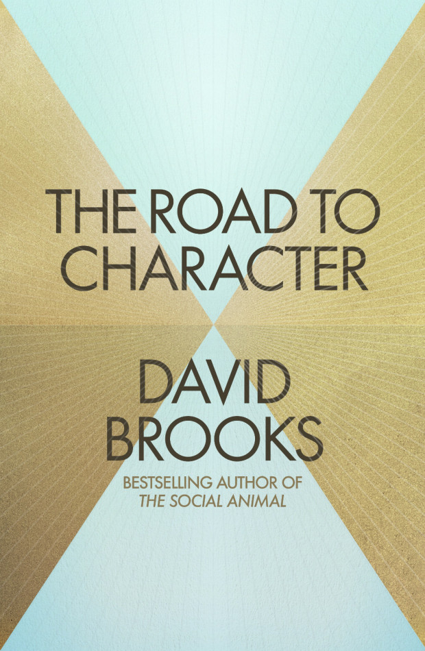
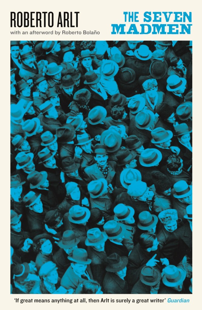
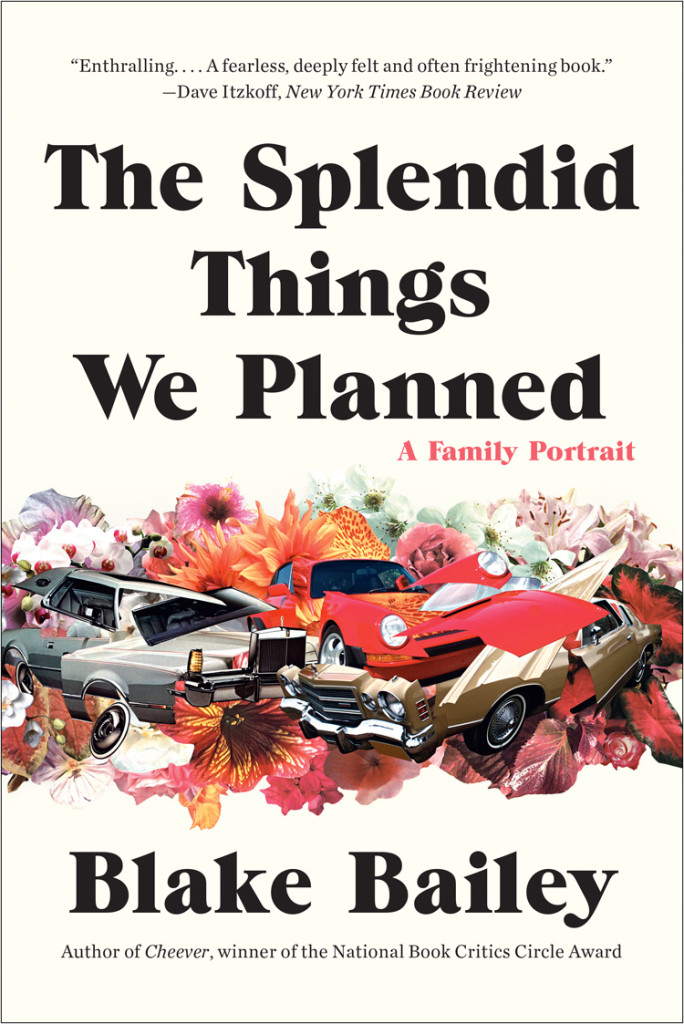
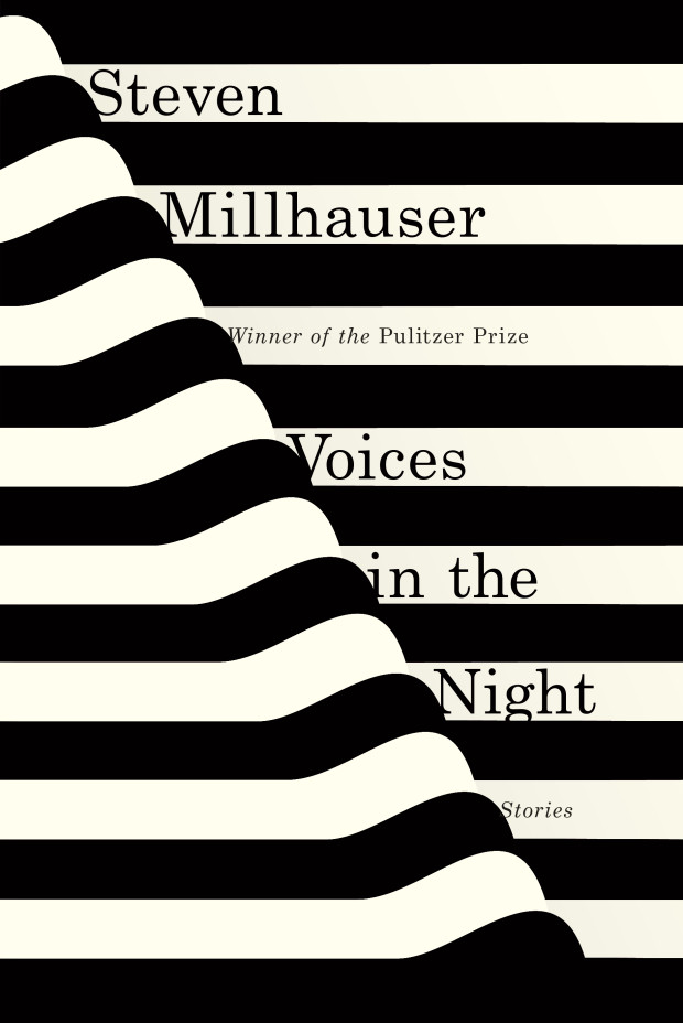
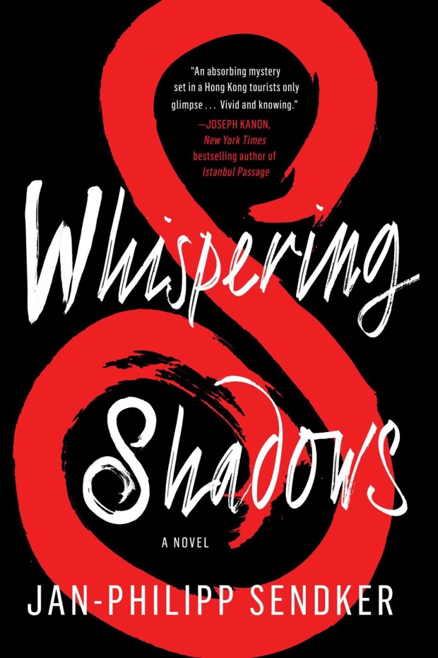
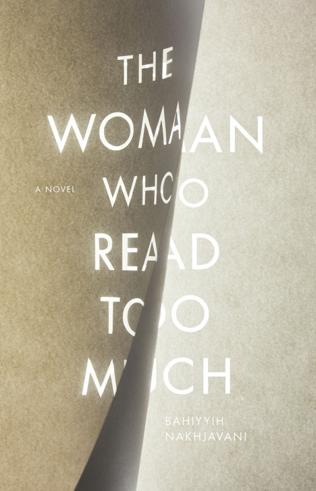
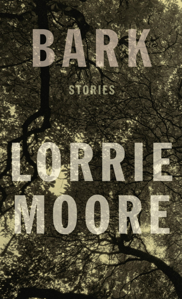
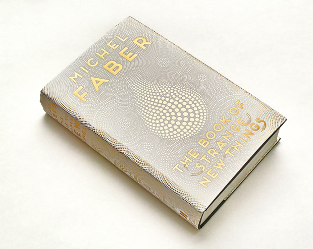
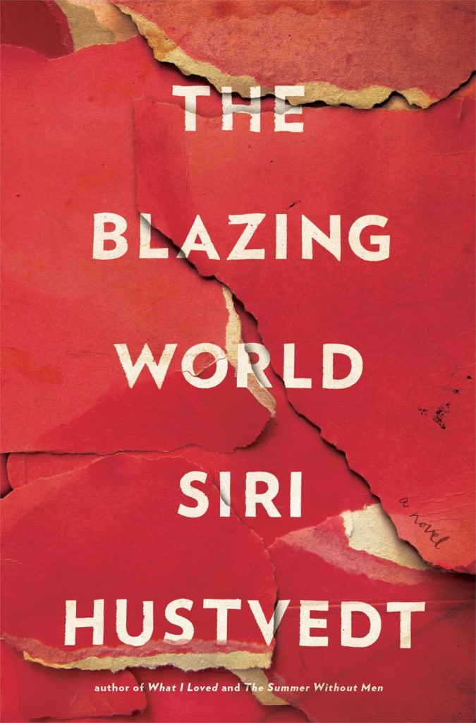
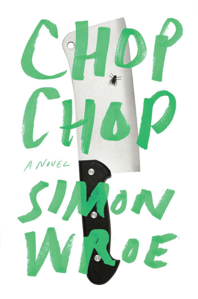
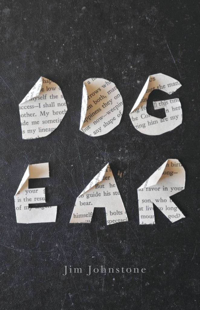
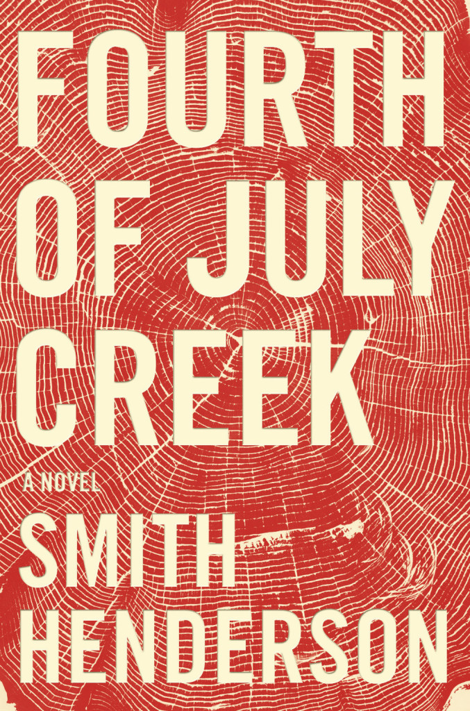
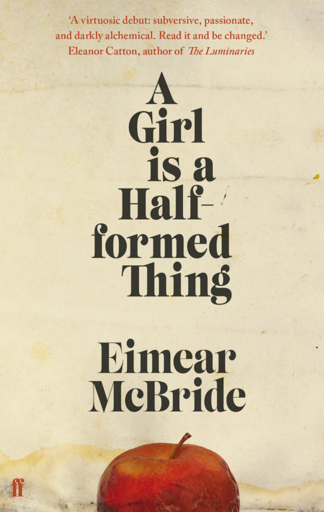
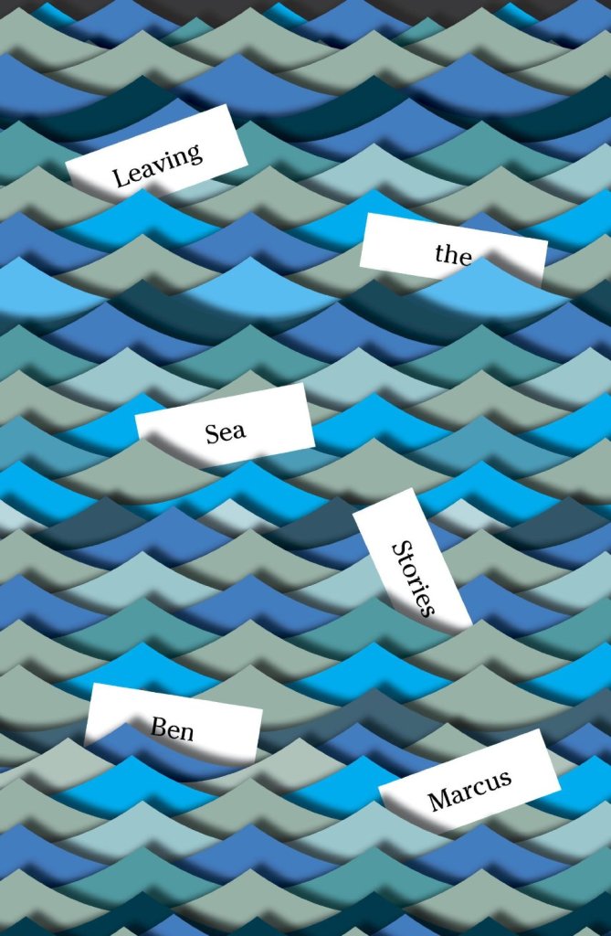
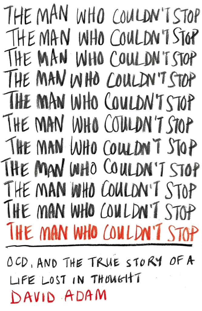
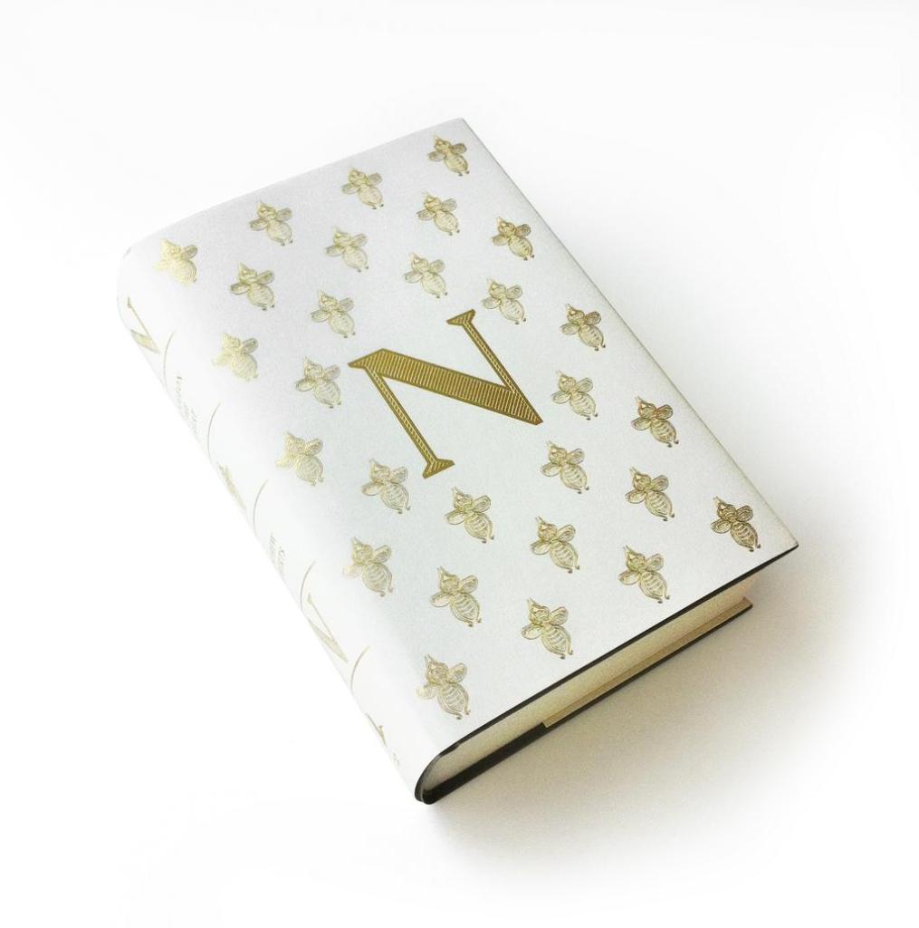
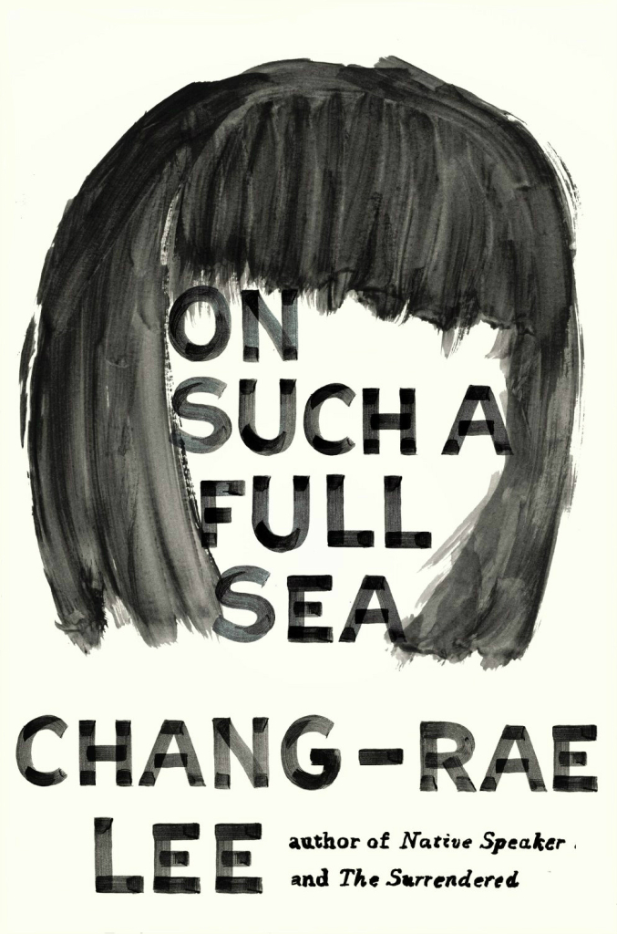
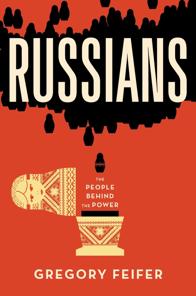
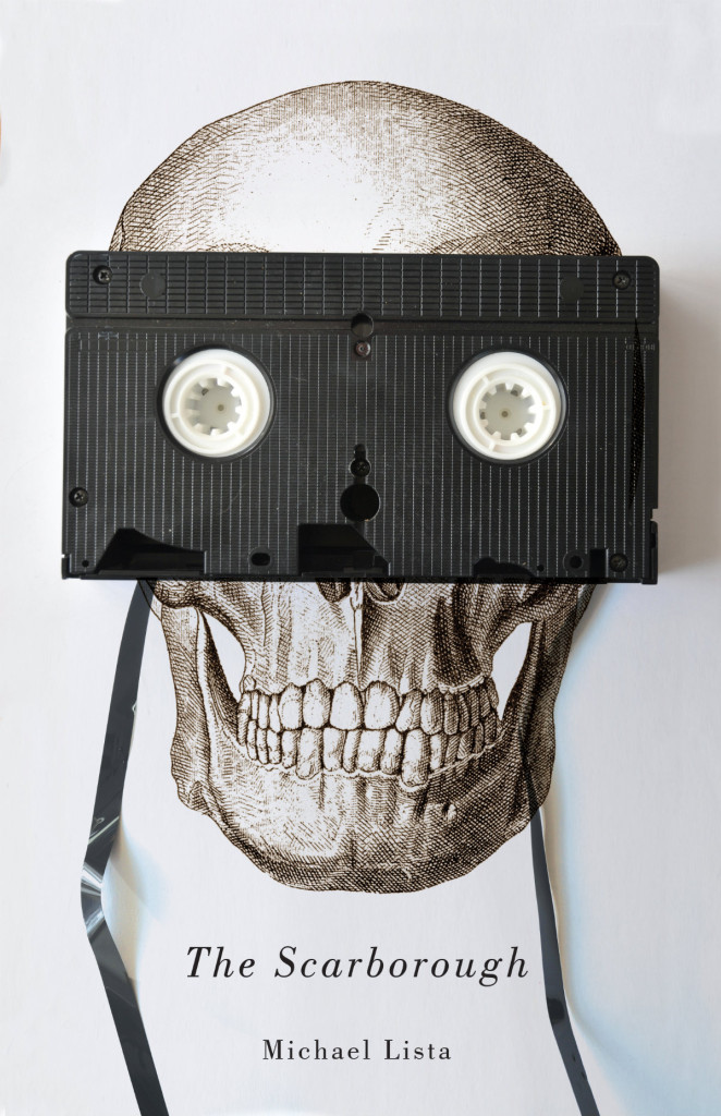
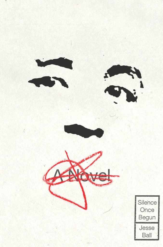
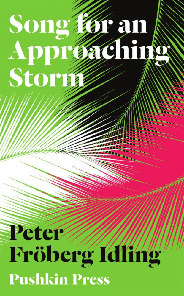
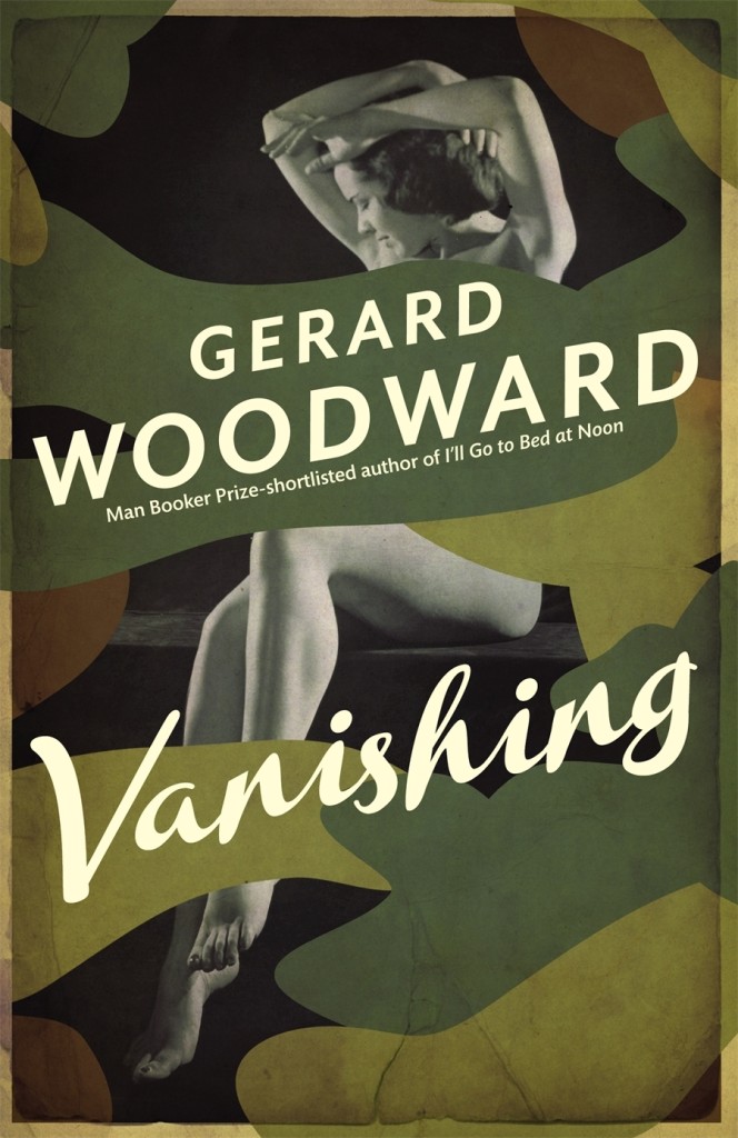
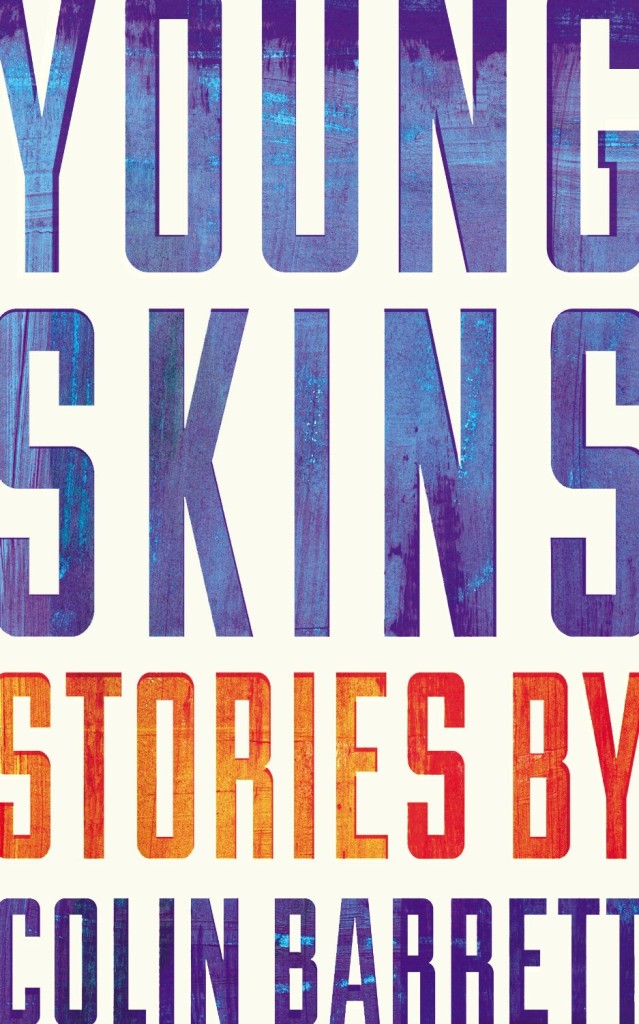
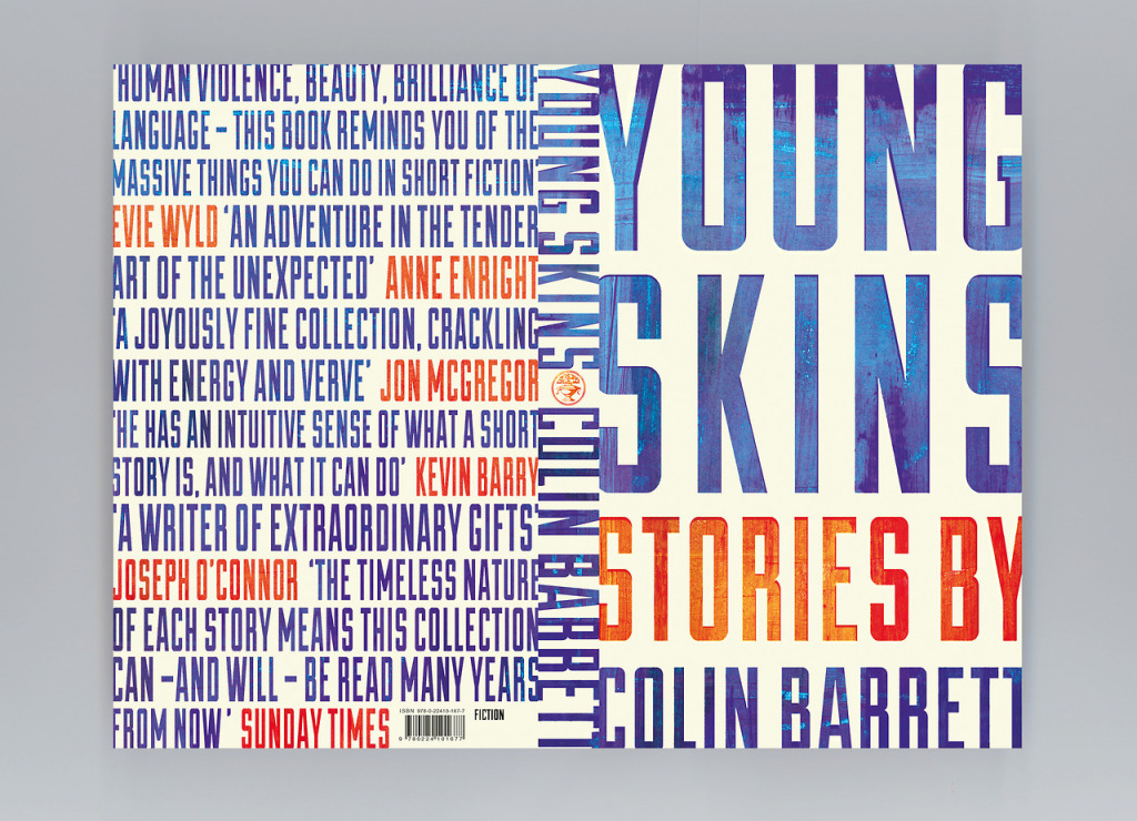
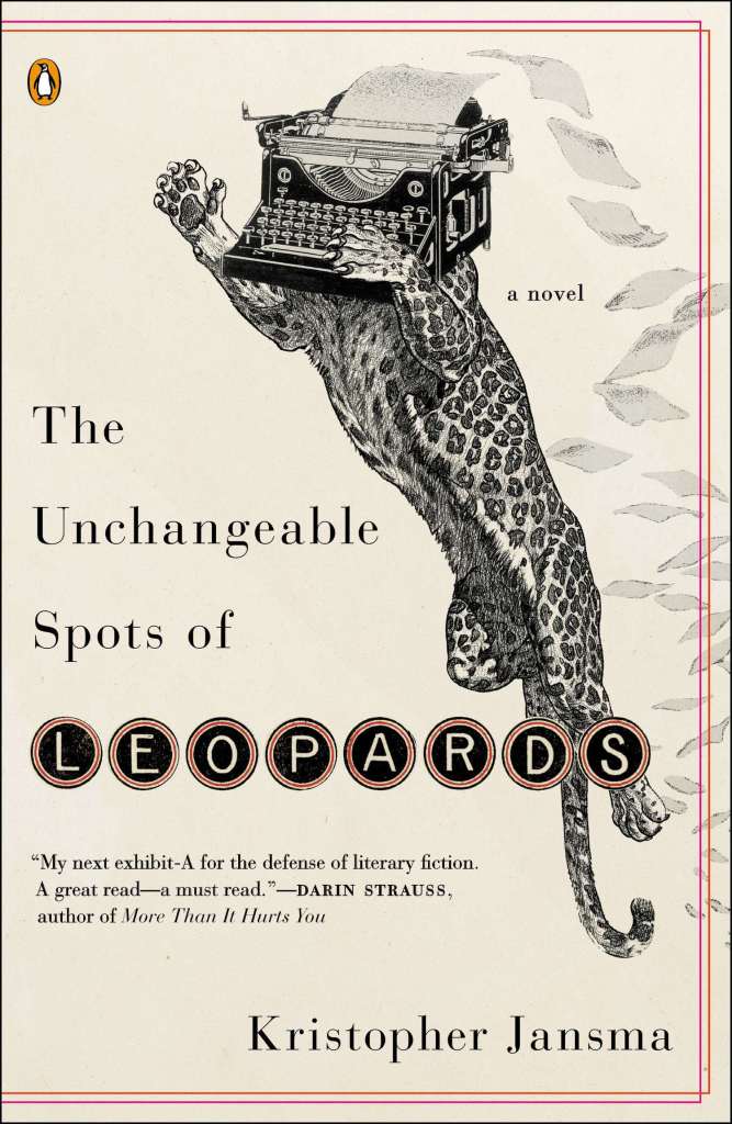
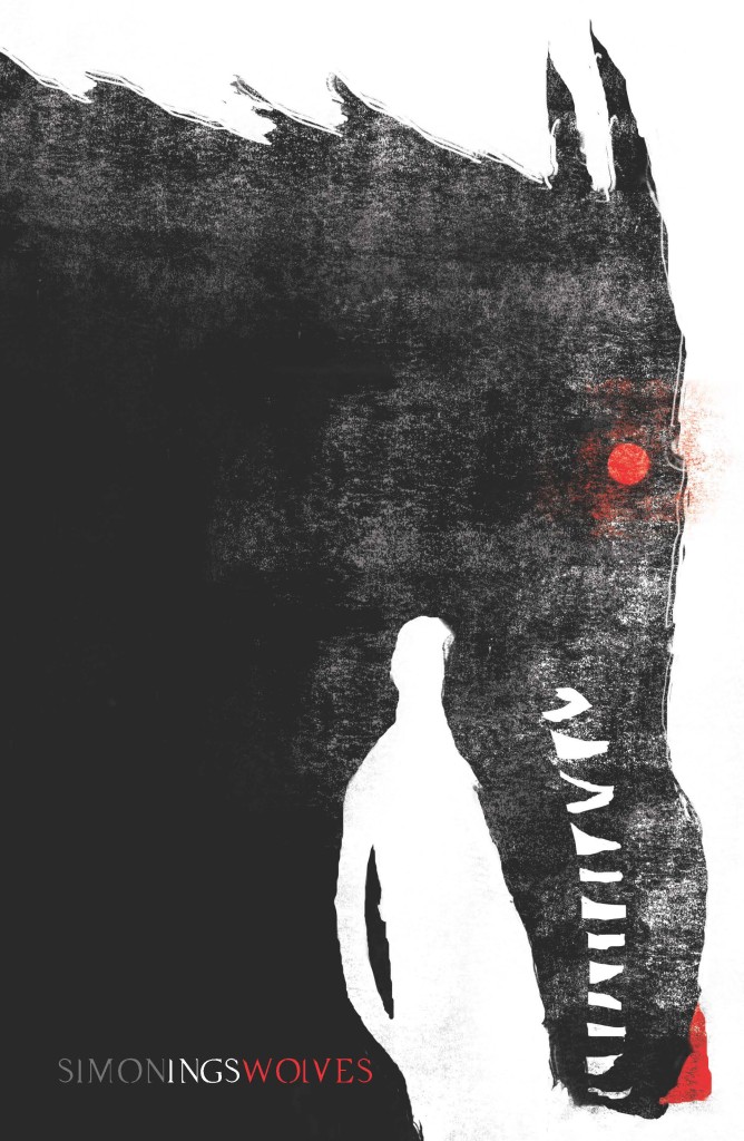
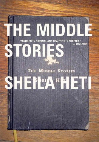
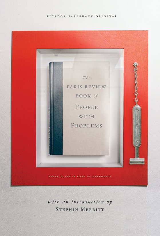
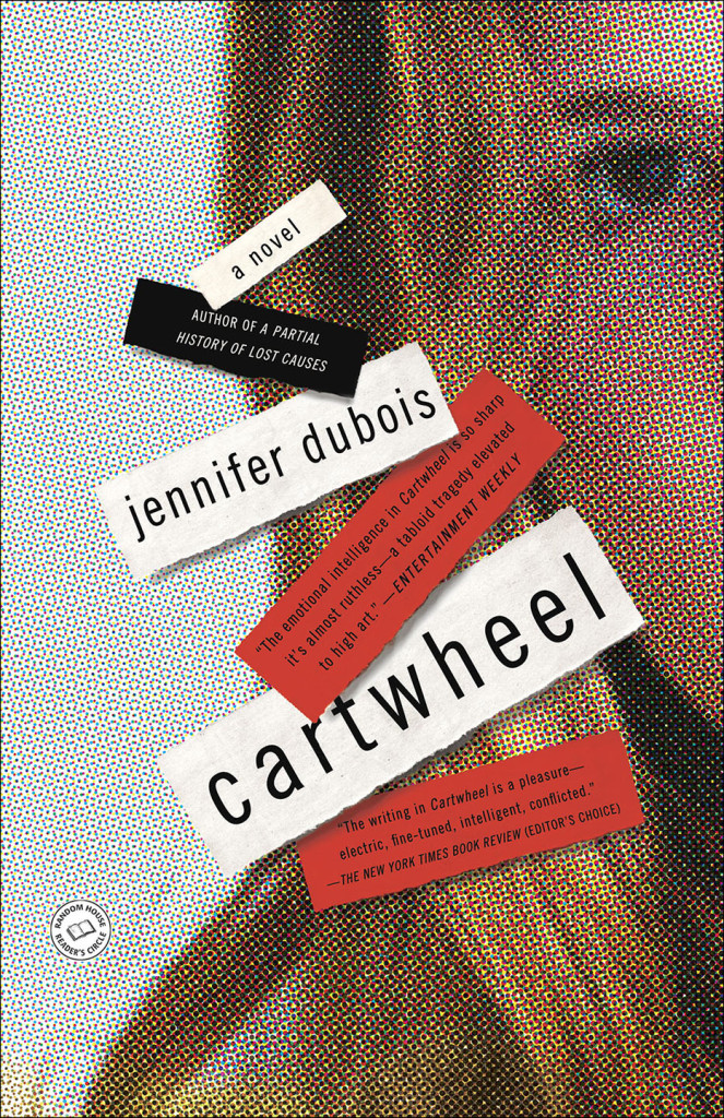
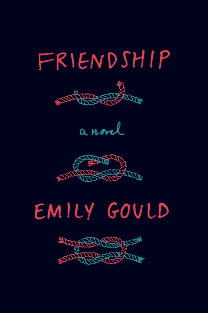
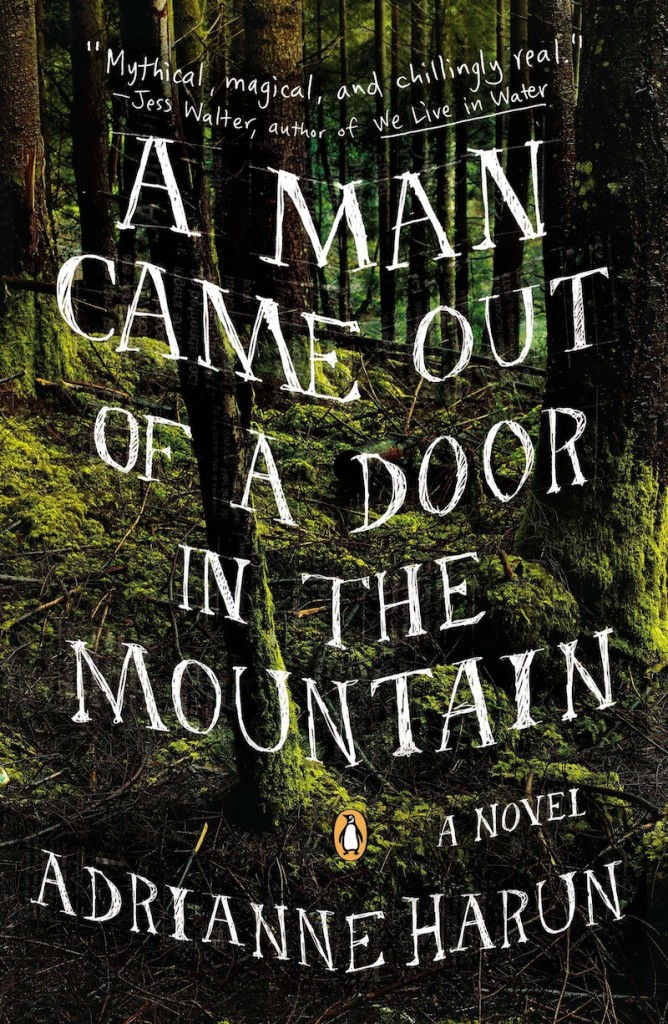
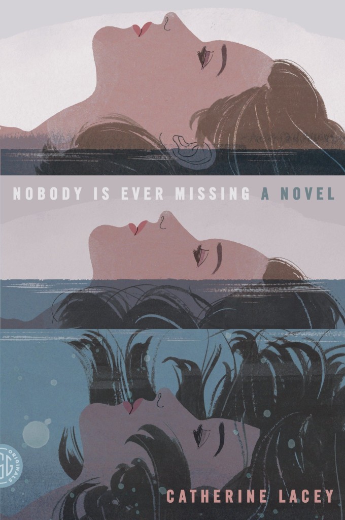
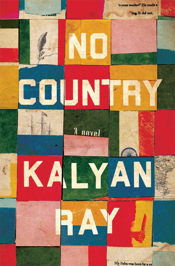
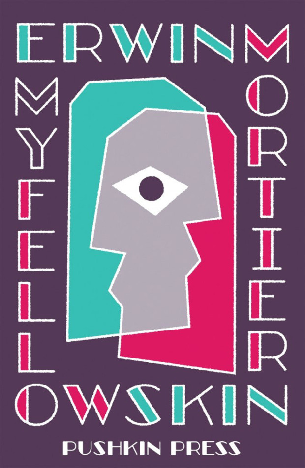
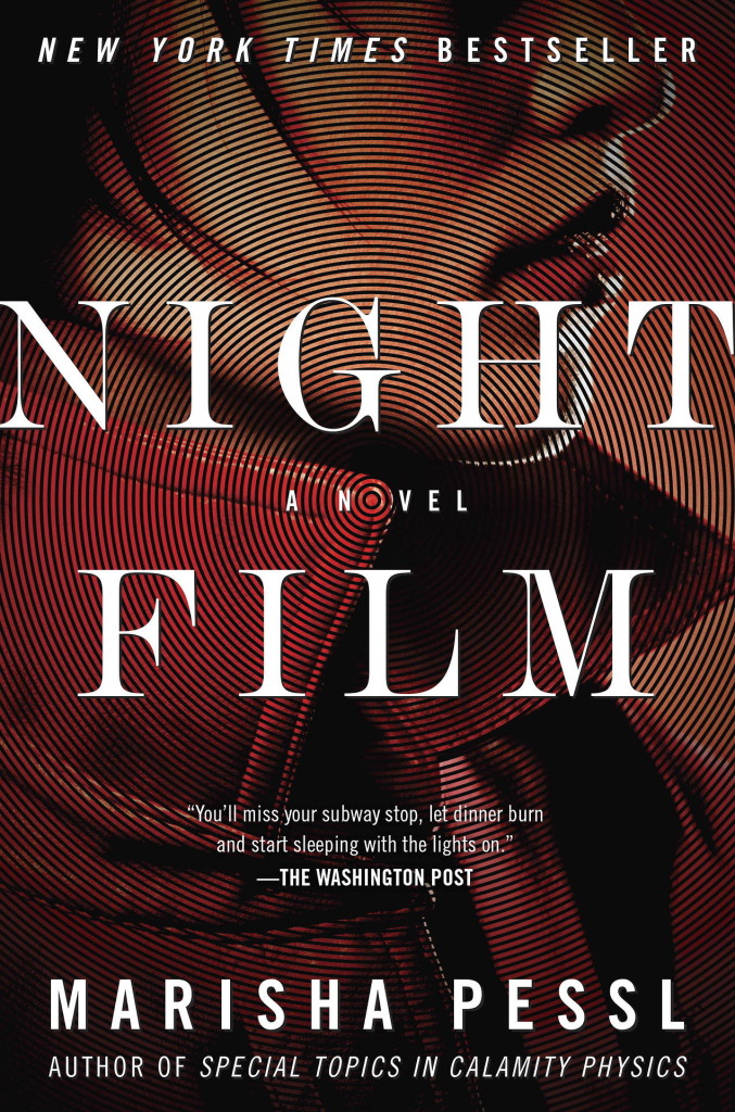
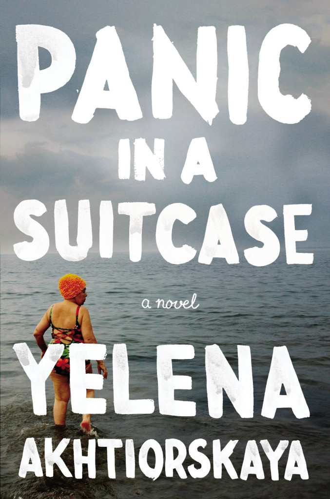
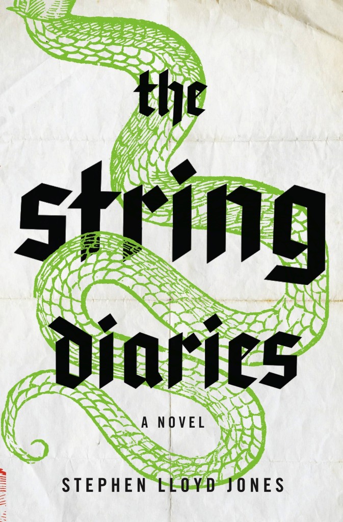
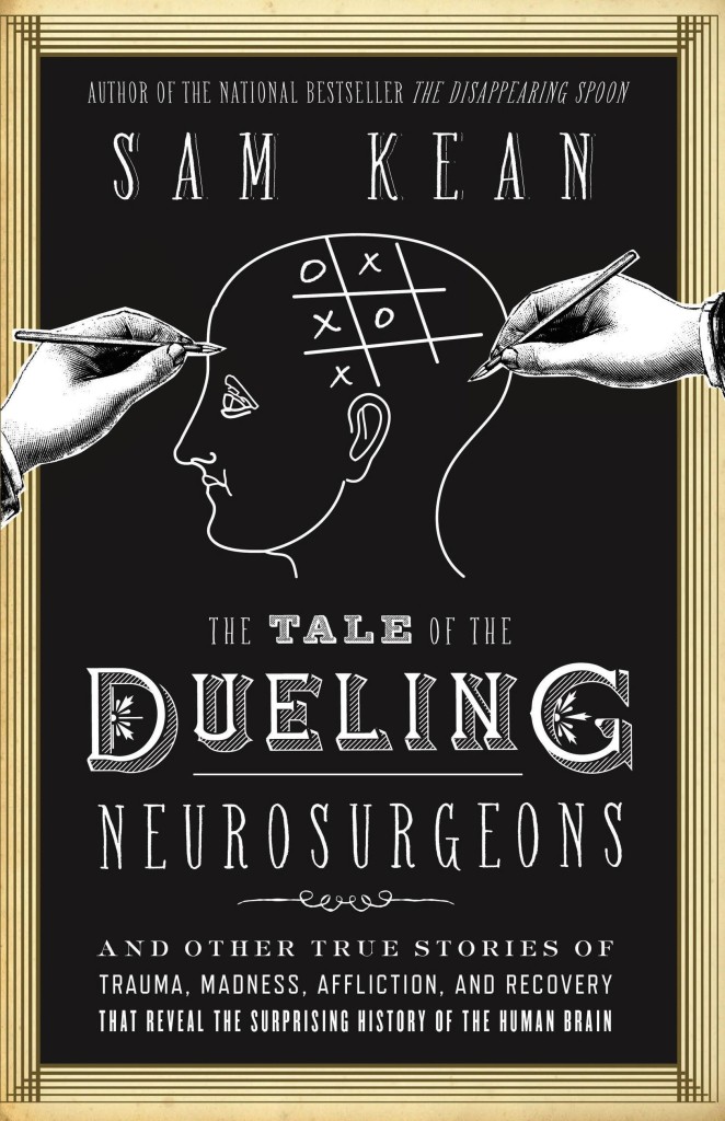
Never mind that still feels like some crazy never-ending winter in Toronto, it’s (allegedly) April so here are a few new and recent covers that have caught my eye in the past month…
American Warlord by Johnny Dwyer; design by Oliver Munday (Knopf / April 2015)
Book designers, you do amazing work. Thank you. I am especially grateful to all the designers and art directors (not to mention publicists and other publishing folk) who have shared their wisdom, provided me with images, and helped me with design credits this year — these posts would not be possible without you. I also want thank my fellow book design bloggers, notably Book Covrs, Booketing, and Caustic Cover Critic, for their sterling work, and my local bookstores, Type, Book City on the Danforth, Ben McNally Books, and Indigo Bay & Bloor, for letting me browse their shelves.
Here are my covers of 2014:
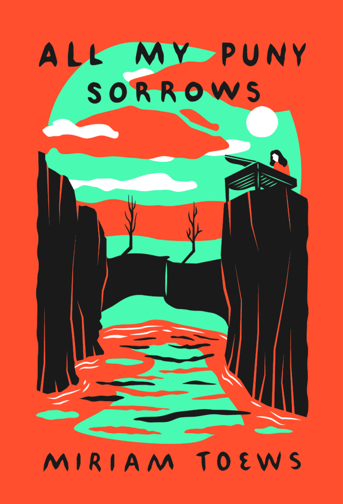
All My Puny Sorrows by Miriam Toews; design by Sunra Thompson (McSweeney’s / November 2014)
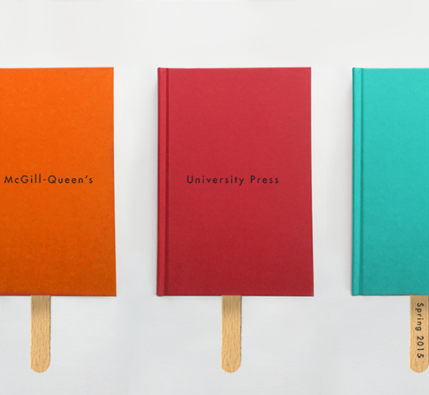
For the past few years, Quill & Quire (magazine to the stars) has asked Canadian books designers choose their favourite covers of the year. This year, however, instead of choosing a book cover like everybody else, David Gee picked out the McGill-Queen’s University Press Spring 2015 catalogue designed by David Drummond.
After laughing pretty hard at Mr. Gee’s audacity (and his transparent attempts to never work in this town again), I realised I would love to do a post on great catalogue covers.
Print catalogues can be beautiful things, and as David Gee himself points out, “the simple fact that publishers’ catalogues tend to fly under the public radar doesn’t mean they’re easy to design.” They’re are also an endangered species. Publishers are cutting costs, and most are switching to digital alternatives. Now would seem like the perfect time to celebrate the charm of the print catalogue before it disappears completely.
I don’t usually ask for submissions, but I don’t think I can possibly gather enough material together for this by myself. So if you’ve ever toiled thanklessly over a publisher catalogue and you’d like to see a little appreciation for your hard work, send me an email (hello [at] casualoptimist . com] with your favourite catalogue covers (and interiors if you wish), and I’ll showcase all my favourites in the New Year. The images should be hi-res jpegs or pngs (at least 620px wide), and please be sure to include the publisher information, and all the relevant credits.
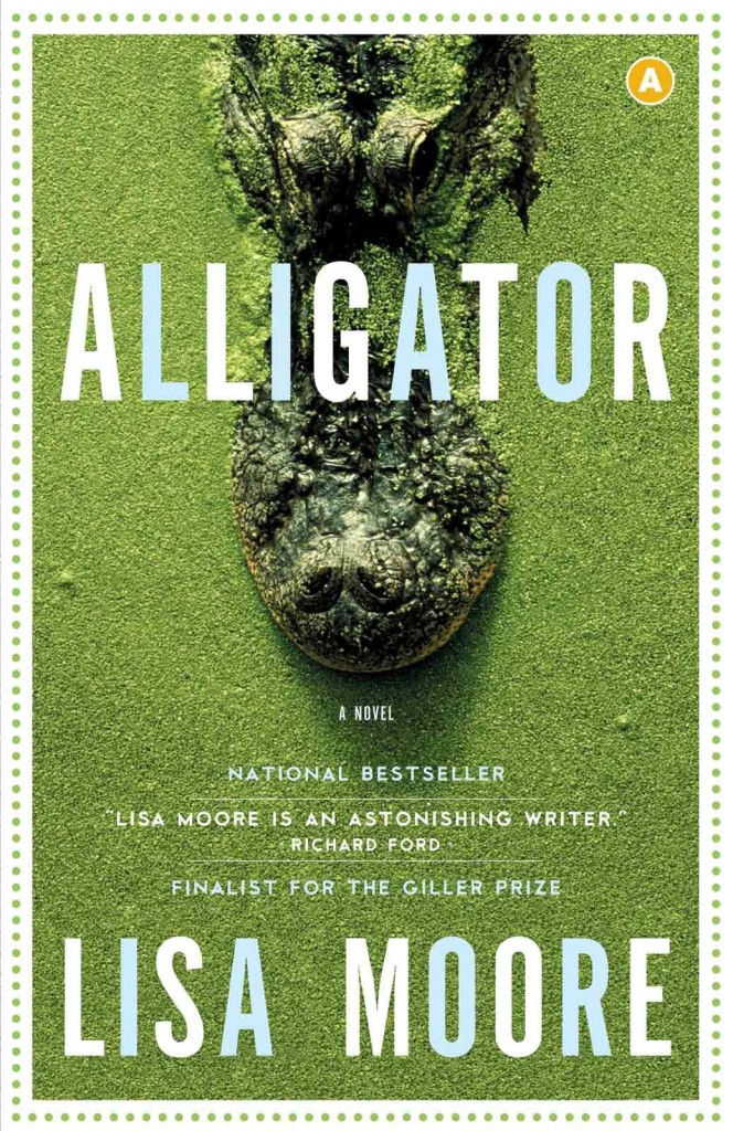
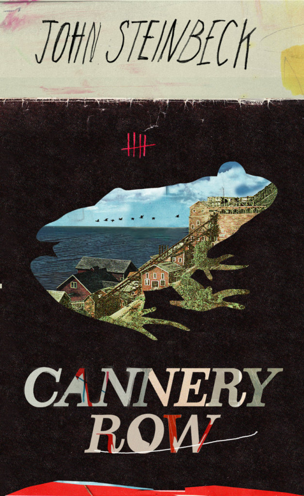
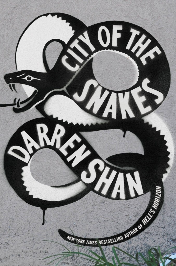
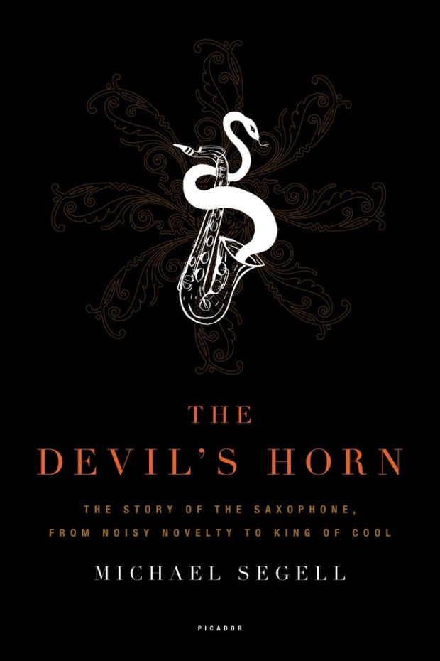
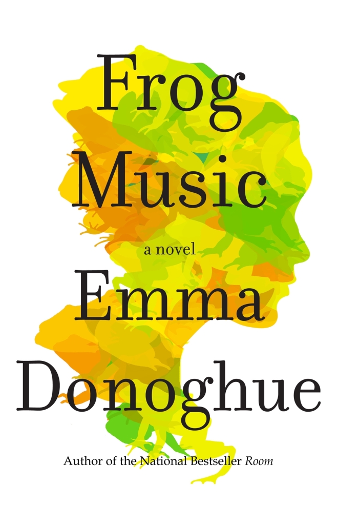
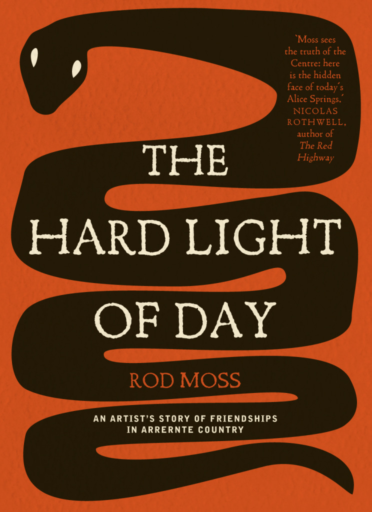
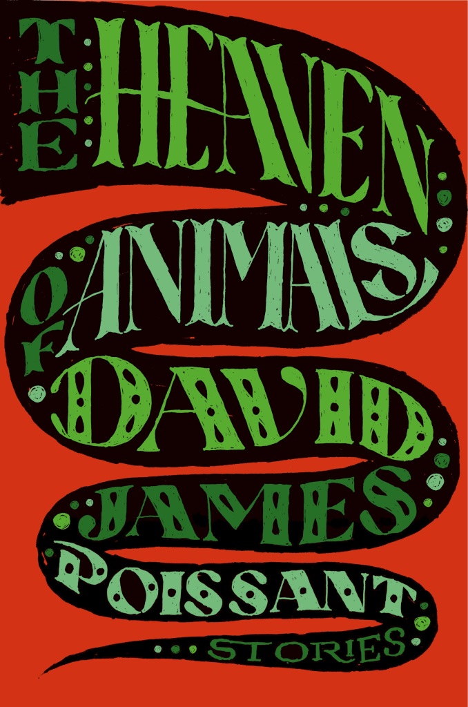
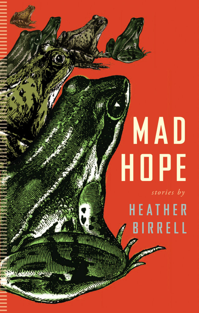
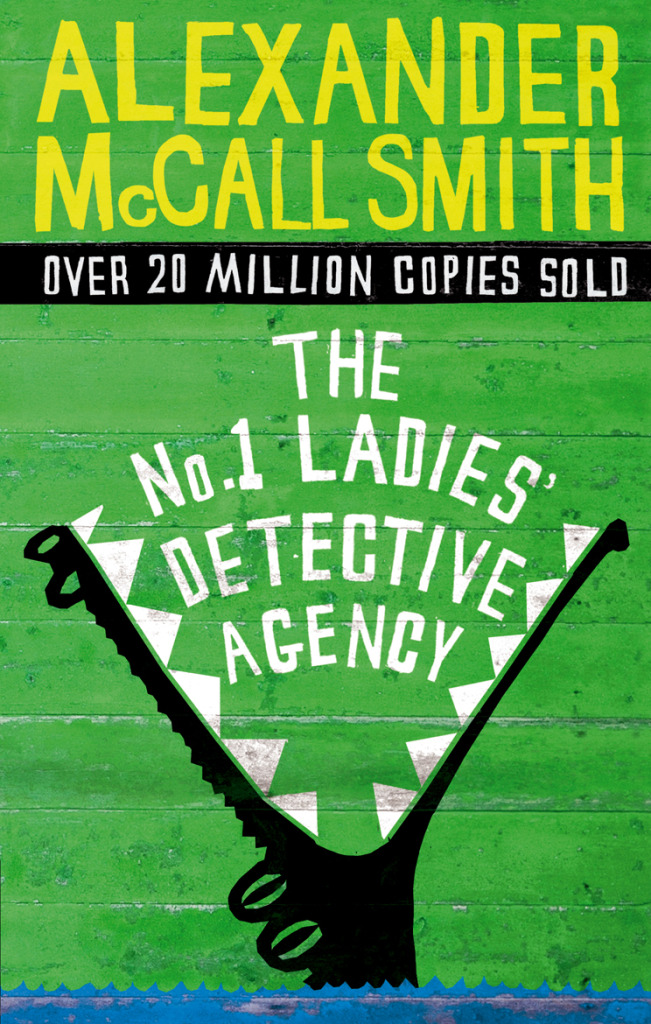
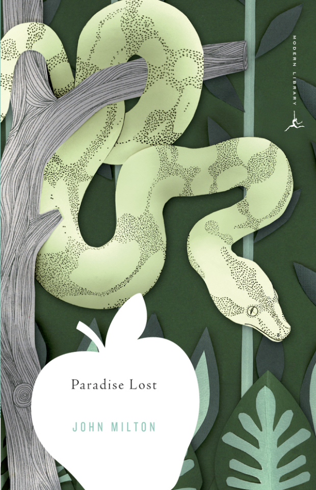
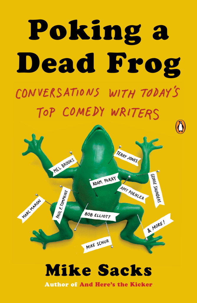
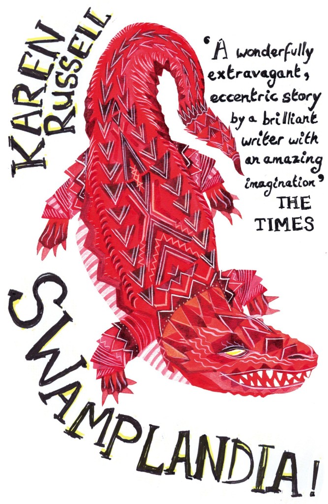
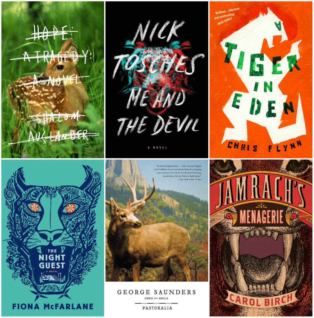
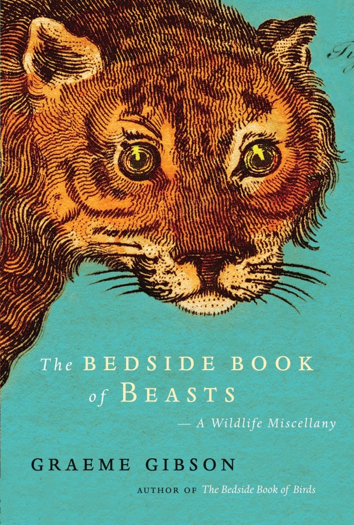
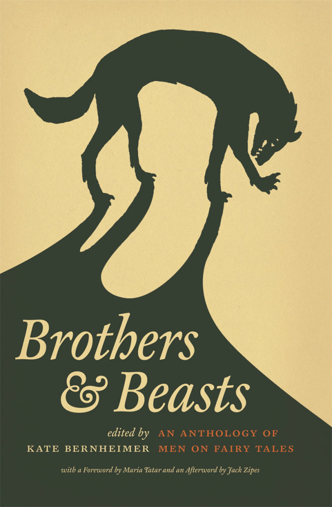
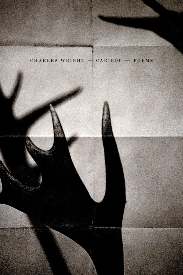
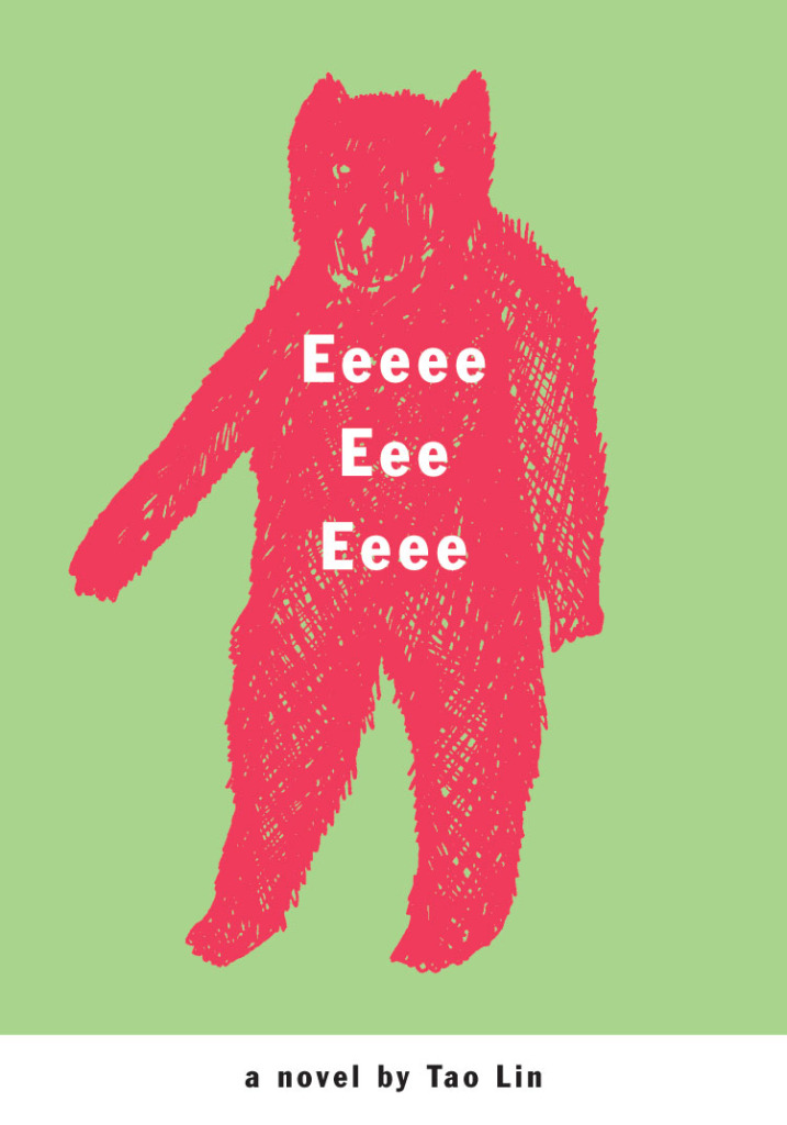
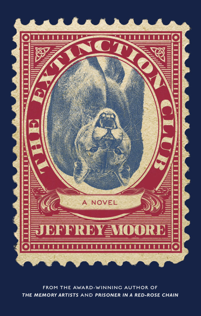
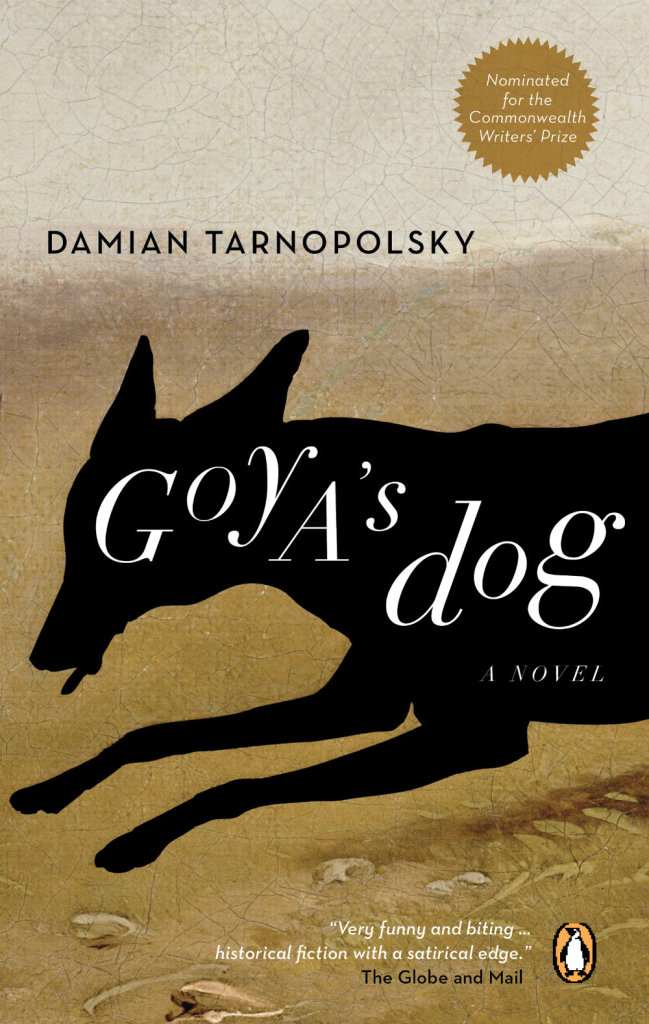
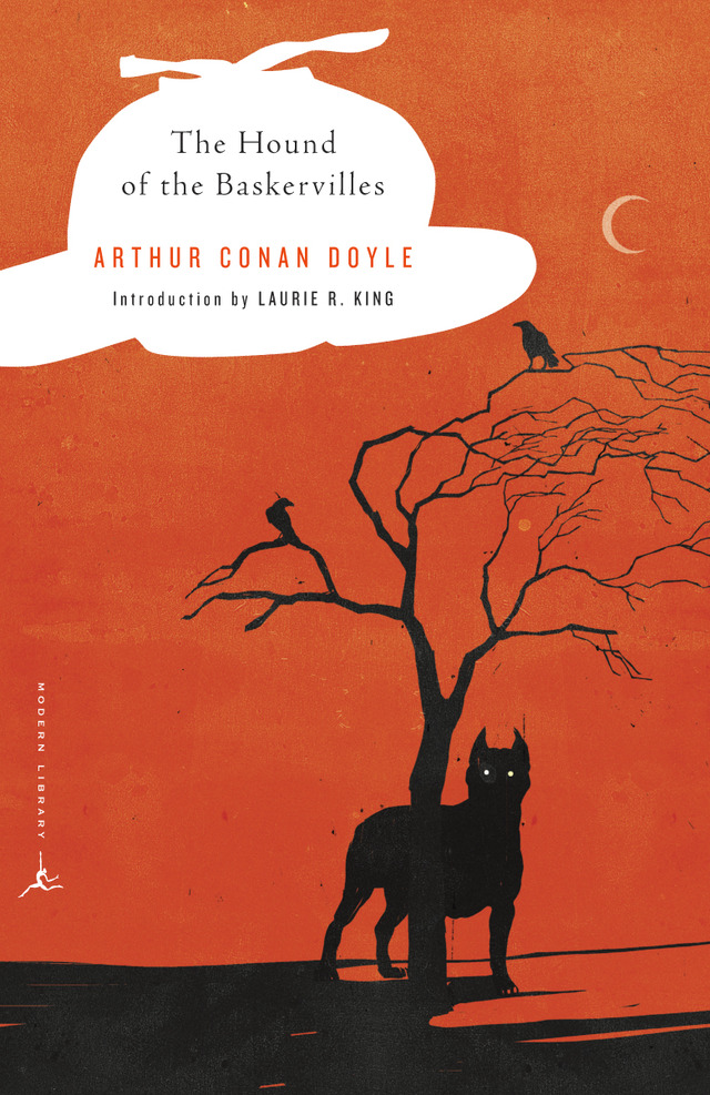
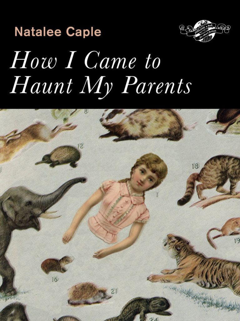
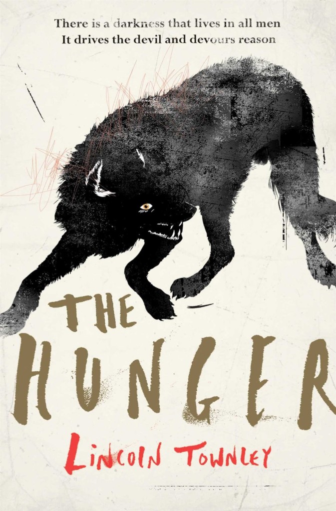
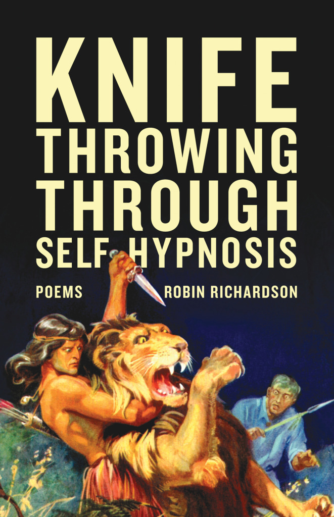
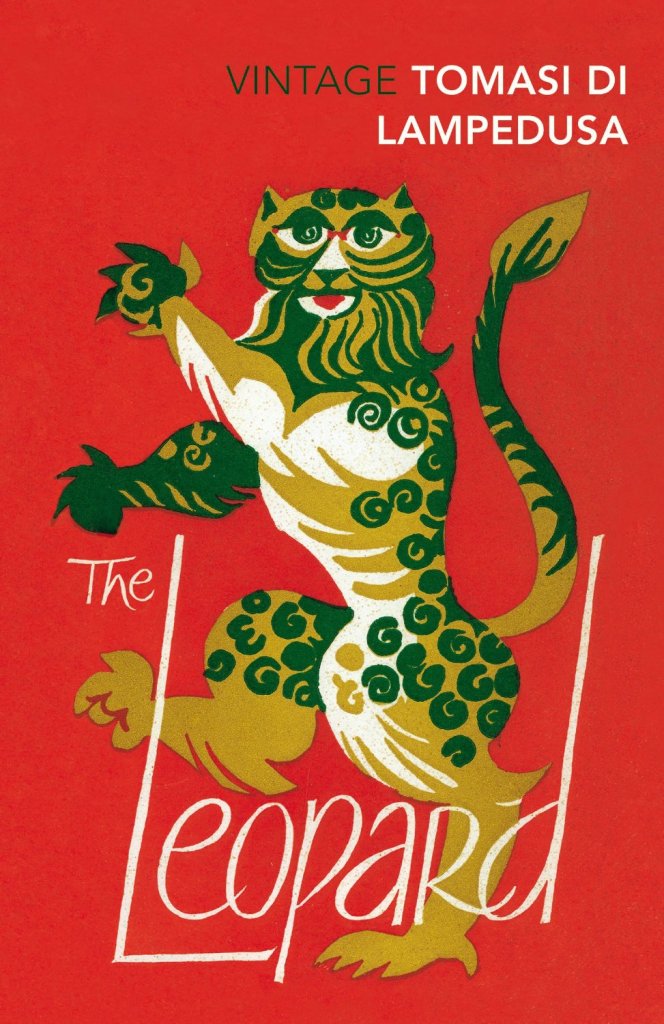
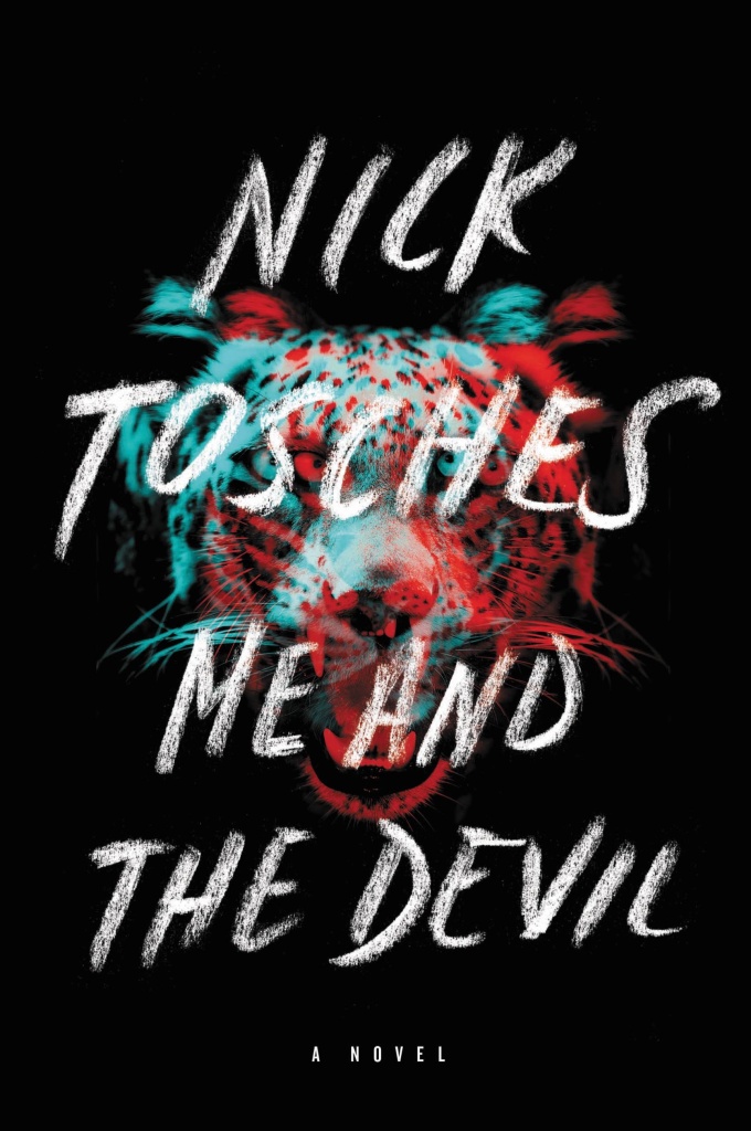
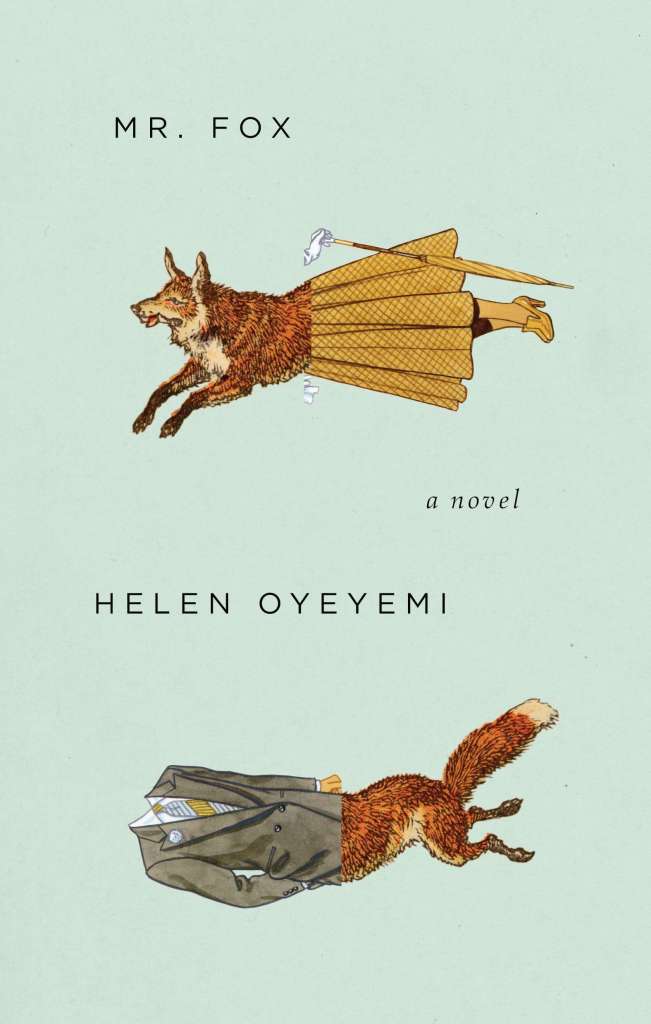
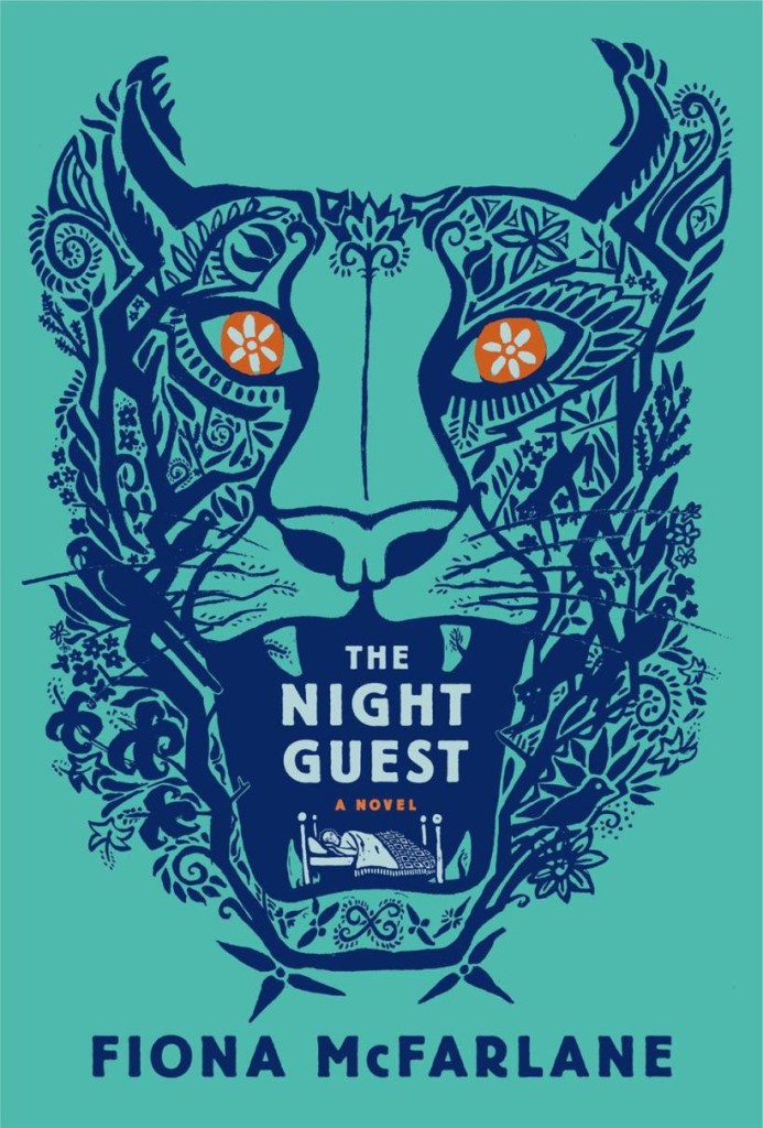
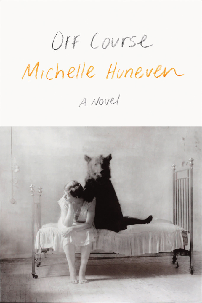
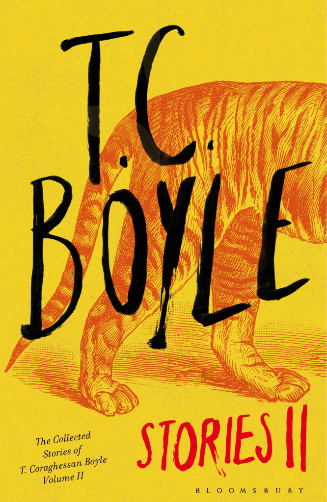
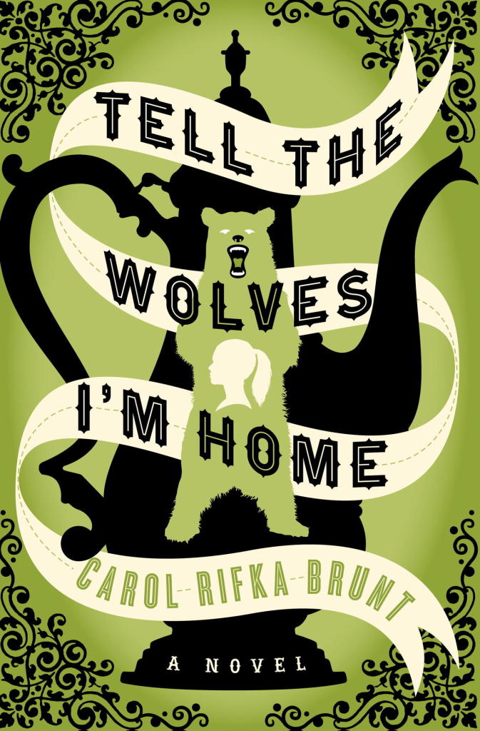
Lions and tigers and bears! Oh my! I’m kicking off a new series today on animal book covers. The first post is on ‘beasts’ — mostly ‘wild’ beasts, but one or two more domesticated (and dead) animals may have nosed their way in. Other posts series will look at birds, bugs, reptiles and amphibians, and quite possibly sea creatures and farm animals (unless someone pays me a large amount of money to stop before that). Thanks to all the designers, ADs, publicists and others who have been helping me with images and credits. If you notice that some information about a cover is missing, please let me know.
It used to be enough for a book to idly stand out in a bookstore. Nowadays, however, new books must jostle for attention with everything. Thousands of distractions are just a click away. Is it any wonder that book-cover design is more important than ever?
In today’s Globe and Mail, I talks about recent trends in book cover design and pick a few of my favourite covers from the year so far. If you live in Canada you can find a lovely-looking print version of the article in the Arts pages.
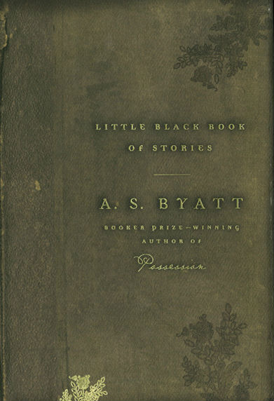
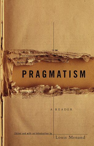
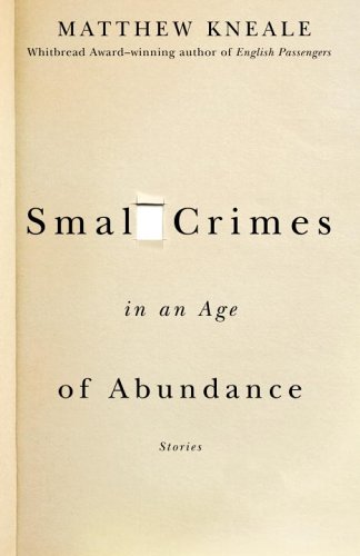
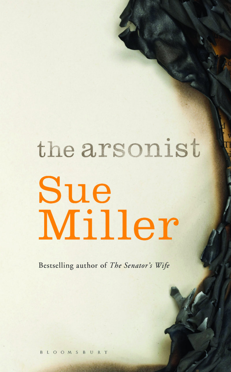
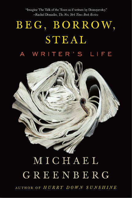
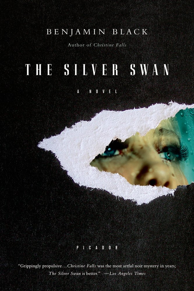
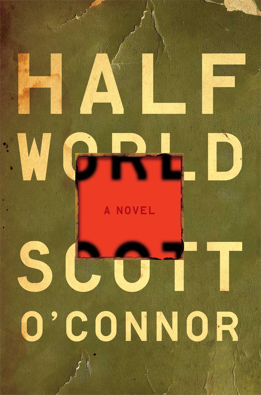
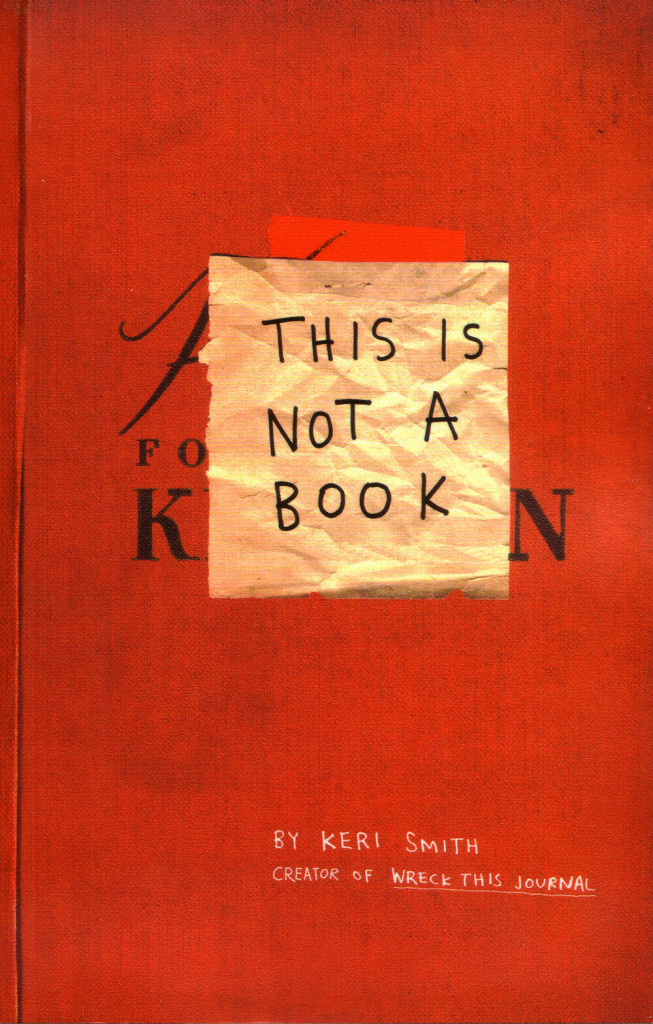
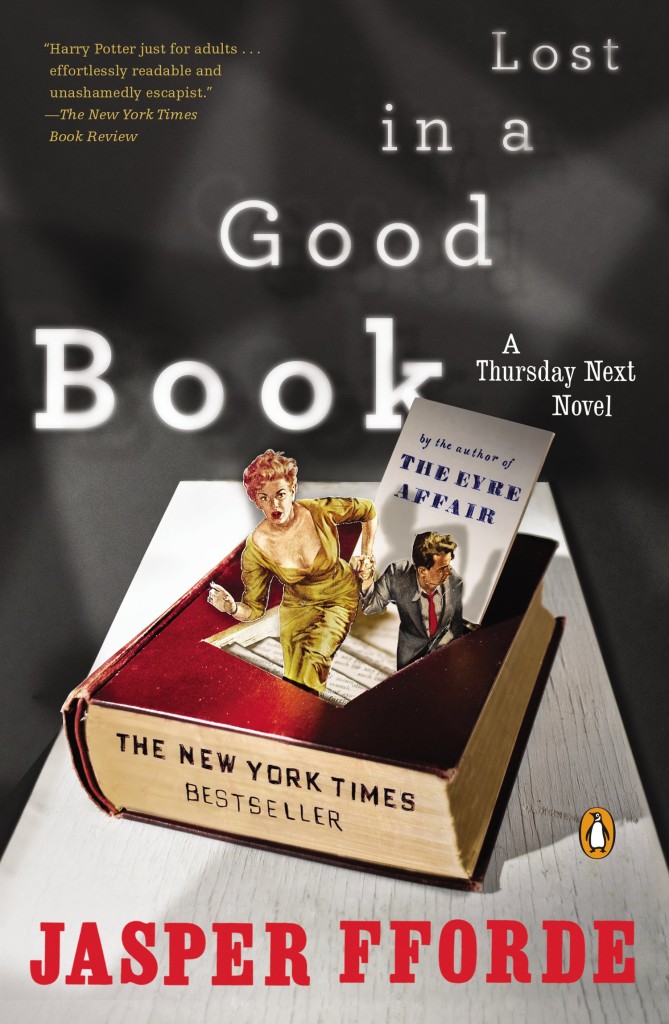
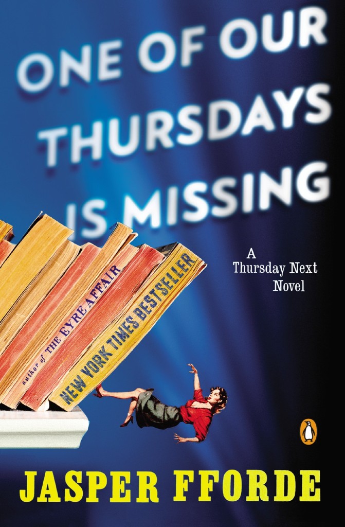
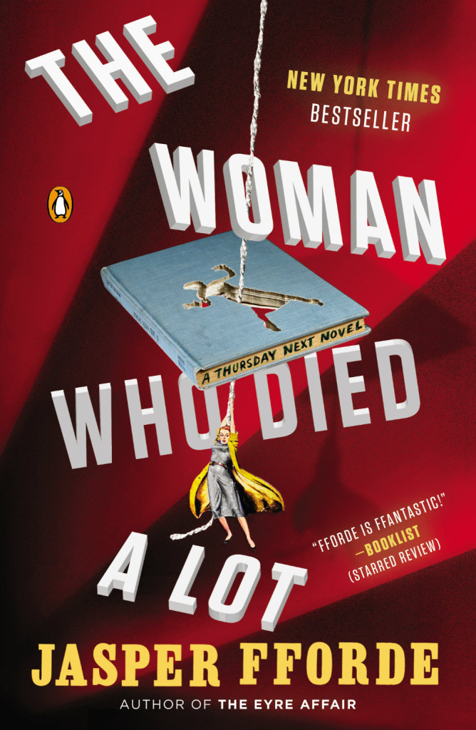
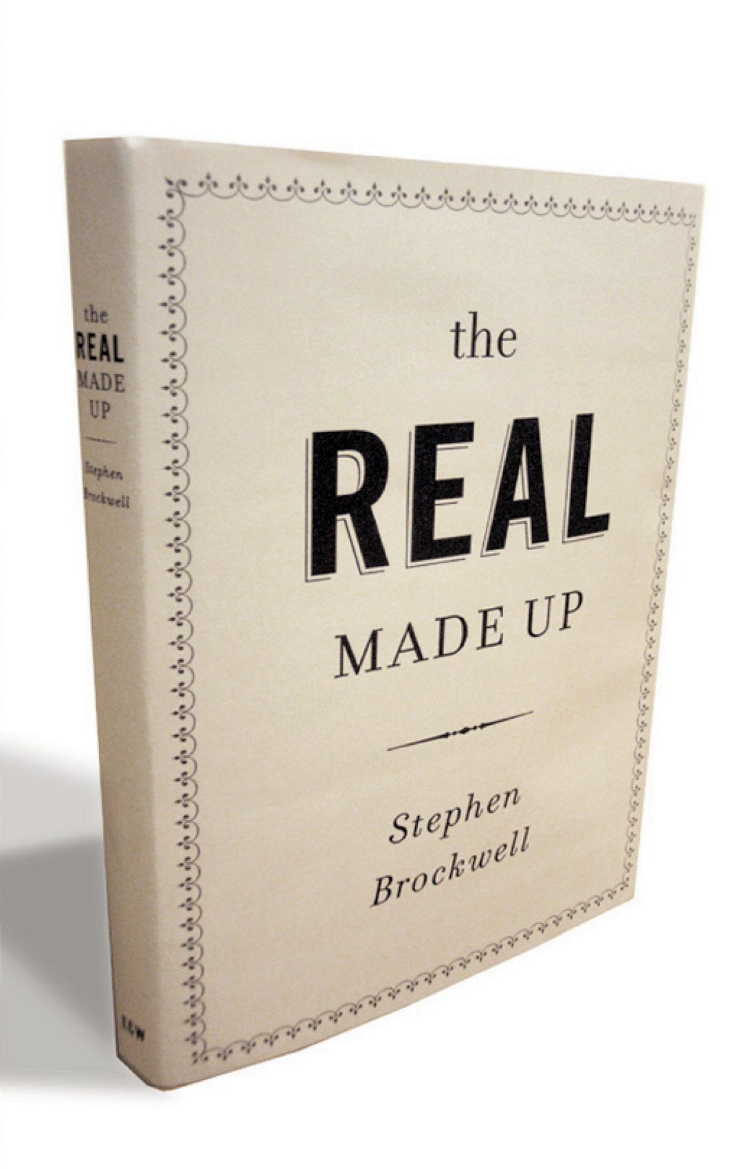
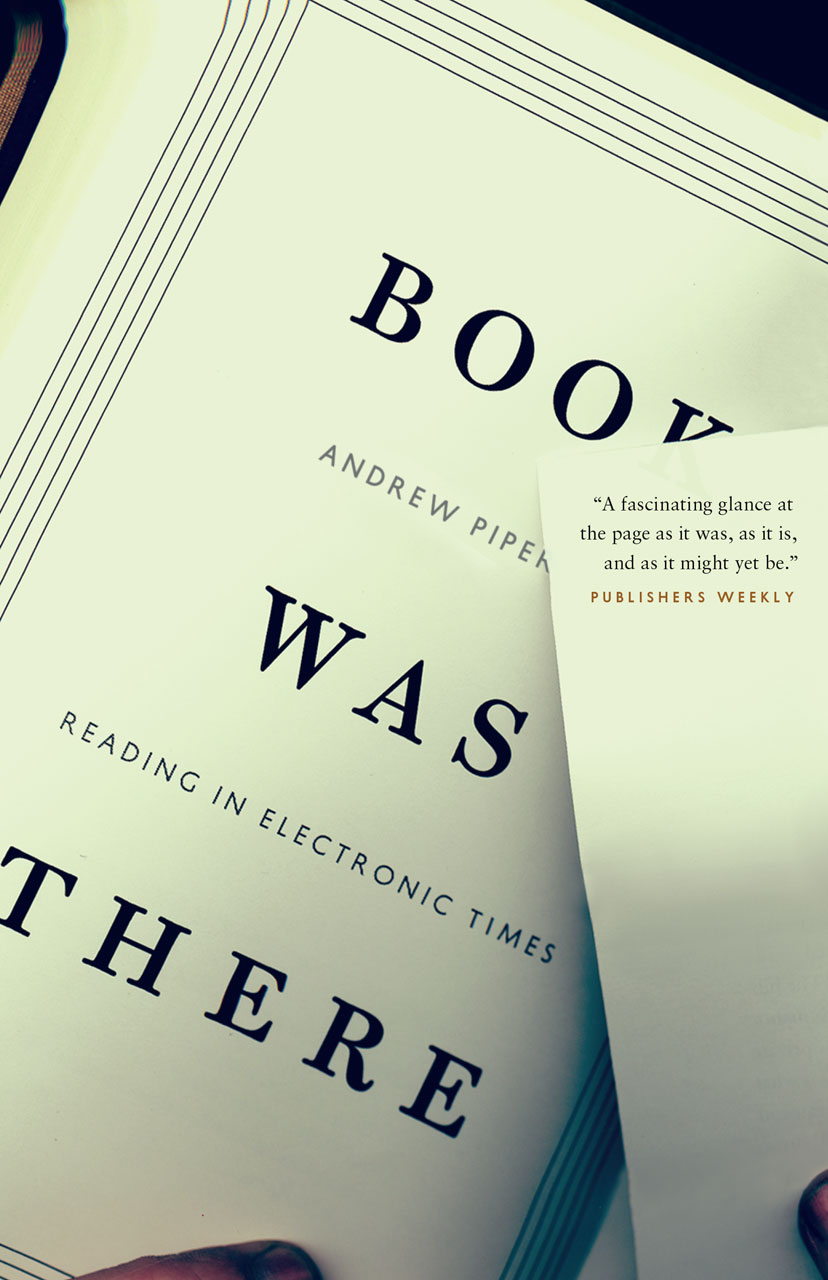
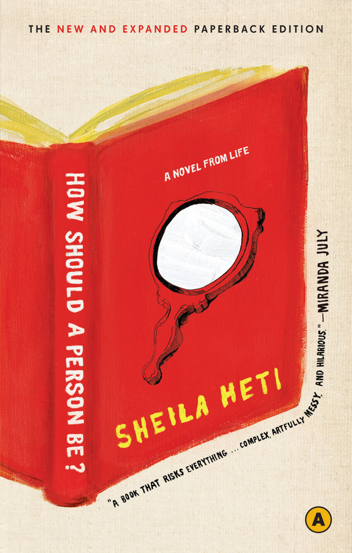
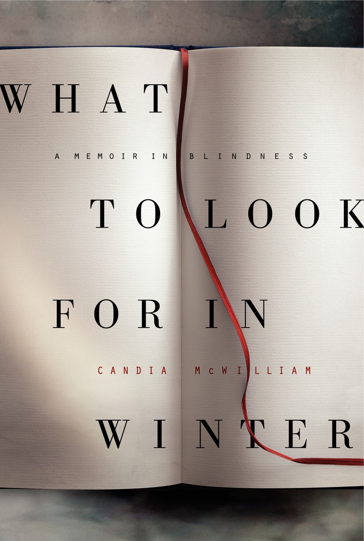
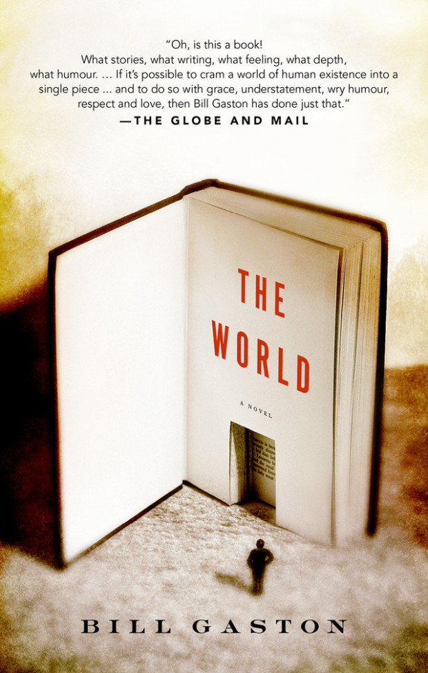
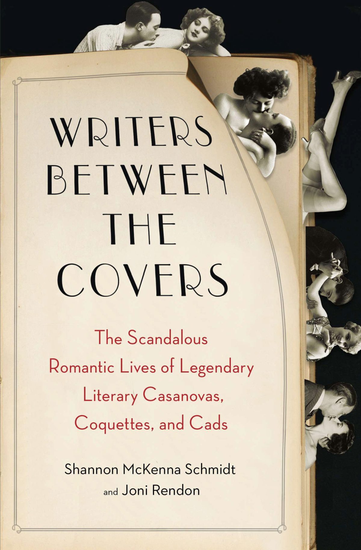
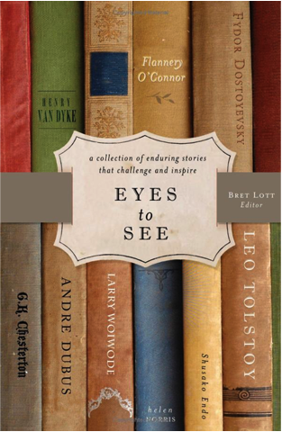
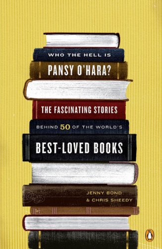
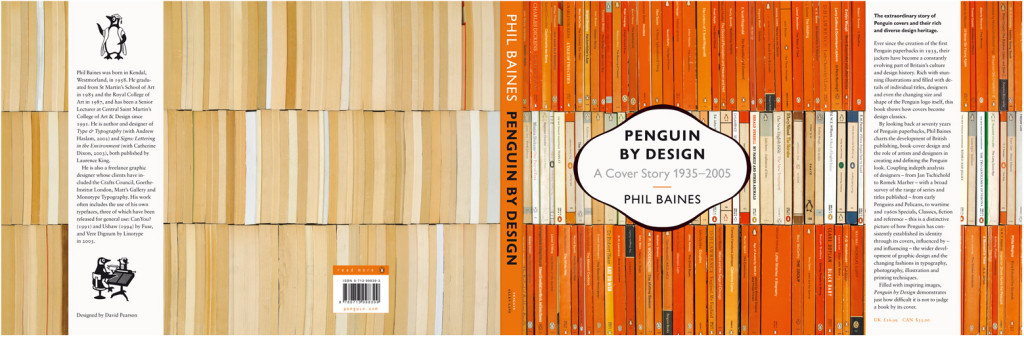
It started, innocently enough, with a tweet from my friend Steven Beattie, book review editor of Canada’s Quill & Quire magazine, about the cover of The Most Dangerous Book, Kevin Birmingham’s new ‘biography’ of Ulysses by James Joyce, designed by Ben Wiseman (Penguin June 2014).
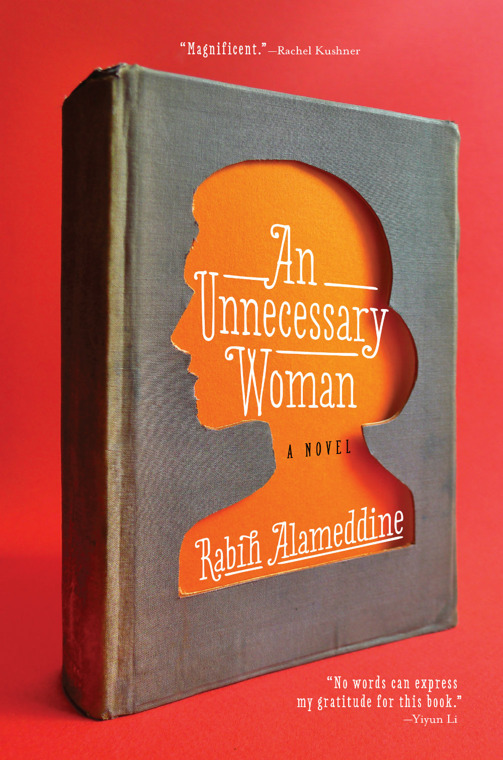
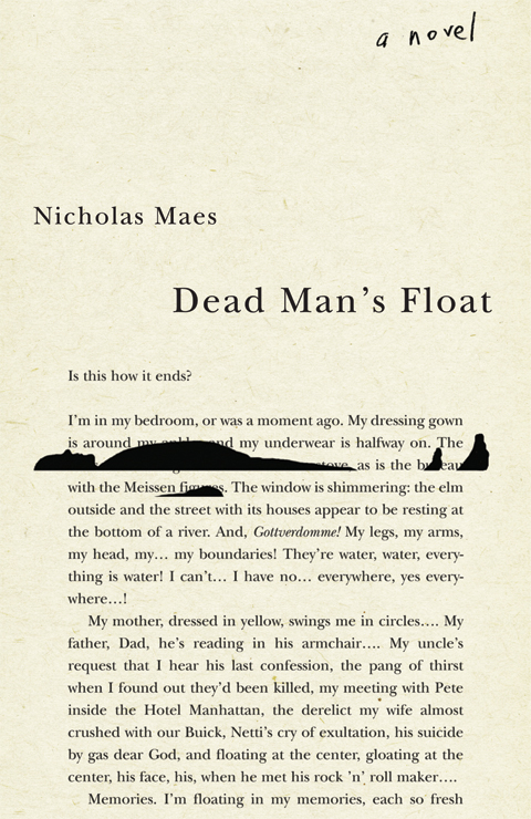
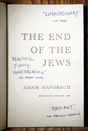
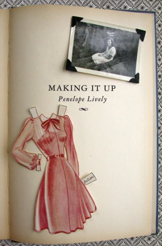
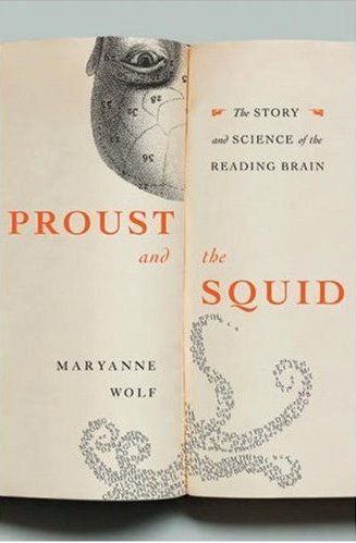
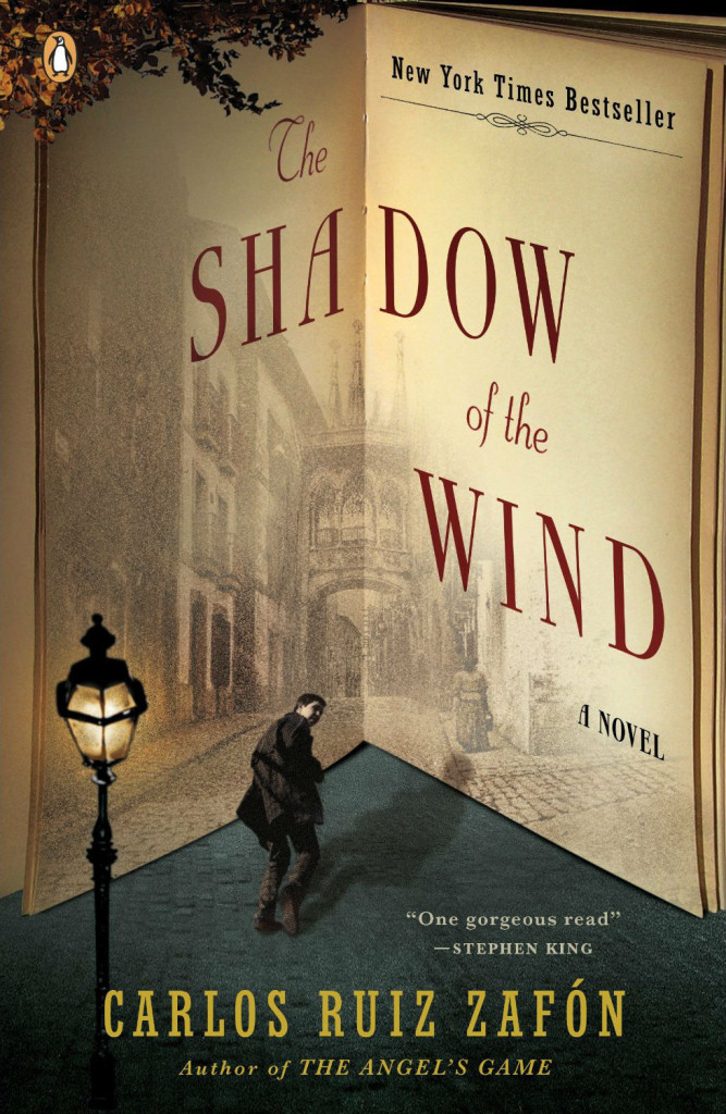
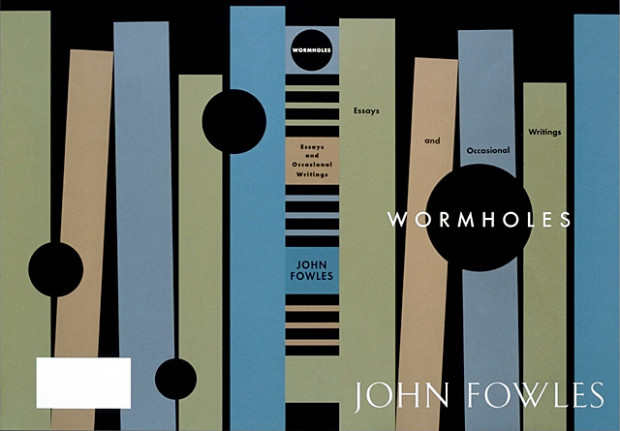
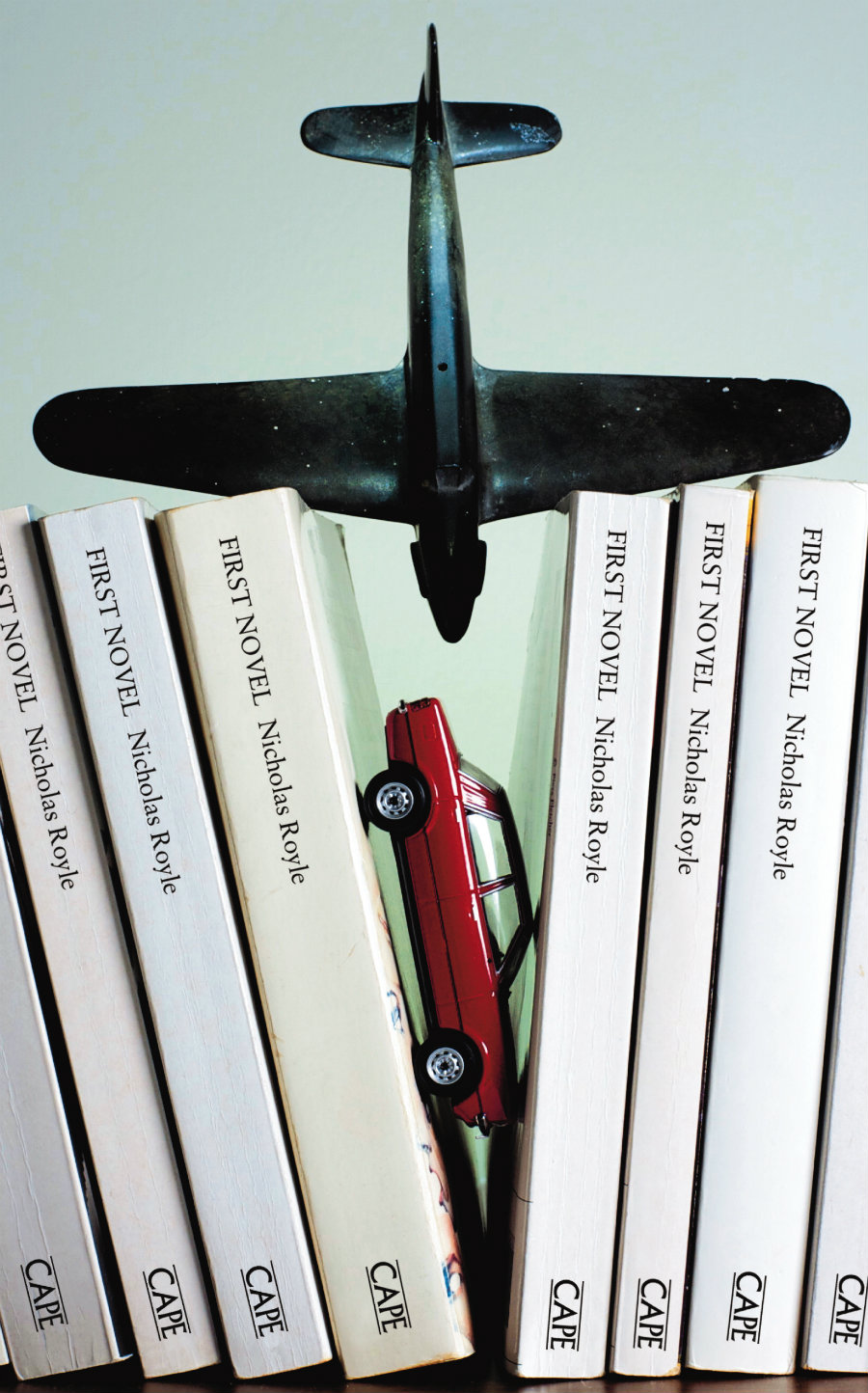
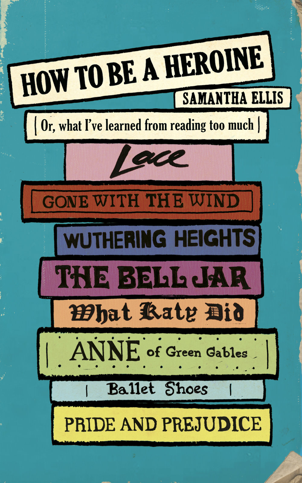
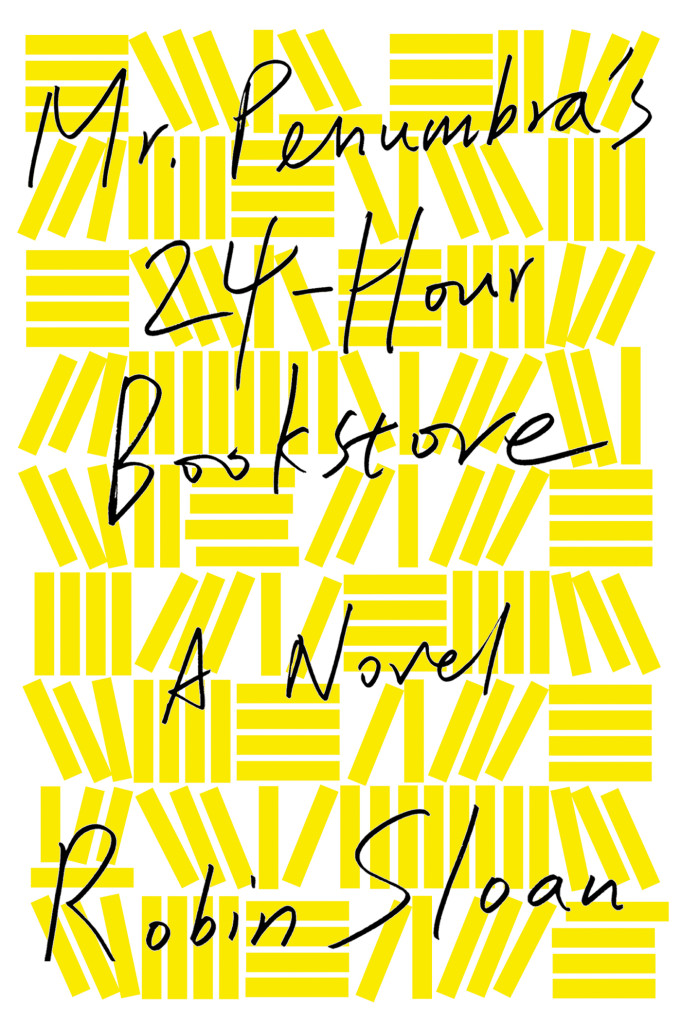
That sparked a conversation with designer David Gee and Joseph Sullivan of The Book Design Review about books on book covers. Joe wrote a a post on the subject in 2009 on the subject, and I rather naïvely thought it would be easy (EASY!) to post a few contemporary examples of the trend, completely underestimating what an undertaking such a project would become.
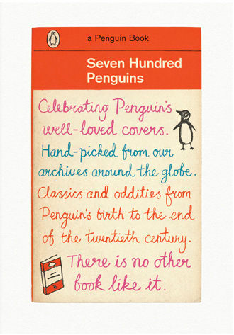
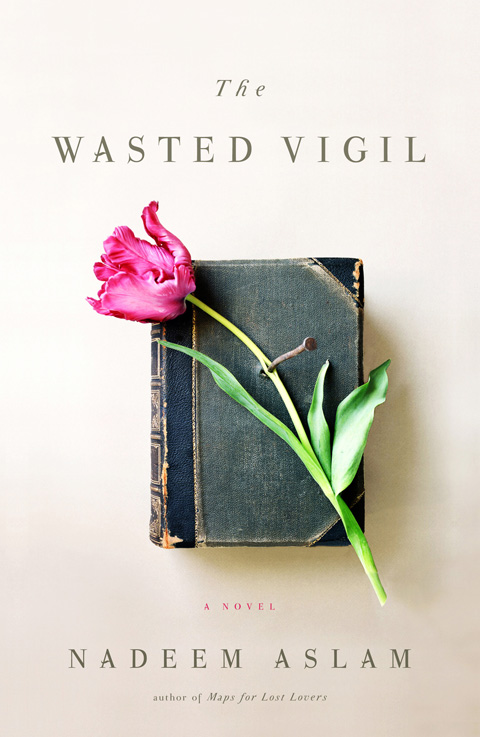
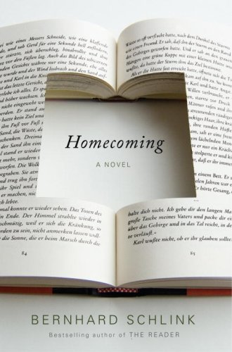
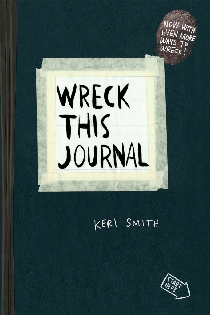
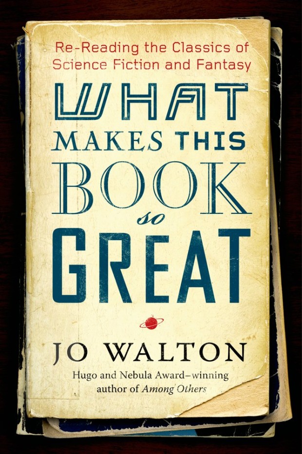
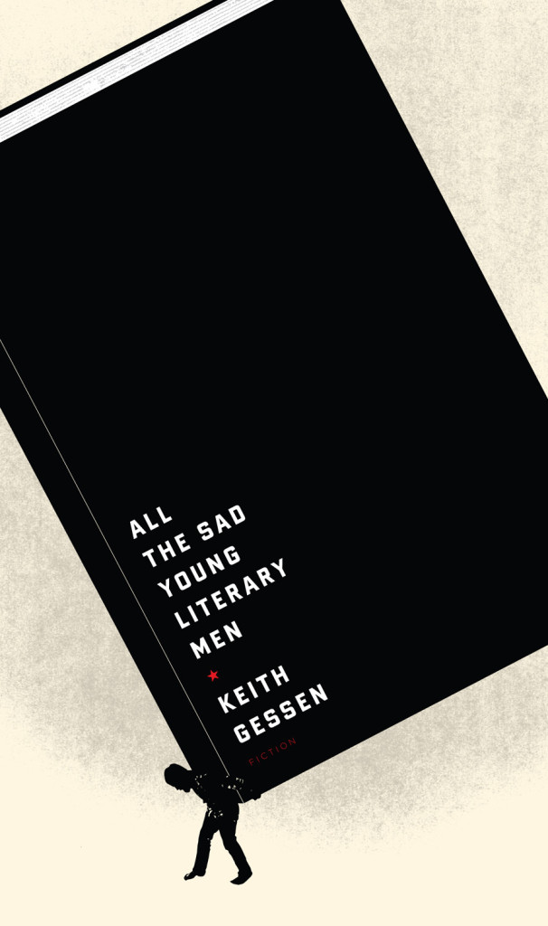
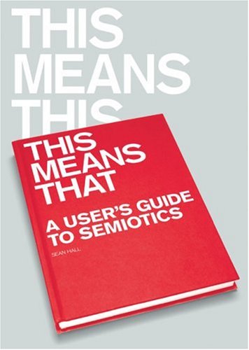
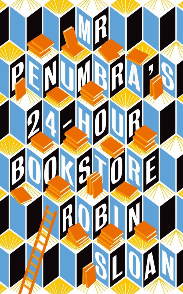
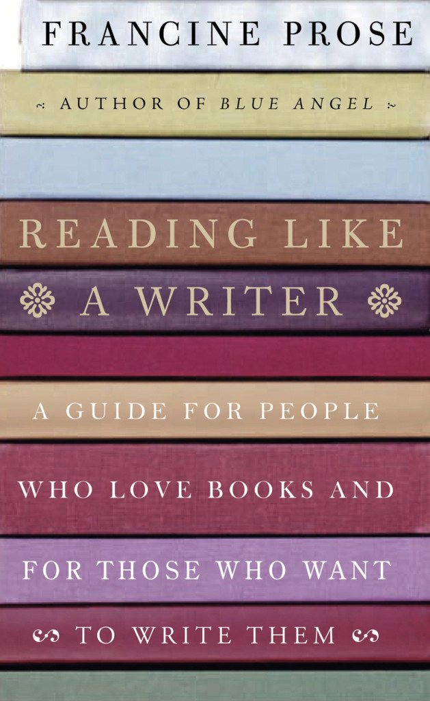
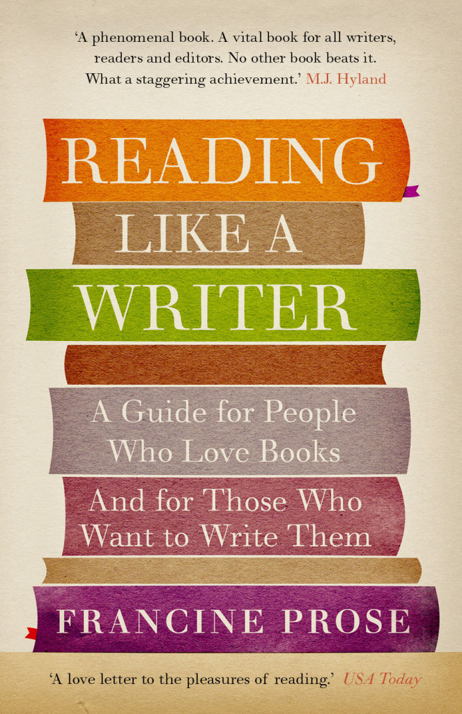
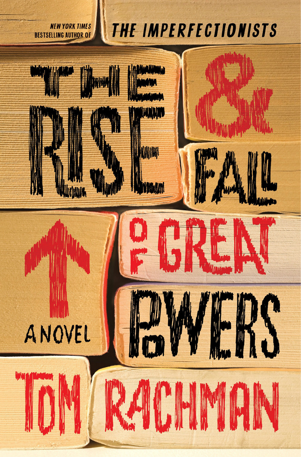
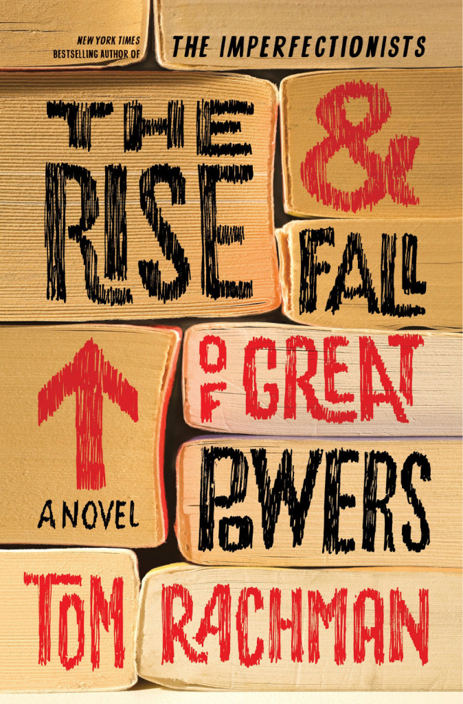
What follows is an attempt to showcase some of different ways designers incorporate books into their cover designs. Along side covers from the past five years, I’ve included some earlier examples from Joe’s post, and this post about ‘meta-covers’ from HTML Giant. Many of the images of the older titles are small (and some are just not very good), but where I have been able to source a larger image, I’ve included it at full (or close to full) size. I’m indebted to the Book Cover Archive, which is still an invaluable resources after all this time, Ferran Lopez‘s (also mothballed) Jacket Museum, and all the designers and book folk who sent me cover images, and helped me in numerous other ways. Thank you. This isn’t comprehensive survey but, to be honest, I had to stop somewhere…
The Knowledge by Lewis Dartnell; design by Kris Potter (Penguin April 2014) Priceless by William Poundstone; design by Jennifer Carrow (Hill & Wang January 2010)
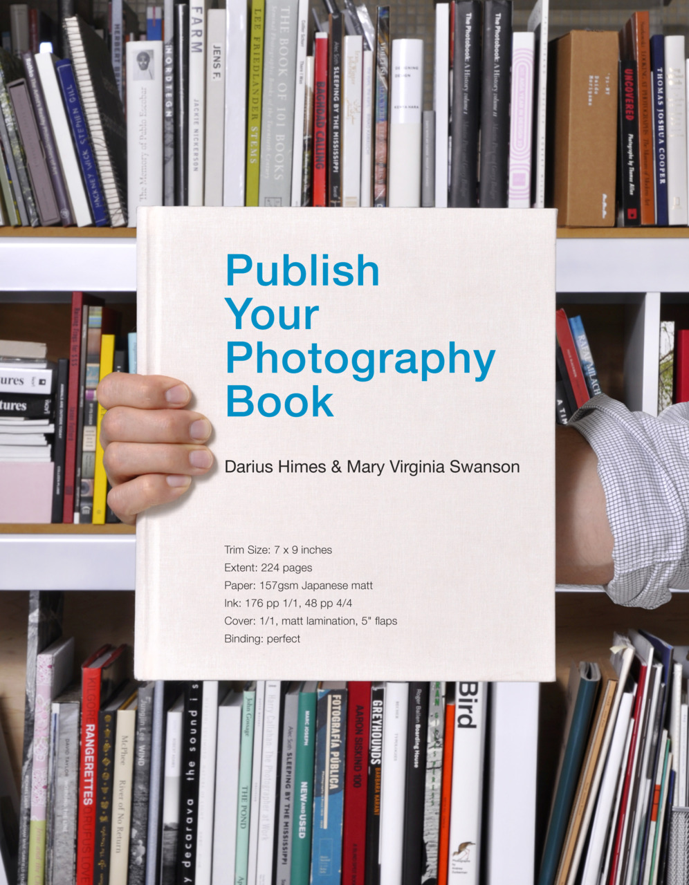
Publish Your Photography Book by Darius D. Himes & Mary Virginia Swanson; design by David Chickey & Masumi Shibata (Princeton Architectural Press March 2011)
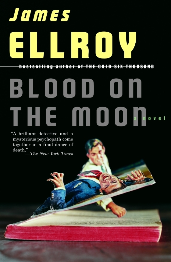
And those of you with a good memory will remember Chip Kidd used also art by Thomas Allen for a series of James Ellroy titles publisher by Vintage in the US:
As well posting great cover designs for books released in July, I’ve taken this month’s round-up as an opportunity to catch up on a few I missed earlier this year. Enjoy!
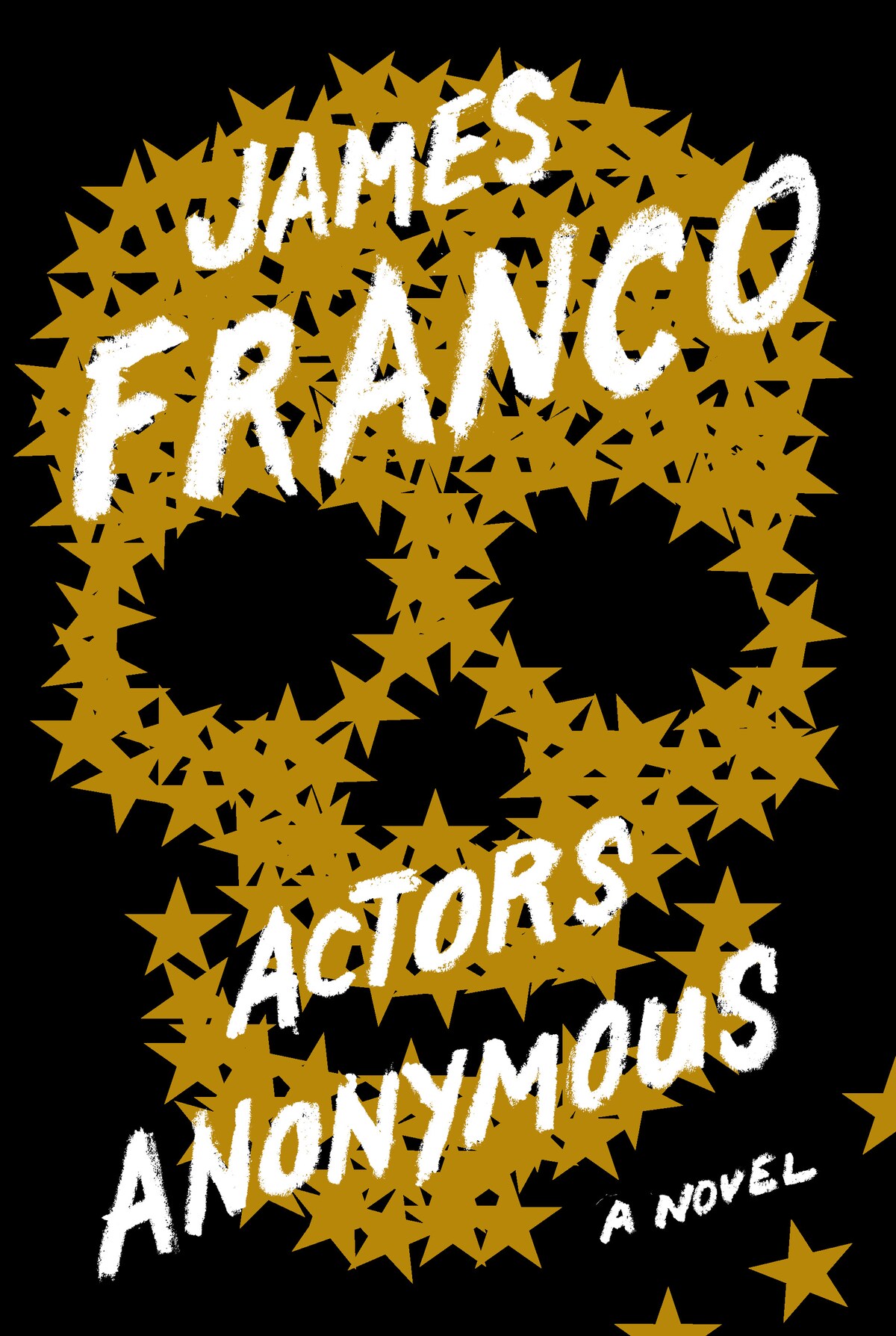
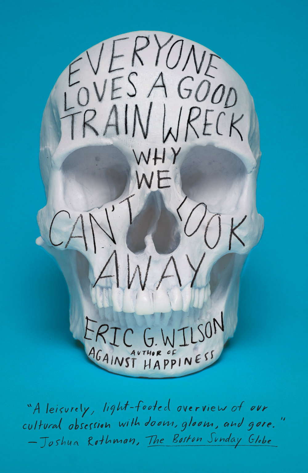
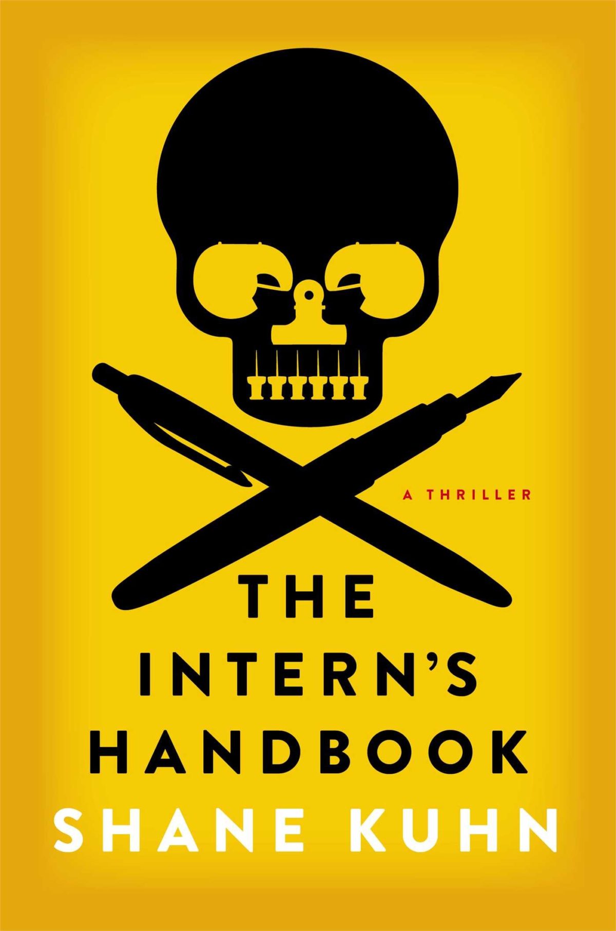
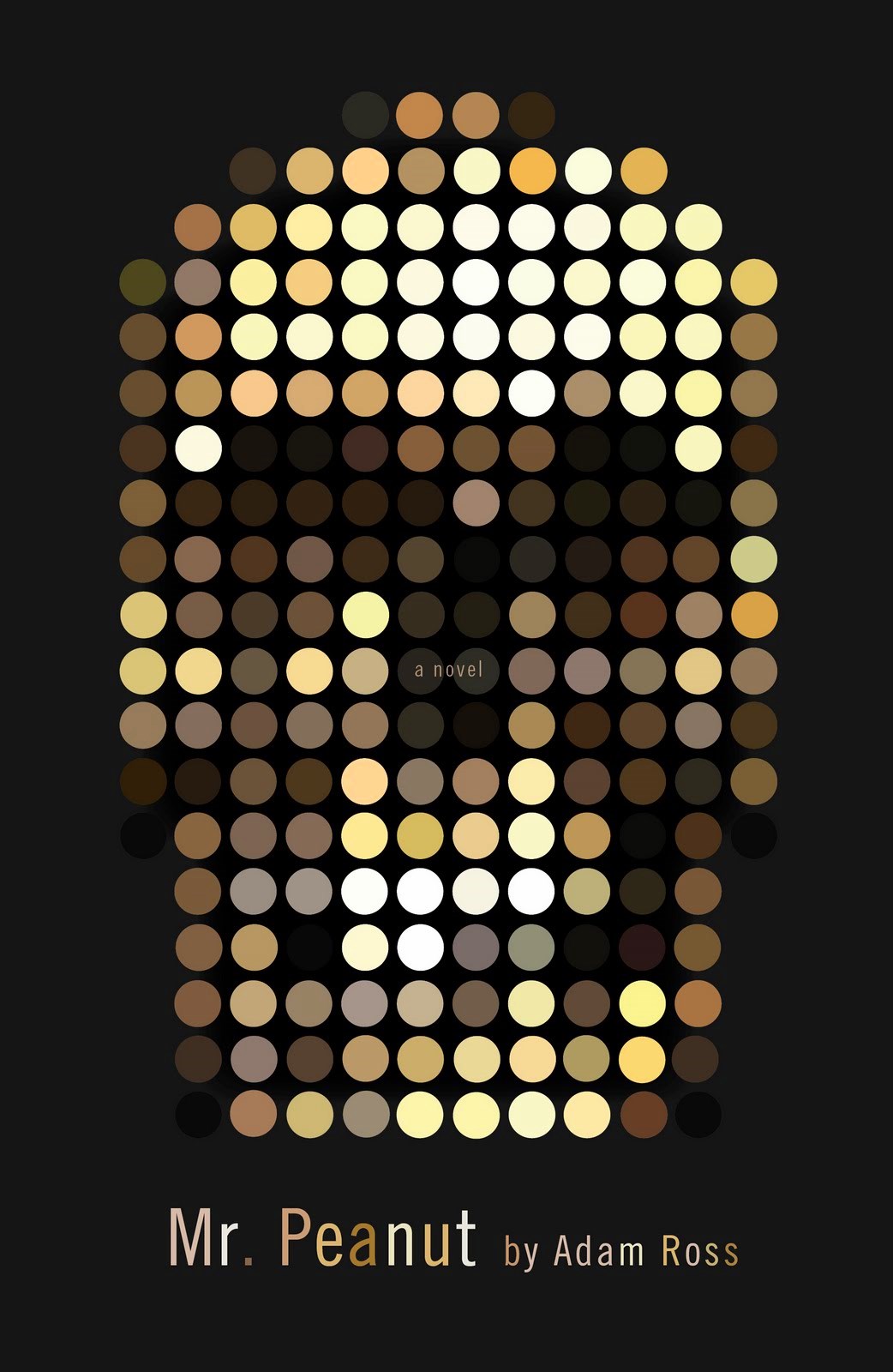
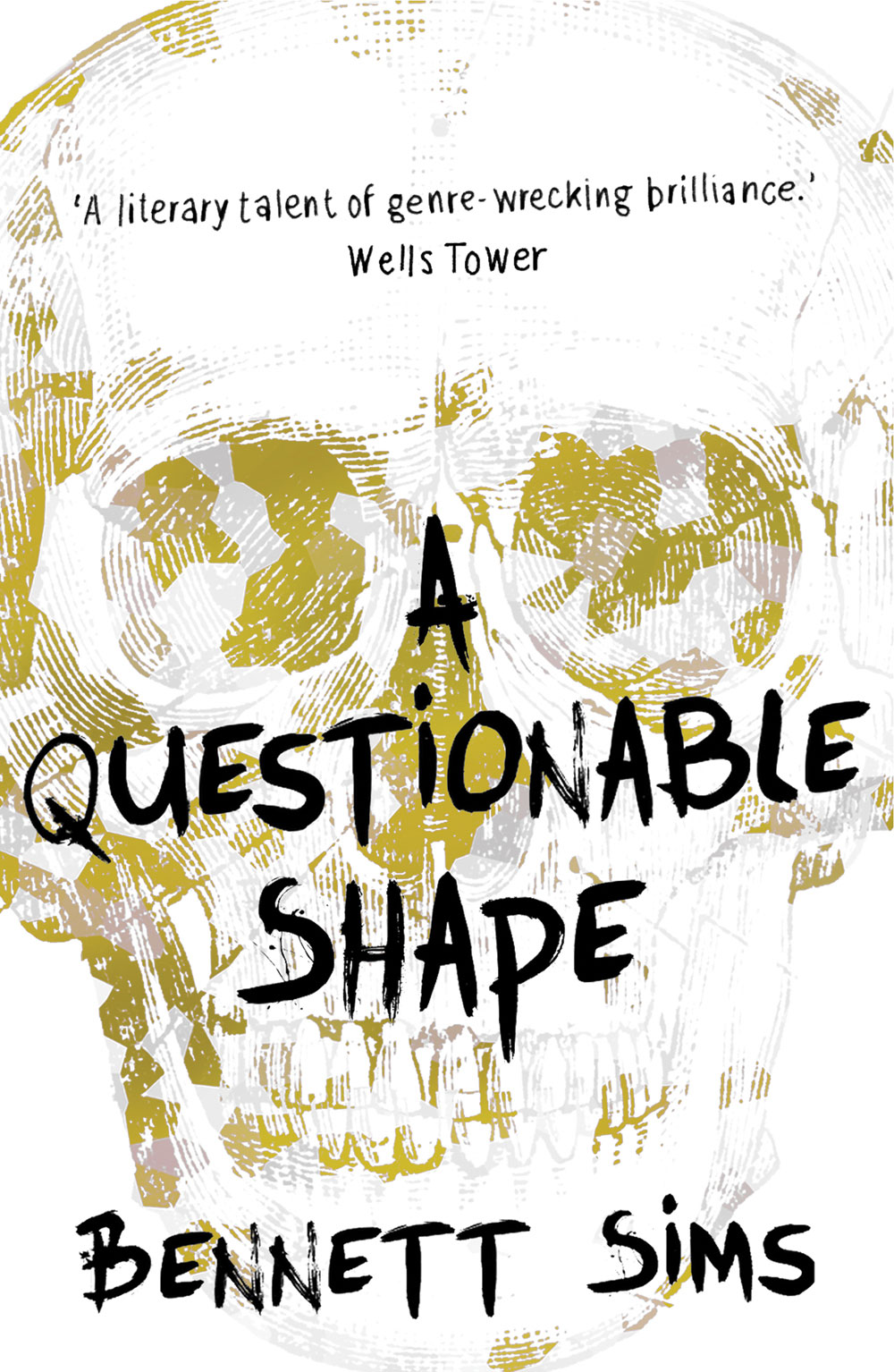
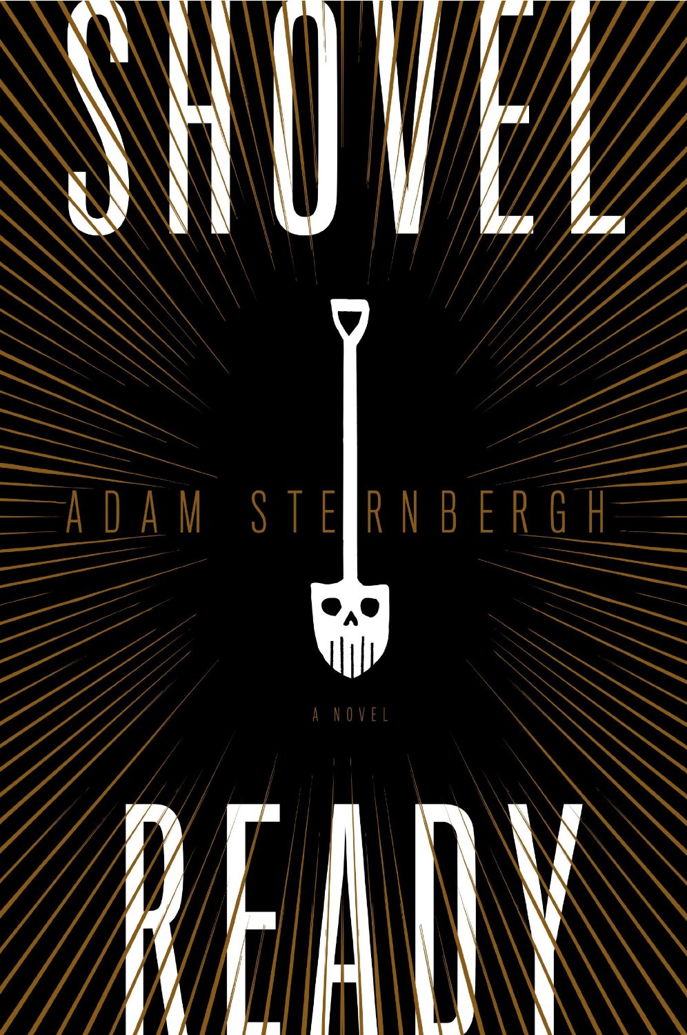
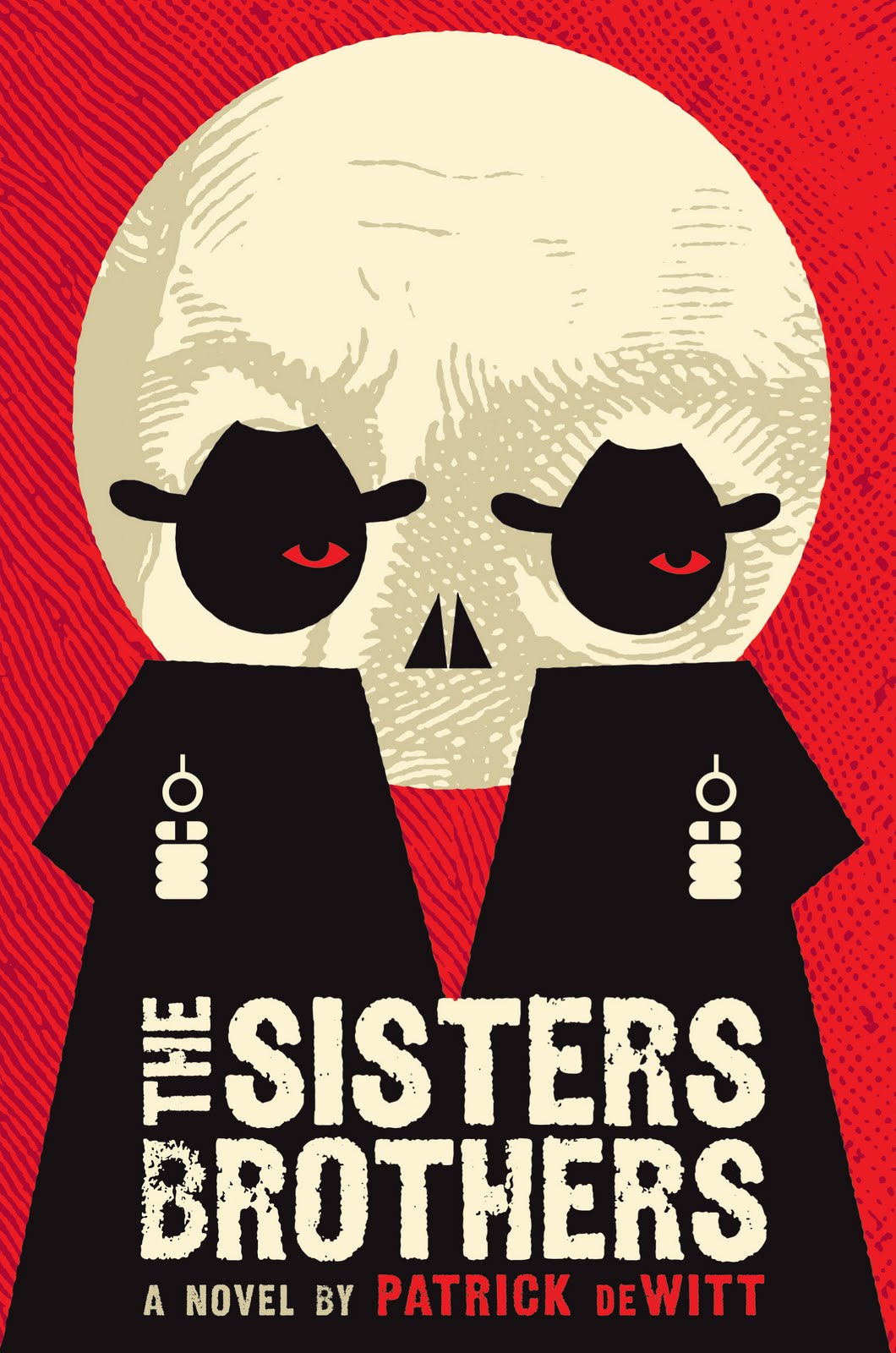
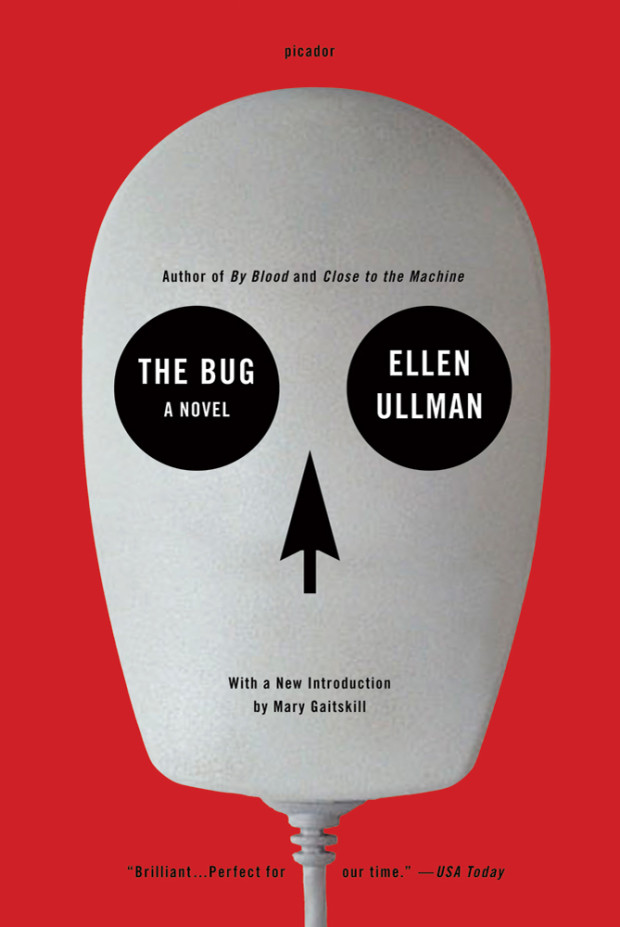
A comprehensive visual history of the human skull is surely an entire Steven Heller book in the making (I guess we’ll just have to make do with a Wikipedia page for now). But as Faye Dowling’s contemporary compendium The Book of Skulls1 makes plain, what was once taboo — terrifying even — has become a pop culture phenomenon. Images of skulls now appear in art, design, fashion, and illustration. Apparently we like to be reminded we are all going to die. Even book covers are not immune. Here are a few recent examples that caught my eye:
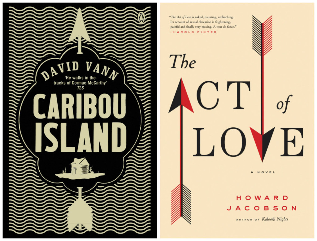
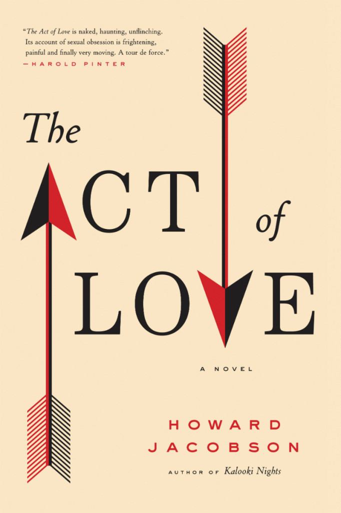
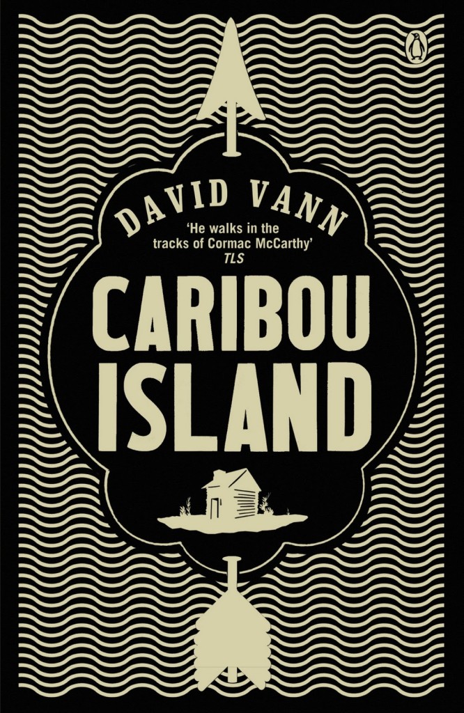
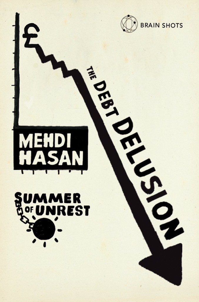
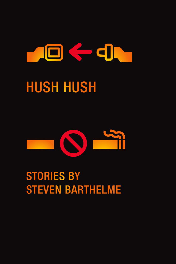
As I was collecting images for my recent posts on triangles and book covers, I started thinking about the use of triangle’s directional cousin, the arrow. Inspired by a vintage cover design by Elaine Lustig and Jay Maisel, I thought I’d gather a selection of recent book covers that use arrows as part of their design.
I’ve spent far too long on this already, but I am sure I have forgotten some corkers. Please let me know what I’ve missed in the comments. I also have to say thanks to all the designers who helped me with this, especially Catherine Casalino, Richard Green, and (the very patient) Jason Ramirez who all dug deep into their archives for me.