Skip to content

Tag: covers

A Window onto a Window

photograph by Ike Edeani

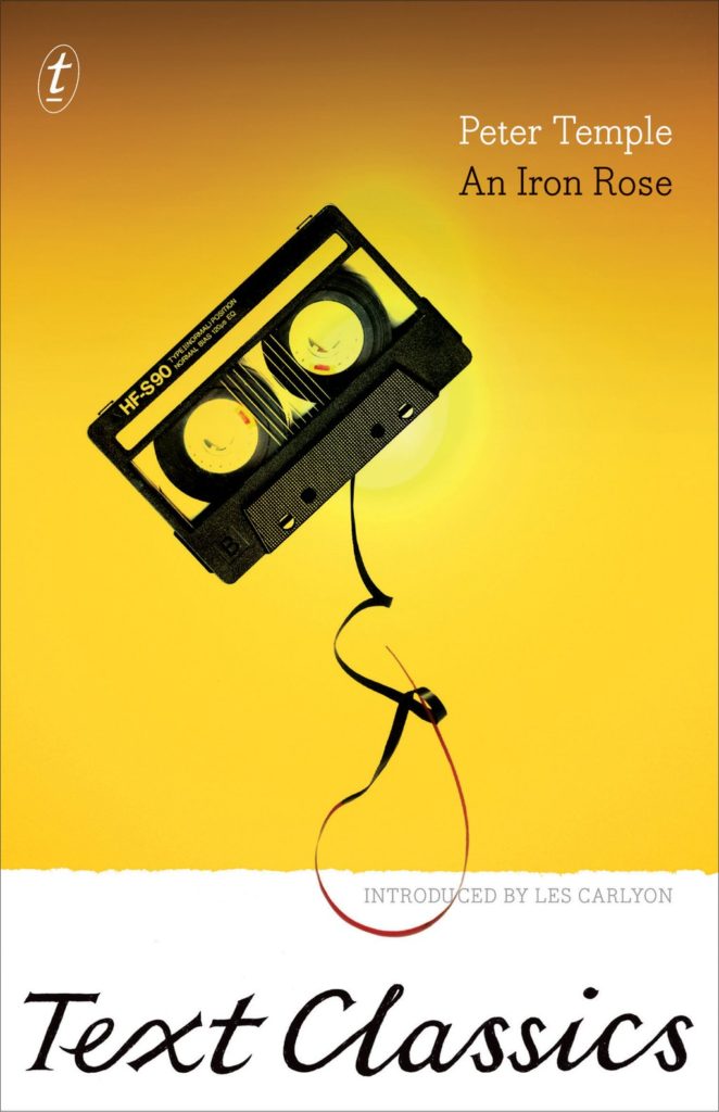
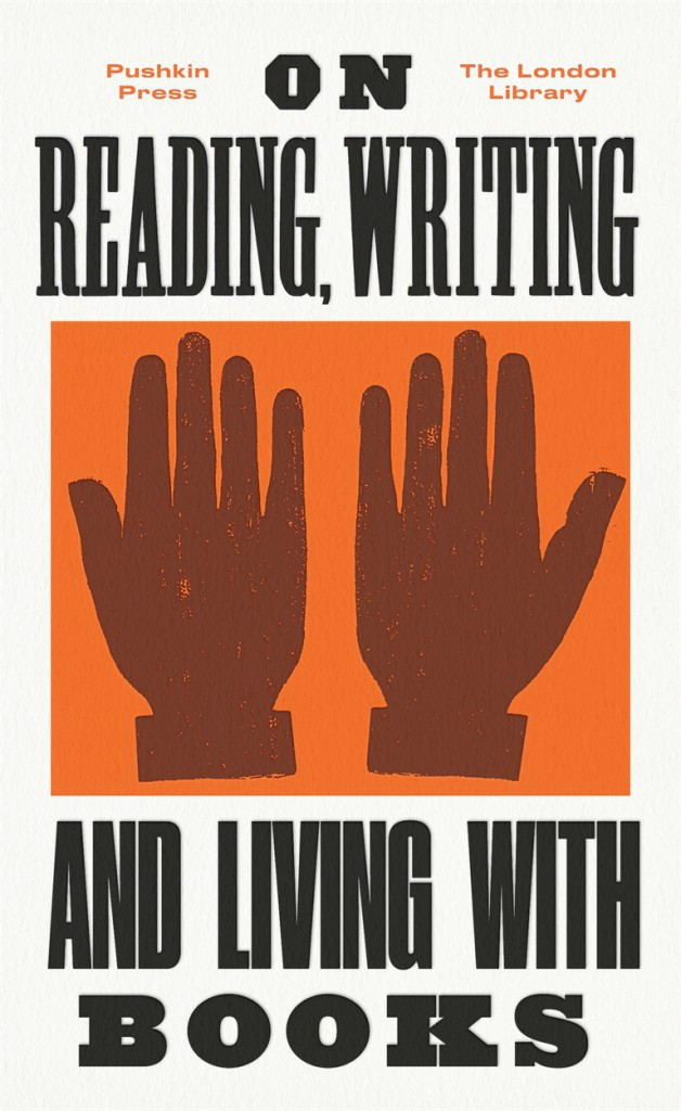
In this profile of Peter Mendelsund in the June issue of Rhapsody Magazine, there is a lovely bit about the designer’s architect-artist father:
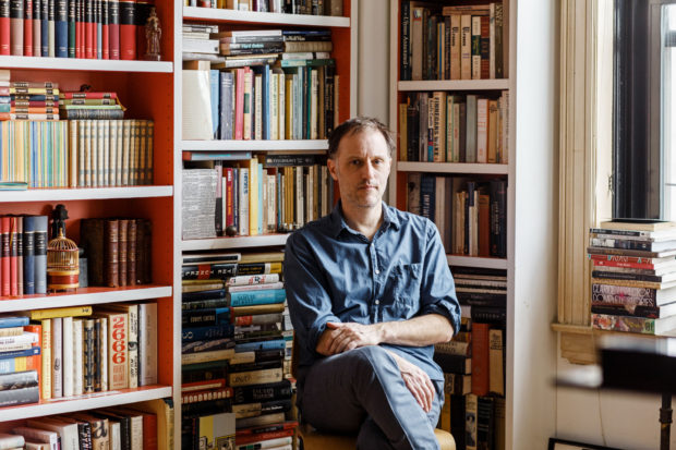
In the living room of Knopf associate art director Peter Mendelsund’s Upper Manhattan apartment, inspiration is everywhere: a battered, sea-green first edition of Ulysses; a toy version of the rocket Tintin takes to the moon; the vertebra of a blue whale; and, on top of his baby grand piano, a wooden model of a convention center made by his father, in the mid-’70s, when he worked for a New York architecture firm. It was never built, because the firm didn’t win the competition (Renzo Piano did), nor were any of his other models, because, in his late 30s, Benjamin Mendelsund was diagnosed with a brain tumor and devoted the rest of his life—he died at 48—to sculpture and painting. “He cut out all the bureaucracy of architecture,” Mendelsund says, “and turned to this.” He points to a small canvas painted entirely black except for two rectangles—two faded photos of a barn’s loft, its window open to the bright of day.

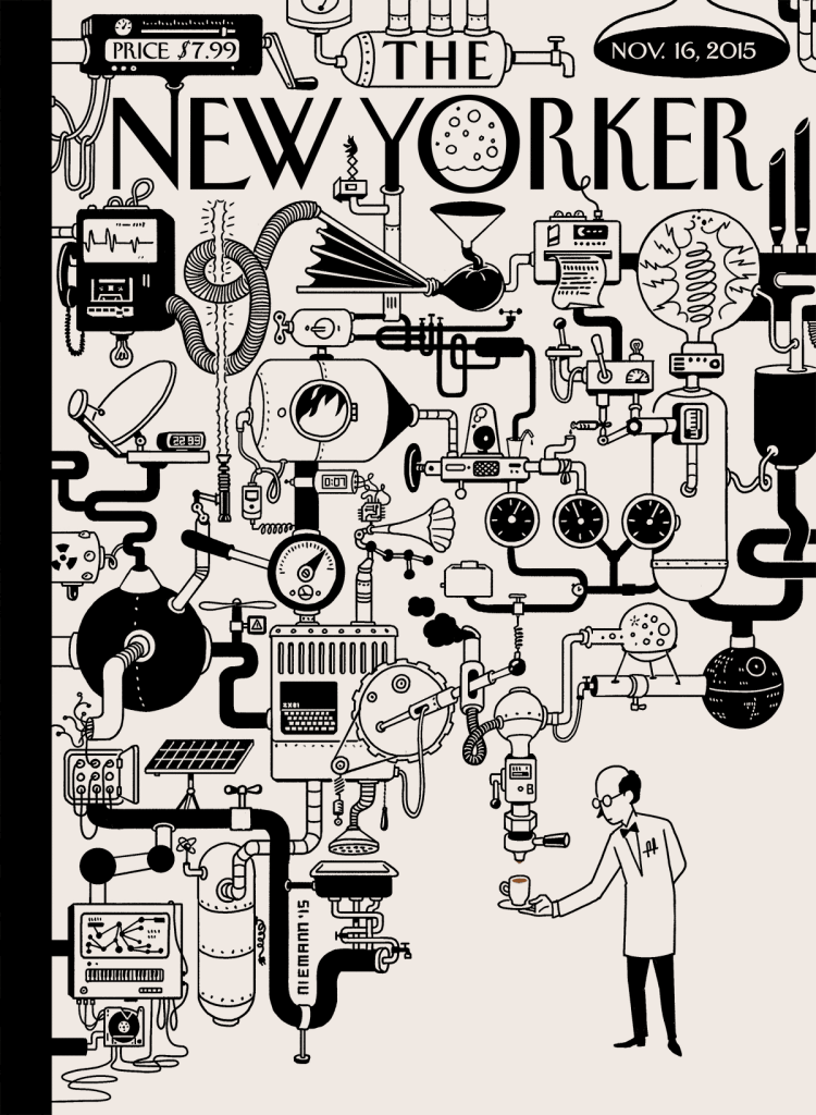
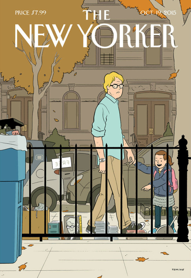
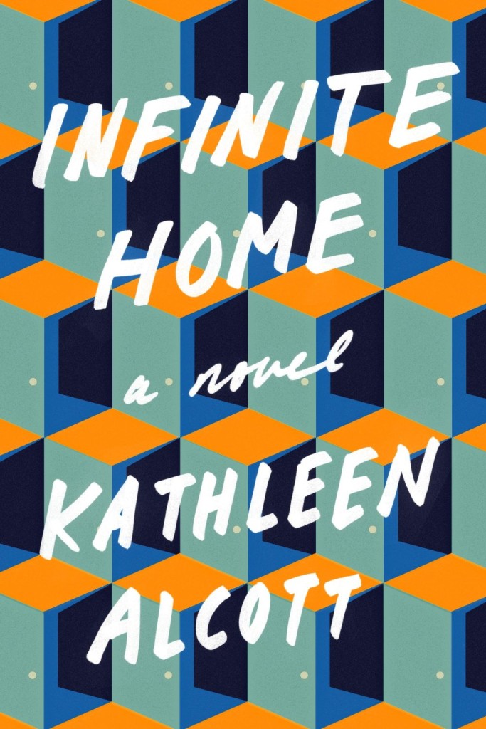
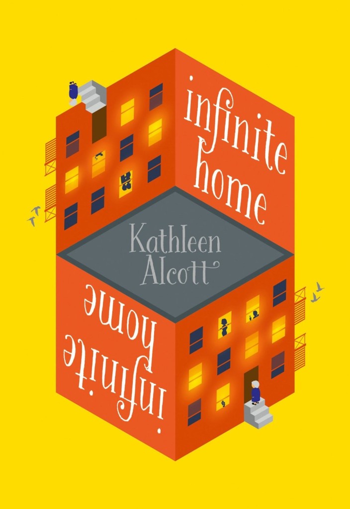
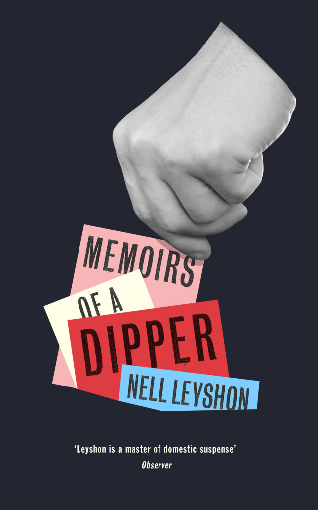
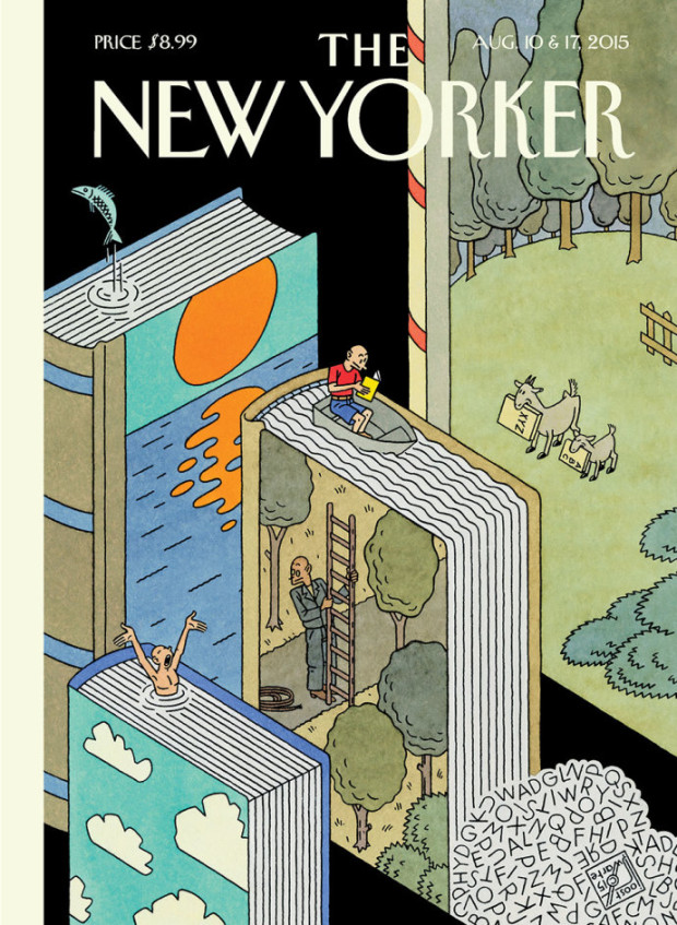
That image of a window onto a window is central to the signature style that’s made Mendelsund one of our preeminent book jacket designers: geometric, fascinated with negative space, striving to capture infinity through simplicity. You see the painting echoed in his cover for Martin Amis’s 2006 novel, House of Meetings, for which he photographed a tiny simulacrum of a room, its perspective slanting toward a miniature door. You see it in his many book jackets with drop-cuts—holes carved out of an image—like the diamond torn from a woman’s face on an early cover for The Girl With the Dragon Tattoo, back in 2005 when it was called The Man Who Hated Women. And you see it in his May 11, 2015, New Yorker cover, which features an American flag smashed like a storefront window, a single star-shaped hole evoking the myriad emotions of last year’s civil unrest in Baltimore.

His father’s second act as an artist also helps explain how, at 33, Mendelsund had the confidence to abandon his career as a classical pianist (“Eventually, I realized that I’d never truly be world class”) and reinvent himself. His wife suggested he try something visual—he was always drawing; he had designed their wedding invitation. “Sometimes the obvious things take a long time to see.”

Comments closed

Rogue Bibliophile

rogue bibliophile 2500AD Tom Gauld

Tom Gauld‘s cartoon on the future for book lovers for The Guardian this weekend.

Tom also did the cover and interior illustration in this weekend’s Guardian Review for an article on plot by John Mullan.

joy of plot tom gauld

Comments closed

Today in Micro-Trends: Cassette Tape Book Covers

This is another one of those posts that started out on Twitter — a flippant tweet from me sparking a conversation about books with cassette tapes and vinyl records on their covers. It turns out that putting a record on a cover has become quite popular. Unfortunately the composition of many of these covers is often strikingly similar, even if the tone/intent is different.

The combination of clunky retro-future technology of cassettes and the DIY aesthetic of mix tapes, on the other hand, provides a richer vein of inspiration…

Art Behind the Mixtape design UnderConsideration
The Art Behind the Tape by Marshall “DJ Mars” Thomas, Djibril Ndiaye, Maurice Garland, and Tai Saint-Louis; design UnderConsideration (2015)

Big Rewind design Regina Starace
The Big Rewind by Libby Cudmore; design by design Regina Starace (William Morrrow / February 2016)

Counter Narratives Palgrave Macmillan
The Counter-narratives of Radical Theology and Popular Music edited by Michael Grimshaw; design Palgrave Macmillan Design (Palgrave Macmillan / May 2014)

don't-you-forget-about-me
Don’t You Forget About Me by Jancee Dunn; design by Catherine Casalino (Villard Books / July 2008)

9781846146459
Earthbound by Paul Morley; design by Jim Stoddart (Penguin / August 2013)

he died with his eyes open design Christopher King
He Died with His Eyes Open by Derek Raymond; design by Christopher Brian King (Melville House / October 2011)

Iron Rose design W H Chong
An Iron Rose by Peter Temple; design by W. H. Chong (Text / June 2016)

Kill Your Friends design Glenn ONeill photo colin thomas
Kill Your Friends by John Niven; design by Glenn ONeill; Photograph Colin Thomas (Cornerstone / July 2014)

Landscapes of the Metropolis of Death design Jim Stoddart
Landscapes of the Metropolis of Death by Otto Dov Kulka; design by Jim Stoddart (Penguin / March 2014)

UMN28 Walsh Bootlegs D1.indd
Bar Yarns and Manic Depressive Mix Tapes by Jim Walsh; design by Michel Vrana; lettering by Robert Lawson (University of Minnesota Press / NYP)

New Sorrows design Clare Skeats
The New Sorrows of the Young W. by Ulrich Plenzdorf; design Clare Skeats; cover art by Joel Penkman; series design David Pearson (Pushkin Press / September 2015)


Signal to Noise by Silvia Moreno-Garcia; design by Erik Mohr (Solaris / October 2015)

Tape
Tape by Steven Camden; cover art by Keri Smith (HarperCollins Children’s Books / January 2014)

Tsar of Love and Techno design Christopher Brand Photography Bobby Doherty
Tsar of Love and Techno by Anthony Marra; design Christopher Brand; photography Bobby Doherty (Hogarth / October 2015)

(I also rather like this tape-related killed cover by designer Na Kim)

So there you have it — cassette tape book covers are a thing. But please let’s not get started on VHS tape book covers…

Comments closed

David Pearson Found on the Shelves

on_corpulence-design_david_pearson_illus_joe_mclaren

At The Bookseller, designer David Pearson talks about his new cover designs for Pushkin Press’s ‘Found on the Shelves’ series celebrating 175 years of the London Library:

At the heart of successful series design is motif – be it colour, type, grid, imagery, or other visual touchpoints – yet Pearson’s latest covers for Pushkin are perhaps less obviously groupable. “The series identifier is a subtle one,” he says, “but it is present in the use of decorative borders. I had begun to explore this idea of active border-making with some of Pushkin’s Collection Covers; the idea being that a decorative border can provide a layer of meaning or a tension point within the cover, and not simply act as a framing device.

“For The London Library series, this takes the form of overlapping tyre treads in ‘Cycling: The Craze of the Hour’; snaking, northbound steam in ‘The Lure of the North. It’s a small thing to hang your ideas on – and it matters little if no one notices it – but it ensured that I didn’t flounder at the beginning of the design process, as I had something to kick against, an inbuilt challenge to wrestle with.”

Pearson attributes much of the covers’ liveliness to the illustration, which he is quick to credit: “I intend to broaden the illustrative scope [further titles are scheduled for November] but for this first selection I’m relying on tried, trusted and incredibly talented hands. Joe McLaren produced the illustrations for ‘On Corpulence’ and ‘Life in a Bustle’ – and as with all of Joe’s work, the result is joyous.” The additional images were sourced from illustrations within the texts themselves, giving some of the covers a distinctly vintage appearance.

Each of the covers will print using a spot colour – one outside the gamut of four-colour CMYK printing, as it cannot be created using a combination of cyan, magenta, yellow and black (“key”); as a consequence of this it is bolder, more vibrant and less ubiquitous (and therefore more striking) – and will feature black foil-blocking on uncoated paper stock.


On Reading design David Pearson

life_in_a_bustle_design_david_pearson_illus_joe_mclaren Cycling David Pearson

Save

Comments closed

Making It Up: The Bookseller Interviews Mr Keenan and Gray318

Mr Keenan and Gray318

I love this Bookseller interview with designers Jamie Keenan and Jon Gray, co-founders of the Academy of British Cover Design (among other things):

ABCD tends to recognise and reward brave, striking and fresh approaches, rather than more “conventional” cover aesthetics. I ask the pair whether they feel designers have more freedom these days; whether, as books become imbibed with more longevity and are seen as less disposable, publishers are more amenable to the idea of cover art as art, rather than as a marketing tool. They are reticent; Keenan responds: “It’s strange, because when you do see a weirdo cover – for a reason, not just for the sake of it – quite often they are really successful. If you think of a book as an actual package and compare that to other forms of packaging, its really old-fashioned in a lot of ways.

“Imagine a poster for, say, the next iPhone, and it has a quote on it like you’d see on a book cover – ‘this is the best phone I have ever had!’ – you just think, this is so old-fashioned, that kind of endorsement idea. On a book cover it’s the norm. A lot of advertising you see, you aren’t really sure what it’s for but it draws you in, whereas a lot of book covers are really overt – they tell you exactly what the book is about. We’re supposedly becoming more and more visually literate, but book covers are still, in some ways, quite naïve.”

Gray concurs: “It feels like a real nervous habit, the quote on the front. Is that really helping a book to be sold? Can [shoppers] not just read that on the back and get the same idea…on the front, is it really making someone think: ‘aha!’?”

“The greatest and the worst thing about book cover design is that no one really knows if it’s incredibly powerful or a complete waste of time,” Keenan says. “Quite often when you get a brief, you’ll be sent other covers that the [client] likes and some of them will look absolutely terrible…but it was a bestselling book! So that automatically becomes, in their eyes, a sort of ‘good cover’.”

“There’s no science to it,” Gray agrees.

You can almost hear them sipping their pints.

Comments closed

Christoph Niemann’s Coffee Break

11_16_15-12001

Christoph Niemann for The New Yorker.

Comments closed

Recognition

CoverStory-Tomine-Recognition

Adrian Tomine’s latest cover for The New Yorker. Adrian’s new book, Killing and Dying, is out now.

Comments closed

Françoise Mouly: No House Style

Sarah Shatz: Françoise Mouly

It’s Nice That has a great interview with the remarkable Françoise Mouly, co-founder of comics anthology Raw, editorial director of TOON Books, and, of course, art editor at The New Yorker:

“One of the things we had at Raw which I have tried to keep is not having a house style, it doesn’t all look alike. Raw really was the sum of its parts but you can’t say that Raw magazine was Joost Swarte or Charles Burns or Sue Coe.

“At The New Yorker when I came in there was a house style, a nice cat-on-the-windowsill type watercolour and you could look at the covers and see the common denominator. I have tried to never let it settle into, ‘Oh that’s a New Yorker cover’ except in the approach.”

Comments closed

Book Covers of Note August 2015

The entire book industry isn’t on vacation. It only seems that way. 1 Here’s August’s book covers of note…

Aesthetics of Middlebrow Fiction design Palgrave
The Aesthetics of Middlebrow Fiction by Tom Perrin; design Palgrave Macmillan (Palgrave Macmillan / August 2016)

Ally Hughes design by Darren Booth
Ally Hughes Has Sex Sometimes by Jules Moulin; design by Darren Booth (Dutton / August 2015)

Almost Famous Women design by Na Kim
Almost Famous Women by Megan Mayhew Bergman; design by Na Kim (Scribner / July 2015)

Among the Ten Thousand design Strick&Williams
Among the Ten Thousand Things by Julia Pierpoint; design by Strick&Williams (Random House / July 2015)

Barbara the Slut design by Rachel Willey
Barbara the Slut by Lauren Holmes; design by Rachel Willey (Riverhead / August 2015)

Barbarian Days design Darren Haggar
Barbarian Days by William Finnegan; design by Darren Haggar (Penguin / July 2015)

Black Hole design Matt Dorfman
Black Hole by Bucky Sinister; design by Matt Dorfman (Soft Skull / August 2015)

Capitalism in the Web design by Anne Jordan
Capitalism in the Web of Life by Jason W. Moore; design by Anne Jordan and Mitch Goldstein (Verso / August 2015)

Death by Video Game design by Steve Panton
Death by Video Game by Simon Parkin; design by Steve Panton (Serpent’s Tail / August 2015)

Dust That Falls From Dreams design Oliver Munday
The Dust That Falls From Dreams by Louis de Bernières; design by Oliver Munday (Pantheon / August 2015)

Genghis Khan design James Paul Jones
Genghis Khan by Frank McLynn; design by James Paul Jones (Bodley Head / July 2015)

And because it’s always interesting to see US and UK covers side by side…

Infinite Home US
Infinite Home by Kathleen Alcott; design by Alex Merto (Riverhead / August 2015)

infinite home
Infinite Home by Kathleen Alcott; design by Stuart Bache (Borough Press / July 2015)

Katrina After the Flood design by Julius Reyes
Katrina by Gary Rivlin; design by Julius Reyes (Simon & Schuster / August 2015)

Landline design Olga Grlic handlettering Jim Tierney
Landline by Rainbow Rowell; design by Olga Grlic; hand-lettering by Jim Tierney (St. Martin’s Press / July 2015)

Memoirs of a Dipper design by Gray318
Memoirs of a Dipper by Nell Leyshon; design by Gray318 (Fig Tree / June 2015)

Narcisa design by Milan Bozic
Narcisa by Jonathan Shaw; design Milan Bozic (Harpercollins / March 2015)

New American Stories design by Peter Mendelsund.
New American Stories edited by Ben Marcus; design by Peter Mendelsund (Vintage / July 2015)

9780385538343
Street Poison by Justin Gifford; design by Michael J. Windsor (Doubleday / August 2015)

Vegetarian design Tom Darracott
The Vegetarian by Han Kang; design by Tom Darracott (Portobello / January 2015)

Terf_9780385679725_jkt_all_r3.indd
Wicked and Weird by Rich Terfry; design by Scott Richardson (Doubleday Canada / August 2015)

Comments closed

Joost Swarte’s “Summer Adventures”

Joost-Swarte-Summer-Adventures

“Cartooning has an edge on all other media. You don’t need anything else such as canvas and paint, or camera and actors: the road to expression is only a sheet of paper and a pencil away.”

A new Joost Swarte cover for The New Yorker.

Comments closed

Books Covered by Stuart Bache

reunion of ghosts design by jo walker

Designer Stuart Bache, art director of Oneworld Publications, has started a new vlog about book cover design. In his latest video, Stuart looks at the cover for A Reunion of Ghosts by Judith Claire Mitchell, designed by Jo Walker:


And if that wasn’t enough, Stuart is also writing a column on book design for UK trade magazine The Bookseller. The most recent post is on new covers for classic crime novels.

Comments closed

Australian Book Design Awards Winners 2015

Congratulations to all the 2015 Australian Book Design Awards Winners!

caro was here design gayna murphy
Caro Was Here by Elizabeth Farrelly; design by Gayna Murphy
consumer-behaviour-in-action design regine abos
Consumer Behaviour in Action by Peter Ling, Steven d’Alessandro, Hume Winzar; design Regine Abos
A Fairy Tale by Jonas T. Bengtsson; design by Allison Colpoys
fictional woman design tara moss and matt stanton
The Fictional Woman by Tara Moss; design Tara Moss & Matt Stanton
Movida Solera by Frank Comorra & Richard Cornish;  design by Daniel New
Movida Solera by Frank Comorra & Richard Cornish; design by Daniel New
What Came Before by Anna George; design by Laura Thomas

You can find all the winning designs on the Australian Book Designers Association website.

Comments closed