Skip to content

Tag: Books

Hunger

At the risk of this turning into W.W. Norton Week on The Casual Optimist, I wanted to re-post this gorgeous cover for Hunger by Lan Samantha Chang designed by High Design, with art direction by Albert Tang. It was originally included with my Q & A with Norton’s Ingsu Liu earlier this week, but removed when I updated the post.

W.W. Norton Book Design Archive on Flickr

Comments closed

Midweek Miscellany, August 5th, 2009

Foucault — A nice new cover design from David Drummond (approval pending).

(And apparently I like photos of the backs of people’s heads)

Kill Your DarlingsPrint asks book designers Carol Devine Carson, John Gall, Paul Buckley, Rodrigo Corral, John Gray, Gabriele Wilson, Paul Sahre, and Peter Mendelsund about the covers that didn’t quite make it:

every book jacket designer has at least one that got away—a fresh, inventive cover that was shot down en route to the bookstore shelf. These “lost” covers form a parallel universe in which the books we read and love exist in entirely different skins.

Re-typing History — The Financial Times reports on typographer Mike Parker’s challenge to the accepted history of the ubiquitous Times New Roman:

The… evidence for his version of history is a brass pattern plate bearing a large capital letter B. He holds the plate up to show the familiar form of the letter, its characteristic curves and serifs. The point, he says, is that such pattern plates represent a technology that was not used after 1915. The creation of Times New Roman was announced in 1932.

Bite-Size Edits — Baking books with the Book Oven chefs.

Forgotten Bookmarks — the “personal, funny, heartbreaking and weird things” found in books at a rare and used bookstore.

The Book Depository launches in the US. There are details at The Book Depository blog.

And finally…

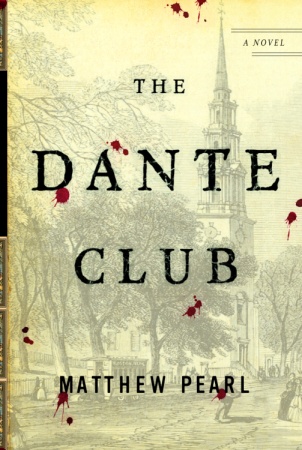
Trial and Error — Author Matthew Pearl discusses the evolution of the cover for his novel The Dante Club. It’s nice to read about an author not having a hideous experience with a publisher for a change, and I actually think that the cover design for The Dante Club, while not flashy, gives a lot of great visual cues to readers about the nature of the book (which is really what it is about isn’t it?).

1 Comment

Q & A with Ingsu Liu, W.W. Norton

Having spent a lot of my life in the UK, I wasn’t particularly familiar with venerable New York independent publisher  W.W. Norton and Co. until my stint at Toronto’s (now doomed) Pages Books and Magazines where their books were frequently on tables.

Although I left Pages a few years ago, I was recently reminded of the breadth and quality of Norton’s books — and, of course, their covers — by their decision to archive their book cover designs on Flickr.

In a roundabout way, the launch of the design archive also put me in touch with Steve Colca, Norton’s online marketing manager. He in turn, hooked me up with Ingsu Liu who kindly agreed to talk about the design process at Norton for this week’s Q&A.

Currently V.P. art director at W.W. Norton, Ingsu Liu graduated from the graphic design program at Pratt Institute in 1988 and began her career at Penguin, William Morrow and Vintage Books before accepting a position at Norton in 1997.

Briefly, describe your role at Norton

I oversee the hardcover jacket imprint.

How many designers are on your team?

I oversee two in-house art directors; together we collaborate with various outside freelance designers, illustrators, art researchers and photographers.

Approximately how many covers does Norton require each season?

About 55 to 75 books each season. We do 2 seasons, for a total of roughly 125 books a year.

Is there a ‘house’ style?

I certainly hope not. I believe it’s most beneficial to be diverse, so that each book jacket can have it’s own voice. This helps to keep the list fresh and my job more fun.

Do you approach fiction and non-fiction differently?

It really depends on what the book requires, but the basic process is the same. First I talk to the editor, publisher, and marketing… then drawing from those conversations, the book brief, the author’s writing, the current market place, the comparative titles and what the book is about, I then decide which direction the jacket should go and set out to assign the best designer or artists for that title. My focus is on what’s best for the particular title, everything else comes naturally after.

Which books provide the biggest challenges?

The titles that no one can agree how best to market the book and therefore what sort of jacket it should have. Also, big print runs where there is more at stake. Then, there’s the occasional book where the author’s 6 year old daughter gets to dictate the jacket design.

What do you look for in a cover design?

Craftsmanship, mood… but a strong concept will always rule the day. Also, the surprise factor is pure gold; nothing is worse than the “same design, different day” effect. A design should, at the very least, have its own point of view.

How are final covers decided upon?

After I have decided on who is best to work on the cover design, I start presenting the designs at our jacket committee meetings. There we narrow it down to one final choice. Then — when there is not a six year old involved — the author, the author’s agent, the editor, the marketing and the publisher all have to sign off on one final jacket design. Sometimes, after we finally get all these diverse interests on the same boat, a single book buyer can kill our jacket and we start the whole process all over again.

Do you think there’s a tension between producing creative covers and what will play in the market?

See the last sentence in my answer above. That said, we are constantly being subjected to various subjective opinions. It is my job, when I can, to filter through it all and to use the good advice and to discard the bad… and unfortunately, the folks with the bad advice often have the loudest voice. See Dick Cheney.

Have you any recent favourites?

Obsession: A History by Isaac Tobin (University of Chicago)

Milk by Barbara deWilde (A.A. Knopf)

Pride and Prejudice and Mansfield Park by Leigh-Anne Mullock

Metamorphosis and Other Stories by Mother (Penguin Classics)

Waiting For The Barbarians by Paul Buckley (Penguin)

Sedaris by David Drummond (University Of Minnesota Press)

The Paranoid Style by Brett Yasko (Vintage)

The list goes on and on, and on….

Do you discern any current trends in American book cover design?

Most obvious is the rebirth of interest in comic artists. Whether it is a whole book or just a jacket image, I never get tired of seeing great comic art. Growing up in Taiwan, I spent countless hours lost in thousands of comic books, it is what inspired my interest in art and has kept my fascination to this day.

Also it’s nice to see so many designers and artists collaborating so that hand-done art is being combined beautifully with all these hi-tech designs and applications. This mix of raw and slick often creates the most interesting packages.

Are they any designers whose work you particularly admire?

Sagmeister, Will Staehle, Evan Gaffney, Louise Fili, Peter Mendelsund, John Gall, Paul Buckley, David Drummond, Patti Ratchford, David High and Gabriele Wilson. The fact is there are too many to list…

Are there any book or design blogs you read regularly?

I mostly still enjoy going to the book stores to be inspired, but Eye Magazine, the annuals from Print, Communication Art, AIGA, and the Type Directors Club are the good old standby’s for me. For blogs, I like FaceOut Books, The Book Design Review, Design: RelatedThe Book Cover Archive, and most recently The Casual Optimist. And now that you’ve interviewed me, your blog is totally awesome!
With the growth in e-books, do you think cover design will continue to be important?

I very much hope so. I love holding a beautifully produced book in my hands. But the fact is that one must embrace the future — for it’s coming whether you want it to or not.

Thanks Ingsu!

With special thanks to Steve Colca, Manager of Internet Marketing at W. W. Norton & Co. for arranging the interview

UPDATE:

Since originally posted on August 4th, 2009, some of the images accompanying this interview have been changed. The previous images were my selections from the W.W. Norton Design Archive on Flickr chosen to illustrate the work of some of the designers mentioned in the Q & A and to reflect the diversity of books designed and published by the team at W.W. Norton. To avoid confusion, all the current images were art directed by Ingsu Liu.

Design credit for the individual covers included in this post:

Flash Fiction Forward Design by Rodrigo Corral
The Meaning Of Night Design by Patti Ratchford
Busted Design by Jon Grey
What Can I Do When Everything’s On Fire? Design by Evan Gaffney
Stitches Design by Paul Buckley

4 Comments

Midweek Miscellany, July 29th, 2009

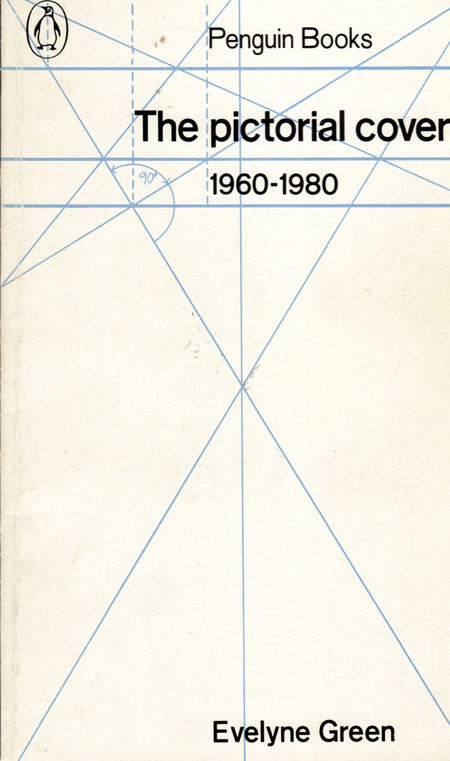
Geometric books covers at Design Daily.

The Debate That Will Not Die — Mike Shatkin weighs in on DRM and tries to find that elusive middle-ground. The discussion continues into the comments (of course)…

Unputdownable — A nice ad campaign by Saatchi & Saatchi for Penguin Books in Malaysia (via The 26th Story).

Great Ideas — The Caustic Cover Critic looks at the covers for all 20 of the new additions to Penguin’s Great Ideas series. Some fantastic typographic stuff here as you might imagine, although — to be honest — I think there are one or two weaker entries in this round and the purple motif works better for some books than others…

A New Page — (Much linked to elsewhere, but in case you missed it) Nicholson Baker’s meticulous vivisection (or “epic takedown” if you prefer) of the Kindle in The New Yorker:

The problem was not that the screen was in black-and-white; if it had really been black-and-white, that would have been fine. The problem was that the screen was gray. And it wasn’t just gray; it was a greenish, sickly gray. A postmortem gray. The resizable typeface, Monotype Caecilia, appeared as a darker gray. Dark gray on paler greenish gray was the palette of the Amazon Kindle.

This was what they were calling e-paper?

And if you can’t get enough of that Kindlenfreude feeling…

David L. Ulin, book editor  The LA Times, weighs in on Amazon’s troubling reach.

Niches — Richard Nash, formerly of Soft Skull Press, talks about his new community-based venture, tentatively called ‘Cursor’, in Publishers Weekly.

And finally…

A Journey Round My Skull has a nice post of vintage Swedish books covers from collected from the excellent  Martin Klasch. I particularly like this vampiric cover for Raymond Chandler’s The Big Sleep by Martin Gavler from 1963 (above).

Comments closed

Zeitoun

My colleague Jennifer from Publishers Group Canada just handed me a copy of the new Dave Eggers book Zeitoun and, as with all new McSweeney’s first edition hardcovers, it is a thing of beauty.

Unfortunately the image above does not really do the (jacketless) cover justice (and I’m so low-tech that I don’t have a camera here in the office to take a snap for you).

On the finished book, the buildings, paddle, and skin (and the reflections) in Rachell Sumpter‘s lovely (front and back) cover illustrations are accentuated in a bold yellow ochre (which I think you can just make out in the image above).

The front cover is embellished with silver lettering and highlights, and — to finish it all off — the illustrations are offset by a lovely dark red spine that wraps about ¾ of an inch onto the front and back of the book.

No doubt a designer would be able to tell you all the wonderful specs and technical terms for all of this, but I hope — if nothing else — I’ve persuaded you to seek out Zeitoun in your local bookstore and look for yourself.

(Full disclosure: PGC are part of Raincoast Books — the folks I work for — just not the part I work for, if that makes sense).

UPDATE:

A recent Wall Street Journal feature on Zeitoun included this picture of the finished book:

1 Comment

Something for the Weekend, July 24th, 2009

Group Thinkery — Book-designing, tuba-playing Christopher Tobias has launched a new blog to discuss books, design, and publishing. Group Thinkery is also on Twitter.

I came across the stellar portfolio of High Design’s David High — which includes this rather brilliant cover for The Management Myth for W.W. Norton — earlier this week thanks to a tweet from the chaps at FaceOut Books. Go take a look.

Luck — In another one of those long, fascinating Agents and Editors Q&As from Poets and Writers that are always well worth your time, Jonathan Galassi, president and publisher of Farrar, Straus and Giroux, looks back at his career and comments on the current state of the industry:

One of the really hard lessons was realizing how much of a crapshoot publishing is—how you can love something and do everything you can for it, and yet fail at connecting it to an audience. Maybe you misjudged it. Maybe it didn’t get the right breaks. One of the hardest things to come to grips with is how important the breaks are. There’s luck in publishing, just like in any human activity… That was one of the hardest lessons: how difficult it is to actually be effective… Writing is its own reward. It has to be. I really believe that. This is a part of publishing that’s really hard to come to grips with. But publishers can’t make culture happen the way they want it to happen… We can huff and puff and pay money and advertise and everything else, but in the end, if the readers don’t come, we can’t do anything about it.

The lovely-looking limited edition, hand-made Done Walking With My Regular Shoes by recent graduate Stina Johansson. The cover design is screen-printed onto canvas (via DesignWorkLife).

Andy designing — The New Directions blog looks at the book designs of Andy Warhol:

Andy Warhol worked for New Directions as a book designer off and on for almost 10 years. Our editor-in-chief recalls James Laughlin telling her an Andy Warhol anecdote:

“He was a very strange looking man. But all the secretaries loved him because he would sneak little origami creatures on their desks when they weren’t looking. One time as he was walking out of the office he looked bashfully over at a secretary goggling at him and said ‘I like you. You’re so hirsute.’ Her reply? A very soft and giggly ‘thank you.’”

Personalization — Steven Heller talks to Rick Smolan about The Obama Time Capsule, a book that can be customized by the reader before it is printed:

I wondered if there was a way to create a book that wove together all these amazing images with each individual book buyer’s own story, photos and even their children’s artwork, so that every single copy was unique. I intentionally didn’t want to do a trade book edition because part of the goal was to have no books in warehouses, no print run, no books printed that might have to be later pulped and destroyed, no books shipped over by container ship from China or Korea (where all the big coffee table books are printed). The idea was to do the book of the future 10 years ahead of its time.

In this particular instance the customization of the book sounds a little gimicky to me, but possibilities it opens up seem pretty endless…

And lastly… Not being very quick on the uptake (what, you noticed?) I just came across the winners of The Strand bookstore’s Eye on The Strand photography contest. The Grand Prize was awarded to Josh Robinson for ‘Strand Shadows’ (above) and the contest exhibition, which opened on July 15th, will run through August 26, 2009 at the Pratt Institute CCPS Gallery, located at 144 West 14th Street, New York. I’m also rather fond of Cary Conover’s ‘Upside Down’ which took second place:

1 Comment

Q & A with Nate Salciccioli

Thanks to blogging and Twitter I’ve been lucky enough to connect with a group of people in the book trade that I probably wouldn’t have met otherwise. Their enthusiasm and willingness to share their experiences is in stark contrast to the traditional reluctance of people in the industry to talk meaningfully (or positively) about what they do (without being three sheets to the wind).

Book designers in particular have an amazing online dialogue about their work and so over the next couple of months I’m planning a series of interviews with some of the designers whose projects have recently caught my eye.

First up on the docket is Nate Salciccioli. Nate is a graphic designer at The DesignWorks Group — purveyors of fine book covers since 1996 — and the chap behind the excellent Paradox of Awesome (it’s a long story and you probably had to be there…).

Even though he is only 23 (according to his website), Nate’s work has already been recognized by Print, Graphis, CMYK Magazine and elsewhere.

What attracted you to a career in book design?

Like many things, my career in book design was accidental. I’ll admit that, while in design school, I had neither considered nor seen many book covers. It certainly hadn’t entered my school-addled brain that I would (or could) pursue it exclusively. That all changed when I landed an internship with The DesignWorks Group, which I deem one of the most providential events of my life thus far. Everyone here is such a blast to work with, and I think falling in love with what they do here led to my love of book cover design.

Briefly, could you tell me a little about The DesignWorks Group?

Surely. Our little studio has been in the industry going on 14 years. We work almost exclusively in book cover design, with a few identities, websites, and movie posters thrown in for good measure. All told, there are 6 designers who call DWG home, and some amazing production and management people. From what I’ve gathered in talking with friends, the atmosphere at DWG is pretty unique; we love to collaborate, love to have fun, and LOVE the Shat (for those of you who are uninitiated, that’s William Shatner).

Something interesting is that none of our clientele is local. We work with publishers in NYC, Chicago, Nashville, San Francisco, Colorado Springs, Boston, and lots of other equally spaced out locations. This creates an interesting disconnect, which I think actually has helped our studio reach out through the internet with platforms like FaceOut Books, design:related, and Twitter.

How long have you worked there?

I’ve been working here since July 1, 2007. Has it really been over two years? I’m still waiting for two 30 inch monitors, if anyone is reading this…

Is there a ‘house’ style?

Thankfully, no. Our range of clients is so diverse that I think we’d be doing ourselves a disservice to aim towards anything as unified as a ‘house style.’ All the designers working here are deathly afraid of repeating themselves (in a good way). I do have to make a concerted effort to expose myself to lots of different kinds of design aesthetics to avoid getting a NATE look. Which reminds me, I need to stop using Futura…

Is there much collaboration between designers at DWG?

We’re always talking to each other. Many times a day I’m showing different people what I’m working on, and in turn taking a look at their screen. I can’t tell you how valuable this is in keeping my brain from fizzling. As a team, we’ll have brainstorming sessions when someone wants help in coming up with concepts. These concept generation sessions (CGSs??) always enrich the thinking on any given project.

Could you describe your design process?

Ah. You had to ask. Can I plead the fifth? Does ‘Plead the Fifth’ even make sense in Canada?

To be honest, my process varies from project to project. Sometimes I’ll read the book, do some sketches, find something I like, find a great image, create some brilliant typography, and get an ecstatic response from the client. SOMETIMES. More often, I’ll read and reread the given material from the client, roll some ideas around in my head for a while, and struggle for about an hour in Photoshop until I gain some momentum. If that doesn’t work, I run to the local convenience store for an ice cold Coca-Cola. I can’t stress enough the role of caffeine in graphic design.

What are your favourite projects to work on?

I love digging my teeth into a good fiction title. To me, fiction affords the most open-ended challenge: design something unique that gives an insight into the story. It’s more than problem solving. The art director I’m working with at the publisher plays a huge role in setting the tone for the project: Are we going for something brilliant, or for something palatable by Danielle Steele fanatics?

Some of my favorite projects lately have been a book about zombies, a reference series for Barnes and Noble, and several university press projects. I can’t get enough projects for university presses, by the way. Always a fun challenge.

What are the most challenging?

The biggest challenge is trying to continue innovating after several rounds with a project. When your ideas keep getting shut down, you have to find the place in your head that refuses to give up. On the flipside, it can be very rewarding to emerge from a bout like this with a cover that makes everyone happy (including me); it happens like that, sometimes.

What do you think makes a good cover design?

I’ve discovered that a good cover is more than just “oh wow, look at that neato type” or “shee whiz, no title on the cover!” It’s about communication in the end. I’ve admittedly produced designs that I thought looked great, but didn’t speak to the audience at all. If a cover can effectively introduce the book to its intended audience while still looking like a million bucks, it’s a good cover.

Where do you look for inspiration?

I have a morning routine that runs me through the gamut of book cover design sites (of which, happily, there are PLENTY), design inspiration sites, and blogs. I also have a running folder of lovely bits of design I find in different places. FFFFound is a great resource for visual stimuli, as are sites like NOTCOT.org and The Book Cover Archive. Just walking into a Barnes and Noble is a wonderful way to build enthusiasm for book design, as you can actually TOUCH them.

Who else is doing interesting work right now?

Some of my favorites to watch right now are Brian Chojnowski, Jason Heuer, Megan Wilson, Ben Wiseman, Christopher Brand, Jacob Covey, Helen Yentus, and Adam Johnson. There are so many talented designers working in book design, it boggles my mind.

As a young designer, what do you think the future holds for book cover design?

Some older and MUCH smarter people have told me there will always be a market for book cover design. I guess I’ll have to take their word for it. For me, the skills I develop working in books could translate easily to many other graphic design facets, which brings some comfort. I don’t expect to be holding a cardboard sign that says “Have Mouse, will Kern for Food” any time soon.

Thanks Nate!

You can find more of Nate’s work at his website and design:related portfolio.

6 Comments

Knots

I usually avoid discussions of digital rights management (DRM) as much as possible. It’s a Gordian Knot. We can spend a lot of time and energy painstakingly untangling it, never to find a form of DRM that keeps everyone happy. Or we can  end DRM altogether with one bold stroke (“mission accomplished!”) only to discover that cutting the knot takes longer than we expected and is more complicated than we first thought. Either way, my sense is that we will continue to have some kind of hybrid situation — with some e-books ‘protected’ by DRM and some not — as we both cut and untangle all the issues…

And for all that I’m often left wandering if DRM really matters as much as we tend to think it does. Do people outside of our strange intersection of media and technology really care about it as much as we do? Are there other pressing issues that we should direct energy towards?  I have this nagging sense that as we agonise over the do-we-don’t-we of DRM, most people just want to read good books.

Nevertheless, the great DRM debate has come to the fore again as a result of Michael Bhaskar’s seemingly mild assertion that DRM Is Not Evil on Pan Macmillan’s The Digitalist blog, which resulted in the (predictable) slew of comments.  Michael has now posted a response which has garnered another slew of comments.  It’s all worth reading if you can summon the energy and want some insight into the issue (although I don’t think anyone mentions foreign rights, but perhaps some one will get to that yet…)

3 Comments

Something for the Weekend, July 10th, 2009

Shute — JRSM, the Caustic Cover Critic, has a great post on the work of book designer and illustrator Mick Wiggins, whose evocative illustrations (which look a bit like dark interpretations of vintage Tube posters) adorn the Penguin Classics US editions of John Steinbeck and the new Vintage Classics editions of Nevil Shute.  JRSM will have an interview with Mick Wiggins soon. Can’t wait…

The Revenge of PrintEric Obenauf, publisher at Two-Dollar Radio on the state of print and publishing for The Brooklyn Rail:

The goal for book publishers, most simply put, should not be to undertake a virtual arms race of developing technology with both the Internet and media, or to try to compete on a bloated scale with music and film, or even to translate a work to conform to an undetermined potential future model. The mission for book publishers and print media at large should be to create a product that is irreplaceable and indispensable.

And I will just add for the umpteenth time that it’s not about e-books, DRM, pricing, or devices — it’s about making better books.

Big BluePhilip Hoare, author of Leviathan or, The Whale winner of this year’s Samuel Johnson Prize (and one the books I’m currently reading), chooses his Top 10 Whale Tales in The Guardian. You can also hear Claire Armitstead’s interview with Philip for The Guardian here and read PD Smith‘s TLS review here. And, for the record, Philip is a Southampton boy like myself…

Top 10 Comic Book Cities as chosen by Architects Journal. Gotham is only number 6 (via Book Oven on Twitter).

And lastly…

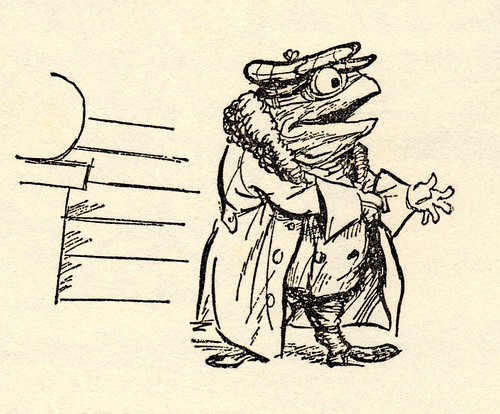
Up We Go! Up We Go! — The wonderful BibliOdyssey has posted a number of E. H. Shepard’s lovely illustrations for The Wind in the Willows.

Have a great weekend.

1 Comment

Monday Miscellany, June 29th, 2009

Gestalten’s Naïve: Modernism and Folklore in Contemporary Graphic Design, edited by Robert Klanten and Hendrik Hellige,  reviewed at The Designer’s Review of Books.

Served — Jeremy Ettinghausen, Penguin UK’s Digital Publisher, explains the rationale for their new (v. cool sounding) project for kids We Make Stories:

[A]s the debate about the value and price of digital content rages on, I’m testing out a new mantra on my suspicious colleagues; services not content. The idea, ill-formed as it is in my head, is that while we might continue find it a challenge to get consumers to pay for digital content, we might be able to use our skills, expertise and experience to create services that people will pay for. Services are what we do for writers, so perhaps there might be services we can create for readers.

Proof I think — were it still needed — that not all the most interesting book stuff is being generated in Seattle.

Friction — Laura J. Murray’s excellent critique of Brett Gaylor’s documentary RiP: A Remix Manifesto for Culture Machine (PDF). Murray’s comments about a copyright  ‘war’ and choosing ‘sides’ certainly resonated with me:

I’m not on any side, because I’m not in a war. Such language is a) a kneejerk echo of the Hollywood/recording industry message, b) offensive to anyone who has ever experienced a blood and guts war, and c) a joke to those who are not already convinced of the importance of remix. But most importantly, it is, d), an unproductive way of framing our current copyright challenges, because it suggests that the debate won’t end until one side has achieved total victory.

Amen.

The State of the Union — A big sprawling spaghetti post from the the chaps at Three Guys and One Book (loosely) about the state of publishing from the perspective of readers (mostly). I don’t agree with all of it by any means, but some of it sticks…

Less, But Better — A profile and brief interview of design hero Dieter Rams at BBH Labs. Just FYI — If I ever write a publishing manifesto (ha!), it will be called Less, But Better: A Publishing Manifesto. And just for the hell of it, here are Dieter Rams 10 principles of good design:

  1. Good design is innovative
  2. Good design makes a product useful
  3. Good design is aesthetic
  4. Good design helps us to understand a product
  5. Good design is unobtrusive
  6. Good design is honest
  7. Good design is durable
  8. Good design is thorough to the last detail
  9. Good design is concerned with the environment
  10. Good design is as little design as possible

Most, if not all, of these principles could be applied to publishing. Who (or where?) is publishing’s Dietar Rams?

And finally…

Big Gold Dream — Michael Fusco’s great redesigns for the Pegasus Classic Crime reissues of Chester Himes seen (of course) at FaceOut Books. Michael Fusco has some more great cover designs on his website.

(And a quick side note to publishers and designers — it was impossible to find decent hi-res image of these covers. If you want people share your brilliant work, you need to work on this. Ideally I want images that are at least 400px x 600px)

1 Comment

Something for the Weekend, June 26th, 2009

2009 Penguin Design Award — Peter Adlington’s abstract design for The Secret History by Donna Tart (pictured above) took 1st place. More on the Penguin Blog.

The Good Design Book — Christopher Simmons, graphic designer and principle at the San Francisco-based design firm MINE, records the progress and process of writing and designing his new book on design (via Unbeige). The whole concept reminded me that I should also mention the crowdsourced Smashing Magazine Book.

OK, Go — Kassia Krozser, Kirk Biglione, and Kat Meyer (and an unnamed “veteran of the book industry”), put their money where their collective mouth is, and launch digital publisher Quartet Press (and they’re accepting submissions).

The Debrief — Organizer Hugh McGuire pens his personal thoughts on BookCamp Toronto for Book Oven.

One of the most powerful things about BookCamp, compared with other events I’ve been to, is that this was not just a grassroots group. There was high-level engagement from the publishing industry, with publishers, editors, senior VPs, production managers, marketers, and interns, and everything in between. It was great to see the honest debate and conversation being lead by these insiders, who are truly grappling with the future of their business and their passion.

And VANTAP‘s Sean “Crazy Horse” Cranbury  adds his 2 cents on #bcto09 at the Books on The Radio blog, and teases BookCamp Vancouver.

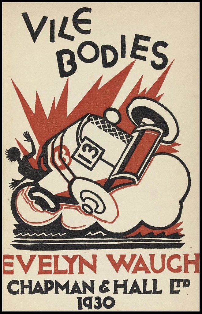
Vile Bodies — The 1930 first edition cover of Evelyn Waugh’s second novel seen at BibliOdyssey.

And last, but not least…

Apples and Oranges — The article about the evolution of Amazon by Adam L. Penenberg, author of the forthcoming Viral Loop: How Social Networks Unleash Revolutionary Business Growth, that launched a great Twitter chat with @FastCompany and yesterday’s ’26 Things…’ list (which could have easily been twice as long). 

Comments closed

26 Things Not Related To Amazon

Oh dear. I’m really not an Amazon-hater. But this morning I inadvisedly took Fast Company magazine to task on Twitter for only writing book industry stories about Amazon and the Kindle.

In their response, Fast Company rightly pointed out that the Fast Talk section of the April edition of the magazine  featured technology — aside from the Kindle —  that is changing book publishing. It included  (short) interviews with Josh Hug, CEO and co-founder of Shelfari (which is in fact owned by Amazon), Julia Cheiffetz, Senior Editor at HarperStudio, the team behind Scholastic’s 39 Clues, Steve Haber developer of the Sony e-reader, and Eileen Gittins, CEO of Blurb.

Funnily enough, I had actually bought April issue of Fast Company and completely forgotten about this (admittedly somewhat forgettable) feature. Suitably chastened, I apologised for my sweeping generalization.

I am grateful (and slightly amazed) that Fast Company took the time to reply to my glib missive and put me straight. However, I do think there is a tendency — not just isolated to Fast Company — to use Amazon as the only frame of reference in stories about the book trade.

With this in mind,  I challenged myself to pull together a quick list of current book-related things that I think are exciting that don’t (as far as know) have anything to do with Amazon (yet).

So here is a completely personal, off-the-cuff list of 26 book companies, ideas, projects, blogs, websites and trends that I think are inspiring, interesting, exciting, or worth watching (and are unconnected to Amazon):

(And yes, I realise there is a certain irony in writing a list that’s not about Amazon just to prove not everything has to do with Amazon)

  1. The Afterword
  2. Authonomy
  3. BookArmy
  4. BookCamp
  5. The Book Cover Archive
  6. The Book Depository
  7. Bookkake
  8. BookNet Canada
  9. Cell phone novels
  10. Drawn & Quarterly*
  11. Faber Finds
  12. FaceOut Books
  13. Gollancz’s collaboration with the D&AD Global Student Awards
  14. Google Books
  15. Gutenberg Rally beta
  16. Harlequin
  17. iPhones
  18. McNally Robinson
  19. Shortcovers
  20. Unbooks
  21. Twelve
  22. Twitter
  23. VANTAP
  24. Vromans
  25. We Tell Stories
  26. WW Norton’s Book Design Archive

Who or what would be on your list?

*Full disclosure: D+Q are distributed in Canada by Raincoast Books.

3 Comments