Skip to content

Tag: Design

Book Covers of Note April 2017

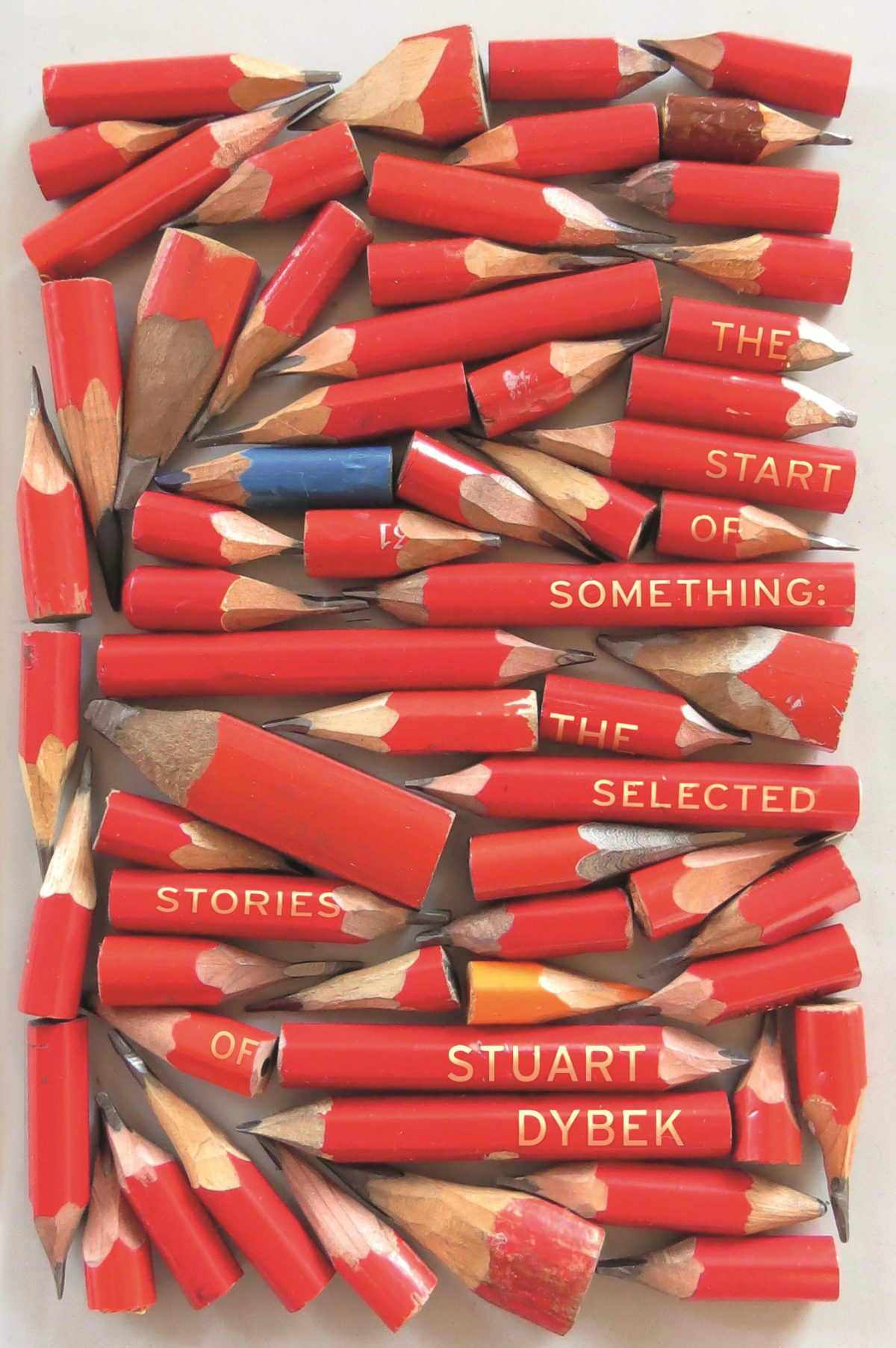
This edition of ‘book covers of note’ is brought to you entirely by Gray318 who designed the covers of all the books published this month. OK, that’s an exaggeration, but Jon did design FOUR of the covers on my list — all different, all brilliant. How no one has published a monograph of his work yet is beyond me. Anyway… This month’s post also includes covers by David Pearson, Erik Carter, Scott Richardson, Kimberly Glyder, Katie Tooke, Rachel Vale and more… 


Black Moses by Alain Mabanckou; design by Gray318 (Serpent’s Tail / April 2017)


England Your England by George Orwell; design by David Pearson (Penguin Modern Classics / March 2017)


The Fortunate Brother by Donna Morrissey; design by Pete Adlington (Canongate / April 2017)


Ghachar Ghochar by Vivek Shanbhag; design by Luke Bird (Faber & Faber / April 2017)

And, just FYI, after 6 years at Faber & Faber, Luke has decided to set up his own studio should you wish to hire him (and on the basis of this cover alone, why wouldn’t you?).

The Good People by Hannah Kent; design by Rachel Vale (Picador / February 2017)


The Handmaid’s Tale by Margaret Atwood; art direction by Christopher Moisan; illustration by Patrik Svensson (Houghton Mifflin Harcourt / April 2017)

This is just the latest in a number of striking covers for The Handmaid’s Tale  rare bookseller and author Rebecca Romney recently compiled a list


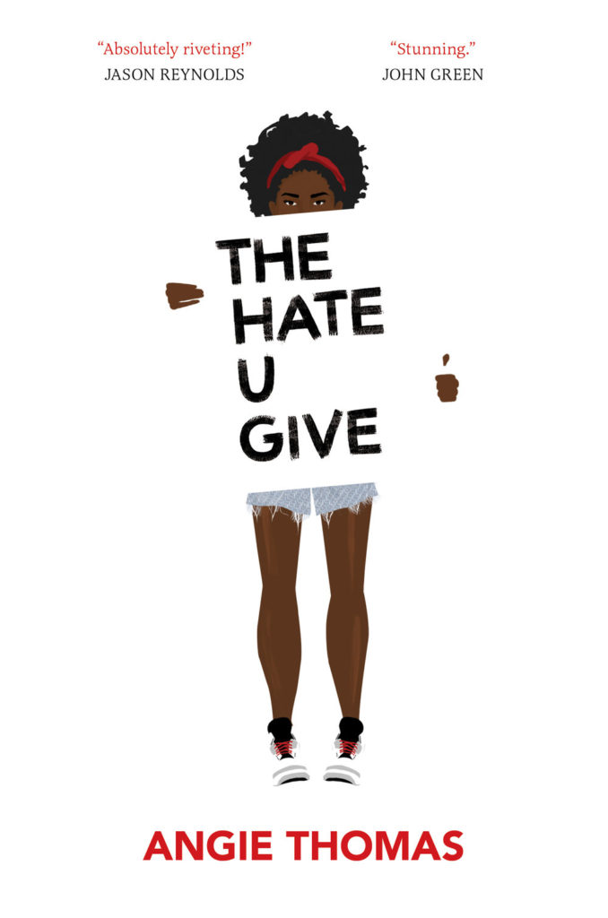
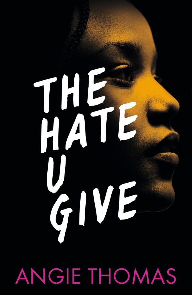
The Hate U Give by Angie Thomas; design by Jenna Stempel; illustration Debra Cartwright (Balzer + Bray / February 2017)

The cover of the UK edition of The Hate U Give, published by Walker this month, was designed by Maria Soler.

It’s interesting that both designs have acrostic titles. I wonder if this was in the brief?  


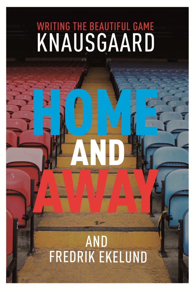
Home and Away by Karl Ove Knausgaard and Fredrik Ekelund; design by Alex Merto (Farrar, Straus & Giroux / January 2017)

The cover of the British edition, published by Harvill Secker in November 2016, was designed by Matt Broughton. 


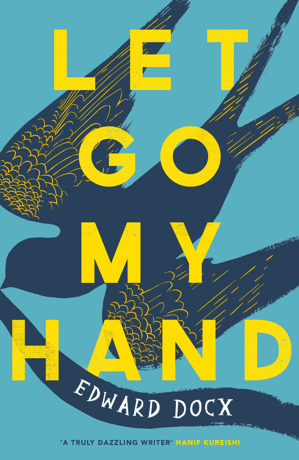
Let Go My Hand by Edward Docx; design by Katie Tooke (Picador / April 2017)

Literature Class by Julio Cortázar; design by Rodrigo Corral and Zak Tebbal (New Directions / March 2017)

Locus Solus by Raymond Roussel; design by Erik Carter (New Directions /March 2017)


The Night Ocean by Paul La Farge; design by Will Staehle (Penguin / March 2017)


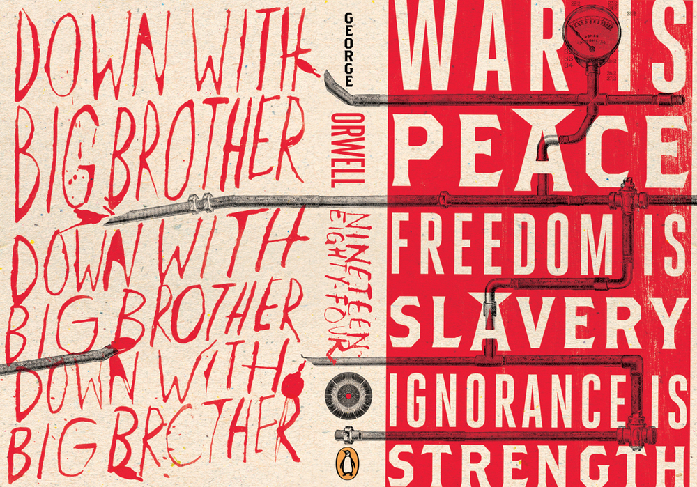
Nineteen Eighty-Four by George Orwell; design by C. S. Richardson (Penguin Canada / March 2017)

In the US, Houghton Mifflin Harcourt have also published a new edition of Nineteen Eighty-Four. The cover — which owes a wee debt to Peter Mendelsund’s eye motif covers for the Schocken editions of Kafka (in my very humble opinion) — was designed by Mark Robinson.

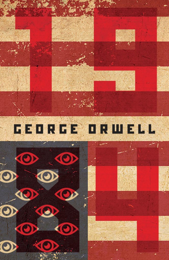
You can see a few other recent covers for Nineteen Eighty Four here


Out of Line by Barbara Lynch; design by Delcan & Company; photography by George Baier IV (Atria / April 2017)

The Redemption of Galen Pike by Carys Davies; design by Zoe Norvell (Biblioasis / April 2017)


Six Stories by Matt Wesolowski; design by Mark Swan (Orenda / March 2017)

Sorry to Disrupt the Peace by Patty Yumi Cottrell; design by Sunra Thompson (McSweeney’s / March 2017)

The jacket has a really nice metallic finish in real life. The bright green cover under the jacket is also really nice. 

Sound System by Dave Randall; design by Jamie Keenan (Pluto Press / April 2017)


Spaceman of Bohemia by Jaroslav Kalfar; design by Allison Warner (Little Brown & Co. / March 2017)


Sympathy by Olivia Sudjic; design by Gray318 (Houghton Mifflin Harcourt / April 2017)

To Be a Machine by Mark O’Connell; design by Gray318; robot/photograph by Marco Fernandes (Granta / April 2017)

The Teeth of the Comb & Other Stories by Osama Alomar; design by Erik Carter (New Directions / April 2017)

Us&Them by Bahiyyih Nakhjavani; design by Anne Jordan and Mitch Goldstein (Stanford University Press / April 2017)


Voices from the Jungle: Stories from the Calais Refugee Camp; design by Gray318 (Pluto Press / April 2017)


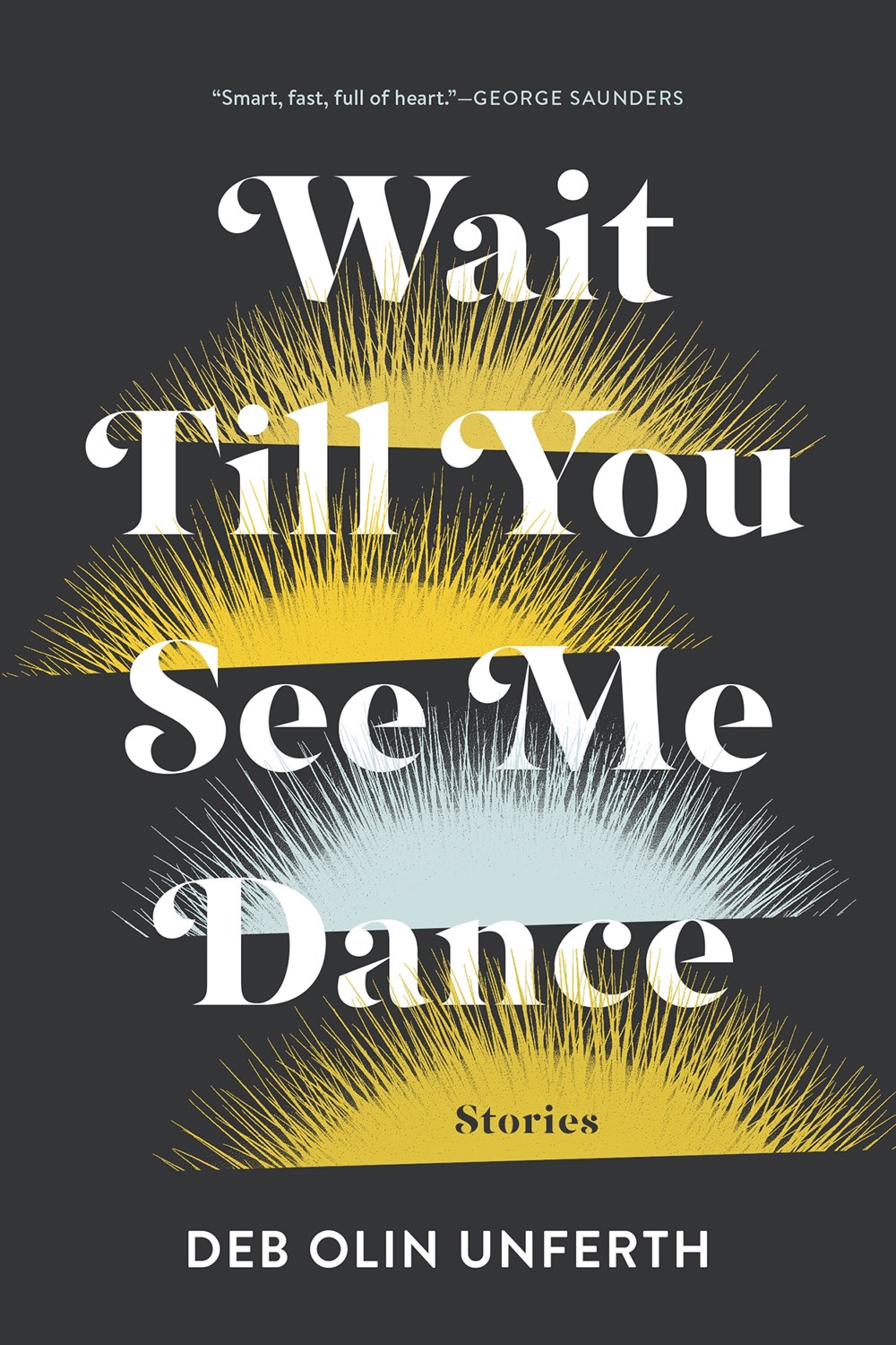
Wait Till You See Me Dance by Deb Olin Unferth; design by Kimberly Glyder (Graywolf / March 2017)


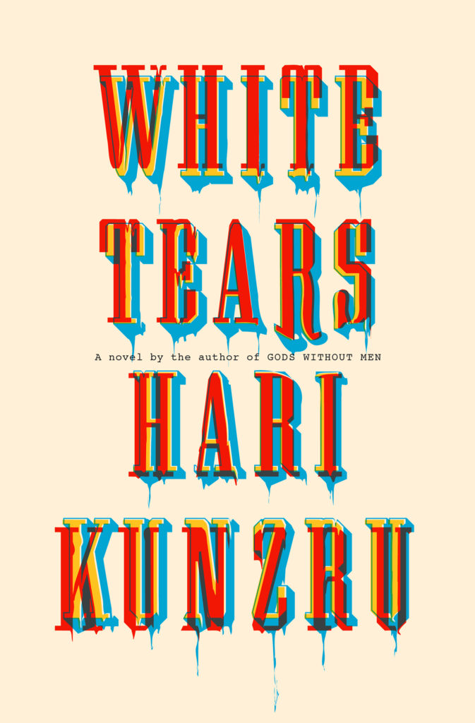
White Tears by Hari Kunzru; design by Peter Mendelsund (Knopf / March 2017)

The cover of the UK edition, published this month by Hamish Hamilton, was designed by Richard Bravery.

Comments closed

Elena Ferrante Covers Designed by Angelo Bottino

The covers of the Anglo-American editions of Elena Ferrante’s novels published by Europa Editions have been… well, controversial to say the least (read an interview with the art director about their “kitsch” quality here). The Australian editions of Ferrante’s Neapolitan quartet, published by Text Publishing, have much more stylish, cinematic covers designed by W. H. Chong (you can read about his process here). But these illustrated covers designed by Angelo Bottino for Brazilian publisher Intrínseca for Um Amor Incômodo (Troubling Love) and A Filha Perdida (The Lost Daughter) are really rather lovely. I would love to see a complete set of Ferrante’s novels with covers designed by Bottino.  

UPDATE: The cover illustrations for the Intrínseca editions of The Lost Daughter and Troubling Love are by Andy Bridge and Marian Trotter respectively. Thanks to Angelo Bottino for letting me know! 


Save

2 Comments

Design Canada Documentary

Greg Durrell of Canadian design firm Hulse&Durrell, and Jessica Edwards and Gary Hustwit of Film First are putting together a documentary about Canadian graphic design:

The project is currently on Kickstarter. There are a couple of weeks to go and they are still a few thousand dollars shy of their goal. Please help out if you can. 

Comments closed

Book Covers of Note March 2017

Holy smokes! There are a lot of good covers this month! Feast your eyes on March’s book covers of note:


Amiable with Big Teeth by Claude McKay; cover art by Sean Qualls (Penguin / March 2017)


The Book of Greek and Roman Folktales, Legends & Myths edited and translated by William Hansen; design by Amanda Weiss (Princeton University Press / March 2017)


The Bridge Ladies by Betsy Lerner; design by Justine Anweiler (Pan Macmillan / March 2017)


A Conjuring of Light by V.E. Schwab; design by Will Staehle (Tor Books / February 2017)

This completes a distinctive set of covers for V.E. Schwab’s ‘Shades of Magic’ trilogy by Will Staehle: 


Dead Letters by Caite Dolan-Leach; design by Jaya Miceli (Random House / February 2017)


Dick Cheney Shot Me in the Face by Timothy O’Leary; design by David A. Gee (Unsolicited Press / February 2017)


Done Dirt Cheap by Sarah Nicole Lemon; design Alyssa Nassner; illustration Amanda Lanzone (Amulet Books / March 2017)


The Education of Margot Sanchez by Lilliam Rivera; cover art by Dana Svobodova (Simon & Schuster / February 2017)


Eyes Wide Open by Isaac Lidsky; design by Zoe Norvell (Tarcher / March 2017)

And now two covers for Exit West by Mohsin Hamid — first the cover for the UK edition designed by Richard Bravery (Hamish Hamilton / March 2017):

And the cover of the US edition designed by Rachel Willey (Riverhead / March 2017):


The Hearts of Men by Nickolas Butler; design by Allison Saltzman (Ecco / March 2017)


Jerzy by Jerome Charyn; design by Alban Fischer (Bellevue Literary Press / March 2017)


Little Nothing by Marisa Silver; design by James Paul Jones (Oneworld / March 2017)

Rachel Willey’s cover design for the US edition of Little Nothing published by Blue Rider Press was part of my September 2016 round-up.


The Name of the Game is Kidnapping by Keigo Higashino; design by Janet Hansen (Vertical / February 2017)


Narcissism for Beginners by Martine McDonagh; design by Tree Abraham (Unbound / March 2017)


Next Year for Sure by Zoey Leigh Peterson; design by Jaya Miceli; cover art by Jarek Puczel (Scribner / March 2017)


One Day We’ll All Be Dead and None of This Will Matter by Scaachi Koul; design by C.S. Richardson (Doubleday Canada / March 2017)


One of the Boys by Daniel Magariel; design Thomas Colligan (Scribner / March 2017)


Optimists Die First by Susin Nielsen; design by Joan Wong (Wendy Lamb Books / February 2017)


Our Short History by Lauren Grodstein; design by Olga Grlic (Algonquin / March 2017)


Standard Hollywood Depravity by Adam Christopher; design by Will Staehle (Tor Books / March 2017)


Swimmer Among the Stars by Kanishk Tharoor; design by Tyler Comrie (Farrar, Straus and Giroux / March 2017)

I believe the cover of the UK edition, published next month by Pan Macmillan, was designed by Justine Anweiler:


The Tea Girl of Hummingbird Lane by Lisa See; design by Lauren-Peters-Collaer (Scribner / March 2017)


The Zoo of the New edited by Nick Laird & Don Paterson; design by Richard Green (Particular Books / March 2017)

Comments closed

Books

Modern Toss

(This is a little too close to the bone)

1 Comment

ABCD Award Winners 2017

The winners of the annual Academy of British Cover Design (ABCD) Awards were announced at a glittering ceremony London in last night. The dashing Danny Arter has a posted a full report on the proceedings at The Bookseller. You can see all the winning covers below… 

Young Adult

The Memory Book by Lara Avery; design by Sinem Erkas (Quercus / January 2017)

Sci-fi/Fantasy

Radiance by Catherynne M. Valente; design & illustration by Nathan Burton (Corsair / August 2016)

Non-fiction

The Genius of Birds by Jennifer Ackerman; design by Jack Smyth (Little, Brown / April 2016)

Series Design

Vintage Virginia Woolf; design by Suzanne Dean; illustration by Aino-Maija Metsola (Vintage / October 2016)

Classics/Reissue

The Birds and Other Stories by Daphne du Maurier; design Jamie Keenan (Virago / October 2016)

Children’s

The Boy in the Striped Pyjamas by John Boyne & illustrated by Oliver Jeffers; design by Dominica Clements; illustration by Oliver Jeffers (Doubleday / October 2016)

Women’s Fiction

Vinegar Girl by Anne Tyler; design by Kris Potter (Hogarth / June 2016)

Literary Fiction

The Start of Something by Stuart Dybek; design Suzanne Dean; cover art by Marion de Man (Jonathan Cape / November 2016) 

Crime/Thriller

Maestra by L.S. Hilton; design by Blacksheep (Zaffre Publishing / March 2016)

Mass Market

Girls on Fire by Robin Wasserman; design by Jack Smyth (Little, Brown / May 2016)

All of this year’s shortlisted covers can be found on the ABCD website. Last year’s winning covers can be seen here; the 2015 winners here

Comments closed

Back to Futura

Vox takes a lighthearted look at the history of Futura, “the font that escaped the Nazis and landed on the moon”: 

Comments closed

Alan Aldridge 1943-2017

British artist and designer Alan Aldridge died last week aged 73. In the words of designer Mike Dempsey, Aldridge “was a major influence on the British design and illustration scene in the 1960’s.” Although he is perhaps best known for his work for The Beatles, The Who and Elton John (not to mention his infamous poster for Andy Warhol’s film Chelsea Girls) it began, Dempsey notes, “with his controversial post as fiction art director of Penguin Books in 1965 where he challenged the status quo, upsetting many on the way.”

The Guardian obituary explains how Aldridge got his start in design:  

Sheer chutzpah won him his first job at a design agency, where he passed off his girlfriend’s portfolio of work as his own and was hired for £3 a week. “I blag beautifully,” as he put it. When he turned up to work the following Monday and was told to wear a suit, he went to Bethnal Green baths and stole one.

He drew portraits in his spare time, and as news of his abilities spread, he was recruited as a trainee by Germano Facetti, the art director at Penguin Books. Aldridge worked his way up to designing book covers, then was offered a job as a junior visualiser at the Sunday Times. The paper had the UK’s first colour supplement, offering new opportunities in design and photography that Aldridge was keen to exploit.

His most memorable contribution was his transformation of a Mini into a four-wheeled work of art, handpainted by Aldridge in a hectic 24-hour session. It was the magazine’s cover image in October 1965, with the title Automania. Meanwhile he had still been creating covers for Penguin, and was lured away from the Sunday Times to become Penguin’s fiction art director. Aldridge set about creating a radical, freewheeling new look for Penguin’s catalogue.

Aldridge talked more about this unorthodox beginning in this video:

My introduction to Aldridge was the revised 1971 edition of The Penguin Book of Comics, the book he conceived with George Perry (the cover of the first edition, originally published in 1967, is pictured above). I found it on the shelf in my grandparents house and pored over the pages of reproduced art. The book was my first introduction to American comics, and the idea that comics could be taken (somewhat) seriously. I found Aldridge’s illustrations, which also appear throughout the book, confusing and fascinating in equal measure. I know they reminded me of Heinz Edelmann’s art for Yellow Submarine — I think for a while I assumed they were by the same person — but you can read about Aldridge’s own work with The Beatles in this 2005 article from Eye Magazine

Aldridge refused to call himself an artist, illustrator, or designer. Instead he was a self-styled ‘graphic entertainer’, a precursor of today’s designer-entrepreneur, who had created a moderately successful product called ‘Put-Ons’, tattoo skin transfers. He was also always pitching projects that could turn a profit. He even convinced Albert Grossman, Bob Dylan’s manager, to produce a book of Dylan lyrics. But when Sgt. Pepper’s was released in 1967, Aldridge had an idea that promised surefire success.

‘I noticed the initials of ‘Lucy in the Sky with Diamonds’ spelled LSD and decided that it would be fun to explore visually the hidden meaning in the Pepper’s lyrics. I called Paul (who I’d never met, but had his home phone number) and said I’d like to interview him [about this], and much to my amazement he not only said yes, he said let’s do it now and come right away to his house in St John’s Wood. You don’t argue with an edict like that.’ The interview and accompanying illustrations appeared in 1967 in The Observer under the headline: ‘A Good Guru’s Guide to the Beatles Sinister Songbook.’ Bags of fan mail rapidly followed. ‘It didn’t take a brain surgeon to figure out that I was on to something. So I pitched a dummy of the book, The Beatles Illustrated Lyrics, which had three or four spreads of illustrated lyrics, to Peter Brown (Beatle manager Brian Epstein’s partner for many years) at Apple. The book would have all the lyrics from ‘Love Me Do’ to ‘A Day In The Life’ illustrated by famous artists; I think I even mentioned getting Picasso, Dali and Magritte! Peter showed the layouts to John and Paul and got the boys’ okay.’

Having Lennon and McCartney’s sanction, however, did not mean Aldridge instantly nailed the book. He still had to present the project to Dick James, owner of Northern Songs, which published and co-owned the Lennon / McCartney lyrics. ‘Dick liked what he saw, then curve-balled me,’ Aldridge winces. ‘An American publisher had come to him with a similar deal, and had offered a lot of money, but since I had the boys’ okay he’d give me two weeks to get a publishing deal that gave him an advance of £20,000, a huge sum in 1968.’ For a week, Aldridge phoned every publishing house in London and New York, explaining the urgency. He was, however, turned down by everyone. ‘Not because of the large advance, but because they all thought the Beatle phenomena wouldn’t last another year.’

The Man with Kaleidoscope Eyes: The Art of Alan Aldridge, a catalogue of Aldridge’s work, is available from Abrams.

Comments closed

Dick Bruna 1927-2017

Dutch illustrator and designer Dick Bruna died last week, aged 89. Much of the coverage has focused on Miffy, the picture book rabbit he created in the 1950’s, but as The Guardian obituary notes, he was also well known as a book cover designer:

Bruna was born in Utrecht, the son of Johanna Erdbrink and Albert Bruna, and the intention was that he should join the family publishing firm, AW Bruna & Zoon. But Bruna, having been sent to Paris and London to learn about publishing and bookselling, including a brief spell working for WH Smith, opted instead to train as a graphic designer. He had been a keen artist throughout his childhood, especially during the second world war years, when his family lived in the Dutch countryside and he did not go to school, educating himself instead by studying the art of Rembrandt and Van Gogh.

He studied briefly at art school in Amsterdam for six months before leaving to join the family firm in 1951. There he worked as a designer and illustrator, creating more than 100 posters and 2,000 book jackets, including, most famously and distinctively, the covers for Georges Simenon’s Maigret titles in the 1960s, with a black pipe superimposed on a variety of backgrounds.

And as obituary in New York Times makes clear, the flat minimalism of Miffy and his design work is very much part of a graphic tradition in Dutch art and design:  

Mr. Bruna never became the fine artist he had originally wanted to be, but his work has nevertheless been recognized as part of the Dutch canon of art and design.

“Bruna very much continues a Dutch tradition which we call the ‘klare lijn’ — you could translate it as the clear line, or you could just call it simplicity,” said Taco Dibbits, director of the Rijksmuseum in Amsterdam, which in 2015 organized an exhibition devoted to a half-century of Mr. Bruna’s art and graphic designs. “You see that’s he’s part of a tradition going from Pieter Saenredam through Vermeer to Mondrian.”

During his time in Paris, Mr. Bruna was influenced by the bold lines and two-dimensionality of Henri Matisse and Fernand Léger, Mr. Dibbits said. He also used primary colors and clear lines favored by members of the Dutch de Stijl movement, a pared-down, abstract aesthetic heralded by artists like Mondrian and the designer Gerrit Rietveld.

“He eliminates anything that’s not essential from the face of this little rabbit until it’s really reduced to the absolute minimum,” Mr. Dibbits said. “And he does the same for the text of his children’s books. He uses a language that’s not simple or stupid, but he reduces to the bare essentials.”

You can find an incredible collection of Bruna’s book covers (over 3,000 of them!) here (via Present & Correct). I’m particularly fond of his De Schaduw covers for Havank:

Comments closed

Book Covers of Note February 2017

A little later than usual — between one thing and the apocalypse — but there are some great covers out this month, including at least one contender for cover of the year:


The Bear and the Serpent by Adrian Tschaikovsky; design by Neil Lang (Pan Macmillan / February 2017)

The cover for the previous book in the series, The Tiger and the Wolf, was also designed by Neil: 


Birds Art Life Death by Kyo Maclear; design by Jonny Pelham; illustration by Kyo Maclear (Fourth Estate / February 2017)

The cover of the US edition published by Scribner, which also features illustrations by Kyo Maclear, was designed by Lauren Peters-Collaer:


The Blot by Jonathan Lethem; design by Gray318 (Jonathan Cape / February 2017)


The Brand New Catastrophe by Mike Scalise; design by Oliver Munday (Sarabande Books / January 2017)


Civil Wars by David Armitage; design by Peter Mendelsund (Yale University Press / February 2017)


Darke by Rick Gekoski; design by Pete Adlington (Canongate Press / February 2017)


Emergency Admissions by Kit Wharton; design by Jonny Pelham (Fourth Estate / February 2017)


Is That Kafka? by Reiner Stach; design by Erik Carter (New Directions / February 2017)

Erik’s design for the hardcover was included in my June post last year:


It Can’t Happen Here by Sinclair Lewis; design Jim Stoddart (Penguin / January 2017)


The Lucky Ones by Julianne Pachico; design by Luke Bird (Faber & Faber / February 2017)


Manly Health and Training by Walt Whitman; design by Richard Ljoenes (Regan Arts / February 2017)

The Memory Book by Lara Avery; design by Sinem Erkas (Quercus / January 2017)


Never Enough by Barney Hoskyns; design by Jamie Keenan (Constable / January 2017)


Nicotine by Nell Zink; design by Julian Humphries (Fourth Estate / October 2016)

Had I seen this cover last year when the book was published, it would undoubtedly made my end of the year list.

And on the topic of covers of the year, here’s that early contender for 2017:


A Separation by Katie Kitamura; design by Jaya Miceli (Riverhead / February 2017)

And from the sublime to the hilarious…


Spurt by Chris Miles; design by Lucy Ruth Cummins (Simon & Schuster / February 2017)


A Simple Story by Leila Guerriero; design by Oliver Munday (New Directions / February 2017)


This is the Ritual by Rob Doyle; design by Greg Heinimann (Bloomsbury / January 2017)

Greg’s design for the hardcover of This Is The Ritual, also published by Bloomsbury, was included in my January post last year:


Who Lost Russia by Peter Conradi; design by Mark Ecob (Oneworld / February 2017)

Save

Comments closed

Goudy & Syracuse: The Tale of a Typeface Found

The tale of rediscovering Sherman, a typeface designed by American type designer Frederic Goudy in 1910 and revived by Chester Jenkins for Pentagram in 2016 for Syracuse University:

Comments closed

1984

1984 by George Orwell; design by WH Chong (Text Publishing)

The dystopia described in George Orwell’s nearly 70-year-old novel “1984” suddenly feels all too familiar. A world in which Big Brother (or maybe the National Security Agency) is always listening in, and high-tech devices can eavesdrop in people’s homes. (Hey, Alexa, what’s up?) A world of endless war, where fear and hate are drummed up against foreigners, and movies show boatloads of refugees dying at sea. A world in which the government insists that reality is not “something objective, external, existing in its own right” — but rather, “whatever the Party holds to be truth is truth.”

“1984” shot to No. 1 on Amazon’s best-seller list this week, after Kellyanne Conway, an adviser to President Trump, described demonstrable falsehoods told by the White House press secretary Sean Spicer — regarding the size of inaugural crowds — as “alternative facts.” It was a phrase chillingly reminiscent, for many readers, of the Ministry of Truth’s efforts in “1984” at “reality control.” To Big Brother and the Party, Orwell wrote, “the very existence of external reality was tacitly denied by their philosophy. The heresy of heresies was common sense.” Regardless of the facts, “Big Brother is omnipotent” and “the Party is infallible.”

Michiko Kakutani, New York Times

As Nineteen Eighty-Four is suddenly more relevant than ever, I thought I would share a few of the recent covers for Orwell’s classic novel…

1984 by George Orwell; design by David Pearson (Penguin Classics)

1984 by George Orwell; design by Gray318 (Penguin)

1984 by George Orwell; illustration Daniel Mitchell (Penguin Random House Spain)

1984 by George Orwell; illustration by Marion Deuchars (Penguin Modern Classics)

1984 by George Orwell; design by Shepard Fairey (Penguin)


Save

2 Comments