Skip to content

Tag: Design

Jason Booher Interviewed at The Perch

Last Magazine design Jason Booher

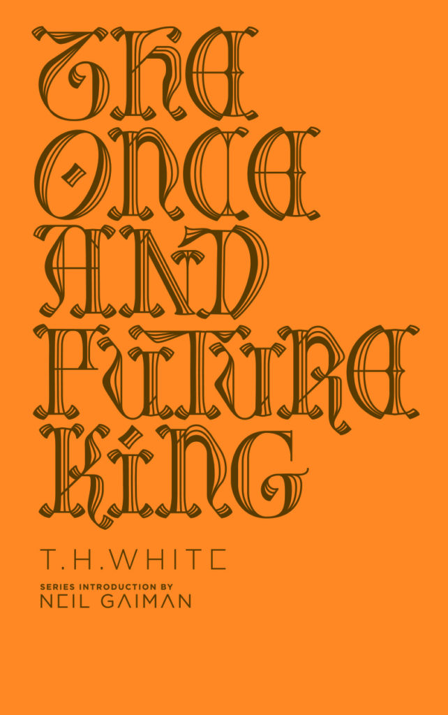
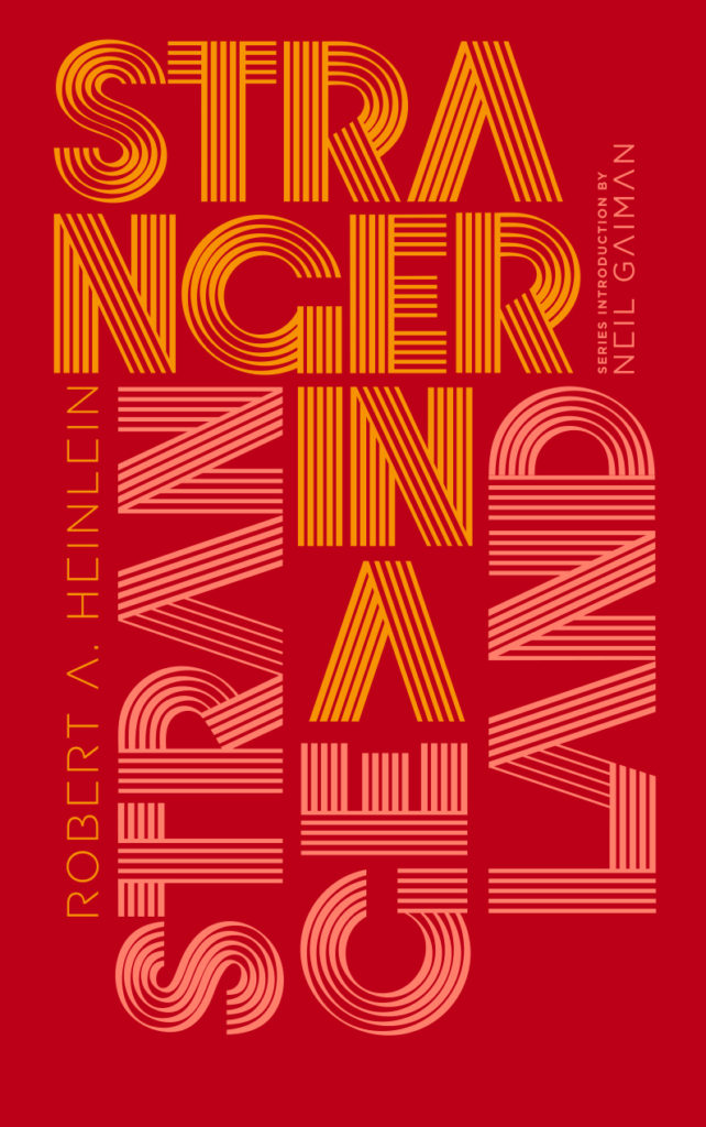
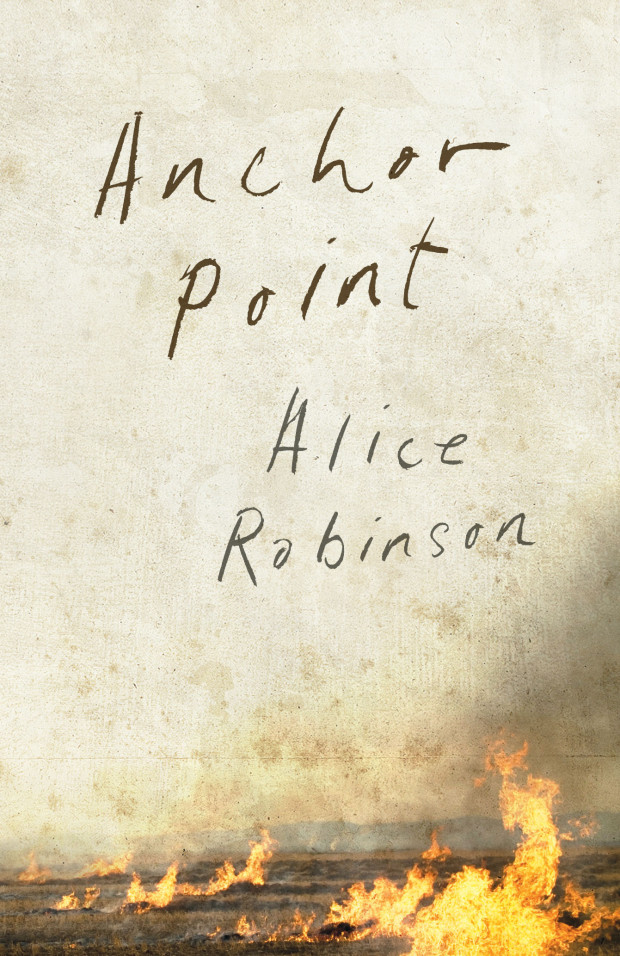
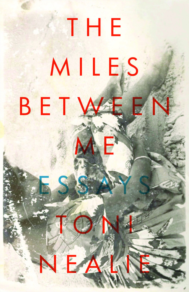
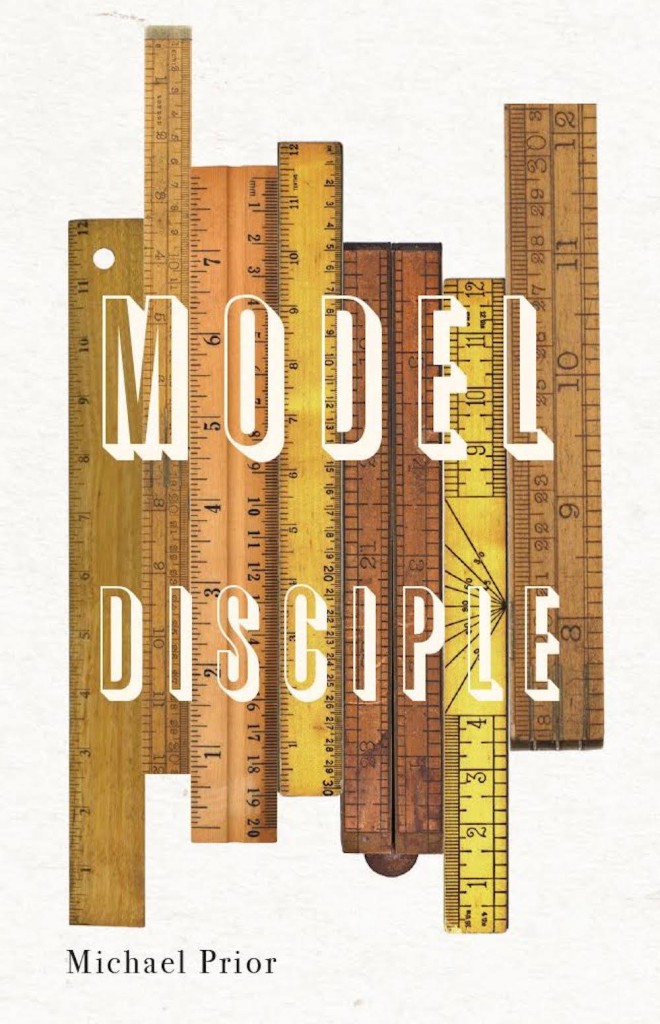
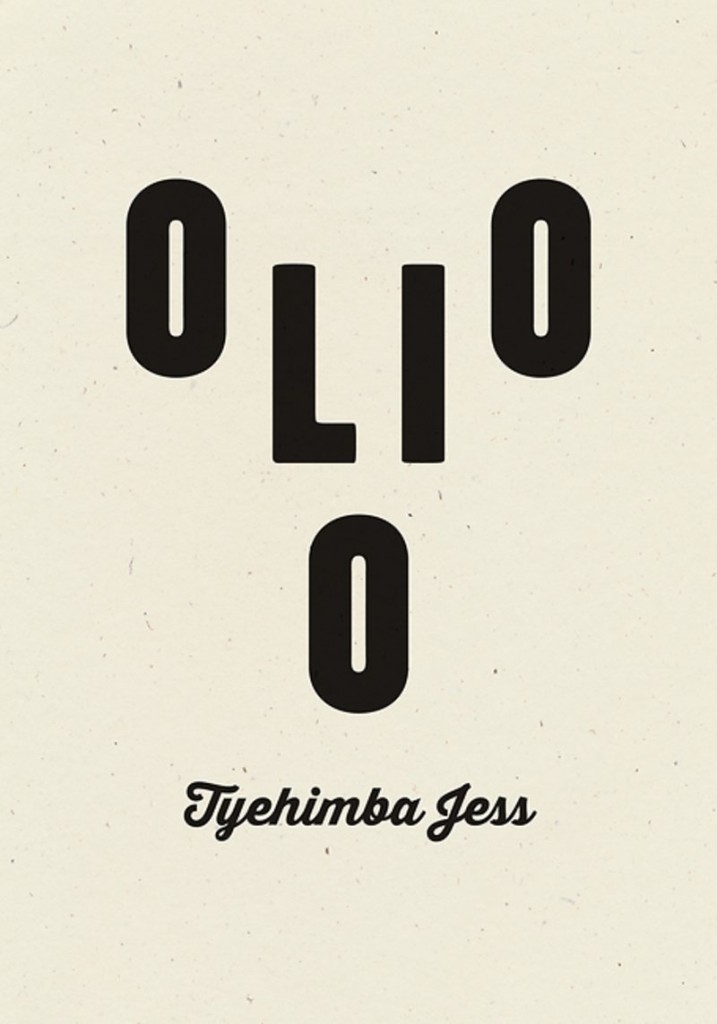
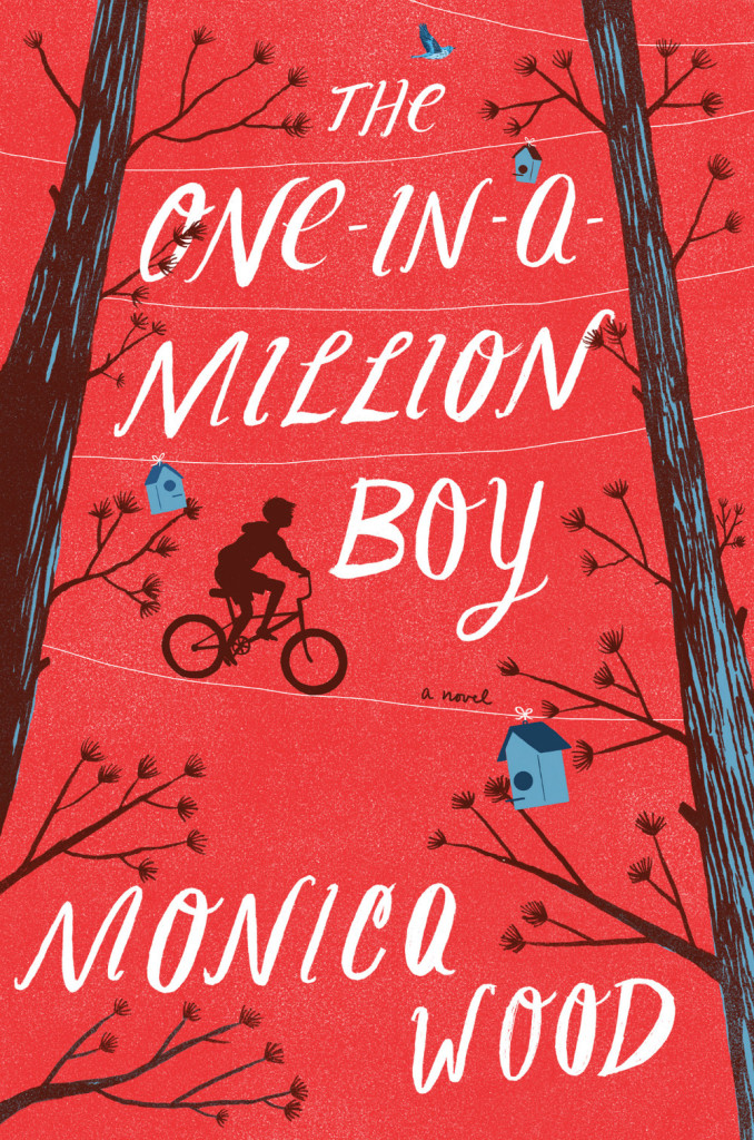
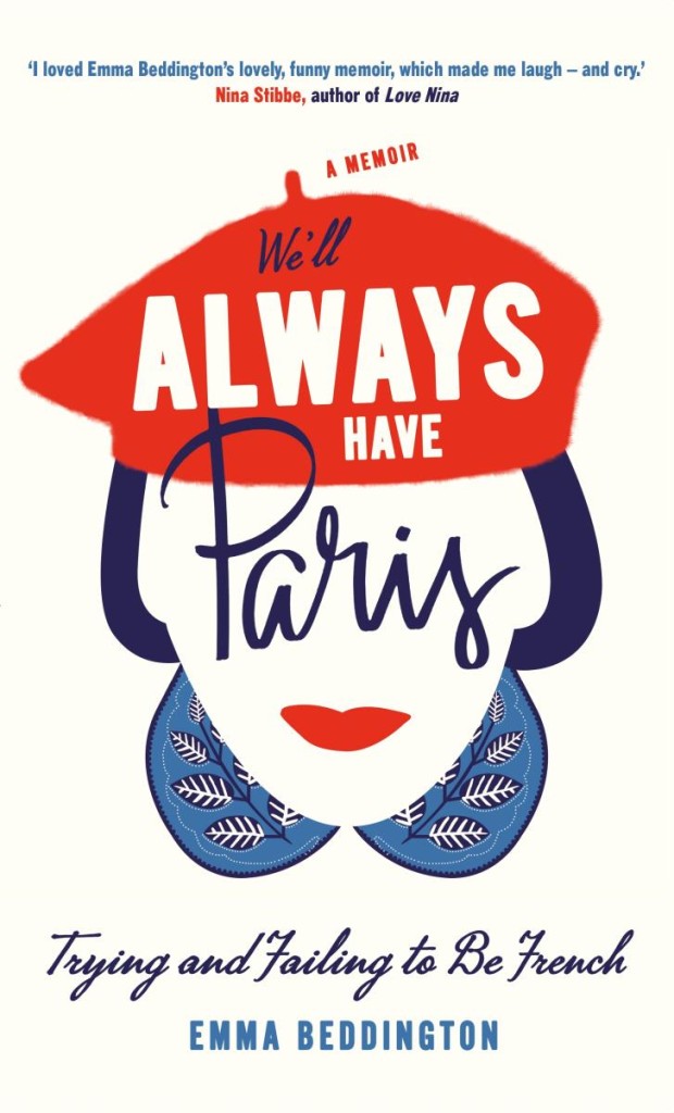
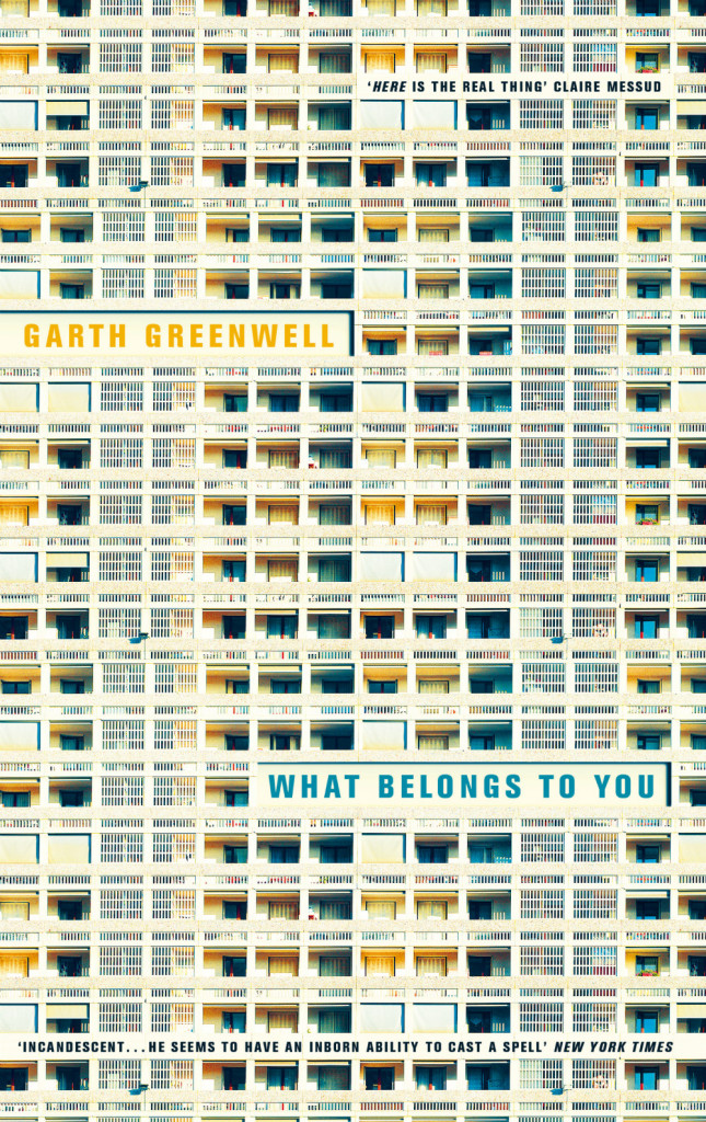
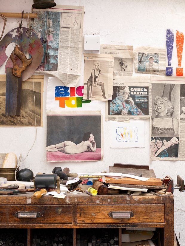
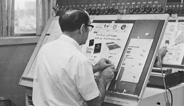
Jason Booher, designer and art director of Blue Rider Press and Plume, talks to Penguin Random House blog The Perch about the book cover design process:

A design can be thought of as a set of constraints or parameters. In book design, these consist of things like the conceptual literary content of the book, what makes the book unique in the context of other similar books or all books, how the author is (or is not) known, the expectations of the book from the point of view of the author/editor/sales force/readers, the context of book jacket in the contemporary moment, the context of book jackets in the last 10 (or even 20) years, visual pop culture. Or something that is obvious and not obvious is working with type is very difficult. And it perhaps the most specialized thing that graphic designers bring to that general problem solving into form.

Jason also describes how he approaches a book cover:

There’s a combination of reading the manuscript, and listening to the editor talk about the book. As an art director, I have to dip into almost all the of the books to see what they are like before deciding to whom to give each title. As a designer (if I’m working on that title’s jacket) it’s always different with every book. But as a general process I will read the book, and think and sketch, and sketch, and reread, work though a number of ideas, throw most of them out, stay with others, reread, take a walk (much harder when you are also the art director), try to come up with something new. Those are the first steps.

And how he works with other designers:

When I work with a freelancer (as well as with my in-house designers), I like to see what they come up with without any input from me. Not only are you more likely to get something special and surprising, something you couldn’t have thought of yourself (which is why art directors work with a variety of freelancers in addition to their in-house staff), but you are sending a signal of trust. If a designer knows what “kind” of design they are expected to deliver, they might not push very far or hard. But if they take ownership of being the first arbiters of what the package of the book might be, there is more of a chance for something brilliant. I’m just trying to maximize the talent I have working with me.

With my in house staff, it is similar but there might also be a concept that is floating that we will work with. Or occasionally I’ll work with one designer or my whole team to come up with  ideas together. That’s an exception though, and cover design is generally a sole enterprise in the initial stages. Then it becomes a collaboration when I see comps, and goes from there.

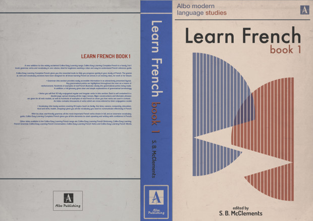
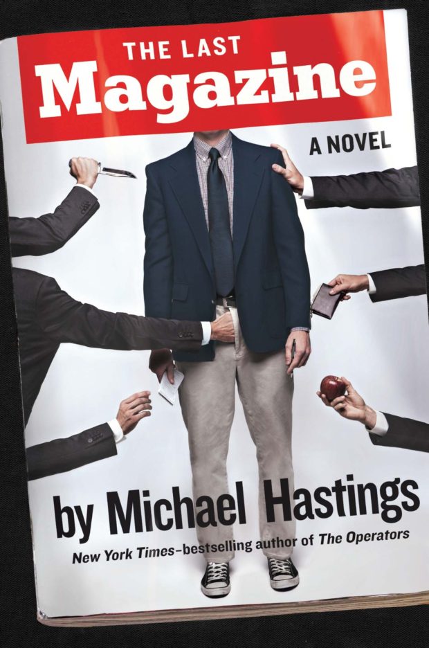
Read the whole interview here.

Comments closed

The Many Ways a Book Cover is Rejected

Is That Kafka design Erik Carter

In an excellent post for The Literary Hub, designer Erik Carter writes about designing the cover of Reiner Stach’s Is That Kafka? 99 Finds for New Directions, and the process of getting a book cover approved:

The actual process of designing a book jacket is more than just reading the book and making a beautiful image with your favorite font and slapping it on the front. A good cover should represent the spirit of the book and celebrate what makes that book unique. So then why do so many covers fall for the same visual clichés as so many other covers? Go on down to your local online book dealer and you’ll see bargain bin stock photos adorned with tiny endorsements about how this book is so, so much better than other one you’re about to click on. In order to get a book cover approved you have to get the sign off from the art director that you’re working for, the marketing department, the author, the editors, sometimes even the author’s spouse, their milkman, or their next door neighbor. It’s a nimble game of politics that you have to play to get the vision that you have for a cover into the bookstore. And it’s a game where design is often the loser. The publisher wants the book to sell, the designer wants the book to look good, and the author wants the cover to match their vision of what the cover of their book should be. And almost always, these three are at odds. There is a lack of definition for “what looks good” and a shaky science as to “what will sell” and authors are so close to their books it can be difficult to find out what it is that they actually want. The language of aesthetics and the aesthetics of language need to trust each other. It’s important for designers to be more acclimated with what it is that a publisher is looking for as to what will sell. Compromising that business by stretching your typefaces to the point of unreadability may not do you any favors. Ultimately it’s the author’s book, and they know it far better than you do, so really it’s their opinion that matters the most, even if they are not familiar with the fundamentals of good design.

Comments closed

Penguin Galaxy Series design by Alex Trochut

2001 design Alex Trochut

Following on from their horror classics series selected by Guillermo Del Toro, Penguin US is publishing six hardcover science fiction and fantasy classics this fall with introductions from Neil Gaiman, and (more importantly!) brilliant typographic covers by Brooklyn-based Spanish designer Alex Trochut. Available in October, the finished covers will be foil on uncoated paper over board.

dune design Alex Trochut Left Hand of Darkness design Alex Trochut neoromancer design Alex Trochut The Once and Future King design Alex Trochut Stranger in a Strange Land design Alex Trochut

Comments closed

Australian Book Design Awards 2016 Shortlist

ABDA Shortlist

ABDA, the Australian Book Designers Association, recently announced the shortlist for the 64th Australian Book Design Awards. As in previous years, the shortlist includes some cracking designs in a wide-range of categories. The finalists for literary fiction are pictured below:

Designed by John Durham (Affirm Press / 2016)
Designed by Allison Colpoys (Scribe /2016)
Design by Laura Thomas (Hamish Hamilton / 2016)
Designed by W.H. Chong (Text Publishing / 2016)

The winning books will be announced on Friday 13 May at the Awards Party in Melbourne.

Comments closed

Jacket Everyday

Last month, Canadian designer Steve St. Pierre started asking people what the title of their life story would be and creating book jackets for the replies. The results are both brilliant and weird.

Leah Collins recently talked to Steve about his project for CBC Arts:

“I love book cover design,” St. Pierre says, and the thing that makes it special, he says, is that a successful cover is “kind of like a blind date.”

“You’re trying to essentially put charm into a book cover,” he says. But unlike drinks with some random from Tinder, the relationship you have with a novel is likely going to be longer. Probably way more meaningful, too.

“It’s that negotiation, trying to be charming and trying to get someone to just think twice about what’s in front of them,” says St. Pierre. “That, to me, is my favourite part of designing these things.”

For the record, Steve just asked me to contribute a title. I’m thinking about it.

Comments closed

Book Covers of Note April 2016

All Things Cease design Mario Hugo
All Things Cease to Appear by Elizabeth Brundage; design by Mario Hugo (Knopf / March 2016)

Assault design Oliver Munday
The Assault by Harry Mulisch; design by Oliver Munday (Pantheon / April 2016)

Association-Small-Bombs design Matt Vee
The Association of Small Bombs by Karan Mahajan; design by Matt Vee (Viking / March 2016)

Beloved Poison Jordan Metcalf
Beloved Poison by E. S. Thomson; cover art Jordan Metcalf (Little, Brown & Co / March 2016)

black hole blues design Janet Hansen
Black Hole Blues and Other Songs from Outer Space by Janna Levin; design by Janet Hansen (Knopf / March 2016)

Dada design Anne Jordan
Dada Presentism by Maria Stavrinaki; design by Anne Jordan & Mitch Goldstein (Stanford University Press / April 2016)

Five Rivers Met on a Wooded Plain design James Paul Jones
Five Rivers Met on a Wooded Plain by Barney Norris; design James Paul Jones (Doubleday / April 2016)

In the Name of Editorial Freedom design Isaac Tobin
In the Name of Editorial Freedom edited by Stephanie Steinberg; design by Isaac Tobin (University of Michigan Press / September 2015)

I’m so embarrassed that I missed this great type-only cover by the brilliant Isaac Tobin last year that I’m including it here.

Speaking of which, I also missed this rather fine David Drummond cover from late last 2015 too…

Life and Other Near-Death Experiences design David Drummond Nov 2015
Life and Other Near-Death Experiences by Camille Pagán; design by David Drummond (Lake Union Publishing / November 2015)

Man Lies Dreaming design Marina Drukman
A Man Lies Dreaming by Lavie Tidhar; design by Marina Drukman (Melville House / March 2016)

Ben Summers’ cover design for the UK edition of A Man Lies Dreaming published by Hodder and Stoughton was a book cover of note waaaaay back in October 2014!

The Miles Between Me design Alban Fischer
The Miles Between Me by Toni Neale; design by Alban Fischer (Curbside Splendor / April 2016)

Model Disciple design David Drummond
Model Disciple by Michael Prior; design by David Drummond (Vehicule Press / April 2016)

Olio design Jeff Clark
Olio by Tyehimba Jess; design by Jeff Clark / Quemadura (Wave / April 2016)

one in a million design CS Neal
The One-In-Million Boy by Monica Wood; design by C. S. Neal (Houghton Mifflin Harcourt / April 2016)

Pillow Book design Alysia Shewchuk
A Pillow Book by Suzanne Buffam; design by Alysia Shewchuk (House of Anansi / April 2016)

She Weeps design Joan Wong
She Weeps Each Time You’re Born by Quan Barry; design by Joan Wong (Vintage / February 2016)

Study in Charlotte jacket art Dan Funderburgh design Katie Fitch
A Study in Charlotte by Brittany Cavallaro; jacket art Dan Funderburgh; design Katie Fitch (Katherine Tegen Books / March 2016)

Sudden Death
Sudden Death by Álvaro Enrigue; design by Stephen Parker; photograph Mark Vessey (Harvill Secker / April 2016)

The cover of the US edition published by Riverhead and designed by Rachel Willey was in last month’s post.

Susuzluk (Thirst)_Steven Mithen
Susuzluk (Thirst) by Steven Mithen; design by James Paul Jones (Koc University Press / April 2016)

Tempest design David Pearson
The Tempest by William Shakespeare; design by David Pearson (Penguin / April 2016)

tuesday-nights-in-1980 design Rodrigo Corral
Tuesday Nights in 1980 by Molly Prentiss; design by Rodrigo Corral (Gallery/Scout Press / April 2016)

to the left of time design Jackie Shepherd
To the Left of Time by Thomas Lux; design by Jackie Shepherd (Houghton Mifflin Harcourt / April 2016)

Well Always Have Paris design Justine Anweiler
We’ll Always Have Paris by Emma Beddington; design by Justine Anweiler; lettering by Cocorrina (Macmillan / April 2016)

What Belongs To You design Justine Anweiler
What Belongs to You by Garth Greenwell; design by Justine Anweiler (Picador / April 2016)

This is a variant on the cover of the US edition from FSG designed by Jennifer Carrow, which is also very nice (especially the zig-zag of the type), but I especially like the Andreas Gursky-like edge-to-edge grid and hyper-real colour of the UK edition.

1 Comment

Alan Kitching: “I always try to have some logic to the job”

AK_FULL-BOOK-Dec-15-58

Related to my post earlier today, typographer Alan Kitching also talked to It’s Nice That this week about printing with letterpress, and a new monograph documenting his work:

Kitching started Omnific studio with Martin Lee and Derek Birdsall, who he had met through Anthony Froshaug, in the late 1970s. They worked from a studio in Covent Garden, then still surrounded by typesetters and other service people, until rents shot up and they moved out to a toy factory in Islington. By this time some foundries were starting to sell off their type, and Omnific bought up a press and installed it at their new studio: “All this type was selling off cheap, cheap-ish, and it was the last chance to get this stuff. So we bought it all and I continued printing there for around three years until I decided I wanted to leave. I didn’t really know what I was going to do but I wanted to buy the press and the type and go and print somewhere”, Kitching says. “I didn’t want to be a jobbing printer but I wanted to start out on my own. It was a very precarious thing to do because we were successful, well-established, and I was taking a backwards step, it was a bit of a leap in the dark.”

AK_FULL-BOOK-Dec-15-72

The new book, Alan Kitching: A Life in Letterpress, will be published Laurence King on April 7. A ‘Collectors Edition‘ of only 200 copies featuring a limited edition, numbered print by Kitching will also be available. Laurence King have produced four short teaser trailers for the book:

Comments closed

Inside Typographer Alan Kitching’s Home

Alan Kitching 3614

The Guardian visits the London home of designer, artist and typographer Alan Kitching:

The rooms in Alan Kitching’s home are arranged like one of his letterpress prints. Some are stacked, some are wedged, some aren’t in the right place. One dominates, while others bow out. But each room, like each letter, makes an impact and has a purpose.

From the outside, it’s obvious this isn’t an ordinary home: three large, shop-style window panels showcase Kitching’s iconic prints – word-based images in big, bold type. A fourth is given over to local notices: jumble sales and student art shows. “That was Celia’s idea,” Kitching says. “She was more gregarious than me.” Celia Stothard, his late wife, bought the property 19 years ago. She chose it for its flexibility: a place for them to live and hold talks, exhibitions and performances. She was a designer and artist, too, as well as a jazz singer.

The building is a former alehouse in Kennington, south London, buttressed up against a courthouse (local folklore has it that Charlie Chaplin used to come here to fetch jugs of ale for his mother). Storage rooms cascade off the back of the ground floor, where Kitching runs the Typography Workshop, into a cellar crammed with his extensive, 19th-century type collection. Upstairs, a high-ceilinged mezzanine has a reading nook reachable only by the swivel of a library ladder.

Comments closed

Graphic Means

Sliders_GraphicMeans7

Before the desktop computer revolutionized the way the graphic design industry worked, type and image were painstakingly put together by hand with the aid of various ingenious machines and tools.

Currently in production, the documentary, Graphic Means explores graphic design production of the 1950s through the 1990s—from linecaster to photocomposition, and from paste-up to PDF.

It looks fascinating:

You can support the production the film by pre-ordering a copy from the Graphic Means website.

Comments closed

David Pearson Found on the Shelves

on_corpulence-design_david_pearson_illus_joe_mclaren

At The Bookseller, designer David Pearson talks about his new cover designs for Pushkin Press’s ‘Found on the Shelves’ series celebrating 175 years of the London Library:

At the heart of successful series design is motif – be it colour, type, grid, imagery, or other visual touchpoints – yet Pearson’s latest covers for Pushkin are perhaps less obviously groupable. “The series identifier is a subtle one,” he says, “but it is present in the use of decorative borders. I had begun to explore this idea of active border-making with some of Pushkin’s Collection Covers; the idea being that a decorative border can provide a layer of meaning or a tension point within the cover, and not simply act as a framing device.

“For The London Library series, this takes the form of overlapping tyre treads in ‘Cycling: The Craze of the Hour’; snaking, northbound steam in ‘The Lure of the North. It’s a small thing to hang your ideas on – and it matters little if no one notices it – but it ensured that I didn’t flounder at the beginning of the design process, as I had something to kick against, an inbuilt challenge to wrestle with.”

Pearson attributes much of the covers’ liveliness to the illustration, which he is quick to credit: “I intend to broaden the illustrative scope [further titles are scheduled for November] but for this first selection I’m relying on tried, trusted and incredibly talented hands. Joe McLaren produced the illustrations for ‘On Corpulence’ and ‘Life in a Bustle’ – and as with all of Joe’s work, the result is joyous.” The additional images were sourced from illustrations within the texts themselves, giving some of the covers a distinctly vintage appearance.

Each of the covers will print using a spot colour – one outside the gamut of four-colour CMYK printing, as it cannot be created using a combination of cyan, magenta, yellow and black (“key”); as a consequence of this it is bolder, more vibrant and less ubiquitous (and therefore more striking) – and will feature black foil-blocking on uncoated paper stock.


On Reading design David Pearson

life_in_a_bustle_design_david_pearson_illus_joe_mclaren Cycling David Pearson

Save

Comments closed

Inside High-Rise

French-book-new2

I’m a bit late to this, but the Creative Review talked to graphic artists Michael Eaton and Felicity Hickson about their fantastic looking work on Ben Wheatley’s film adaptation of J.G. Ballard’s High-Rise, which included designing book covers, record sleeves, cigarette packets, supermarket products and apartment plans…

ME: It was a really fun one – from a design point of view, everything just looked so cool from that time. One of the first things I did was the Learn French book… I looked at old 70s school textbooks. And quite early on with Felicity, we worked out what the main fonts of the film would be.

We had fonts on the office wall that Ben and Mark Tildesley, the production designer, liked – certain things would have their own font; the high rise itself, the supermarket and everything had a sort of ‘brand’ within the building. So from the start, you were aware of how you could stick to a certain aesthetic. Then you’d be given your task by the set decorator [Paki Smith] from the script.

FH: We had a few references, but [for the supermarket] Paki had the wonderful idea of using colour as the main graphic; so you’d have these blocks of colour. We did blocks of products, so as you went down the aisle, rather than seeing individual products you saw bold, graphic shapes. It wasn’t a line of ten different brands on the shelf, you had all these own-label ‘Market’ brands. It was a ‘stylised’ view of dressing.

ME: We realised when we saw the shelves just how much it would take to fill the space. We looked at references for that – Andreas Gursky’s shots of supermarkets with loads of repeats of the same packaging, that was the starting point. We also looked at old images of phone books, any kind of instructional manual, toy kits.

We looked at covers of things, such as Penguin books and magazines. Also, the buyers on the film would be out buying props and every so often they’d come in with, say, a box of comics, or TV guides from the 70s. So we had all this great stuff lying around the office we could look through.

Final-Freud-1024x756

Record-covers

WashingPowder2

Comments closed

Making It Up: The Bookseller Interviews Mr Keenan and Gray318

Mr Keenan and Gray318

I love this Bookseller interview with designers Jamie Keenan and Jon Gray, co-founders of the Academy of British Cover Design (among other things):

ABCD tends to recognise and reward brave, striking and fresh approaches, rather than more “conventional” cover aesthetics. I ask the pair whether they feel designers have more freedom these days; whether, as books become imbibed with more longevity and are seen as less disposable, publishers are more amenable to the idea of cover art as art, rather than as a marketing tool. They are reticent; Keenan responds: “It’s strange, because when you do see a weirdo cover – for a reason, not just for the sake of it – quite often they are really successful. If you think of a book as an actual package and compare that to other forms of packaging, its really old-fashioned in a lot of ways.

“Imagine a poster for, say, the next iPhone, and it has a quote on it like you’d see on a book cover – ‘this is the best phone I have ever had!’ – you just think, this is so old-fashioned, that kind of endorsement idea. On a book cover it’s the norm. A lot of advertising you see, you aren’t really sure what it’s for but it draws you in, whereas a lot of book covers are really overt – they tell you exactly what the book is about. We’re supposedly becoming more and more visually literate, but book covers are still, in some ways, quite naïve.”

Gray concurs: “It feels like a real nervous habit, the quote on the front. Is that really helping a book to be sold? Can [shoppers] not just read that on the back and get the same idea…on the front, is it really making someone think: ‘aha!’?”

“The greatest and the worst thing about book cover design is that no one really knows if it’s incredibly powerful or a complete waste of time,” Keenan says. “Quite often when you get a brief, you’ll be sent other covers that the [client] likes and some of them will look absolutely terrible…but it was a bestselling book! So that automatically becomes, in their eyes, a sort of ‘good cover’.”

“There’s no science to it,” Gray agrees.

You can almost hear them sipping their pints.

Comments closed