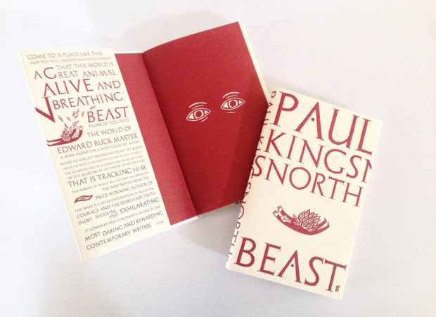
Creative Review talks to Mark Ecob about his cover design for Paul Kingnorth’s new book Beast (Faber & Faber, July 2016), which incorporates “a series of folkloric linocut illustrations” by Alan Rogerson.
I love this cover.
Comments closedBooks, Design and Culture
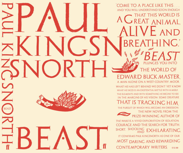
Creative Review talks to Mark Ecob about his cover design for Paul Kingnorth’s new book Beast (Faber & Faber, July 2016), which incorporates “a series of folkloric linocut illustrations” by Alan Rogerson.
I love this cover.
Comments closed


At Literary Hub, Designer Oliver Munday discusses his design process and reading the whole text:
Comments closedAs designers, we are forced to read quickly, and incisively, mining for the clues to the coveted iconic cover. It can feel careless at times, leading me to believe that my reading skills are being dulled. I think of the author in this process, and in some ways the guilt that I may feel about a less-than-ideal reading of their text is exceeded by the potential of presenting their book with the best possible jacket, one that their audience of ideal readers will appreciate. A cover that feels simultaneously unexpected and inevitable.
I used to aspire to a process that created an expanse for reading each text, one that merged the ideal-designer and ideal-reader into one, but found the boundaries of distinction too severely marked. It would be amazing to have the time, space, and inclination to read an entire text when designing its cover, but I have realized that is not essential. There may be times when my two selves are reconciled, but in the event that they exist separately, a reading designer, divided against himself, will remain standing.
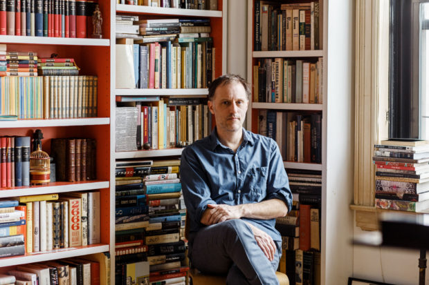
In this profile of Peter Mendelsund in the June issue of Rhapsody Magazine, there is a lovely bit about the designer’s architect-artist father:
Comments closedIn the living room of Knopf associate art director Peter Mendelsund’s Upper Manhattan apartment, inspiration is everywhere: a battered, sea-green first edition of Ulysses; a toy version of the rocket Tintin takes to the moon; the vertebra of a blue whale; and, on top of his baby grand piano, a wooden model of a convention center made by his father, in the mid-’70s, when he worked for a New York architecture firm. It was never built, because the firm didn’t win the competition (Renzo Piano did), nor were any of his other models, because, in his late 30s, Benjamin Mendelsund was diagnosed with a brain tumor and devoted the rest of his life—he died at 48—to sculpture and painting. “He cut out all the bureaucracy of architecture,” Mendelsund says, “and turned to this.” He points to a small canvas painted entirely black except for two rectangles—two faded photos of a barn’s loft, its window open to the bright of day.
That image of a window onto a window is central to the signature style that’s made Mendelsund one of our preeminent book jacket designers: geometric, fascinated with negative space, striving to capture infinity through simplicity. You see the painting echoed in his cover for Martin Amis’s 2006 novel, House of Meetings, for which he photographed a tiny simulacrum of a room, its perspective slanting toward a miniature door. You see it in his many book jackets with drop-cuts—holes carved out of an image—like the diamond torn from a woman’s face on an early cover for The Girl With the Dragon Tattoo, back in 2005 when it was called The Man Who Hated Women. And you see it in his May 11, 2015, New Yorker cover, which features an American flag smashed like a storefront window, a single star-shaped hole evoking the myriad emotions of last year’s civil unrest in Baltimore.
His father’s second act as an artist also helps explain how, at 33, Mendelsund had the confidence to abandon his career as a classical pianist (“Eventually, I realized that I’d never truly be world class”) and reinvent himself. His wife suggested he try something visual—he was always drawing; he had designed their wedding invitation. “Sometimes the obvious things take a long time to see.”

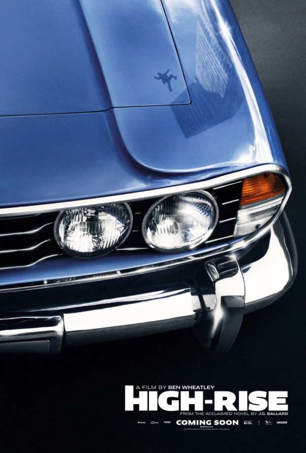
In a long and fascinating interview with the Ballardian, Ben Wheatley talks about J.G. Ballard and his adaptation of High-Rise:
Initially, I really enjoyed the cult appeal of [Ballard’s] work, or more specifically the counter-cultural aspect. His books, particularly Crash and High-Rise, were like rites of passage for anyone trying to read subversive and counter-cultural literature. Alongside Naked Lunch and Fear and Loathing in Las Vegas, they were books you had to read. But I was especially struck by Ballard’s use of language and turns of phrase, which didn’t feel like any other writer I had come across.
Although I enjoy SF, and that was also part of the charm of his novels, I also think it was books like The Atrocity Exhibition and then his 70s books that really hooked me in. When I was a teenager, there were two writers that really appealed to me: Burroughs and Ballard. They weren’t just authors and novelists in the traditional sense, they seemed much more dangerous and enigmatic than other writers. Burroughs naturally has a mystique because he shot his wife in the head and was a junkie, and therefore the extremity of his fiction was partially mirrored in his real life.
But the thing is, there was something about Ballard that was even stranger and perhaps more insidious, in the sense that he didn’t do those extreme things and was living a quiet, suburban life as a father to three children while also pouring out these amazingly perverse books. That had a big effect on me, but I was also aware of him through music, comics and other media. I wasn’t a particularly voracious reader of novels, so in some ways I experienced Ballard through a kind of cultural response to his work.
This is the best, most in-depth interview with Wheatley I’ve read on the subject of adapting Ballard and making High-Rise.
Comments closed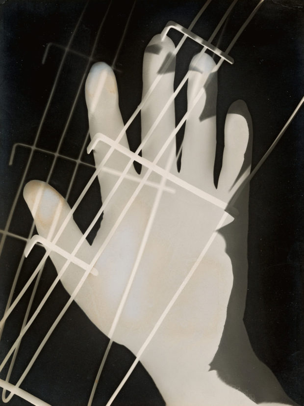
The New York Times on a new exhibition of work by Hungarian artist and designer Laszlo Moholy-Nagy at the Guggenheim in New York:
The first large Moholy-Nagy exhibition in this country in over 50 years may also be, its organizers say, the largest anywhere. It packs around 300 works into Frank Lloyd Wright’s great spiral — perhaps a record itself. They represent some dozen mediums including painting and sculpture, film and projection, works on paper as well as graphic, set and exhibition design and several forms of photography.
The show provides a bracing picture of both the extent and the unity of Moholy-Nagy’s art as it moves up the ramp, superbly styled for the occasion by Kelly Cullinan, the museum’s senior exhibition designer. Her scheme separates Moholy-Nagy’s achievement into separate strands and then braids them together fluidly. The abstract paintings and sculptures dominate the museum’s signature bays; most films are displayed in small alcoves between the ramps. Moholy-Nagy’s extensive writings and graphic design are displayed on each level in vitrines, whose bright rectangular lids manage to evoke the colorful trapezoids in his paintings. And his complex involvement with photography is played out on free-standing partitions, enabling close study of the interplay of documentary, photomontage and camera-less photograms — a term he invented — sometimes made using his own sculpture. Certain forms and motifs reappear in different mediums, and the give and take between photography and painting is one of the show’s driving forces.
It sounds like a must-see.
Moholy-Nagy: Future Present is at the Guggenheim until September 7. The exhibition is also travelling to Chicago and Los Angeles.
Comments closed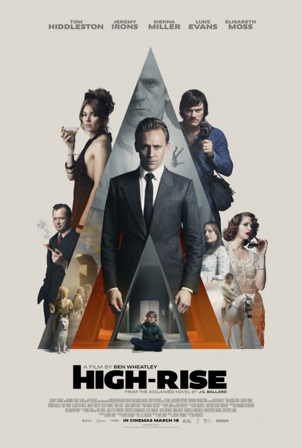
Andrew F. Sullivan, author of ultra-violent urban noir WASTE,1 reviews Ben Wheatley’s adaptation of High-Rise by J.G. Ballard for TIFF.Net:
Wheatley and Ballard point to a pattern—a dissolution of social order that cannot be prevented by technology or progress. Even the most unnatural setting seems to only drive humanity back to its base needs—food, water, shelter, flesh. The past, the basest parts of being human, carry more weight than any building, any new technological development. Elevators become new traps for the hunters. The supermarket on the seventh floor is one last place to forage. Even the soundtrack reimagines this future past for the audience, Portishead performing ABBA’s pop hit “S.O.S.” as a warning for the residents and viewers alike—a dirge for a new world.
Residents begin to harvest the building itself for what they need and reject the outside world. Wheatley’s design team has mimicked the 70s-era incredibly well, but everything is innovative. The products and designs on the shelves are made specifically for this brave new world. The future is behind us. The high-rise becomes a place unto itself—a slow motion horrorshow.
Much like his previous work, Wheatley refuses to provide a straight narrative for the audience and at times, the film descends into an anarchic blend of images without the rules to bind them—as it should. We scurry past a horse on a rooftop, a gang of TV presenters armed with baseball bats and chair legs, a dog drowned in the pool. Parties turn into rituals, sacrifices, religious ceremonies and then dissolve back into chaos once again. Wheatley’s camera starts out sleek and mannered, transitioning smoothly from one floor to the next. However, once the social order slides, the narrative structure breaks under the strain. Viewers slider from one party to another, the camera following bodies as they rise and fall. The film itself opens with an ending.
Edwin Turner has also written about High-Rise at Biblioklept. Ed’s opinion of the movie is less favourable than Andrew’s, but his post also pointed me to Tasha Robinson’s interesting review of the film at The Verge:
There’s a touch of Luis Buñuel’s ‘Exterminating Angel’ in the way everyone in the building seems to be stuck there, isolated from the outside by mutual consent, for no reason anyone cares to address. But Wheatley’s visual style never feels beholden to Buñuel. It’s more familiar from 1960s speculative-fiction films. The Brutalist architecture and cold sterility of the building suggests Jean-Luc Godard’s ‘Alphaville,’ and the polished futurism and stiffly remote characters are reminiscent of François Truffaut’s ‘Fahrenheit 451.’ The retro cars, suits, and architecture all put ‘High-Rise’ more in a quaint, remote past than a dystopian future. They also add to the sense of otherworldliness that hangs over the film.
And so does the sense that High-Rise is driven more by Wheatley’s poster-ready striking images — a suicide falling from a high balcony in ultra slow motion, Laing expressionless and spattered with paint — than by any sort of human drives. “Laing would surrender to a logic more powerful than reason,” Hiddleston narrates, hand-waving away any irrational behavior. No one in the film really operates on reason, they just represent emotional factions. Wilder becomes a feral, untrustworthy spirit of the denied and oppressed. Ann becomes an equally monstrous symbol of the selfish, out-of-touch aristocracy that actively enjoys spitting on everyone below them. Both sides are poisonous. Laing isn’t an innocent caught in the middle, he’s desperately looking for a place to fit in, and his narrative isn’t about saving anyone, not even himself.


2 Comments


Early this week I posted about the Robert Brownjohn online archive created by his daughter, Eliza. Today, a new website dedicated to the work of the graphic designer Roy Kuhlman curated by his daughter, Arden Kuhlman Riordan, has gone live.
Kuhlman is best known, of course, for the brilliant mid-century modern book covers he designed for Grove Press. The site is not comprehensive — at least not yet — but given the number of covers and other pieces Kuhlman must have designed over his career that is, perhaps, not surprising. Archiving his work must be a massive undertaking. Hopefully there is much more to come.
1 Comment
Congratulations to all the winners of the Australian Book Design Awards 2016 announced yesterday in Melbourne!


See all the winning designs on the ABDA website.
Comments closed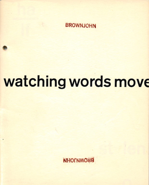
The work of influential designer Robert Brownjohn, best known for the title sequence for the 1964 James Bond film Goldfinger, has been archived online by his daughter Eliza.
If you’re unfamiliar with Brownjohn’s work, I would also recommend picking up a copy of Sex and Typography, Emily King’s book on the designer published by Princeton Architectural Press a few years back.
(via Creative Review)
Comments closedThis is another one of those posts that started out on Twitter — a flippant tweet from me sparking a conversation about books with cassette tapes and vinyl records on their covers. It turns out that putting a record on a cover has become quite popular. Unfortunately the composition of many of these covers is often strikingly similar, even if the tone/intent is different.


The combination of clunky retro-future technology of cassettes and the DIY aesthetic of mix tapes, on the other hand, provides a richer vein of inspiration…
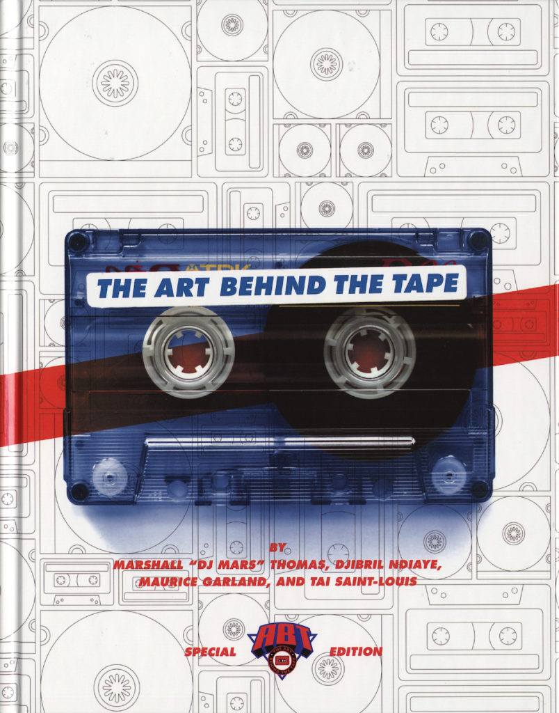
The Art Behind the Tape by Marshall “DJ Mars” Thomas, Djibril Ndiaye, Maurice Garland, and Tai Saint-Louis; design UnderConsideration (2015)
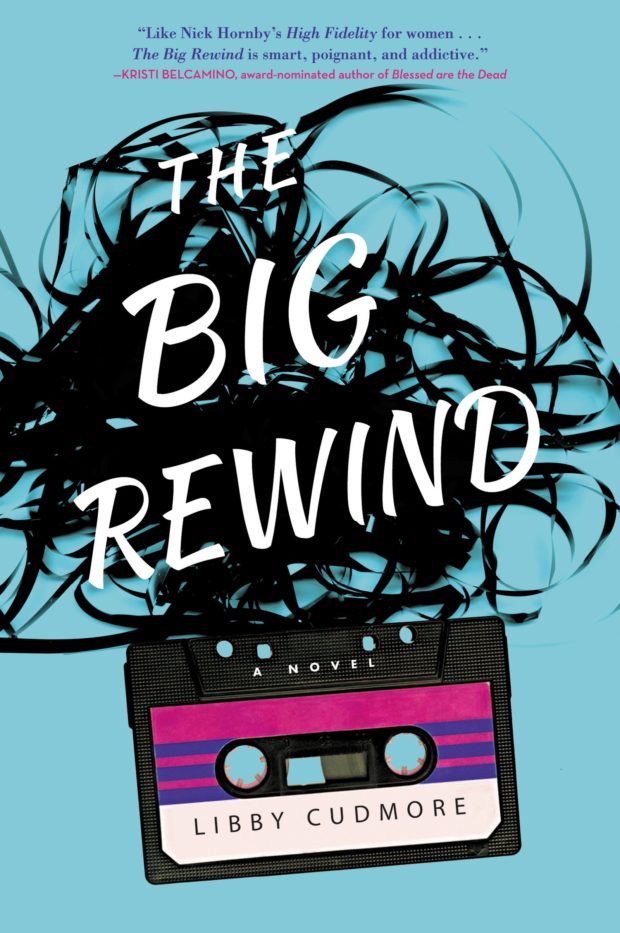
The Big Rewind by Libby Cudmore; design by design Regina Starace (William Morrrow / February 2016)
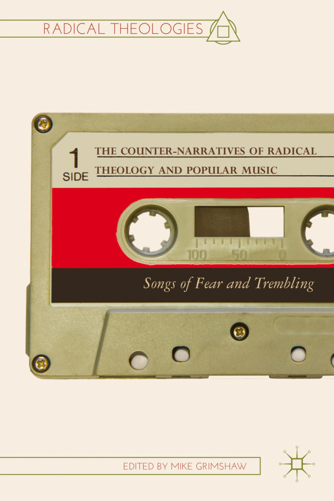
The Counter-narratives of Radical Theology and Popular Music edited by Michael Grimshaw; design Palgrave Macmillan Design (Palgrave Macmillan / May 2014)
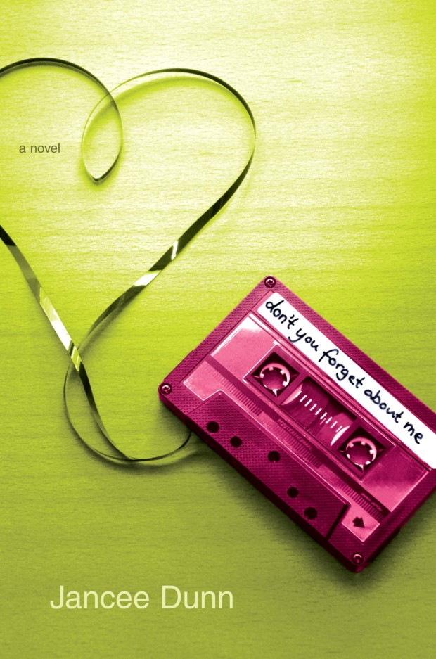
Don’t You Forget About Me by Jancee Dunn; design by Catherine Casalino (Villard Books / July 2008)

Earthbound by Paul Morley; design by Jim Stoddart (Penguin / August 2013)
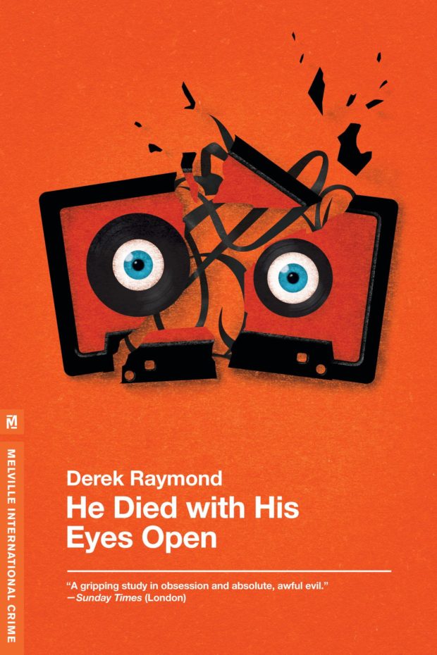
He Died with His Eyes Open by Derek Raymond; design by Christopher Brian King (Melville House / October 2011)
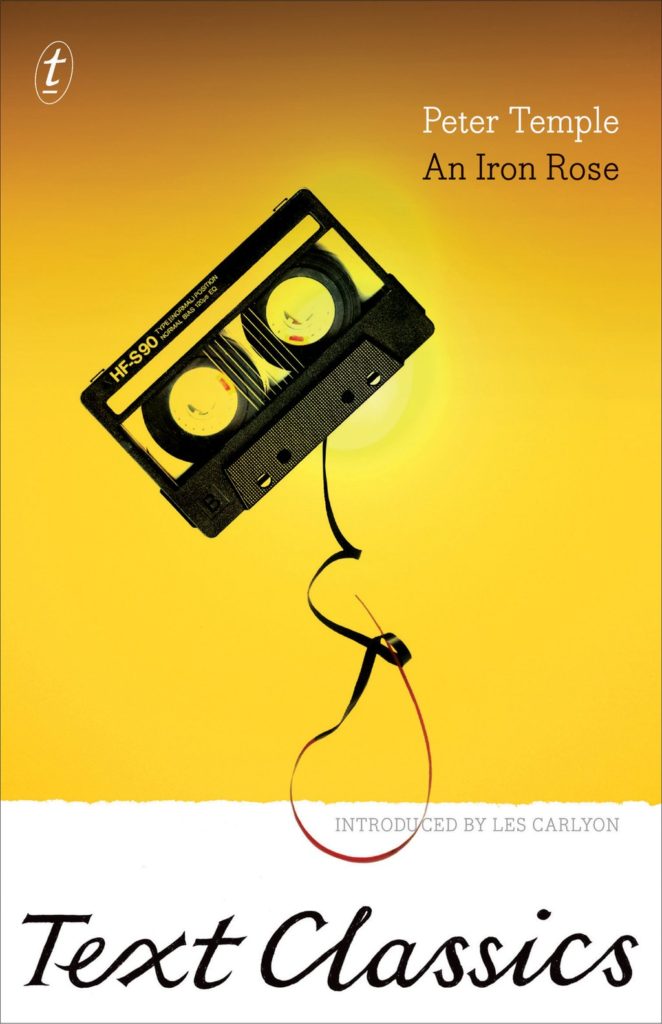
An Iron Rose by Peter Temple; design by W. H. Chong (Text / June 2016)
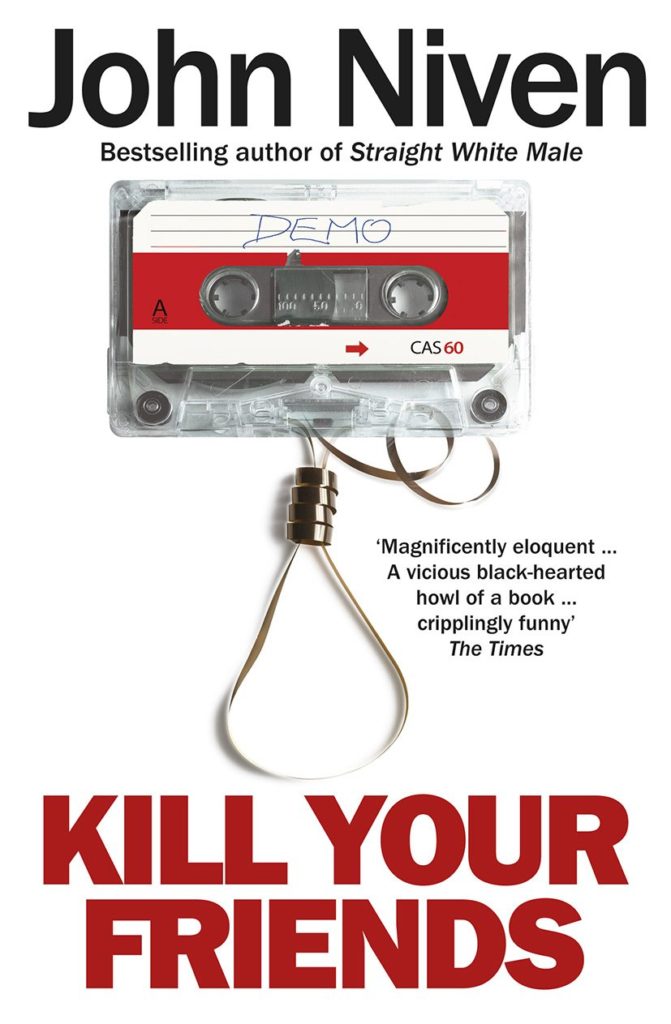
Kill Your Friends by John Niven; design by Glenn ONeill; Photograph Colin Thomas (Cornerstone / July 2014)

Landscapes of the Metropolis of Death by Otto Dov Kulka; design by Jim Stoddart (Penguin / March 2014)

Bar Yarns and Manic Depressive Mix Tapes by Jim Walsh; design by Michel Vrana; lettering by Robert Lawson (University of Minnesota Press / NYP)
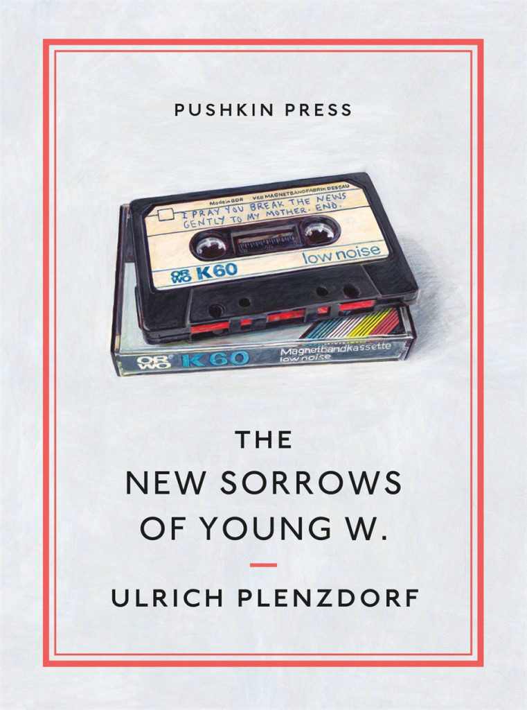
The New Sorrows of the Young W. by Ulrich Plenzdorf; design Clare Skeats; cover art by Joel Penkman; series design David Pearson (Pushkin Press / September 2015)

Signal to Noise by Silvia Moreno-Garcia; design by Erik Mohr (Solaris / October 2015)

Tape by Steven Camden; cover art by Keri Smith (HarperCollins Children’s Books / January 2014)

Tsar of Love and Techno by Anthony Marra; design Christopher Brand; photography Bobby Doherty (Hogarth / October 2015)
(I also rather like this tape-related killed cover by designer Na Kim)
So there you have it — cassette tape book covers are a thing. But please let’s not get started on VHS tape book covers…


It’s the first week of May (whaaaat?), so it must be time for some new book covers…
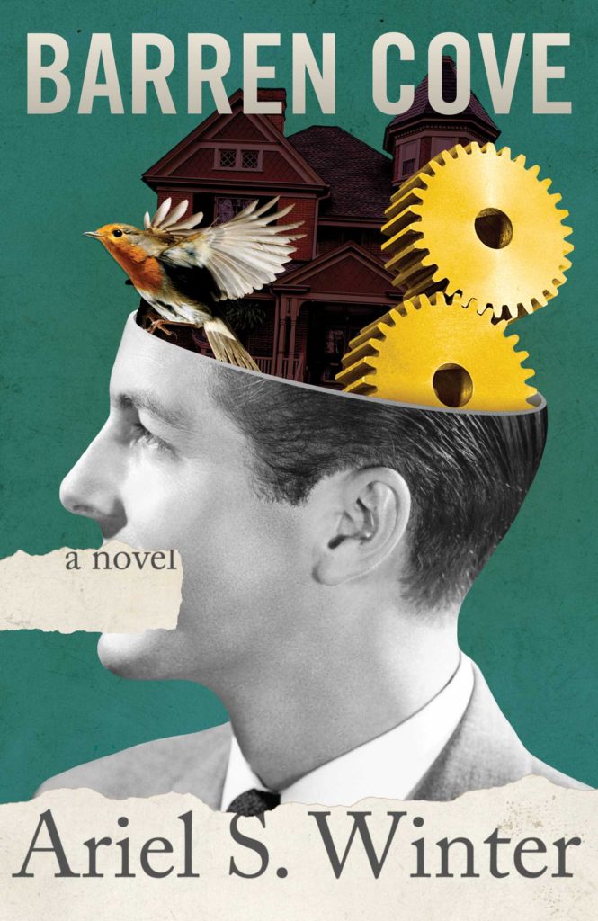
Barren Cove by Ariel S. Winter; design by Chelsea McGuckin (Atria / May 2016)
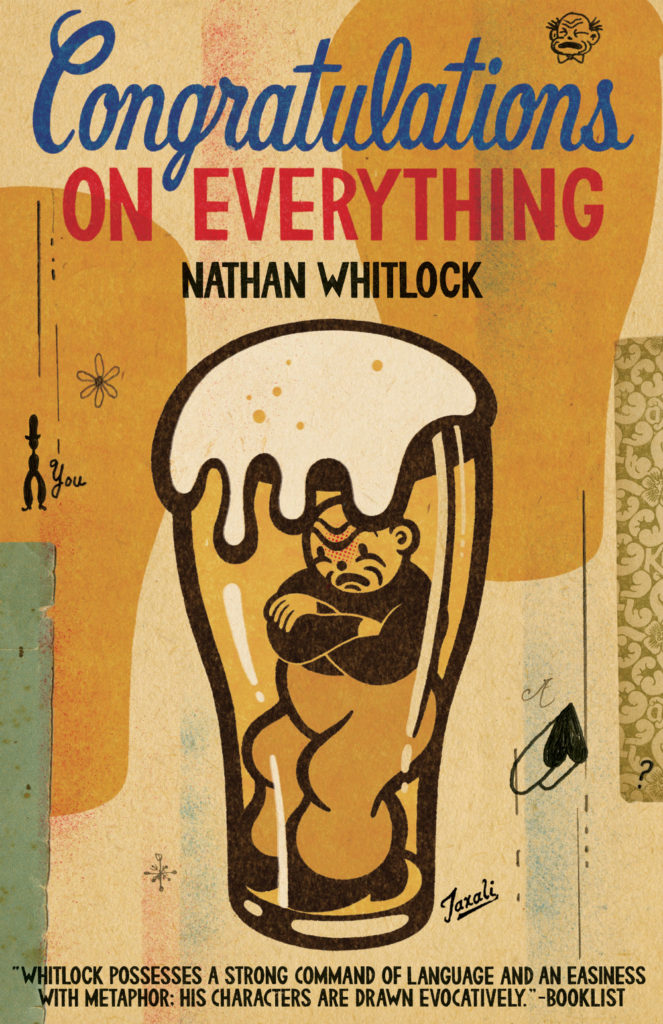
Congratulations on Everything by Nathan Whitlock; cover art by Gary Taxali (ECW / May 2016)
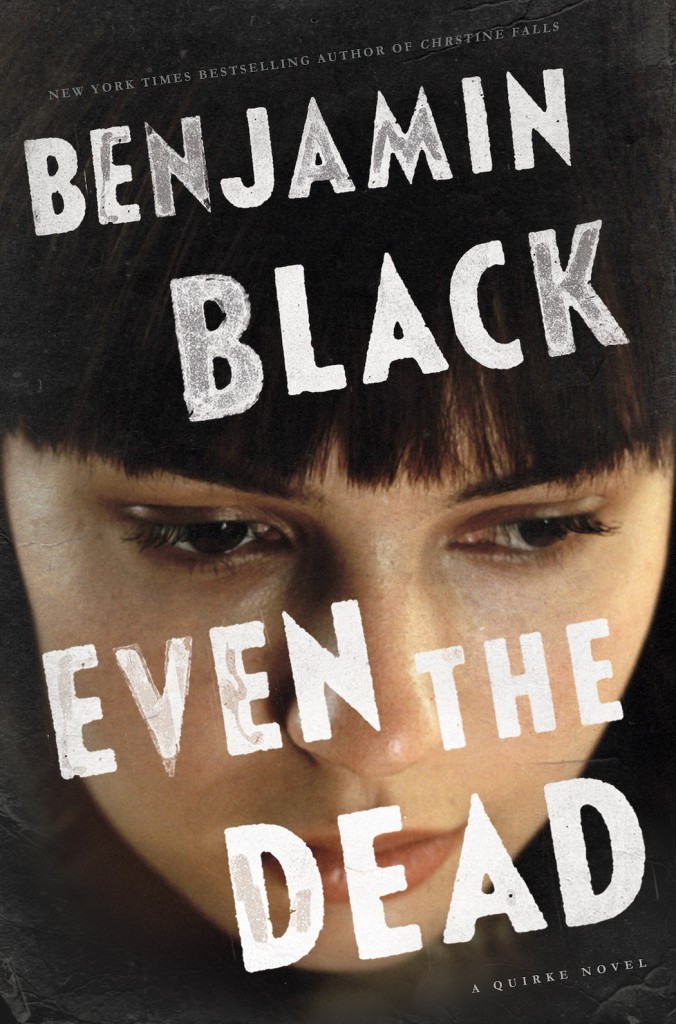
Even the Dead by Benjamin Black; design by David Shoemaker (Henry Holt / January 2016)
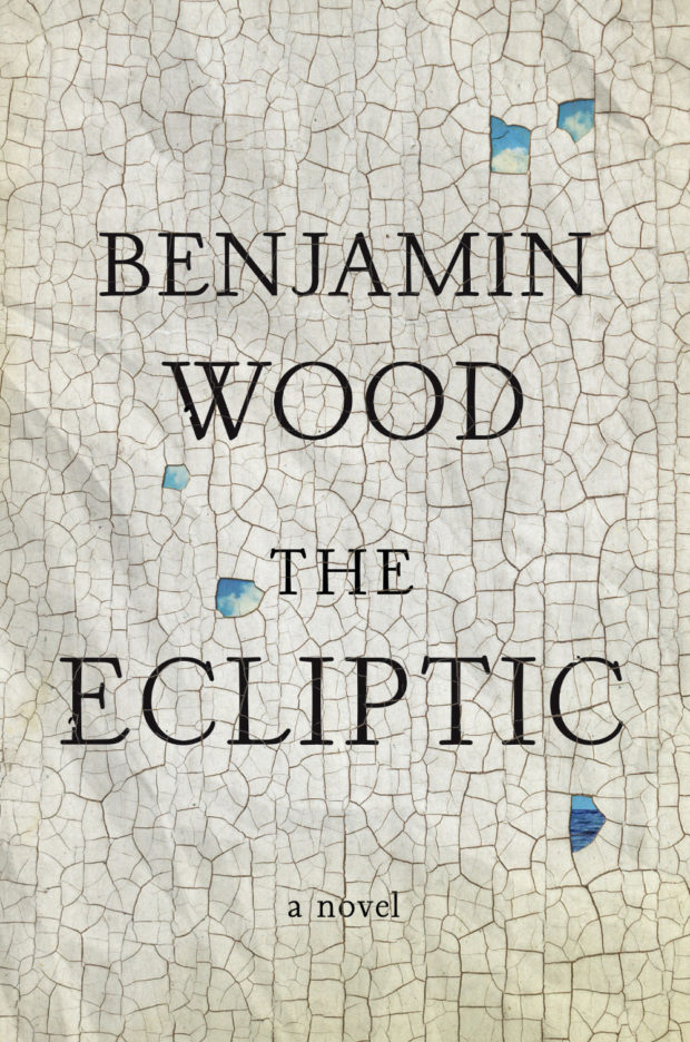
The Ecliptic by Benjamin Wood; design Jamie Keenan (Penguin Press / May 2016)
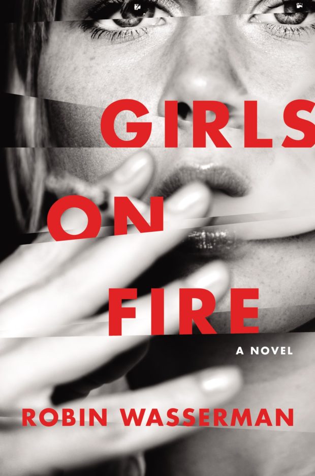
Girls on Fire by Robin Wasserman; design by Robin Bilardello (Harper / May 2016)
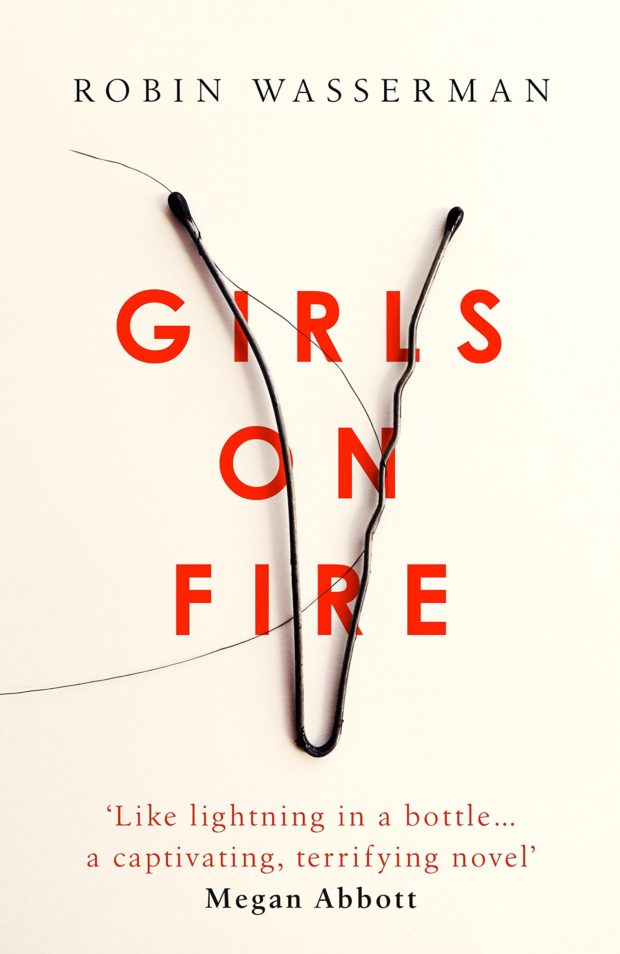
Girls on Fire by Robin Wasserman; design by Jack Smyth (Little, Brown / May 2016)


The Haters by Jesse Andrews; design by Chad W. Beckerman and Will Staehle (Abrams / April 2016)
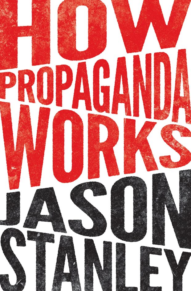
How Propaganda Works by Jason Stanley; design by Chris Ferrante (Princeton University Press / May 2016)
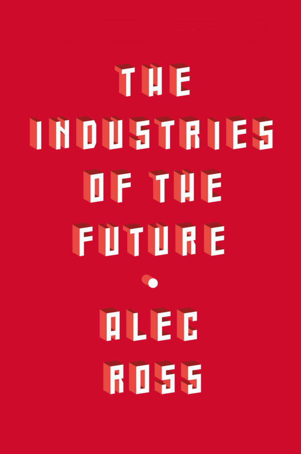
Industries of the Future by Alec Ross; design by Jason Heuer (Simon & Schuster / February 2016)
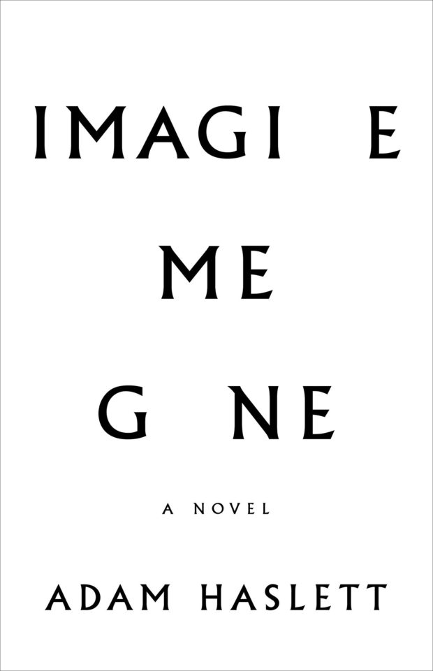
Imagine Me Gone by Adam Haslett; design by Keith Hayes (Little, Brown & Co. / May 2016)
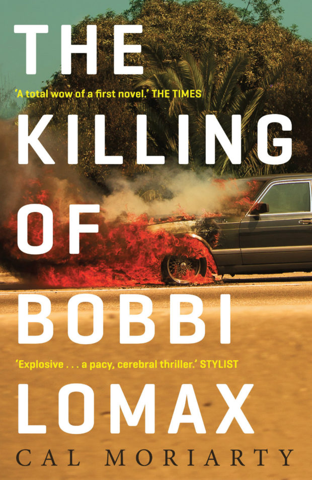
The Killing of Bobbi Lomax by Cal Moriarty; design by Alex Kirby (Faber & Faber / May 2016)
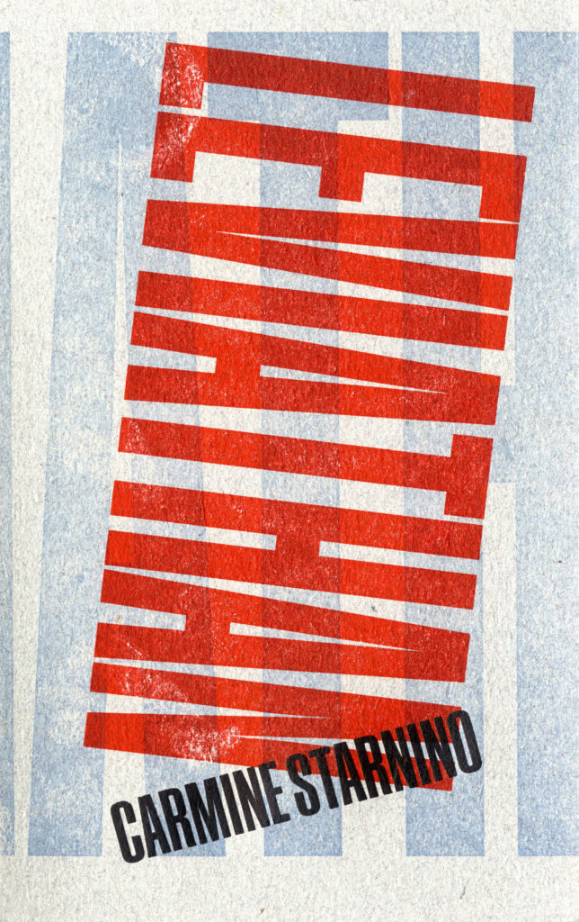
Leviathan by Carmine Starnino; design Andrew Steeves (Gaspereau / April 2016)
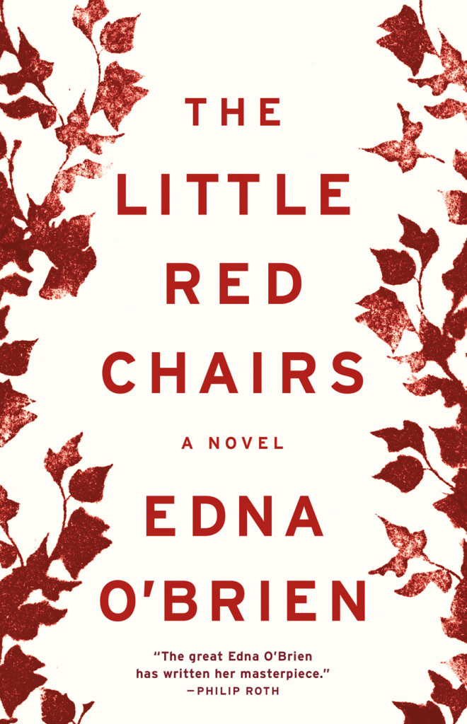
Little Red Chairs by Edna O’Brien; design by Keith Hayes (Little, Brown & Co. / April 2016)

Macroeconomics by Ben Fine and Ourania Dimakou; design by David Drummond (Pluto Press / May 2016)

Microeconomics by Ben Fine; design by David Drummond (Pluto Press / May 2016)


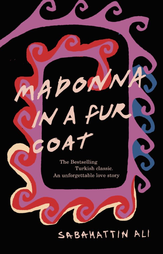
Madonna in a Fur Coat by Sabahattin Ali; design by Coralie Bickford-Smith (Penguin / May 2016)
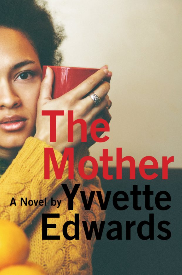
The Mother by Yvvette Edwards; design by Robin Bilardello (Amistad / May 2016)
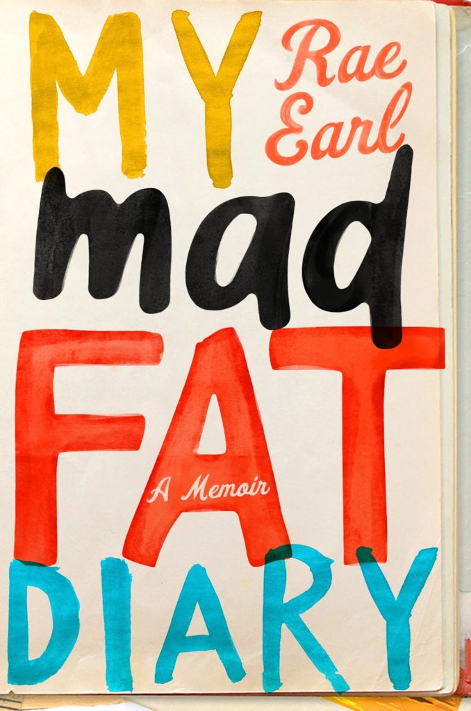
My Mad Fat Diary by Rae Earl; design by Olga Grlic (St. Martin’s Griffin / April 2016)
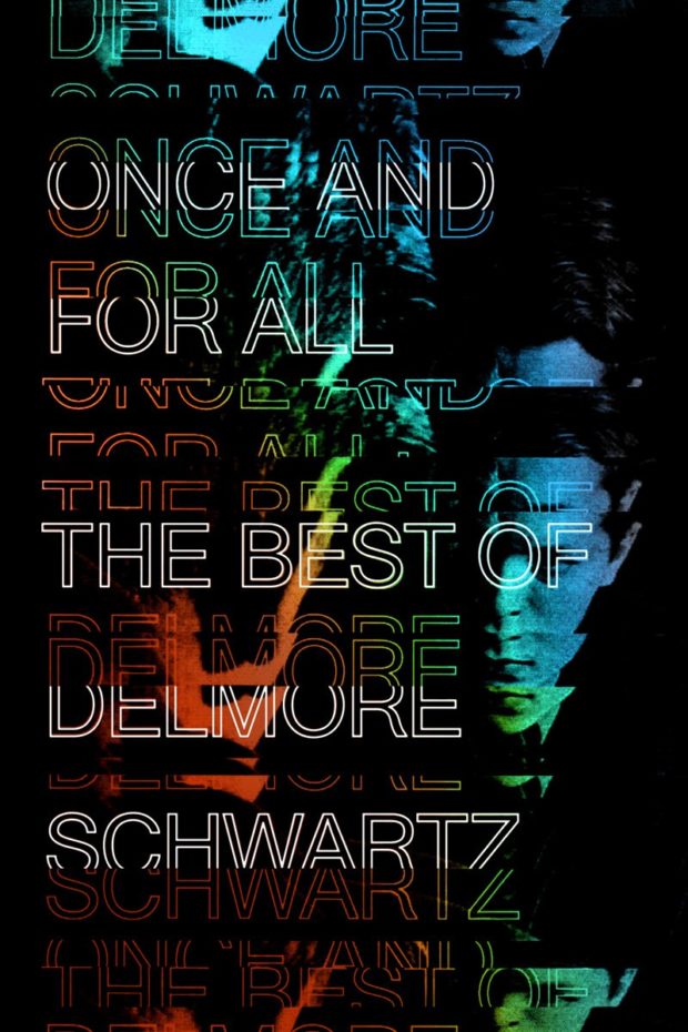
Once and for All by Delmore Schwartz; design Erik Carter (New Directions / May 2016)
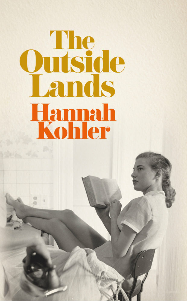
The Outside Lands by Hannah Kohler; design by Ami Smithson / Cabin London (Picador / May 2016)
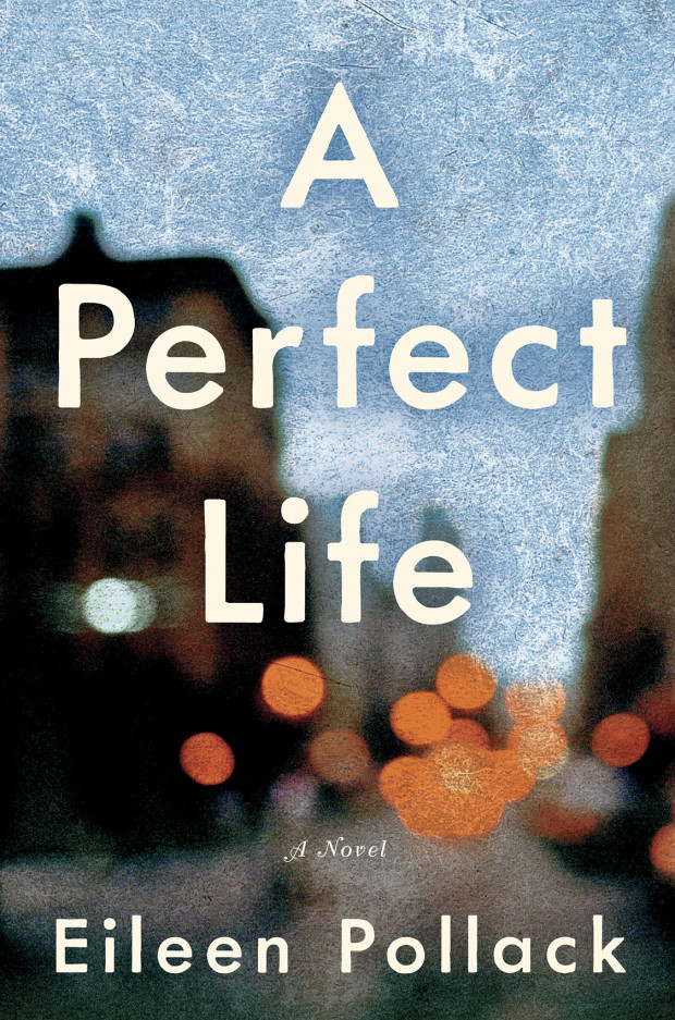
A Perfect Life by Eileen Pollack; design by Allison Saltzman (Ecco / May 2016)
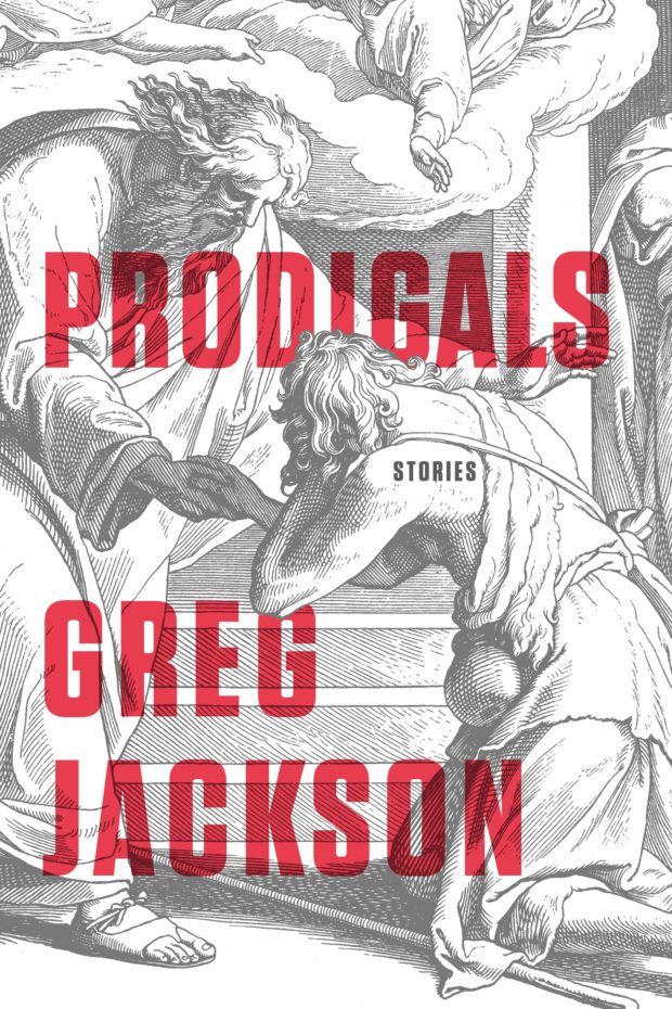
Prodigals by Greg Jackson; design by Rodrigo Corral (Farrar, Straus & Giroux / March 2016)
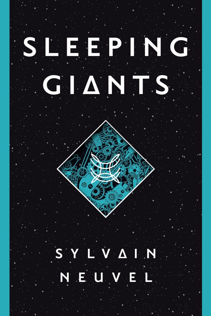
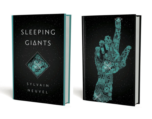
Sleeping Giants by Sylvain Neuvel; design by Charles Brock / Faceout Studio (Del Ray / April 2016)
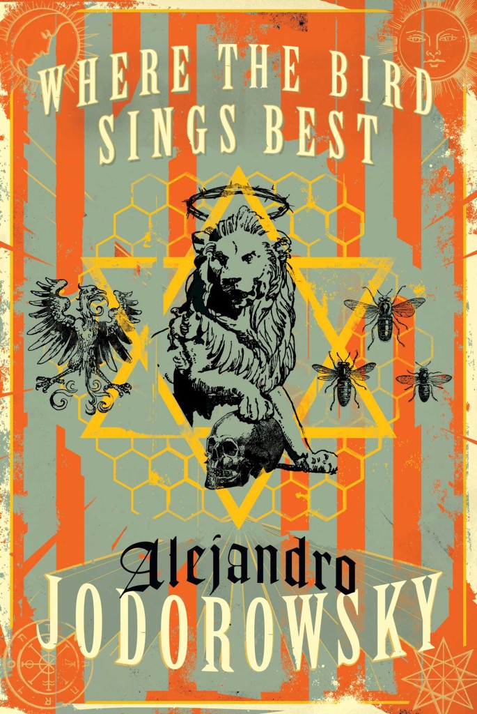
Where the Bird Sings Best by Alejandro Jodorowsky; design by Richard Ljoenes (Restless Books / April 2016)
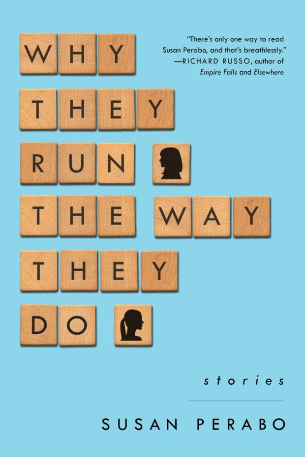
Why They Run the Way They Do by Susan Perabo; design Alison Forner (Simon & Schuster / February 2016)
Writing for The Guardian, Simon Garfield (Just My Type), visits the first UK retrospective Dutch designer and curator Willem Sandberg:
“This is printed on wallpaper, very asymmetric … an amazing thing really,” Fraser Muggeridge, the curator, says as he shows me his collection of Sandberg ephemera in his studio in London’s Smithfield. It is a space Sandberg would have admired, with its display of promotional work for emerging artists and galleries crowding in from the walls. “I don’t think he was trying to make the most perfect work, but it was always free-spirited and arresting.” His letters were highly sculptural, revealing negative space; at first glance a torn “T” becomes a sideways “E”. They speak of his obsession not only with making intricate objects by hand, but also with solid branding: his graphics for the Stedelijk created a look and mood for a museum that today would require a huge budget and corporate pitching.
Astonishingly, most of Sandberg’s catalogues and posters were a sideline, designed in the evenings and at weekends. Sandberg was the director of the museum from 1945 to 1962, and his close relationship with the local state printer produced an identity that transformed the Stedelijk into one of Europe’s first truly modern galleries. He created what he liked to refer to as an “Anti-Museum”, rejecting the traditional dark and hushed rooms and creating something bright and accessible, a place of social interaction. He championed young artists, and he succeeded in attracting people who had barely set foot in a museum before. There was a shop, a learning centre and a cafe, all brave innovations in the middle of the century. As was Sandberg’s scheme to get the Stedelijk a little more noticed in the city: he painted the entire building white.


‘Willem Sandberg: From Type to Image‘ is at the De La Warr Pavilion, Bexhill-on-Sea, UK until 4 September.
Comments closed