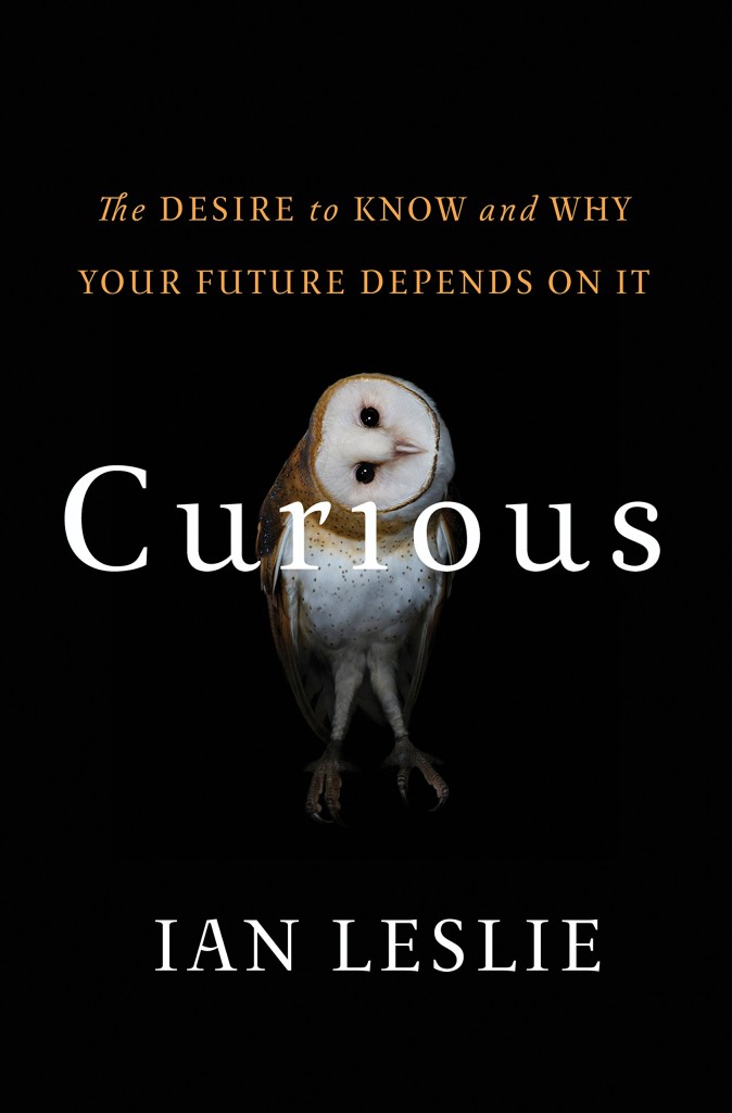
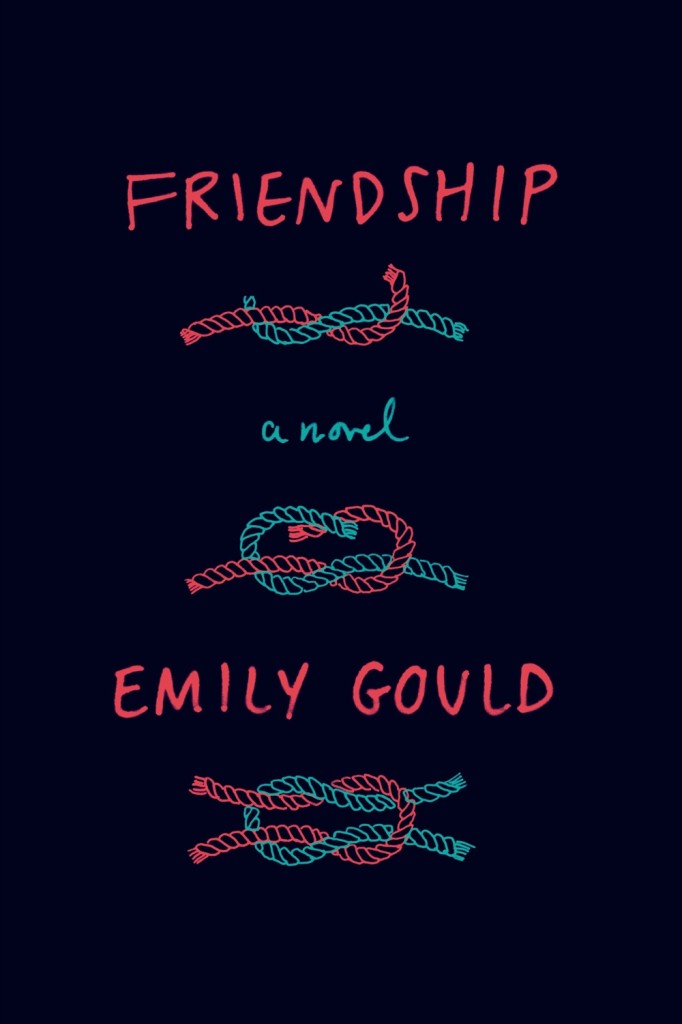
Congratulations to all the winners of the Australian Book Design Awards 2016 announced yesterday in Melbourne!

design Michelle Mackintosh

design Josh Durham
See all the winning designs on the ABDA website.
Comments closedBooks, Design and Culture
Congratulations to all the winners of the Australian Book Design Awards 2016 announced yesterday in Melbourne!
See all the winning designs on the ABDA website.
Comments closedThis is another one of those posts that started out on Twitter — a flippant tweet from me sparking a conversation about books with cassette tapes and vinyl records on their covers. It turns out that putting a record on a cover has become quite popular. Unfortunately the composition of many of these covers is often strikingly similar, even if the tone/intent is different.


The combination of clunky retro-future technology of cassettes and the DIY aesthetic of mix tapes, on the other hand, provides a richer vein of inspiration…
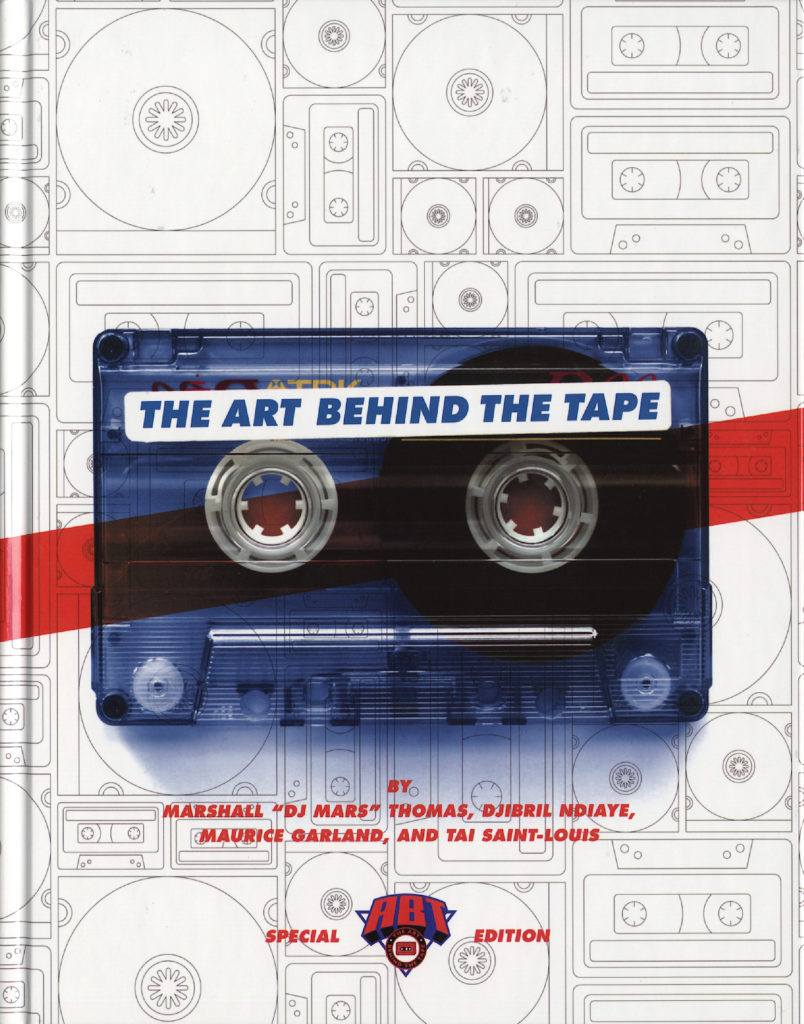
The Art Behind the Tape by Marshall “DJ Mars” Thomas, Djibril Ndiaye, Maurice Garland, and Tai Saint-Louis; design UnderConsideration (2015)
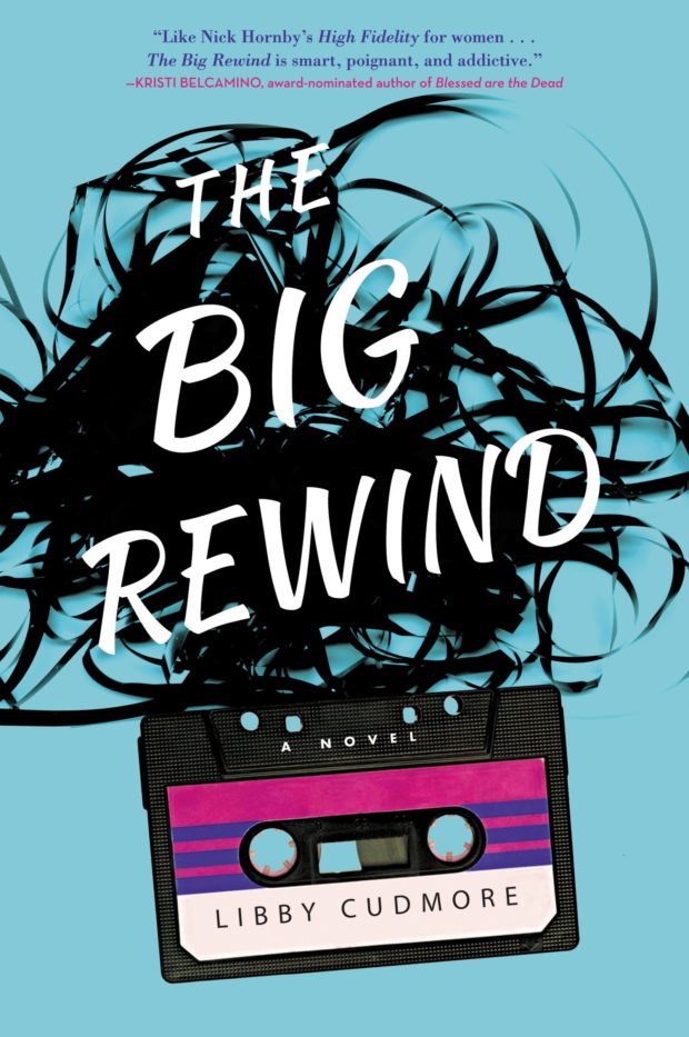
The Big Rewind by Libby Cudmore; design by design Regina Starace (William Morrrow / February 2016)

The Counter-narratives of Radical Theology and Popular Music edited by Michael Grimshaw; design Palgrave Macmillan Design (Palgrave Macmillan / May 2014)

Don’t You Forget About Me by Jancee Dunn; design by Catherine Casalino (Villard Books / July 2008)

Earthbound by Paul Morley; design by Jim Stoddart (Penguin / August 2013)
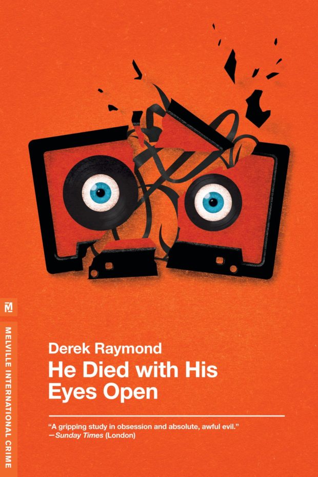
He Died with His Eyes Open by Derek Raymond; design by Christopher Brian King (Melville House / October 2011)
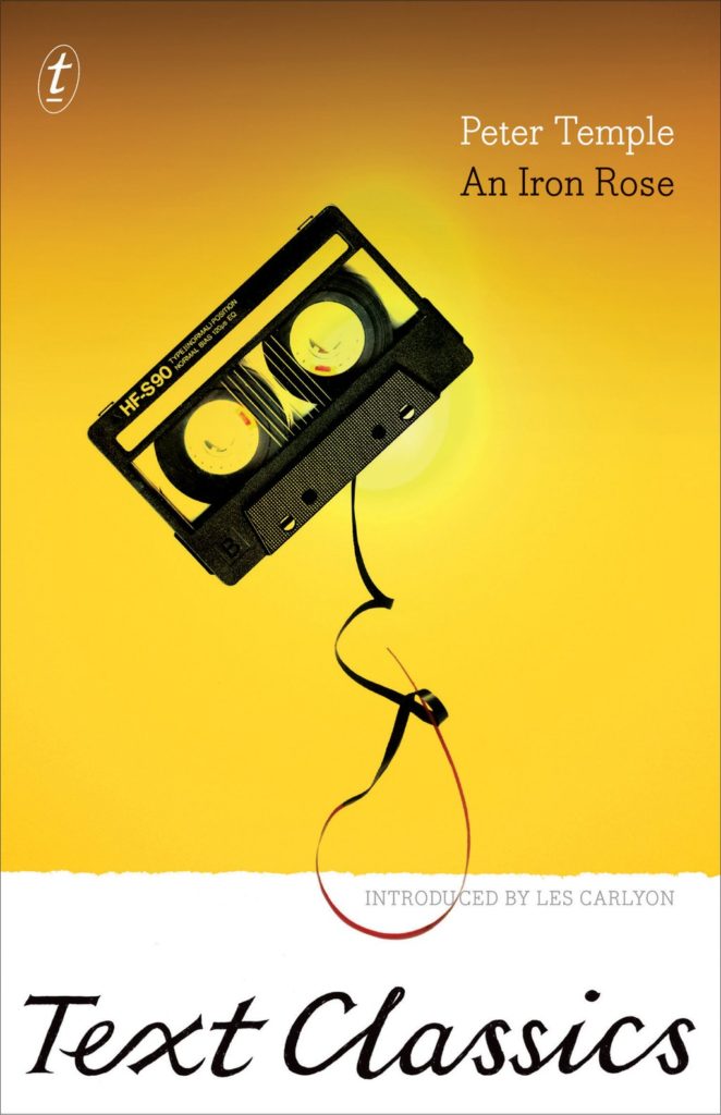
An Iron Rose by Peter Temple; design by W. H. Chong (Text / June 2016)
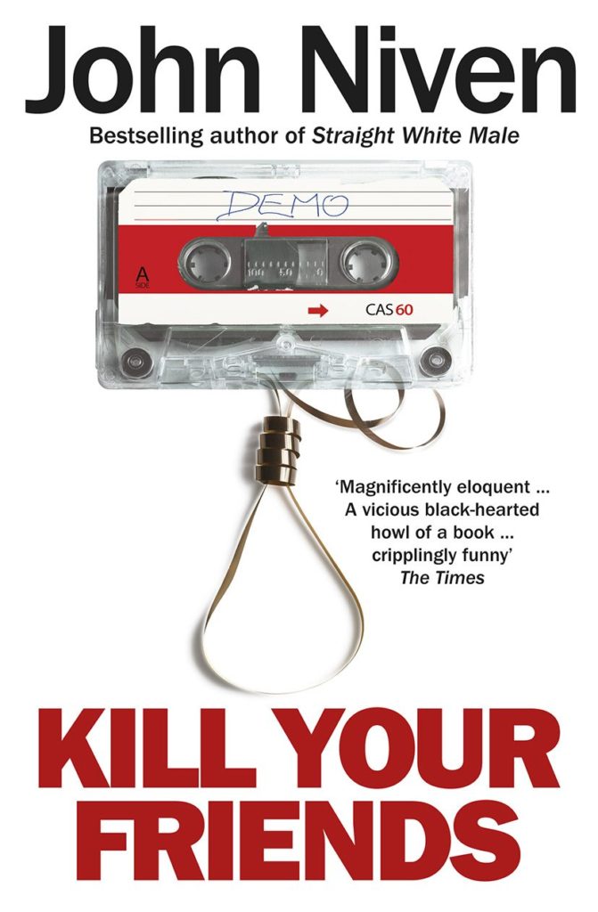
Kill Your Friends by John Niven; design by Glenn ONeill; Photograph Colin Thomas (Cornerstone / July 2014)

Landscapes of the Metropolis of Death by Otto Dov Kulka; design by Jim Stoddart (Penguin / March 2014)

Bar Yarns and Manic Depressive Mix Tapes by Jim Walsh; design by Michel Vrana; lettering by Robert Lawson (University of Minnesota Press / NYP)
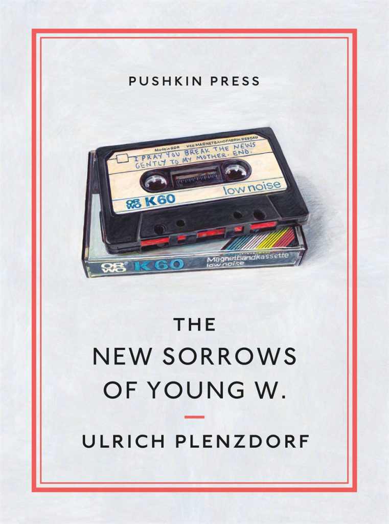
The New Sorrows of the Young W. by Ulrich Plenzdorf; design Clare Skeats; cover art by Joel Penkman; series design David Pearson (Pushkin Press / September 2015)

Signal to Noise by Silvia Moreno-Garcia; design by Erik Mohr (Solaris / October 2015)

Tape by Steven Camden; cover art by Keri Smith (HarperCollins Children’s Books / January 2014)

Tsar of Love and Techno by Anthony Marra; design Christopher Brand; photography Bobby Doherty (Hogarth / October 2015)
(I also rather like this tape-related killed cover by designer Na Kim)
So there you have it — cassette tape book covers are a thing. But please let’s not get started on VHS tape book covers…


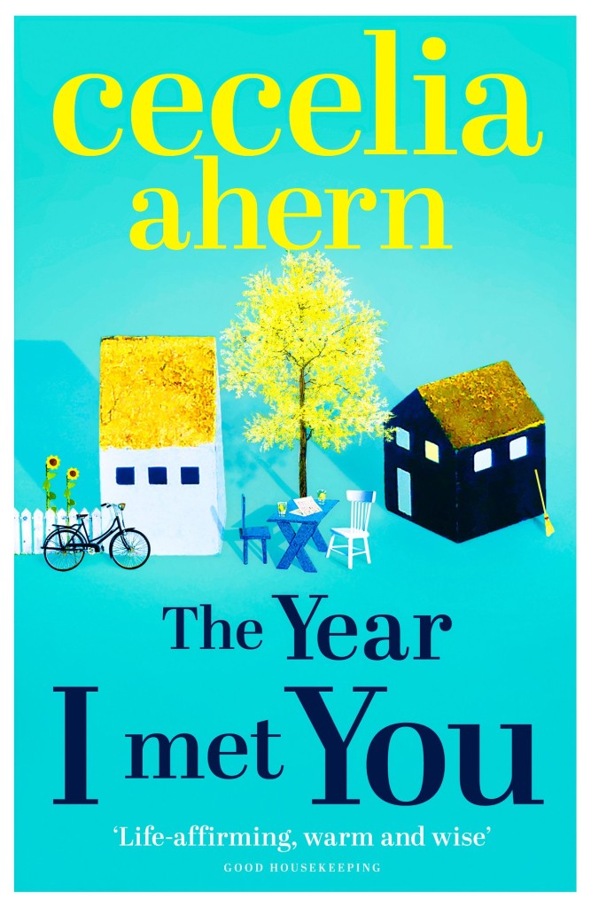
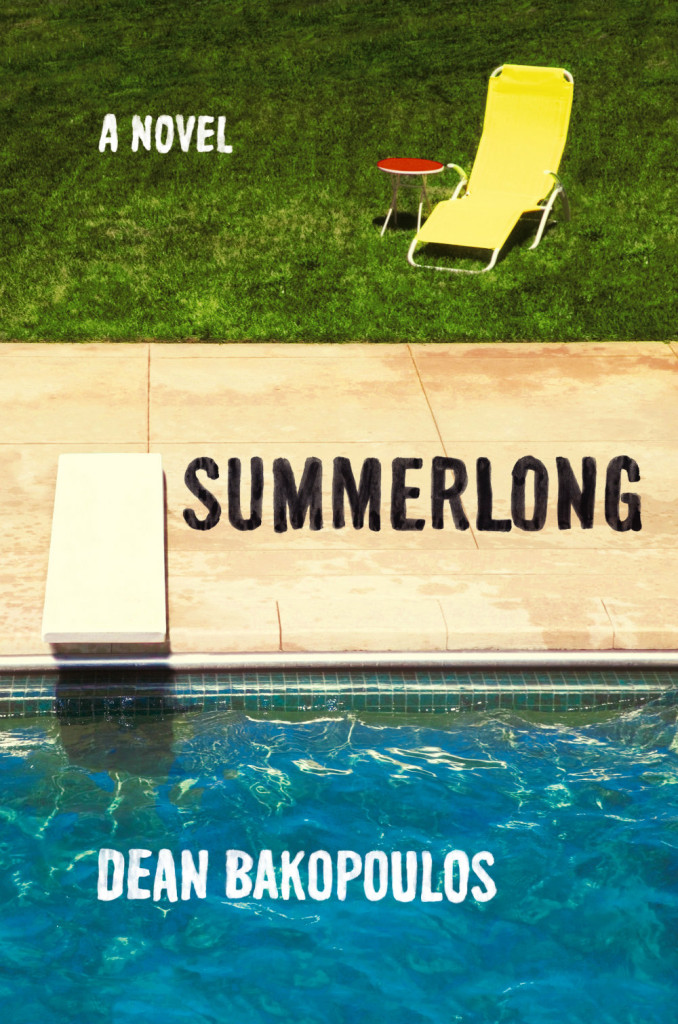
It’s the first week of May (whaaaat?), so it must be time for some new book covers…

Barren Cove by Ariel S. Winter; design by Chelsea McGuckin (Atria / May 2016)
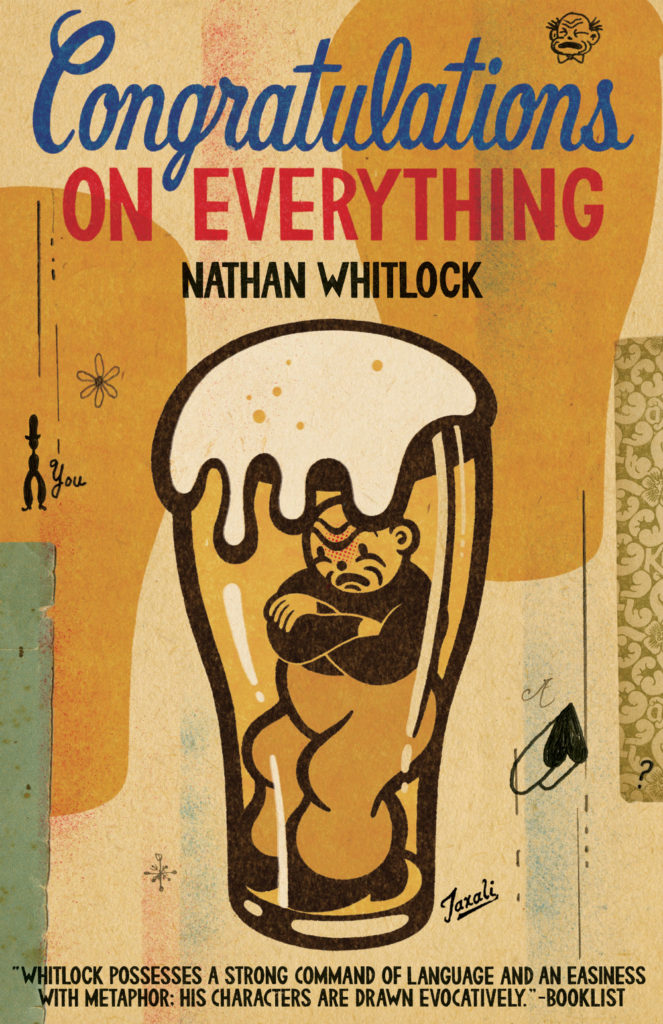
Congratulations on Everything by Nathan Whitlock; cover art by Gary Taxali (ECW / May 2016)
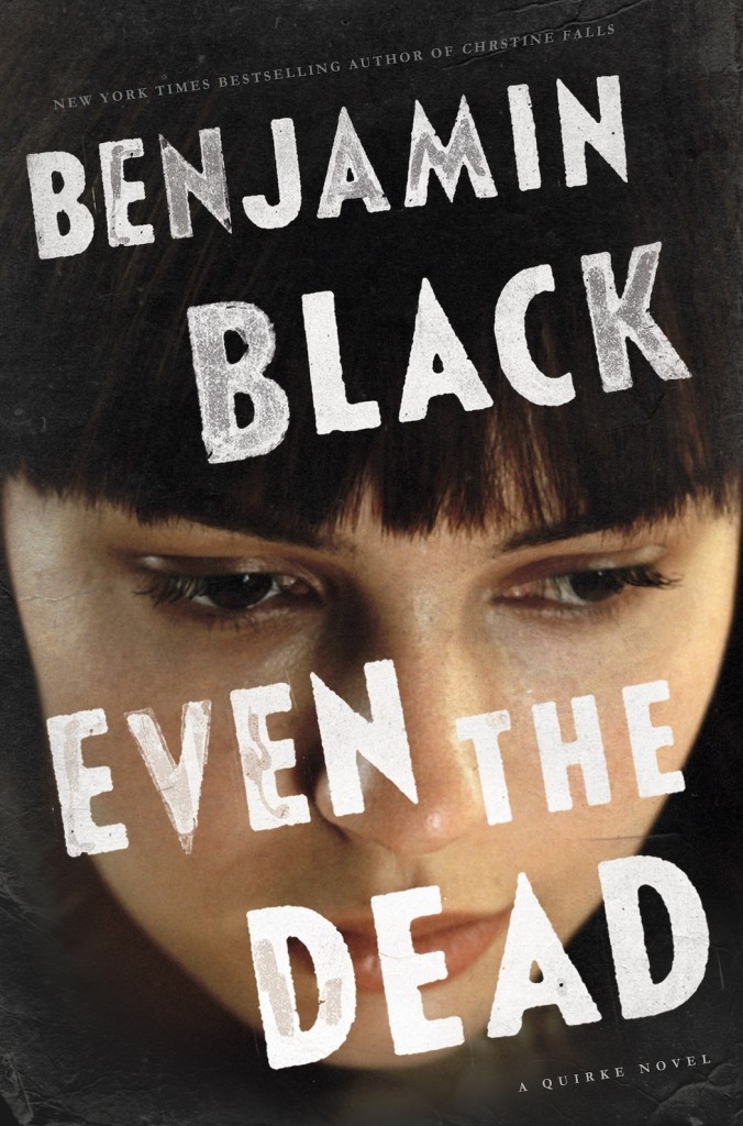
Even the Dead by Benjamin Black; design by David Shoemaker (Henry Holt / January 2016)

The Ecliptic by Benjamin Wood; design Jamie Keenan (Penguin Press / May 2016)

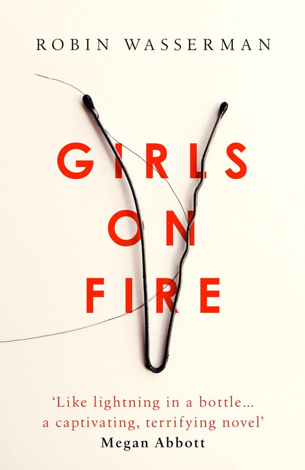
Girls on Fire by Robin Wasserman; design by Robin Bilardello (Harper / May 2016)
Girls on Fire by Robin Wasserman; design by Jack Smyth (Little, Brown / May 2016)


The Haters by Jesse Andrews; design by Chad W. Beckerman and Will Staehle (Abrams / April 2016)
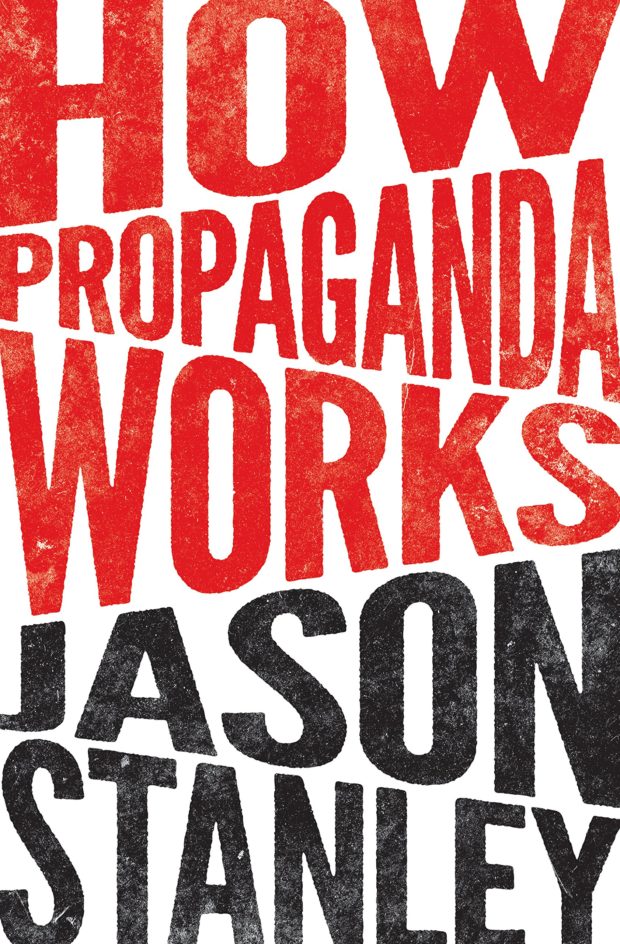
How Propaganda Works by Jason Stanley; design by Chris Ferrante (Princeton University Press / May 2016)
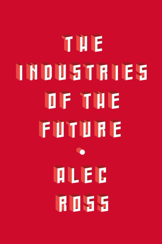
Industries of the Future by Alec Ross; design by Jason Heuer (Simon & Schuster / February 2016)
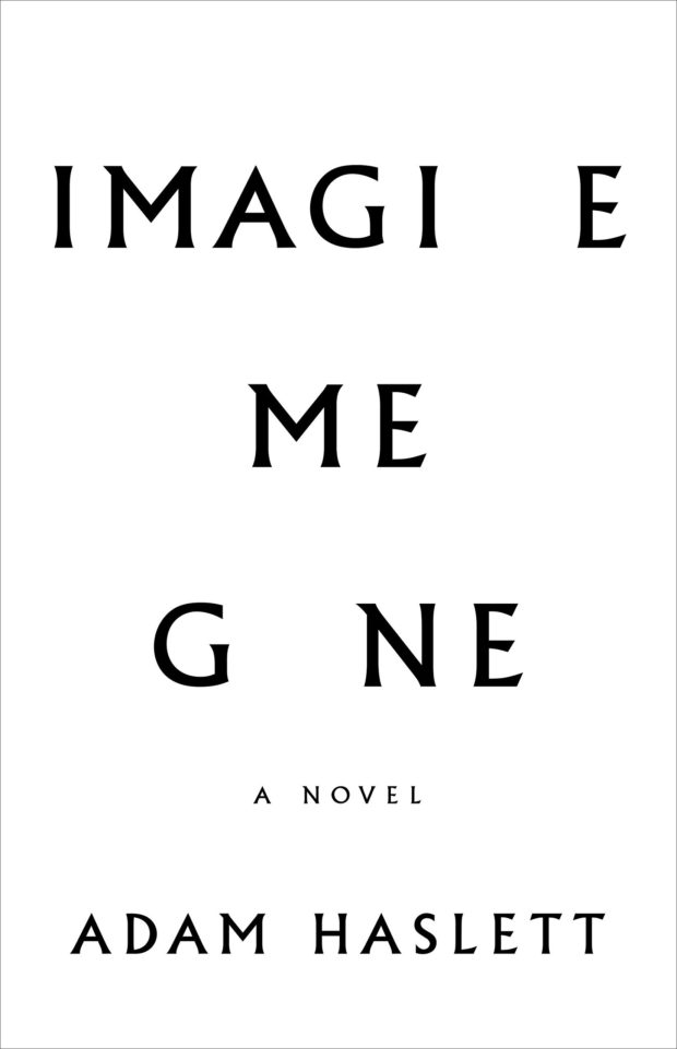
Imagine Me Gone by Adam Haslett; design by Keith Hayes (Little, Brown & Co. / May 2016)
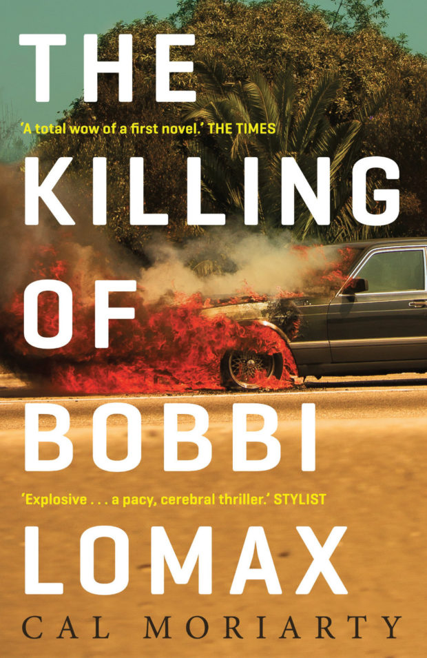
The Killing of Bobbi Lomax by Cal Moriarty; design by Alex Kirby (Faber & Faber / May 2016)
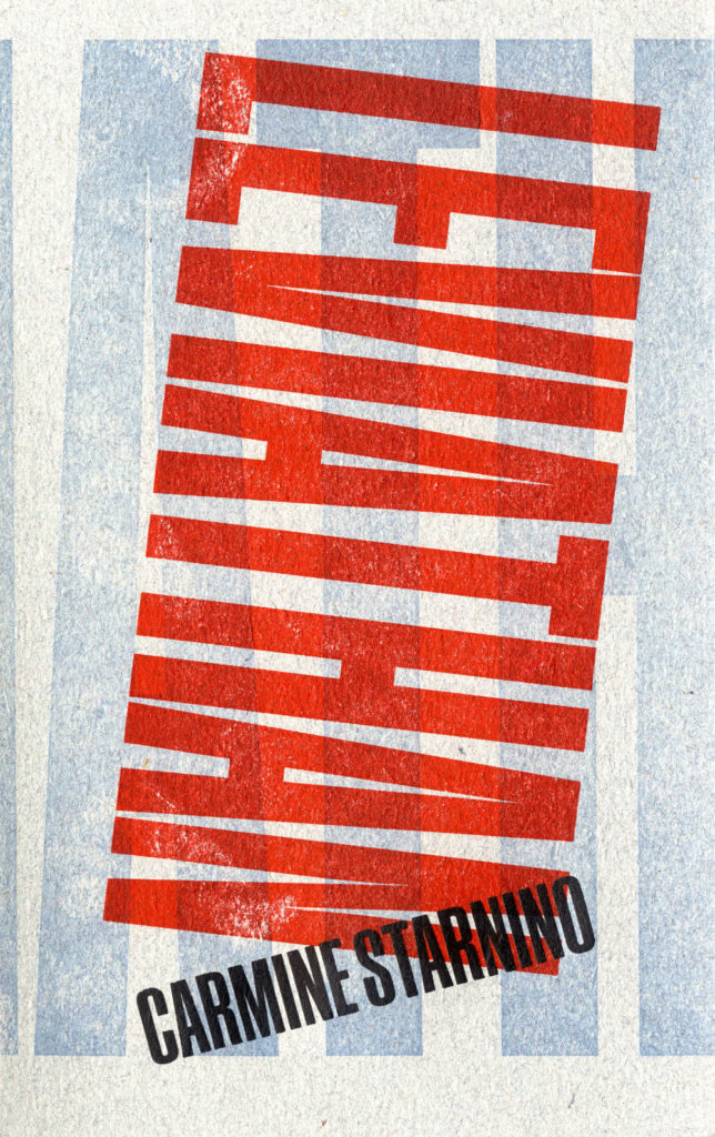
Leviathan by Carmine Starnino; design Andrew Steeves (Gaspereau / April 2016)
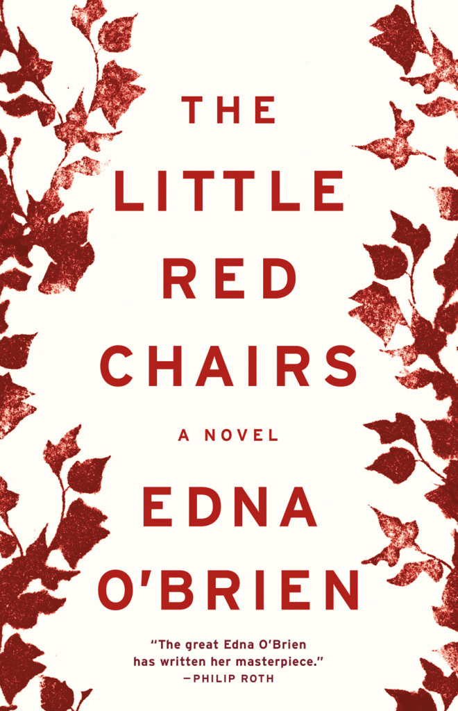
Little Red Chairs by Edna O’Brien; design by Keith Hayes (Little, Brown & Co. / April 2016)

Macroeconomics by Ben Fine and Ourania Dimakou; design by David Drummond (Pluto Press / May 2016)

Microeconomics by Ben Fine; design by David Drummond (Pluto Press / May 2016)


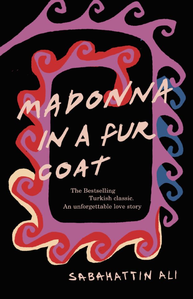
Madonna in a Fur Coat by Sabahattin Ali; design by Coralie Bickford-Smith (Penguin / May 2016)
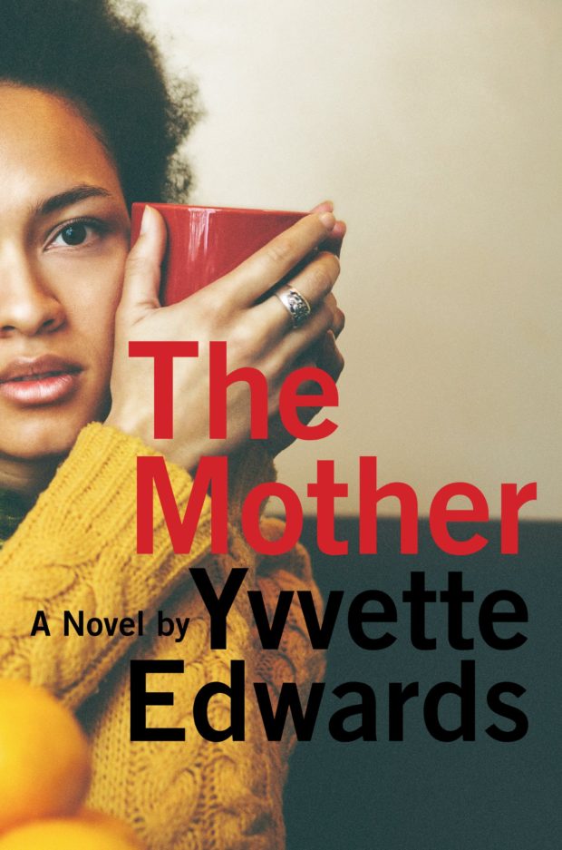
The Mother by Yvvette Edwards; design by Robin Bilardello (Amistad / May 2016)
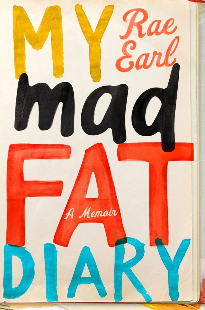
My Mad Fat Diary by Rae Earl; design by Olga Grlic (St. Martin’s Griffin / April 2016)

Once and for All by Delmore Schwartz; design Erik Carter (New Directions / May 2016)

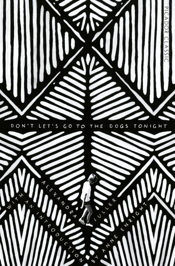
The Outside Lands by Hannah Kohler; design by Ami Smithson / Cabin London (Picador / May 2016)

A Perfect Life by Eileen Pollack; design by Allison Saltzman (Ecco / May 2016)
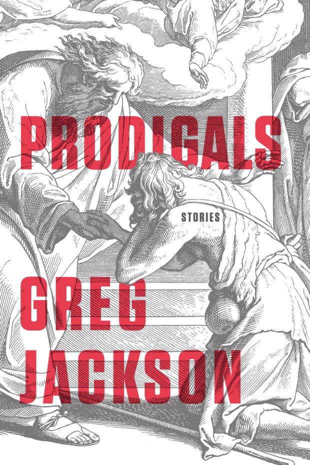
Prodigals by Greg Jackson; design by Rodrigo Corral (Farrar, Straus & Giroux / March 2016)
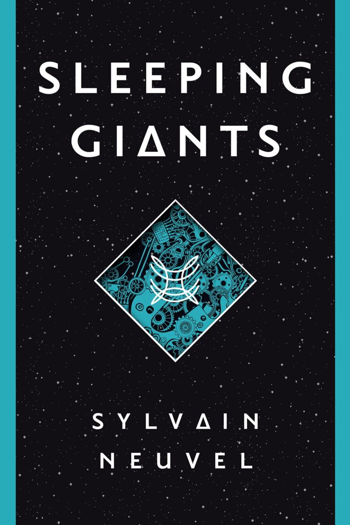
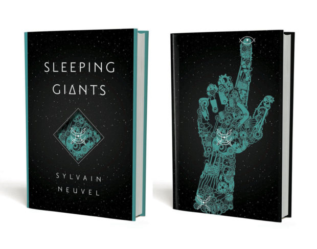
Sleeping Giants by Sylvain Neuvel; design by Charles Brock / Faceout Studio (Del Ray / April 2016)

Where the Bird Sings Best by Alejandro Jodorowsky; design by Richard Ljoenes (Restless Books / April 2016)
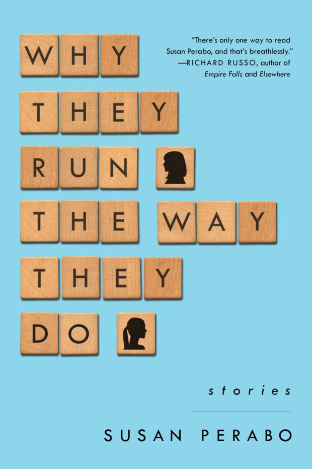
Why They Run the Way They Do by Susan Perabo; design Alison Forner (Simon & Schuster / February 2016)


Jason Booher, designer and art director of Blue Rider Press and Plume, talks to Penguin Random House blog The Perch about the book cover design process:
A design can be thought of as a set of constraints or parameters. In book design, these consist of things like the conceptual literary content of the book, what makes the book unique in the context of other similar books or all books, how the author is (or is not) known, the expectations of the book from the point of view of the author/editor/sales force/readers, the context of book jacket in the contemporary moment, the context of book jackets in the last 10 (or even 20) years, visual pop culture. Or something that is obvious and not obvious is working with type is very difficult. And it perhaps the most specialized thing that graphic designers bring to that general problem solving into form.
Jason also describes how he approaches a book cover:
There’s a combination of reading the manuscript, and listening to the editor talk about the book. As an art director, I have to dip into almost all the of the books to see what they are like before deciding to whom to give each title. As a designer (if I’m working on that title’s jacket) it’s always different with every book. But as a general process I will read the book, and think and sketch, and sketch, and reread, work though a number of ideas, throw most of them out, stay with others, reread, take a walk (much harder when you are also the art director), try to come up with something new. Those are the first steps.
And how he works with other designers:
When I work with a freelancer (as well as with my in-house designers), I like to see what they come up with without any input from me. Not only are you more likely to get something special and surprising, something you couldn’t have thought of yourself (which is why art directors work with a variety of freelancers in addition to their in-house staff), but you are sending a signal of trust. If a designer knows what “kind” of design they are expected to deliver, they might not push very far or hard. But if they take ownership of being the first arbiters of what the package of the book might be, there is more of a chance for something brilliant. I’m just trying to maximize the talent I have working with me.
With my in house staff, it is similar but there might also be a concept that is floating that we will work with. Or occasionally I’ll work with one designer or my whole team to come up with ideas together. That’s an exception though, and cover design is generally a sole enterprise in the initial stages. Then it becomes a collaboration when I see comps, and goes from there.
Read the whole interview here.
Comments closed
In an excellent post for The Literary Hub, designer Erik Carter writes about designing the cover of Reiner Stach’s Is That Kafka? 99 Finds for New Directions, and the process of getting a book cover approved:
Comments closedThe actual process of designing a book jacket is more than just reading the book and making a beautiful image with your favorite font and slapping it on the front. A good cover should represent the spirit of the book and celebrate what makes that book unique. So then why do so many covers fall for the same visual clichés as so many other covers? Go on down to your local online book dealer and you’ll see bargain bin stock photos adorned with tiny endorsements about how this book is so, so much better than other one you’re about to click on. In order to get a book cover approved you have to get the sign off from the art director that you’re working for, the marketing department, the author, the editors, sometimes even the author’s spouse, their milkman, or their next door neighbor. It’s a nimble game of politics that you have to play to get the vision that you have for a cover into the bookstore. And it’s a game where design is often the loser. The publisher wants the book to sell, the designer wants the book to look good, and the author wants the cover to match their vision of what the cover of their book should be. And almost always, these three are at odds. There is a lack of definition for “what looks good” and a shaky science as to “what will sell” and authors are so close to their books it can be difficult to find out what it is that they actually want. The language of aesthetics and the aesthetics of language need to trust each other. It’s important for designers to be more acclimated with what it is that a publisher is looking for as to what will sell. Compromising that business by stretching your typefaces to the point of unreadability may not do you any favors. Ultimately it’s the author’s book, and they know it far better than you do, so really it’s their opinion that matters the most, even if they are not familiar with the fundamentals of good design.
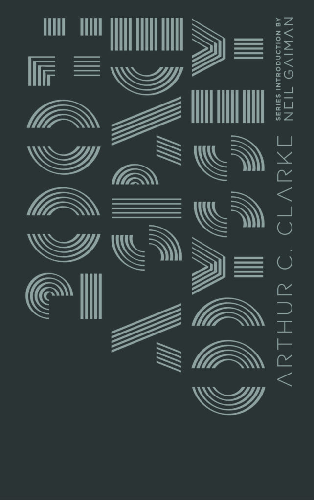
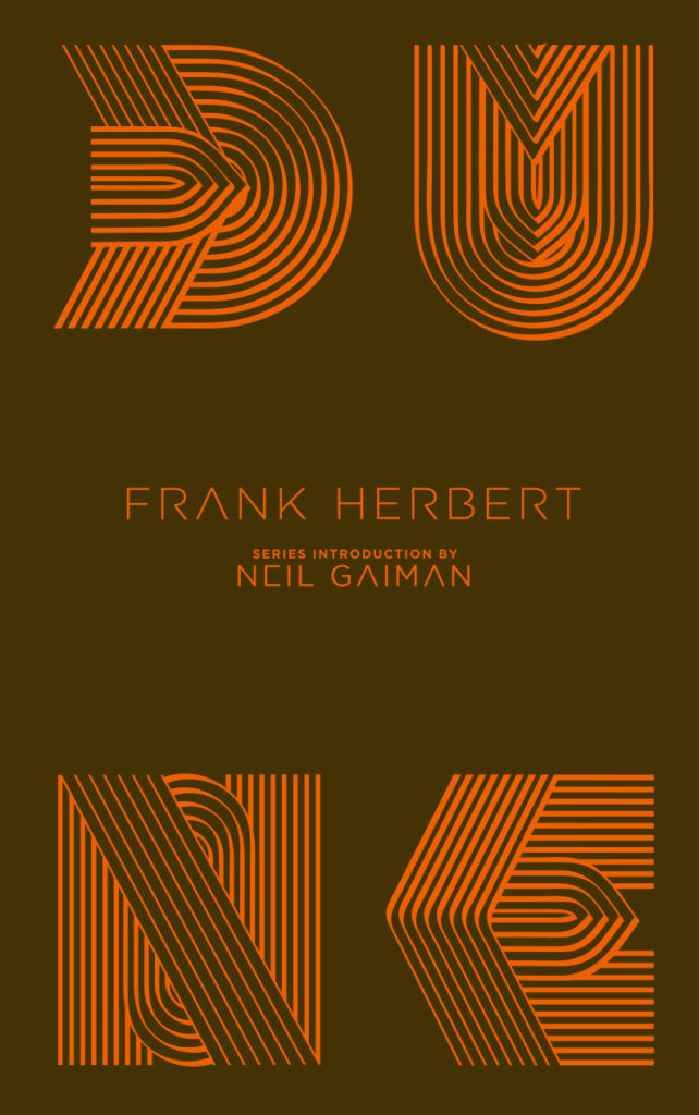
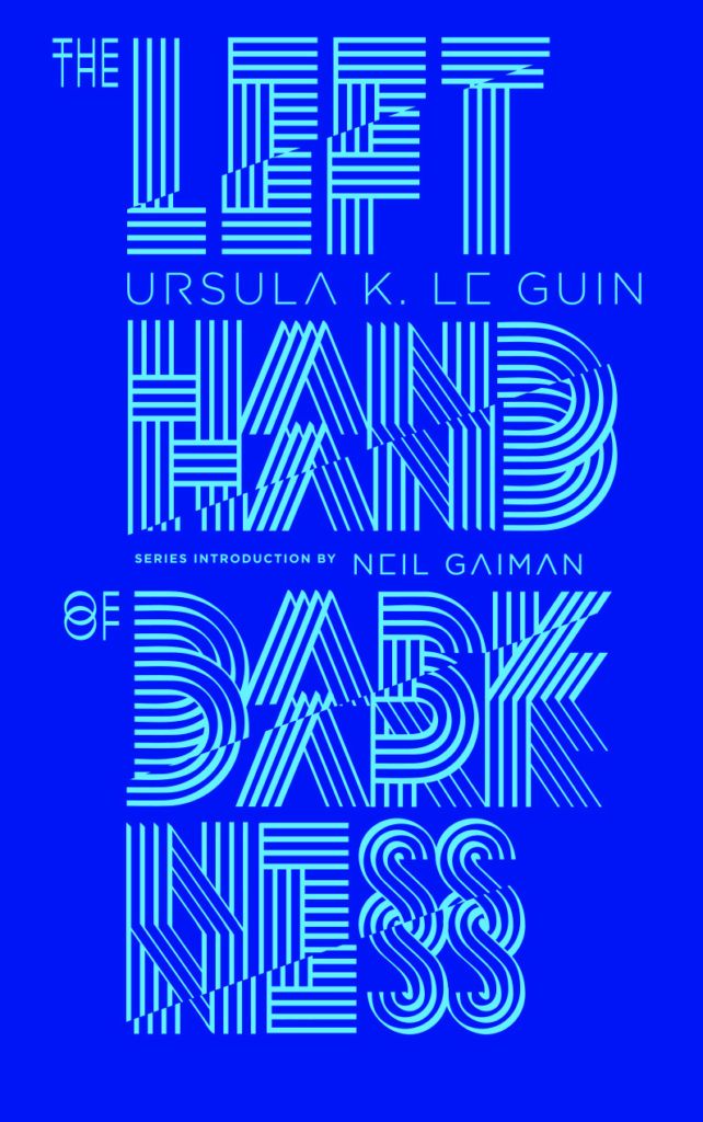
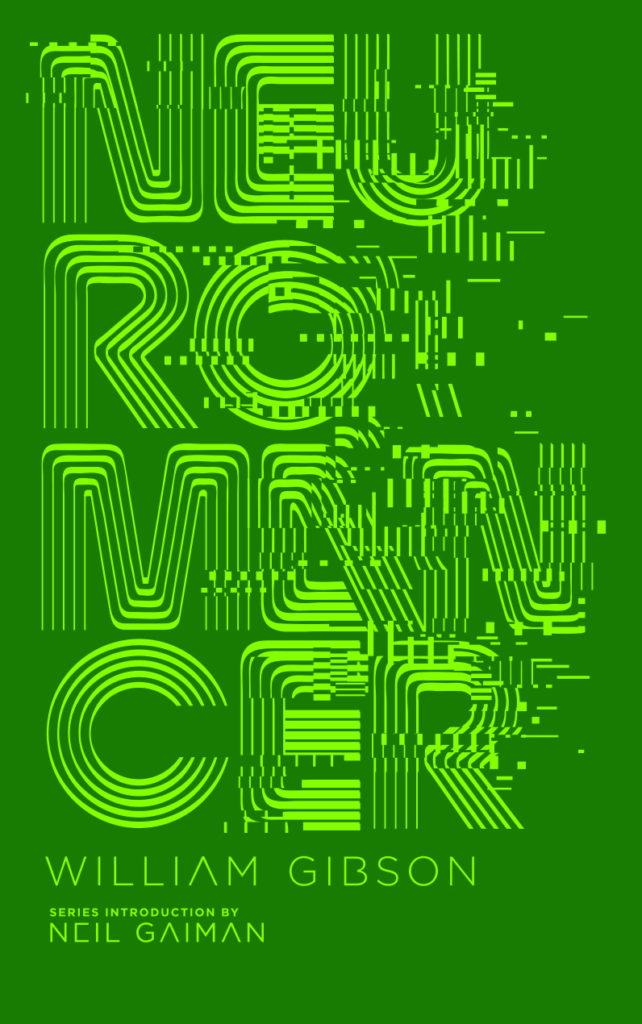
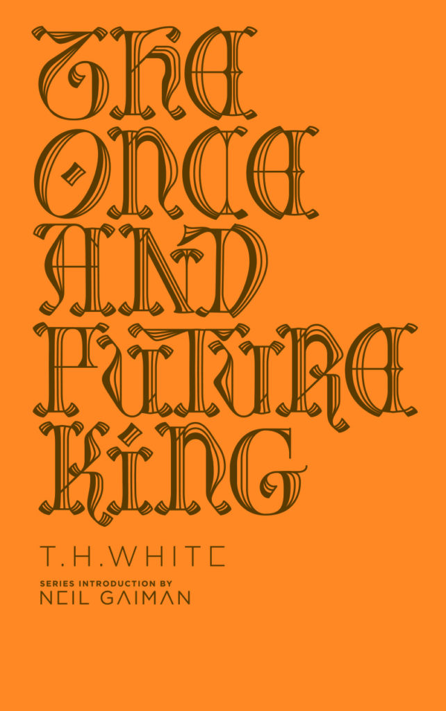
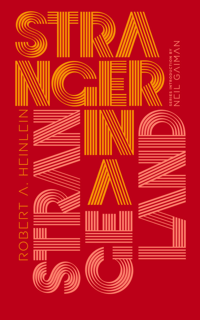
Following on from their horror classics series selected by Guillermo Del Toro, Penguin US is publishing six hardcover science fiction and fantasy classics this fall with introductions from Neil Gaiman, and (more importantly!) brilliant typographic covers by Brooklyn-based Spanish designer Alex Trochut. Available in October, the finished covers will be foil on uncoated paper over board.
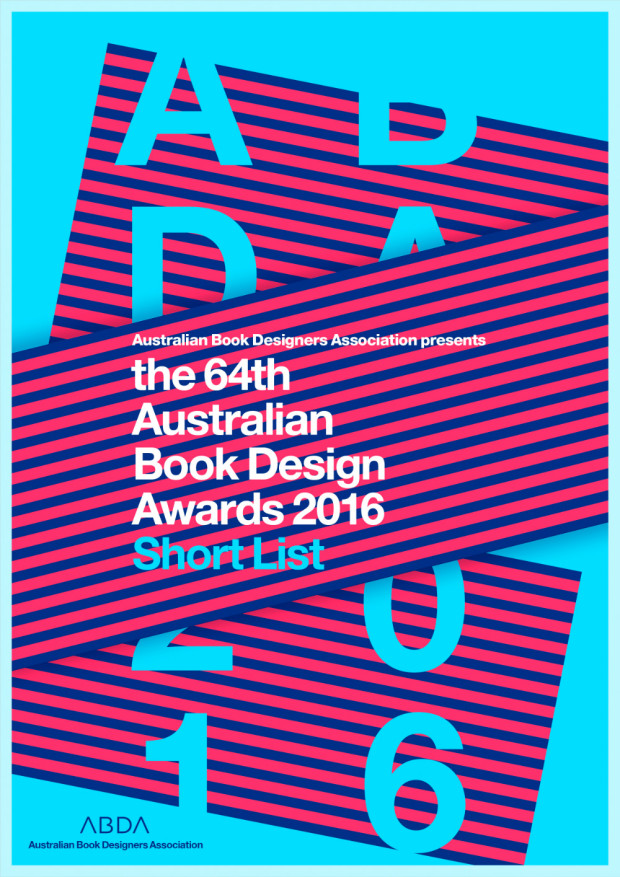
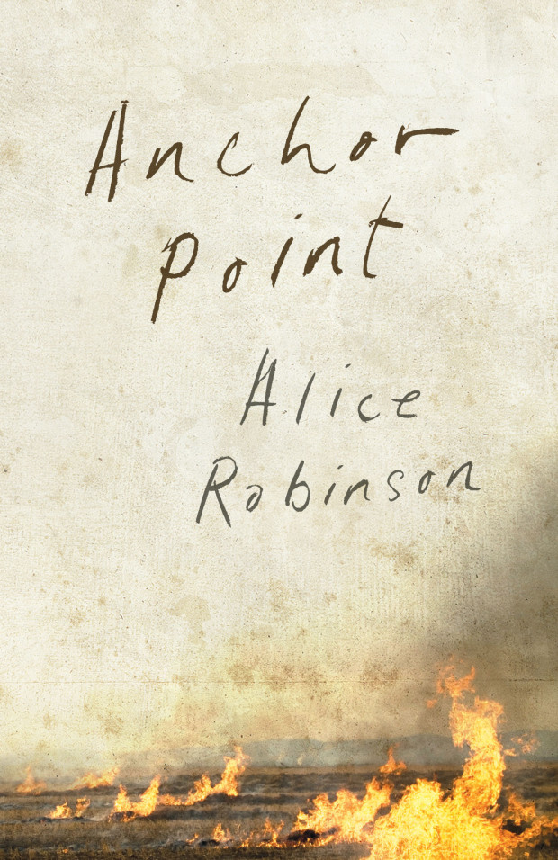
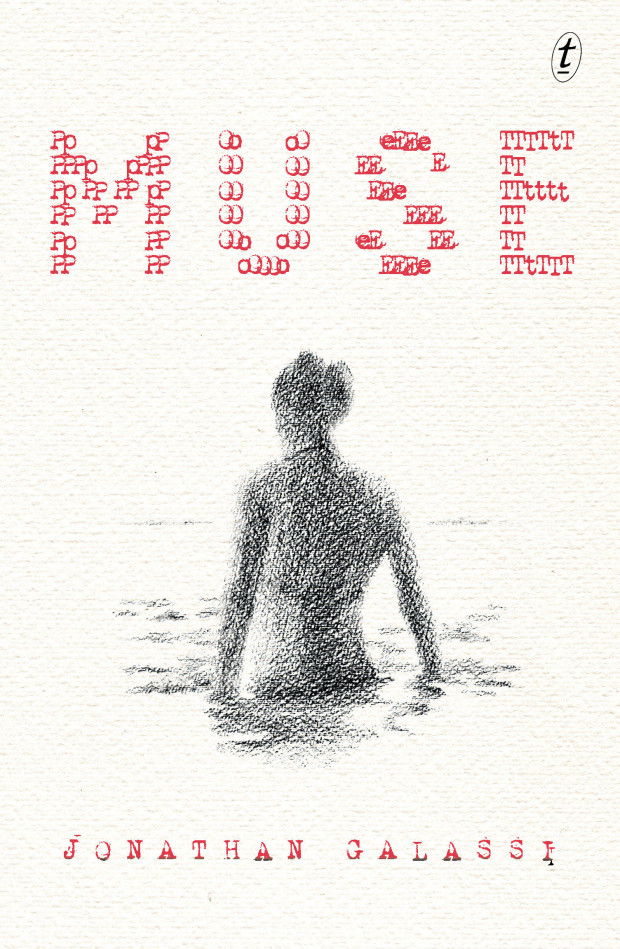
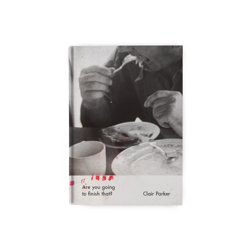
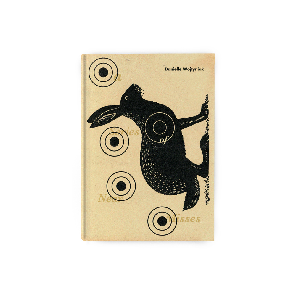
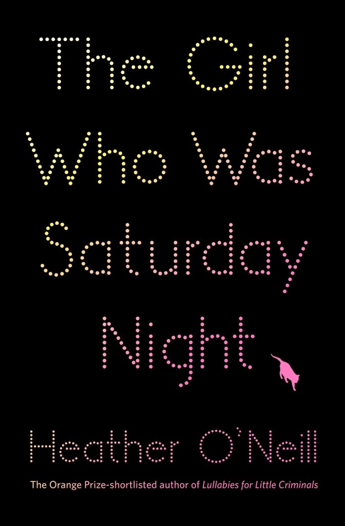
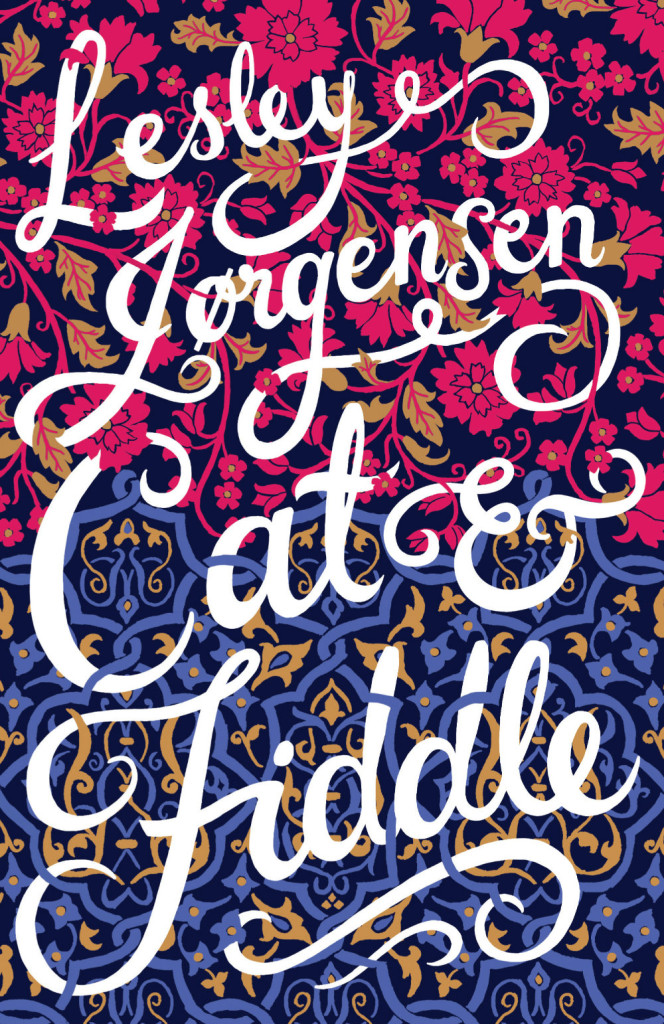
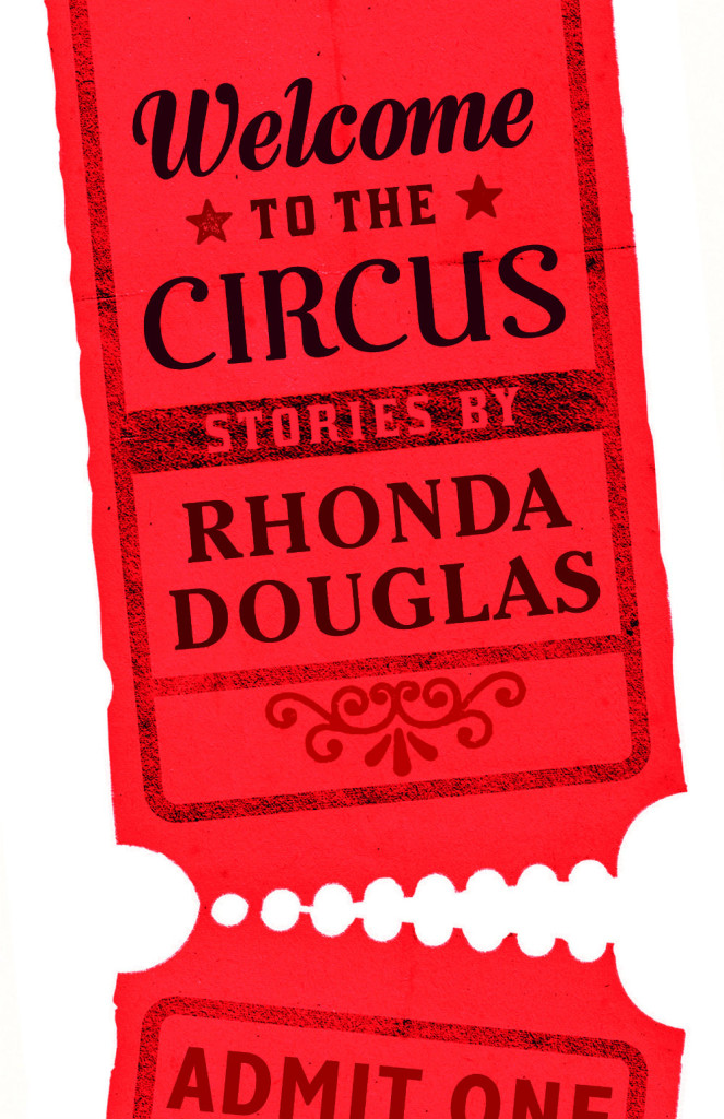
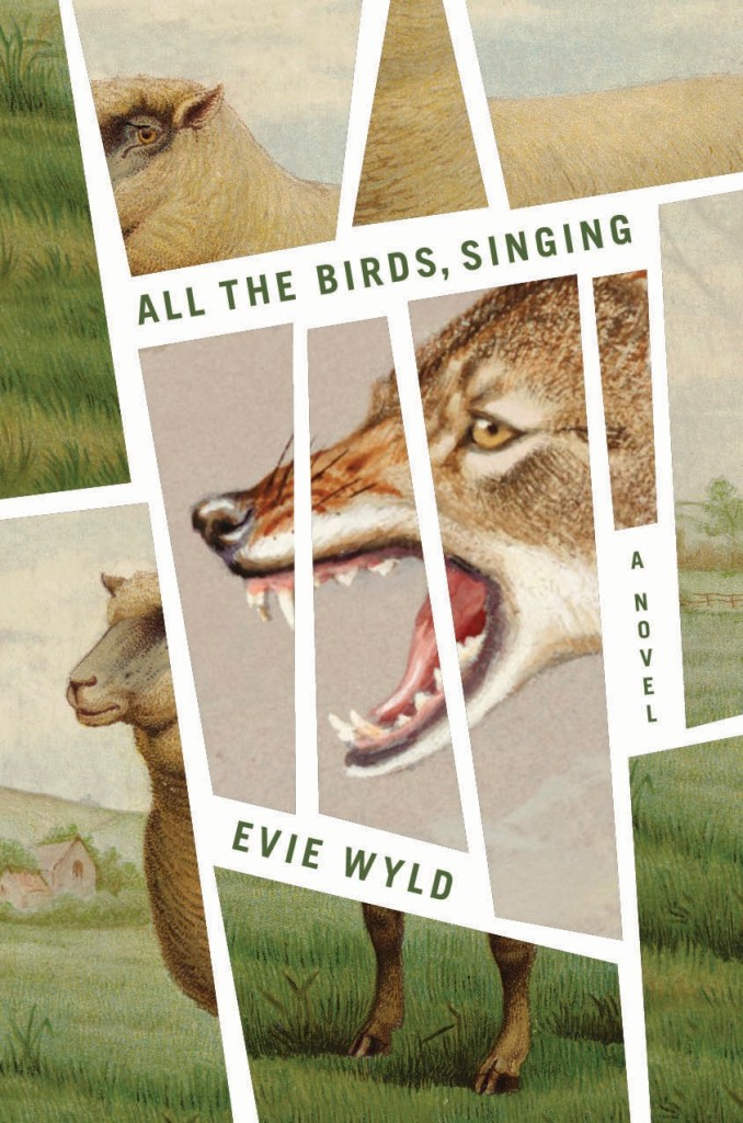
ABDA, the Australian Book Designers Association, recently announced the shortlist for the 64th Australian Book Design Awards. As in previous years, the shortlist includes some cracking designs in a wide-range of categories. The finalists for literary fiction are pictured below:

The winning books will be announced on Friday 13 May at the Awards Party in Melbourne.
Comments closed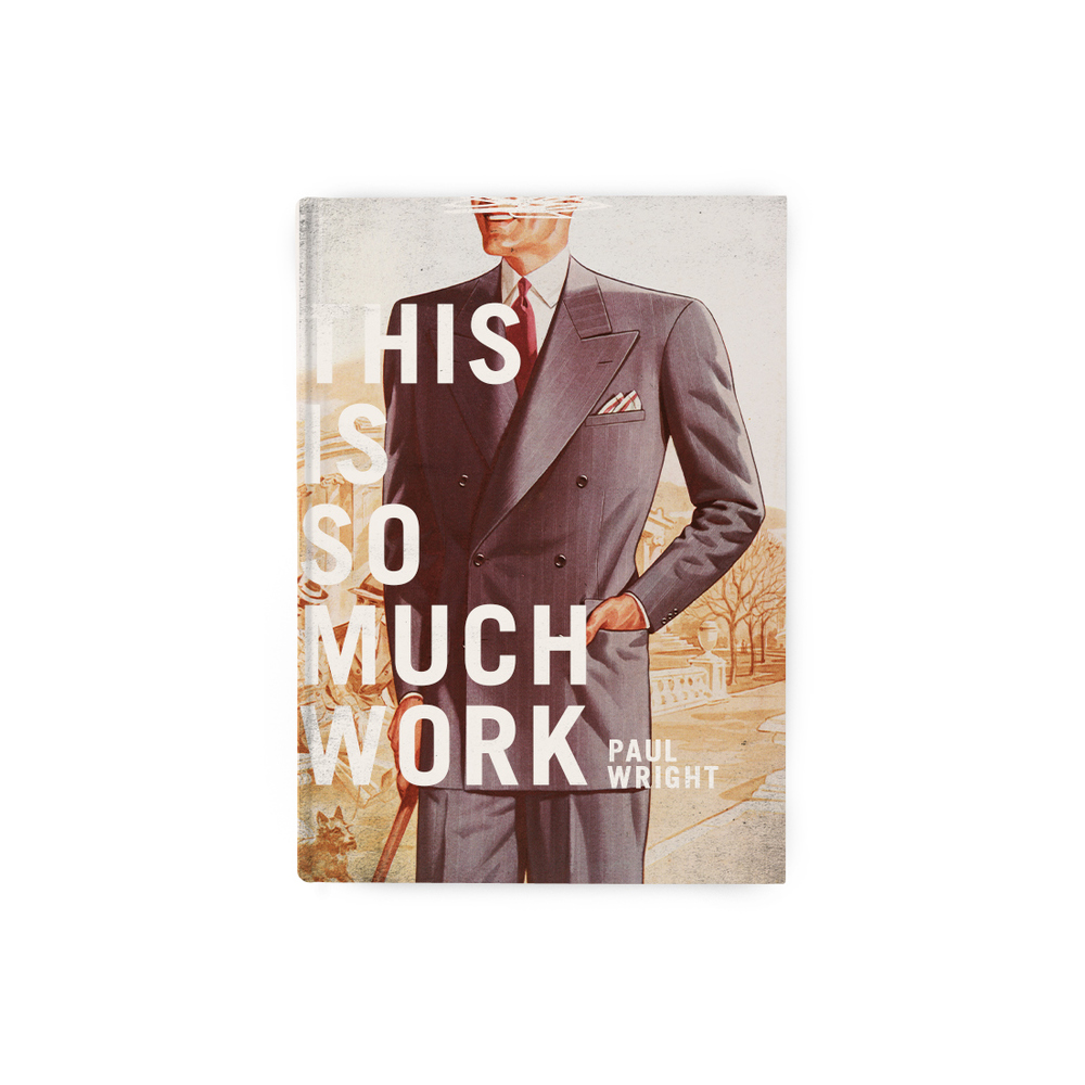

Last month, Canadian designer Steve St. Pierre started asking people what the title of their life story would be and creating book jackets for the replies. The results are both brilliant and weird.
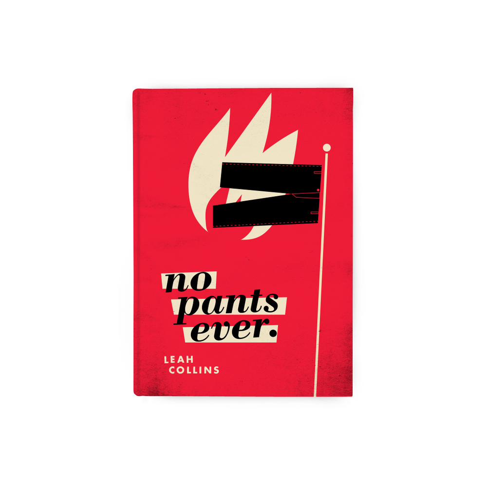
Leah Collins recently talked to Steve about his project for CBC Arts:
“I love book cover design,” St. Pierre says, and the thing that makes it special, he says, is that a successful cover is “kind of like a blind date.”
“You’re trying to essentially put charm into a book cover,” he says. But unlike drinks with some random from Tinder, the relationship you have with a novel is likely going to be longer. Probably way more meaningful, too.
“It’s that negotiation, trying to be charming and trying to get someone to just think twice about what’s in front of them,” says St. Pierre. “That, to me, is my favourite part of designing these things.”

For the record, Steve just asked me to contribute a title. I’m thinking about it.


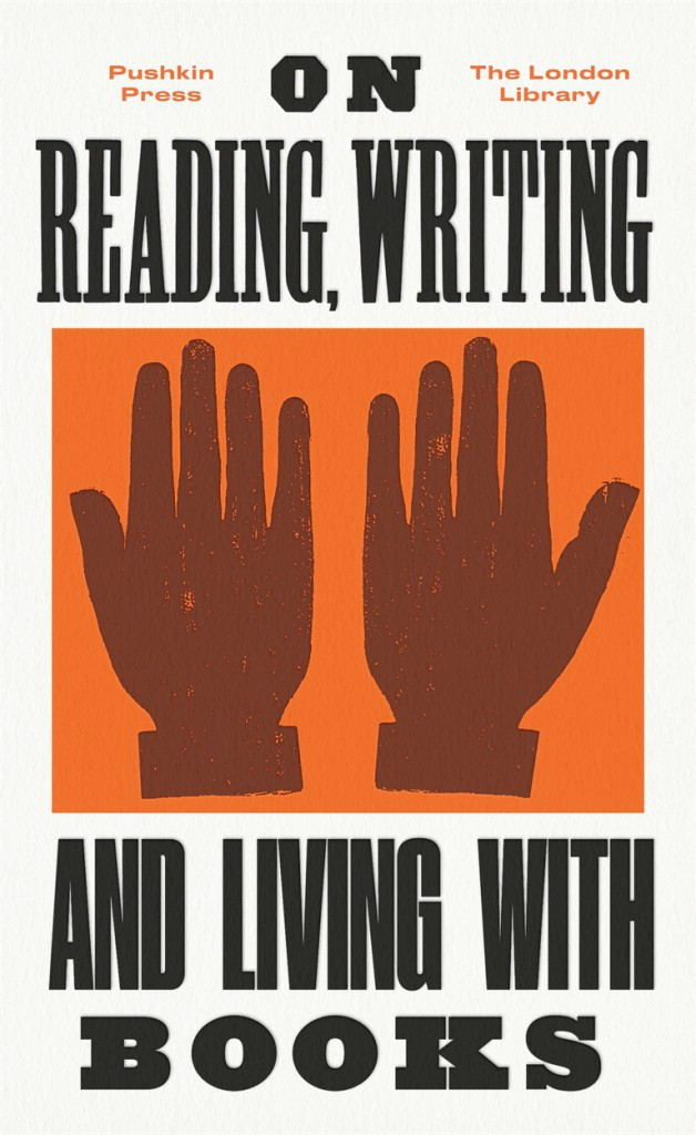
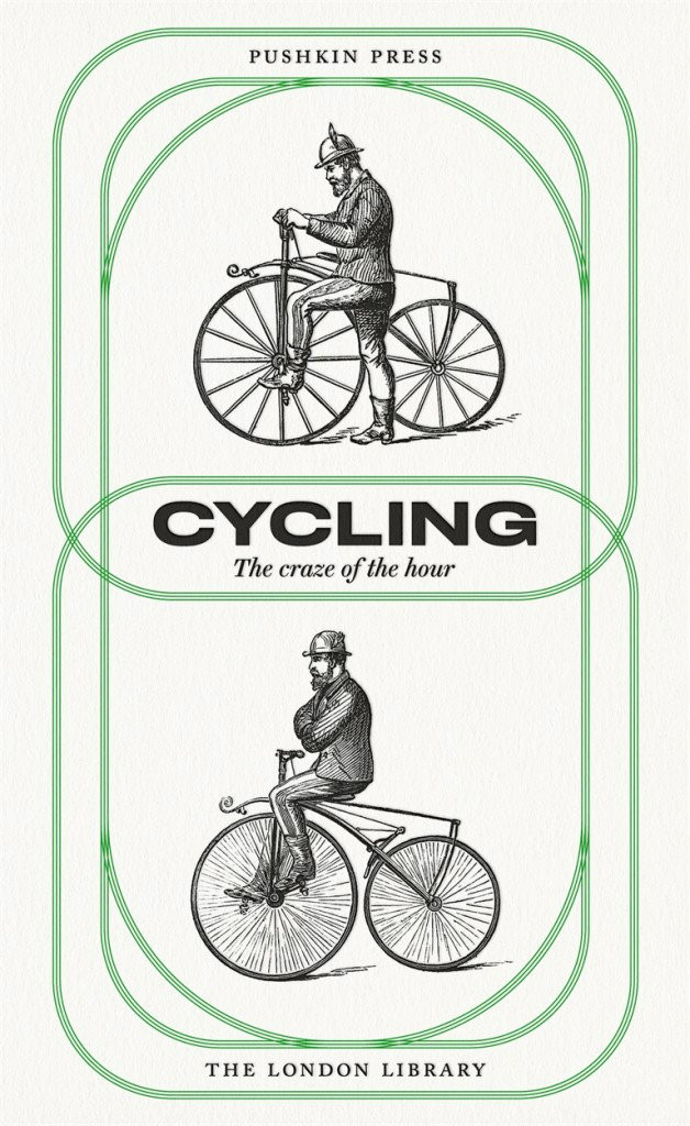
At The Bookseller, designer David Pearson talks about his new cover designs for Pushkin Press’s ‘Found on the Shelves’ series celebrating 175 years of the London Library:
At the heart of successful series design is motif – be it colour, type, grid, imagery, or other visual touchpoints – yet Pearson’s latest covers for Pushkin are perhaps less obviously groupable. “The series identifier is a subtle one,” he says, “but it is present in the use of decorative borders. I had begun to explore this idea of active border-making with some of Pushkin’s Collection Covers; the idea being that a decorative border can provide a layer of meaning or a tension point within the cover, and not simply act as a framing device.
“For The London Library series, this takes the form of overlapping tyre treads in ‘Cycling: The Craze of the Hour’; snaking, northbound steam in ‘The Lure of the North‘. It’s a small thing to hang your ideas on – and it matters little if no one notices it – but it ensured that I didn’t flounder at the beginning of the design process, as I had something to kick against, an inbuilt challenge to wrestle with.”
Pearson attributes much of the covers’ liveliness to the illustration, which he is quick to credit: “I intend to broaden the illustrative scope [further titles are scheduled for November] but for this first selection I’m relying on tried, trusted and incredibly talented hands. Joe McLaren produced the illustrations for ‘On Corpulence’ and ‘Life in a Bustle’ – and as with all of Joe’s work, the result is joyous.” The additional images were sourced from illustrations within the texts themselves, giving some of the covers a distinctly vintage appearance.
Each of the covers will print using a spot colour – one outside the gamut of four-colour CMYK printing, as it cannot be created using a combination of cyan, magenta, yellow and black (“key”); as a consequence of this it is bolder, more vibrant and less ubiquitous (and therefore more striking) – and will feature black foil-blocking on uncoated paper stock.

Comments closed

I love this Bookseller interview with designers Jamie Keenan and Jon Gray, co-founders of the Academy of British Cover Design (among other things):
ABCD tends to recognise and reward brave, striking and fresh approaches, rather than more “conventional” cover aesthetics. I ask the pair whether they feel designers have more freedom these days; whether, as books become imbibed with more longevity and are seen as less disposable, publishers are more amenable to the idea of cover art as art, rather than as a marketing tool. They are reticent; Keenan responds: “It’s strange, because when you do see a weirdo cover – for a reason, not just for the sake of it – quite often they are really successful. If you think of a book as an actual package and compare that to other forms of packaging, its really old-fashioned in a lot of ways.
“Imagine a poster for, say, the next iPhone, and it has a quote on it like you’d see on a book cover – ‘this is the best phone I have ever had!’ – you just think, this is so old-fashioned, that kind of endorsement idea. On a book cover it’s the norm. A lot of advertising you see, you aren’t really sure what it’s for but it draws you in, whereas a lot of book covers are really overt – they tell you exactly what the book is about. We’re supposedly becoming more and more visually literate, but book covers are still, in some ways, quite naïve.”
Gray concurs: “It feels like a real nervous habit, the quote on the front. Is that really helping a book to be sold? Can [shoppers] not just read that on the back and get the same idea…on the front, is it really making someone think: ‘aha!’?”
“The greatest and the worst thing about book cover design is that no one really knows if it’s incredibly powerful or a complete waste of time,” Keenan says. “Quite often when you get a brief, you’ll be sent other covers that the [client] likes and some of them will look absolutely terrible…but it was a bestselling book! So that automatically becomes, in their eyes, a sort of ‘good cover’.”
“There’s no science to it,” Gray agrees.
You can almost hear them sipping their pints.
Comments closedMuch later than usual, here are this month’s book cover selections…
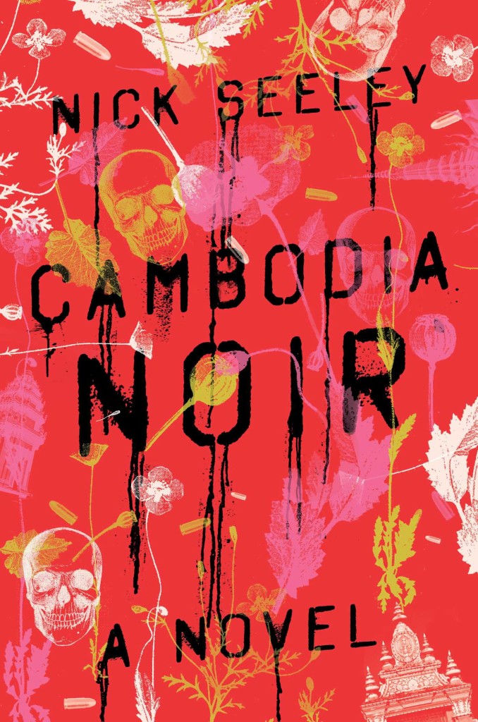
Cambodia Noir by Nick Seeley; design by Alex Merto (Simon & Schuster / March 2016)
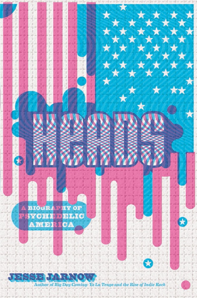
Heads by Jesse Jarnow; design by Alex Camlin (Da Capo / March 2016)
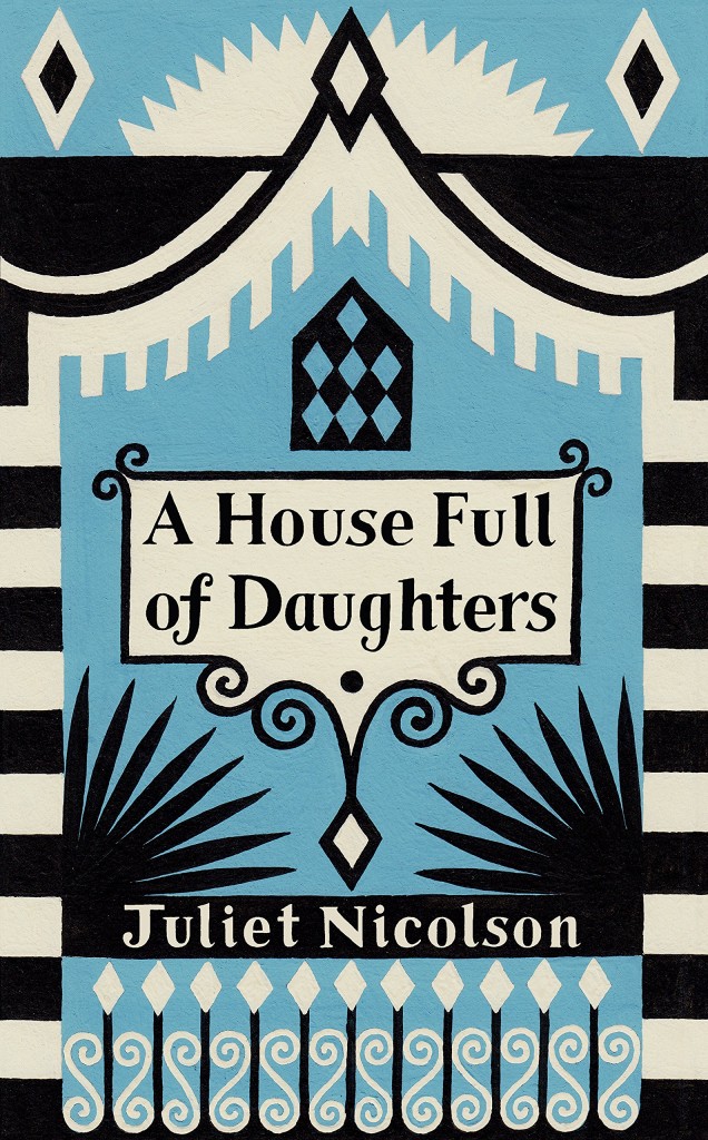
A House Full of Daughters by Juliet Nicolson; design by Cressida Bell (Chatto & Windus / March 2016)
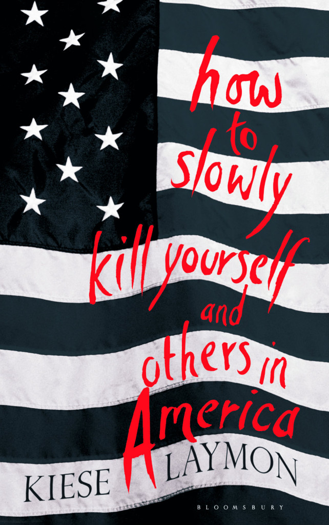
How to Slowly Kill Yourself and Others in America by Kiese Laymon; design by Greg Heinimann (Bloomsbury / March 2016)

Insignificana by Dolan Morgan; design by Alban Fischer (CCM / March 2016)
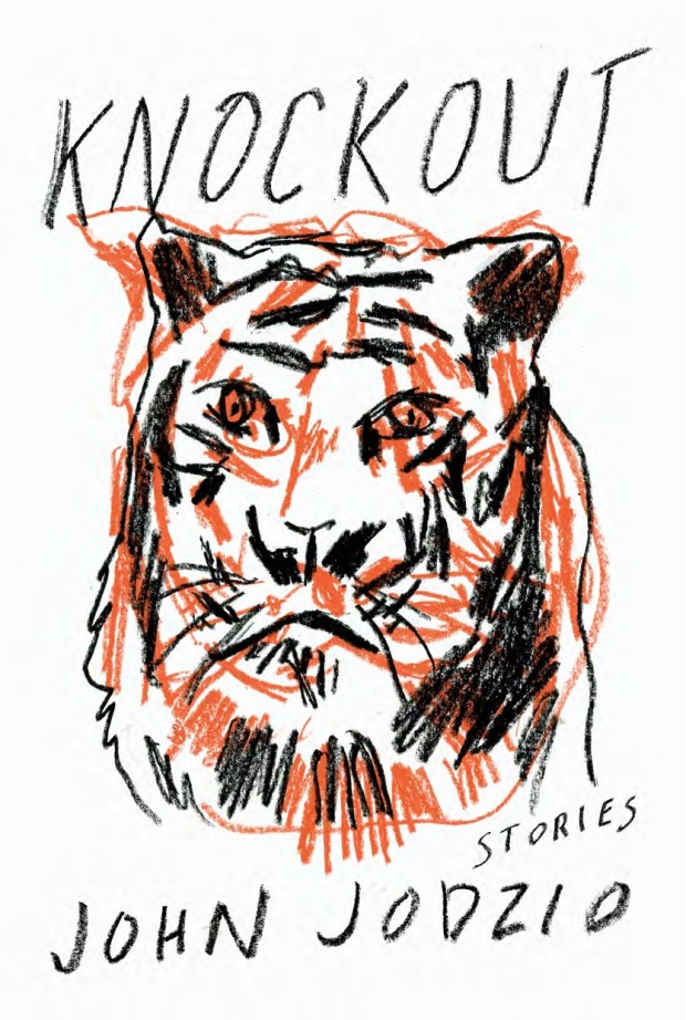
Knockout by John Jodzio; design by Matt Dorfman (Soft Skull / March 2016)
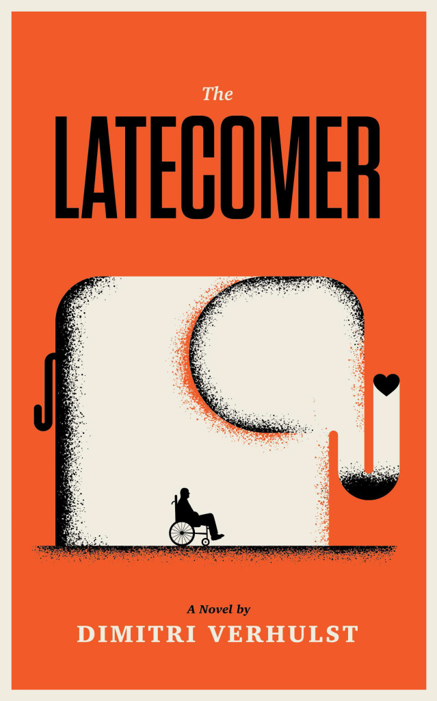
The Latecomer by Dimitri Verhulst; design Ross Proulx / Doublenaut (Portobello Books / March 2016)
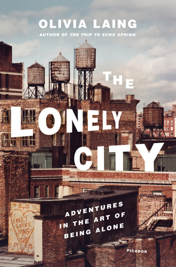
The Lonely City by Olivia Laing; design Henry Sene Yee; photograph by Jerome Liebling (Picador USA / March 2016)
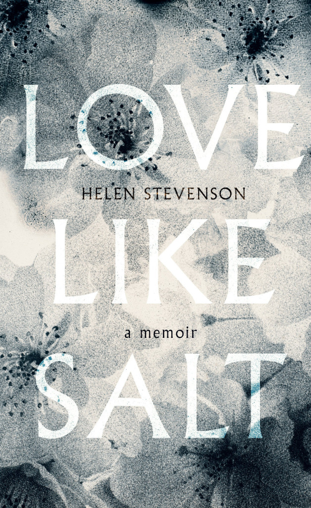
Love Like Salt by Helen Stevenson; design by Nico Talyor; image by Sarah Gillespie (Virago / March 2016)
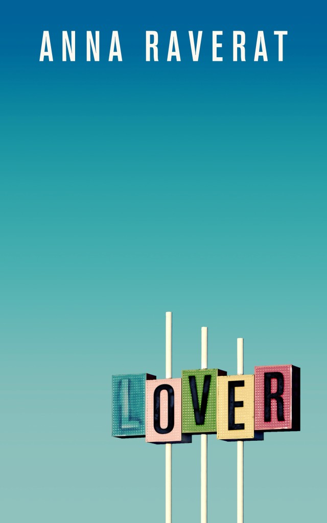
Lover by Anna Raverat; design by Neil Lang (Picador / March 2016)
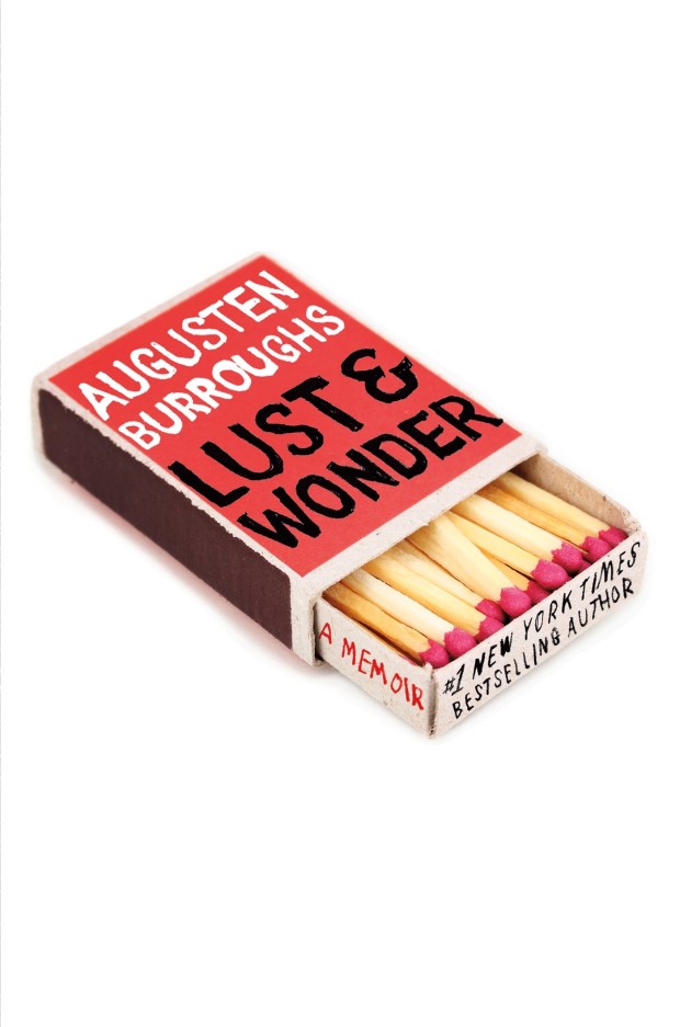
Lust & Wonder by Augusten Burroughs; design by Olga Grlic (St. Martin’s Press / March 2016)
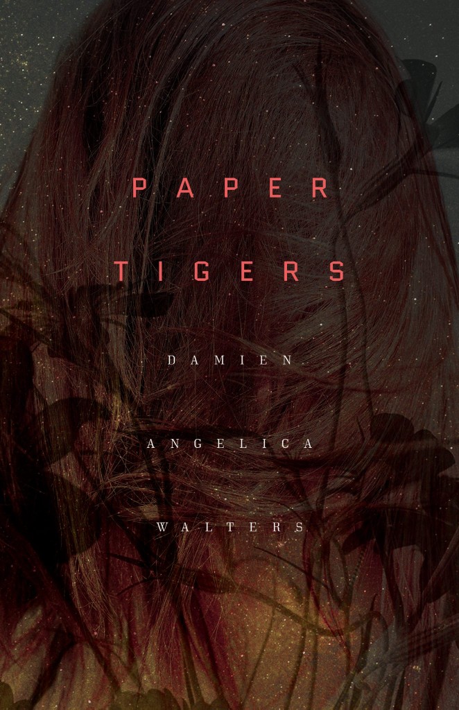
Paper Tigers by Damien Angelica Walters; design by Alban Fischer (Dark House Press / February 2016)
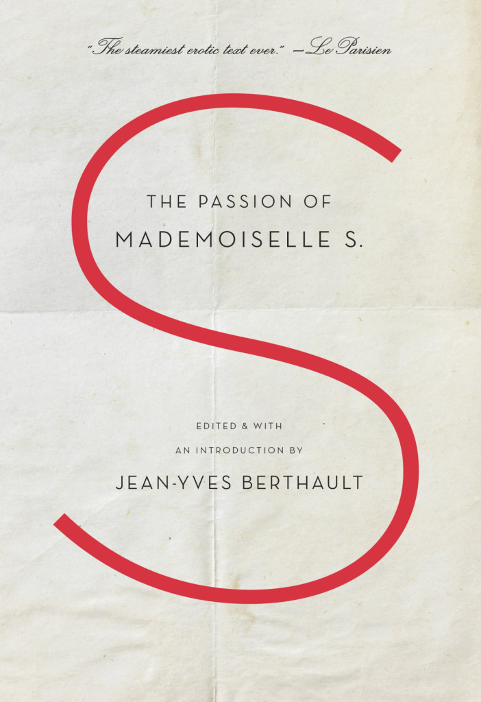
The Passion of Mademoiselle S. edited by Jean-Yves Berthault; design Gabriele Wilson (Spiegel & Grau / February 2016)
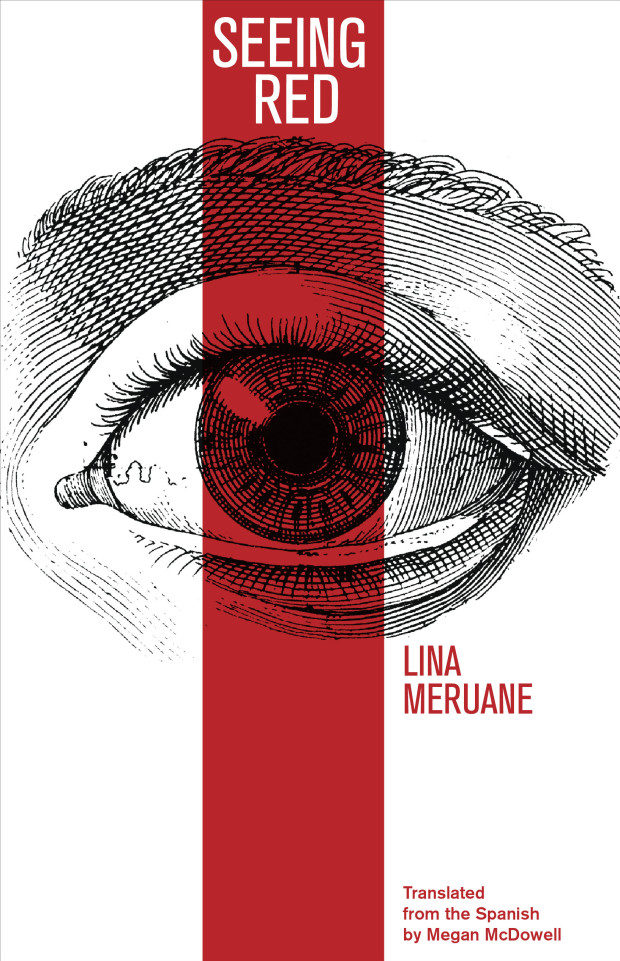
Seeing Red by Lina Meruane; design by Anna Zylicz (Deep Vellum / March 2016)

Socialist Optimism by Paul Auerbach; design by Emma J. Hardy (Palgrave / March 2016)
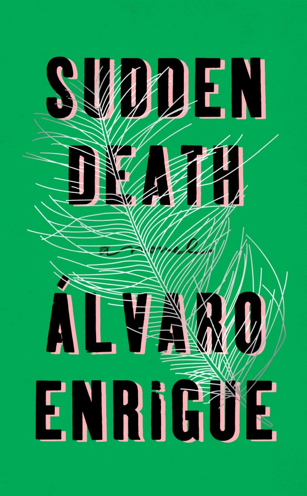
Sudden Death by Álvaro Enrigue; design by Rachel Willey (Riverhead / March 2016)
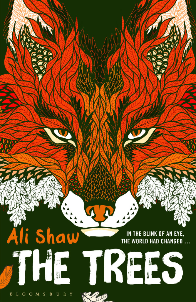
The Trees by Ali Shaw; design by David Mann (Bloomsbury / March 2016)
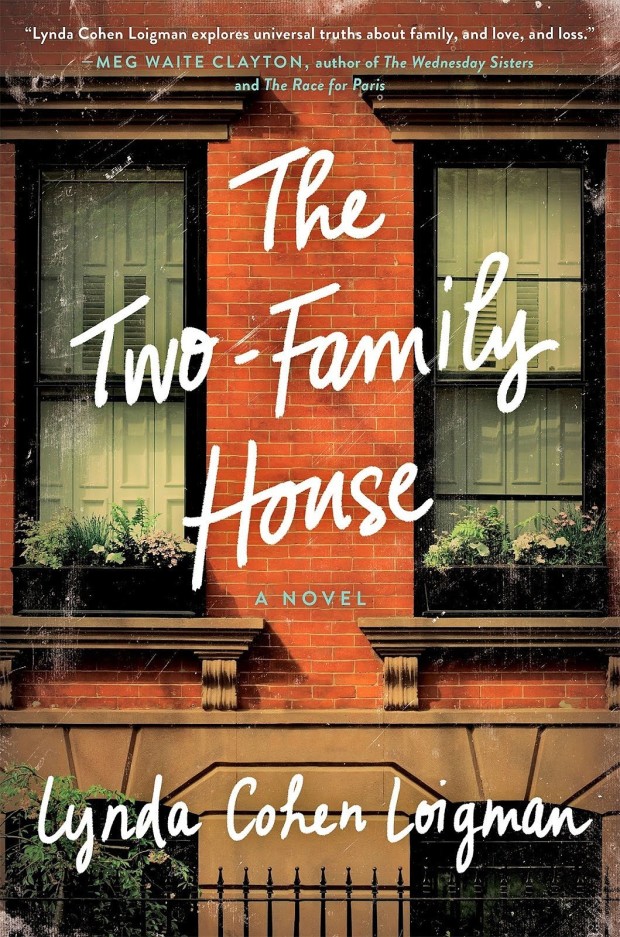
The Two-Family House by Lynda Cohen Loigman; design by Sara Wood (St. Martin’s Press / March 2016)
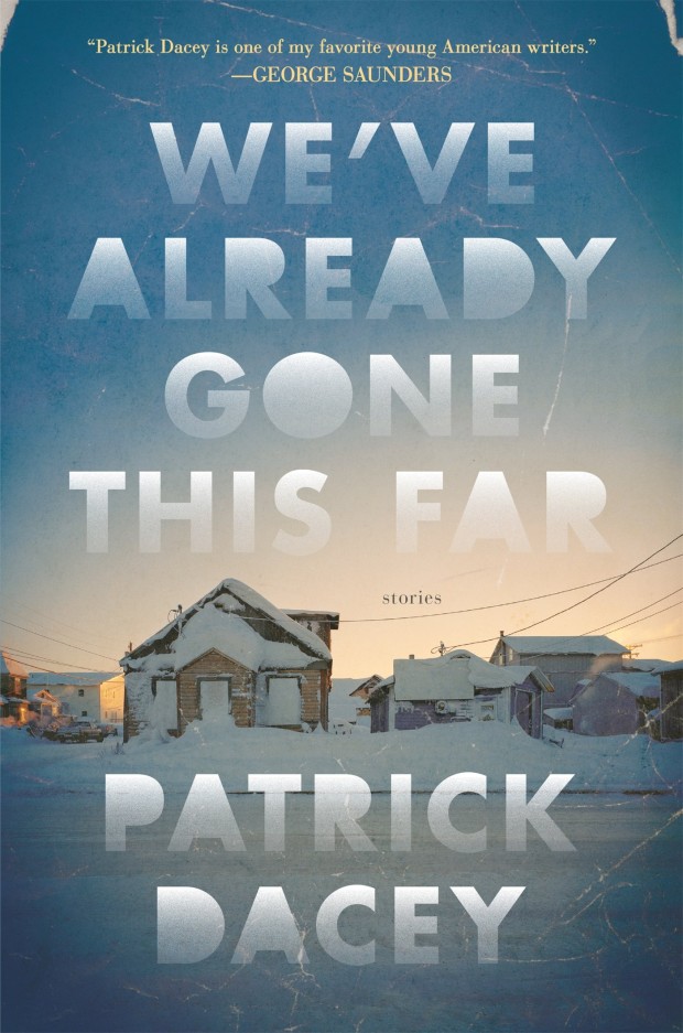
We’ve Already Gone This Far by Patrick Dacey; design by Lucy Kim (Henry Holt / March 2016)
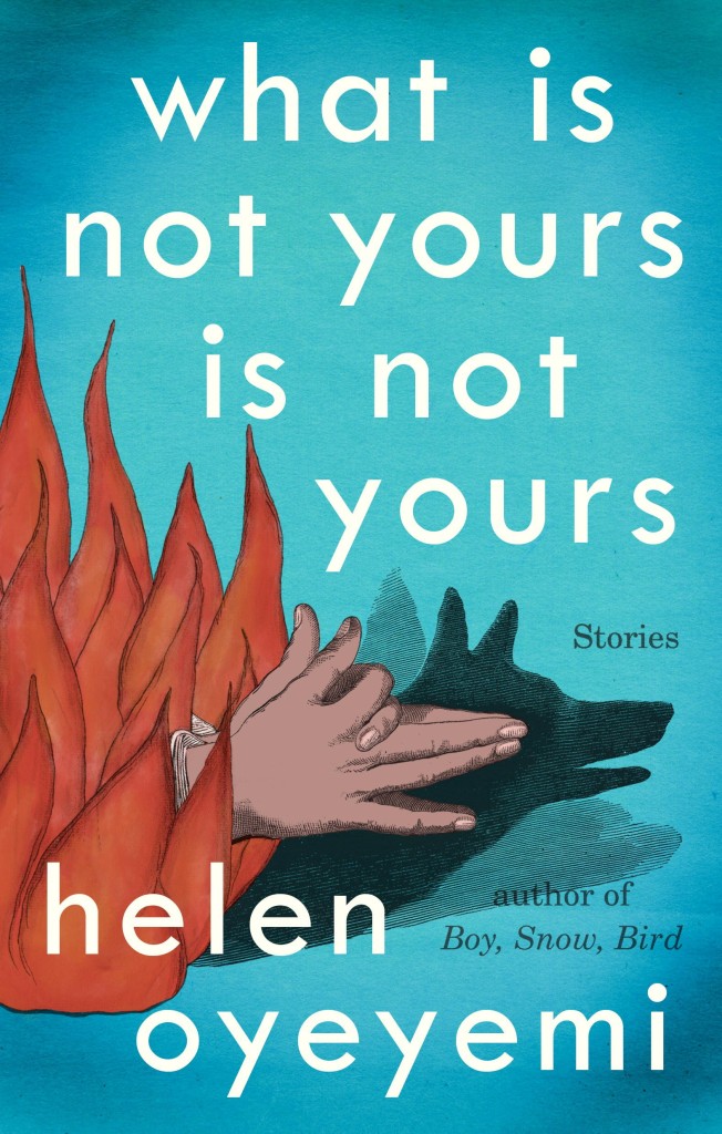
What Is Not Your Is Not Yours by Helen Oyeyemi; design by Helen Yentus (Riverhead / March 2016)
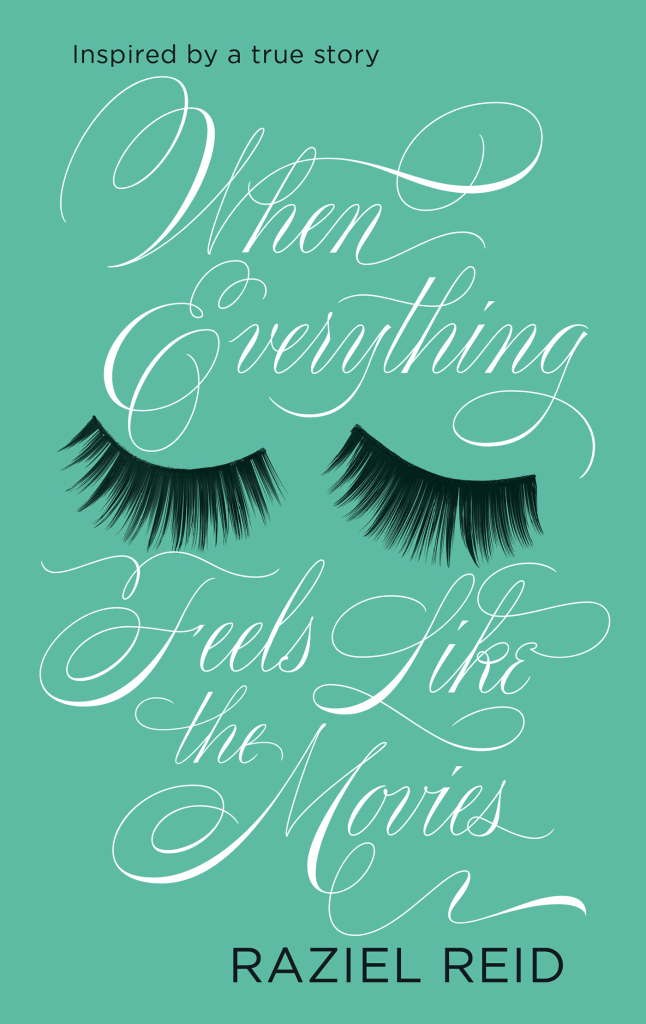
When Everything Feels Like the Movies by Raziel Reid; design Ceara Elliot; lettering and illustration Martina Flor (Atom / February 2016)

XX: Poems for the Twentieth Century by Campbell McGrath; design Sara Wood (Ecco / March 2016)
If you follow the Casual Optimist on Twitter, you will know that a couple of weeks ago design studio Aishima asked people to tweet about inspiring women graphic designers using the hashtag #celebratewomen. As today is International Women’s Day, I thought I would follow up my #celebratewomen tweets with a visual list of 52 inspiring women book cover designers (one for every week of the year!) — from influential veterans whose work I’ve admired for years to junior designers that have just appeared on my radar.
The names of all 52 designers can be found at the end of the post. With a few more hours in a day the list could easily have been many times longer, so apologies to anyone I have overlooked. Please let me know who you would’ve included in the comments or on Twitter.


Gabrielle Bordwin


Terri Nimmo


Ami Smithson / Cabin


Abby Weintraub


Megan Wilson


