Skip to content

Tag: book covers 2015

Salman Rushdie and Adult-YA Crossovers

rushdie

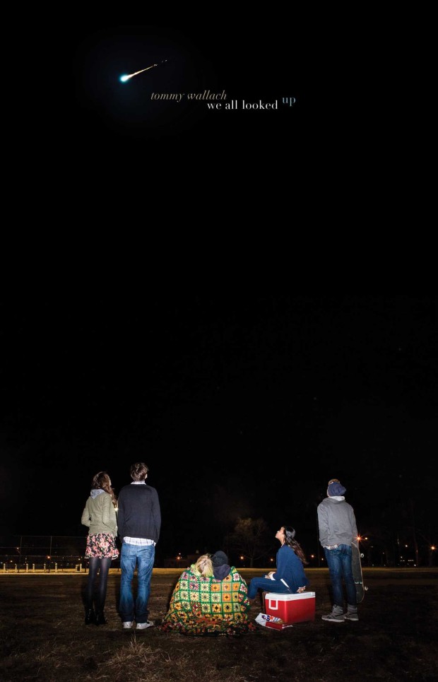
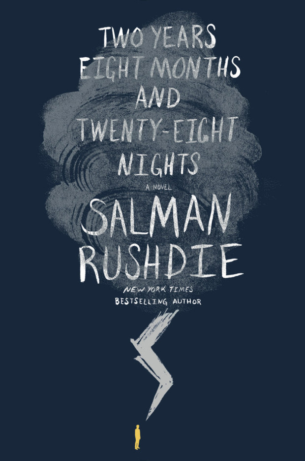
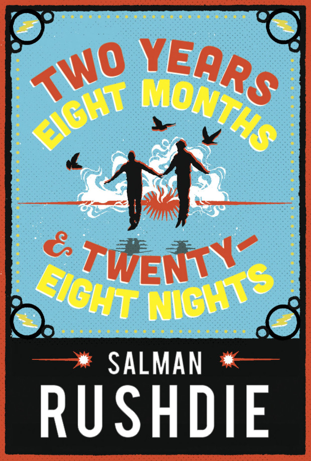
The cover of the US edition of Salman Rushdie’s first adult novel in seven years. Two Years Eight Months and Twenty-Eight Nights (Random House, September 2015), was revealed on Buzzfeed last week.1 While the cover itself is perfectly fine, the most remarkable thing about it is how much it looks like a novel for young adults.

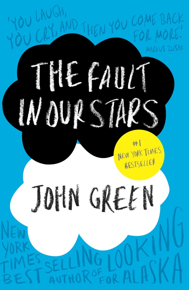
I was immediately reminded of the cover of The Fault in Our Stars by John Green, designed by Rodrigo Corral (Penguin 2012)…

fault-in-stars-nyt

…and the lovely hand-lettered YA covers of Australian designer and illustrator Allison Colpoys:

why-we-took-the-car-design-allison-colpoys

After some further thought, however, I realised that it is even more reminiscent of the cover for the novel Waiting for Doggo by Mark B. Mills, designed by Yeti Lambregts (Headline, November 2014), which made me wonder if, perhaps, we are starting to see more adult covers that look like YA?

Since the success of Harry Potter, publishers have known that adults read ‘children’s books’ for pleasure, and they will often try to appeal these to older readers with more mature covers. On Twitter last week, American YA cover designer Erin Fitzsimmons (interviewed on the blog here), identified this as ‘crossover appeal.’ But crossover appeal can go both ways, and it seems that adult covers are being designed to reach the widest possible audience too.

This trend is more pronounced in the UK where bright and whimsical illustrated covers are common for commercial fiction. The vibrant cover of the UK edition of Two Years Eight Months and Twenty-Eight Nights (and the accompanying backlist) — beautifully illustrated by Sroop Sunar and unveiled today — is a perfect example:

two-years-illustration-sroop-sunar

According to CMYK, the Vintage Books design blog, Sunar was inspired by printed ephemera found in India around the time of Independence, and the brightly coloured covers would work equally well for YA as for adult fiction:

rushdie-uk-backlist-illustration-sroop-sunar

US publishers have (I think) been slower to market adult fiction to younger readers in this way. Although hand-lettering has become very common on US covers for a while now, photographic images still dominate commercial fiction covers. Compare, for example, the UK cover of Station Eleven by Emily St. John Mandel, illustrated by Nathan Burton (left), with US edition designed by Abby Weintraub (on the right):

From my own experience, I can also think of at least one quirky illustrated cover — for an upcoming literary novel that the publisher has very high hopes for — that was killed at the last minute in favour of a more traditional photographic one. The original design could easily have been for a gothic Young Adult fantasy. The new cover, much less ambiguous, is clearly intended for adult book clubs.

Even so, Two Years Eight Months and Twenty-Eight Nights and a few other recent covers suggest that US publishers are willing to experiment, and as audiences for YA and adult fiction become harder to differentiate, we will only see more covers that blur those lines.

Comments closed

Book Covers of Note April 2015

Never mind that still feels like some crazy never-ending winter in Toronto, it’s (allegedly) April so here are a few new and recent covers that have caught my eye in the past month…

american-warlord-design-oliver-munday
American Warlord by Johnny Dwyer; design by Oliver Munday (Knopf / April 2015)

boring-girls-design-david-gee
Boring Girls by Sara Taylor; design by David A. Gee (ECW  / April 2015)

city-beasts-design
City Beasts by Mark Kurlansky; design by Rachel Willey (Riverhead / February 2015)

dismantling-design-zoe-norvell
Dismantling by Brian DeLeeuw; design by Zoe Norvell (Plume / April 2015)

every-living-one-design-alban-fischer
Every Living One by Nathan Haukes; design by Alban Fischer (Horse Less Press / March 2015)

galaxy-man-design-chas-brock
The Galaxy Game by Karen Lord; design by Charles Brock (Del Rey / January 2015)

game-of-love-and-death-artwork-cs-neal-design-nina-goffi
The Game of Love and Death by Martha Brockenbrough; design by Nina Goffi; illustration by Christopher Silas Neal (Scholastic / April 2015)

(You know who could do an amazing Harper Lee cover? Christopher Silas Neal, that’s who!)

hausfrau
Hausfrau by Jill Alexander Essbaum; design by Gabrielle Bordwin (Random House / March 2015)

herland-design-julia-connolly-petra-borner
Herland by Charlotte Perkins Gilman; design by Julia Connolly;  illustration Petra Börner (Vintage / April 2015)

how-to-run-a-government-design-barnbrook
How to Run a Government by Michael Barber; design by Barnbrook (Allen Lane / March 2015)

love-sex-and-other-foreign-policy-goals-design
Love and Other Foreign Policy Goals by Jesse Armstrong; design by Matt Broughton (Jonathan Cape / April 2015)

man-who-planted-trees-design-thomas-ng
The Man Who Planted Trees by Jim Robbins; design by Thomas Ng; photograph Peter Kupfer (Spiegel & Grau / March 2015)

musical-brain
The Musical Brain by César Aira; design by Rodrigo Corral (New Directions / March 2015)

odd-man-out-design-ms-corley
Odd Man Out by F. L. Green; design by M. S. Corley (Valancourt Books / March 2015)

on-the-way-design-alban-fischer
On the Way by Cyn Vargas; design by Alban Fischer (Curbside Splendor / April 2015)

(I also like Alban Fischer’s cover for Does Not Love by James Tadd Adcox, published by Curbside Splendor in 2014, a lot)

PlagueandCholera
Plague and Cholera by Patrick Deville; design by Sian Wilson (Abacus / April 2015)

queen-of-bright-shiny-things-design-anna-booth
The Queen of Bright and Shiny Things by Ann Aguirre; design by Anna Booth; photography by Jon Barkat and Gary Spector (Feiwel & Friends / April 2015)

road-to-character-design-jim-stoddart
The Road to Character by David Brooks; design by Jim Stoddart (Allen Lane / April 2015)

Seven_Madmen_FINAL_Cover_RGB (1)
The Seven Madmen
by Roberto Arlt; design by Steve Panton; series design Peter Dyer (Serpent’s Tail / February 2015)

splendid-things-we-planned-design-greg-mollica
The Splendid Things We Planned by Blake Bailey; design by Greg Mollica; cover art by Matthew Cusick (W. W. Norton / February 2015)

strange-case-of-rachel-k-design-paul-sahre
The Strange Case of Rachel K by Rachel Kushner; design by Paul Sahre (New Directions / March 2015)

syrian-notebooks-design-david-a-gee
Syrian Notebooks by Jonathan Littell; design by David A. Gee; photograph by Mani (Verso / March 2015)

Tout-peut-changer-design-Nouvelle-Administration
Tout Peut Changer by Naomi Klein; design by Nouvelle Administration (Lux Éditeur / March 2015)

voices-in-the-night-design-janet-hansen
Voices in the Night by Steven Millhauser; design by Janet Hansen (Knopf / April 2015)

(Another great 2014 cover I missed — but saw in a bookstore recently — is Janet’s design for Hiding in Plain Sight by Nuruddin Farah)

whispering-shadows-design-gray318
Whispering Shadows by Jan-Philipp Sendker; design by Gray318 (Atria / April 2015)

woman-who-read-too-much-design-anne-jordan
The Woman Who Read Too Much by Bahiyyih Nakhjavani; design by Anne Jordan (Stanford University Press / April 2015)

(I like this unused unused comp very much too)

worthy-design-kimberly-glyder
Worthy by Denice Turner; design by Kimberly Glyder (University of Nevada Press / April 2015)

2 Comments

Go Set A Watchman

This post was updated April 4, 2015 with additional illustrations and commentary.

Earlier this week, the US and UK covers for the new Harper Lee novel, Go Set a Watchman, were revealed online to great excitement and — because design criticism is a spectator sport — no small amount of derision.

go-set-a-watchman-US

The US cover was designed by Jarrod Taylor for HarperCollins. An apparent homage to the classic post-war American book covers designed by the likes of W. A. Dwiggins, George Salter, and Ismar David, there was some suggestion, on Twitter at least, that it bore an uncanny resemblance to the dust jacket of the first edition of Ayn Rand’s Atlas Shrugged (published in 1957), designed by Salter himself.

Certainly, the covers do compliment each other — a testament to how well Taylor has captured the tone of the period — but the minor similarities grind to a halt at yellow train lines and the design of a headlamp. The composition, colour, and lettering are all quite different. More importantly in my opinion, the mood of the covers is in stark contrast. Go Set A Watchmen, with its (faux) hand-brushed letters, golden leaves, old-fashioned locomotive, and evening blue hue is wistful and nostalgic. The ruler-straight horizon and railway sleepers give it steadiness and calm. It evokes both the passing of time and the desire, perhaps, to return to the past.

Atlas Shrugged, on the other hand, is simply a period piece. The design itself, with its hot purple sky, rugged mountains, ominous dark tunnel, tilted railway sleepers, and — let’s face it — bloody enormous red warning light, is far from nostalgic. It’s all fear, urgency and speeding danger — the stencilled letters telling you (in case you hadn’t quite figured it out yet) that this book means serious business… Armchair psychoanalysts have at it.

In fact, the cover of Go Set A Watchman is an update of the original dust jacket of To Kill A Mockingbird (published in 1960) designed by Shirley Smith — the autumnal leaves making a nice allusion to both the author and her previous book, as well as an indication of where the new novel might take us.

But, for all the vintage styling, there is a kind of efficiency to new design that is, I think, unmistakably modern. The illustration, the colour palette, and even the brush-stroke typography, all have the feel of contemporary commercial fiction. It will not look out of place either online, or along side other bestsellers in Barnes and Noble.

Harper-Lee-UK

UK cover is, in the British fashion, being credited to the in-house design team at William Heinemann rather than to an individual designer1.

Also looking to evoke the past, it appears to draw inspiration from the typography of vintage film.

It’s a nod, perhaps, to the Academy Award-winning (and much beloved) film adaptation of To Kill A Mockingbird starring Gregory Peck (1962), but the burning orange background, red shadows and dark silhouettes suggest — unintentionally perhaps — an earlier literary film adaptation, Gone with the Wind (1939).2

The Art Deco-inspired typography is also perplexing. While To Kill A Mockingbird is set in early 1930s, Go Catch A Watchmen is apparently set 20 years later — well after the heyday of Art Deco (but firmly in the post-war period that inspired the US cover).

Stylistically too, there is something about the combination of illustration and type that feels rather inauthentic and, as a consequence, the cover has a sort of unsatisfying post-modernism gloss. It is much less successful at evoking the period than Ben Wiseman’s noir-inspired design for The Hilliker Curse by James Ellroy (published in 2010) for example.

Even so, there’s no getting away from the fact that it is vibrant and bluntly effective. Less book jacket than a glaring burnt orange advertisement, it is meant to be read at small sizes online (pre-orders, pre-orders, pre-orders….), or piled up at a distance.  If you miss the author’s name and the silhouette of a mockingbird at the top of the cover, the words To Kill A Mockingbird loom large at the bottom.

This bold placement of the old title between the lines of the new triggered a slew of obvious jokes on Twitter, but it is actually rather ingenious — the designer neatly accommodates a remarkably large font size and, at the same time, slides in a wry allusion to the long shadow of To Kill A Mockingbird — a far wittier, nuanced joke than the repeated ‘Go Set A To Kill A Watchman Mockingbird’ gags online. For all its brash intent, it’s a cleverer cover than it first appears.

Ultimately, neither the UK cover or its American counterpart are going to win design awards. But neither are they terrible, and given the expectations for this book (and the controversy surrounding it), we should be grateful for that. Certainly we should not blame the designers who have produced surprisingly effective covers given the limitations they were surely working under. Covers for high-profile (and expensive!) books always involve compromises of one sort or another, and already risk-averse publishers become even more timid when so much is riding on a single title. As we saw in 2012 with The Casual Vacancy by J. K. Rowling, big books often get blandly familiar, easily recognisable (and readable) covers rather than conceptual, original designs. The book industry is behind readers on this who — after years of exposure to Apple products — are more sophisticated about design than ever before, but Go Set A Watchman was never going to be the book that brought publishers up to date.

UPDATE: If you’re curious about what designers think of the Go Set A Watchman covers, Peter Cocking, Brian Morgan, Ingrid Paulson, and Michel Vrana share their thoughts with the Globe & Mail, while at The Guardian, Stuart Bache gives his considered opinion.

7 Comments

Five Designers, One Illustrator, Two Letterers and More Than a Hundred Versions of a Jacket

hausfrau

If you’ve ever wondered quite how many iterations a cover can go through before the final one is chosen, this video cycles through a multitude of design ideas for the US edition of Hausfrau by Jill Alexander Essbaum published by Random House this month:

“I worked with five designers, one illustrator and two letterers on more than a hundred versions of the jacket,” Robbin Schiff, executive art director at Random House, told Mashable. “The final design, with its stark Swiss typography against the moody and lush floral grouping, conveys a sensual but claustrophobic atmosphere”.1

And, if you’re interested, you also read about the cover of the UK edition created by Maricor/Maricar (pictured below) on the Picador Blog. The whole process sounds a little less… fraught.

hausfrau-UK

UPDATE: Thank you to the folks at Random House for letting me know that the final cover for the US edition was designed by the talented Gabrielle Bordwin. The video was created by Caroline Teagle.

1 Comment

Vintage Feminism

9780099595731

Earlier this month Vintage UK published new editions of The Second Sex by Simone de Beauvoir, The Beauty Myth by Naomi Wolf, and A Vindication of the Rights of Woman by Mary Wollstonecroft.

As CMYK, the Vintage design blog, revealed, these new editions were designed in-house by the talented Mr. Matthew Broughton, and feature black and white photography by Anton Stankowski on The Beauty Myth and A Vindication of the Rights of Woman, and Joy Gregory on my personal favourite, The Second Sex.

Interestingly, Vintage have also published  smaller format ‘short editions’ of the same three books — The Second Sex, The Beauty Myth, and  A Vindication of the Rights of Woman — featuring key extracts from the main texts.

In contrast to the sharp photographic covers above, the short editions feature illustrated covers designed by Gray318 with something of retro, E. McKnight Kauffer or Alvin Lustig, feel:

9781784870393


3 Comments

Book Covers of Note March 2015

Here is March’s selection of new and noteworthy covers. It’s a little bit of the Merto and Mendelsund show I’ll admit, but I assure you there really are some brilliant covers by other designers this month too!

a-z-of-you-and-me
The A-Z of You and Me by James Hannah; design by Leo Nickolls (Doubleday / March 2015)

bookseller
The Bookseller by Cynthia Swanson; design by Kimberly Glyder (Harper / March 2013  killed)

discontent-and-its-civilizations
Discontent and its Civilizations by Mohsin Hamid; design by Rachel Willey (Riverhead / February 2015)

field-notes-from-a-catastrophe
Field Notes from a Catastrophe by Elizabeth Kolbert; design by Patti Ratchford; illustration by Eric Nyquist (Bloomsbury / February 2015)

I also loved Eric’s ‘H is for Hawk’ illustration in the February 22nd edition of The New York Times Book Review.

9780701186982
The Four Books by Yan Lianke; design by Matt Broughton (Chatto & Windus / March 2015)

get-in-trouble
Get in Trouble by Kelly Link; design by Alex Merto (Random House / February 2015)

highway-of-despair
The Highway of Despair by Robyn Marasco; design by Jennifer Heuer (Columbia University Press / March 2015)

9780374172077
Holy Cow by David Duchovny; design by Rodrigo Corral; illustration and lettering by Natalya Balnova (Farrar, Straus & Giroux / February 2015)

i-am-sorry
I Am Sorry to Think I Raised a Timid Son by Kent Russell; design by Peter Mendelsund; hand lettering by Janet Hansen; photography by George Baier IV (Knopf / March 2015)

knife
The Knife by Ross Ritchell; design by Alex Merto (Blue Rider Press / February 2015)

(Camouflage book covers are the New Thing!)

last-word
The Last Word by Hanif Kureishi; design by Jaya Miceli (Scribner / March 2015)

letter-to-a-future-lover
A Letter to a Future Lover by Ander Monson; design by Marian Bantjes (Graywolf / February 2015)

Layout 1
The Librarian by Mikhail Elizarov; design by David Pearson (Pushkin Press / March 2015)

9781627790932
Making Nice by Matt Sumell; design by Gray318 (Henry Holt & Co. / February 2015)

9780691165073
One Day in the Life of the English Language by Frank L. Cioffi; design by Chris Ferrante (Princeton University Press / March 2015)

poser
The Poser by Jacob Rubin; design by Will Staehle (Viking / March 2015)

satin_island
Satin Island by Tom McCarthy; design by Peter Mendelsund (Knopf / February 2015)

so-youve-been-publicly-shamed
So You’ve Been Publicly Shamed by Jon Ronson; design by Matt Dorfman (Riverhead / March 2015)

The-Swan-Book
The Swan Book by Alexis Wright; design by Ceara Elliot (Corsair / March 2015)

unloved
The Unloved by Deborah Levy; design by Katya Mezhibovskaya; photograph by Robert and Shana ParkeHarrison (Bloomsbury / March 2015)

walls-around-us
The Walls Around Us by Nova Ren Suma; design by Connie Gabbert (Algonquin Books / March 2015)

we-all-looked-up
We All Looked Up by Tommy Wallach; Lucy Ruth Cummins; photographer Meredith Jenks (Simon & Schuster / March 2015)

The version of this cover which caught my eye was actually wordless — and I believe that was the designer’s original intention — so I’m a wee bit disappointed that the publisher didn’t quite have the courage to follow through on that.

worst-person-ever
Worst Person Ever by Douglas Coupland; design by Alex Merto (Plume / March 2015)

1 Comment

Lettres Libres

Brut_LL

Canadian designer Catherine D’Amours kindly let me know about her work at Nouvelle Administration to redesign the ‘Lettres Libres’ series published by Montreal-based publisher Lux Éditeur, with the help of Jolin Masson, a freelancer for the team. Printed on craft paper, each cover has its own pattern based on the subject of the book.

I am also a big fan of Catherine’s work for Le Quartanier, another Montreal-based publisher. You can read more about her NOVA series here.

1 Comment

Book Covers of Note February 2015

Here is this month’s selection of new book covers that have caught my eye…

angry-youth-comix
Angry Youth Comix by Johnny Ryan; design by Keeli McCarthy (Fantagraphics / February 2015)

Dom Casmurro hi-res
Dom Casmurro by Machado de Assis; design by Nathan Burton (Daunt Books / February 2015)

etta-otto-russell-james
Etta and Otto and Russell and James by Emma Hooper; design by Gray318 (Penguin / January 2015)

fishermen-gray318
The Fishermen by Chigozie Obioma; design by Gray318 (Pushkin Press / February 2015)

Girl In The Dark
Girl in the Dark by Anna Lyndsey; design by Greg Heinimann (Bloomsbury / February 2015)

i-am-radar
I Am Radar by Reif Larsen; design by Will Staehle (Penguin Press / February 2015)

ismael-and-his-sisters
Ismael and His Sisters by Louise Stern; design by Dan Mogford (Granta / February 2015)

italians
The Italians by John Hooper; design by Nicholas Misani (Viking / January 2015)

karate-chop-pearson
Karate Chop by Dorthe Nors; design by David Pearson (Pushkin Press / February 2015)

munich-airport
Munich Airport by Greg Baxter; design by Anne Twomey (Twelve Books / January 2015)

room
The Room by Jonas Karlsson; design by Christopher Brand; photograph by George Baier IV (Hogarth / February 2015)

shooting-stars-burton
Shooting Stars by Stefan Zweig; design by David Pearson (Pushkin Press / February 2015)


Pudd’nhead Wilson and The Prince and the Pauper by Mark Twain; design by Isabel Urbina Peña (Vintage / February 2015)

utopia-of-rules
The Utopia of Rules by David Graeber; design by Christopher Brian King (Melville House / February 2015)

2 Comments

Books Covers of Note January 2015

January’s selections include some of this month’s new releases plus a few stragglers from 2014 that were undeservedly overlooked last year:

against-the-country
Against the Country by Ben Metcalf; design and illustration by Leanne Shapton (Random House / January 2015)

bad-character-novel
A Bad Character by Deepti Kapoor; design by Janet Hansen (Knopf / January 2015)

Brave New World
Brave New World by Aldous Huxley; design by Scot Bendall & Richard Carey / La Boca (Vintage / November 2014)

fifty-mice
Fifty Mice by Daniel Pyne; design by Alex Merto (Blue Rider Press / December 2014)

first-bad-man
The First Bad Man by Miranda July; design by Mike Mills (Scribner / January 2015)

91bGUNqrbPL._SL1500_
GB84 by David Peace; design by Christopher King (Melville House / November 2014)

hall-of-small-mammals
Hall of Small Mammals by Thomas Pierce; design by Grace Han; cover art by Kate Bergin (Riverhead / January 2015)

9781250052216
The Heart Does Not Grow Back by Fred Venturini; design by Henry Sene Yee (Picador / November 2014)

I-THINK-YOURE-TOTALLY-WRONG
I Think You’re Totally Wrong: A Quarrel by David Shields and Caleb Powell; design by Chip Kidd (Knopf / January 2015)

mermaids-in-paradise

Mermaids in Paradise by Lydia Millet; design by Chris Welch Design (W. W. Norton / November 2014)

9780241004968
Trouble in Paradise By Slavoj Žižek; design by Richard Green (Allen Lane / November 2014)

unbecoming
Unbecoming by Rebecca Scherm; design by Paul Buckley (Viking / January 2015)

schafferzf
The Veiled Sun by Paul Schaffer; design by David Drummond (Véhicule Press / January 2015)

weathering
Weathering by Lucy Wood; design by Greg Heinimann (Bloomsbury / January 2015)

X
X by Ilyasah Shabazz with Kekla Magoon; design by Matt Roeser (Candlewick Press / January 2015)

Comments closed