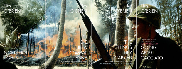
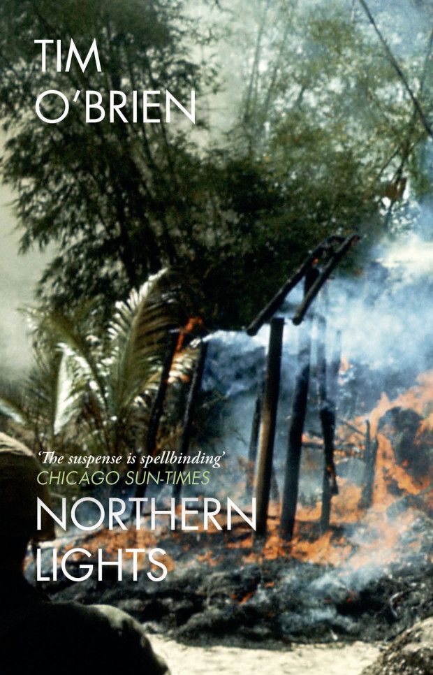
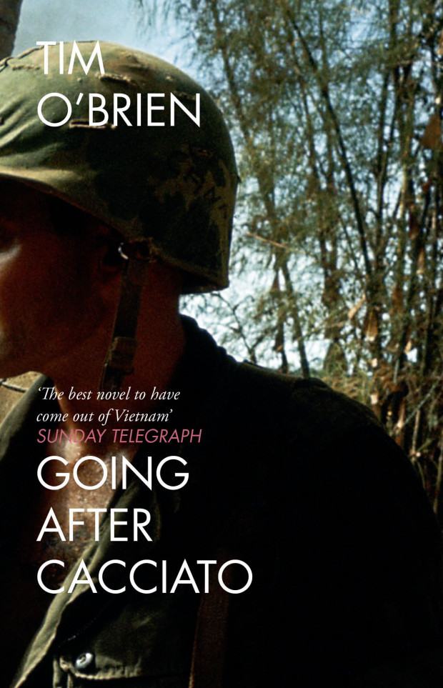
As I mentioned on Twitter yesterday, designer Jo Walker recently redesigned the covers of Tim O’Brien’s classic Vietnam war novelsIf I Die in a Combat Zone, Going After Cacciato,The Things they Carried, andNorthern Lights for 4th Estate in the UK. The series uses a single, searing photograph of a burning Vietnam village taken in 1965 by photographer Dominique Berretty spread over the four covers. The effect is extraordinary, and the design is an interesting contrast to Cardon Webb‘s (also brilliant) typographic covers for the US editions, published by Broadway.
You can read more about Jo’s design process for the series on the 4th Estate blog.
“From the beginning I wanted to come up with something that looked alien, as though someone had brought it back from a holiday in a country you’d never heard of”
They make for a stunning set.
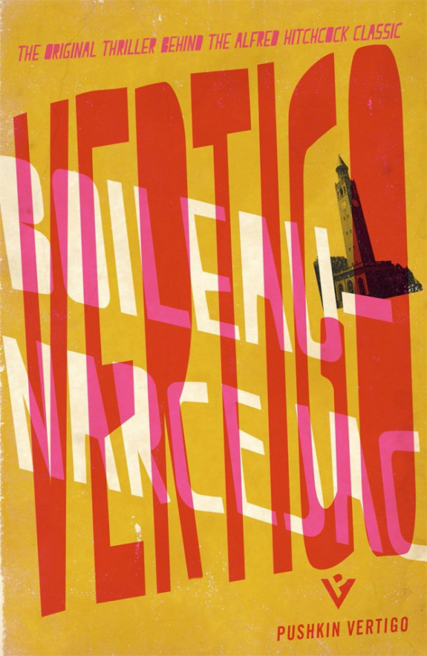
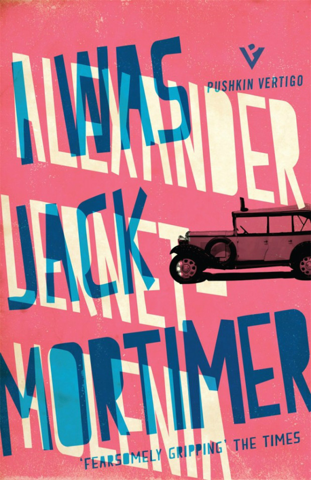
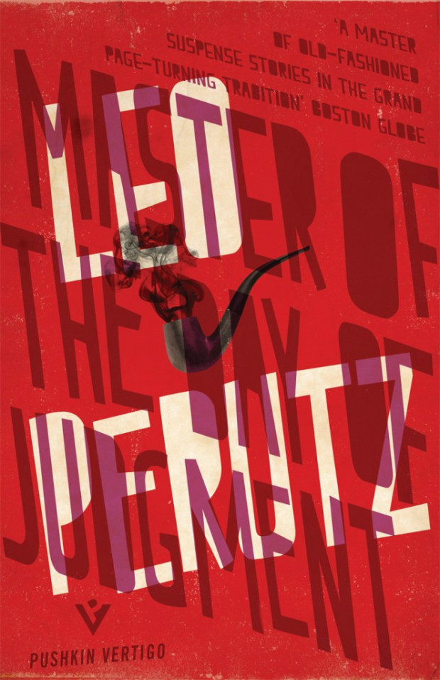
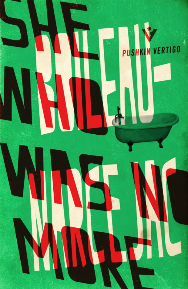
Jamie also created that rather nice “PV” logo for the imprint. Nicely done Mr. Keenan.
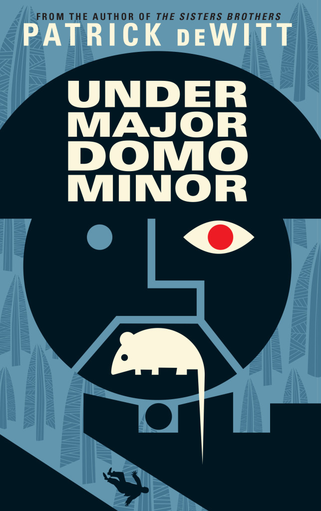
Next month sees the publication ofUndermajordomo Minor, the new novel by award-winning Canadian author Patrick deWitt.
An “ink-black comedy of manners”, itapparently involves an Alpine castle, a mysterious Baron Von Aux, and a lot of bad behaviour — including, if the Quill and Quire‘s Steven W. Beattie is to be believed, “an extravagant act of Hieronymus Bosch-like grotesqueness… perpetrated upon a large rat.”
It sounds a little like a horror movie directed by Wes Anderson. Or Terence Fisher doing something nasty to Gilbert and Sullivan.
While the cover for the US edition (published by Ecco) was designed by the talented Sara Wood, the UK and Canadian editions of Undermajordomo Minor feature the distinctive artwork of Dan Stiles, the American illustrator and designer who designed the covers of deWitt’s previous novels The Sisters Brothers and (the reissued) Ablutions.
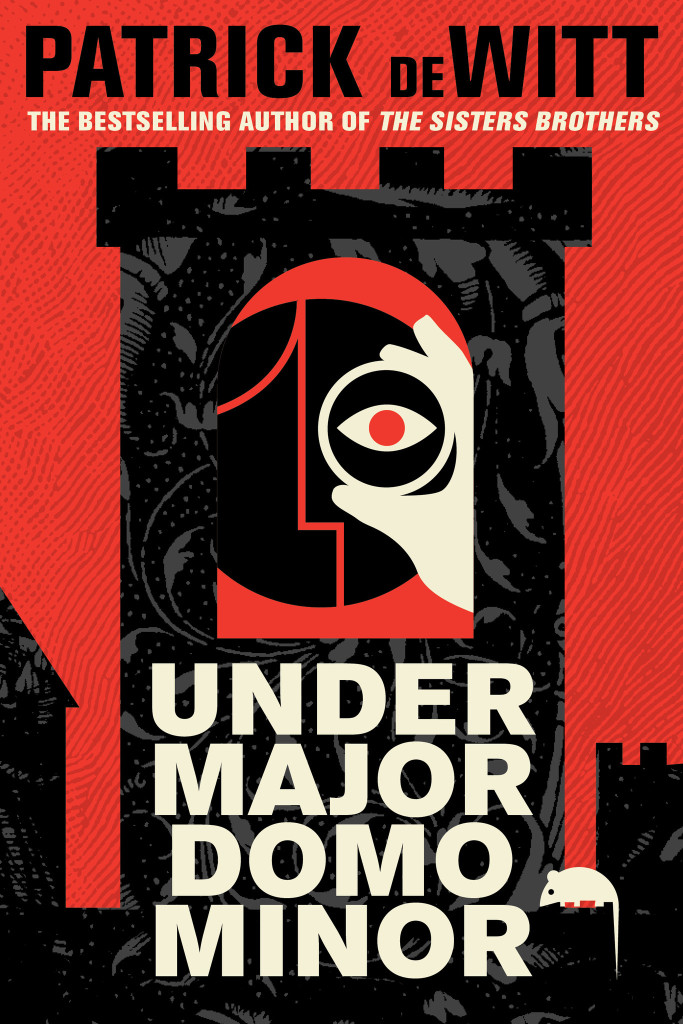
Granta (UK)
House of Anansi (Canada)
Although Stiles has created different designs for Granta, and House of Anansi, the UK and Canadian covers (both featuring that unfortunate rat) have strong echoes of those previous books. According to the Canadian art director Alysia Shewchuk, this was a deliberate decision. “Dan Stiles created a very a distinctive look for The Sisters Brothers — highly stylized, dark yet playful — and we wanted to pick up these threads in our cover for Undermajordomo Minor.”
This is most apparent in the Anansi cover. Its bold geometric design is similar to Stiles’s theatrical cover for Granta, but its colour palette and texture bring it back to the The Sisters Brothers.
Interestingly, the focus of the Canadian cover is different too. “We’d seen early versions of the covers for both the US and the UK editions, and while we liked the different directions they’d each gone in, for our edition we thought it was important to feature the main character (Lucy Minor) and the castle where he lives and works,” says Shewchuk. “Dan understood exactly what we were looking for and he nailed it on the first go-around.”
Undermajordomo Minor will be published on September 3rd in the UK, September 5th in Canada, and September 15th in the US.
In the meantime, watch the slightly Monty Python-esque trailer made by artist Joanna Neborsky, with music by deWitt’s brother Nick deWitt, released today:
Correction: When first posted, I stated incorrectly that the US cover was also designed by Dan Stiles. The final design and illustration for the Ecco edition of Undermajordomo Minor is by Sara Wood. The post has been amended and updated to credit Sara for her work.
It’s finally summer, and because July is traditionally something of a quiet month in publishing, I’m taking the opportunity to catch up on a few covers that I missed earlier in the year…
This summer UK publisher Virago is publishing two sets of Daphne du Maurier’s most famous titles with new and beautifully illustrated covers.
According to editorial director Donna Coonan, du Maurier’s reputation has flourished in recent years. She is also an author with cross-generational appeal. “The heroines of her best-known novels are young women at a turning point in their lives,” says Coonan. “These are beautifully written books that are exciting, suspenseful and brilliantly atmospheric. There is passion, danger, romance . . . and pirates!”
For over a decade Virago published du Maurier’s backlist with a uniform style. “They sat nicely together in a set, but were starting to look a little dated and lacked individuality,” says art director Nico Taylor. “I had never read du Maurier before, but once I got stuck in I realised just how diverse her writing is which led me to the idea that presenting each novel with a distinctive, individual look would be the best way to ensure du Maurier’s work continues to look fresh.”
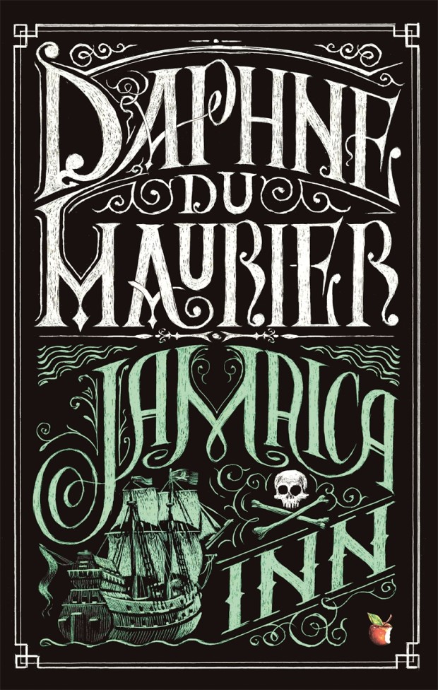
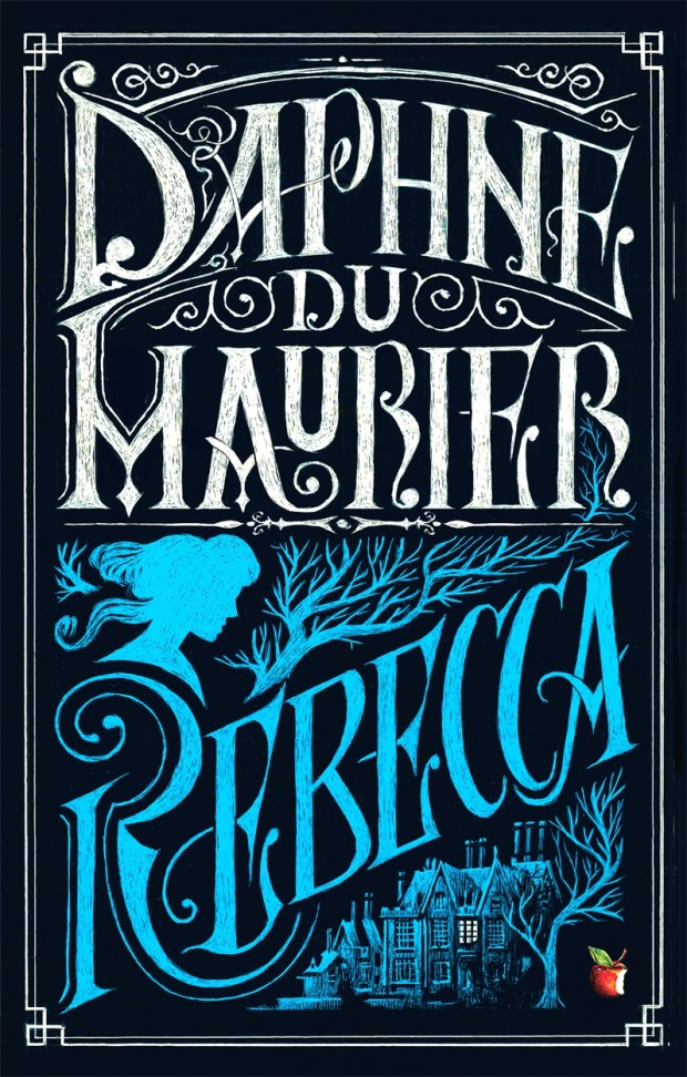
For the first three titles in series (there are a staggering 17 or so more to come!), Taylor worked with illustrators Neil Gower (Jamaica Inn, Frenchman’s Creek) and Jordan Metcalf (Rebecca). “It became clear that it would be hard to avoid some of the obvious reference points from each title, but I was keen that they were used in an integrated or suggestive way… all credit has to go to the illustrators for imagining their respective covers in such distinctive ways.”
Alongside this refreshed backlist, Virago is also planning to introduce these same three classics — French Man’s Creek, Jamaica Inn, and Rebecca, — to young adults with new covers by Iacopo Bruno. “This was a great opportunity to show that du Maurier is a big contribution to the gothic novels popular with this age group of readers,” says art director Sophie Burdess. “I wanted to create a set of covers primarily composed of evocative gothic typography that gave du Maurier the authority and appeal she deserves as well as giving a feel for the individual themes of each novel,” she continues. “[Iacopo] is a rare and exceptionally beautiful illustrator and hand lettering artist who knows just how to pitch the work for a younger audience… the task of creating a set of beautiful compositions of elegant hand lettering and vignette illustrations was very safe in his hands.”


")