Skip to content

Tag: architecture

The Last London

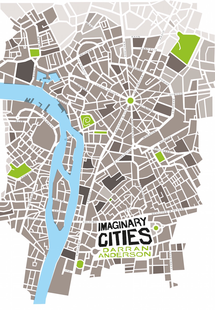
The London Review of Books has a brilliant, sprawling, melancholy essay by author and psychogeographer Iain Sinclair titled ‘The Last London’. It’s difficult to know what to quote from the essay as it touches on so many interesting, diverse things, but this passage about London in science fiction is perhaps most appropriate for here: 

In 1909 [Ford Madox] Ford published an essay titled ‘The Future in London’, a provocative vision of a planned last city, a London circumscribed by the sixty-mile sweep of a compass point set in Threadneedle Street. He anticipated the urban planner Sir Patrick Abercrombie in reading London as a series of orbital hoops, ring roads and parkland. Brought to life on the edge of the river, this port settlement has always been a magnet for outsiders. It was constructed that way, developed to draw in the scattered tribes, the hut dwellers, to establish the importance of a river crossing. A satellite of Colchester, it was 100 AD before Londinium became a significant entity. And then it was lost, abolished, pulled apart, before it grew again.

Ford Madox Ford’s Edwardian pipedream is ahead of its time. He sees that Oxford and Cambridge and the south coast are all part of the London microclimate. He sees the river coming into its own as an avenue for transport. He envisages escalators and moving pavements, and a population enriched and civilised by incomers. He presents himself as so much the English gentleman that he is doomed to spend most of his career in chaotic exile, in France and the US. Ford is self-condemned, like Wyndham Lewis. His London is as fantastic now as the Magnetic City, protected by river and man-made canals, in Lewis’s The Human Age trilogy: ‘The blank-gated prodigious city was isolated by its riverine moat.’

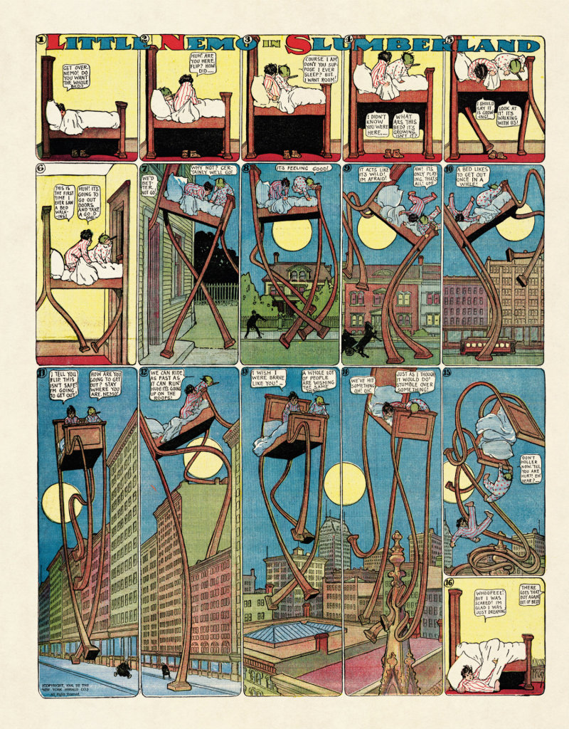
The compulsion to imagine and describe a final city runs from Richard Jefferies, with his After London; or, Wild England (1885), through Ford and Lewis, to the drowned worlds of J.G. Ballard and Will Self, the dystopian multiverses of Michael Moorcock and China Miéville. Fredric Jameson, considering postmodernism, talks about the ‘hysterical sublime’: a sort of Gothic rapture in contemplation of lastness, the voluntary abdication of power to superior aliens. This was heady stuff for my own compulsive beating of the bounds, an exploration of neural paths and autopilot drifts through the City into Whitechapel and Mile End. One of these haunted dérives brought me to the window of a bookshop in Brushfield Street, alongside Spitalfields Market. The shop, of course, is gone now and the proprietor dead. I zoomed in on an item with a striking riverside skyline on the dust-jacket: Last Men in London by W. Olaf Stapledon, published in 1932. Here was a more intimate coda to the better-known Last and First Men (1930). I had to carry the book home.

Comments closed

Brutalist Dreams

At the New York Review of Books, American architecture critic Martin Filler casts a critical eye over a slew of new books on Brutalist architecture: 

In addition to its echoes of art brut—Jean Dubuffet’s name for outsider art—New Brutalism was also an oblique riposte to New Humanism, a set of beliefs inspired by Geoffrey Scott’s hugely influential book ‘The Architecture of Humanism’ (1914). But Scott’s call for a return to Arts and Crafts design principles was scorned as escapist nostalgia by many young midcentury modernists. Among them was the period’s foremost British architecture critic, Reyner Banham, who with his scant empathy for the Arts and Crafts Movement’s focus on social reform issues belittlingly described New Humanism as “brickwork, segmental arches, pitched roofs, small windows (or small panes at any rate)—picturesque detailing without picturesque planning. It was, in fact, the so-called ‘William Morris Revival,’ now happily defunct….”

Yet it was not a utopian nineteenth-century dreamland that Brutalism countered as much as the thin, commercialized version of the International Style that after World War II gained ascendance through economic expediency. Brutalism’s striking departure from the steel-skeleton-and-glass-skin conformity of this routine, profit-oriented modernism was defined by its contrary emphasis on raw concrete (‘béton brut’ in French) in massive forms of imposing scale, idiosyncratic shape, rough finish, and uncompromising forcefulness, with a building’s inner workings and services—structure, plumbing, electricity, heating, and ventilation—unabashedly exposed. Brutalism soon became a worldwide craze, as this comparatively economical means of fabrication offered a cost-effective alternative to hand-riveted metal construction and allowed a broader array of sculptural effects than those obtainable with rectilinear frameworks.

One gets the sense Filler is no fan of Brutalism — at least its bleak British incarnation — so there is, inevitably, a reference to J.G. Ballard’s dystopian novel High-Rise:

This was never a style that attempted to convey warmth, comfort, intimacy, or other qualities we tend to associate with an enjoyable way of life, and thus it never won much love except from architectural specialists. Brutalism posited an unsentimental, not to say harsh, view of the modern world, and however heroic its unflinching embodiment of hard realities may have been, most people do not enjoy a daily diet of architectural anxiety and alienation, especially in northern climates under cloudy skies.

One of the first signs of rejection came in J.G. Ballard’s dystopian novel ‘High-Rise (1975), which is set in a thinly fictionalized version of Ernő Goldfinger’s Trellick Tower in London’s North Kensington (1966–1972). (It is one of fifty-four sites highlighted in the ‘Brutalist London Map’, a useful guide to landmarks of the style in the British capital.) This thirty-one-story apartment block, commissioned by the Greater London Council, was based on Le Corbusier’s original Unité in Marseilles, although Goldfinger’s scheme is nearly twice as high as its prototype. Trellick Tower was well received by its first inhabitants, but as was also true of contemporaneous public housing projects in the United States, it quickly went to pot as funds for its upkeep and security were slashed, which resulted in a rapid descent into crime and squalor.

Neoconservative critics blamed the architecture, but as sociological studies have since proven, the claim that tall residential complexes breed social malaise is groundless. After Trellick Tower was privatized in the 1980s, when Margaret Thatcher got the British government out of the public housing business, the building’s owner-residents increased protection from intruders, paid for long-delayed repairs, and it is now a highly desirable property rightly appreciated for its design quality. 

If anyone can point me to a review of these books by someone a little more sympathetic to Brutalism, I’d be much obliged. 

Comments closed

Darran Anderson on Imaginary Cities and Books as Maps

COV_cities_noMarks

Author Darran Anderson discusses his book Imaginary Cities with Rhys Tranter:

[M]y intention was to write something that isn’t self-contained; a book that somehow spills out of its pages and into the world… I wanted to send people out looking for Sant’Elia or Chernikhov or whoever. It would be as much a map as a book…

…We have a tendency to think of books as ends in themselves, which has always seemed somewhat ludicrous, even a bit arrogant to me; the assumption because you’ve read Isherwood’s Berlin novels, you’ve got the Weimar Republic sussed (I don’t mean that detrimentally to Isherwood, whose work I love, incidentally). It’s like that bucket list approach to experience, when you hear someone say they’ve ‘done’ Europe or Thailand. However great a book is, however ‘definitive’ it is on a subject, it strikes me as only a point of beginning or as temporarily conclusive, as time and perspectives are constantly changing. I’ve always had enough self-doubt to be resistant to definitive narratives so I wanted Imaginary Cities to be full of points of departure, contradictions and questions. That’s one of the things I loved about Calvino’s Invisible Cities, which the title is also a nod to. The sense of poetic incompleteness to it. The feeling that the story is continuing on somewhere beyond its pages.

Imaginary Cities, which is already available in the UK, will be published in the US by University of Chicago Press in April 2017.

1 Comment

Ed Ruscha: Buildings and Words

Ed Ruscha: Buildings and Words is a short documentary, commissioned by MOCA in Los Angeles, exploring two of the recurring themes in the artist’s work. It was written and directed by Felipe Lima, and is narrated by Owen Wilson:

Apparently Ruscha calls his font ‘Boy Scout Utility Modern’, which immediately makes me wonder if Wes Anderson is a fan.

1 Comment

A Window onto a Window

photograph by Ike Edeani

In this profile of Peter Mendelsund in the June issue of Rhapsody Magazine, there is a lovely bit about the designer’s architect-artist father:

In the living room of Knopf associate art director Peter Mendelsund’s Upper Manhattan apartment, inspiration is everywhere: a battered, sea-green first edition of Ulysses; a toy version of the rocket Tintin takes to the moon; the vertebra of a blue whale; and, on top of his baby grand piano, a wooden model of a convention center made by his father, in the mid-’70s, when he worked for a New York architecture firm. It was never built, because the firm didn’t win the competition (Renzo Piano did), nor were any of his other models, because, in his late 30s, Benjamin Mendelsund was diagnosed with a brain tumor and devoted the rest of his life—he died at 48—to sculpture and painting. “He cut out all the bureaucracy of architecture,” Mendelsund says, “and turned to this.” He points to a small canvas painted entirely black except for two rectangles—two faded photos of a barn’s loft, its window open to the bright of day.

That image of a window onto a window is central to the signature style that’s made Mendelsund one of our preeminent book jacket designers: geometric, fascinated with negative space, striving to capture infinity through simplicity. You see the painting echoed in his cover for Martin Amis’s 2006 novel, House of Meetings, for which he photographed a tiny simulacrum of a room, its perspective slanting toward a miniature door. You see it in his many book jackets with drop-cuts—holes carved out of an image—like the diamond torn from a woman’s face on an early cover for The Girl With the Dragon Tattoo, back in 2005 when it was called The Man Who Hated Women. And you see it in his May 11, 2015, New Yorker cover, which features an American flag smashed like a storefront window, a single star-shaped hole evoking the myriad emotions of last year’s civil unrest in Baltimore.

His father’s second act as an artist also helps explain how, at 33, Mendelsund had the confidence to abandon his career as a classical pianist (“Eventually, I realized that I’d never truly be world class”) and reinvent himself. His wife suggested he try something visual—he was always drawing; he had designed their wedding invitation. “Sometimes the obvious things take a long time to see.”

Comments closed

Working for the Building

high-rise-paint

In a long and fascinating interview with the Ballardian, Ben Wheatley talks about J.G. Ballard and his adaptation of High-Rise:

Initially, I really enjoyed the cult appeal of [Ballard’s] work, or more specifically the counter-cultural aspect. His books, particularly Crash and High-Rise, were like rites of passage for anyone trying to read subversive and counter-cultural literature. Alongside Naked Lunch and Fear and Loathing in Las Vegas, they were books you had to read. But I was especially struck by Ballard’s use of language and turns of phrase, which didn’t feel like any other writer I had come across.

Although I enjoy SF, and that was also part of the charm of his novels, I also think it was books like The Atrocity Exhibition and then his 70s books that really hooked me in. When I was a teenager, there were two writers that really appealed to me: Burroughs and Ballard. They weren’t just authors and novelists in the traditional sense, they seemed much more dangerous and enigmatic than other writers. Burroughs naturally has a mystique because he shot his wife in the head and was a junkie, and therefore the extremity of his fiction was partially mirrored in his real life.

But the thing is, there was something about Ballard that was even stranger and perhaps more insidious, in the sense that he didn’t do those extreme things and was living a quiet, suburban life as a father to three children while also pouring out these amazingly perverse books. That had a big effect on me, but I was also aware of him through music, comics and other media. I wasn’t a particularly voracious reader of novels, so in some ways I experienced Ballard through a kind of cultural response to his work.

This is the best, most in-depth interview with Wheatley I’ve read on the subject of adapting Ballard and making High-Rise.

Comments closed

A Dirge for a New World

Empire Design
Empire Design

Andrew F. Sullivan, author of ultra-violent urban noir WASTE,1 reviews Ben Wheatley’s adaptation of High-Rise by J.G. Ballard for TIFF.Net:

Wheatley and Ballard point to a pattern—a dissolution of social order that cannot be prevented by technology or progress. Even the most unnatural setting seems to only drive humanity back to its base needs—food, water, shelter, flesh. The past, the basest parts of being human, carry more weight than any building, any new technological development. Elevators become new traps for the hunters. The supermarket on the seventh floor is one last place to forage. Even the soundtrack reimagines this future past for the audience, Portishead performing ABBA’s pop hit “S.O.S.” as a warning for the residents and viewers alike—a dirge for a new world.

Residents begin to harvest the building itself for what they need and reject the outside world. Wheatley’s design team has mimicked the 70s-era incredibly well, but everything is innovative. The products and designs on the shelves are made specifically for this brave new world. The future is behind us. The high-rise becomes a place unto itself—a slow motion horrorshow.

Much like his previous work, Wheatley refuses to provide a straight narrative for the audience and at times, the film descends into an anarchic blend of images without the rules to bind them—as it should. We scurry past a horse on a rooftop, a gang of TV presenters armed with baseball bats and chair legs, a dog drowned in the pool. Parties turn into rituals, sacrifices, religious ceremonies and then dissolve back into chaos once again. Wheatley’s camera starts out sleek and mannered, transitioning smoothly from one floor to the next. However, once the social order slides, the narrative structure breaks under the strain. Viewers slider from one party to another, the camera following bodies as they rise and fall. The film itself opens with an ending.


Edwin Turner has also written about High-Rise at Biblioklept. Ed’s opinion of the movie is less favourable than Andrew’s, but his post also pointed me to Tasha Robinson’s interesting review of the film at The Verge:

There’s a touch of Luis Buñuel’s ‘Exterminating Angel’ in the way everyone in the building seems to be stuck there, isolated from the outside by mutual consent, for no reason anyone cares to address. But Wheatley’s visual style never feels beholden to Buñuel. It’s more familiar from 1960s speculative-fiction films. The Brutalist architecture and cold sterility of the building suggests Jean-Luc Godard’s ‘Alphaville,’ and the polished futurism and stiffly remote characters are reminiscent of François Truffaut’s ‘Fahrenheit 451.’ The retro cars, suits, and architecture all put ‘High-Rise’ more in a quaint, remote past than a dystopian future. They also add to the sense of otherworldliness that hangs over the film.

And so does the sense that High-Rise is driven more by Wheatley’s poster-ready striking images —€” a suicide falling from a high balcony in ultra slow motion, Laing expressionless and spattered with paint — than by any sort of human drives. “Laing would surrender to a logic more powerful than reason,” Hiddleston narrates, hand-waving away any irrational behavior. No one in the film really operates on reason, they just represent emotional factions. Wilder becomes a feral, untrustworthy spirit of the denied and oppressed. Ann becomes an equally monstrous symbol of the selfish, out-of-touch aristocracy that actively enjoys spitting on everyone below them. Both sides are poisonous. Laing isn’t an innocent caught in the middle, he’s desperately looking for a place to fit in, and his narrative isn’t about saving anyone, not even himself.

Empire Design
Empire Design


2 Comments

Ever Wanted Something More?

high-rise

Although the early reviews have not been especially kind to the Ben Wheatley film adaptation of J.G. Ballard’s High-Rise, the trailer looks amazing.  The Anthony Royal Architecture website is also a nice touch.

I can’t wait.

Comments closed

The Real-World Architecture of Monument Valley

monument valley

Architecture critic Alexandra Lange, author of Writing About Architecture, talks to the creators of Monument Valley — an award-winning video game in which players must navigate the Princess Ida through a maze of impossible buildings and architectural puzzles — for Curbed:

Much of Monument Valley operates in the impossible space drawn by M. C. Escher, whose 1960 drawing ‘Ascending and Descending’ Monument Valley lead designer Ken Wong has acknowledged as an inspiration. The Escher drawing even features a couple of figures scratching their heads about how to get around. The connection between Escher’s drawing and Wong’s original Monument Valley concept sketch is clear; Wong’s is also strikingly similar to the finished product. The whole structure floats in space in a way that suggests infinity, and it features the same isometric perspective, same gelato colors, and a similar sequence of steps and ladders and domes to give it a touch of character. In Monument Valley, sometimes you seem to be floating on water and sometimes in space; sometimes positive and negative are reversed, and you may be underground in paths and tunnels carved from rock. “We were all so taken with [Escher’s] image,” says [Neil] McFarland, that the designers said, “We don’t know what this game is, but if we can make that into a game we will be really happy.”

For the design buff, the game seems rife with visual cues, allusions to the built world, and academic references. Even if Monument Valley’s designers aren’t familiar with deconstructivism, 1970s architecture may have infiltrated its digital world sideways, as architecture-school graduates turn into programmers and once rarefied ideas turn into placeless pins. Monument Valley’s chapters have to cover a lot of territory, in scale and geography.

Sometimes Ida seems very small, like an earlier puzzle-solving heroine in a gridded Wonderland, wending your way through a music box. Sometimes she appears to be climbing a pixel version of Philip Johnson’s concrete-block Monument to Lincoln Kirstein (1985), “a staircase to nowhere.” Sometimes she finds herself holding a red flower, laying it on a rectangular sarcophagus in a sea of sarcophagi that strongly resemble Eisenman’s Berlin Memorial to the Murdered Jews of Europe (2004). Sometimes you find yourself tripping along a wall that resembles Bofill’s La Muralla Roja housing project (1968), “characterized by a series of interlocking stairs, platforms, and bridges.” Elsewhere the game recalls Tarsem Singh’s cult movie The Fall, filmed at the Lake Palace Hotel in Udaipur (a real-life white, floating world) and the Chand Baori stepwell, a Qbert landscape made exclusively of blocks. Some scenes are more perplexing, and require your seven-year-old to show you which button to push or which screw rotates the cube so that what was once an unbridged gap closes, in digital space, and allows you to cross.

I really don’t play a lot video games, but I do love Monument Valley.

Comments closed

The Complete Little Nemo

Cover

If you were wondering what to get me for Christmas this year, Taschen recently published Winsor McCay: The Complete Little Nemo 1905–1927which collects together all 549 of Winsor McCay’s extraordinary Little Nemo strips.

First published in The New York Herald in 1905, McCay’s innovative, beautifully detailed strips have been available online for sometime, and there have been attempts at reprint collections before, but this oversize edition looks absolutely gorgeous:

11

13

15

16

Comments closed

Major Styles in Troll Bridge Architecture

major-styles-troll

Tom Gauld.

Comments closed

German Post-War Modern

atelier-de-montrouge

Focusing on European architecture, art and design in the second-half of the twentieth-century, German Post-War Modern is currently one of my favourite Tumblrs.

Comments closed