Skip to content

Freelance illustrator and paper artist Kevin Stanton recently contacted me about his book illustrations for the new Signature Shakespeare editions of Romeo and Juliet and Macbeth.
Art directed by Ashley Prine at Sterling Publishing, and with additional typography by the immensely talented Chin-Yee Lai, both books have laser-cut covers, as well as five laser-cut interior illustrations per book, and more than 30 other illustrations.
The results are beautiful and the project sounded like fascinating undertaking, so I thought I would ask Kevin a little more about it.
We corresponded by email.


How did the project come about?
Two years ago, at the very beginning of my foray into freelancing and just a month after graduating from Pratt, I received an unsolicited email from Pamela Horn, a Editorial Director at Sterling Signature. It turns out that a higher-up in the company had seen my work at Pratt’s Annual Pratt Show and passed my portfolio on to her!
After we met a few times, she mentioned that she’d been looking to do a project with a paper artist, and that when the right one came along she would let me know. Initially this had meant a series of Classics book covers, but that fell through. Nine months after our first interview, I got the call — Pam wanted to do a series of Shakespeare plays, starting with Romeo and Juliet and Macbeth, each with a cover and fifteen plates! And that was a dream job right there! And after some discussion with my Art Director, Ashley Prine, it got even better, even more unreal: today it is a hardcover book with a laser-cut cover, five interior two-layer laser-cut illustrations, and almost forty printed spots, spreads, act openers and motifs. And my name on the cover to boot!

How did you approach such a big project?
The process was interesting to figure out. After hand-cutting a great deal of the book, we realized that scans of the pieces didn’t look good and there was no quick-fix for turning them into vectors. Enter my friend and assistant, Victoriya Baskin. Since my sketches before I cut are like maps of everything (I don’t freehand anything), she was able to vector it all together so that we had a product that could be printed on the pages and sent to the laser-cutter with clean, expert lines! And the work can be edited, which was our primary concern with paper.

How you feel about the final results?
It’s been an absolute dream. As a young illustrator, and one that works in paper, I couldn’t have hoped for a better display of my work than these books. I am so happy with them, although seeing them on the shelves in a book store is the most surreal experience for me. It’s a privilege to work with my entire team, and an honor to have been a part of such a phenomenal production! Much Ado about Nothing and Hamlet are next in line to be published in November!

Thanks Kevin!
You can see more of Kevin’s work on these books on his blog.

I first saw the work of Nigel Peake in his book In The Wilds, published by Princeton Architectural Press in 2011. Collecting Nigel’s beautiful and meditative drawings and watercolours of rural landscapes and buildings, the book reminded me of both of the work of Paul Klee (Highways and Byways, for example) and Rings of Saturn, W. G. Sebald’s discursive record of ambling through East Anglia.
I subsequently discovered, of course, that Nigel had already produced a significant body of work prior to In the Wilds, including illustrations for Ninja Tune, Hermes, the Royal Horticultural Society, Habitat, The Believer and Dwell magazine, as well as several books.
And in this shiny digital age, there is undoubtedly something wonderful in Nigel’s meticulous hand-drawn maps and tumbledown sheds. We corresponded by email.
Do you remember when you first become interested in art and illustration?
I feel like I have always drawn. Some of my earliest memories are associated with painting and the things that surround it, the plastic containers that held the primary colours and the smell from the cheap paint. When I was growing up I did not really think in terms of design or illustration I just had a wish to draw all the time. And that is still true now, I type this surrounded my paints, pens and paper… so maybe not much has changed. Drawing for me, is essentially a way of thinking through a thought or an idea, to document and try to understand what is around me.

What was your first job as illustrator?
When I was still studying and finishing my architecutural thesis I designed a snowboard graphic for a company in California. After that I worked on a project with Ninja Tune…

And how did the project for Ninja Tune come about?
In truth I am not too sure, I remember leaving a zine for DJ Food when he was djing at Edinburgh, I was not even thinking of it in terms of work , I just wanted to share my work with those that I admired. One way or another I ended up drawing the artwork for the Coldcut ‘Sound Mirror’ LP and singles. They were really nice people to work with and I have made a few other things for them since.

You’re also an architect as well as an artist. How does that inform your work?
I am not a ‘complete’ architect – in that I have yet to finish it professionally. I did study it for 6 years. Studying architecture did not directly affect how I draw, but it did introduce me to a lot of different ways of thinking. I read a lot of interesting books and listened to some wonderful conversations. It was hard work, and the studio ethic of working all day is still engrained in me. I am interested in architecture and how it holds all these moments that occur every day. I recently made a book about the bridges of London, these fantastical structures that essentially have become invisible to those who live there. It is amazing to be in a city and look around, and you have all these forms and shapes that where designed and made by us. It is the combination of our efforts.
Why did you decide to move away from the city?
It was not intentional, it just happened. I was tutoring and drawing projects and then I seem to end up in the country, I probably got tired of being in a city. I had been living in Edinburgh for 8 years. At the moment I travel a lot with my work so it is nice to live somewhere that is quiet and simple, and a place that I want to return to.

What is it about the details of vernacular architecture that particularly interest you?
I am not sure, it is probably because it is what I have grown up around. I enjoy how things are put together, and vernacular architecture is very honest in that respect – you can see what holds what up.
Also a lot of things fall apart because of the wind and the rain and old age, and I find this equally beautiful because when this happens you see all the parts that where previously hidden to the world.
It is an architecture determined by what is close to hand and so the materials and colours used are more interesting. Blue twine holds it together and plastic bags and old gates bridge the gaps.


Is there a tension between your love of the countryside and your fascination with built structures?
Not particulary, probably because I look at them with the same interest, when I look at a leaf I am still amazed by the detail and the wonder of it and then when I look at a skyscraper I can not believe that we can make such incredible structures. The only tension is that if I spend too long in a city I want to go to the places where there are no buildings, I particularly miss the sea if I have not seen it for a while.
Do you take a lot of photographs or do you rely more on sketchbooks?
I do take photographs, but not to draw from, but just to remember things that I see along the way. I also like how a camera allows you to frame what is around you – by taking a photo of something you edit everything else around you and that one moment is held. I keep sketchbooks and draw in them every day not because I think it is fashionable or because I think I should but because I will forget things – so I use them to hold those things that might turn into something someday. I think this idea of keeping a book comes from school because for years we sat at tables with books marked maths, geography, chemistry… so it seems normal to keep writing and drawing things into a book.

Apart from nature and buildings, where do you look for inspiration?
Nearly everything I see has an affect upon me, one of my favourite things is to sit and just look, not as a form of procrastination but as a way of observing what is around me. There is so much to see and hear in everything.
Beyond what I see, I know that music is probably my biggest influence. In the same way that I have early memories of drawing – these are entangled with memories of music. My mother played Gracelands on repeat in the house or the car. And my father always had Pet Sounds. On a Friday night we would have record night and each of us would get to choose one to play. I always listen to music when I am drawing or making things. It is such a beautiful thing to close your door for a while, sit at your table and put on a record and simply draw.


You publish some of your work with Analogue Books in Edinburgh. How did that come about?
I studied architecture in Edinburgh and Analogue opened a few years after I had arrived. I remember going in and liking the books they had and more importantly the people who owned it seemed kind. And so I started to bring some work in and got to know Russell and Julie through that. Since then we have published zines and books and exhibitions and probably eaten a lot of McVities biscuits. They are some of the best people I have met through my work. Hopefully in the next few months we are going to make some new things.
Your work does seem particularly well suited to the books. Are you interested in the juxtaposition of word and pictures?
Books are wonderful objects. There were a lot of books around me when I was growing up.
The possibilities are endless, in terms of what words and pictures can do. Making a book is as close as I will get to making an album. With this form, you can tell a story or not, but with each page you can explore an idea, knowing that it will be seen after what went before, so for me there is a beautiful rhythm to a book. The flicking of a page has great joy in it. For now I like making work as a series ( maps, sheds, bridges, birds, billboards, cameras…) and so books are perfect for this exploration.

Who are a few of your favourite writers?
To name a few who I can always return to, in no order.
John Steinbeck, Earnest Hemmingway, F Scott Fitzgerald, Seasmus Heaney, George Simenon, Maj Sjowall and Per Wahloo, Francis Ponge, Jorge luis Borges, Gaston Bacherlard, Walter Benjamin, Arthur Conan Doyle and John Cheever.
What are you reading currently?
At the moment I am living in Austria and have read all the books I packed so for now I am reading the newspaper.
Thanks Nigel!
Full Disclosure: In the Wilds by Nigel Peake is published by Princeton Architectural Press, and distributed in Canada by my employer Raincoast Books.
 Jennifer Heuer is a book designer based in Brooklyn. Formerly a designer at HarperCollins and Simon & Schuster, she now runs her own studio out of the Pencil Factory. Jen’s striking inkblot design for 1000 Black Umbrellas by Daniel McGinn, published by Californian small press Write Bloody, was one of my favourite covers of last year. As Jen was in a list with many of the usual suspects — several of whom have already been interviewed here — it only seemed appropriate to feature more her excellent work on The Casual Optimist and interview her as well.
Jen and I corresponded by email earlier this year.
When did you become interested in book design? Where did you start your career?
In college I always thought that I wanted to design either album covers or book covers. I didn’t really know how to get into either field after I graduated, but I was fortunate to have Dave Caplan hire me over at HarperCollins. It was a great place to start and Dave was an awesome boss. I was in the children’s department there, and worked on a wide range of covers as well as interiors. It was boot camp in learning how to package an entire manuscript — all the way down to the binding specs and headbands. It was a great way to start thinking beyond the cover and the spine.
I spent about 4 years there learning the ins and outs of book design with a great team. My next goal was to move over to adult book cover design. Simon and Schuster became my new home where I was able to have a blast creating fiction and nonfiction covers for five super talented art directors.

Why did you decide to go freelance?
It’s funny, I’d always dreamed of taking the freelance plunge, but had planned on staying in-house for a few years more before doing so. Thankfully, my husband, Jed, and I shook up our lives a bit and moved to Portland, Oregon for a year. He was joining the experimental team of WK12 at Wieden+Kennedy and I figured I’d be miserable if I sat around Brooklyn without him. So we packed up, and took a few weeks to drive across the country and try something new. The best and scariest decision I’ve made in a long time.
I set up a studio in town and biked to work most days. I worked on building up clients and challenging myself with new projects and classes in and around the area. I even learned how to letterpress! In the end, I’m so glad I took the freelance jump when I did.

Who are some of the publishers you work with?
Just over a year out on my own I’m so thankful to say I’ve worked with HarperCollins, Random House, Little Brown, Grand Central, Penguin, Thomas Nelson, Simon & Schuster, Scribner, Freepress, Ecco, Columbia University Press, Write Bloody, Harvard Business Review Press, and W.W. Norton & Co.


Could you describe you book cover design process?
Each book is different, so the process can vary. But ideally, this is how I hope I’m working:
Naturally, I read the manuscript if there is one. While I’m reading I keep a running list of keywords, signifiers, and themes in my notebook. From there I create some free-association lists of words, trying to decide on a general direction for the look. Then I head to the Pratt library. As an alumni, I have access to the remarkably eclectic collection. The library is where I tend to sketch out ideas. I made these simple worksheets, basically 6 book shaped rectangles on a sheet of paper to knock around some layouts before using the computer. When I’m back in the studio I set up a moodboard on imgspark.com to organize the artwork I’ve created and keep track of art I’ve collected. That’s kinda the whole shebang. I do a lot of prep work before starting the actual design, although you need to be wary of overthinking a project. Sometimes it’s nice to have almost no time at all and just go with my gut. I recently got to do that with the 30 Books in 30 Days project and the Lolita Project.


What are your favorite books to work on? The most challenging?
Well, this may sound super obvious, but I really don’t care what the subject matter is — from brain eating aliens to a medical history, or a memoir on life abroad, to a beautiful love story — as long as it’s a smart, well-written book that I want to pass along to friends and family. Those are the best books to work on. The ones where you don’t feel like you’re doing work while reading the manuscript. The most rewarding projects present a conceptual design challenge, similar to editorial illustration.
Do you see any current trends in book design?
I feel like I’m hearing more and more about making the book an object of desire — something that will be coveted and gift-worthy. And I love seeing smart special effects on covers these days. While this may be the knee-jerk reaction to e-books, I hope it will be something that holds on long enough to make everyone appreciate the object of the book. There also seems to be more attention paid to detail throughout the entire book — from the cover to the end paper to the title page. It’s a great thing to see these days, and solidifies the purpose of the designer.


Where do you look for inspiration and who are some of your design heroes?
Inspiration honestly comes from everywhere. The important part is to pay attention. I try to to get away from my desk and go to the library, museums, read fashion magazines, the newspaper, listen to the radio, watch documentaries and observe closely. I tend to find that when I’m not consciously searching for a design solution, I’m inspired by things happening around me. These things are often times closely related to the project at hand. Perhaps its all synchronicity, but either way, paying attention to what’s around me seems to work well.
As far as heroes go, it’s the people around me that inspire me the most. Friends I’ve known over the years who keep me on my creative toes are an incredible source of inspiration. Of course there are greats throughout the history of art and design, but I feel like I look up to a different person or group of people depending on what I’m working on.
OK, that’s annoyingly vague. Here are some examples: I just watched Senna, and loved the Formula One graphics and footage from the 80’s; the silk screen posters from Slavs and Tatars in the Print/Out show at MoMA were wonderfully fresh and fun to read; found this amazing book of South African block prints while searching for artwork at the library; was settling into the new studio and read an interesting article about brainstorming and the chance creative interactions that were coming out of MIT’s make-shift Building 20.


Who else do you think is doing interesting work right now?
I mentioned earlier that my husband and I spent some time living in Portland last year, and the WK12 group was a big influence. Not necessarily in how I work visually, but in thinking beyond the assignment. While I love spending hours in bookstores oohing and aahhing over the beautiful covers, I’ve been trying to look elsewhere when it comes to interesting work.
It spans from the gorgeous Alexander McQueen textiles, to the beautifully clever industrial design of Joey Roth (I love these speakers!). I’ve been looking at the photography of Todd Hido, and love the eye of Jason Fulford. But I try to pull inspiration from the world outside of design and art. Shows like The Moth, Radiolab, and TED are obvious ones, but incredible resources. The people who are doing the most interesting work are those promoting solid ideas and telling those stories in brand new ways.

What books have you read recently?
Non-work related reading? I’ve been really into Aravind Adiga’s novels. I randomly picked up Between the Assassinations from the free book shelf when I used to work at S&S a couple of years ago and loved it. Right now I’m in the middle of his latest. I’m also in the middle of Chronic City which is a blast to read. I tend to be in the middle of a lot of books when it’s not work related, and always seem to lose track of what I was last reading.
Work related, I enjoyed reading Alexi Zentner’s Touch—lovely story! And a soon-to-be-released collection of short stories by Lucia Perillo was a truly good read (got to use a photo by Todd Hido!).
Do you have a favorite book?
That’s a tough one… It used to be A Farewell to Arms, but it’s been so long since I’ve read that. I did a piece for a gallery show based on Leaves of Grass and found it to be amazingly relaxing to read. And a recent favorite (before any hint of a movie, which I think I’ll skip) is Extremely Loud and Incredibly Close. I loved the combination of visual narrative and traditional narrative to tell a story.


What does the future hold for book cover design?
Oh, I’m sure it’s adorable puppies on every cover. I think my mom would be happy with that! Who wouldn’t?!
Thanks Jen!
You can read more about Jen’s design process in this interview for Faceout Books.

I first came across the London-based (and wonderfully-named) design studio We Made This by way of founder Alistair Hall’s prodigious collections of ephemera and found type on Flickr. The chances are I found these either via Ace Jet 170, a fellow designer and collector (and cyclist) who I interviewed last week, or Alistair’s page on Ffffound. It wasn’t until later than I discovered that We Made This also designed book covers and had actually worked with David Pearson on several covers for Penguin’s Great Ideas series.
More recently, We Made This has come to the attention of the literary community for the stylish and witty designs for the Ministry of Stories, and its fantastical shop front Hoxton Street Monster Supplies. The bold, flat typographic designs for the Hoxton Street Monster Supplies store are, of course, characteristic of the work produced by We Made This — taking inspiration from the best of British post-war design and Alistair’s love of printed vintage ephemera to produce something sharp, modern and irreverent but also, somehow, local and warm.
Alistair and I chatted by email.
When did you first become interested in design?
I did art at A-level, and loved it, and the artists I gravitated towards tended to have a fairly graphic sensibility – Jasper Johns, Richard Long, Jenny Holzer, David Hockney. Anything with a bit of typography caught my eye. But I didn’t realise that graphic design existed as a separate discipline, and certainly not as a career. It was never really talked about. So I studied Art History and English at Leeds University, then worked as a production assistant on TV commercials for a year or so. While I was working out what to do next, I was vaguely thinking about moving into films, so I read the BFI book Inside Stories: Diaries of British Film-makers at Work. In the book, the producer Julie Baines talks about going to see the proofs of the poster for her film. It was like a lightbulb went on in my head – “Ah, that’s what I want to do. Make posters.” So in 1999 I went to Central Saint Martins to do the BA Graphics course, and adored it – particularly when it came to the physical making of stuff – screenprinting, letterpress, etching, bookbinding, and photography (this was before digital cameras had really got going).
Is the joy of actually making things yourself integral to what you do?
Hell yes. It’s like therapy. In fact, it’s something I’ve been thinking about a lot lately. Running a blog, as I’m sure you know, is hugely satisfying – it generates fascinating conversations with people from across the design spectrum, and from across the planet. But crikey it eats up a lot of time! And having run the We Made This blog for coming up on six years, I think this year I’m going focus on it less, and use some of the time I was spending on the blog to make some actual physical stuff.
Why did you decide to start your own agency? What were you doing before?
When I left college I was lucky enough to get a place at the design studio CDT, which was then being run by the lovely Mike Dempsey (the D of CDT). The studio did a fine mix of branding, print, editorial and environmental work – I spent a year and a half there, and learnt a vast amount. My favourite job there was the work we did for the Royal College of Art’s Summer Shows in 2003, for which I wrote and set a chunk of copy that we used on invitations, leaflets, signage and the catalogue. It was fairly tongue in cheek, but a lot of the students hated it. At around that time NESTA launched a short residential course that helped young creatives to set up businesses, and I got a place on that (as did a few of the students who’d been at the Royal College – there was a distincly uncomfortable silence once I owned up to that bit of work). The course was brilliant, and as soon as it finished, I handed in my resignation and set up We Made This.


What interests you about ephemera?
Well, I guess there’s a few things. There’s that feeling that you’re discovering something that no-one else necessarily knows about – these things aren’t design classics by big name designers, they’re little bits and bobs created by anonymous designers. I suppose I must feel some affinity with that… They’re enormously evocative of different periods, so there’s something there about the joy of wallowing in the past – that can be as much about the language used on them as on the design itself. Then there’s the fact that a lot of it is quite utilitarian, almost un-designed, with function dictating form, which always has an inherent beauty and honesty. Mainly though, I think all designers are just visual magpies – it’s in our DNA to get woefully overexcited about old bits of paper and old signs, and to want to take them home to feather our nests.
Do you collect specific kinds of things?
No, I’m way too undisciplined for that. I guess I do loosely focus on design from around the 1890s through to the 1950s. I tend to find most of my stuff at the regular Ephemera Society fairs in London – they’re brilliant sales that happen every few months, where ephemera traders get together and sell their wares: old luggage labels, theatre playbills, invoices, maps, all that kind of thing.
Where else do you look for inspiration?
Well, I think the most important part of the design process is research, and you never really know where that might lead you. If I was being unecessarily fanciful, I’d say it’s a bit like being a private detective – the brief is the case, and the solution to the case is out there somewhere. You just have to know where to look, who to interrogate. But you don’t have to wear a trenchcoat.
I might start with some online research but I try to move to something physical as quickly as possible. Living in London we’re blessed with a vast wealth of fantastic libraries, museums and galleries, and I often find myself heading to them to find specific visual references. The City of London Libraries’ online catalogue is often one of my first points of call – of the libraries it covers, the St Bride Library is particularly lovely, though at the time of writing, it’s open by appointment only.
I have a Ffffound page too, which is useful as an online scrapbook for keeping track of any visual bits online that catch my eye. Though we were discussing in the studio the other day whether one of the dangers of the web is that we’re all looking at the same stuff at the same time. A particular style can become omnipresent very quickly – it’s called the world wide web for a good reason – and it’s possible that regional design styles are rather fading away as a result, and everything is becoming a tad homogeneous. The web is great, but you know, approach with caution.

What was it like working with David Pearson on the Great Ideas series?
Hideous. A really unpleasant experience. Although he comes across as one of the loveliest people you could hope to meet, what a lot of people don’t realise about Dave is that he has borderline psychopathic tendencies that often manifest themselves in verbal, and occasionally physical, abuse.
Actually, it was annoyingly pleasurable. I think he was very skilled at knowing which covers each of us (the series was designed by David himself, Phil Baines, Catherine Dixon and me) would work well on. He pretty much let us get on with it, providing just a few gentle nudges here and there. He has a very thoughtful approach to design – in fact, I think he’d make an incredible art director. (If he can get a grip on the psychopathy, obviously.) Of course, the brief was just a gift. And after the books started selling by the bucketload, I think Penguin were happy to let most of the cover designs sail through.

Do you often get asked to design book covers?
Not as often as I’d like. Designing books is generally a real pleasure, particularly as you have such a concrete thing at the end of it. (Well, you have done historically… more on that below.) But I’m very lucky that I get to work on such a breadth of different types of work – though I do sometimes worry that I’m a jack of all trades, master of none. Maybe I should start focusing a bit more…
How did you get involved in the Ministry of Stories?
That all came about after I saw the film of Dave Eggers’ inspiring TED talk about his brilliant 826 literacy project. I posted the film on our blog, and asked if anyone was going to be setting up something similar in London. On the back of that post, a few of us got together and chatted loosely about how a London version of 826 might work. Things pootled along gently for a while, until Lucy Macnab and Ben Payne (the brilliant project directors) secured some funding, at the same time as Nick Hornby, who had been thinking about setting up something similar himself, joined the gang.
The Ministry follows the model of the 826 centres: a writing centre where kids aged 8-18 can get one-to-one tuition with professional writers and other volunteers; with the centres being housed behind fantastical shop fronts designed to fire the kids’ imaginations (and generate income for the writing centres). In our case, the shop is Hoxton Street Monster Supplies – Purveyor of Quality Goods for Monsters of Every Kind.


The identity for the Ministry itself grew out of an extensive series of branding workshops where hundreds of names for the project were mulled over. Lots of Post-It notes later, we eventually gravitated towards a group of names that had a slightly tongue-in-cheek air of authority about them. While that was going on, I happened to stumble upon my grandmother’s old post-war ration book, featuring the Ministry of Food logo, which seemed like the right sort of name and look for the project. There was also a fantastic exhibition about the Ministry of Food on at the Imperial War Museum, which was great for visual research.
 What was the design process like for the Hoxton Street Monster Supplies project?
Well, it was just a real pleasure really. A stupid amount of work, far more than I’d anticipated, but a real pleasure.
The story is that the shop was established in 1818, and ever since then has served the daily needs of London’s extensive monster community. It stocks a whole range of essential products for monsters. You can pick from a whole range of Tinned Fears (each of which comes with a short story from authors including Nick Hornby and Zadie Smith), a selection of Human Preserves, bars of impacted earwax, jars of daylight for vampires with S.A.D.; and a variety of other really rather fine goods.
I was given a fairly free rein by Lucy and Ben, which made things much easier, and right from the start I had a really clear idea of how it was all going to look. Of course, we had the brilliant work of the various 826 stores to use as inspiration, particularly the gorgeous Brooklyn Superhero Supply Co., designed by Sam Potts.
It was quite a full-on process though. For example, for the products: it meant coming up with the initial ideas for what they might be, working out how to produce them, naming them, writing the copy for the packaging, designing the packaging, and then actually putting the products together in the days before we opened. Fortunately we had a fantastic team of incredibly talented volunteers working on that whole process.
Have you read any interesting books lately?
I’ve just finished George Orwell’s 1984, which rather ridiculously I’d not read before, and which I loved. I’ve been going through a stage of reading some classic literature, so I’ve also recently read Dracula, Treasure Island and Huckleberry Finn. From a more contemporary point of view, I’ve also just read Alan Hollinghurst’s The Stranger’s Child, which was great – not quite up there with some of his other stuff, but still great. I definitely lean toward fiction when it comes to reading.
Do you have a favourite book?
The Day I Swapped My Dad for Two Goldfish, which is a kid’s book written by Neil Gaiman, and illustrated by Dave McKean, (who also did the brilliant Batman graphic novel, Arkham Asylum). It’s hilarious and beautiful.
As far as Really Serious Grown Up Fiction goes, The Master and Margarita blew me away when I read it. In fact, I think it might be about time to read it again.
On the more populist side, I love Iain M Banks’ science fiction novels, particularly the Culture novels, such as Consider Phlebas.
What does the future hold for books and print design?
Hmm. Just let me get this crystal ball powered up…
Ah, heck, I’m no expert. I’m not sure what’s going to happen next, but as someone who designs covers now and again, I have been having a think about what’s going on right now with books and print. (And it is perhaps useful here to make the distinction between literature, which is the content, and books, which are the containers of that content.) I think for literature, it’s an amazing time, with a whole raft of new ways for readers to experience the written (or typed) word. For books, obviously things are looking a bit more rocky. But I don’t think it’s all gloom and doom.
(I should point out up front that I don’t own a Kindle, nor an iPad, so I’m still effectively a luddite. I don’t have anything against either of those devices really. I already own a Mac, a Macbook Pro, and an iPhone, so I just couldn’t bring myself to rush out and grab another bit of Apple’s admittedly lovely kit.)
I think the two fundamental recent changes are: where you get your literature from, and what form that literature takes.
To set the scene, if we look just a few years back, it used to be that where you bought literature from was bookshops; or you’d borrow it from a library, or from friends and family. It would come in either hardback or paperback form – you could get audio books too, but mainly your literature came in the form of printed ink on paper pages, bound between two covers and a spine, and with some sort of hopefully appealing cover design.
So, to look at where you now buy your literature. More than likely you might go to one of the big three: Amazon, Apple, or Google; or possibly directly to a publisher’s site. You might still go along to a bookshop, where you can browse books on tables and shelves, picking them up, feeling them, touching them, even smelling them. But that’s going to become more and more unlikely.
So, you’re going to buy your chunk of literature. You might still choose to buy it in the form of a printed book. But you’re looking increasingly likely to download it, perhaps to your e-reader, with its monochrome e-ink screen and reflowable text; or perhaps to a shiny tablet, where it might be enhanced with moving images and audio. Or perhaps you’ll download it to your smartphone, either as an e-book, or as a dedicated app.
So if that’s where we’re at, how’s it working for us right now?
If we look at the first bit, the where, then I think the big problem is that no-one has really come up with anything online that beats the experience of browsing books in a shop. Obviously Amazon has all the bells and whistles of recommendations, similar items, suggestions based on your browsing history and so on, but good lord, it’s so cluttered! Apple’s iTunes is cleaner, but is still hardly an enjoyable experience. And publishers’ websites are almost universally hideous. (Canongate are perhaps the exception there, with their canongate.tv site, which at least feels like it’s heading in the right direction.)
Online retail of literature seems to still be stuck at the stage of apologetically showing you little thumbnails of book covers, as if admitting that these rectangles of pixels are just substitutes, and that the actual physical book cover will make up for it. But hey, we might never get that actual physical book cover now! So why not show us big beautiful images for the literature we’re thinking of buying. Maybe if you thought of these images as the equivalent of film posters, then you’d start to think in a different way? This should all be done so much better.
Looking at the second bit, the form our literature takes, how’s that doing?
It seems that the days of the paperback are numbered. E-readers and tablets and smartphones have dug its grave, and they’re just standing around waiting for the coffin to arrive.
The book cover, which as well as a sales tool, used to be a visual catalyst for our memories of a piece of literature, well, that’s been sidelined on e-books. As I’ve already mentioned, when you’re buying online, you’re limited to a small thumbnail. Once downloaded, sometimes you glimpse it on your device as the story first begins, but often you don’t. That seems like a lost opportunity. Surely we can do better? I saw that John Gall recently posted a possible triptych cover for an iPad edition of a book, which is an interesting new idea (unfortunately, it got rejected).
Meanwhile, the outside of your device always stays the same – after all, the device is more a library than it is a book. So the pleasure of seeing what book someone was reading, perhaps on the beach or on the tube, that’s gone. (Of course, if you want to surreptitiously read porn in public, these are happy times for you!)
Also, now that literature has become partially disconnected from its package, it starts to exist more in your head. In some ways, that could be a good thing – more pure somehow, your experience of literature no longer so influenced by the marketing team and the cover designer. But equally, an additional texture (literally and metaphorically) has been removed.
I think e-readers are pretty good, but not yet brilliant, particularly when it comes to page transitions, which are still a grimly disruptive moment in your reading, far more disruptive than turning a physical page. And you’d be more upset if you lost one than if you lost an actual book; and as everyone likes to point out, you can’t really read them in the bath. (But how many people exactly are still taking baths? And of those, how many are reading in their baths? Have they tried reading in bed? It’s far better.)
Tablets like the iPad or the Kindle Fire are great for enhanced experiences, like Faber and Touch Press’s version of T.S. Eliot’s poem The Wasetland, but less good for reading lengthy texts. Just too damn bright. Apps like Enhanced Editions’ version of Nick Cave’s The Death of Bunny Munro are interesting too, bringing lots of extra mulitmedia stuff to the party. But apparently rather costly to develop.
(If I may digress slightly, Apple’s new iBooks Author app looks quite exciting as a cheap way for designers to self-publish work. Yes it means you’re tied to the iPad rather than any other device, but still… shiny!)
From a more philosophical point of view, as Jonathan Franzen recently pointed out, there’s something distinctly unsettling about the the fact that screen based text lacks permanence. If it’s not printed, it may well change – just as in Orwell’s Ministry of Truth in 1984, where historical documents were constantly revised to suit the Party’s needs. Of course, that’s an issue for all digital media. Similarly, you can’t really lend an e-book to a friend. And can you pass on your library of e-books to your children? What will happen to all that digital content in the future?
So, overall it feels like there’s yet some work to be done with e-books before they really live up to their potential. And obviously it means that the satisfaction of producing a concrete ‘thing’ is no longer there, which is a shame. But they’re here to stay, so it’s pointless for us as designers to stick our heads in the sand while lamenting the death of the book. Better to look to the exciting new possibilities.
And, anyway, while e-books are doing their thing, they’ve also thrown fresh light on physical books – we’ve started re-examining why we love their physical form, we’ve started to treasure them again. It’s not a new area (the Folio Society has been creating beautiful high-end editions of books for years), but it’s obviously now an expanding area. You can see this with Penguin’s hardback F.Scott Fitzgeralds, and their Clothbound Classics series, as well as the gorgeous Fine Editions from White’s Books. For book designers, that opens up lots of exciting possibilities.
Gosh, I rather rambled on there. I’m sure far wiser and more people than me will have a much clearer idea of where the industry might be going.

Thanks Alistair!

I don’t know exactly when I first discovered Ace Jet 170. It was a few years ago — at least four because I was reading it before I started The Casual Optimist. And it must have been recommended by someone (I Like? Noisy Decent Graphics?) because I don’t think I can have stumbled across it. But perhaps I did. Certainly, there was little reason for me to be interested in the blog of designer/writer living in Belfast at the time. And yet I started t0 follow Ace Jet 170 religiously. I still do, even as I’ve lost interest in many other well-known design blogs who ‘curate’ stuff.
Admittedly, I share some common interests with Richard Weston, the man behind Ace Jet 170 — Penguin paperbacks, printed ephemera, maps, found type and fatherhood, to name a few — but really it is the tone of the blog as much as anything that keeps me coming back. “Unassuming” is probably the word for it, but somehow that undersells it. It’s personal, funny, idiosyncratic and occasionally little eccentric. It looks like it comes easily, although I expect it probably doesn’t.
Like Anne Ward at I Like, Richard seems to find everything interesting and yet never really tries to sell you anything. There is little shameless promotion. Just interesting things. And like I Like, Ace Jet 170 was one of the early inspirations for this blog — one of the few I hoped it would be like when it grew up. (It isn’t of course, but how could it be?)
Richard and I are now friends, but in a very modern way. We’ve never met or even spoken to each other (I still don’t know what he looks like), but we stay in what seems like a very ambling dialogue via Twitter, Instagram and Path. I do actually feel quite honoured to finally him on the blog talking at length. We chatted by email.

When did you start Ace Jet 170?
The middle of 2006.
How has the blog developed since then? Is it different from when you started?
I think it is different. At first, I was just trying to catalogue stuff I had stashed away all over the place. In retrospect, it’s not the best way to do that. But as time went by it became somewhere to write as well. It’s a little wordier than it used to be. Of course, it also gained interest from others and has helped me make surprising connections.

What’s your interest in ‘found type’?
Loads of typographers and graphic designers love ephemeral typography. And have done for decades. If you look through old copies of Typographica, there’s Fletcher/Forbes/Gill [Alan Fletcher, Colin Forbes and Bob Gill], or Herbert Spencer or Robert Brownjohn with photos of found type.
If you have a love of letter forms, you’re drawn to them aren’t you? My blog, again, was just a useful place to put things. Quite quickly, other people started sending stuff in. That was probably the first kind of feedback I got. It was exciting to find out other people wanted to contribute. So it became an irregular slot on Fridays. Not every Friday. And then of course, I realised Flickr collates “crowd sourced” found type much better. And Flickr pools started springing up. Nothing to do with me. But they show how common the urge is.

In your personal photography you often seem to be looking for the beautiful in the mundane. Is that a conscious thing?
Like the found type thing, it is a compulsion. Something that’s been with me for years – long before I started recording it. I have pretty modest tastes and expectations. I guess I have a fairly humble background. So the little things mean a lot. But it’s an interesting world isn’t it? I mean visually. I reckon you could work down any street and take ten photos of interesting, everyday things. Instagram, of course, monopolises on that. It takes it to the next, natural level where we can all share stuff.

When did you start collecting vintage Penguin paperbacks?
When we lived in England, I found this Penguin Education book, in a box of junk outside a second-hand bookshop. The cover was designed by Derek Birdsall at Omnific. It’s so simple and perfect. He was already a bit of a hero of mine.
A little later, I picked up a Pelican also by Birdsall. It wasn’t in the common style, which was odd. It was less of a big idea like Juniors but beautiful. I was hooked. I soon got to know the Marber Grid that Pelican and Penguin books used through the 60s and into the 70s. It coincided with a glut of covers from emerging talents so you’d find covers by Fletcher, Forbes and Gill; loads by Germano Facetti and then Romek Marber himself; but also Milton Glaser, Massimo Vignelli, Alan Aldridge – all these guys who went on to become the leading lights of their generation. Finding covers credited to names you knew became pretty exciting. You could pick up a design by Abram Games for 50p. That’s amazing. But I also admired the system. The Marber Grid was beautifully constructed and it’s a testament to it that it was used so extensively. It just worked so damn well. And then there’s the whole Penguin business, Allen Lane’s brilliant idea. Inspiring. Oh and I like sets. Penguin do a great set. Always have done. Still do.

Do you look for certain designers or illustrators?
I generally prefer to pick up covers I like. If they’re by designers I recognise, all the better but it’s not essential. You get to know them after a while and that’s fun. You see a cover and you think, hey that looks like a Facetti. And you’re right!
With the Pelicans, I really like the ones that successfully represent the idea behind the book. Some do that more successfully than others. Occasionally the good ones aren’t the aesthetically pleasing ones, but they make a point really well.
With Penguins I can pass them by if I don’t like the illustration on the cover then go into a cold sweat if I find one with a Paul Hogarth cover.
David Gentleman’s covers for the Penguin Shakespeare series are amazing. And the Stephen Russ covers for The Penguin Poets; beautiful and clever within a very restricted format. Great design.


Are there any editions you particularly covet?
There’s a little booklet called Penguin Books, The Pictorial Cover, 1960-1980 by Evelyne Green that was published by Manchester Polytechnic in 1981. I really want a copy. Saw one on Amazon recently but it’s out of my price range. It’s a really low-key publication – typewritten text. It’s hardly a “book” but it’s unique. I harbour a fantasy that one day I’ll find one in the surplus box at a charity book shop and pick it up for 50p.


What else do you collect?
Blimey. So many things. Sometimes I think I collect collections. I have a stamp collection that I love but I’m not a proper stamp collector. A proper one would be horrified with how I store them. I have them on file cards in little Moleskine wallets. And they’re judged purely on looks. I don’t care about their value or country of origin. Actually, the cheaper the better and I think every country produces brilliant and bloody awful stamps designs.
I’ve got tons of books of course, stationery products (staplers, bulldog clips, typewriters), coffee pots, branded espresso cups, vintage light meters, you know, all sorts of nonsense. Some are really small collections.
What have you read recently?
I’m well into the Saul Bass book. Karen, my wife, keeps laughing at me. She says designers aren’t really supposed to read these books. We’re supposed to leave them lying around and look at the pictures every now and then but I love a monograph. It’s an amazing, if slightly cumbersome book. And it’s been a long time coming – I remember the Bass exhibition at the Design Museum in London, must have been around ten years ago. There was talk of a book after that.
By sharp contrast, we read 101 Things I learned in Architecture School, in the UX Belfast Book Club I go to. It’s short, snappy and really good. Interesting glimpse into the life of an architect and great to see universal principles that apply across disciplines.
And then I read From Those Wonderful Folks Who Gave You Pearl Harbor. Have you read it? Has everyone? It’s brilliant. Really captures a less politically correct time.
Haven’t read much fiction for a good while. Lots of work related stuff. David Weinberger’s Everything is Miscellaneous was brilliant too.

What are a few of your favourite books?
Favourites are hard; so much to choose from. I have books that have had a major effect on me and my work. Ruari McLean’s first book on Tschichold and the ancient tomb by Vincent Steer, Printing Design and Layout really pushed me on as a young designer. And John R Biggs’ modestly titled Basic Typography.
Monographs! Like I said before: I love a monograph: Games, Sutnar, Huber, Aicher, Lustig, Schleger, Rand – amazing stuff. Then I like a marketing book too: anything by John Grant. Fiction-wise: trickier still. I’ve read lots by classics like Chandler and Deighton. Graham Greene.
What is the day job?
I work at a multidisciplinary design company called Thought Collective. It’s pretty new, although born out of two companies that came together, officially, at the beginning of 2011. One a “traditional” design studio and the other a web developer. So the company is evenly split now between cross media designers and those concerned with coded matters.
I claimed the rather grand job title of Head of Strategic Design. I write and design. Work out strategies and how to do stuff I’ve never done before. It’s really good.
Is there a thriving design community in Northern Ireland?
Yes. It’s a microcosm. Belfast in particular is an intensely populated, compact area. I think the Irish connection fuels the creativity of the region. So there’s some great things going on. There’s a significant web design/development community and loads of design companies. The degrees of separation seem fewer so it’s fairly easy to get to know other designers.
Are you still interested in print design?
Definitely, although I don’t do much. From where I’m sitting print feels more treasured than it was, say, ten years ago. There are loads of great books being published and things like letterpress are way more accessible than they used to be. I feel there’s a great focus on craft.

How do traditional ways of thinking about design apply to digital design?
For a spell, while I was acclimatising to working on more digital projects, I thought it was a major shift. But then it dawned on me that much of what I’d learned to date was still extremely relevant. There are universal design principals that transcend medium. And the parallels between the development of intelligent marketing activities offline and user experience focus online are striking.
I don’t know if you know the Claude C Hopkins book Scientific Advertising? He wrote it just after he retired. Around 1923. Hopkins has been described as the ‘Father of Modern Advertising’ and [David] Ogilvy said something like, “you shouldn’t work in advertising until you’ve read this book seven times” – like he would. It’s antiquated in many ways. But also, with a little imagination you can discern from it techniques and approaches that are still very active today. Especially online. I’m talking about strategic marketing scenarios. If nothing else, it illustrates how principals cross over mediums. And can be timeless.
And then there’s all that fundamental human stuff (hierarchy of needs etc) that has nothing to do with the specific channels by which messages are delivered.
So, “traditional ways of thinking” apply well. What’s new is some of the language used and the complex mechanical ways in which ideas are expressed and realised.

What does the future hold for books?
I think the near future is looking pretty healthy. It feels like we’re in some kind of print renaissance for crafted, tactile print-based experiences. There’s some great stuff being made.
But I do think that one day, once we’ve all got used to reading on devices and the experience has become much more rich and fulfilling, that print may well vanish. If it does, it’ll be when we’re happy for it to die; when other forms provide what we want and need. Perhaps in the future we’ll think of digital files as artifacts when their content delivers a sensory experience we can currently only guess at.
Or perhaps we’ll stop caring about the artifact like we care less about the Album or CD sleeve; when we treasure the content more that the object. I’d be very happy if that doesn’t happen in my life time.
Is that a bit of a depressing point to finish on? It’s not meant to be. Rich digital experiences are exciting. Who knows what the book of the future will be like. You can be pretty sure it’ll exceed expectations.
Thanks Richard!

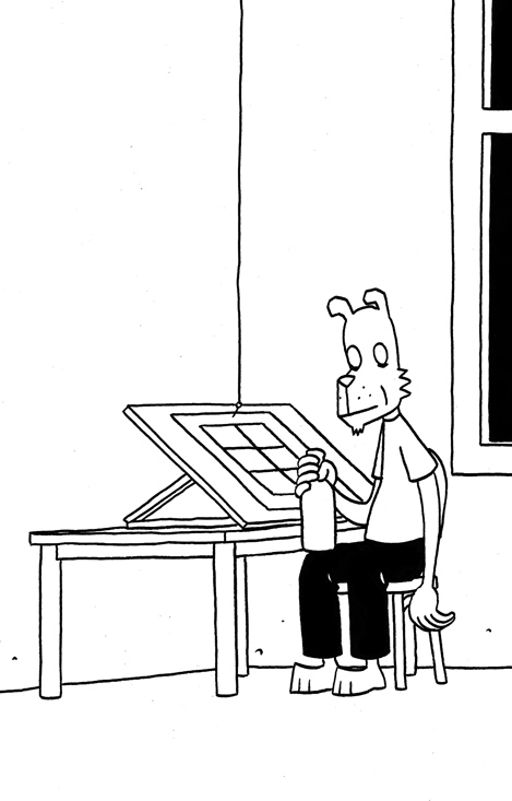
I’ve written about Norwegian cartoonist Jason for The Casual Optimist before and his work appears here with unerring regularity — if you are a frequent reader you are no doubt already familiar with it.
Like British cartoonist Tom Gauld who I interviewed early this year, Jason’s comics are immediately identifiable. You cannot mistake them for the work of someone else. And again, like Tom, Jason’s work references both the pop and the high-brow: zombies and werewolves on the one hand; Hemingway and the Beats on the other. The result is both original and off-beat. His protagonists are like renegades from a Max Fleischer cartoon who’ve inadvertently wandered into a Jim Jarmusch movie… Anthropomorphic animals smoking cigarettes, drinking coffee, talking about French actresses. Action and slapstick wrestle with ennui and loneliness.

Jason, whose work has been translated into Swedish, Spanish, German, Italian and French, currently lives in Montpellier, France. He was kind enough to talk to me in English. His new short story collection Athos in America will be published in December by Fantagraphics.

When did you first start drawing cartoons?
Around age 13, I guess. And then at age 16 I started selling cartoons and one page strips to a Norwegian humour magazine. I did that through high school.
Did you always want to be a professional cartoonist?
No, it was a hobby. To become a cartoonist in Norway was not much of an option. I went to art school to become an illustrator, but my career never took off, so I kept doing comics. I met other cartoonists in Oslo, there was sort of a little scene. And then I moved to France to be closer to the French comic book industry. I did books that were translated into English, French plus some other languages, and the last seven or eight years I’ve been able to have an income almost exclusively from doing comics.


How did you become involved with your US publisher Fantagraphics?
We sent — that is me and my Norwegian publisher, Jippi — we sent Hey, Wait… to Fantagraphics. I’m still not quite sure if Kim Thompson read our submission or if he had already read the French version, but anyhow, they decided to publish the book, and then later Shhh! And The Iron Wagon. And for some strange reason, the books seem to sell okay, so I’m still published by them. [Hey, Wait…, Shhh! and The Iron Wagon are collected in the book What I Did]


Briefly, could you describe your working process?
I have ideas in my brain, just lying there, that I sometimes think about. This can last years. Then suddenly I can get ideas for dialogues. I write this down. It’s maybe four or five pages. I can start working on those, and at the same time think about what’s going to happen next. I don’t write a full script. It’s based on improvisation. I write pieces of dialogue. Or sometimes I sketch out the pages first, the images, and write the dialogue after. I usually work on nine or ten pages at the same time, pencil a bit here , then ink it, and then pencil a bit there and ink that. It’s the completely wrong way of doing it, by the way, but it seems to be the only way I can work.

Your work often references classic movies. What are some of your favourite films?
How much room do you have? I like Fred Astaire and Ginger Rogers films, film noir, Brian De Palma, John Ford, especially The Searchers and Howard Hawks, especially Rio Bravo, Buster Keaton, Laurel and Hardy. Paris, Texas, Down by Law, Animal House, Blues Brothers, Fanny and Alexander, Five Easy Pieces, The Last Picture Show, Miller’s Crossing, Roman Holiday, On The Waterfront, Life of Brian. Days of Heaven by Terrence Malick is probably my favourite film.

In your recent book Werewolves of Montpellier, one of the characters says they don’t understand the appeal of Brigitte Bardot. Really?
Yes, really! What, you like her? She just looked a little stupid to me. I find Catherine Deneuve a lot more appealing, or Emmanuelle Beart and Julie Delpy to stick with French actresses.

You recently post a list of your 5 favourite Tintin books. Has Hergé been an influence on your work?
Yes, very much so. It was one of the first cartoonists that appealed to me. I borrowed his albums at the library as a kid. I started drawing my own cartoons. And I think you can have a much worse teacher than Hergé. It’s not really the clear line that is the most important thing, even if that is part of what I like with him, it’s more the very clear storytelling that you find in his books. On page three you’re hooked. I think you can read his books in a foreign language, in Russian, and still understand the story and enjoy it. I don’t re-read the books that often, but I often take them out, my favourite albums like The Broken Ear and The Shooting Star, and just look at the drawings.
What do think about the new Steven Spielberg adaptation?
I’ve only seen the trailer. It doesn’t look that bad. I don’t want to just completely rule it out, like its a sacrilege and that Spielberg has no right to adapt Hergé. Not sure about the computer animation, but the original plan was apparently live action with a computer animated Terry [Milou/Snowy], and I think I really would have hated that. And the European animation films, based on each album, are just terrible. Everything that is exciting and funny in the albums are completely lost in the animation films. So I don’t think the Spielberg film can be any worse.

Who are some of your other creative heroes?
Jim Jarmusch, Hal Hartley, Wes Anderson, Aki Kaurismäki. Jaime Hernandez, Jim Woodring, Daniel Clowes, Chester Brown.
Who else do you think is doing interesting work right now?
There are two Argentinian cartoonists I like, Liniers and Pablo Holmberg. The French cartoonist Christophe Blain. Calef Brown’s children books. I like the Mutts books by Patrick McDonnell. I’m not sure if it’s necessarily «interesting», but I find them appealing. It’s like the last, good newspaper strip. I like the old newspaper strip collections: Captain Easy, Prince Valiant, Little Orphan Annie, Gasoline Alley.

What books have you read recently?
This summer I read The Selected Letters by Jack Kerouac, Off The Road by Carolyn Cassady. I tried to read The Subterraneans by Kerouac, but gave up. I read Chronicles by Bob Dylan, Positively 4th Street by David Hadju and A Freewheelin’ Time by Suze Rotolo. I also read Dave Van Ronk’s memoirs, The Mayor of MacDougal Street, so I look forward to the new film by the Coen brothers, based on his life. What else? Blood Meridian by Cormac McCarthy, Last Night in Twisted River by John Irving and Freedom by Jonathan Franzen. I’m currently reading Volume 1 in The Letters of Ernest Hemingway.

What are a few of your favourites books?
Well, Hemingway. The Sun Also Rises and A Farewell to Arms, his short stories. Bukowski, mostly his novels, but I’ve also started reading his poetry. Raymond Carver and Tobias Wolff. Lorrie Moore, her short stories. Kelly Link. There’s a British writer I like, Rupert Thomson. John Fante, especially Ask The Dust, John Steinbeck, especially East of Eden and Grapes of Wrath, Cormac McCarthy, especially The Road and No Country for Old Men. Raymond Chandler and other old pulp writers like Charles Willeford and David Goodis. I like Elmore Leonard. Paul Auster. John Irving. Every four or five years I re-read Cider House Rules, Garp and Hotel New Hampshire.

Are there any stories you would like to illustrate?
Yes, there are one or two books I’d like to adapt to comics. But I’ll probably wait until I’ve run out of ideas myself.

Do you worry about the future of books and print?
No. I don’t know. The bike didn’t disappear when the car came. There are hopefully room for both books and electronic media. Personally I’ll stick with paper. I’ve no interest in reading on a screen. And I’ll be dead in 40 years anyhow. How much can they screw it up by then?
Thanks Jason!

Tom Gauld is a cartoonist and illustrator based in London. I first came across his work a few years ago in a book called Both published by Bloomsbury in 2003. Both (sadly now out of print) collected comics by Tom and Simone Lia originally self-published as First and Second under their imprint Cabanon Press.
Since then Tom’s book cover illustrations and literary cartoons have featured regularly here and on The Accidental Optimist. His work is funny (oh so funny) — silly even — but it combines pathos with the farcical. His heroes are unlikely or put-upon; his robots lonely, mundane or murderous; detectives are clueless; scientists baffled. Everyone (including the robots), it seems, would rather have stayed at home with a cup of tea and a good book. There is a gentle subversiveness to it all, although it is never mean-spirited. I hesitate to describe it as Pythonesque, but it is in a way. Tom’s machines all look as if they go ‘ping’. Other references include superheroes (less than you might think), adventure serials, mysteries, literary fiction, 1970’s science-fiction, Stanley Kubrick, fairy tales, and old Open University TV shows. It’s eccentric to say the least, but wonderful nonetheless.
Tom and I corresponded by email.

When did you first start drawing cartoons?
I’ve drawn for as long as I can remember and I drew a lot of cartoons when I was at school, but I suppose it was when I was studying at Edinburgh College of Art (around 1998) that I really began drawing comics and cartoons seriously.
Why did you start self-publishing your work?
I first self-published a comic called First with my friend Simone Lia in 2001 when we were studying at the Royal college of Art in London. I’d say we did it partly because we didn’t know anyone else who would publish it, but also because I was interested in the business of designing and hand making the whole object. I had bought a self-published comic called OAF by Mat Brinkman a few years earlier and it inspired me to self-publish: it was small and hand-made and quite rough, but really unique and lovely. I suppose I’d seen self-published stuff before, but OAF really excited me.

Was the design of your books always important to you?
Yes, definitely. I think with any book, but particularly with a picture book of some kind, the experience for the reader begins before they even pick up the book. So I try to make every aspect of my own books contribute towards the story or idea. When I started, I was as much interested in designing, making and publishing a book as I was in the actual stories within.
Is Cabanon Press on permanent hiatus?
I wouldn’t want to say that Simone and I won’t ever start it up again. But we don’t have any plans to do anything with it for the moment. I’m still self-publishing things, but for Cabanon to work I think it has to be something Simone and I do together and we’re too busy with other things.

Where are your cartoons published now?
I do a weekly cartoon for The Guardian which appears in the (art and books) Review every Saturday, some of these cartoons also appear in The Believer’s comics section. I do something to accompany the The New York Times “Riff” essay every Sunday but that’s usually more an illustration than a cartoon. I also regularly put my work on my Flickr photostream.

Briefly, could you describe your working process?
I sit and think and doodle in my sketchbook until I have a good idea. Then I’ll make rough pencil sketches on copier paper till I have things worked out visually. Then I hone these sketches on paper and in photoshop till I have a rough version of the image which I can send to anyone who needs to approve it. Then I will print out the image and use a lightbox to trace an ink version which I crosshatch then scan back into the computer where I can clean it up, tweak bits and add any colour. I love using the computer but I try to stay away from it till I’ve done most of the thinking for an idea, looked at it from all sides, because I feel that once the computer is involved things are on an inevitable path to being finished. Whereas in my sketchbook the possibilities are endless.

How is illustrating a book cover different from your weekly cartoons?
It’s very different. I feel more pressure doing a book cover than almost anything else, I think “This author has probably spent years writing this book: I mustn’t mess it all up with a crap cover”. So I have to try and find a way to react to the book and make something which is suitable, but is also strong and interesting in its own way.

Are you planning any more full-length comics?
My forthcoming book Goliath is really the first time I’ve written a book-length narrative (albeit quite a short book) and I found it much harder than writing short pieces, but I’m happy with the result now. I will probably write another one, but not straight away. I’ve got a couple of shortish things I want to do, then after that I don’t know what I’ll do.

Where do you look for inspiration, and who are some of your cartooning heroes?
I listen to the radio, watch TV and films, go to museums and most of all read.
Cartooning heroes: William Heath-Robinson, Gary Larson, Roz Chast, Richard McGuire, Ben Katchor, Daniel Clowes, Chris Ware, Jochen Gerner.

How has Edward Gorey influenced your work?
I’m a big fan of Edward Gorey. I discovered his work when I was at college and immediately wanted to seek out everything he’d ever produced. I like that what he makes is unclassifiable: he makes picture books for adults which aren’t comics, many are self-published but they’re beautifully produced. I love his drawing, the odd narratives, the design of the books, the compositions, the hand drawn typography: everything really. The way I crosshatch (with small “patches” of short lines rather than long ones) I learned from Gorey.

Are you obsessed with robots?
I think I probably am a bit. I find they are very good props/characters for my stories and ideas. I like the inherent sadness in robots: they are sentient beings but also products which can break or be discarded (in my stories anyway). Also, they are much easier to draw than real people.

Who else do you think is doing interesting work right now?
Jon McNaught, Kate Beaton, Anders Nilson, Sammy Harkham.
What are a few of your favourite books?
Off the top of my head:
The Inheritors by William Golding
The Vinegar Works by Edward Gorey
Tinker, Tailor, Soldier, Spy by John le Carre
Teratoid Heights by Mat Brinkman
The Summer Book by Tove Jansson
The Stanley Kubrick Archives by Alison Castle

Are there any books you would love to illustrate?
I’d like to do a book of fairy-tales or folk-tales.
What have you read recently?
The Thousand Autumns of Jacob de Zoet by David Mitchell
Through the Language Glass by Guy Deutscher (A fascinating book about language and colour)
The Annotated Brothers Grimm by Maria Tatar
The Cardboard Valise by Ben Katchor

What’s next for books and print?
One thing which might happen with the rise of e-books is that the books that DO get published in paper may have to justify themselves by being better made, designed and illustrated. That would make me happy.
Thanks, Tom!
For the sake of full disclosure, I should mention that Tom’s forthcoming book Goliath, will be published by Drawn & Quarterly and distributed in Canada by my employer Raincoast Books.

“I haven’t changed my mind about modernism from the first day I ever did it…. It means integrity; it means honesty; it means the absence of sentimentality and the absence of nostalgia; it means simplicity; it means clarity. That’s what modernism means to me…” — Paul Rand
There is something of a Modernist tendency in the design of David Drummond. It is not in a strict adherence to the grid or Accidentz Grotesk (or anything quite so obvious), but rather in the thought and purpose underlying his work. There is always a clarity and assurance to the concept and composition. There is never erroneous detail or ornament. Form most definitely follows function. To describe David’s work this way, however, is something of an injustice. His designs are far wittier (and much less pedantic) than one thinks Modernism ought to be. But then again, whoever said Modernism couldn’t be funny or irreverent? Not Paul Rand.
Perhaps it is simply better to say that David’s designs are the epitome of good ideas well executed. Their apparent effortlessness make it easy to underestimate his work. It is only when one tries to imagine how the cover could have looked otherwise that you truly realise his originality and what he has rejected or removed to get to his apparently simple designs. It should not be a surprise that Paul Rand is inspiration. After all, it was Rand who said:
“Simplicity is not the goal. It is the by-product of a good idea and modest expectations.”
Somehow that seems to get to the core of David’s work.
I am absolutely thrilled to post this interview. David’s work has received awards from AIGA, Communication Arts Magazine and Print Magazine and he is one of the finest book cover designers working today.
We corresponded by email.

How did you get into book design?
I was working in Montreal for an ad agency when I got a call from McGill-Queen’s University Press. On the recommendation of my sister, whose book they were publishing, they were interested in looking at my portfolio. That was the catalyst to start breaking out on my own.

When did you open your own studio?
I opened Salamander Hill Design in 2001
Approximately how many publishers do you work with?
I just checked the folder on my computer titled “Presses” and there are about 40 in there. Some are very active and some not at all. It kind of goes up down. Some of them are self published authors as well. There are maybe about 10 that I have longstanding relationships with that feed me with work pretty regularly.

How many covers do you work a season?
Hard to say really. I have so many that are all at varying stages of production. Right now, if I count the books on my list, there are about 30. What I have come to realize is that it is really important for me to always have a lot of work on the go. It helps to keep me in the zone where I can do my best work. I really do think the creative faculty is like a muscle that you have to keep flexing.
You were previously an art director for a marketing and communications company. Has this informed your book cover design?
This is going to sound funny but I wouldn’t really describe myself as a book cover designer. My approach to cover design is pretty much the same that I apply to any area of visual communication. I see the project as solving a visual problem, whether it is a book cover, illustration, logo or package design. Even though I have always entered work in book cover design competitions through the years, it has also been equally important for me to enter competitions like Communication Arts Design Annual to have the work judged in the larger context of graphic design as a whole.

Do you still do corporate identity work and packaging design?
Lately I have been getting back into identity work more and more. I guess I must have been missing it. Last year I decided to branch out and do some illustration work for magazines and that has been really exciting. The tight deadlines and fast turn-arounds force you to make decisions faster. I really hope to develop that more this year. Just last week someone e-mailed me about doing a poster for film festival in Italy. It always amazes me when a job like that lands in your in-box out of the blue.

Could you describe your book cover design process?
In a nutshell: present the cover brief to yourself as a problem that has to be solved. Then I try and bombard my brain with images from all kinds of sources to see if I can trigger something. For me it is about finding the visual hook. If that doesn’t work right away I tend to put it aside and take my dog Beau for a walk. I am sure all the local farmers that pass me on the road in their pick-up trucks must wonder about me and my dog walking far from home in all kinds of weather but I would honestly say it is an important part of my creative process.
I tend to like showing one concept whenever possible. I would say this is true for all of my design work. It shows the client that you have taken a stand and believe in the solution. That doesn’t mean you haven’t produced many different concepts along the way. I am sort of brutally self critical and if something isn’t working or if I am forcing it too much I put it aside and start again. I work with a lot of different clients with different protocols and some of them require that multiple concepts be presented up front. When that is the case I still try and make a strong case for the one I believe in.
I think the key to doing your best work is having a great client relationship. My brother is a poet and he compares publishing a book of poems to launching a pebble off the Grand Canyon and waiting for the sound of it hitting the bottom to come back to you. That is a bit the way I feel when I start working for a new client when you aren’t familiar with their approval process. Sometimes you launch your design out there and then — silence. I have a relationship with most of my clients where I know they want to be surprised by a solution. It does set the bar high each time but I need that challenge.
My wife works as a horse groom for a big show barn and gets up at 5:00 in the morning to get ready for work. Consequently I start my day around the same time. It’s funny — I live in farm country and basically keep farmer’s hours. The lights are also on in the neighbouring barns when I start my day. I focus on idea generation in those early hours and leave the more mundane production stuff to later in the day when my energy is flagging. The Tron, Inception, Dark Knight soundtracks come in handy at that point to keep me going.

What are your favourite books to work on?
Hard to say really. For the nonfiction stuff I love working on covers that have a great title that presents the subject in a new way. That really tends to help get the ball rolling.
What are the most challenging?
Books on the economy/Wall Street, Canadian Federalism, the Supreme Court, Native Peoples. I say this because I have done so many of them and each time you have to find a new way of presenting it. So far I have always managed to find a new take on it. I keep going back to the well and so far it hasn’t gone dry.
Do you see any current trends in book design?
Not a big fan of trends. Whenever I have been asked to judge design work for competitions the work that always grabs you are the ones that present a strong concept with a clean and simple execution. I think that is the key to producing work that is timeless.

Where do you look for inspiration, and who are some of your design heroes?
I look for inspiration pretty much everywhere. Paul Rand is a big design hero of mine because he kept on creating right to the end. I pretty much knew early on in my career that, because I’m such an oddball, the path of becoming creative director in a big agency was not really an option — not much of a schmoozer.
For me it has always been about the work.
Who else do you think is doing interesting work right now?
So many designers really. I would probably choose designers outside of the book design world like Montreal design firm Paprika — their work never ceases to surprise me.
What does the future hold for book cover design?
I truly feel privileged to get up in the morning and find a new design brief for a cover design in my in-box. Doing this type of work is a perfect fit for me and I hope to continue doing it for as long as it lasts.

And lastly… You (somewhat famously) live in a rural municipality in Quebec with a population of less than 500 people. What can you see from your studio window?
I live in a big rambling farmhouse built in 1825 on about 140 acres of land in Elgin, Quebec. The back fence line is the American border. Our farm sits at the base of the Adirondacks just where the Chateauguay Valley begins. My office is on the second floor with a view out the back. The view is always changing. Depending on the time of the year there are sheep, cows, horses, wild turkeys, deer, and an assortment of barn cats outside my window.
Wonderful! Thanks David.
David’s work can be seen at his blog and at the website for Salamander Hill Design.

I recently mentioned to a friend that I was going to interview book cover designer Jason Ramirez. “Jason’s the best,” he said. “Any time I’m stuck on type, I try to imagine what Jason would do and work from there.”
And when you look at Jason’s book covers you know what he means. A designer at New York’s St. Martin’s Press his typography is always beautiful. Each elegant letter is given room breath and perfectly compliments the design as a whole.
There is, in fact, an irresistible incisiveness and precision to Jason’s work that lend all his book covers an airy beauty. They feel spacious and uncluttered; direct without ever being blunt. I’m sure it won’t be too long before more designers ask, “what would Jason do?”
Jason and I corresponded by Twitter and email, and you can see more his portfolio on the Behance Network.

How did you get into book design?
I pretty much took a roundabout way into book design. I first went to college in upstate New York with the intention to eventually study medicine. Four years later, after a near-fatal rendezvous with organic chemistry, I graduated with a degree in comparative religious studies. I spent the next few years in San Francisco working for a real estate investment company, first in human resources and then in marketing and branding. It was during my stint in marketing and branding, which introduced me to the design world of San Francisco, that I began to daydream about a move to the city of New York to study design. Eventually I worked up the courage to make the move and was accepted to Parsons School of Design. During my last year at Parsons I had the good fortune of taking a book cover design course instructed by Gabriele Wilson. Pretty much from the onset of the class I was hooked. Shortly after graduating again, I began working with Rodrigo Corral and continued for a bit over a year before landing at St. Martin’s Press.

How long have you been at St Martin’s?
I’ve been with St. Martin’s Press since November 2007.
Approximately how many titles do you work on a season at St Martin’s?
I work on anywhere from ten to fifteen new titles each season, across four different imprints: St. Martin’s Press (trade hardcover), St. Martin’s Griffin (trade paperback), Minotaur (mystery) and Palgrave-Macmillan (which is actually an academic and trade publishing company; a close cousin to St. Martin’s).

Is there a house style?
No. One of the terrific things about working at St. Martin’s is the variety of titles published each season. Working across genres provides an opportunity to bring a fresh perspective to each project.
Do you also work freelance?
I’ve had the opportunity to work with a few publishers including, Atlas & Co., HarperCollins, Oxford University Press, The Countryman Press, W.W. Norton, and Vintage. I’ve also dabbled in a bit of interior book design with the talented design and publishing duo of Scott & Nix (Charles Nix and George Scott).
Could you describe your design process?
My process may vary depending on the project, but I always begin by reading. I try to read as much as possible of whatever materials are available, be it a manuscript, proposal, or synopsis. Depending on the subject matter, additional research might be needed. Not to mention that a bit of scouting for related imagery and typography can often inform and inspire. I tend to rely heavily on a sketchbook to record notes relating to the content and meaning of a book; ideas about imagery, typefaces and colors; and thumbnail sketches. And from this hopefully a clear, clever and attractive idea will prevail.

What are your favourite books to work on?
I appreciate the opportunity and challenge to work on various genres. Though I often tend to be drawn to non-fiction titles such as academic and business-oriented subjects. The conceptual challenge to visually simplify complex and comprehensive subject matter that might not be immediately accessible to a reader resonates with me.
What are the most challenging?
Any project has the potential to be challenging. Sometimes a project that I expect to be relatively easy to nail will prove to be the most time-consuming, requiring multiple rounds of revision. The challenge in this situation can be sustaining a fresh approach throughout multiple iterations, as well as mitigating your ideas with the opinions of others involved.

Do you have any recent favourites?
Two recent favorites include, Gabriel García Márquez: The Early Years, a biography that charts Márquez’s life leading up to the publication of his classic, One Hundred Years of Solitude; and Glimmerglass, my foray into the burgeoning young adult paranormal genre. I’m also quite fond of two relatively recent freelance projects: Power, a business management book about leadership and management success; and The Triggering Town, a collection of witty and inspirational essays on writing and poetry.

Where do you look for inspiration, and who are some of your design heroes?
I will take cues from popular culture, be it the daily headlines, magazines, music, television, movies, and the internet. On any given day, I might find inspiration in a post in my Twitter feed, from a thought-provoking illustration within the New York Times, by thumbing through a design or art book, or simply from a conversation had with a friend or colleague. And I’m almost always inspired when inside a book store.
I admire the work of Paul Rand, Alvin Lustig, Vaughan Oliver, Stefan Sagmeister, and Michael Bierut, to name a few. But the reality is that there so many visually creative people, both inside and outside of publishing, whose work I admire and find inspirational.

Who else do you think is doing interesting work right now?
There are many smart and talented designers working in publishing today who are consistently creating great jacket design such as Rodrigo Corral, Evan Gaffney, John Gall, Jamie Keenan, Peter Mendelsund, and Gabriele Wilson.
What are you reading currently?
Admittedly, at times I can be a bit lazy. So aside from finishing the lingering manuscript, scrolling through my Twitter feed, or browsing my Netflix queue, it’s not surprising that I’m reading an outdated issue of New York Magazine, inching closer to finishing The Glass Castle which I began last summer, and randomly reading excerpts from the Autobiography of Mark Twain.

What does the future hold for book cover design?
This is the great unknown. I prefer to believe that the physical book will survive alongside the electronic book. That said, as technology evolves, additional possibilities may be created for book cover design in a digital form. In the long-term perhaps the digital book, both the content and the artwork used to package and identify it, will become multi-dimensional and interactive so that a reader might have the ability to navigate through multiple layers of storytelling. Or maybe I’ve seen one too many Harry Potter movies … I guess we’ll have to wait and see.
Thanks Jason!

I feel a special admiration for The Second Pass. Launched almost two years ago — shortly after first tentative posts at The Casual Optimist — and with a list of whip-smart contributors, it seemed to signify a second wave online literary journals that built on the success of groundbreaking sites like Bookslut and ReadySteadyBlog. Well-designed and appropriately eclectic, it had wider horizons than ailing newspaper review pages, and yet Brooklyn-based founder John Williams — who previously worked in publishing — seemed less prone to the snark so commonplace among some of the more established online literary set.
 I was, needless to say, surprised when I first received an email from John. The idea that he had even heard of the less-than whip-smart The Casual Optimist seemed so… unlikely. And yet, John and I have remained in touch on and off for the past year and half, and I have even contributed to The Second Pass, so I thought it was high time I talked to him about the site and its recent book party in Brooklyn.
We corresponded by email…
For those people unfamiliar with the site, could you describe The Second Pass?
The site is an online magazine devoted to books new and old. It features reviews of new books, essays about older and more obscure books, and a blog about books of all stripes. That’s the basics. It’s a place where serious readers of all kinds can enjoy themselves and, from time to time, maybe learn about a book or author they might not otherwise learn about.
What makes The Second Pass unique?
Unique is a strong word. There are other sites and publications that pay attention to obscure books, but I think the site’s regular devotion to it — including out-of-print books — is rare, if not entirely unique. I also like to think the writing is generally at a level that separates it from many other online-only enterprises.
What lessons have you learned in the first 20 months of editing the site?
Plan ahead. And have contingency plans. I’ve learned those lessons, though I’m still learning to act on them.
Appearance and readability often seem to be an afterthought for websites about books, but that doesn’t seem to be the case with The Second Pass. Did a lot of planning go into the design of the site?
Yes, my friend Strath Shepard spent time coming up with several visual ideas for the site, and I chose from among them — any one of which I would have been thrilled with. I wanted to make sure the site looked good, because I think design is as important online as anywhere else. It should be strong and inviting without being an obstruction or a distraction, in my opinion.
Is it easier or more difficult for independent online literary journals to find an audience today?
Easier than it was in the past online? I’m not sure about that. My unscientific sense is that many more people are spending time online, but that the idea of a big audience for niche blogs or journals is more or less a dead dream. Reaching a certain core number of readers is easy enough online, if you’re patient and steady in your production, but I think the audience for serious books coverage is inherently limited in a way that can be hard to admit. I would rather try to reach the maximum of that particular audience (and I have no idea what that number would be; my site’s traffic is surely a tiny sliver of it) than start throwing too many things at the wall to try to reach a more general audience. I think the pressing need for lots of traffic is reflected at a place like The Huffington Post, where the books coverage is a hodgepodge of too-frequently-published pieces that don’t feel unified in any satisfying way. But those people who work for places where increasing traffic is paramount — to paraphrase David Letterman, I wouldn’t give their troubles to a monkey on a rock. I’m happy there’s no one above me worrying about traffic.
What other book sites do you read regularly?
Maud Newton, The Book Bench, Paris Review Daily, Bookslut, The Millions, John Self, Levi Stahl’s I’ve Been Reading Lately, the Barnes & Noble Review, Mark Athitakis, Novel Readings, and yours. Those might be the ones I check most regularly, off the top of my head, but I drop in on many more, most or all of them on the links page at The Second Pass.
Where does the name of your blog, A Special Way of Being Afraid, come from?
It comes from a Philip Larkin poem called “Aubade,” which is a terrifying and beautiful confrontation of the fear of death. It begins: “I work all day, and get half-drunk at night. / Waking at four to soundless dark, I stare.” And a bit later: “This is a special way of being afraid / No trick dispels. Religion used to try…” It’s always been one of my favorite poems, and I thought that phrase would make a good blog name, back in 2005, when I started it. I still like the name.
How has the experience as founder and editor of The Second Pass been different from blogging?
I started the older blog while working for a big publishing house, partly as a way to maintain the habit of writing and to develop my own voice while in a job that made it difficult to find time for those things. Especially in the beginning, I felt it was important to keep the blog regularly updated, for the exercise of it and for building readership, however modest. I feel that pressure more keenly with The Second Pass, since I have more ambitions for it. Ideally, I would update it far more often than I do. I also work with other people on The Second Pass. I wear all the hats, but I rely on reviews and essays from other writers, a social part of the experience that I really enjoy but that makes it different from the more dictatorial nature of the blog.
The blog is also more wide-ranging. I’m probably a reader first and foremost, but I’m also a longtime fan of music, movies, and sports, among other things. Not to mention the more personal things I might ruminate about over there. I still consider the blog a useful outlet for those things, though I’ve been terribly neglecting it for the past several months, if not longer.
The Second Pass held its first event in November. What made you decide to throw a party?
I had been meaning to have a party ever since last March, when the site celebrated its one-year anniversary, but was stymied by various obstacles that wouldn’t have stymied someone with more resolve. I thought it would be fun to have a party, and figured it couldn’t hurt the site’s visibility. Plus, I wanted to showcase some of the fantastic people who have written for the site.
Who read at the event?
Carlene Bauer, Will Blythe, and Maud Newton read from works of fiction in progress. Jason Zinoman read from his book about horror movies in the 1960s and ’70s, which is being published here next summer. And Lauren Kaminsky read an excerpt from a terrifically weird book called Listen, Little Man by Wilhelm Reich, a screed written by an Austrian psychoanalyst who worked with Freud and later seemed to have cracked up pretty good. I’m hoping Lauren will write about the book (and him) for the site at some point.
Do you think the evening was a success? And will you be organizing more events in future?
I thought it was a big success. I’m biased, of course, but the readers couldn’t have done a better job, there was plenty of wine and food, and everyone seemed to have a good time. Melville House, an independent publisher and bookstore in Brooklyn, was a gracious host. And yes, I’m certainly hoping to do it again, perhaps in Manhattan next time, when the site turns two (which happens March 10) or soon after.
Do you think interest in live book events will see the same kind of revival that live music events have in recent years?
I think live book events, at least in New York, have been thriving in recent years. My dirty little secret is that I find many traditional readings dull. Not all, but many. Lots of good writers just aren’t good readers, which is no knock on them. It’s not their job, and they’re very different skills. Only a few lucky people have both. I think it’s also asking a lot of a text to keep people interested for a long stretch of time while it’s read aloud. (I’m not a big fan of audio books for that reason, though this is probably saying much more about my aural attention span than about the worth of audio books.)
Who are some of your other favourite authors?
William Trevor, Richard Russo (especially pre-Pulitzer), Marilynne Robinson, David James Duncan, Dostoevsky, Lorrie Moore, Wilfrid Sheed, Nabokov, William James, Martin Amis (back when), Iris Murdoch, Richard Ford (the Bascombe books, particularly), to name a few.
What were your favourite books of 2010?
I recently finished The Killer of Little Shepherds by Douglas Starr, a nonfiction story set in late-19th-century France, which tells the parallel stories of a serial killer on the loose and a criminologist who was doing a lot to introduce the set of forensic techniques that we now, thanks to TV, simply refer to as “CSI.” It’s a gripping story, smartly told. I also enjoyed Brady Udall’s The Lonely Polygamist. He’s an old-fashioned storyteller, sweeping and just the right amount of sentimental, and this novel is about a Mormon with four wives and 28 children.
What books are you looking forward to reading in 2011?
I’m glad you asked this, because it reminded me that I’m behind in figuring out what the site will cover this year. I’m a fan of Jonathan Coe’s work, and his new novel, The Terrible Privacy of Maxwell Sim, is coming in March. Just today, I received a galley of House of Exile by Evelyn Juers, a biography of Heinrich Mann, his wife Nelly, and their circle of famous friends. I’ve been looking forward to its U.S. publication since I read a terrific review in the TLS. And of course, there’s David Foster Wallace’s novel in April. Though I’m skeptical of posthumous releases, including this one, I’m as curious as every other fan of his.
Thanks John!
Photo credit: Justin Lane
credit Justin LaneJ

John Gall is Vice President and Art Director for Vintage/Anchor Books, an instructor at the School of Visual Arts, and the author Sayonara Home Run! The Art of the Japanese Baseball Card.
Previously Art Director at Grove/Atlantic, Gall has been interviewed about his work by Step Inside Design, Design Bureau, and Barnes & Noble (video). He garnered even wider attention in 2009 when he commissioned a roster of high-profile designers — including Rodrigo Corral, Carin Goldberg, Chip Kidd, Paul Sahre, Megan Wilson and Duncan Hannah — to redesign twenty-one Vladimir Nabokov book covers within the confines of specimen boxes (read more about the designs at Print Magazine).

I have wanted to interview John for a long time, but as he talked about book design extensively elsewhere and regular readers are more than likely familiar with his work already, I was waiting for the right subject. It was his colleague Peter Mendelsund, who suggested that rather than discuss his book covers, I should ask John about his collages. John Gall makes collages? Yes, indeed he does. And, needless to say, they are very good.
I met John in Toronto in December last year, and we corresponded by email.

When did you first start making collages?
It’s something that I’ve been doing sporadically since forever. And when I say sporadic I mean, years or decades between doing anything.
Do you create them digitally or by hand?
All hand done. One of the reasons I do this is to get away from the computer, drop the design think and work with the hands. Its kind of liberating to not have the ability to resize things on the fly. I sometimes use a digital camera to keep track of the permutations since my brain no longer can.

Can you give me a sense of their size?
8 x 10 on up to 18 x 24
How do you chose your titles?
The titles come from things I may be thinking about, or reading, or songs I may be listening to at the time I am making them. Then I make an anagram. It now takes me a lot of time to decipher the original source and many times I cannot. Strangely, when I posted “Hot Elves,” I got a ton of hits, which made me briefly consider naming everything after comic-nerd fetishes.
Who are your artistic influences and where do you look for inspiration?
I like the same old dead people as everyone else: Kurt Schwitters, Marianne Brandt, Georges Hugnet, Rauschenberg, John Chamberlain (not dead yet!), etc. People working today who make me incredibly jealous: Fred Free, Mark Lazenby, John Stezaker, James Gallagher, Lou Beach and family, Wangechi Mutu, Clara Mata, Robert Pollard, Nicole Natri, Paul Butler, Charles Wilkin and a bunch of people I’ve met on Flickr who’s real names I do not know.
Not sure how influential any of these folks are but they do inspire me to get off my ass and get to work.

Is creating a collage a similar process to designing a cover?
Yes and no. In both cases you are moving things around on a page until they look “right”. For me, when I am doing the collage work I am eliminating the concept (and most of the time the typography) so it is reduced to forms on a page.
Graphic design is a total left brain/right brain thing. A combination of logical carefully considered thinking and intuitive personal expression. For the collage work I try to put the logical aside and exercise the intuitive muscle.

Has making collages informed your designs?
When I am stuck, I sometimes find myself thinking “What can’t I do on a book cover”? Its chance to make the wrong path and see where that leads. Force myself to make the wrong decisions. Trying to leave thoughts of what looks “good” out of the equation. Nearly impossible, but that is the goal. The hope was that these notebooks could fuel design ideas. Not so sure if that is still the case. They’ve become a thing unto their own.
Have you ever used one of your pieces in a cover?
I used them on a poster once. Attempted to use them on a skateboard design. A couple of people have tried to use them on book covers, to no avail.


Was creating a series of collages from recombined book covers cathartic?
Not really. More like, “hmmm…its 12:30 AM, I’ve spent all day working on book covers and now I’m tearing apart old covers to make new covers. Lo-ser”.
That said I’ve since started up this series again and will be posting them shortly. But I can only do these when I am away from work for a spell. Generally its like, “enough with the book covers already, is Food Jammers on yet?”.
Where do you gather your source materials from?
Most of what I work with comes in the daily mail: catalogs, magazines, etc. I intentionally try not to work with anything that is too vintage or too inherently beautiful—though I do break this rule all the time. My thinking is that all the great collage artists of the past used source material that was lying around in the trash or purchased at the local five and dime. Today we look at a Cornell piece or a Schwitters piece and marvel at the incredible printed material they had to work with. They were working with the Foodtown circulars and Bass Pro Shop catalogs of their day except, well, OK, more beautiful.
Do you still collect Japanese baseball cards?
The collecting has tapered of quite a bit since the book was published. I’m much more selective now. but if I see something particularly beautiful up for auction I’ll probably go for it. I’m not a super smart collector though. I tend to buy what I like and not what will be valuable.

Do you collect anything else?
I’m trying not to acquire to much stuff anymore and am getting ready to purge. I collect old snapshots, the occasional flashlight and I’ve recently acquired a hankering for old high school yearbooks. I’ve also been trading and collecting collage work.
Your collages are included in the recently released Graphic: Inside the Sketchbooks of the World’s Great Graphic Designers. How did that come about?
The author Steven Heller, asked me if I had anything that I’d want to contribute. I told him I keep two kinds of notebooks, one that is basically a to do list and idea book. The others are the collage notebooks. They were much more interested in those. By the way, its a beautiful book.

Untitled, James Gall (2008); Untitled, Owen Gall (2008)
You’ve collaborated with your kids on some collages. Can you tell me about ‘Dad’s Drawing Class’?
Kids are the best. The great thing about collage is that anybody can do it, but its hard to do well. Kids are naturals. They have no preconceived notions as to what looks good, just do what they like. So they are free to do whatever they want—that is, until they get old enough to become self conscious..
Dad’s Drawing Class is something I like to do with my kids while we are hanging out on vacation without cellphones and video games. We’ve done collage, some drawing exercises. I even had them drawing typographic forms one morning. My wife is also very creative and influential in this regard. She teaches a nature drawing program for children.

Where can we see your work next?
I had a couple pieces in a group show last year and some of my work will be in a book coming out next spring called “Cutters”. Showing this work is not something that I am actively pursuing. I’m not so convinced of its worthiness. I have a flickr stream, a typepad blog and if you find yourself wandering around in my attic any time soon, you will probably see some work.
Thanks John!
Images:
- The Eye by Vladimir Nabokov, designed by John Gall
- The Enchanter by Vladimir Nabokov, designed by Megan Wilson and Duncan Hannah
- The Gift by Vladimir Nabokov, designed by Rodrigo Corral
- Paper Souls, John Gall (2008)
- Less Bravos, John Gall (2008)
- Shack Wine, John Gall (2010)
- Yeast Grippe, John Gall (2009)
- Limeade Fans, John Gall (2009)
- Cover Combine #13, John Gall (2011)
- Cover Combine #8, John Gall (2011)
- Cover Combine #4, John Gall (2009)
- Amendable Boy, John Gall (2010)
- Spray Degree, John Gall (2010)
- Untitled, James Gall (2008)
- Untitled, Owen Gall (2008)
- Gas Diode Zoom, John Gall (2008)
This week’s Q & A with The Heads of State is my last interview of 2010. There are more Q & A’s with book designers and other book folk planned for 2011, but in the meantime, here’s a round-up of this past year’s interviews:
- Jason Godfrey, Bibliographic, Laurence King (London)
- Peter Mendelsund and Tom McCarthy, C, A.A. Knopf (New York / London)
- Stuart Bache, designer (Birmingham, UK)
- Ferran López, Random House Mondadori (Barcelona)
- Paul Buckley and Christopher Brand, Penguin 75, Penguin (New York)
- Daniel Justi, book designer (São Paulo)
- Karen Horton, Design:Related (New York)
- Clare Skeats, book designer (London)
- Jason Gabbert, book designer (Bend, OR)
- The Heads of State, design shop (Philadelphia)


