Skip to content

Category: Books

Coralie Bickford-Smith | Serious Interview

Alan Trotter entertainingly interviews Coralie Bickford-Smith about her new cover designs for the Penguin Great Food series:

The lettering on the covers is by the talented Stephen Raw, and you can see all the finished designs on the Penguin Books Flickr.

My interview with Coralie is here.

Comments closed

Louis Menand | The Big Think

In a really fascinating 28 minute interview from last year, Louis Menand — Professor of English at Harvard University, critic and author most recently of The Marketplace of Ideas — discusses books, culture, criticism, science, education (and more in between) with the Big Think:


(via Mark Athitakis. I can’t quite believe I didn’t see this earlier!)

Comments closed

Jo Nesbø | BBC World Book Club

With A.A. Knopf FINALLY publishing his novel The Snowman in the US this May, Norwegian author Jo Nesbø discusses his earlier Harry Hole novel The Redbreast with the BBC World Service Book Club:

BBC WORLD BOOK CLUB: JO NESBØ

1 Comment

The Bookbinder | Made in Toronto

A lovely short film about bookbinder Don Taylor made by Tate Young and Ian Daffern for the new online daily Toronto Standard:

Comments closed

Something for the Weekend

FF Spinoza — A nice looking new type family designed by New York-based art director Max Phillips:

With the goal of readability in mind, Phillips named the typeface after 17th century rationalist and lens-grinder Baruch Spinoza, a man whose job it was to help people see clearly.

The family is meant as an elegant workhorse, a classic text family with just enough individual character to hold its own in display sizes. It was inspired by mid-century German book faces like Trump Mediæval and Aldus, and by the types of Nicolas Kis. The forms are narrow and economical, with open counters. The line is firm and distinct. It has strong thick strokes and serifs to help it grip the page. Its intended virtues are firmness, clarity and modesty.

Interestingly, Phillips is also author of the Shamus Award-winning mystery Fade to Blonde, and co-founder of the pulp-infused Hard Case Crime imprint.

Sign ManualThe New Yorker takes a look at Helvetica and the New York City Subway System by Paul Shaw:

Though Helvetica was always the choice font for typographic synchronization, it was simply too expensive to ship over from Amsterdam, where it was made (back in the days of metal type, lead font plates had to be imported, a costly endeavor, since the plates had to be custom manufactured to fit American printing presses). In the early sixties (much like today) New York City Transit just didn’t have the money. Instead, the MTA used a similar font called Standard, or Akzidenz-Grotesk, which took nineteen years to fully phase out. It wasn’t until 1989 that the MTA officially ratified the decision to replace it with Helvetica in its “Sign Manual.”

The review is accompanied by a slideshow of images from the book.

Something Irretrievably LostRob Young, former editor of The Wire magazine, talks about his latest book Electric Eden: Unearthing Britain’s Visionary Music with Mark Thwaite at ReadySteadyBlog:

[T]here will always be a tradition, running underneath the more visible forms of pop and rock music. At certain times it comes into focus and is a fairly hip reference point for various artists; at other times – much of the 80s and early 90s, for example – it’s practically invisible and/or unredeemable.

Right now we’re on an upswing, possible as an inevitable reaction to the huge leaps forward in digital and electronic music in the 90s; also because, when making or locating all sorts of music has become so easy and accessible, there’s a certain nostalgia for an indefinable organic quality to the production and a sense that music can be about more than purely formal concerns. This, I’m sure, is connected at some instinctive level with the destabilising effects of recent political developments here. It’s very noticeable that folk revivals tend to occur when people are afraid of something being irretrievably lost.

The Computational Process — Ted Striphas, author of The Late Age of Print, on the distinction between ‘“algorithmic culture” and “culturomics”:

I must confess to being intrigued by culturomics… Having said that, I still want to hold onto the idea of algorithmic culture. I prefer the term because it places the algorithm center-stage rather than allowing it to recede into the background, as does culturomics. Algorithmic culture encourages us to see computational process not as a window onto the world but as an instrument of order and authoritative decision making. The point of algorithmic culture, both terminologically and methodologically, is to help us understand the politics of algorithms and thus to approach them and the work they do more circumspectly, even critically.

And finally…

Just a reminder that the late and final deadline for AIGA’s reinstated 50 Books/50 Covers is April 21, 2011.

2 Comments

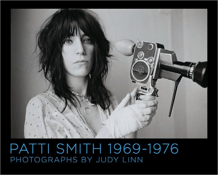
Patti Smith 1969-1976, Photographs by Judy Linn

“I was eager to be Judy’s model and to have the opportunity to work with a true artist. I felt protected in the atmosphere we created together. We had an inner narrative, producing our own unspoken film, with or without a camera.” — Patti Smith

Here’s a short promotional trailer for Patti Smith 1969-1976, Photographs by Judy Linn, mentioned briefly in this morning’s round-up:

(via @theBDR)

Comments closed

Midweek Miscellany

Book Art: Iconic Sculptures and Installations Made from Books by Paul Sloman, a 220-page overview of contemporary art, installation, and design created with and from books , published Gestalten.

La Mémoire Retrouvée — Edmund de Waal, author of The Hare with the Amber Eyes, on his family’s connection to Proust, for The Daily Telegraph:

Proust played with the interpenetration of the real and the invented; his novels have a panoply of historical figures who appear as themselves mingling with characters reimagined from recognisable people. Elstir, the great painter who leaves his infatuation with Japonisme to become an Impressionist, has elements of both Whistler and Renoir, but has another dynamic force. And Proust’s characters stand in front of actual pictures. The visual texture of the novels is suffused not just with references to Giotto and Botticelli, Dürer and Vermeer, Moreau, Monet and Renoir, but by the act of looking at paintings, by the act of collecting them, remembering what it was to see something, the memory of the moment of apprehension.

Doomed — Jonathan Coe, author most recently of The Terrible Privacy of Maxwell Sim, on film adaptations of books for The Guardian:

In the course of their famous book-length interview, François Truffaut once asked Alfred Hitchcock about his approach to literary adaptation, and Hitch’s response was as magisterial, worldly and mischievous as one would expect: “What I do is to read a story only once, and if I like the basic idea, I just forget all about the book and start to create cinema. Today I would be unable to tell you the story of Daphne du Maurier’s The Birds. I read it only once, and very quickly at that.”


Circumventing the Male Gaze The New Yorker‘s Hilton Als on photographer Judy Linn and a new book collecting her photographs of Patti Smith:

I wonder what Patti and Judy saw in one another—I mean, beyond the description Judy provides in her little essay at the back of the book. What is the energy that one being picks up on, and how does it complement the other’s? Judy and Patti went to Detroit one summer and worked for a local paper and Crawdaddy, respectively; Patti wrote rock criticism and Judy took pictures. Lester Bangs was their friend. The world got bigger. Collaboration can be vexing, but there’s not a note of complaint in their work together. The pictures are documents of girls doing things together, sometimes in their summer dresses. And when there’s a third person present—Mapplethorpe, some other boy—they make a little room for him, but he’s rarely center frame; the pictures are rare in that they circumvent the male gaze and thus approval; instead, they document how each woman’s vision is equal to the other’s.

And finally…

Designer Data — The New York Times on data visualization:

Visual analytics play off the idea that the brain is more attracted to and able to process dynamic images than long lists of numbers. But the goal of information visualization is not simply to represent millions of bits of data as illustrations. It is to prompt visceral comprehension, moments of insight that make viewers want to learn more.

And on a related note: The Infographic Inforgraphic by Ivan Cash.

Comments closed

Henning Mankell: The Last Wallander?

The Swedish author Henning Mankell talks to NPR New’s Morning Edition about the 11th and possibly last Wallander novel The Troubled Man:

“Maybe I’m a little old-fashioned. In the times where everyone is talking about how everything is a process, I am keen on dots … you call them a period. I believe in periods. I really thought that now is the ending, to make the final period in the stories of Wallander.”

NPR NEWS MORNING EDITION: HENNING MANKELL

Comments closed

Something for the Weekend

A Swiss Typeface + 2 Italian Designers = New York City — Michael Bierut reviews Helvetica and the New York City Subway System by Paul Shaw for the WSJ:

Mr. Shaw is irritated with the widespread belief that the modern New York subway system has always been associated with the Swiss typeface Helvetica. This misperception was fueled by the attention the typeface received in 2007 on the 50th anniversary of its introduction, especially in Gary Hustwit’s “Helvetica,” a documentary survey of the astonishing ubiquity of a lettering style that appears over the entrances of American Apparel and Staples, on Lufthansa airplanes and New York City garbage trucks, on Comme des Garçons bags, and, yes, on New York subway signs. But the last, as Mr. Shaw shows, was not always so.

The Habit of Reading — Harvard professor Marjorie Garber talks about her new book, The Use and Abuse of Literature, with The Atlantic:

I don’t believe there’s a necessary divide between highbrow and lowbrow or whatever. I think that the habit of reading is intensely pleasurable and it’s also hard. The pleasure of it is partly the pleasure of detection, the pleasure of recognition, the pleasure of response… I’m very optimistic actually about the future of literature and literary reading—I’m far from despairing and I don’t actually feel that there’s a crisis. What we need is to continue to show the power of reading, the pleasure of reading—and, again, more people experience that than we are sometimes aware of.

Jessa Crispin, editor-in-chief of Bookslut,  reviews the book for NPR:

In fact, it’s proof of literature’s strength and lasting value that a 19th century writer like Jane Austen can still speak to the contemporary love lives of her readers, and that a book like the Diary of Anne Frank can still cause a ruckus among protective parents. That fight over comic books? The same arguments were made about Shakespeare, because, it was suggested, Elizabethan drama wasn’t real literature. (Early debates also routinely happened over novels, ballads and books written by women.) People have been trying to ban books for ages, from the 18th century’s Fanny Hill and the court cases against Lady Chatterley’s Lover and Ulysses, all the way to Harry Potter. “[Literature’s] greatness… is enhanced rather than undercut” by these challenges, Garber argues. There will always be stubborn, scandalized readers trying to define what literature is, but the greats will endure.

From Head to Hand — A lovely essay by ceramic artist Edmund de Waal, author of The Hare With Amber Eyes, on Primo Levi’s The Wrench and being a maker, in Slate:

Here, at last, was a book structured round structure. It was a conversation about how you took one part of learning and took it to another job. This made sense of how deeply connected the hand and the head really are. It articulated for me the way that I would throw a dozen porcelain pots and look at them, affectionately perhaps but also with a dispassionate eye, and plan the next dozen. It understood how I knew when dipping a pot into a bucket of glaze or listening to the sound of the flames when firing my kiln that there is something out of balance.

And, above all, there was a feeling that Levi was not speaking for people who make things. He doesn’t explicate or translate technical terms. In The Wrench, Faussone’s voice is clear and unhurried, paced in response to the real complexities and real pleasures that he encounters. Alongside him is Levi with his “specific challenge: I have a double experience—a chemist in the world’s eyes, and feeling, on the contrary a writer’s blood in my veins.”

People Like Us — A profile of Coudal Partners on Signal vs. Noise, the 37 Signals blog:

Despite the varied efforts, one consistent theme for the firm is a sense of curiosity and playfulness… That attitude attracts kindred spirits. “In our experimental films, in our contests, in our blog postings, and the products we make, we are trying to satiate our own curiosity and interest,” he says. “And we just take it on faith that there are a lot of people who share those curiosities and those interests with us. And if so, they will buy our products and they’ll watch our movies. Maybe you don’t have to sell to everybody. Maybe there’s enough people like us.”

And finally…

Bass is Best — Steven Heller on the movie posters of Saul Bass, for The Atlantic:

Bass’s work is appealing for its nuance, and his keen ability for making subtle, abstract symbols speak louder than literal photographs. What makes the new Hollywood versions so unappealing is the inability to allow the viewer to fill in the blanks. When Bass worked for Hollywood studios he created a consistent identity for films, from main and credit titles to posters and ads.

Comments closed

DODOcase

In yesterday’s round-up I briefly mentioned DODOcase who use traditional bookbinding techniques to produce iPad and e-reader covers locally in San Francisco. Here’s a video introduction to the company and their products:

Another reason (were one needed) to get an iPad (right after Swords & Sworcery!).

Comments closed

Kazuo Ishiguro | Jamie Keenan

The super-talented Jamie Keenan has done a beautiful redesign for Vintage’s Kazuo Ishiguro backlist. You can see them in their full glory at Art Director John Gall’s blog Spine Out.

Comments closed

Wim Crouwel: A Graphic Odyssey

Phaidon Books has posted a short profile of the original “Gridnik”, graphic designer Wim Crouwel:

Crouwel, who appeared in Gary Hustwit’s documentary Helvetica, is famous for his innovative approach to typography and his 1967 ‘New Alphabet’. The New Alphabet font was adapted by designer Peter Saville for the cover of Joy Division’s album Substance, released by Factory Records in 1988.

An exhibition of celebrating Crouwel’s work, Wim Crouwel: A Graphic Odyssey, is at The Design Museum in London from March 30th – July 3rd.

UPDATE: Wim Crouwel: A Graphic Odyssey – Catalogue is published by Unit Editions with three different cover photographs to choose from.

4 Comments