
Designer Roberto de Vicq de Cumptich interviewed by Debbie Millman for Design Matters. Wonderful stuff:
Roberto’s most recent book Men of Letters & People of Substance is published by Godine:

Comments closed
Books, Design and Culture
Designer Roberto de Vicq de Cumptich interviewed by Debbie Millman for Design Matters. Wonderful stuff:
Roberto’s most recent book Men of Letters & People of Substance is published by Godine:
Comments closed
In his recent essay ‘Graphic Design Criticism as a Spectator Sport’ designer Michael Bierut (author of 79 Short Essays on Design) suggested that “at a time where more people than ever are engaged with design,” design criticism has been reduced to a “seemingly endless series of drive-by shootings punctuated by the occasional lynch mob, conducted by anonymous people with the depth of barroom philosophers and the attention span of fruit flies.”
Unsurprisingly, I thought of Mr. Bierut during the recent furore about the cover design of The Bell Jar.

When Faber and Faber published a 50th anniversary edition of Sylvia Plath’s novel last month with a brightly coloured new cover, they can hardly have expected a controversy. But the design, which features a photograph of a woman holding a compact and touching up her make-up, was, it turned out, nothing less than “a ‘fuck you’ to women everywhere.” It was so truly hideous, that if “Sylvia Plath hadn’t already killed herself, she probably would’ve” when she first saw it. It was “THE BELL JAR as chick lit” — “1990s chick lit“!
It wasn’t much better when the designers weighed in. If the diplomatic Jamie Keenan thought Faber hadn’t “got it quite right,” Barbara DeWilde was less equivocal: “it’s a travesty… I’m still almost speechless that it was published in this form.”
We are, of course, morbidly fascinated by Plath, who died tragically young — there are at least 3 new books about her life being published this year alone. That The Bell Jar is both semi-autobiographical and her only novel makes our opinions about it even more intense.
But just how much of the criticism was actually fair?
On the face of it, the image isn’t entirely inappropriate. Mirrors (and photographs) are a recurrent motif in the book (one of its working titles was The Girl in the Mirror). The novel even begins with Esther working for a fashion magazine in New York. She talks about her looks, her clothes and her make-up. She carries a compact in her bag. Esther is fixated with appearances even as she struggles against being defined by hers.

Nor is the new design some kind of “chick lit makeover” — that just seemed like a convenient, if inaccurate, headline. While defining what qualifies a ‘chick lit’ is notoriously difficult, the cover has none of whimsy usually associated with the genre. Furthermore the new design wasn’t a sudden attempt to make the book look more feminine. The beautiful Faber Firsts cover from 2009 designed by Mark Swan also uses a glamorous retro image (albeit a disturbingly cropped one).
In fact, the new cover, also designed by Swan, is much more jarring than the Faber Firsts’ almost romantic image. There’s an angular sickliness to it — an awkward, unpleasant toxicity. The bright colours are unnaturally heightened, the pose mannered, the jerky lettering like “loops of string lying on the paper” blown askew.
As Faber themselves would later would confirm, it was meant to unsettle. The intent “was that the image of the expressionless woman ‘putting on her mask’ and the discordant colour palette would suggest ambivalence and unease.”

Certainly the new cover, is harder to like. It is indisputably ugly, especially compared to Swan’s earlier design or the original Faber cover from 1967 (pictured above) designed by Shirley Tucker (if not more so than this Warholian shocker from 1998). But tasteful covers rarely stand out on the shelves and from a marketing perspective there isn’t anything necessarily wrong with something being dissonant. It can be startling effective as Peter Mendelsund’s covers for Simone de Beauvoir demonstrate. Disruptive designs can also provoke interest in new readers and there is even some anecdotal evidence this is precisely what has happened with The Bell Jar — it is, apparently, “doing the business.”

Still, the design of The Bell Jar fails, at least as an accurate representation of the book. The mirror’s reflection does nothing to imply the introspection or detachment of the novel — only a coquettish vanity and narcissism. The woman in the photograph is just too put-together, too worldly. The mannered glamour is reminiscent of the stifling fashion photography of the 1950’s. This isn’t a 19 year-old’s face, “bruised and puffy and all the wrong colours.” There is no ennui or anxiety on display. No hint of poverty or isolation. Nothing of the suicidal depression aor a person coming apart. There is none of the disappointment. It is just an icily cool model posing for a photograph — an image Esther herself denies:
The magazine photograph showed a girl in a strapless evening dress of fuzzy white stuff, grinning fit to split, with a whole lot of boys bending in around her. The girl was holding a glass full of a transparent drink and seemed to have her eyes fixed over my left shoulder on something that stood behind me, a little to my left. A faint breath fanned the back of my neck. I wheeled around.
The night nurse had come in, unnoticed, on her soft rubber soles.
“No kidding,” she said, “is that really you?”
“No, it’s not me. Joan’s quite mistaken. It’s somebody else.”

To make matters worse for Faber, they also revealed the new cover shortly after Penguin Classics reissued new editions of George Orwell with cover designs by David Pearson. The contrast is unfavourably stark. Where Pearson deftly combines wit and originality with respect for material (not to mention Penguin’s design heritage), the stock photography, anachronistic type and bright colours of The Bell Jar seem crass and gaudy.

Comparisons with similarly stylish new editions of Kafka and Joyce designed Peter Mendelsund, Truman Capote designed by Megan Wilson, and Ralph Ellison designed by Cardon Webb, are unequally unflattering. It’s not hard to see that Plath, like so many other women writers, has been decidedly short-changed.
As Fatema Ahmed, noted in her post ‘Silly Covers for Lady Novelists‘ for the London Review Books blog, “the anniversary edition fits into the depressing trend for treating fiction by women as a genre, which no man could be expected to read and which women will only know is meant for them if they can see a woman on the cover.”
In recent years, contemporary writers as diverse as Francine Prose, Jodi Picoult, Jennifer Weiner, Meg Wolitzer, Fay Weldon, and Lionel Shriver have all noted how fiction by women is marginalized. No matter that women buy the most books, women writers are less well-reviewed, win fewer literary awards, and all too often the covers of their books don’t accurately reflect nature of the work itself.

If books by Jonathan Franzen, Chad Harbach and Ben Marcus are designed to look different and stand out on the shelves, contemporary literary fiction written by women tends to look the same regardless of the book’s subject matter. All too often there is a photograph of woman on the cover — pretty, domesticated, inoffensive and wistful. The assumption is that women only want to read certain kinds of stories, and that men don’t want to read books by women at all. In discussing the treatment of her own work, Shriver dryly pointed out, “publishing’s notion of ‘what women want’ is dated and condescending.”

This isn’t always true, of course. Hilary Mantel’s Thomas Cromwell novels defy all expectations. See Now Then, Jamaica Kincaid’s first novel in 10 years, has a type-only cover. The Casual Vacancy by J. K. Rowling is notable for its hand-drawn lettering and calculated, corporate blandness. Both the American and the British editions of Zadie Smith’s NW — designed by Darren Haggar/Tal Goretsky and Gray318 respectively — are stunning. Alison Forner’s sinister canned cranberries for May We Be Forgiven by A. M. Homes is a neat inversion of domesticated happiness. The Penguin Modern Classics reissues of Carson McCullers designed by Jim Stoddart — with images selected by Penguin Press picture editor Samantha Johnson — also demonstrate that 20th century classics by women do not have to suffer from poor design or gender stereotypes.

There are surely other isolated examples too. But one can’t help thinking they are exceptions that prove the rule, and it is a particularly bitter irony that Plath’s novel about a young woman struggling with society’s expectations of her should, 50 years later, expose that woman writers are still stereotyped and treated poorly in comparison to their male counterparts. My sense is, however, that this latest controversy is a sign that the tide is turning. Women, both writers and readers, are being more outspoken about what is wrong with the way their books are handled by publishers and the media. They expect more and they expect better. This is the upside of design as a spectator sport. White middle-aged men are no longer the only voices being heard. Thankfully.
I was recently asked for my opinion on the new cover of The Bell Jar for an article in the Chicago Tribune. This an edited and expanded version of my comments to journalist Nara Schoenberg for that article. Thanks to everyone who gave feedback on an earlier draft of these remarks.
9 Comments
Decaying Rabelaisians — An interesting look at the current state of French literature by Florence Uniacke for The Spectator:
Will Hobson, former contributing editor at Granta, says that fiction, philosophy, memoir and non-fiction (amongst other genres) are not clearly defined in France like they are in the UK, and this ‘super-genre’ doesn’t tend to sit well with English readers. The French philosophise, intellectualise, internalise, characterise and analyse; and in the mean time the storyline forgets to materialise. It’s not hard to believe that an English translation of The Roving Shadows by Pascal Guignard, winner of the Prix Goncourt in 2002, which was described as ‘a sequence of beginnings of novels, stories, landscapes and autobiographical fragments’, sold hardly any copies.
Lowered Expectations — Philip Lopate on essays and doubt, for the New York Times:
I like the freedom that comes with lowered expectations. In the area of literary nonfiction, memoirs attract much more attention than essay collections, which are published in a modest, quasi-invisible manner, in keeping with anticipated lower sales. But despite periodic warnings of the essay’s demise, the stuff does continue to be published; if anything, the essay has experienced a slight resurgence of late. I wonder if that may be because it is attuned to the current mood, speaks to the present moment. At bottom, we are deeply unsure and divided, and the essay feasts on doubt.
See also: Adam Kirsch on the ‘new essayists’ for The New Republic (which only reinforces my belief that I am the only person in the known world who was ambivalent about Pulphead and hasn’t the slightest interest in How Should A Person Be)
The Dream Book of Blank Pages — Andrew Gallix on unread (and unreadable) books for The Guardian:
There was a time when a learned fellow (literally, a Renaissance man) could read all the major extant works published in the western world. Information overload soon put paid to that. Since there is “no end” to “making many books” – as the Old Testament book Ecclesiastes prophesied, anticipating our digital age – the realm of the unread has spread like a spilt bottle of correction fluid. The librarian in Robert Musil’s The Man Without Qualities only scans titles and tables of contents: his library symbolises the impossibility of reading everything today. The proliferation of lists of novels that you must, allegedly, have perused in your lifetime, reflects this problem while compounding it. On a recent visit to a high street bookshop, I ogled a well-stacked display table devoted to “great” novels “you always meant to read”. We measure out our lives with unread books, as well as coffee spoons.
And finally…

A wonderful post by Charles Simic on Aperture Magazine, for the NYRB Blog:
Comments closedIn one of the older issues, Minor White had an essay called “What is Meant by ‘Reading’ Photographs” that made a big impression on me. He writes in it about hearing photographers often say that if they could write they would not take pictures. With me, I realized, it was the other way around. If I could take pictures, I would not write poems—or at least, this is what I thought every time I fell in love with some photograph in the office, in many cases with one that I had already seen, but somehow, to my surprise, failed to properly notice before. There is a wonderful moment when we realize that the picture we’ve been looking at for a long time has become a part of us as much as some childhood memory or some dream we once had. The attentive eye makes the world interesting. A good photograph, like a good poem, is a self-contained little universe inexhaustible to scrutiny.

The Importance of the Unimportant — Dwight Garner interviews Clive James for The New Republic:
I was the first person to take unserious television seriously. There were plenty of people who were writing profoundly about profound stuff. I was first to spot the importance of stuff that was unimportant: the stuff in between the shows, the link material, the sports commentators, the trivia. I started writing about that. It was illustrative, and you could be funny about it. You start describing a culture by taking that approach. That was my contribution.
Savage Satire — Samuel Carlisle considers whether American Psycho would be better without the violence, at The Believer:
Ellis… had trouble with American Psycho’s violence while writing it: the murder scenes remained unwritten until the rest of the book was completed, at which point Ellis read FBI criminology textbooks detailing actual serial killings and returned to insert the scenes that would be most unsettling to author, reader, and public alike. “I didn’t really want to write them,” he told an interviewer later, “but I knew they had to be there.”
What this leaves us with is violence that is mostly self-contained in a handful of brief chapters. To remove that violence would more or less be a clean excision, leaving the rest of the savagely insouciant satire intact.
And on a related note: The LA Times theatre critice Charles McNulty on depictions of violence on stage:
What is the line between acceptable and unacceptable violence in art? If gruesomeness is the criterion, much of Jacobean drama would have to be banned, including Shakespeare’s “King Lear,” with its graphic scene of Gloucester’s eyes being mercilessly plucked out. Some may believe they can identify pornography at a glance, but violence places keener demands on our sensibilities. Its artistic validity isn’t a function of how many liters of blood are spilled or how many limbs are dismembered. The question is one of gratuitousness. Or to put it another way: How does the brutality fit into a work’s larger vision?
And finally…
Ahab — New research suggests that Fredric Wertham misrepresented his research and falsified his results for his controversial book on the corrupting influence of comic books The Seduction of the Innocent, published in 1954:
Michael Chabon, who researched the early history of comics for his Pulitzer Prize-winning novel, “The Amazing Adventures of Kavalier & Clay,” said that while Wertham had been viewed as “this almost McCarthyite witch hunter,” he was actually “an extremely well-intentioned liberal, progressive man in many ways,” providing mental health services to minorities and the poor.
But of “Seduction of the Innocent,” Mr. Chabon said: “You read the book, it just smells wrong. It’s clear he got completely carried away with his obsession, in an almost Ahab-like way.”
(pictured above: The Phantom Lady drawn by Matt Baker was one the comics cited in Seduction of the Innocent. A reappraisal of Baker, one of the earliest African American comic book artists, has just been published by TwoMorrows Publishing.)
Comments closed
Deciphered — Designer Peter Saville on his designs for New Order, particularly Blue Monday and Power Corruption and Lies, at Upon Paper:
To me a record cover is part of the everyday, the now. And regularly there were phases of reference and quotation that – for whatever reason – I found relevant or pertinent. There were things going on in fashion or architecture that I would be aware of… things that I would take a reading from. I was interested in how the arts in general, but in particular the applied arts, were in some way evoking the mood, the appetite or the direction, the direction of the now. I always had a sense of what direction ‘the now’ was, it started with my own senses and then I would double-check and double-check to determine that what I was thinking was not merely insular. Around ’82 to ’83, I began to feel confident in my own sensibility.

Txtng teh Apclyps — The Guardian rock critic Alexis Petridis talks to Nick Cave about this new album:
“Texting is apocalyptic on some level,” he muses, when the title of Push The Sky Away’s first single, We No Who U R is mentioned. “It’s a reduction of things. Maybe the last book, the last thing that ever gets written is just a bye, you know, goodbye in text speak.”
And finally…
Teju Cole on literature, Barak Obama, dirty wars and drone strikes, at The New Yorker:
Comments closedThe plain fact is that our leaders have been killing at will.
How on earth did this happen to the reader in chief? What became of literature’s vaunted power to inspire empathy? Why was the candidate Obama, in word and in deed, so radically different from the President he became? In Andrei Tarkovsky’s eerie 1979 masterpiece, “Stalker,” the landscape called the Zona has the power to grant people’s deepest wishes, but it can also derange those who traverse it. I wonder if the Presidency is like that: a psychoactive landscape that can madden whomever walks into it, be he inarticulate and incurious, or literary and cosmopolitan.

Tell Me a Story From Before I Can Remember — A silkscreen poster of an ideal bookshelf of 100 books designed by Athens-based design studio KEIK Bureau.
Going Back to Bed — Jonathan Jones on the art of Robert Rauschenberg, for The Guardian:
Bed belongs to what is arguably the greatest series of works of art ever made in America. It is said to have been Johns who came up with the word “combines” to describe the works Rauschenberg started to assemble in 1954, putting together found photographs, newspaper clippings, fabrics, furniture, tyres and stuffed animals in intense configuations, all soaked and veiled in abstract expressionist paint. Thinking about them, I find myself struggling to find any match for what Rauschenberg achieved, not just in visual art, but in other arts, such as fiction. For what he created in these complex, tantalising, epic works was that elusive cultural totem, the “great American novel”.
Airstrip 1 — David Aaronovitch on George Orwell’s vision of a totalitarian future, for the BBC Magazine:
Comments closedI was brought up in a house full of books, none of them by George Orwell.
Simone de Beauvoir was there, as was Sartre and Aldous Huxley and even Lenin. The last is actually a clue as to the absence of the first.
My parents were Communists. To them Orwell was on the other side of politics – someone whose principal writings were hostile to them and what they wanted to achieve….
‘Excerpts from Beatrix Potter’s Little-Known Experimental Storybook’, a recent comic strip by Tom Gauld:

The text is from Kurt Schwitters’ poem Ursonate.
A collection of Tom’s short strips, You’re All Just Jealous of My Jetpack is out in April.
Comments closedSnowstorm…something, something… Snowstorm… Hmm, what? Oh right. Here we go…

Pick Up a Pearson — A profile of book designer David Pearson in the New York Times:
The chillingly eloquent jacket of “Nineteen Eighty-Four” is the work of the British graphic designer David Pearson He is responsible for the design of four more books that have been reissued by Penguin in the Great Orwell series of paperbacks. From the horror movie typography on “Animal Farm” to the Vorticist-inspired illustration that Mr. Pearson commissioned from Paul Catherall for “Down and Out in Paris and London,” each of the covers exhibits the wit, thoughtfulness and ingenuity that have come to distinguish his work.
“David manages to combine respect for tradition with playfulness and a light touch,” said the graphic design historian Emily King. “He also has a brilliant understanding of the book as a physical object.”
Kvelling — Gerald Howard on the 50th anniversary of the New York Review of Books, at Salon:
Last week, my colleague at Doubleday came by my office with an austere-looking 11-by-15-inch broadsheet. Good God! It was a facsimile edition of the first issue of the New York Review of Books, Feb. 1, 1963. The advertising director and I sat there kvelling over this wondrously manifested printed object from another universe, with its Murderers Row of reviewers weighing in on many books that all these years later still matter, its old-school book ads with their quaint frontal appeals to the reader’s higher cultural aspirations…
The Literaries — A great essay Eddie Campbell about comics criticism at The Comics Journal:
Moving sideways at this point takes me to another recurring argument that falls within the jurisdiction of the present rant. I refer to the incessant debate over who authored Marvel Comics, was it Stan Lee or was it Jack Kirby?… The literaries are inclined to debate whether the furnishing of a plot is enough of a claim to authorship, or whether the real writer in this case was the artist. Once the argument gets started it can go in any direction, and is just as likely to deny that a plot was ever given in the first place, because it is obligatory that everybody who wasn’t there have an opinion and take sides. None of that has ever mattered, as far as I’m concerned, though I acknowledge that the ownership of successful movie franchises could make a difference to this party or that. But the movies do not interest me and I do not care. None of them have ever captured the thing that made Marvel comics exciting to me in 1965 when I discovered them for myself.
And finally…
Amazon Unpacked — A long, must-read piece at the FT on Amazon’s warehouse in the former mining -town of Rugeley, Staffordshire:
As online shopping explodes in Britain, helping to push traditional retailers such as HMV out of business, more and more jobs are moving from high-street shops into warehouses like this one. Under pressure from politicians and the public over its tax arrangements, Amazon has tried to stress how many jobs it is creating across the country at a time of economic malaise. The undisputed behemoth of the online retail world has invested more than £1bn in its UK operations and announced last year that it would open another three warehouses over the next two years and create 2,000 more permanent jobs. Amazon even had a quote from David Cameron, the prime minister, in its September press release. “This is great news, not only for those individuals who will find work, but for the UK economy,” he said.
People in Rugeley, Staffordshire, felt exactly the same way in the summer of 2011 when they heard Amazon was going to occupy the empty blue warehouse on the site of the old coal mine. It seemed like this was the town’s chance to reinvent itself after decades of economic decline. But as they have had a taste of its “jobs of the future”, their excitement has died down…
You can probably guess where it goes from there (but you should still read it)…
Comments closed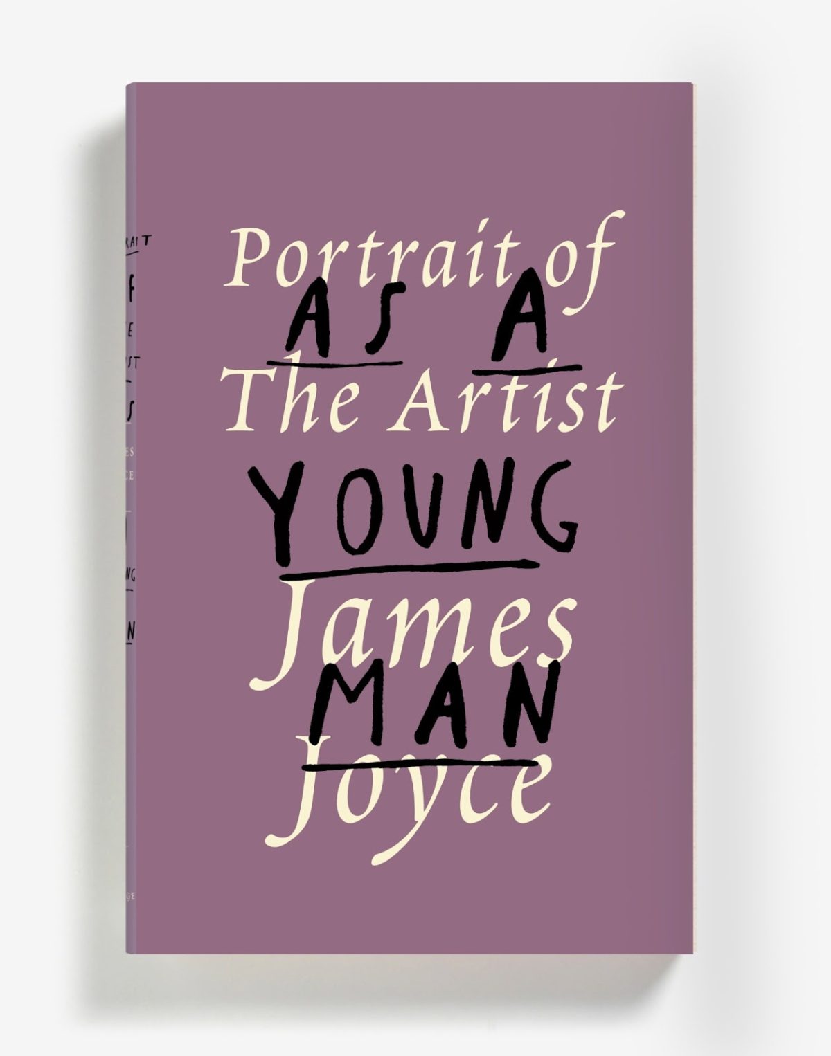
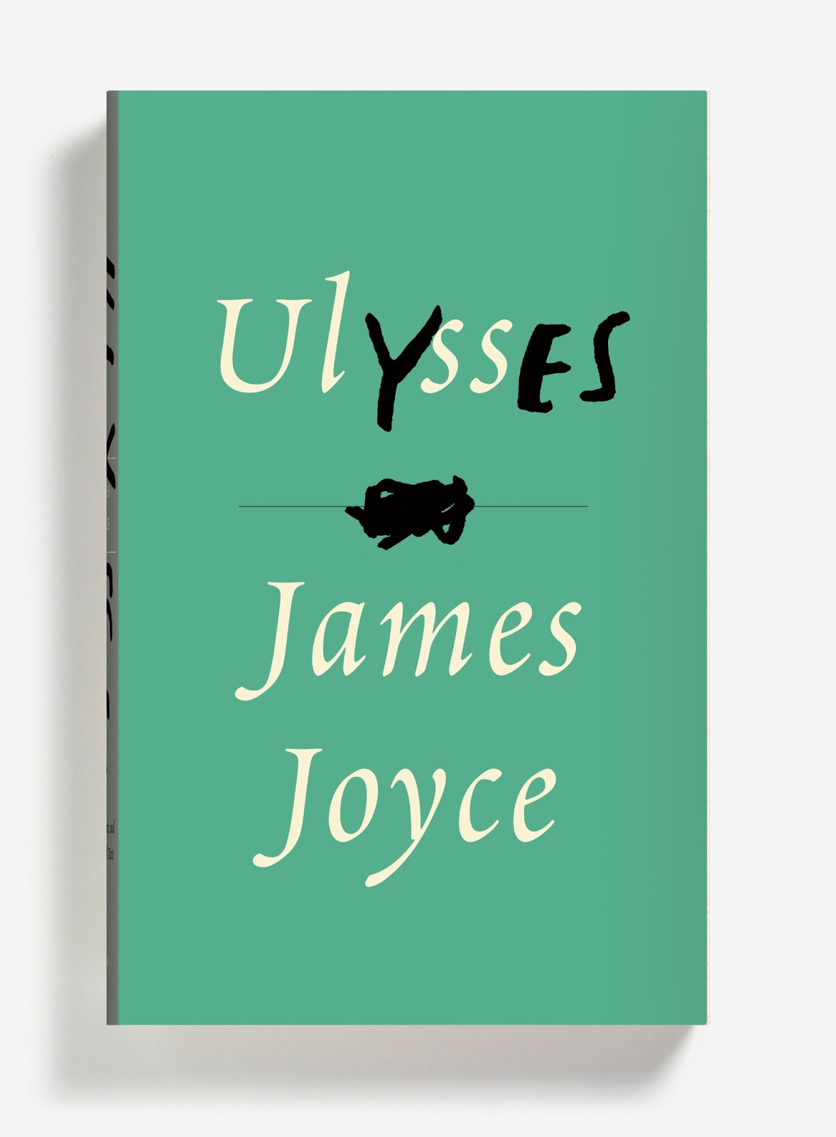
Three new James Joyce cover designs, and one extraordinary post by Peter Mendelsund. Brilliant stuff…
The Box — Author Michael Chabon on the films of Wes Anderson at the NYRB Blog:
Anderson’s films have frequently been compared to the boxed assemblages of Joseph Cornell, and it’s a useful comparison, as long as one bears in mind that the crucial element, in a Cornell box, is neither the imagery and objects it deploys, nor the Romantic narratives it incorporates and undermines, nor the playfulness and precision with which its objects and narratives have been arranged. The important thing, in a Cornell box, is the box… All movies, of course, are equally artificial; it’s just that some are more honest about it than others. In this important sense, the hand-built, model-kit artifice on display behind the pane of an Anderson box is a guarantor of authenticity; indeed I would argue that artifice, openly expressed, is the only true “authenticity” an artist can lay claim to.
The Same Curious Brain — A profile of author and artist Oliver Jeffers, at the National Post:
Jeffers doesn’t just tell stories. He’s an artist — paintings, printmaking, collage — and a commercial and editorial illustrator, with clients ranging from Anthropologie and Weight Watchers to the Guardian and Newsweek. His monograph Neither Here Nor There, which was published last summer, is a collection of his non-children’s work — a bust of Darth Vader; a satellite crash-landed in a cornfield; a hammer nailed to a wall — though it still feels like part of the same universe. Jeffers prefers it this way.
“My books are all about telling stories, and a lot of my art is about asking questions,” he says. “But they’re equally extensions of the same curious brain.”
And finally…
The Spy Novelist Who Knows Too Much — a New York Times story about the decidedly nasty-sounding 83-year-old French pulp novelist Gérard de Villiers so implausibly bonkers it probably has to be at least partially true:
Last June, a pulp-fiction thriller was published in Paris under the title “Le Chemin de Damas.” Its lurid green-and-black cover featured a busty woman clutching a pistol, and its plot included the requisite car chases, explosions and sexual conquests. Unlike most paperbacks, though, this one attracted the attention of intelligence officers and diplomats on three continents… “It was prophetic,” I was told by one veteran Middle East analyst who knows Syria well and preferred to remain nameless. “It really gave you a sense of the atmosphere inside the regime, of the way these people operate, in a way I hadn’t seen before.”
And it gets better from there…
Comments closed

A bit late in the day on this, but the British edition of HHhH by Laurent Binet, designed James Paul Jones Senior Designer at Vintage Books, is quite something. The book was recently released in paperback in the UK.
And, if you’re curious, the North American edition designed by Rodrigo Corral looks like this:

The Language Policy — Further thoughts from Tim Parks on the role of editors, at the NYRB Blog:
As readers, it seems, we love to feel we are in direct, unmediated contact with an especially creative, possibly subversive mind and that we are getting all of its quirks and qualities unmediated and unmitigated by the obtusity of lesser folks perversely eager to return everything to the expected and mundane. This is no doubt why so little is said about editing even in the more learned papers, while nothing at all appears in the popular press, let alone at a promotional level. One cannot imagine, for example, a publisher launching an advertising campaign to boast that it has the most attentive copy editors in the business and can guarantee that everything you may read from its list has been properly purged of anything grammatically iffy, or foreign, or idiosyncratic.


Numbers — Rick Poyner on The Book of Numbers created by Herbert Spencer Spencer in collaboration with his daughter, Mafalda:
The concept is simple enough. “We live in a world full of numbers: on houses and shops, on buses and motor cars, on magazines and packages, on stamps and labels, in fairgrounds and markets, on boats and aeroplanes, on road signs and posters,” write the Spencers. A series of photographs documents the occurrence of the numbers 1 to 100 going about their business somewhere out there in the world. Most numbers — seen on a showcard, a trash can, a hanging sign, a ceramic tile, a bus stop — receive their own images. In a few cases, such as house numbers and a set of maps, several consecutive numbers form a photogenic group within the same picture.
(It sounds fantastic).
And finally…
Colin Dickey on the haunted hotels of Los Angeles, at the Virginia Quarterly Review:
Comments closedAll hotels are haunted. It doesn’t matter which hotel; it’s already played host to a murder, an overdose, an accidental death with a story. You’re kidding yourself if you don’t see this, if you don’t recognize you sleep with ghosts. Every hotel staff has its stories, any cleaning woman or bellhop knows the score. In Wilkie Collins’ 1878 gothic novel The Haunted Hotel, an Italian villa is converted to a hotel shortly after it houses an unexplained, horrific tragedy. On opening night, a guest (“not a superstitious man”) takes Suite 14, and leaves hurriedly the following morning. The next night another couple take the suite; throughout the night the woman has horrifying dreams—awake, “afraid to trust herself again in bed,” she too makes excuses and leaves.
Assume, then, that every nightmare you’ve ever had in a hotel was a cry for help, some violence from the past reaching out to you.

The Bell Jar by Sylvia Plath was first published in 1963 under the pseudonym Victoria Lucas. To mark the book’s 50th anniversary, Faber & Faber have posted a series of fascinating video interviews with Shirley Tucker, who designed the cover of their original 1966 edition.

After studying graphic art at the Royal College, Tucker spent several years working in Penguin’s design department, then headed by the distinguished German designer Hans Schmoller. She joined Faber in 1959 and worked alongside another great German emigre typographer, Berthold Wolpe (who created the Albertus typeface used on many of Faber’s typographic covers). Tucker worked in Faber production department until her retirement in 1987.
Shirley Tucker on Designing Book Covers:
Shirley Tucker on her Favourite Faber Covers:
Shirley Tucker on Berthold Wolpe:
1 Comment
The Many Lives of Donald Westlake — Michael Weinrab on the work of Donald Westlake, for Grantland:
The Outfit is 213 pages, which is actually somewhat long by the standards of the early Parker novels. There are 24 Parker titles in all, and most of the early ones are tight little symphonies of spare and rigid prose, split into four distinct movements; they somehow manage to adhere to a rough formula and still blow your hair back every time. Their tone is brutal and unsentimental, and their themes are Nietzschean to the extreme: People act, without adverbial accompaniment, and the whys and wherefores are utterly beside the point. The protagonist is a career criminal, a sociopathic utilitarian who despises small talk. When someone asks him if he had a good flight to his destination, he thinks, This wasn’t a sensible question. He is concerned entirely with the successful execution of crimes and with his own self-preservation amid this process. One memorable chapter ends with the line, “He buried him in the cellar in the hole the kid had dug himself.”
The Parker novels, written by Westlake under pseudonym Richard Stark, have been republished by the University of Chicago Press, with covers designed by David Drummond.
Simulations — Tim Maughan on Extreme Metaphors, a new collection of interviews with J.G. Ballard, at Tor.com:
You can perhaps argue that Ballard missed the big change that was to come just years after his death—the apparent crisis of global capitalism, the shift of industrial and financial production towards the east, and the tightening pressure on the suburban middle classes that this would result in. But the kicking back against these pressures, in the form of the online rebellion and well mannered protest of Anonymous and the Occupy movement, seem to fit perfectly into this description. Both are, in many ways, more of a simulation of a protest than an actual protest themselves—one involves doing little more than clicking a mouse, the other seemingly owing more to music festivals and camping than to hard-fought political resistance.

Let It Bleed — An interview with cartoonist Yoshihiro Tatsumi at Hazlitt:
The parents were really up in arms about these bad books. Manga at that time was different than it is now. It was friendly manga, so little kids could read it too… On the page you have the same number of panels, the people move from left to right and they’re all the same size and it all looks the same on the page… There was no movement or anything like that. We took inspiration from movies, doing zoom shots or close-ups. Using the camera. We wanted to use these techniques in manga, really violent movement. We were trying to move the panels in a realistic kind of way, to make work without lies, true work.
Tatsumi, Eric Khoo’s 2011 film based on Tatsumi’s memoir A Drifting Life, is currently showing at the Lightbox in Toronto.
And finally…
The Names Change But… The conclusion to Mark Medley’s fascinating series on House of Anansi, ‘A Publisher’s Year’, at the National Post:
Comments closed“The truth about publishing is that publishing houses change their names and identities all the time. It’s the nature of this perilous trade. When I started in the business there was a Collins, and there was a Harper & Row. I can’t even remember when it became HarperCollins. There was Doubleday Canada, and all of its imprints, and there was a Random House, and all of its imprints…”
Publishers fail and new publishers emerge to take their place.