Skip to content

Category: Books

How Do Novels Get Translated?

novels-translated-tom-gauld
A: Tiny Robots. Always.

(Tom Gauld)

Comments closed

Tove Jansson: Love, War and the Moomins

9781897299197_cfl

At BBC News, Mark Bosworth looks at the life of artist and writer Tove Jansson:

Tove Jansson grew up in an artistic household in Helsinki. Her father, a Swedish-speaking Finn, was a sculptor, her Swedish mother an illustrator.

While her mother worked, Tove would sit by her side drawing her own pictures. She soon added words to the images. Her first book—Sara and Pelle and the Octopuses of the Water Sprite—was published when she was just 13.

She later said that she had drawn the first Moomin after arguing with one of her brothers about the philosopher Immanuel Kant. She sketched “the ugliest creature imaginable” on the toilet wall and wrote under it “Kant”. It was this ugly animal, or a plumper and friendlier version of it, that later brought her worldwide fame.

Jansson studied art in Stockholm and Helsinki, then in Paris and Rome, returning to Helsinki just before the start of World War Two.

“The war had a great effect on Tove and her family. One of her brothers, Per Olov, was in the war. They didn’t know where he was, if he was safe, and if he was coming back,” says Boel Westin, a friend of Jansson’s for 20 years and a Professor of Literature at Stockholm University.

Jansson’s first Moomin book—The Moomins and the Great Flood—was published in 1945, at the end of this difficult and nerve-wracking period, with Comet in Moominland following soon afterwards.

“Tove’s anxiety and grief are embedded in the first two books. She was depressed during the war and this is mirrored in those books because they are about catastrophes,” says Westin.

Comments closed

Recent Covers of Note March 2014

9781408857229
The Arsonist by Sue Miller; design by Greg Heinimann

barcelona-shadows
Barcelona Shadows by Marc Pastor; design by Clare Skeats

beauty
Beauty by Frederick Dillen; design by Christopher Lin

Mabey Dreams
Dreams of the Good Life by Richard Mabey; illustration by Millie Marotta; design Samantha Johnson / Coralie Bickford-Smith

fantomes_fument_c1
Les fantômes fument en cachette by Miléna Babin; design by David Drummond

frog music
Frog Music by Emma Donoghue; design by Katie Tooke; illustration Emma Farrarons

give-me-everything-you-have
Give Me Everything You Have by James Lasdun; design by Julia Connolly

9780374175344
The Improbability Principle by David J. Hand; design by Oliver Munday

metamorphosis
Metamorphosis by Franz Kafka; design by Jamie Keenan

13068415704_287b75914a_b
The New New Thing by Michael Lewis; design by Darren Haggar

on-the-reproduction-of-capitalism
On the Reproduction of Capitalism by Louis Althusser; design by Neil Donnelly

9780374209148-gabriele-wilson
The Orchard of Lost Souls by Nadifa Mohamed; design by Gabriele Wilson

swan-gondola-9781780744902
The Swan Gondola by Timothy Schaffert; design by Alex Merto

9781250039569
The Trip to Echo Spring by Oliva Laing; design by Henry Sene Yee

why-we-took-the-car-design-allison-colpoys
Why We Took the Car by Wolfgang Herrndorf; design by Allison Colpoys

This slideshow requires JavaScript.

3 Comments

Stephen Page: Past, Present and Future

The Bookseller has posted an edited transcript of a recent speech by Stephen Page, chief executive of Faber & Faber, at the IPG and Publishing Scotland conferences:

One joy of digital is that it promotes thinking about all incarnations of reading, from the insubstantial to the disposable to the luxurious. We’re back to a place where we must imagine all the means we have of expressing value for a text. Where a reader will buy a £100 edition, let’s make that, and a 99p e-book where that’s appropriate… In the future we’ll spend a lot more time talking and listening to consumers. Whether they’ll listen will depend on our skills and the degree of fandom for the writer. If we’re successful, we’ll get a conversation going among consumers, and if we’re really skilful they’ll come back to talk some more. Having the systems and skills to do this will be the core to a publisher’s commercial opportunity, alongside taste.

Comments closed

Wes Anderson and Stefan Zweig

society-of-crossed-keys

At The Telegraph, film-maker Wes Anderson discusses the influence of Stefan Zweig on his new movie The Grand Budapest Hotel with Zweig biographer George Prochnik (author of the forthcoming Stefan Zweig at the End of the World):

There’s a wonderful photochrom of the hotel that I always thought of as sort of the model for our hotel, which is the Hotel Pupp in Karlovy Vary, which was in Carlsbad. The thing we learned when we visited all sorts of places that we found on this collection of pictures was that none of them were enough like what they once were to work for us. But the photochrom images seemed to tap into a truth about Zweig’s vision of the world that I was able to draw on in developing a visual aura for the film.

In The Post Office Girl, Zweig’s description of the grand hotel in Switzerland is so evocative. The protagonist is a girl who works in the post office. She’s invited to stay in this hotel as a gift from her rich aunt, and when she arrives in this place, the management thinks she’s there to make a delivery. Her suitcase is a basket. Finally they realise she’s actually going to be a guest in the hotel, which is unlike anywhere she’s ever been. Her point of view about this treatment she receives, and her experience of walking in and realising, “This is where I’m going to sleep”, is so powerful. But also that by the time her holiday abruptly ends, she is already addicted to this other way of life, and her existence is so dramatically changed, and a sort of desperation comes over her — and then a connection she makes with someone who is in his own desperate state. The idea of that work being something that had been out of print for that long is sort of surreal.

At a recent event at the New York Public Library, Anderson similarly discussed Zweig’s work with Paul Holdengräber:


UK publisher Pushkin Press has recently published The Society of the Crossed Keys a selection of Zweig’s writings that inspired Anderson. The cover illustration (pictured top) is by Nathan Burton (whose covers for Alma Classics I mentioned here yesterday). Pushkin have reissued a number of Zweig’s books with covers by Burton, Petra Börner, and David Pearson.

Grand-Budapest-Hotel-Poster

The movie itself was reviewed all over place the last week, but I quite enjoyed Richard Brody’s review for The New Yorker:

Perhaps more than ever, Anderson takes a joyful yet aching delight in recreating the styles of bygone days. The hotel is like a majestically confected cake on the outside and a jewel box on the inside, adorned with staff and guests whose uniforms and fashions are nuanced to the buttons, and whose behavior is self-controlled to the glance. Yet also, more than in any of his other films, that very recreation is his subject. “The Grand Budapest Hotel” is about the spiritual heritage and the political force of those long-vanished styles—about the substance of style, not just the style of his Old World characters but also, crucially, Anderson’s own. This isn’t Anderson’s most personal film, in the strict sense, but it is, alongside “The Life Aquatic with Steve Zissou,” his most reflexive one—even more so because the new film exposes the inner workings not just of his practice of filmmaking but of his sensibility.

UPDATE: Creative Review talks to the film’s lead graphic designer Annie Atkins about her work:

We actually used comparatively few typefaces in the movie, as most lettering was created by hand. Wes and Adam had been on location recces all around Eastern Europe and had references of all kinds of hand-made signage from the last 100 years or so. The beautiful thing about period filmmaking is that you’re creating graphic design for a time before graphic designers existed, per sé. It was really the craftsmen who were the designers: the blacksmith designed the lettering in the cast iron gates; the glazier sculpted the lettering in the stained glass; the sign-painter drew the lettering for the shopfronts; the printer chose the type blocks for the stationery…

… My absolute favourite piece is the book itself that opens the story. It’s a modern pink hardback with a drawing of the hotel on the front, and the name of the movie as the hotel sign. It’s a relatively simple piece, but it’s really special having a prop that you made with the movie’s name on it like that. I remember Wes had sent me a quick sketch showing his idea for the book, and I really loved being able to help make that work for him. I treasure that piece, actually – we made three for the shoot, in case one got dropped in the snow, and so I brought one home with me.

grand-budapest-hotel-book

2 Comments

Alma Classics by Nathan Burton

9781847493828

Nathan Burton’s new covers for Alma Classics are rather nice.

9781847493538
9781847493781
9781847493774
9781847493712

You can see a couple more at Nathan’s blog.

3 Comments

The Academy of British Cover Design Winners

The Academy of British Cover Design held its inaugural awards ceremony last night. The competition was open to any cover produced for a book published between January 1 and December 31 2013 by a designers based in the UK. Here are the winning cover designs in each of the 10 categories:

Children’s

charm-and-strange
Charm and Strange by Stephanie Kuehn; design by Sharon King-Chai

Young Adult

Tinder
Tinder by Sally Gardner; design by Laura Brett

Sci-Fi / Fantasy

i-robot
I, Robot by Isaac Asimov; design by Clare Skeats

Mass Market

scent-of-death
The Scent of Death by Andrew Taylor; design by Emma Rogers

Literary Fiction


Tampa by Alissa Nutting; design by Gray318

Crime / Thriller

81V5+2E42cL._SL1500_
Tequila Sunset by Sam Hawken; design by Tony Lyons at Estuary English

Non-fiction

football-type
Football Type; design by Rick Banks at Face37

Series Design

tender-is-the-night
 F. Scott Fitzgerald paperbacks; design by Sinem Erkas (pictured: Tender is the Night)

Classics / Reissue


1984 by George Orwell; design by David Pearson

Women’s Fiction

instructions-for-a-heatwave
Instructions for a Heatwave by Maggie O’Farrell; design by Yeti McCaldin

2 Comments

Herzog and the Monsters

herzogandthemonsters_smallimage3
How is that I’ve not seen Herzog and the Monsters before now? Lesley Barnes‘ lovely 2006 short animated film, made at the Glasgow School of Arts, has just about all you could wish for: “a small boy who steals words, a forest full of monsters and lots of vintage penguin books.”

Barnes’ music video for I Didn’t See It Coming by Belle and Sebastian is also charming:

(via The Dissolve)

Comments closed

Tove Jansson: The Hand That Made the Moomins

9781770461345
At The New Yorker, James Guida reviews Tove Jansson: Life, Art, Words: The Authorized Biography by Boel Westin, and Jansson’s memoir of childhood Sculptor’s Daughter (both published by Sort of Books):

Writing the Moomins afforded an escape at war’s end. After a quiet start, the series took off in the fifties, bringing welcome financial stability—but the success also represented a kind of detour. Jansson’s ambitions for painting never left her. Now free time was scarce, thanks to an unceasing flow of fan mail, the minutiae of merchandising, processions of visitors, and, until Lars, one of her brothers, took over, the arduous demands of the comic strip. For a while, there was no pleasure to be found in working. Thankfully, social media didn’t exist yet: “I could vomit over Moomintroll,” she wrote. “I shall never again be able to write about those happy idiots who forgive one another and never realize they’re being fooled.”

As with someone like Kafka, it is hard to know how literally to take Jansson’s obstacles. To some degree, her entrapment was avoidable: to be so involved in the products, to answer every letter, seem Moominish ideas—either that or, for a person who so prized being left free and alone, they’re plain masochistic. Were an analogous scenario to occur in the books, the hassles would be washed away by flood, to be followed by a celebratory picnic. As it was, Jansson believed that her nature didn’t give her a choice.

moomins-desert-island
On related note, Montreal’s Drawn Quarterly have just published two new paperback books in their lovely series of classic Moomin comic strips reworked in full colour, Moomin and the Golden Tail and Moomin’s Desert Island (pictured above).

(NB: the Moomin storybooks, published by FSG, and the Moomin comic books, published by D+Q, are distributed by my employer Raincoast Books. Sorry I seem to be doing this so much lately!)

Comments closed

Morale

morale
In light of my previous post about how awful being a writer is, Tom Gauld‘s latest cartoon for The Guardian seems strangely appropriate…

Comments closed

Writing and the Cost of Living

mfc_vs-nyc

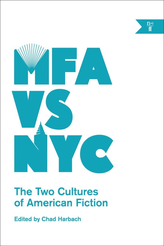
I finally just got around to reading Emily Gould‘s spiralling essay on writing and debt ‘How much my novel cost me‘ over the weekend. It’s an excerpt from the new n+1 book MFA vs NYC edited by Chad Harbach (author of The Art of Fielding), which seems like it could be essential reading for idealistic folks wishing to pursue writing as a career:

IT’S HARD TO WRITE ABOUT BEING BROKE because brokeness is so relative; “broke” people run the gamut from the trust-funded jerk whose drinks you buy because she’s “so broke right now” to the people who sleep outside the bar where she’s whining. But by summer 2012 I was broke, and in debt, and it was no one’s fault but mine. Besides a couple of freelance writing assignments, my only source of income for more than a year had come from teaching yoga, for which I got paid $40 a class. In 2011 I made $7,000.

During that $7,000 year I also routinely read from my work in front of crowds of people, spoke on panels and at colleges, and got hit up for advice by young people who were interested in emulating my career path, whose coffee I usually ended up buying after they made a halfhearted feint toward their tote bag–purses. I felt some weird obligation to them and to anyone else who might be paying attention to pretend that I wasn’t poor. Keeping up appearances, of course, only made me poorer. I’m not sure what the point of admitting all this might be, because I know that anyone who experiences a career peak in his mid-twenties will likely make the same mistakes I did, and it’s not even clear to me that they were all mistakes, unless writing a book is always a mistake, which in some sense it must be.

Interestingly, Robert McCrum touches on the financial difficulties of older authors in an article for this weekend’s The Observer

To writers of my generation, who grew up in the age of Penguin books, vinyl records and the BBC, it’s as if a cultural ecology has been wiped out. For as long as most of us can remember, every would-be writer knew the landscape of the printed word. This Georgian square was home to publishing grandees (now retired). On that high street were the booksellers (now out of business). In those twisting back streets, you could expect to find literary agents working the margins with the injured innocence of pickpockets at a synod. It was a mutually dependent ecosystem.

Publishers were toffs, booksellers trade and printers the artisan champions of liberty. Like the class system, we thought, nothing would change. The most urgent deadline was lunch. How wrong we were. The years 2007-2010 are pivotal: first… came the credit crunch. And it occurred at the very moment that the IT revolution was wrecking the livelihoods of those creative classes – film-makers, musicians and writers of all sorts – who had previously lived on their copyrights.

Gould is self-recriminating. McCrum — a former editor-in-chief at Faber and Faber — is nostalgic for a time I don’t remember (things were always better in the ‘old days’ in publishing circles). For Gould the internet is a double-edged sword — a platform and a distraction — for McCrum it has brought nothing but woe. Both seem to agree, however, that nobody is making any money, “marketing types” are awful (aren’t they though?), and being a writer is not all it’s cracked up to be…

friendship_gould

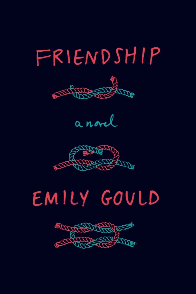
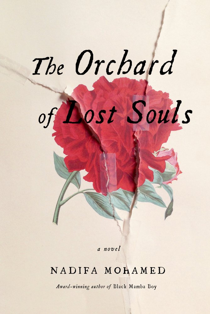
Coincidently, Emily Gould’s new novel Friendship will be published in the US and Canada by Farrar, Straus & Giroux on July 1 (and a couple of days later in the UK by Virago). I’m not sure who designed the cover, but it is rather nice.

(NB: FSG, and n+1 / Faber & Faber are distributed in Canada by my employer Raincoast Books)

UPDATE: Leslie Jamison, author of the forthcoming essay collection The Empathy Exams (published by Graywolf Press, also distributed in Canada by Raincoast — sorry), reviews MFA vs NYC  for The New Republic:

Writers throughout these essays face the shame of privilege and the specter of poverty: They join magazine mastheads to keep from going broke, or they teach to keep from going broke, or else they actually do go broke—they’re broke in Brooklyn and broke in Los Angeles. Eli Evans evokes his years living in a “warehouse on Pico and Fourth” in one perfect image, one of the most remarkable moments in the entire collection: “I once found a baby rattlesnake strangled with electrical wire and tied to a signpost.” This baby rattlesnake, apparently, is what dreams become…

1 Comment

Fred the Clown: Book Review

fred_079-Book-Review
By Roger Langridge. I’ve read reviews like this (except the bit about liking books usually comes at the beginning).

Comments closed