Skip to content

Category: Books

Penguin Short Stories

Penguin book of the British Short Story Tom Gauld

Cor Blimey! Tom Gauld for The Guardian.

And, if you’re curious, the rather splendid covers for the actual two volumes of The Penguin Book of the British Short Story were designed by Matthew Young:

2 Comments

Robert Hughes on Robert Rauschenberg

9781400044450

The New York Review Books has an excerpt from the late Robert Hughes’s unfinished memoir — to be published for the first time this month by Knopf in The Spectacle of Skill: Selected Writings of Robert Hughes — on artist Robert Rauschenberg:

Rauschenberg’s references to other media aren’t just tricks. They’re an integral part of the way he connects the language of his images to that of a wider world. Collagists had always done this, ever since the invention of collage. Braque and Picasso brought newspaper clippings and headlines into their images, though these had to be scaled to the actual size of the printed page—you couldn’t effectively do a cubist collage six feet high, it would need too many elements.

The same was true of Kurt Schwitters, with his bus tickets and cigarette wrappers and bits of wood or rusty iron. But around 1962, Rauschenberg began to use not things but the images of things. He gathered photos and enlarged them into silk screens, so that they could be printed directly on the canvas. This had two main effects. First, it enormously increased his image bank, because just about everything in the world, from mountains to beetles, from spermatozoa to Thor-Agena rockets, has been photographed. And second, by reusing silk-screened images from one painting to the next, it let him use repetition and counterpoint across a series of works in a way that wasn’t possible, or not easily possible, if he had been using things themselves. In doing this, he was adapting to the great central fact of American communication, its takeover by the imagery of television.

Comments closed

Dammit!

Dammit

Tom Gauld.

Comments closed

Picador Twentieth Anniversary Modern Classics

Virgin Suicides_rounded


Originally founded in 1995 as a publishing house for sophisticated hardcovers and reprint paperbacks, Picador USA is celebrating its twentieth anniversary this month with a set of four small limited edition modern classics with covers designed by Kelly Blair. Printed on pearlized cream stock, with rounded corners and colourful full-bleed imagery, the books look like exquisite pocket-sized treats.

According to creative director (and long-time friend of the blog) Henry Sene Yee, the books were the brainchild of Stefan von Holtzbrinck, head of Macmillan Publishing. “With Picador’s 20th Anniversary approaching, Stefan wanted us to celebrate it with some special printings. There were these tiny volumes in Europe that caught his eye, and he wanted us to do something like that.”

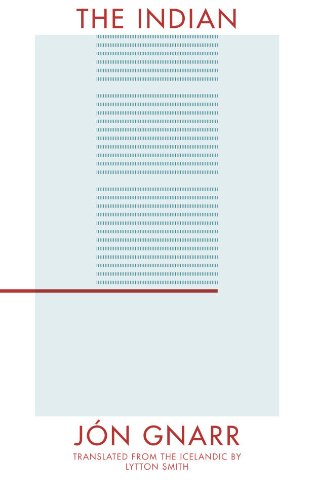
While still deciding which titles to include, and on the exact format and size, Henry worked out some early ideas in a notebook-sized format, using lines and shapes to represent the theme or narrative of each book. Facing a tight deadline however, Henry didn’t have time to finish the project by himself. He had a difficult decision to make. “Giving away a dream project is the hardest thing to do, but you have to be selfless and match up the best talent with the books.”

Henry, who has been at Picador from the very beginning, was determined to acknowledge the art department’s contribution to the publisher’s history. “One of my very first assistants was Kelly Blair. She is a brilliant designer and illustrator, and is now herself an Art Director at Pantheon / Knopf. If this project was going to celebrate the history of Picador and I couldn’t design it myself, I thought it should be someone who was there with me at the very beginning. Kelly made poetic sense, and made it feel better about letting go. A little.”

Kelly’s initial ideas included illustrations and some all-type solutions. “All were great,” says Henry, “but Kelly wanted to send me one more last-minute idea even though she wasn’t sure she liked it as much as her first ones. Of course that was the one we all loved and printed! Sometimes when a solution seems simple, we doubt its value.”

In addition to the new covers, Steven Seighman redesigned and re-typeset each book making them easy and inviting to read, even at the smaller size. “Even though they look great online,” says Henry, “it’s not until you have the actual wrapped and bound book in your hands that you appreciate its power and the beauty of print in the small format size.”

Steppenwolf_rounded

Housekeeping_rounded

Jesus Son_rounded

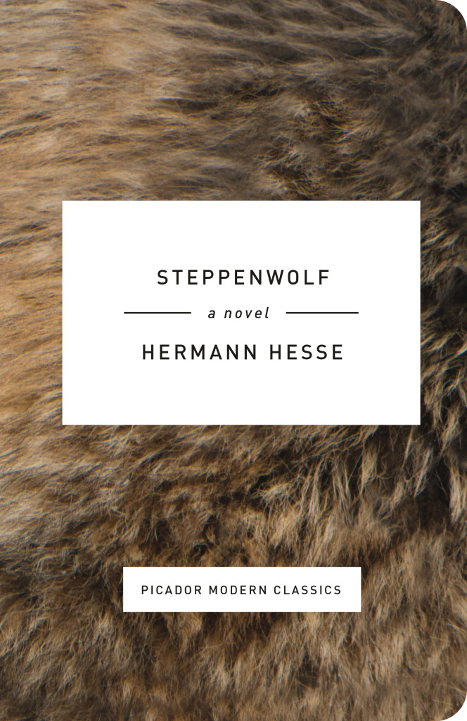
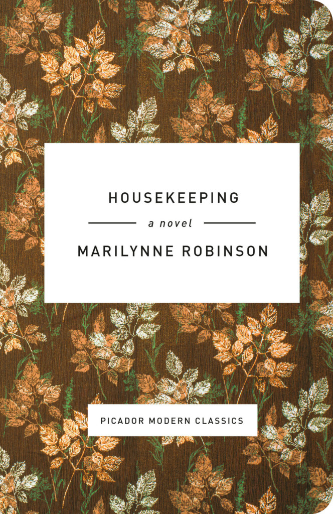
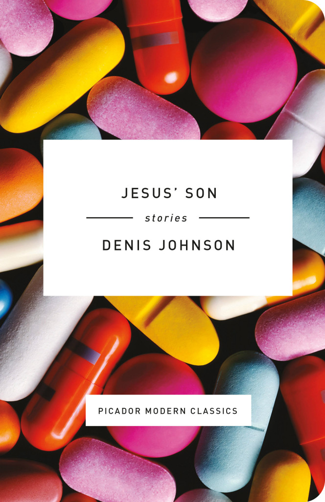
The Twentieth Anniversary Picador Modern Classics — Housekeeping by Marilynne Robinson, Jesus’ Son by Denis Johnson, Steppenwolf by Herman Hesse, and The Virgin Suicides by Jeffrey Eugenides — were published last week in the US. Thanks to art director Henry Sene Yee for talking to me about the project. 

Comments closed

Book Covers of Note November 2015

Next month I’ll say goodbye to 2015 with my annual list of my favourite covers of the year. Until then, here’s November’s book covers of note, my last monthly covers post for the 2015:

baddeley brothers design David Pearson
Baddeley Brothers by The Gentle Author; design David Pearson (October 2015)

9780374166670
The Big Green Tent by Ludmila Ulitskaya; design by Devin Washburn (FSG / November 2015)

(I previously included Devin’s cover in my November 2014 post before discovering that publication had been postponed until 2015. It’s so good that I figure it deserved a second shot now the book is finally coming out this month.)

A Brief History of Seven Killings Special Edition design James Paul Jones
A Brief History of Seven Killings by Marlon James (Special Edition); design James Paul Jones (Oneworld / November 2015)

Book of Magic design Matthew Young
The Book of Magic by Brian Copenhaver; design Matthew Young (Penguin / November 2015)

Dont Suck Dont Die design by Lindsay Starr
Don’t Suck, Don’t Die: Giving Up Vic Chesnutt by Kristin Hersh; design by  Lindsay Starr (University of Texas; October 2015)

Drinking in America Rex Bonomelli
Drinking in America by Susan Cheever; design by Rex Bonomelli (Twelve Books / October 2015)

Early Stories of Truman Capote design David Pearson
Early Stories of Truman Capote; design by David Pearson (Penguin / November 2015)

Eternal Zero design by Peter Mendelsund
The Eternal Zero Naoki Hyakuta; design by Peter Mendelsund (Vertical / November 2015)

Hausfrau design by Gabrielle Bordwin Photographer Mihaela Ninic
Hausfrau by Jill Alexander Essbaum; design by Gabrielle Bordwin; Photographer Mihaela Ninic (Random House / August 2015)

Home is Burning design by Rodrigo Corral
Home is Burning by Dan Marshall; design by Rodrigo Corral (Flatiron / October 2015)

Just an Ordinary Day design Edel Rodriguez

Just an Ordinary Day by Shirley Jackson; design Edel Rodriguez (Random House / August 2015?)1

Let Me Tell You design by Edel Rodriguez
Let Me Tell You by Shirley Jackson; design by Edel Rodriguez (Random House / August 2015)

The Mare design by Oliver Munday
The Mare by Mary Gaitskill; design by Oliver Munday (Pantheon / November 2015)

Mass Disruption design CS RIchardson
Mass Disruption by John Stackhouse; design by Scott Richardson (Random House Canada / October 2015)

Norwegian Wood
Norwegian Wood by Lars Mytting; design by John Gall (Abrams / October 2015)

Only Street in Paris design by Strick&Williams
The Only Street in Paris by Elaine Schiolino; design by Strick & Williams (W.W. Norton / November 2015)

The Reflection design by Adly Elewa
The Reflection by Hugo Wilcken; design by Adly Elewa (Melville House / September 2015)

busylife_cover_hi-res
Some Recollections of a Busy Life by T.S. Hawkins; design by Jessica Hische; illustration by Wesley Allsbrook (McSweeney’s / November 2015)

Souffles-Anfas design Anne Jordan and Mitch Goldstein
Souffles-Anfas edited by Olivia C. Harrison and Teresa Villa-Ignacio; design Anne Jordan and Mitch Goldstein (Stanford University Press / November 2015)

Southern Insurgency design by Jamie Keenan
Southern Insurgency by Immanuel Ness; design by Jamie Keenan (Pluto Press / November 2015)

trace design by Debbie Berne
Trace by Lauret Savory; design by Debbie Berne (Counterpoint / November 2015)

Unfaithful Music design by Spencer Kimble
Unfaithful Music & Disappearing Ink by Elvis Costello; design by Spencer Kimble (Blue Rider Press / October 2015)

3 Comments

George Saunders Writing Education

Manner of Being

The New Yorker has a lovely essay by George Saunders, excerpted from a new book called A Manner of Being: Writers on Their Mentors, on his education as a writer:

For me, a light goes on: we are supposed to be—are required to be—interesting. We’re not only allowed to think about audience, we’d better. What we’re doing in writing is not all that different from what we’ve been doing all our lives, i.e., using our personalities as a way of coping with life. Writing is about charm, about finding and accessing and honing ones’ particular charms. To say that “a light goes on” is not quite right—it’s more like: a fixture gets installed. Only many years later… will the light go on.

Comments closed

James Gleick on What Libraries Can (Still) Do

James Gleick (The Information, Faster) on libraries, and James Palfrey’s book BiblioTech: Why Libraries Matter More Than Ever in the Age of Google, at the NYRB Blog:

In the midst of an information explosion, librarians are still the most versatile information specialists we have. And the purest. In his new book, BiblioTech, a wise and passionate manifesto, John Palfrey reminds us that the library is the last free space for the gathering and sharing of knowledge: “Our attention cannot be bought and sold in a library.” As a tradition barely a century and a half old in the United States, it gives physical form to the principle that public access to knowledge is the foundation of democracy.

The problem of libraries now—and it is a problem—involves some paradoxes, which need to be sorted out. For one thing, as Palfrey says, librarians will need to cherish their special talent as “stewards” while letting go of the instinct to be “collectors.” Knowledge in physical form needs to be handled carefully, preserved, and curated. But with digital information pouring into iPhones and Kindles in petabytes—via Twitter and Instagram and YouTube, not to mention Amazon’s self-publishing factories—libraries need to rethink old habits. They cannot collect everything, or even a small fraction of everything. “That model is already too hard to keep up,” Palfrey says. “A network of stewards can accomplish vastly more than a disconnected (even sometimes competitive) group of collectors ever can.”

Comments closed

Liniers in New York

CoverStory-Hipster-Stole-Liniers-876-1200-06183144

The New York Times profiles Argentinian cartoonist Ricardo Siri, better known as Liniers:

“When I started the comic everything was horrible,” Liniers, 41, said in a recent interview at his publisher’s office in SoHo at the start of an East Coast book tour. “The towers fell here,” he said, “and in Argentina there was a huge economic tailspin and we had five presidents in a week. So I wanted to create something optimistic as an act of resistance, like a positive revolution.”

In “Macanudo,” plotlines usually do not extend past the punch line, if one exists at all, and the characters and type of humor can change daily. Penguins, gnomes and an olive named Oliverio are only a handful of the creatures that float in and out of “Macanudo.”

“I like to surprise,” Liniers said. “When readers open up the paper, I don’t want them to know what to expect.”

35361-1

Liniers has two new books out this fall — Macanudo #3, a collection of his newspaper strips published by Enchanted Lion, and Written and Drawn by Henrietta, an original kid’s book published by TOON.

Comments closed

Love Among the Ruins

Jacket design by Cardon Webb; jacket photograph Orgasmic Man by Peter Hujar 1987

At the New York Times, Edmund White examines our enduring fascination with the New York of the 1970s:

Recently there’s been, in TV and film and certainly in books, an intense yearning for a specific five-year period in New York City, those years between the blackout in 1977, and 1982, when AIDS was finally named by the Centers for Disease Control. First was Rachel Kushner’s 2013 novel ‘‘The Flamethrowers,’’ whose heroine is a sharp-eyed bystander in the SoHo art scene, and now… ‘‘City on Fire’’ by Garth Risk Hallberg, which also concerns itself with the same time period. There are two television series in development that take place in the late 1970s as well, one directed by Martin Scorsese and co-written with Mick Jagger; the other by Baz Luhrmann. Next year, the Whitney will mount the first retrospective of David Wojnarowicz, the ultimate East Village grunge artist, in over 15 years; the work of his lover, the photographer Peter Hujar — which has recently been used both for an advertising campaign for the men’s wear designer Patrik Ervell and on the cover of… Hanya Yanagihara’s novel ‘‘A Little Life’’ — will be the subject of a forthcoming retrospective at New York’s Morgan Library.

COLLECTIVELY, THESE WORKS express a craving for the city that, while at its worst, was also more democratic: a place and a time in which, rich or poor, you were stuck together in the misery (and the freedom) of the place, where not even money could insulate you. They are a reaction to what feels like a safer, more burnished and efficient (but cornerless and predictable) city. Even those of us who claim not to miss those years don’t quite sound convinced. ‘‘Well, I sure don’t have nostalgia about being mugged,’’ John Waters told me. Though then he continued: ‘‘But I do get a little weary when I realize that if anybody could find one dangerous block left in the city, there’d be a stampede of restaurant owners fighting each other off to open there first. It seems almost impossible to remember that just going out in New York was once dangerous. Do any artistic troublemakers want to feel that their city may be the safest in America? Who’s going to write a book about walking the safe streets of Manhattan? It’s always right before a storm that the air is filled with dangerous possibilities.’’

m train design carol devine carson
Jacket design by Carol Devine Carson; jacket photograph by Claire Alexandra Hatfield

Similiarly, at the Guardian, Glenn Kenny looks at our obsession with the New York of Lou Reed and Patti Smith:

The New York we aspired to was Lou [Reed]’s, not Liza Minnelli’s, or a little later, Frank Sinatra’s. (The New York we aspired to was also Martin Scorsese’s, too, as it happened, and it’s almost entirely forgotten that it’s in his movie of the same name that the future anthem New York, New York made its first bow.) And these days, “wild side” New York is gazed at in rearview with fervent affection, in works by Edmund White, Patti Smith, Brad Gooch and others. (Not to mention those, like Garth Risk Hallberg or Rachel Kushner, who are too young to have their own memories to work with.) Smith’s books, in particular, seem to have hit a nerve. Her new book M Train is a more impressionistic sequel to her National Book award winning memoir of 2011, Just Kids, which is currently being developed as – weirdly enough, for me and perhaps for her – a Showtime TV miniseries.

The place these books conjure is both very scary, and very exhilarating. Not a place where some kind of arty misfit or wannabe arty necessarily wanted to live, but rather a place where one such creature could live. And hence, a place where one such young creature had to live.

Comments closed

Our Town in Literature: New Fiction by Local Authors

our town in literature tom gauld

Tom Gauld.

Comments closed

The Poster Boys on Penguin Design

Clockwork Orange David Pelham

This month on the Poster Boys podcast, designers Brandon Schaefer and Sam Smith look back at 45 years of Penguin design history from the early years of the company under the direction of typographer Jan Tschichold to the work of art director David Pelham in the 1970s. Inspired by David Pelham’s famous design for the cover of A Clockwork Orange, Sam and Brandon also take a look at the artwork for Stanley Kubrick’s film adaptation of Anthony Burgess’s cult novel:

Poster Boys Episode 11: Penguin mp3

You can download the podcast from the Poster Boys website, or you can subscribe in iTunes.


Comments closed

Deep Vellum Book Cover Design by Anna Zylicz

Mountain and the Wall Full design by Anna Zylicz

At the Toronto launch of John Freeman’s new anthology last night — encouragingly called ’10 Reasons to Not Shoot Yourself in the Face Over the State of Literature’ — Literary Hub‘s Jonny Diamond mentioned design as a reason to be optimistic about current state of publishing. In particular, Jonny called out the book covers of Deep Vellum, a Dallas-based literary non-profit that publishes literature in translation.1 The covers, designed by Anna Zylicz, are strange, minimal, and instantly recognizable. There’s something of a hard-edged Peter Saville feel to them. I especially like the cover for Sphinx by Anne Garréta. Anna Zylicz is clearly a designer to watch.

sphinx design by Anna Zylicz

Mountain and the Wall design by Anna Zylicz

Calligraphy Lesson by Anna Zylicz

Indian design by Anna Zylicz

1 Comment