Tom Gauld for The Guardian.
Tom’s new graphic novel, Mooncop, will be published by D+Q next month.
Comments closedBooks, Design and Culture

At Observer, Penguin creative director Paul Buckley, talks about his new book Classic Penguin: Cover to Cover. I particularly enjoyed this epic rant on designing covers for new books:
New books, this piece of writing, everything is riding on that new cover. Is the mood right? Does the imagery hint at what is going on in the text? Did you tell too much? Did you tell too little? Yes, it takes place in the winter, but we want it as a summer read, so try to avoid seasons; she would never dress like that, or maybe she would, but it makes an off-putting cover; I know everyone in the book dies – but that image is so depressing no one will buy it; is the author’s name prominent enough? The type has to be much, much larger. We understand the word has sixteen letters, make it larger. No, it can’t go sideways, people can’t read sideways. I know spines read sideways, that’s not the same. No, no it’s not, and no, this word cannot be broken. We realize the title is part of the problem, we know it’s confusing, we can’t change it. Ok, the type is too condensed; it’s ok if it goes smaller if we can get a nicer font. Have you tried it sideways? The author hates it sideways and is suggesting you try championing condensed 87, do you have that font? I don’t know who designed this, I think it was one of his students, he asked that we show it to “the art dept;” I know, I know, now I can at least say I did. It’s approved! Sales didn’t like the cover, we have to change it. Was it just one person? Bob, how many in sales disliked the cover? Oh, it was just Jim, he’s always out in left field, never mind, glad I asked. Or, yes it was just Sally, BUT she looooves this book. I know you did too, we all do, we still need a new cover by next Tuesday’s deadline. Huge chain “X” wont commit to this book with this cover, I know we all loved it maybe you can save it for something else, here are some suggestions from the buyer, at least they are trying to be helpful.
You can read my 2009 Q & A with Paul here, and my 2010 interview with Paul and Christopher Brand about their book Penguin 75 here.
1 Comment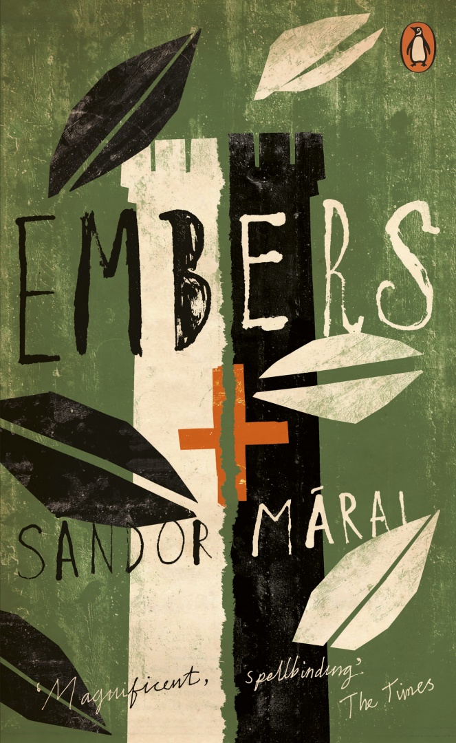
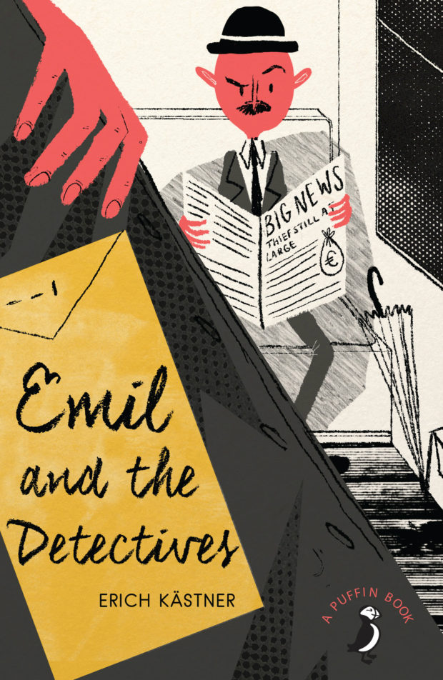
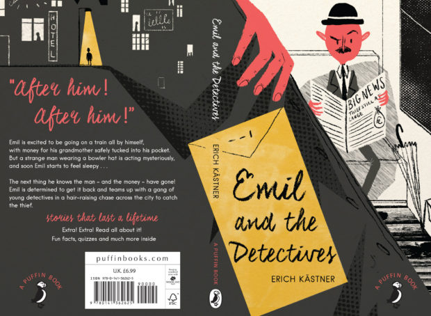
The latest additions to Penguin’s ‘Essentials’ series, released this month, have some rather splendid new covers, including Jon Gray‘s wonderful design for Embers by Sandor Márai, Julian House’s typographic design (with echoes of Robert Brownjohn) for The Spy Who Came in from the Cold, and David Foldvari‘s illustrated design for How Many Miles to Babylon by Jennifer Johnston.


You can see more of the new Penguin Essentials covers, and read about the design process, at Design Week.
Comments closedBack from vacation and back to the grind… August is traditionally a slow month in publishing, but that isn’t to say there aren’t plenty of great covers around at this time of year…

Ashes of Fiery Weather by Kathleen Donohoe; design Brian Moore (HMH / August 2016)
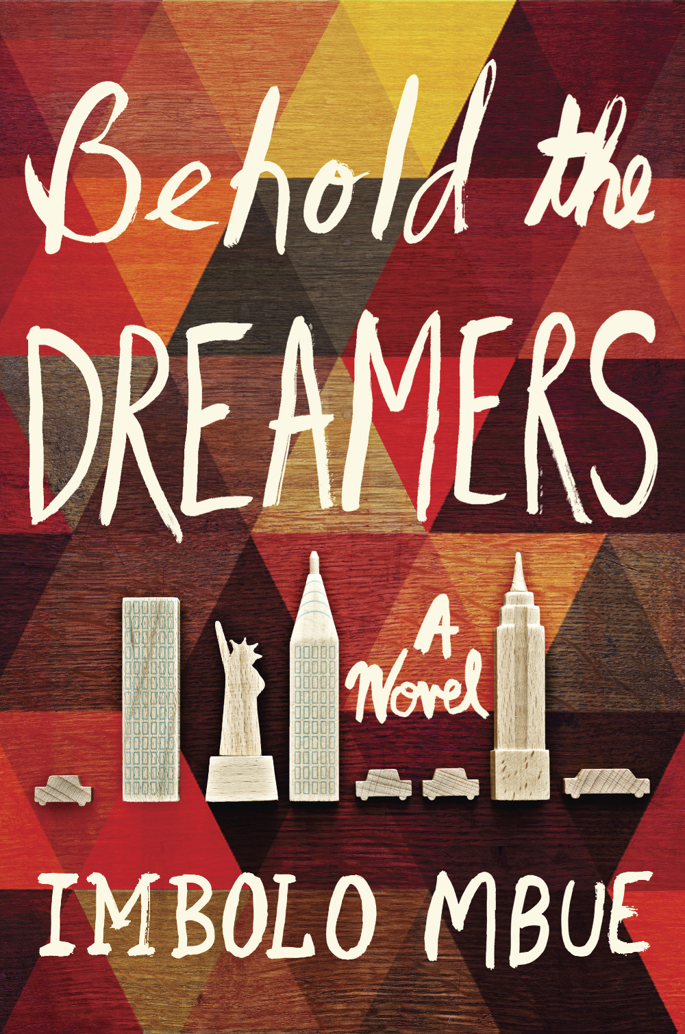
Behold the Dreamers by Imbolo Mbue; design by Jaya Miceli (Random House / August 2016)

The Best Kind of People by Zoe Whittall; design by Alysia Shewchuck (House of Anansi / August 2016)

The Book by Keith Houston; design by David High (W.W. Norton / August 2016)

A Burglar’s Guide to the City by Geoff Manaugh; design by Nayon Cho (Farrar, Straus & Giroux / April 2016)

Compartment N0. 6 by Rosa Liksom; design by Kimberly Glyder (Graywolf Press / August 2016)

The Comet Seekers by Helen Sedgwick; design by Chloe Giordano (Harvill Secker / August 2016)

Cuckoo by Keren David; design by Jack Smyth (Atom / August 2016)

Enter Title Here by Rahul Kanakia; design by Maria Elias (Hyperion / August 2016)

The Fire This Time by Jesmyn Ward; design by Na Kim (Scribner / August 2016)

The Hate Race by Maxime Beneba Clarke; design by Allison Colpoys (Hachette Australia / August 2016)

Inexperience and Other Stories by Anthony Macris; design by Alissa Dinallo (UWAP / August 2016)

Making Literature Now by Amy Hungerford; design by Anne Jordan and Mitch Goldstein (Stanford University Press / August 2016)
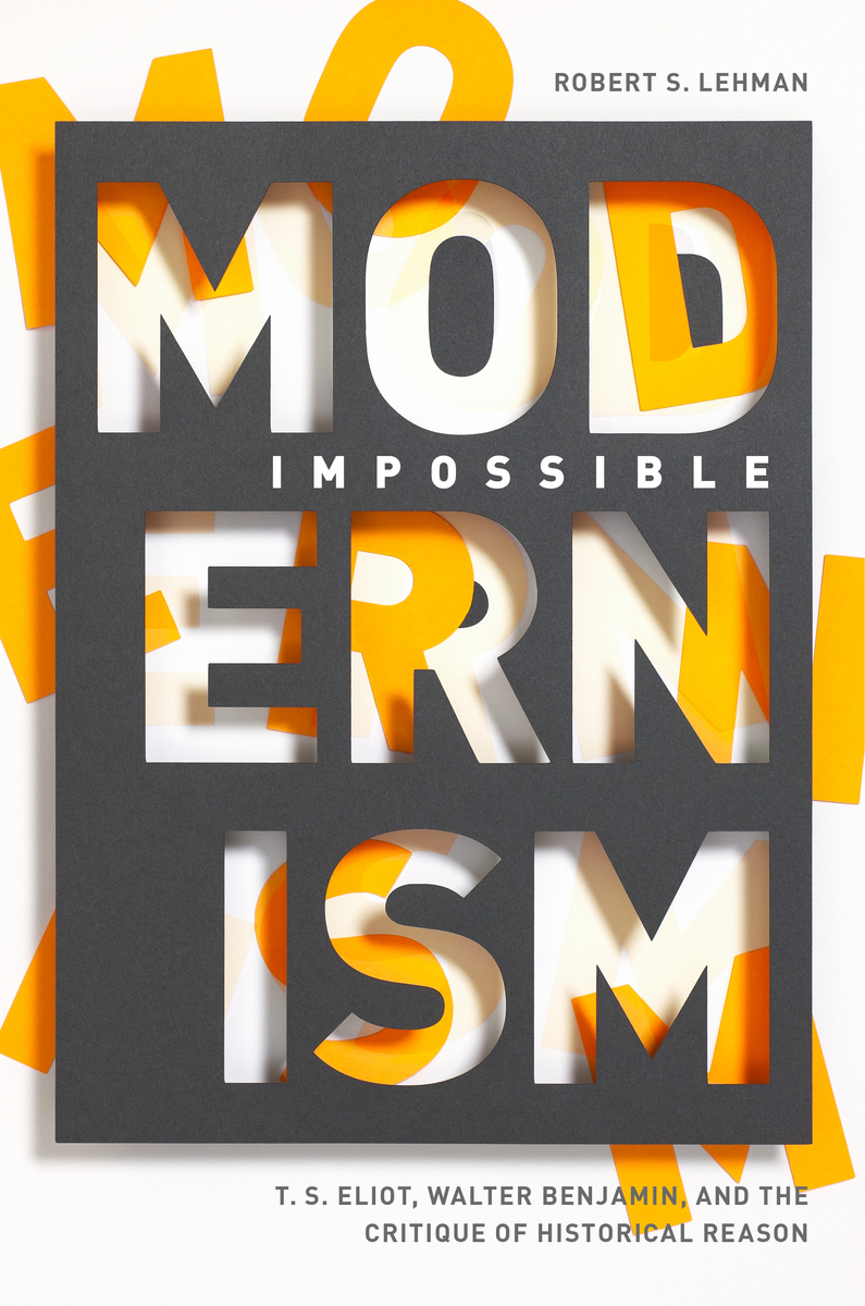
Impossible Modernism by Robert S. Lehman; design by Anne Jordan and Mitch Goldstein (Stanford University Press / August 2016)
These two look rather nice side by side…


Marx 2020 by Ronaldo Munck; design by Daniel Benneworth-Gray (Zed / August 2016)

The Nordic Theory of Everything by Anu Partanen; design by Milan Bozic (Harper / June 2016)

Playing Dead by Elizabeth Greenwood; design by Alison Forner (Simon & Schuster / August 2016)

Pond by Claire-Louise Bennett; design by Alex Merto (Riverhead / July 2016)
The jacket art for Pond is apparently a detail from ‘Fair is foul and foul is fair’ by artist Margriet Smulders.

Radiance by Catherynne M. Valente; design & illustration by Nathan Burton (Corsair / August 2016)
Nathan’s design is a nice compliment to Will Staehle‘s cover for the US edition published by Tor Books last year:


Riverine by Angela Palm; design by Kimberly Glyder (Graywolf / August 2016)
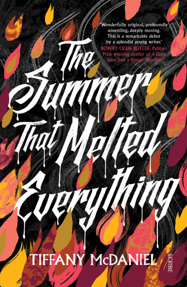
The Summer That Melted Everything by Tiffany McDaniel; design by Allison Colpoys (Scribe / August 2016)

Taduno’s Song by Odafe Atogun; design by Chris Gale (Canongate / August 2016)

Underground Airlines by Ben H. Winters; design by Oliver Munday (Mulholland Books / July 2016)
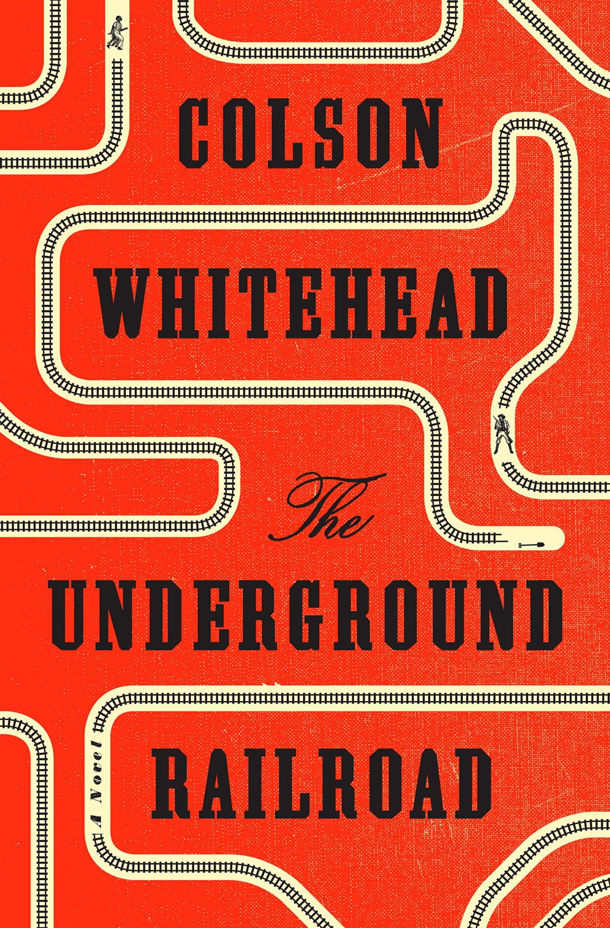
The Underground Railroad by Colson Whitehead; design by Oliver Munday (Doubleday / August 2016)

You Don’t Have to Live Like This by Benjamin Markovits; design by Jarrod Taylor (Harper / July 2016)


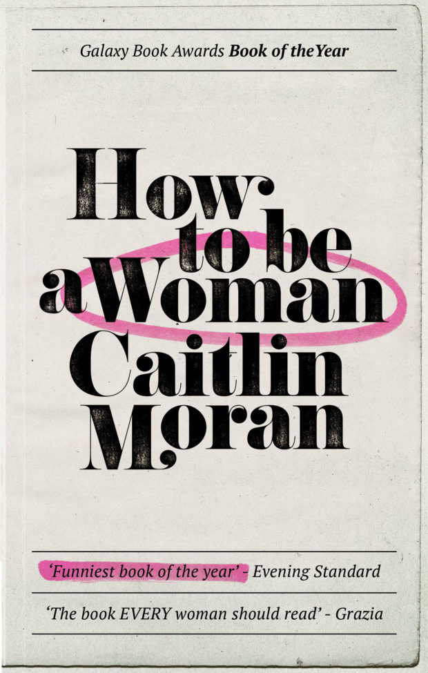
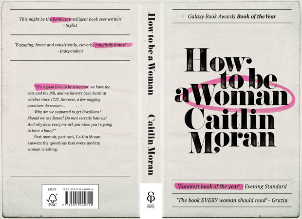
At The Literary Hub, the talented Jennifer Heuer on gendered book covers and being a woman designer:
1 CommentI love what I do and I’ve been fortunate enough to work with a lot of amazing art directors on a lot of great projects. I’m always grateful for the work I get. But I’ve talked to a lot of women in the industry over the years, and there is a clear pattern we’ve all experienced. One day a few months ago, I was commissioned to work on the backlist of a prolific women’s lit author. Minutes later, an art director called about a memoir in which the author was “always the bridesmaid.” Later that day: a novel about a wife dealing with her husband’s indifference while balancing her new career and motherhood. Three projects from three different art directors. All aimed directly at women readers.
I doubt that many of my male colleagues have had the same experience. And that day wasn’t an anomaly.
The talented art director and cover designer Catherine Casalino has told me, “When you’re on the receiving end of a project, it’s hard to say no, and even harder to explain why you don’t want to work exclusively on women’s fiction,” and continued with, “I think if we mixed things up a little more—hired women to design sports books and hired men to design cookbooks—we’d get some fresh and unexpected designs. And that would benefit all of us in the industry.” Another female designer has written to me saying, “It’s no surprise that women are assigned these topics—being women, it’s natural to assume we are interested in these things—but sometimes the associations are so tenuous that you start wondering if the gender bias is actually a form of laziness.”
I swear that these posts are taking me longer and longer to compile, but rest assured there are some wonderful covers this month:

All the Time in the World by Caroline Angell; design by Lucy Kim (Henry Holt / July 2016)

American Girls by Alison Umminger; design by Philip Pascuzzo (Flat Iron / June 2016)
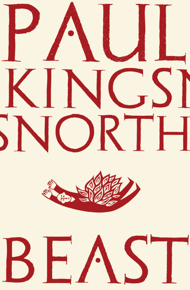
Beast by Paul Kingsnorth; design Mark Ecob; illustration Alan Rogerson (Faber & Faber / July 2016)
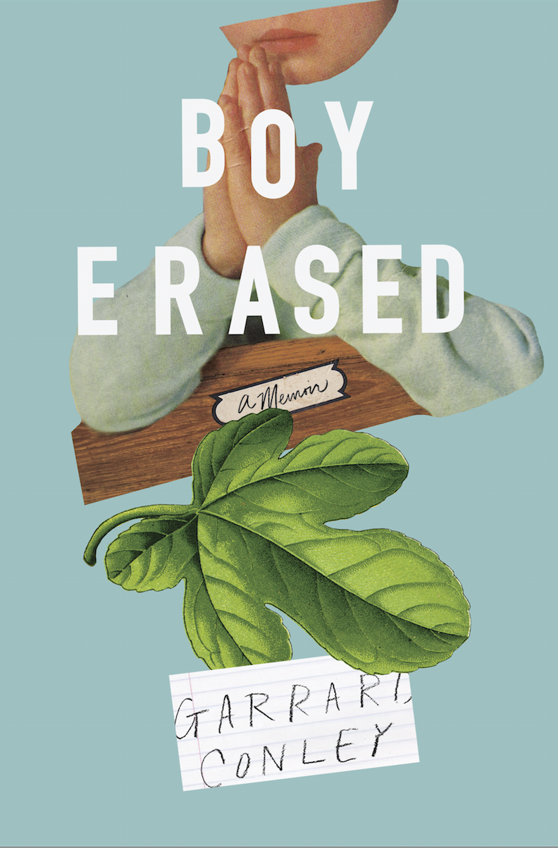
Boy Erased by Garrard Conley; design Rachel Willey (Riverhead / May 2016)
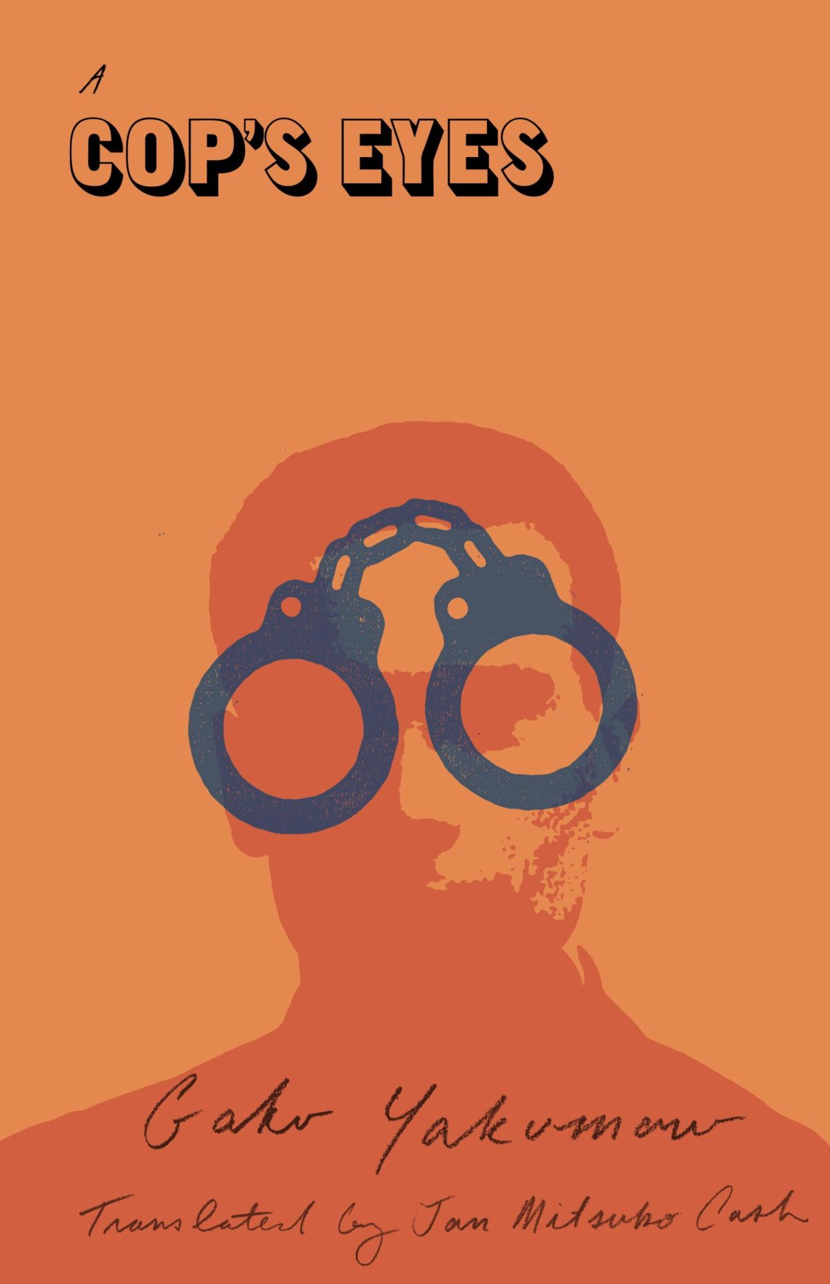
A Cop’s Eyes by Gaku Yakumaru; design by Peter Mendelsund (Vertical / May 2016)
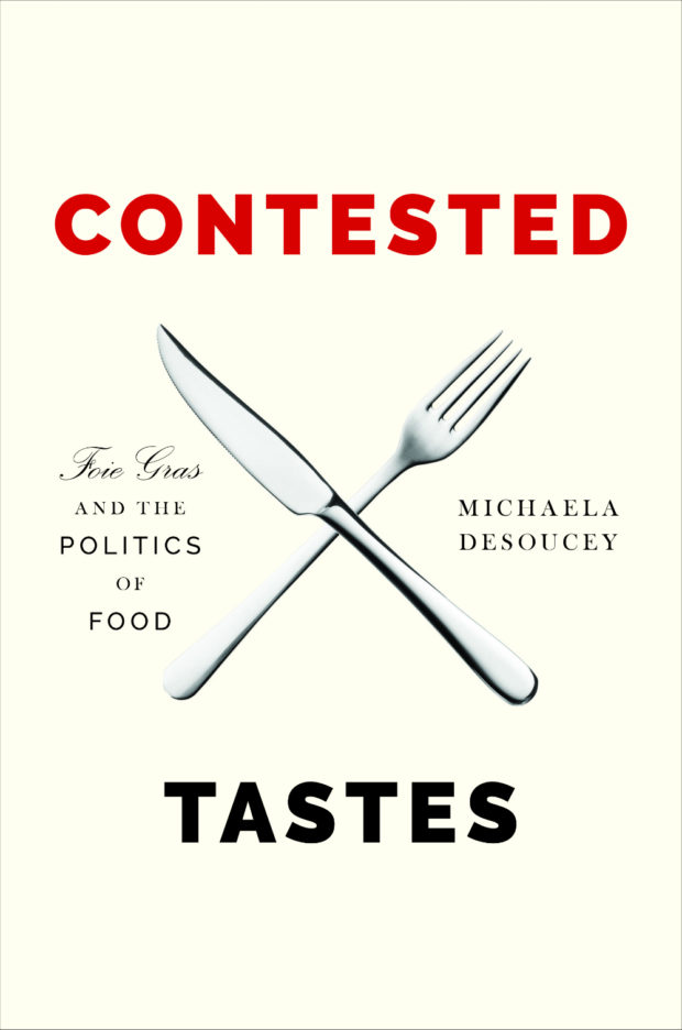
Contested by Michaela Desoucey; design Jason Alejandro (Princeton University Press / July 2016)
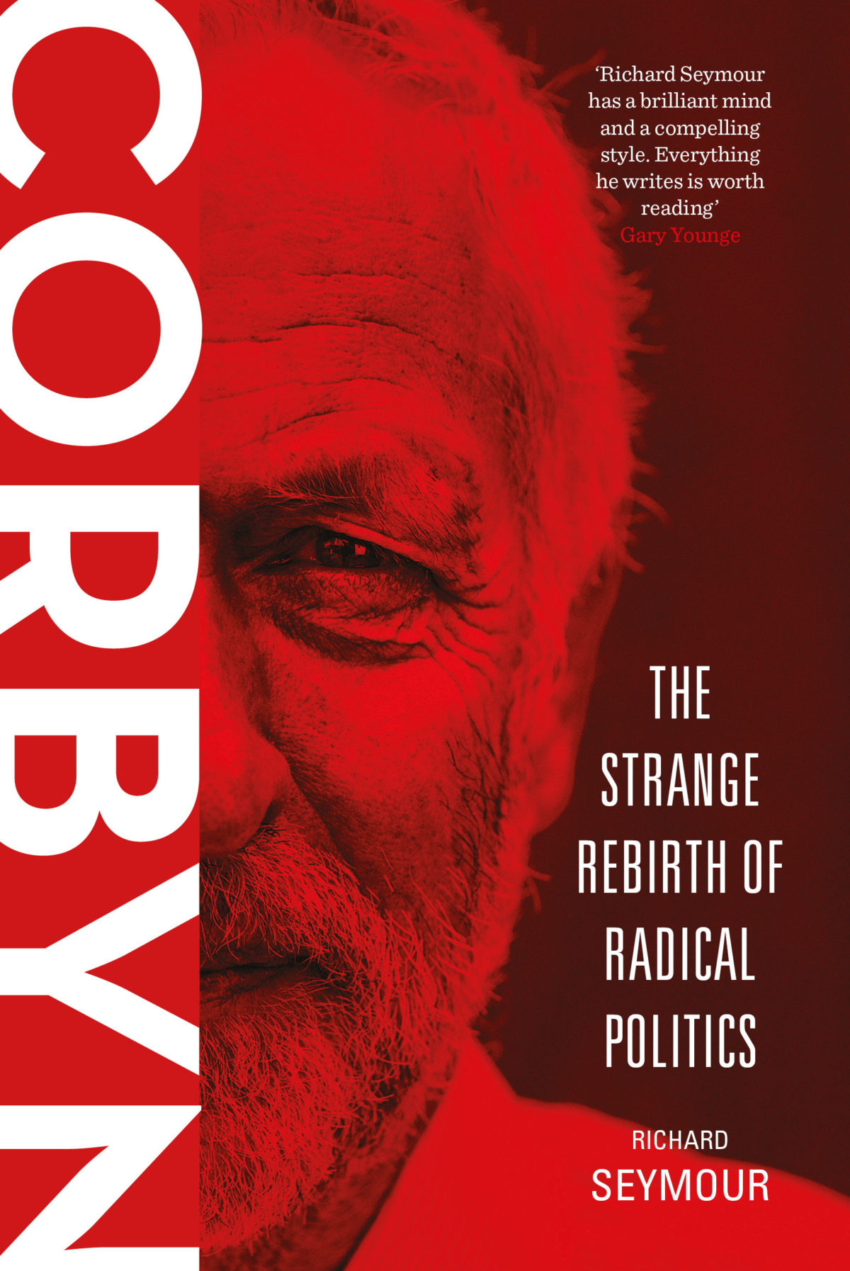
Corbyn by Richard Seymour; design by Dan Mogford (Verso / July 2016)
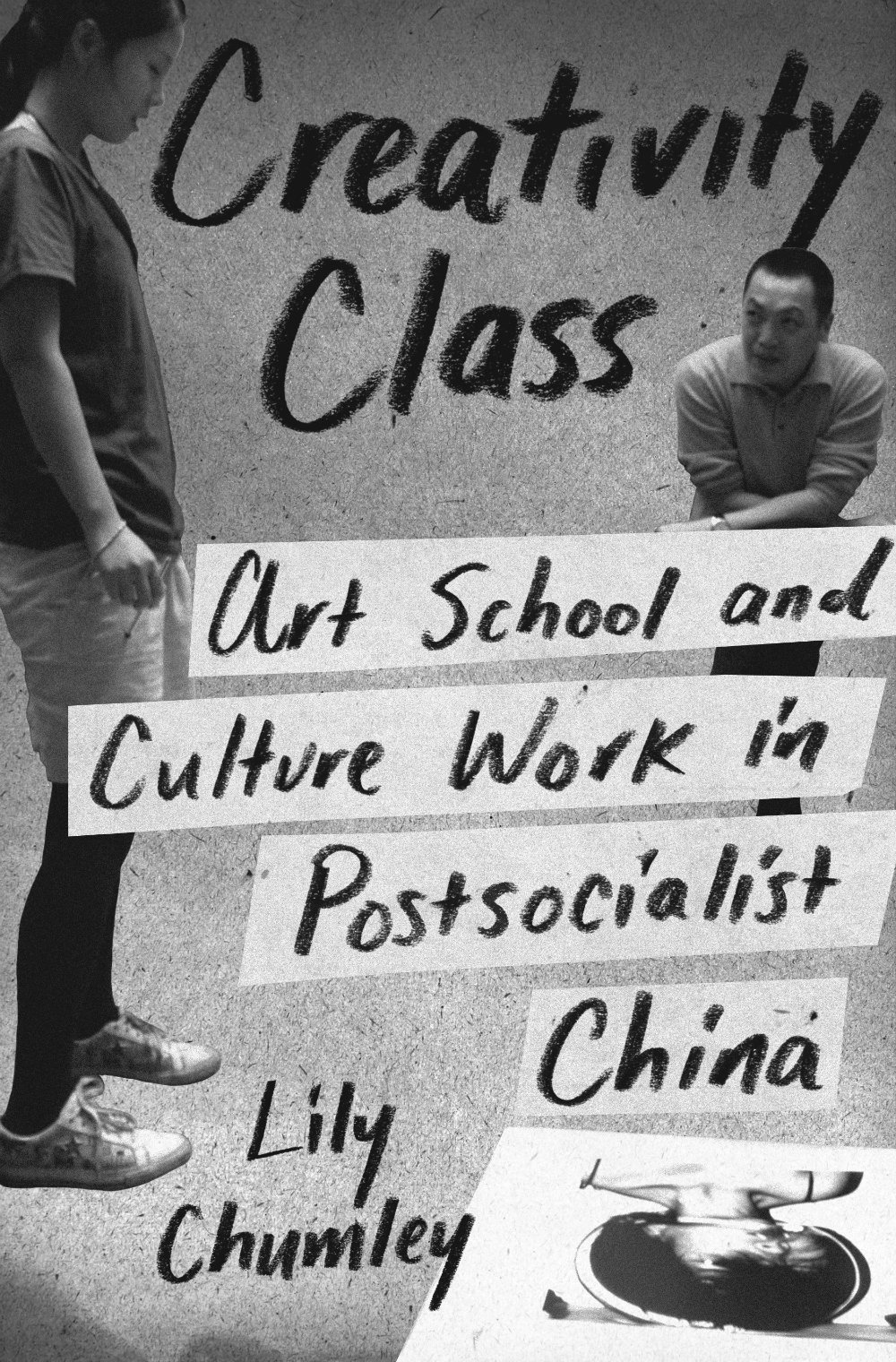
Creativity Class by Lily Chumley; design by Amanda Weiss (Princeton University Press / July 2016)

Dialogue by Robert McKee; design by Catherine Casalino (Twelve Books / July 2016)
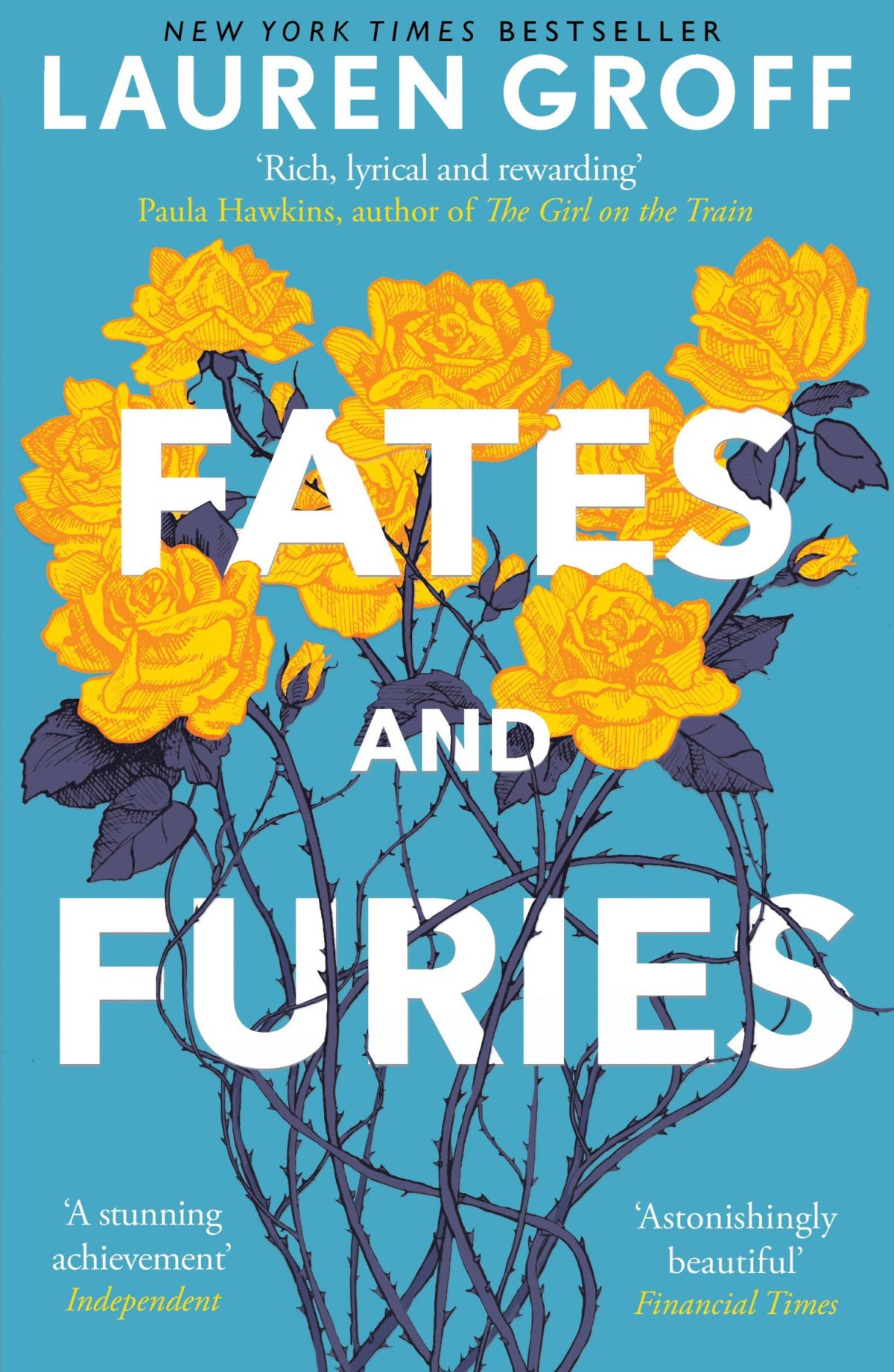
Fates and Furies by Lauren Groff; design by Melissa Four (Windmill Books / July 2016)
It’s interesting to compare/contrast this new cover for the UK paperback with the covers of the UK hardcover, designed by Suzanne Dean, and the US hardcover, designed by Rodrigo Corral and Adalis Martinez:


The Food & Wine of France by Edward Behr; design by Samantha Russo; photograph Oddur Thorisson (Penguin / July 2016)
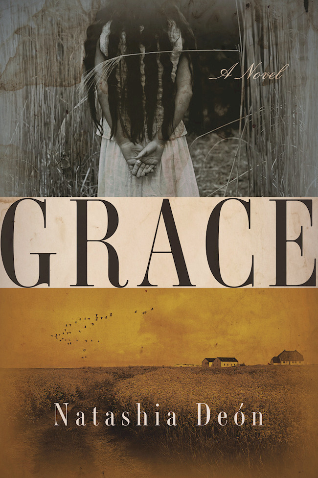
Grace by Natashia Deón; design by Elena Giavaldi (Counterpoint / June 2016)

The Hatching by Ezekiel Boone; design by Chelsea McGuckin; art by David Wu (Atria Books / July 2016)
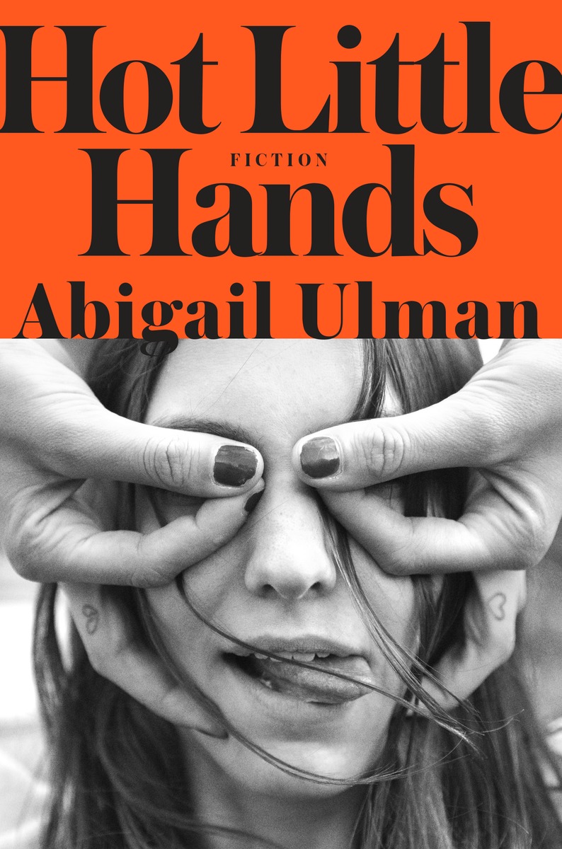
Hot Little Hands by Abigail Ulman; art direction by Greg Mollica; design by Ben Wiseman; photograph by RJ Shaughnessy (Spiegel & Grau / May 2016)
It’s also interesting to see US hardcover next to the purely typographic cover from Australia designed by Laura Thomas, and the racier, retro Penguin UK cover designed by Richard Bravery:


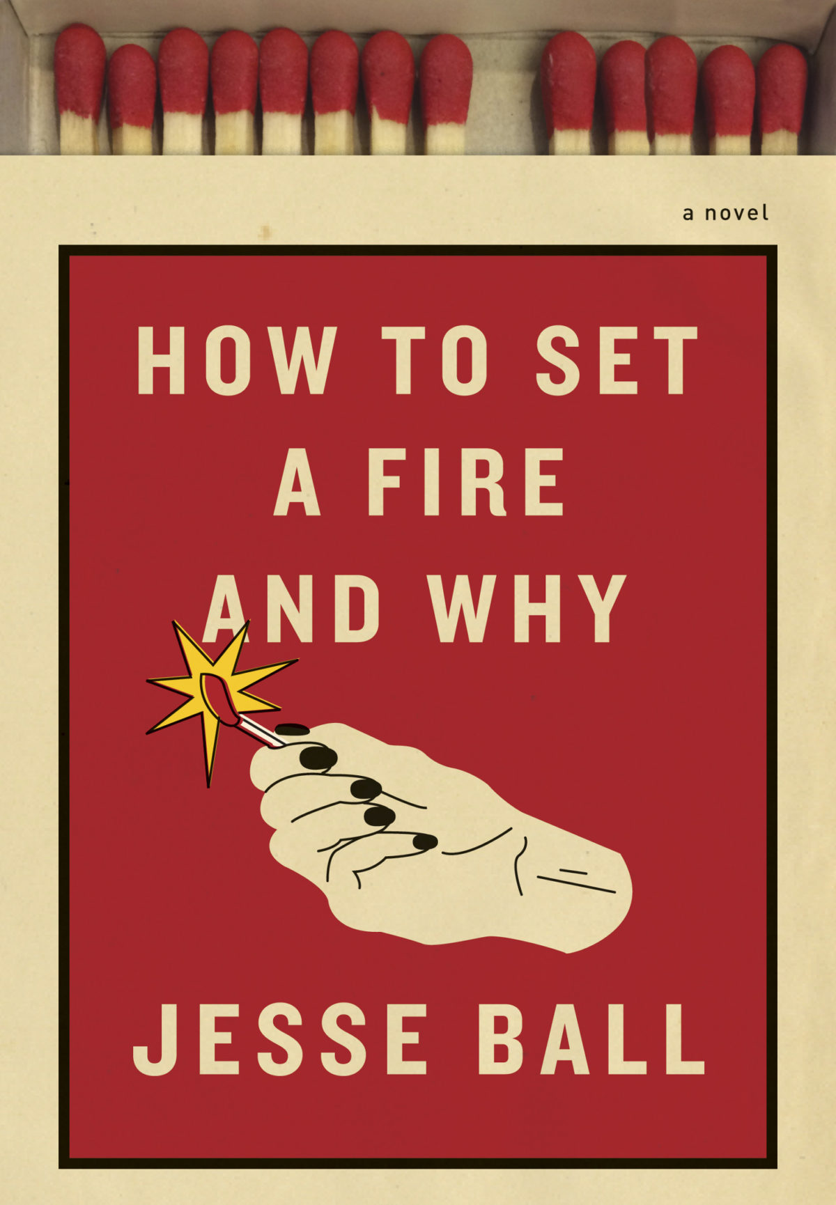
How to Set a Fire and Why by Jesse Ball; design by Kelly Blair (Pantheon / July 2016)
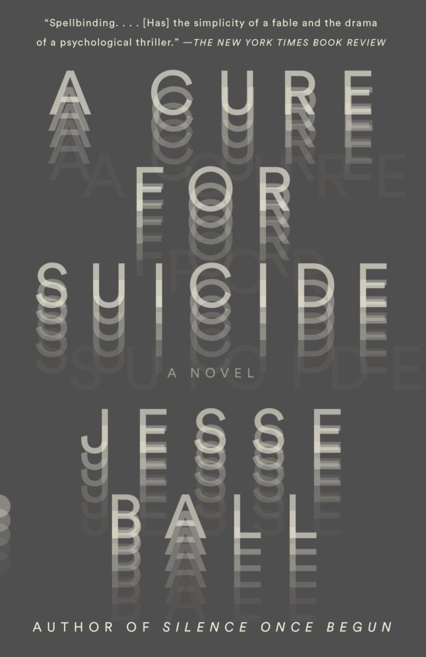
This struck me as something as quite a bold change of direction for the covers of Jesse Ball’s novels, which have often been quite minimal and typographic. It feel quite different to the recent paperback edition of A Cure for Suicide by Jesse Ball, designed by Helen Yentus and Jason Booher (Vintage / June 2016), for example:
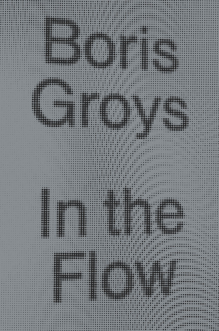
In the Flow by Boris Groys; design by Everything Studio (Verso / March 2016)

Invincible Summer by Alice Adams; design by Lauren Harms (Little, Brown & Co. / June 2016)
The UK cover of Invincible Summer, designed by Justine Anweiler, was included in last month’s post.


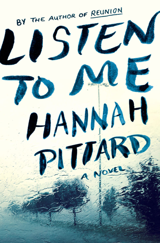
Listen to Me by Hannah Pittard; design by Catherine Casalino (HMH / July 2016)
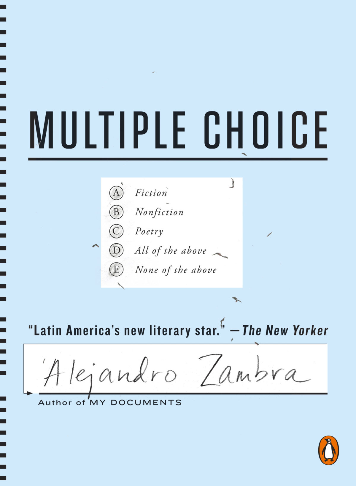
Multiple Choice by Alejandro Zambra; design by Nayon Cho (Penguin / July 2016)

Smoke by Dan Vyleta; design by Mark Swan (Weidenfeld & Nicolson / July 2016)
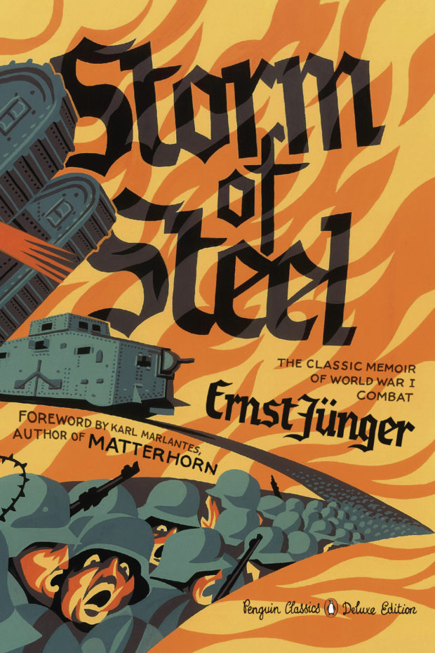
Storm and Steel by Ernst Jünger; design by Neil Gower (Penguin / May 2016)
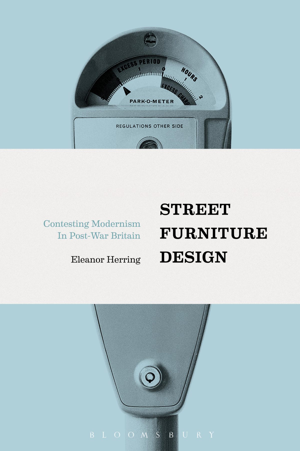
Street Furniture Design by Eleanor Herring; design by Daniel Benneworth-Gray (Bloomsbury / July 2016)
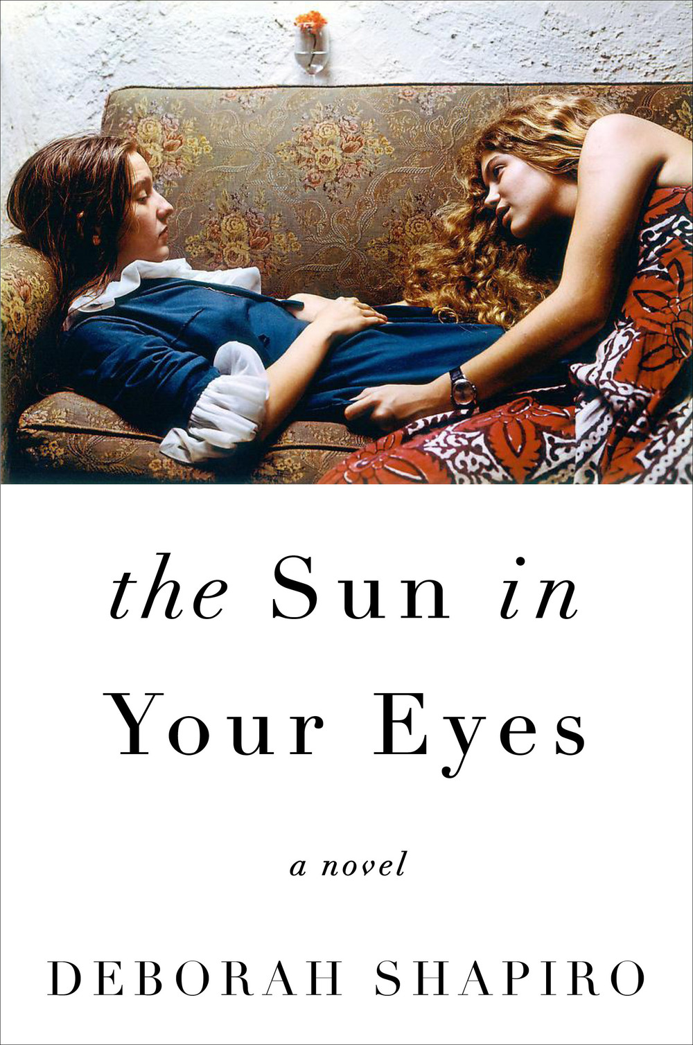
The Sun in Your Eyes by Deborah Shapiro; design by Mumtaz Mustafa (HarperCollins / July 2016)
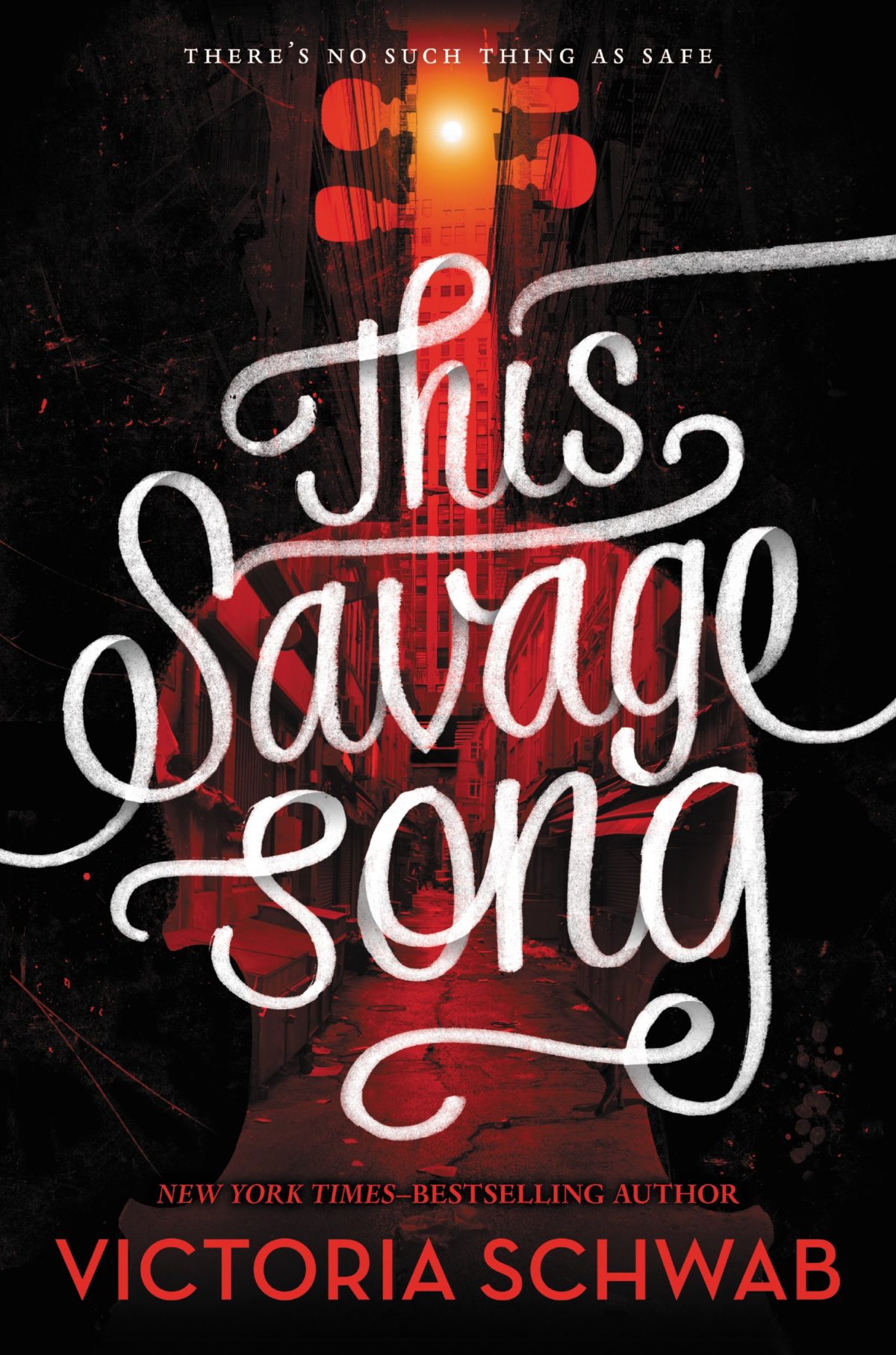
This Savage Song by Victoria Schwab; design Jenna Stempel (GreenWillow / July 2016)
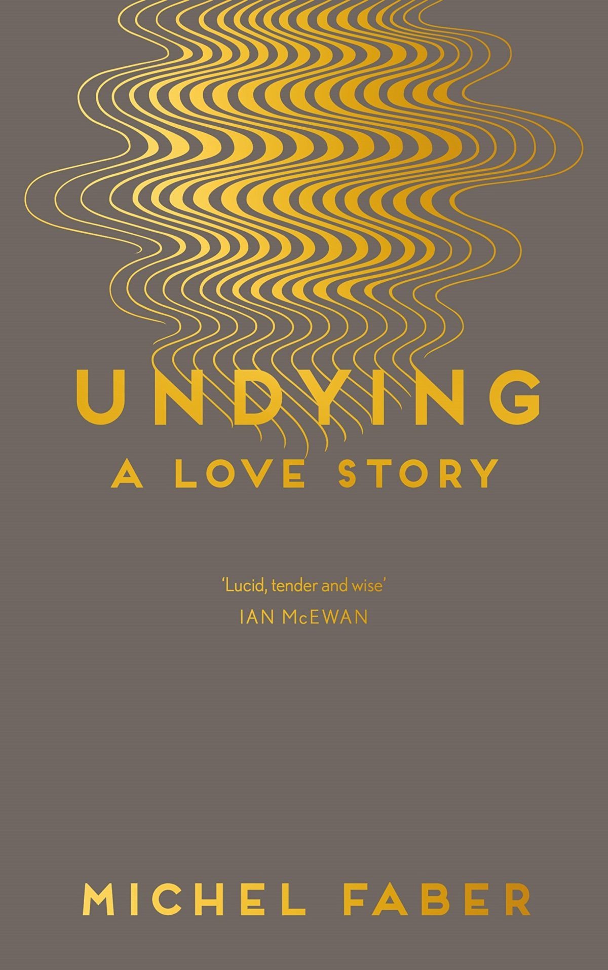
Undying by Michel Faber; design by Rafi Romaya; art by Yehrin Tong (Canongate / July 2016)
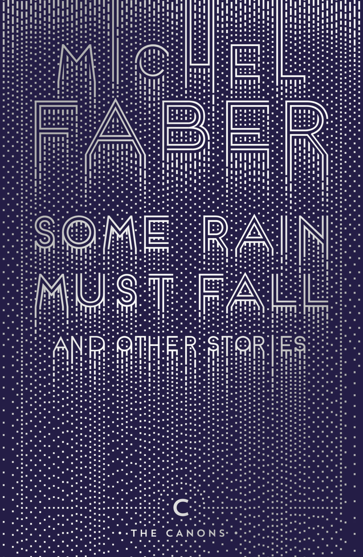
The paperback of Michel Faber’s Some Rain Must Fall is out this month too. The cover is another Rafi Romaya / Yehrin Tong collaboration:


Vinegar Girl by Anne Tyler; design by Kris Potter (Hogarth / June 2016)
As I noted on Twitter earlier this week, this combination of type and overlapping floral image — lovely as it is — is becoming a bit of a thing…


If anyone has a good name (and/or pithy description) for this trend let me know. In the meantime, designer Dan Blackman pointed me to his beautiful poster designs for DelVal College from 2011, which are early examples of this idea…


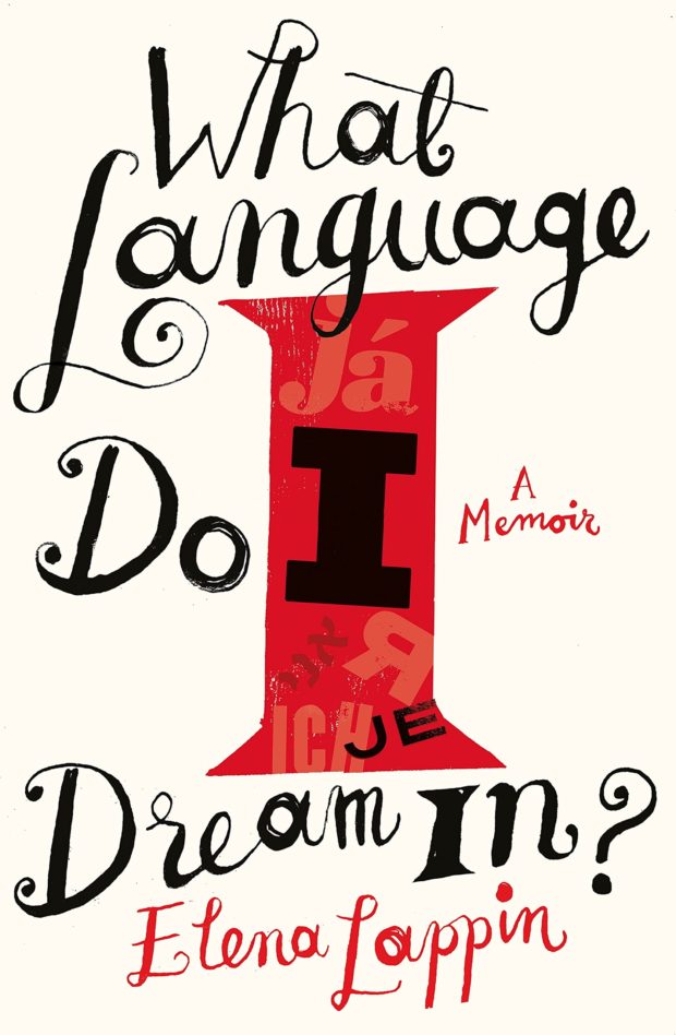
What Language Do I Dream In by Elena Lappin; design by Gray318 (Virago / June 2016)
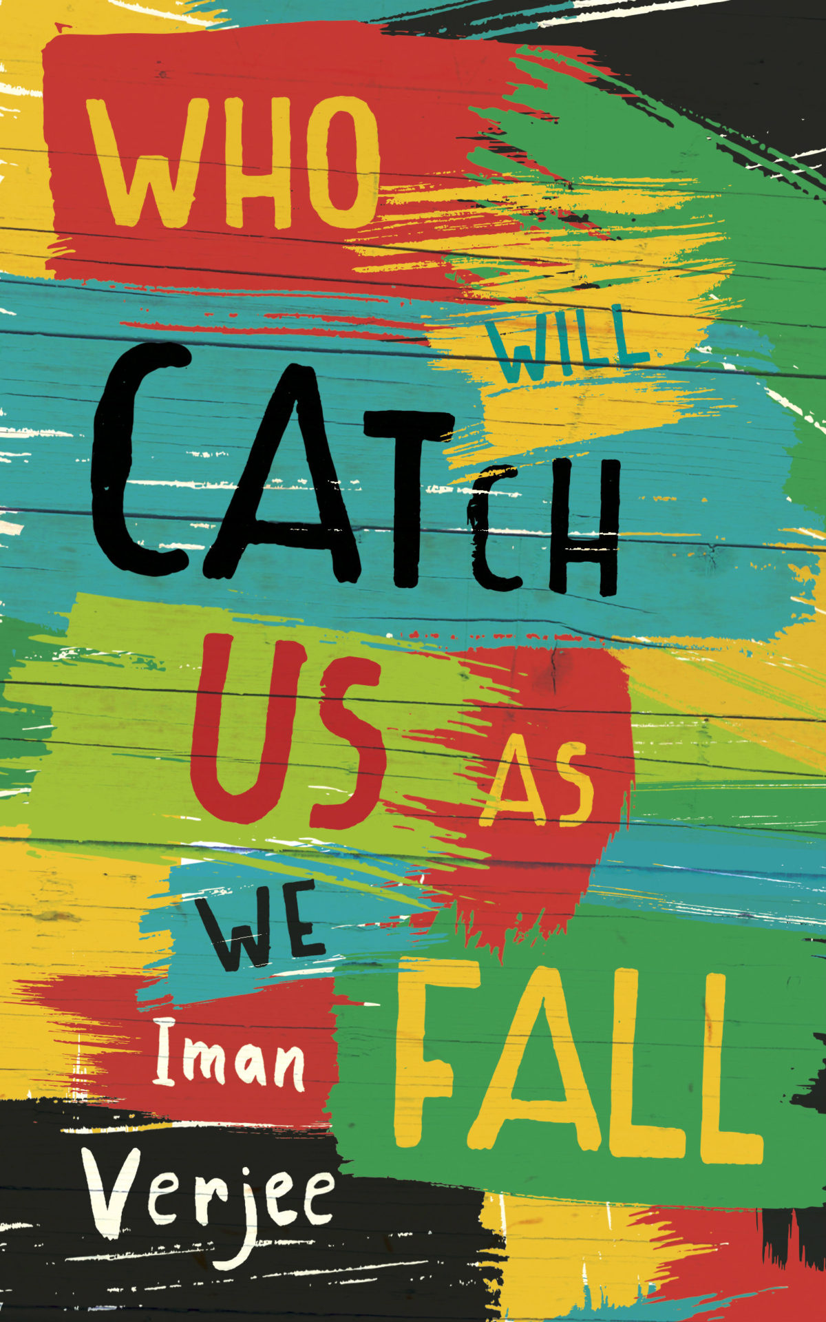
Who Will Catch Us As We Fall by Iman Verjee; design by James Paul Jones (Oneworld / July 2016)

Windows into the Soul by Gary T. Marx; design by Isaac Tobin (University of Chicago Press / July 2016)
I’m a little bit late to this, but Penguin Random House UK recently announced the winners of their annual Design Award. The award, which celebrates its 10th anniversary this year, offers art and designs students first-hand experience real book cover design briefs. The winner of each of the three categories — Adult Fiction, Adult Non-fiction and Children’s — receives a work placement at PRH, as well as a £1,000 cash prize. This year’s winners were Ailsa Johnson (Children’s), Zack Crook (Adult Fiction) and Zachary Wieland.
Comments closed

CNN Philippines interviews Elda Rotor, vice president and publisher of Penguin Classics at the Penguin Random House in New York:
Comments closedThe main joy is bringing an audience to a work that would otherwise lead a quiet life, not having the chance to be brought into the light of a modern readership. A greater joy is hearing individual responses of how enlightening or enjoyable a book has been, and connecting that experience with the fact that the edition was a Penguin Classic. The challenges are working very hard to edit, produce, and publish a book and to see its reception to be very modest. So either you realize that the readership was small, or that for some reason we failed to reach a wider audience for a variety of factors… In the 10 years I’ve worked at Penguin Classics, it’s proven to be true that there is nothing that compares to a quality edition of a great work of literature. We are very much in the digital world, providing e-books for much of our list. But there’s something about the physical beauty of a book, finely executed inside and out, that readers find deeply satisfying. We bring much work and thought into the production of our books, from authoritative texts, interior design, to cutting-edge book design, and we have built a strong reputation for this distinction. Developing series such as the Penguin Drop Caps, Penguin Horror, Civic Classics, and soon the Penguin Orange Collection and Penguin Galaxy represents our dedication to our readers and curating special series for their interests that are beautiful objects unto themselves. Overall it reflects the deep respect we have for the reader’s experience and our focus on enriching that experience with a Penguin Classic.
Congratulations to the winners of this year’s 50 Books | 50 Covers competition organized by Design Observer in association with AIGA. All fifty winning books can be found here; the winning covers here.


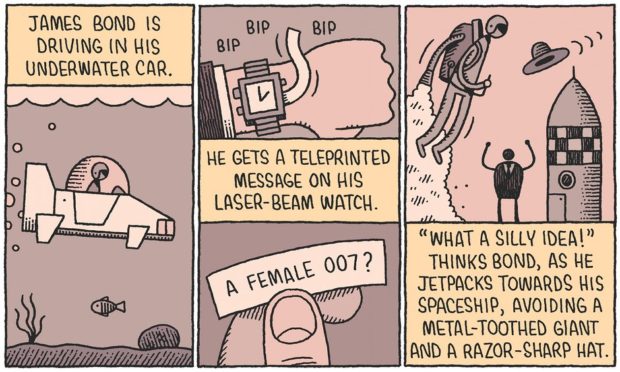
Tom Gauld on women leads in spy fiction for The Guardian. See also, people of colour in fantasy films.
Comments closed