At The Telegraph, film-maker Wes Anderson discusses the influence of Stefan Zweig on his new movie The Grand Budapest Hotel with Zweig biographer George Prochnik (author of the forthcoming Stefan Zweig at the End of the World):
There’s a wonderful photochrom of the hotel that I always thought of as sort of the model for our hotel, which is the Hotel Pupp in Karlovy Vary, which was in Carlsbad. The thing we learned when we visited all sorts of places that we found on this collection of pictures was that none of them were enough like what they once were to work for us. But the photochrom images seemed to tap into a truth about Zweig’s vision of the world that I was able to draw on in developing a visual aura for the film.
In The Post Office Girl, Zweig’s description of the grand hotel in Switzerland is so evocative. The protagonist is a girl who works in the post office. She’s invited to stay in this hotel as a gift from her rich aunt, and when she arrives in this place, the management thinks she’s there to make a delivery. Her suitcase is a basket. Finally they realise she’s actually going to be a guest in the hotel, which is unlike anywhere she’s ever been. Her point of view about this treatment she receives, and her experience of walking in and realising, “This is where I’m going to sleep”, is so powerful. But also that by the time her holiday abruptly ends, she is already addicted to this other way of life, and her existence is so dramatically changed, and a sort of desperation comes over her — and then a connection she makes with someone who is in his own desperate state. The idea of that work being something that had been out of print for that long is sort of surreal.
At a recent event at the New York Public Library, Anderson similarly discussed Zweig’s work with Paul Holdengräber:
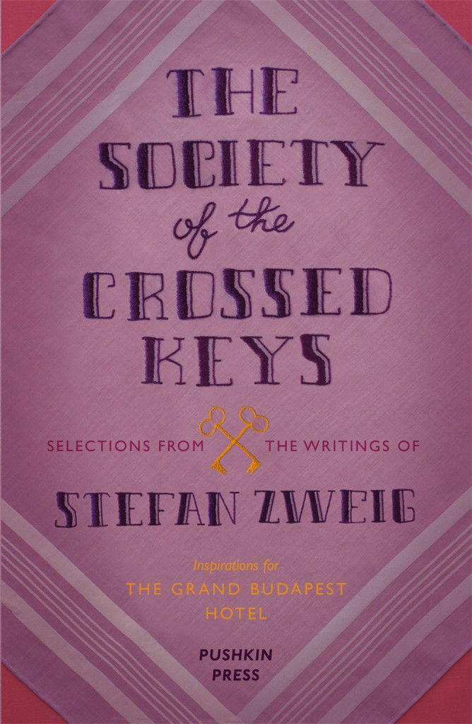
UK publisher Pushkin Press has recently published The Society of the Crossed Keys a selection of Zweig’s writings that inspired Anderson. The cover illustration (pictured top) is by Nathan Burton (whose covers for Alma Classics I mentioned here yesterday). Pushkin have reissued a number of Zweig’s books with covers by Burton, Petra Börner, and David Pearson.
The movie itself was reviewed all over place the last week, but I quite enjoyed Richard Brody’s review for The New Yorker:
Perhaps more than ever, Anderson takes a joyful yet aching delight in recreating the styles of bygone days. The hotel is like a majestically confected cake on the outside and a jewel box on the inside, adorned with staff and guests whose uniforms and fashions are nuanced to the buttons, and whose behavior is self-controlled to the glance. Yet also, more than in any of his other films, that very recreation is his subject. “The Grand Budapest Hotel” is about the spiritual heritage and the political force of those long-vanished styles—about the substance of style, not just the style of his Old World characters but also, crucially, Anderson’s own. This isn’t Anderson’s most personal film, in the strict sense, but it is, alongside “The Life Aquatic with Steve Zissou,” his most reflexive one—even more so because the new film exposes the inner workings not just of his practice of filmmaking but of his sensibility.
UPDATE: Creative Review talks to the film’s lead graphic designer Annie Atkins about her work:
We actually used comparatively few typefaces in the movie, as most lettering was created by hand. Wes and Adam had been on location recces all around Eastern Europe and had references of all kinds of hand-made signage from the last 100 years or so. The beautiful thing about period filmmaking is that you’re creating graphic design for a time before graphic designers existed, per sé. It was really the craftsmen who were the designers: the blacksmith designed the lettering in the cast iron gates; the glazier sculpted the lettering in the stained glass; the sign-painter drew the lettering for the shopfronts; the printer chose the type blocks for the stationery…
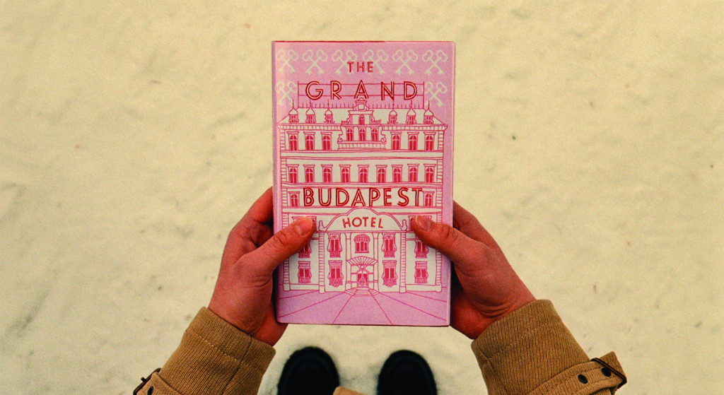
… My absolute favourite piece is the book itself that opens the story. It’s a modern pink hardback with a drawing of the hotel on the front, and the name of the movie as the hotel sign. It’s a relatively simple piece, but it’s really special having a prop that you made with the movie’s name on it like that. I remember Wes had sent me a quick sketch showing his idea for the book, and I really loved being able to help make that work for him. I treasure that piece, actually – we made three for the shoot, in case one got dropped in the snow, and so I brought one home with me.
[…] to quickly follow up my post about Wes Anderson and The Grand Budapest Hotel earlier this week, there is an interesting interview with art director Adam Stockhausen about working with on the […]
[…] posted about Wes Anderson’s Zweig-inspired film The Grand Budapest Hotel quite a lot in 2014. But as the film won four Oscars last month (including the award for production […]