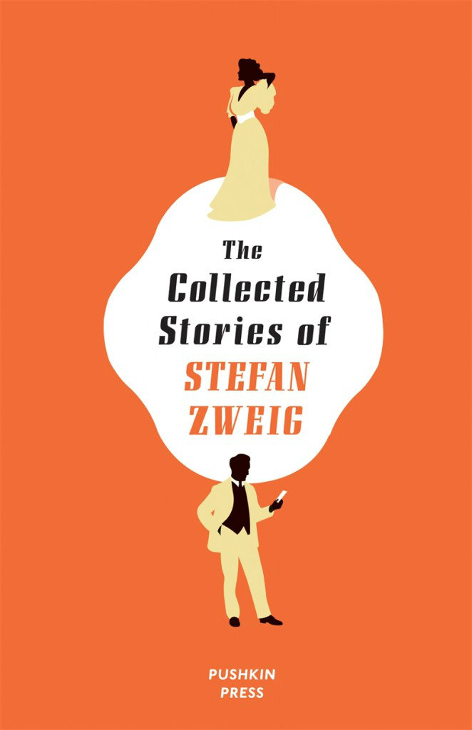
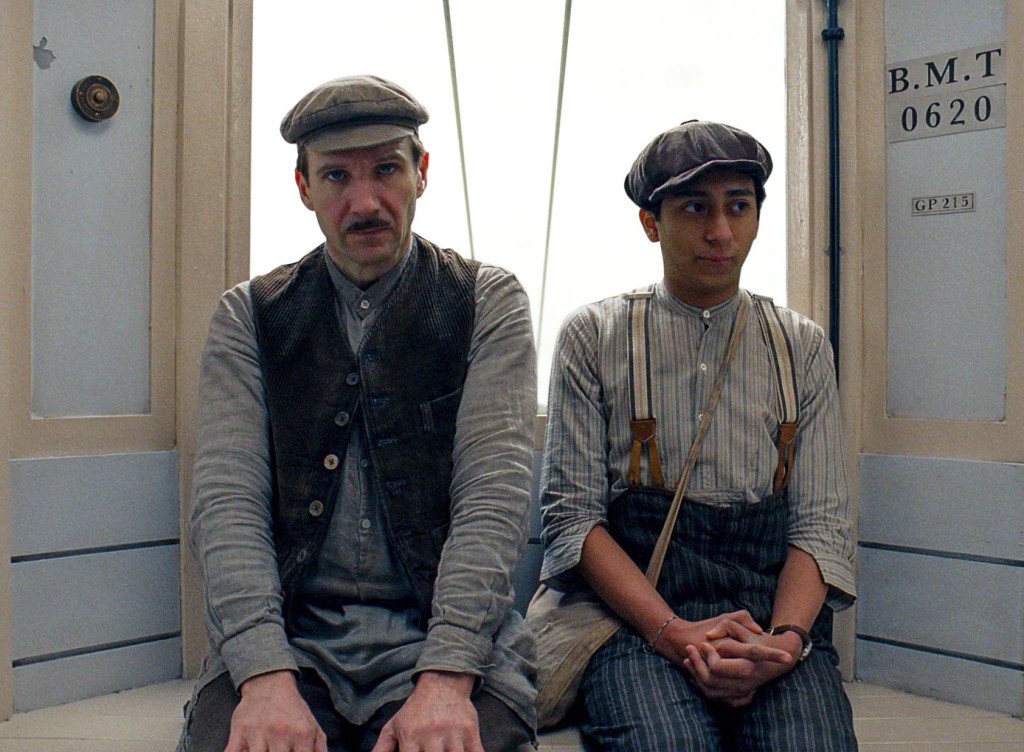
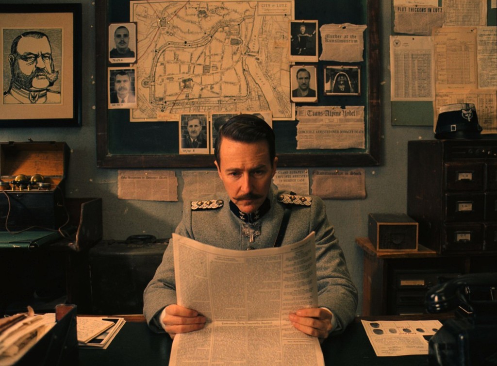
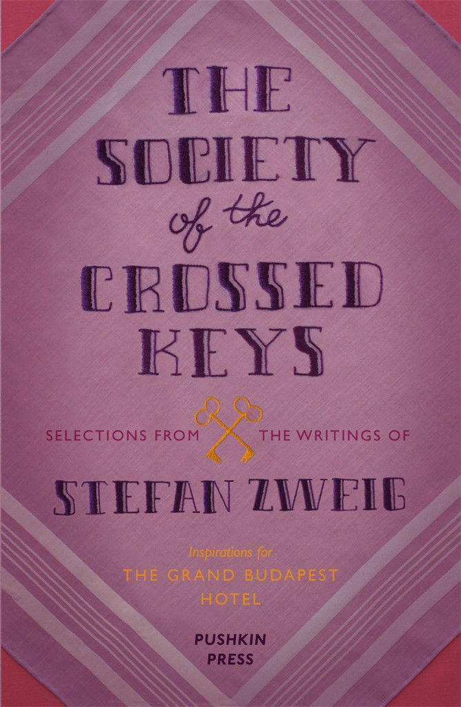
I thought I read somewhere that Wes Anderson’s new film The French Dispatch was based on the Paris Review, but theNew Yorker is saying no, actually, it is all about them. IDK. ¯\_(ツ)_/¯
Designer Annie Atkins talks to Design Week (registration required) about her work on Wes Anderson’s The Grand Budapest Hotel, and “the often ‘invisible’ role of graphic design on screen”:
“Most of the skills I employ today are things I’ve learnt on set,” Atkins says. “Before starting this job, I hadn’t really hand-crafted anything since being a child. Things like taking up a quill; getting my paints and pencils out; hand-binding books – I never would have done that in the advertising agency I was working in.”
Of course, 11 hours isn’t solely devoted to creating art. While a lot of the day is spent in a “production line” of stitching, gluing, folding, ripping things up, sticking them back together again, tea staining and pouring fake blood over things, there are less glamorous elements to the job too.
“A lot of the day is paperwork,” Atkins says. “Organising, planning, scheduling, ordering materials – that’s the boring bit. Then some of the day is liaising with art directors and the production designer to figure out the style and directions things will go in. Then it’s bums on seats, making stuff.”
It’s that “making” part that is so important. “It’s tempting to sit at a computer and make everything that way,” she says. “But if you’re working in a period in the past, you really have to understand the methods that were employed to make those graphics at the time, then imitate – or even better, use – them to give that authenticity.”
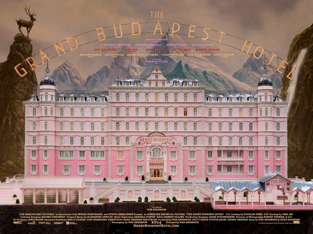
I posted about Wes Anderson’s Zweig-inspired film The Grand Budapest Hotelquitealotin2014. But as the film won four Oscars last month (including the award for production design) and I revisited the movie this past weekend, I don’t feel too bad about posting a few links about it again — it is so beautifully designed and constructed.
“The Grand Budapest Hotel” is an incredibly rich film, one of his best, definitely the most logistically and maybe thematically complex. It’s kind of every Wes Anderson film stacked one on top of the other, like a wedding cake.
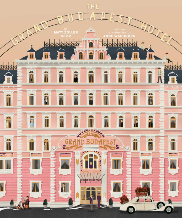
While RogerEbert.com produced this 16 minute video essay adapted from the book:
The book even has a nice animated trailer:
Elsewhere, Quartz interviewed the film’s lead graphic designer Annie Atkins:
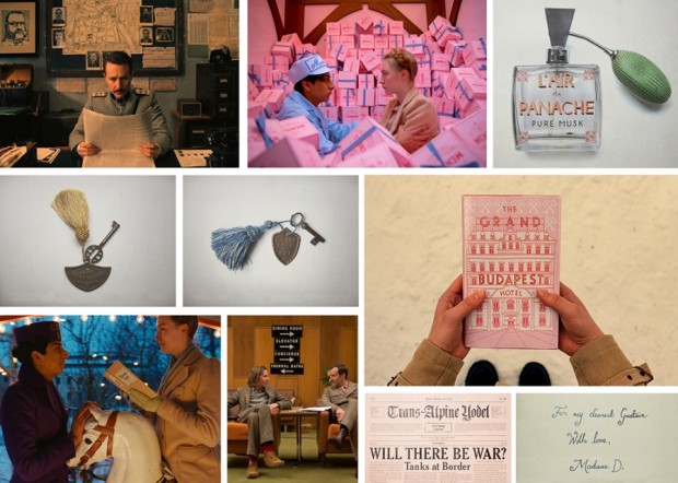
“A fictitious country needs all kinds of graphics: flags, banknotes, passports, street signs,” she told Quartz. “It’s impossible to imagine graphics like these. You have to do your research and you’ll find treasures that you couldn’t even have begun to sit down and draw until you saw them in front of your eyes.”
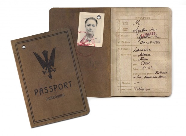
Working closely with Anderson and the film’s production designers Adam Stockhausen and Anna Pinnock, Atkins meticulously hand-crafted almost every of piece of ephemera shown on camera. “Every piece I made began with showing Wes a collection of real examples from the period,” she explained. “We looked at hundreds of pieces of design from Eastern Europe at the beginning of the last century as reference.”
And Deadline talks to production designer Adam Stockhausen about the film and working with Anderson:
Wes knew that he wanted the hotel to be pink. That’s one of the fun things about working with him—he has such a strong sense of color and makes very bold, daring choices that, just left to my own devices I’m not sure I would have come up with. So, working with him is inspiring in that way. And then it’s a process—working with colors that go together, adding in tones that help balance things, figuring out what the right pinks are. The funny thing is, we started with all this pink, and I think this would be true of any color—if you use too much of it, you stop seeing it because it’s everywhere and you start taking it for granted. So, we found that we had to add in yellows and different colors to kind of cut it back so you could see it more. And it’s those kinds of things you learn as you’re going; in this case, we learned from taking a section of the walls in the hotel and painting them.
Most of the inspiration we had for the hotel came from our site visit to Karlovy Vary in the Czech Republic. But we also put tons of research into the setting before we visited Europe. We looked at archive photos from many different hotels, including several hotels in London, Scotland, Switzerland—all over the place. Personally, I think the design was most influenced by the Grandhotel Pupp, which sits on a hill overlooking the town of Karlovy Vary.
The town of Karlovy Vary is filled with pastel-colored buildings that line the riverfront, and it has several hotels that stand on hills that look over the town. The whole place had the right feeling we wanted to convey in the movie.
That National Geographic article also alerted me to this interesting featurette about the creating the film’s hotel in a department store in Görlitz, Germany:
Zweig’s world is the world of the exile: the world of those displaced — by war, imprisonment, or by life, for whom hotels on Lake Geneva or the French Riviera are the only safe, if liminal, spaces. His characters are bereft of any sense of belonging; in the absence of a network, a sense of home, their emotions are heightened and their actions become ever more erratic. Thus in “Amok,” a doctor working in India finds himself blackmailing a patient for sex, painfully aware of how his self-imposed exile is disconnecting him from his own personal morality. In “Incident on Lake Geneva,” a Russian prisoner of war attempting to return home is stymied by a series of redrawn borders he does not understand; he tries to swim across, only to drown.
Such stories, of course, are colored by their political context: Zweig’s world is a world cut loose from itself. People’s bonds to their sense of self, of home, of country, of allegiance, have all been severed. But even consciously temporal stories like “Mendel the Bibliophile” — about a Viennese book collector sent to a concentration camp, and “The Invisible Collection,” about a blind art collector unaware of the fact that his family has sold his beloved prints to cope with rising German inflation — transcend their political context. They are, at their core, about the human need to connect, to ascribe meaning to what is not there, to look too fondly on an easier and imagined past as a means of coping with the at times impossible demands of real life.
Meanwhile, in the new issue of the London Review of Books, Michael Wood reviews the Zweig-inspired The Grand Budapest Hotel:
Zweig was born in an actual Europe and left, in the 1930s, to die in an actual Brazil… Best known during his lifetime for his vast and immensely readable biographies (of Dickens, Dostoevsky, Marie Antoinette, Mary Queen of Scots), he has recently been resurrected (in English, that is, since in French and German he hadn’t died) as the author of brilliant and bitter, if slightly too well-made fictions. It is from Joan Acocella’s fine introduction to one of them (Beware of Pity) that I take the fact that Zweig wrote a book called The World of Yesterday and the notion that he ‘saw himself as a citizen not of any one country, but of Europe as a whole.’ Of course Zweig was more serious about that world than the movie is or wants to be. He thought he had lived there. The movie thinks no one did.
I really wasn’t going to post anything else about Wes Anderson and Stefan Zweig, but film critic Max Nelson’s review of The Grand Budapest Hotel for the LA Review of Books is one of the best things I’ve read on the subject:
Like much of Zweig’s fiction, The Grand Budapest Hotel ends on an elegiac note. But what exactly is it elegizing? Agatha is too indistinct and vaguely defined a character for the movie to work as a tribute to lost love; her closest, warmest scenes with Zero pale in comparison to, say, Sam and Susie’s beachside dance in Moonrise Kingdom, Mr. Fox’s mid-film confrontation with his wife, or Margot and Richie’s devastating brief encounter late in Tenenbaums. You could argue that Zero, in Zweigian fashion, is conflating Agatha with the whole of prewar European life: its varied perfumes, its elaborately decorated baked goods, and its general sense of romance and adventure. But unlike prewar Vienna, prewar Zubrowka never existed anywhere other than in Anderson’s imagination. It’s difficult to imagine Zweig setting, for instance, Letter from an Unknown Woman or Journey into the Past in a fantasy country; like many of the author’s stories, they speak directly to his acute awareness of having caught the tail end of a particularly vivid chapter in his own national history. “I pity those,” he wrote, “who were not young during the last years of confidence in Europe,” for “whoever experienced that epoch… knows that all since has been retrogression and gloom.” If The Grand Budapest Hotel is an elegy for the codes and manners of fin-de-siècle Europe, then Anderson is trapped in a potentially disingenuous position: that of eulogizing a world he only ever could have accessed through the nostalgia-drenched writings of its earlier elegists, and which he can only now evoke on his own, imagined terms.
Just to quickly follow up my post about Wes Anderson and The Grand Budapest Hotelearlier this week, there is an interesting interview with art director Adam Stockhausen about working with on the film at The Dissolve:
[The references] come from all over the place. They’re very specific, but they can come from any place. They can come from a story, they can come from a painting, they can come from a movie. In this movie, there’s a Bergman film called The Silence, with the boy wandering around the hallways, we modeled our hallways on that. If you look at the hotel doors in that film, ours are a carbon copy. There’s a sequence in a Hitchcock movie called Torn Curtain where he comes out of his hotel and he gets on the bus and he goes to the museum; we have a bit of an homage to that sequence when Deputy Kovacs goes from his office to the art museum and he’s being chased by Willem Dafoe’s character. For the palm court we looked at Rousseau paintings. For the command tent in Moonrise Kingdom, we looked at Churchill’s war room. The references can be very wide, but they’re all pretty different.
There’s a wonderful photochrom of the hotel that I always thought of as sort of the model for our hotel, which is the Hotel Pupp in Karlovy Vary, which was in Carlsbad. The thing we learned when we visited all sorts of places that we found on this collection of pictures was that none of them were enough like what they once were to work for us. But the photochrom images seemed to tap into a truth about Zweig’s vision of the world that I was able to draw on in developing a visual aura for the film.
In The Post Office Girl, Zweig’s description of the grand hotel in Switzerland is so evocative. The protagonist is a girl who works in the post office. She’s invited to stay in this hotel as a gift from her rich aunt, and when she arrives in this place, the management thinks she’s there to make a delivery. Her suitcase is a basket. Finally they realise she’s actually going to be a guest in the hotel, which is unlike anywhere she’s ever been. Her point of view about this treatment she receives, and her experience of walking in and realising, “This is where I’m going to sleep”, is so powerful. But also that by the time her holiday abruptly ends, she is already addicted to this other way of life, and her existence is so dramatically changed, and a sort of desperation comes over her — and then a connection she makes with someone who is in his own desperate state. The idea of that work being something that had been out of print for that long is sort of surreal.
At a recent event at the New York Public Library, Anderson similarly discussed Zweig’s work with Paul Holdengräber:
The movie itself was reviewed all over place the last week, but I quite enjoyed Richard Brody’s review for The New Yorker:
Perhaps more than ever, Anderson takes a joyful yet aching delight in recreating the styles of bygone days. The hotel is like a majestically confected cake on the outside and a jewel box on the inside, adorned with staff and guests whose uniforms and fashions are nuanced to the buttons, and whose behavior is self-controlled to the glance. Yet also, more than in any of his other films, that very recreation is his subject. “The Grand Budapest Hotel” is about the spiritual heritage and the political force of those long-vanished styles—about the substance of style, not just the style of his Old World characters but also, crucially, Anderson’s own. This isn’t Anderson’s most personal film, in the strict sense, but it is, alongside “The Life Aquatic with Steve Zissou,” his most reflexive one—even more so because the new film exposes the inner workings not just of his practice of filmmaking but of his sensibility.
UPDATE:Creative Review talks to the film’s lead graphic designer Annie Atkins about her work:
We actually used comparatively few typefaces in the movie, as most lettering was created by hand. Wes and Adam had been on location recces all around Eastern Europe and had references of all kinds of hand-made signage from the last 100 years or so. The beautiful thing about period filmmaking is that you’re creating graphic design for a time before graphic designers existed, per sé. It was really the craftsmen who were the designers: the blacksmith designed the lettering in the cast iron gates; the glazier sculpted the lettering in the stained glass; the sign-painter drew the lettering for the shopfronts; the printer chose the type blocks for the stationery…
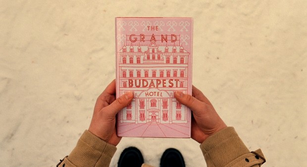
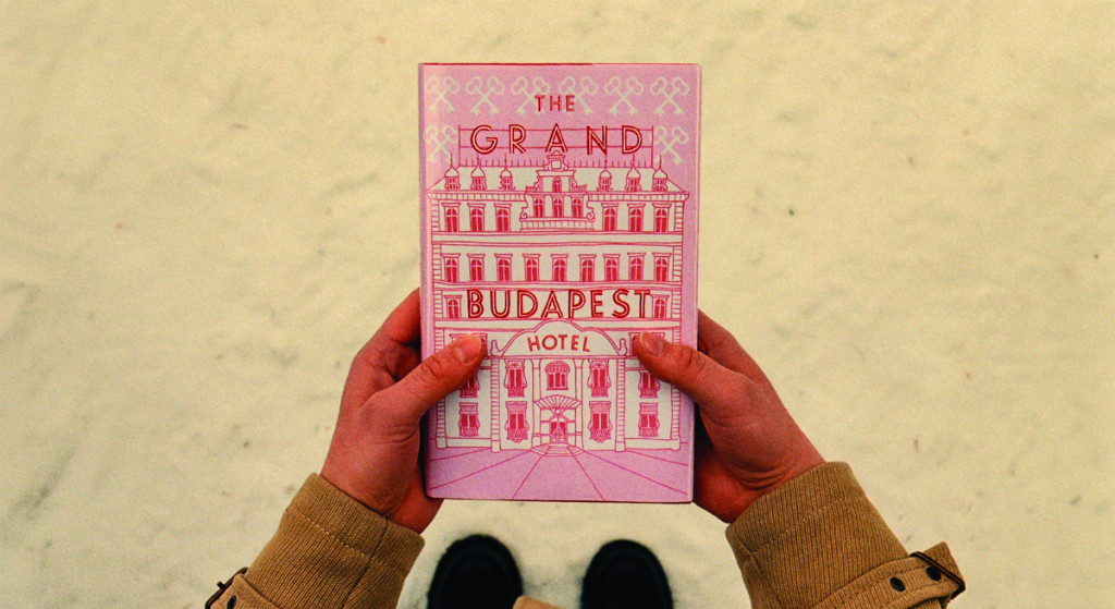
… My absolute favourite piece is the book itself that opens the story. It’s a modern pink hardback with a drawing of the hotel on the front, and the name of the movie as the hotel sign. It’s a relatively simple piece, but it’s really special having a prop that you made with the movie’s name on it like that. I remember Wes had sent me a quick sketch showing his idea for the book, and I really loved being able to help make that work for him. I treasure that piece, actually – we made three for the shoot, in case one got dropped in the snow, and so I brought one home with me.
Way Too Indie explores the visual themes of American film director Wes Anderson:
for all his towering success as an American auteur, the look and feeling behind each Anderson film finds its influences more rooted in foreign cinema. The tracking camera, moving from room to room, examining the bourgeoisie and upper class in the films of Luis Buñuel (e.g. El Angel Exterminador) laid the groundwork for the dolly and tracking shots in Anderson’s Rushmore, The Royal Tenenbaums and early sections of The Life Aquatic with Steve Zissou. The frenetic energy and overall zeal found in François Truffaut’s Jules et Jim serves also as the celluloid backbone of most of Anderson’s works, specifically Bottle Rocket, The Royal Tenenbaums, and Fantastic Mr. Fox. The melancholic swoons of the silver screen’s longing romantics permeate Moonrise Kingdom, Hotel Chevalier/The Darjeeling Limited and in the romance subplot of Bottle Rocket. These films share the same sort of beautiful yet honest moments found in Jean-Luc Godard’s Pierrot Le Fou.
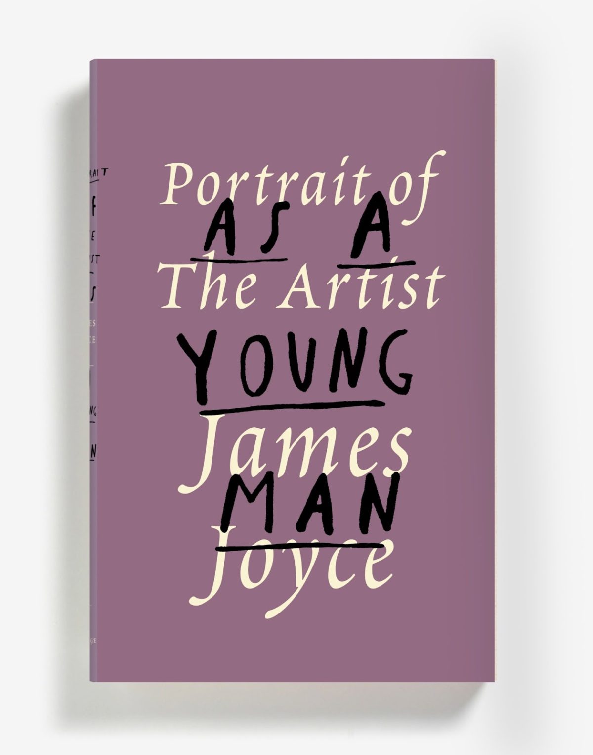
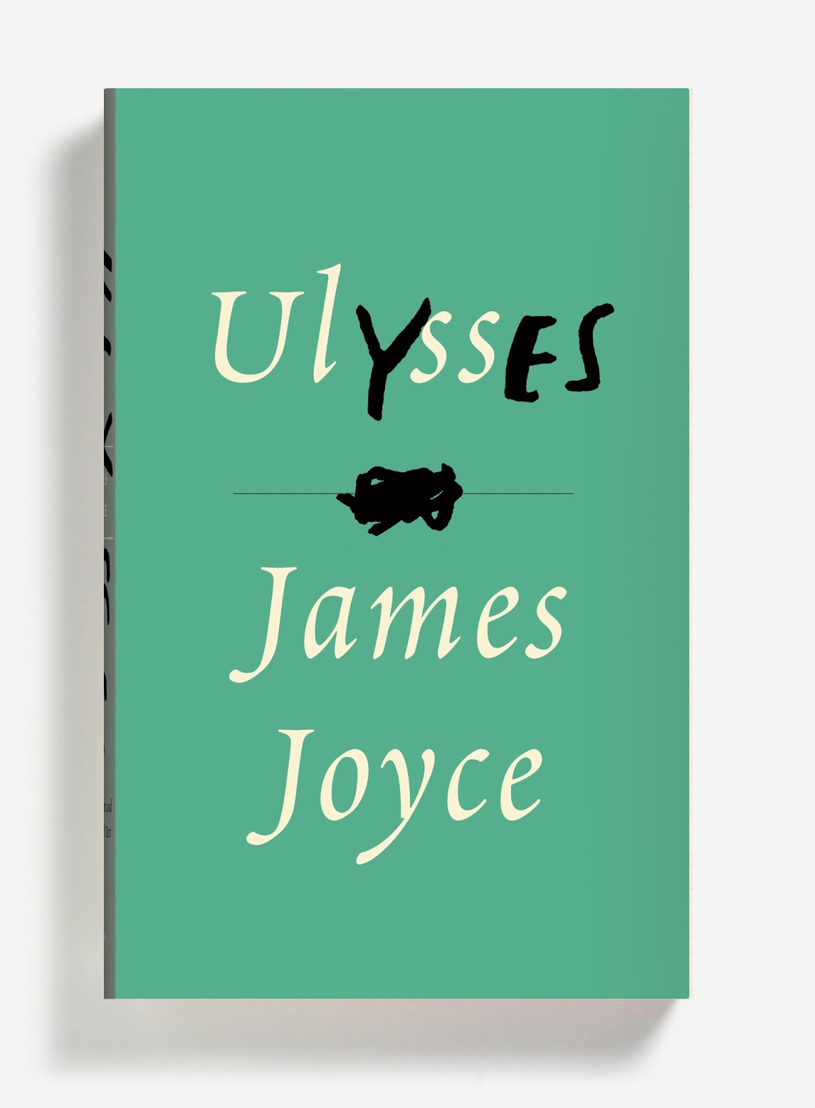
Three new James Joyce cover designs, and one extraordinary post by Peter Mendelsund. Brilliant stuff…
The Box — Author Michael Chabon on the films of Wes Anderson at the NYRB Blog:
Anderson’s films have frequently been compared to the boxed assemblages of Joseph Cornell, and it’s a useful comparison, as long as one bears in mind that the crucial element, in a Cornell box, is neither the imagery and objects it deploys, nor the Romantic narratives it incorporates and undermines, nor the playfulness and precision with which its objects and narratives have been arranged. The important thing, in a Cornell box, is the box… All movies, of course, are equally artificial; it’s just that some are more honest about it than others. In this important sense, the hand-built, model-kit artifice on display behind the pane of an Anderson box is a guarantor of authenticity; indeed I would argue that artifice, openly expressed, is the only true “authenticity” an artist can lay claim to.
The Same Curious Brain — A profile of author and artist Oliver Jeffers, at the National Post:
Jeffers doesn’t just tell stories. He’s an artist — paintings, printmaking, collage — and a commercial and editorial illustrator, with clients ranging from Anthropologie and Weight Watchers to the Guardian and Newsweek. His monograph Neither Here Nor There, which was published last summer, is a collection of his non-children’s work — a bust of Darth Vader; a satellite crash-landed in a cornfield; a hammer nailed to a wall — though it still feels like part of the same universe. Jeffers prefers it this way.
“My books are all about telling stories, and a lot of my art is about asking questions,” he says. “But they’re equally extensions of the same curious brain.”
And finally…
The Spy Novelist Who Knows Too Much — a New York Times story about the decidedly nasty-sounding 83-year-old French pulp novelist Gérard de Villiers so implausibly bonkers it probably has to be at least partially true:
Last June, a pulp-fiction thriller was published in Paris under the title “Le Chemin de Damas.” Its lurid green-and-black cover featured a busty woman clutching a pistol, and its plot included the requisite car chases, explosions and sexual conquests. Unlike most paperbacks, though, this one attracted the attention of intelligence officers and diplomats on three continents… “It was prophetic,” I was told by one veteran Middle East analyst who knows Syria well and preferred to remain nameless. “It really gave you a sense of the atmosphere inside the regime, of the way these people operate, in a way I hadn’t seen before.”