The Casual Optimist turned 4 years old at the end of last week. While not exactly a historic achievement, the blog has lasted the length of a presidency and exactly 3 years, 11 months longer than I thought it would. In order to celebrate this minor triumph, I thought I would post some memorable book covers from the last 4 years. It was going to be 10 covers, then it was 20… It quickly became 25, then it was 30… by 30 I figured I might as well do 40… I missed 40 and had to cap it at 50. It was just for fun and not meant to be a definitive survey — it’s just 50 covers that have stuck in my mind. Let me know what you would’ve included in the comments. Leave a comment or send me an email if I am missing details or have incorrectly attributed something.
The keen-eyed among you will also notice that there are no covers from 2012. I’m keeping my powder dry. You can expect a post of my favourite covers of the year in the not too distant future. You can let me know your picks for 2012 in the comments as well. In the meantime, I’m going on vacation so this will be my last post for a while.
So here you go — 50 great covers with some occasional notes. Enjoy…

Milk by Anne Mendelson, design by Barbara deWilde (Knopf 2008)

Canadian Water Politics edited by Mark Sproule-Jone, Carolyn Johns and B. Timothy Heinmiller, design by David Drummond (McGill-Queens University Press 2008)
This is such classic Drummond: bold visual idea; tidy, unobtrusive type; and better than one could ever expect for an academic subject as fascinating as Canadian water politics sounds. I also love that this made it on to AIGA’s 50 Books / 50 Covers list for 2008.

Obsession by Lennard J. Davis, design by Isaac Tobin (University of Chicago Press 2008)
The lettering for the cover of Obsession was created by Isaac’s partner Lauren Nassef using pinpricks through card. It was astonishing in 2008 and it is astonishing now.

Bright Shiny Morning by James Frey, design by Gray318 (John Murray 2008)
For this amazingly seedy cover, designer Jon Gray apparently drew the type first and then took it to sign shop to be made. The finished sign, photographed for the cover, now hangs in the office of James Frey’s UK publisher John Murry (or at least it used to).

Downtown Owl by Chuck Klosterman, design by Paul Sahre (Scribner 2008)

A Wolf at the Table by Augusten Burroughs, design by Chip Kidd (St. Martin’s Press 2008)

2666 by Roberto Bolaño, design by Charlotte Strick (Farrar, Straus & Giroux 2008)

Sweet Bird of Youth by Tennessee Williams, design by John Gall (New Directions 2008)

Asterios Polyp by David Mazzucchelli, design by David Mazzucchelli (Pantheon 2009)
The eponymous Asterios Polyp, paper architect, reminded me so much of an art teacher I once had that it was hard not to love this book. It was also beautifully put together and the cover, or the paper band, however you would describe it, looked like nothing else.

Columbine by Dave Cullen, design by Henry Sene Yee (Twelve, 2009)
The weight of designing a sophisticated and nuanced cover about a high school shooting must have been immense. Henry’s cover shows great restraint, and yet conveys an air of overwhelming sadness. A remarkable cover.

Cheers! An Intemperate History of Beer in Canada by Nicholas Pashley, designed by David A. Gee (Harpercollins Canada 2009)
I saw Cheers! on display at the Toronto Public Library the other day and I still find it funny. It is a great visual joke, but it also makes me laugh because of the sense that David somehow ‘got away with it.’ Covers this original usually die by committee, so consider it a victory for designers everywhere.
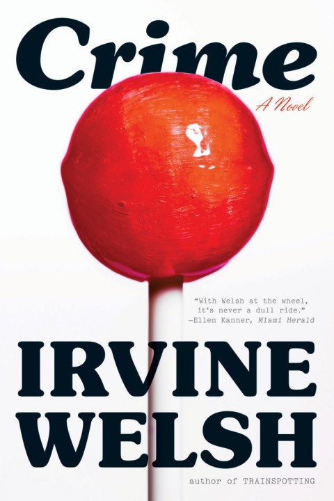
Crime by Irvine Welsh, design by Darren Haggar (W.W. Norton 2009)
Great image. Great type.

Chronic City by Jonathan Lethem, design by Miriam Rosenbloom (Faber & Faber 2009)
A giant tiger and bonus points for the Ben-Day dots.
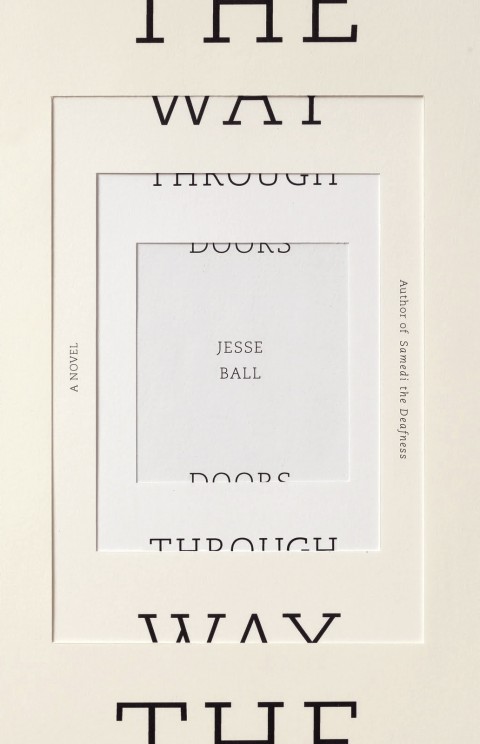
The Way Through Doors by Jesse Ball, design by Helen Yentus and Jason Booher (Vintage 2009)
I am, admittedly, a sucker for repetition, variation and half-legible type, but I think this works beautifully.

Heaven is Small by Emily Schultz, design by Ingrid Paulson (House of Anansi 2009)
This may be apocryphal, but the story goes that people in bookstores tried to peel the post-it note off to see the ‘real’ cover of Heaven is Small. Certainly Ingrid redesigned the paperback to be a little less confusing (if no less meta). The new design is a clever variation on the hardcover, but I do prefer the original. The coffee stain is also great touch.
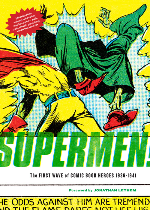
Supermen: The First Wave of Comic Book Heroes 1936-1941 edited by Greg Sadowski, design by Jacob Covey (Fantagraphics 2009)

Monstrous Affections by David Nickle, design by Erik Mohr (ChiZine Press 2010)
While the type on this cover always seemed to a little lightweight to me, the extraordinary image is just seared into my brain. Designer Erik Mohr is creating a very distinctive look for Toronto small independent CZP.

Filthy English by Peter Silverton, design by Dan Mogford (Portobello 2010)
Another cover that just makes me laugh. But I also like that it doesn’t include the title or the author’s name. It trusts the reader’s intelligence, which is always nice to see.

Mr. Peanut by Adam Ross, design by Peter Mendelsund (Knopf 2010)

An Object of Beauty, by Steve Martin, design by Darren Booth (Grand Central Publishing 2010)

Ethics of Interrogation by Michael Skerker, design by Isaac Tobin (University of Chicago Press 2010)
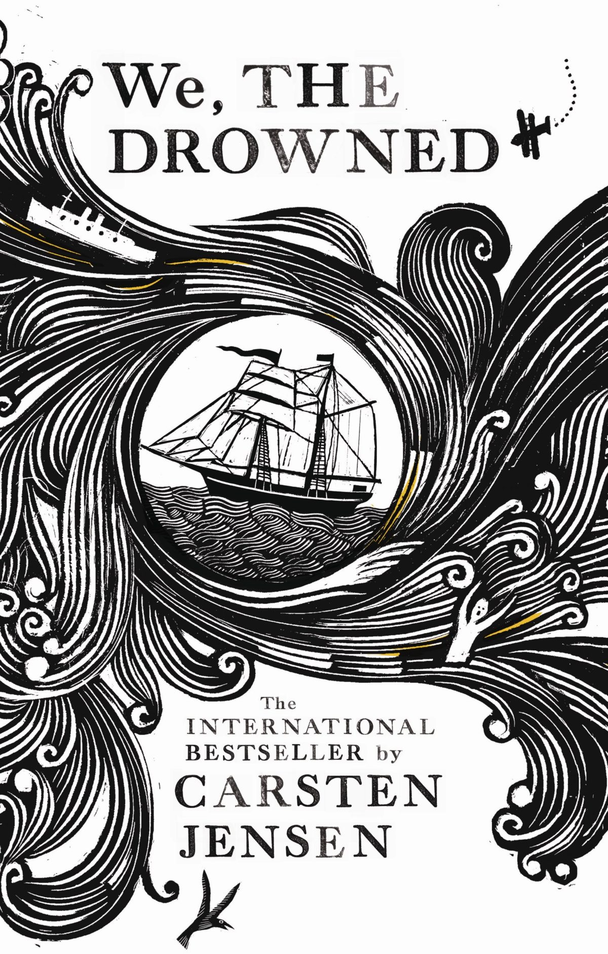
We The Drowned by Carsten Jensen, design by Suzanne Dean, illustration by Joe McLaren (Harvill Secker 2010)

Gabriel García Márquez: The Early Years by Ilan Stavans, design by Jason Ramirez (St Martin’s Press 2010)

Ilustrado by Miguel Syjuco, design by Gray318 (Picador UK, 2010)
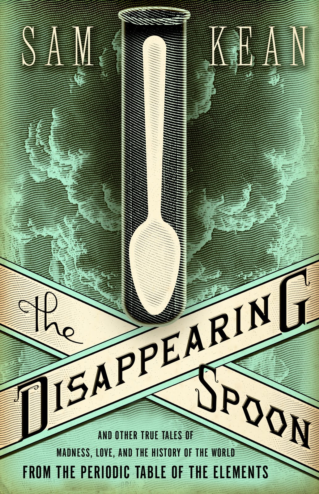
The Disappearing Spoon by Sam Kean, design by Will Staehle (Little Brown & Co. 2010)

C by Tom McCarthy, design by Peter Mendelsund (Knopf, 2010)
This cover just defies rational explanation. There is something vaguely obscene and unpleasant about it. The design is awkward and uncomfortable. Yet it is unforgettable and it is strangely perfect for a book that is also vaguely obscene, unpleasant, and awkward. Mendelsund and McCarthy are an interesting pairing.

Jamrach’s Menagerie by Carol Birch, design by Gray318 (Canongate 2011)
Yet another example of Jon Gray’s versatility as a designer. This isn’t immediately identifiable as his work, but once you know, it is obvious really. Who else would it be? This is just a no-bullshit great cover.

Art of Immersion, by Frank Rose, design by Jason Booher (W. W. Norton 2011)

The Psychopath Test by Jon Ronson, design by Matt Dorfman (Riverhead Books 2011)

The Information by James Gleick, design by Peter Mendelsund (Pantheon 2011)

This Will Be Difficult to Explain by Joanna Skibsrud, design by Michel Vrana (Hamish Hamilton Canada)
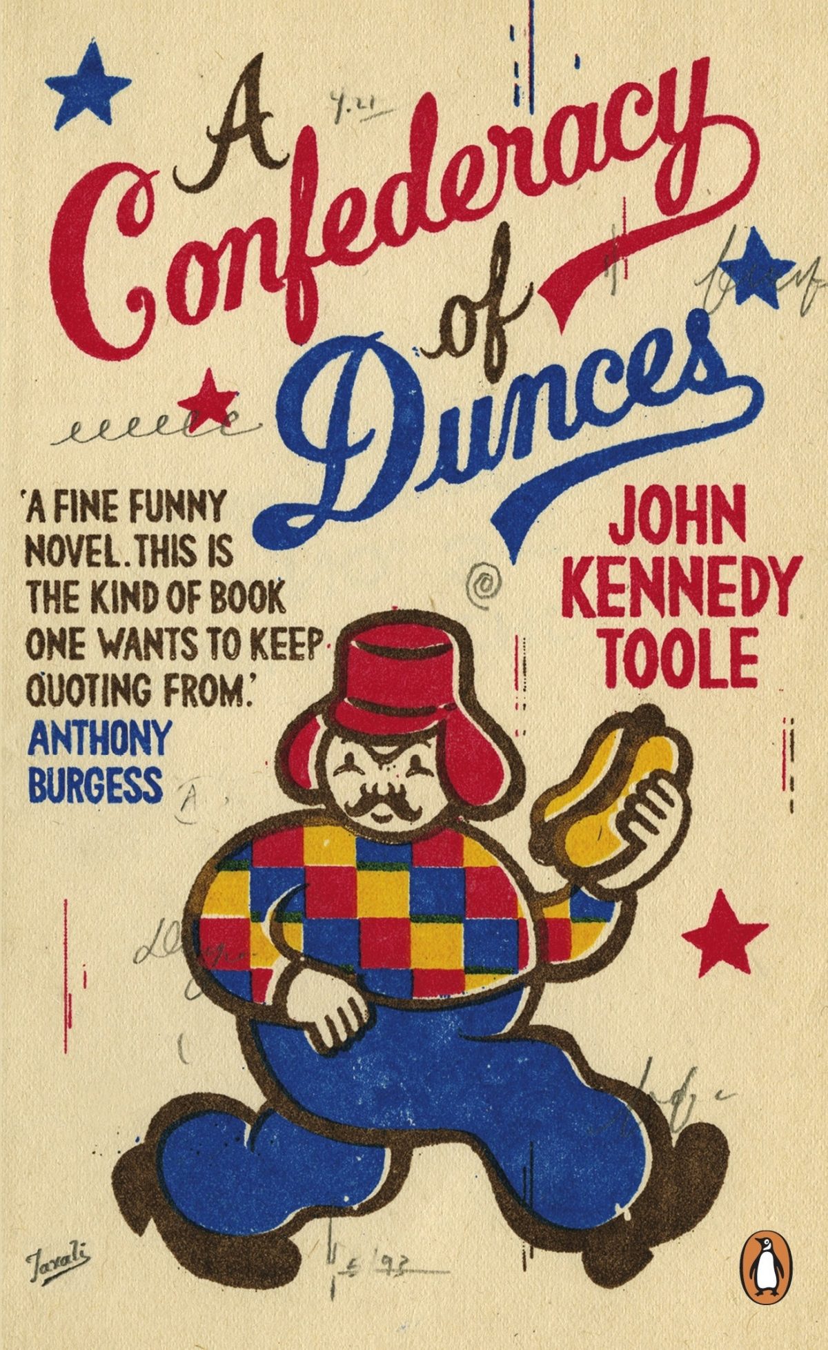
Confederacy of Dunces by John Kennedy Toole, design by Gary Taxali (Penguin 2011)
You just know this is Gary Taxali the minute you see it. Perfect.

The Best American Comics 2011 Edited by Alison Bechdel, illustration by Jillian Tamaki (Houghton Mifflin Harcourt 2011)
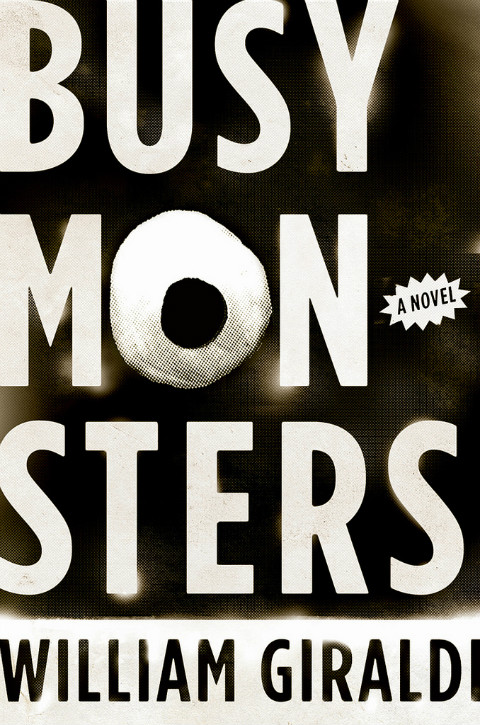
Busy Monsters by William Giraldi, designed by Rodrigo Corral Design (W.W. Norton 2011)
Series
In all honesty, I could have just posted 5o covers from series designed by Coralie Bickford-Smith and David Pearson here. It would not have been hard. At all. The creative forces behind the ‘Penguin Clothbound Classics’ and ‘Penguin Great Ideas’ series respectively, Coralie and David are surely two of the most influential designers working today. They have brought pattern, typography and a knowledge of design history back into fashion.
Coralie and David are not, however, the only designers who have done some remarkable work on series in the past few years. While I do want to highlight their work, I also want to share a few covers from series by other designers that seemed unique to me in some way…
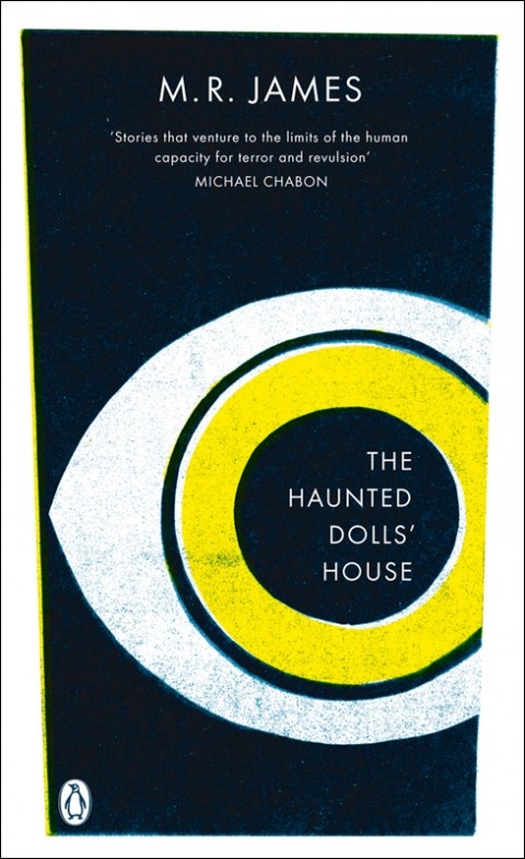
The Haunted Dolls’ House by M. R. James, design by Coralie Bickford-Smith (Penguin 2008)


Jane Eyre by Charlotte Bronté, design by Coralie Bickford-Smith (Penguin 2009)
The Odyssey by Homer, design by Coralie Bickford-Smith (Penguin 2010)
Penguin F. Scott Fitzgerald Collection
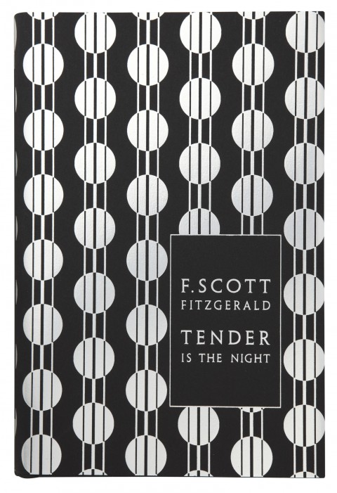
Tender is the Night by F. Scott Fitzgerald, design by Coralie Bickford-Smith (Penguin 2011)
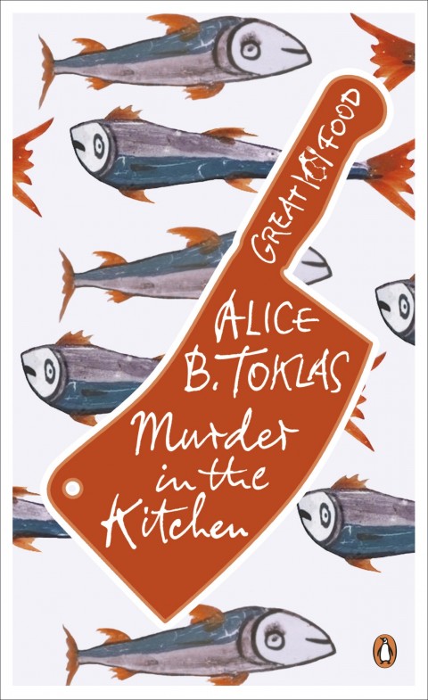
Murder in the Kitchen by Alice B. Toklas, design by Coralie Bickford-Smith, lettering by Stephen Raw (Penguin 2011)

Books v. Cigarettes by George Orwell, design by David Pearson (Penguin 2008)
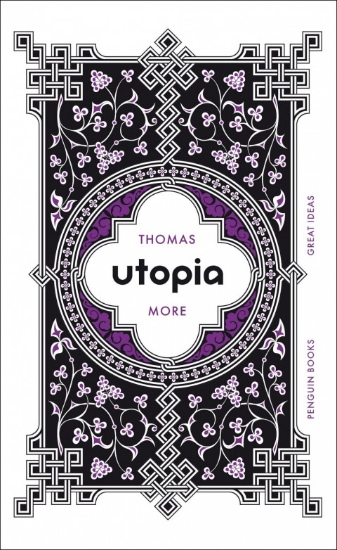
Utopia by Thomas More, design by David Pearson (Penguin 2009)
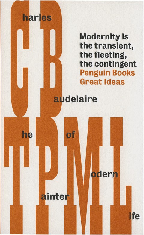

The Painter of Modern Life by Charles Baudelaire, design by David Pearson (Penguin 2010)
The Perpetual Race of Achilles and the Tortoise, design by Alistair Hall (Penguin 2010)
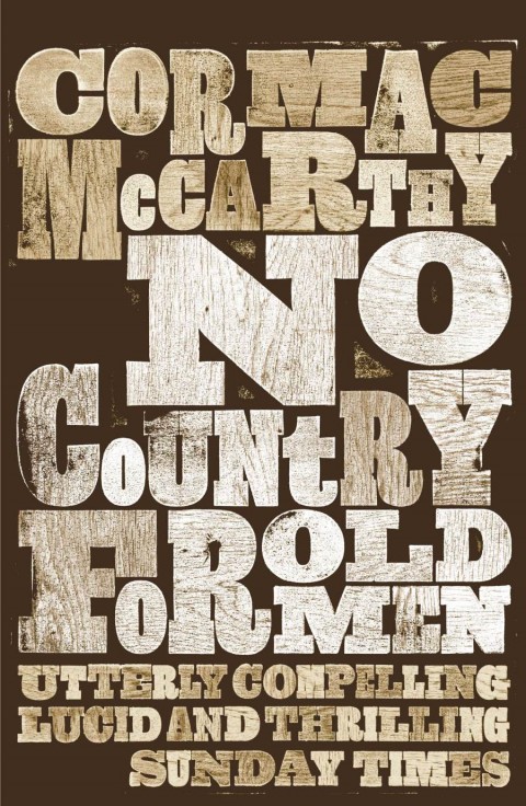
Cormac McCarthy Collection (Picador)
No Country for Old Men by Cormac McCarthy, design by David Pearson (Picador 2010)

The Train by Georges Simenon, design by Christopher Brian King (Melville House Press 2011)
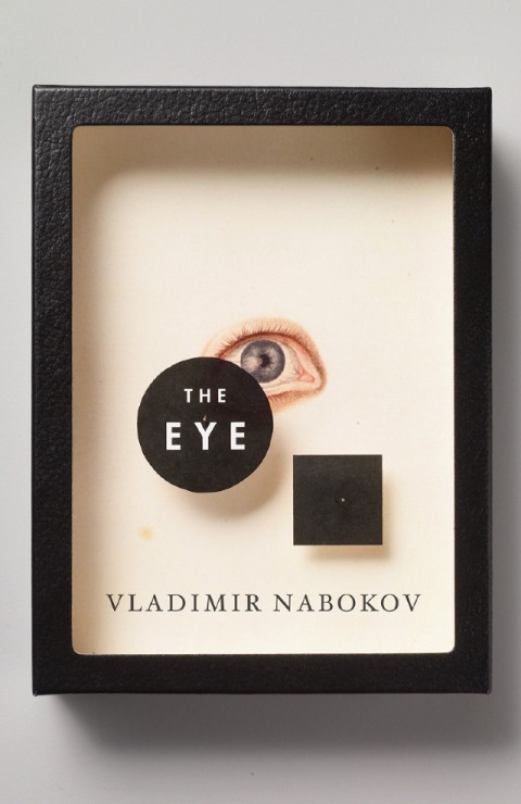
Vintage Nabokov
The Eye by Vladimir Nabokov, design by John Gall (Vintage )

The History of Sexuality Volume 2 by Michel Foucault, design by Peter Mendelsund (Vintage 2010)

John le Carré Collection
Tinker, Tailor, Soldier, Spy by John le Carré, illustration by Matt Taylor, designed by Paul Buckley / Gregg Kulick (Penguin 2011)
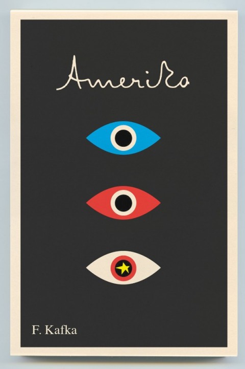
Amerika by Franz Kafka, design by Peter Mendelsund (Schocken 2o11)

Double Indemnity by James M. Cain, design by Evan Gaffney (Vintage 2011)
And there you have it. My attempt to break the internet.
I am greatly indebted to the Book Design Review, especially Joseph’s best of 2008 and 2009 lists, and the Book Cover Archive, both of which are still fantastic resources even though they are mothballed. Caustic Cover Critic and FaceOut Books were also really helpful.
I am so grateful to everyone who bothers to read the blog regularly, especially all the book designers and art directors who have, much to my surprise, supported and championed The Casual Optimist for the past four years — your generosity is what keeps this it going. THANK YOU.
Perfect selection thanks!
[…] Amazing review of book covers from the last four years. As this is the only one ive read i chose this one. Like this:LikeBe the first to like this. This entry was written by adam, posted on 25/09/2012 at 20:48, filed under Theory. Bookmark the permalink. Follow any comments here with the RSS feed for this post. Post a comment or leave a trackback: Trackback URL. « Street Ghosts […]
A perfect selection. Wow! 4 years. Congrats Dan. It’s a wonderful blog and I hope to never see it go away anytime soon. Enjoy your vacation and takes lot’s of instagram shots so we can all envy you.
I love the cover for Ken MacLeod’s Intrusion, a novel about pressure on mothers to take a pill called the Fix that eliminates genetic weaknesses.
[…] PHOTOS: The 50 most memorable book covers of the last four years. […]
[…] The Casual Optimist har laget et innlegg om de 50 mest minneverdige bokomslagene fra de siste 4 årene. Om du har sans for fine omslag, vil kanskje dette prosjektet interessere […]
A little bit too late but congratulations, Dan. Great selection and great, great blog
[…] A finales del mes pasado The Casual Optimist cumplía 4 años y lo celebró publicando una selección de 50 portadas memorables que han aparecido en el, probablemente, mejor blog de libros y diseño. Dejo aquí la primera de ellas, para ver la cuarenta y nueve restantes seguir este enlace. […]
I design software but your blog is the greatest source of inspiration in my life. Wish you the best, always.
Thanks, Soo!
[…] Via: The Casual Optimist […]
[…] https://casualoptimist.com/blog/2012/09/21/5-memorable-covers-2008-2011/ […]
I have always found myself imagining having a great and memorable cover to a book of personal poetry; for it to be the book that remains upon a thousand coffee tables amidst the mornings following crazy parties where drunk people come across the cover many a time and just stare at its beauty without ever even feeling the need to open it up and investigate further. Great selection. I do think you should indeed judge a book by the cover :)