Time & Again is a melancholy short film by Jacques Khouri about a man’s repetitive daily life. It is beautifully done with animated Chris Ware-like sequential panels:
Published June 3, 2010
Books, Design and Culture
Time & Again is a melancholy short film by Jacques Khouri about a man’s repetitive daily life. It is beautifully done with animated Chris Ware-like sequential panels:
[A quick note about the poll: thanks to everyone who voted, left a comment or sent me note this week — I really appreciate it. The feedback has been great. I’m going to shut the poll down at midnight tonight, but please let me know if you have any further thoughts about the direction of The Casual Optimist.]


Lauren Kaiser’s Little Red Riding Hood seen at Type Theory (pictured above).
 The Oscars of Type — Ellen Lupton’s list of the year’s top typefaces at Print magazine. “Best Actress” was awarded to Underware’s Liza Pro (pictured above). My interview with Ellen Lupton is here.
Happiness as By-product — Jessa Crispin founder of Bookslut interviewed by Jeff VanderMeer, author of Booklife (which Crispin was critical of interestingly):
I was having a conversation with a writer the other day, and he stated that the best things are always by-products. Happiness is a by-product, and I loved that he said that. You can plot your journey to success or happiness or wealth or whatever it is you’re looking for, but if you’re too focused on the end result, you’re going to miss anything good going on around you… Not that we should all sing songs around the campfire and braid each other’s hair, but there has to be a combination of the two, forward motion and goal planning, but while taking a look at the people around you.
Comics Studies Reader — Jeet Heer on comics and comic scholarship at Books@Torontoist:
I think there’s a wide variety of things that can be done with comics, and I think we’ve only scratched the surface… One of the interesting things about manga is that kids are reading translated manga that reads right to left. Part of the reason that’s possible is because comics are both words and pictures – half of the translation work is already done. So you can look at a comic book in a language you don’t know and you won’t get everything but you can still get a fair bit of what it’s about. And so they have this sort of function as cultural ambassadors. You can actually learn a lot about a culture just by looking at the comics.
The New Yorker 85th anniversary covers by Chris Ware, Adrian Tomine, Dan Clowes, and Ivan Brunetti seen at the Creative Review blog (Adaptation by Tomine pictured below).

Art Spiegelman and Francoise Mouly (art editor at the aforementioned New Yorker) discuss The Toon Treasury of Classic Children’s Comics with (a particularly gushy) Michael Silverblatt for KCRW’s BookWorm :
Comments closedBack in November, the chaps at The National Post asked me and a selection of eminently more qualified Canadian book types what we thought the most important publishing story of the past 10 years was. They ran the results at the weekend and the smart answers ranged from decline of literary magazines to the rise of Google.
I have to admit, I was at a bit of loss as to how answer the question. Decades are such arbitrary periods of time. I read somewhere that the 19th Century didn’t really end until 1914, and in a way I feel like the 21st Century didn’t really start until the day after 9/11 2001. And who is to say that epoch is over? So many things still look the same…
Of course I really have no idea what any of the last 10 years meant for books. I don’t have enough perspective. All I knew is that I wanted to say something positive (nobody likes a whiner) and avoid saying anything too obvious, boring or bullshitty (i.e. definitely no talk about either the “death of publishing” or “teh internetz”).
In the end I equivocated and then gushed about something close to my heart — comics:
“J.K. Rowling’s Harry Potter and online retailer Amazon dominated the decade, but they have their roots in the previous century (Amazon was founded in 1994, Harry Potter and the Philosopher’s Stone was published in 1997). George W. Bush surely has a claim — his crimes and misdemeanours created an industry within an industry and produced many fine books including The Dark Side by Jane Mayer and The Forever War by Dexter Filkins — but the very thought of the 43rd President of U.S. being the publishing story of the decade is simply too horrifying to contemplate seriously. Many people will no doubt say e-books, but I think they will be the story of the next decade. So I’m going to go with the popular success and the critical acceptance of long-form comics (the “graphic novel” if you must) as the big story. With the likes of Asterios Polyp, Black Hole, Bone, Epileptic, Fun Home, George Sprott, The Hunter, Jimmy Corrigan, Louis Riel, Paul Moves Out, Persepolis, Safe Area Gorazde, Scott Pilgrim, Skim and Shortcomings (not to mention the beautiful reprints of Peanuts and translations of Tezuka and Tatsumi) to name just a few, we really have had a wonderful decade.”
Perhaps, not the wisest thing I’ve ever written, but hey…
The Post also asked us to nominate our best books of the decade.
As I’ve said before, I’m really not terribly qualified (at least compared to some) to make a call on “best” (especially when it comes to Canadian literature), but I did strive to be more objective than I was with my personal list of the books of 2009, which meant leaving out eclectic favourites ranging from Stet and How To Be Alone at one end of the spectrum to Hellboy: Conqueror Worm and Hard Revolution at the other, with the likes of I’ll Go To Bed At Noon, Lush Life, Mother’s Milk and The Dark Room stuck somewhere in the middle. And that’s not to mention all the art and design books I chose to leave out: 79 Short Essays on Design, Penguin By Design, The Curiously Sinister Art of Jim Flora, Charley Harper, to name just a few of the top of my head…
But with all those caveats firmly in place, here is my annotated and abridged list of the best books of the decade compiled for The Post:

Remainder by Tom McCarthy (Metronome 2005, subsequently published by Alma and Vintage)
Tom McCarthy’s Remainder was the first book I worked on at Raincoast Books — We briefly distributed the Alma Books hardcover before Vintage published their own paperback edition (pictured above, cover design by John Gall of course,with the most unlikely of blurbs from Jonathan Lethem) in the US and Canada — so it has a special place on my shelf. Oh and it’s really good.
Here’s what I wrote for The National Post:
“If only for a fleeting moment Remainder, a dark and spare novel about personal authenticity and murderous re-enactment, seemed to offer a creative alternative to the cul-de-sac of overwrought and twee novels emanating from Brooklyn (and creative writing classes everywhere). Sadly the bloated and banal seem to have made a decided comeback (if they ever went away), but even so, the unashamedly intellectual Remainder stands out, perfectly capturing the fears and anxieties of the decade.”

The Amazing Adventures of Kavalier and Clay by Michael Chabon (Random House 2000)
Possibly the polar opposite of Remainder, Chabon’s literary Boy’s Own adventure hit a lot of my buttons: Golden Age Comics, Eisner, Steranko, European folklore, New York, and WWII. Really, what’s not to like? But my affection for this book ebbs with every new effort — including Chabon’s own — to repeat the formula and turn pulp into something politely literary. (And NB the Picador paperback cover design above is by Henry Sene Yee — you can see his sketches here).

Jimmy Corrigan: The Smartest Kid on Earth by Chris Ware (Pantheon 2000)
Perhaps not my favourite graphic novel favourite of the decade (that slightly dubious honour would probably go to Tekkon Kinkreet — and although the English edition I own was published in 2007, the series itself is actually from the mid-90’s, so I didn’t think it qualified for this list), but Ware’s breakthrough graphic novel began the decade and went on to creatively define it for graphic novels. No Jimmy Corrigan, no McSweeney’s Issue 13.

Never Let Me Go by Kazuo Ishiguro (Knopf 2005)
Like Kavalier and Clay, Ishiguro’s quietly evocative SF novel justifiably appeared on a lot of other Best of the Decade lists. It’s just beautifully, beautifully written and has a silver sliver of ice at its heart.

The Dark Side by Jane Mayer (Doubleday 2008)
It’s almost impossible to think about books that are representative of the decade without including at least one on the Bush Presidency, 9/11 and the awful ‘war on terror’. The Dark Side could easily have been the aforementioned Forever War by Dexter Filkins, or Ghost Wars by Steve Coll, or Imperial Life in the Emerald City by Rajiv Chandrasekaran, or one of the many other excellent books on these topics. But Mayer’s exposé of state-sanctioned torture chillingly underlines the bureaucratic banality of evil and the horror lived long in the mind after I finished reading it.
And, you know what? The Dark Side reminded me that books are important. They can and should be more than vehicles of self-promotion. Research — real research — requires more than Wikipedia. And — fuck it — we need to keep paying writers to write.

Louis Riel: A Comic Strip Biography by Chester Brown (D+Q 2003)
I suspect Louis Riel is now a creative and stylistic albatross for poor ol’ Chester Brown, but it was my joint first choice for the Canadian book the decade. This is what I wrote for The National Post:
“Not only is Louis Riel a uniquely Canadian story, it was published by Drawn + Quarterly (surely the most interesting Canadian publisher of the decade) and it epitomizes their success at unearthing and supporting creative talent. It isn’t a coincidence that Daniel Clowes—author of Ghost World and one the cartoonists of his generation—has decided to publish his new book with them.”

Pattern Recognition by William Gibson (GP Putnam And Sons 2003)
Although Pattern Recognition did not receive good reviews when it was first published and I bought the hardcover out of a reminder bin, it was my other pick for Canadian book of the decade. The book’s obsession with the fringes of pop culture and the dislocation and horror of the globalized world seemed to me (in some small way) to make it the first novel genuinely about the 21st Century. Even if it dates horribly (which many critics seemed to think it would), I think it’s a something of a cult classic. This is what I said to The National Post:
“A prescient post-September 11th novel about viral media, [Pattern Recognition is] the antithesis of the clunking, insular, parochial Canadian novel so beloved of literary prizes. The book is not without its flaws – it was not well received by the critics when it was published in 2003 – but it just fizzes with ideas, oddness, and energy. I can’t think of another Canadian novel that I refer to quite as often in everyday conversation. Give me flawed and brilliant over dull and worthy any decade of the century.”
OK — I love Pattern Recognition and I do talk about it a lot — but I was being a bit of a shit disturber here (which is probably why The Post ignored it). That said, Pattern Recognition is better than several other books (that shall remain nameless) that did make the cut that’s for sure.
So, that’s my list. You can read the Post’s selections here. What did we miss out?
5 Comments
I get excited just about every time I post an interview on The Casual Optimist (I am officially a cheap date), but it is a special thrill to post a Q & A with Jacob Covey, designer and Art Director at Fantagraphics.
Partly this is because I’m grateful that in defiance of all reason, publishing wisdom, cold, hard financial facts, bitter law suits, common sense and ‘good taste’, pioneering Seattle-based comics publisher Fantagraphics even exists.
Partly it’s an excuse (not that I really need one) to post Love + Rockets cover art.
And partly it’s because I thought there was a very real chance the interview wouldn’t happen.
But mostly it is because there is something about Jacob’s work — which combines the Chantry-esque DIY design aesthetic of skate art, gig posters, record sleeves, underground comix, zines and punk, with a Ware-like preoccupation with detail and precision — that resonates with me and fits so perfectly with Fantagraphics.
Needless to say, Jacob’s award-winning work has been featured in Print, Communication Arts and How.
We caught up over email…

How did you get into book design?
The germ of the thing started with working at the public library where I was a conspicuously slow page. I would look at every cover I was shelving, setting aside certain ones to check out and carry a few blocks away to a color photocopier. I liked having the inspiration around and I couldn’t afford to buy design books. This was around 1999, when I was beginning to study graphic design and at night was staying out late shooting photos of bands for record labels, local monthlies, and things like that. As for getting into book design professionally, in late 2003 I had just moved back to the Northwest after leaving a job in Los Angeles at a skate company. I was interviewing for a job to churn out ads at the local alternative weekly, The Stranger, and the Art Director, Joe Newton, kindly suggested that I instead talk to Gary Groth at Fantagraphics. They were looking for a new designer but apparently they were in no hurry to actually hire someone as I basically called relentlessly for six months. I think I was just the last man standing at the other end of the phone line so they hired me.


Briefly, could you tell me about working at Fantagraphics?
If the publishing industry is a zoo, then Fantagraphics is the monkey house. It’s not a conventional workplace and you could get tetanus from walking barefoot but it’s a place where everyone is laboring out of love and there’s a lot of receptivity to trying new things and having your ideas heard. Much more so than I think is possible at most publishers. I have immense respect for the history of the company as an archivist of great work and I have the opportunity to deal with our publishing decisions on a regular basis. It’s satisfying in that way– but the office itself is a neglected three story house with 30 years of dusty artwork, ancient paste-ups, and discarded razor blades strewn about. So it’s not for everyone.
As for the work, Fantagraphics publishes the great cartoonists from Charles Schulz to R. Crumb, but as often as not I’m designing a book of paintings or a collection of pop culture artifacts or even the occasional prose novel.

You’re also a freelance designer. How is that different from your role as art director at Fanta
For one thing I’ve established myself with Fantagraphics enough that I know the material well and have to explain my decisions less. They’re very supportive and because of that I am mostly pushing myself to do better work. With my freelance clients there’s a lot more to learn from their needs and the process involves more time spent on researching and exploring ideas. The freelance work is also much more varied subject matter. For example, as I type this I’m working on the branding for a 2011 museum exhibition focusing on the band Nirvana, a non-fiction book cover for HarperCollins, a band t-shirt design, an AIGA event poster, and a book layout for a start-up imprint in the UK. There are a lot of other publishers I’d like to work with but I’m a pretty shoddy self-promoter.


Could you describe your design process?
In the case of Fantagraphics, I hate to say that most of the time there are so many projects on my plate that I’m just cranking the books out, trying to trust my instincts and learning from any mistakes. We have a list of about 50 books a year with only me and one other designer, Adam Grano, along with our works-through-the-night production guy, Paul Baresh, scanning and laying out everything from the books to the ads and supplying media requests — if we get behind schedule we rarely hire out for another designer, the book simply gets published late. So there’s a lot of pressure to just keep moving. The job requires a lot of discipline to approach books with an eye on getting them approved by the editor/artist without delays and yet still make them interesting. There is process but it’s very accelerated and it’s not unusual that I have to go with my first impulse for a book design and wish I had time to do a dozen more comps.


Is designing for reprint collections different than designing for new material?
Notably, the job description of a cartoonist and a graphic designer are similar in that they both work with text and images but the truth is very few cartoonists have a very developed design sense (just as my cartooning skills are sub par). Working with individual artists on original material can be a really rewarding collaboration or a Sisyphean attempt to improve an idea that the artist is married to. So, in truth, the deader the artist, the easier my job — reprint collections have a more dispassionate approval process.

What are your favourite books to work on?
I’m not sure that there’s any type of book that’s my favorite to work on but I’ve become very comfortable with the process that goes into art books in general. I just finished working on a very collaborative book of VHS box art with the collector/editor Jacques Boyreau and I enjoyed that. The subject matter itself isn’t necessarily what’s interesting to me but there was a long process of sitting with Jacques early on and determining the best way to showcase the work, which ended up being very austere, spotlighting the actual physical history of the boxes and conjuring the experience of seeing them in their element by retaining the old, beaten up boxes, plastered in rental stickers. Some of these boxes we had to prop back together from having been chopped up for those large plastic cases that were used in videostores. In the end, there was more of an anthropological story to looking at the boxes themselves rather than just the art that was on them.
This doesn’t work for every project but it’s great for receptive, collaborative editors. It’s fun to step into someone else’s fixation and figure out how to present the material more evocatively, in a way that will pull other people into what the editor loves about the subject. To design in a way other than plop-plop-plop, here are the images and some nice captions. Then I finish that book and it’s my job to find out and communicate what’s exciting about the next one.

How much say do the artists involved have in the design of their books?
Assuming the artists are involved in a given project, they generally have all the say they want. Fantagraphics publishes The Best and we have to respect the artists’ wishes and peccadilloes. They’re visual people so we usually end up with a good package, if not always a great one.

How are final cover decisions made at Fanta?
On a lot of projects I get more say than is customary for the Art Director but it ultimately rests on the in-house editor of the project and the outside artist or editor whose book it is. We all hash out our opinions about what works for the material and the market but we don’t really have scheduled meetings to sit down and scrutinize. Again, it’s all pretty swift moving.


Who else do you think is doing interesting work right now?
Honestly I can’t seem to go on the web without being intimidated by all the talent that’s out there. I couldn’t list all the people. By far, the designer who most consistently floors me is Peter Mendelsund. The man works brilliantly in every genre thrown at him. I also have to say how happy I am that the Design Works Group guys are in nearby Oregon. I don’t know any other book designers here in Seattle so it’s great to have them around, making a good name for the Northwest.
Where do you look for inspiration and who are some of your design heroes?
I’m a cliché: Inspiration is wherever it turns up.
Art Chantry has been really important throughout my development and is someone whose talent and vision I admire a great deal. I think his influence shows up the most in my work, though not necessarily in the most obvious ways. Chantry, Lester Beall and the Constructivists were my heroes when I used to proclaim design heroes. I would definitely add Mendelsund and Paul Sahre to my contemporary list.
Of course you can’t work in comic book design without acknowledging the significance of two of the world’s most important contemporary designers, Chip Kidd and Chris Ware. They made it possible for me to do a lot of what I do with Fantagraphics.


Could you tell me a little about your personal project Beasts! ?
Beasts! is a classical bestiary of mythological creatures as depicted by some of my favorite contemporary artists from the worlds of comics, skate graphics, rock posters, children’s book illustration, the fine art world, et cetera. The first book is now in its fourth printing and the second and final volume came out in early 2009. Each book has ninety artists and four writers involved. I call myself the curator of the project as it’s more like an art exhibit than a standard art book. I wrote up brief descriptions based on my research of creatures, then the artists chose the creature that was most interesting to them and the writers would pen proper text based on historical references to the creatures. It’s a lot more serious than people seem to expect. I like these stories, I like that these creatures existed to someone who told the original story, and it was great to see them given form — a lot of the beasts are very obscure and before I got art from an artist there usually wasn’t any depiction to be found for a beast. There are also interviews with respectable experts like the marine biologist, artist, and writer Richard Ellis as well as contemporary eyewitnesses to some mysterious beasts.
Did you design the Beast! books as well as edit them?
Yes, except the Chinese edition that just came out. The publisher translated and totally repackaged it for that market. It was part of my intent with Beasts! to see what could come of a close working relationship between the editor and the designer on a book project. (Obviously I took that to the extreme by performing both roles.) Books are generally fairly linear, straight-forward affairs or sometimes they’re eccentric art books that end up feeling like design masturbation. I’m interested in what can happen somewhere in between these things that will engage the reader to enjoy multiple readings or even to just feel like more of a participant in the whole experience. There are a lot of interesting details that never make it into books simply because the designer isn’t involved with the editorial side or is otherwise not involved on a collaborative level.


What does the future hold for book cover design?
Everyone’s got an opinion on that and my voice would just be din. It’s hard to say if it’s like the film world facing VCRs or the music world facing MP3s but it’s not bleak to me.
Thanks Jacob!
You can find more of Jacob’s work on his website.
UPDATE: Jacob was kind enough to send me a few more images to accompany the interview and these have now been added to the original post.


The Nabokov Collection — Art Director John Gall on the Vintage Nabokov redesign at Design Observer:
Nabokov was a passionate butterfly collector, a theme that has cropped up on some of his past covers. My idea was also a play on this concept. Each cover consists of a photograph of a specimen box, the kind used by collectors like Nabokov to display insects. Each box would be filled with paper, ephemera, and insect pins, selected to somehow evoke the book’s content. And to make it more interesting… I thought it would be fun to ask a group of talented designers to help create the boxes.
John’s short essay is accompanied by a great slide show of the specimen boxes (above: The Luzhin Defense by Paul Sahre; below Speak, Memory by Michael Bierut).

And Joseph at The BDR has a nice follow up post, with a couple of nice vintage Nabokov covers.
So, do the specimen boxes (lovely as they are) work as covers? You tell me…
Amazon releases a Kindle app for PCs. But who cares? Hmm… I don’t know if I ‘care’ as such, but I do think it’s significant. Is it one more nail in the plastic coffin of single use devices? There’s more on the app at the Washington Post…
And while we’re on the subject of e-books…
The Internet Isn’t Killing Anything — From Russell Davies:
Something That’s Growing Is Not The Same As Something That’s Big.
Something That’s Declining Is Not The Same As Something That’s Small.
…Worth remembering I think.

Best Illustrated Children’s Books of 2009 — The New York Times choose their favourites (accompanied with a lovely slide show). The New Yorker‘s Adam Gopnik talks about the selection process with Sam Tanenhaus on the Book Review Podcast (pictured above: Tales From Outer Surburbia written and illustrated by the awesome Shaun Tan).
And finally…

A sneak peak at the new Krazy & Ignatz cover by Chris Ware for Fantagraphics.
1 Comment Photo by Erika Larsen. Design by Paul Buckley
It is not every day that I get an email from the Vice President Executive Creative Director of Penguin US, so it was something of a surprise when Paul Buckley sent me a note a few weeks ago about a book cover design mentioned in my interview with his wife Ingsu Liu.
I had been conspicuously unable to locate the image online and Paul was able to help. But it seemed like too good an opportunity to miss, so I asked the Brooklyn-based designer if he would be willing to do a Q & A about his work as well. Again, much to my surprise, not only did Paul say yes, he managed get his answers back to me in record time (with annotations and links included!)…
 Of Mice and Men
How did you come to book design?
I went to SVA on an illustration scholarship, and was very intent on becoming an illustrator. While other parents were giving their kids children’s books, my father was giving me illustration annuals. But I supported myself during my college years working for various NYC design studios as a designer, learning through those around me… and at the same time pursuing freelance illustration assignments as well – basically learning both crafts simultaneously through different venues. Right after graduation I took a 3 month road trip spending my savings, and thus came home to Greenpoint needing an income. A studio manager at one of the studios I worked in during my early college years suggested me to her sister who was working at NAL/Plume/Dutton, as they needed a Junior Designer… I landed the position with a portfolio that was equal parts design and illustration. Though in the beginning I was very hardcore about becoming the best painter I could be, I quickly fell in love with designing book covers and never looked back… within two years we merged with Penguin. Though I’ve become far too busy (and lazy!) to pull out the oils and actually paint something, I did manage to get a few simple ink drawings in the Society of Illustrators this year. I realize these will pale in comparison to 99% of everything else done by the true working pros in the annual, but it was still a kick and an honor to have my work chosen for inclusion.
 The World According to Garp
Can you describe your role at Penguin?
I act as a Creative Director overseeing a sizeable staff and many many projects. My Penguin publishing team is very open to me and my guys pitching ideas and we nicely act as an overall creative team, in a way that editorial and art together collaborate to create nice projects — most recently I’m directing a cover design book where we have the authors commenting on their covers, and a new series named Penguin Ink, where the world’s leading tattoo artist’s do covers for me. Recently in the stores is the gorgeous collaboration of Roseanne Serra with Ruben Toledo… this was all Roseanne’s brilliant art direction, and I had nothing to do with it — but it is gorgeous Penguin project that is very much worth checking out.
Art by Duke Riley
 Art by Chris Conn
How many imprints do you oversee?
Six
Does each imprint have a particular design style?
Yes, each imprint is very unique unto itself, as each Publisher/Editorial team brings their own style, as does each Art Director. In my group, Roseanne Serra and I collaborate on Penguin paperbacks, and to a lesser degree, with the Viking imprint as well. Roseanne art directs Pam Dorman books. Joe Perez smartly art directs Portfolio and Sentinel, which are brilliant business and political imprints. Darren Haggar art directs Penguin Press overseeing the packaging for literary giants like Thomas Pynchon and Zadie Smith… and while not it’s own imprint per se, Maggie Payette Art Directs our gorgeous poetry series.
The Jan Tschichold Penguin paperbacks are design icons in the UK. Is there a sense of that legacy within Penguin Group USA?
Very much so. We all have quite a few Tschichold books on our shelves. The UK Penguin art department, under the Art Direction of Jim Stoddart and John Hamilton, does an incredibly beautiful job of keeping that legacy alive.
How is American book cover design different from the UK?
I don’t know that it is all that different. In fact, Art Directors over here, and Art Directors over there, are hiring the same art and design talents on each side of the Atlantic.
Do you discern any current trends in American book cover design? Yes… very nicely a resurgence of designers and illustrators who do both the design and illustration; the whole package. Jaya Miceli, Chris Brand, Jon Gray, Gregg Kulick, Jamie Keenan, Rodrigo Corral, Ben Wiseman, Jennifer Wang, Tal Goretsky, etc – these are the folks creating the personally unique covers of today that will be the design icons of tomorrow.

 Art by Chris Ware
How did the Penguin Graphic Classics come about?
We do a handful of what we call Penguin Graphic Classics Deluxe packages every list, and when it was time do one for Voltaire’s Candide, I handed it off to Helen Yentus who was in my group at the time. Helen wanted to work with Chris Ware on it, and off it went with us all happy that he accepted the assignment. When Chris’s sketch came in, it just sort of blew everyone away… Up to that point we’d never had anyone grab editorial control of a cover that way… Chris had gone hog wild and wrote all his own copy and illustrated and designed the living hell out of every square inch of this cover from flap to flap. It took forever to make its way around the packaging meeting table with everyone grabbing hold of it, reading it and laughing out loud. A short time later, our Penguin Publisher Kathryn Court declared that we needed to do more of these. Kathryn really nurtures good art and design and is one of the reasons I’ve been here so long.

Cover by Tomer Hanuka with design by Paul Buckley and Tomer Hanuka
Art by Anders Nilsen
 Art by Charles Burns
 Art by Roz Chast
How did you match the artists with the titles?
The titles were given to us by the Penguin Classics editorial team, and Helen and I would sit in my office surrounded by comic books and simply have fun matching this artist with that title.
 Art by Michael Cho. Design by Paul Buckley
Are their plans to expand the series? What new covers can we look forward to in the future?
We do about 6 a year and I think we are all comfortable with that number at the moment. I just finished White Noise with Michael Cho… Moby Dick by Tony Millionaire just came out, as did Huck Finn by Lilli Carré, and Ethan Frome by Jeffrey Brown. In the near future, I’d really love to do something with Jim Rugg, Jeff Lemire, Mike Mignola, David Small, and I still hold out hope that one day Crumb will actually say to me “damnit you pesky bastard… ok, ok, I’ll do it”.
 Art by Tony Millionaire
 Art by Lilli Carre. Design by Paul Buckley
Do you still design yourself?
All the time… mostly in the evenings after everyone has gone home and I can focus without the constant distractions of the work day. My greatest hits are posted on my website.
Art by David Byrne. Design by Paul Buckley.
Pigmented foil stamped on linen cloth
 Art by Will Eisner. Design by Paul Buckley.
Art direction by Ingsu Liu & Albert Tang
Art by Will Eisner. Design by Paul Buckley.
Art direction by Ingsu Liu & Albert Tang
Photo by Fredrik Broden. Design by Paul Buckley
Could you describe your design process?
I start each project with the hope that I’m going to do something unusual; and then I try my best to do just that — read the material and find a visually unique way to interpret it. I tend to go either very loud, or very subdued and moody. I do a ton of comps for every cover I work on — sometimes, 20 or more to explore what I’m thinking and all the tangents that come along during the process — I get nuts when freelancers send me two or three comps. I’ll show 3-5 of what I think are the best and receive comments and direction on those from editorial… when discussing why a designer did this or that, I think what people commenting on book covers seem to gloss over is that the publishers and editors have far more at stake than the cover designer — they have committed sums of money and must answer to the house and the author to make this book a success — so they are very strong about what they think the cover should be and nothing is being printed without their full consent.
Here are a few rejects from the pile… I’m not saying these covers are better for the individual book, than what got printed… maybe the books would have tanked with these covers… but they do illustrate how in-house visions do not always sync:
Upper left: art by Paul Buckley. Upper right: various stock.
Lower Left: art by Amy Bennett with descending placards by Paul Buckley.
Lower Right: painting by Keniche Hoshine with added stock image.
(see final cover here)
Various antique endpapers combined with altered ebay images
and antique portrait of feral child.
(see final cover here)
Do you approach fiction and non-fiction differently?
Often, yes. Fiction needs a more peripheral approach where I’m looking to capture a mood to reflect the book’s tone, whereas non-fiction often needs you to stare it directly face on and state precisely what the topic is.
What are your favourite books to work on?
Any title where the Editor and Publisher are open.
What are the most challenging?
Any title where the Editor and Publisher are nervous.
Where do you look for inspiration?
Everywhere. My staff blows me away daily. My wife shows me beautiful work constantly. Editors show me stuff. Blogs like yours so nicely showcase how much great work is out there. Friends deluge my inbox with artist links. Illustrators. Photographers. Fine Artists. Music. Furniture. All talent is inspiring. Cruising Flickr and the web in general has me bookmarking new people daily, and I can spend hours google imaging the most absurd things that always tangent me to the greatest places. I found and purchased an image for a difficult book cover project recently just because I decided to google “leucistic squirrel” after I noticed a few in Prospect Park. I have no idea how we all existed before the internet.
What do you look for in a designer’s portfolio?
A unique talent. Distinction.
 Front cover art by Frank Miller. Design by Paul Buckley
What does the future hold for book cover design?
There will be a market that just wants/needs to download the material for reading purposes, and there will be a market that is looking for an object. What Penguin does with the Graphic Classics is a great example– some student will download Gravity’s Rainbow cheaply, while an older Thomas Pynchon or Frank Miller fan with a little more cash in their pocket will want the beautiful book/object. So I believe the cover design market will shrink in that way. Textbooks and travel guides will go digital first as there is no real reason to carry all that in your backpack or pay for all that book production. For digital readers, big budget fiction and non fiction titles will have moving covers, more like mini movie trailers. If Grisham were still with us, his future digital reader cover would be something akin to us looking at a murky black screen… the reader would hear running footsteps and ragged breathing… then a loud shot rings out, and a big red splotch hits your screen and drips to form the title type. Then one blurb after another flies across the screen and after a moment Grisham himself pops up in the corner thanking you for purchasing his new book and asking if you’d like to peruse his backlist titles… and click this link if you’d like to pay an extra dollar to help our troops in North Korea, Iran, Afghanistan or Iraq. Interior-wise, there will be tons of product placement… not necessarily for gratuitous reasons; but because people, places and things are mentioned on every page in every book be it fiction or non fiction; and if folks desire a more interactive read that really helps them get into the book in a different way, then it’s possible there will be quick jump links to everything – for instance… if in this book, the character is having lunch in Balthazar and then running off to the Standard Hotel for an ongoing affair… then why not have Balthazar and The Standard pay a small fee to the publisher to provide these links; this seemingly free advertising? Big money to had there. I reserve judgement as to whether any of this is a good thing or a bad thing… but as publishing goes more digital, I think it’s naive to think these things wont happen to books just as they happen everywhere else.
Thank you very much!
You bet.
9 CommentsHappy New Year! I hope you’re keeping safe and well. The first post of the year is the now customary look back at the previous year’s Young Adult covers. All the covers on this year’s list are illustrated (which was almost, but not quite, the case last year too). I love illustration — it’s part of the reason why I still keep doing these posts! — so it’s possible that this just reflects my personal preferences, but almost all the YA covers I saw this year were illustrated. There were very few photographic or type/letter-only covers.
I compile this list a little differently to my adult list. It’s mostly done over a few weeks at the end of the year rather than compiled across the year as a whole. I’m sure this skews my selections too. I’m probably overly reliant on cover reveal posts and best of the year lists. I think this probably means that the big American publishers are over-represented, which is less than ideal. I suspect they’re dominant in the category anyway, but I’m sure I am missing some interesting covers from independent and international publishers all the same.
The Horror and Fantasy seem to be having a moment. The line between YA and adult covers seems very blurred in both genres. I had to double-check a number to titles to confirm where they belonged. It happened often enough for me to think it was intentional, which probably speaks to who is reading YA and what they are looking for. It is also possible that I am over-indexing both genres here because they seem more mature and they appeal to me personally. I am also less of a fan of the illustration styles popular for the romance genres at the moment, so I think it’s fair to say they are under-represented on the list. I am very aware that I am not the target audience, so I’m not sure it is something that should overly worry art directors (although apologies if you’re disappointed not to see more of your covers on the list!). Still, it might be nice to see some new / different approaches to Romance — and all genres, frankly — going forward.
And with that, I wish you all the best for 2025, and I hope you enjoy the post!
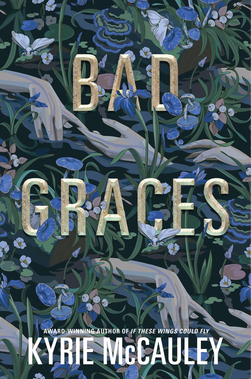
Bad Graces by Kyrie McCauley; design by Joel Tippie; art by Katya Murysina (Katherine Tegen Books / June 2024)
Bad Like Us by Gabriella Lepore; design and illustration by Julian D. Paulsen (Inkyard Press / March 2024)
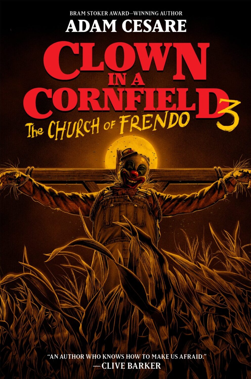
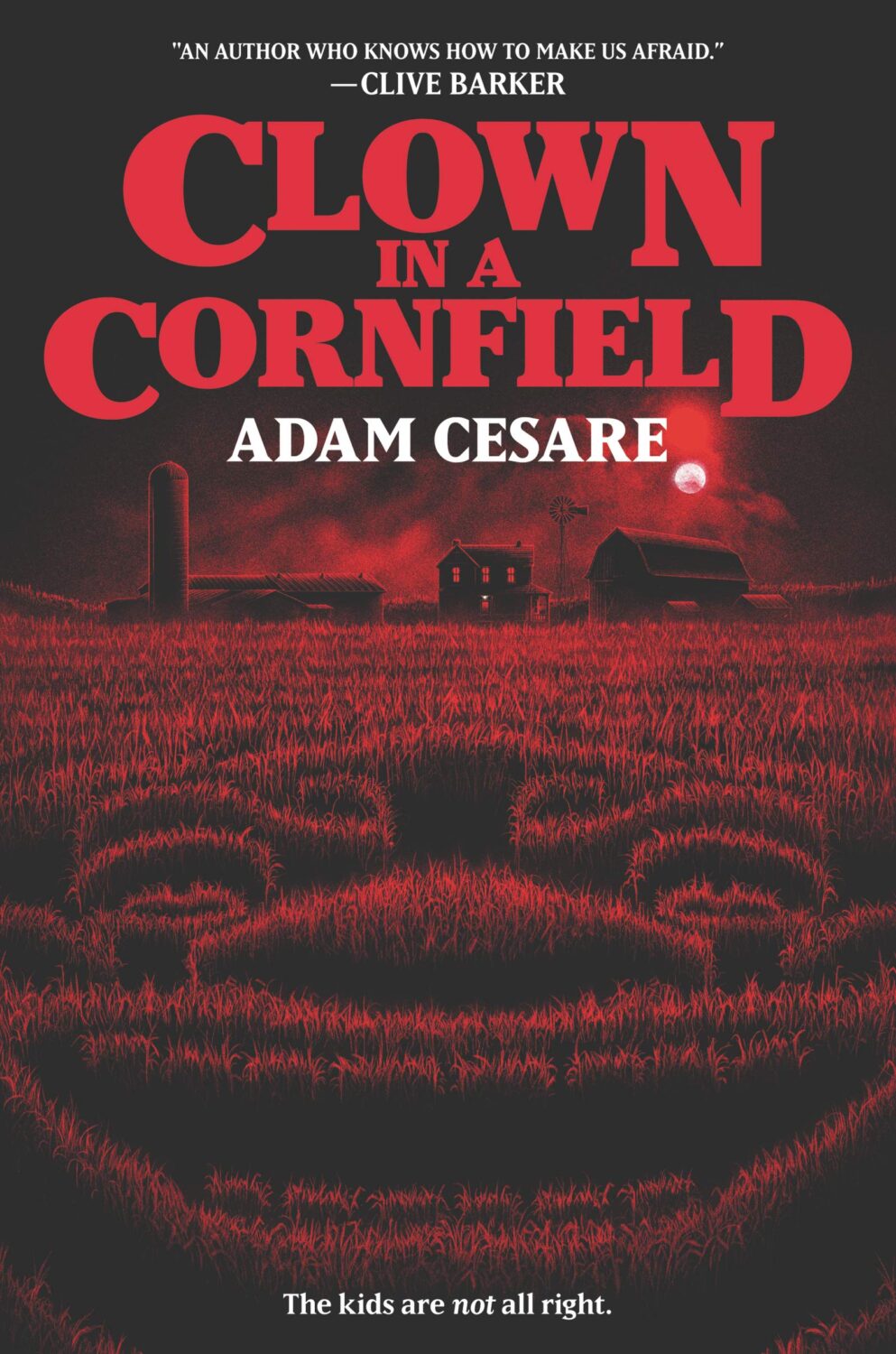
Clown in a Cornfield 3: The Church of Frendo by Adam Cesare; design Jenna Stempel-Lobell; art by Matt Ryan Tobin (HarperTeen / August 2024)
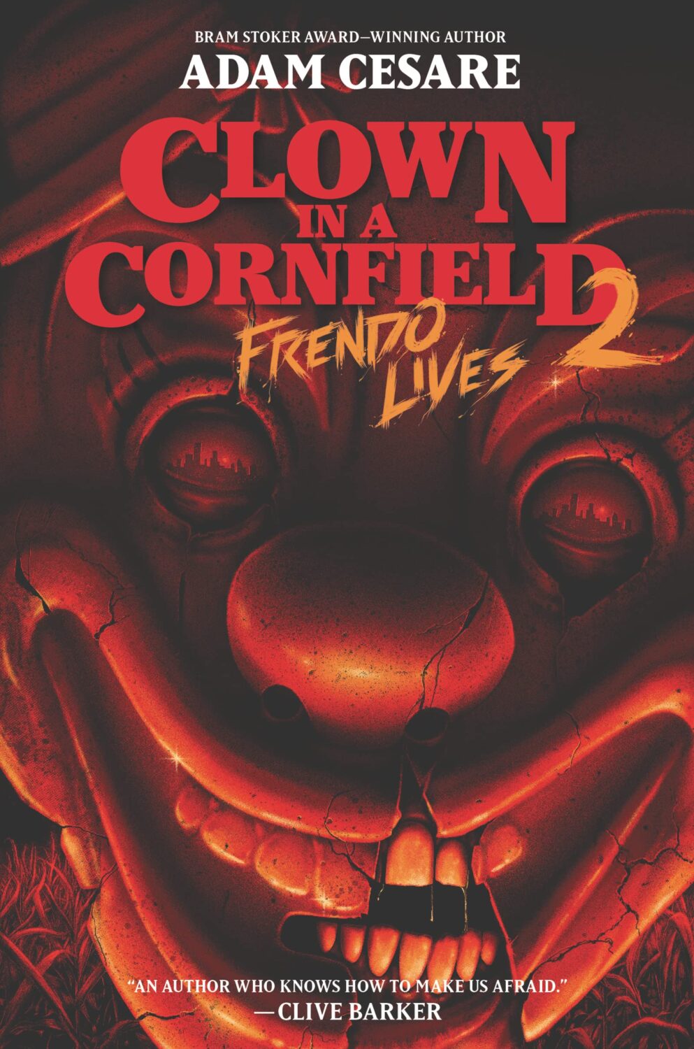
I think this is my favourite cover from the series thus far, but the covers of the original Clown in a Cornfield from 2020, and the second book Frendo Lives from 2022, are also very creepy.
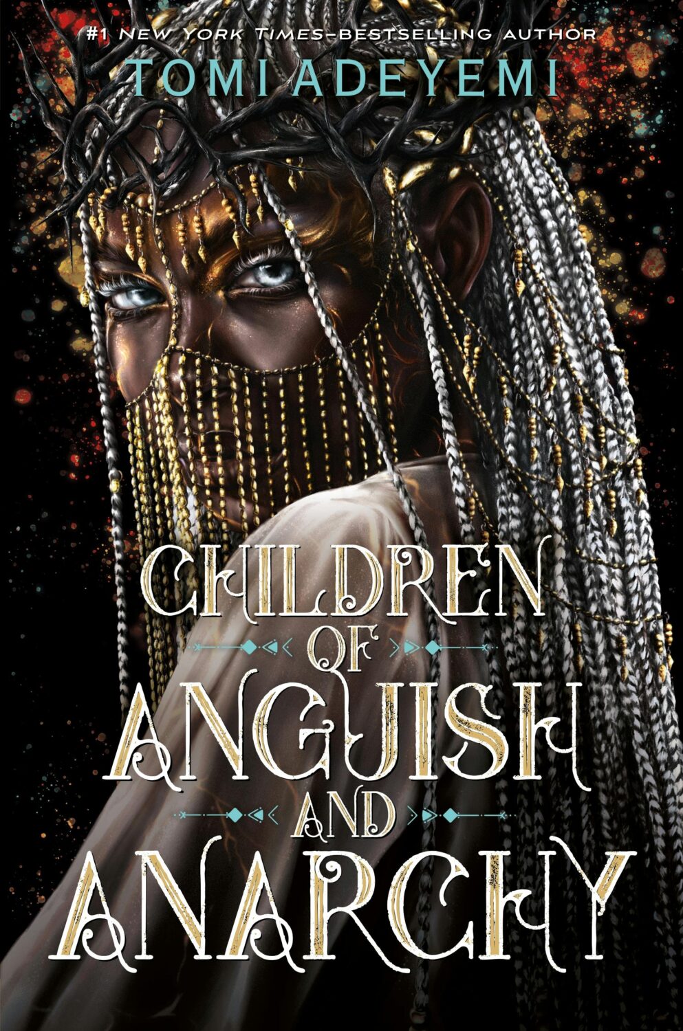
Children of Anguish and Anarchy by Tomi Adeyemi; design by Samira Iravani; art by Lola Idowu (Henry Holt / June 2024)
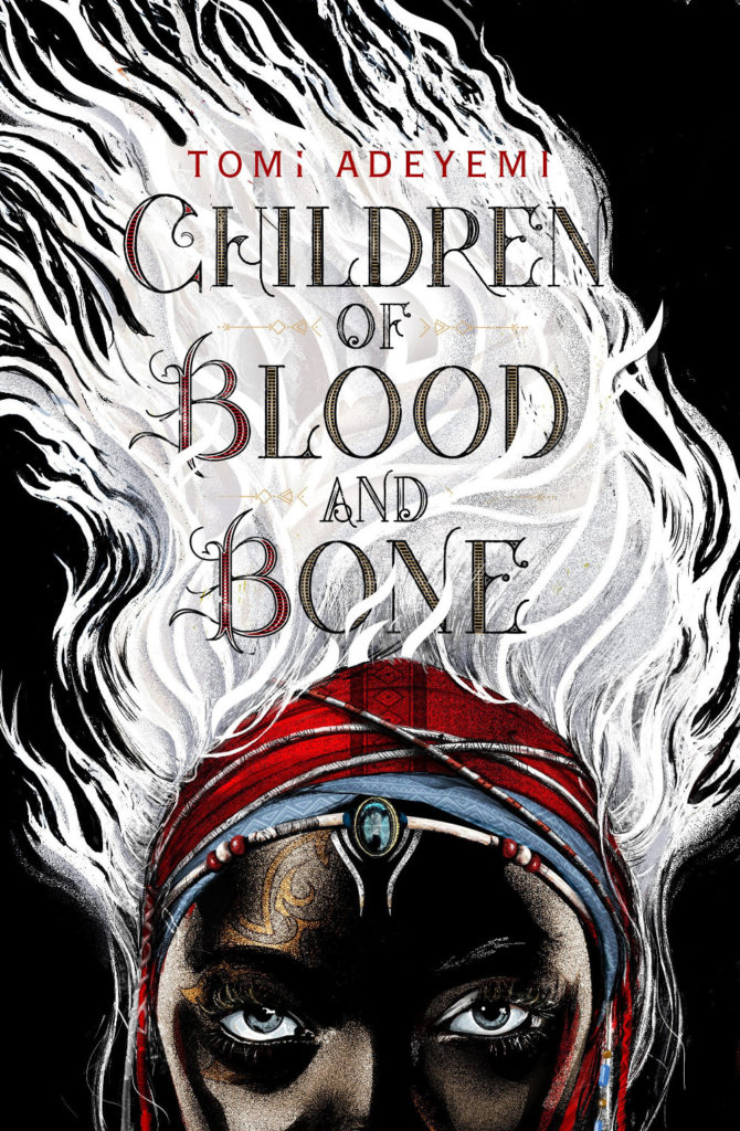
The previous two books in the series, Children of Blood and Bone and Children of Virtue and Vengeance, were in my 2018 and 2019 lists respectively, although they have a different designer and different illustrators.

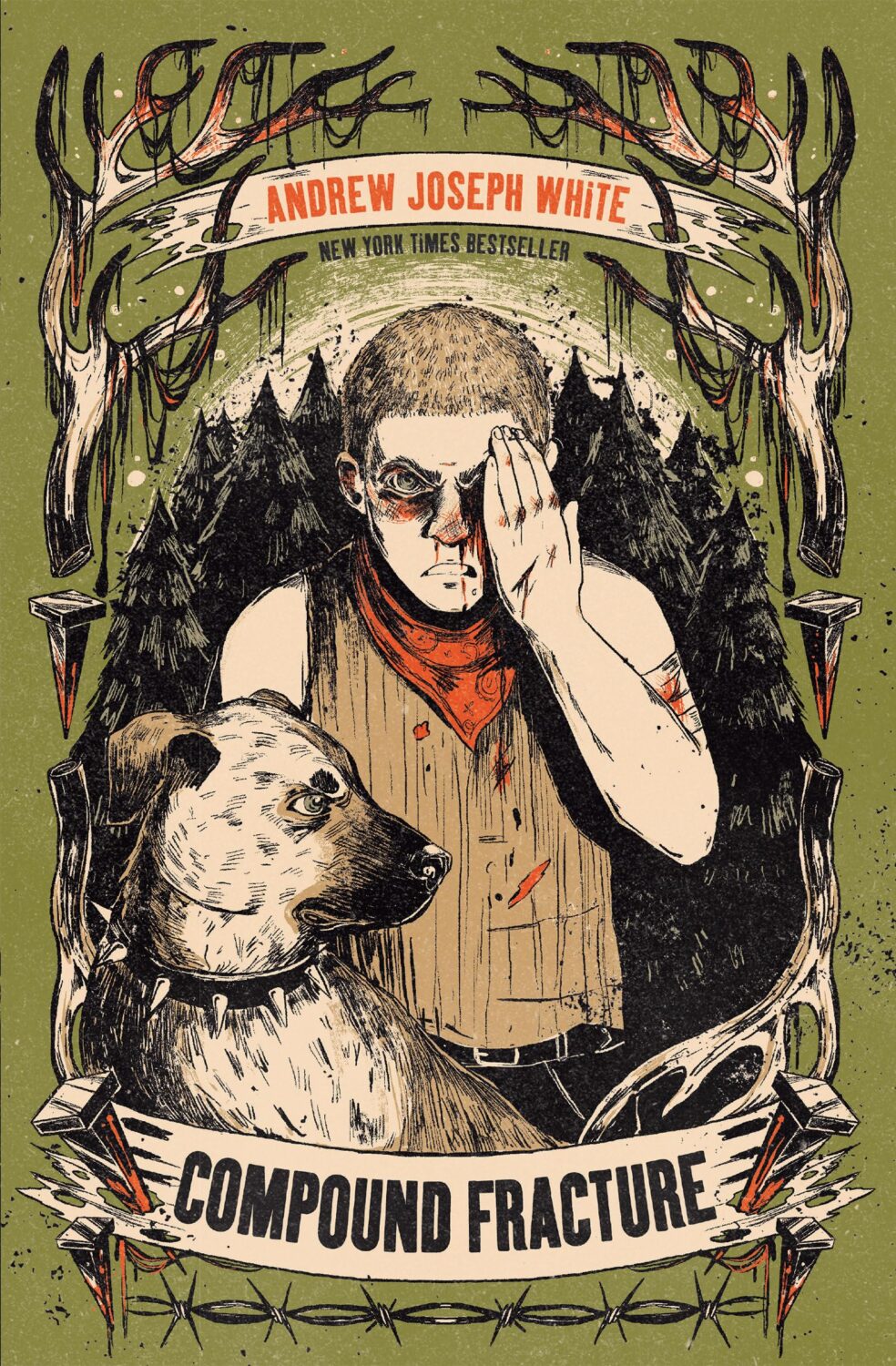
Compound Fracture by Andrew Joseph White; design and illustration by Evangeline Gallagher (Peachtree Teen / September 2024)
The cover of The Spirit Bares Its Teeth by Andrew Joseph White was on last year’s list.

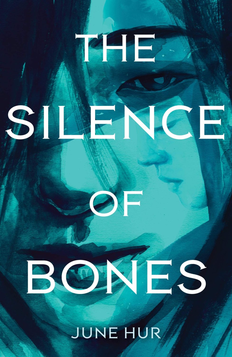
A Crane Among Wolves by June Hur; design by Aurora Parlagreco; art by Yejin Park (Feiwel & Friends / May 2024)
The covers of June Hur’s books The Silence of Bones and The Forest of Stolen Girls were on the 2020 and 2021 lists respectively, again with different designers and illustrators.
Don’t Let the Forest In by CG Drews; design by Meg Sayre; art by Jana Heidersdorf (Feiwel & Friends / October 2024)
Dust by Alison Stine; design by Kerri Resnick; art by Annabelle Ariane (Wednesday Books / December 2024)
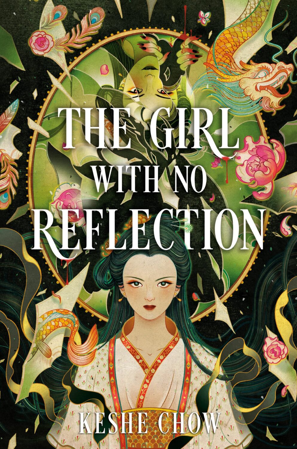
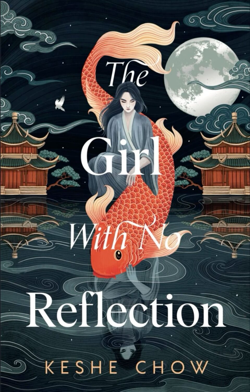
The Girl With No Reflection by Keshe Chow; design by Casey Moses; art by Victo Ngai (Delacorte Press / August 2024)
The cover of the UK edition of The Girl With No Reflection published by Hodder & Stoughton was designed by Micaela Alcaino.
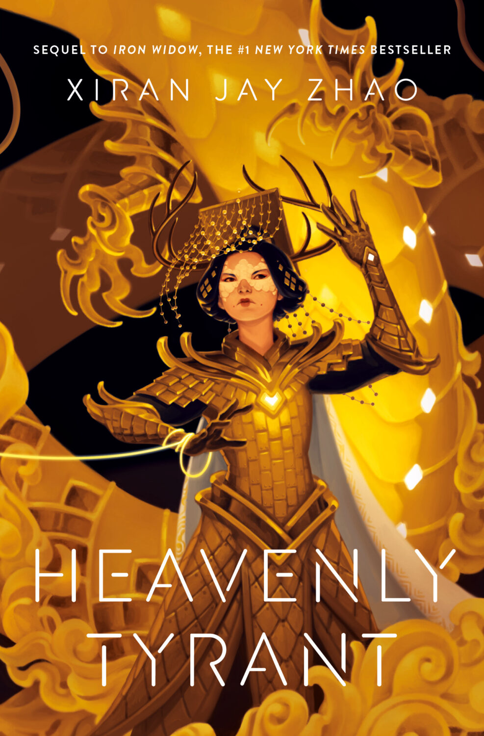
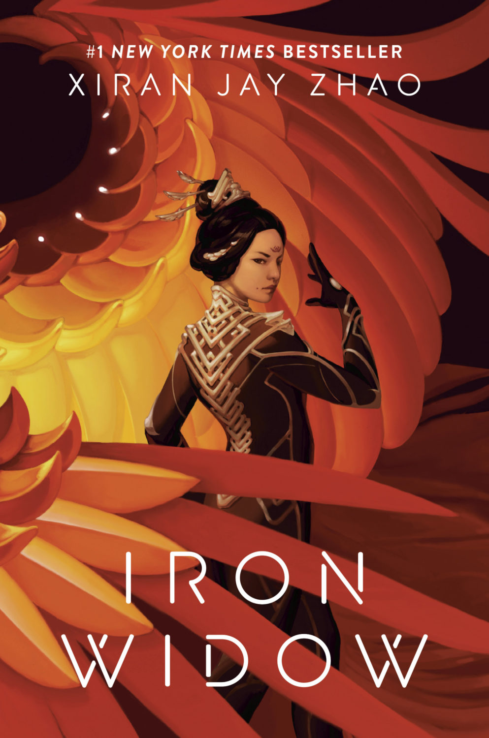
Heavenly Tyrant by Xiran Jay Zhao; design by Terri Nimmo; art by Ashley Mackenzie (Tundra / December 2024)
The cover of Iron Widow, the previous book in the series, was on the 2021 list.
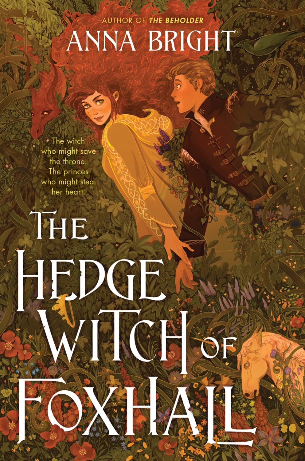
The Hedgewitch of Foxhall by Anna Bright; design by Corina Lupp; art by Christin Engelberth (Harperteen / March 2024)
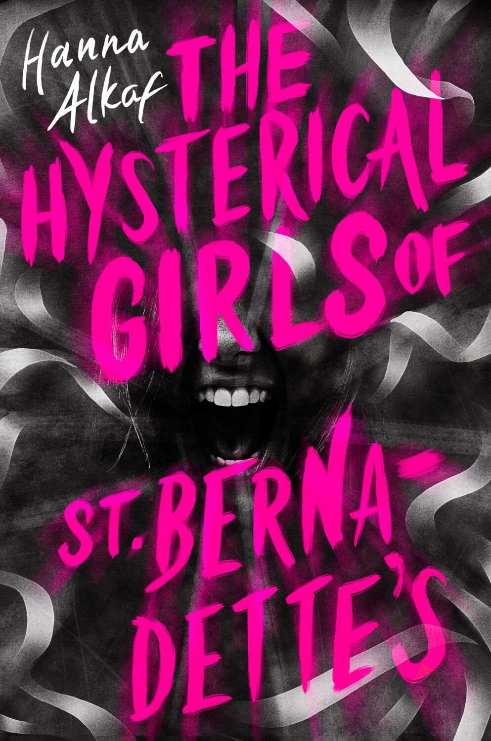
The Hysterical Girls of St. Bernadettes by Hanna Alkaf; design by Leo Nickolls (Simon & Schuster BFYR / September 2024)

The Invocations by Krystal Sutherland; design by Theresa Evangelista; art by Aykut Aydoğdu (Nancy Paulsen Books / January 2024)
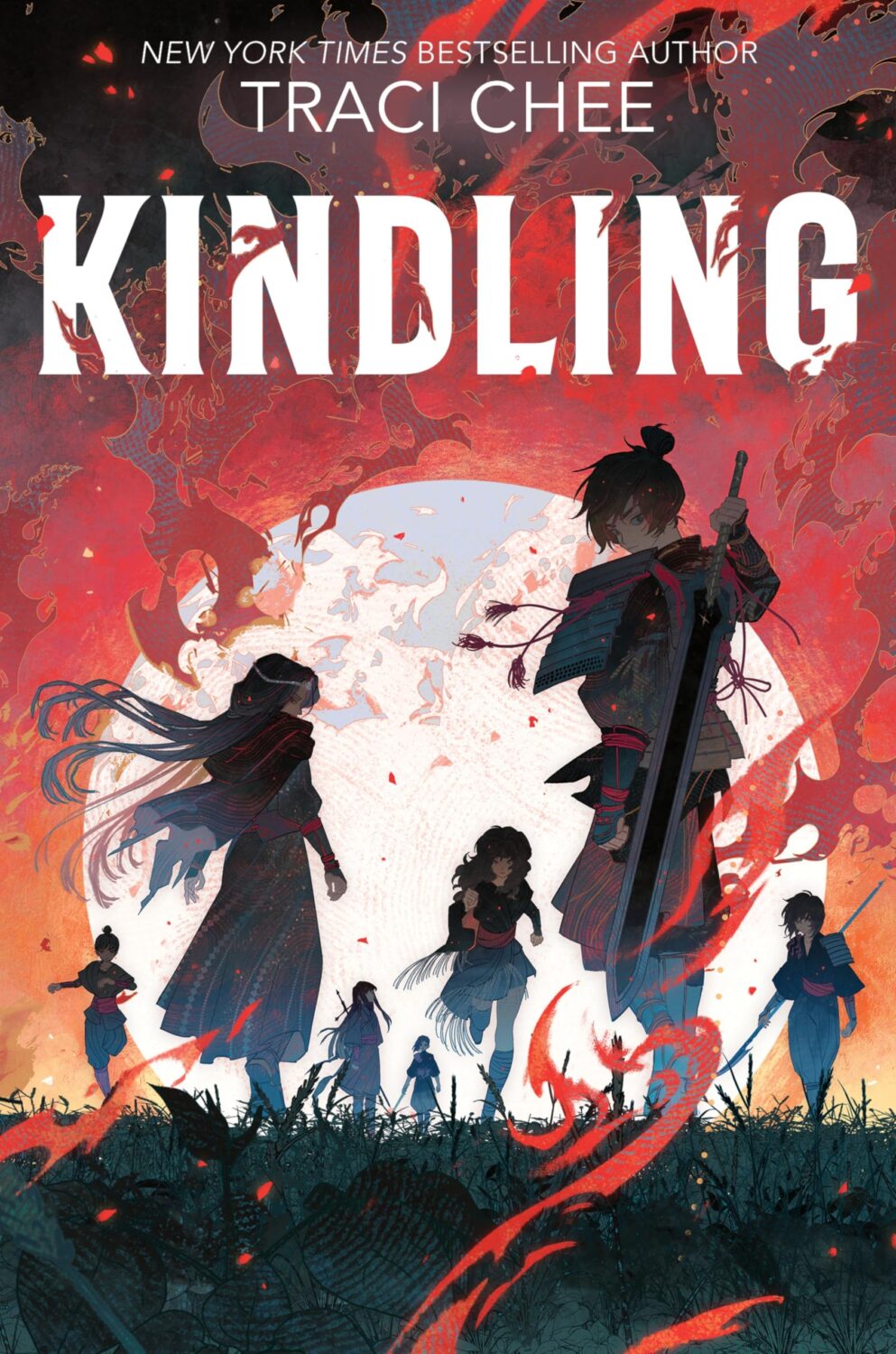
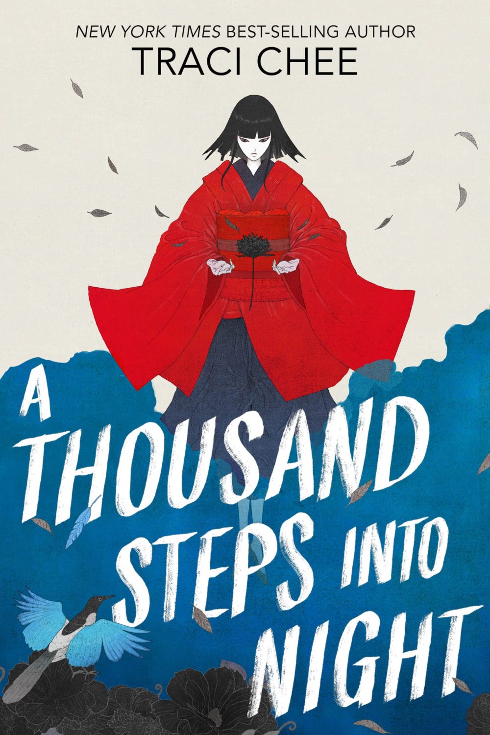
Kindling by Traci Chee; design by Kathy H. Lam; art by Kiuyan Ran (HarperCollins / February 2024)
The cover of A Thousand Steps into the Night by Traci Chee was on the 2022 list with a different art style.
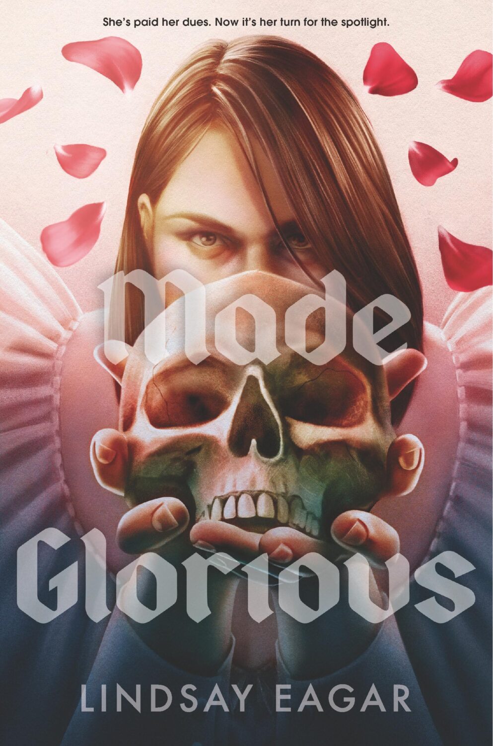
Made Glorious by Lindsay Eager; design by Maria T. Middleton; art by Deena So’Oteh (Candlewick / April 2024)
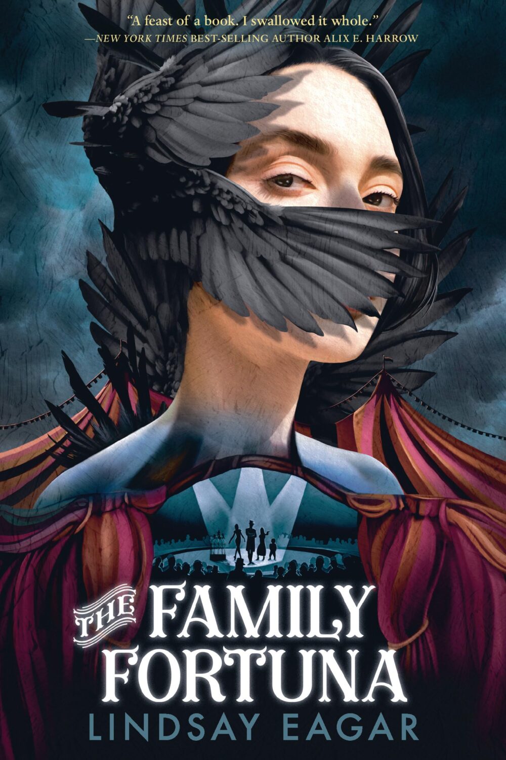
I missed the cover of The Family Fortuna by Lindsay Eagar last year, but it’s also delightfully creepy. The art is by Elena Masci, and I believe the designer is Matt Roeser.
Merciless Saviors by H. E. Edgmon; design by Kerri Resnick; art by Elena Masci (Wednesday Books / April 2024)
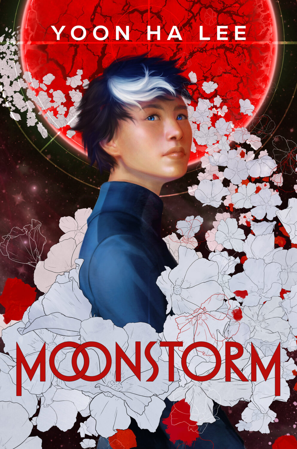
Moonstorm by Yoon Ha Lee; design by Liz Dresner; art by Priscilla Kim (Delacorte Press / June 2024)
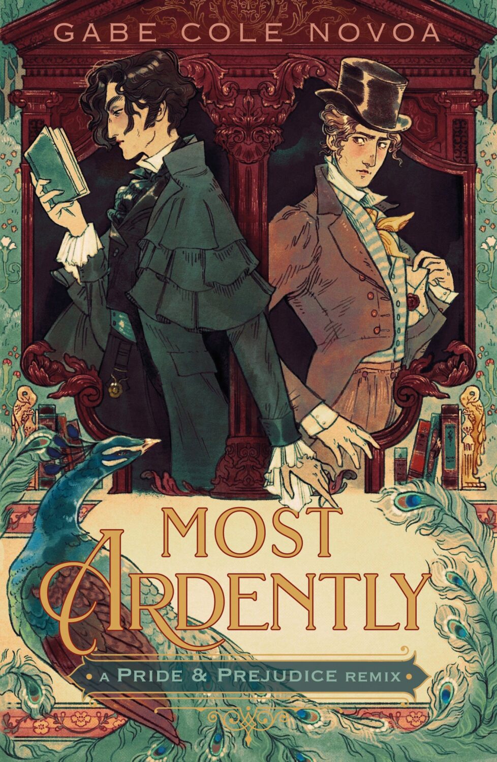
Most Ardently by Gabe Cole Novoa; design by Samira Iravani; art by Marlowe Lune (Feiwel & Friends / January 2024)
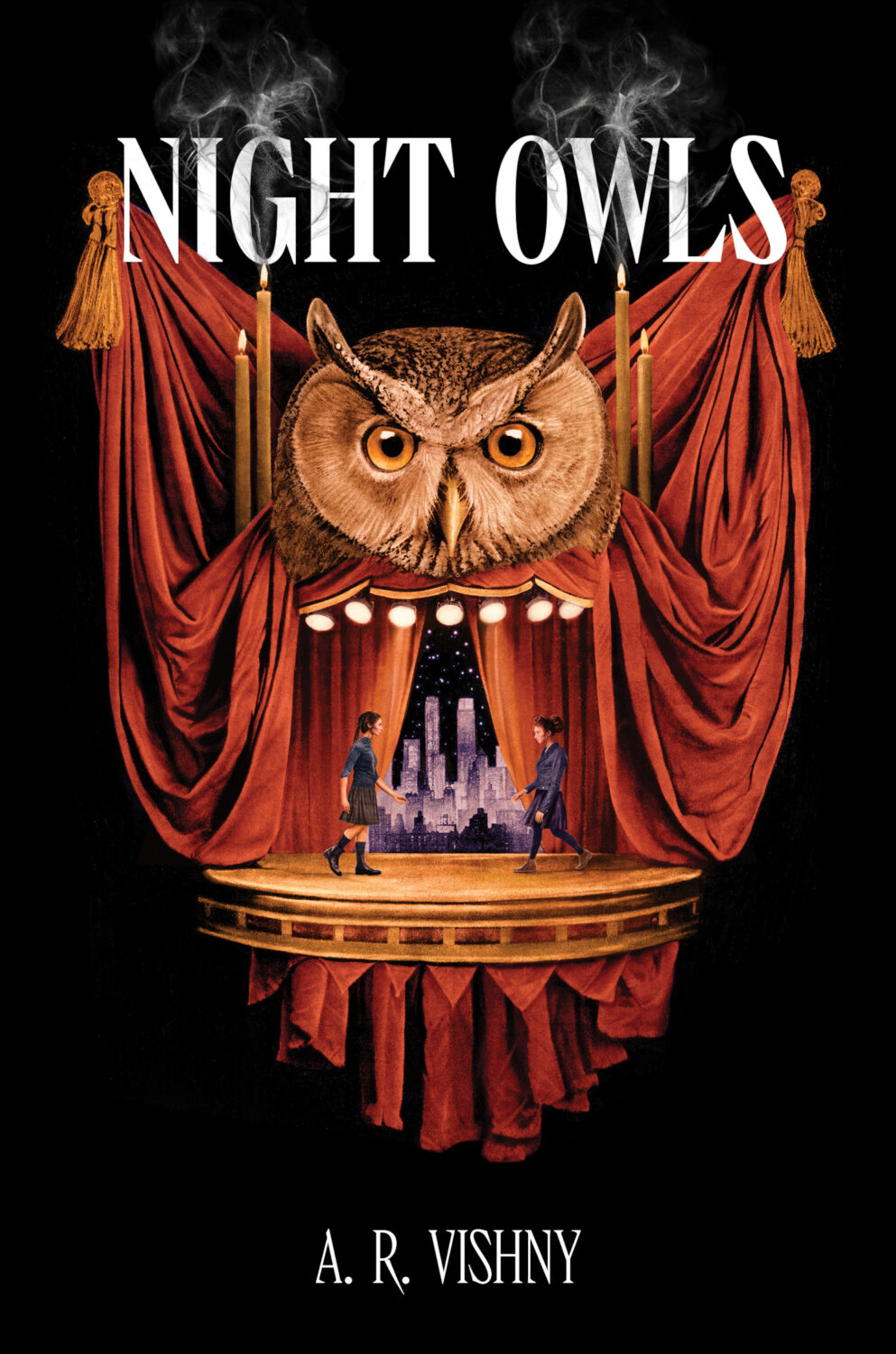
Night Owls A. R. Vishny; design by Jenna Stempel-Lobell; art by Zach Meyer (HarperCollins / September 2024)
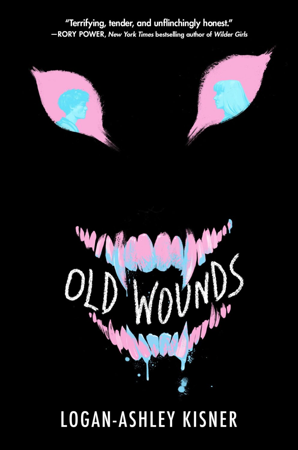
Old Wounds by Logan-Ashley Kisner; design by Liz Dresner; art by Zoë van Dijk (Delacorte Press / September 2024)
The Orbit of You by Ashley Schumacher; design by Kerri Resnick; art by Giuditta Bertoni (Wednesday / March 2024)
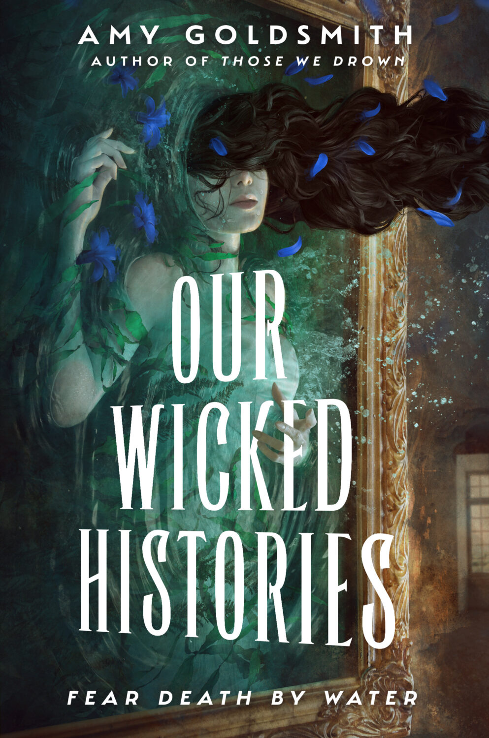
Our Wicked Histories by Amy Goldsmith; design by Liz Dresner; art by Marcela Bolivar (Delacorte Press / July 2024)
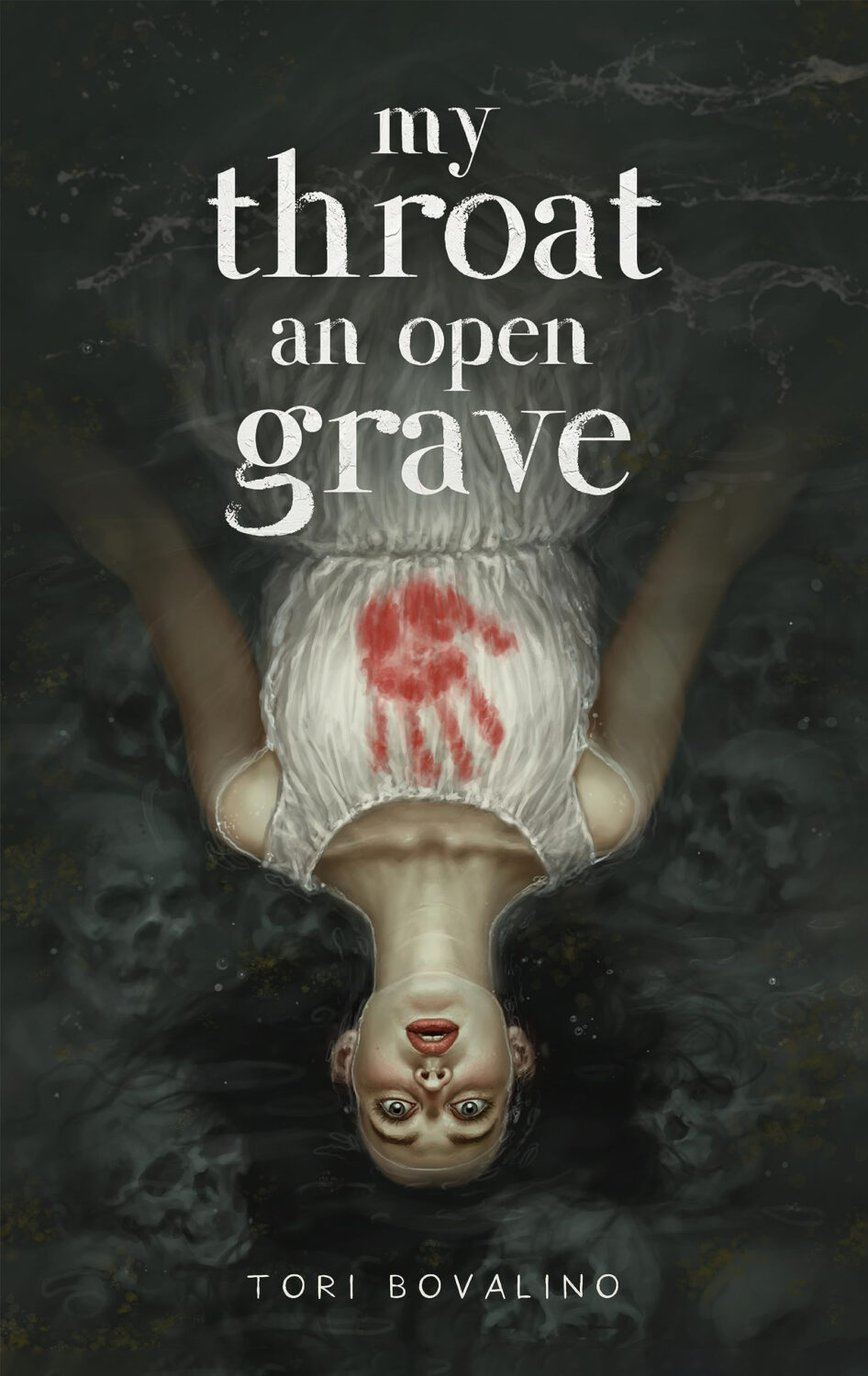
My Throat an Open Grave by Tori Bovalino; design by Rosie Stewart; art by Tristan Elwell (Page Street YA / February 2024)
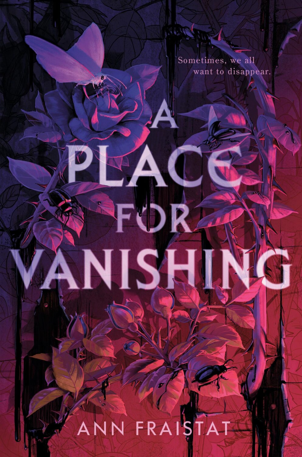
A Place for Vanishing by Ann Fraistat; design by Trisha Previte; art by Zoë van Dijk (Delacorte Press / January 2024)
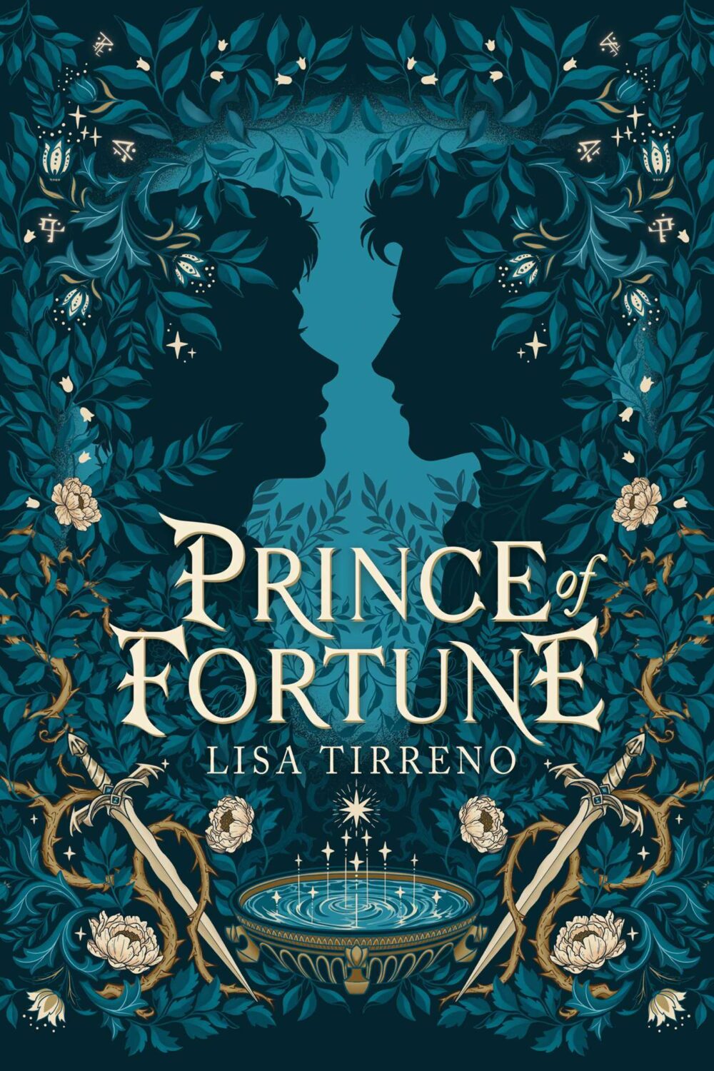
Prince of Fortune by Lisa Tirreno; design by Rebecca Syracuse; art by Serena Archetti (Atheneum BFYR / October 2024)
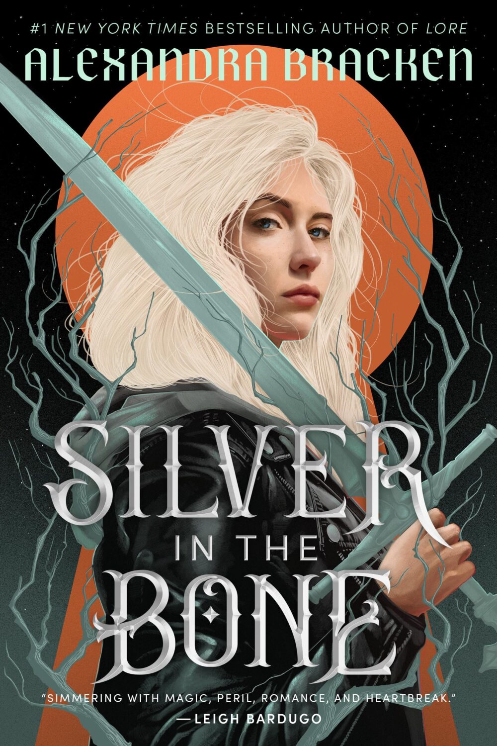
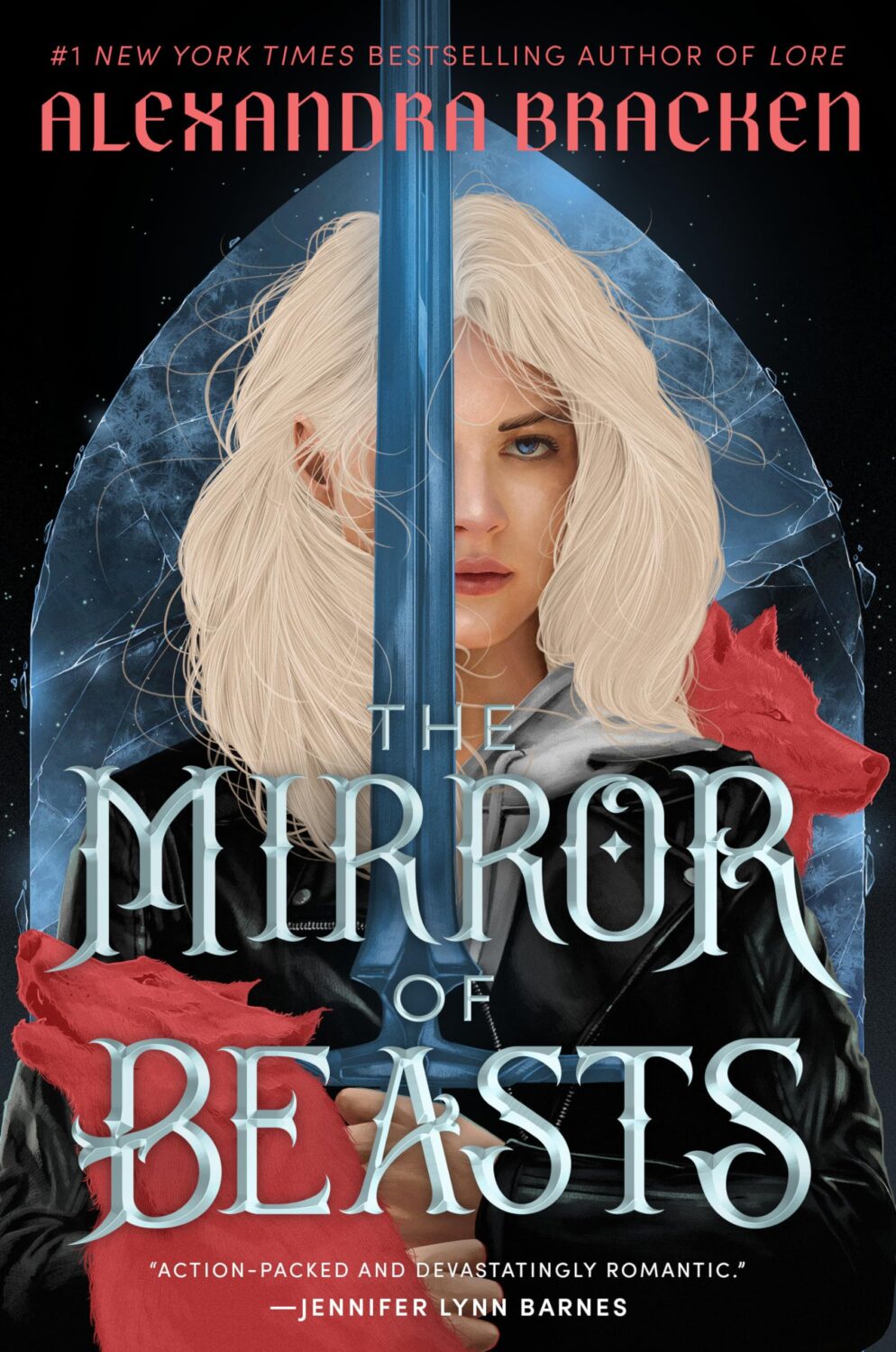
Silver in the Bone by Alexandra Bracken; design Liz Dresner; art Tomasz Majewski (Ember / May 2024)
This is actually the paperback of the first title in series. The new cover matches the latest book, released in July, The Mirror of Beasts.
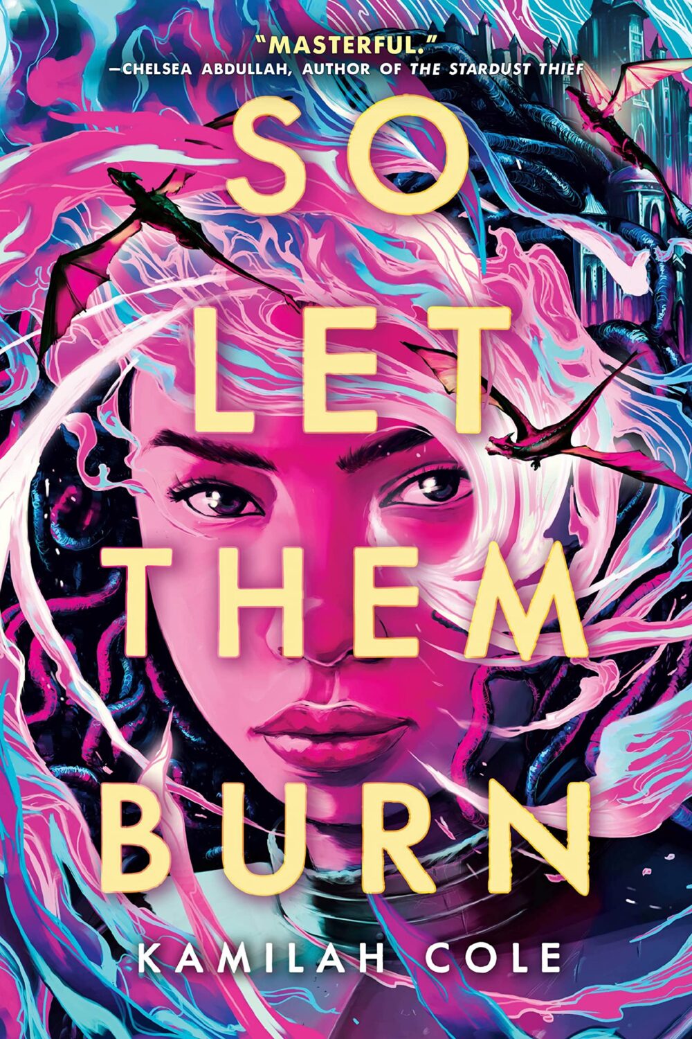
So Let Them Burn by Kamilah Cole; design by Jenny Kimura; art by Taj Francis (Little, Brown BFYR / January 2024)
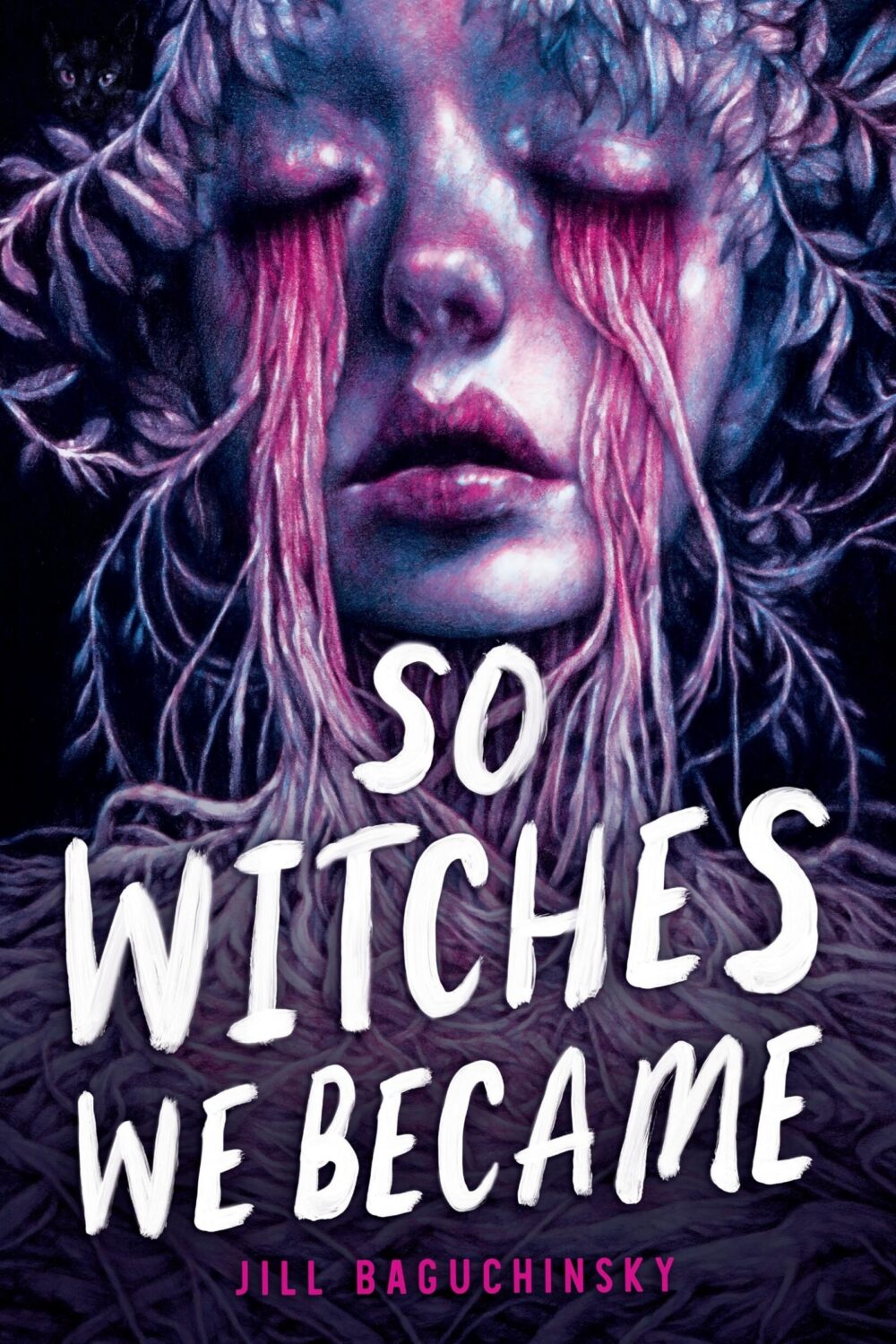
So Witches We Became by Jill Baguchinsky; design Jenny Kimura; art by Marco Mazzoni (Little, Brown BFYR / July 2024)
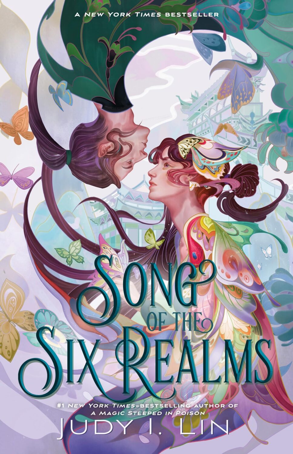
Songs of the Six Realms by Judy I. Lin; design by Rich Deas; art by Sija Hong (Feiwel & Friends / July 2024)
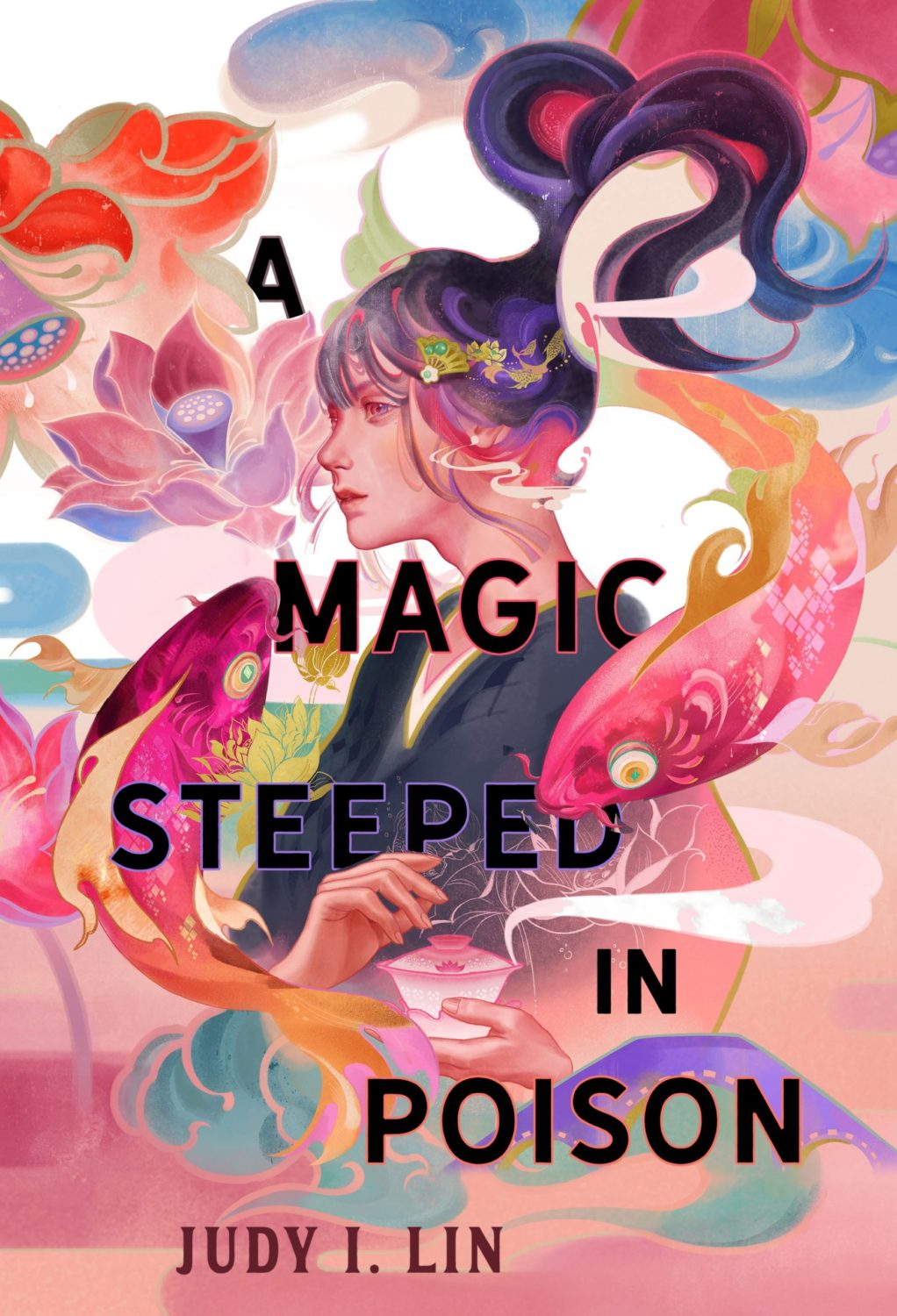
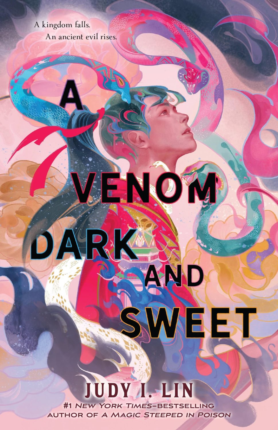
The cover of A Magic Steeped in Poison and it’s sequel A Venom Dark and Sweet by Judy I. Lin were on 2022’s list.
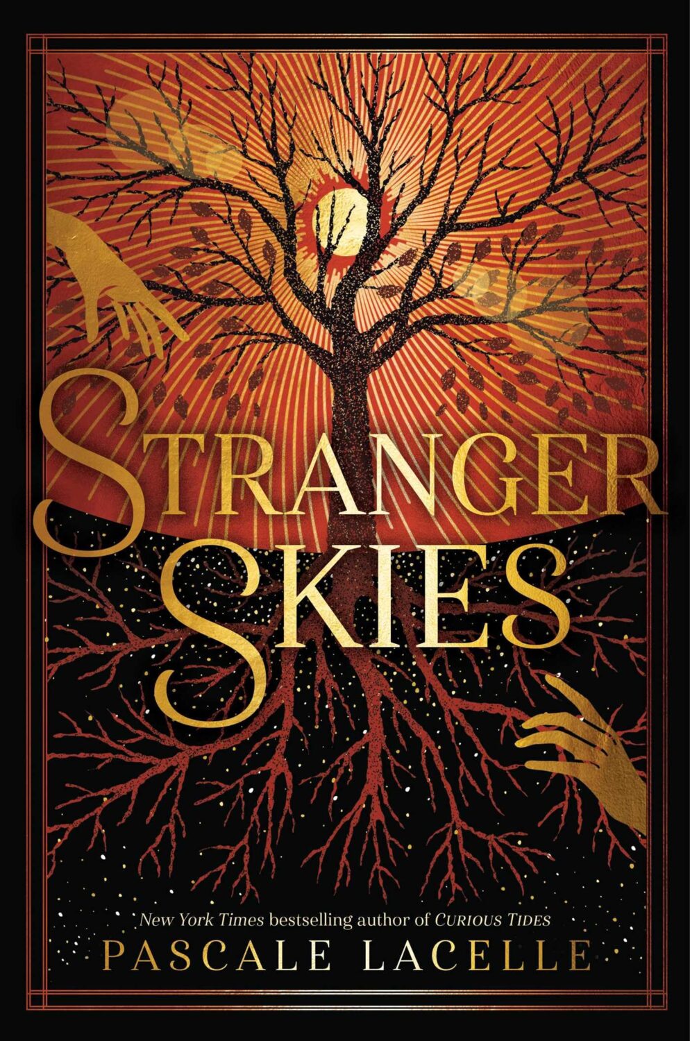
Stranger Skies by Pascale Lacelle; design by Greg Stadnyk (Margaret K. McElderry Books / November 2024)
The cover of Curious Tides by Pascale Lacelle was on last year’s list.

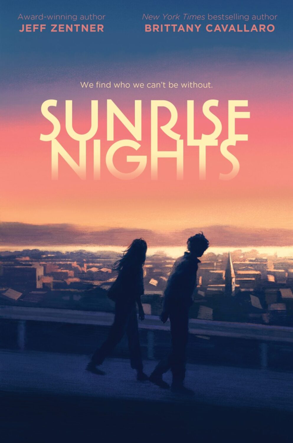
Sunrise Nights by Jeff Zentner & Brittany Cavallaro; design Laura Mock; art by Hokyoung Kim (Quill Tree Books / July 2024)
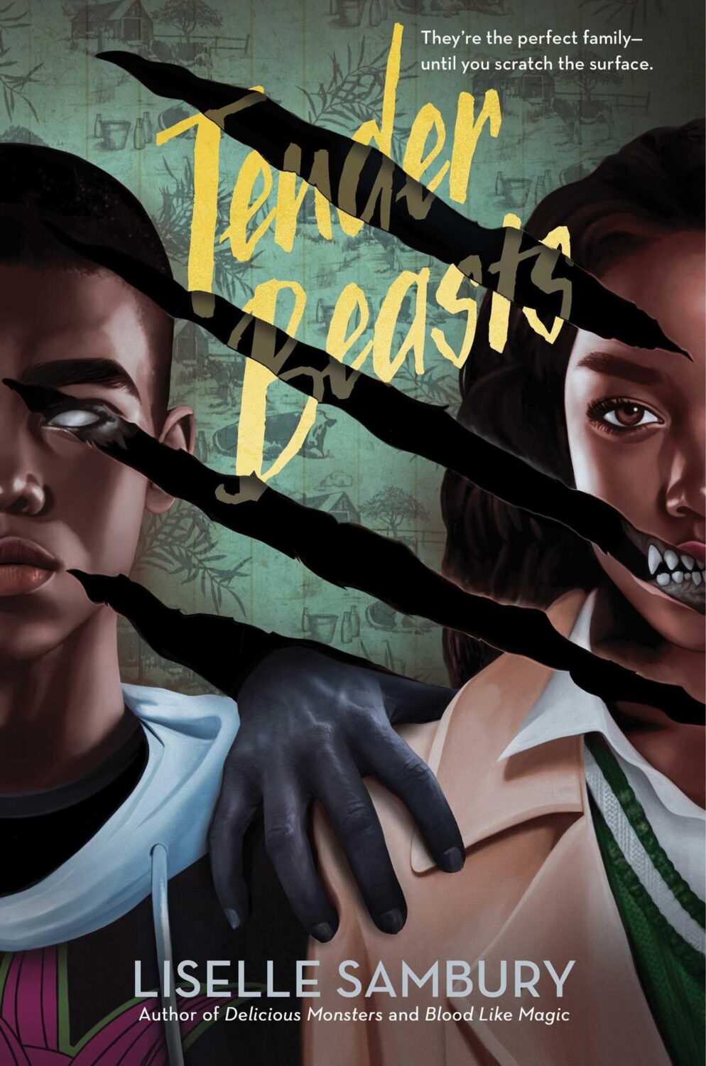
Tender Beasts by Liselle Sambury; design by Greg Stadnyk; art by Elena Masci (Margaret K. McElderry Books / February 2024)
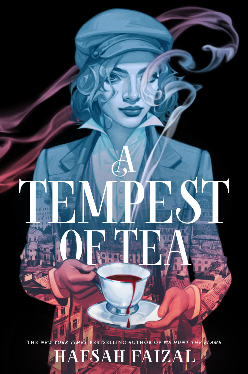
A Tempest of Tea by Hafsah Faizal; design by Aurora Parlagreco; art by Valentina Remenar (Farrar, Straus & Giroux BYR / February 2024)
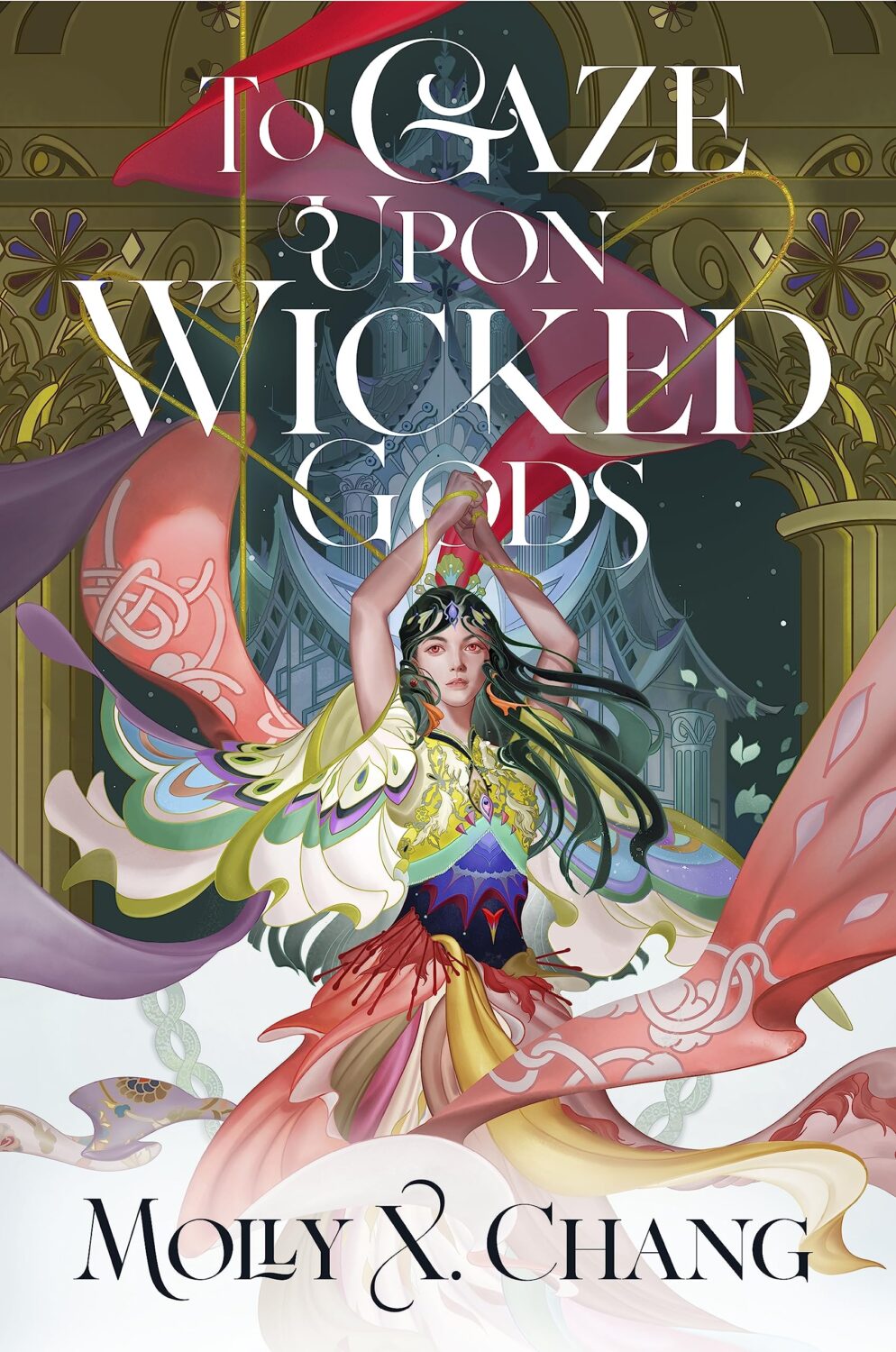
To Gaze Upon Wicked Gods by Molly X. Chang; design by Regina Flath; art by Sija Hong (Del Rey Books / April 2024)
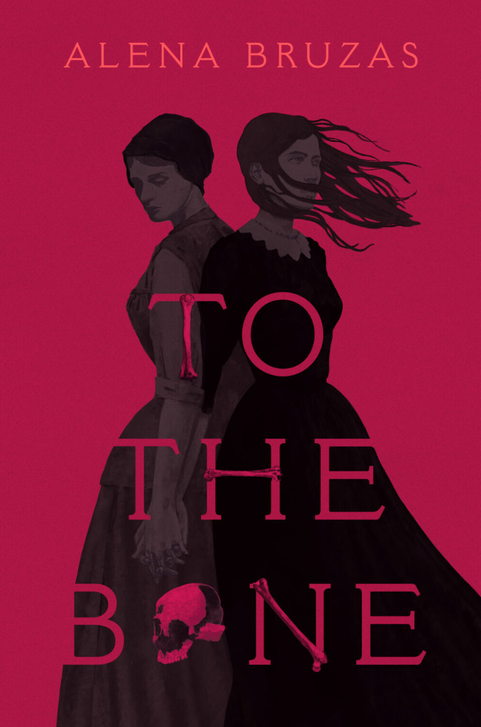
To The Bone by Alena Bruzas; design by Kristie Radwilowicz; art by Adam Parata (Rocky Pond Books / September 2024)
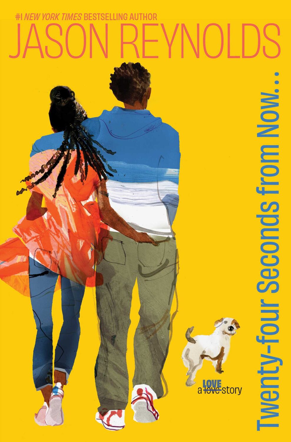
Twenty- Four Seconds From Now by Jason Reynolds; design by Sonia Chaghatzbanian; art by Daniel Egnéus (Atheneum Books / October 2024)

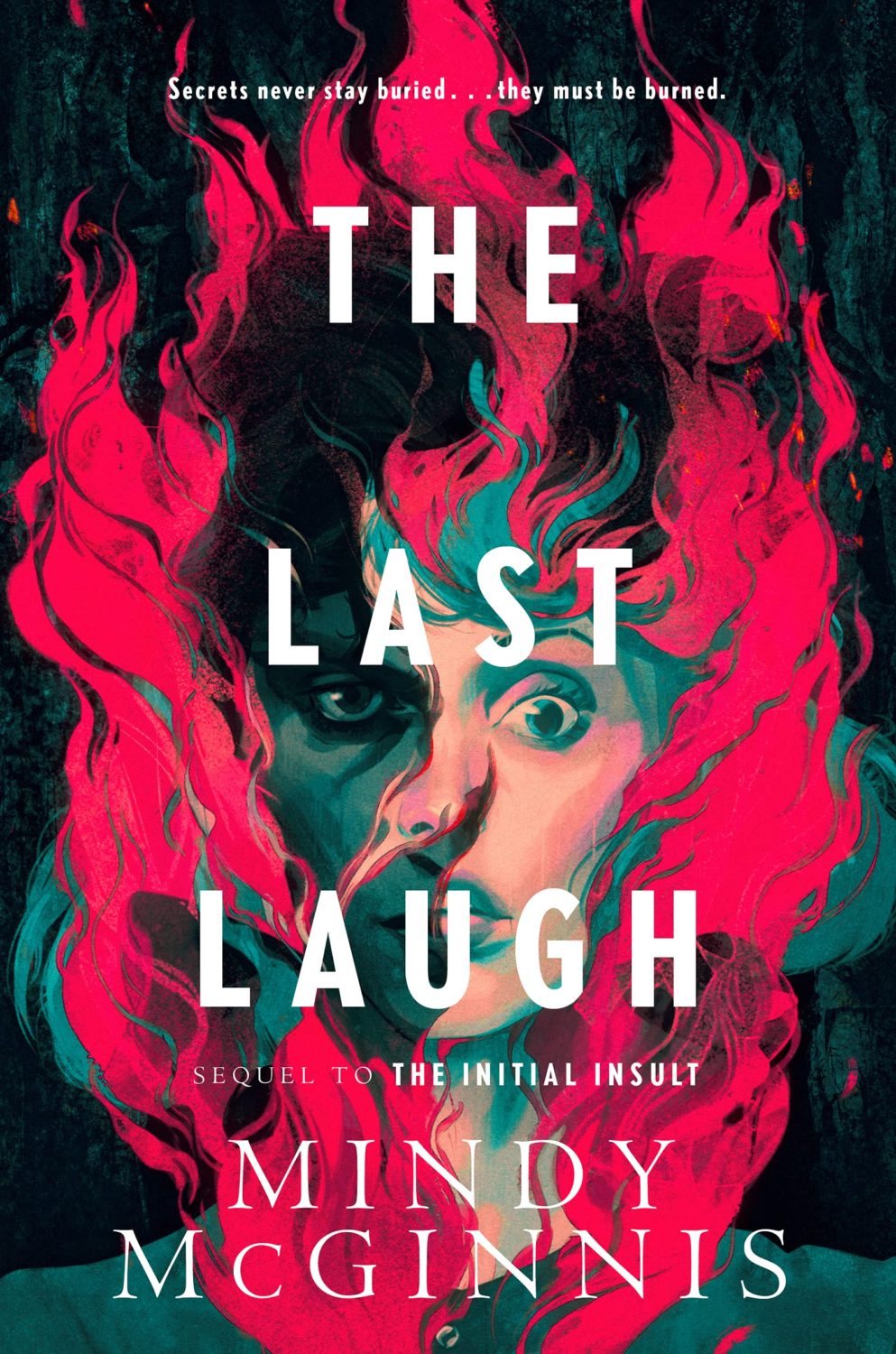
Under This Red Rock by Mindy McGinnis; design by David Curtis; art by Corey Brickley (Katherine Tegen Books / March 2024)
The cover of The Last Laugh by Mindy McGinnis (and re-jacketed backlist) were on the 2022 list.
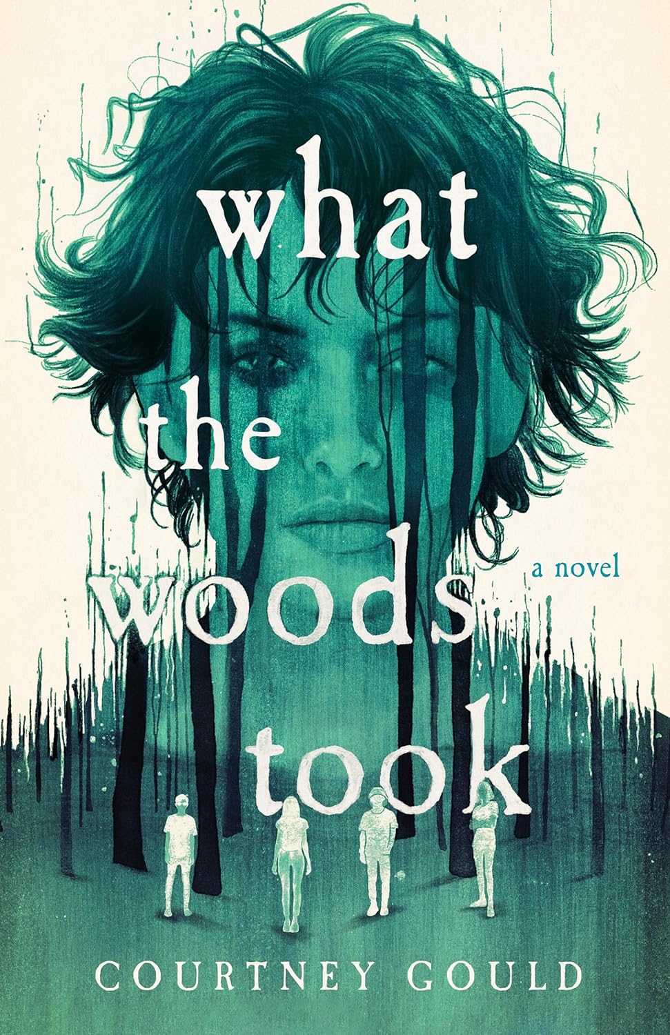
What the Woods Took by Courtney Gould; design by Kerri Resnick; art by Peter Strain (Wednesday Books / December 2024)
I was sure I had included the covers forThe Dead and the Dark and Where Echoes Die by Courtney Gould illustrated by Peter Strain in previous lists, but apparently I hadn’t. They’re really nice:

Where Sleeping Girls Lie by Faridah Àbíké-Íyímídé; design by Elizabeth Clark; art by Aykut Aydoğdu (Feiwel & Friends / March 2024)
Comments closedI hope you’re keeping safe and well wherever you find yourself. A couple of people sent me posts about “blob” covers this month. If you read the blog regularly, you probably already know that I am pretty skeptical that they’re as much of thing as they’re made out to be. The examples always seem to be the same old covers with a couple of broadly similar-ish recent ones thrown in for relevance. They kind of look the same (not really) at small sizes, less so up close. “Bold and blocky” always seemed a more accurate description to me — blocks of bold colours combined with blocks of (blocky) bold text. At worst, it feels like a loosely defined trend for the kind of literary-ish books that frequently appear in the likes of New York Times rather than something we should be agonizing over. I don’t know why fixation with it grates. Maybe it’s because the commentary always seems slightly snide? Or because I just don’t think it represents an accurate picture of contemporary book cover design? I mean, book covers are always going to look broadly the same. There are some obvious common limitations that most designers have to work within. Even so, there are still lots of publishers and designers doing interesting and different things if you scratch the surface. Look a bit further — they don’t all look the same!

The Adult by Bronwyn Fischer; design by Kate Sinclair (Random House Canada / May 2023)

Berlin by Bea Setton; design by Emily Mahon; cover image by Nataša Denić (Penguin Books / May 2023)
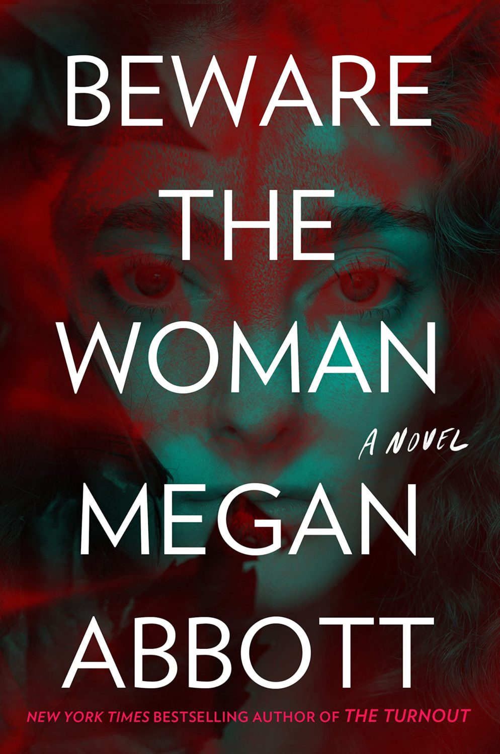
Beware the Woman by Megan Abbott; design by Tal Goretsky (G.P. Putnam’s Sons / May 2023)
I feel like Megan Abbott often gets really nice covers that work both for the genre and stand out in some way.
(But does this count this as a blob cover? Or is it not quite blobby enough? ¯\_(ツ)_/¯ )

Chrysalis by Anna Metcalfe; design by Jack Smyth (Granta / May 2023)

Close to Home by Michael Magee; design by Na Kim; photograph by Oumayma B. Tanfous (Farrar, Straus & Giroux / May 2023)
I believe the movie poster-like cover of the UK edition of Close to Home, published by Penguin last month, was designed by Gray318. The cinematic photo is by Enda Bowe from his Love’s Fire Song project.


The Covenant of Water by Abraham Verghese; design by Kelly Winton (Grove Press / May 2023)

The East Indian by Brinda Charry; design by Tristan Offit (Scribner / May 2023)

Endpapers by Jennifer Savran Kelly; design by Jaya Miceli (Algonquin / February 2023)

The Girls’ Guide to Hunting and Fishing by Melissa Bank; design by Annie Atkins (Penguin / May 2023)
This is just one of the many great covers in the Penguin Essentials series.
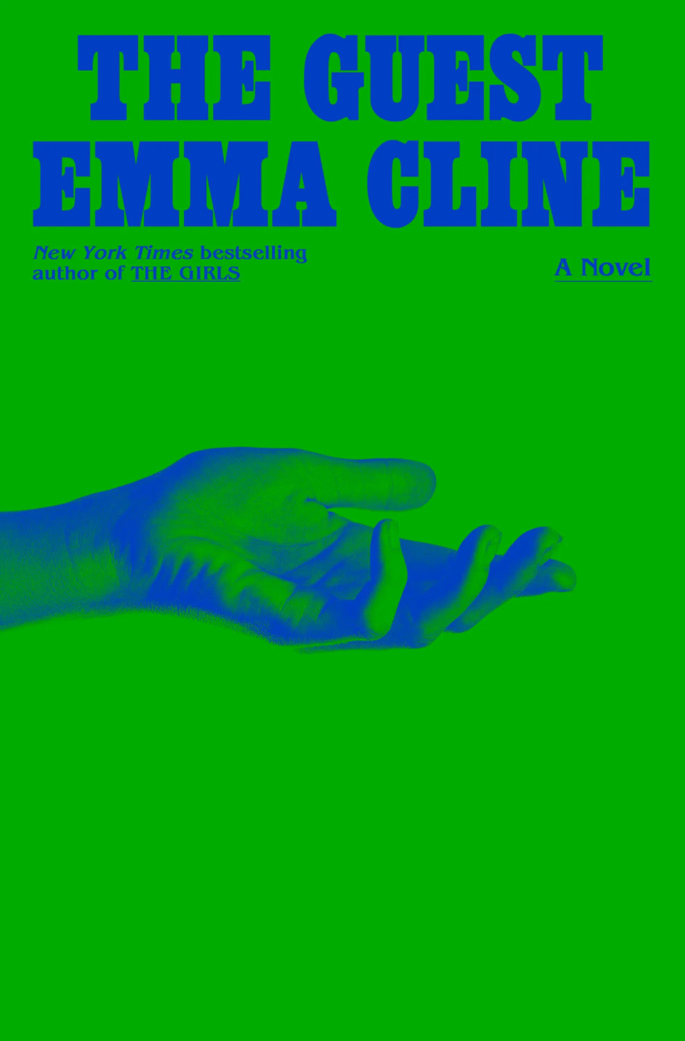
The Guest by Emma Cline; design by Oliver Munday (Random House / May 2023)

A History of Burning by Janika Oza; design by Albert Tang; illustration by Simone Noronha (Grand Central / May 2023)
The cover of the UK edition of A History of Burning, published by Vintage this month, was designed by Suzanne Dean with an illustration by Muhammed Sajid.


In Vitro by Isabel Zapata; design by Zoe Norvell (Coffee House Press / May 2023)
This reminded me that I’ve been meaning to link to Zoe’s side project I Need a Book Cover, an online directory of (English language) book cover designers. It’s well worth checking out even if you don’t literally need a book cover.
I think the Saul Bass-ian cover of the Mexican edition of In Vitro, published Almadía, was designed by Alejandro Magallanes, but it would be great if someone more familiar with Mexican publishing can confirm!


Landscapes by Christine Lai; design by Kate Sinclair (Doubleday Canada / May 2023)
A nice Kate Sinclair double this month bringing the up the Canadian content!

The Nursery by Szilvia Molnar; design by Hayley Warnham (Oneworld / May 2023)
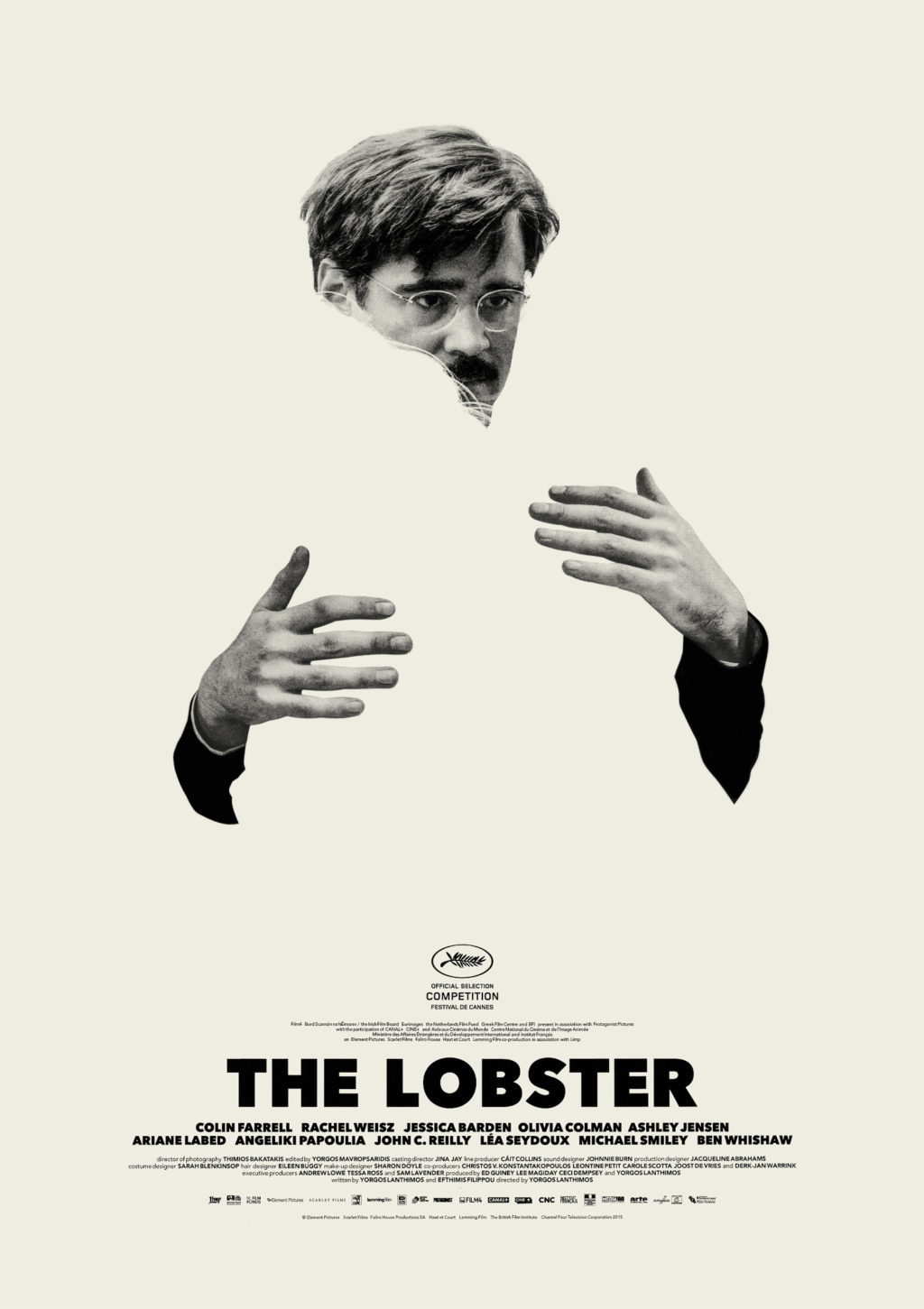
Disembodied hands are a bit of a thing this month (see The Guest), but this actually reminded me of Vasilis Marmatakis‘s lovely minimalist posters for The Lobster:


Our Migrant Souls by Héctor Tobar; design by Rodrigo Corral (MCD / May 2023)
Shy by Max Porter; design by Carlos Esparza (Graywolf / May 2023)
The cover of the UK edition of Shy, published last month by Faber & Faber, was designed by Jonathan Pelham. Jonny is going freelance full-time in June if you would like to hire him!

The Sorrows of Others by Ada Zhang; design by Janet Hansen (Public Space Books / May 2023)
The colour palette of this reminded me of Janet’s cover for Speak, Okinawa by Elizabeth Miki Brina from a couple of years ago.

Oof. Hello, January. This is all rather soon isn’t it? But here we are, a new month, and another selection of new book covers (with a few ‘old’ ones that I missed in the excitement at the end of 2015). Happy New Year…
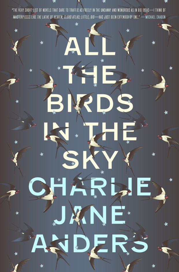
All the Birds in the Sky by Charlie Jane Anders; design by Will Staehle (Tor Books / January 2016)
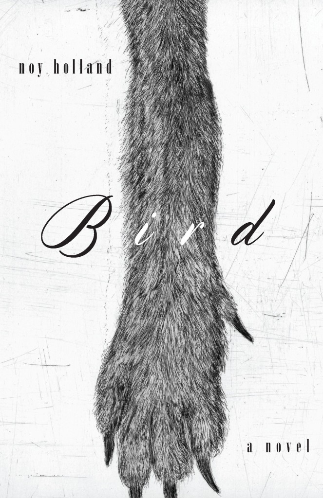
Bird by Noy Holland; design by Kelly Winton (Counterpoint / November 2015)
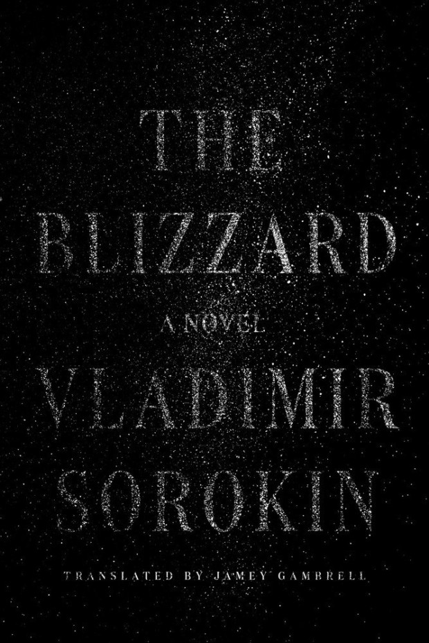
The Blizzard by Vladimir Sorokin; design by Devin Washburn (FSG / January 2016)
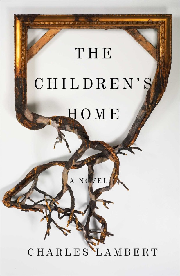
The Children’s Home by Charles Lambert; design by Jaya Miceli (Scribner / January 2016)
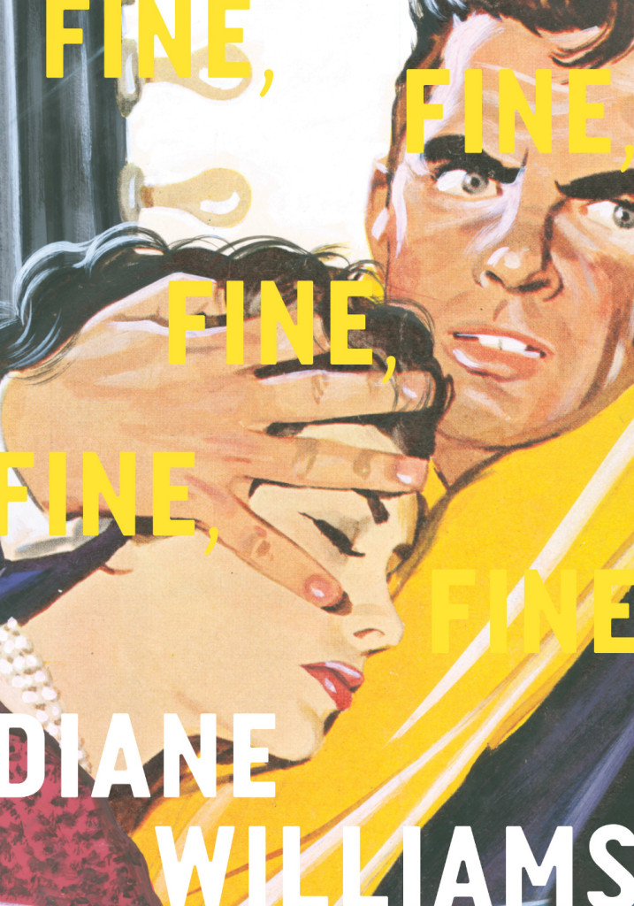
Fine, Fine, Fine, Fine, Fine by Diane Williams; design by Dan McKinley (McSweeney’s / January 2016)
A note from the book on the cover art:
“The art on this book’s cover is unsigned and was created for a romance novella published in Mexico City in the 1960s that appeared in serial form. This piece was produced using collage and gouache overpainting on illustration board, and the back reads “El Angel No. 64.” The printer of these covers held on to the originals for decades, and the entire collection was recently purchased from his warehouse. Works are available from the Pardee Collection Gallery of Iowa City, and ‘El Angel’ is provided courtesy of Diane Williams and Wolfgang Neumann.”
Gamelife by Michael W. Clune; design by Alex Merto (FSG / September 2015)
Girl Through Glass by Sari Wilson; design Jaya Miceli (Harper / January 2016)
Good on Paper by Rachel Cantor; design by Adly Elewa (Melville House / January 2016)
The Ministry of Nostalgia by Owen Hatherley; design by Andy Pressman (Verso / January 2016)
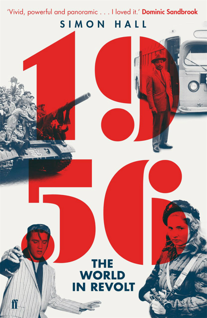
1956: The World in Revolt by Simon Hall; design by Alex Kirby (Faber & Faber / Janaury 2016)
A nice US / UK compare and contrast for The Portable Veblen by Elizabeth McKenzie:


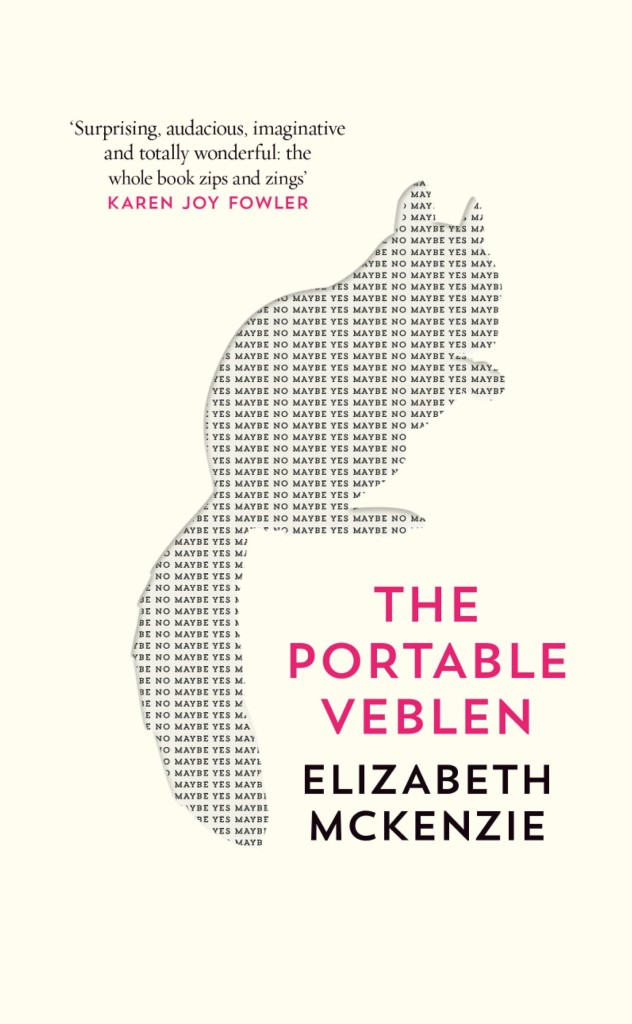
Portable Veblen by Elizabeth McKenzie; design by Jo Walker (Fourth Estate / January 2016)
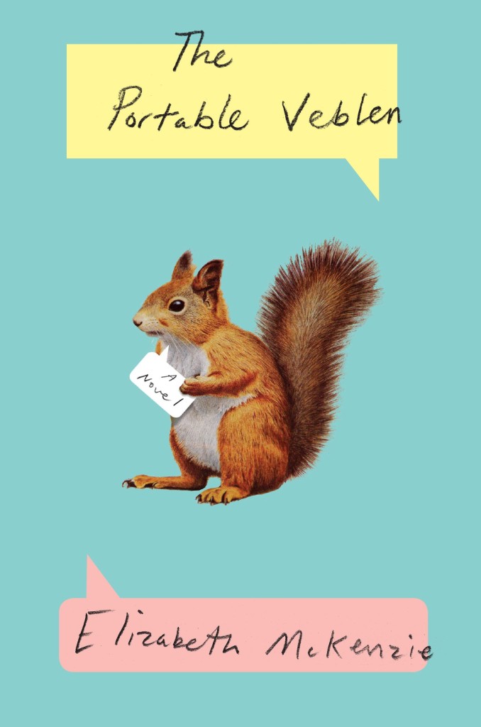
Portable Veblen by Elizabeth McKenzie; design by Oliver Munday (Penguin Press / January 2016)
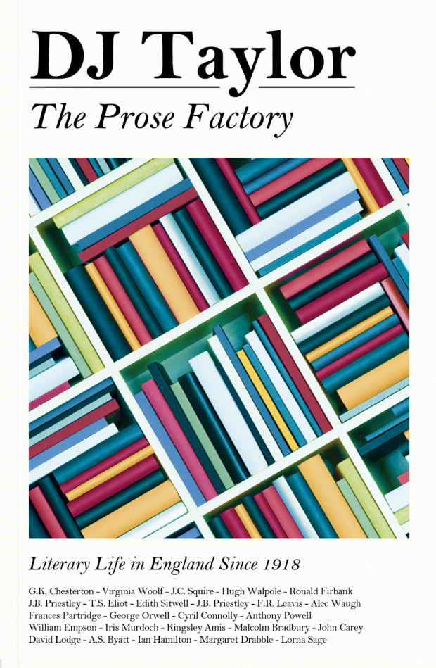
The Prose Factory by D. J. Taylor; design by James Paul Jones (Chatto & Windus / January 2016)
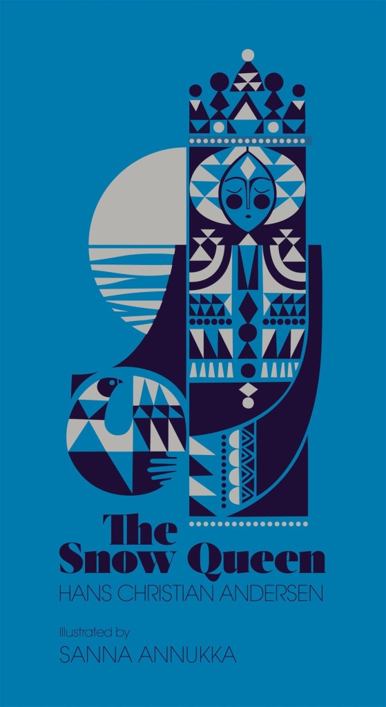
The Snow Queen by Hans Christian Andersen, illustrated by Sanna Annukka; cover art by Sanna Annukka (Hutchinson / October 2015)
This looks absolutely beautiful, but I’ve seen very little about it online, much less seen it in person. Apparently Sanna Annukka has also illustrated an edition of Hans Christian Andersen’s The Fir Tree. It looks wonderful too.
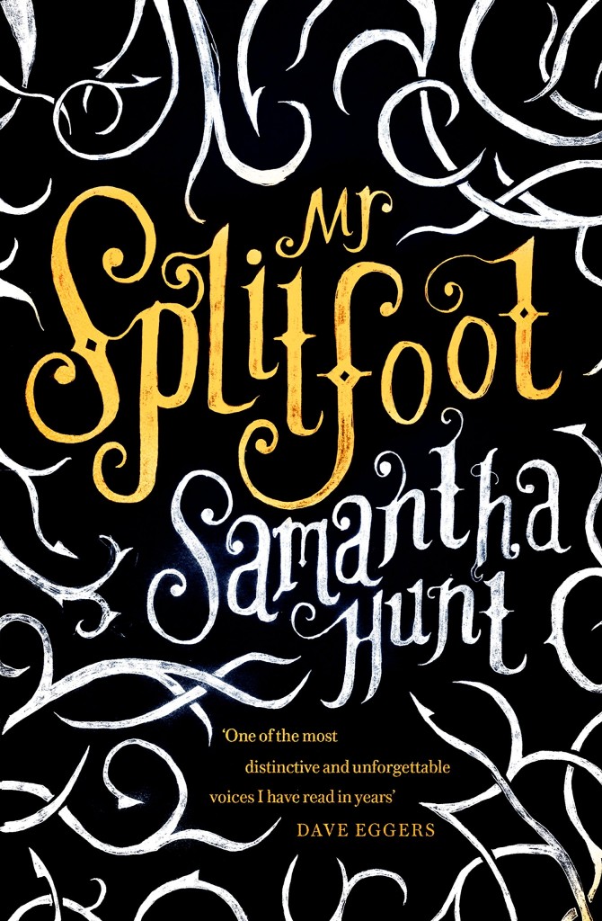
Mr. Splitfoot by Samantha Hunt; design by Nico Taylor (Corsair / January 2016)
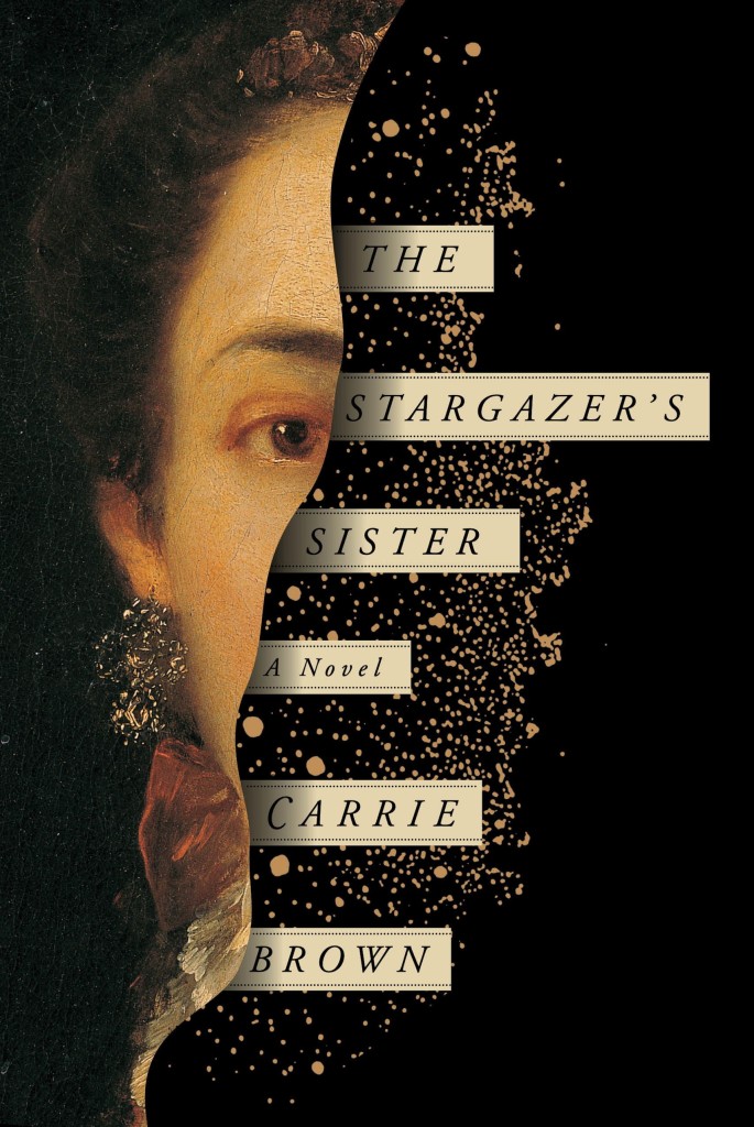
The Stargazer’s Sister by Carrie Brown; design by Oliver Munday (Pantheon / January 2016)
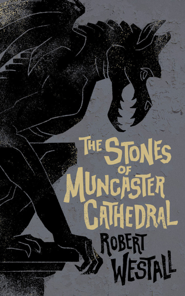
The Stones of Muncaster Cathedral by Robert Westall; design by M.S. Corley (Valancourt Books / December 2015)
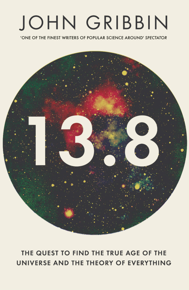
13.8 by John Gribbin; design by Shepherd Studio (Icon / October 2015)
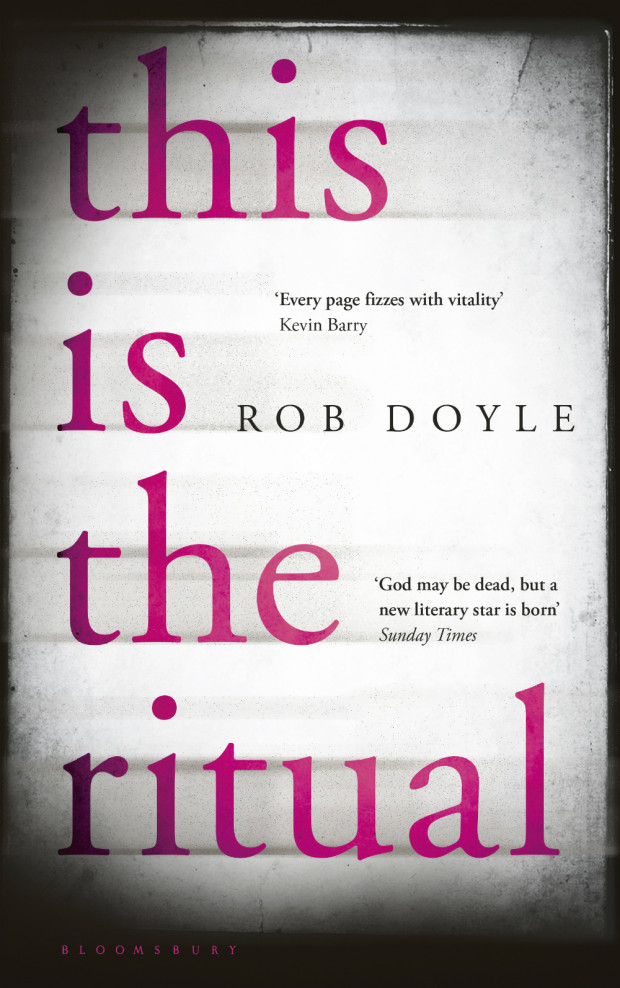
This is the Ritual by Rob Doyle; design by Greg Heinimann (Bloomsbury / January 2016)
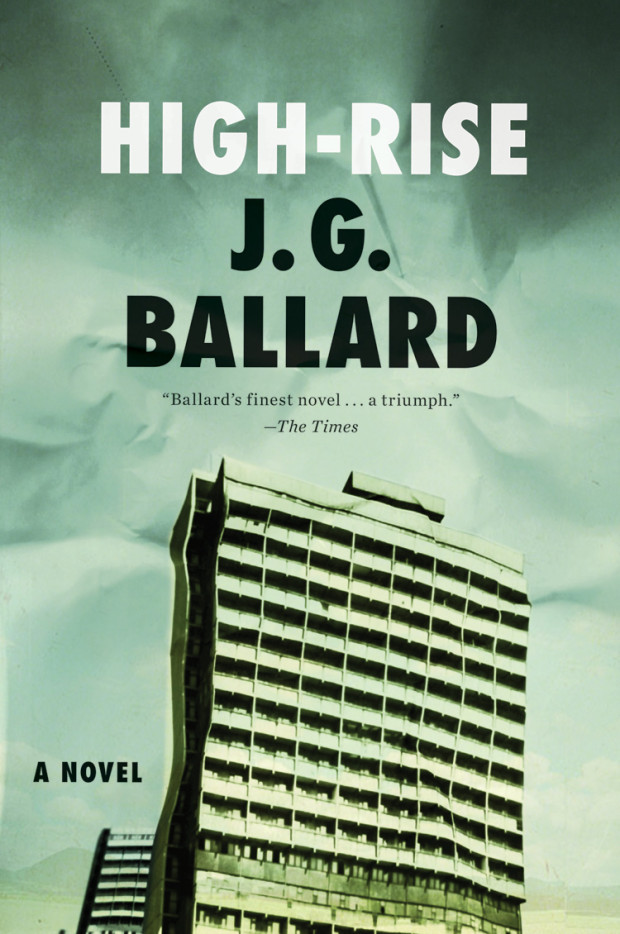
With the release of the Ben Wheatley movie adaptation starring Tom Hiddleston imminent, Chris Hall looks at High-Rise and the ‘inner-space’ of J. G. Ballard’s science fiction for The Guardian:
Comments closedHigh-Rise is the final part of a quartet of novels – the first three are The Atrocity Exhibition (1970), Crash (1973) and Concrete Island (1974) – with each book seeded in the previous one. Thematically High-Rise follows on from Concrete Island with its typically Ballardian hypothesis: “Can we overcome fear, hunger, isolation, and find the courage and cunning to defeat anything that the elements can throw at us?” What links all of them is the exploration of gated communities, physical and psychological, a theme that is suggestive of Ballard’s childhood experiences interned by the Japanese in a prisoner-of-war camp on the outskirts of Shanghai in the 1940s. It was, he always claimed, an experience he enjoyed.
The built environment is not a backdrop, rather it is integral and distinctive in its recurring imagery – from abandoned runways, to curvilinear flyovers and those endlessly mysterious drained swimming pools. Perhaps more than any other writer, he focused on his characters’ physical surroundings and the effects they had on their psyches. Ballard, who died in 2009, was also interested in the latent content of buildings, what they represented psychologically. Or, as he once obliquely put it, “does the angle between two walls have a happy ending?” – by which he meant that we project narrative on to external reality, that the imagination remakes the world. In Ballard’s fiction, nothing is taken at face value.
In High-Rise and Concrete Island especially, Ballard examines the flip side to what he called the “overlit realm ruled by advertising and pseudo-events, science and pornography” that The Atrocity Exhibition and Crash mapped out. Under-imagined or liminal spaces, such as multi-storey car parks and motorway flyovers, act as metaphors for the parts of ourselves that we ignore or are unaware of. His characters are often forced to assess the physical surroundings and, by extension, themselves rather than to take them for granted.
If you follow book design on social media at all, chances are you’ve come already across Matt Roeser‘s funny, if somewhat dinosaur-fixated, Twitter feed. But over the past couple of years as senior designer at independent children’s publisher Candlewick Press in Massachusetts, Matt has been quietly producing some bright, brilliant, and original covers for their line of young adult titles.
I first came across Matt’s work about 4 years ago when he first started a Tumblr project called New Cover, and was working outside publishing in St. Louis. Now he is designing books full-time, it only seemed appropriate to ask him a few questions about his interests and influences, his work, and his career. We corresponded by email.
Were there a lot of books in your house growing up?
Absolutely. We lived two blocks away from our library, so my parents were always taking my brother and I there and letting me bring home as much as I could carry. That, paired with the book order forms our teachers would pass out every month (of which I had an unhealthy level of excitement for) meant there was always a constant stream of books in our house.
Did you have a favourite book as a kid?
I had three, and to this day, still can’t decide which one I like the most because they’re each fabulous in their own way: From the Mixed-Up Files of Mrs. Basil E. Frankweiler because the kids run away and live in a museum (I’m still hoping to do this one day!), The Westing Game, because it’s an epic murder mystery, and The Phantom Tollbooth, because it’s so imaginative and full of wordplay, which I have a soft-spot for.
Do you remember when you first became interested in design?
Yes, and it was paired with reading in a way. The movie Jurassic Park came out when I was 10 and I went with my brother to see it at least 5 or 6 times and was just completely enthralled. Then my brother bought the book with the now-classic Chip Kidd design on the front. I read it and, being my first “big-person” book that I had read, it really stuck with me. I remember thinking it was so cool that the design of the jacket was used for the logo for the park in the movie. And it was on t-shirts, lunchboxes, everything. The fact that a new Jurassic Park movie is coming out next year, and they’re still using Chip Kidd’s design just makes me so happy. So while I don’t think I completely realized it at the time, that’s the moment that I became aware and interested in design. And since I’ve never actually grown up, all of the things I loved as a child (dinosaurs, space, time travel) still excite me to this day (thus why a majority of my tweets revolve around dinosaurs). I even had a Jurassic Park themed 30th birthday party which was simultaneously my most proud and most embarrassing moment in life.
Is anyone else in your family creative?
Yeah, my immediate and extended family is full of carpenters and woodworkers, interior designers and painters and people that just generally like to create and build with their hands.
Did you study design at school?
Initially, when I started college, I dove deep into marketing. However, I quickly found out, after taking macro-economics and a plethora of other numbers-based courses, that the business side of marketing was not at all interesting to me. I then started taking a bunch of creative communication classes that included various advertising and graphic design courses, and quickly felt much more at home. Ultimately, a lot of my design education was self-taught, but at school I learned the basic process of working on creative projects that really stuck with me.
What were you doing before you joined Candlewick?
I worked with the creative team at Atomicdust, a branding and marketing agency in St. Louis, Missouri. I definitely learned the ins and outs of the creative process while there. We had a great array of clients that allowed us to flex our creative muscles in a variety of ways as we came up with messaging and then decided the best ways to get that message out. Learning how to boil down a company’s entire purpose/goals/soul into a clear message was great experience for what I do now: communicating an entire book’s essence through its jacket.
Before you were designing books professionally, you started New Cover, a self-initiated project redesigning the covers of some of your favourite books. Was your goal to get a job in publishing?
Ultimately. It was really driven from the fact that I love to read and I love design, and it had always been a secret “dream-job” ambition of mine to make of career of combining the two. Part of my job at Atomicdust was hiring designers, and as a result, I was sent tons of resumes and portfolios. Every once in a while, there would be someone who didn’t have any work to show but was still looking for a job, but you can’t really hire a designer without seeing any of their work. And then it hit me; if I wanted publishers to hire me to design book covers, they weren’t just going to do it because they saw that I could design websites and brochures. They would need to see book covers. So I picked a few of my favorite books and started creating new covers for them. The project was featured on a couple of design blogs and then spiralled from there into real work from publishers.
Can you tell me a little bit about Candlewick Press and what it’s like to work there?
Candlewick has all of the best elements of a smaller company mixed with the structure of a larger corporate company. There are about 95 employees in total and we’re all on one huge floor of a building in Davis Square, a sort of hipster-y area right outside of Boston. It’s a really open and encouraging environment that gives me the freedom to fully visualize the design ideas I have for titles. We’re the companion company to Walker Books in the UK as well as Walker Australia, so occasionally we’ll take on some of their titles and vice versa, or we’ll coordinate a global launch for a title that we will all be simultaneously publishing. It also means we have an almost never-ending source of imported chocolates and cookies coming to the office via visitors from our other branches.
How many designers work in your office?
The art department has about 15 designers, a majority of who work primarily on picture books. I mostly work on young adult and middle grade fiction and a non-fiction title every now and then.

Did you ever think you would make a career of designing kids’ books?
Looking back at previous jobs, you can definitely see all of the stepping stones that got me here. In high school, I worked in the children’s room of my town’s library. Then, during college, I worked at a preschool. So I’ve always sort of been surrounded by kids’ books. That, paired with graphic design in college and at Atomicdust, and it makes sense.
Can you describe your process for designing a book cover?
First, I read the book. I like to think that the jacket idea is already there in the text somewhere and I just have to find it and bring it to fruition. Once I’ve read the manuscript, I start sketching out ideas both on paper and on my computer. Sometimes I have a really clear initial vision of what the cover should look like and the final cover ends up looking pretty similar. Other times, I won’t have as clean-cut of an initial idea, so I’ll do really broad image searches based on a few keywords I’ve written down while reading just to get the wheels turning. It’s hard to say where ideas come from. The ultimate goal is to make a finished product that would catch someone’s eye, regardless of who the specific audience is. If I can make it interesting enough for anyone to pick up, I’ve done my job.
What are your favourite kinds of projects to work on?
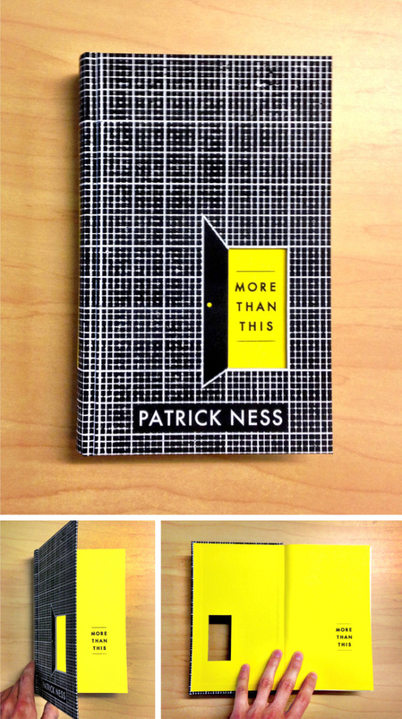
Anything that’s a little off. As a reader, I like stories where about 75% of what’s going on seems normal and then there’s this gray space remaining where something unexpected/bizarre/weird is happening. It’s why I like books like The Prestige, Jonathan Strange and Mr. Norrell, A Tale for the Time Being, and the TV show LOST. So story-wise, those are projects I get the most excited about. Also, anytime a book is part of Launch (the titles that the publisher is really pumped about) because that ultimately means they’re willing to try different things to set the book apart. Whether it’s a die-cut through the case for More Than This, or a ¾ jacket wrapped around a printed case, or stamping the entire design in foil, I enjoy playing with the materials in new ways.
Who are some of your design heroes?
Chip Kidd, Jonathan Gray, Peter Mendelsund. Their designs are always interesting, unique and more often than not, little works of art.
Who else do you think is doing interesting work right now?
Will Staehle and Oliver Munday. They are two people that whenever I see their name on a book jacket, I’m simultaneously super excited to see a great cover and also maddeningly jealous of their innate talent that makes it look so easy. I haven’t seen a cover of theirs that I don’t like.
Is there a particular author or a book you’d like to design (or redesign!) a cover for?
Hmm, this is tough. I feel like a lot of them I did as part of New Cover back in the day, although I should revisit some of those and the questionable design decisions I made at the time. Some of those author names are in such a tiny point size that I just laugh thinking about it now. I would love to take on a series redesign as it’s something I haven’t gotten the chance to do professionally.
What’s in your ‘to read’ pile?
The Bone Clocks by David Mitchell! I’ve been anticipating this book for a while after reading and falling in love with his novel Cloud Atlas. A coworker was able to grab an ARC of the The Bone Clocks at BEA, so I’m currently immersed in it. I’m also looking forward to the new Murakami book coming out in a few months. And, after numerous people have told me that they can’t believe I haven’t read it yet, The Lost City of Z is the next book I’m reading.
Do you have a system for organizing your books?
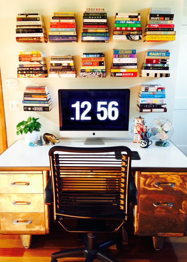
A few years back, I saw a floating pile of books on a wall in a design store and thought it was genius. Then, like I do with most things, I went overboard and bought 15 of them to hang over my desk. (See photo) They’re perfect for displaying some of my books in a way that’s a little different than normal. I try and fill them with a good mix of books I love and books that are visually amazing, and then put the majority of my other books in these three huge old steel lockers I have. One day, I will have a room with shelves going up every wall and a rolling ladder that I can ride around on like Belle does in the beginning of Beauty and the Beast and then I will truly be happy.
What’s the one book you recommend to everyone?
Cloud Atlas. It’s one where I would pause after reading a sentence and look out the window and contemplate life and just wonder how anyone could possibly be this good at writing. If you only saw the movie and hated it, go read the book. Before that, A Confederacy of Dunces. The dialogue is hysterical and I don’t remember laughing more at a book in my entire life.
What does the future hold for book cover design?
I think regardless of how popular ebook readers become, there’s always going to be those titles that people want to buy a physical copy of. Maybe this means, as an industry, we make fewer (but more special) physical versions of books, which I don’t necessarily see as a bad thing. I’m a big believer in quality over quantity and if we want people to buy physical books, they need to be everything that they can’t get in an ebook: the materials should be exceptional, the design should be a work of art, the interior should have (gasp!) well thought out margins. It should be something they want to display. On the flip side, there’s always going to be an audience that only cares about the content. They don’t want stacks of books everywhere, don’t want to lug them around, don’t care (gasp!) about margins. I can understand all of that. But there will still be a need for associating some sort of image with the book. I can’t/don’t want to imagine a future where there’s just a long text list of titles that people choose from with no accompanying visual. When that day comes, you can find me barricaded in my own personal library, muttering to myself as I zoom around on my rolling ladder.
Thanks Matt!
Comments closed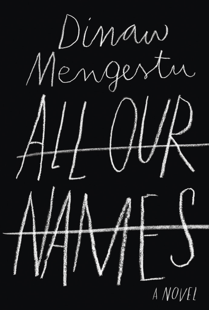
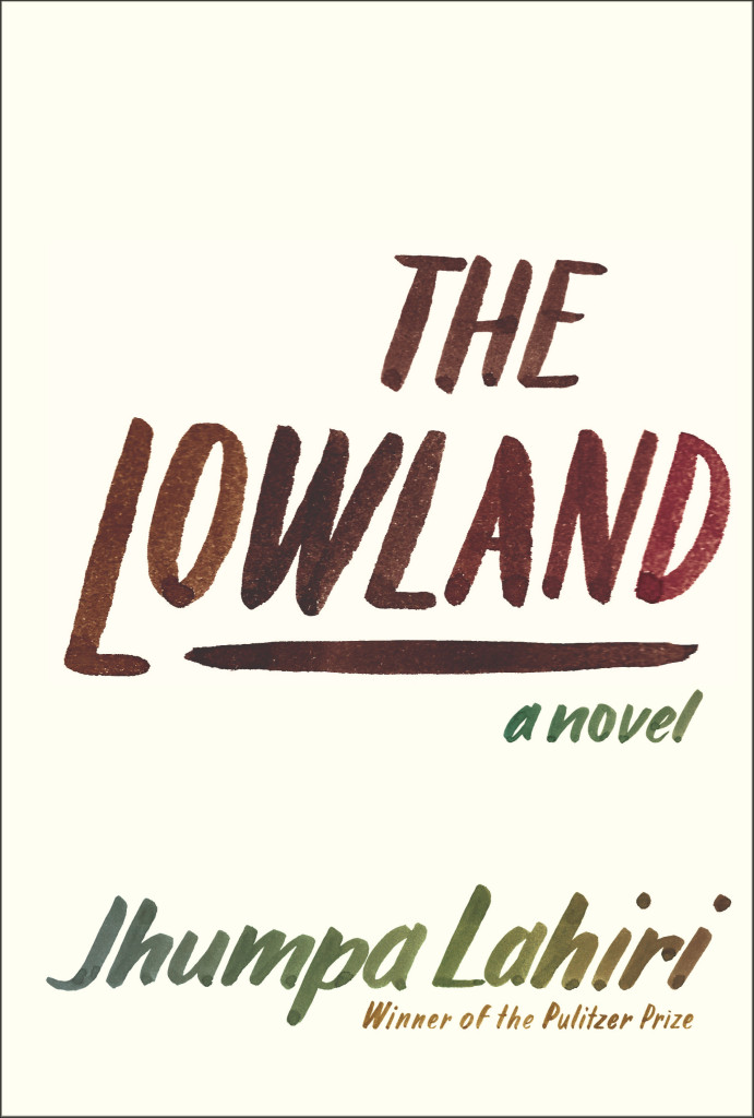
If you’ve walked into a North American bookstore recently, or you’ve been paying attention to the book reviews on this side of the Atlantic, you will have no doubt seen the stylish black cover for All Our Names by Dinaw Mengestu with its distinctive chalkboard lettering. Or perhaps you remember the hand-lettered cover for the Knopf edition of The Lowland by Jhumpa Lahiri? It was one of my favourite covers of the past year. Both are the work of Venezuelan designer Isabel Urbina Peña. Now based in New York City, Isabel is a cover designer for Random House and creator of a typographic zine called Rants from a Stranger.
Since relaunching her website earlier this year, Isabel’s cover designs have been featured on numerous blogs already (including here), but I was thrilled to have the opportunity to talk to her earlier this month about her work and career in greater depth.
Isabel and I corresponded by email. Here is our conversation:
Do you remember when you first became interested in design?
I think because of my parents, art was in my life since I can remember. But, when I was in 7th grade there was a big boom of internet start-ups in Venezuela and I remember clearly “deciding” that I wanted to be a graphic designer then…I was 13 and the concept of what graphic design was at the time was probably wrong, but that moment definitely steered me in this direction. Also, there was a moment in my “foundation year” in college where one of my type teachers talked about how the “typographer” was present in the page, but invisible to the reader and that just flipped a switch in my brain.
Is anyone else in your family creative?
Both of my parents are architects and they really motivated my sister and me creatively while growing up.
We spent half of our childhoods going to museums, plays, as well as ceramic, poetry and creative writing classes. My dad also paints and belongs to a drawing circle. When I was little he would sit with me and walk me through art books or give me a canvas and ask me to paint from inspiration, or even from some big painting like Van Gogh’s sunflowers. Paul Klee, Gauguin and Chagall are a few of the artists that I discovered through them when I was six or seven… I have to say my mind was blown, I still cherish those moments.
Were there a lot of books in your house growing up?
A ton. My dad also reads a LOT… So he wanted me to be “a reader.” I would get books for Christmas, birthdays, holidays, regular days…no Nintendo growing up… believe me that was tough, haha. He really sparked a love for reading and I would find new material everywhere; at my grandma’s I would read through all my uncle’s adventure books; at garage sales I started picking up Penguin paperbacks because they looked so simple and literary. Reading felt like something my dad and I shared, but it was also mine to discover.
Did you study design in Venezuela?
Yes, I studied at a small school called ProDiseño. Until very recently the “campus” was literally a two-flight house with a tub and a living room. Classes were really small, so everyone knew each other. The school started after a group of 80 students from IDD (Instituto de Diseño Neumann) left to start their own school. Neumann was founded by a large group of European immigrants who taught them design through the Bauhaus principles. Prodiseño had a very strong inclination towards clean, conceptual design. Everything had a purpose and “a why.” The content always came first; then the form. It was a very special experience and it prepared me to do anything (design, typography, illustration, animation, motion graphics…) and most importantly taught me to learn how to “think.” It was a very complete, Renaissance-style education.
Is there a strong arts/design community in Caracas?
Definitely, though it is a rather small one compared to New York City, it is very interesting.
There are a lot of events that support the arts and design and mostly DIY culture. A lot of self-proposed shows and collectives that put on parties with great visuals and self-produced posters. Also, a lot of zines and self-published publications are popping all over town.
How is living in New York different?
Well, New York is different in every way: from the variety of people you meet to the cultural experiences that are available to you. Living here, for me, has been a rich experience loaded with references of all kinds, and motivation. If anything it makes me expect more from myself and aim higher.
How long have you lived there?
This is my 6th year in New York, but it honestly feels like I just got here. Of course, I’ve learned so much and evolved, but it feels like it never gets old.
Does what’s going on in Venezuela worry you?
YES, I am glad you asked.
I am extremely worried by what’s going on in Venezuela and I think not enough people know about our situation. Protests started almost two months ago and people are being murdered and attacked on the streets daily and there doesn’t seem to be any change in the attitude of the current government. The truth is the people have the right to protest for the many problems that Venezuelan people are dealing with right now (the extreme insecurity they live in, the rapidly increasing inflation rates, the scarcity of many basic necessities and the extreme corruption, just to name a few) and the way that the government is handling this protests is, just, criminal. There are human right violations occurring left and right and even though there is proof (video and photos) for a lot of these events, the government is turning a blind eye and not doing anything to impart justice. Instead they focus their efforts in bullying opposition leaders and undermining the people’s rights. It is very, very sad and scary for all Venezuelan people and unfortunately change won’t come easily… but Venezuelans are still fighting hard, hopefully with a brighter future awaiting for all.
Can you describe your process for designing a book cover?
I start by reading the book and the TI (Title Info) sheet, getting familiar with the author and his backlist, if there is one. I take a bunch of notes and list ideas while and after I’m reading. I try to list everything—you never know when the “silliest” idea will spark something good. I’ll do a mood board and sketch a selection of these ideas in small (2 x 3 inches or so) detailed thumbnails with pencil and paper. Depending on the book, developing these ideas might be on or off the computer. I do a lot of paperback-size pencil sketches to define a lot of the lettering shapes and details.
Sometimes I will ink and do minimal clean up in the computer and sometimes I digitize the lettering in a font editing software and make the comps. Once I do that, I usually present a range of “developed” ideas and looks to my art director. We discuss if we need to adjust or tighten anything and then show the editors.
What are your favourite kinds of projects to work on?
Honestly, I am quite new at this, and I try to get the most out of any project. Figuring out what best represents the book I’m working on is one of the things I enjoy the most. That said, I really love doing all the cover art from scratch, and creating a “unique” design with custom lettering and illustrations.


Can you tell me about your zine “Rants from a Stranger”?
Rants from a Stranger is a self-published “booklet” inspired by zines, graphic novels, comics and the DIY culture. I like to call it a “typographic novel,” though it doesn’t really qualify as a graphic novel because of its length, and it is more on the zine realm. I love type and lettering and this was the perfect excuse to hand-letter more and produce a periodical self-published piece where I had full control of the creative direction.
I thought it would be fun and different to develop a series of “comics” without illustrations and solely use lettering as the “characters” of the story. So far there are two black and white issues and the third issue (special edition, in color) is coming out in late April as a collaboration with a very talented musician and artist from Venezuela, Mariana Martin Capriles, aka Mpeach. I’m really excited about this issue because of our collaboration, and also because it comes with a paper record player and a flexi EP record of her new song, “Boogaloo Mutante.”
Who are some of your design heroes?
Gerd Leufert, Gego (Gertrude Goldschmidt) and Nedo Mión Ferraro were very important figures in my formation as a designer and I still look through their books every time I have a chance. Their students, now well known graphic designers, and former teachers of mine, like Álvaro Sotillo, Gabriela Fontanillas and Carlos Rodríguez have always inspired me through their impeccable work and dedication.
Doyald Young’s lettering work take my breath away, and old school type designers like W.A. Dwiggins and Frederic Goudy are daily inspirations.
Who do you think is doing interesting work right now?
So many brilliant folks out there! Freddy Arenas, my super talented other half, does amazing motion graphics and illustration.
In the cover design world, my co-workers are doing great stuff, all the time. Linda Huang, Joan Wong, Pablo Delcán, Kelly Blair, Megan Wilson, Peter Mendelsund, Carol Carson, Stephanie Ross… From the type, design, art and illustration world Jesse Ragan, Village, Kris Sowersby, OCD, Steve Powers (ESPO), Sergio Barrios, Wayne White, Craig Ward, Alex Trochut, Elizabeth Carey Smith, Gustavo Dao, Suzi Sadler, Ryan Bernis, Priyanka Batra, Sasha Prood, Ping Zhu, Victo Ngai, Elana Schenkler, Geoff McFetridge, Nobrow Press, quite a mix…
I could keep going…
What advice would you give a designer starting their career?
Try harder. I think it’s really important to be critical of your own work and be able to accept its faults. Always, strive for more and be hungry. At the same time, embrace your mistakes, learn from them and move on to the next project. I am a big fan of tweaking and fixing til the end of days… but sometimes you just have to learn to let go of projects and keep going. Erik van Blokland said to our Cooper Type class (regarding typeface design), “Release early and release often; recognize what you did wrong in the project and try again.” I remind myself to do that everyday.
I think you should always try to work in what you love and feel passionate about. Even if it means reinventing yourself and making up your own projects in your spare time. This is where the good work will be. Don’t be afraid to make changes and try different things if you need to.
What’s in your ‘to read’ pile?
I’m currently reading Americanah by Chimamanda Ngozi Adichie and Inter Views by James Hillman. I really want to read Dissident Gardens by Jonathan Lethem, My Age of Anxiety by Scott Stossel and The Goldfinch by Donna Tartt from this past season.
Someday, I’d love to re-read Cortazar’s Hopscotch (Rayuela) and all of Jorge Luis Borges.
The list goes on…
Do you have system for organizing your books?
Ha, no. I used to be very organized and had them alphabetically, color code them, etc… Those days are over… Nowadays, I move them around pretty often and they stay wherever they land.
Do you have a favourite book?
Not really a favourite single book, but I do have an influential shortlist: Virginia Woolf’s The Waves, L’Étranger by Albert Camus, Cuentos de Amor, Locura y Muerte by Horacio Quiroga, Piedra de Mar by Francisco Massiani, Ficciones by Jorge Luis Borges, Oscar Wilde’s Collection by Siruela (Biblioteca de Babel).
Thanks Isabel!
4 CommentsCan't find what you're looking for? Try refining your search: