Skip to content

59 search results for "chris ware"

Klaas Verplancke’s “On the Grid”

I love this illustration by Klaas Verplancke for the recent ‘Style Issue’ of the New Yorker (which has a fun animated version of the cover on its website).

It works on lots of levels, but it also feels like a bit of nostalgic throwback. People look at their phones these days (although I did see someone with a word search book on the Toronto subway this morning, so some people are keeping it old school at least).

Grid patterns suit the cover of the New Yorker so well though. They work as a representation of Manhattan’s city grid and its skyline, as well as magazine layouts and puzzles. I was reminded me of Sergio García Sánchez’s “Modern Life” cover from a couple of years ago (itself a riff on Piet Mondrian’s New York-inspired painting “Broadway Boogie Woogie“). Chris Ware divided the cover into a comic book (ish) grid during the pandemic too. I’m sure there are more examples. (Grids are good!)

Comments closed

Why I Love Comics

18ware-comics-master1050

Chris Ware for the New York Times Sunday Book Review.

Comments closed

Q & A with Gene Luen Yang

I wouldn’t be surprised if you were feeling a little disillusioned with comics right now — frictionless superhero movies that deliver ever-diminishing emotional returns; ham-fisted editorial decisions; disputes over rights, compensation and artwork; violence; stupidity; institutional misogyny and racism; and generic blandness will do that.

Beyond the multiplexes and controversies, however, it is actually a quite an exciting time to be reading comics.

There are signs — Brian K. Vaughan and Fiona Staples‘ space opera Saga, Hawkeye by Matt Fraction, David Aja and Javier Pulido, and Scott Snyder and Greg Capullo‘s horror-driven Batman spring to mind — that genre comics may still have some life in them.

Classic series and newspaper strips are being properly curated and are more available than before. Under-appreciated artists are being rediscovered.

Alternative cartoonists such as Peter Bagge, Alison Bechdel, Chester Brown, Jaime and Gilbert Hernandez, Rutu Modan, and Chris Ware are producing some of the best work of their careers. The art of Daniel Clowes and Art Spiegelman is being recognised with gallery exhibitions.

And sitting somewhere between in the alt. auteurs and the superheroes, cartoonists like Emily Carroll, Becky Cloonan, Tom Gauld, Faith Erin Hicks, Hope Larson, Bryan Lee O’Malley, Luke Pearson, Noelle Stevenson — artists who have absorbed a diverse range of influences — are carving out niches for themselves, often combining and subverting genres and styles to produce uniquely personal visions.

It’s in this last, loose group of cartoonists1 — the one between the experimental and the mainstream — that I’d put artist and writer Gene Luen Yang.

Best known for his work on the Avatar: The Last Airbender graphic novels, and the critically acclaimed American Born Chinese, Gene’s most recent work is Boxers & Saints, an ambitious two-volume historical graphical novel telling parallel stories of two young on the opposite sides of the Boxer Rebellion. Already shortlisted for the National Book Award for Young People’s Literature and listed amongst Publishers Weekly‘s best books of the year — it is a remarkably mature, compassionate, and accomplished work that is at times funny, at times tragic, but always very human.

I recently met Gene while he was in Toronto to promote Boxers & Saints. I was impressed by his thoughts on being a cartoonist and on the medium itself, and we spent a good couple of hours talking books, comics, and movies. We have since corresponded by email for this Q & A.

American Born Chinese and Boxers & Saints are distributed in Canada by my employer Raincoast Books, and parts of this interview have appeared previously on the Raincoast blog.

  1. These are, admittedly, all very arbitrary, untidy and personal lists and categorizations — nobody who’s interesting fits exactly.
2 Comments

Q & A with Luke Pearson

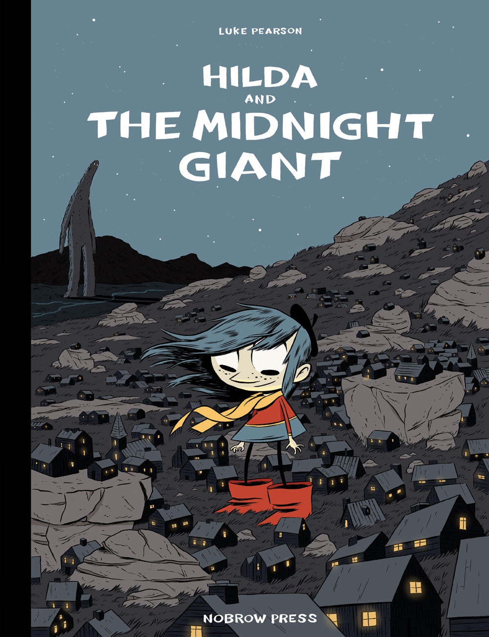
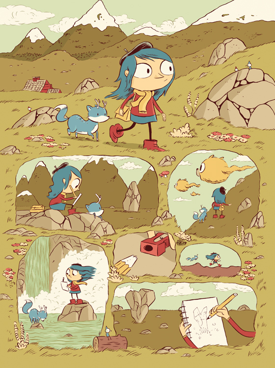
I’ve been a fan of Luke Pearson‘s work since picking up a copy of Hilda and the Midnight Giant from Nobrow Press a year or so ago. The beautiful illustrations, quality printing and oversize format gave it the exotic feel of the comics albums British school kids used to sneak back from vacations in France (and maybe still do?). Despite my immediate sense of nostalgia, the comic itself was fresh, different and delightfully free of cynicism. I read it over and over with my kids, and then savoured it on my own after they were asleep.

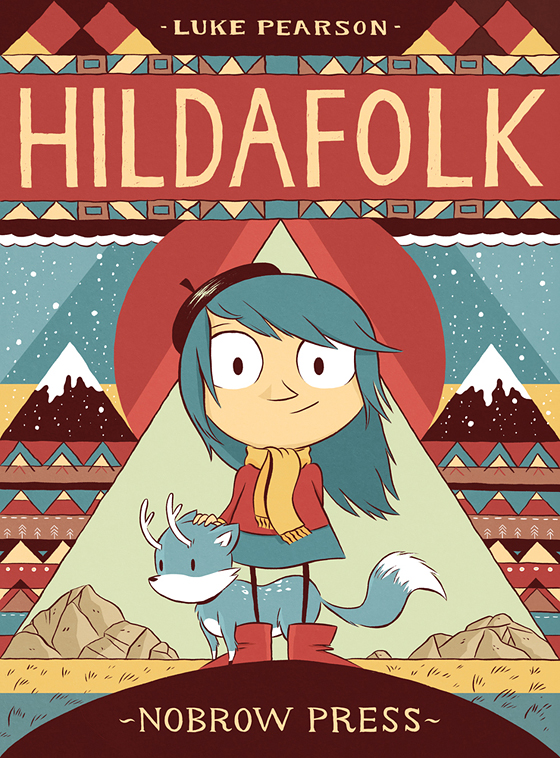
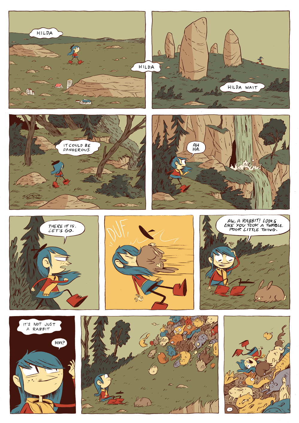
Happy to find a kids comic that adults could also love, I quickly went back and found a copy of Hildafolk (recently reissued in hardcover as Hilda and the Troll) and bought Hilda and the Bird Parade as soon as it was published. While seemingly drawing inspiration from Northern European stories and Tove Jansson’s magical Moomin books, Hilda’s world has it’s own, unique mythology — a strange wood man, truculent elves, troll rocks, sea spirits, salt lions, flying furballs, and lonely, ancient giants. The wide-eyed and blue-haired child and her mother are a curious and reassuring modern presence in this old and magical world. The fantastical is everyday to them — something to be fitted around work and school. Their problems are the problems of the real world — where to live, how to make friends with the neighbours, how to do the right thing…

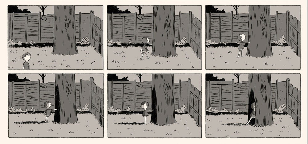
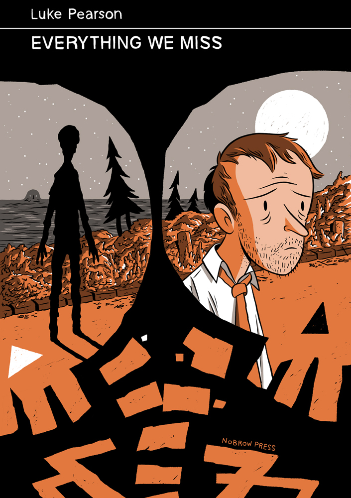
This juxtaposition of the modern and the magical is also evident in Luke’s comics for adults. But where the Hilda comics are unabashedly bright and joyful, the adult comics are filled with melancholy and sadness. Like Kevin Huizenga‘s Glenn Ganges comics, the fantastical in Luke’s adult comics is shadowy, nightmarish, and all the more unsettling for its appearance in mundane, familiar settings. The monsters and ghosts in stories like like You Mustn’t Be Afraid (included in the anthology Nobrow 7: Brave New Worlds), and the full-length graphic novel Everything We Missare the personal demons (sometimes scary, sometimes familiar) of the world weary, not the new friends of a child in unexplored territory. But for all their apparent differences, at their heart the Hilda stories and Luke’s adult comics are fundamentally about the same things: people, relationships, and about understanding one’s place in the world.

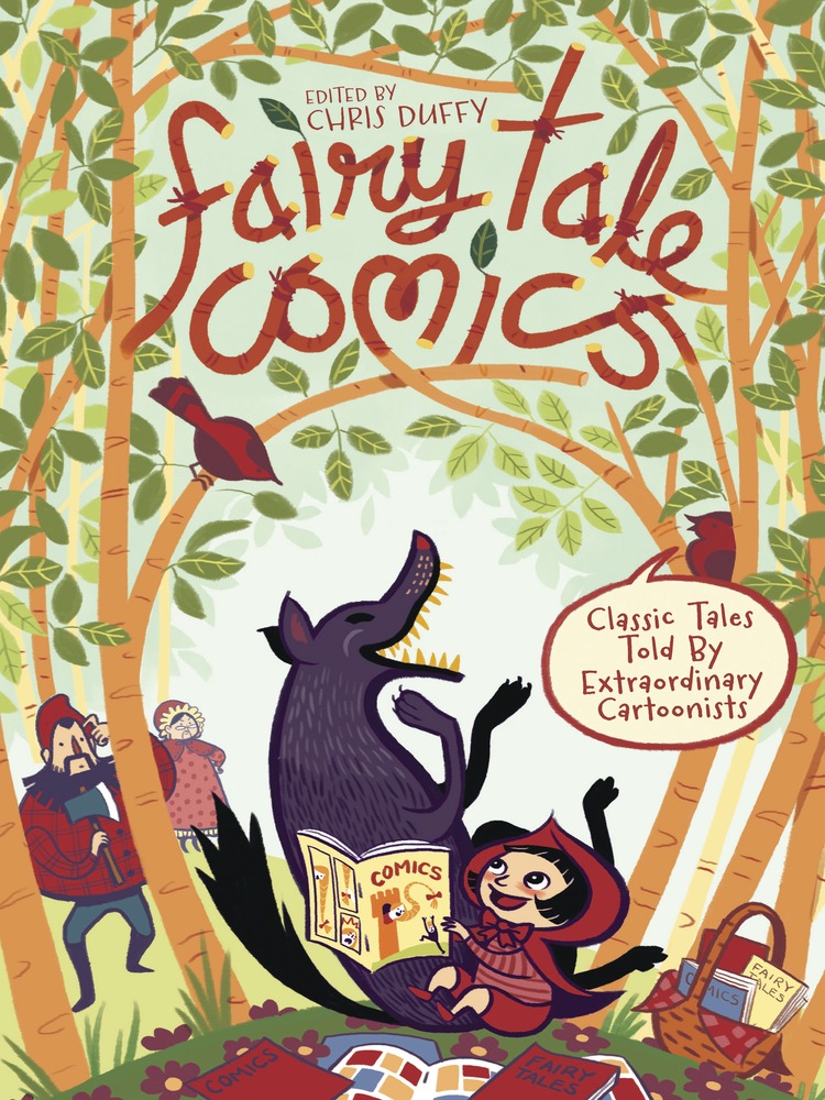
I recently spoke to Luke for the Raincoast Blog about ‘The Boy Who Drew Cats,’ his wonderful contribution to the newly published kids anthology Fairy Tale Comics. Here, we talk about his influences, his comics and his book cover illustrations. We corresponded by email.

When did you first start drawing comics?

When I was very young. I think I probably started drawing speech bubbles as soon as I figured out how to draw people. I used to draw comics about a character called Super Rabbit and show it to my grandparents.

Did you always want to be a professional cartoonist?

I probably did at some point when I was a child. It was obviously something I always thought about, but I was only really familiar with the smallest selection of comics and was entirely ignorant to how the industry worked, so it seemed like a crazy, unachievable dream to ever expect to get to that point. I eventually wound up going to university to study illustration and going into that I was prepared to basically just try and be an illustrator and it was only through the process of that that I remembered that comics were something that I still liked doing and that it was actually weird that I wouldn’t be doing them.

What was the inspiration for the Hilda books?

I draw really heavily on Scandinavian folklore (particularly Icelandic and Norwegian) for the Hilda comics. I got hooked on that initially from researching Icelandic folktales for a map project we were set at university. I really liked how strange and low-key they were. Not much happens and then the weirdest thing will happen, but it’s described really plainly and matter-of-factly and then it will end really abruptly. I tried to fuse some of the stuff I’d read for that with memories from an earlier family holiday to Norway which had a big effect on me and set a bunch of ideas in motion that for a long time I had nothing to do with.

The series has drawn comparisons to Tove Jansson beloved Moomin stories. Has Jansson been an influence on your work?

The 1990 tv series was my first exposure and I always felt like it was key in the shaping of my psyche somehow. I came relatively late to discovering the full breadth of what she did. If I had to choose to have an idol, I guess she would be it, maybe. So obviously she is a big influence on me, as a cartoonist, illustrator and a writer. I always feel a bit weird about any comparison though, because I can’t tell if it’s meant kindly or if it’s more like ‘I can see where you steal your ideas’. Hilda was designed very self consciously, at least initially, to resemble a kinder Little My.

Your contribution to Fairy Tale Comics, ‘The Boy Who Drew Cats’, has a similar magical quality to Hilda. What attracted you to the story?

It was actually one of a couple of stories suggested to me by Chris Duffy, who edited the book. I liked how far removed it felt from the kind of Brothers Grimm stories that I generally think of when I think ‘fairytales’. It’s more like a horror story with a lot of weird details that seemed fun to me. I liked the Japanese setting. I was also completely unfamiliar with it so I didn’t have to feel the weight of past interpretations on me as I adapted it.

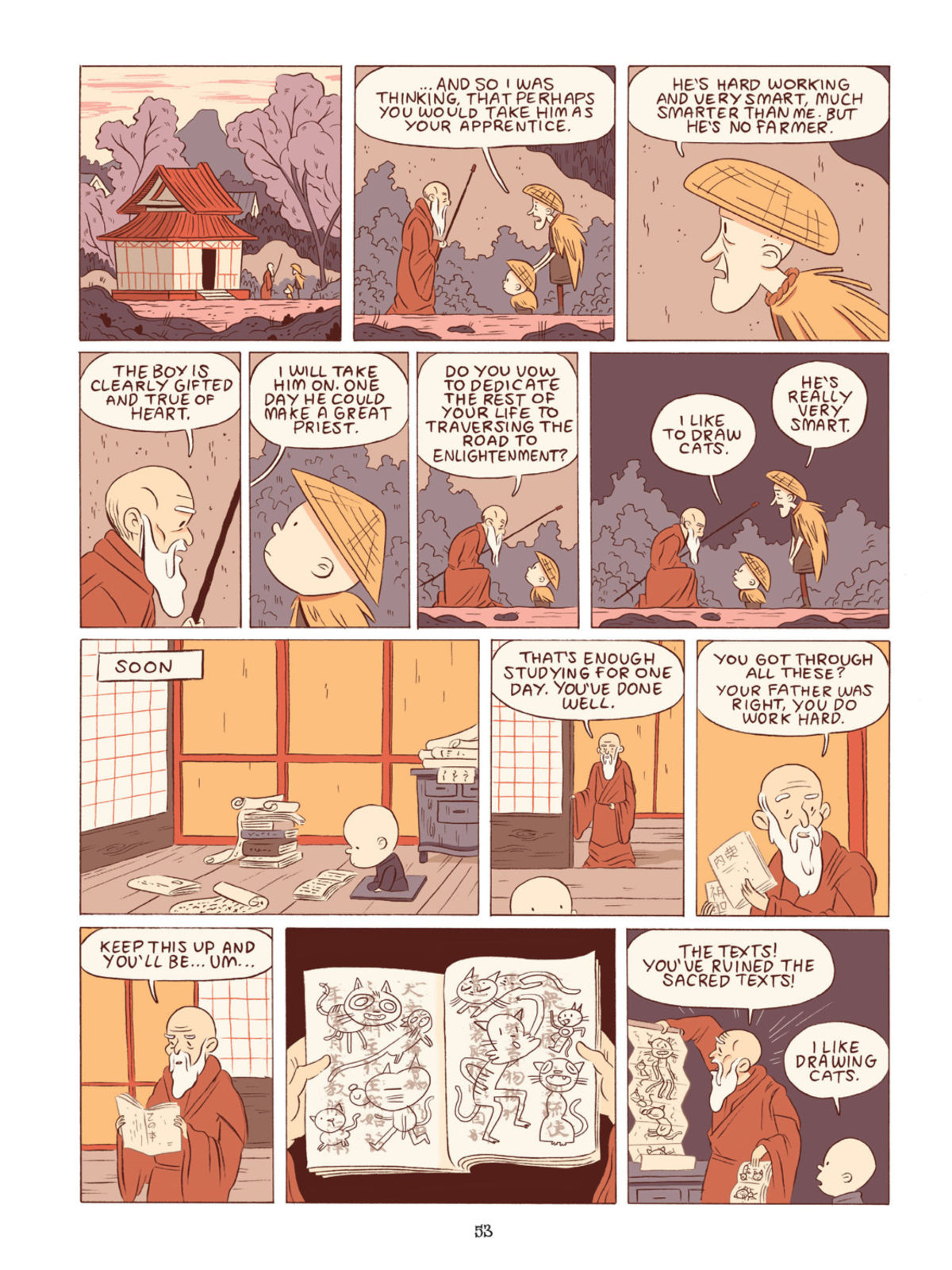
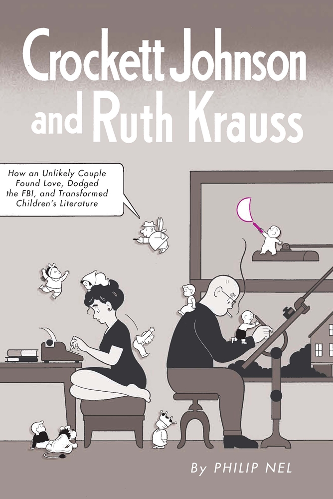
I love that the child at the centre of ‘The Boy Who Drew Cats’ looks a lot like Harold from ‘Harold and the Purple’ Crayon. Has Crockett Johnson been an influence on your work?

Actually no! I’m not super familiar with Crockett Johnson’s work at all. He actually started off as Charlie Brown and then I pulled his features around a bit.

Do you approach your comics for kids differently from your adult comics?

I think this is the only kids comic I’ve done that isn’t a Hilda comic. Usually I’d point out that I draw my kids comics (Hilda) in a different style to how I tend to draw my adult stuff. I guess really I’m just talking eyes here. Hilda is full colour with big eyes and my other comics tend to be limited colour with dot eyes. This is full colour with dot eyes so I guess it sits in the middle. Less superficially, I’d say I try to be really clear in regards to storytelling and try and wrap things up neatly with my children’s work.

Briefly, could you describe your working process?

I generally draw and ink on paper, scan, colour in photoshop. I switch between brush pens, brushes, fineliners and dip pens. I don’t have any particular paper that I always use. I’m starting to enjoy occasionally inking in photoshop now, which I’m just using a wacom tablet for.

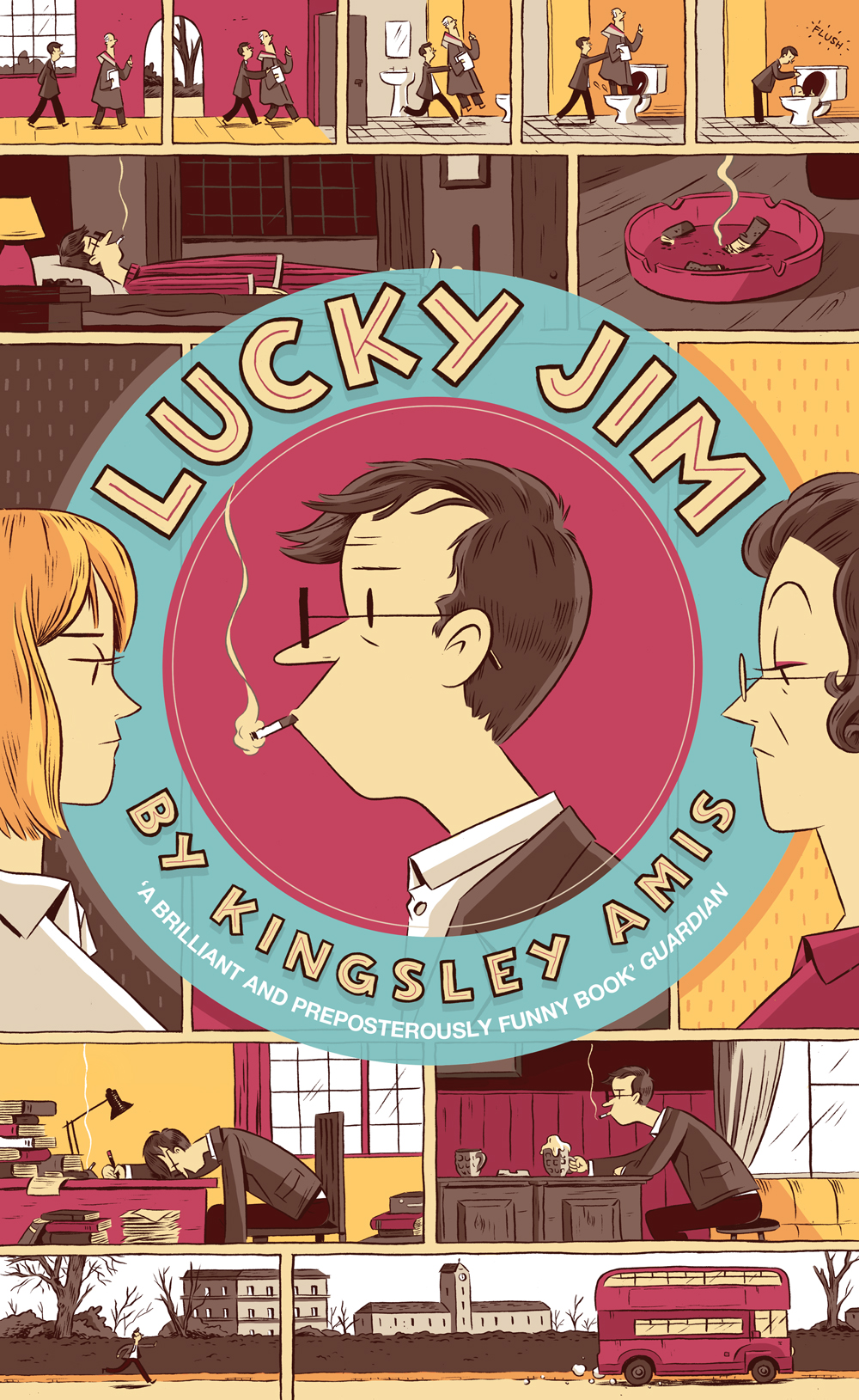
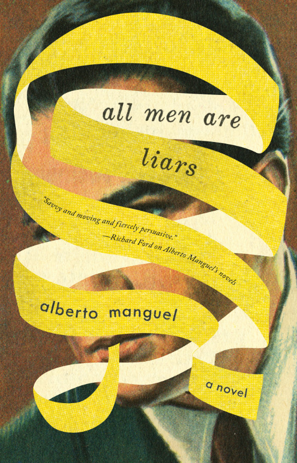
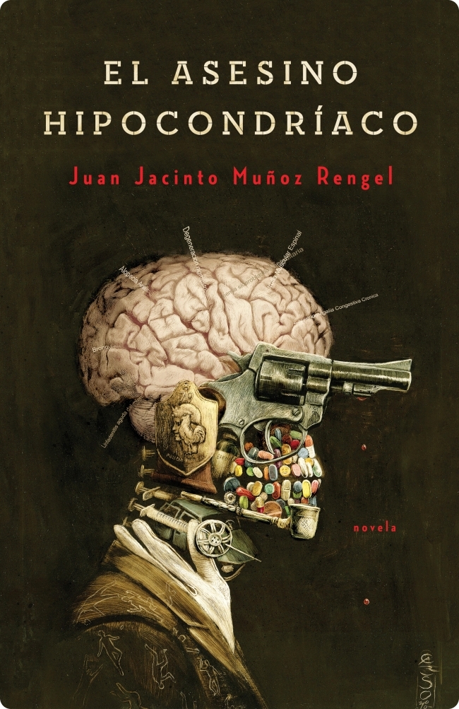
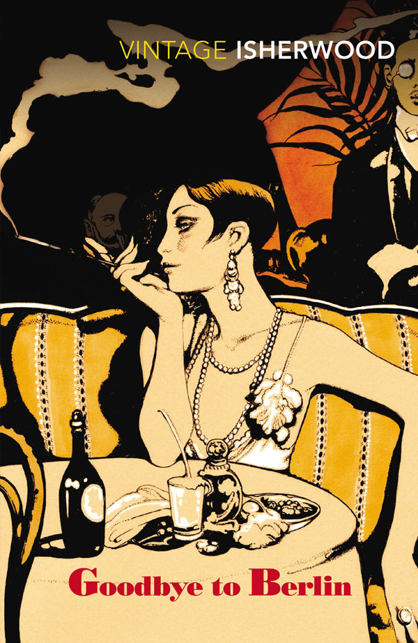
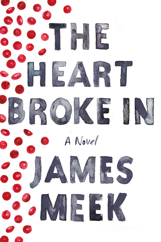
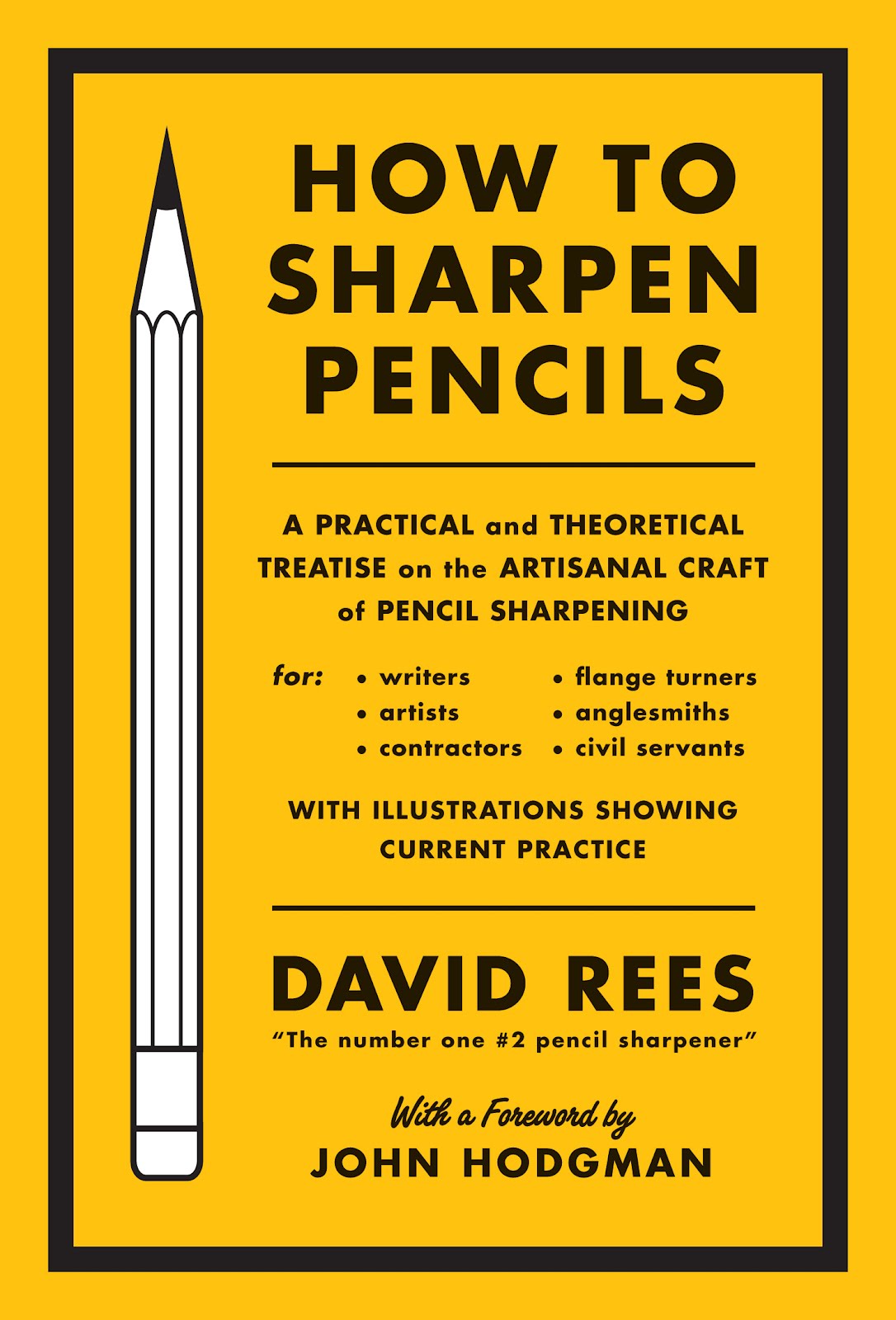
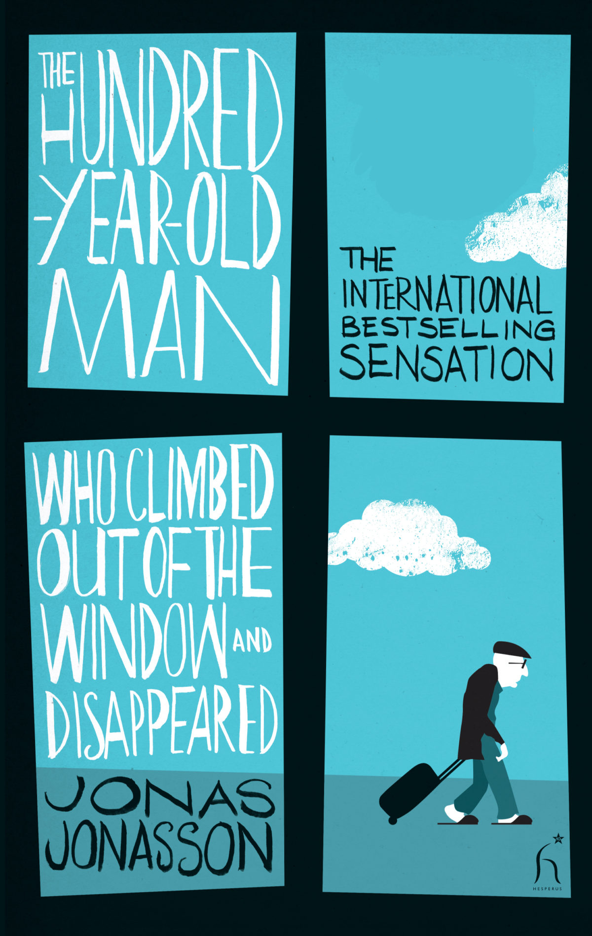
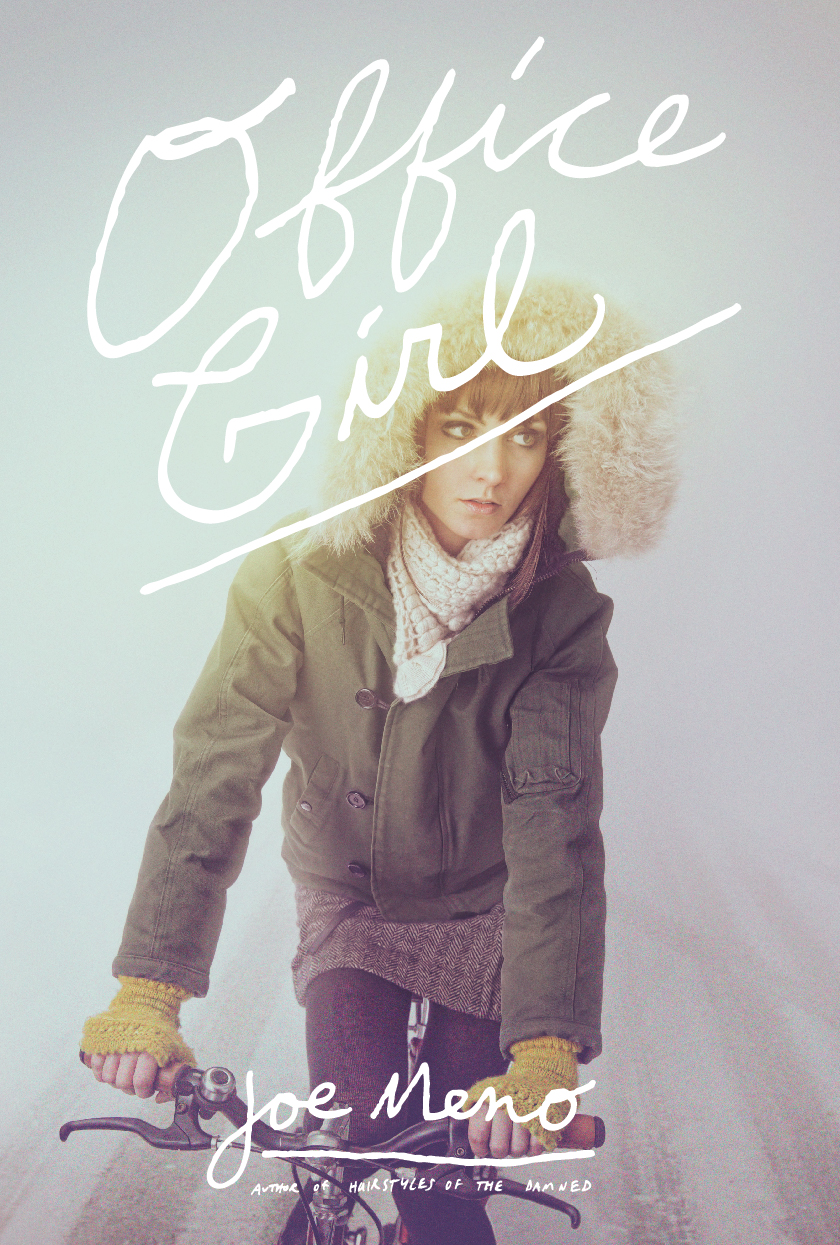
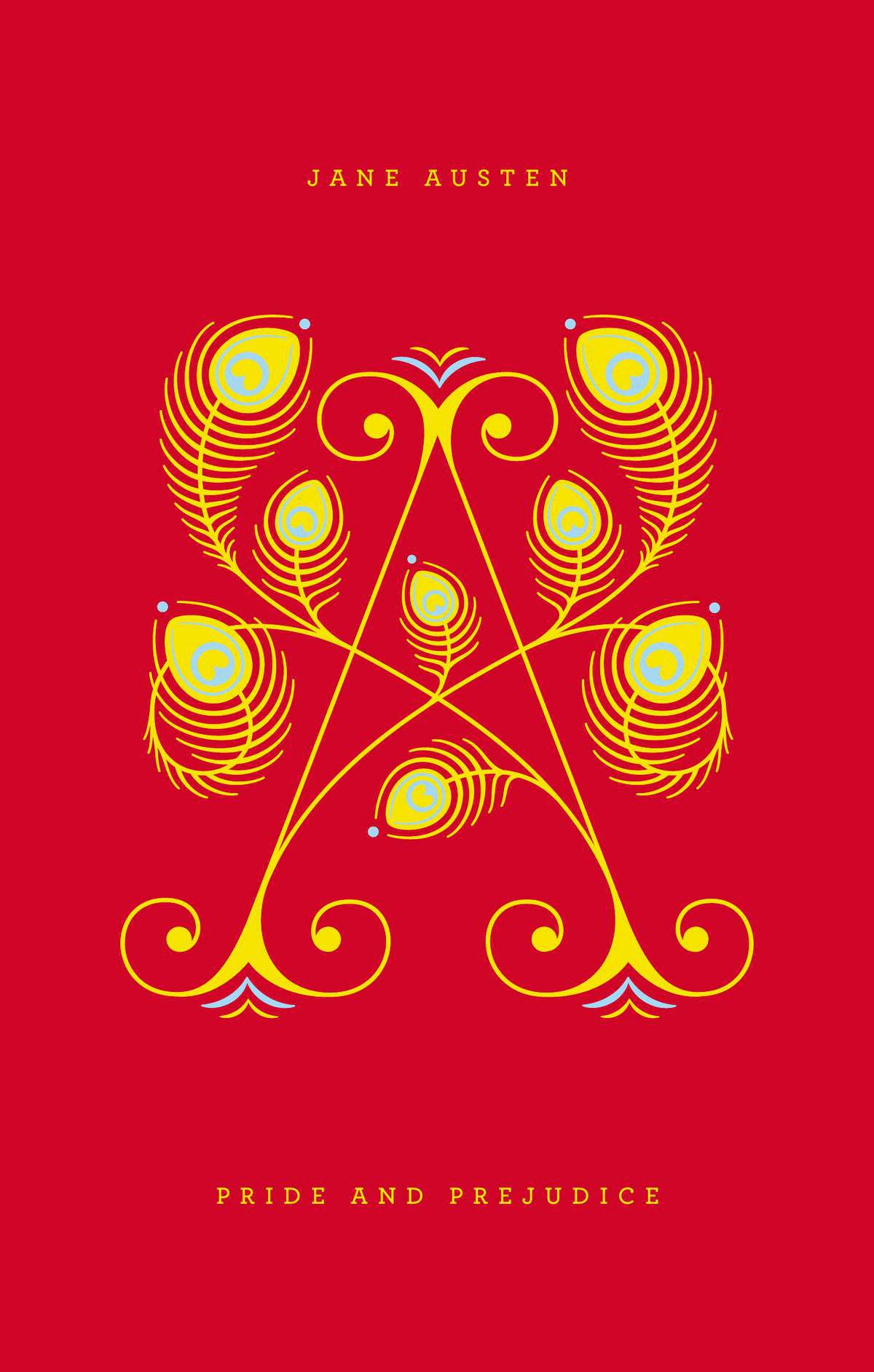
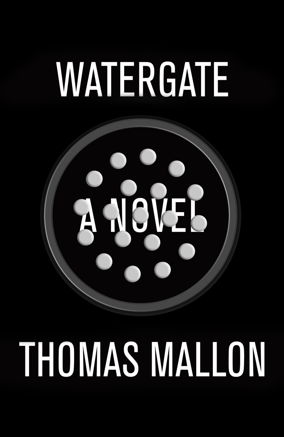
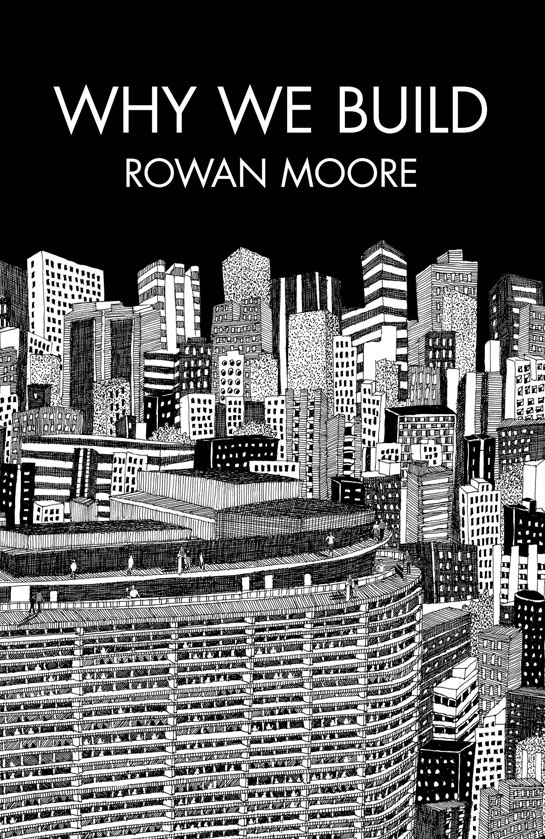
How is illustrating a book cover different from drawing comics?

Other than involving the same technical skills, it’s different in every way. I guess you are kind of trying to ‘tell a story’ with a cover, but really you just want to create an image that’s striking, intriguing, aesthetically pleasing and somehow captures the tone of the book. I’d say it feels a lot easier than a comics page, because you can just spend all your time fine tuning and perfecting this one thing until it’s ready, rather than having to worry about fifteen different images and making sure they all look good and all fit on the page and make sense when read one after the other. That said, it’s a totally different thing and requires different skills.

Are there any books you would love to illustrate?

Watership Down or something by Franz Kafka. I wouldn’t want to do them in the style I draw my comics though. My taste in book covers is not quite in sync with the ones I’ve actually drawn.

What have you read recently?

I just finished reading Tenth of December by George Saunders. I just bought a couple of collections of Michael Dougan comics which I really like.

How did you get involved with Adventure Time?

I got an email asking if I wanted to take a storyboard test, which I took and I guess they liked it. There’s no interesting story there really. I’ve boarded on two episodes so far, ‘Candy Streets’ and ‘Frost & Fire’ and should be doing some more some time soon.

Where do you look for inspiration, and who are some of your cartooning heroes?

I try to just pay attention to things and take everything in as inspiration in some way or another. But you know, I also just look at tumblr and stuff like every one else does. Some of my heroes are Tove Jansson, Chris Ware, Osamu Tezuka, Gene Deitch and Philippa Rice.

Who else do you think is doing interesting work right now?

Loads of people, but the more I list the more I feel like I’m missing out. My favourite cartoonist right now is Anatola Howard.

Have you thought about creating web-comics?

Yes, but I can’t see myself ever having a dedicated site for a specific regularly updated comic. I usually put my shorter comics online if I can and I wish I could do that more often. I can definitely see myself doing a regularly updated thing for a limited period of time at some point.

Do you worry about the future of books and print?

I can’t say it’s ever kept me up at night.

Thanks Luke!

2 Comments

Remembering Kim Thompson

Kim Thompson, co-publisher of Fantagraphics, passed away on June 19th at the age of 56. Even though I briefly worked with the folks from Fantagraphics 5 or 6 years ago, I am sad to say that I never had the opportunity to meet him in person. I’m sure I would have learned a lot.

I recently linked to Seattle Weekly article about the future of Fantagraphics after Kim’s death, and so I also wanted to link to Robert Boyd‘s remembrances of Thompson in The Stranger:

I realize that readers might not understand why Kim Thompson was an important person—not just to me, but to art… [Fantagraphics] published Gilbert and Jaime Hernandez, Daniel Clowes, Chris Ware, Peter Bagge, Ivan Brunetti, Carol Tyler, and so many other great cartoonists, and are still doing it today. When you compare the publishing achievements of the underground comics generation (a brief brilliant flame) to Fantagraphics (and its peers, like Drawn & Quarterly), it’s hardly a contest. Fantagraphics is one of the greatest publishers of comics in any language of all time and one of the strongest promulgators of the art of comics in existence. And Kim Thompson was crucial to that 30-plus years of artistic success.

Sometime ago, the indefatigable Tom Spurgeon posted a long and comprehensive obituary of Thompson at The Comics Reporter that also serves as a potted history of Fantagraphics if you are interested in this particular corner of comics culture. There is a somewhat shorter obituary at The Comics Journal.


Ben Schwartz also posted about Thompson and the importance of The Comics Journal at the Los Angeles Review of Books:

Kim Thompson was born in 1956 to American citizens living abroad in Denmark, and arrived here in the US in 1977. That same year, Kim joined Gary Groth to help put out The Comics Journal, begun in 1976. The Comics Journal was the first forum for nothing but discussion, criticism, and journalism about comics to rise above the level of the zine (not to discount those incredibly vital fan networks). There would be no comics section here at the Los Angeles Review of Books, or anywhere else, without The Comics Journal. They were not the only comics-oriented publication, but they were the only one with actual journalistic standards that hired writers of depth and knowledge… Critical magazines have a way of stimulating creativity. From the heated, hyper-talkative culture of the 1940s and 50s Partisan Review, a Saul Bellow emerged to embody its aesthetic. From Cahiers du Cinema and its attempt to create a new critical language for film, the French New Wave filmmakers appeared. In a similar way, from the Comics Journal intelligentsia, a literary comics… movement began.

Finally, Tom Spurgeon posted (re-posted?) this 2008 interview with Thompson, again at The Comics Reporter. It is striking how much he still believed there was to be done:

“The industry has changed far more radically, and for the better, than I ever could have imagined, in terms of the respect accorded to comics, the level of work being produced, comics’ place in the market, the whole ball of wax. (You have to bear in mind that when we started cartoonists were literally wondering whether Americans would ever be willing to read comic books that ran beyond the length of an issue of Giant-Size Fantastic Four.)

The weird thing is that the idea of “graphic novels” and comics for adults has had so very little penetration into the general literate populace. Most regular people are, in my experience, still utterly stunned and confused at the very idea, New York Times Book Review reviews notwithstanding. There is a weird disconnect between the press’s enthusiastic embrace and promotion of the medium and its effect on actual “mainstream” readers… It remains an uphill battle, and if I’d known how much of an uphill battle it would continue to be, even with all of these victories, I might have become an advertising copywriter circa 1979″

He will surely be missed.

(pictured above: a portrait of Kim Thompson by Jim Blanchard; Eric Reynolds, Gary Groth, and Kim Thompson by Daniel Clowes commissioned for the (as yet) unpublished Comics As Art)

1 Comment

Cartoon College


Following a group of aspiring indie cartoonists struggling through two gruelling years at the Center for Cartoon Studies in White River Junction, Vermont, and featuring candid interviews with the likes Chris Ware, Scott McCloud, Lynda Barry, Charles Burns, Françoise Mouly, Art Spiegelman and Jules Feiffer, Cartoon College looks like a fascinating documentary about “one of the world’s most tedious artistic disciplines:”

The film was released on iTunes this week, with the DVD available in July.

Comments closed

Something for the Weekend

Arresting Charm — Writer and artist Howard Chaykin on the late Carmine Infantino who died April 4th:

My best friend Michael Abramowitz was a huge fan of Carmine’s, and I held and hold his tenure on The Flash from 1956 to 1965 in great affection. Infantino’s Flash was infused with a sleek modernism absent from other work of the period, a look and sensibility utterly different from that of his peers. His work was profoundly two dimensional, apparently uninterested in deep space. He frequently used the lower panel border as his horizon, with figures standing on that line, creating an effect somewhat like a stage apron, with flat shapes serving to represent middle and deep distance. It sounds odd, and it was, but it had an arresting charm. Infantino’s work, viewed today, is far more sophisticated, but also more emotionally detached, than that of his colleagues.

You can see more Carmine Infantino covers at The Golden Age blog.

Accidental Publishing — A feature on Seattle’ comics publisher Fantagraphics in Publishers Weekly:

The Fantagraphics publishing program began “almost by accident” in 1981, according to Groth, and over the last three decades has grown to feature some of the most critically acclaimed comics artists in the U.S. and from around the world. The Fantagraphics list includes the work of the Hernandez brothers (Love and Rockets), Daniel Clowes (EightballGhost World), Chris Ware (The ACME Novelty Library), and Jim Woodring (Frank, Weathercraft) and has grown to include multi-volume archival reprint projects such as R. Crumb’s The Complete Crumb Comics and Charles Schulz’s Peanuts. By championing the comics medium and the creators it has published, Fantagraphics has been instrumental in raising the profile of graphic fiction as an art form that transcends the superheroes and monsters that established the medium so many decades ago.

The Only Kind of Geography — Writer Alan Moore on psychogeography and, in particular, his work with Eddie Campbell on From Hell (via LinkMachineGo):

My approach, in keeping with Theophile Gautier’s elegant definition of Decadent literature as being capable of plundering from the most ancient past or the most recent ‘technical vocabularies’ (which is also a good working definition of postmodernism), would be to see the current model of psychogeography as evolving from and thus essentially containing earlier versions of the practice, making these original techniques available to modern artists as important tools within their repertoire. For example, one need not subscribe to any nebulous New Age conceptions with regard to ‘ley lines’ to appreciate that Brecon visionary Alfred Watkins’s idea of linking geographic points into a web of sightlines could have modern application if regarded as a linkage of ideas, as in both Iain Sinclair’s work and in my own From Hell.

Psychic Garburator — Margaret Atwood on dreams at the NYRB Blog:

Most dreams of writers aren’t about dead people or writing, and—like everyone else’s dreams—they aren’t very memorable. They just seem to be the products of a psychic garburator chewing through the potato peels and coffee grounds of the day and burping them up to you as mush. If you keep a dream journal, your mind will obligingly supply you with more dreams and shapelier ones, but you don’t always want that, nor can you necessarily make any sense of what you may have so vividly dreamt. Why, for instance, did I dream I had surged up through the lawn of Toronto’s Victoria College and clomped into the library, decomposing and covered with mud? The librarian didn’t notice a thing, which, in the dream, I found surprising. Was this an anxiety dream? If so, which anxiety?

See also: Leon Neyfakh on Margaret Atwood at Technology at The New Republic.

And finally…

An interview with Patti Smith at LA Weekly:

I’m much too self-centeredly ambitious to simply be content with the transfer of success from one realm to another. I would rather write or record something great and have it overlooked than do mediocre work and have it be popular. My goals are really work-oriented. I don’t stay in one discipline because it’s more lucrative than another. In fact, the most successful thing I ever did was Just Kids, for which I had absolutely no expectations. I just wanted to do a beautiful little book that would give Robert [Mapplethorpe] to the people. And then it became a global success. It’s so funny, because Robert always cared about me becoming successful, while I never did. It’s almost like he was suddenly saying, “Dammit, Patti, you’re gonna be successful, even if I have to make it happen!” I always laugh when I think that my greatest success came through Robert.

Comments closed

Favourite Covers of 2012

For the past couple of years now (since Joseph Sullivan put the Book Design Review on ice in fact), I’ve been posting a short list of my favourite covers for books for the year. Now that thing for the New York Times is out of the way, I’m free to post my list for 2012.

To make a couple of very general observations about book design this year, the cover that probably made the greatest impact was Fifty Shades of Gray. It was a design that made it OK to read erotica in public, something which surely contributed to the book’s breakout success — a point not lost on other publishers who rushed to re-package their own erotica titles in a similar fashion. The results inevitably lacked the finesse of the original, but imitation is the sincerest form of flattery, as they say…

But while the cover of Fifty Shades of Gray smartly defied the conventions of its genre, it wasn’t an exciting cover and some publishers seemed to be more conservative in their design choices, playing it safe or relying on formulas. The jacket for The Casual Vacancy could hardly have been more forgettable, and it was not alone. A bland sameness crept in. Perhaps that could be said every year. I suspect, however, that smaller budgets, tighter deadlines, and readers browsing thumbnails rather than shelves had an effect.

Nevertheless, some publishers were willing to trust their art directors and designers, and publish interesting and challenging covers. If I was to identify a common theme to my choices this year, it would be hand-drawn lettering and illustrated designs. With the ubiquity of stock photos and uninspired type-choices, that seems to be where the interesting things are happening, at least to my mind. Perhaps photographs will make a come back next year?

After Freud Left edited by John Burnham; designed by Isaac Tobin
University of Chicago Press

All Men Are Liars by Alberto Manguel; design by Jason Booher
Riverhead

El asenino hipocondríaco by Juan Jacinto Muñoz Rengel; design by Ferran López, illustration Santiago Caruso
Plaza & Janés


Crockett Johnson and Ruth Krauss by Philip Nel; design by Chris Ware
University Press of Mississippi

Cruel Britannia by Ian Cobain; design by FUEL
Portobello Books

The Dubliners by James Joyce; design by Apfel Zet / Richard Bravery
Penguin Essentials, Penguin (UK)

The Flame Alphabet by Ben Marcus; design by Peter Mendelsund
Knopf

A Free Man by Aman Sethi; design by Ben Wiseman
W.W. Norton

Goodbye to Berlin by Christopher Isherwood; illustration by Vania Zouravliov

Vintage Isherwood, Vintage (UK)

The Heart Broke In by James Meek; design by Jennifer Carrow; illustration by Michele Banks
Farrar, Straus & Giroux

Hope: A Tragedy: A Novel by Shalom Auslander; design by John Gall
Riverhead

How to Sharpen Pencils by David Rees; design by Christopher Brian King
Melville House

The Hundred-Year-Old Man Who Climbed Out of the Window and Disappeared by Jonas Jonasson; design by Jonny Pelham
Hesperus Press

Husk: A Novel by Corey Redekop; design by David A. Gee

In Praise of Nonsense by Ted Hiebert; design by David Drummond
McGill-Queens University Press

Invisible Man by Ralph Ellison; design by Cardon Webb

Vintage (US)

Lost at Sea by Jon Ronson; design by Matt Dorfman
Riverhead

May We Be Forgiven by A. M. Homes; designed by Alison Forner
Viking

Men in Space by Tom McCarthy; design by John Gall
Vintage (US)

NW by Zadie Smith; designed by Gray318
Hamish Hamilton

Office Girl by Joe Meno; design by Cody Hudson, photograph by Todd Baxter
Akashic

Pride and Prejudice by Jane Austen; design by Jessica Hische / Paul Buckley

Penguin Drop Cap, Penguin (US)

Swimming Studies by Leanne Shapton; design Leanne Shapton / Matthew Young
Particular Books

Watergate: A Novel by Thomas Mallon; design by Paul Sahre

Why We Build by Rowan Moore; illustration by Diane Berg
Picador (UK)

Honourable Mentions:

;

You can find my lists for 2010 and 2011 here and here, and if you haven’t seen my 50 covers post from earlier this year, you can find that here. Happy Holidays!

16 Comments

Something for the Weekend

Folklore — Mike Mignola talks about drawing Hellboy again, at ComicsAlliance:

I do have a library. Very little of it is leather-bound. The folklore and mythology library, which is in my studio, is pretty tacky looking since it’s all picked out of used bookstores. I am a book guy but more and more I do use a computer to do certain research things. But there are 30-40, 50, maybe 100 books of folklore in there, most of which haven’t been read. I’ll look at a table of contents and go, “Wow there’s 30 to 40 different Hellboy stories in there.” It’s very comforting to know there’s a million stories to tell that I can pluck off the shelf for those days where it’s like, “Well, I got nothing!”

Suicide Watch — Steve Almond reluctantly reviews Building Stories by Chris Ware for The New Republic:

Ware is essentially a poet of solitude. He uses language and images to capture the private torments of unfulfilled lives. His characters drift in a sea of self-recrimination and unmet desire (not unlike the rest of us). They rarely find love, or resolution.

This bleak approach does yield a curious dividend, though. The occasional moments of grace explode off the page. At one point, we see his heroine cavorting with her daughter on their front lawn. “I remember Lucy landing on top of me, laughing…with the sun shining behind her suddenly life came into perfect focus,” she muses. “This was what it was all about … this very moment … the joyful reality of my daughter.” The girl’s lovely face, nearly life-size, beams at us from the middle of the page.

Of course, this idyll is shattered by the news that one of her friends has committed suicide. If Ware has one flaw, it’s his obvious discomfort with the notion that people—at least his people—might ever find an enduring happiness.

And, while were on the subject of comics…

Hannah Berry, author of the enjoyable Britten & Brülightly, writes about the independent comics scene in the Britain at the New Statesman. Berry’s second graphic novel Adamtine was published earlier this year in the UK by Jonathan Cape.

Also at the New Statesman, Hayley Campbell on the current state of British comics.

Meanwhile, back in the world of big grown-up publishing…

The Telegraph profiles Liz Mohn, “the woman behind media giant Bertelsmann” and, therefore, the monster that is Penguin Random House.

And finally…

Lubricated — Hunter Oatman-Stanford (how’s that for a moniker?) examines the nautical past of popular tattoos at Collectors Weekly:

“Many sailors are extremely superstitious,” says [C.W] Eldridge [founder of the Tattoo Archive], “so they would get specific tattoos to relieve this anxiety over their beliefs. There are stories of guys in the old, wooden-ship days who would get Christ’s head tattooed on their backs so if they got into trouble and had to take lashes, the person wielding the lash would be more sympathetic.”

The variety of designs matched each and every danger aboard a ship. “Sailors would get things like a pig and rooster on their feet to keep them from drowning,” Eldridge says. “They would have ‘Hold Fast’ tattooed on their knuckles so that when they were in the riggings, their hands would stay strong. They would get hinges on their elbows to keep them from having rheumatism and arthritis, and sometimes they would even get a little oil can tattooed above the hinge so that the hinges would stay lubricated.”

Comments closed

Something for the Weekend

Down the River — An interview with Sean Howe, author of Marvel Comics: The Untold Story, at The Phoenix:

Marvel is this narrative tapestry that all of these people have worked on and passed on. It’s sort of like television soap operas, but there’s something about that creative ownership that somebody has that’s not lasting, and the proprietary feeling that they have when something that they are a collaborator on doesn’t belong to them at all. It’s due to the way that Marvel ’s storytelling worked — Marvel Comics was this river that rushed by all these people, and they would throw their ideas into this river, and the river would just keep going on without them, it was bigger than any of them. And I think that Marvel is just an extreme example of that kind of thing which exists in the comic book industry.

See also: Sean Howe interviewed at Publishers Weekly; a review of the book at the A.V. Club; and for the (even) nerdier among you, a more critical review at The Hooded Utilitarian.

And on a semi-related note… Chris Ware interviewed by Tavi Gevinson for Rookie Magazine. It’s a little different from all the other interviews I’ve read with Ware recently:

Our memories are all we have, and even those we think of as “real” are made up. Art can condense experience into something greater than reality, and it can also give us permission to do or think certain things that otherwise we’ve avoided or felt ashamed of. The imagination is where reality lives; it’s the instant lie of backwash from the prow of that boat that we think of as cutting the present moment, everything following it becoming less and less “factual” but no less real than what we think of as having actually occurred.

Dead Comrades — D. J. Taylor on the writer Julian Mclaren-Ross, for The Guardian:

In strict category terms, the author of Bitten by the Tarantula (Maclaren-Ross’s titles nearly always leap up at you from the library catalogue) is a classic English literary bohemian in a tradition that goes back at least as far as Marlowe: one of those people who really do live their lives out of suitcases, whose books are ground out in a procession of rented rooms with the landlord’s boots resounding on the carpetless stair and whose best work appears in a brief window of opportunity before the milieu in which they operate rises up and drowns them. Certainly the form of Maclaren-Ross’s fiction seems intimately connected to the circumstances in which it was composed: written at night, Benzedrine tablets (“My pills”) to hand, in seedy west London hotels after a day spent bar-propping in the Soho drinking dens.

And finally…

Little SunJon Gray on his cover design for The Yellow World by Albert Espinosa, at Design Week:

The brief was: ‘read this amazing book and please give it an interesting cover’. I’m really lucky in that Jim Stoddart, the art director, gave me pretty much free-reign.
.. I thought that there was something appealing in the big yellow ball. Rather like Olafur Eliasson’s giant sun at Tate Modern a few years back. It’s warming and comforting on the eye. I also thought it would stand out against other books and without type would make you want to pick it up and find out more.

(via Theo Inglis)

Comments closed

Midweek Miscellany

It’s Complicated — Gabriel Winslow-Yost surveys the work of Chris Ware for the New York Review of Books:

Ware’s drawings are meticulous, even chilly, with flat, muted colors and the straight lines and perfect curves of an architectural rendering. The panels follow an orderly horizontal grid, but have a discomfiting tendency to occasionally shrink to near illegibility; or they might suddenly demand to be read from right to left, or even disappear entirely, to be replaced by pretty but unhelpful typography (“Thus,” “And so”), complicated diagrams, or plans for a paper model of one of the stories’ locations. Dreams and fantasies invade the story without warning—when Jimmy [Corrigan] first meets his father, we see him brutally murdering the sheepishly friendly man, while their desultory small talk struggles on.

Also at the NYRB: Zoë Heller’s review of Salman Rushdie’s preening new book Joseph Anton: A Memoir.

Chance Art — Rick Poynor on the photography of designer Herbert Spencer, at Design Observer:

As a photographer, Spencer seemed to delight in unraveling the order he spent his days as a designer attempting to create. His most telling and memorable images, those that seem most fully his own, show a world in which things fall apart, signs of official communication fray into visual poetry, and ordinary people assert their presence by inscribing streets, buildings and land with unofficial messages and marks.

And finally…

The Shadow Line — Sean O’Hagan interviews avant-garde filmmaker and founder of Film Culture magazine Jonas Mekas for The Guardian:

At the end of our talk, I ask him what he thinks of contemporary culture and how it compares to the creative iconoclasm that he was part of in 50s and 60s New York. He thinks about his answer for some time. “When the old forms began collapsing and falling away though exhaustion and repetition, a new sensibility is born. That is what happened back then and may be happening now.” He tells me how taken he is with the Joseph Conrad notion of the shadow line: a moment of great cultural change that occurs every so often, sweeping all that is old and exhausted out of the way. “It is overdue.”

Comments closed

Something for the Weekend

In Search of Lost Time — Jimmy Stamp on Chris Ware’s Building Stories, at Design Decoded:

If there’s a central theme to Building Stories, it is the passing of time – and our futile struggle against it. The comic book is the perfect medium to explore this idea. After all, what is a comic but sequential, narrative art? Unlike a photograph, a comic panel does not typically show a single moment in time but is, rather, a visual representation of duration. That duration might be the time it takes Superman to punch out a giant robot, the seconds that pass while a failed artist chops a carrot, or the years it takes for a single seed to travel around the world. In every comic book, time passes within the panel. More noticeably though, time passes between the panels. This is where the art of storytelling comes in. There are no rules in comics that standardize the duration of a panel or a sequence of panels. In Building Stories, sometimes milliseconds pass between panels, sometimes entire seasons, and sometimes even centuries can expire with the turn of the page.

See also: Mike Doherty interviews Chris Ware for the National Post.

Nuts — Jon Ronson, author of The Psychopath Test, interviewed at The Awl:

the stuff I was gravitating towards at the beginning was people who lived on the fringes of society and funny, absurd stories about the kind of crazy things that see us through. You know, belief systems that seemed kind of completely irrational to me. And I’ve got to admit, at the time, in my early 20s, I probably thought I was better than them. They were kind of nuts and I was, you know, sane and rational. But the older I get, the less I feel that. Now I feel completely on a par of irrationality with them.

And finally…

Cents — Damon Krukowski of Galaxie 500 and Damon & Naomi on musicians and streaming music services, at Pitchfork:

the sale of recorded music has become irrelevant to the dominant business models I have to contend with as a working musician. Indeed, music itself seems to be irrelevant to these businesses– it is just another form of information, the same as any other that might entice us to click a link or a buy button on a stock exchange.

As businesses, Pandora and Spotify are divorced from music. To me, it’s a short logical step to observe that they are doing nothing for the business of music — except undermining the simple cottage industry of pressing ideas onto vinyl, and selling them for more than they cost to manufacture.

Comments closed