
Type designer Matthew Carter, creator of typefaces such as Verdana, Georgia and Bell Centennial, talks about his career, working within constraints, and the connection between technology and type for TED Talks:
The Casual Optimist Posts
Penguin Books Wallpapers
In a partnership with file-transfer service WeTransfer, Penguin Books (UK) has made a series of rather nice desktop wallpapers available. The photographs feature book covers from their Street Art series, as well as recent designs by Jon Gray and Nathan Burton. Click on the images for the hi-res versions:

Iain Sinclair, American Smoke (Cover: Nathan Burton)

Nick Cave, And the Ass Saw the Angel (Cover: ROA)

Zoë Heller, The Believers (Cover: Sickboy)

Zadie Smith, Embassy of Cambodia (Cover: gray318)

Joshua Ferris, Then We Came to the End (Cover: 45RPM)
You can read more about Penguin’s collaboration with WeTransfer here.
1 CommentGraywolf and the Art of Independent Publishing

At Guernica Magazine, Jonathan Lee interviews Fiona McCrae, the publisher at American independent press Graywolf:
Any day of the week you can see that the big publishers are publishing some great books… But I think sometimes the context they’re working in involves the wrong kind of economic stress—or at least, a focus on economics and commerce that is not always conducive to interesting literary dialogue, or finding the new things that are happening at the edges of the literary culture. A very big publisher is unlikely to publish poetry unless the poets have already proven themselves—made it. And they are unlikely to go anywhere near essays, or hybrid books that fall between genres or play with conventions. Translation. Short stories. Criticism. We’re able to publish all these things, but someone who is required to hit X financial target each year is unlikely to go anywhere near those areas of literature…
There are dozens of obstacles to any given book succeeding. If a book succeeds it always does so against the odds. The odds in one generation might relate to the fact that people would rather be watching television than reading your book. The odds in the next generation might be that they’d rather be on their computer than reading your book. Once it was that people would rather be riding a bicycle than reading your book. It doesn’t do any good to be talking, as an author or publisher, about the obstacles. There are better uses of energy, I think. Yes, we can all feel helpless and wary in this industry sometimes, but it’s better, as a publisher, to look at the ways in which e-books and Twitter and so on can help us reach new readers, rather than treating social media as an enemy to literature.

Just last Friday, Publishers Weekly ran a short piece about the surprise success of Leslie Jamison’s The Empathy Exams, winner of the Graywolf Press Nonfiction Prize:
The Empathy Exams has already gone through five print runs, and a sixth print run of 10,000 copies has been scheduled, bringing the total number of copies in print to 25,500.
Graywolf, the small literary press in Minneapolis that published The Empathy Exams, is no stranger to media attention, having published books that have won National Book Awards and Pulitzer Prizes. While the publisher expected that the collection, which won the 2011 Graywolf Nonfiction Prize on the basis of a partial manuscript, would receive positive media attention, it is still a bit taken aback at the degree of acclaim. The buzz began months ago, when the key independent booksellers who received early galleys started talking it up on social media and recommending it to their colleagues. The bookseller chatter picked up steam at Winter Institute, which Jamison attended. It has continued through this past month, when Jamison launched her book tour at Yale University in New Haven, where she is pursuing a Ph.D in literature, followed by a more formal launch at Common Good Books in St. Paul, Minn. She has been speaking before standing-room-only crowds at indies around the country since then.
Well played.
(Disclosure: Graywolf Press are distributed in Canada by my employer Raincoast Books)
Comments closedBatman: Strange Days

For me, and I suspect plenty of other people of a certain age, the noir-inspired Batman: The Animated Series, is still the most satisfying version of the character to come to screen. The series has long since ended but happily, Bruce Timm, co-creator of the series, has produced a new, wonderfully retro, animated short called Batman: Strange Days to celebrate the Dark Knight’s 75th anniversary:
In a recent interview with Comics Alliance, Timm talked about his work on the original series and the retro look of the new short:
I wanted to make the whole cartoon look as if it was like the cartoon itself was made in 1939, got stuck in a vault somewhere, and nobody has seen it until now. Not that I thought we were going to pull that kind of hoax, but that was the feel I wanted. I wanted it to be so authentically old school. I went back and looked at those early Bob Kane comics and even though they’re really super crude, there’s something really cool about the way Batman looks in those comics. He’s got the really long ears, they kind of stick out in an inverted “A” shape, or a “V” shape, on the top of his head because they kind of stick out on an angle; they’re really tall. He’s got tiny eyes, his trunks are long, his boots are long. He has short little gloves. I tried to incorporate as much of that in there as possible.
No surprise then that like the animated series, it reminds me a lot of the Fleischer Studios Superman cartoons from the early 1940s. The first episode of that series, “The Mad Scientist”, was released September 26th 1941 (before Superman could even fly!):
Personally, I like the episode 2, “The Mechanical Monsters, a lot:
And just as side note, when Batman first battled Hugo Strange’s giant monster men in Batman #1 (Spring 1940), he doesn’t mess about with tear gas — he actually takes them down with a machine gun. It would be the last time Batman killed anyone on purpose.

Book Cover Design on Tumblr

There is a Casual Optimist Tumblr as you know, but I don’t post a lot of new book covers there. Fortunately there are other Tumblrs that do focus on book cover design if that’s your thing. Here are a few that I follow:

Book Covrs (pictured above: Trying Not To Try by Edward Slingerland; design by Gray318)

Booketing (pictured above: One Last Thing Before I Go by Jonathan Tropper; design by Jim Tierney)

CMYK / Vintage Books (pictured above: The Country of Ice Cream Star by Sandra Newman; design by Julia Connolly)

HarperCollins Design (pictured above: Treachery by S. J. Parris; design by Alexandra Allden, illustration by Daren Newman)

Penguin Design (Pictured above: The Moon is Down by John Steinbeck; design by Jim Stoddart)

Random House Art Department (pictured above: In Cold Blood by Truman Capote; design by Eric White)

Verso Covers (pictured above: The Oil Road by James Marriott and Mike Mino-Paluello; design by Alex Merto)

There are also several book designers who are on Tumblr in their own right. Here are some that use it showcase their work: Robin Bilardello, David Gee, Kimberly Glyder, Greg Heinimann, James Paul Jones, Oliver Munday, and Stephanie Ross. (Pictured above: The Tin Horse by Janice Steinberg; design by Kimberly Glyder)
Who am I missing? Let me know what book design Tumblrs you follow!
(Pictured top: The Quick by Lauren Owen, illustration by Jim Kay, taken from Vintage UK’s CMYK Tumblr)
Update:
Two I missed…

Hey, Good Bookin’ (pictured above: Wolf in White Van by John Darnielle; design by Timothy Goodman)

Lovely Bookcovers (pictured above: Evening is the Whole Day by Preeta Samarasan; design by Leo Nickolls)
Jim Jarmusch on Genre

Jim Jarmusch talks to The Playlist about his new film Only Lovers Left Alive, and his interest in genre:
Comments closedI just like genres… I really like the whole history of vampire films that are more the kind of marginal, the less conventional ones. Starting with “Vampyr” by Carl Dreyer in the ‘30s, and many, many interesting films – “Shadow of the Vampire” with Willem Dafoe, then in the ‘80s the “Hunger” with David Bowie and Catherine Deneuve. I liked George Romero’s film “Martin” a lot, Katheryn Bigelow’s film “Near Dark,” Abel Ferrara’s “The Addiction,” Clair Denis’ “Trouble Every Day,” Polanski’s “Fearless Vampire Killers.” I loved “Let The Right One In”—that was from like five, six years ago, beautiful… I’ve always loved… that type of approach. Rather than the sort of more obvious one and I wanted to make a love story for quite a long time. It’s had different variances to it, but somehow it got merged maybe eight years ago into my vampire film. So, I wanted to make a love story that involved vampires. Why, I can’t really tell you… It interests me. And I like genres too sometimes because they imply a kind of metaphoric element. Just by the fact that they are a genre. So you can work within [that genre] and do something different inside of that frame. So, that always appeals to me, or not always, but in the case of the few films where I’ve referred to genres, there’s something attractive there for me too.
Recent Book Covers of Note April 2014

The Accidental Universe by Alan Lightman; design by Pablo Delcán (Pantheon January 2014)

Boy, Snow, Bird by Helen Oyeyemi; design by Jo Thomson (Picador March 2014)

Boy, Snow, Bird by Helen Oyeyemi; design by Helen Yentus (Riverhead March 2014)

Chop Chop by Simon Wroe; design by Ben Wiseman (Penguin April 2014)

Danish Dynamite: The Story of Football’s Greatest Cult Team by Rob Smyth, Lars Eriksen & Mike Gibbons; design by Steve Leard (Bloomsbury April 2014)

Dept. of Speculation by Jenny Offill; design by Gray318 (Granta March 2014)

The Empathy Exams: Essays by Leslie Jamison; design by Kimberly Glyder (Graywolf April 2014)

L’Exception by Auður Ava Ólafsdóttir; design by David Pearson (Éditions Zulma April 2014)
David’s cover design for Rosa Candida by Auður Ava Ólafsdóttir (Éditions Zulma March 2011) is also stunning.

Mistakes I Made at Work edited by Jessica Bacal; design by Jaya Miceli (Plume April 2014)

Quand j’étais l’Amérique by Elsa Pépin; design by David Drummond (Les Éditions XYZ April 2014)

Resurrection by Wolf Haas; design by Christopher Brian King (Melville House January 2014)
The cover for next book in the series, Come, Sweet Death! (Melville House July 2014), is great too.

There Goes Gravity: A Life in Rock and Roll by Lisa Robinson; design by Alex Merto (Riverhead April 2014)
Centred Concentric Circles — It’s a Thing

This post actually started life on (one of) my other blog(s). I noticed a couple of rather similar looking covers that used a circle motif, but at the time I was sure I was missing at least one other cover. As it turned out, I was thinking of the cover of Who Owns the Future by Jaron Lanier which is out in paperback this month. I hadn’t realised that it was a riff on an earlier Jaron Lanier cover. Then I was reminded of James Paul Jones‘s cover design for Black Moon by Kenneth Calhoun, published last month. AND then I remembered Jamie Keenan’s cover design for Kino by Jürgen Fauth from a couple of years ago (Atticus Books April 2012), which is a bit different but still uses concentric circles.
Anyway, here is an updated version of that post. I know the cover of My Life in Middlemarch was designed by Elena Giavaldi. I don’t know who designed the others. Sorry. Please leave a comment if you can help with attribution, or you can think of any other covers that fit the pattern…

You are Not a Gadget by Jaron Lanier; design Stefanie Posavec (Penguin February 2011)

Who Owns the Future by Jaron Lanier (Penguin April 2014)

The River of No Return by Bee Ridgway; design by Nick Misani (Plume March 2014)

My Life in Middlemarch by Rebecca Mead; design by Elena Giavaldi (Crown January 2014)

The Man Who Walked Away by Maud Casey; design by Natalie Slocum (Bloomsbury March 2014)

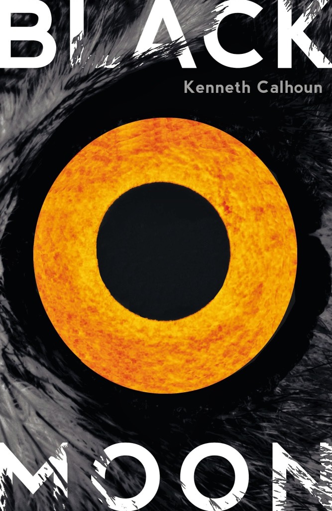
Black Moon by Kenneth Calhoun; design by James Paul Jones (Hogarth March 2014)
UPDATE:
The North American cover design for the new David Mitchell is too on-trend to ignore:

The Bone Clocks by David Mitchell; design by Peter Mendelund and Oliver Munday (Random House September 2014)
And I rather like this as well:

The Time Traveler’s Almanac edited by Ann Vandermeer & Jeff Vandermeer; design by Will Staehle (Tor Books March 2014)
UPDATE 2:
Although this isn’t vertically centred, the cover to A Deeper Sense of Place (Oregon State University Press November 1 2013) seems like it belongs here, as much for the colour palette as anything. The design, which pre-dates most of the covers here, is by David Drummond.

Also not quite centred vertically, but most definitely ahead of the curve (as it were), is Michel Vrana‘s design for Death Sentences by Kawamata Chiaki (University of Minnesota Press February 2012):

Mike Langley, Sign Painter
A rather lovely short film on sign painter Mike Langley by Dress Code:
(via I Love Typography)
Comments closed


