The New York Times obituary for type designer Adrian Fruitger who died at the age of 87 on September 10 in his native Switzerland:
The son of a weaver, Adrian Johann Frutiger was born on May 24, 1928, in Unterseen, near Interlaken, Switzerland. As a youth he hoped to be a sculptor, but his father discouraged him from plying so insecure a trade. Apprenticed to a typesetter as a teenager, he found his life’s work.
In 1952, after graduating from the School of Applied Arts in Zurich, Mr. Frutiger moved to Paris, where he was a designer with the type foundry Deberny & Peignot, eventually becoming its artistic director. There he created some of his earliest fonts, among them Président, Méridien and Ondine; in the early 1960s he founded his own studio in Paris.
Commissioned to create signage for airports and subway systems, Mr. Frutiger soon realized that fonts that looked good in books did not work well on signs: The characters lacked enough air to be readable at a distance. The result, over time, was Frutiger, a sans serif font designed to be legible at many paces, and from many angles.
One of Frutiger’s hallmarks is the square dot over the lowercase “i.” The dot’s crisp, angled corners keep it from resolving into a nebulous flyspeck that appears to merge with its stem, making “i” look little different from “l” or “I.” (For designers of sans serif fonts, the gold standard is to make a far-off “Illinois” instantly readable.)
For more on Frutiger and his work, there is an interesting interview with the designer in the spring 1999 issue of Eye Magazine.
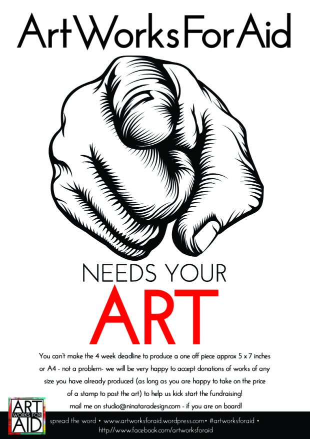
In response to the refugee crisis currently unfolding in Europe, designer and illustrator Nina Tara has set up Art Works For Aid.
Nina is asking artists, illustrators, designers and photographers to donate small works of art to be sold at auction to raise funds for organizations such as Human Relief Foundation helping refugees.
If you would like to help by buying an artwork, the first AforA auction is today. If you’re a ‘creative’ and you would like to donate a work of art just send an email to Nina.
You can find more information about the initiative on the AforA blog, and see images of some of the work that has already been donated on the AforA Facebook page.
Before turning his attention to graphics and advertising, Italian artist and designer Bruno Munari (1907-1998) made his mark as a member of the Futurists, an avant-garde art movement fascinated by modernity, mass production, and pushing at technological limits.
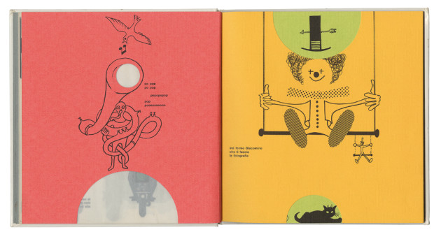
The influence of Futurism — not to mention modernism’s jokers Dada and Surrealism — is apparent throughout Munari’s Books, a collection of Munari’s book design recently published in English by Princeton Architectural Press. Munari relentlessly experimented with typography, photography, collage, and printing materials. There is a book made of metal, another that comes with a hammer. There is page after page of special papers, unique bindings, loose pages, punches, tears, and flaps. The breadth (and the volume!) of his work is staggering, and it all crackles with this restless sense of innovation, urgency, and provocation.
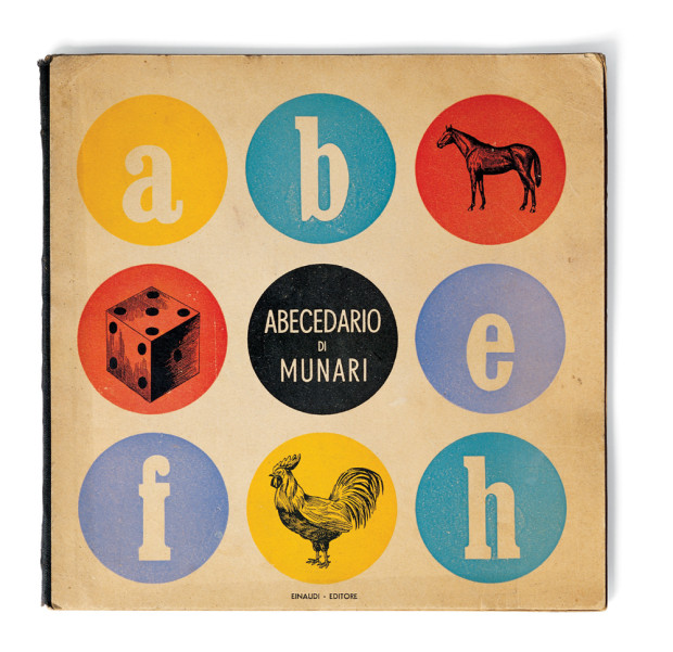
Bruno Munari’s ABC (image credit: Cleveland: World Publishing Company, 1960)
“A great children’s book, with beautiful expressive figures, the right story, printed simply, would not be accepted (by some parents), but children would love it.”1
But Munari’sdesigns and illustrations are also surprisingly full of warmth and wonder. This is most apparent in his expressive illustrations, and the large number of books Munari produced for very young children. Even readers familiar with Bruno Munari’s ABCand Bruno Munari’s Zoo, may find themselves astonished at just how many other extraordinary children’s books he created that aren’t currently available in English.
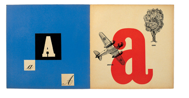
Abecedario de Munari (image credit: Rome: Emanuele Prandi, 1942)Abecedario de Munari (image credit: Rome: Emanuele Prandi, 1942)
“we need to deconstruct the myth of the artist-hero who produces only masterpieces for the intelligent. We have to show that as long as artists are outside the problems of everyday life, only a few people will be interested. And now, in these days of mass culture, artists must climb down from their pedestals and be so kind as to design a butcher’s sign.”2
If Munari’s Books has a shortcoming, it is the rather academic introductory texts (they will be useful for better design writers than me, but I got little sense of the Munari’s life or the personality behind the designs from them). Fortunately, the book is peppered with lively quotations from Munari himself. The most pithy come from Arte come mestiere, a collection of Munari’s writing on design first published in English in 1971 as Design as Art (and reissued as a Penguin Modern Classic in 2008). The short essays in Arte come mestierewere originally written for Milan daily newspaper Il Giorno, and they address everyday life as well as design. They’re witty, discursive (and sometimes even surprisingly practical), and a perfect accompaniment to the illustrations in Munari’s Books.
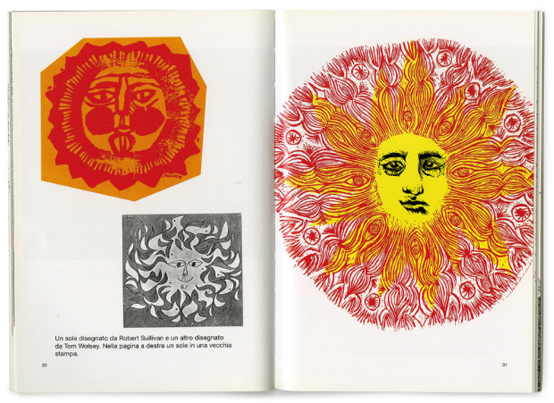
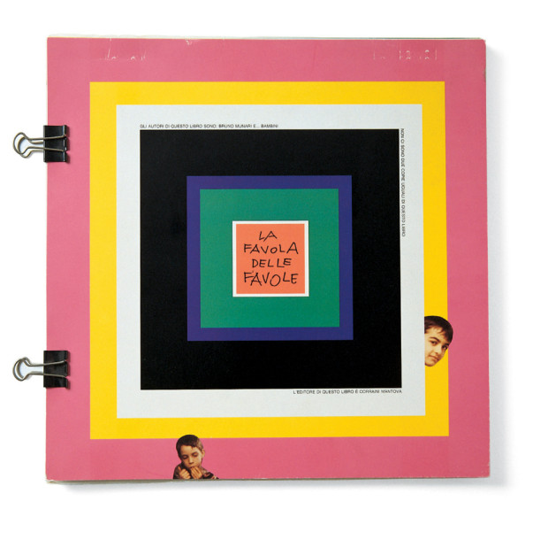
Disegnare il sole (image credit: Mantua: Graziano Peruffo, 1980)La favola delle favole (image credit: Mantua: Maurizio Corraini Editore, 1994)Nella nebbia di Milano (Mantua: Graziano Peruffo, 1968)
Writing at NY Magazine’s Vulture, Boris Kachka, whose book Hothouseon Farrar, Straus & Giroux was published in paperback last year, profiles nonprofit literary publisher Graywolf Press:
Publishing just over 30 books a year, Graywolf has had authors win four NBCC awards, a National Book Award, two Pulitzers, and a Nobel Prize — all in the last six years. This year, it will exceed $2 million in sales for the first time. No other independent press, never mind a 41-year-old nonprofit, has come so far so fast. It didn’t happen by accident.
“I think of success as being able to say yes to something that doesn’t necessarily look like a commercial winner,” says Fiona McCrae, Graywolf’s publisher since 1994, over yogurt and decaf on one of her monthly visits to New York. “Knowing something is good and having to say no, that seems to me the bigger failure.” An affably owlish Brit, McCrae started out in London’s legendary literary Faber & Faber before transferring to its small American spinoff in Boston. Three years later, she heard that Graywolf’s founder was resigning.
Scott Walker began hand-sewing poetry chapbooks in Port Townsend, Washington, in 1974. While picking up poets like Tess Gallagher and Jane Kenyon, Walker turned Graywolf Press into a nonprofit and relocated to the Twin Cities, home to a thriving philanthropic base (which also supports nonprofit presses Milkweed and Coffee House). But in the ’90s, a publishing slump hit Graywolf particularly hard; Walker resigned and his board eventually hired McCrae. At the time, she had zero experience in nonprofits — possibly to Graywolf’s benefit, because she chafed at the complacency to which nonprofits are prone. “There’s got to be a way in which you absolutely value Graywolf,” she says, “but like, come on, everybody! Other small presses are not the measure. Do you say, ‘For our size, we get more attention, so that’s it,’ or do you say, ‘Where can we go?’
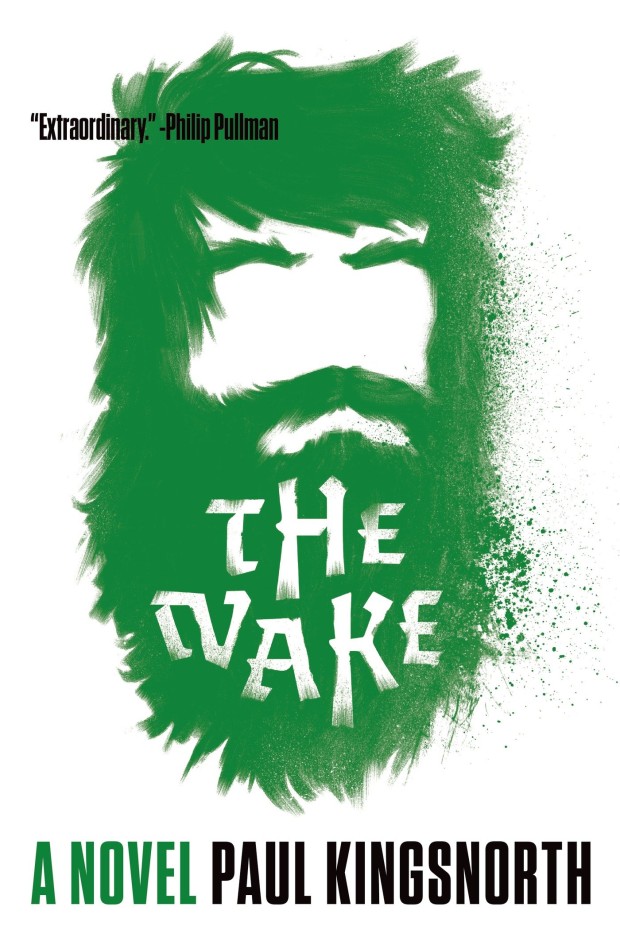
And speaking of Graywolf, I am looking forward to picking up a copy The Wake by Paul Kingsnorth, which they are publishing in North America this month (can anyone tell me who designed the cover?)
Adobe’s Inspire magazine has a remarkably forthright post by designer Kelli Anderson on ‘advice culture’:
Will the creative community ever get its fill of advice?…
…Since advice is a nurturing impulse (a way to pass wisdom on to the future…or just next year’s graduating class), is there really any harm in this oversaturation? Does the monotone nature of our conversation on success, work, and failure actually hurt us?
I would argue yes—there is a dark side to the peppy culture of pretty advice. While other shades of goodwill, such as compassion, generosity, and friendship, only improve with quantity, advice has a cumulative effect—pooling emphasis and importance around the notion of individual initiative. More than slogans, working hard, being nice, and doing what you love have gradually become canonized as the actual reasons that success or failure occurs. When the logic of advice is allowed to co-opt reality, we begin to believe that individual initiative is why things happen.
The result may feel good and empowering, but it also creates the distorted impression that an individual’s good work, alone, will translate to a proportional reward. Conversely, failures stemming from other factors—like ingrained structural prejudice or simply bad timing—may too easily be misattributed to an individual’s lack of commitment, failure to work hard enough, or insufficient love-doing. A culture of self-help advice fosters a belief that we exist in a pure meritocracy, where everything is fair, and that our shared work of shaping an equitable community is done.
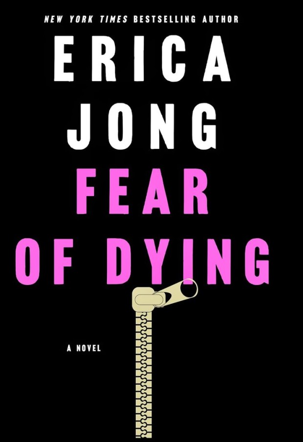
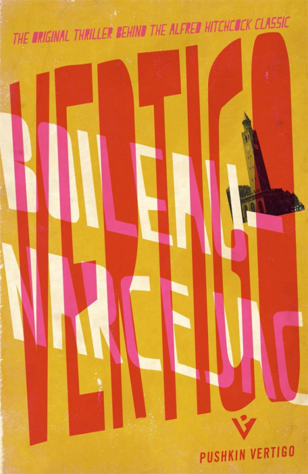
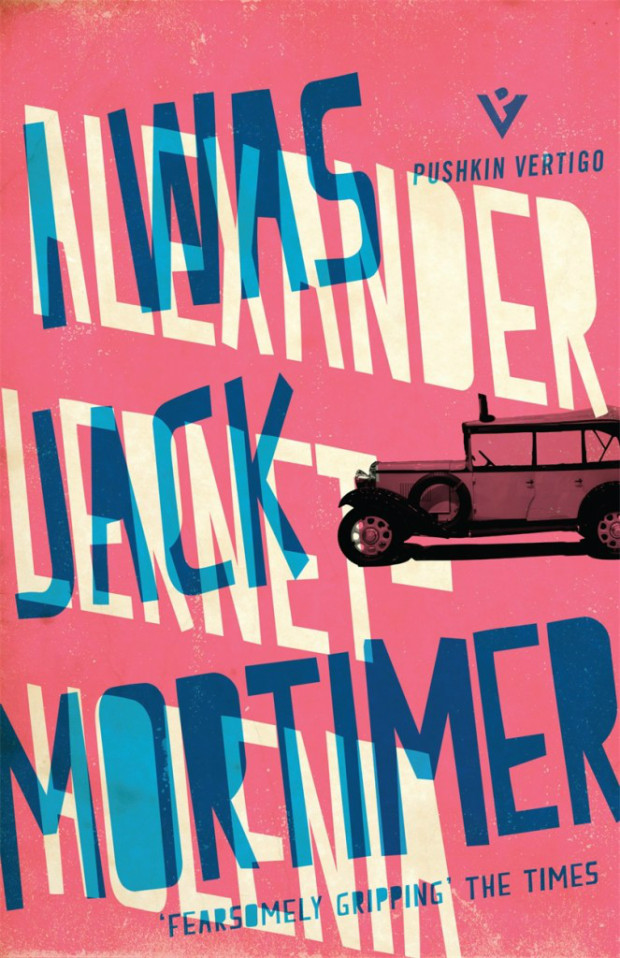
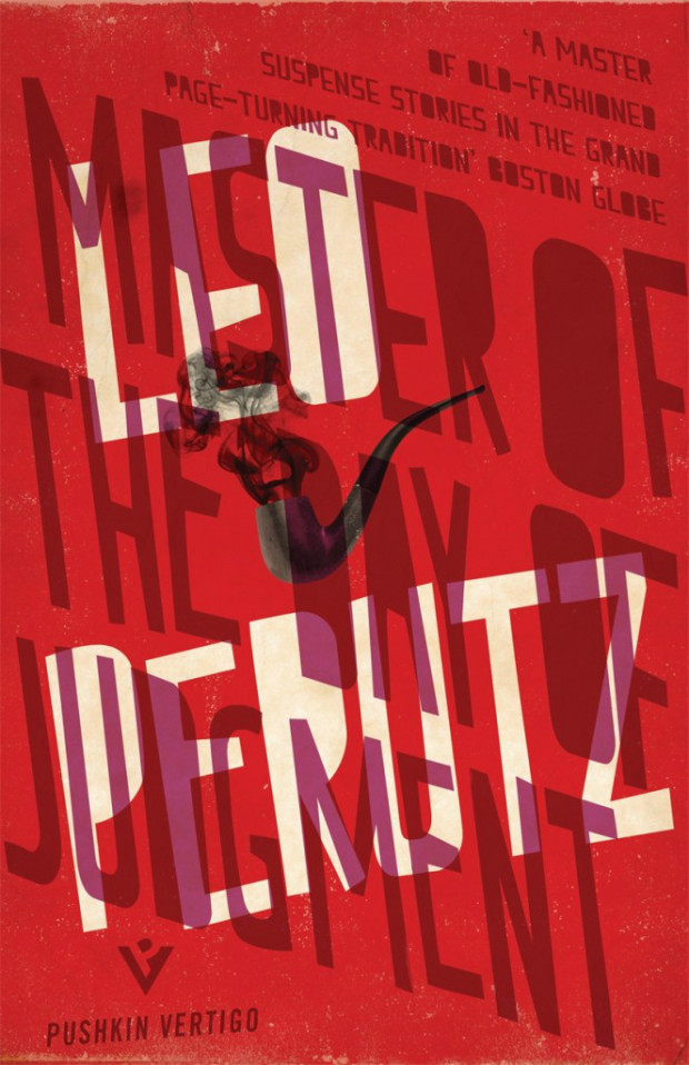
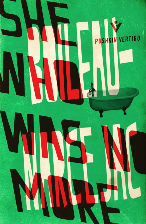
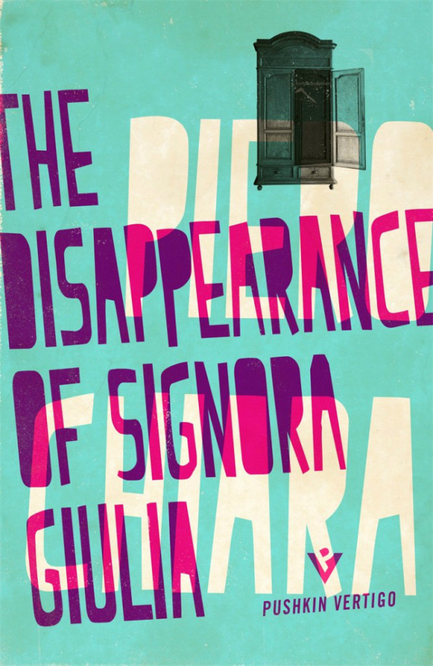
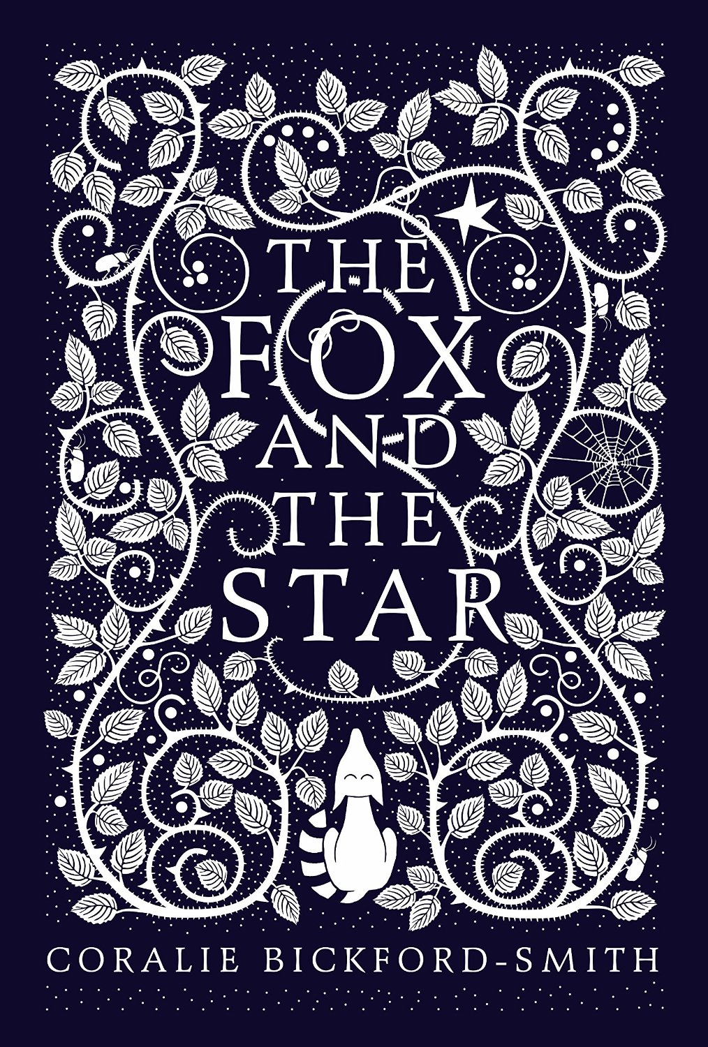
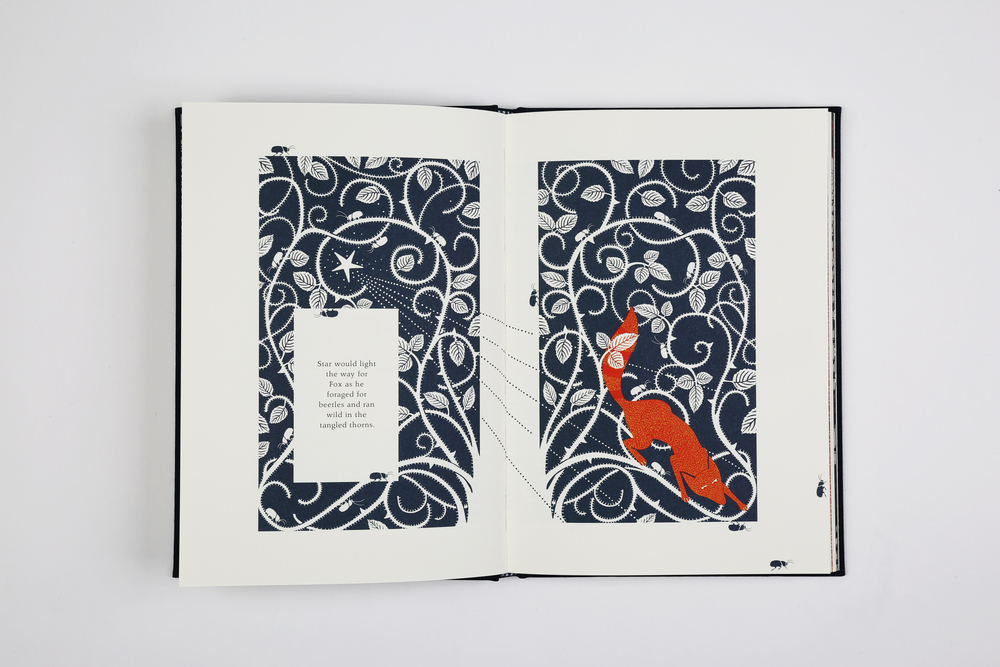
“From the beginning I wanted to come up with something that looked alien, as though someone had brought it back from a holiday in a country you’d never heard of”
They make for a stunning set.
Jamie also created that rather nice “PV” logo for the imprint. Nicely done Mr. Keenan.
The inspiration comes from a place of personal experience that I wanted to document. It’s a life lesson that I found hard to learn; one of love, loss and the ability to adapt to the constant changes that are a part of life. On a visual level my inspiration came from my design heroes, William Blake and William Morris. My love of pattern and book design is evident in the illustrations.