In the midst of an information explosion, librarians are still the most versatile information specialists we have. And the purest. In his new book, BiblioTech, a wise and passionate manifesto, John Palfrey reminds us that the library is the last free space for the gathering and sharing of knowledge: “Our attention cannot be bought and sold in a library.” As a tradition barely a century and a half old in the United States, it gives physical form to the principle that public access to knowledge is the foundation of democracy.
The problem of libraries now—and it is a problem—involves some paradoxes, which need to be sorted out. For one thing, as Palfrey says, librarians will need to cherish their special talent as “stewards” while letting go of the instinct to be “collectors.” Knowledge in physical form needs to be handled carefully, preserved, and curated. But with digital information pouring into iPhones and Kindles in petabytes—via Twitter and Instagram and YouTube, not to mention Amazon’s self-publishing factories—libraries need to rethink old habits. They cannot collect everything, or even a small fraction of everything. “That model is already too hard to keep up,” Palfrey says. “A network of stewards can accomplish vastly more than a disconnected (even sometimes competitive) group of collectors ever can.”
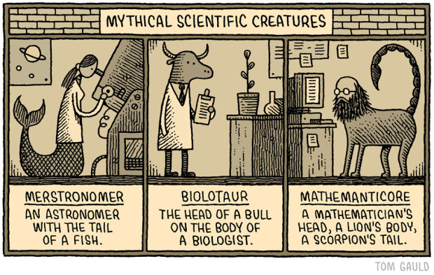
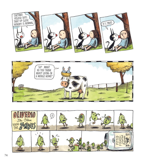
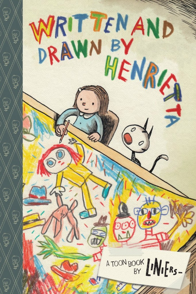
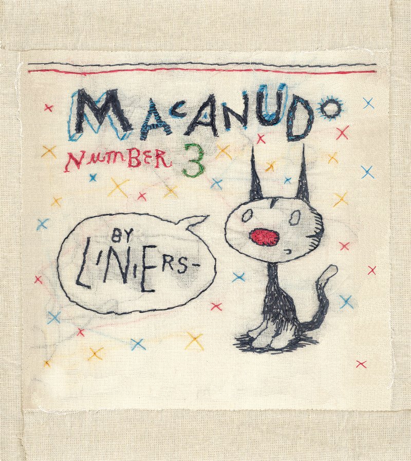
The New York Times profiles Argentinian cartoonist Ricardo Siri, better known as Liniers:
“When I started the comic everything was horrible,” Liniers, 41, said in a recent interview at his publisher’s office in SoHo at the start of an East Coast book tour. “The towers fell here,” he said, “and in Argentina there was a huge economic tailspin and we had five presidents in a week. So I wanted to create something optimistic as an act of resistance, like a positive revolution.”
In “Macanudo,” plotlines usually do not extend past the punch line, if one exists at all, and the characters and type of humor can change daily. Penguins, gnomes and an olive named Oliverio are only a handful of the creatures that float in and out of “Macanudo.”
“I like to surprise,” Liniers said. “When readers open up the paper, I don’t want them to know what to expect.”
Liniers has two new books out this fall — Macanudo #3, a collection of his newspaper strips published by Enchanted Lion, and Written and Drawn by Henrietta, an original kid’s book published by TOON.
In a fascinating piece for the Paris Review, art director and book designer Charlotte Strick talks to the Criterion Collection’s head art director Sarah Habibi, and designer/art director Eric Skillman about their work:
“There are cases where everyone thinks of a movie in one way, but Criterion feels the director was aiming to say something different than what is typically thought. So for us, it’s about repositioning the film to show that it’s not actually the film that marketing people said it was all those years ago.” Package design can do a lot of this work. Instead of traditional marketing meetings, Criterion holds what they call “brief meetings,” in which the staff reviews a film’s historical significance—where it occurred in the director’s career, its genre, the political climate, and so on. After a brief, they typically have two to three weeks for initial cover sketches. Habibi referred to this as “the heavy lifting period,” in which they aim to nail down the look and style they’re after. Once a cover direction has been selected, another three months is spent refining the artwork and carrying the visual language throughout the entire package so that the design feels truly unified. Design by committee, Habibi insisted, never produces the most inspired work, so to ensure that the designs don’t become muddled by too many voices, they strive to keep the approval process as simple as possible and the meetings quite intimate with only the art department, the in-house producer, and the most senior staff weighing in.
Jacket design by Cardon Webb; jacket photograph Orgasmic Man by Peter Hujar 1987
At the New York Times, Edmund White examines our enduring fascination with the New York of the 1970s:
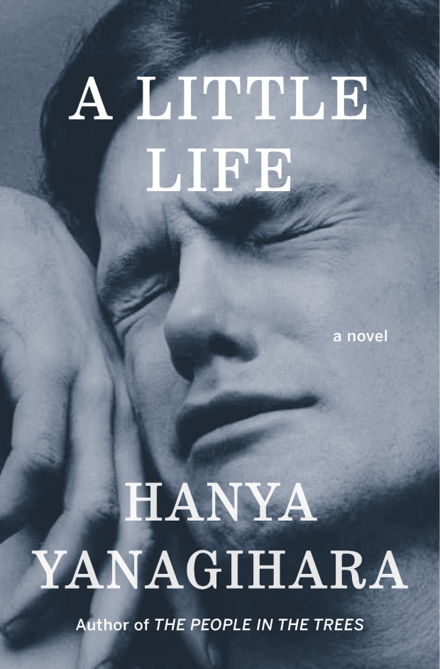
Recently there’s been, in TV and film and certainly in books, an intense yearning for a specific five-year period in New York City, those years between the blackout in 1977, and 1982, when AIDS was finally named by the Centers for Disease Control. First was Rachel Kushner’s 2013 novel ‘‘The Flamethrowers,’’ whose heroine is a sharp-eyed bystander in the SoHo art scene, and now… ‘‘City on Fire’’ by Garth Risk Hallberg, which also concerns itself with the same time period. There are two television series in development that take place in the late 1970s as well, one directed by Martin Scorsese and co-written with Mick Jagger; the other by Baz Luhrmann. Next year, the Whitney will mount the first retrospective of David Wojnarowicz, the ultimate East Village grunge artist, in over 15 years; the work of his lover, the photographer Peter Hujar — which has recently been used both for an advertising campaign for the men’s wear designer Patrik Ervell and on the cover of… Hanya Yanagihara’s novel ‘‘A Little Life’’ — will be the subject of a forthcoming retrospective at New York’s Morgan Library.
COLLECTIVELY, THESE WORKS express a craving for the city that, while at its worst, was also more democratic: a place and a time in which, rich or poor, you were stuck together in the misery (and the freedom) of the place, where not even money could insulate you. They are a reaction to what feels like a safer, more burnished and efficient (but cornerless and predictable) city. Even those of us who claim not to miss those years don’t quite sound convinced. ‘‘Well, I sure don’t have nostalgia about being mugged,’’ John Waters told me. Though then he continued: ‘‘But I do get a little weary when I realize that if anybody could find one dangerous block left in the city, there’d be a stampede of restaurant owners fighting each other off to open there first. It seems almost impossible to remember that just going out in New York was once dangerous. Do any artistic troublemakers want to feel that their city may be the safest in America? Who’s going to write a book about walking the safe streets of Manhattan? It’s always right before a storm that the air is filled with dangerous possibilities.’’
Jacket design by Carol Devine Carson; jacket photograph by Claire Alexandra Hatfield
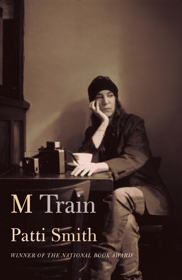
Similiarly, at the Guardian, Glenn Kenny looks at our obsession with the New York of Lou Reed and Patti Smith:
The New York we aspired to was Lou [Reed]’s, not Liza Minnelli’s, or a little later, Frank Sinatra’s. (The New York we aspired to was also Martin Scorsese’s, too, as it happened, and it’s almost entirely forgotten that it’s in his movie of the same name that the future anthem New York, New York made its first bow.) And these days, “wild side” New York is gazed at in rearview with fervent affection, in works by Edmund White, Patti Smith, Brad Gooch and others. (Not to mention those, like Garth Risk Hallberg or Rachel Kushner, who are too young to have their own memories to work with.) Smith’s books, in particular, seem to have hit a nerve. Her new book M Train is a more impressionistic sequel to her National Book award winning memoir of 2011, Just Kids, which is currently being developed as – weirdly enough, for me and perhaps for her – a Showtime TV miniseries.
The place these books conjure is both very scary, and very exhilarating. Not a place where some kind of arty misfit or wannabe arty necessarily wanted to live, but rather a place where one such creature could live. And hence, a place where one such young creature had to live.
Website Typorn1 talks to Stephen ONeill about his photographs of found type, lettering, and signs, TypeChap:
“I’m always on the look out for the vernacular and spectacular, documenting beautiful old letters and signage before they disappear… Through my photographs I want to provide inspiration for designers, sign-writers and photographers to keep these wonderful old letterforms alive… It’s interesting to see how positively clients react to type. One very dry financial client I worked for, were totally sold on some letterpress ads (very much influenced by the great Alan Kitching) and it became their house style for about 3 or 4 years – something of a miracle in an industry swamped with weak stock imagery”
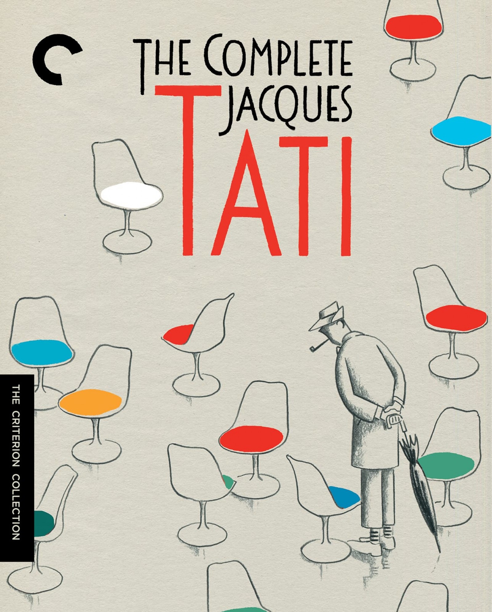
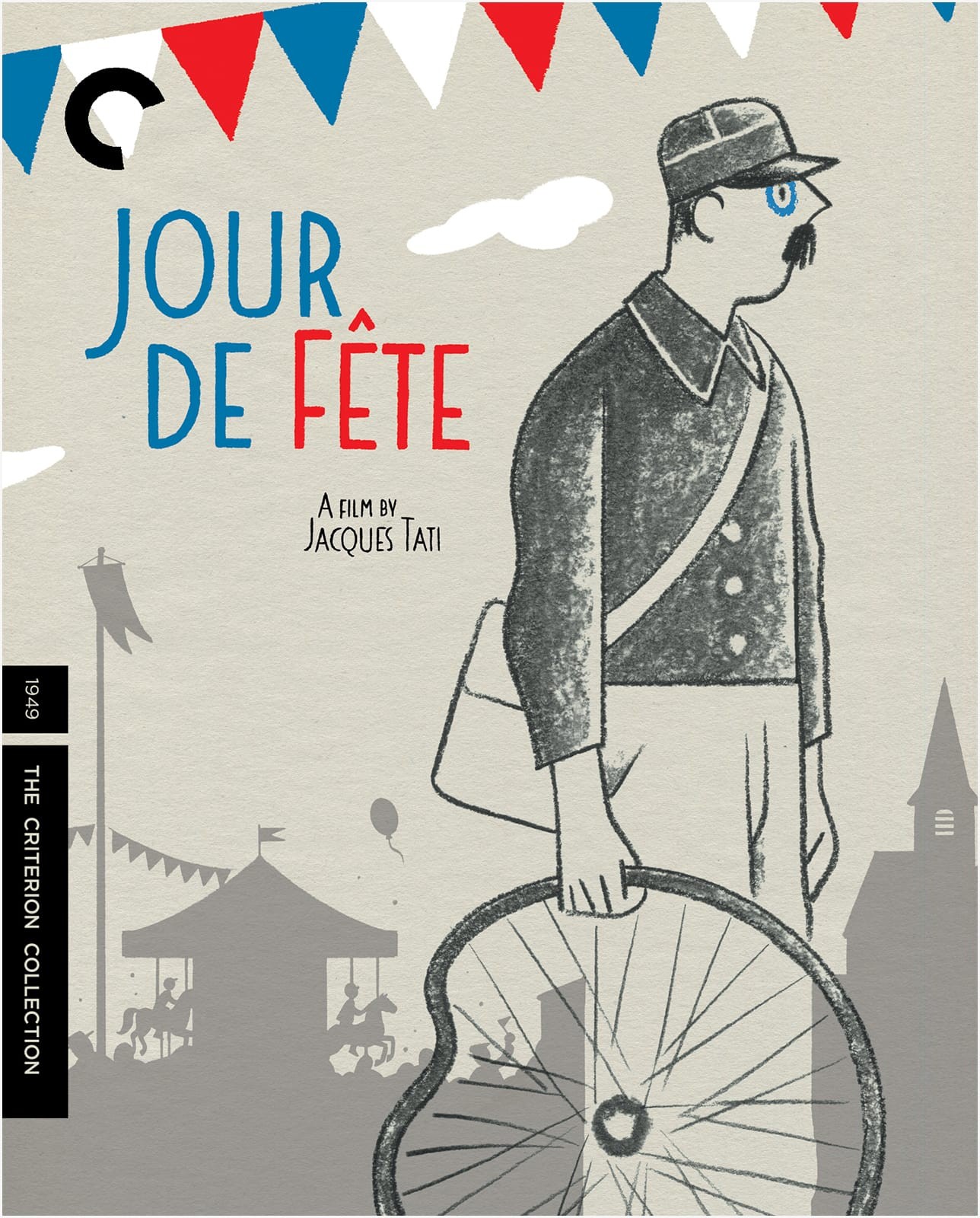
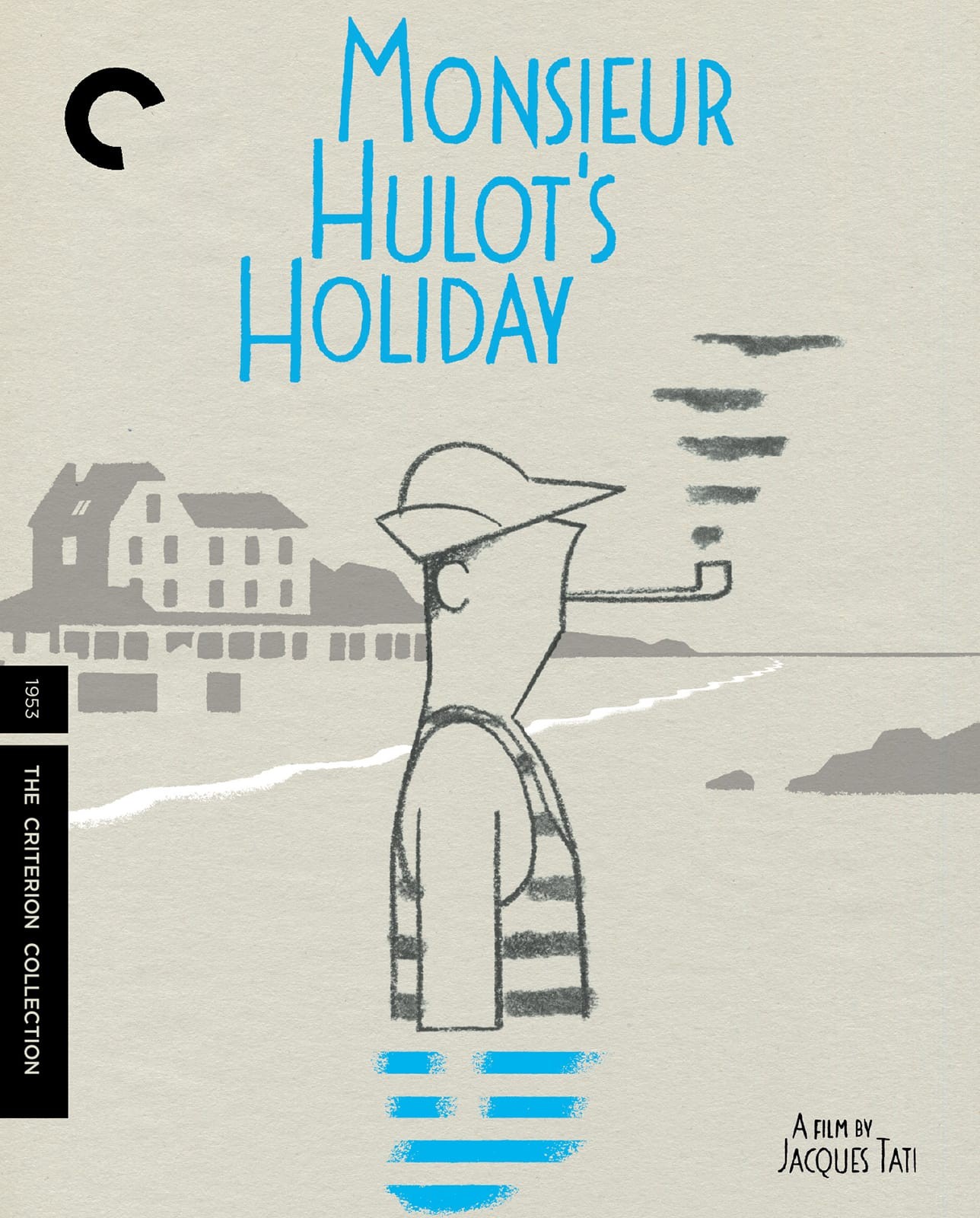
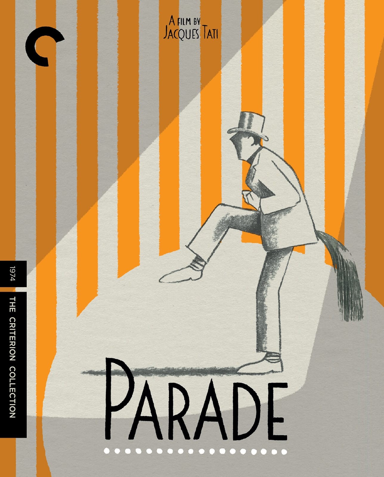
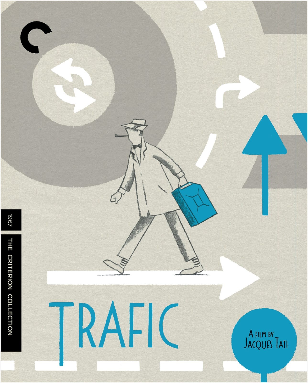
I am at least a year late on this, but I do love these covers for the Criterion Collection box set of Jacques Tati films. The illustrations are by Belgian illustrator David Merveille who has also created a series of books inspired by the work of Jacques Tati. Currently, only Hello, Mr. Hulot is available in English, but I believe a second book, Mr. Hulot on the Beach, will be published in English in 2016 by NorthSouth Books.
You can see more of David’s designs and illustrations for the box set on his blog.
Thanks to designer Andy Allen for bringing these covers to my attention. Images and other interesting stuff via Adrian Curry’s marvellous Movie Poster of the Week column.
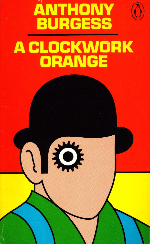
This month on the Poster Boys podcast, designers Brandon Schaefer and Sam Smith look back at 45 years of Penguin design history from the early years of the company under the direction of typographer Jan Tschichold to the work of art director David Pelham in the 1970s. Inspired by David Pelham’s famous design for the cover of A Clockwork Orange, Sam and Brandon also take a look at the artwork for Stanley Kubrick’s film adaptation of Anthony Burgess’s cult novel:
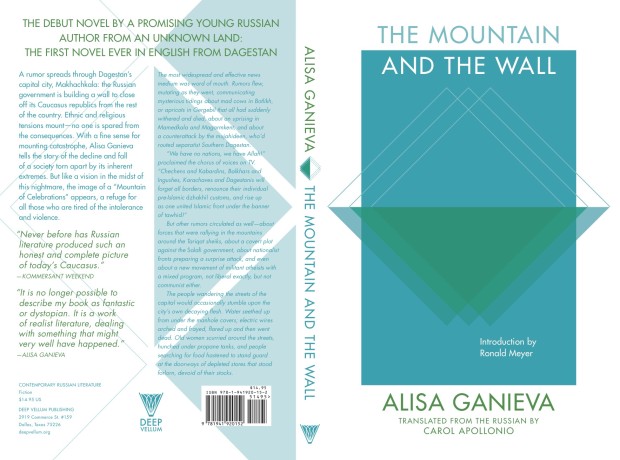
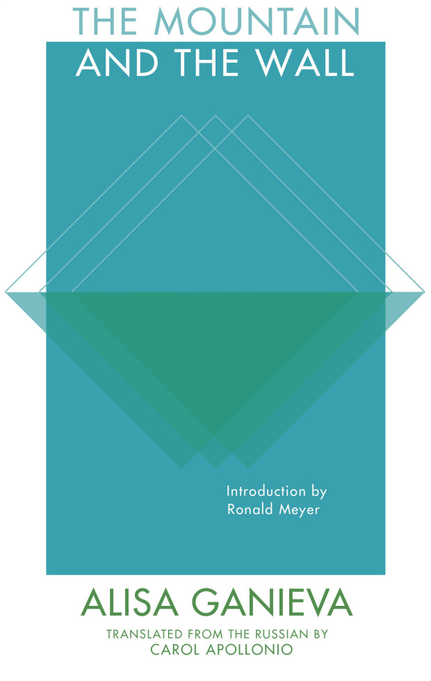
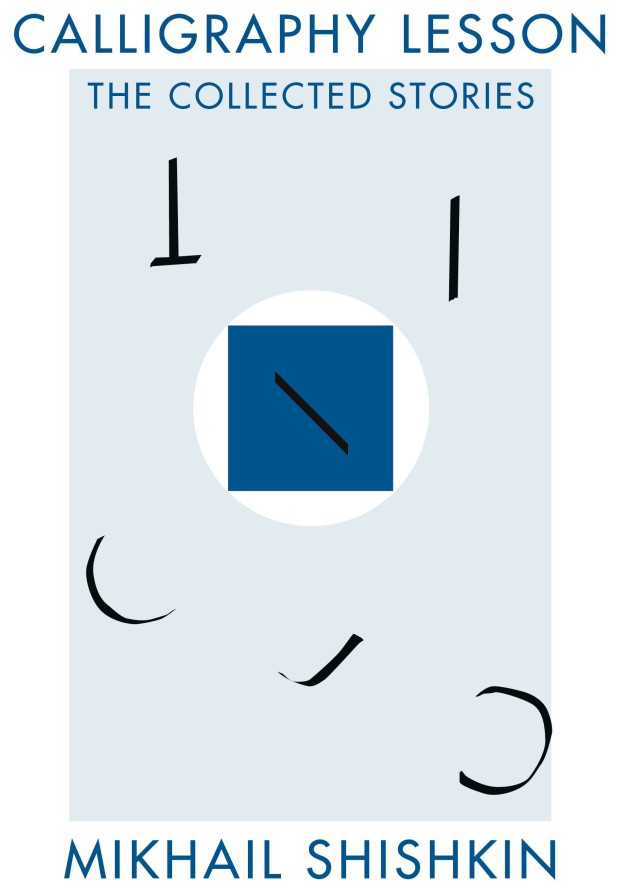
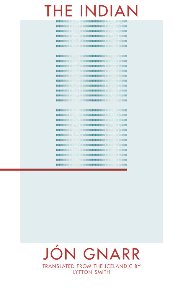
At the Toronto launch of John Freeman’s new anthologylast night — encouragingly called ’10 Reasons to Not Shoot Yourself in the Face Over the State of Literature’ — Literary Hub‘s Jonny Diamond mentioned design as a reason to be optimistic about current state of publishing. In particular, Jonny called out the book covers of Deep Vellum, a Dallas-based literary non-profit that publishes literature in translation.1 The covers, designed by Anna Zylicz, are strange, minimal, and instantly recognizable. There’s something of a hard-edged Peter Saville feel to them. I especially like the cover for Sphinx by Anne Garréta. Anna Zylicz is clearly a designer to watch.