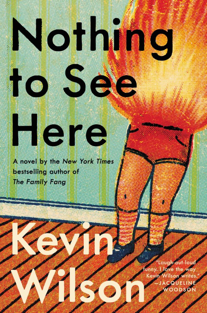
Oh hey, it’s October, AKA the best month of the year, so this is the last of my monthly cover round-ups for 2019. My look back at the year will be coming soon, so if I have shamefully overlooked your work for the past 10 months, or you want to share a cover design for a book that is coming out in November or December, now would be a really great time to drop me a line! High resolution images are always appreciated. This goes double if you design or illustrate YA covers. 1
Are we seeing the beginnings of a psychedelia revival? There are a couple of covers coming in 2020 in addition to these three that make me think we might be…
Mister Miracle by Tom King and Mitch Gerads was unexpectedly one of my favourite comics this year. I hadn’t previously read any books set in the ‘Fourth World’ despite it’s massive influence on comics and films. I’ve always found Jack Kirby’s grandiose, dialed up to 11, vision of the New Gods to be a little too much, even for Jack Kirby.1 But the constant overwhelming ridiculousness of it all is one of the themes of Mister Miracle. How do you stay sane, let alone have a normal life with a family, when you are constantly ground down by the world you find yourself in, and confronted daily with situations that are tragic, absurd, and just so much bigger than you?
At the Daily Beast, Entertainment Editor Melissa Leon talks to author Tom King about how his experiences as a CIA counterintelligence officer and his personal struggles with stress and anxiety shaped the book.
“The book started when I had one of those first-episode-of-the-Sopranos panic attacks and I ended up in the hospital,” he says. “It was one of those things where you ask the doctor, ‘Am I dying or am I crazy?’ And they tell you you’re crazy and you’re like, woo-hoo! Oh, wait a second.” He laughs. “I thought I was a pretty tough guy. I’d been to war twice, I’d had three kids. In my own little nerdy corner of the world I was pretty successful. But there was something brittle inside of me.”
Mister Miracle was his chance to write about those brittle parts—and about the creeping suspicion in the age of Trump that reality is fundamentally, metaphysically even, coming undone… Unremarkable events [unfold] in heightened, surreal circumstances; sometimes touching, funny, or grim. The juxtapositions are essential to King, who likens the scenes to the memory of debriefing a source in Iraq in 120-degree weather. “We were both sweating and talking about a guy getting his head chopped off. It was horrible,” he remembers. “But it was my wife’s birthday.” He recalls shuffling into a corner, calling his wife, and singing “Happy Birthday” in half-hushed tones. “That’s what life is, right? The mundane lives right next to the crazy.” …
It sounds all very grim, but somehow it isn’t. At least not completely. There is a lot of humour and affection in it too, which is why I think it works. Somehow King finds a way to be (just about) life-affirming in the end.
Gerads layered artwork is also extraordinary and, at times, beautiful. Laid out on the page in a metronomic 9 panel grid, the glitches, blurs, and repetition add to the sense of dislocation and detachment from reality, like life is being filtered and replayed through a screen.
Part of Mister Miracle’s ambition is to capture a feeling many know intimately, but which can be hard to put into words. King and Gerads articulate that dread succinctly, often with a single phrase: “Darkseid Is.” Panels black out without warning, flashing the phrase in typewriter lettering. It interrupts moments of loneliness or disassociation. But it can also be a punchline, or a shrug: When Big Barda says it, for example, she could just as well say “shit happens.”
Aeneis by Vergilius; design by Gray318 (Jaguar / 2019)
Jon will surely not thank me for mentioning this, but the Aeneid cover reminds me of the brilliant 2007 Penguin Modern Classics editions of Kafka designed by Mother and Jim Stoddart (featuring photographs by Gary Card and Jacob Sutton), and I can’t pass up the opportunity to post them here. They still look extraordinary…
(And in the process of looking for images, I cam across a nice essay from a couple of years ago by designer Clare Skeats discussing the Kafka covers at Grafik)
High School by Tegan & Sara; design by Na Kim (MCD / September 2019)
The cover of the Canadian edition published by Simon & Schuster Canada (left) was designed by Emy Storey. The cover of the UK edition published by Virago (right) was adapted from the Canadian design by Nico Taylor.
Sontag by Benjamin Moser; design by Tom Etherington; photograph by Richard Avedon (Allen Lane / September)
The cover of the US edition published by Ecco was designed by Allison Saltzman. Title only appears on the spine (which, if my social media is anything to go by, gets big high fives from book designers everywhere).
The New York Times ran a short article about the genesis of this cover earlier this year.
For the font-curious, the typeface is Alias Harbour according to the folks at Fonts In Use. Another calligraphic type alternative to the ubiquitous Lydian perhaps?
In April this year, AIGA posthumously honoured designer Alexander Girard (1907-1993) with an AIGA Medal, recognizing “his effortless ability to move across innumerable surfaces and scales, his life-long innovative and inspirational cross-disciplinary design practice, and his undeniable impact on mid-century modernism in America.”
Alexander Girard was a designer who defied easy categorization, mostly because he worked—and excelled—in every field. Tireless, creative, and immersive, Girard was most comfortable when absorbed in a project, and he managed to complete a staggering catalog raisonné in his lifetime: houses, department stores, trendy restaurants, less trendy restaurants, logos, a terrazzo material, an airline, a folk art museum, even an imaginary land with its own language…
…Girard’s colorful, geometric, typography-driven, and folk-inspired personal aesthetic became indistinguishable from the midcentury look still sold by the Michigan-based company [Herman Miller]. As later brand director… Sam Grawe wrote back in 2008 for Dwell, “colors hitherto considered gauche—magenta, yellow, emerald green, crimson, orange—became a part of the company’s formal vocabulary, and in time, the world’s.”
Herman Miller — the company with which Girard is most closely associated — recently posted an extended cut of the tribute video made for the AIGA’s celebration of Girard’s life and work:
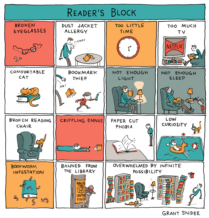
I’ve been in a bit of reading slump of late so I can relate to this recent cartoon by Grant Snider for the New York Times Books Review (although, thankfully, I’ve not been banned from the library!).
The Guardian has an essay by American cartoonist Art Spiegelman on the events that shaped the original ‘golden age’ superheroes and their creators, and why these characters still resonate with readers and movie-goers:
The young Jewish creators of the first superheroes conjured up mythic – almost god-like – secular saviours to deal with the threatening economic dislocations that surrounded them in the great depression and gave shape to their premonitions of impending global war. Comics allowed readers to escape into fantasy by projecting themselves on to invulnerable heroes.
Auschwitz and Hiroshima make more sense as dark comic book cataclysms than as events in our real world. In today’s all too real world, Captain America’s most nefarious villain, the Red Skull, is alive on screen and an Orange Skull haunts America. International fascism again looms large (how quickly we humans forget – study these golden age comics hard, boys and girls!) and the dislocations that have followed the global economic meltdown of 2008 helped bring us to a point where the planet itself seems likely to melt down. Armageddon seems somehow plausible and we’re all turned into helpless children scared of forces grander than we can imagine, looking for respite and answers in superheroes flying across screens in our chapel of dreams.
Apparently a version of this essay was originally intended to serve as the introduction to a Folio Society collection called Marvel: The Golden Age 1939–1949, but was rejected for not being ‘apolitical’.
Here are your August book covers of note. Another good month, I think?
The Bell Jar by Sylvia Plath; design by Gray318 (Faber & Faber / July2019)
This is apparently available now (according to Faber’s Instagram at least!), but I haven’t been able to find it online. If anyone cares to share the ISBN, I will try to add a link.
The new design is inspired by the 1966 cover designed by Shirley Tucker.
This is an interesting change in direction from the cover of The Infatuations by Javier Marías designed by Isabel Urbina Peña and published by Knopf in 2013.
(The UK covers for Javier Marías’ novels published by Hamish Hamilton are photographic. If anyone can supply me with the design/photo credits, I’d be happy to add them in here for reference!).
Thank you to the good folks on Twitter who helped me identify the designer and then the typeface. It turns out the type is “Lydia” from Colophon Foundry — a revival of the Bold Condensed styles of (you guessed it!) Lydian.
Tree also designed the cover of the UK edition published by And Other Stories last year. She wrote about the process of designing both covers for Spine not so long ago (they really are doing a better a job of this than me, aren’t they?).
Michel has also dusted off his comics publishing endeavour Black Eye Books if you’d like to support him. There is a new book by Jay Stephens planned for next month.