Skip to content

The Casual Optimist Posts

Midweek Miscellany

The Backwards Novel Seen Backwards by Tom Gauld.

I also love Tom’s Lost Fairy Tales for a promotional concertina booklet made by his agent Heart (surely there’s a full length book to be had here?).

Ways of Reading from A Working Library:

Every book alights a path to other books. Follow these paths as far as you can.

Lovely.

Back to BasicsBooktwo.org‘s James Bridle on the Apple tablet (what else?):

I’ve spent several years urging publishers to get on board with new technologies and try new things, but equally I hope there’s space for a lot of publishers to get back to concentrating on what they do best: acquiring, editing, producing and publishing books… [W]e should probably stop scrambling to get on the latest bandwagon (vanilla Books-as-Apps, I’m looking at you), and concentrate on the basics: ebook production, metadata, integrated marketing, quality and consideration. There is a lot to be done, but this or that device will never be the be-all-and-end-all of the future of publishing.

I think James has a point. But honestly, no one I know (and that is an admittedly limited sample) believes “this-or-that device” will magically “save” publishing. Surely it is only bloggers in need of straw men and ‘journalists’ paid to hyperventilate who say that kind of shit?

Moving (swiftly) on…

Modern Myths — Will Self on H. G. Well’s The War of the Worlds in The Times:

The War of the Worlds is one of those books that demonstrates our culture’s surprising ability to continue the manufacture of myth. I say surprising, because one would think, with all the technological reproducibility of art now at our disposal — from raw print, to film, to digitisation — that there would be no room left for that hazy instability within which myth thrives.

(Pictured above: The NYRB edition of The War of the Worlds with illustrations by Edward Gorey)

And finally, completely unrelated to books…

Dear Coffee I Love You… Yes, yes, I do. (Pictured above: What I’d Rather Be Doing)

2 Comments

Something for the Weekend

Slim pickings in a week in which book nerds obsessed about the implications of the rumoured Apple tablet (and PS – if anyone else describes it as the fucking ‘unicorn’ it’s clobberin’ time…), while in a completely unrelated move (snarf!), Amazon announced it was going to allow iPhone style apps to be uploaded and sold on the Kindle (begging the question when does the Kindle become the Pontiac Aztek?) and — faster than you can say bait and switch — they offered self-published authors improved royalties.

But, anyway, here’s more fun stuff for your weekend pleasure…

What To Leave Out? — I Love Typography‘s favourite fonts of 2009, including the lovely Phaeton and Biographer (pictured above), as well as Jos ‘exljbris’ Buivenga’s  Calluna.

The big graphic novels of 2010 according to Publishers Weekly.

And finally… I’ve been meaning to link to this for ages, at least in part so I could post Erik Mohr‘s cover for Monstrous Affections by David Nickle

Horror Stories — Waaaaay back in November The National Post chatted with the publishers and authors from dark fiction specialists ChiZine Publications :

[W]e wanted to produce beautiful, well-written books. Books you wanted to pick up — and when you did, you wouldn’t be disappointed by what was inside. Essentially, books we ourselves wanted to read…

Genre fiction is notorious for having cheesy, sloppily executed covers with no sense of design or what is attractive to potential book buyers. We’ve been incredibly lucky that Erik has made our books look so good. And by “good” I sometimes mean “disturbing.”

Maybe what we’ve managed to do with CZP is to find a niche that wasn’t being filled…or maybe we created our own niche.

Comments closed

Q & A with Jason Godfrey, Bibliographic

Jason Godfrey’s Bibliographic: 100 Classic Graphic Design Books was one of my favourite books last year.

Published by Laurence King in the UK, the book is distributed by Raincoast in Canada (Chronicle Books in the US) and so I was fortunate enough to have the opportunity to ask Jason a few questions about the book and get some lovely spreads from the publisher.

My original plan was to run the interview on the (recently redesigned) Raincoast website, but ultimately the interview was a little too long for our blog there, so I’ve decided to republish the whole unexpurgated monster here.

As I mentioned on in my original Raincoast blog post, Bibliographic is not history of graphic design or even a definitive list of 100 books on the subject — it’s more of an essential design book shopping list — and basically I really wanted to know why Jason decided to make the book, how he decided on the  final selections, and what exactly was informing his decisions.

We corresponded by email…

What was the inspiration for Bibliographic?

There was a need for a illustrated resource of graphic design publishing. Many books and articles contained very good reading lists but I had always found them rather detached without the visual reference. The best graphic design books are important artefacts in the history of graphic design and many of the books are becoming difficult to find and access.
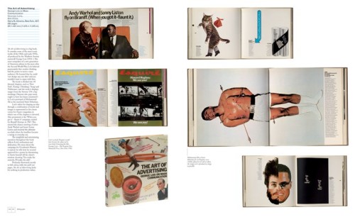
004-103_1

What criteria did you use to select the books?

The only rule that was applied throughout was that the books had to be visually interesting, there seemed little point in photographing books that would not look appealing on the page. That the books were designed by some of the cream of graphic design this turned out not to be a big problem but it did mean that some important critical analyses had to be put to one side.

Did you ask other designers for their recommendations?

Whilst mentioning to other designers that I was working on Biblographic I found that they were very keen to promote their own favourite titles and it did help extend the list and also confirm the importance of books that had already been chosen. As part of the book I asked about 20 designers to give me a list of 10 books from their own library, this was an idea borrowed from the designer Tony Brook at Spin who had earlier published a newspaper Spin 2 with reading lists from 50 designers.
Was it difficult to decide which recent books to include?

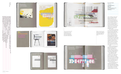
To gauge which newly published titles will come to be seen part of the canon of graphic design books is not the easiest of tasks. Looking back from a distance helps to establish the relevant trends and lends more perspective to any choices. Regardless the best books all seem to be those that can tell a good story. One recent book, Mark Holt and Hamish Muir’s 8vo: On the Outside (Lars Müller Publishers, 2005) did just this, exploring the process of the studio’s work and the effect of technological on this process and output in a thoroughly engaging book.

There are photographs of every book included in Bibliographic. Were any of the books difficult to locate?

A number of the books are from my own collection others I borrowed from friends and colleagues. Some were so precious I had to send the photographer Nick Turner over to where the their owner could keep them in sight at all times. A handful of books I could only locate at the St Bride Printing Library who were kind enough to facilitate their shooting.

Were there any books you wanted to include but couldn’t access?

Early in the process of compiling my list of 100 books I decided that many of the early examples of early 20th Century graphic design books particularly those of the typographic revolutions of the 1920s and 1930s would be too difficult to access as they are now the preserve of museums. It would all have taken me too far from my premise that Bibliographic could be representative of a working studio library.

Which books came close to being in the 100, but didn’t quite make the final cut?

Tough choices had to made particularly where an author or series of books were successful. Alan Fletcher is very well represented in the book and I couldn’t justify putting in the excellent Identity Kits: A Pictorial Survey of Visual Signals (Studio Vista, 1971) a book he co-authored with Germano Facetti the then art director at Penguin Books. Another book that came very close was Robert Bringhurst’s The Elements of Typographical Style (Hartley & Marks, 1992) which I felt lacked the visual punch necessary for Bibliographic.

Of the books you don’t own in Bibliographic, is there one that you particularly covet?

The 1926 Deberny & Peignot, Specimen Général would be a welcome addition to my library. There was copy in a studio I worked for and I was forever using it as a point of reference or just to admire the elegant section dividers designed by Maximilien Vox.

When did you start collecting design books?

There are a few books that I have from when I was a student but I didn’t seriously start collecting until I had been working professionally for a few years and made a decision to stop buying records in favour of what I found to be the more fulfilling occupation of acquiring books.

What is on your ‘to buy’ list?

New Graphic Design in Revolutionary Russia (Lund Humphries, 1972) by Szymon Bojko is a book I am trying to locate. I have yet to see a copy but it was designed by Herbert Spencer the author and designer of Pioneers of Modern Typography (Lund Humphries, 1969) and so I am expecting an interesting book.

In the introduction to Bibliographic, Steven Heller says he has a separate apartment for his books! How extensive is your library?

Mine is not as nearly extensive as Steven’s although it does take up a large part of my studio and I am in need of extra shelving at the moment. It also needs saying that in common with most designers my collection also contains many books on the arts, photography and others of general interest.

What is your own design background?

I graduated from the Royal College of Art in London and worked for a number of years at Pentagram Design, then moved to New York and Austin, Texas before returning to London and setting up my own studio.

What were the challenges of designing a book about design books?

After the efforts of writing Bibliographic the actual design was very enjoyable. Because each spread contains only one book the challenge was in arranging the images to create an enjoyable flow throughout the book. The spreads from the photographed books are so rich with graphic imagery that I was worried that the pages would look like graphic wallpaper if all the images were kept in pro, but changing the scale of the spreads helped to create changing areas of white space and focus the readers attention on one spread at a time.

Could you describe your process for designing books?

Knowing the amount of copy and image count for an average page is the start for any book design project. From this point I can begin to form a grid (invariably using the guides in Derek Birdsall’s excellent Notes on Book Design (Yale University Press, 2004), chose the typefaces, text and headline styles, treatment of imagery and other pagination. This will go to form sample spreads that are approved by the publisher before advancing on the book proper.

What does the future hold for book design?

The evolution of book design seems to move at a glacial pace, its foundations are based on a template centuries old with some 20th Century tweaks by the likes of Lászlo Moholy-Nagy and Gyorgy Kepes. Advances in printing technology have and will allow for more flexibility in how pages are laid out and inevitably there will be new fashions and styles to accommodate but little wholesale change.

Thanks Jason!

6 Comments

Midweek Miscellany

Catcher in the Rye — Illustration and hand-lettering by Toronto-based Darren Booth (self-directed project). Darren has done a rather fine Lord of the Flies cover as well.

The Catastrophist — Chris Hitchens on J.G. Ballard in The Atlantic:

For most of his life, our great specialist in catastrophe made his home in the almost laughably tranquil London suburb of Shepperton, the sheltered home of the British movie studios. He obviously relished the idea of waking one day to find himself the only human being on the planet, to explore a deserted London and cross a traffic-free Thames, to pillage gas stations and supermarkets and then to drive contentedly home.

Read the Printed Word!

I Pledge to Read The Printed Word — Buttons from readtheprintedword.org

“A Day Pass to Fucking Narnia” —  Paul Carr’s ‘Anticipating the Apple Tablet: When Journalism becomes Fan Fiction’ at TechCrunch:

I get that an Apple tablet is big news. I agree with those who say that Apple’s product launches deserve more attention than those from other companies as their products tend to be ‘game-changers’… But until the official launch announcement comes, I would rather not hear another word about Apple and their tablet. Not because it isn’t news – but because so many of the journalists anticipating the launch have dropped any sense of responsibility to their readers and replaced it with cloying fanboyism.

(Please note the funny, if slightly schoolboy, URL of the post)

And finally…

A rather fine new cover by David Drummond.

5 Comments

Heads Will Roll

Steve Osgoode, Director of Digital Marketing and Business Development at HarperCollins Canada, pointed me (and everyone else on Twitter) to an interesting post on e-books at An American Editor by Rich Adin. It’s a nice coda to the Guy LeCharles Gonzalez post I mentioned yesterday:

No industry changes overnight, so it is certain that publishers aren’t going to change their business model tomorrow just because a handful of people demand it… But the anger of the devotees, as few as they may be in number, continues and becomes increasingly strident, with neither side willing to “hear” the other.

Adin goes on to raise some interesting points. I do, however, have problems with his argument that the internet has fostered a sense of entitlement:

The Age of the Internet has birthed a belief among some consumers that they are entitled to everything they want when they want it at a price they want to pay…  Entitlement says I have rights that are more valuable than your rights (or that you have no rights)…

There is certainly some grain of truth to this and, to be fair, Adin’s argument is more nuanced than the quotation suggests. But it is also a dangerously seductive argument for publishers who don’t want to take full responsibility for their actions.

On a basic level, blaming the consumer and/or accusing them of being uppity (or worse, criminals) is not a good business strategy. Figuring out what they will pay for is a much better idea.

Customers don’t necessarily want cheap — they want value. Sure, everyone likes cheap stuff in the short term — free is even better — and yet most people know that in the end you get what you pay for. Quality costs.

Consumers will pay for things when they believe they are worth it, and as publishers, we need to recognise we aren’t always providing real value for money. We publish too many books and (shh… whisper it) a lot of them aren’t very good. We can do better. How many books really do need to be released in hardcover a full year before they’re available as paperbacks (or e-books) for example?

I also don’t think you can ignore that consumer attitudes are being led by businesses — that publishers have been all too willing to oblige — who have an interests in devaluing creative content as much as possible. Cheap content gets people in to stores and sells devices and publishers have benefited from this in the short-term. But we need to realise that cheapening our own content is like pissing in the pool. Not cool and not a good idea — even if it feels good at the time…

That all said, I think Adin recognises that it is not a one way street. He argues that publishers and consumers need to compromise:

The ebookers have thrown down the gauntlet, the publishers need to pick it up and accept the challenge. Simply because some ebookers have decided that publishers have no role to play in the future ebook world doesn’t make it so. Publishers need to redefine themselves in 21st century terms, not rehash 20th century concepts.

This, at least, seems spot on to me…

Read the whole article.

7 Comments

“E” is for Experiment (Not E-books)

Guy LeCharles Gonzalez, Audience Development Director at F+W Media, had an interesting op-ed at Publishing Perspectives last week about e-books and e-readers:

[T]here is a lot of R&D money being poured into [e-readers] — that’s how technology companies work — and one or more of them may eventually click with consumers, but right now it’s a fledgling market and the hype surrounding it has reached irrational levels in publishing circles… There are many fundamental business issues that need to be addressed related to e-books — rights, royalties, pricing, distribution, marketing — and it’s up to publishers, agents and authors to figure them out together and not be distracted by every new shiny object the technology companies come up with.

Although clearly not a big advocate for e-readers, Guy raises a lot of the question marks that I think still hang over the devices in a fairly balanced way, and the article as a whole expresses a lot of the doubts I hear from other quietly skeptical people in publishing.

Needless to say, the whole thing is worth reading and Guy has more to say on the subject at his blog loudpoet.

1 Comment

Something for the Weekend

Salu, Bonjour! — The Caustic Cover Critic features the awesome work of designer Michael Salu. The typography is great.

And speaking of typography…

KnockoutThe New York Times profile type jedis Hoefler & Frere-Jones:

Sitting in their New York studio in the charmingly ramshackle Cable Building, designed in 1892 by the flamboyant Beaux-Arts architect Stanford White, Mr. Hoefler and Mr. Frere-Jones are engaging advocates for their craft. They met in 1989, when they were working independently and found themselves hunting for the same antique typography books. “We’ve given up now because the prices have gone crazy,” said Mr. Frere-Jones. “Between us we own so many that if there’s something we don’t have, it’s either an uninteresting variation or there’s only one in the world and it costs $20,000.”

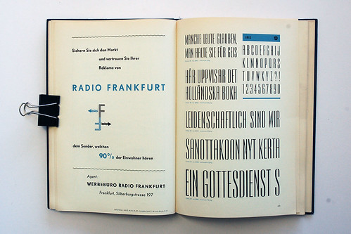
Schriftenkatalog — Beautiful pages from a 1960’s Dutch type catalogue on Flickr (via Inspire Me)

And… The history of the ampersand at the Webdesigner Depot (thanks Nic).

A Guide to Online Publicity (For Dummies) — Freelance writer, editor and blogger Lindsay Robertson’s common sense — but on the money — “do’s and don’ts” for flacks like me approaching bloggers like er… me (via Kottke).

And finally…

Two lovely posts at The Silver Lining featuring the work of Elaine Lustig Cohen: Part 1 and Part 2. There are more Elaine Lustig Cohen book covers at ephemera assemblyman and there is an amazing Flickr pool devoted to the design work of Alvin and Elaine Lustig here.

1 Comment

The Third & The Seventh

I’m fairly certain that every architect and designer on the planet has seen Alex Roman’s artful short film The Third & The Seventh already. But I haven’t seen it mentioned on any book blogs as yet, and so for the benefit of other architecturally-inclined book nerds who may not have caught it, I thought I would share it here (although you really should go and watch it in full-screen HD at Vimeo).

Even though it is apparently a full-CG animated piece, the film beautifully captures the light and elegance of the architectural space, and yes, there are even a few books in it…

There is an interview with the filmmaker about the film at Motionographer.

1 Comment

Goodbye BDR

Just like every other book blogger (and their mum),  I was sadden to read that Joseph Sullivan has decided to put his blog The Book Design Review on an “indefinite hiatus.”

The BDR has consistently been one of my favourite book blogs and was one of the first I added to my RSS reader.

It was a revelation to discover a blog that was about books and design. But more importantly The BDR made me realise that book blogs could be about the people who made books as well those that wrote them, and that enthusiasm might just be more interesting than snarkasm.

Nevertheless, I understand why Joe is taking a break (and I hope it is just a break, even though I don’t really think it is). Taking blogging seriously — taking the time to curate material and write about it well — can wear you down. There is (self-imposed) pressure to deliver, and when it doesn’t pay (and it doesn’t) it is hard to justify — especially if other creative projects fall by the wayside…

But, to be honest, I also feel kind of responsible. In the 5 years since Joe started The BDR a lot of other book design blogs like mine (even though I tell myself this isn’t really a book design blog) and sites like FaceOut Books and Pieratt‘s The Book Cover Archive have cropped up. Imitation may be the sincerest form of flattery, but it’s also fucking irritating. Even though he’s always been very kind to me, I’m sure Joe must have thought WTF? on more than one occasion. Perhaps the Amazon poll for the best book cover of 2009 was the final straw?

All I really know though is that I will miss The BDR terribly, and that will try not to disappoint Joe’s regular readers who chose to haunt The Casual Optimist in its (hopefully temporary) absence.

Thanks again Joe. (And sorry).

(Pictured: The Great Perhaps, designed by Jamie Keenan, one The BDR‘s Favourite Book Covers of 2009)

5 Comments

The Silver Lining

The Silver Lining blog is so good right now it’s giving me a headache: Art, books, ephemera, photography… All the good stuff, all in one place…

That is all. Carry on…

(pictured: De Sainte in New York, book cover by Dick Bruna seen at The Silver Lining)

2 Comments

Ben Wiseman | Chekhov

I really like these Chekov covers for W.W. Norton by Rodrigo Corral Design’s Ben Wiseman:


But I think the alternates are pretty special too:

There is a very short interview with Ben at idsgn.

(via FormFiftyFive and Cosas Visuales)

Update:

The good folks at W.W. Norton have just added Ben’s Chekhov covers to their Flickr design archive (thank you!).

These new editions are available in July 2010.

4 Comments

Something for the Weekend

Megan Wilson‘s new cover design for An Education by Lynn Barber.

Of a Certain Blockheadedness — Scott McLemee on the internet’s “gigantic plot” to get him to write for free:

The idea that new media has somehow abolished the old hierarchical structuring of the field (making everything level and equal and rhizomatic and whatnot) is only half right, at best. The hierarchies aren’t as well-marked as they used to be but they aren’t gone. Talk of an “army of amateurs” is at this point persuasive only to people who enlist without paying any attention to the fine print.

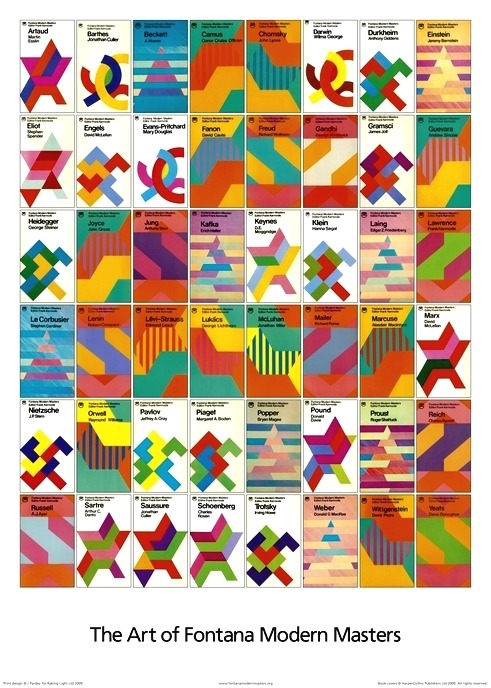
The Art of Fontana Modern Masters — Much linked to elsewhere, James Pardey (of the The Art of Penguin Science-Fiction site mentioned here) has new project on the Op-Art inspired Fontana Modern Masters book cover designs. He’s also written about the series for Eye (via Ace Jet 170 and Daily Discoveries on Design).

The New SleeknessAmi Greko and Pablo Defendini (and other “bookish types”) try to fill a hole in publishing punditry. Having tried that myself and failed horribly, I can only wish them good luck.

Around The World with the Bodoni Family — A beautiful new 60-page book by graphic designer Teresa Monachino seen at The Creative Review. Each letter of the alphabet is printed in Bodoni to illustrate a place beginning with that letter.

Wave of Mutilation — Tom McCarthy, author of Remainder, on the films of David Lynch in the New Statesman. Yes, it is as weird and unlikely as it sounds (via 3:AM):

Try to count the instances of deformity in Lynch’s work, or of people being deformed on camera, and you’ll lose count pretty quickly…  Deformity, for Lynch, is not simply thematic: it is instrumental. In his films, what the continual, almost systematic replacement of body parts and faculties by instruments – crutches, wheelchairs, hearing aids and ever weirder apparatuses sometimes as large as rooms – produces is a whole prosthetic order, a world of which prosthesis is not just a feature, but a fundamental term, an ontological condition.

Information Wants to be Valued — Ian Grant, Managing Director of Encyclopaedia Britannica, at BookBrunch:

The new online world has given book publishers good reason to review everything that they do, from what to publish to how to run their businesses. It is a noisy call to new action and fresh efforts, but publishers are well-placed to respond. The core skills we have had for generations – imagining our users, creating shapely products that meet their needs, and identifying the transfer of value that results in a sale, are precisely the skills that make good publishing online successful and satisfying. Information does not “want to be free”; customers want to be inspired and satisfied.

And finally: It seems I’m not the only one who doesn’t take predictions about the book industry entirely serious… Laurence Hughes over at the Huffington Post:

Some time in the next decade, someone will download both The Bible and The Satanic Bible to their e-reader, triggering the Final Conflict and ushering in Armageddon and the End of Days. Expect a slight dip in book sales during the thousand-year reign of the Antichrist.

2 Comments