Skip to content

The Casual Optimist Posts

Nobody Knows Anything

Book Qupte by Brandon Schaefer

Anyone who has spent 5 minutes discussing publishing with me knows that William Goldman’s line “nobody knows anything” from Adventures in the Screen Trade is one on my mantras, so I was thrilled that designer Brandon Schaefer (whose awesome The Dark Knight illustration buzzed around the internet last summer) decided to use it for as part of his Book Quotes poster series.

You can see the rest of the series (and more of Brandon’s lovely design) on Flickr.

Comments closed

Something for the Weekend

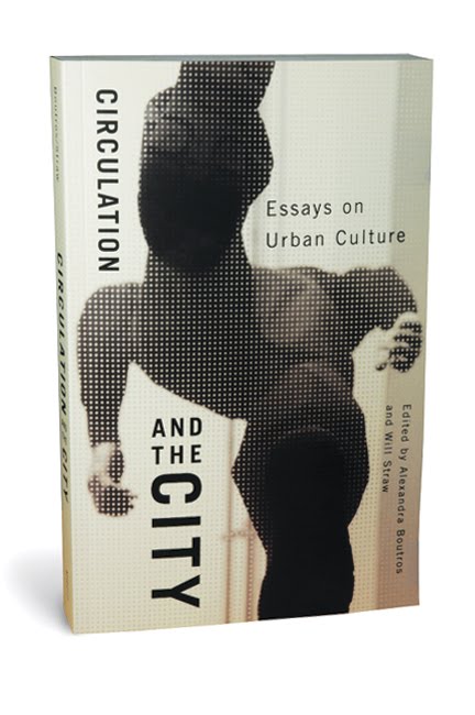
Circulation and the City design by David Drummond

New from David Drummond

The Original Spirit — Toronto indie institution This Ain’t The Rosedale Library (one of the 10 best bookshops in the world according to The Guardian) featured at Books@Torontoist, with some nice quotes from owner Charlie Huisken:

“creative knowledge [is] accumulative and comes from many sources… Being an autodidact has served me well”

Books in the Age of the iPad — Craig Mod’s article on printed books and digital publishing caused much of a flutter on Twitter yesterday. I’m not sure that I entirely agree with his thesis — which seems to imply that some kinds of content can be completely divorced from their media — but his website is beautifully designed, and more importantly he makes some interesting points. I especially like his conclusion:

I propose the following to be considered whenever we think of printing a book:

  • The Books We Make embrace their physicality — working in concert with the content to illuminate the narrative.
  • The Books We Make are confident in form and usage of material.
  • The Books We Make exploit the advantages of print.
  • The Books We Make are built to last

In that vein, more on David Pearson‘s beautiful book cover designs for Cormac McCarthy at We Made This. I love that he used rubber stamps…

And finally… Jaron Lanier, author of You Are Not A Gadget, talks about the failure of Web2.0 with Aleks Krotoski of The Guardian:

3 Comments

Educate or “Educate”?

I had an interesting discussion with author Jim Hanas (@jimhanas) on Twitter today about customers and education. It started with Jim’s comment (re-tweeted by Director of Digital Initiatives for Chelsea Green Publishing, Kate Rados / @KateRados):

“When you start trying to ‘educate’ your customers, it’s the beginning of the end for any industry.”

I disagreed, and said so. I believe education informs and liberates. Rarely is it a negative thing in life or business.

But as it turned out, in this context ‘educate’ meant something different to Jim than it did to me. For Jim, it was a sinister euphemism for scold, blame, bully, and punish. ‘Education’ was “code for ‘litigation.'”

If I understood him correctly, Jim was saying that to ‘educate’ our customers would be to repeat the mistakes of the music industry.

Needless to say, I don’t want to see publishers suing school children. For me, though, ‘educate’ means to inform, communicate, and engage — all things  publishers should do and not just with their books. To educate means, for example, an editor talking about a new acquisition, a production manager explaining why they used FSC approved paper, or a designer explaining how to use their tools.

Until now, we have assumed that nobody cared about this stuff. But the web has showed us that it can be endlessly fascinating, and, perhaps more pertinently, that an unwillingness to explain what we do ourselves creates a vacuum that will be filled by others who either have something to gain or who find our lack of transparency and engagement frustrating (looking at you Hugh McGuire!).

Ultimately, then, I don’t think Jim and I were in true disagreement. We just understood a word differently. Perhaps the lesson is that publishers need to educate, not “educate”?

4 Comments

The Discussion That Will Not Die!

Tales from the Crypt Bronte

Now the dust has almost settled on the Amazon-Macmillan dispute, John Sargent, CEO of Macmillan, laid out their new position on availability, pricing and the (much discussed) agency model yesterday:

We will price our e-books at a wide variety of prices. In the ink-on-paper world we publish new books in different formats (hardcover, trade paperback, and mass market paperback) at prices that generally range from $35.00 to $5.99. In the digital world we will price each book individually as we do today… For physical books, the majority of new release hardcovers are published in cheaper paperback versions over time. We will mirror this price reduction in the digital world.

This follows hot on the heels Motoko Rich’s second stab at explaining the issues around pricing for The New York Times (her previous — fairly woeful — attempt is here):

Publishers argue that it would be difficult to sustain a vibrant business on much lower prices. Margins would be squeezed, and it would become more difficult to nurture new authors…“You’re less apt to take a chance on an important first novel if you don’t have the profit margin on the volume of the big books,” said Lindy Hess, director of the Columbia Publishing Course, a program that trains young aspirants for jobs in the publishing industry. “The truth about this business is that, with rare exceptions, nobody makes a great deal of money.”

This echoes similar points made by Lydia Dishman’s in an earlier article, “The Case Against Dirt-Cheap E-Books”, at BNET:

If massive sales are the only aim, content is devalued to the point of creating digital pulp. Maybe no one old enough to remember real pulp fiction (not the Tarantino film) is reading this, but the only thing that lives on from that era are histories of the pulp fiction genre, not the actual books, which by definition were cheaply produced and contained even “cheaper” content. Pulp’s inherently ephemeral — not exactly a stable foundation for a new business model.

Pricing seems to be the issue that just will not go away right now, and none of the points raised here are new. But I guess the upside is that there is now some more informed discussion going on and publishers are beginning to take it seriously. That, and John Sargent giving other CEO’s a free lesson in communications and transparency.

(Image from R. Sikoryak‘s Masterpiece Comics published by Drawn & Quarterly)

2 Comments

Midweek Miscellany

The “Consummate Amateur” — Graphic designer, collector and archivist JP Williams (who blogs at the wonderful amassblog) profiled at Sight Unseen.

Overcoming Creative Block — 25 Artists, designers, and creators share their strategies at ISO50. I rather like Erik Spiekermann’s pithy list:

  1. Avoid
  2. Think
  3. Research
  4. Collect
  5. Sketch
  6. Deconstruct

    Schriftguss AG — A lovely Flickr set of  type specimens  (via The Ministry of Type).

    And Finally…

    American Psycho in six panels by Claire Murray seen at The Creative Review. Genius.

    Comments closed

    The Silver Lining Top 5

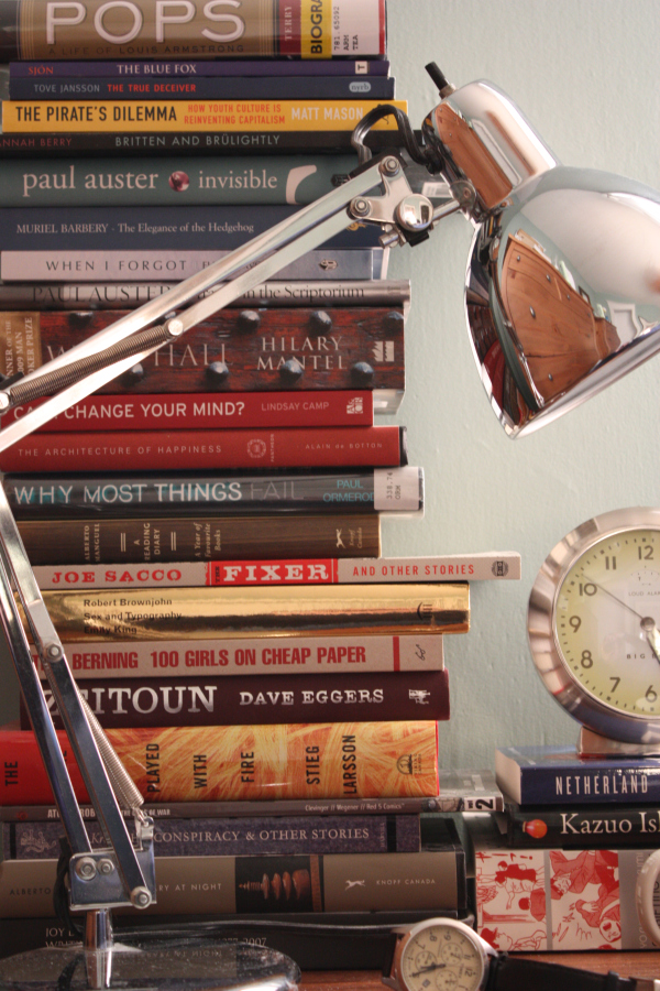
    The nice folks at The Silver Lining blog — consistently one of my favourite blogs for vintage design goodness — were kind enough to ask me for a contribution to their ‘Top 5’ feature last month, and so, as of today, the top 5 books beside my bed are online for everyone to see.

    The Top 5 are:

    1. Pops: A Life of Louis Armstrong by Terry Teachout
    2. The True Deceiver by Tove Jansson
    3. The Blue Fox by Sjón
    4. Britten and Brülightly by Hannah Berry
    5. The Pirate’s Dilemma: How Youth Culture Reinvented Capitalism by Matt Mason

    I actually just finished reading Pops at the weekend, but there is no guarantee that I will read the rest in that order — the list really is just a happy accident of stacking. You you can read more about each of the selections in the post at The Silver Lining.

    Comments closed

    Monday Miscellany

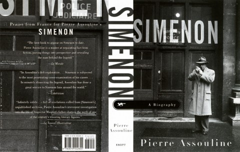
    Simenon designed by Archie Ferguson

    Pub Psychology — Archie Ferguson, formerly of Knopf and now art director at HarperCollins, interviewed at the CoveredUp blog:

    Publishing has always seemed a lot more glamorous than it is. And if it ever was glamorous, those days are long, long gone. These days I spend a lot of time answering emails – not phone calls – from far and wide, running up and down the stairs… doing damage-control, and feeling more like I’m a psychologist as much as anything else.

    Virtual CityJonathan Lethem, author of Chronic City, interviewed in The New Statesman:

    Manhattan, the great secular-commercial metropolis, the world’s first and greatest city founded on concepts other than religious or national identity – and therefore a kind of science-fiction city, a conceptual project, a place unnaturally subject to the distorting forces of capital, ideology, projection, wish-fulfilment and so on – has become…a place both persistently real and unreal. Or, an unreal place where real people are living out their existence… What’s gone wrong and right in this place has a special amount to tell us.

    The difference between Time Roman and Times New Roman — Because I know you’re curious.

    The Form of a Book — Another lovely, insightful post from A Working Library:

    On the page, the rhythm of the text emerges from both the macro design—the pleasing shape of the page, the proper amount of thumb space—and the micro—the right amount of leading, the evenness of the word spacing, the correct break of a line. On the screen, the rhythm of a text encompasses all of these things and more—the placement of a link, the shift from text to video and back again, the movement from one text to another. The rhythm becomes more complex as the orchestra gets larger, but the desire for rhythm does not subside.

    In order to create this rhythm, the book must be designed and composed for the screen. A beautiful digital text can no more be arrived at by “converting” from a print design than a beautiful print book can be created by converting a Word file. The digital book will never come into its own so long as it is treated as a byproduct, unworthy of attention.

    2 Comments

    Midweek Miscellany

    Vintage Dostoevsky, design by Michael Salu

    Precisely and Concisely — The Caustic Cover Critic interviews designer and Artistic Director of Granta magazine Michael Salu:

    Bizarrely, designers looking for employment are often judged by what software they’re able to use. Intellect, cultural awareness and often creativity don’t seem to be values worthy of a resume. There is no substitute for good ideas, the rest are just supportive tools. I have always been quite a craft-led designer, but I am of the generation that studied with a mac in front of them and I think its good to understand the importance of both.

    The Honest Bookseller — Erin Balser of Books in 140 profiles Toronto independent bookstore Ben McNally Books for The Torontoist:

    “I’d rather have a book that sells one copy that no one else will sell than to stock several best sellers you can get anywhere,” McNally says. “That’s what makes this store. That’s why people come… My first responsibility is my customer. When I think a book should be cut by a third or if there’s a subplot that goes nowhere, I have to tell you that… I’m often a very critical reader. When people come and ask me ‘Is this any good?’ I have to be honest.”

    William Kentridge: Five Themes — Beautiful book design from Abbott Miller and Kristen Spilman at Pentagram.

    Speaking of Pentagram… Pentagram partner Paula Scher has some blunt stuff to say about design in a interview with Pr*tty Sh*tty.

    The Rules — Inspired by Elmore Leonard’s 10 Rules of Writing, The Guardian asked authors — including Diana Athill, Margaret Atwood, Richard Ford, Jonathan Franzen, Neil Gaiman, and PD James, Hilary Mantel, Michael Moorcock, Philip Pullman, Ian Rankin, Will Self, Sarah Waters, and Jeannette Winterson — for their personal dos and don’ts. (Part two is here).

    On the subject of writing, the wonderful BBC radio series The History of the World in a 100 Objects has recently touched on the history of writing, literature, and mathematics in episodes about the Early Writing Tablet, the Flood Tablet and the Rhind Mathematical Papyrus. The series is a collaboration with The British Museum. Great stuff.

    Diana Athill, Margaret Atwood, Roddy Doyle, Helen Dunmore, Geoff Dyer, Anne Enright, Richard Ford, Jonathan Franzen, Esther Freud, Neil Gaiman, David Hare, PD James, AL Kennedy
    1 Comment

    John Downer Glass Gilding Video

    Following up from last week’s Midweek Miscellany post, here is glass gilder John Downer talking about creating that amazing lettering for Reserve‘s window in Los Angeles:

    Reserve Glass Gilding by John Downer from Reserve LA on Vimeo.

    2 Comments

    10+ Flickr Groups for Book Design and Inspiration

    10 Websites for Vintage Books, Covers and Inspiration” is one of the most popular posts on The Casual Optimist, and here, at long last, is the promised follow-up: “10 Flickr Groups for Book Design and Inspiration.”

    There are a lot of amazing photostreams with book sets — Covers etc, insect54, Kyle Katz, mjkghk, Montague, Paula Wirth, and Scott Lindberg to name just a few that I’ve come across — but I’ve decided to focus this post on my favourite group pools because they collate the best of these individual streams together.

    I’ve also decided to highlight groups that are about specific subjects, genres, publishers, or designers, because I think these are more useful than the more general (but still interesting) book pools such as A+ Book Covers, Book Cover Club, and My Books

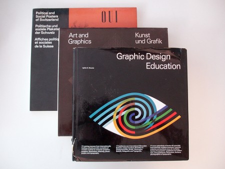
    ABC Verlag Graphic Design books

    1. ABC Verlag, Zurich — A collection of scans and images from Zurich-based ABC Verlag who specialized in graphic design and fine art books between 1962 to 1989.
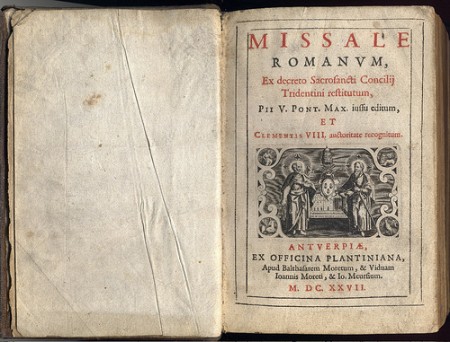
    1627

    2. Antique Books — images of books, covers and illustrations that are a hundred years old or more.
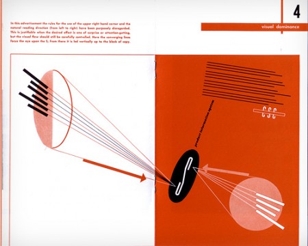
    Design and Paper: Number 13: Spread

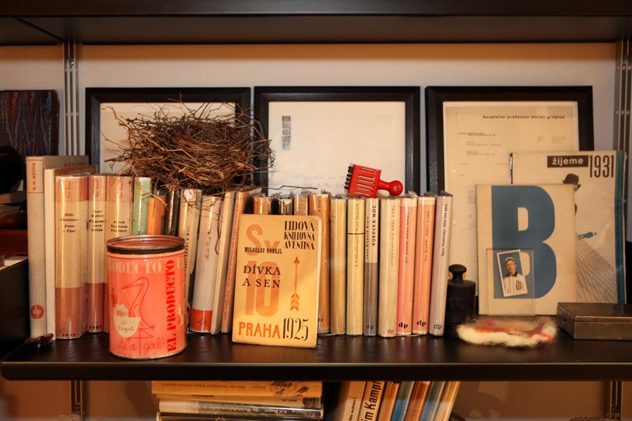
    3. Designers’ Books — “what’s on the shelves of designers and other smart creatives.” Not to be confused with the also excellent designers-books.com pool or Book Design pool.
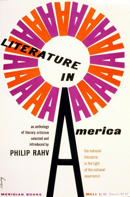
    Literature in America

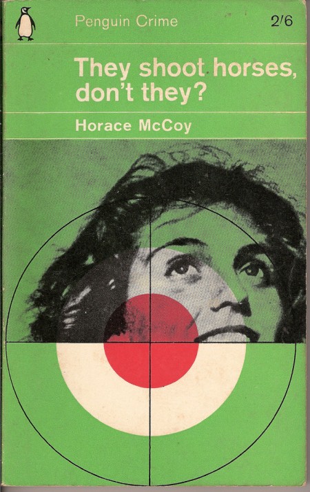
    4. Alvin & Elaine Lustig Design — celebrates the work of Alvin and Elaine Lustig, both renowned for their incredible book cover designs.
    They Shoot Horses Don't They

    5. The Penguin Paperback Spotters’ Guild — An astonishing collection of vintage Penguins, Pelicans, Peregrines, and Puffins. Also of interest: The Great Pan! Illustrated Pan Book Covers and Vintage Fontana Books.
    Playback by Raymond Chandler Cover art by William Rose

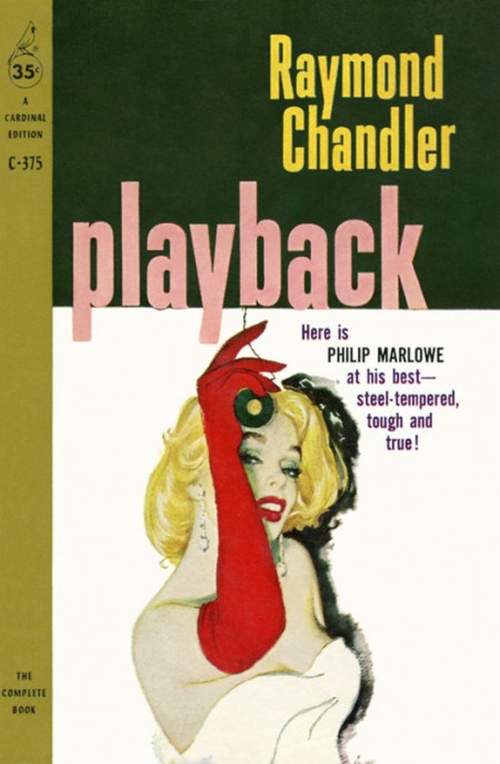
    6. Pulp Fiction — As you would expect: detective novels, crime fiction, adventure comics, trashy romance, weird science, blaxploitation and more. See also: The Old-Timey Paperback Book Covers and The Crime & Mystery Book Covers.
    Thoughts on Design by Paul Rand

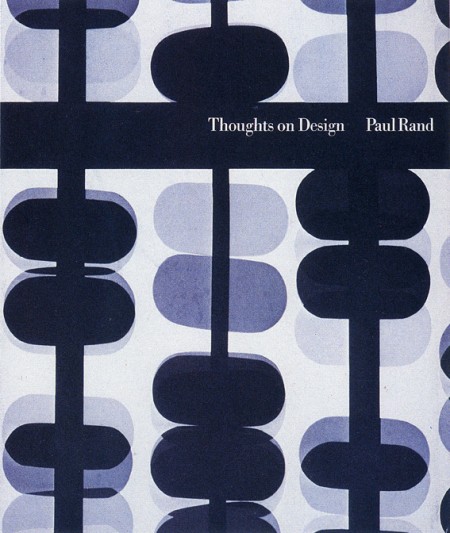
    7. The Paul Rand Modern Graphic Design Fan Club — Like the Lustig Design group, this is not just a book pool, but it does, however, include many of Paul Rand’s iconic book designs, making it essential to this list in my opinion.
    I Know an Old Lady, by Rose Bonne. Pictures by Abner Graboff.
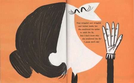
    8. The Retro Kid A collection of cool illustrated children’s books from the mid-1940’s through the mid-1960’s, curated by The Ward-O-Matic illustrator Ward Jenkins.
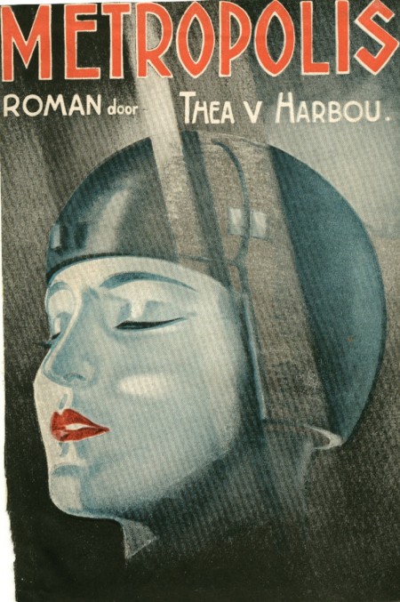
    metropolis thea v marbou

    9. The SciFi Books Pool Vintage science fiction covers from the 1940s, 50s, 60s and 70s.
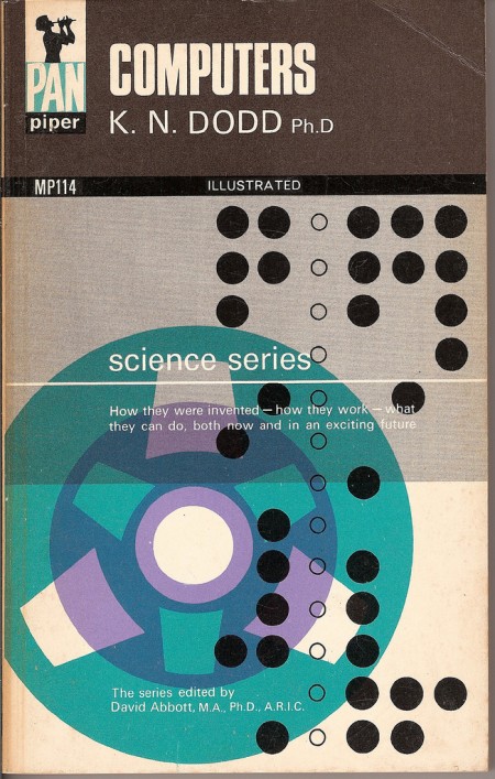
    computers

    10. Vintage Paperbacks — The place for amazing paperbacks that aren’t Penguins. Curated by graphic designer and art director Gregory Boerum, the focus is on quality stuff with design interest from the 1960’s and 70’s.

    So there we have it: 10 of my favourites. What are yours?

    10 Comments

    Midweek Miscellany

    EndGrain — A “directory and aggregator for wood type and letterpress works and information on the web.” Lovely.

    Crash — Iain Sinclair (author, most recently, of Hackney, That Rose-Red Empire — just out in paperback by the way) on JG Ballard’s artistic legacy:

    A late moralist, he practised undeceived reportage, not prophecy: closer to Orwell than HG Wells. Closer to Orson Welles than to either. Closer to Hitchcock. Take out the moving ­figures on staircases that go nowhere and stick with hollow architecture that co-authors subversive drama

    Picture Book Report — 15 artists create illustrations inspired by their favourite books. Pictured below: Kali Ciesemier‘s take on Sabriel by Garth Nix. I’m also looking forward to Robot Johnny‘s take on The Hitchhiker’s Guide to the Galaxy (via The Art Department).

    Indigo 2.0Canadian Business magazine on Indigo and their digital book division Kobo:

    “Kobo has been across the smartphone space from the beginning,” says Lisa Charters, senior vice-president and director of digital for Random House Canada. “And that unique offering is really important to us as publishers, because we want consumers to have all options to read e-books, and not necessarily have to purchase a $300 device.”

    What’s more, says New York publishing consultant Mike Shatzkin, “they beat Google into the cloud.” Kobo’s library system is based in cloud computing. When you buy a Kobo book, it resides on Kobo’s servers and you access it via your device of choice. So when you squeeze in 20 pages of The Lost Symbol on your laptop in the morning, and later that day open the Kobo application on your BlackBerry, Kobo automatically plops you down on page 21.

    Interesting stuff, although I do wish journalists could stay away from the Gutenberg clichés (and Dan Brown. Barf).

    And finally…

    Reserve Window Design — “We hired our good friend John Downer, who is a professional sign painter & typographer, to fly to LA to do gold leaf lettering on our store window & transom. Glass gilding is becoming a lost art that only a few dozen people in the United States still know how perform” (via We Love Typography):

    4 Comments

    The Peanut Gallery

    Having written a couple of things this week about what publishers should be doing, Don Linn has a timely post at his blog Bait ‘n’ Beer on exactly why such thoughts are usually wide of the mark:

    [N]ot all publishers are the same. While there are some commonalities among the hundreds of publishers, there are major differences between trade, academic, educational, reference and other types of publishers and even within those broad categories, there are major differences (even within the same house) between fiction and nonfiction, text and illustrated, genre and general fiction, children’s, YA and adult titles. And I’ve only named a few… The point is it’s dangerous to take individual examples and generalize them to an entire, very diverse industry.

    He goes on remind readers that talk is always cheap:

    [P]ublishers don’t do everything critics think they should [because] not many publishers are rolling in cash at the moment. I can’t name a single publisher who wouldn’t want to spend more on investments in marketing, quality, workflow improvement and editorial, but the money’s just not there. So we need to temper our expectations with a dose of financial reality.

    It’s a great post. And worth reading every time you think a publisher should be doing something they aren’t.

    (link)

    Comments closed