“She sees you seeing her. The hand on the hip is not passive, her gaze is not passive. She looks strong!…I wanted this image to stand as a piece of inspiration to keep fighting for justice for her. When I look at the dress, it…reminds me of Lady Justice.”
Sisters by Daisy Johnson; design by Suzanne Dean; photograph Simon Kerola (Jonathan Cape / August 2020)
The cover of the US edition of Sisters, published by Riverhead this month, was designed by Jaya Miceli. The painting is by Jeremy Olson. (Thank you to the folks on Twitter who helped me with this!)
David Pearson has designed three new covers for the Penguin editions of Albert Camus’ novels The Plague, The Outsider, and The Fall. The typeface is apparently Portrait, designed by Berton Hasebe for Commercial Type, and the covers are printed on Colorplan Dapple embossed paper from G. F. Smith. The new editions were published July 30, 2020.
Maybe someone has done this before and I didn’t notice (or, more likely forgotten), but it’s great to see a photograph from the EPA’s remarkable DOCUMERICA Project — available through the US National Archives on Flickr — on a book cover.
Rodham by Curtis Sittenfeld; design by Jo Thomson (Doubleday / July 2020)
It’s interesting that the US cover of Rodham is essentially the same as the UK one. I would’ve thought for sure that they would take different approaches.
Artist Stanley Donwood talks about his artwork for Radiohead, his collaboration with author Robert MacFarlane on Ness, and his own book Bad Island, published earlier this year by Hamish Hamilton (and slated to be published in the US by W.W. Norton this fall).
The cover of the UK edition, which will not be published until 2021(!), was designed by Craig Fraser. It has a very vintage Faber feel… maybe it’s just the type?
This reminded me of the cover of the similarly themed American Manifesto by Bob Garfield, designed by Richard Ljoenes and published earlier this year by Counterpoint….
I love this illustration for the June 29 issue of The New Yorker magazine by Matt Willey. It accompanies ‘The Rescue Will Begin in Its Own Time‘, a series of short pieces by Franz Kafka that have not been published in English before, and that will appear this fall in the New Directions book The Lost Writings.
Inspired by Eugène Delacroix’s ‘Liberty Leading the People’, artist Kadir Nelson explains how he illustrated the July 2020 cover of Rolling Stone to accompany Jamil Smith’s cover story on Black Lives Matter.
This cover immediately reminded me of Helen Crawford-White’s cover A Half-Baked Ideaby Olivia Potts published last year…
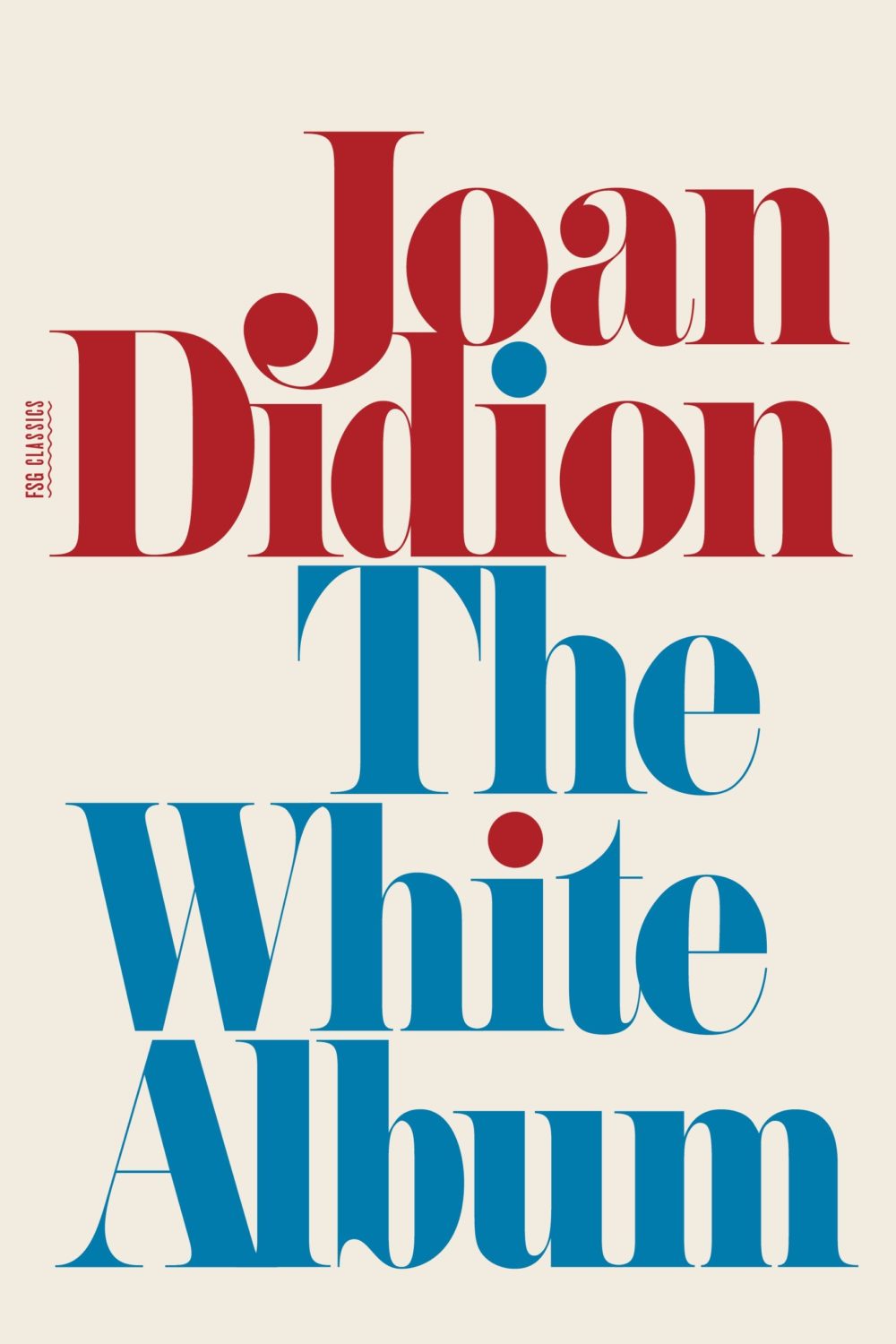
And then I thought maybe it was a nod to the cover of The White Album by Joan Didion, published in 1979 (the reissue below uses the original cover), and which Fonts in Use informs me uses the typeface Pistilli Roman. But maybe I am over thinking it…?
I was also reminded of these two recent covers, so maybe it is just a thing…?
I believe this is only available as an ebook, which seems a bit of shame. It would be nice to see in print. The cover does remind me of something else though. I can’t think what exactly. The best I could come up with was Tyler Comrie‘s cover for The Unwanted by Michael Dobbs. But I feel like there is cover that does something similar with a painting as a background? Possibly I’m just imagining it.
Oh and for those of you who are interested, the design team at Penguin Random House Canada have started posting their work to Instagram as one_last_tweak.
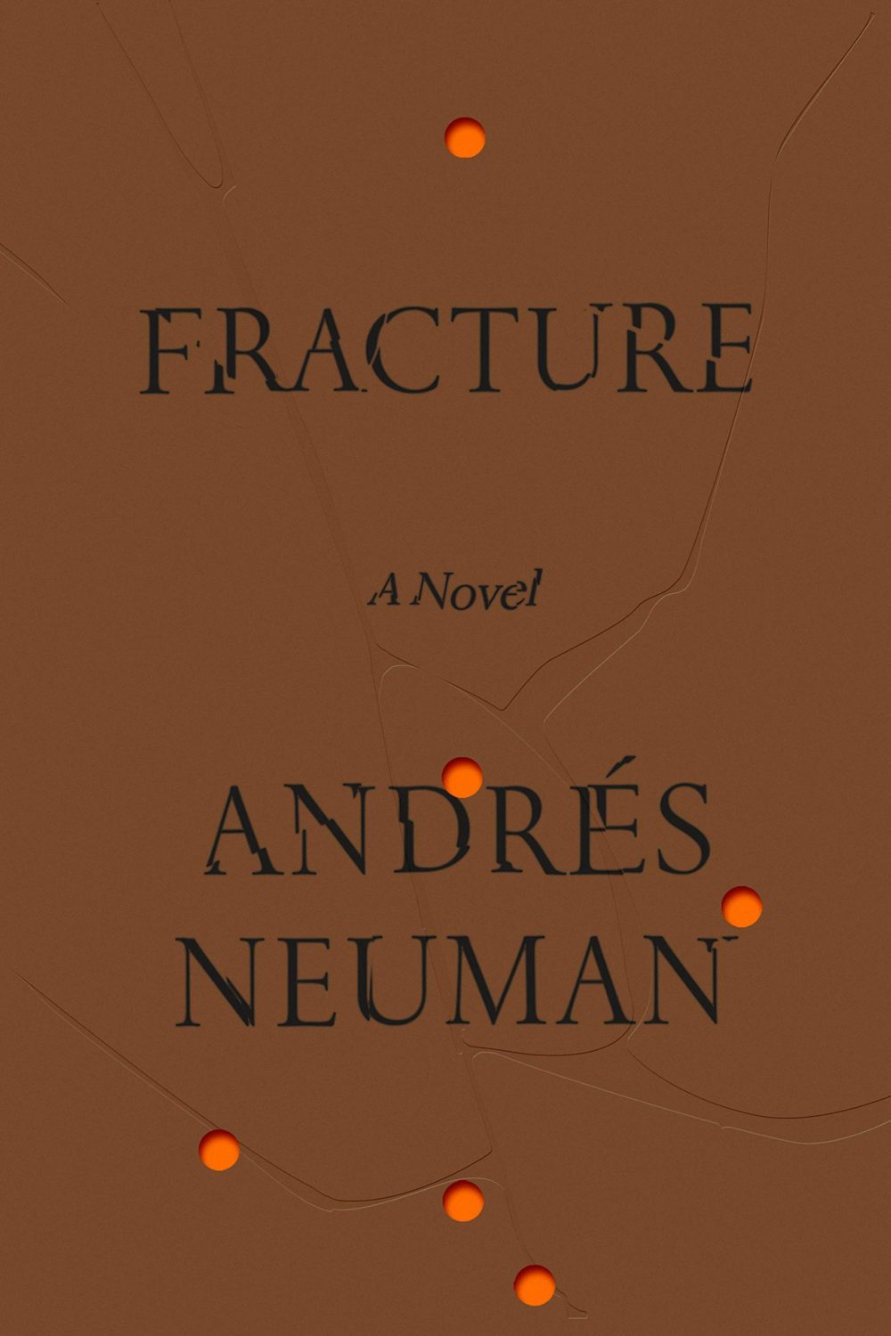
Fracture by André Neuman; design by June Park (Farrar Straus & Giroux / May 2020)
“Having lived in Chicago for thirty years, I’ve only ever been a visitor to New York, but I love it like no other city. Teeming with unpredictable people and unimaginable places and unforeseeable moments, life there is measured not in hours but in densely packed minutes that can fill up a day with a year’s worth of life. Lately, however, closed up in our homes against a worldwide terror, time everywhere has seemed to slur, to become almost Groundhog Day-ish, forced into a sort of present-perfect tense—or, as my fellow New Yorker contributor Masha Gessen more precisely put it, ‘loopy, dotted, and sometimes perpendicular to itself.’ But disaster can also have a recalibrating quality. It reminds us that the real things of life (breakfast, grass, spouse) can, in normal times, become clotted over by anxieties and nonsense.”
Chris Ware has created another brilliant cover for The New Yorker to illustrate April 15th, 2020, “a kaleidoscopic account of a single day in New York” during the pandemic.
Its densely packed grid and the juxtaposition of mundane, ‘snapshots’ reminds me — perhaps more than some of his other covers for the magazine — of Ware’s comics.