Skip to content

The Casual Optimist Posts

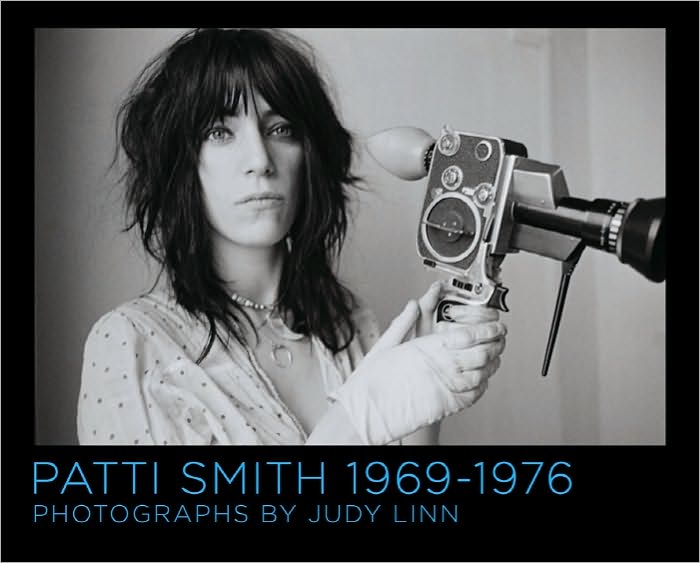
Patti Smith 1969-1976, Photographs by Judy Linn

“I was eager to be Judy’s model and to have the opportunity to work with a true artist. I felt protected in the atmosphere we created together. We had an inner narrative, producing our own unspoken film, with or without a camera.” — Patti Smith

Here’s a short promotional trailer for Patti Smith 1969-1976, Photographs by Judy Linn, mentioned briefly in this morning’s round-up:

(via @theBDR)

Comments closed

Midweek Miscellany

Book Art: Iconic Sculptures and Installations Made from Books by Paul Sloman, a 220-page overview of contemporary art, installation, and design created with and from books , published Gestalten.

La Mémoire Retrouvée — Edmund de Waal, author of The Hare with the Amber Eyes, on his family’s connection to Proust, for The Daily Telegraph:

Proust played with the interpenetration of the real and the invented; his novels have a panoply of historical figures who appear as themselves mingling with characters reimagined from recognisable people. Elstir, the great painter who leaves his infatuation with Japonisme to become an Impressionist, has elements of both Whistler and Renoir, but has another dynamic force. And Proust’s characters stand in front of actual pictures. The visual texture of the novels is suffused not just with references to Giotto and Botticelli, Dürer and Vermeer, Moreau, Monet and Renoir, but by the act of looking at paintings, by the act of collecting them, remembering what it was to see something, the memory of the moment of apprehension.

Doomed — Jonathan Coe, author most recently of The Terrible Privacy of Maxwell Sim, on film adaptations of books for The Guardian:

In the course of their famous book-length interview, François Truffaut once asked Alfred Hitchcock about his approach to literary adaptation, and Hitch’s response was as magisterial, worldly and mischievous as one would expect: “What I do is to read a story only once, and if I like the basic idea, I just forget all about the book and start to create cinema. Today I would be unable to tell you the story of Daphne du Maurier’s The Birds. I read it only once, and very quickly at that.”


Circumventing the Male Gaze The New Yorker‘s Hilton Als on photographer Judy Linn and a new book collecting her photographs of Patti Smith:

I wonder what Patti and Judy saw in one another—I mean, beyond the description Judy provides in her little essay at the back of the book. What is the energy that one being picks up on, and how does it complement the other’s? Judy and Patti went to Detroit one summer and worked for a local paper and Crawdaddy, respectively; Patti wrote rock criticism and Judy took pictures. Lester Bangs was their friend. The world got bigger. Collaboration can be vexing, but there’s not a note of complaint in their work together. The pictures are documents of girls doing things together, sometimes in their summer dresses. And when there’s a third person present—Mapplethorpe, some other boy—they make a little room for him, but he’s rarely center frame; the pictures are rare in that they circumvent the male gaze and thus approval; instead, they document how each woman’s vision is equal to the other’s.

And finally…

Designer Data — The New York Times on data visualization:

Visual analytics play off the idea that the brain is more attracted to and able to process dynamic images than long lists of numbers. But the goal of information visualization is not simply to represent millions of bits of data as illustrations. It is to prompt visceral comprehension, moments of insight that make viewers want to learn more.

And on a related note: The Infographic Inforgraphic by Ivan Cash.

Comments closed

Kurt Weidemann 1922-2011 | GestaltenTV

GestaltenTV have posted an 16-minute interview with influential German typographer and graphic designer Kurt Weidemann who died at the age of 88 on March 31st, 2011:

Weidemann helped form the graphic identities companies such as Mercedes-Benz and Porsche, as well as designing books for the Büchergilde Gutenberg and the publishing houses Ullstein, Propyläen, Ernst Klett and Thieme.

Jürgen Siebert has written an obituary of Weidemann for FontFeed:

Weidemann was a disputatious designer. He disseminated his knowledge in numerous specialized books and countless presentations and talks. Legendary are his 10 Thesen zur Typografie, published in 1994 in the book Wo der Buchstabe das Wort führt. Ansichten über Schrift und Typografie. This resulted in his appeal: “God protect us from the vagrant creativity of the typomaniacs.” Weidemann never could reconcile with the immense variety of different typefaces. During a discussion at Swiss Mediaforum in 2010 he literally said: “There are ten, maybe fifteen very good typefaces, which I can agree with at least. There are 30,000 on the market, of which 29,990 can be sunk in the Pacific Ocean without causing any cultural damage.”

Comments closed

Little Scraps of Paper

Little Scraps of Paper is a lovely series of short documentary films about how creative people use notebooks to record their thoughts and develop their ideas. The series was created last year by director Tomas Leach, assisted by Nicolas Cambier and Daniel Diego Lincoln.

In this film, Norwegian product designer Oscar Narud talks about his process:

(Thanks Kate!)

Comments closed

Henning Mankell: The Last Wallander?

The Swedish author Henning Mankell talks to NPR New’s Morning Edition about the 11th and possibly last Wallander novel The Troubled Man:

“Maybe I’m a little old-fashioned. In the times where everyone is talking about how everything is a process, I am keen on dots … you call them a period. I believe in periods. I really thought that now is the ending, to make the final period in the stories of Wallander.”

NPR NEWS MORNING EDITION: HENNING MANKELL

Comments closed

Something for the Weekend

A Swiss Typeface + 2 Italian Designers = New York City — Michael Bierut reviews Helvetica and the New York City Subway System by Paul Shaw for the WSJ:

Mr. Shaw is irritated with the widespread belief that the modern New York subway system has always been associated with the Swiss typeface Helvetica. This misperception was fueled by the attention the typeface received in 2007 on the 50th anniversary of its introduction, especially in Gary Hustwit’s “Helvetica,” a documentary survey of the astonishing ubiquity of a lettering style that appears over the entrances of American Apparel and Staples, on Lufthansa airplanes and New York City garbage trucks, on Comme des Garçons bags, and, yes, on New York subway signs. But the last, as Mr. Shaw shows, was not always so.

The Habit of Reading — Harvard professor Marjorie Garber talks about her new book, The Use and Abuse of Literature, with The Atlantic:

I don’t believe there’s a necessary divide between highbrow and lowbrow or whatever. I think that the habit of reading is intensely pleasurable and it’s also hard. The pleasure of it is partly the pleasure of detection, the pleasure of recognition, the pleasure of response… I’m very optimistic actually about the future of literature and literary reading—I’m far from despairing and I don’t actually feel that there’s a crisis. What we need is to continue to show the power of reading, the pleasure of reading—and, again, more people experience that than we are sometimes aware of.

Jessa Crispin, editor-in-chief of Bookslut,  reviews the book for NPR:

In fact, it’s proof of literature’s strength and lasting value that a 19th century writer like Jane Austen can still speak to the contemporary love lives of her readers, and that a book like the Diary of Anne Frank can still cause a ruckus among protective parents. That fight over comic books? The same arguments were made about Shakespeare, because, it was suggested, Elizabethan drama wasn’t real literature. (Early debates also routinely happened over novels, ballads and books written by women.) People have been trying to ban books for ages, from the 18th century’s Fanny Hill and the court cases against Lady Chatterley’s Lover and Ulysses, all the way to Harry Potter. “[Literature’s] greatness… is enhanced rather than undercut” by these challenges, Garber argues. There will always be stubborn, scandalized readers trying to define what literature is, but the greats will endure.

From Head to Hand — A lovely essay by ceramic artist Edmund de Waal, author of The Hare With Amber Eyes, on Primo Levi’s The Wrench and being a maker, in Slate:

Here, at last, was a book structured round structure. It was a conversation about how you took one part of learning and took it to another job. This made sense of how deeply connected the hand and the head really are. It articulated for me the way that I would throw a dozen porcelain pots and look at them, affectionately perhaps but also with a dispassionate eye, and plan the next dozen. It understood how I knew when dipping a pot into a bucket of glaze or listening to the sound of the flames when firing my kiln that there is something out of balance.

And, above all, there was a feeling that Levi was not speaking for people who make things. He doesn’t explicate or translate technical terms. In The Wrench, Faussone’s voice is clear and unhurried, paced in response to the real complexities and real pleasures that he encounters. Alongside him is Levi with his “specific challenge: I have a double experience—a chemist in the world’s eyes, and feeling, on the contrary a writer’s blood in my veins.”

People Like Us — A profile of Coudal Partners on Signal vs. Noise, the 37 Signals blog:

Despite the varied efforts, one consistent theme for the firm is a sense of curiosity and playfulness… That attitude attracts kindred spirits. “In our experimental films, in our contests, in our blog postings, and the products we make, we are trying to satiate our own curiosity and interest,” he says. “And we just take it on faith that there are a lot of people who share those curiosities and those interests with us. And if so, they will buy our products and they’ll watch our movies. Maybe you don’t have to sell to everybody. Maybe there’s enough people like us.”

And finally…

Bass is Best — Steven Heller on the movie posters of Saul Bass, for The Atlantic:

Bass’s work is appealing for its nuance, and his keen ability for making subtle, abstract symbols speak louder than literal photographs. What makes the new Hollywood versions so unappealing is the inability to allow the viewer to fill in the blanks. When Bass worked for Hollywood studios he created a consistent identity for films, from main and credit titles to posters and ads.

Comments closed

DODOcase

In yesterday’s round-up I briefly mentioned DODOcase who use traditional bookbinding techniques to produce iPad and e-reader covers locally in San Francisco. Here’s a video introduction to the company and their products:

Another reason (were one needed) to get an iPad (right after Swords & Sworcery!).

Comments closed

Kazuo Ishiguro | Jamie Keenan

The super-talented Jamie Keenan has done a beautiful redesign for Vintage’s Kazuo Ishiguro backlist. You can see them in their full glory at Art Director John Gall’s blog Spine Out.

Comments closed

Midweek Miscellany

L’Exception Française —  The Guardian on an exhibition in Paris celebrating the centenary of French publisher Gallimard:

Gaston [Gallimard] himself always protested that he had never had any ambition or even vocation to be a publisher. And when in 1910 he was invited to join the “adventure” of the Nouvelle revue française (Nrf), it was an example of what became a rule, letting his friends “guide his life”. Modest, somewhat detached, well turned-out and above all, perhaps, “without side”, he was to prove a magnet for writers of violently contrasting aesthetic and political allegiances. He had charm, and he had luck. He drew towards him, and elected to that most exalted of circles, the comité de lecture, such arbiters of literary taste and intellectual vigour as Jacques Rivière, Jean Paulhan, André Malraux, Albert Camus and Raymond Queneau.

Gallimard, 1911-2011: Un siècle d’édition is at the Bibliothèque nationale de France until 3 July, 2011.

Dry Eyed — David L. Ulin revisits James M. Cain’s Mildred Pierce for the LA Times:

“Mildred Pierce” is less a work of noir than it is a straightforward realist novel: dry-eyed, unsentimental, in which a woman finds grace, of a kind, first by surpassing her limitations and then by recognizing them. That’s a metaphor for what it means to be a grown-up, for what it means to have to take care of a family, to sacrifice in the name of a greater good. It’s also an acute portrait of a society in transition — that of Los Angeles between the wars.

A Map of Wrong Turns — Robert Darnton breaks down why the Google Books settlement failed for the NYRB:

The cumulative effect of these objections, elaborated in 500 memoranda filed with the court and endorsed in large part by Judge Chin’s decision, could give the impression that the settlement, even in its amended version, is so flawed that it deserves to be pronounced dead and buried. Yet it has many positive features. Above all, it could provide millions of people with access to millions of books. If the price were moderate, the benefit would be extraordinary, and the result would give new life to old books, which rarely get consulted from their present locations on the remote shelves or distant storage facilities of research libraries… How can these advantages be preserved without the accompanying drawbacks?

See also: John Naughton on the settlement in The Observer.

Geographic Ingredients — An interesting article by Alison Arieff on communities of local manufacturers for The New York Times:

“For decades we have developed a culture of disposability — from consumer goods to medical instruments and machine tools. To fuel economic growth, marketers replaced longevity with planned obsolescence — and our mastery of technology has given birth to ever-accelerating unplanned obsolescence. I think there is increasing awareness that this is no longer sustainable on the scale we have developed.”

Interestingly, one of the companies Arieff mentions is DODOcase who use traditional bookbinding techniques to make beautiful cases for iPads and e-readers.

And finally…

A quick reminder that tomorrow, Thursday March 31st 2011, is the deadline for AIGA’s 50 Books/50 Covers competition. You can enter online here.

Comments closed

Wim Crouwel: A Graphic Odyssey

Phaidon Books has posted a short profile of the original “Gridnik”, graphic designer Wim Crouwel:

Crouwel, who appeared in Gary Hustwit’s documentary Helvetica, is famous for his innovative approach to typography and his 1967 ‘New Alphabet’. The New Alphabet font was adapted by designer Peter Saville for the cover of Joy Division’s album Substance, released by Factory Records in 1988.

An exhibition of celebrating Crouwel’s work, Wim Crouwel: A Graphic Odyssey, is at The Design Museum in London from March 30th – July 3rd.

UPDATE: Wim Crouwel: A Graphic Odyssey – Catalogue is published by Unit Editions with three different cover photographs to choose from.

4 Comments

Akira Revisited

New York Times movie critic A. O. Scott discusses Katsuhiro Otomo’s 1988 anime classic Akira and Japan’s pop culture obsession with apocalyptic disaster:

The film was based on Otomo’s original six-volume, 2182-page epic, which is thought to be one of the first works of manga to be translated into English in its entirety.

Comments closed

More Montaigne

Author Sarah Bakewell talks about How To Live: Or, A Life of Montaigne in One Question and Twenty Attempts at an Answer with Ramona Koval for ABC RN’s The Book Show:

THE BOOK SHOW: HOW TO LIVE, A LIFE OF MONTAIGNE

Comments closed